
Text Style Palette
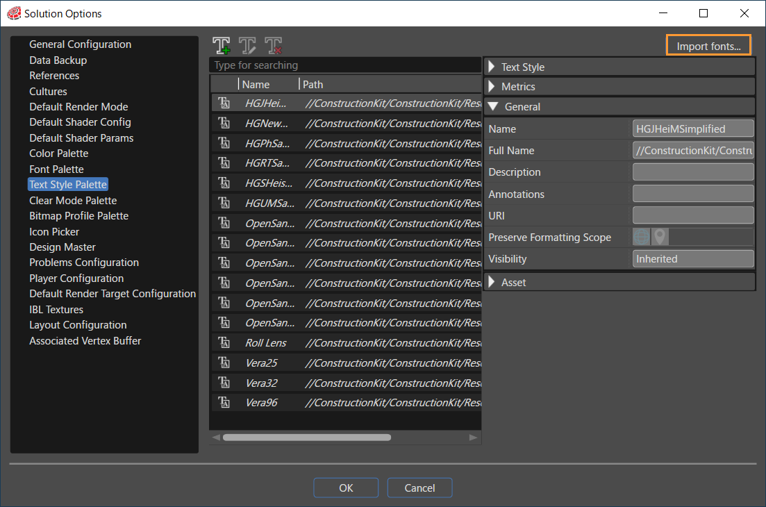
The Text Styles palette section allows you to create, edit, and delete various text style templates.
If there are no imported fonts, fonts can be imported using the [ Import Fonts... ] button in the upper right corner of the Text Styles palette section. The [ Import Fonts ] dialog window displayed by this button can also be displayed by selecting fonts from the menu bar [ Import > Import Resources... ].
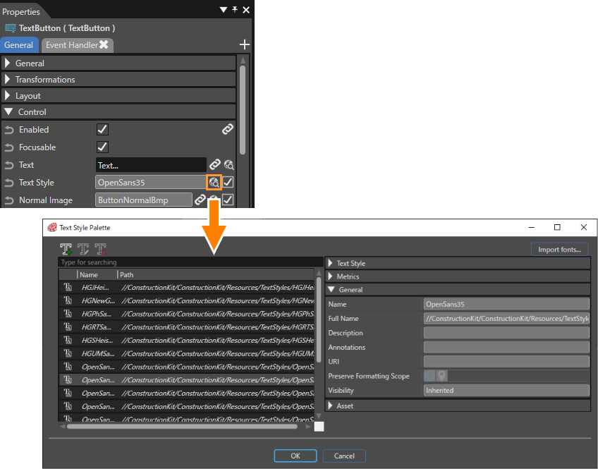
Text styles are required for nodes and controls that display text. For example, 2D text nodes have a property called [ Style ] and controls such as text controls and text button controls have a property called [ TextStyle ]. These properties can be used to set the text style.
Adding a new Text Style
To add a new text style, press the Add Text Style button to open the Add New Text Style dialog.
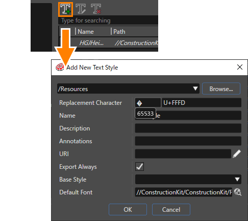
Please refer to Font Palette for detailed information about the "Default font" field.
The newly created created text style has four different sections on the right side of the Text Styles palette window.
- Text Style
- Metrics
- General
- Asset
The following subsections are provided below the text style section.
- Entries
- Cultures
Fonts can be configured based on unicode range and language. In other words, the ISO code of the language (the standard nomenclature used to classify languages) conditions the font selection.
Entries
Entries can be set to different fonts, which are used for text edited in Scene Composer. First, new children must be added using the "+" button. Any child can be deleted and the order in which they appear can be changed. Every new child has three main properties.
- Lower Bound
- Upper Bound
- Font
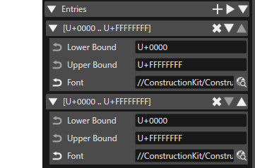
Bound in Entries represents an ASCII decimal value corresponding to all the letters of the Latin alphabet (65 to 90 are uppercase letters from A to Z, 97 to 122 are lowercase letters). If a specific font is selected, and the Lower Bound selected is 65 (= U+0041) and the Upper Bound is 90 (= U+005A), then all uppercase letters in text using that style will be rendered in that specific selected font.
Bound set in decimal is automatically converted to the corresponding ISO code when the Enter key is pressed.
For example, if Lower Bound is set to 3311, pressing the Enter key will automatically display it as the ISO code "U+0CEF". If Lower Bound is set to 200000, it will automatically display it as the ISO code "U+1E8480".
Values greater than U+010000 are plane units.
-
Cultures
In Culture, different items can be set after adding children in the same way as above. In this way, all text style items are grouped by Culture. For more information, see Culture Setting.
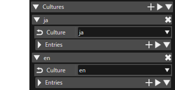
In the image below different cultures and entries can be seen (Click to enlarge image).
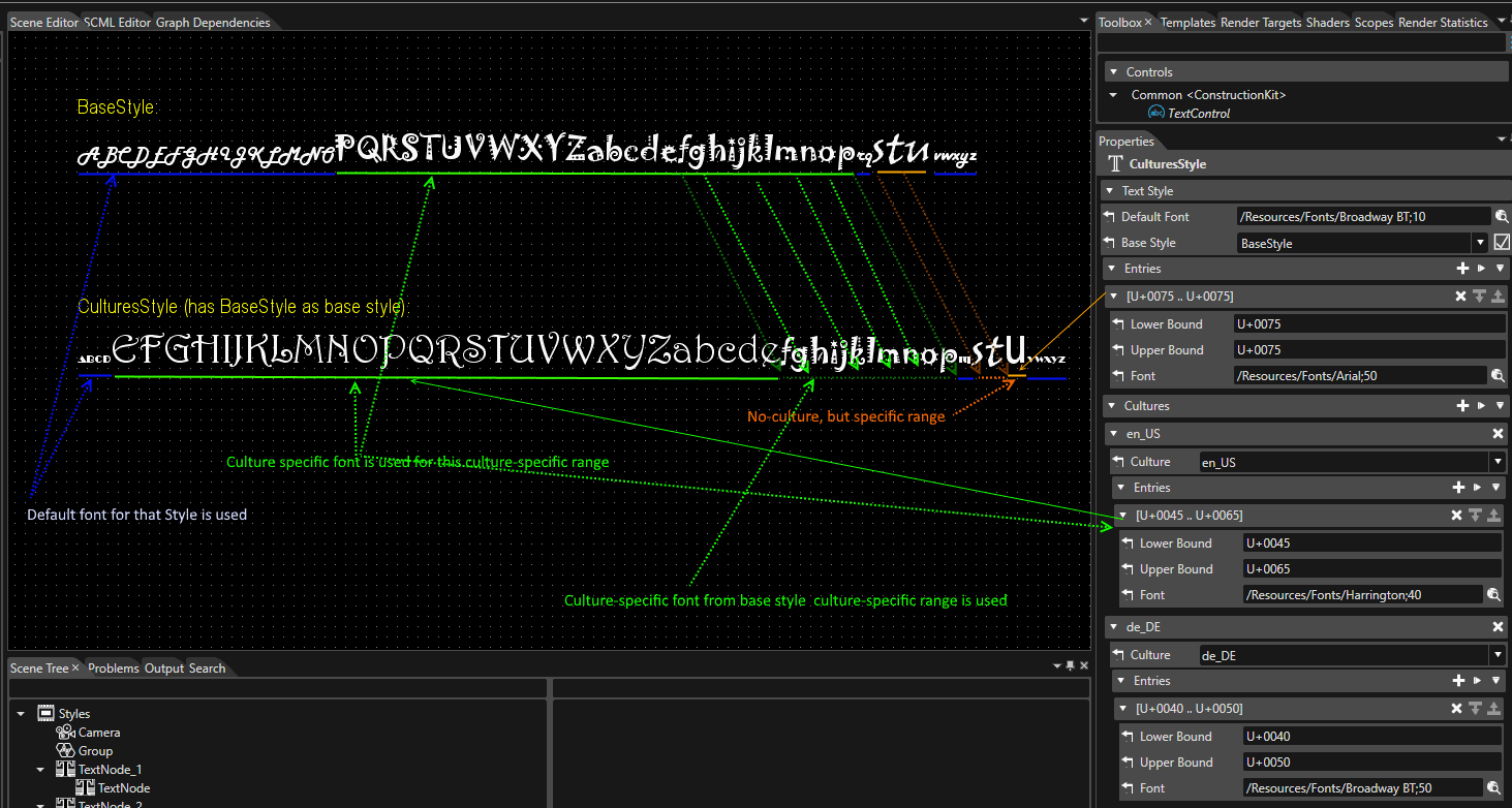
It is possible to create a style which uses a specific font associated for any letter if desired.
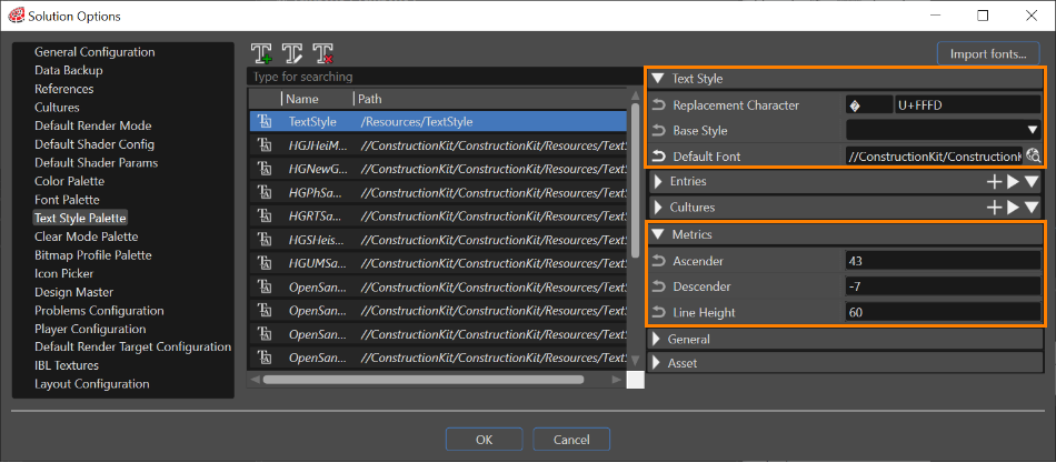
- The "Text Style" section has a great importance because of the selection of the main font used in association with a created style.
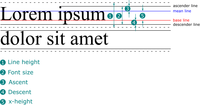
- The "Metrics" section presents font line spacing information. The edited results are reflected in the Scene Editor, and the edited values are also used when outputting assets.
- Ascender: defines the part of a lower-case letter that is taller than the font's x-height
- Descender: defines the portion of a letter that extends below the baseline of a font.
- Line Height: represents the vertical distance between lines of text
lineGap = lineHeight - (ascender - descender)
- The "General" section provides all the necessary information about the created style: Name, Description, Icon and so forth.
- The "Asset" section provides information about exporting, Id, Symbolic name, and Candera name and path.
To find the cultures that are used and the fonts that were set, a verification is done until a valid configuration is found. The codepoint resolution is done according to rules verified in the following order:
- Check if Active Culture is in the Culture list of the current TextStyle
- Check if Active Culture is in the Culture list of the Base Style
- Configuration of Entries in current Text Style
- Configuration of Entries in Base Style
- Default Font from current Text Style
- Default Font from Base Style
If none of the above checks will give any result, the default code point will be used.
Text Style Editor
There are three ways to open the Text Style Editor:
- Select a TextStyle in the Text Style Palette and press the Edit text style button, which will open the Text Style Editor.
- Double-click on a TextStyle in the Solution Explorer panel.
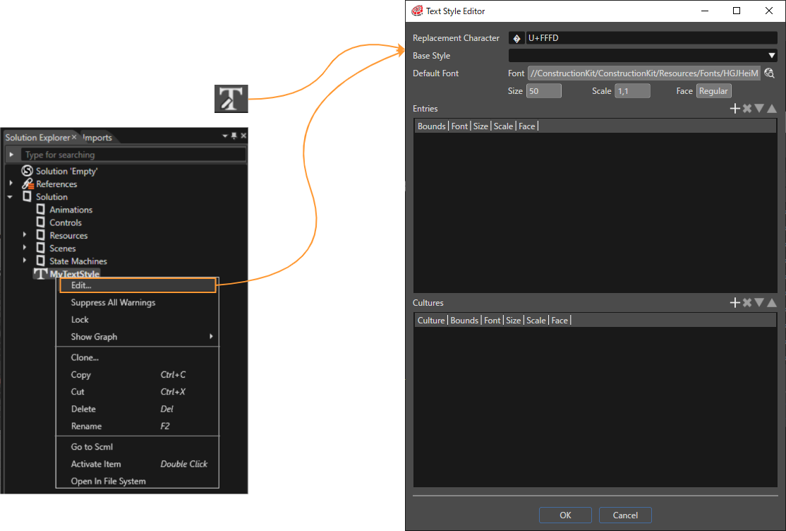
- Select a TextStyle in the Solution Explorer panel and choose Edit from the context menu.
TextStyles from the ConstructionKit are not editable.
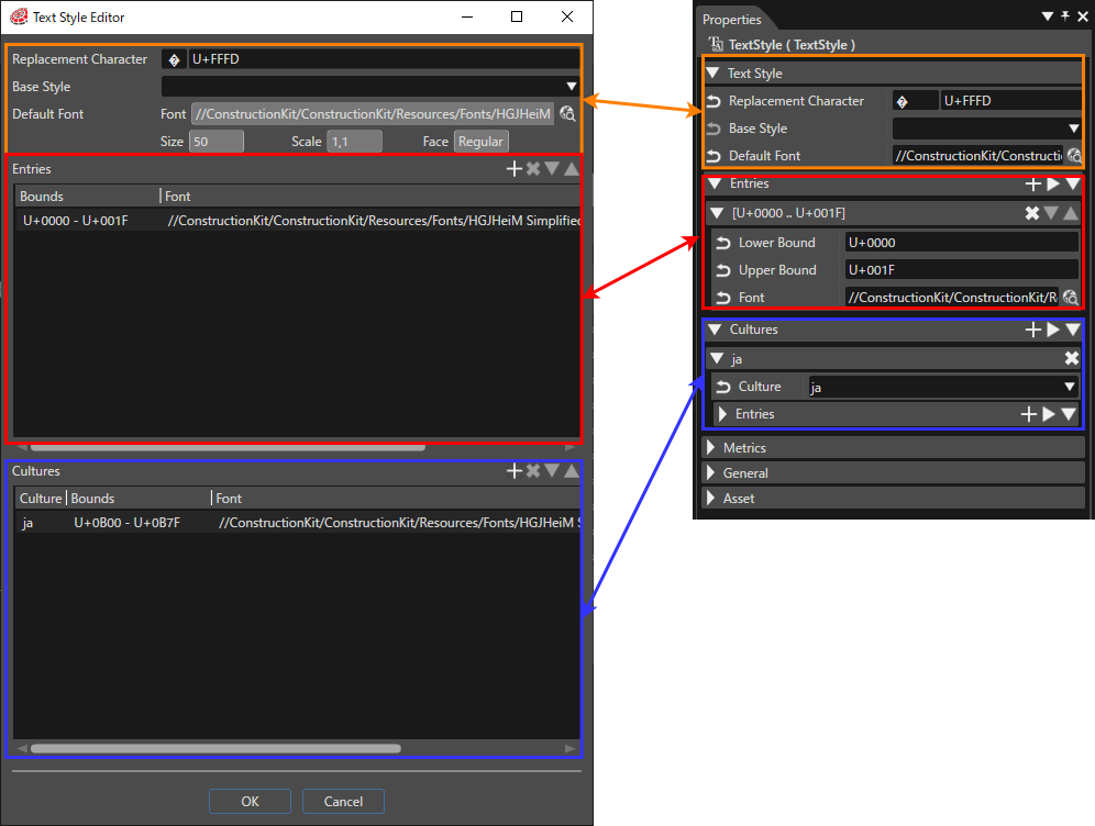
The Text Style Editor is a dialog that is focused on editing Text Style properties. It provides three sections, which can also be found in the Properties panel:
- Text Style properties
- Entries
- Cultures
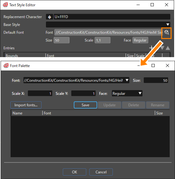
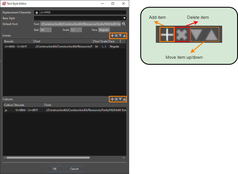
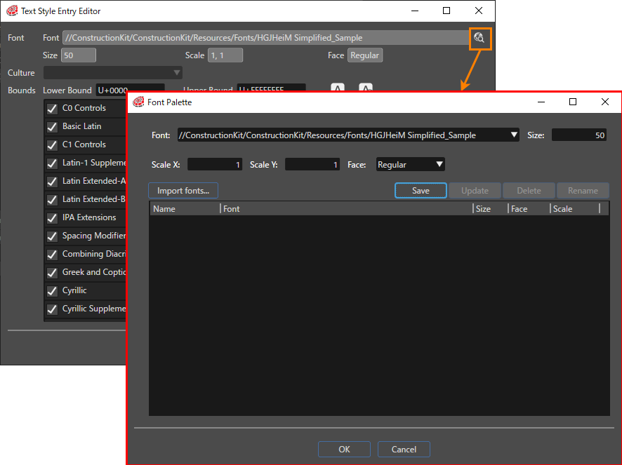
All text styles are based on the Default Font, which can be changed by clicking on the item selection icon on the right (see figure below). After clicking on the icon, the Font Palette dialog opens and the Default Font can be selected from the selection box.
Items in the [ Entries ] and [ Cultures ] sections can be edited using the toolbar on the right (see figure below). Pressing the [ Add Item ] icon opens the Text Style Entry Editor dialog where you can edit additional items.
The items in the "Entries" and "Cultures" section can be edited using the little toolbars on the right.
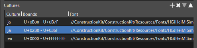
When sorting configuration items within Cultures, only items within the same Cultures can be sorted.
In the figure below, the user can swap rows 1 and 2 (both with Culture as "en"), but not rows 2 and 3.
Text Style Entry Editor
The Text Style Entry Editor is used to add or edit items. This editor can be displayed in two ways The Text Style Entry Editor UI that is displayed also depends on the method selected.
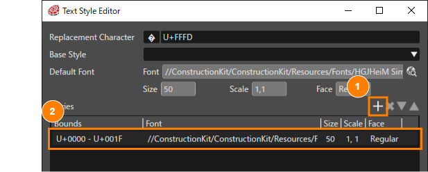
- Press the + icon on the right side of the Entries or Cultures section of the Text Style Editor ( Add Entries ).
- Double-click on an item that has already been set ( Edit Entries ).
Add Entries
As mentioned above, if you press the + icon to the right of the Entries section in the Text Style Editor, the Text Style Entry Editor shown below will appear. Settings can be made for multiple Entries.
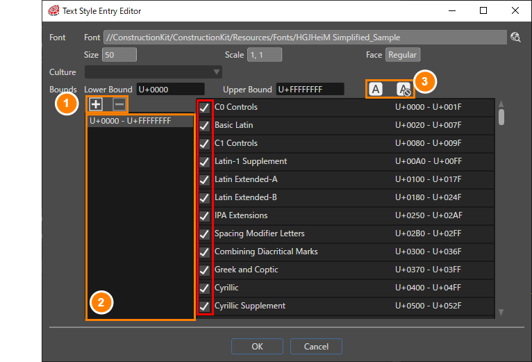
| 1 | Add/Remove Bounds button |
Add and remove Bounds ranges for use in Entries. Press the + button to add and the - button to delete.
|
| 2 | Setting Bounds List |
The Bounds list range added/edited in the previous section will be displayed. |
| 3 | Select All / Deselect All button |
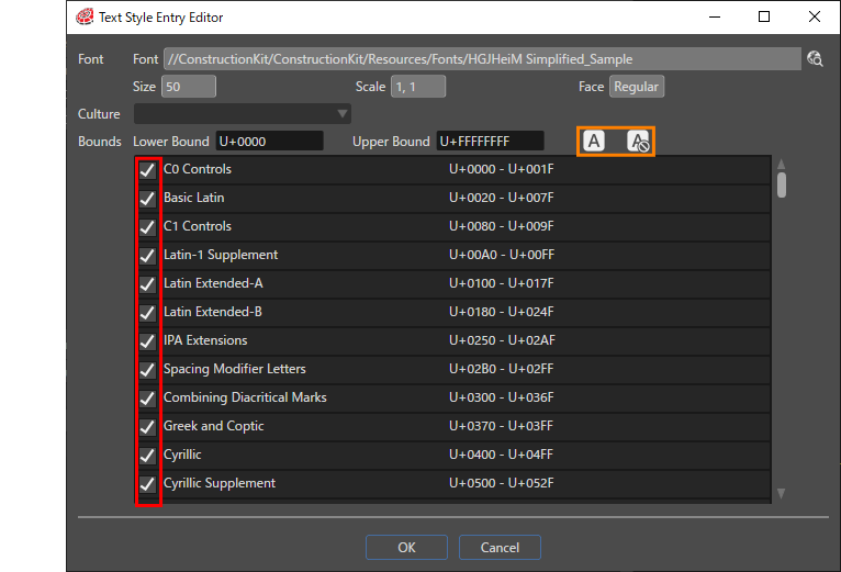
Select and deselect the checkboxes of the displayed Bounds items (red frame in the above figure) at once.
|
The Lower/Upper Bound value is automatically set according to the check status of the Bounds item's checkbox. For more information on the behavior of the set values, see Bounds Range Setting.
Edit Entries
Bounds editing for the selected Entry on the Text Style Editor. Here you will perform editing operations on the Bounds range set in Add Entries.
Similar to the explanation for Add Entries, the selection status of the checkboxes in the Boud list (red frame in the figure below) changes when the [Select All/Deselect All] button (orange frame in the figure below) is operated.
Bounds range setting
In the Text Style Entry Editor, the Bounds range for each Entry is set by checking the checkbox for each Bound displayed in the list.
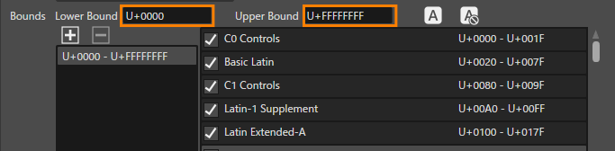
- Click on the [ Select All ] button
All Bounds will be checked and the Lower/Upper Bound values will be set as follows.
Lower Bound value: U+0000
Upper Bound value: U+FFFFFFFFFFF
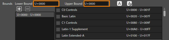
- Click on the [ Deselect All ] button
All Bounds will be unchecked and the Lower/Upper Bound values will be set as follows.
Lower Bound value: Lower value of the upper Bound item in the list among the Bound items in the selected range.
Upper Bound value: Same value as the Lower Bound value already set.
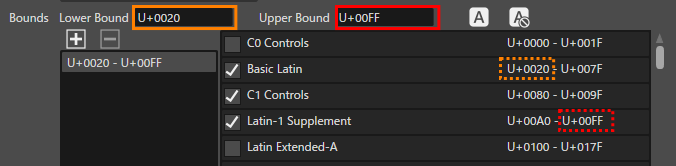
- Check any Bound item
When any Bound item is checked, the Lower/Upper Bound values are set as follows.
Lower Bound value: Lower value of the upper Bound item in the list among the Bound items in the selected range.
Upper Bound value: Upper value of the lower Bound item in the list among the Bound items in the selected range.
Font
Pressing the item selection icon opens the Font Palette dialog, where you can select a new font.
Select Culture
When editing items in the Cultures section of the Text Style Editor (orange frame below), you can use this pull-down menu (red frame below) to select the culture.
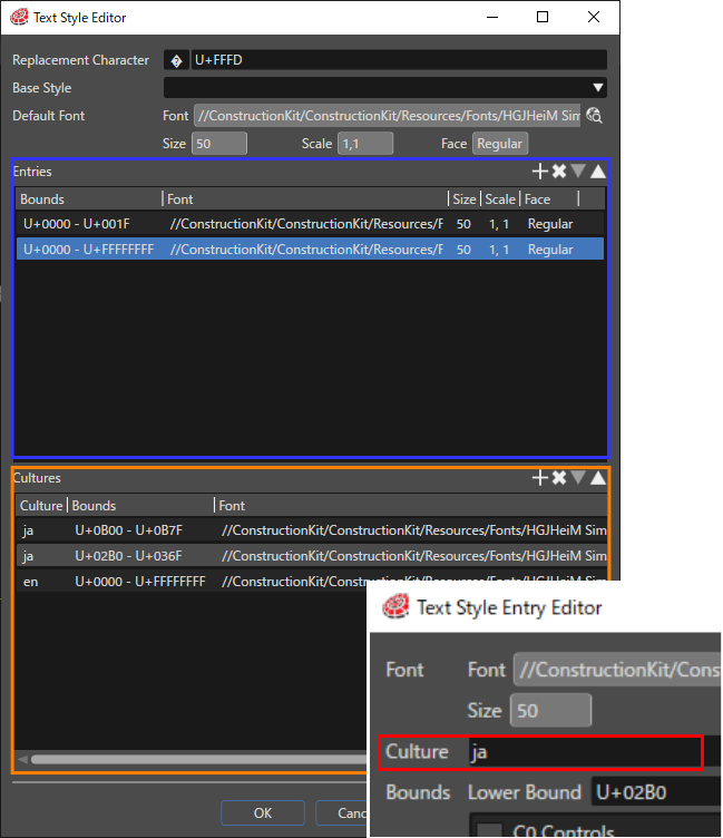
When editing the Text Style Entry Editor from the Entries section of the Text Style Editor (blue frame above), the pull-down menu in the Culture section (red frame above) is disabled and Culture cannot be selected.