
Touchable
ControlDevelopment
KeyboardKey
Keyboard key is building block of Keyboard Control.
Properties
This Control does not have any configurable properties.
Scrollbar
The Scrollbar is used internally in List and ScrollView and shows up when the layout-size of those controls is smaller than its actual content. It can be used by custom scrollable controls.
Properties
| Property Name |
Type |
Description |
| Scroll Direction |
Enum (Vertical, Horizontal) | The direction in which the Scrollbar scrolls. |
| Handle Minimum Size |
Integer |
The minimum height (for vertical scrollbar) or minimum width (for horizontal scrollbar) of the handle in pixels. |
| Scrollbar Visibility |
Enum (Automatic, Collapsed, Visible) | Configure the visibility of the scrollbar. By default it is set to Automatic which will determine the visibility based on the actual content. |
| Min Movement To Scrolling |
Integer |
Minimum distance a touch gesture needs to move to start scrolling. |
| Blend Type |
BlendType::Enum |
Sets the blend option. |
Functionality
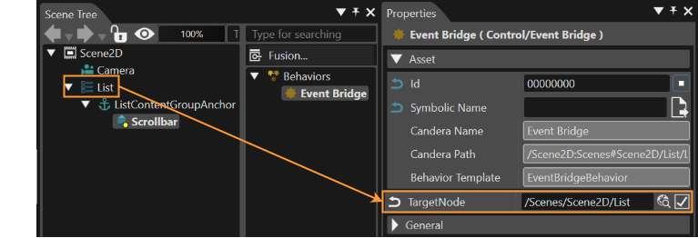
The Scrollbar emits a ScrollableEvent which can be forwarded to a Behavior (f.e. List Behavior, Scroll View Behavior) via the Event Bridge Behavior.
| Behavior Name |
Type |
predefined/userdefined |
Description |
| Event Bridge |
Control Behavior |
predefined in List and ScrollView Control |
Forwards the ScrollableEvent from the Scrollbar to a Behavior |
| List |
Control ConstructionKit Behavior |
predefined in List Control |
Internally receives the ScrollableEvent from the Scrollbar. |
| Scroll View |
Control ConstructionKit Behavior | predefined in ScrollView Control |
Internally receives the ScrollableEvent from the Scrollbar. |
PageIndicatorElement
A PageIndicatorElement is a Control that is part of the Page Indicator Control. The Page Indicator Control indicates the currently displayed page. PageIndicatorElement is intended to be used as component of Page Indicator and therefore is not focusable as individual element.
The Control offers the possibility to customize it’s appearance through 9 patch image and color properties.
Properties
| Property Name |
Type |
Description |
| Selected Indicator Image | Candera::Image2D | Image displayed when the control is in selected state. |
| Indicator Image | Candera::Image2D | Image displayed when the control is in base deselected state. |
| Selected Indicator Pressed Image | Candera::Image2D | Image displayed when the control is in selected state and pressed. |
| Indicator Pressed Image | Candera::Image2D | Image displayed when the control is in deselected state and pressed. |
| Hovered Color | Candera::Color | The color to blend with the current control image when the control is hovered. |
| Disabled Color | Candera::Color | The color to blend with the current control image when the control is disabled. |
Button
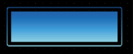
The visual appearance can be configured with three images depending on the button's state and a hovered color that can be defined including an alpha value.
Additionally the Button offers an Anchor to attach content. Therefore you can also set the padding of the Button and its content.
Properties
| Property Name |
Type |
Description |
| Enabled |
bool |
If true, the control is enabled. Otherwise the visual representation of the control will be changed to the disabled colors. Also disable the focus to avoid receiving input. |
| Focusable | bool | If true, the control is focusable. Otherwise the control can not be focused. |
| Normal Image | 9 Patch Image | The image which is used as Button Image for the color multiplication of other states like Hovered. |
| Pressed Image | 9 Patch Image | The image which is used as Button Image if the pressed state applies. |
| Focused Image | 9 Patch Image | Transparent image contained in the center (border) of the control which is activated if the control has the current focus. The control must be set as focusable. Note that the focused image will always be contained in the top layer of the control. |
| Hovered Color Property Reference | Enum (Self, Other) | Choose how the property gets set. Via own property or from another Behavior. |
| Hovered Color | Candera::Color |
The color which is used as hovered color for blending with the Button Image. This property is only available if Hovered Color Property Reference is configured for "Self". |
| Hovered Color Property Provider |
Candera::Behavior |
Property Behavior which contains the color which has to be set on the effect. This property is only available if Hovered Color Property Reference is configured for "Other". |
| Disabled Color Property Reference |
Enum (Self, Other) | Choose how the property gets set.Via own property or from another Behavior. |
| Disabled Color | Candera::Color |
The color to set on the disabled Button. This property is only available if Disabled Color Property Reference is configured for "Self". |
| Disabled Color Property Provider |
Candera::Behavior |
Property Behavior which contains the color which has to be set on the effect. This property is only available if Disabled Color Property Reference is configured for "Other". |
| Padding | Candera::Margin | Padding of the Button. Used when a content is attached. |
| Blend Type | BlendType::Enum | Sets the blend option. |
Functionality
The functionality of the button can be edited in the Behaviors panel or in the EventHandler Tab (see chapter EventHandler Tab). An EventHandler that checks for Clicks will perform the user defined action.
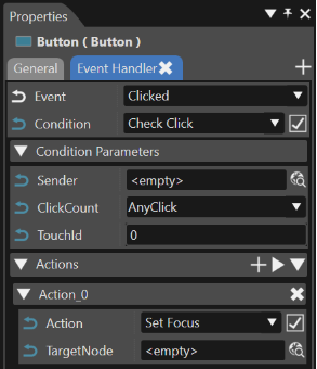
| Behavior Name |
Type |
predefined/userdefined |
Description |
| EventHandler | Control Behavior | predefined |
Checks a defined condition and invokes a defined action behavior if that condition is true. |
| CheckClick | Input Condition Behavior | predefined | Condition checks if the button has been clicked |
| Action | Action Behavior | userdefined | Userdefined action that will be performed when the button is clicked. |
CoverFlow
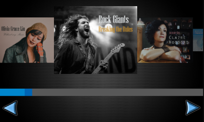
A CoverFlow is a proof-of-concept control that allows for horizontal swiping of child items. The items are scaled according to their location.
Child items are placed in provided anchor. It is possible to add padding by placing blank items at the beginning and at the end of the anchor content.
By default, the CoverFlow works horizontally.
Properties
| Property Name |
Type |
Description |
| Value | Float/Variant | Current value (position) of the CoverFlow. |
| Minimum | Float/Variant | The minimum value of CoverFlow. |
| Maximum | Float/Variant | The maximum value of CoverFlow. |
| Zoom Minimum |
Float/Variant |
Zoom effect minimum value. |
| Zoom Maximum |
Float/Variant | Zoom effect maximum value. |
| Zoom By Layout | bool | Wethere zoom accomplished by layout size. |
| Increase Swipe Direction |
Enum (Left, Right, Up, Down) |
The direction of the swipe to increase value |
| Decrease Swipe Direction |
Enum (Left, Right, Up, Down) |
The direction of the swipe to decrease value |
| Orientation | StackLayouter::Arrangement | Selects arrangement for cover flow. See Set Layout for more information. |
| Blend Type | BlendType::Enum | Sets the blend option. |
Dial
A dial is used to set a value within a specified range or to select between different options which are represented by the value of the dial. The control knob changes the value when the user touches and turns it. The degree of rotation corresponds to the desired value change. The dial snaps into its predefined positions defined by its step size.
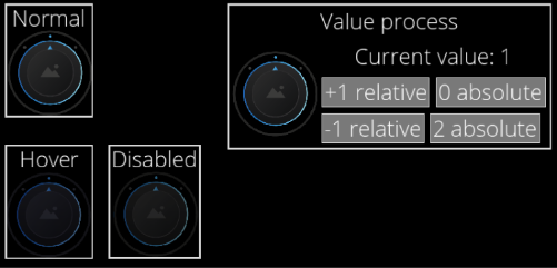
The below figure shows an example using a 3-step rotation, with a Minimum Rotation of -45 degrees, Maximum Rotation of +45 degrees, and Step Size of 45 degrees. In this example, BackgroundImages 0 is displayed corresponding to Current Value = 0. Similarly, Current Value = 1 displays BackgroundImages 1 and Current Value = 2 displays BackgroundImages 2.
For a 5-step rotation with a Minimum Rotation of -90 degrees, Maximum Rotation of +90 degrees, and Step Size of 45 degrees, you will need to set 5 BackgroundImages.
The rotary knob supports events. If it receives an event of value change (ValueChangeEvent), the knob will be set accordingly. When the control is focused it is possible to control it using the keyboard (up/down arrow).
Properties
| Property Name |
Type |
Description |
| Enabled | bool | If set to false it will not react on focus events and does not have to support different visualizations for the different states. |
| Focusable | bool | If true, the control is focusable. Otherwise the control can not be focused. |
| Current Value |
FeatStd::Int32 | Current value for the dial. |
| Step Size |
FeatStd::Float | Step size in degrees. |
| Minimum Rotation |
FeatStd::Float | Minimum rotation of the dial. |
| Maximum Rotation |
FeatStd::Float | Maximum rotation of the dial. |
| Knob Image |
Candera::Image2D | The image to set on the effect. |
| BackgroundImages |
Candera::Image2D | A list of images which should be available for selection. |
| Focus Image |
Candera::Image2D | The image to set on the effect. |
| Disabled Color |
Candera::Color | The color which can be used from other Behaviors. |
| Hovered Color |
Candera::Color | The color which can be used from other Behaviors. |
| Increment Key Code |
Candera::KeyboardKeyCode::Enum | Check the KeyCode of the pressed key (can also be modifier). |
| Decrement Key Code |
Candera::KeyboardKeyCode::Enum | Check the KeyCode of the pressed key (can also be modifier). |
| Blend Type |
BlendType::Enum | The blend type that will be set on the affected node. |
Drawer
The Drawer Control provides a retractable area controlled via events. It offers an Anchor, where any kind of nodes can be attached to.
If the Drawer receives a Drawer Event, the Control will open or close itself. The "Change Drawer State" action allows to send these events and also provide the functionality to toggle the state of the Drawer Control.
When the "Drag Enabled" Property is set to true, then the Drawer can also be opened/closed by dragging the Knob.
All nodes that are attached to the Anchor will be displayed in the same way as they would be displayed when attached to an Overlay Layouter.
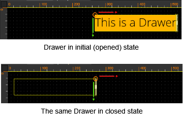
The image below shows a Drawer Control with "Appear Direction" left in initial state and in closed state. When the drawer gets closed, it slides to the left and gets hidden like closing a desk drawer.
Nine-Patch-Images are not supported by Drawer Image properties (Knob Pressed Image, Knob Normal Image).
Properties
| Property Name |
Type |
Description |
| Open | bool | If true, the control is shown in it's opened state. Otherwise the visual representation of the control will be it's closed state. |
| Appear Direction | Enum (Left, Right, Top, Bottom) |
Specifies the direction from which the content will appear. |
| Knob Pressed Image | Candera::Image2D | Specifies the look of the dragable Knob when it is pressed. Note: Should have the same or a bigger size than the Normal Image. |
| Knob Normal Image | Candera::Image2D | Specifies the look of the dragable Knob when it is not pressed. Note: Should have the same or a smaller size than the Pressed Image. |
| Drag Enabled | bool | If true, then the dragable Knob is active and visible. |
| Blend Type | BlendType::Enum | Sets the blend option. |
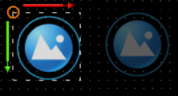
IconButton
Properties
| Property Name |
Type |
Description |
| Identifier |
String |
Identifier which is used when emitting an Event (e.g. Click Event). |
| Enabled |
bool |
If set to false, it will not react on focus events and does not have to support different visualizations for the different states. |
| Focusable |
bool |
If true, the control is focusable. Otherwise the control can not be focused. |
| Normal Image | 9 patch image | The Image which is used if the normal state applies. |
| Pressed Image | 9 patch image | The Image which is used if the pressed state applies. |
| Focused Image | 9 patch image | Image which is transparent in the center (border). It gets activated if the control has the current focus. Therefore be sure that the Button is focusable. |
| Hovered Color | Candera::Color | The color which is used as hovered color for blending with the Button Image. |
| Disabled Color | Candera::Color | The color which is used for blending with the disabled Button Image. |
| Padding |
Candera::Margin | Padding of the button. Used when a content is attached. |
| Icon Horizontal Alignment | Enum (Left, Center, Right) | The horizontal alignment of the icon. |
| Icon Vertical Alignment | Enum (Top, Center, Bottom) | The vertical alignment of the icon. |
| Icon Normal Image | Candera::Image2D | The image which is used as Icon on the button if not pressed or hovered. |
| Icon Pressed Image | Candera::Image2D | The image which is used as Icon on the button if the pressed state applies. |
| Icon Focused Image |
Candera::Image2D | The image to set on the effect. |
| Icon Hovered Color |
Candera::Color | The color which is used as hovered color for blending with the button Icon image. |
| Icon Disabled Color |
Candera::Color | The color which is used for blending with the disabled button Icon Image. |
| Blend Type | BlendType::Enum | Sets the blend option. |
InputField
The InputField contains an editable text. If the Control has the keyboard focus it can be modified by receiving “Key Events”. This events can e.g. be sent from a “Virtual Key Behavior”. Additionally the InputField contains a caret which can be shifted by “Key Events” (KeyCode: Key_LeftArrow or Key_RightArrow). Furthermore the InputField sends “Enter Exit" Events in case of losing the focus. This events can be checked by an Event Handler with the “Check Enter Or Exit Behavior” e.g. to activate a virtual keyboard. As other Controls it contains a value (string) which can be forwarded. Therefore just use the “Forward Value” Behavior and set another Control as Target Node.
The default text and the placeholder text have got additional properties for customizing them visually.
Properties
| Property Name |
Type |
Description |
| Enabled | bool | If true, the control is enabled. Otherwise the visual representation of the control will be changed to the disabled colors. Also disable the focus to avoid receiving input. |
| Focusable | bool | If true, the control is focusable. Otherwise the control can not be focused and will not receive any inputs. |
| DefaultText | String | Text which will be set as default text. |
| Text Color |
Candera::Color | The color set on the text. |
| Text Style |
Text Style |
The Style that will be set to the Text Node. |
| Text Disabled Color |
Candera::Color |
The color to set on the text if the control is disabled. |
| Placeholder Text | String | The Text that will be set to the Text Node. |
| Placeholder Text Color |
Candera::Color | The color of the placeholder text. |
| Placeholder Text Style |
Text Style |
The Style that will be used. |
| Placeholder Disabled Color |
Candera::Color |
The color to set on the effect of the Text. |
| Caret Image | Candera::Image2D | The image to set as caret. |
| Off Time Ms | Integer | Milliseconds before switching the blinking caret to On state. |
| On Time Ms | Integer | Milliseconds before switching the blinking caret to Off state. |
| Background Image | Candera::Image2D | The image to set as Background. |
| BG Disabled Color | Candera::Color | The color to set on the BG if the control is disabled. |
| Focused Image | Candera::Image2D | The image to set as FocusBorder. |
| Set Value On Enter |
bool |
If true, the value will be set when the Enter key is pressed. |
| Set Value On Each Change | bool | If true, the value will be set on each input. |
| Max Text Length | Integer | Maximum count of characters. |
| Just Digits | bool | If true, the InputField will receive just digits. |
| Blend Type | BlendType::Enum | The blend type that will be set on the affected nodes. |
| Keyboard Node |
Node |
Keyboard node. |
| Keyboard Layout Name |
String |
Layout name. |
Keyboard
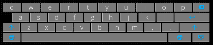
The Keyboard Control emulates physical computer keyboard that enables a user to enter characters into an InputField Control. The Keyboard Control is highly customizable via Configuration Script described below.
To use the Control one needs to connect an InputField with a keyboard via KeyboardAction with Action Open. When the InputField send the event, the Keyboard appears and sends pressed characters to the InputField that activates it.
Properties
| Property Name |
Type |
Description |
| Configuration Script | String |
Keyboard layout configuration script - key definitions (strings, KeyboardCodes or KeyboardActions) separated by spaces and newlines; may have parameters in parentheses and width specifiers in square brackets. See documentation and examples for reference. See Keyboard Behavior for more information. |
| State Machine Node |
Node |
Node containing State Machine Behavior, that will be sent a ValueChanged event with layout name, when layout switching occurs. In turn, State Machine may send SetConfiguration KeyboardAction to the Keyboard, to set new Keyboard layout configuration string. If left empty, layout changes will trigger ValueChanged on Keyboard node itself - in this case layout configuration string may be updated using Value change conditions attached to Keyboard node. |
| Navigate Up Key Code |
Candera::KeyboardKeyCode::Enum | Key used for navigating up |
| Navigate Down Key Code |
Candera::KeyboardKeyCode::Enum | Key used for navigating down |
| Navigate Next Key Code |
Candera::KeyboardKeyCode::Enum | Key used for navigating right |
| Navigate Previous Key Code |
Candera::KeyboardKeyCode::Enum | Key used for navigating left |
| Navigate Start On Down Key |
bool |
Enter navigation mode when pressing down key for the first time |
| Navigate End On Up Key |
bool |
Exit navigation mode when pressing up key on the first row |
| Navigate Start Key Code |
Candera::KeyboardKeyCode::Enum | Key used for entering navigation mode |
| Navigate End Key Code |
Candera::KeyboardKeyCode::Enum | Key used for exiting navigation mode |
| Navigate Close Key Code |
Candera::KeyboardKeyCode::Enum | Key used for closing keyboard |
| Navigate Invoke Key Code |
Candera::KeyboardKeyCode::Enum | Key used for invoking key action |
| Blend Type |
BlendType::Enum | The blend type that will be set. |
MenuItem
A proper usage is to place or create it inside a MenuScreen control because of internal events that communicate with it. Those events handle runtime repositioning an instance of MenuItem or deleting it from a MenuScreen.

Properties
| Property Name |
Type |
Description |
| Enabled | bool | If true, then item is visible |
| Focus Image On Selection | 9-patch image | The border image is set while the MenuItem is selected |
| Focus Image On Dragging | 9-patch image | The border image is set while the MenuItem is in edit mode |
| Delete Button Normal Image | 9-patch image | The image will be shown in top-right of the Control in edit mode to enable deletion of the instance of MenuItem |
| Delete Button Pressed Image | 9-patch image | The image will be set while Delete Button is pressed |
| Delete Button Hovered Color | Candera::Color | The color will be blend with Delete Button images while a user has his cursor over the Delete Button |
| Focusable |
bool |
If true then focus node will be visible |
| Image | 9-patch image | A bitmap that is the icon of the Control |
| Label | String | A text that will be set to the Text Node. |
| Label Color | Candera::Color |
A color of the Icon Label. |
| Label Style | Text Style | A font style of the Text. |
| Label Trimming | Enum (None, Ellipsis, Custom Text) |
Trimming defines the behavior to employ when content overflows the content area |
| Blend Type | BlendType::Enum | The blend type that will be set. |
Menu Screen
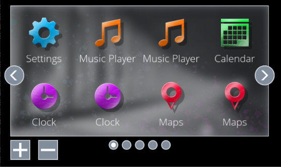
The Menu Screen Control represents a menu in the form of a grid of icons (instances of the Menu Item Control).
It has configurable number of rows and columns as well as default and maximum number of screens. A user can swipe between neighboring screens. The Control handles user input and forwards proper information to children MenuItem nodes. The children nodes may be removed and reordered at run time.
Properties
| Property Name |
Type |
Description |
| ActiveScreenIndex | FeatStd::UInt32 | Index (starting at 0) of the current visible screen. |
| NumberOfScreens | FeatStd::UInt32 | Default number of screens (can be changed in runtime) |
| Rows | FeatStd::UInt32 | Number of rows of a grid in a single screen |
| Columns | FeatStd::UInt32 | Number of columns of a grid in a single screen |
| Items | Binding Source | Binding to a list containing icons and labels that should be accessible in the MenuScreen |
| Swap Item Animation Easing Function | EasingFunctions::Enum | Interpolation method for animations of swapping items |
| Swap Item Animation Length | FeatStd::Float | Length of the swapping animation |
| Change Screen Animation Easing Function | EasingFunctions::Enum | Interpolation method for animations of changing screens |
| Change Screen Animation Length | FeatStd::Float | Length of the changing animation |
| Key Code To Move Selection Left | Candera::KeyboardKeyCode::Enum | Key that changes focus from an item to its left neighbor |
| Key Code To Move Selection Right | Candera::KeyboardKeyCode::Enum | Key that changes focus from an item to its right neighbor |
| Key Code To Move Selection Up | Candera::KeyboardKeyCode::Enum | Key that changes focus from an item to its top neighbor |
| Key Code To Move Selection Down | Candera::KeyboardKeyCode::Enum | Key that changes focus from an item to its bottom neighbor |
| Focusable | bool | Enables grabbing focus by the Control |
| Screen Change Timeout | FeatStd::Float | Time of dragging a Menu Item outside the Control to fire Change Screen |
| Background Image | Candera::Image2D | Background image of screens |
| Focus Border Image | Candera::Image2D | Image of the border rendered when the Control grabs focus |
| Limit Of Screens | FeatStd::UInt32 | Maximum number of screens that may be handled by the Control in runtime |
| Page Indicator Node | Node | Page indicator that helps in navigation between screens of the Control |
| Blend Type | BlendType::Enum | The blend type that will be set. |
PageIndicator
A Page Indicator is a control that indicates currently visible page of set and provides method to switch to another page directly by click or if focused in a stepping manner using rotary action input.
The control interacts with MenuScreens through exchange of ValueChange and ChangeValue events. The cooperating control is set in Target Node property.
The action keys will move the focus in/out of the control and when in then will switch pages until first or last page is reached. Continued action will pass the focus out of the control.
By default the control supports up to 8 pages, support for more pages requires manual addition of additional PageIndicatorElements in the control.

Properties
| Property Name |
Type |
Description |
| Target Node | Node | A node to exchanging events. |
| Active Page Index | FeatStd::UInt32 | Index of currently visible page. Must be in range from 0 to Number Of Pages - 1 . |
| Number Of Pages | FeatStd::UInt32 | Number of available pages. |
| Decrement Key Code | Candera::KeyboardKeyCode::Enum | The Key Code triggering decrement of the value. |
| Increment Key Code | Candera::KeyboardKeyCode::Enum | The Key Code triggering increment of the value. |
| Blend Type | BlendType::Enum | Sets the blend option. |
Roll
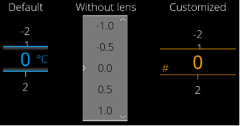
The Control represents a vertical list of numeric values from a specified range with a specified step. Current value of the Control is visible in the middle of the control and can be zoomed like using lens. Changing the current value can be animated and can be done using touch/pointer or configurable keys of a keyboard. One can edit the current value of the Control by entering it with a keyboard.
To use the Control simply put it in a scene and configure all desirable properties. A roll can forward value as well as receive a send value as event.
The range is implemented in a way that it starts at Minimum Value, increases by (positive) StepSize but no further than Maximum Value. This conforms to the way range stepping is usually implemented, and gives configuration flexibility.
Properties
| Property Name |
Type |
Description |
| Focusable |
bool |
If true, the control is focusable. Otherwise the control cannot be focused. |
| Value | Float | The value which will be changed using the roll |
| Min | Float | The minimum value which can be reached. This value is always smaller or equal to the MaxValue. |
| Max | Float | The maximum value which can be reached. This value is always bigger or equal to MinValue |
| Step | Float | The increment/decrement of the value. |
| LensVisible | bool | Is lens group visible? Enables highlighting of the current value, default zooming and bordering it. |
| Use Cyclic Roll | bool | Is roll cyclic? If true the MinValue of the Control can be reached after the MaxValue of the Control and vice versa |
| Allow Dragging Past Limit | bool |
Allow temporary over-dragging (dragging to blank values before first and after last entry). If true there is visible animation of the Control being „out of range“ while moving below minimum and above maximum value. |
| Value Style | Candera::TextRendering::Style | Sets the text style for the values outside the Lens. |
| Value Color | Candera::Color | Specifies color of values in the vertical list outside the Lens |
| Lens Style | Candera::TextRendering::Style | Sets the text style for the values inside the Lens. |
| Unit Text | String | Text used in lens (it means: when the lens is used at all) to present a unit of the value |
| Unit Style | Candera::TextRendering::Styler | Sets the text style for the Unit Text. |
| Unit Margin | Candera::Margin | Specifies margin of the UnitText |
| Unit Color | Candera::Color | Specifies color of the UnitText |
| Decoration Image | Candera::Image2D | Specifies a border image of the Lens |
| Text Input Color | Candera::Color | Specifies color of the text entered in the InputField while editing the current value of the Control |
| Text Edit Background | Candera::Image2D | The background image used for the Input Field when entering Text Edit mode. |
| Max Text Length | Unsigned Int 16 | Specifies maximum count of characters that may be entered while editing the current value of the Control |
| Decrement Key Code | Candera::KeyboardKeyCode::Enum | Key used to decrement the current value of the Control |
| Increment Key Code | Candera::KeyboardKeyCode::Enum | Key used to increment the current value of the Control |
| Edit Key Code | Candera::KeyboardKeyCode::Enum | Key used to enter edit mode (show InputField) of the current value of the Control |
| Blend Type | BlendType::Enum | Sets the blend option. |
| Keyboard Node | Node | Specifies which Keyboard control should be used when entering edit mode. |
| Keyboard Layout Name | String | Layout name. |
SpinBox
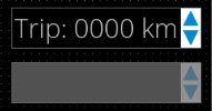
A spin box or spin button is a control that enables users to increase or decrease the number value by a specific increment (often by 1, 5 or 10) via clicking an up or down arrow button.
The action key/s will move the focus in/out of the control and informs via event about the confirmed value.
Properties
| Property Name |
Type |
Description |
| Enabled |
bool |
If set to false it will not react on focus events and does not have to support different visualizations for the different states. |
| Focusable |
bool |
If true, the control is focusable. Otherwise the control can not be focused. |
| Value |
Variant | The value to be formatted |
| Step Size |
Variant |
Increment/Decrement step value. |
| Minimum Value |
Variant | Minimum value |
| Maximum Value |
Variant | Maximum value |
| Text Format |
String |
The format string which includes one format specifier (beginning with %). See C printf() function. |
| Text Alignment |
Enum (Left, Centered, Right, Automatic) | The horizontal text alignment, using the culture text direction, is used to define how text will be horizontally aligned within its layout area. |
| Text Color |
Candera::Color | Text color. |
| Disabled Text Color |
Candera::Color | Disabled text color. |
| Text Style |
Candera::TextRendering::Style | The Style that will be used. |
| Spinbox Color Hovered |
Candera::Color |
The color for hovered SpinBox. |
| Spinbox Color Disabled |
Candera::Color | The color for disabled SpinBox overlay. |
| Background Image |
Candera::Image2D | The image to set on the effect. |
| Arrow Up Normal Image |
Candera::Image2D | The increment button image. |
| Arrow Up Pressed Image |
Candera::Image2D | The increment button pressed image. |
| Arrow Down Normal Image |
Candera::Image2D | The decrement button image. |
| Arrow Down Pressed Image |
Candera::Image2D | The decrement button pressed image. |
| Increment Key Code |
Candera::KeyboardKeyCode::Enum | KeyCode of the key used to increase value. |
| Decrement Key Code |
Candera::KeyboardKeyCode::Enum | KeyCode of the key used to decrease value. |
| Blend Type |
BlendType::Enum | The blend type that will be set on the affected nodes. |
Sub-List
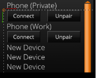
You can create a submenu in your solution by configuring this control as a child node of a List control.
With this control, you can easily invoke a submenu that can be expanded or collapsed. Key navigation is also built-in.
For detailed usage, please refer to “Getting Started > Sample Solutions > GettingStartedControls Solution > GettingStartedControls Part 3”.
Properties
| Property Name |
Type |
Description |
| Enabled |
bool |
If set to false the List will not react to Focus events. It also sets the Visibility of the list. |
| Visible |
bool |
If true, the List is being rendered. |
| Parent List Node |
Candera::AbstractNodePointer | The node with a ListBehavior that acts as a parent to this SubListBehavior. |
| Handle Keyboard Events |
bool |
Makes the behavior handle KeyboardFocusNavigation events internally. |
| Scroll Direction |
ScrollDirection::Enum (Vertical, Horizontal) |
The direction in which the SubListBehavior scrolls. |
| Animation Duration |
UInt32 |
Duration of the scrolling animation. |
| Deceleration Factor |
Float |
Loss of flick animation speed over time. |
| Max Speed Per Flick |
Float |
Maximum amount of speed each flick motion adds to the flick animation. |
| Min Speed Per Flick |
Float |
Minimum speed required to count a touch gesture as a flick and start or continue the flick animation. |
| Min Movement To Scrolling |
UInt32 |
Minimum distance a touch gesture needs to move to start a scrolling animation. |
| Max Touch Sample Age |
UInt32 |
Maximum age in milliseconds of touch movement speed counted towards generating flick animation speed. |
| Items |
Items |
The items property is used for binding of dynamic items. It can only be set via databinding. Only one visible list control should be bound to a fragment list in the model. Otherwise the list fragments in the model are not able to provide data for both list controls. Use a separate list model that is filled with the same data if such a use case is required. |
| Blend Type |
BlendType::Enum | The blend type that will be set. |
TextButton
As for the simple Button Control the visual appearance of the TextButton can also be configured with three images depending on the button's state and a hovered color that can be defined including an alpha value.
Additionally the TextButton offers a predefined TextNode which can be modified via the Text and the Text Style properties.
The action that is performed when pressing the TextButton can easily be defined in the EventHandler Tab. The functionality of the TextButton is similar to the Button. An example configuration of the Event Handler is given in the Button section.

Properties
| Property Name |
Type |
Description |
| Enabled |
bool |
If set to false it will not react on focus events and does not have to support different visualizations for the different states. |
| Focusable |
bool |
If true, the control is focusable. Otherwise the control can not be focused. |
| Text |
String |
The Text that will be set to the Text Node. |
| Text Style |
Candera::TextRendering::Style | The Style that will be used. |
| Normal Image |
Candera::Image2D | The image which is used as Button Image for the color multiplication of other states like Hovered. |
| Pressed Image |
Candera::Image2D | The image which is used as Button Image if the pressed state applies. |
| Focused Image |
Candera::Image2D | Image which is transparent in the center (border). It is used for the control with the current focus (only one of the HMI) |
| Hovered Color |
Candera::Color | The color which is used as hovered color for blending with the Button Image. |
| Disabled Color |
Candera::Color | The color to set on the disabled Button. |
| Text Color |
Candera::Color | The color of the text. |
| Disabled Text Color |
Candera::Color | The color to set on the effect of the Text. |
| Blend Type |
BlendType::Enum | The blend type that will be set. |
CheckBox
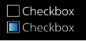
The CheckBox Control can easily be configured with a text, images for a normal and a pressed state as well as for a selected and a selected pressed state. Additionally a focused image can be defined. The action that is performed when the value changed can easily be defined in the EventHandler Tab.
Properties
| Property Name |
Type |
Description |
| Enabled |
bool |
If set to false it will not react on focus events and does not have to support different visualizations for the different states. |
| Focusable |
bool |
If true, the control is focusable. Otherwise the control can not be focused. |
| Value |
bool/Variant |
Selected or not (true/false). |
| Text |
String |
Text of the CheckBox. |
| Text Style |
Candera::TextRendering::Style | The Style that will be set to the Text Node. |
| Normal Image |
Candera::Image2D | The image which is used as CheckBox Image if the normal state applies. |
| Pressed Image |
Candera::Image2D | The image which is used as CheckBox Image if the not selected CheckBox is pressed. |
| Selected Image |
Candera::Image2D | The image which is used as CheckBox Image if the selected state applies. |
| Selected Pressed Image |
Candera::Image2D | The image which is used as CheckBox Image if the selected CheckBox is pressed. |
| Focused Image |
Candera::Image2D | Image which is transparent in the middle (border). Used for the control with the current KeyboardFocus (only one of the HMI) Frames the entire control (including text) |
| Hovered Color |
Candera::Color |
The color which is used as highlighted color for blending with the Selected/Normal image. |
| Disabled Color |
Candera::Color |
The color to set on the effect. |
| Blend Type |
BlendType::Enum | The blend type that will be set. |
Functionality
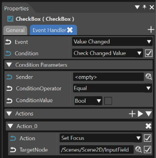
The functionality of the CheckBox can be edited in the Behaviors panel or in the EventHandler Tab (see also chapter EventHandler Tab). An EventHandler that checks for the Value Changed Event will perform the user defined action.
| Behavior Name | Type | predefined/ userdefined | Description |
|---|---|---|---|
| EventHandler | Control Behavior | predefined | Checks a defined condition and invokes a defined action behavior if that condition is true. |
| Check changed Value | Control Condition Behavior | userdefined | Condition checks the changed value of the CheckBox. |
| Action | Action Behavior | userdefined | Userdefined action that will be performed when the checkbox is clicked. |
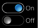
ToggleButton
It is typically used for activating and deactivating a persisting functionality.
As for the simple Button Control the visual appearance of the ToggleButton can also be configured with four images depending on the button's state and a hovered color that can be defined including an alpha value.
Additionally the ToggleButton offers two predefined TextNode that can be modified via the First Text and the Second Text properties.
The action that is performed when pressing the ToggleButton can easily be defined in the EventHandler Tab. The functionality of the ToggleButton is similar to the Button (when reacting on mouse clicks) or to the CheckBox (when reacting on a value change). Corresponding sample configuration of the Event Handler are given in the Button section and in the CheckBox section.
Properties
| Property Name |
Type |
Description |
| Enabled |
bool |
If set to false it will not react on focus events an |
| Focusable |
bool |
If true, the control is focusable. Otherwise the control can not be focused. |
| Value |
bool/Variant |
Toggled or not (true/false). |
| First Text |
String |
The Text that will be set with the first toggle image. |
| Second Text |
String |
The Text that will be set with the second toggle image. |
| First Image |
Candera::Image2D | The image which is used as ToggleButton Image if the first state applies. |
| First Pressed Image |
Candera::Image2D | The image which is used as ToggleButton Image if the first toggle image is pressed. |
| Second Image |
Candera::Image2D | The image which is used as ToggleButton Image if the second toggle state applies. |
| Second Pressed Image |
Candera::Image2D | The image which is used as ToggleButton Image if the second toggle image is pressed. |
| Focused Image |
Candera::Image2D | Image which is transparent in the middle (border). Used for the control with the current KeyboardFocus (only one of the HMI) Frames the entire control (including text) |
| Hovered Color |
Candera::Color | The color which is used as highlighted color for blending with the first and second toggle image. |
| Disabled Color |
Candera::Color | The color which is used as disabled color for blending with the first and second toggle image. |
| Click Count |
ClickCount::Enum (AnyClick, SingleClick, DoubleClick, TripleClick) |
If the value ClickConditionBehavior receives matches the Click Count set, it will return a positive response. |
| Blend Type |
BlendType::Enum | The blend type that will be set on the affected nodes. |
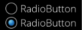
RadioButton
The functionality of the RadioButton is similar to the CheckBox (when reacting on a value change). A corresponding sample configuration of the Event Handler is given in the CheckBox section.
Properties
| Property Name |
Type |
Description |
| Enabled |
bool |
If set to false it will not react on focus events and does not have to support different visualizations for the different states. |
| Focusable |
bool |
If true, the control is focusable. Otherwise the control can not be focused. |
| Text |
String |
Text of the RadioButton. |
| TextStyle |
Candera::TextRendering::Style | The Style that will be set to the Text Node. |
| Normal Image |
Candera::Image2D | The image which is used as RadioButton Image if the normal state applies. |
| Pressed Image |
Candera::Image2D | The image which is used as RadioButton Image if the not selected RadioButton is pressed. |
| Selected Image |
Candera::Image2D | The image which is used as RadioButton Image if the selected state applies. |
| Selected Pressed Image |
Candera::Image2D | The image which is used as RadioButton Image if the selected RadioButton is pressed. |
| Focused Image |
Candera::Image2D | Image which is transparent in the middle (border). Used for the control with the current KeyboardFocus (only one of the HMI). Frames the entire control (including text) |
| Hovered Color |
Candera::Color | The color which is used as highlighted color for blending with the Selected/Normal image. |
| Disabled Color |
Candera::Color | The color to set on the effect. |
| Blend Type |
BlendType::Enum | The blend type that will be set on the affected nodes. |
| Selected |
bool/Variant |
Specifies the type and the value to pass onto Process Value Behavior. |
CircularSlider
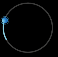
Circular slider is a control that allows user to set the value using circular slide movement or directly indicate value on slider's bar.
In default version the slider is a full circle, but using properties user easily can operate on e.g. quarter of the circle. In case of circular slider user can set the start angle and the end angle and map that to output value which is also customizable.
User can use the circular slider's value as an input for another control using "Forward Value Behavior".
Change of the value is indicated by slider's bar and thumb position. Thumb is optional (please check UseThumb property)
Circular slider can be connected with all controls that support "changeValueEvent". For example: progress bar, gauge, text value.
Properties
| Property Name |
Type |
Description |
| Value | Variant | Value of the slider |
| Minimum Value |
Variant |
Minimum value of the slider |
| Maximum Value |
Variant |
Maximum value of the slider |
| Step Size |
Variant |
Step size for value increment/decrement by keyboard |
| Minimum Angle |
Float |
Minimum rotation of the slider. |
| Maximum Angle |
Float |
Maximum rotation of the slider. |
| Increment Key Code |
Candera::KeyboardKeyCode::Enum | Increment value KeyCode |
| Decrement Key Code |
Candera::KeyboardKeyCode::Enum | Decrement value KeyCode |
| Background Image |
Candera::Image2D | Background image |
| Active Image |
Candera::Image2D | Image showing current value, will be masked, must have GlBitmapColorMaskBlend |
| Thumb Image |
Candera::Image2D | Thumb image |
| Thumb Image Pressed |
Candera::Image2D | Thumb image during touch |
| Thumb Hover Color |
Candera::Color | Hover color blend for thumb image |
| Focus Image |
Candera::Image2D | Focus node image |
| Disabled Color |
Candera::Color | Disabled color blend for control |
| Enabled |
bool |
If set to false it will not react on focus events and does not have to support different visualizations for the different states. |
| Focusable |
bool |
If true, the control is focusable. Otherwise the control can not be focused. |
| Use Thumb |
bool |
Should thumb node be visible? |
| Active Image Hover Color |
Candera::Color | Hover color blend for active image. |
| Blend Type |
BlendType::Enum | The blend type that will be set on the affected nodes. |
Using "Pivot hint" images' property it is possible to create customized slider control similar to customized gauge control. Please check the Advanced Cluster Solution part 1-4.
Slider
The Slider provides a value which changes corresponding to the position of the knob. This knob can be dragged. Additionally the value can be set directly or by an event (e.g. by using the Send Value as Event Behavior). Furthermore the Slider offers to define the visual representation of different states (f.e. Pressed, Hovered).

Properties
| Property Name |
Type |
Description |
| Enabled | bool | If set to false it will not react on focus events and does not have to support different visualizations for the different states. |
| Focusable |
bool |
If true, the control is focusable. Otherwise the control can not be focused. |
| Value |
Variant |
The bindable value of the slider |
| Minimum |
bool/Variant |
Minimum Range |
| Maximum |
bool/Variant |
Maximum Range |
| Knob Normal Image |
Candera::Image2D | The image of the knob in normal state. |
| Knob Pressed Image |
Candera::Image2D | The image of the knob in pressed state. |
| Knob Center Margin |
Candera::Margin | Knob Center Margin, used for positioning the Knob around the Slider value. Should not exceed the contorl boundary to avoid clipping issues of standalone Slider. |
| Track Image |
Candera::Image2D | The image of the slider track. |
| Track Fill Image |
Candera::Image2D | The image to set on the effect. |
|
Track Margin |
Candera::Margin | Track Margin, can be used to provide space to display Knob around the track, so it fits within Control boundary and Focus Rectangle. |
| Fill Color |
Candera::Color | Color that gets blended with the fill color |
| Focused Image |
Candera::Image2D | Image which is transparent in the center (border). It is used for the control with the current focus |
| Hovered Color |
Candera::Color | The color which is used as hovered color for blending with the Track Image. |
| Disabled Color |
Candera::Color | The color which can be used from other Behaviors. |
| Use Center |
bool |
If true, the center value defined for the knob bitmap is used to align the knob to the value position, otherwise the calculated center. |
| Blend Type |
BlendType::Enum | The blend type that will be set on the affected nodes. |
Slider control does not support external clipping set by ClippingSetterTraverser. The Knob may be incorrectly clipped when placed inside a control that recursively imposes clipping on its children (e.g. List).
Functionality
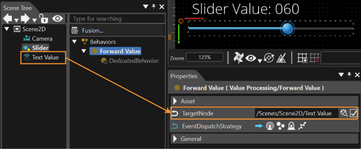
The functionality of the slider can be extended by the Forward Value Behavior. Therefore attach the behavior to the Slider which offers you to set a Target Node. The Behavior will then forward the changed value to the defined control. (Control needs a Value Behavior where "Accept Value Behavior" is enabled.)
| Behavior Name | Type | predefined/ userdefined | Description |
|---|---|---|---|
| Forward Value Behavior | Value Processing | userdefined | Forwards a received value. Associated controls with a value property receive the value. |
| Value Behavior | Value Processing | predefined | Control which has to receive the value has to have a Value Behavior where "Accept Value Behavior" is enabled. |
ScrollView
Similar to the List the ScrollView offers an Anchor where any node (also Controls) can be attached to.
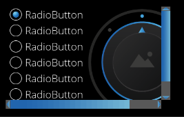
The size of the ScrollView can be set using the Layout of the Control. If the size of the attached nodes is bigger than the layout size of the ScrollView, Scrollbars will appear. In difference to the List the ScrollView doesn't layout the attached nodes. So Controls and other nodes can be placed at any position. (Also the hierarchy doesn't matter which means that an additional Layouter or GroupBox can be added.)
Properties
| Property Name |
Type |
Description |
| Vertical Scrollbar Visibility | ScrollbarVisibility::Enum (Automatic, Collapsed, Visible) | Configure the visibility of the scrollbar. By default it is set to Automatic which will determine the visibility based on the actual content. |
| Horizontal Scrollbar Visibility |
ScrollbarVisibility::Enum (Automatic, Collapsed, Visible) | Configure the visibility of the scrollbar. By default it is set to Automatic which will determine the visibility based on the actual content. |
| Blend Type |
BlendType::Enum | The blend type that will be set. |
List
The List offers an Anchor where any nodes (also Controls) can be attached to. The list then automatically layouts these child nodes.
When setting the layout size of the List, a Scrollbar will appear as soon as the layout size is smaller than the list of items. Whether the Scrollbar appears sideward or at the bottom depends on the Scroll Direction Property.
Be sure that the list items are child nodes (just first level) of the anchor. So no additional Layouter or GroupBox is possible.
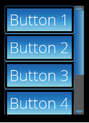
Properties
| Property Name |
Type |
Description |
| Handle Keyboard Events | bool | Makes the behavior react to KeyboardFocusNavigation events. |
| Scroll Direction |
Enum (Vertical, Horizontal) | The direction in which the List scrolls. |
| Animation Duration |
UInt32 |
Duration of the scrolling animation. |
| Deceleration Factor |
Float |
Loss of flick animation speed over time. |
| Max Speed Per Flick |
Float |
Maximum amount of speed each flick motion adds to the flick animation. |
| Min Speed Per Flick |
Float |
Minimum speed required to count a touch gesture as a flick and start or continue the flick animation. |
| Min Movement to Scrolling |
UInt32 |
Minimum distance a touch gesture needs to move to start a scrolling animation. |
| Max Touch Sample Age |
UInt32 |
Maximum age in miliseconds of touch movement speed counted towards generating flick animation speed. |
| Scrollbar Handle Minimum Size |
UInt32 |
The minimum height (for vertical scrollbar) or minimum width (for horizontal scrollbar) of the handle in pixels. |
| Scrollbar Visibility |
ScrollbarVisibility::Enum (Automatic, Collapsed, Visible) | Configure the visibility of the scrollbar. By default it is set to Automatic which will determine the visibility based on the actual content. |
| Scrollbar Min Movement to Scrolling |
UInt32 |
Minimum distance a touch gesture needs to move to start scrolling. |
| Items |
ItemsType |
The items property is used for binding of dynamic items. It can only be set via databinding. Only one visible list control should be bound to a fragment list in the model. Otherwise the list fragments in the model are not able to provide data for both list controls. Use a separate list model that is filled with the same data if such a use case is required. |
| Blend Type |
BlendType::Enum | The blend type that will be set. |
For a more advanced application and extended functionality of the list control, please also see the List Control - Snapping Mechanism.
MultiStateButton
The functionality of the MultiStateButton can be edited in the Behaviors panel or in the EventHandler Tab (see also chapter EventHandler Tab). An EventHandler that checks for the Value Changed Event will perform the user defined action corresponding to the current value.
This functionality is similar to the CheckBox (when reacting on a value change). A corresponding sample configuration of the Event Handler is given in the CheckBox section.
Properties
| Property Name |
Type |
Description |
| Enabled | bool | If set to false it will not react on focus events and does not have to support different visualizations for the different states. |
| Focusable |
bool |
If true, the control is focusable. Otherwise the control can not be focued. |
| Current State |
Variant |
Current state of the MultiStateButton (starts with 0). |
| Maximum State |
bool/Variant |
Maximum value of MultiStateButton (starts with 0). |
| Text |
String |
Text of the Button. |
| Text Style |
Candera::TextRendering::Style | The Style that will be set to the Text Node. |
| StateImages |
list of Candera::Image2D |
A list of images which should be available for selection. |
| Focused Image |
Candera::Image2D | Image which is transparent in the middle (border). Used for the control with the current focus. Frames the entire control (including text) |
| Pressed Color |
Candera::Color | The color which get multiplied to the current Button image to represent the Pressed State. |
| Hovered Color |
Candera::Color | The color which get multiplied to the current Button image to represent the Hover State. |
| Disabled Color |
Candera::Color | The color to set on the disabled Control. |
| Blend Type |
BlendType::Enum | The blend type that will be set on the affected nodes. |
TouchIndication
The TouchIndication indicates the location of touch events. The indicator appears offset from the touch location by its distance to the origin point in the scene. Furthermore on and off animations can be set for animating the TouchIndication.
Also an area can be defined where the TouchIndication is allowed to take place.
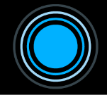
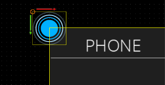
The Indicators offset to the touch position is set by the offset to the origin point of the scene (0,0). So if the TouchIndication should be centered at the touch position be sure to position the TouchIndication as shown in the image beneath.
Properties
| Property Name |
Type |
Description |
| Touchable Id | String | Can be packaged into an event or message to identify its sender. |
| On Animation |
Animation |
Optional animation played on placing a touch (touch Down). Note: This controls modifies its own Position to indicate the touch location. Please avoid animating its position. |
| Off Animation |
Animation |
Optional animation played on releasing the touch (touch Up). The indicator will be hidden after the animation stops (its rendering will be disabled). Note: This controls modifies its own Position to indicate touch location. Please avoid animating its position. |
| Hide Indicator On Move |
bool |
Hide the touch indicator when a move is detected, otherwise the indicator will stay visible during movement until the finger is lifted from the screen. |
| Touch Area Node |
Node |
Limits to the Touch Area Node's bounding rectangle - the area the Touch Indication Behavior indicates touch on. |
| Camera |
Camera Node |
The camera used to render the touch indicator. Will be used to correctly match touch position with object position in case the camera has a position offset. |
| Image |
Candera::Image2D | The image BitmapActionBehavior will set on RenderNode. |
| Blend Type |
BlendType::Enum | The blend type that will be set on the affected nodes. |
TouchIndication3D
Indicates the location of touch events in a 3D scene.
The minimum configuration required for TouchIndication3D includes setting its camera property. Optional on and off animations can be set for animating the TouchIndication.
Properties
| Property Name |
Type |
Description |
| On Animation | Animation | Optional animation played on placing a touch (touch Down). Note: This controls modifies its own Position to indicate the touch location. Please avoid animating its position. |
| Touchable Id |
String |
Can be packaged into an event or message to identify its sender. |
| Off Animation |
Animation |
Optional animation played when the indicator is hidden. |
| Hide Indicator On Move |
bool |
Hide the touch indicator when a move is detected, otherwise the indicator will stay visible during movement until the finger is lifted from the screen. |
| Camera |
Camera Node |
TouchIndication3D modifies its own position to place itself in front of this camera so to appear under the touch location on the screen. Disclamer: The minimum configuration required for TouchIndication3D includes setting its camera property. |
| Touch Area Node |
Node |
The node whose area the Touch Indication Behavior should indicate touch events on. |
| Distance From Camera |
Float |
How far from the camera should the touch indication node be rendered. |
| Blend Type |
BlendType::Enum | The blend type that will be set. |
TouchIndication3DMarker
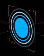
The TouchIndication3D uses the TouchIndication3DMarker as TouchIndication3DAnchor. The TouchIndication3DMarker's function is to visually mark the location of a detected touch.
Properties
| Property Name |
Type |
Description |
| Blend Type |
BlendType::Enum | The blend type that will be set. |