Pollen Infoscreen
Description
The Pollen Infoscreen is a WebAPI based solution that displays allergy risk based on set location and contaminants. To better tailor the user experience, it is possible to set custom contaminants along with the general allergy risk input via WebAPI.
Run Pollen Infoscreen Sample
This solution requires active WebAPI data binding and can only be properly run via our PlayerConnector. Is not fully functional in the built-in SceneComposer player.
To run the solution with the player connector in simulation environment the following steps have to be executed:
- Generate the simulation asset of the Pollen Infoscreen Sample Solution and save it in
<cgi-studio-installation-path>\bin\CommunityEdition\Python\Samples\PollenInfoScreen - Obtain the API Key from Polleninformation Datenschnittstelle / API | Polleninformation.
Use the contact form to request an API Key. -
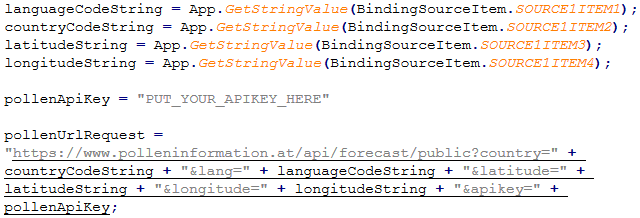
After receiving your API key, replace "PUT_YOUR_APIKEY_HERE" with your API key on line 276 of the script
<cgi-studio-installation-path>\bin\CommunityEdition\Python\Samples\PollenInfoScreen\PollenInfoScreen.py, as seen below.
If the API Key is not set, you are still able to run the solution, but the information will not be updated.
- Before executing the Python script, open a command prompt in
<cgi-studio-installation-path>\bin\CommunityEdition\Python\Samples\PollenInfoScreen and, if it is not already installed, install the CanderaAppConnector Python library using:
python -m pip install ..\..\ - Execute the python script
<cgi-studio-installation-path>\bin\CommunityEdition\Python\Samples\PollenInfoScreen\PollenInfoScreen.py
Example usage:
Parameters:python PollenInfoScreen.py ^ -lbp ..\..\..\RaspberryPi_Simulation\PlayerConnector\PlayerConnectorLibrary.dll ^ -abp PollenInfoScreen.bin- -lbp (Library Binary Path)
Path to the PlayerConnector library<cgi-studio-installation-path>\bin\CommunityEdition\RaspberryPi_Simulation\PlayerConnector\PlayerConnectorLibrary.dll - -abp: (Asset Binary Path)
Path to the asset saved previously
- -lbp (Library Binary Path)

The solution has a resolution of 1280 * 720 and features an overview scene as well as an insights scene where further contaminants are displayed.
To run it on the Target please follow the steps from Run Sample with Player Connector Library.
Overview scene:
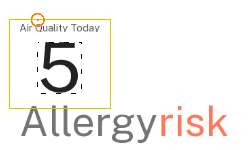
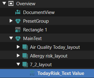
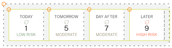
The overview scene features the most important information at one glance. Via clicking the location (in this case Vienna) the user can select different countries and cities. In the top left corner the overview scene shows the general allergy risk (depending on the strongest contaminant that day) and shows the forecast for the upcoming 3 days as well in the box next to it.
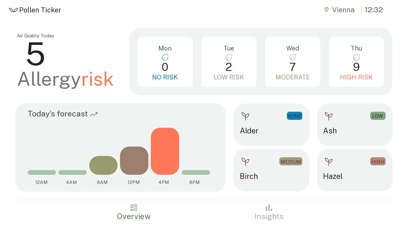
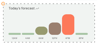
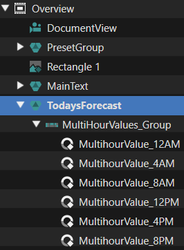
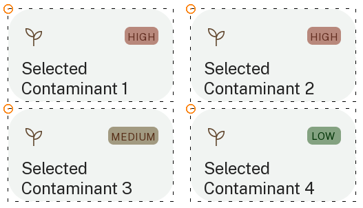
In the left bottom corner the forecast for the day is shown on a more granular level in 4-hour intervals. In addition to the general information the users can set up to 4 individual contaminants to also have the most relevant ones available at a glance.
Dynamic Elements:
- Clock control
- Air Quality – text value
- DayRisk control (4 week days)
- MultihourValue control (bars with 10 levels/images)
- Pollen_Brief control (level of preselected contaminant, with 4 levels, triggers list of contaminants)
- City Button (triggers location list)
- Insights Button (switches to contaminants list scene)
Insights scene
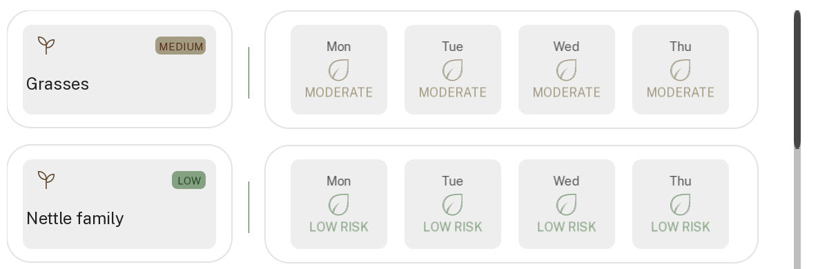
The insights scene features a list of up to 8 available contaminant information available via WebAPI. The list hierarchy is taken over from the WebAPI data and is usually ranked by strongest to weakest contaminant (with the strongest contaminant on the top of the list).
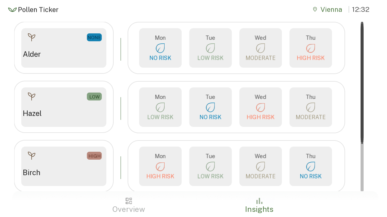
- ContaminantName control
- 4 x ContaminantLevel
Since we have many similar elements, we can create a template for each type and instance it several times.
Controls
Below you can find detail explanations of the individual controls and properties as used for the Pollen Infoscreen solution.
DayRisk
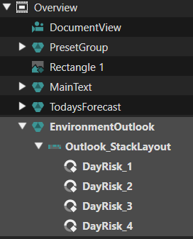
We have a background, over which there is a string showing the day, an icon according to risk level, a number representing risk values from 0 to 10, and a second fixed text or icon for risk level. The risk level has only 4 values: none, low, mid, high.
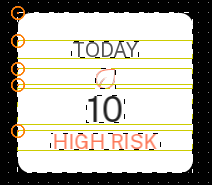
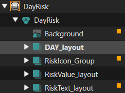
The Control only needs to receive the day text, and the risk level. For the Icons and risk level text, we can use a “Render Child Nodes” behavior to select which element to make visible, and we can setup with 11 elements, by duplicating the 4 available elements (none, low, med, high) to (none, low, low, low, med, med, med, med, high, high, high).
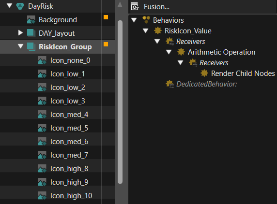
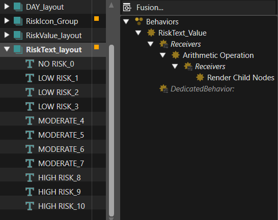
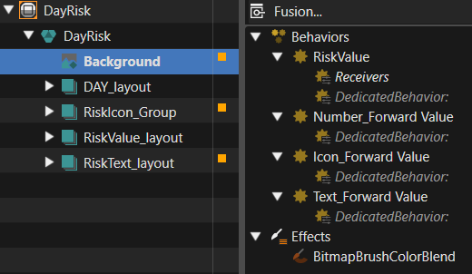
The risk value has a single entry point and is forwarded to the three controls that each need it. This could also have been done with using fewer elements and arithmetic operator behavior. This is a bit more flexible as it allows to easily add new images for each value, if needed.
PollenBrief
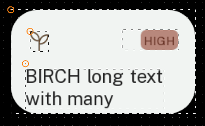
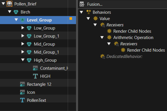
This control shows the contaminant name (can be multiline and word-wrapped, to handle possible long strings received), and an icon and text group showing level (low, med, high). The contaminant level here is in the interval [0..4], but a value of 0 for “Render Child Nodes” will show none of the children, so we added an “Arithmetic Operation” to add 1 and turn this to [1..5].
MultihourValue
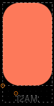
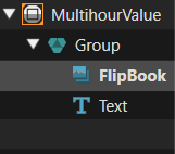
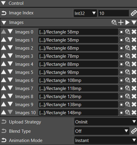
For the graph elements we have 10 values and 10 images. If we have no individual properties to set, we can use a “FlipBook” control, to just switch the images. In this case we have to configure the list of images in the FlipBook control.
ContaminantLevel
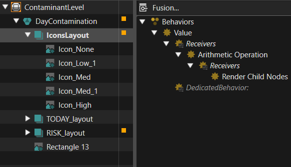
The contaminant level in the insights list is similar to the DayRisk, but slightly different visuals, and no number displayed (the level is shown by color/icon and text, and we only have none, low, mid, high).
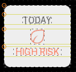
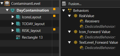
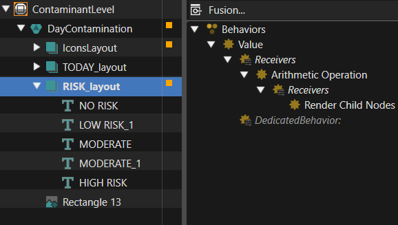
The risk value is dispatched to the icon and text groups, which have “Render Child Nodes” behaviors.
ContaminantName
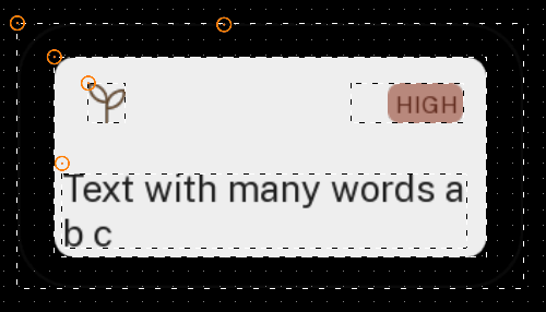
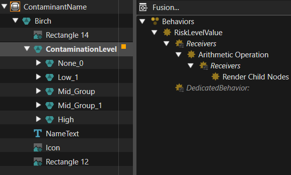
The contaminant description in the insights list is very similar to the PollenBrief, with slightly different placement and size of elements.
ContaminantsListElement
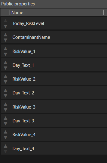
This template is used to put together a ContaminantName template and 4 ContaminantLevel templates. These can be used as list elements.
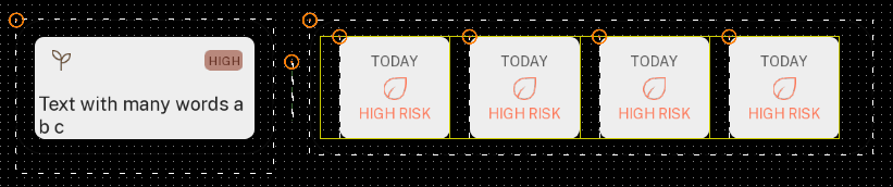
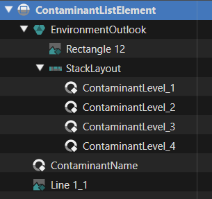
The properties of these templates can be exposed in the larger template:
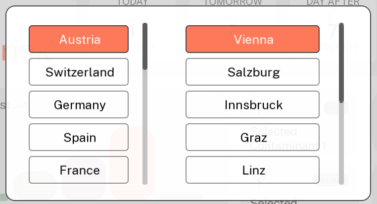
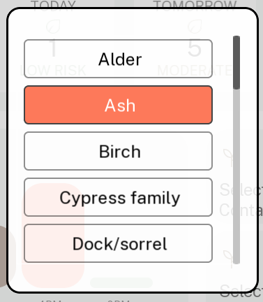
As mentioned, some buttons trigger lists, which have similar designs: contaminants list and locations list. These are meant to allow selection of a list element, which will remain highlighted.
Contaminant
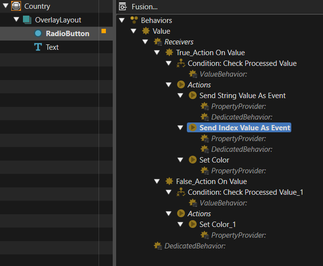
This template was designed for elements of the contaminants list. The template consists of a “Radio Button”, to allow for a single element to be selected, and a “Text” control. The normal RadioButton text was set to an empty string, and the actual text is set in the “Text” control, to allow more configuration options for it’s properties (font, size, color). The white/red background images are set in the “Radio Button” control properties.
When unselected (value = False), we just set text color to black, via a “Set Color” behavior.
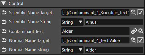
When selected, we set text color to white, and also trigger 2 actions to send 2 different string values to editable target nodes. This way, the contaminant name and scientific name can be sent to 2 nodes to display them, and, via databinding, these will be available to the controlling application.
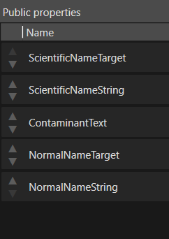
The public properties expose only what we need to configure from the outside.
Country
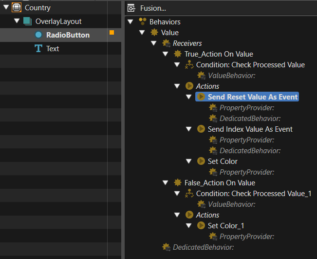
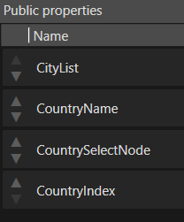
The country list button template sends an integer to be used as index, to select which list of cities to be shown to the right of the current country, and also a boolean false value to reset the selection in the list of associated cities. This way there will be no city selected for a country until user selects one, and the last city selected by user will be used, regardless of the state of the list, or which country is currently selected.
City
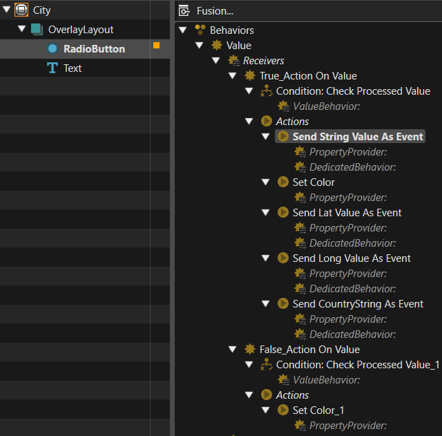
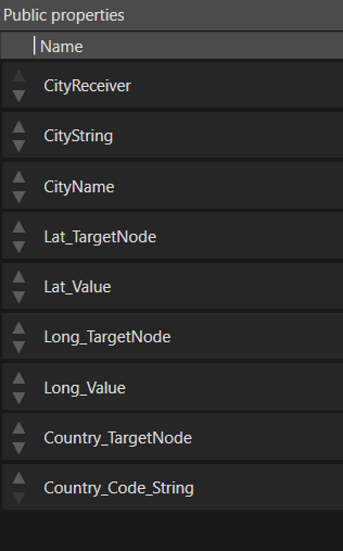
Contaminants_List
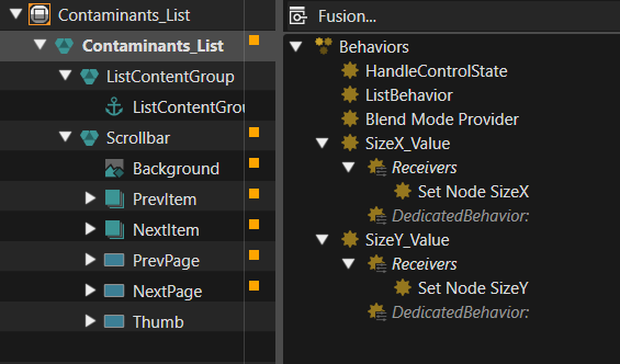
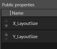
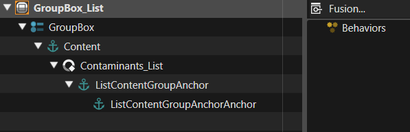
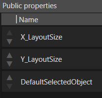
This is simply a List control that was locally expanded so that it’s ScrollBar can be configured with our custom graphical elements. For convenience, there are also setters for the X size and Y size, which is the size after which the list will start cutting of visibility of its elements. The anchor node will be used to set the list elements.
GroupBox_List
This control uses the Contaminants_List, and further sets it into a GroupBox, so that only one radio button element will be selected. An anchor node is added under the Contaminants_List anchor, to expose it. The properties will allow setting list size and default selected element for the GroupBox.
Scenes
The app has 2 main scenes, the “Overview” and the “Insights” scene, and can switch between them using the buttons on the bottom bar. The “TopBar” and “BottomBar” scenes are always loaded and visible. For selecting items from lists, there are also two smaller scenes always loaded, and their visibility is controlled by triggering animations: “Location_Popup” and “ContaminantsList_Popup”.
Overview Scene
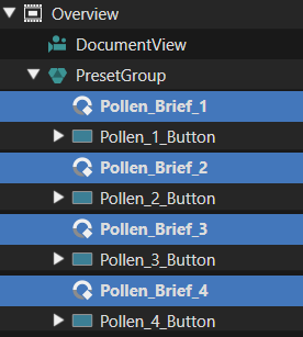
Insights Scene
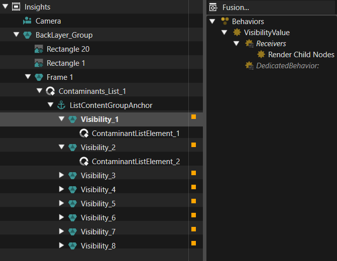
This scene only contains a list of the contaminants we know of and their level. It is only meant to be viewed, there are no buttons for interaction. The elements of the list are ContaminantListItem templates. The list has a fixed number of 8 elements. The number of received contaminants can be higher or smaller. If Higher, we only show the first 8. If lower, we disable rendering for the unused elements via a “Render Child Nodes” behavior. When there are more elements than visible in the given space, a scroll-bar will appear (and scale as well as move itself appropriately). To customize the “Scrollbar” with imported graphical elements, the Contaminants_List template is used.
TopBar Scene

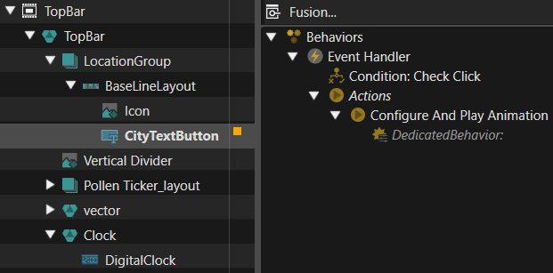
In the top bar we have some fixed graphical elements, a digital clock, implemented using the default “DigitalClock” control, and a “TextButton”, where we set the name of the currently set city. Pressing this button will trigger an animation that will make the location list popup visible.
BottomBar Scene
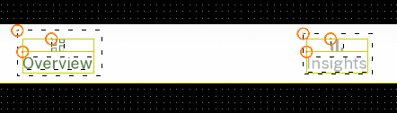
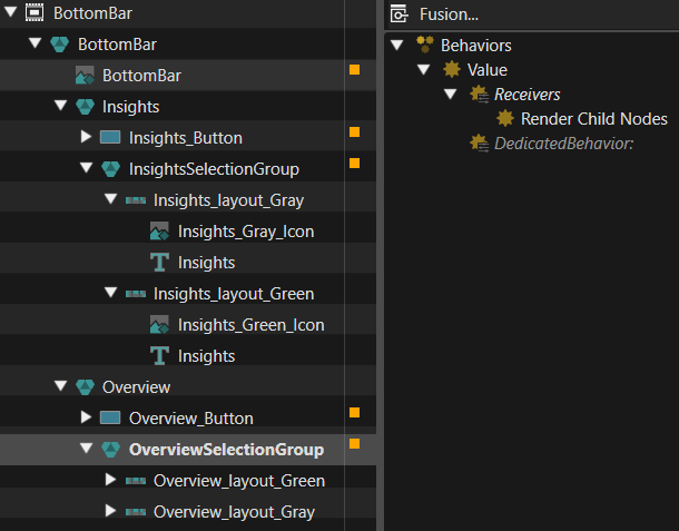
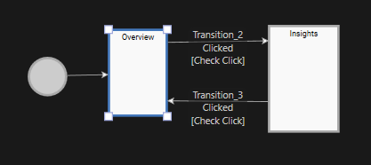
In the bottom bar we have buttons to switch between the 2 main scenes. When the button is clicked, the state machine transition occurs. To select between the gray and green versions, a RenderChildNodes behavior is used.
ContaminantList_Popup Scene
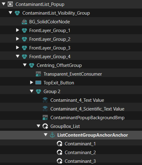
This scene contains 4 lists, one list for each of the front page contaminants. We could have had a single list and configure it with the currently selected one upon opening, but this way each will be opened in the same state in which it was closed. String values are sent from the Contaminant template to nodes with databound values, so new contaminants can also be added without the need to modify and recompile the code. Rendering is disabled for these 2 nodes, but could be enabled for debug purposes.
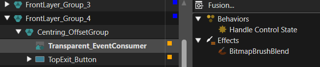
There is a Transparent_EventConsumer node, which covers the area behind the list, and has a “Handle Control State” behavior, to avoid touch events going to elements underneath. Under this, but over all other elements, there is a transparent “TopExit_Button” node, which is used to close the popup when touching outside the list.
Location_popup Scene
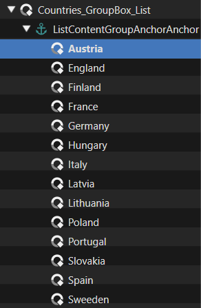
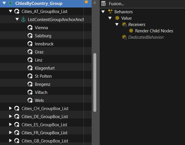
This is the largest scene in the solution. There are 2 lists visible, a countries list and a cities list. In the scene there is a list of cities for each country. The Lists of cities are under a node with a “Render Child Nodes” behavior, so only one of the lists of cities is made visible. The index of the list to show is set from the “Country” template of the first list. Like the Contaminants List Popup, this scene has a node to prevent events going to the elements under it, and a full screen button to exit when tapping outside.
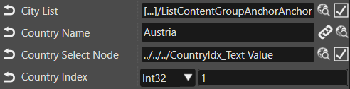
This setup makes it possible to add new countries and cities just by configuring the asset. For a country, we need the name, the node to which it must be forwarded, the index of it’s cities list in the group of city lists, and the root of the cities list, to reset their selection.
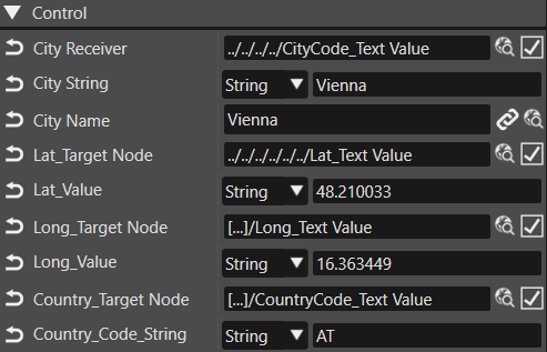
For a city, we need the name to be shown, but more importantly, we need to get it’s geographical coordinates and country code to the app. So we send a Latitude, Longitude, and country code to nodes with databindings. Having this in the asset allows to edit, remove, or add any new city to the list just by editing in SceneComposer. The source code will remain unchanged, it will just use the new values received trough databindings.
Other elements
Below you can find more information on the remaining elements not beloning in the controls and scenes chapter.
Associated script (WebAPI)
This app is based on the Web API and data from www.polleninformation.at. At https://www.polleninformation.at/datenschnittstelle you can find information about the format of the URL used to retrieve the data, and the format of the response JSON. Here you can also see the data needed for API requests, and the data received. In short, to make a request we need language, country, and geographic coordinates, which we can get from databinding, from strings preset in the asset.
When a response is received, it is parsed and values are set to the bindings to display the danger levels and contaminants.
State Machine
In the “GlobalStateMachine”, only the transition between “Overview” and “Insights” is handled, by deactivating the source scene and activating the destination for each transition. Also, on entry of “Overview”, the other scenes are loaded.
Animations
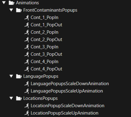
The only animations used in this solution are for the pop-up lists opening and closing. Each list has an individual animation. Currently they are identical, the list scales up from the center and scales down towards the center of the screen, and a transparent gray background fades in and out. Since each list has it’s own animation, it would also be possible to have it appear from and disappear into the associated element which triggered it.