GettingStartedControls Solution
Overview
The GettingStartedControls solution is a sample solution for a gauge cluster and a center cluster. Various controls are used to realize an advanced gauge cluster and a center cluster. In addition, interactions between those controls are built to realize HMI logic.
For information on how to create the main scenes of this sample solution and how to implement HMI logic using controls, please refer to the GettingStartedControls tutorial.
Description
Scene
The GettingStartedControls solution consists of the scenes listed in the table below.
| Scene name | Description |
| SceneHome |
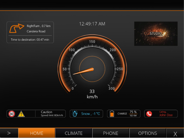
Scene for the main screen. The speedometer is displayed in the center of the screen, and navigation information, time, display, various indicators, etc. are displayed around it. In addition, the SceneMenuTabs scene is overlaid at the bottom of the display area. |
| SceneClimate | Scene for the car climate settings screen with air conditioning and various heating |
| ScenePhone | Scene for the phone screen. Displays the phone book and a contact with a call and hang up |
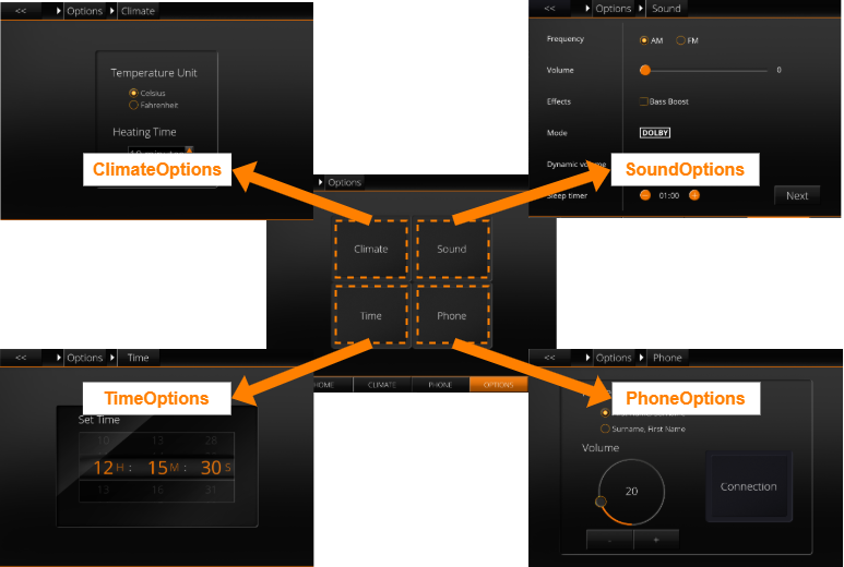
| SceneOptions | A scene for a screen to select one of 4 other options scenes. |
| ClimateOptions | Scene for the climate-related settings screen to configure the temperature unit and heating |
| SoundOptions | A scene for the audio-related settings screens with extensive |
| TimeOptions | A scene for the time-related settings screen. |
| PhoneOptions | A scene for the phone-related settings screen. |
| ConnectionOptions | A scene for the phone connection settings screen. |
| SceneMenuTabs |
Scene for the screen switching tabs of SceneHome/SceneClimate/ScenePhone/SceneOptions. |
| SceneBack | Background scene. |
| SceneBreadcrumb | A scene for the breadcrumb list that appears at the top of SceneOptions. |
Control
The following table lists the featured controls used in the GettingStartedControls solution. For more information about each control, please refer to Predefined Controls.
| Control name | Description |
| BreadCrumb |
The collection of Options scenes was mainly introduced to demonstrate the capabilities of the BreadCrumb |
| List |
The phone screen contains a dynamic list. It is important to know that in the Player some code had to be implemented that allows phone-book entries and adding them. |
| Drawer |
The drawer is used twice in the sample. First of all the menu in the bottom of the screen appears as a drawer if the user hovers over the corresponding Control (at the bottom of the screen). To close the menu-drawer the "X"-Button in the right side of the menu has to be pressed. |
| Roll | The time-options screen includes three roll controls for setting the time (seconds, minutes and hours). |
| Keyboard | When clicking on of the time-rolls an on-screen keyboard |
| Various Core Controls | In the SoundOptions scene, Core controls are used to display various audio-related settings. |
This Core Controls sample solution showcases a lightweight Control Set optimized for low-end devices. It includes only essential controls, enabling safe performance testing and validation on memory-constrained platforms.
Behavior
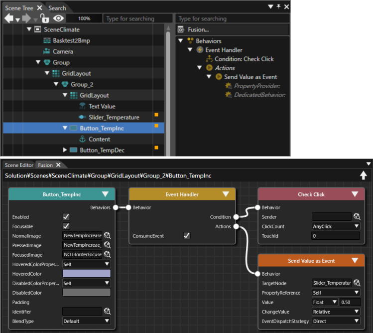
Behaviors are configured for each controlcontrol to exchange data with other nodes as needed. Behavior settings can be viewed in the Extra Scene Tree or Fusion panel of the relevant node.
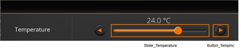
The image below shows an example of behavior settings for Button_TempInc (Button control) in the SceneClimate scene. The Button_TempInc is a button to increase the air conditioner's temperature setting in 0.5°C increments. Due to the behavior settings, each time Button_TempInc is pressed, a value of 0.5 is passed to Slider_Temperature (Slider control), synchronizing the button press action with the slider display.
State Machine
The transitions between different scenes are configured using a State Machine (MenuStateMachine). Transitions of the Options scenes are encapsulated into a separate Subchart to keep everything neatly arrangedarranged..
The configuration of the State Machine transitions between scenes can be viewedviewed in the State Machine Editor.
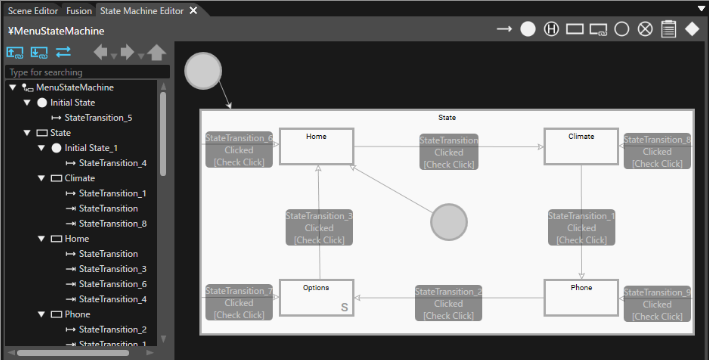
Transition
The Transition Type is set to Slide for transitions between SceneHome, SceneClimate, ScenePhone, and SceneOptions scenes. This causes a scene to slide from left to right to reveal the next scene. A Fade transition is set for transitions between option-related scenes. This is achieved using a VariantVariant in the Transition Rule Editor.
Transition settings can be viewed in the Transition Rule Editor.
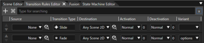
Play/Operation using Player
Click the [ Play Selected Scenario... ] icon on the toolbar to launch the Player and the Advanced Cluster solution will be displayed in the Player view.
The initial screen of the GettingStartedControls solution is the SceneHome scene. If you move the cursor to the bottom of the screen, a tab menu will appear, and you can move to each scene from the tab menu. In each scene, you can check the operation of various controls used in the GettingStartedControl solution.
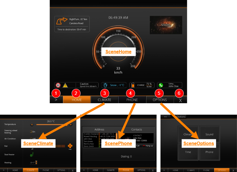
| (1) | Each time you click, the display screen will change in the following order: SceneHome -> SceneClimate -> ScenePhone -> SceneOptions (after SceneOptions, you will return to SceneHome). |
| (2) | When clicked, SceneHome will be displayed. |
| (3) | When clicked, SceneClimate will be displayed. |
| (4) | When clicked, ScenePhone will be displayed. |
| (5) | When clicked, SceneOptions will be displayed. |
| (6) | When clicked, the SceneMenuTabs will be hidden. |
From the SceneOptions scene, you can transition to scenes for various options.