
GettingStartedControls Part 3
In Part 3 of the GettingStartedControls Sample we will create a (Phone Connection) Options scene. This scene offers the possibility to choose the connection type (Cable, Bluetooth and other) from a Dial Control on the left side. The right side displays a List of devices. When a device gets selected, an associated Sub-List Control with two TextButtons will be shown.
As basis for step 3 of our GettingStartedControls tutorial, please use your own created solution from the previous "GettingStartedControls" tutorial.
And this is what the final scene will look like:

Preparing the Options scene
A scene will be created and the camera will be configured in the Render Targets panel.
- Create a new scene via the menu bar "Scene" - "New 2D Scene" or press < Ctrl+2 > on your keyboard
- The "Add New Scene 2D" dialog will be opened.
- The "Add New Scene 2D" dialog will be opened.
- In the first row select "/Scenes" from the drop-down menu. Enter "SceneOptions" as name and press [ OK ]. We use the prefix "Scene" to have all scenes listed next to each other in the Solution Explorer panel.
- A new scene "SceneOptions" is created and visible in the Solution Explorer panel in folder "Scenes".
- The new scene is opened in the Scene Editor and in the Scene Tree panel.
- In the Scene Tree panel you can see that the scene already has a camera.
- In the Render Targets panel you can see that the camera is already added to the RenderTarget.

- In the Render Targets panel check the checkbox of "SceneOptions\Camera" in order to enable rendering.
- Rendering of the scene is enabled.
- Rendering of the scene is enabled.
- In the Render Targets panel select the SceneOptions\Camera. In the Properties panel's [ Camera ] section change the sequence number to 2.
- The camera's sequence number is set to 2.
- In the Scene Tree panel the red Information/Warning/Error square disappears.

Importing Images
This scene uses the built-in Scene Composer controls but they will be customized with new images. Therefore these images have to be imported into the Scene Composer solution.
- In the menu bar select Import > Import Resources...
- The "Import Resources" dialog will be opened.
- The "Import Resources" dialog will be opened.
- In the "Import Resources" dialog navigate to the path given in the table below. Select all 16 files and press [ Open ]
- The "Import Images" dialog will be opened.
Import Resources Path /cgi_studio_content/Resources/GettingStartedControls/Options
- The "Import Images" dialog will be opened.
- In the "Import Images" dialog select folder "/Resources", make sure to create a new folder "Options" for the imported images and click [ OK ].
- In the Solution Explorer you can see that there is a new folder "Options" in folder "Resources" that contains the 16 imported images.
- The images have been imported and can be used in the Scene Composer solution.

Configuring the Background
This scene is composed of two parts: Connection and Devices. For each of these parts a 2D Group node will be created. To position the background image a BimapNodeBitmapNode will be configured with one of the images imported in the previous section.
- From the Toolbox panel's [ Node 2D ] section drag a 2D Group node into the Scene Tree directly onto the node "SceneOptions".
- In the Scene Tree panel you can see a 2D Group node.
- In the Scene Tree panel you can see a 2D Group node.
- From the Toolbox panel's [ Node 2D ] section drag a BitmapNodes onto the 2D Group node.
- In the Scene Tree panel you can see that a BitmapNodes has been created.
- In the Scene Tree panel you can see that a BitmapNodes has been created.
- In the Scene Tree panel select the 2D Group and create a copy either via the context menu entries "Copy" and "Paste" or via the keyboard <Ctrl>+C and <Ctrl>+V.
- A copy of the 2D Group with its BitmapNode has been created.
- In Scene Tree panel the name of the copy is "Group_1".
- In the Scene Tree panel select the nodes added in the steps before one after the other and rename them either via the context menu entry "Rename" or by pressing <F2> on your keyboard. Apply the names provided in the table below.
- In the Scene Tree panel you can see that the nodes have been renamed.
Target Item Name Group Connection BitmapNode Background Group_1 Devices BitmapNode Background 
- In the Scene Tree panel you can see that the nodes have been renamed.
- In the Scene Tree panel select both BitmapNodes called "Background". This can be achieved by selecting one BitmapNode, holding down the <Ctrl> key and keeping it pressed while clicking on the second BitmapNode. In Scene Tree panel's right side select the "BitmapBrushBlend" effect. In the Properties panel's [ Effect ] section click on the magnifying glass icon next to the Image property.
- In the Properties panel you can now edit the BitmapBrushBlend effect for both BitmapNodes.
- The "Choose Item" dialog will be opened.

- In the "Choose Item" dialog select the image as in the table below and click [ OK ].
- The Choose Item dialog will be closed.
- In the Scene Editor a background image is visible displaying a vertical grey-black gradient.
Property Path Image /Resources/Options/ConnectionOptionsENBOSBmp 
- In the Scene Tree panel select the "Connection" group. In the Properties panel's [ Transformations ] section adjust the "Position" property according to the table below. Repeat this step with the "Devices" group.
- In Scene Editor two rectangles with a gradient background are visible.
Target Name Position X Position Y Connection
78.00 58.00 Devices
551.00 58.00 
- In Scene Editor two rectangles with a gradient background are visible.
Configuration of the "Connection" Nodes
The left side of the scene offers the possibility to choose the connection type. The Scene Composer's built-in Dial control will be customized with new images that fit to the scene's design. TextNodes will be added as labels.
Creation and Positioning of the Dial Control
- From the Toolbox panel's [ Controls ] section under Touchable drag a Dial control into the Scene Tree panel directly onto the "Connection" group.
- In the Scene Tree panel a Dial control has been added into the "Connection" group.
- In the Scene Editor the Dial control is visible in the top left corner of the left gradient image.
- In the Scene Tree panel select the Dial control. In the Properties panel's [ Transformation ] section adjust its position according to the table below.
- In the Scene Editor the Dial control is positioned in the lower center of the gradient image.
Target Name Position X Position Y Dial
72.00 163.00
- In the Scene Editor the Dial control is positioned in the lower center of the gradient image.
Configuration of the Dial Control
The following steps show how to configure the Dial control with new images.
- In the Properties panel's [ Control ] section click on the magnifying glass icon next to property "Knob Image".
- The "Choose Item" dialog will be opened.
- The "Choose Item" dialog will be opened.
- In the "Choose Item" dialog select the image as in the table below and click [
OK ]OK].- The "Choose
ItemItem" dialog will be closed. - In the Scene Editor an orange ring will become visible.
Property Path Knob Image /Resources/Options/NewDial_arrow_middleBmp
- The "Choose
- In the Properties panel's [ Control ] section click on the the "BackgroundImages" section.
- In the Properties panel the "BackgroundImages" section will be expanded.
- In the Properties panel the "BackgroundImages" section will be expanded.
- In the Properties
panelpanel's [BackgroundImages] section click on the magnifying glass next to "BackgroundImages 0".- The "Choose Item" dialog will be opened.
- The "Choose Item" dialog will be opened.
- In the "Choose
ItemItem" dialognavigate to "/Resources/Options/NewDial_background_leftBmp",selectthisthe image as in the table below and click [OK ]OK].
- The "Choose Item" dialog will be closed.
- In the Properties panel the first
BackgroundImageone of the BackgroundImages has been configured.Property
Path
BackgroundImages 0
/Resources/Options/NewDial_background_leftBmp - Repeat steps 4 and 5 to configure the remaining BackgroundImages. After this step the BackgroundImages
asareinconfigured according to the table below.- In Properties panel all BackgroundImages are configured.
- In Scene Editor you can see the newly configured images.
If the new images are not visible try refreshing the screen by pressing the <F5> key on your keyboard.
StateImages Image Path BackgroundImages 0 /Resources/Options/NewDial_background_leftBmp BackgroundImages 1 /Resources/Options/NewDial_background_middleBmp BackgroundImages 2 /Resources/Options/NewDial_background_rightBmp 
- In the Solution Explorer panel select the new Knob Image "/Resources/Options/NewDial_arrow_middleBmp". In the Properties panel's [ Bitmap ] section enable "Pivot Hint" by checking the respective checkbox.
- A new property "Pivot Hint" becomes visible.
- A new property "Pivot Hint" becomes visible.
- Configure the "Pivot Hint" as in the table below.
- The Pivot Hint for the Knob Image is configured correctly.
Target Name
Enable Pivot Hint Pivot Hint X
Pivot Hint Y
NewDial_arrow_middleBmp true 84,50
88,00
- The Pivot Hint for the Knob Image is configured correctly.
- In the Solution Explorer select the three images that were configured as BackgroundImages. In the Properties panel proceed similar to steps
107 and11,8, enabling and configuring the Pivot Hint of these three images according to the table below.- The Pivot Hint is configured correctly.
- In Scene Editor the Dial's images are neatly aligned. The images have a common center.
If the the images are still not aligned correctly try refreshing the screen by pressing the <F5> key on your keyboard.
Target Name Enable Pivot Hint Pivot Hint X Pivot Hint Y NewDial_arrow_middleBmptrue84,5088,00
130,50
130,50 NewDial_background_middleBmp true
130,50 130,50 NewDial_Background_rightBmp true
130,50 130,50
Adding TextNodes as Connection Labels
TextNodes will be configured with an attractive font and positioned as labels for choosing the connection type.
- From the Toolbox panel's [ Nodes 2D ] drag and drop a TextNode into the Scene Tree panel directly onto the "Connection" group node.
- In the Scene Tree panel a TextNode will become visible.
- In the Scene Editor the text "Text" will appear.
If the text does not appear in Scene Editor, the BitmapNode "Background" might be covering the TextNode. Make sure that "Background" is the first (top) item inside the "Connection" group. Nodes can be re-arranged in the Scene Tree panel via drag&drop.
- In the Scene Tree panel select the new TextNode. In the Properties panel's [ 2D Text Node ] section click on the magnifying glass icon next to property "Style".
- The "Text Style Palette" dialog will be opened.
- The "Text Style Palette" dialog will be opened.
- In the "Text Style Palette" dialog select "OpenSans25" and click [ OK ].
- In Scene Editor the Text Style of the TextNode will change.
- In Scene Editor the Text Style of the TextNode will change.
- In the Scene Tree panel right click onto
Connectionthe TextNode and select "Clone..." from the context menu.- The "Clone Item" dialog will be opened.
- The "Clone Item" dialog will be opened.
- In the "Clone Item" dialog change to the "Multiple Clone" tab. Configure "Number of Copies" to "3" and click [ OK ].
- In the Scene Tree panel 4 TextNodes are now available inside the "Connection" group.

- In the Scene Tree panel 4 TextNodes are now available inside the "Connection" group.
- In the Scene Tree panel select the newly created TextNodes one after the other and configure their names in the Scene Tree panel and the remaining properties in the Properties panel as in the table below.
- The TextNodes are fully configured.
- The final result of the Connection part can be seen in the images below.
TextNode Name 2D Text Node Transformations Text Position X Position Y TextNode_Connection Connection 141 61 TextNode_Bluetooth Bluetooth 149 134 TextNode_Cable Cable 20 200 TextNode_Other Other 315 200 
Setting up the "Devices" nodes
The right side of the scene displays a list of devices. Scene Composer's built-in List control will be expanded to facilitate customization later on. Based on the existing List control a new reusable MyList control template will be created.
- In the Scene Tree panel copy the TextNode_Connection from the Connection Group2D either via the context menu "Copy" or via the keyboard shortcut <Ctrl + C>. Paste the TextNode into the Devices Group2D either via the context menu "Paste" or via the keyboard shortcut <Ctrl + V>.
- In the Scene Tree panel you can see that TextNode_Connection has been copied to the Devices group.
- In the Scene Editor another Textnode with "Connection" is visible.
- In the Scene Tree panel select the new TextNode_Connection from the Devices group and rename it to TextNode_Devices either via the context menu "rename" or via the keyboard shortcut <F2>.
- In the Scene Tree panel you can see a TextNode called TextNode_Devices inside of the Devices Group2D.
- In the Scene Tree panel you can see a TextNode called TextNode_Devices inside of the Devices Group2D.
- In the Scene Tree panel select TextNode_Devices. In the Properties panel's [ 2D Text Node ] section change the TextNode's Text property and in the [ Transformation ] section adapt its Position according to the table below.
- Text and position of the TextNode are configured.
- In the Scene Editor you can see that the devices part has got a headline.
TextNode Name 2D Text Node Transformations Text Position X Position Y TextNode_Devices Devices 145 61
- From the Toolbox panel's [ Control ] section under "Touchable" drag a List Control into the Scene Tree panel directly onto the "Devices" group node.
- In the Scene Tree panel a "List" node is visible directly under the "Background" node.
- This list node contains a "ListContentGroupAnchor", that is visible in Scene Tree panel by expanding the List node via a click on the triangle on its left.
- In the Scene Tree panel right-click on the newly created List node and choose [ Expand Control Node ] from the context menu.
- In the Scene Tree panel the expanded List now shows a "ListContentGroup" and a "Scrollbar".
- In the Scene Tree panel the expanded List now shows a "ListContentGroup" and a "Scrollbar".
- In the Scene Tree panel right-click on the "Scrollbar" and once again choose [ Expand Control Node ] from the context menu.
- In the Scene Tree panel the expanded Scrollbar shows 6 sub-nodes.

- In the Scene Tree panel the expanded Scrollbar shows 6 sub-nodes.
- In the Scene Tree panel right-click on the List node and choose [ Save as Control... ] from the context menu.
- The "Add New Templates" dialog will be opened.
- The "Add New Templates" dialog will be opened.
- In the "Add New Templates" dialog select the "/Controls" folder to store the new control in, enter "MyList" as name and click [ OK ].
- A new customizable control "MyList" has been created. It is visible in the Solution Explorer panel in the Controls folder and in the Toolbox panel's [ Controls ] section as last item of the list.
-
The Scene Editor doesn't display SceneOptions any more, it displays the control MyList.
-
The Scene Tree panel shows the structure of MyList.
-
The Properties panel shows the properties of "MyList (Control)".

Configure MyList Control
Expose MyList's ScrollBarVisibility
Scene Composer's List internally holds a property for the scrollbar's visibility, which is not shown in the Properties panel by default. The following steps show how to access a list of hidden properties. For this sample solution we will make the scrollbar's visibility property publicly editable in the Properties panel.
- In the Solution Explorer right-click on the newly created control "MyList" and choose [ Control Properties... ] from the context menu.
- The "Configure Public Control Properties" dialog will be opened.

- The "Configure Public Control Properties" dialog will be opened.
- In the "Configure Public Control Properties" dialog's tree on the left side select the following item MyList > List > Scrollbar > Behaviors > ScrollbarBehavior. In the dialog's centered panel "Internal properties" find property "ScrollbarVisibility", check the "Is Public" checkbox and click [ OK ].
- The "Configure Public Control Properties" dialog will be closed.
- For every instance of the MyList control, there will be a property available to configure the visibility of the scrollbar.

- In the Scene Tree navigate back to SceneOptions by pressing the arrow in the top left corner.
- The Scene Tree panel navigates back to SceneOptions and displays SceneOptions and its nodes.
- The Scene Editor displays SceneOptions.

- In the Scene Tree delete the List node.
- The "Delete Item" dialog will be opened.
- The "Delete Item" dialog will be opened.
- In the "Delete Item" dialog press [ OK ].
- The List node is deleted.
- The List node is deleted.
- From the Toolbox panel's [ Control ] section drag and drop a MyList control into the Scene Tree panel directly onto the Devices group.
- In the Scene Tree panel, a new MyList node will be visible.
- In the Scene Tree panel, a new MyList node will be visible.
- In the Scene Tree panel select "MyList". In the Properties panel's [ Control ] section set the "Scrollbar Visibility" to "Visible".
- In the Scene Editor a small blue scrollbar becomes visible.

- In the Scene Editor a small blue scrollbar becomes visible.
Customize MyList's Scrollbar
Scene Composer's default scrollbar has a blue base color. For our orange based design the scrollbar will be customized in the steps below.
- In the Scene Tree panel double-click on the MyList node.
- Scene Tree panel will switch from displaying SceneOptions to displaying the MyList template.
- In the Scene Tree panel select the "Thumb" button node. In the Properties panel change the button's image properties according to the table below by clicking the magnifying glass icon and selecting the appropriate image in the "Select Item" dialog.
- New images for the scrollbar's "Thumb" have been defined.
MyList > List > Scrollbar > Thumb Thumb Images Image Path Normal Image /Resources/Options/ThumbNormalBmp2Bmp Pressed Image /Resources/Options/ThumbPressedBmp2Bmp Focused Image /Resources/Options/ThumbNormalBmp2Bmp
- New images for the scrollbar's "Thumb" have been defined.
- In the Scene Tree panel select the "VerticalPrevItem" button node. In the Properties panel change the button's image properties according to the table below by clicking the magnifying glass icon and selecting the appropriate image in the "Select Item" dialog.
- New images for the scrollbar's "VerticalPrevItem" have been defined.
MyList > List > Scrollbar > PrevItem > VerticalPrevItem VerticalPrevItem Images Image Path Normal Image /Resources/Options/ArrowUpNormalBmp2Bmp Pressed Image /Resources/Options/ArrowUpPressedBmp2Bmp Focused Image /Resources/Options/ArrowUpNormalBmp2Bmp
- New images for the scrollbar's "VerticalPrevItem" have been defined.
- In the Scene Tree panel select the "VerticalNextItem" button node. In the Properties panel change the button's image properties according to the table below by clicking the magnifying glass icon and selecting the appropriate image in the "Select Item" dialog.
- New images for the scrollbar's "VerticalNextItem" have been defined.
MyList > List > Scrollbar > NextItem > VerticalNextItem VerticalNextItem Images Image Path Normal Image /Resources/Options/ArrowDownNormalBmp2Bmp Pressed Image /Resources/Options/ArrowDownPressedBmp2Bmp Focused Image /Resources/Options/ArrowDownNormalBmp2Bmp
- New images for the scrollbar's "VerticalNextItem" have been defined.
- In the Scene Tree navigate back to SceneOptions by pressing the arrow in the top left corner.
- The Scene Tree displays SceneOptions.
- In the Scene Editor the scroll bar is now rendered with the new images in orange color.

Configure MyList's Main Item
Our MyList control will be composed of MainItems. Whenever a certain MainItem gets selected, the appropriate Sub-List will be displayed. The following steps explain how to build up a MainItem.
- In the Scene Tree panel double-click on the MyList node.
- Scene Tree panel switches from SceneOptions to MyList.
- You are now able to edit the MyList template.
- From the
Toolbar'Toolbox panel's [ 2D Nodes ] section drag an OverlayLayout into the Scene Tree panel directly onto the List's "ListContentGroup" (MyList > List > ListContentGroup).- In the Scene Tree panel there is an OverlayLayout inside of "ListContentGroup".
- In the Scene Tree panel there is an OverlayLayout inside of "ListContentGroup".
- From the
Toolbar'Toolbox panel's [ 2D Nodes ] section drag a RenderNode and a TextNode into the Scene Tree panel directly onto the OverlayLayout that was created in the previous step.- In the Scene Tree panel there are a RenderNode and a TextNode inside the OverlayLayout that was created in the previous step.
- In the Scene Editor the TextNode is visible displaying the TextNode's default text "Text".

- In the Scene Tree panel select the nodes created in the previous steps and rename them either via the context menu entry "Rename" or by pressing <F2> on your keyboard according to the table below.
- In the Scene Tree panel the nodes are renamed according to the following table.
Initial Name New Name OverlayLayout MainItem TextNode EntryName RenderNode FocusImage
- In the Scene Tree panel the nodes are renamed according to the following table.
- In the Scene Tree panel select the List (Group2D). In the Properties panel's [ Transformation ] section configure the position and size according to the following table.
- In Scene Editor the Position and size of the selected rectangle is adjusted according to the new settings.
Size X and Size Y properties are initially set to "Automatic" and greyed out. Clicking onto the "A" next to the greyed-out input field allows you to edit these properties.
Target Item Transformation Layout Position X Position Y Size X Size Y List (Group2D) 58 134 300 300
- In Scene Editor the Position and size of the selected rectangle is adjusted according to the new settings.
In the Scene Tree panel select the TextNode2D (MainItem > EntryName). In the Properties panel's [ TextNode2D ] section click on the magnifying glass icon to the right of the Style property.The Text Style Palette dialog will be opened.
Configure MyList's Highlight for Selected Item
In a list it is useful to highlight the selected item. This will be done using a FocusImage drawing a border around the focused MainItem.
- From the Toolbox panel's [Effects] section drag a BitmapBrushColorBlend effect into the Scene Tree panel directly onto the MainItem's FocusImage.
- In the Scene Tree panel's right side you can see BitmapBrushColorBlend effect under "Effects" when FocusImage is selected.
- In the Scene Tree panel's right side you can see BitmapBrushColorBlend effect under "Effects" when FocusImage is selected.
- In the Scene Tree panel select FocusImage. In the Scene Tree panel's right side select the BitmapBrushColorBlend effect. In the Properties panel click on the magnifying glass icon next to the "Image" property.
- The "Choose Item" dialog will be opened.
- The "Choose Item" dialog will be opened.
- In the "Choose Item" dialog select the image as in the table below and click [ OK ].
- The "Choose Item" dialog will be closed.
Target Item Image MyList > List > >ListContentGroup > MainItem > FocusImage > BitmapBrushColorBlend //ConstructionKit/ConstructionKit/Controls/Images/Common/BorderFocusedBmp
- The "Choose Item" dialog will be closed.
- In the Properties panel change the Color property by entering new values for "Red", "Green" and "Blue" according to the table below.
- In the Properties panel the configured orange color will be visible.
The Color property can also be edited in the Color Palette window, which can be opened by clicking on the color preview rectangle next to the Color property.
Target Item Color Red Green Blue MyList > List > >ListContentGroup > MainItem > FocusImage > BitmapBrushColorBlend 1.0 0.62 0.00 
- In the Properties panel the configured orange color will be visible.
- In the Scene Tree panel select the FocusImage node. In the Properties panel's [ Layout ] section set the StretchBehavior to "Fill" according to the table below.
- In the Scene Editor the FocusImage RenderNode will appear highlighted with an orange outline.
Target Item Layout > StretchBehavior MyList > List > >ListContentGroup > MainItem > FocusImage Fill 
- In the Scene Editor the FocusImage RenderNode will appear highlighted with an orange outline.
Create MyList's Sub-List
A Sub-List will be used to display 2 TextButtons to "Connect" or "Unpair" the associated device. The TextButtons will be positioned by a StackLayout. New images for normal, pressed and focused image will be defined.
- From the Toolbox panel's [ Controls ] section under "Touchable" drag a Sub-List into the Scene Tree panel directly onto the List's ListContentGroup
- In the Scene Tree panel the Sub-List node is positioned inside of ListContentGroup just below the MainItem.
- The Sub-List has a SubListAnchor.

- From the Toolbox panel's [ Node2D ] section drag a StackLayout into the Scene Tree panel directly onto the Sub-List's SubListAnchor.
- In the Scene Tree panel the StackLayout appears beneath the Sub-List's SubListAnchor.
- In the Scene Tree panel the StackLayout appears beneath the Sub-List's SubListAnchor.
- From the Toolbox panel's [ Controls ] section under "Touchable" drag a TextButton Into the Scene Tree panel directly onto the StackLayout you added in the step before.
- In the Scene Tree panel the TextButton appears beneath the StackLayout.
- In the Scene Tree panel the TextButton appears beneath the StackLayout.
- In the Scene Tree panel select the StackLayout. In the Properties panel's [ Transformation ] and [ Layout ] section configure the properties as in the table below.
- In the Scene Editor the dashed line of the TextButton's boundings will decrease.
Target Item Transformations Layout Scale X Scale Y Margin Left TextButton 0,75 0,75 12
- In the Scene Editor the dashed line of the TextButton's boundings will decrease.
- In the Properties panel's [ Control ] section click on the magnifying glass icon next to the TextButton's "Normal Image" property.
- The "Choose Item" dialog will be opened.
- The "Choose Item" dialog will be opened.
- In the "Choose Item" dialog select the image according to the table below and click [ OK ].
- A new image for "Normal Image" has been configured.
- A new image for "Normal Image" has been configured.
- Repeat steps 5 and 6 for the TextButton's "Pressed Image" and "Focused Image".
- New images are configured for the TextButton.
Target Item Image Path Normal Image /Resources/Options/ButtonNorma_BkBmp Pressed Image /Resources/Options/ButtonNorma_Prss_OreBmp Focused Image /Resources/Options/NOTBorderFocusedBmp
- New images are configured for the TextButton.
- In the Scene Tree panel select the TextButton and create a copy either via the context menu entries "Copy" and "Paste" or via the keyboard <Ctrl>+C and <Ctrl>+V.
- A copy of the TextButton has been created.
- In Scene Tree panel the name of the copy is "TextButton_1".
- In Scene Tree panel rename the TextButtons according to the table below. Renaming can be done either via the context menu "Rename" or pressing <F2> on your keyboard.
- In Scene Tree panel the TextButtons are renamed.
- In Scene Tree panel the TextButtons are renamed.
- In Scene Tree panel select the TextButtons individually and change the text they are displaying in the Properties panel's [ Control ] section according to the table below.
- The texts of the TextButtons have been changed.
Target Item New Name Control - Text TextButton TextButton_Connect Connect TextButton_1 TextButton_Unpair Unpair 
- The texts of the TextButtons have been changed.
Configure Behaviors for the Focus Handling of MyList's MainItem
Whenever MyList's MainItem gets focused, an orange border shall be displayed. Focus and FocusLeave behaviors are used to enable or disable the rendering of the FocusImage. The behaviors are configured using Fusion.
A detailed explanation about Fusion, how to operate Fusion (how to add Fusion Nodes) and a configuration example can be found in the documentation about Fusion.
- In the Scene Tree panel select the MainItem's FocusImage. In the Properties panel's [ Item ] section uncheck "Enable Rendering".
- In the Scene Editor FocusImage (the orange rectangle) is not visible any more.
- In the Scene Tree panel an icon indicates the FocusImage node's disabled rendering.

- In the Scene Tree panel select the MainItem GroupNode. Then press the [Fusion...] button on the right side of the Scene Tree.
- Fusion panel is opened displaying the Fusion diagram with the
MainItem'sMainItem Fusion Node. - The MainItem Fusion node has a Behaviors connector on its right side.
- Fusion panel is opened displaying the Fusion diagram with the
DragAdd Fusion Nodes to the MainMenu Fusion Node using its Behaviors connectorto the right and then release the mouse button.The [Select Behavior] dialog will be opened, which displays a list of behaviors.
While typing the list of behaviors will be narrowed down.
Connector
Add Fusion Nodes
MainItem Fusion Node
Behaviors
Handle Control State
Behaviors
Focus
Behaviors
FocusLeave Add
TwoAnnewEnableRendering FusionnodesNode will beaddedconnected to the Focus Fusiondiagram:Node.
Focus Fusion Node
Actions EnableRendering FocusLeave Fusion Node
Actions EnableRendering Configure the properties "Visible" and "
- MyList's behaviors for focus handling are configured.
- Whenever the MainItem gets the focus, the FocusImage will get visible.
- Whenever the MainItem looses the focus, the FocusImage will get invisible.
Behavior Visible Target Node Focus - EnableRendering
True MyList > List > ListContentGroup > MainItem > FocusImage FocusLeave - EnableRendering
False MyList > List > ListContentGroup > MainItem > FocusImage 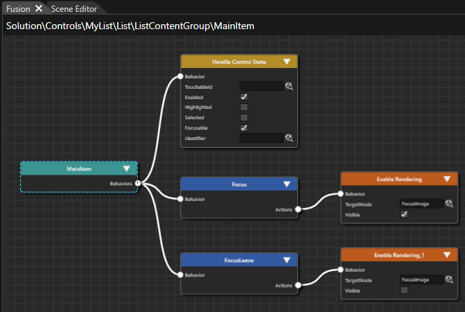
Configure Behaviors for MyList's MainItem
When an item in the Devices list is clicked, a Sub-List will become visible. This Sub-List contains buttons for connecting/disconnecting.
- In the Scene Tree panel select item MyList > List > ListContentGroup > MainItem. Then press the [Fusion...] button on the right side of the Scene Tree.
- Fusion is opened displaying the Fusion diagram with the
MainItem'sMainItem Fusion Node. - The MainItem Fusion
nodeNode has a Behaviors connector on its right side.
- Fusion is opened displaying the Fusion diagram with the
DragAdd Fusion Nodes to the MainItem Fusion Node using its Behaviors connectorto the right and then release the mouse button.The [Select Behavior] dialog will be opened, which displays a list of behaviors.
- A new Fusion node will be added to the Fusion diagram:
[EventHandler].Handler Fusion Node. - The
[EventHandler]Handler Fusion node has 2 connectors on its right: a Condition connector and an Action connector.
Connect to Fusion Node
Connector
Add Fusion Nodes
MainItem
Behaviors
Event Handler
- A new Fusion node will be added to the Fusion diagram:
[Check LogicCondition].
With the [Check Logic Condition]Condition you can combine 2 conditions with a configurable logic operation (And, Or, Xor).
Connector
Add Fusion Nodes
Event Handler
Condition
Check Logic Condition
Connector
Add Fusion Nodes
Check Logic Condition
Condition
Check Key Input
Condition
Check Click Configure the
[CheckClick]Click and[Check KeyInput]Input condition are logically combined through[Check LogicCondition].condition.[The Check LogicCondition]condition will evaluate to TRUE if either the[CheckClick]Click condition or the[Check KeyInput]Input condition is TRUE.
Condition Property Value Check Logic Condition Operation Or Check Key Input KeyCode Key_Enter Check Click - -
- A new Fusion
nodeNode[will be added to the Fusion diagram: Send Value asEvent]EventwillFusionbeNode.createdthatisconnectedConnect totheFusion[EventNode
Handler]Connector
Add Fusionnode.Nodes
Event Handler
Action
Send Value As Event
- Send Value As Event is configured according to the table.
- On every click or enter key press a boolean value will be sent to the Sub-List control.
To configure the TargetNode click on the magnifying glass icon to open the [Choose Item] dialog. Navigate to the desired object and press [OK].
Behavior Property Value Send Value As Event Target Node /Controls/MyList/List/ListContentGroup/Sub-List Value Bool - TRUE Change Value Relative 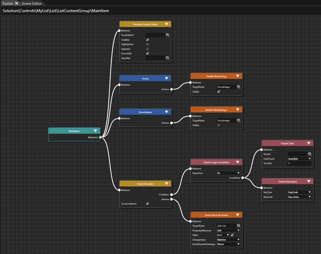
Configure Behaviors for MyList's Sub-List
The visibility of the Sub-List shall be toggled by clicking the MainItem. Let's configure the necessary behaviors to the Sub-List.
- In the Scene Tree panel select item MyList > List > ListContentGroup > Sub-List node. Then click the [Fusion...] button on the right side of the Scene Tree.
- Fusion is opened displaying the Fusion diagram with the Sub-List's Fusion Node.
- The Fusion node has a Behaviors connector on its right side.
DragAdd a Fusion Node the Sub-List Fusion Node using its Behaviors connector according to therighttableand then release the mouse button. In the opened [Select Behavior] dialog find the [Value] behavior and double-click it.below.
- A new Fusion
nodeNode will be added to the Fusion diagram:[Value].
- A new Fusion
The [Value]Value FusionnodeNode.hasa[Receivers]connectorsConnectontoitsFusionrightNode
side.Connector
Add Fusion Nodes
Sub-List
Behaviors
Value
- Configure the
[Value]ValuenodeFusion Node according to the table below.- The Value behavior's type has been changed to Bool.
Behavior Property Value Value Variant Bool - FALSE
- The Value behavior's type has been changed to Bool.
- Add
ana[ActionFusionOnNodeValue]thebehaviorValue Fusion Node using its Receivers connector according to the[Value]tablenode's [Receivers] connector. To do this, drag the [Receivers] connector to the right and release the mouse button. In the [Select Behavior] dialog find the behavior [Action On Value] and double-click it.below.
- A new Fusion
nodeNode[ActionwillOnbeValue]addedappears into the Fusiondiagram.diagram: Action On Value Fusion Node.
Connect to Fusion Node
Connector
Add Fusion Nodes
Value
Receivers
Action On Value
- A new Fusion
- Add
atwo[CheckFusionProcessedNodeValue]thebehaviorAction On Value Fusion Node according to the[ActiontableOnbelow.
Value]node's - 2
[Condition]newconnector.FusionAddNodesawill[SetbeControl State] behavioradded to the[Fusion diagram: Check Processed Value Fusion Node and Set Control State Fusion Node.
Connect to Fusion Node
Connector
Add Fusion Nodes
Action OnValue]Value
node'sCondition
[Actions]CheckconnectorProcessedandValue
configurethem
Actions
Set Control State
[The Action OnValue]Value Fusion Node is configured with an action that will be executedwhenwhenever a new value is received. Inorour case the Sub-List's Control State is set to enabled when the Bool value "TRUE" is received.
Behavior Property Value Check Processed Value ConditionOperator Equal ConditionValue Bool, TRUE Set Control State State Enabled ChangeTo TRUE
Connector
Add Fusion Nodes
Value
Receivers
Action On Value_1
Action On Value
Condition
Check Processed Value_1
Actions
Set Control State_1
Configure the newly added Fusion Nodes according to the table below.
[The Action OnValue]Value_1 Fusion Node is configured with an action that will be executedwhenwhenever a new value is received. Inorour case the Sub-List's Control State is set to disabled (enabled = FALSE) when the Bool value "FALSE" is received.
Behavior Property Value Action On Value_1--
Check Processed Value_1
ConditionOperator Equal ConditionValue Bool, FALSE Set Control State_1
State Enabled ChangeTo FALSE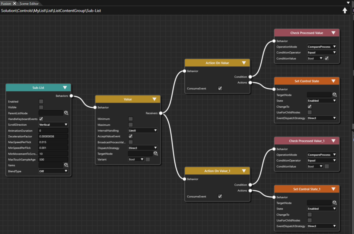
Test MyList in the Player
Let's test if the configured behaviors of MyList control are functional.
- Save your solution either via the menu bar "File - Save Solution" or via the keyboard <Ctrl + S>.
- The solution has been saved.
- In the Scene Composer's Toolbar click on "Play selected scenario...".
- The resources will be generated and the Player will be started.

- The resources will be generated and the Player will be started.
- In the CGI Panel check Scenes#SceneOptions and uncheck SceneHome and SceneClimate
- In the Player window SceneOptions will be displayed with the Connection Dial on the left side and the empty Devices List on the right side, displaying the scrollbar.

- In the Player window SceneOptions will be displayed with the Connection Dial on the left side and the empty Devices List on the right side, displaying the scrollbar.
- In the Player window click the first item of the Devices List, the text of which is "Text".
- In the Player window's Devices List an orange border will be displayed indicating the selected MainItem.
- Additionally, the Sub-List with the TextButtons "Connect" and "Unpair" will be displayed below the selected MainItem.

- In the Player window click the selected MainItem again.
- The TextButtons of the Sub-List will disappear.
- In the Scene Composer's Toolbar click the "Close the Player" button.
- The Player and CGI Panel window will be closed.

- The Player and CGI Panel window will be closed.
Configure a Devices List using MyList
So far we have been working on our MyList control with only one single list entry. Now that this first list entry is fully configured, we can create more of them.
- In the Scene Tree panel select the Main Item and the Sub-List. Copy and paste them to create 4 more instances. This can be done either via the context menu [ Copy ] and [ Paste ] or via the keyboard shortcuts <Ctrl + c> and <Ctrl + v>.
- In the Scene Tree panel you can see that MyList's ListContentGroup now contains 5 MainItems and 5 Sub-Lists.

- In the Scene Tree panel you can see that MyList's ListContentGroup now contains 5 MainItems and 5 Sub-Lists.
- In the Scene Tree panel select the MainItems individually. Use Fusion to configure the appropriate TargetNode for the [Send Value As Event] Fusion nodes (see table below).
- The "Send Value As Event" behaviors' TargetNodes are configured with the respective MainItems.
To easily set the Target Node lock the Properties panel using the pad lock icon in the top right corner. From the Scene Tree panel drag the Sub-List node into the Properties panel directly onto the input field next to "TargetNode". Finally, don't forget to unlock the Properties panel clicking the pad lock icon once again.
SendValueAsEvent of TargetNode MainItem /Controls/MyList/Group2D:List/Group2D:ListContentGroup/CompositeNode2D:Sub-List MainItem_1 /Controls/MyList/Group2D:List/Group2D:ListContentGroup/CompositeNode2D:Sub-List_1 MainItem_2 /Controls/MyList/Group2D:List/Group2D:ListContentGroup/CompositeNode2D:Sub-List_2 MainItem_3 /Controls/MyList/Group2D:List/Group2D:ListContentGroup/CompositeNode2D:Sub-List_3 MainItem_4 /Controls/MyList/Group2D:List/Group2D:ListContentGroup/CompositeNode2D:Sub-List_4
- The "Send Value As Event" behaviors' TargetNodes are configured with the respective MainItems.
- In the Scene Tree panel select MainItem's EntryName. In the Properties panel's [ 2D Render Node ] section change the property "Text" according to the table below.
- In the Scene Editor you can see the changed texts.
TextNode2D Text MainItem > EntryName Phone (Private) MainItem_1 > EntryName Phone (Work) MainItem_2 > EntryName New Device MainItem_3 > EntryName New Device MainItem_4 > EntryName New Device
- In the Scene Editor you can see the changed texts.
Check the Options Scene
- To check the result of configuring the first scene, open the display view. This view represents the final rendered result and can be opened via the menu bar: View - Display - Display-0.
- The display panel will be opened in a floating way displaying the scene configured in the steps above.

- The display panel will be opened in a floating way displaying the scene configured in the steps above.
- In the Scene Composer's Toolbar make sure that the item "Generate and Play" is selected in the drop-down menu and click the [ > ] button to the left.
- This will generate the asset so it is available as input for the Player. After that the CGI Panel will be started.

- This will generate the asset so it is available as input for the Player. After that the CGI Panel will be started.
- In the CGI Panel tick the checkbox next to "
Scenes#SceneClimate"Scenes#SceneOptions" and uncheck "Scenes#SceneHome".SceneClimateSceneOptions will become visible in the Player.
- You can now play around with the configured Options Controls in the scene and watch the results.
- Grab the Connection Dial Control and switch between Cable, Bluetooth and Other.
- Click into the Devices List to open the Sub-List.
- Click on the Sub-List's "Connect" and "Unpair" TextButtons and watch the configuredhover and click effects.
- Click on several devices in the Devices List to make multiple Sub-Lists visible. Now you can test the scrollbar.