Advanced Cluster Part 3
In part 3 of this Best Practice the Custom_Gauge control will be further customized adding controls:
- A TextValue control to display the gauge's current value numerically
- A Text control above of the numeric value to display the gauge's scope (e.g. speed)
- Another Text control below the numeric value, which can be used to display the unit (e.g. km/h)
In order to make our control more versatile, various properties of our configured Custom_Gauge (like all images and text styles) will be made public.
Public Control Properties are those that can be configured when using a Custom_Gauge in a scene.
Create and Configure Two TextNodes and a TextValue Node
- In Scene Composer's Solution Explorer navigate to the path
blowbelow and double-click on the "Custom_Gauge" control.- The Scene Tree panel shows the Custom_Gauge control's tree.
- Scene editor displays the Custom_Gauge control.
Path in Solution Explorer Control Solution/Controls Custom_Gauge
- From the Toolbox panel's Nodes 2D section drag and drop a StackLayout into the Scene Tree panel directly onto the Custom_Gauge node.
- In the Scene Tree panel you can see that a StackLayout has been created directly under the Custom_Gauge node.
- In the Scene Tree panel you can see that a StackLayout has been created directly under the Custom_Gauge node.
- From the Toolbox panel's Controls section under Common drag and drop 2 Text controls and 1 Text Value control into the Scene Tree panel directly onto the StackLayout.
- In the Scene Tree panel you can see the 2 Text controls and the Text Value control directly under the StackLayout.
- In the Scene Tree panel you can see the 2 Text controls and the Text Value control directly under the StackLayout.
- In the Scene Tree panel select the StackLayout as well as the 2 Text controls one after the other and rename them according to the table below either via the context menu entry "Rename" or by pressing <F2> on your keyboard.
- In the Scene Tree panel you can see that the Controls have been renamed.
Target Item New Name StackLayout StackLayout_Texts Text Text_Top Text_1 Text_Bottom
- In the Scene Tree panel you can see that the Controls have been renamed.
- In the Scene Tree panel re-arrange StackLayout_Texts and its contents via drag and drop until it looks like in the image below.
- The Scene Tree looks as in the image below.
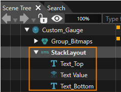
- The Scene Tree looks as in the image below.
- In the Scene Tree panel select StackLayout_Texts controls. In the Properties panel under Layouter and Layout adjust the properties as in the table below.
- In the Properties panel you can see that the correct values are set.
Property Value Layouter Arrangement Vertical Layout Vertical Alignment VCenter MinimumSize X 250.00 Y 0.00
- In the Properties panel you can see that the correct values are set.
- In the Scene tree panel select Text_Top, Text Value and Text_Bottom one after the other. In the Properties panel under Layout and Control configure the properties as in the table below.
- In the Properties panel you can see that the correct values are set.
- In the Scene Editor the texts are centered and the Text Value appears in a bigger font.
Property Text_Top Text Value Text_Bottom Layout VerticalAlignment VCenter VCenter VCenter HorizontalAlignment HCenter HCenter HCenter Control Text RPM - <empty String> TextStyleText StyleOpenSans35
Vera96 OpenSans35 TextAlignmentText AlignmentCenter Center Center TextFormatText Format- %04d -
Configure the TextNodes' and TextValue Node's Position
- In the Scene Tree panel select StackLayout_Texts. In the Scene Tree panel's right side click on the [Fusion...] button.
- Fusion will be opened covering the Scene Editor.
- StackLayout_Texts Fusion diagram will be displayed. It only has one Fusion Node.
- Fusion will be opened covering the Scene Editor.
- In Fusion use the StackLayout_Texts' "Behaviors" connector to add 2 new Fusion Nodes: Connect 2 Value Processing > Value behaviors to the StackLayout_Texts Fusion Node.
Please check Fusion's Basic Operations documentation on how to add Fusion Nodes.
- In Fusion 2 new Fusion Nodes "Value" and "Value_1" have been created.
- In Fusion 2 new Fusion Nodes "Value" and "Value_1" have been created.
- In Fusion select and right-click on the behavior nodes and rename them according to the table below.
- In Fusion the Value behavior fusion nodes have been renamed.
Target Item New Name Value Value_TextPos_X Value_1 Value_TextPos_Y
- In Fusion the Value behavior fusion nodes have been renamed.
- In Fusion use the Value behaviors' "Receivers" connectors to add a Value Processing > Transformation > SetPosition Fusion Node to each of them.
- In Fusion 2 new Fusion Nodes "Set Position" have been created, one of which is connected to Value_TextPos_X, the other to Value_TextPos_Y.
- In Fusion 2 new Fusion Nodes "Set Position" have been created, one of which is connected to Value_TextPos_X, the other to Value_TextPos_Y.
- In Fusion select and right-click on the behavior nodes and rename them according to the table below.
- In Fusion the
SetPositionSet Position behavior fusion nodes have been renamed.
Target Item New Name Value_TextPos_X > Set Position Set Position_X Value_TextPos_Y > Set Position Set Position_Y
- In Fusion the
- In Fusion configure the
behaviorsbehaviors' Fusion Nodes according to the table below.- In Fusion the Fusion Nodes' Properties have been changed.
- In Scene Editor the position of StackLayout_Texts has been changed. The texts are now neatly placed inside the Custom_Gauge control as you can see in the image below.
Fusion Node Property Set Position_X Set Position_Y TargetNode Custom_Gauge > StackLayout_Texts
Custom_Gauge > StackLayout_Texts TranslationAxis2D AxisX AxisY Property Value_TextPosX Value_TextPosY Variant (Float) 205 (Float) 230
In Scene Editor the position of StackLayout_Texts has been changed. The texts are now neatly placed inside the Custom_Gauge control as you can see in the image below.Fusion NodeProperty: VariantValue_TextPos_X(Float) 205Value_TextPos_Y(Float) 230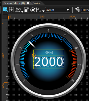
Configure Value Forwarding and Maximum Value
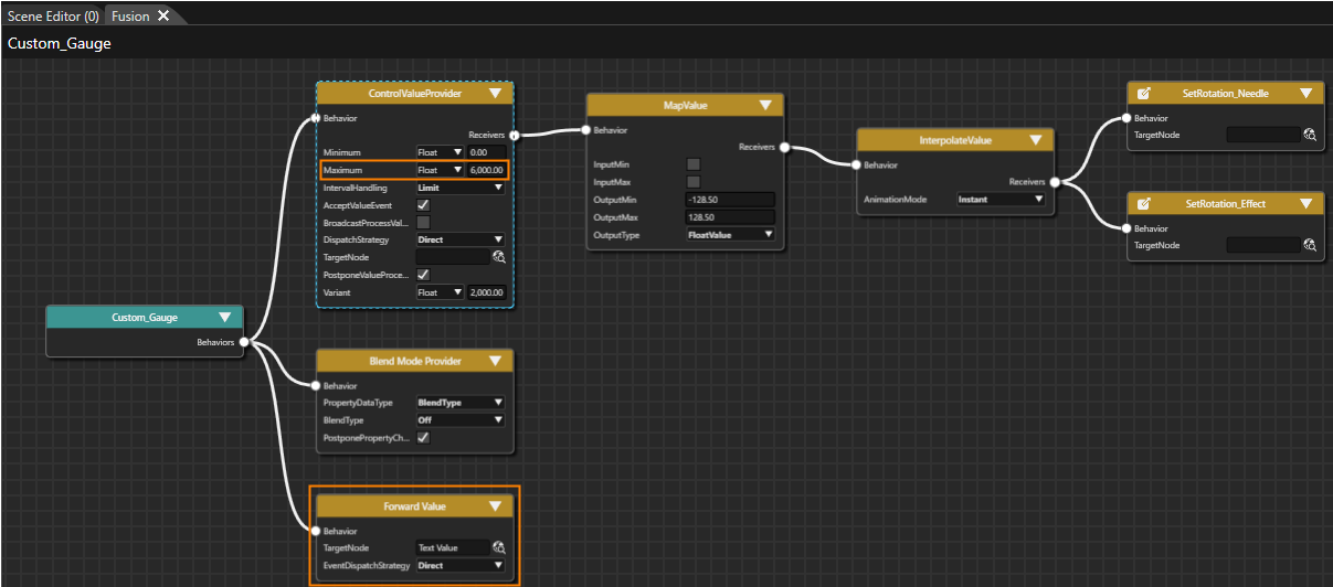
- In Fusion add a Value Processing > Forward Value behavior to the Behaviors connector of the
StackLayout_TextsCustom_Gauge Fusion Node. Configure its TargetNode according to the table below.- In Fusion the property will be changed accordingly.
StackLayout_Texts Fusion diagram will look as in the image below.
Forward Value Fusion Node Property Value TargetNode Custom_Gauge > StackLayout_Texts > Text Value 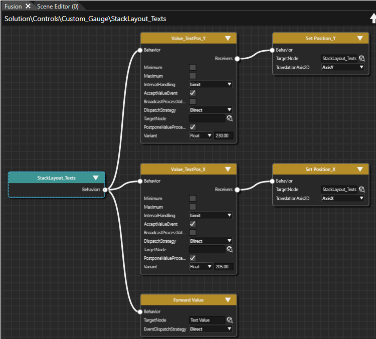
In Fusion in the ControlValueProvider Fusion Node configure the property Maximum according to the table below.
- In Fusion the the property is changed accordingly.
| ControlValueProvider | |
| Property | Value |
| Maximum | (Float) 6000.00 |
Configure Public Control Properties
- In the Scene Tree panel right click "Custom_Gauge" and select "Control Properties..." from the context menu.
- The Configure Public Control Properties dialog will be opened.
- The Configure Public Control Properties dialog will be opened.
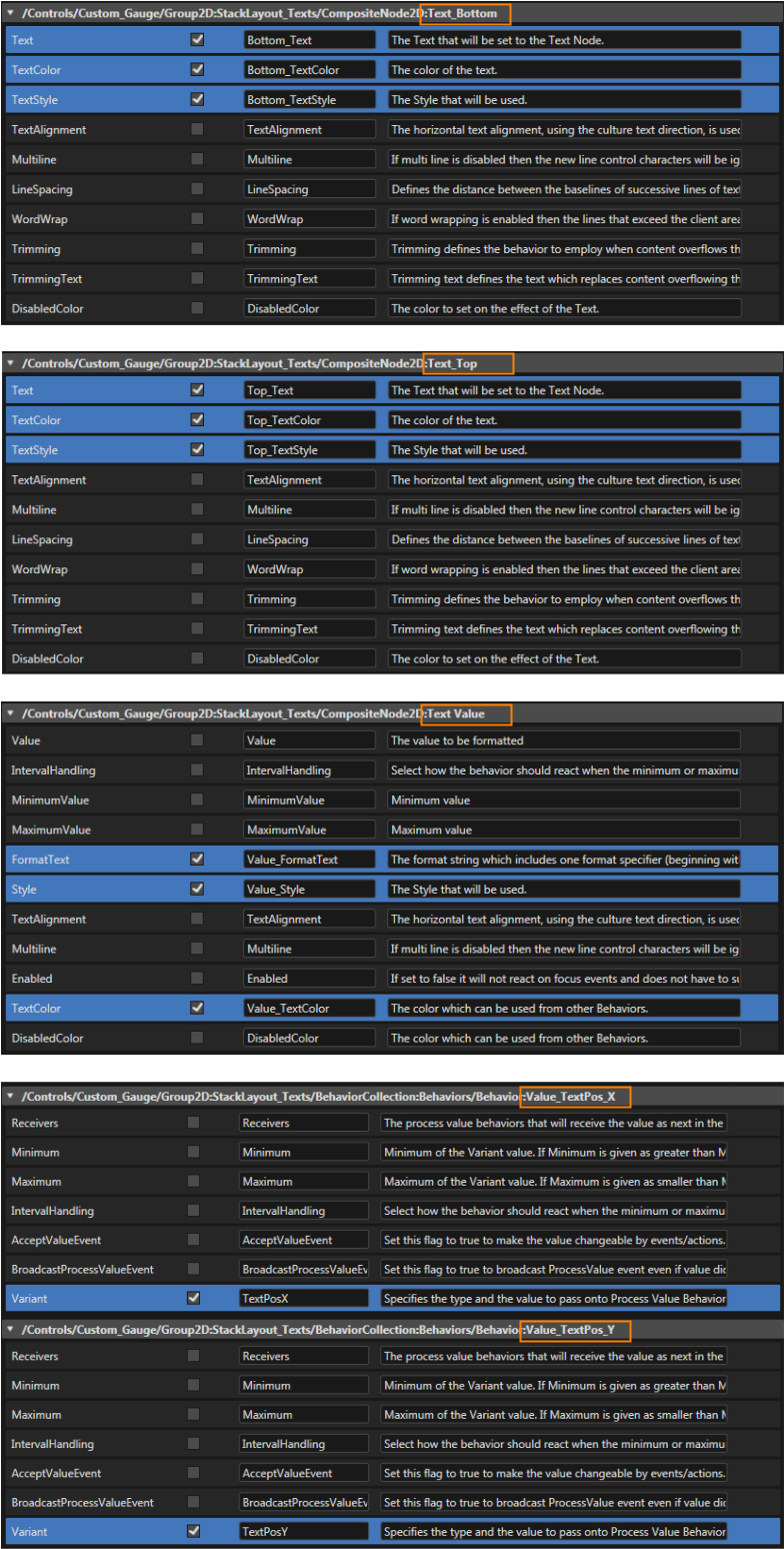
- In the Configure Public Properties dialog the Properties which should be public to the user of the Custom_Gauge control need to be marked with the "Is Public" checkbox. Check the "Is Public" checkbox and eventually change the image properties' names according to the table and images below.
- Image properties necessary for using and configuring the Custom_Gauge will be made public.
- The Custom_Gauge control is now fully configured and ready to use.
Custom_Gauge > Group_Bitmaps > Property Is Public Source Name BackgroundImage > ProvideImageProperty x Image BackgroundImage NeedleImage > ProvideImageProperty x Image NeedleImage NeedleEffectImage > ProvideImageProperty x Image NeedleEffectImage ForegroundImage > ProvideImageProperty x Image ForegroundImage 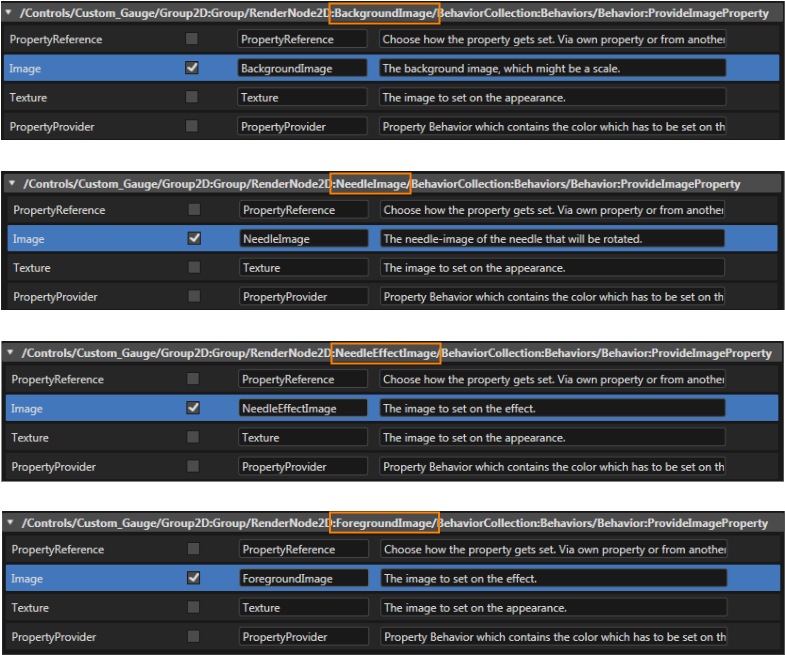
- In the Configure Public Properties dialog check the "Is Public" checkbox and perform other configurations according to the table and images below.
- Image properties necessary for using and configuring the Custom_Gauge will be made public.
- The Custom_Gauge control is now fully configured and ready to use.
The properties made public in this Configure Public Properties dialog will be configurable in the Properties panel's Controls section.
| Custom_Gauge > StackLayout_Texts > | |||
| Property | IsPublic | Source | Name |
| TextBottom | x | Text | Bottom_Text |
| x | TextColor | Bottom_TextColor | |
| x | TextStyle | Bottom_TextStyle | |
| Text_Top | x | Text | Top_Text |
| x | TextColor | Top_TextColor | |
| x | TextStyle | Top_TextStyle | |
| Text Value | x | FormatText | Value_FormatText |
| x | Style | Value_Style | |
| x | TextColor | Value_TextColor | |
| Behaviors > Value_TextPos_X | x | Variant | TextPosX |
| Behaviors > Value_TextPos_Y | x | Variant | TextPosY |