Advanced Cluster Part 3

In Inpart 3 of this Best Practice the “Custom_Gauge”,Custom_Gauge addcontrol newwill “StackLayout”be further customized adding controls: 

    A TextValue control to display the gauge's current value numerically A Text control above of the numeric value to display the gauge's scope (e.g. RPM) Another Text control below the numeric value, which can be used to display the unit (e.g. km/h)

    In order to make our control more versatile, various properties of our configured Custom_Gauge (like all images and nametext itstyles) “StackLayout_Texts”will be made public.

    Public AddControl 2Properties “Text”are controlsthose andthat 1can “Textbe Value”configured controlwhen using a Custom_Gauge in a scene. 


      In Scene Composer's Solution Explorer navigate to the “StackLayout_Texts”,path rename the text controls to “Text_Top”blow and “Text_Bottom”
      drawing-5-1731058207.png

      • Ensure that the order of the items inside of this layout is the same as shown in the picture above.

      • Set these parameters: Arrangement = Vertical, MinimumSize = 250, VerticalAlignment = VCenter

      drawing-5-1731058445.png

      • Set these “Text_Top” values: VerticalAlignment = VCenter, HorizontalAlignment = HCenter, Text Alignment = Center, Text Style = OpenSans35, Text = “RPM”

      • Same for the “Text_Bottom” values, but set Text = “” (to be empty)

      • Almost the same for the “Text_Value”, with these differences: Format Text = “%04d”, Text Style = Vera96

      drawing-5-1731059453.png
      drawing-5-1731059504.png

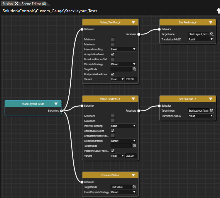
      • Select the “StackLayout_Texts” and add 2 Value behaviors (Toolbox->Behaviors->Value Processing->Value). Name them as “Value_TextPos_X” and “Value_TextPos_Y”

      drawing-5-1731059107.png
      drawing-5-1731060100.png
      • To each of these behaviors, insert 1 “Set Position” behavior (Behaviors->Value Processing->Transformation->Set Position) as Receiver. Name them “Set Position_X” and “Set Position_Y”
      drawing-5-1731060192.png

      • For both of them, set the target node Custom_Gauge->StackLayout_Texts. Select the proper axis (X for Set Position_X, Y for Set Position_Y)

      • For the “Value_TextPos_X” behavior set the Receiver property Variant= (Float) 205 and for the “Value_TextPos_Y” behavior, configure Variant = (Float) 230. 

      • Click at the “Custom_Gauge” control and put “Forward Value” behavior into it

      • Set its target node to “Custom_Gauge->StackLayout_Texts->TextValue”

      drawing-5-1731060415.png

      • Go to the “Custom_Gauge”, double-click on the “ControlValueProvider”"Custom_Gauge" behaviorcontrol.

        The Scene Tree panel shows the Custom_Gauge control's tree. Scene editor displays the Custom_Gauge control.
        Path in Solution Explorer Control Solution/Controls Custom_Gauge From the Toolbox panel's Nodes 2D section drag and setdrop a StackLayout into the ReceiversScene MaximumTree valuepanel todirectly 8000.onto Thenthe tryCustom_Gauge tonode. change
        itsIn Variantthe valueScene soTree panel you can see that a StackLayout has been created directly under the Custom_Gauge node.

        From the Toolbox panel's Controls section under Common drag and drop 2 Text controls and 1 Text Value control into the Scene Tree panel directly onto the StackLayout.
          In the Scene Tree panel you can see the text2 Text controls and needlethe updated.Text Value Right-clickcontrol atdirectly under the “Custom_Gauge”StackLayout.
          In the Scene Tree panel select the StackLayout as well as the 2 Text controls one after the other and rename them according to the table below either via the context menu entry "Rename" or by pressing <F2> on your keyboard.
            In the Scene Tree panel you can see that the Controls have been renamed.
            Target Item New Name StackLayout StackLayout_Texts Text Text_Top Text_1 Text_Bottom
            In the Scene Tree panel re-arrange StackLayout_Texts and its contents via drag and drop until it looks like in the image below.
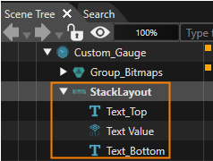
              The Scene Tree looks as in the image below.
              drawing-5-1757057054.png

              In the Scene Tree panel select StackLayout_Texts controls. In the Properties panel under Layouter and Layout adjust the properties as in the table below.
                In the Properties panel you can see that the correct values are set.
                Property Value Layouter Arrangement Vertical Layout Vertical Alignment VCenter MinimumSize X 250.00   Y 0.00
                In the Scene tree panel select Text_Top, Text Value and Text_Bottom one after the other. In the Properties panel under Layout and Control configure the properties as in the table below.
                  In the Properties panel you can see that the correct values are set. In the Scene Editor the texts are centered and the Text Value appears in a bigger font.
                  Property Text_Top Text Value Text_Bottom Layout VerticalAlignment VCenter VCenter VCenter HorizontalAlignment HCenter HCenter HCenter Control Text RPM - <empty String> TextStyle

                  OpenSans35

                  Vera96 OpenSans35 TextAlignment Center Center Center TextFormat - %04d - In the Scene Tree panel select StackLayout_Texts. In the Scene Tree panel's right side click on the [Fusion...] button.
                    Fusion will be opened covering the Scene Editor.
                    StackLayout_Texts Fusion diagram will be displayed. It only has one Fusion Node.

                    In Fusion use the StackLayout_Texts' "Behaviors" connector to add 2 new Fusion Nodes: Connect 2 Value Processing > Value behaviors to the StackLayout_Texts Fusion Node.

                    Please check Fusion's Basic Operations documentation on how to add Fusion Nodes. 

                      In Fusion 2 new Fusion Nodes "Value" and "Value_1" have been created.

                      In Fusion select and right-click on the behavior nodes and rename them according to the table below.
                        In Fusion the Value behavior fusion nodes have been renamed.
                        Target Item New Name Value Value_TextPos_X Value_1 Value_TextPos_Y
                        In Fusion use the Value behaviors' "Receivers" connectors to add a Value Processing > Transformation > SetPosition Fusion Node to each of them.
                          In Fusion 2 new Fusion Nodes "Set Position" have been created, one of which is connected to Value_TextPos_X, the other to Value_TextPos_Y.

                          In Fusion select and right-click on the behavior nodes and rename them according to the table below.
                            In Fusion the SetPosition behavior fusion nodes have been renamed.
                            Target Item New Name Value_TextPos_X > Set Position Set Position_X Value_TextPos_Y > Set Position Set Position_Y In Fusion configure the behaviors Fusion Nodes according to the table below.
                              In Fusion the Fusion Nodes' Properties have been changed.

                              Fusion Node Property Set Position_X Set Position_Y TargetNode

                              Custom_Gauge > StackLayout_Texts

                              Custom_Gauge > StackLayout_Texts TranslationAxis2D AxisX AxisY Property Value_TextPosX Value_TextPosY Variant (Float) 205 (Float) 230
                              In Fusion configure the Variant Property of Value_TextPosX and Value_TextPos_Y Nodes according to the table below.
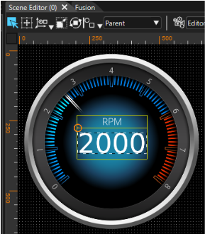
                                In Scene Editor the position of StackLayout_Texts has been changed. The texts are now neatly placed inside the Custom_Gauge control as you can see in the image below.
                                Fusion Node Property: Variant Value_TextPos_X (Float) 205 Value_TextPos_Y (Float) 230
                                drawing-5-1757071312.png


                                In Fusion add a Value Processing > Forward Value behavior to the Behaviors connector of the StackLayout_Texts Fusion Node. Configure its TargetNode according to the table below.
                                  In Fusion the property will be changed accordingly. StackLayout_Texts Fusion diagram will look as in the image below.
                                  Forward Value Fusion Node   Property Value TargetNode Custom_Gauge > StackLayout_Texts > Text Value
                                  drawing-5-1757068723.png

                                  In the Scene Tree panel select the Custom_Gauge node and view its Fusion diagram in Fusion. (If necessary, click on the [Fusion...] button on the Scene Tree panel's right side.)
                                    The Custom_Gauge's Fusion diagram is opened in Fusion. It already consists of several Fusion Nodes.

                                    In Fusion in the ControlValueProvider Fusion Node configure the property Maximum according to the table below.
                                      In Fusion the the property is changed.
                                      ControlValueProvider
                                      Property Value Maximum (Float) 6000.00

                                      Configure Public Control Properties

                                        In the Scene Tree panel right click "Custom_Gauge" and select "Control Properties…”Properties..." Wefrom the context menu.
                                          The Configure Public Control Properties dialog will choosebe opened.

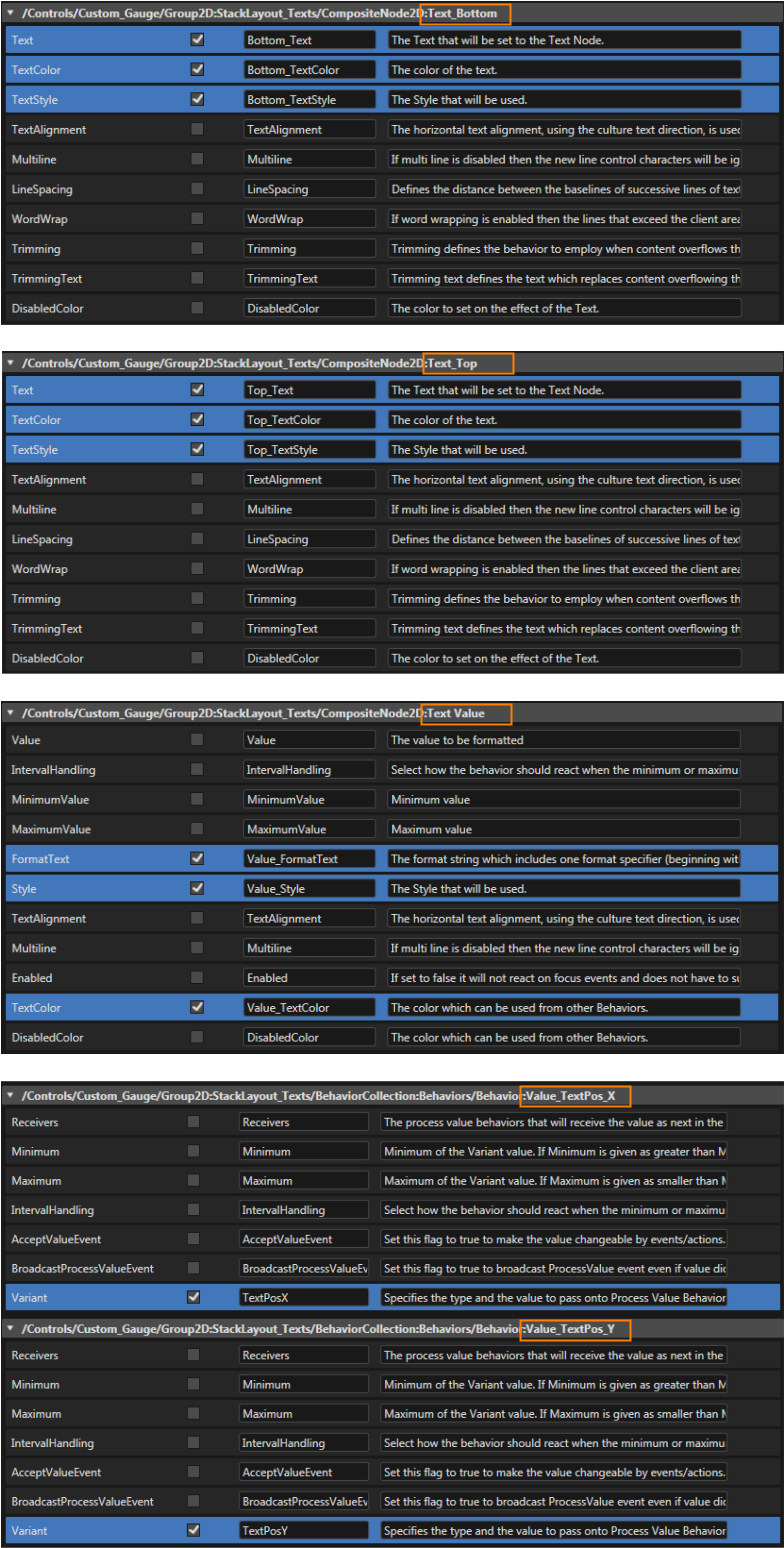
                                          In the Configure Public Properties dialog the Properties which properties should be availablepublic fromto the sceneuser asof the Custom_Gauge control propertiesneed

                                          to Followbe marked with the settings"Is fromPublic" checkbox. Check the pictures"Is below:Public"

                                          ForegroundImage:
                                          drawing-7-1676525492.png

                                          BackgroundImage:

                                          drawing-7-1676525560.png

                                          NeedleImage:

                                          drawing-7-1676525593.png

                                          NeedleEffectImage:

                                          drawing-7-1676525629.png

                                          Text_Bottom:

                                          drawing-7-1676525656.png

                                          Text_Top:

                                          drawing-7-1676525680.png

                                          Text_Value:

                                          drawing-7-1676525703.png

                                          Value_TextPosXcheckbox and Value_TextPosY:

                                          eventually
                                          change
                                          drawing-7-1676525724.png
                                          the
                                          image
                                          properties'
                                          names
                                          according

                                          to the table and images below.

                                            Image properties necessary for using and configuring the Custom_Gauge will be made public. The custom gaugeCustom_Gauge control shouldis now befully finishedconfigured and ready to useuse.
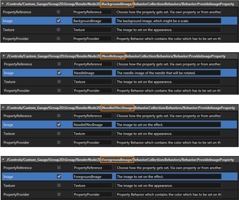
                                            Custom_Gauge > Group_Bitmaps >  Property  Is Public Source Name BackgroundImage > ProvideImageProperty x Image BackgroundImage NeedleImage > ProvideImageProperty x Image NeedleImage NeedleEffectImage > ProvideImageProperty x Image NeedleEffectImage ForegroundImage > ProvideImageProperty x Image ForegroundImage
                                            drawing-5-1757075534.png

                                            In the Configure Public Properties dialog check the "Is Public" checkbox and perform other configurations according to the table and images below.
                                              Image properties necessary for using and configuring the Custom_Gauge will be made public. The Custom_Gauge control is now fully configured and ready to use.

                                              The properties made public in this Configure Public Properties dialog will be configurable in the Properties panel's Controls section.


                                              Custom_Gauge > StackLayout_Texts > Property IsPublic Source Name TextBottom x Text Bottom_Text
                                              x TextColor Bottom_TextColor
                                              x TextStyle Bottom_TextStyle Text_Top x Text Top_Text
                                              x TextColor Top_TextColor
                                              x TextStyle Top_TextStyle Text Value x FormatText Value_FormatText
                                              x Style Value_Style
                                              x TextColor Value_TextColor Behaviors > Value_TextPos_X x Variant TextPosX Behaviors > Value_TextPos_Y x Variant TextPosY
                                              drawing-5-1757075516.png