
GettingStartedControls Part 4
In the first 3 parts of this sample we have created 3 individual scenes. In the Player it was necessary to enable and disable the displayed scenes manually. In this part we will add menu tabs to the bottom of the screen so the user can switch between scenes as he likes.
As basis for step 4 of our GettingStartedControls tutorial, please use your own created solution from the previous "GettingStartedControls" tutorial.
Our menu tabs scene can be seen on the bottom of the climate scene in below image.

Our goal is to create a tab bar to enable the user to switch between different scenes. As this bar shouldn't be displayed permanently, it will be put into a drawer control. This way it can be made visible by hovering an image and it can be hidden again by clicking on a close button. The buttons will be realized using customized radio buttons.
This tab bar will be placed on the bottom of every screen. To avoid having to create this bar inside every scene where it should be displayed, we will define a separate scene, which we can reuse on all screens.
Importing Images
We will use the built-in Scene Composer controls but they will be customized with new images. Therefore these images have to be imported into the Scene Composer solution.
- In the main menu select Import > Import Resources...
- The Windows "Import Resources" dialog will be opened.
- In the "Import Resources" dialog navigate to the path given in the table below. Select all 5 files and press [ Open ]
- The Windows "Import Resources" dialog will be closed.
- Scene Composer's "Import Images" dialog will be opened.
Import Resources Path /cgi_studio_content/Resources/GettingStartedControls/MenuTabs
- In the "Import Images" dialog select folder "/Resources", make sure to create a new folder "MenuTabs" for the imported images and click [ OK ].
- In the Solution Explorer you can see that there is a new folder "MenuTabs" in folder "Resources" that contains the 5 imported images.
- The images have been imported and can be used in the Scene Composer solution.

Creating the TabButton
We will use Scene Composer's built-in RadioButtons as controls for our tab bar. Since the usual RadioButtons' appearance doesn't fit into a tab bar optically, we are going to customize the RadioButton to create a TabButton. We will use the radio button control as our base template.
Remove the RadioButton's Knob
- In the Solution Explorer navigate to "References > SCL: ConstructionKit > ConstructionKit > Controls > RadioButton" and copy the RadioButton control either via the context menu "Copy" or the keyboard shortcut <Ctrl + C>.
- The RadioButton control is in the clipboard and ready to be pasted.
- In the Solution Explorer navigate to "Solution > Controls" and paste the RadioButton control either via the context menu "Paste" or the keyboard shortcut <Ctrl + V> into the Controls folder.
- In Solution Explorer you can see that the RadioButton has been pasted into the Solution/Controls folder.
- In the Solution Explorer rename the RadioButton control in the Solutions/Controls folder to "TabButton" either via the context menu "Rename" or the keyboard shortcut <F2>.
- In the Solution Explorer you can see that the RadioButton in the Solutions/Controls folder is renamed to "TabButton".
- In the Toolbox panel's [ Controls ] section you can see a new folder "Touchable" with the newly created TabButton.

- In the Solution Explorer or in the Toolbox double-click the newly created TabButton.
- In the Scene Editor you can see the TabButton, which currently looks like Scene Composer's RadioButton.
- In the Scene Tree panel you can see the complete design of the TabButton, which is a copy of the RadioButton. On the Scene Tree panel's left side you can see the node structure, on the right side you can see the applied behaviors that form the control's logic.
The important thing to know is that all changes you perform here will be applied to ALL instances of this control class immediately.
This is also valid when changing properties as long as your control class is opened. You can close it by clicking the left arrow at the top of the Scene Tree (marked in orange in the previous image) or by using the context menu of the Control in the SceneTree and choosing "Go To Previous Element".
If you are outside of the control's "Edit mode", all changes in the properties or behavior panel will influence a single instance of the control.
- In the Scene Tree panel navigate to and select the RadioButtonNode (TabButton > StackLayout > OverlayLayout > RadioButtonNode). In the Scene Tree panel's right side select the behavior action as in the table below. In the Properties panel click on the magnifying glass icon next to the Image property.
- The Choose Item dialog will be opened
- In the "Choose Item" dialog select the image as in the table below and click [ OK ].
- The "Choose Item" dialog will be closed.
- The respective image has been changed.
- In the Scene Editor the TabButton (former RadioButton) has changed as you can see in the image below.
RadioButtonNode - Behavior Image SetNormalImage /Resources/MenuTabs/ButtonNorma_BkBmp SetSelectedImage /Resources/MenuTabs/ButtonNorma_Prss_OreBmp SetSelectedPressedImage /Resources/MenuTabs/ButtonNorma_Prss_OreBmp SetNormalPressedImage
/Resources/MenuTabs/ButtonNorma_Prss_OreBmp 
Configure the Text's Position
- In the Scene Tree panel select the TextNode (TabButton > StackLayout > TextNode). In the Properties panel's [ Layout ] section change the HorizontalAlignment and the Margin according to the table below.
- In the Scene Editor panel minor changes in text positioning are visible.
Target Node HorizontalAlignment Margin Left Right RadioButtonNode HCenter 6 6
- In the Scene Editor panel minor changes in text positioning are visible.
- In the Scene Tree panel select the TextNode (TabButton > StackLayout > TextNode). In the Scene Tree panel's right side select the ProviceTextProperty. In the Property panel change the Text property to "TabButton".
- In the Scene Editor the TabButton's text is changed to "TabButton".
- In the Scene Tree panel select the TextNode and drag it onto the root node TabButton, which is called "TabButton".
- In the Scene Tree panel you can see that the TextNode is now directly under the TabButton.
- In the Scene Editor the TextNode with the text "TabButton" is visible. It is hidden behind the Image of the RadioButtonNode.
- In the Scene Tree panel select the RadioButtonNode and drag it onto the root node TabButton as well.
- In the Scene Tree panel you can see that the RadioButtonNode is now between the TabButton and the TextNode.
- In the Scene Editor the TextNode with the text "TabButton" is visible again as in the picture below.
- In the Scene Tree panel select the StackLayout (with the OverlayLayout) and delete it either via the context menu "Delete" or by pressing the delete key on your keyboard.
- The Delete Item dialog will be opened displaying which items are going to be deleted.
- In the Delete Item dialog press the [ OK ] button.
- In the Scene Tree panel you can see that StackLayout and OverlayLayout have been deleted.
- The Scene Tree looks as in the image below.

- In the Scene Tree panel select the RadioButtonNode. In the Properties panel's [ Layout ] section change Alignment and Margin properties as well as the StretchBehavior according to the table below.
- In the Scene Editor the TextNode's text "TabButton" is neatly positioned in the center of the button (see image below).
- We have successfully created and customized our own TabButton control, which can be used like any other control.
Target Node Vertical Horizontal Margin StretchBehavior Alignment Left Right RadioButtonNode HCenter HCenter 0 0 Fill 
Creating MenuTabs Scene
Setting up the Scene
In the following steps a scene is created and the camera and viewport are configured.
- Create a new scene via the menu "Scene" - "New 2D Scene" or press < Ctrl+2 > on your keyboard
- The "Add New Scene 2D" dialog will be opened.
- The "Add New Scene 2D" dialog will be opened.
- In the first row select "/Scenes" from the drop-down menu. Enter "SceneMenuTabs" as name and press [OK]. We use the prefix "Scene" to have all scenes listed next to each other in the Solution Explorer panel.
- A new scene "SceneMenuTabs" is created and visible in the Solution Explorer panel in folder "Scenes".
- The new scene is opened in the Scene Editor and in the Scene Tree panel.
- In the Scene Tree panel you can see that the scene has a camera.
- In the Render Targets panel you can see that the camera is already added to the RenderTarget.

- In the Render Targets panel check the checkbox of "SceneMenuTabs\Camera" in order to enable rendering.
- Rendering of the scene is enabled.
- In the Scene Tree panel select the Camera. In the Properties panel's [Camera] section configure the Viewport height to 54.
The value of this property is calculated automatically. In order to be able to edit it, you have to click on the [A] button to the property's right, which will switch auto off.
- In the Scene Editor you can see that the height of the viewport is reduced to 54, which is about the height of the TabButton control.
- In the Scene Tree panel select the Camera. In the Properties panel's [Camera] section change the sequence number to 3.
- The camera's sequence number is set to 3.
- In the Scene Tree panel the red Information/Warning/Error square disappears.

Adding and Arranging Buttons
A GridLayout is configured to arrange 3 different kinds of buttons forming our menu of our configured car HMI.
- From the Toolbox panel's [Controls] section under "Container" drag a GroupBox into the Scene Tree panel directly onto SceneMenuTabs.
- In the Scene Tree panel you can see that there is a GroupBox node.
- In the Scene Editor you can see a square with a white dashed outline.
- In the Scene Tree panel select the GroupBox node. In the Properties panel's [Layout] section configure the Size according to the table below.
The value of this property is calculated automatically. In order to be able to edit it, you have to click on the [A] button to the property's right, which will switch auto off.
- In the Scene Editor the white dashed outline will match the yellow line that marks the viewport.
Target Node Size X Y GroupBox 1024 54
- In the Scene Editor the white dashed outline will match the yellow line that marks the viewport.
- In the Scene Tree panel click on the little triangle to the left of the GroupBox.
- In the Scene Tree panel the GroupBox node will open and you can see the Content anchor below.
- From the Toolbox panel's [Node 2D] section drag a GridLayout into the Scene Tree panel directly onto the GroupBox's Content anchor.
- In the Scene Tree panel you can see the GridLayout node.
- In the Scene Tree panel select the GridLayout. In the Properties panel's [Layouter] section change the Column Count to 6.
- The Column Count has been changed to 6.
- From the Toolbox panel's [Controls] section drag Controls into the Scene Tree panel directly onto the GridLayout according to the table below.
- In the Scene Tree panel you can see that a Button, 4 TabButtons and a TextButton have been added to the GridLayout.
- In the Scene Editor the blue Button and 4 TabButtons (with the dark background) are rendered directly over each other, so that not all of them are visible.
Controls Section Controls Touchable <ConstructionKit> 1 Button Touchable 4 TabButtons Touchable <ConstructionKit> 1 TextButton 
- In the Scene Tree panel select the GridLayout. In the Properties panel's [Layout] section configure GridAutoArrangement for "horizontal".
- In the Scene Tree panel you can see that the Button, TabButtons and TextButton are neatly arranged.

- In the Scene Tree panel you can see that the Button, TabButtons and TextButton are neatly arranged.
- In the Scene Tree panel right-click on the GridLayout and choose [Configure Layouter...] from the context menu.
- The Grid Layout Editor will be opened.
- In the Grid Layout Editor you can see that the Controls are bunched together inside of the first cell.
The Controls don't have to be configured for a certain column. The Controls will be arranged at runtime using the GridAutoArrangement property that we configured in the previous step.
- In the Grid Layout Editor configure the columns' widths according to the table below and press [OK].
- In the Scene Editor you can see that the columns widths have changed.
Column 1 Column 2 Column 3 Column 4 Column 5 Column 6 0.10 0.20 0.20 0.20 0.20 0.10 
- In the Scene Editor you can see that the columns widths have changed.
Configuring the Menu Bar's Buttons
- In the Scene Tree panel expand the Button by clicking on the little triangle on its left.
- In Scene Tree panel a Content anchor will get visible.
- From the Toolbox panel's [Controls] section under "Common <ConstructionKit>" drag a Text control and drop it directly onto the Button's Content anchor.
- In the Scene Tree panel the Text control appears beneath the Content anchor.
- In the Scene Editor the Button is displayed with the text "Text" on it.
- In the Scene Tree panel select the Text control. In the Properties panel change the properties according to the table below.
- In the Scene Editor the Button is displayed with the centered sign ">".
Properties Section Property Value Control Text > Layout Vertical Alignment VCenter Horizontal Alignment HCenter
- In the Scene Editor the Button is displayed with the centered sign ">".
- In the Scene Tree panel select the Button. In the Properties panel's [Control] section change the Button's Image properties according to the table below. To change the images click on the magnifying glass icon to open the Choose Item dialog, select the appropriate image and click [OK.]
- In the Scene Editor the Button's background will be displayed in almost black color.
Properties Section Property Value General Name Next Control Normal Image /Resources/MenuTabs/ButtonNorma_BkBmp Pressed Image /Resources/MenuTabs/ButtonNorma_Prss_OreBmp Focused Image /Resources/MenuTabs/ButtonNorma_Prss_OreBmp
- In the Scene Editor the Button's background will be displayed in almost black color.
- In the Scene Tree panel select the TabButtons one by one (from top to bottom) and apply the properties in the Properties panel according to the table below.
- In the Scene Tree panel all TabButtons are renamed.
- In the Scene Editor you can see the TabButtons' texts (from left to right): HOME, CLIMATE, PHONE, OPTIONS.
General > Name Control > Text TabHome HOME TabClimate CLIMATE TabPhone PHONE TabOptions OPTIONS
- In the Scene Tree panel select the TextButton. In the Properties panel apply the properties as given in the table below.
- In the Scene Editor the TextButton's Text and Background have changed according to the configuration
- In the Scene Tree panel the TextButton is renamed.
Properties Section Property Control > Text General Name CloseButton Control Text X Normal Image /Resources/MenuTabs/ButtonNorma_BkBmp Pressed Image /Resources/MenuTabs/ButtonNorma_Prss_OreBmp Focused Image /Resources/MenuTabs/ButtonNorma_Prss_OreBmp
- In the Scene Tree panel select the GroupBox. In the Properties panel's [Control] section click on the magnifying glass icon next to property "Default Selected Object".
- The "Choose Item" dialog will be opened.
- In the Choose Item dialog navigate to and select the "TabHome" TabButton which can be found via the path below, and click [OK].
- In the Scene Editor the "TabHome" TabButton will be displayed selected as in the image below.
Default Selected Object Path /Scenes/SceneMenuTabs/GroupBox/Content/GridLayout/TabHome 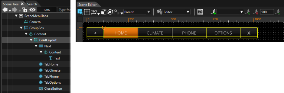
- In the Scene Editor the "TabHome" TabButton will be displayed selected as in the image below.
Integration of the SceneMenuTabs as Navigation bar
To integrate the SceneMenuTabs we have to shrink our Home and Climate scenes. The navigation bar needs 54 pixel of space at the bottom. Therefore we have to change the viewport settings of the cameras of the following scenes:
- SceneHome,
- SceneClimate and
- SceneOptions.

If the camera of SceneMenuTabs isn't already attached to a Render Target, please open the SceneMenuTabs, drag the camera from the Scene Tree Panel onto the RenderTarget in the Render Targets Panel. If necessary, change the property "Sequence Number" inside the cameras. The number is also displayed in parenthesis in the RenderTarget list (see below).

If you open the View menu Display - Display-0 you will see:

-
Swapping has to be enabled for the cameras of SceneHome, SceneClimate and SceneOptions. It has to be disabled for SceneMenuTabs.
What is still missing is the scene switch when hitting one of our TabButtons. Again we have to use an EventHandler for that purpose.
Instead of a direct click action, we will now use a state of our TabButtons buttons. Since they are created out of a RadioButton, they already handle an internal "selected" state. This is what we can use to execute actions when the state changes.
Select the TabHome TabButton, open the context menu of the TabHome TabButton and choose "Add EventHandler".

An EventHandler tab should be available now in the properties panel. Choose the Event "StateChanged". The condition "Check Control State" is already configured as expected. Add a new action via the plus icon. Within the action's Action choose "Perform Transition Requests".

Drag a TransitionRequest from the Toolbox - Behaviors on the Requests node of right panel (Behavior panel).

Add another EventHandler to the TabHome TabButton. This can be done either with the context menu (as we did before) or you can press the plus sign to the right of the EventHandler Tab. This time we have to set the StateCondition to ChangedToFalse. Again, add a "Transiton Request" from the ToolBox Behaviors to the Requests section in the right side of the Scene Tree Panel.

Now select the Transition Request in the right panel of the scene tree of TabHome.

In the Properties panel the RequestType is already set to "Activate" . Click the magnifying glass to set the Identifier property to "SceneHome".

Perform the same actions with the second TransitionRequest but select "Deactivate" as RequestType. Do not forget to set SceneHome as Identifier.

Repeat the same for TabClimate, TabPhone and TabOptions. Note that the TransitionRequests Identifier has to be set to SceneClimate, ScenePhone or SceneOptions respectively.
-
For this tutorial, ScenePhone has been skipped, since most controls have already been covered by other scenes.
Now it's time for you to check the functionality in the player.
As we want to make the navigation bar (our TabButtons) appear on hovering an indicator and disappear when clicking a button, the GroupBox has to be moved into a Drawer Control.
So, the next step is to drag and drop a Drawer Control into the Scene Tree and move the GroupBox onto the Drawer Control's ContentAnchor.

The Drawer Control should only appear if needed, so we uncheck the property "Open".
It shall appear from the bottom so we configure the Appearance Direction accordingly.
-
By unchecking the "Open" property, we close the Drawer Control, so it will hide its content. The content is still available, just hidden in a drawer (like in a desk drawer, where you can put away stuff).
You can check and uncheck this property during editing as you like, but please make sure to uncheck it in the end.

The Drawer Control shall display its content only when we hover an image. Therefore, we need an image, which we will import using the menu.

The image file we need can be found here:
cgi_studio_content/Resources/GettingStartedControls/MenuTabs/arrowsTab.png
We drag and drop this image from the Solution Explorer into our Scene, which creates a RenderNode2D called "arrowsTabBmp". Let's rename this node as "Bitmap_ArrowsBmp". The Position and Scale of this RenderNode2D has to be adjusted as follows.

In order to open the Drawer Control when hovering or clicking on this RenderNode2D, we enhance this RenderNode2D with Control functionality. To do this, we drag and drop a HandleControlState Behavior from the ToolBox Behaviors Panel onto the Bitmap_ArrowsBmp RenderNode2D.
Next, we need to add a Hover and an OnClick Behavior. Drag and Drop these Behaviors from the Toolbox - Behaviors Panel onto the RenderNode2D "Bitmap_ArrowsBmp".

Drag and Drop a "Change Drawer State" Action Behavior onto each of the actions Hover and OnClick.

The Behaviors tree of the RenderNode2D "Bitmap_ArrowsBmp" now looks as follows. Please also note the position of this RenderNode2D "Bitmap_ArrowsBmp" in the SceneTree, which is above the Drawer Control.

Now, we have to configure the TargetNode for the Actions' "Change Drawer State". The TargetNode has to be set to the Drawer Control. Click on the icon next to the TargetNode input field and select the Drawer Control from your SceneMenuTabs.

Do this for both "Change Drawer State" instances, the one on the Hover Behavior and the one on the OnClick Behavior.
We have now configured to open the Drawer Control. The next step is to close the Drawer again when the TextButton "CloseButton" on the right side of our TabBar is clicked.

The functionality of the Drawer Control is now configured completely. To see if it works, the solution has to be saved and we start the Player using "Generate and Play".

In the Player you can see the Drawer opening when hovering the indicator. Close the Drawer again by clicking the right most CloseButton.

The Drawer functionality is working, however, the indicator is visible when the Drawer is opened. To prevent this, we add an Overlay Layout and a black SolidColorNode to the content of the GroupBox. Note that the GridLayout has to be put inside the OverlayLayout too.

The SolidColorNode's StretchBehavior has to be set to "Fill".

And the color of the SolidColorNode's SolidColorBrushBlend effect has to be set to black.

This version of the GettingStartedControls is provided as a complete sample including an already generated asset file for the Player.