
GettingStartedControls Part 2
Part 2 of the GettingStartedControls Tutorial covers the creation of a scene for climate control using various predefined Scene Composer controls. As basis for part 2 of our GettingStartedControls creation tutorial please use your own created solution from part 1.
The final result of our ClimateControl Scene will look like this:

Preparing the Climate Scene
- Create a new scene via the menu "Scene" - "New 2D Scene" or press < Ctrl+2 > on your keyboard
- The "Add New Scene 2D" dialog will be opened.
- The "Add New Scene 2D" dialog will be opened.
- In the first row select "/Scenes" from the drop-down menu. Enter "SceneClimate" as name and press [
OK ]OK]. We use the prefix "Scene" to have all scenes listed next to each other in the Solution Explorer panel.- A new scene "SceneClimate" is created and visible in the Solution Explorer panel in folder "Scenes".
- The new scene is opened in the Scene Editor and in the Scene Tree panel.
- In the Scene Tree panel you can see that the scene already has a camera.
- In the Render Targets panel you can see that the camera is already added to the RenderTarget.

- In the Render Targets panel check the checkbox of "SceneClimate\Camera" in order to enable rendering.
- In the Render Targets panel select the SceneClimate\Camera. In the Properties panel's [ Camera ] section change the sequence number to 1.
- The camera's sequence number is set to 1.
- In the Scene Tree panel the red Information/Warning/Error square disappears.
Configure the ClimateScene's Layout
For the climate scene we will use a more realistic setup of the scene than before, because very often the layout of the elements of a scene are dependent to the screen size or language. Some languages for example are written from right to left and others from left to right. This for sure will influence the layout of texts and controls. Instead of absolute positioning of all elements, we will use a GridLayout.
- In the Toolbox panel under [ Nodes 2D ] drag and drop a GridLayout (see image below) into the Scene Editor or into the Scene Tree panel on the SceneClimate node.
- A GridLayout is visible in the Scene Tree panel.
- It is also available in the Scene Editor, but only its pivot point is visible when it is selected.

- In the Scene Tree panel right-click on the GridLayout to open the context menu and choose "Configure Layouter...".
- The "Grid Layouter Editor" will popup where the GridLayout can be configured.

- The "Grid Layouter Editor" will popup where the GridLayout can be configured.
- On the Grid Layout Editor's lower left corner, use the [ + ] buttons to add rows and columns (see image below). Configure 6 rows and 4 columns.
- The GridLayout is configured with 6 rows and 4 columns.

- The GridLayout is configured with 6 rows and 4 columns.
- Configure the columns' widths and the rows' heights according to the table below using the input fields on the top and right.
- Rows and columns are configured as in the image above.
Column Width Row Width Column 1 0.05 Row 1 0.20 Column 2 0.30 Row 2 0.20 Column 3 0.50 Row 3 0.20 Column 4 0.05 Row 4 0.20 Row 5 0.20 Row 6 0.20
- Rows and columns are configured as in the image above.
- When you're done configuring, press the [
OK ]OK] button.- The Grid Layout Editor will be closed.
Be aware that you cannot see the GridLayout. Its size is 0 as long as no size and no content for its cells has been configured.
- The Grid Layout Editor will be closed.
- In the Properties panel's [ Transformations ] section configure the following position of the GridLayout.
- The position of the GridLayout in the Scene Editor has changed.
Target Item Setting Value Position X 0 Position Y 0
- The position of the GridLayout in the Scene Editor has changed.
-
In the Properties panel's [ Transformations ] section configure the following size of the GridLayout.
The size is currently calculated automatically. In order to be able to change the values for the size, you have to click on the [ A ] button to disable the automatic calculation of the size.
- The size of the GridLayout has changed.
- The GridLayout's grid is now visible.
Target Item Setting Value Size X 1024 Size Y 714 
- It is recommended to save the Scene Composer solution.
Creating and Configuring the Labels
Each of the Controls in the Climate Control Scene has a label, telling the user which setting he is able to change with it.
- From the Toolbox panel drag and drop a "Text" control into the Scene Tree panel directly onto the "GridLayout" node. The "Text" control can be found in the Toolbox panel's [ Control ] section in the list of "Common" controls.
- The "Text" Control can be seen in the Scene Editor's top left corner.
- It is also visible in the SceneTree panel, hierarchically ordered below the GridLayout.
- In the Properties panel's [ Control ] section click on the magnifying glass icon next to the "Text Style" property.
- The "Text Style Palette" dialog will be opened displaying a list of text styles. The currently configured "OpenSans35" is selected.

- The "Text Style Palette" dialog will be opened displaying a list of text styles. The currently configured "OpenSans35" is selected.
- In this "Text Style Palette" dialog select "OpenSans25" and click [
OK ]OK]- In the Scene Editor the size of the "Text" control's text has decreased.
- In the Scene Tree right-click on the "Text" control to open the context menu and select "Clone".
- The "Clone Item" dialog is opened.
- In the "Clone Item" dialog set the "Number of Copies" to 5 and click [
OK ]OK].- In the Scene Tree panel you can see that 5 new "Text" controls have been added, named "Text_1", "Text_2" ...

- In the Scene Tree panel you can see that 5 new "Text" controls have been added, named "Text_1", "Text_2" ...
- In the Scene Tree panel right-click on the "GridLayout" and choose "Configure Layouter..." from the context menu.
- The Grid Layout Editor will be opened.
- The 6 "Text" controls are listed in the panel on the left.
- By default the 6 "Text" controls are also positioned in the top left cell of the GridLayout.
- In the "Grid Layout Editor" drag and drop the "Text" controls from the left into their destination cells one by one as seen in the image below and click [
OK ]OK].- The "Text" controls' position in the GridLayout are now configured correctly.
- In the Scene Editor you can see that the "Text" controls are now neatly positioned in the Scene.
- The layout is done by the GridLayout according to its configuration.

- In the Scene Tree panel select all "Text" nodes. Keeping the <SHIFT> key pressed allows you to add items to your selection. In the Properties panel's [ Layout ] section configure VerticalAlignment to "VCenter"
- "VertigalAlignment" is configured to "VCenter" for all "Text" controls.
- In the Scene Editor all "Text" controls are vertically centered in their cell.

- In the Scene Tree panel select the "Text" controls one after the other and rename them either via the context menu entry "Rename" or by pressing <F2> on your keyboard. Apply the names provided in the table below.
- In the Scene Tree panel you can see that the "Text" controls have been renamed.
Target Item Name Text Text_Temperature Text_1 Text_Steering wheel heating Text_2 Text_Air Condition Text_3 Text_Fan Text_4 Text_Seat heater Text_5 Text_Heating
- In the Scene Tree panel you can see that the "Text" controls have been renamed.
- In the Scene Tree panel select the "Text" controls one after the other again and change text that is displayed by the "Text" controls according to the table below. This can be done in the Property panel's [ Control ] section.
- In the Scene Editor you can see that the "Text" controls display different texts.
Target Item Text Text_Temperature Temperature Text_Steering wheel heating Steering wheel heating Text_Air Condition Air Condition Text_Fan Fan Text_Seat heater Seat heater Text_Heating Heating 
- In the Scene Editor you can see that the "Text" controls display different texts.
Importing Images
This scene uses the built-in Scene Composer controls but they will be customized with new images. Therefore these images have to be imported into the Scene Composer solution.
- In the main menu select Import > Import Resources...
- The "Import Resources" dialog will be opened.
- In the "Import Resources" dialog navigate to the path given in the table below. Select all 36 files and press [ Open ]
- The "Import Images" dialog will be opened.
Import Resources Path /cgi_studio_content/Resources/GettingStartedControls/Climate
- The "Import Images" dialog will be opened.
- In the "Import Images" dialog select folder "/Resources", make sure to create a new folder "Climate" for the imported images and click [
OK ]OK].- In the Solution Explorer you can see that there is a new folder "Climate" in folder "Resources" that contains the 36 imported images.
- The images have been imported and can be used in the Scene Composer solution.

Configuration of Temperature Controls
The temperature settings of this scene are composed of a multitude of different controls that are arranged by a GridLayout. The currently set temperature value can be increased and decreased using the buttons on the left and right side of the Slider. The temperature value can also be controlled dragging the Slider knob.
The configured temperature value is displayed in digits above the Slider. Therefore the Slider and the Text Value Control displaying the value will be connected with a ForwardValue behavior.
To finish the configuration of the temperature controls, the look and feel of the configured temperature controls will be adjusted by exchanging the Slider's and Buttons' default images to be consistent with the scene's design.
Configuring the Layout for the Temperature
The temperature setting for this sample is composed by
- a Text Value control that will displays the current value
- a Slider control that shows the current value as well as the range of the possible values
- a Button control to decrease the currently set value
- a Button control to increase the currently set value
- a GridLayout that layouts the controls above.
The following steps show how to arrange all these fragments to a temperature configuration item.
- From the Toolbox panel's [ 2D Nodes ] drag and drop a "GridLayout" into the Scene Tree panel directly onto the already configured "GridLayout" node.
- In the Scene Tree the new GridLayout will be inserted as element of the already existing GridLayout.
- From the Toolbox panel drag and drop a "Text Value" control into the Scene Tree panel directly onto the new GridLayout. The "TextValue" control can be found in the Toolbox panel's [ Controls ] section under "Common".
- In the Scene Tree panel the "Text Value" control is visible as subordinates to the new GridLayout.
- From the Toolbox panel drag and drop 2 "Button" controls and a "Slider" control into the Scene Tree panel directly onto the new GridLayout. "Button" and "Slider" control can be found in the Toolbox panel's [ Controls ] section under "Touchable".
- In the Scene Tree panel the Buttons and the Slider are visible as subordinates to the new GridLayout.
- In the Scene Tree panel rename the newly created controls according to the table below using the context menu or pressing <F2> on your keyboard.
- In the Scene Tree panel the controls appear with their new names.
Target Item Name GridLayout GridLayout_Slider Text Value Text Value Button Button_TempDec Button_1 Button_TempInc Slider Slider_Temperature
- In the Scene Tree panel the controls appear with their new names.
- In the Scene Tree panel right-click on GridLayout_Slider and choose "Configure Layouter..." from the context menu.
- The "Grid Layout Editor" will be opened.
- In the "Grid Layout Editor" configure 2 rows and 5 columns using the buttons on the bottom left.
- In the "Grid Layout Editor" a grid with rows and columns will be displayed as configured.
- In the "Grid Layout Editor" drag and drop the controls to their destination position as seen in the image below and click [
OK ]OK].- The "Grid Layout Editor" is configured as in the image.

- The "Grid Layout Editor" is configured as in the image.
- In the Scene Tree panel right-click on the (outer, older) GridLayout and choose "Configure Layouter..." from the context menu.
- The "Grid Layout Editor" will be opened.
- In the "Grid Layout Editor" drag and drop GridLayout_Slider into the cell right next to the "Text_Temperature" Text control. Then click [
OK ]OK].- In Scene Editor GridLayout_Slider and all its content is now placed at the correct position.

- In Scene Editor GridLayout_Slider and all its content is now placed at the correct position.
Connect Slider and Text Value Control
The Temperature controls' functionality will be configured in the following steps: The slider's default, minimum and maximum values, the Text Value control's formatting text as well as the "Forward Value Behavior" that takes care that Slider and Text Value will display the same value at all times.
- In the Scene Tree panel select the "Text Value" control. In the Properties panel apply the changes according to the table below.
- In the Scene Editor, the "Text Value" will display "0.0°C" in the center.
Item Name Section Property Value Text Value Control Format Text %2.1f°C Layout HorizontalAlignment HCenter
- In the Scene Editor, the "Text Value" will display "0.0°C" in the center.
- In the Scene Tree panel select the Slider_Temperature. In the Properties panel in the [ Control ] section apply the changes according to the table below.
- The slider's current value, its minimum and maximum value are configured.
- In the Scene Editor the knob of the slider is on a different position than before.
Item Name Section Property Value Slider_Temperature Control Value 22 Minimum 15 Maximum 28
From the Toolbox panel's [ Behaviors ] section drag and drop a ForwardValue Behavior intoIn the Scene Tree paneldirectly onto the Slider_Temperature. The ForwardValue Behavior can be found in the Toolbox panel's [ Behaviors ] section under "Value Processing".In the Scene Tree an orange square appears next to the Slider_Temperature, indicating that this node has a behavior attached.

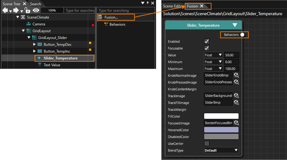
- The
padSelectlockBehaviorsicondialogchangeswilltobelockedopened,state.
InThetheChoosePropertiesItempanel the textfield next to the property "TargetNode"dialog will befilled with the path to the Text Value control.opened.
- The
padlock[ForwardiconValue]changesFusiontonode'sunlocked state.
Path
/Scenes/SceneClimate/GridLayout/GridLayout_Slider/Text Value
- In the Scene Editor you can see that the Text Value will display "22°C", which is the value currently configured in the Slider control.

Beautifying Temperature Setting Controls
The default visual appearance of the Scene Composer's Slider does not fit to this sample's design. Luckily the Slider's images are exchangeable, so are the Button's images.
- In the Scene Tree panel select Button_TempDec. In the Properties panel press the magnifying glass icon next to the property "Normal Image" to open the "Choose Item" dialog.
- The "Choose Item" dialog will be opened.
- Select image "/Resources/Climate/NewTempDecreaseBmp" and press OK.
- The "Choose Item" dialog will be closed.
- Property "Normal Image" is set to "NewTempDecreasBmp".
- In the Scene Editor a new image will be displayed differently.

- Repeat steps 1 and 2 to set a new "Pressed Image" for Button_TempDec. Finally, Button_TempDec should be configured according to the table below.
- Button_TempDec is configured with new "Normal Image" and "Pressed Image" which completely changed its appearance.
Target Item Property Image Button_TempDec Normal Image /Resources/Climate/NewTempDecreaseBmp Pressed Image /Resources/Climate/NewTempDecrease_pressedBmp 
- Button_TempDec is configured with new "Normal Image" and "Pressed Image" which completely changed its appearance.
- In the Scene Tree panel select Button_TempInc and repeat steps 1 to 3 above to configure new images for "Button_TempInc" according to the table below.
- Button_TempInc is configured with new "Normal Image" and "Pressed Image" changing its appearance completely.
Target Item Property Image Button_TempInc Normal Image /Resources/Climate/NewTempIncreaseBmp Pressed Image /Resources/Climate/NewTempIncreae_pressedBmp 
- Button_TempInc is configured with new "Normal Image" and "Pressed Image" changing its appearance completely.
- In the Scene Tree panel select "Slider_Temperature". In the [ Control ] section of the Properties panel set new images according to the table below.
- In the Properties panel the Slider Control's image properties are configured with new images.
- In the Scene Editor you can see the final result of the configured Temperature Slider Control.
Property Image Knob Normal Image /Resources/Climate/NewSliderKnobBmp Knob Pressed Image /Resources/Climate/NewSliderKnobPressedBmp Track Image /Resources/Climate/NewSliderBackgroundBmp Track Fill Image /Resources/Climate/NewSliderBmp 
Configuration of Steering Wheel Heating CheckBox
- From the Toolbox panel's [ Controls ] section under "Touchable" drag and drop a "CheckBox" into the Scene Tree panel directly onto the already configured "GridLayout" node.
- The CheckBox will appear in the Scene Tree panel.
- The CheckBox will also be visible in the Scene Editor.
- The CheckBox will appear in the Scene Tree panel.
- In the Scene Tree panel select the CheckBox and rename it to "CheckBox_Steering heater" either via the context menu entry "Rename" or by pressing <F2> on your keyboard.
- In the Scene Tree panel, the "CheckBox_Steering heater" can be seen.
- In the Scene Tree panel right-click on the "GridLayout". In the opened context menu choose "Configure Layouter...".
- The Grid Layout Editor will be opened.
- The newly added CheckBox will be placed in the grid's top left cell.
- In the Grid Layout Editor drag and drop the CheckBox into the cell to the right of "Text_Steering wheel heating". When you're done, press [
OK ]OK].- The Grid Layout Editor will be closed.
- In Scene Editor the CheckBox will be positioned in the correct cell of the GridLayout.
- In the Properties panel's [ Layout ] section change the "Vertical Alignment" to VCenter.
- In the Scene Editor the CheckBox's position has changed, it is now in the same line as the text "Steering wheel heating".
- In the Properties panel's [ Control ] section change the Text to "On" and configure the CheckBox's images as in the table below.
- In the Scene Editor the CheckBox has a different visual appearance with the new images.
- The Steering Wheel heating Controls have been configured correctly.
Property Image Normal Image /Resources/Climate/NewCheckBoxDeselectedBmp Pressed Image /Resources/Climate/NewCheckBoxDeselectedPressedBmp Selected Image /Resources/Climate/NewCheckBoxSelectedBmp Selected Pressed Image /Resources/Climate/NewCheckBoxSelectedPressedBmp 
Configuration of Air Conditioning RadioButtons
This scene uses RadioButtons to configure Air Conditioning values. RadioButtons need to be put into a common GroupBox in order to ensure their functionality.
Since these RadioButtons should fit into the scene's design, we will exchange the images for various states like normal, pressed, selected and selected pressed.
Setting up the Air Condition Controls
In this section we focus on the Radio Buttons for Air Condition (AC). Two Radio Buttons are configured inside a horizontal Stack Layout. They are grouped together in a GroupBox to help with the RadioButtons' functionality.
- From the Toolbox panel's [ Controls ] section under "Container" drag and drop a "GroupBox" into the Scene Tree panel directly onto the configured "GridLayout" node.
- In the Scene Tree panel the GroupBox is visible, hierarchically below the GridLayout.
- In the Scene Tree panel click the triangle on the left of the GroupBox to open the GroupBox.
- "Content" gets visible below "GroupBox".

- "Content" gets visible below "GroupBox".
- From the Toolbox panel's [ Nodes 2D ] section drag and drop a "Stack Layout" into the Scene Tree panel directly onto the "Content" anchor of the GroupBox that has been added in the first step.
- In the Scene Tree panel the Stack Layout has been added as the GroupBox's content.
- From the Toolbox panel's [ Controls ] section under "Touchable" drag and drop 2 "Radio Buttons" into the Scene Tree panel directly onto the "Stack Layout" that has been added in the previous step.
- In the Scene Tree panel the RadioButtons have been added to the Stack Layout.
- In the Scene Tree panel select the "GroupBox" and "RadioButtons" individually and rename them according to the table below either via the context menu entry "Rename" or by pressing <F2> on your keyboard.
- In the Scene Tree panel, "RadioButton_AC On" and "RadioButton_AC Off" can be seen as in the image below.
Target Item Name GroupBox GroupBox_AC RadioButton RadioButton_AC Off RadioButton_1 RadioButton_AC On 
- In the Scene Tree panel, "RadioButton_AC On" and "RadioButton_AC Off" can be seen as in the image below.
- In the Scene Tree panel right-click on the GridLayout and choose "Configure Layouter..." from the context menu.
- The Grid Layout Editor will be opened.
- In the Grid Layout Editor drag and drop GroupBox_AC onto its correct position to the right of "Text_Air Condition". When you're done press [
OK ]OK].- In the Scene Editor you can see that GroupBox (and its RadioButton content) is in the correct cell in the GridLayout's grid.
- In the Scene Tree panel select the Stack Layout. In the Properties panel's [ Layout ] section set the Vertical Alignment property to "VCenter".
- In Scene Editor the Radio Buttons appear in correctly aligned with the text "Air Condition".

- In Scene Editor the Radio Buttons appear in correctly aligned with the text "Air Condition".
- In the Scene Tree panel select GroupBox_AC. In the Properties panel's [ Control ] section uncheck the "Enable Background" property.
- In Scene Editor you can see that a border around the Radio Buttons disappears.
Configure the Steering Wheel Heating RadioButtons
To adjust the Radio Buttons to the general look and feel of the scene we will configure new images for them.
Remember: If you select both RadioButtons in a "multiple selection" in the Scene Tree panel, you can configure the properties that are the same for both RadioButtons at once.
- In the Scene Tree panel select the Radio Buttons individually. In the Property panel's [ Control ] section change the "Text" property according to the table below.
- In the Scene Editor the Radio Buttons' texts appear as configured.
Target Item Text RadioButton_AC On On RadioButton_AC Off Off
- In the Scene Editor the Radio Buttons' texts appear as configured.
- In the Scene Tree panel select both Radio Buttons. This can be achieved by selecting one Radio Button and click on the second Radio Button while keeping the <Shift> key pressed.
- In the Scene Tree panel and in the Scene Editor you can see that both Radio Buttons are selected.
- In the Properties panel it says "Multiple items selected".
- In the Properties panel's [ Control ] section define new images according to the table below. To do this, click the magnifying glass icon next to the image property to open the "Choose Item" dialog, where you select the corresponding image.
- New images of the Radio Buttons have been configured.
Property Image Normal Image /Resources/Climate/NewRadioButtonNormalBmp Pressed Image /Resources/Climate/NewRadioButtonNormalPressedBmp Selected Image /Resources/Climate/NewRadioButtonActivatedBmp Selected Pressed Image /Resources/Climate/NewRadioButtonActivatedPressedBmp 
- New images of the Radio Buttons have been configured.
- In the Properties panel's [ Layout ] section configure the Margin property of both Radio Buttons according to the table below.
- In Scene Editor the two Radio Buttons are further apart than before.
- The configuration of the Air Condition Radio Buttons and GroupBox is now complete.
Margin Value Left 0 Top 0 Right 100 Bottom 0 
Configuration of Fan Controls
In our scenario the value of the fan can be controlled by two Buttons and a MultiStateButton. These Controls are arranged by a GridLayout.
Interactivity between each Button and the MultiStateButton is provided by an EventHandler. A SendValueByEvent behavior will send a configured value to the TargetNode "MultiStateButton" whenever a button is clicked.
Setting up the Fan Controls
- From the ToolBox panel's [ Nodes 2D ] section drag and drop a GridLayout into the Scene Tree panel directly onto the already existing "GridLayout" node.
- In the Scene Tree panel you can see that a GridLayout has been created under the already existing GridLayout. The newly created GridLayout is hierarchically below the older GridLayout.
- From the ToolBox panel's [ Controls ] section under "Touchable" drag and drop 2 Buttons and 1 MultiStateButton into the Scene Tree panel directly onto the node "GridLayout" that was created in the previous step.
- In the Scene Tree panel you can see that 2 Buttons and 1 MultiStateButton have been created below the GridLayout that has been created in the previous step.
- In the Scene Tree panel create a multiple selection of all Fan Controls (GridLayout, the 2 Buttons and MultiStateButton) by clicking on the first one, holding the <Shift>-key on your keyboard and then clicking on the last one.
- In the Scene Tree panel 4 items are selected.
- In the Properties panel's top it says "Multiple items selected".
- In the Properties panel's [ Layout ] section change the VerticalAlignment to VCenter.
- Vertical Alignment of all 4 nodes is set to center.
- In the Scene Tree panel select the newly created GridLayout, Buttons and MultiStateButton individually and rename them according to the table below either via the context menu entry "Rename" or by pressing <F2> on your keyboard.
- In the Scene Tree panel the newly created Controls appear as in the image below.
Target Item Name GridLayout GridLayout_Fan Button Button_Fan Off Button_1 Button_Fan Max MultiStateButton MultiStateButton_Fan 
- In the Scene Tree panel the newly created Controls appear as in the image below.
- In the Scene Tree panel right-click on the "older" GridLayout and choose "Configure Layouter..." from the context menu.
- The "Grid Layout Editor" will be opened.
- In the "Grid Layout Editor" drag and drop GridLayout_Fan into the cell right next to the "Text_Fan" Text control. Then click [
OK ]OK].- In Scene Editor GridLayout_Fan and its content is now placed at the correct position.
- The MultiStateButton and the 2 Buttons are still overlapping. This will be solved by configuring the layout of GridLayout_Fan in the next steps.
Configuring GridLayout_Fan
- In the Scene Tree panel right-click on the GridLayout_Fan and choose "Configure Layouter..." from the context menu.
- The "Grid Layout Editor" will be opened.
- In the "Grid Layout Editor" configure 1 row and 6 columns using the buttons on the bottom left.
- In the "Grid Layout Editor" a grid with rows and columns will be displayed as configured.
- In the "Grid Layout Editor" adjust the width of the columns on the top of the grid. Then drag and drop the controls to their destination position as seen in the image below and click [
OK ]OK].- The "Grid Layout Editor" is configured as in the image.
- After pressing [
OK ]OK], the controls of GridLayout_Fan are arranged as in the image below.
Configuring MultiStateButton_Fan
- In the Scene Tree panel select MultiStateButton_Fan. In the Properties panel's [ Layout ] section set the Vertical Alignment to VCenter.
- In the Properties panel's [ Control ] section set "Maximum State" to the value of "7".
- In the properties panel the Maximum State property is set to 7.
- In the Properties panel's [ Control ] section click on the "StateImages" property.
- In the Properties panel the StateImage property will be expanded.
- Press the [ + ] button on the right of the "StateImages" property until there are 8 StateImages in the list below.
- In the Properties panel the list of StateImages will consist of entries from "StateImages 0" to "StateImages 7".
- In the Properties panel click on the magnifying glass next to "StateImages 0".
- The "Choose Item" dialog will be opened.
- In the Choose Item dialog navigate to "/Resources/Climate/NewClimate-0Bmp", select this image and click [
OK ]OK].- In the Properties panel the first StateImage has been configured.
- Repeat steps 4 and 5 to configure the remaining StateImages as in the table below.
- In Properties panel all StateImages are configured.
- In Scene Editor you can see the newly configured images.
-
If the new images are not visible try refreshing the screen by pressing the <F5> key on your keyboard.
StateImages Image Path StateImages 0 /Resources/Climate/NewClimate-0Bmp StateImages 1 /Resources/Climate/NewClimate-1Bmp StateImages 2 /Resources/Climate/NewClimate-2Bmp StateImages 3 /Resources/Climate/NewClimate-3Bmp StateImages 4 /Resources/Climate/NewClimate-4Bmp StateImages 5 /Resources/Climate/NewClimate-5Bmp StateImages 6 /Resources/Climate/NewClimate-6Bmp StateImages 7 /Resources/Climate/NewClimate-7Bmp 
Configuring Fan Buttons
- In the Scene Tree panel select "Button_Fan Off". In the Properties panel's [ Control ] section click the magnifying glass icon next to the "Normal Image" property.
- The "Choose Item" dialog will be opened.
- In the Choose Item dialog select "/Resources/Climate/NewButton offBmp" and click [
OK ]OK].- A new image is configured for "Button_Fan Off".
- In the Scene Editor the new image for the button is displayed.
- Repeat steps 1 and 2 above to configure the images for "Button_Fan Off" and "Button_Fan Max" according to the table below
- The images for the Fan Buttons have been changed.
- In Scene Editor the new normal images can are visible.
Target Item Property Image Path Button_Fan Off Normal Image /Resources/Climate/NewButton offBmp Pressed Image /Resources/Climate/NewButton offselectedBmp Button_Fan Max Normal Image /Resources/Climate/NewButton maxBmp Pressed Image /Resources/Climate/NewButton max_selectedBmp 
Add Interactivity to Fan Controls
- In Scene Tree panel select "Button_Fan Off"
.InandtheclickProperties panel activate the "Event Handler" tab. Clickon the [+Fusion...] buttonnextontothe"Actions".
right side of the Scene Tree.AnFusionactionwillisbeaddedopened,todisplaying a Fusion diagram as shown in thealreadyimageattachedbelow."Click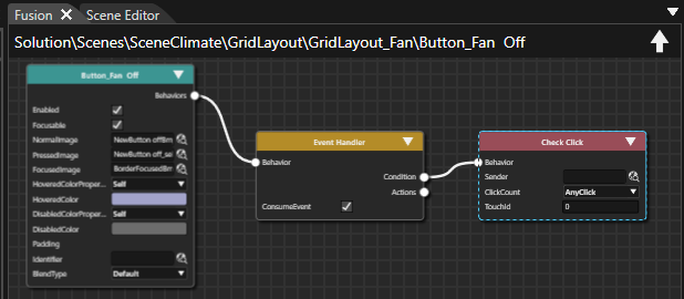
Event Handler".
InDrag thePropertiesEventpanel'Handler'sEventActionsHandlerconnectorTab useof thedrop-downrightmenuandtoreleaseselectthe mouse button.- The Select Behavior dialog will be displayed.
Clickas intoyou find the drop-down menu field and start typing "send" to reduce the number of itemsbehavior in the list.
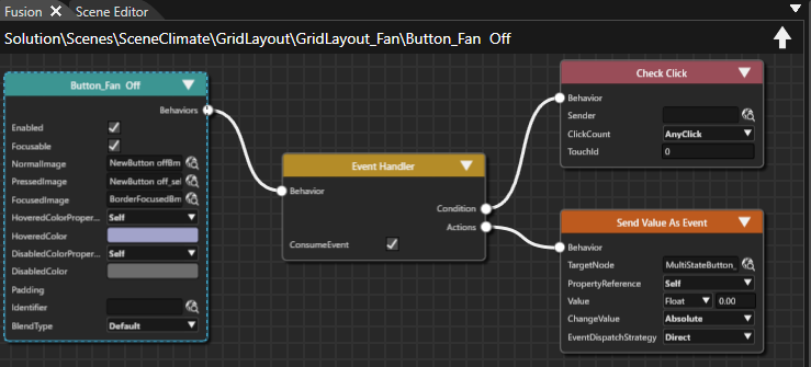
- A
"new Fusion node [Send Value asEvent"Event]actionishas been configuredadded tobetheexecutedFusionwhen a Click Event occurs.diagram.
- MultiStateButton_Fan is configured as TargetNode, where the value will be sent to when a click action occurs on "Button_Fan Off".

The[Button_FanProperties panelOff] isunlocked.configured to send a value of 0.00 to MultiStateButton_Fan whenever it is pressed.
Button_Fan Off Fusion Node: Send Value As Event
TargetNode /Scenes/SceneClimate/GridLayout/GridLayout_Fan/MultiStateButton_Fan Value
Float 0.00
EventHandler of "[Button_FanMax"Max] is configuredaccordingto send a value of 7.00 totheMultiStateButton_Fanimagewheneverbelow.it is pressed.Button_Fan Off Fusion Node: Send Value As Event
TargetNode /Scenes/SceneClimate/GridLayout/GridLayout_Fan/MultiStateButton_Fan Value
Float 7.00

Configuration of Seat Heater MultiStateButton
- From the ToolBox panel's [ Controls ] section under "Touchable" drag and drop 1 MultiStateButton into the Scene Tree panel directly onto the scene's GridLayout.
- In the Scene Tree panel you can see that a MultiStateButton has been created below the scene's GridLayout that has been created in one of our first steps on this page.
- In the Scene Tree panel select the MultiStateButton and rename it to "MultiStateButton_Seat" either via the context menu entry "Rename" or by pressing <F2> on your keyboard.
- In the Scene Tree panel, the "MultiStateButton_Seat" can be seen.
- In the Scene Tree panel select MultiStateButton_Seat. In the Properties panel's [ Layout ] section change the VerticalAlignment to VCenter.
- In the Scene Editor MultiStateButton_Seat is displayed vertically centered inside its cell.
- In the Scene Tree panel right-click on the scene's GridLayout and choose "Configure Layouter..." from the context menu.
- The "Grid Layout Editor" will be opened.
- In the "Grid Layout Editor" drag and drop MultiStateButton_Seat into the cell right next to the "Text_Seat heater" Text control. Then click [
OK ]OK].- In Scene Editor MultiStateButton_Seat is now placed at the correct position.

- In Scene Editor MultiStateButton_Seat is now placed at the correct position.
- In the Scene Tree panel select MultiStateButton_Seat. In the Properties panel's [ Control ] section under "StateImages" click on the magnifying glass next to "StateImages 0".
- The "Choose Item" dialog will be opened.
- In the Choose Item dialog navigate to "/Resources/Climate/NewButtonState1Bmp", select this image and click [
OK ]OK].- In the Properties panel the first StateImage has been configured.
- Repeat steps 6 and 7 to configure the remaining StateImages as in the table below.
- In Properties panel all StateImages are configured.
- In Scene Editor you can see the newly configured images.
-
If the new images are not visible try refreshing the screen by pressing the <F5> key on your keyboard.
StateImages Image Path StateImages 0 /Resources/Climate/NewButtonState1Bmp StateImages 1 /Resources/Climate/NewButtonState2Bmp StateImages 2 /Resources/Climate/NewButtonState3Bmp StateImages 3 /Resources/Climate/NewButtonState4Bmp
- You can check the functionality by changing the Control's "Current State" property to any value from 0 to 3 in the Properties panel's [ Control ] section.
- In the Scene Editor a different image will be displayed for the Seat heater depending on the configured value of the "Current State" property.
- Below you can see the MultiStateButton_Seat when "Current State" is 3.

Configuration of Heating SpinBox
In this section we will configure the Heating control. The SpinBox allows the user to change the values by clicking the uptick and downtick buttons.
- From the Toolbox panel's [ Controls ] section under "Touchable" drag and drop a SpinBox into the Scene Tree directly onto the scene's GridLayout.
- In the Scene Tree panel you can see that SpinBox has been created below the scene's GridLayout that has been created in one of our first steps on this page.
- In the Scene Tree panel select the SpinBox and rename it to "SpinBox_Heating" either via the context menu entry "Rename" or by pressing <F2> on your keyboard.
- In the Scene Tree panel, the "SpinBox_Heating" can be seen.
- In the Scene Tree panel select SpinBox_Heating. In the Properties panel's [ Layout ] section change the VerticalAlignment to VCenter and change the Size's X property to "150".
-
To change the Size's X property you might have to click the disabled [ A ] button first.
- In the Scene Editor SpinBox_Heating is displayed vertically centered inside its cell and its width is reduced to 150px.
Target Item Value Vertical Alignment VCenter Size X 150,00
-
- In the Scene Tree panel right-click on the scene's GridLayout and choose "Configure Layouter..." from the context menu.
- The "Grid Layout Editor" will be opened.
- In the "Grid Layout Editor" drag and drop SpinBox_Heating into the cell right next to the "Text_Heating" Text control. Then click [
OK ]OK].- In Scene Editor SpinBox_Heating is now placed at the correct position.
- In the Scene Tree panel select Spinbox_Heating. In the Properties panel's [ Control ] section adjust the properties given in table below.
- SpinBox_Heating is configured according to the table.
- In Scene Editor the displayed text is changed to "22°C".
-
If the displayed value doesn't change to "22°C" try refreshing the screen by pressing the <F5> key on your keyboard
Target Item Value Value Float 22.00 Minimum Value Float 15,00 Maximum Value Float 28,00 Text Format %02d°C
- In the Properties panel's [ Control ] section click on the magnifying glass icon next to "Arrow Up Normal Image".
- The "Choose Item" dialog will be opened.
- In the Choose Item dialog select /Resources/Climate/New_arrow_incrementBmp
- In Scene Editor you can see that a new image has been configured for the SpinBox.
- Repeat steps 7 and 8 to configure new images according to the table below.
- In Properties panel new images are configured for the SpinBox_Heating as seen in the image below.
- In the Scene Editor new images are visible for the SpinBox.
Target Item Value Arrow Up Normal Image /Resources/Climate/New_arrow_incrementBmp Arrow Up Pressed Image /Resources/Climate/New_arrow_increment_activeBmp Arrow Down Normal Image /Resources/Climate/New_arrow_decrementBmp Arrow Down Pressed Image /Resources/Climate/New_arrow_decrement_activeBmp 
Check the Climate Scene
- To check the result of configuring the first scene, open the display view. This view represents the final rendered result and can be opened via the menu: View - Display - Display-0.
- The display panel will be opened in a floating way displaying the scene configured in the steps above.

- The display panel will be opened in a floating way displaying the scene configured in the steps above.
- In the Scene Composer's Toolbar make sure that the item "Generate and Play" is selected in the drop-down menu and click the [ > ] button to the left.
- This will generate the asset so it is available as input for the Player. After that the CGI Panel will be started.

- This will generate the asset so it is available as input for the Player. After that the CGI Panel will be started.
- In the CGI Panel tick the checkbox next to "Scenes#SceneClimate" and uncheck "Scenes#SceneHome".
- SceneClimate will become visible in the Player.

- SceneClimate will become visible in the Player.
- You can now play around with the configured Climate Controls in the scene and watch the results.
- Temperature slider is working and the displayed temperature is updated.
- Steering wheel heating CheckBox can be checked and unchecked
- Air Conditioning RadioButtons can be toggled
- Fan Buttons and MultiStateButton can be clicked and are functional.
- Seat heater MultiStateButton can be clicked and will change its image
- Heating SpinBox can be configured for values from 15 to 28°C