Solution Handling
- Manage Solutions
- New Solution
- New Solution Wizard
- Custom Solution Templates
- Scene Templates
- Open Solution
- Save Solution
- Clear Solution Cache
- Solution Report
- HMI Report
- Organize a Solution Using Folders
- Reusable Solution Libraries
- Update the Solution Icon
- Source Control Support
- Solution Options
- General Configuration
- Data Backup
- References
- Cultures
- Solution Information
- Default Render Mode
- Default Shader Config
- Default Shader Params
- Color Palette
- Font Palette
- Text Style Palette
- Clear Mode
- Bitmap Profile
- Icon Picker
- Design Master
- Problems Configuration
- Player Configuration
- Default Render Target Configuration
- IBL HDR
- Layout Configuration
- Associated Vertex Buffer
- Annotations
- Searching
- Wireframe Scene Design
- Output
- Problems Browser
- Text Size Report
- Candera Logging
- Undo and Redo Operations
- Device Capabilities and Constraint Violations
- SCHost Information
- Item Names Validation
- Items AssetId
- Auto Values
- Diagram Bird's Eye
Manage Solutions
New Solution
Create a New Solution
A new solution with all the basic elements can be created via Startup Panel item or menu "File" > "New Solution" or Toolbar item.

In the "New Solution" dialog that appears after selecting one of the above, you can set basic information for your solution using two items: "Create new solution" and "Solution Settings."

Create new solution
| Name | Solution name |
| Solution Template |
Solution template to use for the solution (There are several for different purposes, such as Empty, 2D Basic, and 3D Basic.) |
| Platform Name |
Target platform |
| Location |
Save the location of solution (Use the [Browse...] button to select the location to save the new solution.) |
| Create directory for solution |
Create a folder to save the new solution. |
| Create with default State Machine |
Include a GlobalStateMachine in the new solution. (This item can only be set if "Empty" is selected in the Solution Template.) |
| Is Shared Library |
Set it as a Shareable Component Library (SCL). |
Solution Settings
| Width/Height | Display/RenderTarget/2D Camera size |
| Units | Width/Height unit |
| Pixels/Inch | Resolution |
| Clear Color | Set the Clear Color. |
| Color Depth |
True: The Color Depth set in this option will be applied to the Render Target. False: The Color Depth of the selected Solution Template will be applied to the Render Target. |
Once you have completed configuring the solution, click the [ Finish ] button to create the new solution.
To configure more solution details at solution creation time, use the New Solution Wizard by clicking "Next >". About details, please refer to New Solution Wizard.
New Solution Wizard
When a new Solution is created as shown in the previous step, it is possible to use the New Solution Wizard. Here, important parts of the solution can be configured:
- Mange the Data binding source.
- Manage the import of .fbx files.
- Manage the import images.
After clicking "Finish", the solution will be created with a configured Data binding source, including the imported .fbx and image files.
In the ImportView of the "New Solution Wizard", it is possible to delete selected items before they are imported.
Additional settings
Set the Data binding sources and Include Path to be included in the new solution.

[File] is set to the Data binding source that is prepared in advance in CGI Studio Scene Composer. You can also set any file.
Import FBX
Set the FBX file to import when creating a new solution.

Use the [Remove from Import] button to remove the FBX file to be imported.

Import images

It is possible to cancel the creation of a new solution at any moment by using the "Cancel" button. There is the possibility to finish the process of creating a new solution with the Wizard at any step by hitting the "Finish" button. If this option is chosen, it will be necessary to do all the successive configuration and importing manually.
Please note that if the name of a file to be imported contains characters that cannot be used in Scene Composer, an alert message will be displayed and the import operation cannot be performed. For more information on character strings that can be used, please refer to "SceneComposer Names Validation Rules".
Custom Solution Templates
Default Solution
Any created solution can be set as a template solution:
- Create a new solution, name it (example: "MySolutionTemplate") and archive it as a .zip file.
- The .zip file will be added into the Solutions folder. Usually, this folder can be found in the directory <cgi_studio_root>\bin\SceneComposer\Data\Solutions
- Add the new default solution to the XML file "solutions.xml" which can be found in the same folder.
- Write "<Solution Name="My Solution Template" File="MySolutionTemplate.zip" IsDefault="True"/>" and save the XML file.
After restarting SceneComposer, the added solution can be used as template whenever a new solution is created. It will be accessible in the "Solution template" field from the "New Solution" panel.

Scene Templates
A scene created by the user can be set as a template by checking its IsTemplate property. This property is located in the [ General ] category in the Properties panel.

The dialogue used to create new scenes allows the user to select an existing template or import. If there are many scenes - 2D or 3D - created as templates, any of them can be selected and used as a template.

Scenes with the property item Is Template set are indicated by an orange frame on the icon. This makes it easy to identify them as scene templates.

In addition to scenes, the icons of controls and other elements that can be used as templates are marked with an orange frame as shown above.
Imported Scene
- A scene created when importing (FBX, GLTF, Smart Importer) is an imported scene.
- An imported scene cannot be edited, only renaming is possible.
- The user can create a scene based on an imported scene (using the imported scene as template). This can be done by right-clicking on the imported scene in the Solution Explorer panel and choosing Add Scene From Template.

- If the Imported Scene is overwritten (updated) by the SmartImporter, it will also be reflected in scenes created based on the ImportedScene.
Template Scene
- A template scene is a scene that can be treated as a template by setting the scene's IsTemplate property to True.
- The user can create a scene based on a template scene. This can be done by right-clicking on the template scene in the Solution Explorer panel and choosing Add Scene From Template.

- Changes to the template scene will not be reflected in scenes created based on it.
Open Solution
Open an Existing Solution
Open an existing solution via menu "File" > "Open Solution" or Toolbar item.
-
It is possible to open a solution in SceneComposer by dragging the .scs file on "Solution Explorer" or "Scene Tree" panels.

Select the .SCS file associated with the solution in the "Open" dialog.

Recent Solutions
The "File" > "Recent Solutions" menu option contains the last five opened solutions with the most recent displayed first.

Convert a Solution
Since the format of binary asset files generated by SceneComposer differs from version to version, it is required to convert existing solutions for an upgrade to a new CGI Studio version.
Open a solution to convert it into a new SceneComposer version. The "Solution Conversion" dialog will ask for confirmation before converting the solution:

Confirm the solution conversion by using the "Convert" option and the solution will be converted and placed in the same folder. After selecting the "Converted copy" option, the solution will be saved in a location chosen by the user.
All the old solution shaders need to be aligned with the new solution shaders. The "Convert Shaders" dialog allows the user to choose if the shaders differences will be solved automatically - by using the "Replace" button - or manually - by using the "Skip" button. At the same time, the user has the possibility to select those old shaders - placed in the upper part of the panel - which has to be replaced with the new solution shaders and shader programs - placed in the lower part of the panel.

Finally, a message dialog with the result of the conversion is displayed:

If the conversion process encountered some errors, they will be displayed in the "Errors" section of the "Conversion Results" dialog.
Additional outputs:
- A conversion log file, named "ConversionLogFile.txt", can be found in the solution folder.
- An archived file named like the solution and the conversion date is created. It can be found in the solution folder and contains the original solution before the conversion.
Save Solution
Save a Solution
A solution can be saved via "File" > "Save Solution" menu or Toolbar item.

Save a Solution in a New Location
A solution can be saved via "File" > "Save Solution As..."

Select the new location for the solution in the "Save As" dialog.

after pressing "Save", the solution is saved in the selected folder.
Clear Solution Cache
For an opened solution the Scene Composer uses a solution cache, which is stored in %appdata% directory of the user. In some cases, clearing of the solution cache might fix some problems (e.g. working in teams on the same solutions) and free up some space.
By clicking on "Clear Solution Cache" in the File menu the cache of the currently opened solution will be cleared. The solution itself will not be modified.
Solution Report
View the Solution Report
A solution report provides data for all vertex buffers and bitmaps available in a solution. It can be inspected as well as saved into a CSV file.
The "Solution Report..." menu opens a "Solution Report" dialog.


The "Save Report..." button opens a dialog asking for the name and a saving location for the report.

HMI Report
Introduction
The HMI report can be presented in the browser as a set of HTML documents. The documents that make up the report are interlinked and can be navigated using the navigation bar. Other output formats are CSV and Excel. The information provided by this report can allow you to answer several questions regarding your solution. These can include, but are not limited to:
- How many bitmaps are loaded in my solution?
- How many of these bitmaps are actually being used within my solution?
- What is the biggest/smallest bitmap within my solution?
- What controls/widgets/behaviors/texts are contained in my solution, and where are they used?
The HMI report will be presented in the browser as a set of HTML documents. The documents that comprise this report are interlinked and can be navigated by using the navigation bar.
Generating the Report
Upon opening Scene Composer and loading your solution, click Report within the main toolbar. Select the HMI Report... option to display the HMI Report dialog box, in which you can customize several aspects of your report.

| 1 |
Customize the sub-reports included in the generated HMI report. Check the checkboxes for the items to be output. For details on each item, see Report Content. |
|
| 2 |
Styling file |
This will specify where to retrieve the custom .css file to apply to HTML the documents. If left blank, a default styling file will be used. |
| Report Output Path | This is where you specify the output location for the documents. | |
| 3 |
This option specifies the format of the output report. See Output Formats for more information. |
|
After selecting the report’s output path, style file, and contents, press the Generate report button to proceed with generating your report.
Report Content
Report Sites
Report Options fill generate the following report pages:
- Bitmaps
- Bitmaps(summary): An overview of all the bitmaps within your solution. Contains data on bitmap averages, largest and smallest bitmaps, referenced pixel formats, and the frequency at which said formats are referenced.
- Bitmaps Details(detailed): Contains a paginated display and search bar for visualizing available parameter information for all bitmaps. Entries can be sorted by column.
- Used Bitmaps(summary): An overview of the referenced bitmaps within your solution. Contains data on bitmap averages, largest and smallest bitmaps, referenced pixel formats, and the frequency at which said formats are referenced.
- Used Bitmaps Details (detailed): Contains a paginated display and search bar for visualizing available parameter information for all bitmaps. Entries can be sorted by column.
- Unused Bitmaps(summary): An overview of the unreferenced bitmaps within your solution. Contains data on bitmap averages, largest and smallest bitmaps, referenced pixel formats, and the frequency at which said formats are referenced.
- Unused Bitmaps Details(detailed): Contains a paginated display and search bar for visualizing available information for all bitmaps. Entries can be sorted by column.
- Bitmaps(summary): An overview of all the bitmaps within your solution. Contains data on bitmap averages, largest and smallest bitmaps, referenced pixel formats, and the frequency at which said formats are referenced.
- Texts
- FontsandStyles: Contains outline of how often particular Fonts and Style are used.
- Translations: Contains outline of how often particular translations are used.
- FontsandStyles: Contains outline of how often particular Fonts and Style are used.
- Controls
- Controls: A list with the 30 most used controls (if available) and how many times each control was used in all scenes.
-
- Also includes a list of all controls and how many times each control was used within all available scenes.
- Also includes a list of all controls and how many times each control was used within all available scenes.
-
- Controls: A list with the 30 most used controls (if available) and how many times each control was used in all scenes.
- Behaviours
- Behaviors: A list of all behaviors and the scenes in which they are used. Also includes the scene type, behavior name, and the name of the entity associated with the behavior and a list of all behaviors indexed first by name, then by the scene in which they are used.
- Widgets: A list of the 30 most popular widgets (if available) and the frequency each widget was used in all scenes.
Also includes a list of all widgets, indexed by widget name and each scene in which said widget was used.
- Behaviors: A list of all behaviors and the scenes in which they are used. Also includes the scene type, behavior name, and the name of the entity associated with the behavior and a list of all behaviors indexed first by name, then by the scene in which they are used.
- Scenes
- 2D Scenes: A list of all 2D scenes within the solution. A table will be created for each scene showing the quantity of each of the following elements:
-
- Bitmaps
- Controls
- Render Nodes
- Text Nodes
- Widgets
- Bitmaps
-
- 2D Scenes Details (details): A list of all 2D scenes in the solution. A table will be created for each scene containing the names of the following elements:
-
- Bitmaps
- Controls
- Render Nodes
- Text Nodes
- Widgets
- Bitmaps
-
- 3D Scenes: A list of all 3D scenes within the solution including the number of vertices and triangle of each 3D scene.
- 2D Scenes: A list of all 2D scenes within the solution. A table will be created for each scene showing the quantity of each of the following elements:
- Annotations
- Annotations: A list of all annotations in the scene, for any node whose annotations property is set.
- Annotations: A list of all annotations in the scene, for any node whose annotations property is set.
- Rendering
- Rendering: A list of all effects that are used, and how often each effect was used within the solution and a similar list is also provided for text caching strategies and a list showing which text caching strategies are associated with each node, as well as the name of the scene in which said nodes can be found.
- Blending: A list of each blending combination effect and how often they have been used and a list of the blending combinations indexed by combination type, scene type (2/3D), scene name, and then by the entity name associated with the blending combination.
- Rendering: A list of all effects that are used, and how often each effect was used within the solution and a similar list is also provided for text caching strategies and a list showing which text caching strategies are associated with each node, as well as the name of the scene in which said nodes can be found.
Output Formats
- Excel: Basic Excel tables will be generated under selected path under in reports_excel. The particular sites will be accessible as excel pages.
- HTML: Html pages with navigation and basic sorting and filtering will be generated under the selected path in reports_html. The particular sites can be accessed through the navbar.
- CSV: CSV files will be generated under the selected path under in "csv". The respective pages will be accessible as csv files.
File Structure
HMI Reporting binaries are located within the Reporting folder of the bin directory (bin/Reporting).
- images - The various icons required to generate the html report.
- js - Utility scripts and other dependencies (i.e. jquery).
- styles - The available CSS files.
- logs – Contains logs that describe potential errors.
- doc - Contains a developers guide for the Python pipeline.
- scripts - Contains the Python scripts responsible for generating each subreport.
- apy.py - Contains several helper functions for computation purposes.
- driver.py - Contains the driver logic that generates the report.
- setup.bat - Script that install the necessary Python modules (dependencies).
Standard HTML Assets
HMI Reporting assets for HTML pages like css, icons, and js are available under /bin/ HMIReportAssets.
Using the Command Line for Report Generation
CssFilePath is an alternative absolute css file path.
ReportList is a list of sub-reports that should be generated separated by #.
Organize a Solution Using Folders
Solution Explorer Panel
SceneComposer organizes the solution in folders. Via "View" > "Solution Explorer" the "Solution Explorer" panel can be enabled, which displays the folder structure. This panel reflects the structure of the folders on the disk.

A new solution comes with a default structure of folders. The main "Solution" folder contains the following folders:
- Animations: Animations can be put into this folder.
- Controls: The folder for all Controls used in your solution.
- Resources: This folder is for Bitmaps, FBX, Fonts, PSD and other imported resources.
- Scenes: This is the place for all 2D and 3D scenes.
- State Machines: State Machines are best placed into this folder.

Filtering and Searching
Solution explorer provides a filter area where the object types that will be displayed in the panel can be filtered.
By pressing the small arrow from the left upper side of the panel, the filter area becomes visible.

Use the Search edit box on the top of Solution Explorer to search for different items in the solution.

Multi-Selection of Objects
For multi-selection of objects, press the Ctrl key while left clicking all the desired elements to select.
When the last desired element is selected the Ctrl key can be released.
After the multi-selection operation it is possible to copy, move or delete all selected items as desired.
Copy, Clone, Rename and Delete Items
The Solution Explorer Context menu allows cloning, renaming and deleting content.

-
Imported scenes and animation can only be deleted.
Clone Items
"Clone" will make a copy of the item and add it to the same folder as the item selected. The name of the copy will be the name of the item suffixed with a number.
It is possible to specify the number of clones to be generated, simultaneously, for an item. If this number is greater than 1, the name will be read-only and generated automatically.

Rename Items
"Rename" activates the "Rename Field" where the name of the item can be modified:

- Enter the desired name in the text box.
Delete Items
Delete items by using the "Delete" option from the context menu of the selected item in Solution Explorer or Scene Tree.
Delete Items without Dependencies
If the item to delete is not used in the solution, the "Delete Items" dialog simply lists the items to be deleted:

Delete Items with Dependencies
If the item to delete is used in one or more scenes of the solution, the "Delete Items" dialog will list those dependencies and asks for a resolution strategy:

The default resolution strategy can be selected, which can be overridden for specific dependencies. The following resolution strategies can be applied:
- None: The "OK" button will not work until a specific strategy will be selected.
- Replace With: The selected usage item will be replaced with a different item selected by the user.
- Delete Usage Item: The selected usage item will be deleted. The element will not be part of the solution anymore.
- Replace With Null: The application will use the null value where the dependent elements are used.
- Remove Array Item: If there are many elements which are contained in an array (for instance, a Camera inside a Camera Group), the selected item will be removed from the array.

- Delete > Replace With Null: When this resolution is selected the application will try to delete all the dependencies. If this does not succeed, the dependent objects will be replaced with null so they will not be used anymore by the items proposed for deletion.
- Replace With Null > Delete: When this resolution is selected the application tries to use the null value where the dependent elements are used. If this is not possible every dependent element will be deleted. It will not be a part of the solution anymore.
Move Items and Folders with Drag and Drop
Items and folders can be moved via drag & drop.
Items can also be used by dragging them directly into appropriate panels.
If an object is dragged from one folder to another folder where the same type of object is placed under the same name, the object, which is going to be moved to the new folder, is renamed by adding a numbered suffix.
If a drag operation is performed between 2 panels and the target item is part of a multi-selection, all the selected items in the target panel will be affected. For example when 2 groups are selected in the Scene Tree panel and a billboard is dragged over one of the selected groups, a billboard will be added to both selected groups.
Reusable Solution Libraries
Shareable Component Library (SCL) Usage
The main goal of a shareable component library (SCL) solution is to make all the resources from a particular SCS solution available to be used in other solutions. A SCL is an archived file containing SCML/binary files and some meta information. SceneComposer provides the possibility to reuse any part from a solution that is exported as a SCL.
It is possible to set a new created solution as a shareable component library (SCL) by using the "Is Shared Library" checkbox from the "Create new solution" dialog. After the creation of the new solution, the "Export SCL" option will be available under the "File" menu and it will be possible to export the solution as a shareable component library (SCL).

To export a solution already created as a shareable component library (SCL), first, choose the SCL "Library Type" from "File" > "Solution Options" > "General Configuration".

The SCL name can be the same with the SCL solution or it can be modified. Second, after the solution has been saved, the "Export SCL" option will become available under the "File" menu. On this way, the solution can be exported as a shareable component library (SCL) in any place selected by the user.

If an older imported/converted solution already contains a .scl file with displays, the error will be showed in Problems panel. In this way, the user will be noticed and will be allowed to correct this situation.

After the export of the solution as a SCL solution, the content can be used in another solution after it is imported via "Solution Explorer" panel where a "References" node is available. When right click on the "References" node, the "Add Reference" from the context menu allows the user to select the SCL solution.

After selecting an SCL solution, a dialog will appear prompting you to choose a save path format.
However, if the path of the selected SCL solution is located within the Solution folder or the Scene Composer folder, it will automatically be saved as a relative path. In this case, the dialog explained in the below will not be shown.

In this dialog, you can select either a relative path or an absolute path. If you choose to use a relative path, you can further specify the reference base from the following two options:
-
Relative to Scene Composer
-
Relative to solution
If the selected SCL solution exists on the same drive, the relative path option will be available, as shown in the figure above.
If the selected SCL solution exists on the same drive, the relative path option will be available as shown in the figure above.
However, if the selected SCL solution is located on a different drive, it cannot be converted to a relative path. In such cases, the dialog will display only the "Absolute Path" option.
After this step, all the available nodes will become visible under the "References" node in the next panels: "Solution Explorer", "Imports", "Toolbox", "Render Targets" and "Templates".
Another way to import the content of a SCL solution is through the "Solution Options" panel. Here is a specific section - "References" - where all the imported references are visible and other references can be added.

When an external application needs to access some SCL objects, it is mandatory to know which is the SCL name.
SCL name is like a namespace and it is used to access the SCL items from outside (//$NAME$/Controls/MyControl) and also for the Candera name ($NAME$##Controls#MyControl).
Control of SCL Items Visibility
It is possible to control the visibility of the SCL items at the destination by using a flag for scenes, animations, etc. This flag is available in the "Properties" panel. It has three different options:
- Inherited (the element, if it is a leaf, will inherit the property of the parent)
- Public (the element will be available as a reusable/shareable resource)
- Private (the element will not be available as a reusable/shareable resource)

All the available elements can be used in a new SCS or SCL solution. The leaves will inherit the desired type of visibility of any node just if the flag is set after the selection of the node in Solution Explorer panel. If this operation is done by selecting the node in any other panel, the item visibility will not be inherited by its leaves.
-
The referenced content of a SCL solution is available only as read only. No modification can be operated on it. If a modification is needed the user has to operate it on the referenced solution. After the modification has been done, the solution has to be saved and exported, again, as a SCL solution.
Update the Solution Icon
The solution icons displayed in the "Recent" section of the Welcome to Scene Composer screen can be updated.

How to update the Solution Icon
Select [ Update Solution Icon... ] from the context menu of the solution name displayed at the top of the [ Solution Explorer ] to set the current Scene Composer screen as the solution icon.


The updated Solution Icon will take effect after restarting Scene Composer.
Source Control Support
Source Control Support
Source Control Commands
Types of Resolve Conflicts
Source Control Support: Subversion
SceneComposer's built-in source control support uses the Subversion (SVN) Toolchain.
By default, Source Control Support is disabled. Source Control Support can be enabled through the menu "File" - "Preferences...".
Details on Source Control Preferences can be found in chapter Configure Source Control.
Custom source control support can be implemented by means of a specific source control plugin.
See also:
- Source Control Plugin SDK Interface
File > Source Control
All Subversion operations are available via the menu File > Source Control
- Import solution to source control
- Checkout solution from source control
- Update
- Revert
- Lock/Unlock
- Commit
- Cleanup
- Resolve Conflicts
Import to Source Control
If an entity is not in repository, it can be added by choosing the menu option "File" > "Source Control" > "Import".
You will be prompted for the repository URL and an optional comment in order to add the solution to the specified repository.
You have to enter at least part of the Repository URL into the input field manually. The "Browse..." button opens a repository browser window, which helps you to find your desired location in the repository.

Checkout solution from source control
A solution that has already been saved in a repository, can be opened from the Source Control by selecting the "Checkout" menu option from "File" > "Source Control".
In the checkout dialog you can fill in the information about the Repository URL and choose the location.

The first time you will be asked to authenticate. Following dialog will appear and the username and password for the repository will be requested.

The content of the solution loaded from source control is displayed as any other solution in the Solution Explorer. All the items will have specific icons indicating their source control status.

Update
In order to get the latest version of the solution from the repository, right click on the solution from the Solution Explorer panel and choose the option "Update" from the context menu. An update dialog displaying all the changes obtained from the repository appears.

Revert Entity to Source Control
Undo all changes you made in a solution since the last update by selecting the solution from Solution Explorer panel, right-click and select "Source Control" > "Revert" from the context menu.
Lock/Unlock
Be the only person allowed to commit changes on the entire solution; right-click on the item in the "Solution explorer" panel and select the "Lock" option from the context menu. In the same manner the object/solution can be unlocked by choosing the "Unlock" option.
Commit Changes
Upload the changes made on the solution to the repository; right-click on the solution in the "Solution explorer" panel and select the "Commit" option from the context menu. A dialog displaying all the changes to commit appears.
Clean Up
If a subversion command cannot complete successfully, perhaps due to server problems, your working copy can be left in an inconsistent state. In that case you need to do a cleanup operation by choosing the context menu option "Clean Up" on solution.
Resolve Conflicts
Sometimes, when updating/committing the files from the repository one can get a conflict. There are two main types of conflicts:
- File conflicts : occurs when two (or more) users have changed the same lines of a file
- Tree conflicts : occurs when a user has renamed/deleted/moved a file/folder which another user has either renamed/deleted or moved meanwhile.
In order to understand the further information about the conflicts' resolving, it is necessary to explain some Source Control specific terms:
- HEAD revision : represents the latest revision of a file or folder in the repository
- BASE revision : represents the current revision of a file or folder in the user's working copy. This is the revision, the file or folder it was in, when the last checkout, update or commit was performed. The BASE revision is normally not equal to the HEAD revision.
Types of Resolve Conflicts
Sometimes, when updating/committing the files from the repository one can get a conflict. There are two main types of conflicts:
- File conflicts : occurs when two (or more) users have changed the same lines of a file
- Tree conflicts : occurs when a user has renamed/deleted/moved a file/folder which another user has either renamed/deleted or moved meanwhile.
In order to understand the further information about the conflicts' resolving, it is necessary to explain some Source Control specific terms:
- HEAD revision : represents the latest revision of a file or folder in the repository
- BASE revision : represents the current revision of a file or folder in user's working copy. This is the revision, the file or folder which it was in, when the last checkout, update or commit was performed. The BASE revision is normally not equal to the HEAD revision.
File Conflicts
A file conflict occurs when more users have changed the same lines of a file. It is the user's responsibility to choose how the conflict should be resolved because there are more possible alternatives. Whenever a file conflict occurs, the Source Control places three new files in the directory:
- FileName.extention.mine : this is the file as it existed in the working copy before the update. This file has the latest changes in it and nothing else. It doesn't contain any conflict markers.
- FileName.extention.rOldVersionNumber : this is the file that the user checked out before the latest edits. It shows the BASE revision before the latest update of the working copy.
- FileName.extention.rNewVersionNumber : this is the file that the Source Control has just received from the server when the user updated the working copy. It corresponds to the HEAD revision of the repository.
Whenever a conflict is reported, you should open the file in question, and search for lines starting with the string <<<<<<<. The conflicting area is marked like this:

In order to resolve a conflict, the user has more than one option to choose from.
The following alternatives are offered in the "Resolve conflict" dialog that opens from the contextual menu "Source control" > "Resolve conflict" option:
- Resolve using Mine : resolve the current conflict by choosing the local version (FileName.extention.mine) on all conflicts, for the rest it uses the auto-merged. The conflict is "Marked as resolved" by default after choosing this option.
- Resolve using MineFull : resolve the current conflict by choosing the entire local file (FileName.extention.mine). The conflict is "Marked as resolved" by default after choosing this option.
- Resolve using Theirs : resolve the current conflict by choosing "their" file which is the incoming file (FileName.extention.rNewVersionNumber) on all conflicts, for the rest it uses the auto-merged. The conflict is "Marked as resolved" by default after choosing this option.
- Resolve using TheirsFull : resolve the current conflict by choosing the incoming file(FileName.extention.rNewVersionNumber). The conflict is "Marked as resolved" by default after choosing this option.
- Edit conflict : opens an editor where the user can edit the new revision file(FileName.extention.rNewVersionNumber), the file .mine (FileName.extention.mine) and upon these changes the merged file will be changed dynamically. After this, the user will save the changes and will be able to mark the conflict as resolved by pressing the "Mark as resolved" button. Please note that the "Mark as resolved" command does not really resolve the conflict. It just removes the FileName.extention.mine and FileName.extension.r* files, to allow the user to commit the changes.
- Resolved : the user decides only to mark the conflict as resolved leaving the file as it resulted after the latest update, without making other changes on file. This way the user will be able to commit the file.

Tree Conflicts
As it was previously mentioned, a tree conflict occurs when a user has renamed/deleted/moved a file/folder which another user has either renamed/deleted or moved in the meantime.
There are many different situations that can result in a tree conflict, and all of them require different steps to resolve the conflict. For the moment, SceneComposer subversion feature only offers the option "Resolve" for tree conflicts.

The Resolve command does not really resolve the conflict. It just removes the FileName.extention.mine and FileName.extention.r* files, to allow the user to commit his changes. The user will manually resolve the tree conflict or use an external tool.
From the Solution explorer panel, select an item and choose "Source Control" > "Resolved conflict" context menu option.
In the new opened dialog the user will be able to see all existing conflicts and their types (file conflict or tree conflict).
After the user marks the conflict as resolved he can decide whether he will cancel or commit his local changes.
Solution Options
General Configuration
This section allows you to configure fundamental settings that affect the entire solution. It includes essential parameters such as the library type (Solution/SCL), identification settings, default culture, text style, and memory usage options. These configurations directly influence the structure, reusability, and behavior of the project. It is recommended to review and define these settings early in the development process.
Library Management Settings

This group of settings defines the classification and identification properties necessary for managing reusability and uniqueness of a solution. By utilizing the SCL format, you can export a solution as a reusable component and share its resources with other projects.
-
Library Type:
Specifies whether the current solution should function as a standard project (Solution) or as a reusable library (SCL: Shared Component Library). When configured as an SCL, the solution can be exported as an archive containing SCML, binary files, and metadata, and then reused in other projects. -
Library Id:
A 32-bit unsigned integer used to uniquely identify each item in the library within the solution. If the value is set to 0, it will be automatically generated upon saving. -
Safety Asset Custom Id:
This field is used to assign additional identification information related to safety or functional classification. It can be helpful for asset-specific management and control purposes.
Asset Culture

The default culture for the solution can be selected from the [Asset Culture] dropdown menu. This setting affects the entire solution and determines the base language and regional formatting used for localized texts and assets.
Enable uniform setter auto activation

When this option is enabled, ShaderParamSetter configurations are automatically applied. If the "Auto activation scope" property is set to Local, per-asset parameter settings that would normally require manual configuration are handled automatically.
If the scope is set to Global, the system uses shader-defined Auto Uniforms to determine and apply all relevant activation flags at asset generation time.
This feature simplifies the configuration process while ensuring consistent rendering behavior. For further information, refer to the Generic ShaderParamSetter documentation.
Preserve SCML document formatting

Enabling this option allows the SCML Editor to preserve the original formatting and comments in the SCML source files. This is useful for maintaining manually added annotations or structured formatting. For more information, refer to the SCML Editor documentation.
Enable byte alignment of bitmap pixels data in asset

When this option is enabled, Scene Composer aligns bitmap pixel data within asset files to 8-byte boundaries. This alignment can improve graphical processing performance and optimize data transfers in certain environments.
Enable automatic import

To automate the import of image and FBX files, enable this option and configure monitored folders. When new files are added or existing ones updated in the specified folders while the solution is running, the import process is triggered automatically. The monitored folder must be set separately.
Maximum number of scenes rendered in display preview

This setting defines the upper limit of scenes rendered simultaneously in the display preview. It helps prevent excessive resource usage and rendering overhead. Which scenes are rendered depends on the cameras enabled in the Render Targets panel.
We recommend using the dedicated commands in the "Render In Display" menu to enable or disable scenes, cameras, and displays appropriately. If the defined limit is exceeded, a warning is displayed to the user.
Shows text from the master culture instead of the text Id

When enabled, this option displays the actual text from the master culture instead of the text ID. If no text is defined for the master culture, the text ID will be shown as a fallback.
Exports only the master culture

When enabled, only the master culture’s text entries will be included in the exported asset. This is useful when generating lightweight assets prior to localization.
Default text style

The selected "Default Text Style" is applied only to newly added text nodes within the template solution. It does not affect any pre-existing elements. The style is applied exclusively when a user adds a new text node to the template solution by dragging and dropping it.
Default memory pool

Selects the memory pool used when loading image data. This setting can affect asset performance and memory usage.
-
VideoMemory:
Stores images in GPU video memory (VRAM). Recommended when high rendering performance is required. -
ClientMemory:
Stores images in CPU system memory (RAM). Useful for maximizing compatibility or when VRAM usage needs to be minimized. -
ExternalMemory:
Uses externally managed memory regions. This is typically used in embedded environments where memory is shared or managed by external systems.
Choose the most appropriate memory pool based on your target system’s architecture and performance requirements.
Data Backup
Creating backups function is important for reducing the risk from unexpected outages. In this way, SceneComposer gives to the user the ability to restore the system to a previous valid state.
All the saved snapshots can be accesed via Solution Options panel. There, in the "Data Buckup" section, the latest snapshots are available in the "Backups for the current solution" field. The user can select one of them in order to restore the solution to it.

Any restore point of the solution can be found on the hard disk as follows:
...\AppData\Local\SceneComposer\sol\...
References
The content of an SCL solution can be used in another solution after it is imported through the "Solution Options" panel. Here is a specific section - "References" - where all the imported references are visible and additional references can be added.

Cultures
In order to compose texts in different languages, a culture (language setting) must first be created.

| (1) | Add Culture button |
Add a new culture setting row. |
| (2) | Remove Culture button | Delete the selected culture setting row. |
| (3) | Search field |
You can search for a specific text entry by entering any string into the search field. |
| (4) | Culture |
You can select a language from the Culture drop-down menu. This language will serve as the target language for the localization. |
| (5) | Layout Direction |
Selects the direction in which the text is displayed. Normally, the appropriate text orientation is selected automatically, depending on the selected Culture. |
| (6) | Translated Texts | Shows the number of text entries linked to the culture. |
| (7) | Owned by | The name of the solution for which this setting has made is displayed. |
| (8) | OK button | Use this button to save settings. |
| (9) | Cancel button |
Use this button to close the dialog box without saving settings such as added or deleted cultures. |
- Similar settings can also be made via the Culture Solution Options button on the toolbar.
- For information on how to set up multiple languages after setting up a culture, please click here.
Solution Information
This feature allows you to set an easily recognizable name, description, and thumbnail image for each solution. This makes it possible to instantly grasp the content of a solution on the Scene Composer Startup Panel, preventing mix-ups and editing mistakes. Even when managing multiple projects in parallel, you can immediately identify the purpose of each solution, making it a powerful management tool that helps streamline your daily editing work and project progress.

| Title |
Sets the name of the solution. You can assign any name that differs from the file name, allowing you to identify the solution with a clear and meaningful name for project management. The name is displayed in the tooltip on the Scene Composer Startup Panel. |
| Description |
Allows you to set a description for the solution. By noting the purpose of the solution, testing objectives, or key points in its editing history, this description serves as a useful reference when managing multiple solutions. The description is displayed in the tooltip on the Scene Composer Startup Panel. |
| Selected Image |
Allows you to set a reference image that makes it easier to visually identify the solution. This image is displayed as a thumbnail on the Scene Composer Startup Panel.
Default behavior: When you perform [Save] for the solution, a screenshot of the current state is captured automatically and used as the thumbnail. Therefore, after performing Reset, be sure to perform [Save] for the solution. |
| Image Preview | When an image is selected using “Selected Image,” a preview of the image will be displayed here. |
Default Render Mode
Default Render Mode Settings
You can open the Solution Options dialog from [ File > Solution Options ] in the menu bar to configure various rendering properties under [ Default Render Mode ]. These properties are automatically applied by SCHost unless another render mode is explicitly set for the object.

If there is a render mode associated with an object, Scene Composer compares these property values with the default render mode settings and includes a bitmask used by the Candera engine within the asset to optimize rendering.
Render Mode
| Setting | Description |
|---|---|
| CullMode | Configure culling (excluding surfaces from rendering) according to the selected setting. Applying front or back culling optimizes rendering.
|
| Winding | Defines the front face of a polygon by setting the vertex drawing order to clockwise or counterclockwise.
|
| Color Write Enabled | Enables or disables writing fragment color values to the color buffer, configurable per RGBA channel. |
| Enable Depth Write | Enables or disables writing to the depth buffer during rendering. When enabled, depth information is recorded in the depth buffer during rendering. |
| Enable Depth Test | Enables or disables depth testing. When enabled, the depth buffer is used to control rendering based on depth. If disabled, depth writing is also disabled. |
| Depth Comparison |
Configure the comparison function that determines which source (new) pixel depth values pass the depth test. The source depth is compared with the destination (existing) pixel depth using the selected comparison function.
|
| Depth Bias Scale Factor | Specifies the scale factor to determine how much bias to apply to primitives, mainly used to avoid z-fighting (depth conflicts). |
| Depth Bias Units | Specifies a constant depth offset value used together with the scale factor to adjust and avoid z-fighting. |
| Enable Blending | Enables or disables blending (color composition). When enabled, the source color is blended with the destination color in the framebuffer. |
| Blend Color | Defines the constant blend color used when a constant color blend factor is selected. |
| RGB Source Blend Factor | Sets the blend factor applied to the source color in the RGB channels.
|
| RGB Destination Blend Factor | Sets the blend factor applied to the destination color in the RGB channels. Available values are the same as RGB Source Blend Factor. |
| RGB Blend Operation | Specifies the operation used for blending RGB values.
|
| Alpha Source Blend Factor | Specifies the blend factor for the source alpha channel, with the same available values as RGB Source Blend Factor. |
| Alpha Destination Blend Factor | Specifies the blend factor for the destination alpha channel, with the same available values as RGB Source Blend Factor. |
| Alpha Blend Operation | Specifies the operation for blending alpha values, using the same options as RGB Blend Operation. |
| Enable Stencil Test | Enables or disables stencil testing on the stencil buffer, allowing control of rendering based on stencil buffer conditions (area control, masking, etc.). |
Stencil Front / Stencil Back
| Setting | Description |
|---|---|
| Comparison Function |
Configure the comparison function that determines which source (new) values pass the stencil test. The masked reference value (Value) and the masked stencil buffer value are compared, and pass/fail is determined by the selected function.
|
| Value | Specifies the reference value used with the comparison function for stencil testing. |
| Mask | Specifies the mask value applied to the source and destination data during stencil testing, useful for targeting specific bits during comparison. |
| StencilFail | Sets the stencil buffer operation if the stencil test fails.
|
| DepthFail | Sets the operation if the stencil test passes but the depth test fails. Options are the same as StencilFail. |
| DepthPass | Sets the operation if both the stencil and depth tests pass. Options are the same as StencilFail. |
| WriteMask | Specifies the mask value used when writing values to the stencil buffer, allowing control over which bits are written. |
Default Shader Config
For Shader Configuration in detail, see Shader Configuration.
During FBX import, no automatic shader assignment for the imported scene is performed. This means the imported nodes have no shader attachments in the node appearance, and rendering is done according to a default shader configuration as specified in the Default Shader Configuration dialog (See below image).
Same default shader configuration is applied during asset generation, for all nodes having no shader program explicitly assigned.

The default initial shader values for each 3D object type are shown in the table below.
| 3D Object Type | ShaderProgram | UniformSetter |
|---|---|---|
| Billboard | RefTrans_RefTex | TransShaderParamSetter |
| CanvasSpriteWithNoTexture | RefCanvasTrans_RefTex |
CanvasTransShaderParamSetter |
| CanvasSpriteWith1Texture | ||
| MeshWithNoTexture | RefTransLight1_RefColor | TransLightShaderParamSetter |
| MeshWith1Texture | RefTransLight1_RefColorTex | TransMorphingMeshTexShaderParamSetter |
| MorphingMeshWithNoTexture | RefTransLight1Morph_RefColor | TransMorphingMeshShaderParamSetter |
| MorphingMeshWith1Texture | RefTransLight1Morph_RefColorTex | TransMorphingMeshTexShaderParamSetter |
| PlanarShadow | RefTrans_RefUniDiffuseMat | TransUniDiffuseMatShaderParamSetter |
| PointSprite | RefTransPointSprite_RefPointSprite | TransPointSpriteShaderParamSetter |
| SkyBox | RefTransCubeMap_RefCubeMapTex | - |
| SkinningMeshWithNoTexture | RefTransLight1Skin_RefColor | TransLightShaderParamSetter |
| SkinningMeshWithTexture | RefTransLight1Skin_RefColorTex | |
| CanvasText | - |
- The initial value of SharedInstanceId is "0" for all types.
- In CanvasText, there is an AppearanceCollection, with an initial value of "CanvasText".
Default Shader Params
For Shader Configuration in detail, see Shader Configuration.
On this panel, you can change the default names of values specific to the semantics of the UniformSetter.

- Select the target for editing from the [ Auto Uniforms ] and [ Shader Attributes ] tabs.
- After changing the default name, click the arrow button (the orange frame in the above image) to return the name to the default name.
- Clicking on [ Reset All ] will return all edited items to their default names.
- Clicking [ Clear All ] will delete all names.
- When the editing operation is complete, click [ OK ] button at the bottom of the Solution Options dialog to save the edited results.
- If [ Cancel ] button is pressed, the edits will not be saved.
Color Palette
Color and Font as Template
Each TextNode (the text brush) has to be configured for using:
- a specific Color
- a specific Font
It is possible to define some color templates or font templates by using "Color Palette..." or "Font Palette..." that can be found in Solution Options menu ("File" > "Solution Options").
Color Palette
By using the Color Palette many color templates can be saved and kept for future projects. The color templates can be used later to create other solutions and scenes without defining again the properties of a new color.

Color Preview
Selecting a color from the Properties panel will apply the selected color to the elements as preview before closing the editor.
- The element of the object should be selected on the Scene Tree.
- All its material colors properties can be set by using the Color palette. The Color palette opens when any type of color - Ambient/Diffuse/Emissive/Specular - is selected in the Properties panel.
- Any modification of the color will be previewed before closing the editor.

If there are some color templates previously created, they can be used on any object by selecting them from the Color Palette combo box in the Material's section on Properties.

Font Palette
To use specific fonts in each TextNode (text brush), you need to configure the font settings in advance. By using the Font Palette available in the Solution Options menu, you can create and manage font templates that define the font type, size, scale, face, and other font properties to be used.
The created font templates can be applied to each TextNode through the Text Style Editor and can be used across all solutions and scenes during project development. This allows you to apply consistent font settings efficiently across multiple text elements without the need to specify the fonts individually each time.
Font Palette UI

| 1 | Font | Select the font to use. Choose from the fonts available in the system or within the project from the dropdown list. |
| 2 | Size | Specify the font size in points. The larger the number, the larger the text will appear. |
| 3 | Scale X/Y |
Specify the scaling ratio for the horizontal (X) and vertical (Y) directions of the text. The default value is 1 (original size), and setting it to 2 will double the width/height. This option provides the optimal way to scale text without pixelating the glyphs. |
| 4 | Face |
Select the style included in the font (such as Regular, Bold, Italic). This can be used when the selected font contains multiple styles. For TTC fonts, it is recommended to create individual styles for each face included within the font. |
| 5 | Blur Effect |
The Blur Effect is a function that adds a glow effect to the font. It can be used to enhance visibility or to add design accents by applying a soft glow around the text.
For details about this option, please refer to here. |
| /6 | Import fonts | Import external font files into the project. Supports formats such as *.ttf and *.otf. |
| 7 | Save | Save the current settings as a new font definition. It will be registered under a different name from existing definitions. |
| 8 | Update | Overwrite and update the selected font definition with the current settings. |
| 9 | Delete | Delete the selected font definition. Note that deletion is irreversible. |
| 10 | Rename | Rename the selected font definition. The name will serve as the identifier when using the font settings in the Text Style Editor and other areas. |
Procedure to Enable the Blur Effect
This option can only be configured when CANDERA_FONTENGINE is set to Monotype. If any other setting is used, this option will not be displayed and cannot be utilized.
Configuring the CGI Studio Build Environment (CMake)
For information on building a build environment using CMake, please refer to this page.
-
Open the CMake configuration for your CGI Studio project.
-
Please refer to this page for information on the source directory to specify when using CMake.
-
-
Set the
CANDERA_FONTENGINECMake flag toMonotype.-
Please refer to this page for instructions on how to configure Monotype using CMake.
-
-
Use CMake to “Configure” the changes and then “Generate” the solution files.
Building SCHost.dll
Close SceneComposer before building SCHost.dll, otherwise SCHost.dll cannot be copied to the SceneComposer location.
-
Open the generated Visual Studio solution (e.g.,
Player.sln). -
Build the
SCHostproject. -
Ensure that Scene Composer is not running before starting the build.
-
Copy the built
SCHost.dllto the directory where the Scene Composer executable resides. -
If the CMake variable
CGIAPP_SCENE_COMPOSER_PATHis properly configured, the DLL will be automatically copied to the directory containing the Scene Composer executable. -
If it is not configured, you will need to copy the DLL manually.
-
-
If you are using the 64-bit version of Scene Composer, ensure that
SCHost.dllis also built as a 64-bit DLL.
After completing the above steps, launch Scene Composer and confirm that the Blur Effect option is displayed in the Solution Options > Font Palette dialog box.
Text Style Palette
The Text Styles palette section allows you to create, edit, and delete various text style templates.

If there are no imported fonts, fonts can be imported using the [ Import Fonts... ] button in the upper right corner of the Text Styles palette section. The [ Import Fonts ] dialog window displayed by this button can also be displayed by selecting fonts from the menu bar [ Import > Import Resources... ].

Text styles are required for nodes and controls that display text. For example, 2D text nodes have a property called [ Style ] and controls such as text controls and text button controls have a property called [ TextStyle ]. These properties can be used to set the text style.

Adding a new Text Style
To add a new text style, press the Add Text Style button to open the Add New Text Style dialog.

Please refer to Font Palette for detailed information about the "Default font" field.
The newly created created text style has four different sections on the right side of the Text Styles palette window.
- Text Style
- Metrics
- General
- Asset
The following subsections are provided below the text style section.
- Entries
- Cultures
Fonts can be configured based on unicode range and language. In other words, the ISO code of the language (the standard nomenclature used to classify languages) conditions the font selection.
Entries
Entries can be set to different fonts, which are used for text edited in Scene Composer. First, new children must be added using the "+" button. Any child can be deleted and the order in which they appear can be changed. Every new child has three main properties.
- Lower Bound
- Upper Bound
- Font

Bound in Entries represents an ASCII decimal value corresponding to all the letters of the Latin alphabet (65 to 90 are uppercase letters from A to Z, 97 to 122 are lowercase letters). If a specific font is selected, and the Lower Bound selected is 65 (= U+0041) and the Upper Bound is 90 (= U+005A), then all uppercase letters in text using that style will be rendered in that specific selected font.
Bound set in decimal is automatically converted to the corresponding ISO code when the Enter key is pressed.
For example, if Lower Bound is set to 3311, pressing the Enter key will automatically display it as the ISO code "U+0CEF". If Lower Bound is set to 200000, it will automatically display it as the ISO code "U+1E8480".
Values greater than U+010000 are plane units.
-
Cultures
In Culture, different items can be set after adding children in the same way as above. In this way, all text style items are grouped by Culture. For more information, see Culture Setting.

In the image below different cultures and entries can be seen (Click to enlarge image).
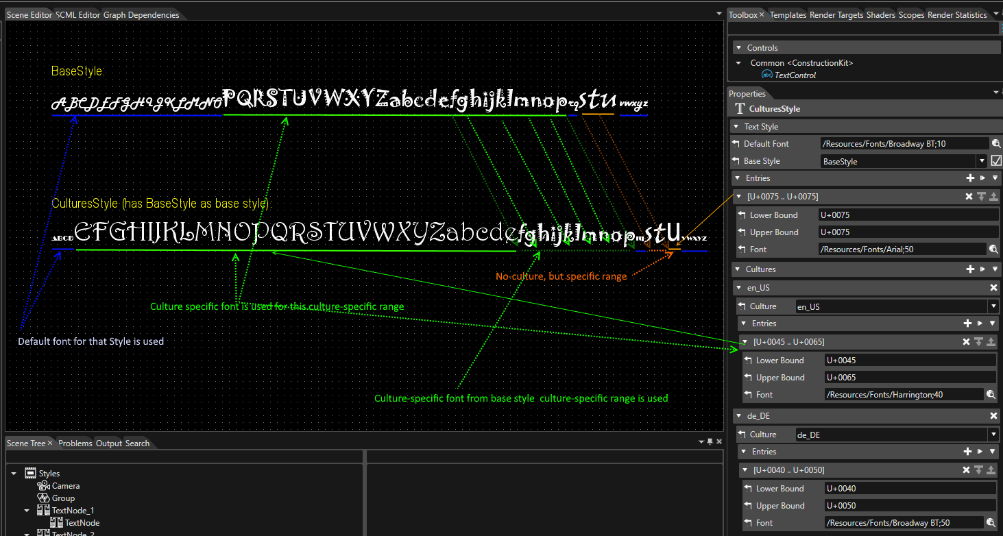
It is possible to create a style which uses a specific font associated for any letter if desired.

- The "Text Style" section has a great importance because of the selection of the main font used in association with a created style.
- The "Metrics" section presents font line spacing information. The edited results are reflected in the Scene Editor, and the edited values are also used when outputting assets.
- Ascender: defines the part of a lower-case letter that is taller than the font's x-height
- Descender: defines the portion of a letter that extends below the baseline of a font.
- Line Height: represents the vertical distance between lines of text
lineGap = lineHeight - (ascender - descender)

- The "General" section provides all the necessary information about the created style: Name, Description, Icon and so forth.
- The "Asset" section provides information about exporting, Id, Symbolic name, and Candera name and path.
To find the cultures that are used and the fonts that were set, a verification is done until a valid configuration is found. The codepoint resolution is done according to rules verified in the following order:
- Check if Active Culture is in the Culture list of the current TextStyle
- Check if Active Culture is in the Culture list of the Base Style
- Configuration of Entries in current Text Style
- Configuration of Entries in Base Style
- Default Font from current Text Style
- Default Font from Base Style
If none of the above checks will give any result, the default code point will be used.
Text Style Editor
There are three ways to open the Text Style Editor:
- Select a TextStyle in the Text Style Palette and press the Edit text style button, which will open the Text Style Editor.
- Double-click on a TextStyle in the Solution Explorer panel.
- Select a TextStyle in the Solution Explorer panel and choose Edit from the context menu.

TextStyles from the ConstructionKit are not editable.
The Text Style Editor is a dialog that is focused on editing Text Style properties. It provides three sections, which can also be found in the Properties panel:
- Text Style properties
- Entries
- Cultures

All text styles are based on the Default Font, which can be changed by clicking on the item selection icon on the right (see figure below). After clicking on the icon, the Font Palette dialog opens and the Default Font can be selected from the selection box.

Items in the [ Entries ] and [ Cultures ] sections can be edited using the toolbar on the right (see figure below). Pressing the [ Add Item ] icon opens the Text Style Entry Editor dialog where you can edit additional items.
The items in the "Entries" and "Cultures" section can be edited using the little toolbars on the right.

When sorting configuration items within Cultures, only items within the same Cultures can be sorted.
In the figure below, the user can swap rows 1 and 2 (both with Culture as "en"), but not rows 2 and 3.

Text Style Entry Editor
The Text Style Entry Editor is used to add or edit items. This editor can be displayed in two ways The Text Style Entry Editor UI that is displayed also depends on the method selected.
- Press the + icon on the right side of the Entries or Cultures section of the Text Style Editor ( Add Entries ).
- Double-click on an item that has already been set ( Edit Entries ).

Add Entries
As mentioned above, if you press the + icon to the right of the Entries section in the Text Style Editor, the Text Style Entry Editor shown below will appear. Settings can be made for multiple Entries.

| 1 | Add/Remove Bounds button |
Add and remove Bounds ranges for use in Entries. Press the + button to add and the - button to delete.
|
| 2 | Setting Bounds List |
The Bounds list range added/edited in the previous section will be displayed. |
| 3 | Select All / Deselect All button |
Select and deselect the checkboxes of the displayed Bounds items (red frame in the above figure) at once.
|
The Lower/Upper Bound value is automatically set according to the check status of the Bounds item's checkbox. For more information on the behavior of the set values, see Bounds Range Setting.
Edit Entries
Bounds editing for the selected Entry on the Text Style Editor. Here you will perform editing operations on the Bounds range set in Add Entries.
Similar to the explanation for Add Entries, the selection status of the checkboxes in the Boud list (red frame in the figure below) changes when the [Select All/Deselect All] button (orange frame in the figure below) is operated.

Bounds range setting
In the Text Style Entry Editor, the Bounds range for each Entry is set by checking the checkbox for each Bound displayed in the list.
- Click on the [ Select All ] button
All Bounds will be checked and the Lower/Upper Bound values will be set as follows.
Lower Bound value: U+0000
Upper Bound value: U+FFFFFFFFFFF

- Click on the [ Deselect All ] button
All Bounds will be unchecked and the Lower/Upper Bound values will be set as follows.
Lower Bound value: Lower value of the upper Bound item in the list among the Bound items in the selected range.
Upper Bound value: Same value as the Lower Bound value already set.

- Check any Bound item
When any Bound item is checked, the Lower/Upper Bound values are set as follows.
Lower Bound value: Lower value of the upper Bound item in the list among the Bound items in the selected range.
Upper Bound value: Upper value of the lower Bound item in the list among the Bound items in the selected range.

Font
Pressing the item selection icon opens the Font Palette dialog, where you can select a new font.

Select Culture
When editing items in the Cultures section of the Text Style Editor (orange frame below), you can use this pull-down menu (red frame below) to select the culture.

When editing the Text Style Entry Editor from the Entries section of the Text Style Editor (blue frame above), the pull-down menu in the Culture section (red frame above) is disabled and Culture cannot be selected.
Clear Mode
The "Clear Mode" item can be created via "Solution Explorer" panel by using the context menu option ("Add" > "New Item"). In this way, all its specific properties ("Clear Color", "Enable Color Write", "Enable Depth Clear" and "Enable Stencil Clear") are related with just one item instead of being included among many other properties of every render target.
A Clear Mode Palette View is available in Solution Options. By using it ("File" > "Solution Options"), it is possible to create different clear mode items which can be saved and reused.

If there are many render targets which are referencing the same clear mode item, it is enough to modify the desired property just once rather than modifying all of them.

After the creation of a "Clear Mode" item, it can referenced by one or more Render Targets. This operation can be done using the "Clear Mode" property available in the "Properties" panel associated with any available render target.
-
If a ClearMode is a associated to a RenderTarget, the RenderTarget is cleared using that ClearMode before any of the attached cameras renders to it.

- See also:
Bitmap Profile
Bitmap Profile
When a graphic object that contains one or many bitmaps is imported, the user has the possibility to set an explicit bitmap profile. Any bitmap profile contains three basic properties which can be set to create a specific profile: "Converter", "Format", and "Origin".
The "Bitmap Profile" feature is accessible in the lower part of any import panel that imports objects which contain bitmaps ("Import FBX", "Import Images", "Import from Solution", "Import from Photoshop").

If there are available many bitmap profiles, the user will be able to select any of them by using the drop-down menu. If not, the user can use the "Browse" but to open the "Bitmap Profiles" dialogue which allows the creation of any desired bitmap profile.
Alternatively, the "Bitmap Profile" dialogue can be open via "Solution Options" panel. (Select "File" > "Solution Options".)

The Solution Explorer context menu allows the creation of a bitmap profile, too. ("Add" > "New Item")

All the created bitmap profiles are available in "Solution Explorer" panel. They can be organized in a separate folder. By double clicking on any bitmap profile the "Bitmap Profiles" panel becomes accessible.

A default bitmap profile can be specified and it will be used for all bitmaps which do not have a profile set explicitly. If necessary, it is possible to set a default bitmap profile by copying any profile previously created by the user. To do this operation it is enough to use the context menu by right click on a created bitmap profile as can be seen in the image below.

Known Issues
When the selected bitmap profile is RLE, RGB565 or RGB888, and the Alpha channel is cut off, a displayed image seems scrambled. In fact, the image is not scrambled, but contains all the artifacts in the source. The affected pixels have a color component and an alpha value of zero. Therefore, the artifacts are not visible when the alpha channel is enabled. When the alpha channel is cut off, then the color channels are shown and therefore those areas get visible.
The solution to this is that the source image has to be modified to remove the color from the areas within zero alpha.
Icon Picker
It is possible to set any type of image as an icon. This "Icon Picker" feature is accesible in the "Solution Options" panel. (Select "File" > "Solution Options".)

The first step towards the creation of a new set of icons is to add images. To select images use the "Import Icons" button which can be found in the upper right corner of the panel. In this way the "Import Icons" panel will become available.

By using the "Select Files" button any desired image and destination folder, for imported images, can be chosen. All images imported as icons will be available as icons and they can be set for any library item (an item which has a folder as Parent) in the solution. The icon can be chosen in the Properties panel.

When an icon is selected for an item, the icon will become immediately visible in the Options panel.

Design Master
The Design Master allows selecting an image that will be displayed as background image in the camera view in order to help on editing.
- Enable this feature by checking the checkbox "Enable" and then selecting the desired image from the existing images of the solution (previous imported images).
- After that all 2D scenes will have the selected image set as default Design master.
- Change the image used as background for a specified scene by selecting a different image for the scene property "Design Master" from the Properties panel.

This feature can also be enabled by using the button placed near Active Rendering.

Problems Configuration
”Errors", "Warnings" and "Messages" that appear in the Problems panel are listed.

- By checking the [ Suppress ] checkbox on the panel, you can hide the notifications that appear in the Problems panel.
- Even if this option is enabled, "Warnings" and "Messages" will be hidden, but "Errors" will still be displayed.
For more information about the Problems Panel, see Problems Browser.
Player Configuration
Configure settings related to CGI Panel startup.

| Panel Path |
Specifies the path to the CGI Panel. By default, the path points to the correct executable but the path can be changed or browsed for with the [ Browse ] button. |
| Panel Path Type |
Specify the path type to the CGI panel from the following three types. [ Relative to Scene Composer] is selected by default.
|
| System Parameters | Parameters that are automatically sent to the player at startup (not editable). |
| User Parameters |
Additional command line arguments can be customized here. These arguments will be executed in addition to the arguments specified in System Parameters. |
| Default Scene |
Select the scene that will be selected by default for the player. To use this option check the checkbox and select the default scene from the scenes set in the solution. |
| Automatic port selection |
If enabled, a different port will be automatically assigned if the port set in the Application port field is already in use. |
| Application port |
Specifies the port to use when setting up a TCP connection with the application. Normally, there is no need to change the default value of "13048". |
Default Render Target Configuration
In the File->Solution Options menu the "Default Render Target Configuration" section allows to set a default render target or to choose whether the camera is activated or not after it has been automatically assigned to the default render target. Default Render Target can also be set to any render target added within the solution.
For more information on how to add a new render target, please refer to Chapter Add a new Render Target.

Not all cameras can be assigned to a default render target (e.g. newly created 2D camera cannot be assigned to a default 3D render target).
IBL HDR
Simply specify a single HDR panorama (latlong) image, and the Engine will automatically generate the required IBL textures. Here, you can configure the target image. The generated IBL will be used as a shared resource within the project. You can also configure the HDR panorama (latlong) image settings during importing a glTF file.

Layout Configuration

Default Bidi Base Level
Defines how alignment is handled in cases where right-to-left characters such as Arabic or Hebrew (Bidi/Bidi) are mixed in with left-to-right writing such as English.
- Implicit: Depends on the first strong character in the string. In other words, if the string begins with "a", it is searched from left to right, and if it begins with "ت", the search is from right to left. If it begins with a space, colon and so on, the first character is searched for in the explicit direction.
- LeftToRight: Placement is fixed from left to right.
- RightToLeft: Placement is fixed from right to left.
- Culture: The orientation set in Culture will be applied regardless of the orientation of the parent layout.
- Inherited: The placement inherits from the parent's layout orientation. If no layout orientation is set for any parent, the orientation specified in Culture will be applied.
- Deprecated: Same as Inherited.
Default Layout Direction
The Layout Direction property defines how the alignment is handled.
- LeftToRightDirection: The alignment is fixed to left-to-right
- Right-To-LeftDirection: The alignment is fixed to right-to-left
- AutomaticDirection: This is the default layout direction. The default interpretation of AutomaticDirection is to inherit the parent’s value (InheritDirection). If no value is set on any parent, and therefore nothing can be inherited, the culture layout direction is used (CultureDirection).
- InheritDirection: Alignment is inherited from the parent layout direction. If no layout direction is set on any parent, the direction of the current culture is used.
- CultureDirection: The alignment depends on the culture and is independent of the parent layout direction.
- Right-to-left for Arabic and Hebrew
- Left-to-right for most languages (e.g. English, German...)
- Right-to-left for Arabic and Hebrew
Associated Vertex Buffer

Here, the original mesh vertex buffer and wireframe vertex buffer information are managed as unique vertex buffer association information.
| Vertex Buffer | Vertex buffer to provide model geometry data |
| Wireframe Vertex Buffer | Wireframe vertex buffer providing model geometry data |
When importing an FBX file, the vertex buffer and the wireframe vertex buffer are automatically registered if the [ Import as wireframe ] is enabled.
If the vertex buffer association information is available, you will see [ Wireframe Enabled ] in the context menu of the 3D scene or 3D node.


Annotations
Add Annotations
A property named "Annotations" is available on each SceneComposer element. By using this property the user can add individual information to selected objects. The property is located in the "Properties" panel under the "General" section next to the "Description" property. It is provided with a "Restore Default" button which allows the user to reset it. Inside the field of the mentioned property, it is possible to add multi-line information as desired; a new line can be started using <CTRL><Enter>

Annotations in SCML Editor
The "Annotations" is serialized only to SCML (no asset, no mff). In this way, the user will be able to see any added "Annotations" in SCML Editor (see the image below).

Annotations in HMI Reports
The information added on any desired item (scene, bitmap etc.) is shown in the generated HMI report under a separate "Annotations" section.

For many details related to the HMI Reports please, consult chapter HMI Report.
Searching
Search for Objects in a Solution
This chapter describes how to use the "Search" panel for advanced searching for objects in a solution.
Specify Search Criteria
Make the Search tab visible in Scene panel. This can be done through the menu "View" - "Search". The select box "Search of Type" allows limiting the search to a specific type of object.
Objects of the following types can be distinguished (listed in alphabetical order):
|
Any object Any node 2D Camera 2D Node 3D Camera |
3D Node Animation Appearance Behavior Bitmap |
Control Control Node 2D Control Node 3D Effect Folder |
Light Material Mesh Render Node Render Target |
Scene Script Component Texture Vertex Buffer Widget |
In the list below the search type and the search button, specific search criteria can be defined related to a specific property of the selected object type. In the example below, a search for all Bitmaps is defined, where the name contains "Gauge".

- Adds additional search criteria. The search function will consider an "AND" operation between several search criteria.
- Deletes an existing search criterion.
- Triggers search action. Pressing the Enter key has the same effect.
It is possible to search nodes referred by a widget having property types "Node" and to search widgets which use a node or its descendant as widget properties. For convenience purpose this functionality is also offered as a context menu on widgets and nodes in the Solution Explorer.

Any referencing widget can be found by using the context menu via Scene Tree.

If a node is referenced by a widget, the node can be found by using the context menu via Widgets panel.
Search Results
Search results are listed at the right area of the Search panel. Double-click on an object from the result list and it will be highlighted in the Scene tree. If the searched value cannot be converted to the property type selected, a warning message is displayed.
Multiple Selection and Editing
In the result list, multiple objects can be selected. The Properties panel will display all the common properties of the selected items:
- The value column is filled only for properties with the same value for all selected items.
- For the rest of the properties the value column will stay empty.
It is possible to change the value of a property for all the selected items at once, by editing the property value in the Properties panel.

Text Search
"Text Search" is a feature that provides the possibility to search a desired text inside a whole solution or just in a single scene.
Make the Search tab visible in Libraries panel via the menu "View" > "Text Search".

From a logical point of view, the first field that should be set is "Look in". You can select a single scene or the entire solution.
As soon as the "Find what" field is completed, the "Find Next" button becomes active. When the desired word is found, all the other buttons become active. In this way it is possible to find a previous text, or to go forward and find the next one. Replace any of the texts which are found in a solution by:
- using the "Replace" button this action is done for a single entry.
- using "Replace All" button this action is done for all the places where the desired word is found.

Case sensitive searching:
If the "Match case" check box is checked, only words that match the case of the word or phrase that you typed in the "Find what" field are found. For example, if you search for "Car" (with a capital "C"), the result includes "Car" but not "car".
All the search events are displayed in the SCML Editor.
Type Ahead Search
In SceneComposer every search field offers the possibility to progressively search for and filter through text. When the text is typed, one or more possible matches for the text are found instantly and immediately presented to the user. This feedback allows stopping short of typing the entire word or phrase they were looking for. You may also choose a closely related option from the presented list.

To increase the flexibility and efficiency of searching it is possible to use different wildcards - characters that can be used as a substitute for any of a class of characters.
- The "Star wildcard" is the most frequently employed and the most useful wildcard, which is the same as an asterisk (*). The star wildcard can represent zero characters, all single characters or any string. For instance, we can use "c*rs" to find "cars" string.
- The "Question Mark" wildcard (?) is used to represent exactly one character, which can be any single character. Thus, two question marks in succession would represent any two characters in succession, and three question marks in succession would represent any string consisting of three characters. For example, it is possible to use five question marks in a row (?????) to find all the scenes that have names which contain five characters.
- The "Slash" (/) character can be used to follow a given path.
Wireframe Scene Design
Wireframe Scene Design
It can be really difficult to find a specific object in a complex scene with many objects(objects hidden by other, bigger objects). A good solution in SceneComposer is the usage of the wireframe nodes preview type. Wireframe rendering applies for meshes (mesh, planar shadow, morphing mesh) and billboards, regardless of their provenience (created by the user, imported, or created by a widget).
There are four different modes available for an entire solution created in SceneComposer: Normal, User Defined, Wireframe and Alpha Blending. Those are from the combo button near the isolated editing button, in the Toolbar.

When the Normal type is selected all the nodes are visible in a usual, non-wire framed, manner. When the User Defined option is selected, at first, all nodes are rendered like in normal mode. But, with the user defined render mode, you can select single nodes and change their "Node Preview Type" property to "Wireframe". These nodes will then always be rendered in wireframe when User Defined rendering is selected, whereas everything else will be rendered normally.

This possibility is available for every selected node, for an entire scene or for the whole solution. Use the User Defined option when the wireframe of only one node should be displayed. In this way, if the Wireframe type of the chosen node is selected, the geometrical structure of the selected object will become visible.

When the Wireframe option in the Toolbar is selected, all the nodes from all the scenes in an opened/newly created solution are displayed as wireframes. Now any new object added to the scene will also be displayed as a wireframe.

Output
The Output panel can be shown by selecting [ View > Output > Output ] in the menu bar.

The Output panel displays all trace information about Scene Composer.

When a message is displayed in the output panel, a context menu is displayed by right-clicking on the panel.

| Export All |
Export all messages displayed in the output panel to a file. |
| Copy |
Copies the message selected on the output panel to the clipboard. |
| Clear | Clears all messages currently displayed. |
Problems Browser
Problems Browser
A dedicated problems browser is available, which can be activated through "View" > "Output" > "Problems"

A problem is a message related to one item in the solution.
In addition to the message itself the problem also has a numeric Id, a severity category (Info, Warning or Error) and a source service (Scml Parser, Shader compiler, etc). By right clicking on the header, it is possible to hide any of its sections or, by using the drag and drop option it is possible to change their order.

The problems browser lists three different categories of problems:
- SCML Errors
- Shader Compiler Errors and Messages
- Missing Dependencies
It is possible to explicitly select information related to one of these categories in the "Category" checkbox. With the buttons placed in the top of the Problems browser, the displayed problems can be filtered according to their origins:
- "Show Only the Suppressed Problems": Display just those problems which were suppressed by the user.
- "Filter Problems by Selected Scene": Display problems only related to the selected scene.
- "Filter Problems by Selected Animation": Display problems only related to the selected animation.
To get focused on problems related to SceneComposer solution configuration, it is possible to suppress warnings or messages solely related to imported content. The first option is ticking the checkbox "Hide warnings and messages from imports in Problems panel" in the "Environment" section of the "Preferences".

The same persistent setting can be toggled directly in the Problems panel by using the button "Hide/Show warnings and messages from imports":

Another possibility to hide warnings is by using the context menu. This operation can be done in both "Solution Explorer" and "Imports" panels. If in the "Solution Explorer" panel the context menu is opened by right clicking on any existing solution or to any of its children, a "Suppress all Warnings" is available. When this is option is selected all the warnings will be hidden.
If one object is selected there will be hidden all the problems related with that object. If the same operation is done for a folder, there will be hidden all the problems related with any children which pertains to that folder.
The forth way to hide warnings is from the problems configuration dialogue - by ticking the "Suppress" checkbox - which is available from the problem browser via "Configure problems" button.

The option to hide warnings is available just for "Warnings" and "Info", not for "Errors".
This setting can also be made in Solution Options > Problems Configuration.
- Errors
- Warnings
- Messages
It is possible to combine the results of these three types of filtering to obtain the desired output.

When right clicking on any selected problem, a context menu gets opened. The context menu shows three different options.
- Export All : a .csv file with al the problems will be exported in a place specified by the user.
- Resolve : Offers an additional context menu to resolve the problem.
- Go to Problem : the user will be able to reach immediately the place where is located the problem which has to be solved.
- Copy : the message of the problem will be copied on the clipboard.
- Suppress Warning : You can choose if the problem should be suppressed for this item or for the entire solution.

Types of Errors
SCML Errors
When faulty SCML modifications are being committed in the SCML Editor, SCML errors are displayed in the Problems view:
Go to Error
When one of the displayed errors is double-clicked, the scene where the error pertains will be loaded and the object will become highlighted on the Scene Tree.
Custom Formats Error
Currently the custom bitmap formats are not supported by Candera 3D (only Candera 2D supports them).
A validation was added to prevent the usage of custom formats in 3D scenes. An error will be displayed in the problem browser panel for every 3D texture which uses a bitmap (or a bitmap theme entry) with custom bitmap format. The validation is applied to the data which is put into the asset (for example an imported bitmap may have the format RGBA but using a bitmap converter the format may be changed to a custom format, this will result in an error).
The asset will not be generated if it would contain any 3D scene which use bitmaps with custom formats.
Shader Compiler Errors
When faulty shader program modifications are being committed in the Shader Editor, shader compiler errors are displayed in the Problems view:

After successful shader compilation, a regarding message is displayed:
Mip-Mapping Warning
A warning should be displayed if mip-mapping is activated on a texture that has non-power-of-two dimensions.
Missing Dependencies
All the missing dependencies are listed on the Problem Browser, too.
Text Size Report
The Text Size Report is a tool that can be used to ensure that the texts and their translations fit their desired sizes. The Text Size Report renders scenes in different cultures and reports any sizing issues the text might have inside of the Text Size Report panel.
The Text Size Report panel is displayed by selecting [ View > Output > Text Size Reportesults ] from the menu bar.

Text Size Report Panel UI

| 1 | Switch |
Switches the panel display style between list view (default) and tree view. |
| 2 |
Filter
|
Two filters are used to narrow down the items in the list.
|
| 3 | Search field |
Searches for items in the list via the name and path. |
| 4 | Execute |
Executes Text Size Report For more information, see Executing Text Size Report. |
| 5 | Refresh |
Refreshes the information in the panel. It is used to update the information when editing operations are performed on a scene, for example, when a node is added. |
| 6 | Export |
Export the configured Text Size Reportdata in csv file format. |
View style
By pressing [ Switch ] icon, you can switch between list view and tree view.
List View
By default the panel is in list view mode and it lists all of the combinations of cultures and texts within the solution.

Tree View
In case of large solutions with many scenes and cultures the tree view is recommended. The tree view items are adhering to the following hierarchy: Culture > Scene > Scene Hierarchy.

In both view style, should any additional text nodes be rendered without being present in the scene, they will be added to the list view along the other nodes and in case of the tree view they will be added to the unpaired nodes.
Executing Text Size Report
The Text Size Reportcan be executed either by clicking the run icon in the Text Size Report panel or using Report > Text Size Reportin the menu bar. The following dialog will appear:

The target scenes and cultures should be selected for the Text Size Report Subsequently the inspection can be executed using the [ Check ] button. To select multiple scenes and execute them all at once, press the [ Check All ] button. During inspection, [ check ] button will be replaced with [ Stop ] button, this can be used to interrupt the Text Size Report The collected data will persist even if the Text Size Reportis not fully complete.
Remote
A remote text size check can be used in order to check the text nodes on a running system. In this mode the rendered text nodes will send a tcp message to the scene composer which will save the results. When dealing with duplicate results the text size report will prefer to hightlight the results that have failed the check at some point (not every result is displayed due to high count of entries).
Setup
In order to use the Remote TSR the Player application needs to start the TSR Server and the scene composer needs to start the TSR Client. The order of these steps is not relevant. Both Player and Scene composer need to be on devices with Internet or same LAN connection. The device needs to have the port 13060 free.
To automatically start the application with a TSR server on, build the application with the CANDERA_TEXT_SIZE_REPORT_ENABLED Cmake Flag set to true. Alternatively if a custom server startup is necessary, a call to DefaultTextStatisticsHost::GetOrCreateHost() from the TextEngine project can be used to start the TSR server inside of the application.
To start the TSR Client in Scene Composer, click the "Execute" icon (see Panel UI) in the Text Size Report panel. Select the [ Remote Check ] tab at the top of the Text Size Report dialog that appears, enter the IP of the device on which the Player is running, and click the [ Connect ] button. When interacting with the Player the results should appear in the panel.
Covered Use Cases
The Text Size Report covers the following usecases:
- Static Texts
- Culture dependent text
- Text nodes with inherited and provided sizes
- Text nodes with truncation, wordwrap
The Text Size Report won't work on:
- Text Nodes with disabled rendering
- Text Nodes outside of the render area
- Text Nodes with cached layout enabled.
- Clipped Text Nodes (Height check only works on word wrapping. Should the first line already be too small it will not check it. )
- Occluded Text Nodes
- Dynamic use cases like changing text or size properties at runtime
- Behavior functionality which rely on Courier features are not properly evaluated in Scene Composer
Candera Logging
The SceneComposer Output panel is similar to the Candera logging panel. Activate the panel via "View" > "Output" > "Candera Logging"

All Candera traces can be displayed.

In the Candera logging panel the first mandatory action is to enable the tracing by using the "Enable/Disable Candera tracing" button. The second setting that is necessary is the configuration of the Candera logging (Press the Candera Logging Configuration button). By default, the lowest level is set to "Off".

To change this setting the "Lowest logging message level" dialog should be used. All the levels are hierarchically ordered based on the quantity of information that is delivered.

Enabling one level will enable the lower levels as well. For instance, enabling "Warning level" for one module will also enable "Error" and "Fatal" levels, or enabling "Debug level" will also enable all other lower levels.
If you would like to realize a distinction between traces (especially when there are many traces), an useful feature is the "Add mark" button. By using it, as many markers as necessary will be introduced to separate different traces.
All the information (including the markers) are kept in a .xml file on the hard disk. Every time when the Candera trace feature is used, all the previous information is displayed.
All Candera traces are delivered and displayed as "Raw" traces. If necessary, it is possible to filter all the traces by adding new filters. For example, ([up almost] && collinear) || (!New) represents an "expression" created to filter the Candera traces. The logical operators used here are && (Or), II (And), ! (Not). The [] brackets can be used on the same way as any other "match case" feature usual in different applications. The () brackets are used to create more complex filters.

All the Candera traces can be exported as a .csv file by using the "Export traces" button at a chosen location on the hard disk.
By default, the "Autoscroll" button is always activated. On this way, the latest traces are displayed in the panel without handling the scrollbar. If necessary, the "Autoscroll" button can be used to change the default status to manual use the scrollbar.
Undo and Redo Operations
Undo and Redo Operations
Any operation concerning scene design and animation design can be undone or redone.
Undo an operation via menu "Edit" > "Undo" or Toolbar item.

Redo an undone operation via menu "Edit" > "Redo" or Toolbar item.

Undo/Redo Actions' History
A very helpful function associated with Undo/Redo options is the "Actions' History". All the previous actions can be shown by pressing the "v" button, which is placed between "Undo" and "Redo" buttons visible in Toolbar.

By using this function all the previous actions are displayed. In this way, it is possible to choose which of the previous actions should be undone.

After all the selected actions have been undone, the "Actions' History" menu will reflect the current state of actions.
After undoing multiple actions, the Redo of "History' Actions" button, which is placed on the right side of the Undo arrow, will become available. The Redo "Actions' History" shows all the actions that have been undone.
-
Importing a resource into Scene Composer, regardless of type, will result in your undo/redo history being cleared.
Device Capabilities and Constraint Violations
Device Capabilities and Constraint Violations
Device capabilities for both target and simulation are displayed in SceneComposer via menu item "Platform" > "Device capabilities".

The "Device Capabilities" panel provides two distinct columns where both "Simulation device capability value" and "Target device capability value" are displayed.

Violations of supported capabilities are reported into the problem viewer panel.
SCHost Information
In order to help the user identify which font engine is active in SceneComposer, a Platform menu entry is available: "SCHost Information".

It displays the configuration that was used to build SCHost, including the font engine.

Item Names Validation
The validation rules for item names are now applied also during imports and solution loading. These rules are:
- The item name mustn't be null or empty;
- Only the following characters are allowed in item names:
In the User Interface (UI)
| Symbol | ASCII | Description | |
|---|---|---|---|
| 1 | No symbol | ASCII(32) | Space |
| 2 | ! | ASCII(33) | Exclamation mark |
| 3 | $ | ASCII(36) | Dollar |
| 4 | % | ASCII(37) | Procenttecken |
| 5 | ' | ASCII(39) | Single quote |
| 6 | ( | ASCII(40) | Open parenthesis (or open bracket) |
| 7 | ) | ASCII(41) | Close parenthesis (or close bracket) |
| 8 | + | ASCII(43) | Plus |
| 9 | , | ASCII(44) | Comma |
| 10 | - | ASCII(45) | Hyphen |
| 11 | . | ASCII(46) | Period, dot or full stop |
| 12 | ; | ASCII(59) | Semicolon |
| 13 | = | ASCII(61) | Equals |
| 14 | @ | ASCII(64) | At symbol |
| 15 | ^ | ASCII(94) | Caret - circumflex |
| 16 | _ | ASCII(95) | Underscore |
| 17 | ` | ASCII(96) | Grave accent |
| 18 | { | ASCII(123) | Opening brace |
| 19 | } | ASCII(125) | Closing brace |
| 20 | ~ | ASCII(126) | Equivalency sign - tilde |
In the SceneComposer Markup Language (SCML)
| Symbol | ASCII | Description | |
|---|---|---|---|
| 1 | # | ASCII(35) | Number |
| 2 | [ | ASCII(91) | Opening bracket |
| 3 | \ | ASCII(92) | Backslash |
| 4 | ] | ASCII(93) | Closing bracket |
- The item name cannot be "." or "..";
- The item name can not end with ".";
- Additionally Backslash (ASCII 92) and Number (ASCII 35) can be part of an item name if that name is generated by SceneComposer.
Items AssetId
Item Asset Validation
In Candera the objects are now identified using a numerical Id. For Library Items (scene, bitmap, etc) the maximum value is 1FF FFFF (25 bits), for Node Attachment Templates (appearance collection, material, render mode, uniform setter, texture) is 7FFFF (19 bits) and for nodes is 3FFF FFFF (30 bits). The Id will be generated automatically if its value is set to 0.

For library items the Ids must be unique for all objects of the same type. For nodes the Ids must be unique inside the scene. If necessary, the property can be copied by using the small button near the field of the property.

-
The copy option is possible by using the context menu (right click inside the AssetId field).
Symbolic Names
This type of names can be assigned to items to make their Id accessible from applications. A symbolic name can be assigned via Properties panel in the field which can be seen in the image below.

A symbolic name can be created by the user or by using the "Generate Symbolic Name" button.
A C++ header with all the symbolic names from the solution can be generated via File->Export Symbolic Names.

Auto Values
Introduction
Auto values are values which are internally computed by SceneComposer or Candera or inherited from other objects in certain situations. In these situations, it is useful to show the computed value and an information that the value is computed.
Example: TextNode2D.LineHeight property can have a computed value. Setting it to any other value than 0, will make the value fixed and effectively used by Candera to separate the lines of text. But when setting it to 0, internally, Candera will use instead the line height value (let’s say 42) specified by the associated text style. In this case, the value 0 is a trigger for computing a different value internally. And we call the computed 42 value an auto value.
Triggers of Auto-Value Properties
There are several triggers for a property to have an auto value:
- Value. This is the most common one - a certain value of the property makes the property auto (usually the default value is the trigger value – in examples above, for Line Height, 0 is also the default value. In this case, having the default value triggers becoming auto).
- Other configuration – like properties of parent, parent type, and so on.. (example: when a node is a child of a layout group, the node’s position becomes auto because it’s computed by the layout group).
- Always Auto – they are values computed by Candera for properties which are not configurable (for example, PreferredSize is a value computed during measuring elements in a Layout process. This is not configurable, but is a value computed based on other values. It may be meaningful for users when understanding of layout is needed).
Functionality of Auto-Values
The text "(Auto)" inside of a read-only properties field indicates that this property has an Auto-Value. The user can interact with auto-values through the switch button which is available in the Properties panel on the right side of the Auto-Value field. In the image below, you can see that the vertical and horizontal size value is an Auto-Value, each having a corresponding switch button on their right.

As can be seen in the image above, a suffix indicates that the value is "auto". As expected, if the button is used the value will become editable and the user will be allowed to modify it as desired.
Auto-Value Properties
- TextNode2D.LineHeight
- Type: integer
- Trigger: having default value (0)
- Is metainfo property: No
- Retrieve auto value: retrieve the line height metric from the metrics of the associated TextStyle
- CanvasText.LineHeight
- Same as TextNode2D.LineHeight
- Node2D.Position
- Type: Vector2
- Trigger: parent is layouter
- Is metainfo property: No
- Retrieve auto value: query SCHost, requires scene being loaded
- Node2D.Scale
- Type: Vector2
- Trigger: parent is layouter and stretch is not None except for when the node has a 9-patch image
- Is metainfo property: No
- Retrieve auto value: query SCHost, requires scene being loaded
- CanvasNode.Position
- Type: Vector3
- Trigger: parent is layouter. Only X and Y are auto
- Is metainfo property: No
- Retrieve auto value: query SCHost, requires scene being loaded
- CanvasNode.Scale
- Type: Vector2
- Trigger: parent is layouter and stretch is not None except for when the node has a 9-patch image
- Is metainfo property: No
- Retrieve auto value: query SCHost, requires scene being loaded
- Node2D.BoundingRectangle
- Type: Rectangle
- Trigger: Width and Height having default value (-1)
- Is metainfo property: No
- Retrieve auto value: query SCHost, add method to retrieve the computed bounding box, requires scene being loaded
- Camera2D.Viewport
- Type: Rectangle
- Trigger: Width and Height having default value (-1)
- Is metainfo property: No
- Retrieve auto value: compute the value based on RenderTarget dimensions and Candera rules
- Camera2D.ScissorRectangle
- Type: Rectangle (only Width and Height can be auto)
- Trigger: Width and Height having default value (-1)
- Is metainfo property: No
- Retrieve auto value: compute the value based on RenderTarget dimensions and Candera rules
- RenderTarget.Width
- Type: integer
- Trigger: having default value (-1)
- Is metainfo property: Yes
- Retrieve auto value: compute the value based on display dimensions (-1 means display width)
- RenderTarget.Height
- Type: integer
- Trigger: having default value (-1)
- Is metainfo property: Yes
- Retrieve auto value: compute the value based on display dimensions (-1 means display height)
- Node.Size (Layout)
- Type: Vector2
- Trigger: having default value (-1; -1)
- Is metainfo property: Yes
- Retrieve auto value: retrieve the ActualSize value from SCHost, which is computed by the Layouter. SCHost already acquires that value to use it to show the adorner for size (using a layout monitor which is notified about layout processing events and values).
- CanvasNode.Size (Layout)
- Type: Vector3 (only X and Y can be auto)
- Trigger: having default values (-1; -1) for X and Y (only X and Y can be auto)
- Is metainfo property: Yes
- Retrieve auto value: retrieve the ActualSize value from SCHost, which is computed by the Layouter. SCHost already acquires that value to use it to show the adorner for size (using a layout monitor which is notified about layout processing events and values).
- CanvasText.Size
- This property is different from the layout size, but has the same name.
- Type: Vector2
- Trigger: having default values (-1; -1) for X and Y
- Is metainfo property: Yes
- Retrieve auto value: retrieve value computed by the CanvasNode through SCHost.
Improving Other UI Areas
The introduction of auto-value concept has an important consequence: user no longer sees the values if the values are the default ones (like 0 for LineHeight or -1 for Viewport.X). However, there are still cases for which, the default value is shown but auto-value cannot be implemented because doesn’t make sense. For these situations, additional improvements can be made.
- MaxSize: This Layout property has a default value of -1 which represents that value is not specified and should be considered infinite. This property can be turned into an optional property, so that by default it shows an unchecked checkbox indicating that MaxSize is not set.
- MinSize: Same as for MaxSize, can be turned into optional.
There are also properties which are not configurable in SceneComposer, nor they are visible in the property panel. They could be displayed in the property panel, but stay read-only, only for the purpose of providing information about internals.
- PreferredSize: Read-only property, can be added to Layout category to display the corresponding value computed by Candera. Value to be retrieved from SCHost.
- ArrangeSize: Read-only property, can be added to Layout category to display the corresponding value computed by Candera. Value to be retrieved from SCHost.
- ArrangePosition: Read-only property, can be added to Layout category to display the corresponding value computed by Candera. Value to be retrieved from SCHost.
Diagram Bird's Eye
This feature is available in Fusion/State Machine. This feature provides a Bird's eye view of the entire Fusion diagram and/or State Machine Editor and marks the current location in the Fusion/State Machine Editor panel with a blue frame. The blue frame in Diagram Bird's Eye can be moved by dragging with the mouse, and its position in Fusion/State Machine Editor panel changes accordingly, providing a bird's eye view of the entire diagram when working with the Fusion diagram/state machine editor.
The following figure shows an example of the display in the Fusion diagram (click to enlarge the figure). The same view is also available in the State Machine Editor.


How to use
Here is an example of how it is used in Fusion (the basic operation is the same for state machines).
- Select [ View > Fusion > Diagram Bird's Eye ] from the menu bar to display the Diagram Bird's Eye panel.
- Normally, the panel is displayed as a floating window.
- Before displaying the Fusion panel, only the message "Diagram is inactive. Double click to display diagram." will appear in the Diagram Bird's Eye panel.
- In case of State Machine Editor, select [ View > State Machine > Diagram Bird's Eye ].

- Display the Fusion panel.
- The fusion diagram in the panel is shown in the Diagram Bird's Eye panel.
- By dragging the blue frame in the Diagram Bird's Eye with mouse operation, the diagram displayed in the Fusion panel is also moved.

Toolbar in Diagram Bird's Eye
[ Zoom ] in the lower left part of Diagram Bird's Eye panel is linked to [ Zoom ] in the toolbar of Fusion panel. Changing the [ Zoom ] in Fusion panel will also change the zoom value in Diagram Bird's Eye (The reverse operation yields the same result.).

When [ Zoom ] in Diagram Bird's Eye panel is changed, the size of the blue frame in the panel changes.
