# 2D Nodes

#### 2D Toolbox

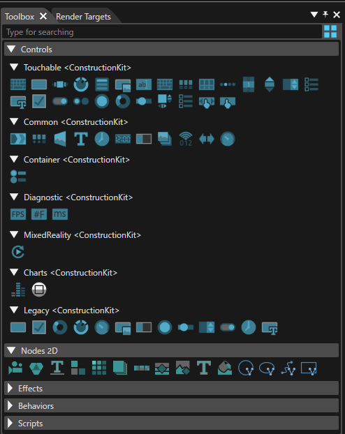
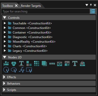
The Toolbox for 2D scenes provides the following items:

<div drawio-diagram="5618"><img src="https://doc316en.candera.eu/uploads/images/drawio/2024-04/drawing-7-1713773118.png" alt=""/></div>

<div class="contents" id="bkmrk-a-%22show-controls-as-"><div class="contents"><div class="contents"><div class="textblock"><dl class="note"><dt></dt><dd><p class="callout info">A "Show Controls as Big Icons/List" button is available in the upper right corner. If this button is used, a different presentation mode - as icons instead of a text list of items - will be made available (see the image below).</p>

</dd></dl></div></div></div></div><div drawio-diagram="5619"><img src="https://doc316en.candera.eu/uploads/images/drawio/2024-04/drawing-7-1713773199.png" alt=""/></div>

<div class="contents" id="bkmrk--1"><div class="contents"><div class="contents"><div class="textblock">  
</div></div></div></div>#### <a class="anchor" id="bkmrk--33"></a>Create 2D Nodes

Following items can be used to create a new node in the scene graph:

<div drawio-diagram="6231"><img src="https://doc316en.candera.eu/uploads/images/drawio/2024-06/drawing-5-1718374267.png" alt=""/></div>

<div class="contents" id="bkmrk-2d-camera%3A-to-be-lin"><div class="contents"><div class="textblock"><table border="0" cellspacing="10" style="width: 100%;"><tbody><tr valign="bottom"><td style="width: 4.94132%;">1

</td><td style="width: 95.0175%;">**2D Camera:** To be linked to a render target, where the render result of the camera will be drawn.   
[Candera::Camera2D](http://dev.doc.cgistudio.at/APILINK/class_candera_1_1_camera2_d.html "A camera defines the view to the scene. At least one Camera2D has to be added to a 2D scene graph and...")</td></tr><tr valign="bottom"><td style="width: 4.94132%;">2

</td><td style="width: 95.0175%;">**2D Group:** Parent item for other nodes. Child nodes are located relative to the parent group.   
[Candera::Group2D](http://dev.doc.cgistudio.at/APILINK/class_candera_1_1_group2_d.html "The class Group2D is a scene graph node that stores a set of nodes as its children. The parent-child relationship between groups and nodes is bidirectional. Whereas a group can hold a group of nodes, a node can at most have one parent at a time. Cycles are prohibited. Changing the groups transformation or alpha value affects the children nodes of the group.")</td></tr><tr valign="bottom"><td style="width: 4.94132%;">3

</td><td style="width: 95.0175%;">**Base Line Layout:** Provides a stacked layout in the horizontal direction.   
[Candera::BaseLineLayouter](http://dev.doc.cgistudio.at/APILINK/class_candera_1_1_base_line_layouter.html "A BaseLineLayouter behaves similar to a Horizontal StackLayouter but instead of aligning the objects ...")</td></tr><tr valign="bottom"><td style="width: 4.94132%;">4

</td><td style="width: 95.0175%;">**Dock Layout:** Provides an area divided into five screens (Top, Bottom, Center, Left, Right). Nodes can be placed in the screens surrounding the Center screen.   
[Candera::DockPanelLayouter](http://dev.doc.cgistudio.at/APILINK/class_candera_1_1_dock_panel_layouter.html "The Dock Panel Layouter provides an easy docking of elements to the left, right, top, bottom or center of the panel. The dock side of an element is defined by the attached dynamic DockSide property. To dock an element to the center of the panel, it must be the last child of the panel.")</td></tr><tr valign="bottom"><td style="width: 4.94132%;">5

</td><td style="width: 95.0175%;">**Grid Layout:** Each node within the group will be positioned within a grid.   
[Candera::DockPanelLayouter](http://dev.doc.cgistudio.at/APILINK/class_candera_1_1_dock_panel_layouter.html "The Dock Panel Layouter provides an easy docking of elements to the left, right, top, bottom or center of the panel. The dock side of an element is defined by the attached dynamic DockSide property. To dock an element to the center of the panel, it must be the last child of the panel.")</td></tr><tr valign="bottom"><td style="width: 4.94132%;">6

</td><td style="width: 95.0175%;">**Overlay Layout:** Allow you to place nodes on top of each other to create a layered effect.   
[Candera::OverlayLayouter](http://dev.doc.cgistudio.at/APILINK/class_candera_1_1_overlay_layouter.html "OverlayLayouter sets sizes of all child elements to fulfill the given area.")</td></tr><tr valign="bottom"><td style="width: 4.94132%;">7

</td><td style="width: 95.0175%;">**Stack Layout:** Stacks nodes in the horizontal or vertical direction.   
[Candera::StackLayouter](http://dev.doc.cgistudio.at/APILINK/class_candera_1_1_stack_layouter.html "A StackLayouter stacks its elements either in horizontal or vertical order.")</td></tr><tr valign="bottom"><td style="width: 4.94132%;">8

</td><td style="width: 95.0175%;">**RenderNode:** Can be associated with any type of effect.   
[Candera::RenderNode](http://dev.doc.cgistudio.at/APILINK/class_candera_1_1_render_node.html "RenderNode is a 2D node that links to an effect chain. Therefore this is the only type of 2D node whi...")</td></tr><tr valign="bottom"><td style="width: 4.94132%;">9

</td><td style="width: 95.0175%;">**BitmapNode:** By default associated with a BitmapBrushAlphaBlend effect.   
Candera::BitmapBrushAlphaBlend</td></tr><tr valign="bottom"><td style="width: 4.94132%;">10

</td><td style="width: 95.0175%;">**TextNode:** By default associated to a TextBrushAlphaBlend effect.   
Candera::TextBrushAlphaBlend</td></tr><tr valign="bottom"><td style="width: 4.94132%;">11

</td><td style="width: 95.0175%;">**Solid Color Node:** By default associated to a TextBrushAlphaBlend effect.   
[Candera::SolidColorBrush](http://dev.doc.cgistudio.at/APILINK/class_candera_1_1_solid_color_brush.html "Output a rectangle filled with a solid color. The rectangle is transformed to the transformation spac...")</td></tr><tr><td style="width: 4.94132%;">12

</td><td style="width: 95.0175%;">**MVG Arc Node:** can be used to display an arc  
</td></tr><tr><td style="width: 4.94132%;">13

</td><td style="width: 95.0175%;">**MVG Ellipse Node:** can be used to display ellipse  
</td></tr><tr><td style="width: 4.94132%;">14

</td><td style="width: 95.0175%;">**MVG Path Node:** can be used to display paths with a combination of instructions  
</td></tr><tr><td style="width: 4.94132%;">15

</td><td style="width: 95.0175%;">**MVG Rect Node:** can be used to display rect.  
</td></tr></tbody></table>

</div></div></div>For each of these types, refer to the Properties panel for inspecting all properties specific for the type of node. Tooltips are available to explain the purpose of the property. Refer also to the <span style="color: rgb(230, 126, 35);">[Properties Overview](https://doc316en.candera.eu/books/appendix/page/properties-overview "Properties Overview")</span> listing the Tooltip descriptions.

About MVG nodes, please refer to <span style="color: rgb(230, 126, 35);">[MVG Nodes](https://doc316en.candera.eu/link/1067#bkmrk-page-title)</span> page.

#### <a class="anchor" id="bkmrk--34"></a>Position of 2D Nodes

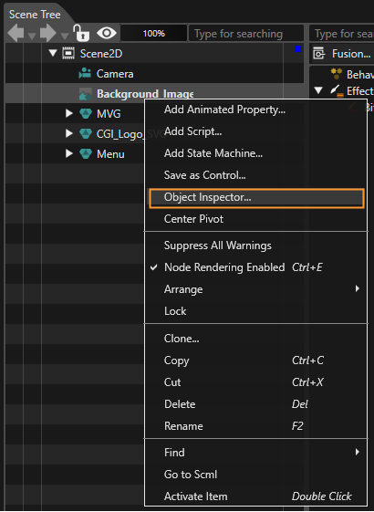
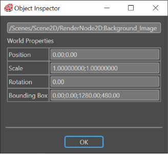
By using the so-called "Object Inspector" feature, it is possible to display the following properties of a 2D node: Position, Scale, Rotation and BoundingBox. This can be done by right-clicking on a 2D node and selecting the "Object Inspector" from the context menu.

<div drawio-diagram="7594"><img src="https://doc316en.candera.eu/uploads/images/drawio/2024-12/drawing-5-1733481496.png" alt=""/></div>

<div class="contents" id="bkmrk--6"><div class="contents"><div class="textblock">  
</div></div></div>The displayed data (visible in the "Object Inspector" panel) is always refreshed reflecting all the changes made by the user.

<div drawio-diagram="6233"><img src="https://doc316en.candera.eu/uploads/images/drawio/2024-06/drawing-5-1718374448.png" alt=""/></div>

<div class="contents" id="bkmrk--9"><div class="contents"><div class="textblock">  
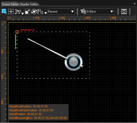
</div></div></div>WorldPivotPosition, WorldPosition and WorldBoundingBox can also be displayed in the Scene Editor panel.

<div drawio-diagram="6234"><img src="https://doc316en.candera.eu/uploads/images/drawio/2024-06/drawing-5-1718374730.png" alt=""/></div>

<div class="contents" id="bkmrk--11"><div class="contents"><div class="textblock">  
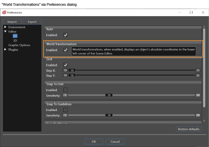
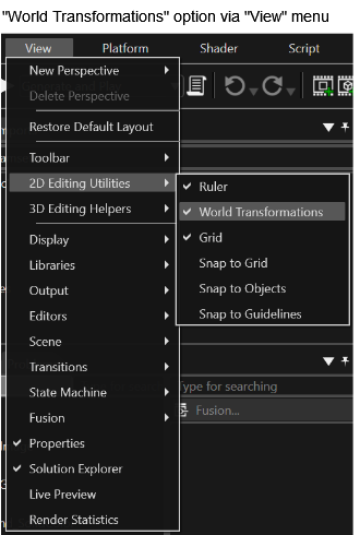
</div></div></div>This feature is disabled by default and can be enabled in "Preferences" &gt; "Editor" &gt; "2D" &gt; "World Transformations". Alternatively, it can be enabled in "View" &gt; "2D Editing Utilities" &gt; "World Transformations".

<div drawio-diagram="6235"><img src="https://doc316en.candera.eu/uploads/images/drawio/2024-06/drawing-5-1718374808.png" alt=""/></div>

<div drawio-diagram="6236"><img src="https://doc316en.candera.eu/uploads/images/drawio/2024-06/drawing-5-1718374847.png" alt=""/></div>

#### <a class="anchor" id="bkmrk--40"></a>Adding Text to the 2D Scenes

Text can be added to the scenes either by using a dedicated node called TextNode2D or by using a Render Node in conjunction with a text effect.

##### TextNode2D

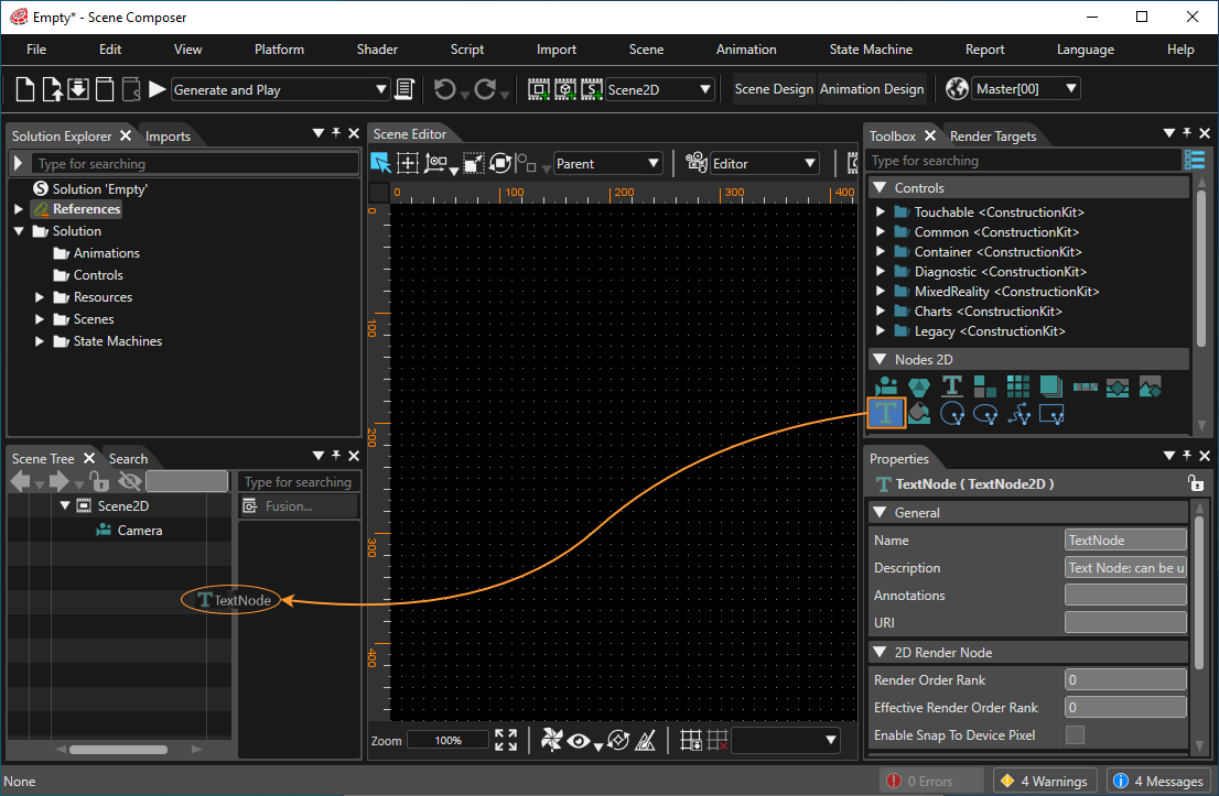
The image below shows how to drag and drop the TextNode2D from the Toolbox to the scene tree:

<div drawio-diagram="7596"><img src="https://doc316en.candera.eu/uploads/images/drawio/2024-12/drawing-5-1733485584.png" alt=""/></div>

<div class="contents" id="bkmrk--17"><div class="contents"><div class="textblock">  
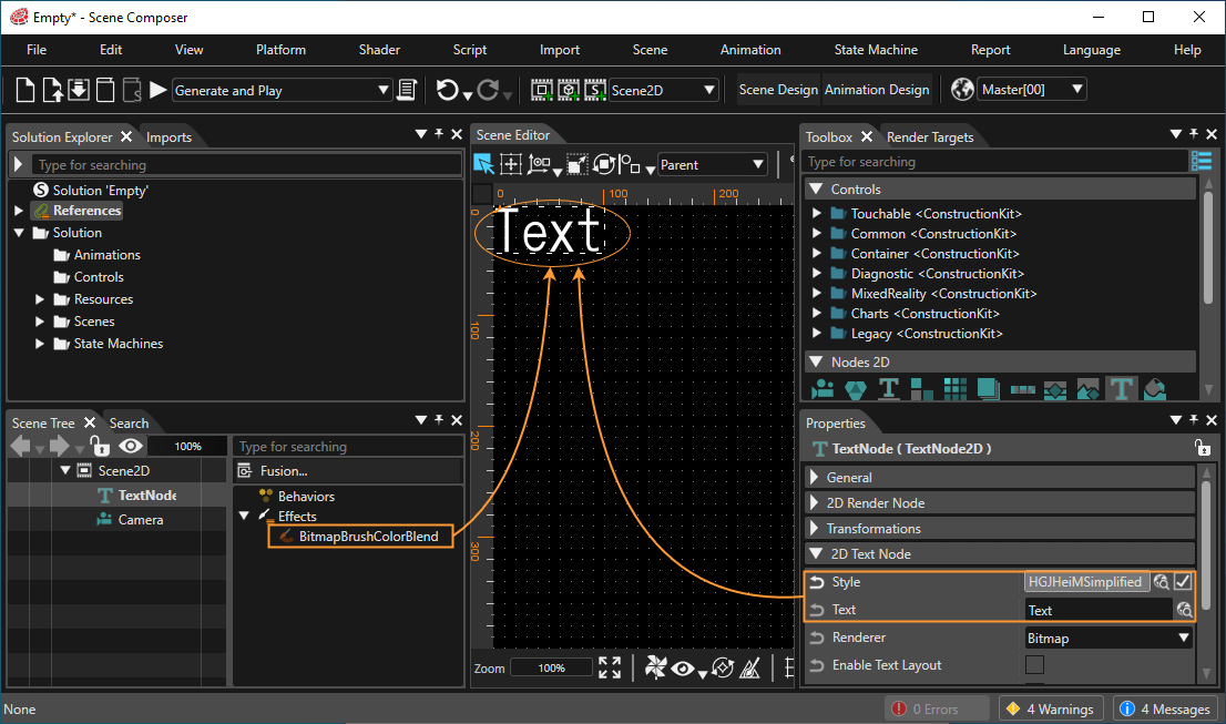
</div></div></div>The TextNode2D default properties are set so that the node is displayed after it is added to the scene tree.

<div drawio-diagram="7597"><img src="https://doc316en.candera.eu/uploads/images/drawio/2024-12/drawing-5-1733485748.png" alt=""/></div>

<div class="contents" id="bkmrk-please-consult-text-"><div class="contents"><div class="textblock"><dl class="note"><dt></dt><dd><p class="callout info">Please consult <span style="color: rgb(230, 126, 35);">[Text Style Palette](https://doc316en.candera.eu/books/solution-handling/page/text-style-palette)</span> for detailed information about adding and editing styles.</p>

</dd></dl></div></div></div>##### Multi Line Text Input

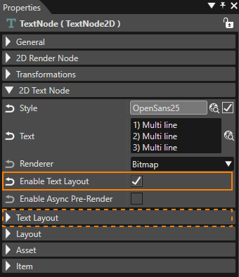
Sometimes it could be necessary to introduce a long text - structured in multiple, successive lines - into a text field. To support this, SceneComposer allows multi-line input in any text field within the Properties panel. To insert a newline press **Ctrl + Enter**. This will put the cursor at the beginning of the next line.

<div drawio-diagram="8625"><img src="https://doc316en.candera.eu/uploads/images/drawio/2025-10/drawing-5-1760691055.png" alt=""/></div>

More text layout properties are available when "Enable Text Layout" is checked .

##### Text Layout  


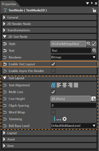
Another category called "Text Layout" includes the following properties: TextAlignment, LineSpacing, Trimming, MultiLine and WordWrap.

<div drawio-diagram="6239"><img src="https://doc316en.candera.eu/uploads/images/drawio/2024-06/drawing-5-1718375411.png" alt=""/></div>

<div class="contents" id="bkmrk--30"><div class="contents"><div class="textblock">**Multi-Line:** In some cases it may be necessary to render a multi-line text as a single line, ignoring any newline characters. This can easily be achieved by unchecking the "Multi-Line" property. The result is immediately visible in the Scene Editor.</div><div class="textblock"></div></div></div><p class="callout info">This properties section is only visible if *Enable Text Layout* is checked. If it is unchecked, the default values of the properties will determine the way the text is rendered.</p>