# 2D Laying Out

Laying out is a feature specific to 2D scenes. Once a layout is applied to a 2D group, all children of that group will be affected by the given layout strategy.

<div class="contents" id="bkmrk-if-the-user-does-not"><div class="contents"><div class="textblock"><dl class="note"><dd><p class="callout info">If the user does not want any laying out support, thus normal editing procedure is applied and no laying out is set. If the user enables laying out for some nodes, and he does not want to move by mistake any of the child nodes which are laid out, the "strict laying out" option can be enabled from File-Preferences menu, Editor - 2D section. On-demand laying out is available by pressing CTRL+ L or by calling "Edit" &gt; "Do-Layout" menu option to trigger Candera to layout all objects in the scene</p>

</dd></dl></div></div></div>Candera supports four built-in layouts: Stack, Grid, Baseline, Overlay, and DockPanel each layout having some specific configuration parameters.

#### **General Layout Properties**

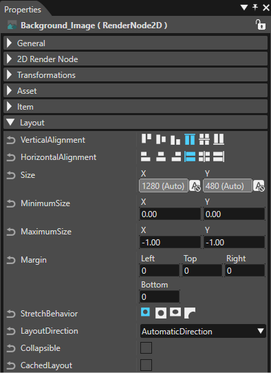
The following properties can be set to any node which is arranged by a parent layouter.

<div drawio-diagram="8794"><img src="https://doc316en.candera.eu/uploads/images/drawio/2025-11/drawing-5-1763718472.png" alt=""/></div>

<div class="contents" id="bkmrk--0"><div class="contents"><div class="textblock">  
</div></div></div>A layout can only be set on a group, having some specific properties, while final laying out is determined by the properties set on all the arrangeable items that are contained in any group on which a layout was set.

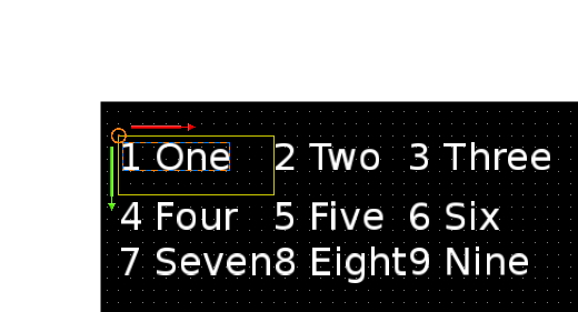
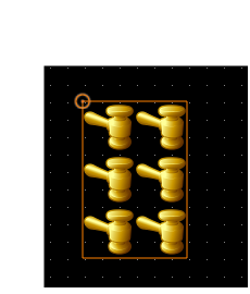
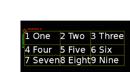
After the creation of a layout, the borders of the grid cells - including bounding boxes - can be visualized simultaneously in the Scene editor. Actually, the border of every cell of the layout will be visible as a yellow line.

<div drawio-diagram="6261"><img src="https://doc316en.candera.eu/uploads/images/drawio/2024-06/drawing-5-1718377917.png" alt=""/></div>

<div class="contents" id="bkmrk--2"><div class="contents"><div class="textblock">  
</div></div></div>This border is visible if the entire group is selected or if just one single cell is selected.

<div drawio-diagram="6262"><img src="https://doc316en.candera.eu/uploads/images/drawio/2024-06/drawing-5-1718377991.png" alt=""/></div>

<div class="contents" id="bkmrk--4"><div class="contents"><div class="textblock">  
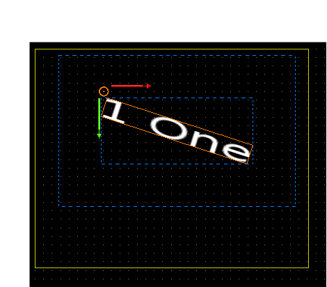
</div></div></div>Two different secondary borders - the bounding box of the parent node, and the bounding box of the effective node - will be visible, marked with blue, if some values are set.

<div drawio-diagram="6263"><img src="https://doc316en.candera.eu/uploads/images/drawio/2024-06/drawing-5-1718378021.png" alt=""/></div>

<div class="contents" id="bkmrk--6"><div class="contents"><div class="textblock">  
</div></div></div>The effective bounding box will become visible if layout values - like margin of the element - are added in Properties panel.

##### <a class="anchor" id="bkmrk--43"></a>Row, Column Number

If the parent layout is a grid, the elements position in the grid can be changed. This has same effects like arranging a node in the Grid Editor Dialog.

##### <a class="anchor" id="bkmrk--44"></a>Alignment

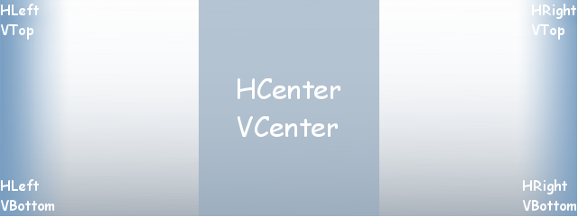
**Vertical Alignment:** Each layout-able element can specify its vertical alignment inside the area which is available by the parent layout.

<p class="callout info">The sample images below were created using an **OverlayLayout** (sized 200x100px) containing an **image** (sized 151x52px). The image's StretchBehavior property is set to **Uniform** and its HorizontalAlignment remains at the default value.   
To demonstrate the impact of different **VerticalAlignment** settings, this property has been varied across all options (from VTop to VStretchBottom). </p>

<div drawio-diagram="8805"><img src="https://doc316en.candera.eu/uploads/images/drawio/2025-12/drawing-7-1764719574.png" alt=""/></div>

<div class="contents" id="bkmrk--10"><div class="contents"><div class="textblock">  
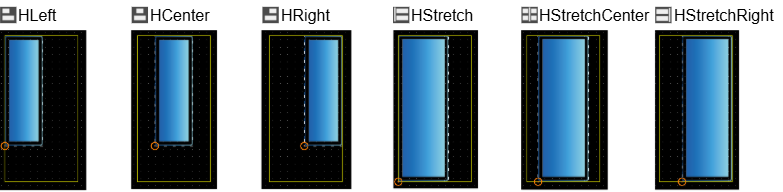
</div></div></div>**Horizontal Alignment:** Each layout-able element can specify its horizontal alignment inside the area which is available by the parent layout.

<p class="callout info">The sample images below were created using an **OverlayLayout** (sized 100x200px) containing an **image** (sized 52x151px). The image's StretchBehavior property is set to **Uniform** and its VerticalAlignment remains at the default value.   
To demonstrate the impact of different **HorizontalAlignment** settings, this property has been varied across all options (from VLeft to VStretchRight). </p>

<div drawio-diagram="8806"><img src="https://doc316en.candera.eu/uploads/images/drawio/2025-12/drawing-7-1764720921.png" alt=""/></div>

<div class="contents" id="bkmrk--11"><div class="contents">  
</div></div><div class="textblock" id="bkmrk--12"></div><div class="textblock" id="bkmrk--13"></div>##### <a class="anchor" id="bkmrk--47"></a>Size

Specify a fixed size for an element by setting the width and height. In case the element won't be asked for its preferred size.

<div class="contents" id="bkmrk-note%3A-minimum-size-a"><div class="contents"><div class="textblock"><dl class="note"><dt>**Note:**</dt><dd>Minimum Size and Maximum Size is taken into account! If the preferred size of the element should be taken set value -1;-1.</dd></dl></div></div></div>**Minimum Size:** An element won't get smaller than its minimum size.

**Maximum Size:** An element won't get larger than its maximum size. If more space is available, it will be placed according to its alignment parameter (see above).

<div class="contents" id="bkmrk-a-fixed-size-can-be-"><div class="contents"><div class="textblock"><dl class="note"><dd><p class="callout info">A fixed size can be defined by setting the same values for minimum and maximum size. (tbd: default value)</p>

</dd></dl></div></div></div>##### <a class="anchor" id="bkmrk--48"></a>Margin

The margin for an element defines some extra space around itself. Different values can be set for left, top, right and bottom margin.

##### Stretch Behavior

If the items size (size of an image, text, or colored rectangle) is smaller than the available space one of the following stretch behaviors can be set:

<div class="contents" id="bkmrk-none%3A-the-item-will-"><div class="textblock">- None: The item will not be stretched; it will be rendered in its original size,
- Fill: The item will be stretched (or shrunk) to fill the exact available space.
- Uniform: The original aspect ratio of the item will not be changed, but all of the item will be shown. Therefore the item might not fill the whole width or height of the available space.
- UniformToFill: The original aspect ratio of the item will not be changed, but the whole available space will be filled. The image will be cut off on the right or bottom side, when Candera\_Layout\_Clipping is enabled.

</div></div>####   
**Stack Layout**

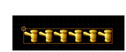
The layout type "Stack" realizes a stacked laying out either in horizontal or vertical direction. The order of the stack elements is given by the order of the child nodes within the laid out group.

<div drawio-diagram="6264"><img src="https://doc316en.candera.eu/uploads/images/drawio/2024-06/drawing-5-1718378083.png" alt=""/></div>

<div class="contents" id="bkmrk--15"><div class="contents"><div class="textblock">  
</div></div></div>Configuring the Stack Layout:

<div class="contents" id="bkmrk-select-the-group-hol"><div class="contents"><div class="textblock">1. Select the Group holding the nodes to be laid out in the Scene Tree panel
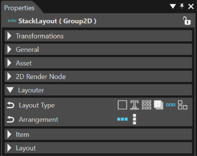
2. Choose LayoutType "Stack" from the Properties panel
3. Choose "Horizontal" or "Vertical" value for property Arrangement in the Properties panel, depending on the desired laying out
4. Call the Do-Layout command using the shortcut keys "Ctrl+L" or from the Edit - Do-Layout menu

</div></div></div><div drawio-diagram="6265"><img src="https://doc316en.candera.eu/uploads/images/drawio/2024-06/drawing-5-1718378110.png" alt=""/></div>

<div class="contents" id="bkmrk--17"><div class="textblock">  
</div></div>#### **Grid Layout**

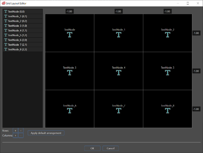
In a Grid layout, every node part of the laid out group is assigned to a cell of the grid. A Grid Layout Editor is available to configure the grid and to arrange nodes in the grid's cells by drag &amp; drop operation.

<div drawio-diagram="6267"><img src="https://doc316en.candera.eu/uploads/images/drawio/2024-06/drawing-5-1718378156.png" alt=""/></div>

<div class="contents" id="bkmrk--19"><div class="contents"><div class="textblock">  
</div></div></div>Configuring the Grid Layout:

<div class="contents" id="bkmrk-select-the-group-hol-0"><div class="contents"><div class="contents"><div class="textblock">1. Select the Group holding the nodes to be laid out in the Scene Tree panel
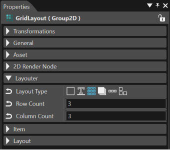
2. Choose LayoutType "Grid" from the Properties panel
3. Optional: Set the number of rows and columns of the grid by editing the properties RowCount and ColumnCount in the Properties panel
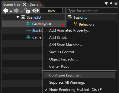
4. Use the context menu item "Configure Layout" on the selected Group in the Scene Tree panel to open the "Grid Layout Editor" dialog

</div></div></div></div><div drawio-diagram="7588"><img src="https://doc316en.candera.eu/uploads/images/drawio/2024-11/drawing-5-1732899967.png" alt=""/></div>

<div class="contents" id="bkmrk--21"><div class="contents"><div class="textblock">  
</div></div></div>Optional: Use the buttons "+","-" to configure the desired number of rows and columns in the "Grid layout editor" dialog, if not done already in the Properties panel.

<div drawio-diagram="949"><img src="https://doc316en.candera.eu/uploads/images/drawio/2023-02/drawing-4-1676443876.png" alt=""/></div>

Arrange the nodes of the group in the grid's cells by drag &amp; drop operation.

<div drawio-diagram="6269"><img src="https://doc316en.candera.eu/uploads/images/drawio/2024-06/drawing-5-1718378288.png" alt=""/></div>

<div class="contents" id="bkmrk--24"><div class="contents"><div class="textblock">  
</div></div></div>Configure width and height for rows and columns by editing the values on the border of the grid. Values within the range \[0...1\] are considered as percentages and values greater than 1 as dimensions.

Confirm the layout configuration by pressing the "OK" button of the dialog "Grid layout editor".

Call the Do-Layout command using the shortcut keys "Ctrl+L" or from the "Edit" &gt; "Do-Layout" menu.

<div drawio-diagram="6270"><img src="https://doc316en.candera.eu/uploads/images/drawio/2024-06/drawing-5-1718378315.png" alt=""/></div>

<div class="contents" id="bkmrk--26"><div class="contents"><div class="textblock">  
</div></div></div>**See also:**

<div class="contents" id="bkmrk-candera%3A%3Agridlayoute"><div class="textblock">- [Candera::GridLayouter](http://dev.doc.cgistudio.at/APILINK/class_candera_1_1_grid_layouter.html "GridLayouter arranges its elements in a grid. The amount of rows and columns for the grid must be spe...")

</div></div>####   
**Baseline Layout**

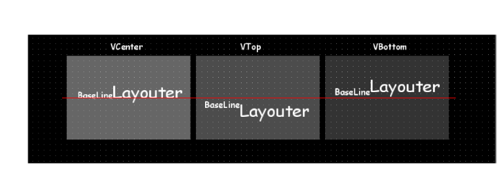
The layout type "Baseline" realizes a stacked laying out in the horizontal direction. It behaves similar to the Horizontal Stack Layout. The major difference consists in its given reference: it aligns the objects to a line instead of aligning them to the client area. The main purpose of this layouter is to align different sizes formatted texts along the same baseline. For instance, if the center is chosen for alignment, the baseline of the text will be aligned to the given line (= baseline offset). The order of the elements is given by the order of the child nodes within the laid out group.

<div drawio-diagram="6271"><img src="https://doc316en.candera.eu/uploads/images/drawio/2024-06/drawing-5-1718378353.png" alt=""/></div>

<div class="contents" id="bkmrk--28"><div class="contents"><div class="textblock">  
</div></div></div>Configure the Baseline Layout by following these steps:

<div class="contents" id="bkmrk-select-the-group-hol-1"><div class="contents"><div class="contents"><div class="textblock">1. Select the Group holding the nodes to be laid out in the Scene Tree panel
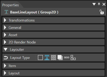
2. Choose LayoutType "Baseline" from the Properties panel
3. Set any value for property Base Line Offset in the Properties panel, depending on the desired laying out
4. Call the Do-Layout command using the shortcut keys "Ctrl+L" or from the Edit - Do-Layout menu

</div></div></div></div><div drawio-diagram="6272"><img src="https://doc316en.candera.eu/uploads/images/drawio/2024-06/drawing-5-1718378402.png" alt=""/></div>

<div class="contents" id="bkmrk--30"><div class="contents"><div class="textblock">  
</div></div></div>**See also:**

<div class="contents" id="bkmrk-candera%3A%3Abaselinelay"><div class="textblock">- [Candera::BaseLineLayouter](http://dev.doc.cgistudio.at/APILINK/class_candera_1_1_base_line_layouter.html "A BaseLineLayouter behaves similar to a Horizontal StackLayouter but instead of aligning the objects ...")

</div></div>####   
**Overlay Layout**

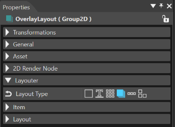
The layout type "Overlay" arranges the objects by laying out them on top of each other or by aligning the nodes according to their general layout properties. The order of the elements is given by the order of the child nodes within the laid out group.

<div drawio-diagram="6273"><img src="https://doc316en.candera.eu/uploads/images/drawio/2024-06/drawing-5-1718378443.png" alt=""/></div>

<div class="contents" id="bkmrk--32"><div class="contents"><div class="textblock">  
</div></div></div>Configuring the Overlay Layout:

<div class="contents" id="bkmrk-select-the-group-hol-2"><div class="contents"><div class="contents"><div class="textblock">1. Select the Group holding the nodes to be laid out in the Scene Tree panel
2. Choose LayoutType "Overlay" from the Properties panel
3. Call the Do-Layout command using the shortcut keys "Ctrl+L" or from the Edit - Do-Layout menu

</div></div></div></div><div drawio-diagram="955"><img src="https://doc316en.candera.eu/uploads/images/drawio/2023-02/drawing-4-1676444073.png" alt=""/></div>

<div class="contents" id="bkmrk--34"><div class="contents"><div class="textblock">  
</div></div></div>**See also:**

<div class="contents" id="bkmrk-candera%3A%3Aoverlaylayo"><div class="textblock">- [Candera::OverlayLayouter](http://dev.doc.cgistudio.at/APILINK/class_candera_1_1_overlay_layouter.html "OverlayLayouter sets sizes of all child elements to fulfill the given area.")

</div></div>####   
**DockPanel Layout**

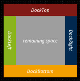
The "DockPanel" layout provides a layout area within it is possible to arrange child elements around the edge of the screen based on four direction: Top, Bottom, Left, and Right.

<div drawio-diagram="6275"><img src="https://doc316en.candera.eu/uploads/images/drawio/2024-06/drawing-5-1718378555.png" alt=""/></div>

<div class="contents" id="bkmrk--36"><div class="contents"><div class="textblock">  
</div></div></div>This type of layout arranges the elements by laying out them in the remaining space after the previous element was set. To dock an element to the center of the panel, it must be the last child of the panel.

<div drawio-diagram="8795"><img src="https://doc316en.candera.eu/uploads/images/drawio/2025-11/drawing-5-1763722666.png" alt=""/></div>

<div class="contents" id="bkmrk--38"><div class="contents"><div class="textblock">  
</div></div></div>Configure the DockPanel Layout by following these steps:

<div class="contents" id="bkmrk-select-the-group-hol-3"><div class="contents"><div class="contents"><div class="textblock">1. Select the Group holding the nodes to be laid out in the Scene Tree panel
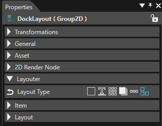
2. Choose Layout Type "DockPanel" from the Properties panel
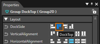
3. For any node inside the Group a new property will become available: "Dock Side". Select it and choose any of the fours available laying outs: "DockLeft", "DockTop", DockRight", "DockBottom".

</div></div></div></div><div drawio-diagram="8796"><img src="https://doc316en.candera.eu/uploads/images/drawio/2025-11/drawing-5-1763722869.png" alt=""/></div>

<div class="contents" id="bkmrk--49"><div class="contents"><div class="textblock">  
</div></div></div>**See also:**

<div class="contents" id="bkmrk-candera%3A%3Adockpanella"><div class="textblock">- [Candera::DockPanelLayouter](http://dev.doc.cgistudio.at/APILINK/class_candera_1_1_dock_panel_layouter.html "The Dock Panel Layouter provides an easy docking of elements to the left, right, top, bottom or center of the panel. The dock side of an element is defined by the attached dynamic DockSide property. To dock an element to the center of the panel, it must be the last child of the panel.")
</div></div>