# 3D Scene Design

# 3D Nodes

#### **3D Toolbox**

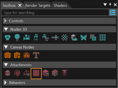
The Toolbox for 3D scenes provides the following items:

<div drawio-diagram="5620"><img src="https://doc316en.candera.eu/uploads/images/drawio/2024-04/drawing-7-1713773371.png" alt=""/></div>

<div class="contents" id="bkmrk-a-%22show-controls-as-"><div class="contents"><div class="contents"><div class="textblock"><dl class="note"><dd><p class="callout info">A "Show Controls as Big Icons/List" is available in the upper right corner. If this button is used, a different presentation mode - as icons instead of a text list of items - will be made available (see the image below).</p>

</dd></dl><div drawio-diagram="5621"><img src="https://doc316en.candera.eu/uploads/images/drawio/2024-04/drawing-7-1713773413.png" alt=""/></div>

</div></div></div></div><div class="contents" id="bkmrk--1">  
</div>##### <a class="anchor" id="bkmrk--98"></a>Create 3D Nodes

Following items can be used to create a new node in the scene graph:

**3D Nodes**

<div drawio-diagram="6051"><img src="https://doc316en.candera.eu/uploads/images/drawio/2024-06/drawing-5-1717765312.png" alt=""/></div>

<div class="contents" id="bkmrk-group%3A-represents-a-"><div class="contents"><div class="textblock"><table border="0" cellspacing="10" style="width: 100%; height: 1022.89px;"><tbody><tr style="height: 60.8281px;" valign="bottom"><td style="width: 9.26689%; height: 60.8281px;"><div class="image">**1**</div></td><td style="width: 90.6919%; height: 60.8281px;">**Group:** Represents a parent container for nodes or other groups.   
[Candera::Group](http://dev.doc.cgistudio.at/APILINK/class_candera_1_1_group.html "The class Group is a scene graph node that stores a set of Nodes as its children. The parent-child re...")</td></tr><tr style="height: 65.5938px;" valign="bottom"><td style="width: 9.26689%; height: 65.5938px;">**2**

</td><td style="width: 90.6919%; height: 65.5938px;">**Light:** Different types of light could be added to illuminate the scene objects. <span style="color: rgb(230, 126, 35);">[Read more...](#bkmrk-light)</span>   
[Candera::Light](http://dev.doc.cgistudio.at/APILINK/class_candera_1_1_light.html "A Node that represents different kinds of light sources. Light sources are used to determine the colo...")</td></tr><tr style="height: 64.7656px;" valign="bottom"><td style="width: 9.26689%; height: 64.7656px;">**3**

</td><td style="width: 90.6919%; height: 64.7656px;">**Camera:** To be linked to a render target, where the render result of the camera will be drawn. <span style="color: rgb(230, 126, 35);">[Read more...](#bkmrk-camera)</span>   
[Candera::Camera](http://dev.doc.cgistudio.at/APILINK/class_candera_1_1_camera.html "A Camera provides Modelview and Projection matrices. Camera is a Transformable.* The eye point is set...")</td></tr><tr style="height: 66.5156px;" valign="bottom"><td style="width: 9.26689%; height: 66.5156px;">**4**

</td><td style="width: 90.6919%; height: 66.5156px;">**Reflection Camera:** Creates a reflection of a specific camera on a given reflection plane. <span style="color: rgb(230, 126, 35);">[Read more...](#bkmrk-reflection-camera)</span>   
[Candera::ReflectionCamera](http://dev.doc.cgistudio.at/APILINK/class_candera_1_1_reflection_camera.html "A ReflectionCamera represents a reflected view of an associated source camera (See function SetSource...")</td></tr><tr style="height: 66.4062px;" valign="bottom"><td style="width: 9.26689%; height: 66.4062px;">**5**

</td><td style="width: 90.6919%; height: 66.4062px;">**Stereo Camera:** Creates the effect of stereo 3D. <span style="color: rgb(230, 126, 35);">[Read more...](#bkmrk-stereo-camera)</span>   
[Candera::StereoCamera](http://dev.doc.cgistudio.at/APILINK/class_candera_1_1_stereo_camera.html "A StereoCamera is a controller of two assigned Camera objects, used to realize the effect of stereosc...")</td></tr><tr style="height: 64.7656px;" valign="bottom"><td style="width: 9.26689%; height: 64.7656px;">**6**

</td><td style="width: 90.6919%; height: 64.7656px;">**Sky Box:** A type of mapping that gives the user the feeling of immersion into a large environment. <span style="color: rgb(230, 126, 35);">[Read more...](#bkmrk-sky-box)</span>   
[Candera::SkyBox](http://dev.doc.cgistudio.at/APILINK/class_candera_1_1_sky_box.html "A SkyBox is an axis aligned cube in world-space, which is used to display the background environment ...")</td></tr><tr style="height: 62.1719px;" valign="bottom"><td style="width: 9.26689%; height: 62.1719px;">**7**

</td><td style="width: 90.6919%; height: 62.1719px;">**Billboard:** A textured or colored 2D area.   
[Candera::Billboard](http://dev.doc.cgistudio.at/APILINK/class_candera_1_1_billboard.html "The class Billboard represents a Plane that can align towards camera automatically, according to the alignment type set. Thus, Billboards are quite often used as "imposters" pretending to be a 3D geometry by showing a 2D image that is always facing the camera. In order to relief distinction between Billboard and PointSprite see following comparison: + Billboards support rectangular dimension and non-uniform scale, + Billboards support different rotation techniques (see Alignment), whereas PointSprites are aligned according to CenterEyeAlignment, exclusively. + Billboards take local rotation and scale into account (see class Transformable), whereas PointSprites ignore Transformable parameters others than position. + PointSprites have a performance advantage due to less geometry (one instead of 4 vertices). Overall recommendation: Use PointSprites for spherical shapes like particles, lens flares, sparkles, dust which are screen aligned (see Billboard::CameraUpAlignment). Further, use Billboards for world up oriented clouds, text, or yaw axis aligned trees, and signs, etc. Note: The Billboard - because of absent normals - does not support lighting. Belows sketch depicts the layout of a Billboard. W U:0,V:1 +-----+ U:1,V:1 H | X | Legend: texture coordinates: U,V; Width: W, Height: H, Local Center: X U:0,V:0 +-----+ U:1,V:0.")</td></tr><tr style="height: 64.7656px;" valign="bottom"><td style="width: 9.26689%; height: 64.7656px;">**8**

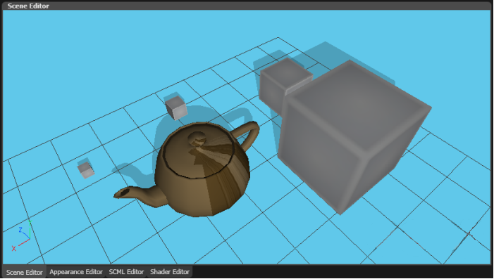
</td><td style="width: 90.6919%; height: 64.7656px;">**Planar Shadow:** Provides the possibility to "throw" some shadows on a configurable planar surface. <span style="color: rgb(230, 126, 35);">[Read more...](#bkmrk-planar-shadow-0)</span>   
[Candera::PlanarShadow](http://dev.doc.cgistudio.at/APILINK/class_candera_1_1_planar_shadow.html "PlanarShadow implements a simple technique to simulate shadow casting. Basically a PlanarShadow node ...")</td></tr><tr style="height: 64.7656px;" valign="bottom"><td style="width: 9.26689%; height: 64.7656px;">**9**

</td><td style="width: 90.6919%; height: 64.7656px;">**MorphingMesh:** A mesh that stores weight values for morphing. <span style="color: rgb(230, 126, 35);">[Read more...](#bkmrk-morphing-mesh)</span>   
[Candera::MorphingMesh](http://dev.doc.cgistudio.at/APILINK/class_candera_1_1_morphing_mesh.html "MorphingMesh is a Mesh that stores weight values for morphing, and activates them as uniforms at rend...")</td></tr><tr style="height: 84.5625px;" valign="bottom"><td style="width: 9.26689%; height: 84.5625px;">**10**

</td><td style="width: 90.6919%; height: 84.5625px;">**LodNode:** A node which accommodates multiple nodes, each of them representing a certain, predefined level of detail. <span style="color: rgb(230, 126, 35);">[Read more...](#bkmrk-level-of-detail-%28lod-1)</span>   
[Candera::LodNode](http://dev.doc.cgistudio.at/APILINK/class_candera_1_1_lod_node.html "LodNode represents a Node which accommodates multiple nodes, each of them representing a certain...")</td></tr><tr style="height: 78.9688px;" valign="bottom"><td style="width: 9.26689%; height: 78.9688px;">**11**

</td><td style="width: 90.6919%; height: 78.9688px;">**PointSprite:** Displayed as a flat square polygon which is always facing the camera (screen-aligned). It can be textured and scaled to simulate perspective.   
[Candera::PointSprite](http://dev.doc.cgistudio.at/APILINK/class_candera_1_1_point_sprite.html "PointSprite represents a GL point primitive. The size (glPointSize) of the point is calculated by def...")

</td></tr></tbody></table>

</div></div></div>**Canvas Nodes**

<div drawio-diagram="6052"><img src="https://doc316en.candera.eu/uploads/images/drawio/2024-06/drawing-5-1717765391.png" alt=""/></div>

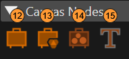
<table border="0" cellspacing="10" id="bkmrk-12-canvas%3A-a-node-wh" style="width: 100%; height: 1022.89px;"><tbody><tr style="height: 64.7656px;" valign="bottom"><td style="width: 9.26689%; height: 64.7656px;">**12**

</td><td style="width: 90.6919%; height: 64.7656px;">**Canvas:** A node which acts as a surface. <span style="color: rgb(230, 126, 35);">[Read more...](#bkmrk-canvas-0)</span>   
[Candera::Canvas](http://dev.doc.cgistudio.at/APILINK/class_candera_1_1_canvas.html)</td></tr><tr style="height: 64.7656px;" valign="bottom"><td style="width: 9.26689%; height: 64.7656px;">**13**

</td><td style="width: 90.6919%; height: 64.7656px;">**CanvasGroup:** A node which can contain other canvas nodes. <span style="color: rgb(230, 126, 35);">[Read more...](#bkmrk-canvas-0)</span>   
[Candera::CanvasGroup](http://dev.doc.cgistudio.at/APILINK/class_candera_1_1_canvas_group.html)</td></tr><tr style="height: 84.5625px;" valign="bottom"><td style="width: 9.26689%; height: 84.5625px;">**14**

</td><td style="width: 90.6919%; height: 84.5625px;">**CanvasSprite:** A node which represents a solid object, offering the possibility to render a texture, a flat colored rectangle or other visual effects. <span style="color: rgb(230, 126, 35);">[Read more...](#bkmrk-canvas-sprite-0)</span>   
[Candera::CanvasSprite](http://dev.doc.cgistudio.at/APILINK/class_candera_1_1_canvas_sprite.html)</td></tr><tr style="height: 64.6875px;" valign="bottom"><td style="width: 9.26689%; height: 64.6875px;">**15**

</td><td style="width: 90.6919%; height: 64.6875px;">**CanvasText:** A node which facilitates displaying text on Canvas.   
[Candera::CanvasText](http://dev.doc.cgistudio.at/APILINK/class_candera_1_1_canvas_text.html "CanvasText represents a text node within a 3D Canvas object.")</td></tr></tbody></table>

Create a new 3D node by drag &amp; drop

<div class="contents" id="bkmrk-on-the-scene-tree-to"><div class="contents"><div class="textblock">- on the Scene Tree to sort the node properly into the scene graph
- directly into the render view of the Scene Editor to create the node on a specific display coordinate.

</div></div></div>New scene nodes are named like the item type, for more than one item suffixed with a number.

Refer to the Properties panel for inspecting all properties specific for the type of node. Tooltips are available to explain the purpose of the property. Refer also to the <span style="color: rgb(230, 126, 35);">[Properties Overview](https://doc316en.candera.eu/books/appendix/page/properties-overview "Properties Overview")</span> listing the Tooltip descriptions.

#### **Light**

#### <a class="anchor" id="bkmrk--99"></a>Types of Light

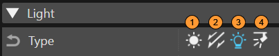
Different kinds of light sources are available:

<div drawio-diagram="6053"><img src="https://doc316en.candera.eu/uploads/images/drawio/2024-06/drawing-5-1717765509.png" alt=""/></div>

##### 1 Ambient Light

<div drawio-diagram="712"><img src="https://doc316en.candera.eu/uploads/images/drawio/2023-02/drawing-4-1676380375.png" alt=""/></div>

<div class="contents" id="bkmrk--9"><div class="contents"><div class="textblock">  
</div></div></div>Ambient light illuminates the scene from all directions. The light intensity is the same everywhere in the scene.   
Position and direction of an ambient light source have no effect.

##### 2 Directional Light

<div drawio-diagram="713"><img src="https://doc316en.candera.eu/uploads/images/drawio/2023-02/drawing-4-1676380453.png" alt=""/></div>

<div class="contents" id="bkmrk--11"><div class="contents"><div class="textblock">  
</div></div></div>Directional light corresponds to sunlight in the real world. Illuminates all objects in the scene from the same direction, and with a constant intensity.   
Position and attenuation of a directional light source have no effect.

##### 3 Point Light

<div drawio-diagram="714"><img src="https://doc316en.candera.eu/uploads/images/drawio/2023-02/drawing-4-1676380468.png" alt=""/></div>

<div class="contents" id="bkmrk--13"><div class="contents"><div class="textblock">  
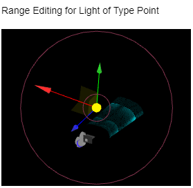
</div></div></div>Point light casts equal omnidirectional illumination from the position of the light source. The intensity of light coming from a point light source can diminish with distance.   
The direction of a point light has no effect.

##### 4 Spot Light

<div drawio-diagram="715"><img src="https://doc316en.candera.eu/uploads/images/drawio/2023-02/drawing-4-1676380479.png" alt=""/></div>

<div class="contents" id="bkmrk--15"><div class="contents"><div class="textblock">  
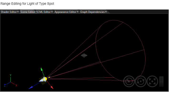
</div></div></div>Spot light casts a light cone from a position centered around a direction.   
A spot light has both: a direction and a position.

#### <a class="anchor" id="bkmrk--108"></a>Light Properties

Please refer to section <span style="color: rgb(230, 126, 35);">[Light Gizmos](https://doc316en.candera.eu/link/133#bkmrk-camera-gizmos%C2%A0 "3D Nodes")</span> for more details on how to edit lights by using gizmos.

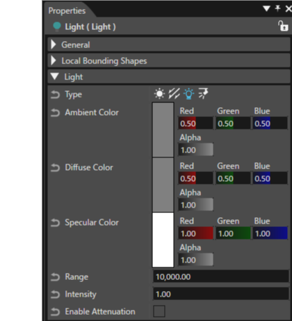
Light properties that can be edited from the Properties panel (Some properties are only applicable depending on the selected light type):

<div class="contents" id="bkmrk-type%3A-the-type-of-a-"><div class="contents"><div class="contents"><div class="textblock">- **Type:** The type of a light source can be changed at any time. This might be useful for switching to a simpler lightning model. Illumination is enabled, if light has rendering enabled and if the node is in the same scope as the light.
- **Ambient Color:** defines the ambient color component that illuminates the ambient color component of the material.
- **Diffuse Color:** illuminates the diffuse color component of the material. It is ignored if type of light is Ambient.
- **Specular Color:** defines the specular color component that illuminates the specular color component of the material. Ignored if type of light is Ambient.
- **Direction:** defines the direction of the light. It is ignored if type of light is Ambient or Point.
- **Range:** defines the range from light to geometry in world space where illumination is applied. It is ignored if type of light is Ambient or Directional.
- **Intensity:** The intensity factor for the diffuse color of the light. Ignored if type of light is Ambient.
- **Enable Attenuation:** Enables or disables the attenuation of light. The greater the distance of an object's geometry to the light, the less illumination is applied. This property will be ignored if the light type is Ambient or Directional.
- **Constant Attenuation Factor:** defines the constant attenuation factor of the light. The attenuation equation is: 1 / (constant + (linear \* distance) + (quadratic \* distance^2)). It is ignored if type of light is Ambient or Directional.
- **Linear Attenuation Factor:** defines the linear attenuation factor of the light. It is ignored if type of light is Ambient or Directional.
- **Quadratic Attenuation Factor:** defines the quadratic attenuation factor of the light. It is ignored if type of light is Ambient or Directional.
- **Spot Angle:** defines the spot angle of the light cone in degrees. It is ignored if type of light is Ambient, Directional, or Point.
- **Spot Exponent:** the distribution of the light within the spot light cone. It is ignored if type of light is Ambient, Directional, or Point.
</div></div></div></div><div drawio-diagram="8576"><img src="https://doc316en.candera.eu/uploads/images/drawio/2025-09/drawing-4-1757469569.png" alt=""/></div>

<div class="contents" id="bkmrk--18"><div class="contents"><div class="textblock">  
</div></div></div>Light properties that can be edited in ShaderParamSetter:

<div class="contents" id="bkmrk-coordinatespace%3A-def"><div class="contents"><div class="textblock">- **CoordinateSpace:** defines the coordinate space for lighting calculations in shader. It has two possible options:   
    &gt; Object - Light is transformed into object space to calculate vertex illumination   
    &gt; World - vertex and normal are transformed into world space to calculate vertex illumination. Object space is less computation intensive and is preferred.   
    However, to assure accurate illumination of non-uniform scaled objects, lighting in world space is indicated.

</div></div></div>#### **Camera**

Refer to the Properties panel for inspecting all properties specific for a 3D camera.   
Tooltips are available to explain the purpose of the property.

Please refer to section <span style="color: rgb(230, 126, 35);">[Camera Manipulation](https://doc316en.candera.eu/link/133#bkmrk-camera-manipulation%C2%A0-0 "3D Scene Editor")</span> for details on how to manipulate cameras.

#### <a class="anchor" id="bkmrk--110"></a>Camera Render Strategy

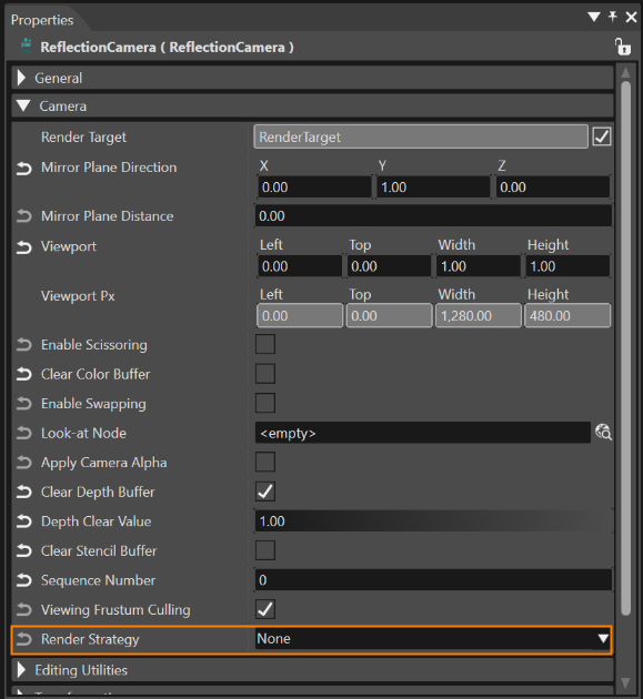
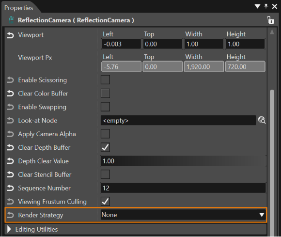
Camera, Reflection camera and LeftEye/RightEye (StereoCamera) objects have a property (available in Properties panel) called "RenderStrategy" that only affects the processing of that camera and its nodes.

<div drawio-diagram="6055"><img src="https://doc316en.candera.eu/uploads/images/drawio/2024-06/drawing-5-1717765797.png" alt=""/></div>

<div class="contents" id="bkmrk--20"><div class="contents"><div class="textblock">  
</div></div></div>Per default "none" is selected as camera render strategy, which means the nodes will be rendered inside a render pass according to the defined render order.

#### <a class="anchor" id="bkmrk--112"></a>Benchmark Render Strategy

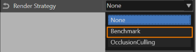
Select "Benchmark" as render strategy to split a render call into several passes.

<div drawio-diagram="6057"><img src="https://doc316en.candera.eu/uploads/images/drawio/2024-06/drawing-5-1717765917.png" alt=""/></div>

<div class="contents" id="bkmrk--22"><div class="contents"><div class="textblock">  
</div></div></div>In a render pass, only that part of the scene graph is rendered, which node's benchmarks are beyond a given threshold. In the next render call, rendering will resume at the previous stop point, until it is complete.

Two properties are relevant to achieve this behavior:

<div class="contents" id="bkmrk-%22render-benchmark%22%3A-"><div class="contents"><div class="contents"><div class="contents"><div class="textblock">- **"Render Benchmark":** A render measure value of the node, given an average time required to rendered that node. Render benchmarks can be calculated by CGI Analyzer and imported into SceneComposer.
- **"Benchmark Threshold":** Only nodes with an accumulated node render benchmark value smaller than or equal to the given threshold will be rendered during a single render call. Otherwise rendering is paused and the remaining nodes will only be rendered in the next step.

</div></div></div></div></div>####  <a class="anchor" id="bkmrk--114"></a>Occlusion Culling

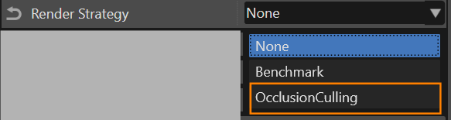
Select "Occlusion Culling" as render strategy to have a new property available in property grid: QueryType.

<div drawio-diagram="6058"><img src="https://doc316en.candera.eu/uploads/images/drawio/2024-06/drawing-5-1717766225.png" alt=""/></div>

<div class="contents" id="bkmrk-occlusion-culling-re"><div class="contents"><div class="contents"><div class="textblock"><dl class="note"><dd><p class="callout info">Occlusion culling render strategy applies only to OpenGLES 3.0 platforms.</p>

</dd></dl></div></div></div></div>The render strategy uses a dynamic property (QueryProperty) per node to determine if an occlusion query should be issued or not. It also stores the query result for that node in that property.

#### **Reflection Camera**

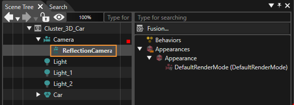
Reflection camera is a special item in the Toolbox that can be added in scenes only under camera nodes using drag &amp; drop.

<div drawio-diagram="7578"><img src="https://doc316en.candera.eu/uploads/images/drawio/2024-11/drawing-5-1732895617.png" alt=""/></div>

<div class="contents" id="bkmrk--25"><div class="contents"><div class="textblock">  
</div></div></div>The camera will have some modified properties after adding a reflection camera on it. After the reflection camera is removed, the camera may still have some modified properties which have been previously required for the reflection camera.

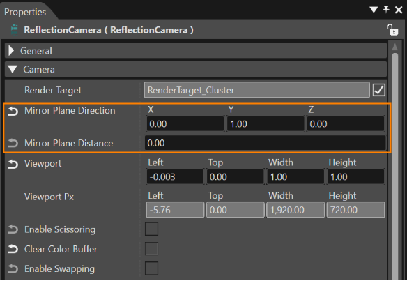
Configure the properties "Mirror Plane Direction" and "Mirror Plane Distance" to visualize the reflection plane.

<div drawio-diagram="6060"><img src="https://doc316en.candera.eu/uploads/images/drawio/2024-06/drawing-5-1717766570.png" alt=""/></div>

<div class="contents" id="bkmrk--27"><div class="contents"><div class="textblock">  
</div></div></div>The reflection will not be rendered in predefined views (Perspective, Orthogonal). Depending on the desired visual effect, set the proper values for the properties: IsColorClearEnabled and SequenceNumber.

#### <a class="anchor" id="bkmrk--118"></a>Camera Render Strategy

Both Camera and Reflection camera objects have a property (available in Properties panel) called "CameraRenderStrategy" that only affects the processing of that camera and its nodes.

<div drawio-diagram="6061"><img src="https://doc316en.candera.eu/uploads/images/drawio/2024-06/drawing-5-1717767841.png" alt=""/></div>

<div class="contents" id="bkmrk--29"><div class="contents"><div class="textblock">  
</div></div></div>Per default "none" is selected as camera render strategy, which means the nodes will be rendered inside a render pass according to the defined render order.

#### **Stereo Camera**

To use the StereoCamera object two Camera objects have to be assigned as the left and the right eye. Only cameras that have no parent, or their parent is the StereoCamera itself, are allowed to be set as eyes. If they have no parent, they'll automatically get assigned as children of this StereoCamera. On these cameras position, lookAtVector, upVector and the projection get set automatically with respect to the StereoCamera objects setting.

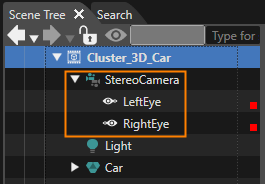
A StereoCamera object is available in the Toolbox. In order to use it, the user should drag it on a scene. After this first step, a StereoCamera object will become available in the Scene Tree.

<div drawio-diagram="7579"><img src="https://doc316en.candera.eu/uploads/images/drawio/2024-11/drawing-5-1732895697.png" alt=""/></div>

<div class="contents" id="bkmrk--31"><div class="contents"><div class="textblock">  
</div></div></div>A LeftEye camera and a RightEye camera will be assigned to the StereoCamera. The LeftEye camera and the RightEye camera may be configured from the properties panel as any other camera. The properties specific for the StereoCamera may be configured from the Properties panel that is available when the StereoCamera is selected. Those are:

<div class="contents" id="bkmrk-eye-separation-and-c"><div class="contents"><div class="textblock">- Eye Separation and
- Convergence distance

</div></div></div>Eye separation controls the interaxial offset of the two Camera objects positions relative to the StereoCamera's position. Here for both camera's the position is set to half of the separation in +X and -X direction.

Convergence distance is the distance from the camera to the plane on which both projections would produce the same image, and therefore no parallax occurs.

<div class="contents" id="bkmrk-the-stereo-camera-co"><div class="contents"><div class="textblock"><dl class="note"><dt></dt><dd><p class="callout info">The stereo camera configuration is hardware dependent and it reflects the way in which the stereo effect is achieved in hardware. Without a special designed hardware it is not possible to properly display any stereo content. Stereo hardware most commonly provides the viewer True 3D visuals by interlacing or overlapping the two video outputs on the same display unit.</p>

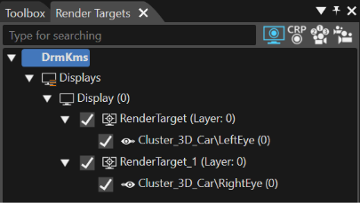
</dd></dl></div></div></div>Without a special designed hardware the only possibility to check the Stereoscopy on SceneComposer is to link every Eye Camera to a different Render Target. For instance, it is possible to associate the LeftEye with a Left Render Target and the RightEye with a Right Render Target. The association of any Eye Camera should be done by following the usual two steps:

<div class="contents" id="bkmrk-create-a-display-and"><div class="contents"><div class="contents"><div class="textblock">- Create a Display and two Render Targets. <span style="color: rgb(230, 126, 35);">[Read more...](https://doc316en.candera.eu/books/display-configuration/page/add-a-new-render-target)</span>
- Associate every of the two cameras to one specific display (RighEye Camera to the R Render target and LeftEye Camera to the L Render target). <span style="color: rgb(230, 126, 35);">[Read more...](https://doc316en.candera.eu/books/display-configuration/page/link-a-camera-to-a-render-target)</span>

</div></div></div></div><div drawio-diagram="6063"><img src="https://doc316en.candera.eu/uploads/images/drawio/2024-06/drawing-5-1717768237.png" alt=""/></div>

<div class="contents" id="bkmrk--33"><div class="contents"><div class="textblock">  
</div></div></div>Both Render Targets are expected to be kept grouped under the same Display as it can be noticed in the image above.

#### <span style="color: rgb(0, 0, 0);">**Stereo Camera Side by Side**</span>

One of the Stereoscopic Camera configurations is the so called "side by side" (SBS) configuration. This type of configuration is based on display that combines the left and right eye images into a single image by squeezing the two together horizontally.

To facilitate the creation of SBS configuration, SceneComposer provides a built in configuration that can be used.

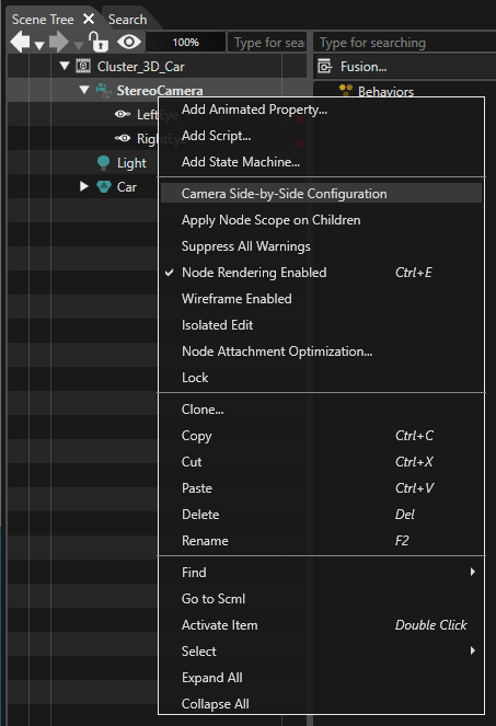
First drag and drop a Stereoscopic Camera from the Toolbox in a 3D scene. Second, right click on the Stereo Camera in the Scene Tree. Select "Camera Side-by-Side Configuration" from the context menu.

<div drawio-diagram="7580"><img src="https://doc316en.candera.eu/uploads/images/drawio/2024-11/drawing-5-1732895923.png" alt=""/></div>

<div class="contents" id="bkmrk--35"><div class="contents"><div class="textblock">  
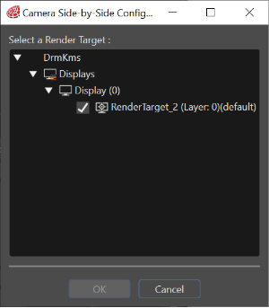
</div></div></div>If a RenderTarget already includes cameras, you can not choose it. So, remove cameras in the RenderTarget and select "Camera Side-by-Side Configuration" menu to be appeared its dialog. After a display and a render target are created, select the Render Target. After this step click "OK".

<div drawio-diagram="6065"><img src="https://doc316en.candera.eu/uploads/images/drawio/2024-06/drawing-5-1717768556.png" alt=""/></div>

<div class="contents" id="bkmrk--37"><div class="contents"><div class="textblock">  
</div></div></div>In the Render Targets panel both "eyes" associated with the Stereo Camera will be displayed.

<div class="contents" id="bkmrk-the-viewport-propert"><div class="textblock"><dl class="note"><dd><p class="callout info">The Viewport property is automatically set. Practically speaking, all the cameras are automatically configured. The dimension of the render target is the only setting that has to be configured manually.</p>

</dd></dl></div><div class="textblock align-right">  
</div></div>#### **Sky Box**

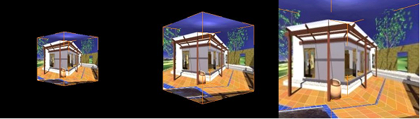
One of the most spectacular types of environment mapping is the so called "sky box". This type of mapping gives the user the feeling of immersion into a large environment. The name is related with one of its first usages into pc games industry, especially in relationship with clouds and sky projected into a 3D level of a computer game.

It is possible to create this type of virtual environment by using the SkyBoxMesh from toolbox. Associated with a camera, this mesh will be placed on every renderization on the same position as camera's position. When a skybox is attached to a camera, any of the clear color properties will not be taken into consideration.

The sky box should only be seen if the active camera is the same one with that camera to which the sky box is attached.

<div class="contents" id="bkmrk-the-sky-box-cannot-b"><div class="contents"><div class="textblock"><dl class="note"><dt></dt><dd><p class="callout info">The sky box cannot be manipulated by using gizmos and its bounding box cannot be displayed when it is selected.</p>

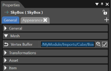
</dd></dl></div></div></div>Usually you need to specify only texture to show skybox (CubeMap Texture). And you do not need to specify VertexBuffer and Shader. But if you want to specify your own SkyBoxMesh:

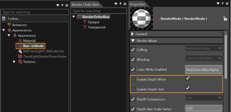
<div class="contents" id="bkmrk-if-the-render-mode-i"><div class="contents"><div class="textblock">- If the Render Mode is used, Enable Depth Write and Enable Depth Test have to be set as "false";
- An adequate CubeMapTexture with six sides has to be set as texture;
- In Appearance the Shader Program that must be selected is RefTransCubeMap\_RefCubeMapTex;

</div></div></div><div drawio-diagram="6067"><img src="https://doc316en.candera.eu/uploads/images/drawio/2024-06/drawing-5-1717769044.png" alt=""/></div>

<div class="contents" id="bkmrk--39"></div>#### **<a class="anchor" id="bkmrk--126"></a>Planar Shadow**

To configure it the following steps have to be taken:

<div class="contents" id="bkmrk-set-the-light-proper"><div class="contents"><div class="contents"><div class="textblock">- Set the light property (the source which will generate the shadow of the object)
- To set the display it is mandatory for the render target to contain a stencil buffer (stencil bits = 8)
- Shadow plane might be configured by using the PlaneDistance and PlaneDirection properties. Please, note that the shadow is on object by itself so its color (material) or render mode can be changed.
- The default shader is adequate for the renderization process.

</div></div></div></div><div drawio-diagram="746"><img src="https://doc316en.candera.eu/uploads/images/drawio/2023-02/drawing-4-1676423814.png" alt=""/></div>

<div class="contents" id="bkmrk--41"><div class="contents"><div class="textblock">  
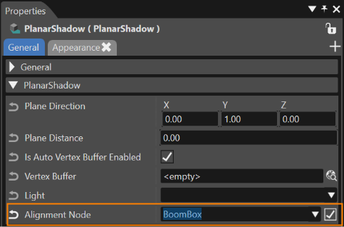
</div></div></div>The AlignmentNode property exposes Candera's automatic alignment behavior. When the alignment node is set, [Candera](http://dev.doc.cgistudio.at/APILINK/class_candera.html "[DataBinding_RefTypeSample]") automatically aligns the shadow plane to the alignment node (which usually is the shadow receiver).

<div drawio-diagram="6068"><img src="https://doc316en.candera.eu/uploads/images/drawio/2024-06/drawing-5-1717769163.png" alt=""/></div>

<div class="contents" id="bkmrk--43"><div class="contents"><div class="textblock">  
</div></div></div>Related with the planar shadow there are many other important aspects:

<div class="contents" id="bkmrk-the-shadow-cannot-be"><div class="textblock">- The shadow cannot be edited by using gizmos (translate, rotate, scale);
- The shadow bounding box is the only selection indicator;
- The correct renderization is related with a stencil buffer;
- It is not possible to add children on shadows;
- The shadow is a mesh; so, a vertex buffer can be associated. If the user will explicitly associate a vertex buffer, the shadow can render with that vertex buffer just if the "IsAutoVertexBufferEnabled" property is deactivated.

</div></div>#### **Morphing Mesh**

##### <a class="anchor" id="bkmrk--129"></a>Shape Morphing

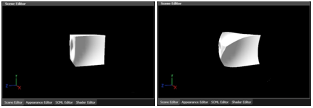
Shape Morphing allows a smooth transition from an origin 3D model shape into a destination shape at runtime, e.g. to change a cube to a sphere. In contrast to model blending a single shape is rendered at every point in time which actually forms the morphed model. This model supports virtually all features of regular models.

<div drawio-diagram="748"><img src="https://doc316en.candera.eu/uploads/images/drawio/2023-02/drawing-4-1676423879.png" alt=""/></div>

<div class="contents" id="bkmrk--46"><div class="contents"><div class="textblock">  
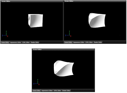
</div></div></div>CGI Studio supports not only a single shape being morphed into another but allows contributing multiple models to the resulting shape. The degree of contribution of a single model to the result is controlled by "morph weight" attribute of the regarding model.

<div drawio-diagram="749"><img src="https://doc316en.candera.eu/uploads/images/drawio/2023-02/drawing-4-1676423891.png" alt=""/></div>

<div class="contents" id="bkmrk--48"><div class="contents"><div class="textblock">  
</div></div></div>Morphing of multiple models can be used for various fancy effects such as 'chaotic' vertex movement, explosion effects, and simple particle effects.

##### <a class="anchor" id="bkmrk--132"></a>Technical Background

Geometries (vertex buffer) of different shapes supposed to be morphed are combined into a special, single vertex buffer for "Morphing Mesh" nodes including all vertex buffer attributes such as position, normals, texture coordinates per original vertex. This combined vertex buffer is uploaded to GPU, the regarding vertex attributes can be accessed in vertex shader. Uniforms applied to vertex shader during rendering by Candera include morphing weights for all contributing shapes. The vertex shader calculates the vertex attributes of the resulting shape by adding all regarding vertex attributes of single shapes multiplied by morphing weight.

For example, the vertex position is calculated in vertex shader as

**Vertex Position = Vertex Position 0 \* Morph Weight 0 + Vertex Position 1 \* Morph Weight 1;**

Other vertex attributes that are subject to morphing calculation are normals, bi-normals, and in special cases, texture coordinates. This calculation moves the vertices between the corner points of the model according to their morph weight.

If color or textures are subject of morphing as well, the resulting color needs to be calculated in an according fragment shader considering morph weights.

##### <a class="anchor" id="bkmrk--133"></a>Prerequisites

3D models need to be prepared for shape morphing. For each "corner" shape, a single model needs to be provided. All models contributing to a morphed shape need to have homologous vertices. This means that all models must have the same number of vertices and the vertices must "semantically correlate". For instance a vertex of model 1 addressed by a certain index is located in a front face. The vertex of model 2 with the same index need to be located on the corresponding front face of the second model, and not, e.g. on a back-side face.

#### <a class="anchor" id="bkmrk--135"></a>Create a MorphingMesh

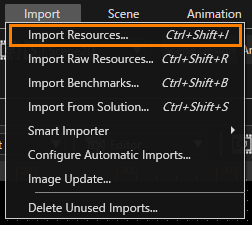
To create a MorphingMesh at least one .fbx file has to be imported. Choose "Import &gt; Import Resources..." from the menu. This will open the "Import Resources" dialog. Browse to your FBX file an click \[ Open \] to import the file.

<div drawio-diagram="5713"><img src="https://doc316en.candera.eu/uploads/images/drawio/2024-05/drawing-4-1715144620.png" alt=""/></div>

<div class="contents" id="bkmrk--50"><div class="contents"><div class="textblock">  
</div></div></div>To import the FBX file in Import dialog click "Select Files..." button.

<div class="contents" id="bkmrk-it-is-possible-to-im"><div class="contents"><div class="textblock"><dl class="note"><dd><p class="callout info">It is possible to import FBX files in SceneComposer by dragging them on "Solution Explorer" panel.</p>

</dd></dl></div></div></div> Configuring shape morphing in SceneComposer:

<div class="contents" id="bkmrk-create-a-%22morphingme"><div class="contents"><div class="textblock">- Create a "MorphingMesh" in a scene by drag and drop from the 3D Toolbox.
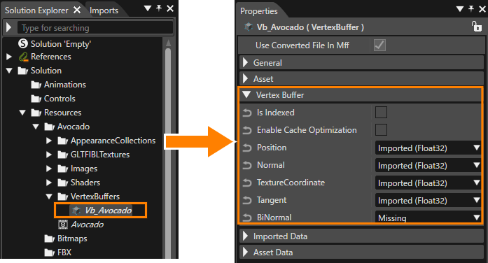
- Drag and drop all vertex buffers having the same amount of vertices, which shall be used for morphing to the MorphingMesh.

<dl class="note"><dt><p class="callout info">The vertex buffers can be dragged just from the Solution Explorer to the MorphingMesh</p>

</dt><dt></dt><dd><div drawio-diagram="7581"><img src="https://doc316en.candera.eu/uploads/images/drawio/2024-11/drawing-5-1732896299.png" alt=""/></div>

</dd></dl></div></div></div>##### <a class="anchor" id="bkmrk--139"></a>Configure Morphing Weights

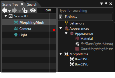
In order to get the desired morphing effect, select the morphing mesh in the right side of the Scene Tree panel and set the weight of each morphing mesh item in the Properties panel accordingly.

<div drawio-diagram="6070"><img src="https://doc316en.candera.eu/uploads/images/drawio/2024-06/drawing-5-1717769811.png" alt=""/></div>

<div class="contents" id="bkmrk-the-sum-of-the-weigh"><div class="contents"><div class="textblock"><dl class="note"><dt></dt><dd><p class="callout info">The sum of the weight of all morphing mesh items part of a MorphingMesh must be 1.00 to get correct morph behavior.</p>

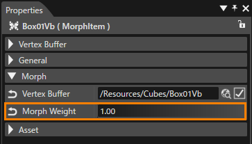
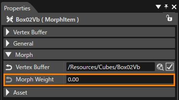
</dd></dl></div></div></div>By default, after creating morphing mesh items, the morph weight of the first item is set to 1.00, while morph weights for all other items are set to 0.00.

<div drawio-diagram="6071"><img src="https://doc316en.candera.eu/uploads/images/drawio/2024-06/drawing-5-1717769836.png" alt=""/></div>

##### Wireframe Line Width

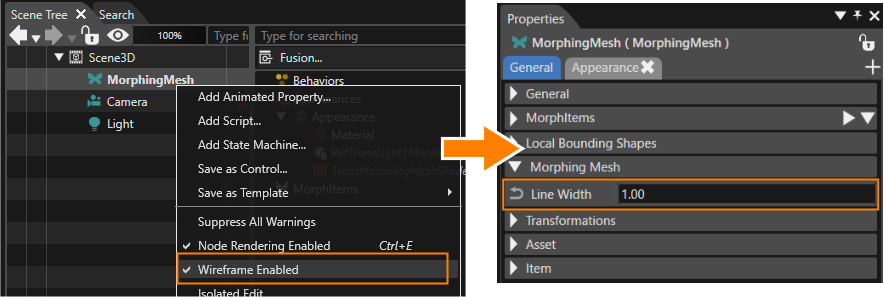
<div class="textblock" id="bkmrk-when-a-wireframe-ver"><div class="textblock">When a wireframe vertex buffer is applied to a morphing mesh and the “Wireframe Enabled” option is enabled from the context menu in the scene tree, the properties item “Line Width” is added to the Morphing Mesh. This specifies the line width of the Morphing mesh when it is rendered as wire.</div></div><div class="textblock" id="bkmrk-the-actual-line-widt">- The actual line width is determined by rounding the specified width to the nearest integer.
- If the setting is less than “1”, it is always set to “1”.

</div><div class="textblock" id="bkmrk--53"><div drawio-diagram="7582"><img src="https://doc316en.candera.eu/uploads/images/drawio/2024-11/drawing-5-1732896434.png" alt=""/></div>

</div><div class="textblock" id="bkmrk--55">  
</div>##### <a class="anchor" id="bkmrk--142"></a>Morphing Shader

The reference shaders for morphing:

<div class="contents" id="bkmrk-reftranslight1morph_"><div class="contents"><div class="textblock">- RefTransLight1Morph\_RefColor and
- RefTransLight1Morph\_RefColorTex

</div></div></div>support morphing between maximal 2 vertex buffers.

#### <a class="anchor" id="bkmrk--143"></a>**Level of Detail (LOD)**

With Level of Detail, 3D render performance can be improved by using low polygon models for far away objects and high polygon models only for objects near to the camera.

##### <a class="anchor" id="bkmrk--144"></a>Create a LodNode

Using the level of details concept in SceneComposer:

<div class="contents" id="bkmrk-create-a-lod-node-it"><div class="contents"><div class="textblock">1. Create a lod node item called "LodNode" in a scene by dragging it from the Toolbox and dropping it to the scene.
2. Add children (for example: 2 Billboards) to the LodNode, providing models for each desired lod level. Note that each child node needs to have an own RenderMode attached.

</div></div></div>##### <a class="anchor" id="bkmrk--145"></a>Configure Lod Levels

Each child of a LodNode must be associated to a specific LodLevel by configuring following properties:

<div class="contents" id="bkmrk-index%2C-lower-bound-o"><div class="contents"><div class="textblock">- index,
- lower bound of visibility range and
- upper bound of visibility range.

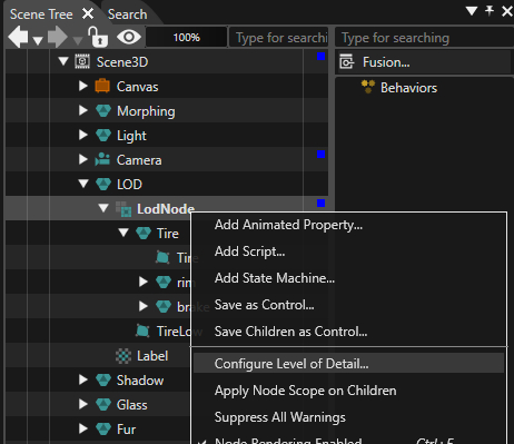
</div></div></div>While the index is given by the order of the LodNode children in the scene graph, lower and upper bound can be configured either in the Properties panel or in the "Configure Level of Detail" dialog. For this, use the context menu item "Configure Level of Detail" on the selected LodNode in Scene Tree panel:

<div drawio-diagram="7583"><img src="https://doc316en.candera.eu/uploads/images/drawio/2024-11/drawing-5-1732897799.png" alt=""/></div>

<div class="contents" id="bkmrk--58"><div class="contents"><div class="textblock">  
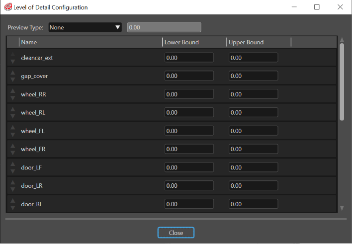
</div></div></div>First of all, the "Level of Detail" dialog allows to specify the Lower Bound and the Upper Bound for any child part of the LodNode.

<div drawio-diagram="6074"><img src="https://doc316en.candera.eu/uploads/images/drawio/2024-06/drawing-5-1717770689.png" alt=""/></div>

<div class="contents" id="bkmrk--60"><div class="contents"><div class="textblock">  
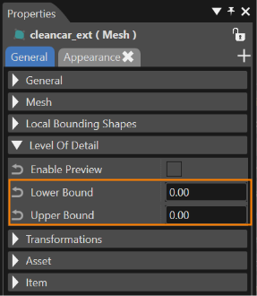
</div></div></div>The same operation can be done in the Properties panel, whenever a LodNod child is selected in the Scene Tree panel:

<div drawio-diagram="6075"><img src="https://doc316en.candera.eu/uploads/images/drawio/2024-06/drawing-5-1717770762.png" alt=""/></div>

#### <a class="anchor" id="bkmrk--149"></a>Configure LodNode

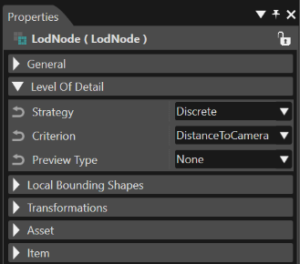
Select the LodNode in the Scene Tree panel to edit the following LoD node properties in the Properties panel:

<div class="contents" id="bkmrk-lod-render-strategy%2C"><div class="contents"><div class="contents"><div class="textblock">- LoD render strategy,
- LoD criterion and the
- preview type

</div></div></div></div><div drawio-diagram="6076"><img src="https://doc316en.candera.eu/uploads/images/drawio/2024-06/drawing-5-1717770799.png" alt=""/></div>

<div class="contents" id="bkmrk--64"><div class="contents"><div class="textblock">  
</div></div></div>The preview type property can be edited in the Level of Detail Configuration dialog, too.

##### <a class="anchor" id="bkmrk--151"></a>Discrete LoD Render Strategy

Select "Discrete" for the Level of Detail render strategy to configure a stepwise transition between the several Lod levels.

After choosing "DistanceToCamera" Lod criterion, the LoD level will be switched depending on the distance of the LodNode to the camera.

##### <a class="anchor" id="bkmrk--152"></a>Blend Lod Render Strategy

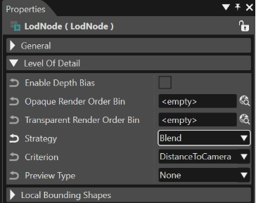
Select "Blend" for the Level of Detail render strategy to configure a smooth alpha blending transition between the several Lod levels. In this case, following additional properties can be specified:

<div class="contents" id="bkmrk-enable-depth-bias-op"><div class="contents"><div class="contents"><div class="textblock">- Enable Depth Bias
- Opaque and Transparent Render Order Bin

</div></div></div></div><div drawio-diagram="6077"><img src="https://doc316en.candera.eu/uploads/images/drawio/2024-06/drawing-5-1717770908.png" alt=""/></div>

<div class="contents" id="bkmrk--66"><div class="contents"><div class="textblock">  
</div></div></div>Again, after choosing "DistanceToCamera" Lod criterion, the LoD level will be switched depending on the distance of the LoDNode to the camera.

#### <a class="anchor" id="bkmrk--154"></a>**Canvas**

Canvas is a node that acts as a surface which allows the user to introduce 2D content in a 3D scene. Canvas nodes can have appearances, just like normal 3D nodes so the user can achieve complex visual effects by using appropriate shaders, materials and textures.

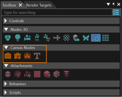
Canvas, CanvasGroup, CanvasSprite and Canvas Text (placed under the "Canvas Nodes" section of the Toolbox) behave like normal nodes when it comes to transformations and selection. Bounding box will be rendered for each of them. They can be translated, rotated, scaled. Canvas acts as a surface. CanvasGroup nodes, CanvasSprite nodes and Canvas Text nodes can be inserted into it.

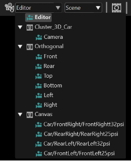
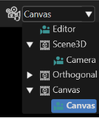
For each Canvas object, a new editing camera is added in the scene camera list and becomes available in "Canvas" category. This camera can be selected and exhibits a special behavior: is automatically oriented towards the canvas, regardless of canvas transformations, so that the Canvas and its children will always appear like they would be viewed from a "Front" camera. A Canvas camera provides an orthographic projection.

<div drawio-diagram="6078"><img src="https://doc316en.candera.eu/uploads/images/drawio/2024-06/drawing-5-1717770962.png" alt=""/></div>

<div class="contents" id="bkmrk--69"><div class="contents"><div class="contents"><div class="textblock">  
</div></div></div></div>#### <a class="anchor" id="bkmrk--156"></a>Canvas Sprite

CanvasSprite is a node that represents a solid object, offering the possibility to render a texture, a flat colored rectangle or other visual effects, depending on its appearance configuration.

Four new shaders will be available in the default solution for configuring the CanvasSprite:

<div class="contents" id="bkmrk-refcanvastrans_refte"><div class="contents"><div class="textblock">- RefCanvasTrans\_RefTex
- RefCanvasTransLight1\_RefColor
- RefCanvasTransLight1\_RefColorTex
- RefCanvasTransUniDiffuseMat\_RefCanvasUniDiffuseMat

</div></div></div>A new uniform setter template will be available in the default solution for configuring CanvasSprite: CanvasTransShaderParamSetter.

#### <a class="anchor" id="bkmrk--157"></a>Canvas Text

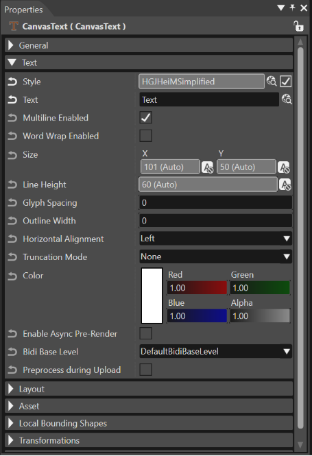
Canvas Text is a node that allows the creation of 2D texts on a Canvas in a 3D scene. When Canvas Text node is selected, specific properties become available in the Properties panel.

<div drawio-diagram="6080"><img src="https://doc316en.candera.eu/uploads/images/drawio/2024-06/drawing-5-1717771031.png" alt=""/></div>

<div class="contents" id="bkmrk--72"><div class="contents"><div class="textblock">  
</div></div></div>In this way the text can be set as desired.

<p class="callout info">The Canvas automatically batches Canvas Texts together to minimize the amount of draw calls. To achieve high batching rates, it is crucial that the user shares Appearances, Render Order Ranks, Render Order Bins, and Scope Masks between Canvas Texts as much as possible. Only Canvas Texts with the same properties can be batched together.</p>

Some of the most important Canvas Text properties are the following:

**Alignment:** The text has a property for horizontal alignment. This property aligns the text within Text::Size. If no Text::Size is set, the Layout::Size is used. The layout has a horizontal and vertical layout alignment property which is used to align the ‘block’ of the measured text within the Layout::Size. The defined layout alignment can be propagated to the text alignment when the text alignment is set to ‘Auto’.  
Otherwise, it is possible to right align the text within Text::Size but left align this block of right aligned text within Layout::Size. The properties will be inverted if the layout direction is set to ‘right to left’.

**Word wrap and truncation:** Both properties prepare a text for use cases in which they do not fit into a size. Therefore, enabling one of them forces the text to fit into the provided smallest size (Layout::Size or Text::Size).   
  
For many other details see the chapter <span style="color: rgb(230, 126, 35);">[Canvas Text - Size Property](https://doc316en.candera.eu/books/layouter/page/canvas-text-size-property)</span>.

#### <a class="anchor" id="bkmrk--159"></a>Canvas Text Outline

By using this feature, it is possible to use shader effects such as Outline on any canvas text node on a 3D scene. This property allows the user to add an outline on any canvas text on a 3D scene.

To use the "Canvas Text Outline" feature, it is mandatory to use an Appearance Collection that has set "RefTransColor\_RefColorTexAlpha" as shader.

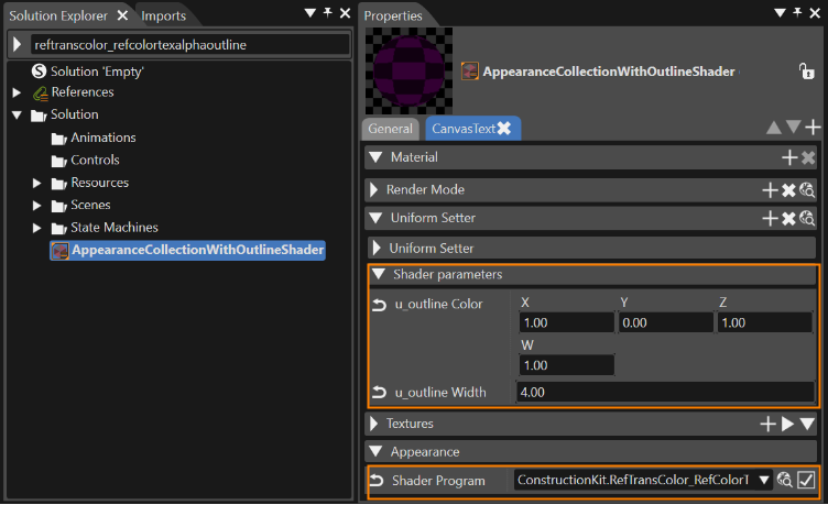
In order to obtain such a collection, first, in "Solution Explorer" copy the "CanvasText" appearance collection which can be found in "References &gt; SCL:ConstructionKit &gt; Resources &gt; Appearances &gt; CanvasText" from "Templates" into your solution. After this step, in "Solution Explorer" rename the copied "CanvasText" appearance collection (e.g.: "AppearanceCollectionWithOutlineShader") then in Properties select the "CanvasText" tab and under the "Appearance" section set "RefTransColor\_RefColorTexAlphaOutline" as shader program.

<div drawio-diagram="6081"><img src="https://doc316en.candera.eu/uploads/images/drawio/2024-06/drawing-5-1717772442.png" alt=""/></div>

<div class="contents" id="bkmrk--74"><div class="contents"><div class="textblock">  
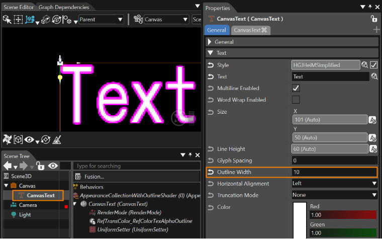
</div></div></div>From now on it is possible to use this appearance collection to set an outlined canvas text. The color and width properties are available under "Shader parameters" section (see the image above). To see how this works, first, when "AppearanceCollectionWithOutlineShader" is selected in "Solution Explorer", modify the u\_outline Color as follows: X=1.00/Y=0.00/Z=1.00/W=1.00 then set the u\_outline Width to be "4". Create a 3D scene and in it drag and drop from Toolbox a Canvas node with a Canvas Text in it. In Scene Tree select the "CanvasText" node and drag and drop on it - from "Solution Explorer" - the "AppearanceCollectionWithOutlineShader". In Scene Tree select again the "CanvasText" node then in Properties modify the "Outline Width" to be at least 1 or 2.

<div drawio-diagram="7584"><img src="https://doc316en.candera.eu/uploads/images/drawio/2024-11/drawing-5-1732898711.png" alt=""/></div>

<div class="contents" id="bkmrk--76"><div class="contents"><div class="textblock">  
</div></div></div>In this way the outline of the text can be set as desired.

#### <a class="anchor" id="bkmrk--162"></a>Canvas Layouter

The functionality of 3D Layout for canvas nodes is similar with that of the layouters known from SceneComposer 2D scenes. By using this feature a Canvas Group is able to align its nodes (group, sprite, or text) according to the configured layouter.

It's not possible to animate the same property for parent and child nodes. Group nodes are resolved and all properties are applied on their child nodes. Either animate the parent group property or the child properties.

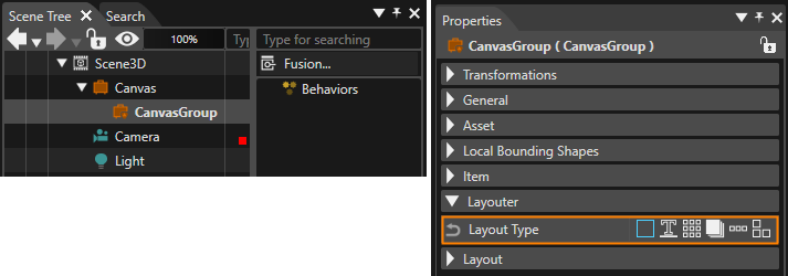
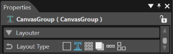
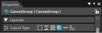
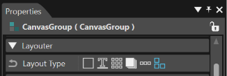
The settings for this feature can be done through a category with the same name available in the Properties panel. To access it, first, a Canvas Group - included in a Canvas - has to be selected:

<div drawio-diagram="7585"><img src="https://doc316en.candera.eu/uploads/images/drawio/2024-11/drawing-5-1732898895.png" alt=""/></div>

<div class="contents" id="bkmrk-in-order-to-get-the--0"><div class="contents"><div class="textblock"><dl class="note"><dt></dt><dd><p class="callout info">In order to get the best perspective on a scene where canvas groups/nodes are used, a special canvas camera is available (see the image below).</p>

<div drawio-diagram="6086"><img src="https://doc316en.candera.eu/uploads/images/drawio/2024-06/drawing-5-1717773292.png" alt=""/></div>

</dd></dl></div></div></div>By using this feature a Canvas Group is able to align its nodes - group, sprite, or text - according to the configured layouter. The available layout types are identical with those used for the 2D layouters:

<div class="contents" id="bkmrk-baseline-layouter-gr"><div class="contents"><div class="textblock">- BaseLine Layouter
- Grid Layouter
- Overlay Layouter
- Stack Layouter
- DockPanel Layouter

</div></div></div><div class="contents" id="bkmrk-the-%22ctrl%2Bl%22-command"><div class="contents"><div class="textblock"><dl class="note"><dd><p class="callout info">The "Ctrl+L" command is a shortcut for the "Do Layout" operation. Please, note, that in the case of 3D Canvas layouter, this command will update the position and scale' values for the selected object.</p>

</dd><dd></dd></dl></div></div></div>**Baseline Layouter**

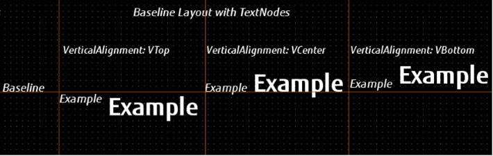
The layout type "Baseline" realizes a stacked laying out in the horizontal direction. It behaves similar to the Horizontal Stack Layouter. The major difference consists in its given reference: it aligns the objects to a line instead of aligning them to the client area. The main purpose of this layouter is to align different sizes formatted texts along the same baseline. For instance, if the center is chosen for alignment, the baseline of the text will be aligned to the given line (= baseline offset). The order of the elements is given by the order of the child nodes within the layouted group.

<div drawio-diagram="6088"><img src="https://doc316en.candera.eu/uploads/images/drawio/2024-06/drawing-5-1717773397.png" alt=""/></div>

<div class="contents" id="bkmrk--80"><div class="contents"><div class="textblock">  
</div></div></div>Configure the Baseline Layouter by following these steps:

<div class="contents" id="bkmrk-select-the-canvas-gr"><div class="contents"><div class="textblock">1. Select the Canvas Group holding the nodes to be layouted in the Scene Tree panel
2. Choose LayoutType "Baseline" from the Properties panel
3. Set any value for property Base Line Offset in the Properties panel, depending on the desired laying out

</div></div></div><div drawio-diagram="725"><img src="https://doc316en.candera.eu/uploads/images/drawio/2023-02/drawing-4-1676381281.png" alt=""/></div>

<div class="contents" id="bkmrk--82"><div class="contents"><div class="textblock">  
</div></div></div>**Grid Layouter**

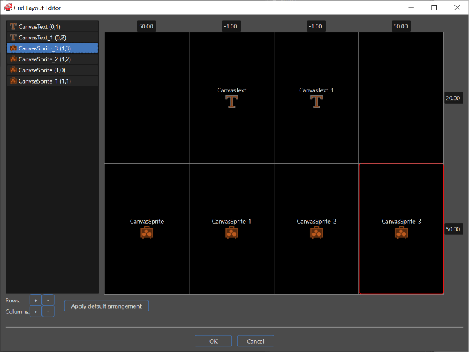
In a Grid layout, every node part of the layouted canvas group is assigned to a cell of the grid. A Grid Layout Editor is available to configure the grid and to arrange nodes in the grid's cells by drag &amp; drop operation.

<div drawio-diagram="6089"><img src="https://doc316en.candera.eu/uploads/images/drawio/2024-06/drawing-5-1717773446.png" alt=""/></div>

 Configuring the Grid Layouter:

<div class="contents" id="bkmrk-select-the-canvas-gr-0"><div class="contents"><div class="contents"><div class="textblock">1. Select the Canvas Group holding the canvas nodes to be layouted in the Scene Tree panel
2. Choose LayoutType "Grid" from the Properties panel
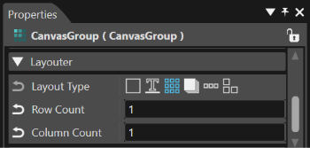
3. Optional: Set the number of rows and columns of the grid by editing the properties RowCount and ColumnCount in the Properties panel
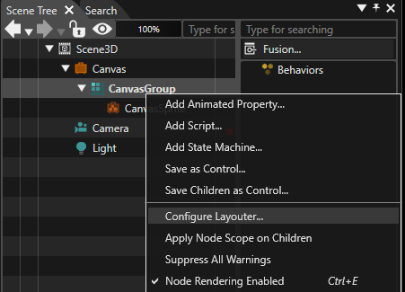
4. Use the context menu item "Configure Layouter" on the selected Group in the Scene Tree panel to open the "Grid Layout Editor" dialog

</div></div></div></div><div drawio-diagram="7586"><img src="https://doc316en.candera.eu/uploads/images/drawio/2024-11/drawing-5-1732898993.png" alt=""/></div>

<div class="contents" id="bkmrk--85"><div class="contents"><div class="textblock">  
</div></div></div>Optional: Use the buttons "+","-" to configure the desired number of rows and columns in the "Grid layout editor" dialog, if not done already in the Properties panel.

<div drawio-diagram="728"><img src="https://doc316en.candera.eu/uploads/images/drawio/2023-02/drawing-4-1676381360.png" alt=""/></div>

 Arrange the nodes of the group in the grid's cells by drag &amp; drop operation.

<div drawio-diagram="6091"><img src="https://doc316en.candera.eu/uploads/images/drawio/2024-06/drawing-5-1717773621.png" alt=""/></div>

<div class="contents" id="bkmrk--88"><div class="contents"><div class="textblock">  
</div></div></div>Configure width and height for rows and columns by editing the values on the border of the grid. Values within the range \[0...1\] are considered as percentages and values greater than 1 as dimensions.

Confirm the layouter configuration by pressing the "OK" button of the dialog "Grid layout editor".

Call the Do-Layout command using the shortcut keys "Ctrl+L" or from the "Edit" &gt; "Do-Layout" menu.

**Overlay Layouter**

The layout type "Overlay" arranges the objects by laying out them on top of each other or by aligning the nodes according to their general layout properties. The order of the elements is given by the order of the child nodes within the layouted group.

<div drawio-diagram="6092"><img src="https://doc316en.candera.eu/uploads/images/drawio/2024-06/drawing-5-1717773662.png" alt=""/></div>

<div class="contents" id="bkmrk--90"><div class="contents"><div class="textblock">  
</div></div></div>Configuring the Overlay Layouter:

<div class="contents" id="bkmrk-select-the-canvas-gr-1"><div class="contents"><div class="textblock">1. Select the Canvas Group holding the canvas nodes to be layouted in the Scene Tree panel
2. Choose LayoutType "Overlay" from the Properties panel

</div></div></div>**Stack Layouter**

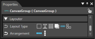
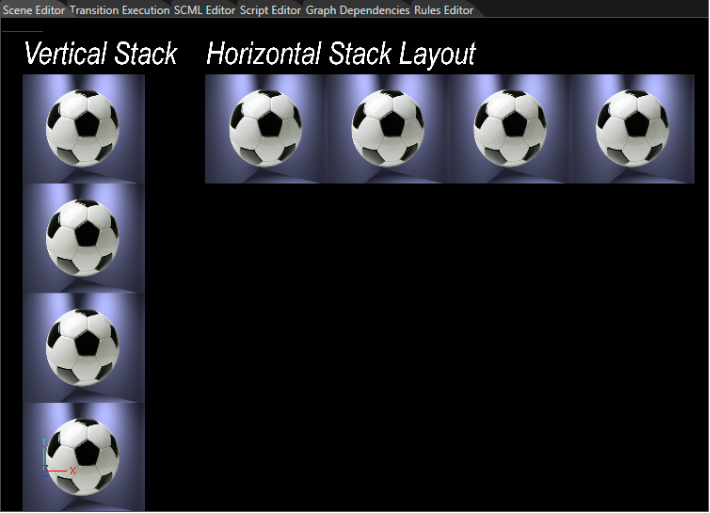
The layout type "Stack" realizes a stacked laying out either in horizontal or vertical direction. The order of the stack elements is given by the order of the child nodes within the layouted group.

<div drawio-diagram="6093"><img src="https://doc316en.candera.eu/uploads/images/drawio/2024-06/drawing-5-1717773691.png" alt=""/></div>

<div class="contents" id="bkmrk--92"><div class="contents"><div class="textblock">  
</div></div></div>Configuring the Stack Layouter:

<div class="contents" id="bkmrk-select-the-group-hol"><div class="contents"><div class="textblock">1. Select the Group holding the nodes to be layouted in the Scene Tree panel
2. Choose LayoutType "Stack" from the Properties panel
3. Choose "Horizontal" or "Vertical" value for property Arrangement in the Properties panel, depending on the desired laying out

</div></div></div><div drawio-diagram="732"><img src="https://doc316en.candera.eu/uploads/images/drawio/2023-02/drawing-4-1676381461.png" alt=""/></div>

<div class="contents" id="bkmrk--95"><div class="contents"><div class="textblock">  
</div></div></div>**DockPanel Layouter**

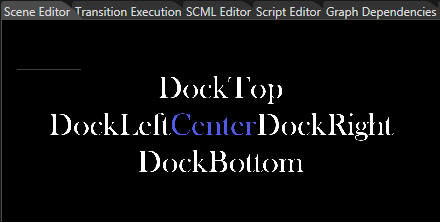
The "DockPanel" layout provides a layout area within it is possible to arrange canvas child elements around the edge of the screen based on four direction: Top, Bottom, Left, and Right.

<div drawio-diagram="733"><img src="https://doc316en.candera.eu/uploads/images/drawio/2023-02/drawing-4-1676381479.png" alt=""/></div>

<div class="contents" id="bkmrk--102"><div class="contents"><div class="textblock">  
</div></div></div>This type of layout arranges the elements by laying out them in the remaining space after the previous element was set. To dock an element to the center of the panel, it must be the last child of the panel.

<div drawio-diagram="6094"><img src="https://doc316en.candera.eu/uploads/images/drawio/2024-06/drawing-5-1717773800.png" alt=""/></div>

<div class="contents" id="bkmrk--106"><div class="contents"><div class="textblock">  
</div></div></div>Configure the DockPanel Layouter by following these steps:

<div class="contents" id="bkmrk-select-the-canvas-gr-2"><div class="contents"><div class="textblock">1. Select the Canvas Group holding the canvas nodes to be layouted in the Scene Tree panel
2. Choose Layout Type "DockPanel" from the Properties panel
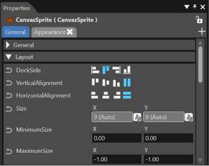
3. For any canvas node inside the Canvas Group a new property will become available: "Dock Side". Select it and choose any of the fours available laying outs: "DockLeft", "DockTop", DockRight", "DockBottom".

</div></div></div><div drawio-diagram="6095"><img src="https://doc316en.candera.eu/uploads/images/drawio/2024-06/drawing-5-1717773917.png" alt=""/></div>

<div class="contents" id="bkmrk--177"><div class="textblock">  
</div></div>

# Node Attachments

#### **Node Attachments Toolbox**

##### <a class="anchor" id="bkmrk--93"></a>Create 3D Node Attachments

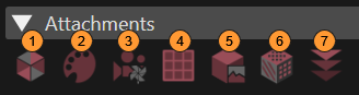
A node can have an appearance attached, having up to four children. Following items from the Toolbox can be used to configure attachments for 3D nodes:

<div drawio-diagram="6155"><img src="https://doc316en.candera.eu/uploads/images/drawio/2024-06/drawing-5-1718341803.png" alt=""/></div>

<div class="header" id="bkmrk-appearance%3A-its-attr"><div class="header"><div class="headertitle"><div class="title"><div class="contents"><div class="contents"><div class="textblock"><table border="0" cellspacing="10" style="width: 100%; height: 508.359px;"><tbody><tr style="height: 71.6875px;" valign="bottom"><td style="width: 5.79283%; height: 71.6875px;">**1**

</td><td style="width: 94.0837%; height: 71.6875px;">**Appearance:** Its attributes define the distinctive visualization of a geometry like Mesh, Billboard, and PointSprite.   
[Candera::Appearance](http://dev.doc.cgistudio.at/APILINK/class_candera_1_1_appearance.html "The class Appearance groups following render attributes: Material, Textures, RenderMode, and Shader. Render attributes define the distinctive visualization of a geometry like Mesh, Billboard, and PointSprite. Further, render attributes can be shared across multiple objects, which conserves memory and enables sharing of appearance characteristics. An Appearance object is mandatory for any object in order to get rendered. Per default all render attributes are initialized to null, which is a valid setting. If the Appearance is activated, all render attributes that are set become activated. If no RenderMode is defined (null), then the default RenderMode is used instead;.")</td></tr><tr style="height: 70.6875px;" valign="bottom"><td style="width: 5.79283%; height: 70.6875px;"><div class="image"><div class="image">**2**</div></div></td><td style="width: 94.0837%; height: 70.6875px;">**Material:** Describes the color attributes of an object's surface. It is primarily used for lighting computations.   
[Candera::Material](http://dev.doc.cgistudio.at/APILINK/class_candera_1_1_material.html "The class Material describes the color attributes of an object's surface and is primarily used for li...")</td></tr><tr style="height: 89.7188px;" valign="bottom"><td style="width: 5.79283%; height: 89.7188px;"><div class="image">**3**</div></td><td style="width: 94.0837%; height: 89.7188px;">**RenderMode:** An appearance component that encapsulates polygon-level and per-fragment compositing render attributes. <span style="color: rgb(230, 126, 35);">[Read more...](#bkmrk-render-mode)</span>   
[Candera::RenderMode](http://dev.doc.cgistudio.at/APILINK/class_candera_1_1_render_mode.html "The class RenderMode is an Appearance component that encapsulates polygon-level and per-fragment comp...")</td></tr><tr style="height: 67.3281px;" valign="bottom"><td style="width: 5.79283%; height: 67.3281px;">**4**

</td><td style="width: 94.0837%; height: 67.3281px;">**Uniform Setter:** A setter associated to a given node in a 3D scene to generate special effects.   
[Candera::GenericShaderParamSetter](http://dev.doc.cgistudio.at/APILINK/class_candera_1_1_generic_shader_param_setter.html "GenericShaderParamSetter bundles uniform shader parameters that are calculated by Candera...")</td></tr><tr style="height: 67.3281px;" valign="bottom"><td style="width: 5.79283%; height: 67.3281px;">**5**

</td><td style="width: 94.0837%; height: 67.3281px;">**Texture:** A collection of textures. **Up to 16 on ES3.0 builds** and **up to 8 on ES2.0 builds**.

<p class="callout info">On ES3.0 builds, additional auto-uniform samplers u\_Texture–u\_Texture15 and u\_CubeMapTexture–u\_CubeMapTexture15 are available for binding the 1th–16th textures.  
On ES2.0, only u\_Texture–u\_Texture7 and u\_CubeMapTexture–u\_CubeMapTexture7 are available.</p>

[Candera::Texture](http://dev.doc.cgistudio.at/APILINK/class_candera_1_1_texture.html "Texture encapsulates a TextureImage and a set of attributes specifying how it is applied to a vertex'...")

</td></tr><tr style="height: 71.6875px;" valign="bottom"><td style="width: 5.79283%; height: 71.6875px;">**6**

</td><td style="width: 94.0837%; height: 71.6875px;">**Cube Map Texture:** A particular type of environment mapping. <span style="color: rgb(230, 126, 35);">[Read more...](#bkmrk-cube-map-texture)</span>   
[Candera::GenericShaderParamSetter](http://dev.doc.cgistudio.at/APILINK/class_candera_1_1_generic_shader_param_setter.html "GenericShaderParamSetter bundles uniform shader parameters that are calculated by Candera...")</td></tr><tr style="height: 69.9219px;" valign="bottom"><td style="width: 5.79283%; height: 69.9219px;">**7**

</td><td style="width: 94.0837%; height: 69.9219px;">**Render Order Bin:** Is used to configure a non-default render order for all the 3D objects in a scene graph. <span style="color: rgb(230, 126, 35);">[Read more...](#bkmrk-render-order-bins)</span>   
Candera::RenderOrderBin</td></tr></tbody></table>

</div></div></div></div></div></div></div>Create a new attachment by drag &amp; drop an attachment type from the Toolbox on the desired 3D node in the Scene Tree panel.

**Apply Appearance Template to Multiple Nodes**

It is possible to apply an attachment to multiple nodes at once: When all the desired nodes are selected, drag and drop the attachment on the multi-selected nodes.

<div class="header" id="bkmrk-if-a-drag-operation-"><div class="headertitle"><div class="title"><div class="contents"><div class="textblock"><dl class="note"><dt></dt><dd><p class="callout info">If a drag operation is performed between two panels and the destination item is part of a multiple selection, all the items in the selection will be affected.</p>

</dd></dl></div></div></div></div></div><div class="contents" id="bkmrk--2"><div class="textblock"><dl class="note"><dd></dd></dl>  
</div></div><div class="header" id="bkmrk--0"><div class="headertitle">  
</div></div><div class="title" id="bkmrk--3"></div>#### **Render Mode**

##### <a class="anchor" id="bkmrk--94"></a>Configure Render Mode

If no "Render Mode" is associated to an object, SCHost will automatically apply the values set in the Default render mode configuration (the default render mode). Otherwise, if a render mode instance already exists on a specific node, note the following:

In the Properties panel, the RenderMode properties provide a checkbox on the left side with two states:

<div class="contents" id="bkmrk-%22inherited%22-%28the-val"><div class="contents"><div class="textblock">- **"Inherited"** (the value is inherited from the default render mode) and
- **"Not Inherited"** (the value set by the user is the one considered).

</div></div></div>If the property value is set to Inherited, the property will be read only and the value will be taken from the DefaultRenderMode (Configuration &gt; Default Render Mode). Only if the checkbox is unchecked (meaning that the property does not inherit from the default render mode configuration) the property will be editable.

<div class="contents" id="bkmrk-a-new-render-mode-ad"><div class="textblock"><dl class="note"><dd><p class="callout info">A new Render Mode added to a node will have all properties set to "Inherited". A RenderMode created based on an imported Scene will have all properties set to "Not Inherited".</p>

</dd></dl></div></div><dl class="note" id="bkmrk--4"></dl>#### **Cube Map Texture**

##### <a class="anchor" id="bkmrk--95"></a>Cube Mapping

Cube mapping is one of the most spectacular types of the so called environment mapping. In SceneComposer this type of mapping can be done by using the CubeMapTexture from the Toolbox. First, a mesh and a collection of six images of a cubical environment map have to be imported. The mesh will be dragged in a 3D scene. The Appearance has to be contained:

<div class="contents" id="bkmrk-material---does-not-"><div class="contents"><div class="textblock">- Material - does not require any special setting;
- Render Mode - the FrontFaceCulling property has to be selected;
- One of the specific shaders available for the CubeMapTexture (e.g. RefTransCubeMap... shader) - in Appearance the Shader Program that must be selected is RefTransCubeMap\_RefCubeMapTex;
- UniformSetter - The uniform setter required by the chosen shader has to be checked

</div></div></div><p class="callout info">`CubeMapTexture` supports **up to 16 slots on ES3.0 builds** and **up to 8 on ES2.0 builds** (each slot maps to `u_CubeMapTextureN`).</p>

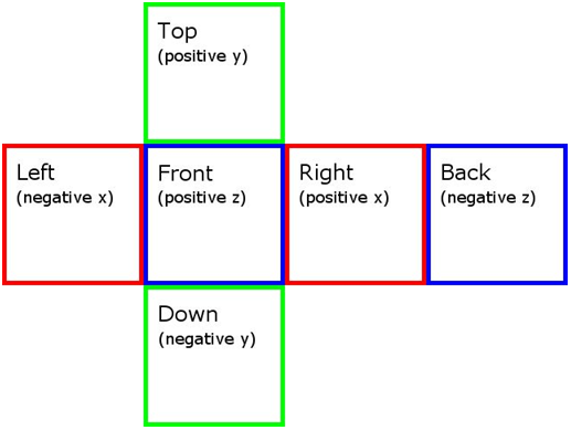
The main feature that has to be used is CubeMapTexture which has to be dragged and set as texture. Six specific properties will become available for this type of texture: Positive X Image / Negative X Image / Positive Y Image / Negative Y Image / Positive Z Image and Negative Z Image. Any of the imported images has to correspond to one of these properties.

<div drawio-diagram="774"><img src="https://doc316en.candera.eu/uploads/images/drawio/2023-02/drawing-4-1676426940.png" alt=""/></div>

<div class="contents" id="bkmrk-any-of-the-imported-"><div class="contents"><div class="textblock"><dl class="note"><dt></dt><dd><p class="callout info">Any of the imported six images has to be vertically flipped to get the desired map. (This step is mandatory because of the OpenGL standard that stores its textures "reversed".)</p>

</dd></dl></div></div></div><div drawio-diagram="775"><img src="https://doc316en.candera.eu/uploads/images/drawio/2023-02/drawing-4-1676426970.png" alt=""/></div>

<div class="contents" id="bkmrk--8"><div class="contents"><div class="textblock">  
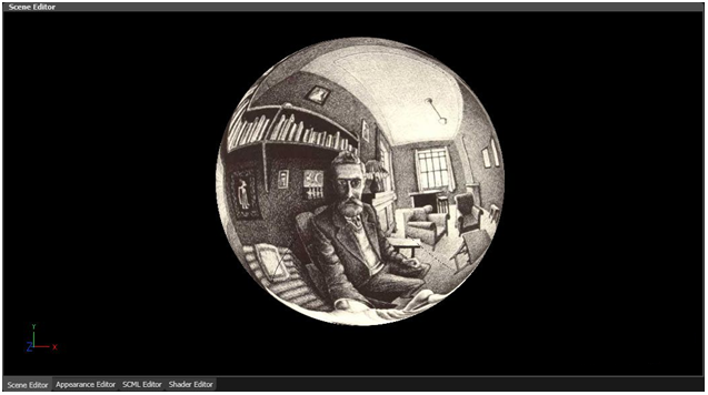
</div></div></div>Any model can be placed inside the environment (in our case, a cube) and set as a reflective map. One of the best examples is to place a sphere inside the cube environment and to use the RefTransCubeMapReflection\_RefCubeMapTex shader. The setting of the properties will be almost the same as in the Cube mapping case. The UniformSetter properties which have to be enabled are ModelMatrix4, NormalModelMatrix3 and ModelViewProjectionMatrix4. The same six images can be used for the sphere as six textures displayed as an unfolded cube.

<div drawio-diagram="776"><img src="https://doc316en.candera.eu/uploads/images/drawio/2023-02/drawing-4-1676426996.png" alt=""/></div>

<div class="contents" id="bkmrk--10"><div class="contents"><div class="textblock">  
</div></div></div>By placing the sphere in an environment some complex and spectacular scenes can be created.

<div drawio-diagram="777"><img src="https://doc316en.candera.eu/uploads/images/drawio/2023-02/drawing-4-1676427011.png" alt=""/></div>

<div class="contents" id="bkmrk--12"><div class="textblock">  
</div></div><dl class="note" id="bkmrk--13"></dl><dl class="note" id="bkmrk--14"></dl><dl class="note" id="bkmrk--15"></dl><dl class="note" id="bkmrk--16"></dl><dl class="note" id="bkmrk--17"></dl>#### **Render Order Bins**

Render Order Bins are containers for items to sort them for rendering.

For a detailed description of the [Candera](http://dev.doc.cgistudio.at/APILINK/namespace_candera.html "[DataBinding_RefTypeSample]") Render Order concept, refer to <span style="color: rgb(230, 126, 35);">[Application and Widget Development Tutorial](https://doc316en.candera.eu/books/candera)</span>.

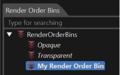
The Render Order Bins collection is displayed in the RenderOrderBins Panel. It can be enabled by choosing "View - Scene - Render Order Bins" menu option.
<div drawio-diagram="6156"><img src="https://doc316en.candera.eu/uploads/images/drawio/2024-06/drawing-5-1718342475.png" alt=""/></div>

<div class="contents" id="bkmrk--19"><div class="contents"><div class="textblock">  
</div></div></div>There are two predefined Render Order Bins: **Opaque** and **Transparent**. Per default, all objects part of a scene are sorted into that bins according to their render attributes. Both default bins are protected, meaning that they are under control of [Candera](http://dev.doc.cgistudio.at/APILINK/namespace_candera.html "[DataBinding_RefTypeSample]") and cannot be deleted.

<div class="contents" id="bkmrk--20"><div class="contents"><div class="textblock">---

</div></div></div>##### <a class="anchor" id="bkmrk--102"></a>Configure a New Render Order Bin

To specify a non-default render order, create a new Render Order Bin by drag &amp; drop from the Toolbox into the RenderOrderBins collection.

<div class="contents" id="bkmrk-to-assign-items-to-t"><div class="contents"><div class="textblock">- To **assign items** to the new Render Order Bin, drag items from the scene graph in the "Scene Tree" panel to the Render Order Bin; these items will appear as children of the Render Order Bin.

- Modify **Render Order Bin Rank:** All the bins are sorted according to the Render Order Bin Rank which is visible as a "read only" field in the Properties panel. If there are many bins dragged from the Toolbox inside the "Render Order Bins" panel, their ranks will be automatically assigned to each of them according with their order. Every time when the user manually rearranges the order of the bins in the "Render Order Bins" panel, their rank is updated.

- If property **Enable Sorting** is checked for the Render order bin, a proper **Render Order Rank Criterion** must be chosen to define the strategy how the render order shall be calculated.   
    &gt; If the selected order criterion is "DistanceToCamera" or "ReverseDistanceToCamera", the "Distance Function" will become available. The mentioned function determines how the distance from camera to any node is calculated.   
    &gt; In case a (Reverse) Render Order Rank Criterion is selected, specify the ranks of the nodes part of a bin on the node property "Render Order Rank". &gt; If the selected order criterion is "BatchOrderCriterion", the "SortbyShaderandRenderMode" and "SortbyAppearance" modes will become available. This criterion produces a render order containing series of nodes that can then be batched by the Renderer to maximize usage of Geometry Instancing.

</div></div></div>In order to check the "BatchOrderCriterion" the following steps should be followed:

<div class="contents" id="bkmrk-open%2Fcreate-an-openg"><div class="contents"><div class="contents"><div class="textblock">- Open/create an OpenGL ES 3.0 Solution;
- Import an .fbx object;
- Create a 3D scene containing the object and a camera (do not activate occlusion culling render strategy);
- Create a display, a render target and set the camera to render on the display;
- Clone some meshes and apply a different appearance to them;
- Set up so that shared appearance meshes are not adjacent. Example: CAM &lt; MESH1 MESH2 MESH3 MESH4 MESH5 MESH6 (odd number meshes have shared appearance, others have a different appearance);
- For the Opaque render order bin, enable sorting;
- Sorting by ReverseDistanceToCamera will reduce the number of Instances (0) and increase the Draw Calls (6) (see the "Display Render Statistics" in SceneComposer);
- Sorting by BatchOrder will draw increase the number of Instances (3) and reduce the Draw Calls (4).
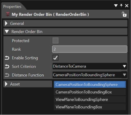
</div></div></div></div><div drawio-diagram="6157"><img src="https://doc316en.candera.eu/uploads/images/drawio/2024-06/drawing-5-1718342562.png" alt=""/></div>

<div class="contents" id="bkmrk-the-previous-step-wi"><div class="contents"><div class="textblock"><dl class="note"><dt></dt><dd><p class="callout info">The previous step will lead to the desired results *just* if a RenderMode object will be associated with every item placed in the Render Order Bin by dragging it from the toolbox panel ("Toolbox" &gt; "Attachments") inside the Appearances section of the Scene Tree. After this operation, the properties "Enable Depth Write" and "Enable Depth Test" which are associated with every RenderMode associated to the items have to be set as in the image below.</p>

</dd></dl></div></div></div><div drawio-diagram="6158"><img src="https://doc316en.candera.eu/uploads/images/drawio/2024-06/drawing-5-1718346611.png" alt=""/></div>

<div class="contents" id="bkmrk-a-render-order-bin-c"><div class="contents"><div class="textblock">- A Render Order Bin can be **cloned, deleted or rename** like any other scene node. **Remove items** from a bin with the "Remove From Bin" context menu.

</div></div></div>**See also:**

<div class="contents" id="bkmrk-candera%3A%3Adistancetoc"><div class="textblock">- [Candera::DistanceToCameraOrderCriterion](http://dev.doc.cgistudio.at/APILINK/class_candera_1_1_distance_to_camera_order_criterion.html "class DistanceToCameraOrderCriterion compares two Node's distances to the camera. A render order bin ...")
- [Candera::CameraOrderCriterion](http://dev.doc.cgistudio.at/APILINK/class_candera_1_1_camera_order_criterion.html "Abstract class CameraOrderCriterion implements different distance functions to determine the distance...")

</div></div><dl class="note" id="bkmrk--24"></dl><dl class="note" id="bkmrk--25"></dl><dl class="note" id="bkmrk--26"></dl>#### **Node Attachment Templates**

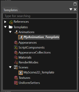
SceneComposer allows saving any node attachment (Appearance, Material, Render Mode or Texture) as a template to enable reuse for other nodes. Templates are also listed in the Templates panel.

<div drawio-diagram="6159"><img src="https://doc316en.candera.eu/uploads/images/drawio/2024-06/drawing-5-1718347102.png" alt=""/></div>

<div class="contents" id="bkmrk--28"><div class="contents"><div class="textblock">  
</div></div></div><div class="contents" id="bkmrk--30"><div class="contents"><div class="textblock">---

</div></div></div>#### <a class="anchor" id="bkmrk--107"></a>Save as Template

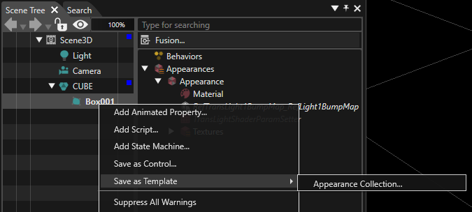
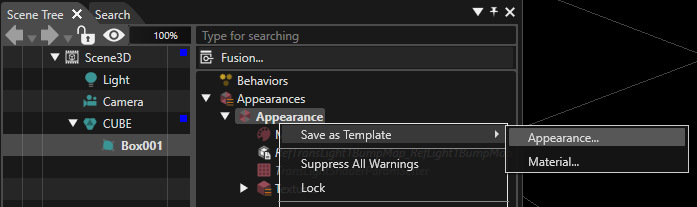
Select a node which contains an appearance, material, render mode, or texture in the Scene Tree and save the selected node attachment as a template with the context menu item "Save as Template".

<div drawio-diagram="7589"><img src="https://doc316en.candera.eu/uploads/images/drawio/2024-12/drawing-5-1733478672.png" alt=""/></div>

<div class="contents" id="bkmrk--32"><div class="contents"><div class="textblock">  
</div></div></div>Alternatively directly select the node attachment in the right side of the Scene Tree and use the regarding context menu item to save the selected attachment as template:

<div drawio-diagram="7590"><img src="https://doc316en.candera.eu/uploads/images/drawio/2024-12/drawing-5-1733478713.png" alt=""/></div>

<div class="contents" id="bkmrk--34"><div class="contents"><div class="textblock">  
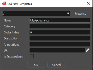
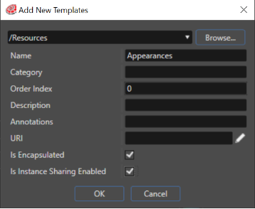
</div></div></div>In the "Add New Template" dialog, specify the template location and template name. Tick the checkbox "Is Instance Sharing Enabled" to allow sharing of a template instance across several nodes (refer to the chapter <span style="color: rgb(230, 126, 35);">[Shared Node Attachments](#bkmrk-shared-node-attachme)</span> for more details).

<div drawio-diagram="6163"><img src="https://doc316en.candera.eu/uploads/images/drawio/2024-06/drawing-5-1718350464.png" alt=""/></div>

<div class="contents" id="bkmrk--36"><div class="contents"><div class="textblock">  
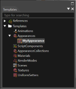
</div></div></div>The new template will be displayed in the Templates panel. This panel contains all node attachment templates grouped by type:

<div class="contents" id="bkmrk--37"><div class="contents"><div class="textblock">  
</div></div></div><div drawio-diagram="6165"><img src="https://doc316en.candera.eu/uploads/images/drawio/2024-06/drawing-5-1718350515.png" alt=""/></div>

<div class="contents" id="bkmrk--39"><div class="contents"><div class="textblock">  
</div></div></div>---

#### <a class="anchor" id="bkmrk--112"></a>Appearance Wrapper

In some circumstances it could be necessary to expose for the user just those properties which should be modified to get a desired setting of an object. For instance, if the object is a button used in an interface, we can suppose that the only properties which have to be modified by the user are "Font", "Text" and "Status". But if the appearance of the object has many other properties, it could be overwhelming for the user to understand exactly which properties have to be modified to get the desired result. So, it is easy understandable why is necessary to provide a concept which will allow replacing a node attachment with an object which exposes only some properties of a regular node attachment.

This Appearance Wrapper feature allows to expose only some properties of an appearance attached to a node or the properties pertaining to its containments (material, render node, shader, uniform setter, texture). In this way, the goal mentioned above - the user will be able to see and modify just the exposed properties - is fulfilled.

When a template object is created from an existing appearance attached to a node, in the "Add New Template" dialog an Is Encapsulated check-box becomes available. If this check-box is enabled, all the properties associated with the template will not be visible for the user in the properties panel when the template will be used. Only the "Generic" category of properties will be available in the Properties panel.

If the user needs only some of encapsulated properties to be visible, this operation should be done by righting click on the template which has all the properties encapsulated. From the context menu the "Configure Properties" should be chosen. The "Configure Properties" dialog provides the possibility to select which encapsulated properties will become visible in the Properties panel. This operation could be done by using the "IsChecked" boxes available in the dialog. When a template with exposed properties is used, all the properties will become visible in the "Public Properties" category of the Properties panel.

<div class="contents" id="bkmrk--43"><div class="contents"><div class="textblock">---

</div></div></div>#### <a class="anchor" id="bkmrk--113"></a>Use a Template

Use a template by dragging it from the Templates panel and dropping it on the desired parent in the Scene Tree:

<div class="contents" id="bkmrk-an-appearance-templa"><div class="contents"><div class="textblock">- An appearance template on a node,
- material, render node and texture on a Appearance.

</div></div></div>It's possible to apply the same template to many multi-selected nodes at once. After all the desired nodes are selected, drag and drop the template on the multi-selected nodes.

<div class="contents" id="bkmrk-if-a-drag-operation--0"><div class="contents"><div class="contents"><div class="textblock"><dl class="note"><dd><p class="callout info">If a drag operation is performed between two panels and the destination item is part of a multiple selection, all the items in the selection will be affected.</p>

</dd></dl></div></div></div></div>The template will replace the existing node attachment by an item linked to the template. In case the template allows instance sharing, the Shared Instance Id used for the node is displayed in brackets.

<div drawio-diagram="6166"><img src="https://doc316en.candera.eu/uploads/images/drawio/2024-06/drawing-5-1718350698.png" alt=""/></div>

<div class="contents" id="bkmrk--45"><div class="contents"><div class="textblock">  
</div></div></div>##### <a class="anchor" id="bkmrk--115"></a>Edit a Node Attachment Template

Edit a node attachment template in the Properties panel after selecting a template in the Solution Explorer panel or in the Templates panel.

Any change in the template will be reflected in all the nodes using it.

#### **Shared Node Attachments**

Shared node attachments refer to instances of appearances, materials, render modes, or textures which are being shared between nodes.

<div class="contents" id="bkmrk-the-appearance-shari"><div class="contents"><div class="textblock"><dl class="note"><dd><p class="callout info">The appearance sharing is only supported for appearance collections.</p>

</dd><dd></dd></dl></div></div></div>There are several options:

**Prevent sharing of a template:** Disable the property "Is Instance Sharing Enabled" of the node attachment template. In this case, each time such a template is applied to a node, a new instance of the template will be created for this node.

**Share exactly one instance of a template:** Enable the property "Is Instance Sharing Enabled" of the node attachment template and use only the default value "0" for the node attachment property "Shared Instance Id". In this case, each time such a template is applied to a node, the same template instance will be shared among all nodes.

**Share more than one instance of a template:** Enable the property "Is Instance Sharing Enabled" of the node attachment template and specify as much distinct values for "Shared Instance Id" as instances are required.

<div class="contents" id="bkmrk--46"><div class="contents"><div class="textblock">---

</div></div></div>#### <a class="anchor" id="bkmrk--117"></a>Enable Instance Sharing

Whenever a new node attachment is created and about to be shared, enable the property "Is Instance Sharing Enabled":

<div drawio-diagram="4952"><img src="https://doc316en.candera.eu/uploads/images/drawio/2023-12/drawing-5-1701442488.png" alt=""/></div>

<div class="contents" id="bkmrk--48"><div class="contents"><div class="textblock">  
</div></div></div>This property can be also set in the Properties panel after selecting an existing template from the Templates panel.

<div drawio-diagram="6167"><img src="https://doc316en.candera.eu/uploads/images/drawio/2024-06/drawing-5-1718350898.png" alt=""/></div>

<div class="contents" id="bkmrk--51"><div class="contents"><div class="textblock">---

</div></div></div>#### <a class="anchor" id="bkmrk--120"></a>Specify Shared Instance Ids

Node attachments from scenes which are linked to templates having "Is Instance Sharing Enabled" set to true will get a new property "Shared Instance Id" to indicate which shared instance of the node attachment to use:

<div class="contents" id="bkmrk-if-shared-instance-i"><div class="contents"><div class="textblock">- If Shared Instance Id is set to -1 a new unshared instance will be created (please, note, that when the Id =-1 even if the template is shared it will be used as if it is not shared),
- Otherwise a shared instance will be created and reused by all nodes having the same Shared Instance Id for that node attachment type.
- Default value for Shared Instance Id is 0 to indicate that the first shared instance of the template is used.

</div></div></div>##### <a class="anchor" id="bkmrk--121"></a>Edit Shared Instance Ids:

The Instance Id of a node attachment can be edited in the Properties panel of the node attachment.

For an overview of all nodes using a shared node attachment template, use the Instance Id Editor from the context menu of the node attachment template:

<div drawio-diagram="6168"><img src="https://doc316en.candera.eu/uploads/images/drawio/2024-06/drawing-5-1718351036.png" alt=""/></div>

<div drawio-diagram="6169"><img src="https://doc316en.candera.eu/uploads/images/drawio/2024-06/drawing-5-1718351200.png" alt=""/></div>

<div class="contents" id="bkmrk--54"><div class="contents"><div class="textblock">  
</div></div></div><div class="contents" id="bkmrk--56"><div class="contents">  
</div></div>Refer to the Node Attachments Optimization Wizard for optimizing existing scenes regarding node attachments. It is possible to export a .csv file with all the shared items by using the "Export to CSV" button which can be seen in the figure above.

#### **Node Attachment Optimization**

SceneComposer provides a wizard to automatically detect node attachments which could be replaced by shared node attachments templates. It is possible to create new node attachment templates, which can be used for the optimization, if no proper node attachment templates exist yet. Selected node attachment candidates can be replaced by shared node attachment templates by the wizard.

##### <a class="anchor" id="bkmrk--125"></a>Invoke Node Attachment Optimization Wizard

Invoke the node attachment optimization wizard from the context menu of any folder in Solution Explorer panel, or from a scene in the Scene Tree:

<div drawio-diagram="6170"><img src="https://doc316en.candera.eu/uploads/images/drawio/2024-06/drawing-5-1718351254.png" alt=""/></div>

<div class="contents" id="bkmrk--58"><div class="contents"><div class="textblock">  
</div></div></div>In the Node Attachment Optimization Wizard, select either the entire solution, or a specific scene or location within the solution as root location for the wizard. Further, the type of node attachments to optimize can be selected.

<div drawio-diagram="6171"><img src="https://doc316en.candera.eu/uploads/images/drawio/2024-06/drawing-5-1718351303.png" alt=""/></div>

<div class="contents" id="bkmrk--60"><div class="contents"><div class="textblock">  
</div></div></div>Press the "Next" button to start optimization analysis for the first type of node attachment.

##### <a class="anchor" id="bkmrk--128"></a>Optimization Analysis Results

During optimization analysis, the wizard detects all nodes with identical properties regarding the selected type of node attachment, and suggests proper node attachment templates to share between those nodes.

As a result of the analysis, the wizard provides a list of node attachment template candidates, which could be shared among several nodes, as well as the number of nodes which would benefit from sharing the same template.

If no proper node attachment template candidate exists yet, the nodes which could share their attachments are listed under the name "( Empty )".

<div drawio-diagram="6172"><img src="https://doc316en.candera.eu/uploads/images/drawio/2024-06/drawing-5-1718351557.png" alt=""/></div>

<div class="contents" id="bkmrk--62"><div class="contents"><div class="textblock">  
</div></div></div>Select "Include already optimized" to include node attachments that have been previously optimized in the list.

<div class="contents" id="bkmrk--63"><div class="contents"><div class="textblock">---

</div></div></div>#### <a class="anchor" id="bkmrk--130"></a>Apply Node Attachment Optimizations

Select the node attachment sharing candidates you want to optimize by

<div class="contents" id="bkmrk-ticking-the-checkbox"><div class="contents"><div class="contents"><div class="textblock">- ticking the checkbox in the left side of the result list and
- pressing the arrow button to expand the details for the selected candidate:

</div></div></div></div><div drawio-diagram="6173"><img src="https://doc316en.candera.eu/uploads/images/drawio/2024-06/drawing-5-1718351632.png" alt=""/></div>

<div class="contents" id="bkmrk--65"><div class="contents"><div class="textblock">  
</div></div></div>Now all fields to apply the optimization are editable:

<div class="contents" id="bkmrk-tick-%22create-new%22-if"><div class="contents"><div class="textblock">- Tick **"Create new"** if no proper node attachment template exists yet. The wizard will create the proper template in the Templates panel.
- Tick **"Use existing"** and select the desired node attachment template from the combo box.

</div></div></div>In the list below, specify which nodes should share the given node attachment template. The numbers displayed in the right side of each node represents the SharedInstanceId to be used.

Apply the changes by pressing the **"Apply changes"** button from the upper right corner of the wizard dialog.

Repeat the optimization for all node attachment types which have been selected in the initial wizard step:

<div class="contents" id="bkmrk-appearance-material-"><div class="textblock">- Appearance
- Material
- RenderNode
- Texture

</div></div><dl class="note" id="bkmrk--66"></dl>#### **Appearance Editor**

The Appearance Editor offers a visual editing and comparison mode for several appearances.

Go to "View" &gt; "Editors" &gt; "Appearance Editor" to activate the Appearance Editor panel. Drag and drop node attachment templates from the Templates panel to the Appearance Editor:

<div drawio-diagram="6174"><img src="https://doc316en.candera.eu/uploads/images/drawio/2024-06/drawing-5-1718352054.png" alt=""/></div>

<div class="contents" id="bkmrk--68"><div class="contents"><div class="textblock">  
</div></div></div>Each of the node attachment template displayed in the Appearance Editor can be selected and then edited using the Properties panel. All changes applied in the Properties panel will be reflected in the Appearance Editor.

<div drawio-diagram="6175"><img src="https://doc316en.candera.eu/uploads/images/drawio/2024-06/drawing-5-1718352108.png" alt=""/></div>

<div class="contents" id="bkmrk--70"><div class="contents"><div class="textblock">  
</div></div></div>It is possible to apply the same appearance to many multi-selected nodes at once. After all the desired nodes are selected, drag and drop the appearance on the multi-selected nodes.

<div class="contents" id="bkmrk-if-a-drag-operation--1"><div class="textblock"><dl class="note"><dt></dt><dd><p class="callout info">If a drag operation is performed between two panels and the destination item is part of a multiple selection, all the items in the selection will be affected.</p>

</dd></dl><dl class="note"></dl></div></div>

# 3D Scene Editor

The "Scene Editor" is the main panel of the application in which scenes and animations are displayed ("render view"). It is the only panel that cannot be closed.

This page describes the five types of interactions that are possible with the render view.  
See Also : <span style="color: rgb(230, 126, 35);">[3D Editing Helpers ](https://doc316en.candera.eu/books/preferences/page/3d-editing-helpers "3D Editing Helpers")</span>

---

#### General

By default, only one Scene Editor is displayed (Scene Editor (0) only). You can display up to four Scene Editors (Scene Editor (0) to (4)) as needed. You can show or hide them from the menu bar \[ View &gt; Editors &gt; Scene Editor \].

- Scene Editor menu on the Menu Bar  
    <div drawio-diagram="8610"><img src="https://doc316en.candera.eu/uploads/images/drawio/2025-10/drawing-7-1760593129.png" alt=""/></div>
- The \[ Display Scene Editor \] icon on the toolbar  
    <div drawio-diagram="8611"><img src="https://doc316en.candera.eu/uploads/images/drawio/2025-10/drawing-7-1760593264.png" alt=""/></div>
    
    When you click the \[ Display Scene Editor \] icon, four icons will appear for toggling the visibility of the Scene Editor. Please refer to the table below for details on each icon.
    
    <table border="1" style="border-collapse: collapse; width: 53.6082%;"><colgroup><col style="width: 20.2873%;"></col><col style="width: 79.7127%;"></col></colgroup><tbody><tr><td><div drawio-diagram="8612"><img src="https://doc316en.candera.eu/uploads/images/drawio/2025-10/drawing-7-1760593313.png" alt=""/></div>
    
    </td><td>The Scene Editor (0) is displayed.</td></tr><tr><td><div drawio-diagram="8613"><img src="https://doc316en.candera.eu/uploads/images/drawio/2025-10/drawing-7-1760593331.png" alt=""/></div>
    
    </td><td>The Scene Editors (0) and (1) are displayed.</td></tr><tr><td><div drawio-diagram="8614"><img src="https://doc316en.candera.eu/uploads/images/drawio/2025-10/drawing-7-1760593345.png" alt=""/></div>
    
    </td><td>Scene Editors (0) through (2) are displayed.</td></tr><tr><td><div drawio-diagram="8615"><img src="https://doc316en.candera.eu/uploads/images/drawio/2025-10/drawing-7-1760593361.png" alt=""/></div>
    
    </td><td>Scene Editors (0) through (3) are displayed.</td></tr></tbody></table>
    
    When a display setting not listed in the table above is applied in the Scene Editor menu on the Menu Bar, the \[ Display Scene Editor \] icon will display "Custom".  
    <div drawio-diagram="8616"><img src="https://doc316en.candera.eu/uploads/images/drawio/2025-10/drawing-7-1760593389.png" alt=""/></div>

Displaying multiple Scene Editors is useful when you want to check a 3D model from multiple directions at the same time.

<div drawio-diagram="8543"><img src="https://doc316en.candera.eu/uploads/images/drawio/2025-09/drawing-7-1756709955.png" alt=""/></div>

<p class="callout info">Additionally, scene editors (1) to (3) support floating display. By using floating display, you can display any scene editor on a separate display.</p>

<p class="callout info">If the displayed Scene (or Control) is updated, it will be reflected in all Scene Editors.</p>

---

The following is an explanation of the scene editor tool icons.

#### Camera Manipulation 

The Camera combo box provides following camera views for a 3D scene:

<div class="contents" id="bkmrk-%22perspective%22-camera"><div class="contents"><div class="contents"><div class="textblock">- **"Perspective" camera:** It offers an approximate representation of the image as it is seen by the eye. A default light is used when the scene doesn't contain any object of type light. Scene Editor provides a <span style="color: rgb(230, 126, 35);">[navigation panel ](#bkmrk-navigation-panel%C2%A0)</span>on the bottom right so the objects can be viewed from all sides.
- **"Orthogonal" cameras** with the subcategories Front, Rear, Top, Bottom, Left and Right: Orthogonal projection is a means of representing a three-dimensional object in two dimensions.
- **Scene cameras:** Further, each camera part of the scene is listed in the combo box. If a scene camera is selected, the scene is displayed from that camera's perspective. Scene cameras are created by dragging an item of type "Camera" from the Toolbox panel and dropping it into the Scene Tree or Scene Editor panel.

<dl class="note"><dt></dt><dd>The scene has to contain an object of type Light to ensure proper lighting in the scene.</dd></dl></div></div></div></div><div drawio-diagram="6176"><img src="https://doc316en.candera.eu/uploads/images/drawio/2024-06/drawing-5-1718355967.png" alt=""/></div>

<div class="contents" id="bkmrk-in-scene-camera-view"><div class="contents"><div class="contents"><div class="textblock"><dl class="note"><dd><p class="callout info">In scene camera view, the camera properties can only be edited in the "Properties" panel.</p>

Perspective Camera (Editor): <div drawio-diagram="4972"><img src="https://doc316en.candera.eu/uploads/images/drawio/2023-12/drawing-5-1702630678.png" alt=""/></div>

</dd></dl></div></div></div></div>Orthogonal Cameras:

<div class="contents" id="bkmrk--19"><div class="contents"><div class="textblock"><dl class="note"><dd><div drawio-diagram="4973"><img src="https://doc316en.candera.eu/uploads/images/drawio/2023-12/drawing-5-1702630713.png" alt=""/></div>

</dd></dl></div></div></div>Scene Camera View

<div drawio-diagram="4974"><img src="https://doc316en.candera.eu/uploads/images/drawio/2023-12/drawing-5-1702630814.png" alt=""/></div>

The Aspect Ratio and the Aspect Autofit properties are available for Camera 3D. If the Aspect Autofit property is set to true (when the checkbox available for Aspect Ratio property is checked), the aspect of the camera will be calculated based on the width and height of the render target. Otherwise, if the checkbox available for Aspect Ratio is left unchecked, the aspect of the camera will be calculated based on the resolution of the display.

<div class="contents" id="bkmrk-note%3A-both-propertie"><div class="contents"><div class="textblock"><dl class="note"><dt></dt><dd><p class="callout info">Both properties are available under the name of the first property - Aspect Ratio.</p>

</dd></dl></div></div></div><div drawio-diagram="6177"><img src="https://doc316en.candera.eu/uploads/images/drawio/2024-06/drawing-5-1718356907.png" alt=""/></div>

<div class="contents" id="bkmrk--21"><div class="contents"><div class="textblock">  
</div></div></div>##### <a class="anchor" id="bkmrk--76"></a>Camera Panning and Zooming

The scene content displayed in the Scene Editor can be modified like this:

<div class="contents" id="bkmrk-panning%3A-move-the-mo"><div class="contents"><div class="textblock">- **Panning:** Move the mouse while holding the middle mouse button down
- **Zooming:** Rotate the mouse wheel forward for zooming in and backward for zooming out

</div></div></div>Enable panning and zooming also for scene cameras with a preference option:

<div class="contents" id="bkmrk-tick-%22enable-scene-c"><div class="contents"><div class="textblock">- Tick **"Enable scene camera manipulation"** in the "Editor Preferences" dialog opened from File-Preferences menu option.

</div></div></div>##### <a class="anchor" id="bkmrk--77"></a>Orient Camera to Selected Object

Sometimes it is quite difficult to locate in a 3D scene a new added object. This feature provides new control to active camera: orienting it to a selected object.

<div class="contents" id="bkmrk-this-feature-is-avai"><div class="contents"><div class="contents"><div class="textblock"><dl class="note"><dd><p class="callout info">This feature is available only for "Perspective" camera.</p>

</dd></dl></div></div></div></div>First select the object in the Scene Tree. After this the "Perspective" camera will be oriented towards the selected object, by pressing the "O" key. The position of the camera remains unchanged; the only thing that changes is its orientation. The reference of the orientation is the geometric center (or "centroid") of the selected object.

##### Rotate Perspective Camera around Selected Object

The object can be seen from different angles by rotating the Perspective Camera around a selected object. After the desired object is selected in the Scene Tree, the camera can rotate around it by holding down the Ctrl key and using Rotate camera.

<div class="contents" id="bkmrk-note%3A-on-the-perspec"><div class="contents"><div class="textblock"><dl class="note"><dd><p class="callout info">On the Perspective Camera Scope menu, the "Selection" option should be chosen.</p>

</dd></dl></div></div></div><div drawio-diagram="6178"><img src="https://doc316en.candera.eu/uploads/images/drawio/2024-06/drawing-5-1718357003.png" alt=""/></div>

<div class="contents" id="bkmrk--23"><div class="contents"><div class="textblock">  
</div></div></div>##### Camera Look-At Node

When this property is set the camera is automatically oriented towards the look-at-node. Up direction and look-at direction are not shown anymore in property grid. Look-at direction is discarded.

<div drawio-diagram="6179"><img src="https://doc316en.candera.eu/uploads/images/drawio/2024-06/drawing-5-1718357420.png" alt=""/></div>

<div class="contents" id="bkmrk-camera-%22look-at-node"><div class="contents"><div class="textblock">  
</div></div></div><div class="contents" id="bkmrk--26"><div class="contents"><div class="textblock">---

</div></div></div>#### <a class="anchor" id="bkmrk--80"></a>Camera Preview Thumbnail

Even though the current selected camera is the Perspective camera, it is possible to see the content displayed by another camera in the thumbnail available in property grid. If the camera is not associated to a render target, the preview will be done on a fixed size virtual render target surface:

<div class="contents" id="bkmrk-100x100px-for-3d-cam"><div class="contents"><div class="textblock">- 100x100px for 3D cameras

</div></div></div>If the camera is associated to a render target, the preview will be generated:

<div class="contents" id="bkmrk-on-a-surface-of-the-"><div class="contents"><div class="contents"><div class="textblock">- on a surface of the same aspect ratio as the render target, and then reduced to a thumbnail image - for 3D cameras

</div></div></div></div><div drawio-diagram="6180"><img src="https://doc316en.candera.eu/uploads/images/drawio/2024-06/drawing-5-1718357629.png" alt=""/></div>

<div class="contents" id="bkmrk--28"><div class="contents"><div class="textblock">  
</div></div></div>The camera preview thumbnail will be displayed in the property grid by selecting the camera whose perspective should be viewed in the Scene Tree.

<div class="contents" id="bkmrk-note%3A-the-%22alpha-ble"><div class="contents"><div class="textblock"><dl class="note"><dd><p class="callout info">The "Alpha Blend Factor" and the "Alpha Destination Blend Factor" in the Default Render Mode Configuration should be set properly. For instance, the former value could be InverseSourceAlpha and the latter value could be DestColor.</p>

</dd></dl></div></div></div>##### <a class="anchor" id="bkmrk--82"></a>Reset Camera

Use the "Reset Camera" button left to the Camera combo box to reset the selected view to the default location and orientation.

<div drawio-diagram="6181"><img src="https://doc316en.candera.eu/uploads/images/drawio/2024-06/drawing-5-1718357680.png" alt=""/></div>

<div class="contents" id="bkmrk-reset-camera-button"><div class="textblock">  
</div></div>####   
**Camera Sequence Editor** 

When many cameras are associated to the same Render Target, editing of the camera sequence can be done in two different ways. The first one is done by following these four steps:

<div class="contents" id="bkmrk-in-the-render-target"><div class="contents"><div class="contents"><div class="contents"><div class="textblock">- In the Render Targets panel select one camera associated to the respective render target;
- Press the F3 key on your keyboard; in this way, the (0) sequence number which is placed next to the name of the camera between round brackets will become editable;
- Choose and write the desired sequence number;
- Press the Enter key.

</div></div></div></div></div><div drawio-diagram="6183"><img src="https://doc316en.candera.eu/uploads/images/drawio/2024-06/drawing-5-1718357783.png" alt=""/></div>

<div class="contents" id="bkmrk--32"><div class="contents"><div class="textblock">  
</div></div></div>The second way to edit the sequence of all cameras associated with the same Render Target is based on the usage of button "Go to Camera Sequence Editor view" which is placed in the Render Targets panel right to the Search field.

<div drawio-diagram="6184"><img src="https://doc316en.candera.eu/uploads/images/drawio/2024-06/drawing-5-1718357928.png" alt=""/></div>

<div class="contents" id="bkmrk--34"><div class="contents"><div class="textblock">  
</div></div></div>When this button is selected, a window with all the cameras from the entire solution is displayed. The filter button "Show only associated cameras" on the left allows to filter just those cameras which are associated to a render target. In the list displayed, every camera has an associated field where the sequence number can be edited.

Unfiltered list in Sequence Camera view:

<div drawio-diagram="6186"><img src="https://doc316en.candera.eu/uploads/images/drawio/2024-06/drawing-5-1718358343.png" alt=""/></div>

Filtered list in Sequence Camera view:

<div drawio-diagram="6187"><img src="https://doc316en.candera.eu/uploads/images/drawio/2024-06/drawing-5-1718358402.png" alt=""/></div>

<div class="contents" id="bkmrk-when-a-previously-cr"><div class="textblock"><dl class="note"><dt></dt><dd><p class="callout info">When a previously created solution is converted, the user is asked if the sequence numbers have to be changed or not. If the user declines, the sequence numbers will not be updated. FTCCmd.exe does not provide this option. It will not change sequence numbers when converting the solution.</p>

</dd></dl></div></div><div drawio-diagram="817"><img src="https://doc316en.candera.eu/uploads/images/drawio/2023-02/drawing-4-1676438123.png" alt=""/></div>

####   
**Context Resource Pool** 

A Context Resource Pool (CRP) is used to share resources among different Context Providers. It allows grouping of render targets and associated device objects (Shaders, Texture Images, Vertex Buffers, etc.) in a common pool.

The Context Resource Pool is accessible via Render Targets panel by using the specific button as can be seen in the image below.

<div drawio-diagram="6188"><img src="https://doc316en.candera.eu/uploads/images/drawio/2024-06/drawing-5-1718358633.png" alt=""/></div>

<div class="contents" id="bkmrk--40"><div class="contents"><div class="textblock">  
</div></div></div>Each platform has some rules and restrictions related to CRPs, for example on some platform multiple displays can share the same CRP, while on some other platform a CRP is required for each Window Surface. SceneComposer displays the relationship between CRPs, Displays, Window Surfaces and Frame Buffer Objects in the Render Target Explorer panel (main view and an additional CRP view).

Depending on the platform, the texture render targets (frame buffer objects) may have an Owner property of type render target reference or CRP. The Owner property is available in the Properties panel (see the image below).

<div drawio-diagram="6189"><img src="https://doc316en.candera.eu/uploads/images/drawio/2024-06/drawing-5-1718358756.png" alt=""/></div>

<div class="contents" id="bkmrk--42"><div class="contents"><div class="textblock">  
</div></div></div>If the type of the Owner property is render target reference, the owner must be a display render target (window surface).

If the type of the owner property is CRP (integer value in SceneComposer), the possible values will be obtained from the available displays.

If the Owner property is available for a render target but it is not set by the user, the render target will be considered orphan.

#### **Camera Group** 

Camera group feature offers extended support for display visualization. They can be added in a camera group to allow the user to enable or disable any of them (solution with many cameras).

How to create a "CameraGroup":

<div class="contents" id="bkmrk-via-%22add%22-%3E-%22new-ite"><div class="contents"><div class="contents"><div class="textblock">- Via "Add" &gt; "New item" option by using the Scene Explorer context menu. Creates a Camera group in a folder specified by the user during this process.

</div></div></div></div><div drawio-diagram="6190"><img src="https://doc316en.candera.eu/uploads/images/drawio/2024-06/drawing-5-1718358885.png" alt=""/></div>

<div class="contents" id="bkmrk-via-context-menu-ins"><div class="contents"><div class="contents"><div class="textblock">- Via context menu inside the Render Targets - Camera Group Explorer view. The Camera Group panel is accessible by using the "Camera Group Explorer view" button (next to "Camera Sequence Editor view"). The context menu can be opened by a right-click anywhere inside this panel, it provides the "New Camera Group" option.

</div></div></div></div><div drawio-diagram="6191"><img src="https://doc316en.candera.eu/uploads/images/drawio/2024-06/drawing-5-1718358964.png" alt=""/></div>

<div class="contents" id="bkmrk-via-context-menu-fro"><div class="contents"><div class="textblock">- Via context menu from the Scene Tree.

</div></div></div>After creating a CameraGroup, it will be visible in the "Camera Group Explorer View". A camera group is a flat list of camera groups identified by a unique name.

Any camera from any scene can be dragged from the Scene Tree inside the group.

<div drawio-diagram="6192"><img src="https://doc316en.candera.eu/uploads/images/drawio/2024-06/drawing-5-1718359152.png" alt=""/></div>

<div class="contents" id="bkmrk--46"><div class="contents"><div class="textblock">  
</div></div></div><div class="contents" id="bkmrk--47"><div class="contents">  
</div></div>Another way to add a camera to the group is by using the context menu: right click on a camera and select the "Add Camera To Camera Group" option.

<div drawio-diagram="6193"><img src="https://doc316en.candera.eu/uploads/images/drawio/2024-06/drawing-5-1718359214.png" alt=""/></div>

<div class="contents" id="bkmrk--49"><div class="contents"><div class="textblock">  
</div></div></div>Any camera inside the group can be locked or unlocked, enabled or disabled. Initially, all newly added cameras are ordered alphabetically. It is possible to change this order manually by dragging the cameras in the desired position.

<div class="contents" id="bkmrk-a-camera-can-belong-"><div class="contents"><div class="textblock"><dl class="note"><dd><p class="callout info">A camera can belong to multiple groups, but its state is unique, meaning that enabling the camera in one group will enable it in all groups and also in the Render Target panel where it is associated to a render target. If a group is disabled or enabled, all the cameras inside it will be disabled or enabled. If one or many from those cameras are members of another group, the second group will be enabled or disabled too.</p>

</dd><dd><div drawio-diagram="6194"><img src="https://doc316en.candera.eu/uploads/images/drawio/2024-06/drawing-5-1718359362.png" alt=""/></div>

</dd></dl></div></div></div>When a camera is a added into a Camera Group it will become a member of an array where all the other cameras are included. If one of those cameras added into a Camera Group is removed, the "Delete Items" panel will become available and the user will have the possibility to use the "Remove Array Item" resolution. In this way, the selected camera will be removed from the array of cameras contained by the Camera Group.

####   
**Camera Gizmos** 

For a camera object the following properties can also be edited by using gizmos, not only from the Properties panel:

##### <a class="anchor" id="bkmrk--100"></a>LookAtVector

Editing is done by click-and-drag the front of the camera as it can be seen in the image bellow and the current look at vector will be rotated by a free rotation alt-azimuthally model, using both X and Y mouse movement.

<div drawio-diagram="826"><img src="https://doc316en.candera.eu/uploads/images/drawio/2023-02/drawing-4-1676438366.png" alt=""/></div>

<div class="contents" id="bkmrk--51"><div class="contents"><div class="textblock">  
</div></div></div>##### Up Direction

Editing is done by click-and-drag the ring around the camera body (which is highlighted with yellow when selected). The current up-vector will be rotated around the world looking-at direction, obtaining a "rolling" effect considering the Y mouse movement.

<div drawio-diagram="4995"><img src="https://doc316en.candera.eu/uploads/images/drawio/2023-12/drawing-5-1702642363.png" alt=""/></div>

<div class="contents" id="bkmrk--53"><div class="contents"><div class="textblock">  
</div></div></div>##### <a class="anchor" id="bkmrk--104"></a>Projection

For Perspective view a wireframe frustum is provided, constructed to suggest fov,znear and zfar; for Orthographic view a wireframe rectangular prism is provided, constructed to suggest width, height, znear, zfar; for Generic projection no impersonator is provided.

<div drawio-diagram="6195"><img src="https://doc316en.candera.eu/uploads/images/drawio/2024-06/drawing-5-1718359725.png" alt=""/></div>

<div class="contents" id="bkmrk--55"><div class="textblock">  
</div></div>#### **Light Gizmos** 

For a light object the following properties can also be edited by using gizmos, not only from the Properties panel:

##### <a class="anchor" id="bkmrk--107"></a>Direction

Editing is done by click-and-drag on the direction arrow. The direction vector will be rotated by a free rotation alt-azimuthally model, using both X and Y mouse movement.

<div drawio-diagram="4996"><img src="https://doc316en.candera.eu/uploads/images/drawio/2023-12/drawing-5-1702643399.png" alt=""/></div>

<div class="contents" id="bkmrk--57"><div class="contents"><div class="textblock">  
</div></div></div>##### <a class="anchor" id="bkmrk--109"></a>Range

For light of type Point the range is suggested by a set of n concentric circles laid at an exponential step (1, 2, 4, 8, etc.). For light of type Spot the range is suggested by the length of the wireframe cone. Editing (spot and point) is done by click-and-drag on the centered light source object (yellow sphere) and the range value will be modified using a combination of X and Y movement.

<div drawio-diagram="831"><img src="https://doc316en.candera.eu/uploads/images/drawio/2023-02/drawing-4-1676438510.png" alt=""/></div>

<div class="textblock" id="bkmrk--59"></div><div class="textblock" id="bkmrk--60"></div><div class="textblock" id="bkmrk--61"><div drawio-diagram="832"><img src="https://doc316en.candera.eu/uploads/images/drawio/2023-02/drawing-4-1676438550.png" alt=""/></div>

</div><div class="contents" id="bkmrk--63"><div class="contents"><div class="textblock">  
</div></div></div>##### <a class="anchor" id="bkmrk--112"></a>Spot Exponent

Editing is done by click-and-drag on the top part of the spot cone (as it can be seen in the image bellow), and the spot exponent is modified using Y movements (up movement increases the value of property spot exponent and down movement decreases it).

<div drawio-diagram="833"><img src="https://doc316en.candera.eu/uploads/images/drawio/2023-02/drawing-4-1676438566.png" alt=""/></div>

<div class="contents" id="bkmrk--65"><div class="contents"><div class="textblock">  
</div></div></div>##### <a class="anchor" id="bkmrk--114"></a>Spot Angle

A wireframe cone is provided and the editing is done by click-and-drag on the cone, the spot exponent value is modified using a combination of Y movements.

<div drawio-diagram="834"><img src="https://doc316en.candera.eu/uploads/images/drawio/2023-02/drawing-4-1676438575.png" alt=""/></div>

<div class="contents" id="bkmrk--67"><div class="textblock">  
</div></div>#### **Picking and Transforming Items** 

<div drawio-diagram="6196"><img src="https://doc316en.candera.eu/uploads/images/drawio/2024-06/drawing-5-1718360051.png" alt=""/></div>

<div class="contents" id="bkmrk--69"><div class="contents"><div class="textblock">  
</div></div></div>In the Scene Editor, an item can be picked by clicking on it. After picking, the bounding box of the item is displayed together with the XY axes, and it is selected in the "Scene Tree" panel:

<div drawio-diagram="836"><img src="https://doc316en.candera.eu/uploads/images/drawio/2023-02/drawing-4-1676438691.png" alt=""/></div>

<div class="contents" id="bkmrk-groups-cannot-be-pic"><div class="contents"><div class="textblock"><dl class="note"><dt></dt><dd><p class="callout info">**Groups** cannot be picked in the render view; they need to be selected in the "Scene Tree" panel. The "Scene Editor" and "Scene Tree" panels are synchronized in terms of the selected item.</p>

</dd><dd></dd></dl>---

</div></div></div>#### <a class="anchor" id="bkmrk--119"></a>Interaction Modes: Selection, Edit the margin of objects inside a layout, Translate, Rotate, Scale

These interaction modes are available for 3D scenes in the Toolbar:

##### <a class="anchor" id="bkmrk--120"></a>Select

When the button "Select" is enabled, the selected object will be highlighted in the Scene Editor but can't be transformed.

##### <a class="anchor" id="bkmrk--121"></a>Edit the margin of objects inside a layout

For more information about this, please refer to <span style="color: rgb(230, 126, 35);">[Adorners](https://doc316en.candera.eu/books/scene-design/page/adorners)</span>.

##### <a class="anchor" id="bkmrk--122"></a>Translate

In this mode, a translation gizmo is represented by an axis coordinate system, having three arrows handles pointing in the directions of the corresponding axis (x, y, or z). For combined operations (translate xy, xz, ..), more rectangle handles positioned on the center and aligned to the corresponding axis combination are provided. Editing is done by click-and-drag a specific arrow handle or a specific rectangle handle.

<div drawio-diagram="837"><img src="https://doc316en.candera.eu/uploads/images/drawio/2023-02/drawing-4-1676438731.png" alt=""/></div>

<div class="contents" id="bkmrk--89"><div class="contents"><div class="textblock">  
</div></div></div>For translation mode three options are available:

<div class="contents" id="bkmrk-%22only-object%22-will-m"><div class="contents"><div class="contents"><div class="textblock">- **"Only object"** will move only the object selected and
- **"Object and Children"** will move the selected object with its children.

</div></div></div></div><div drawio-diagram="6197"><img src="https://doc316en.candera.eu/uploads/images/drawio/2024-06/drawing-5-1718360181.png" alt=""/></div>

<div class="contents" id="bkmrk--96"><div class="contents"><div class="textblock">  
</div></div></div>##### <a class="anchor" id="bkmrk--125"></a>Rotate

In this mode, a rotation gizmo is represented by a set of circles, each corresponding to a plane (xy, xz, yz). Editing is done by click-and-drag a specific circle.

<div drawio-diagram="839"><img src="https://doc316en.candera.eu/uploads/images/drawio/2023-02/drawing-4-1676438777.png" alt=""/></div>

<div class="contents" id="bkmrk--102"><div class="contents"><div class="textblock">  
</div></div></div>Usually the object is freely rotated except the situations when the rotation angle is close to a fixed angle controlled by a tolerance. The tolerance defines the range between two multiple values where the object can freely rotate without being snapped.

<div class="contents" id="bkmrk-the-fixed-angle-valu"><div class="contents"><div class="textblock">- the fixed angle values shall be multiples of 45
- the angle snapping tolerance shall be 22.5 degrees.

</div></div></div>Edit the object with a fixed angle by enabling this option using the button placed near active rendering button.

<div drawio-diagram="840"><img src="https://doc316en.candera.eu/uploads/images/drawio/2023-02/drawing-4-1676438787.png" alt=""/></div>

<div class="contents" id="bkmrk--116"><div class="contents"><div class="textblock">  
</div></div></div>In Translate mode, another feature is the "Translation System" that allows choosing between Parent and View reference system. When Parent system is selected, the reference system is the coordinate system of the scene. Otherwise, the reference system is the coordinate system of the selected object. In both cases, the object can be moved by using the arrow keys.

<div drawio-diagram="6198"><img src="https://doc316en.candera.eu/uploads/images/drawio/2024-06/drawing-5-1718360233.png" alt=""/></div>

<div class="contents" id="bkmrk--130"><div class="contents"><div class="textblock">  
</div></div></div>##### <a class="anchor" id="bkmrk--131"></a>Scale

In this mode, a scale gizmo is represented in a similar way as the translation gizmo. For the combined operations (xy, xz, yz), rectangle handles are provided. For the combined (xyz) mode, a sphere handle is provided (located in the center of the gizmo). Editing is done by click-and-drag a specific arrow, a specific rectangle or the sphere.

<div drawio-diagram="842"><img src="https://doc316en.candera.eu/uploads/images/drawio/2023-02/drawing-4-1676438818.png" alt=""/></div>

<div class="contents" id="bkmrk--134"><div class="contents"><div class="textblock">  
</div></div></div>Move the mouse while pressing left mouse button to translate, rotate, or scale the selected object in the render view. The modification of the properties is also reflected in the "Properties" panel for the selected item.

<div class="contents" id="bkmrk--135"><div class="contents"><div class="textblock">---

</div></div></div>#### <a class="anchor" id="bkmrk--136"></a>Editing Aids

Move from a selected element to another one by using the Tab key. First in the Scene Editor an element would be selected by Left click on it. After this all the elements placed at the same level (in the same group) can be selected by using the Tab key.

<div class="contents" id="bkmrk-in-complex-3d-scenes"><div class="contents"><div class="textblock"><dl class="note"><dt></dt><dd><p class="callout info">In complex 3D scenes is not possible to select some objects just by Left clicking on them. For instance, in a tunnel scene, if the user is trying to select the car by Left clicking on it, just the "hardware" element will be selected - which is in the front of any other elements. To select the car, right click on it and select any element placed in the ray of the "car" group.</p>

</dd></dl></div></div></div><div drawio-diagram="843"><img src="https://doc316en.candera.eu/uploads/images/drawio/2023-02/drawing-4-1676438836.png" alt=""/></div>

<div class="contents" id="bkmrk--139"><div class="contents"><div class="textblock">  
</div></div></div>After the selection is done, it is possible to tab all the selected elements situated at the same level. By using the Shift key + Tab all the elements can be selected in an ascendant order.

Another possibility is to tab selected elements on the same (visual) ray. This option can be done by holding down the Left key and then use the Tab key. To get the ascendant direction the same combination is available: Shift key + Tab (when the Left mouse button is holding down).

##### <a class="anchor" id="bkmrk--140"></a>Move Elements with Arrows Keys

Any element can be moved/scaled/rotated by using arrows. After the selection of the object use the Left, Right, Up and Down arrows to get the desired results.

##### <a class="anchor" id="bkmrk--141"></a>Unselect an Item

The camera cannot be manipulated and vice versa when an item is selected.

Unselect an item by hitting the **Esc** key.

Please refer to section <span style="color: rgb(230, 126, 35);">[3D Editing Helpers](https://doc316en.candera.eu/books/preferences/page/3d-editing-helpers)</span> for further information.

#### **Navigation Panel** 

SceneComposer provides a navigation panel which allows the user to manipulate the predefined perspective and orthogonal cameras using gizmos.

<div drawio-diagram="844"><img src="https://doc316en.candera.eu/uploads/images/drawio/2023-02/drawing-4-1676438982.png" alt=""/></div>

<div class="contents" id="bkmrk--144"><div class="contents"><div class="textblock">  
</div></div></div><div drawio-diagram="4998"><img src="https://doc316en.candera.eu/uploads/images/drawio/2023-12/drawing-5-1702647378.png" alt=""/></div>

<div class="contents" id="bkmrk-%C2%A0-rotates-the-camera"><div class="textblock"><table border="0" style="width: 73.9506%; height: 118px;"><tbody><tr style="height: 35.0667px;" valign="middle"><td style="width: 8.20013%; height: 35.0667px;">**<span style="color: rgb(0, 0, 0);">[1](https://doc316en.candera.eu/uploads/images/gallery/2023-02/04-3d-navigation-2.PNG)</span>**

</td><td style="width: 91.7469%; height: 35.0667px;"> Rotates the camera around the geometrical center of the scene

</td></tr><tr style="height: 37.8667px;" valign="middle"><td style="width: 8.20013%; height: 37.8667px;">**<span style="color: rgb(0, 0, 0);">[2](https://doc316en.candera.eu/uploads/images/gallery/2023-02/04-3d-navigation-3.PNG)</span>**

</td><td style="width: 91.7469%; height: 37.8667px;"> Rotates the camera and does not affect the camera position</td></tr><tr style="height: 35.0667px;" valign="middle"><td style="width: 8.20013%; height: 35.0667px;">**<span style="color: rgb(0, 0, 0);">[3](https://doc316en.candera.eu/uploads/images/gallery/2023-02/04-3d-navigation-4.PNG)</span>**

</td><td style="width: 91.7469%; height: 35.0667px;"> Translates the objects on XYZ axes</td></tr><tr style="height: 10px;" valign="middle"><td style="width: 8.20013%; height: 10px;">**<span style="color: rgb(0, 0, 0);">[4](https://doc316en.candera.eu/uploads/images/gallery/2023-02/04-3d-navigation-5.PNG)</span>**

</td><td style="width: 91.7469%; height: 10px;"> Makes zoom out, zoom in</td></tr></tbody></table>

</div></div>

# Vertex Buffer Editor

Imported Geometry can be managed and configured in either ArrayBuffer or IndexBuffer format, depending on its Geometry Topology. ArrayBuffer offers higher rendering performance (cache efficiency and sequential read) but consumes more memory since vertices cannot be shared.

To configure these two types of Vertex Buffer elements, select the vertex buffer in the Solution Explorer, and then configure the VertexGeometry (vertex attribute statuses) within the \[Vertex Buffer\] category in the \[Properties\] panel.

<div drawio-diagram="8474"><img src="https://doc316en.candera.eu/uploads/images/drawio/2025-07/drawing-4-1751508970.png" alt=""/></div>

Within the Vertex Buffer, each Property Item has a status of Imported (available), Removed (deleted), Regenerated/Generated (added), or Missing (not set). All selected Float32-type vertex attributes within the vertex buffer can be converted to Float16 if necessary, with convertible patterns indicated in parentheses.

When \[Is Indexed\] is enabled, the vertex buffer can be converted to an index array buffer by selecting the optimal index size. Depending on the vertex count, 8-bit, 16-bit, or 32-bit index buffers will be generated, and a valid buffer type can be specified via the BufferType property in the AssetData section.

When importing a glTF file that contains positions, UVs, and normals but lacks tangents, tangents will be automatically generated using the MikkTSpace algorithm. With MikkTSpace support in the Vertex Buffer Editor, the “Generated MikkTSpace” and “Regenerated MikkTSpace” options can now be selected for the Tangent and BiNormal Property Items, improving rendering quality when applying normal maps and ensuring consistency across tools.

The editable items are listed in the table below.

<table border="1" id="bkmrk-normal-%E5%B1%9E%E6%80%A7%E3%81%82%E3%82%8A-missing%2C" style="border-collapse: collapse; width: 800px; border-width: 1px;"><colgroup><col style="width: 161px;"></col><col style="width: 638px;"></col></colgroup><tbody><tr><td><span style="vertical-align: inherit;"><span style="vertical-align: inherit;">Normal</span></span>  
<span style="vertical-align: inherit;"><span style="vertical-align: inherit;">  
</span></span></td><td>- When attribute is not included:  
    Missing, Generated (Float16), Generated (Float32)
- When attribute is included:  
    Imported (Float32), Imported (Float32 =&gt; Float16), Regenerated (Float16), Regenerated (Float32), Removed

</td></tr><tr><td><span style="vertical-align: inherit;"><span style="vertical-align: inherit;">BiNormal/<span style="vertical-align: inherit;"><span style="vertical-align: inherit;">Tangent</span></span></span></span>  
<span style="vertical-align: inherit;"><span style="vertical-align: inherit;">  
</span></span></td><td>- When attribute is not included:  
    Missing, Generated MikkTSpace (Float16), Generated MikkTSpace (Float32), Generated (Float16), Generated (Float32)
- When attribute is included:  
    Imported (Float32), Imported (Float32 =&gt; Float16), Regenerated MikkTSpace (Float16), Regenerated MikkTSpace (Float32), Regenerated (Float16), Regenerated (Float32), Removed

</td></tr></tbody></table>

The selectable items in the \[Properties\] panel vary depending on whether the imported file contains the respective vertex attributes.

<div class="contents" id="bkmrk-if-the-attribute-is-"><div class="contents"><div class="textblock">- If the respective vertex attribute is not included in the imported file (Missing status), \[Generated\] can be selected.
- If the respective vertex attribute is included in the imported file (Imported status), \[Regenerated\] and \[Removed\] can be selected.

</div></div></div>If the import data and the property settings do not match, an error message will appear in the <span style="color: rgb(230, 126, 35);">[Output Panel](https://doc316en.candera.eu/books/solution-handling/page/output)</span>. As with other properties, the settings can be reset using the arrow button on the left of each property (Please refer to the figure below). When settings are changed, values such as Vertex Stride, Vertex Count, and Vertex Format are updated and reflected within the \[Vertex Buffer\] category in the Properties panel.

<div drawio-diagram="8476"><img src="https://doc316en.candera.eu/uploads/images/drawio/2025-07/drawing-4-1751510001.png" alt=""/></div>

# Shader Configuration

<p class="callout info">The Solution option allows for <span style="color: rgb(230, 126, 35);">[Default Shader Configurations](https://doc316en.candera.eu/books/solution-handling/page/default-shader-config)</span>.</p>

#### **Add a New Vertex or Fragment Shader**

Shaders are software programs that include instructions on how the graphics processing unit (GPU) should render certain images on the screen. A shader program consists of two types of shaders:

<div class="contents" id="bkmrk-vertex-shaders-fragm"><div class="contents"><div class="textblock">- Vertex Shaders
- Fragment (or Pixel) Shaders

</div></div></div>There are following options to create a new (empty) shader, which can later be combined into appropriate shader pairs or programs.

Use the "Shader" &gt; "New shader" menu option

<div drawio-diagram="5002"><img src="https://doc316en.candera.eu/uploads/images/drawio/2023-12/drawing-5-1703232468.png" alt=""/></div>

<div class="contents" id="bkmrk--0"><div class="contents"><div class="textblock">  
</div></div></div>In the Shaders panel, use the context menu option "New Shader" of any node within the "Shaders" category:

<div drawio-diagram="6202"><img src="https://doc316en.candera.eu/uploads/images/drawio/2024-06/drawing-5-1718362020.png" alt=""/></div>

<div class="contents" id="bkmrk--4"><div class="contents"><div class="textblock">  
</div></div></div>In the "Add New Shader" dialog, specify the shader location, shader name, and shader type.

<div drawio-diagram="6203"><img src="https://doc316en.candera.eu/uploads/images/drawio/2024-06/drawing-5-1718362044.png" alt=""/></div>

<div class="contents" id="bkmrk--7"><div class="contents"><div class="textblock">  
</div></div></div>After creating the shaders, the shader instructions need to be added in the Shader Editor.

#### <a class="anchor" id="bkmrk--43"></a>Import Vertex and Fragment Shaders

It is also possible to import already existing shaders.  
For information about how to import a Vertex or Fragment shader please refer to section<span style="color: rgb(230, 126, 35);"> [How to Import Resources](https://doc316en.candera.eu/books/import-of-resources/page/how-to-import-resources "Import Shaders").</span>

#### **Add a New Shader Program** 

Fragment and vertex shaders are combined into shader pairs or programs which can then be applied to node appearances.

Create a new shader program:

Use the "Shader" &gt; "New Shader Program" menu option.

<div drawio-diagram="5004"><img src="https://doc316en.candera.eu/uploads/images/drawio/2023-12/drawing-5-1703232678.png" alt=""/></div>

<div class="contents" id="bkmrk--10"><div class="contents"><div class="textblock">  
</div></div></div>Use the context menu option "New Shader Program" of any node within the shader program category from the Shaders panel.

<div drawio-diagram="6204"><img src="https://doc316en.candera.eu/uploads/images/drawio/2024-06/drawing-5-1718362139.png" alt=""/></div>

<div class="contents" id="bkmrk--13"><div class="contents"><div class="textblock">  
</div></div></div>Specify location and name and the desired shader pair consisting of one fragment shader and one vertex shader in the dialog "Add New Shader Program".

<div drawio-diagram="6205"><img src="https://doc316en.candera.eu/uploads/images/drawio/2024-06/drawing-5-1718362176.png" alt=""/></div>

<div class="contents" id="bkmrk--16"><div class="contents"><div class="textblock">  
</div></div></div>Tick the "Export Always" checkbox to always include the shader program to the generated assets.

####   
**Shader Editor** 

Edit shaders in the "Shader Editor". Use the menu option "View" &gt; "Editors" &gt; "Shader Editor" to make the panel visible.

<div class="contents" id="bkmrk--17"><div class="contents"><div class="textblock"><div drawio-diagram="6206"><img src="https://doc316en.candera.eu/uploads/images/drawio/2024-06/drawing-5-1718362236.png" alt=""/></div>

</div></div></div>Open shaders in Shader Editor for editing:

<div class="contents" id="bkmrk-select-a-vertex-or-f"><div class="contents"><div class="textblock">- Select a vertex or fragment shader in the Shaders panel
- Select a shader program in the Shaders panel

</div></div></div>The selected shader(s) are displayed in the Shader Editor panel (in both cases) like this:

<div class="contents" id="bkmrk-the-vertex-shader-in"><div class="contents"><div class="textblock">- The vertex shader in the left side and
- The fragment shader in the right side.

</div></div></div>Shader requirements - including the number of lights, materials and textures - are displayed in a tab in the Property Grid when a shader program is selected. The tab also contains the available attributes and uniforms.

<p class="callout info">On OpenGL ES 3.0 targets, up to **16** texture units are supported (CANDERA\_MAX\_TEXTURE\_UNIT\_COUNT = 16). On OpenGL ES 2.0, **8** texture units are guaranteed unless ES extensions are enabled.</p>

<div class="contents" id="bkmrk--20"><div class="contents"><div class="textblock">---

</div></div></div>#### <a class="anchor" id="bkmrk--48"></a>Shader Editor Features

The context menu of the Shader Editor provides "Cut", "Copy", "Paste", "Delete", "Select All" functions for editing shader instructions:

<div class="contents" id="bkmrk--21"><div class="contents"><div class="textblock"><div drawio-diagram="3289"><img src="https://doc316en.candera.eu/uploads/images/drawio/2023-04/drawing-4-1682582147.png" alt=""/></div>

</div></div></div>On pressing \[Ctrl+ Space bar\], a list with helper functions is available for shader programming:

<div class="contents" id="bkmrk--23"><div class="contents"><div class="textblock"><div drawio-diagram="3290"><img src="https://doc316en.candera.eu/uploads/images/drawio/2023-04/drawing-4-1682582170.png" alt=""/></div>

</div></div></div>Compile the edited shader using the platform's shader compiler

<div class="contents" id="bkmrk-by-using-menu-item-%22"><div class="contents"><div class="textblock">- By using menu item "Shader" &gt; "Compile Shader" or
- by pressing F7 key.

</div></div></div>The compilation result is reported in the "Shader Compiler Errors" panel. This can be opened via menu item "View" &gt; "Shader Compiler Errors".

For further information please refer to section <span style="color: rgb(230, 126, 35);">[Compile Shaders](#bkmrk-compile-shaders%C2%A0 "Compile Shaders")</span>.

#### **Compile Shaders**   


<div class="contents" id="bkmrk-shader-compilation-i"><div class="contents"><div class="textblock">Shader compilation is triggered in the following situations:  
</div></div></div><div class="contents" id="bkmrk-during-shader-editin"><div class="contents"><div class="textblock">1. During shader editing, if requested via menu item "Shader" &gt; "Compile Shader" or by pressing F7 key, the selected shader or shader program will be compiled using the platform's shader compiler.
2. During scene editing, when the scene dependencies are generated, the shaders will be compiled using an internal shader compiler (so called "builtin://DefaultShaderCompiler").
3. During asset generation, depending on the selected shader compiler type, the shaders will be compiled using platform's shader compiler (Target) or internal shader compiler (Simulation).

</div></div></div>The compilation result can be seen in the "Problems Browser" panel. For further information please refer to section <span style="color: rgb(230, 126, 35);">[Problems Browser](https://doc316en.candera.eu/books/solution-handling/page/problems-browser "Problems Browser")</span>.

<div drawio-diagram="6207"><img src="https://doc316en.candera.eu/uploads/images/drawio/2024-06/drawing-5-1718363441.png" alt=""/></div>

<div class="contents" id="bkmrk--27"><div class="contents"><div class="textblock">  
</div></div></div>After successful shader compilation, a regarding message is displayed.

#### **Shader Parameters** 

SceneComposer offers the necessary support to define shader parameters for uniform and attribute values. For every shader, [Candera](http://dev.doc.cgistudio.at/APILINK/namespace_candera.html "[DataBinding_RefTypeSample]") supplies a list of uniforms and their corresponding types. Uniforms are set via UniformSetters.

<div class="contents" id="bkmrk-a-new-category-named"><div class="contents"><div class="contents"><div class="textblock">- A new category named "Shader Parameters" is loaded for every node, after choosing a Shader Program from Properties panel.
- The available uniforms are displayed and desired values can be set for them after choosing a proper Uniform Setter from the "Uniform Setter" property list.

</div></div></div></div><div class="contents" id="bkmrk--28"><div class="contents"><div class="textblock"><div drawio-diagram="6209"><img src="https://doc316en.candera.eu/uploads/images/drawio/2024-06/drawing-5-1718363567.png" alt=""/></div>

</div></div></div>When a shader is edited in the Shader Editor panel and new uniforms are created, those uniforms will only be listed in the Shader Parameters section of the node properties after successful shader compilation.

If the shader program is faulty (e.g. compile error), the previously retrieved uniforms are presented in read-only mode.

#### **Instanceable Shaders** 

Instanceable shaders are integrated into SceneComposer. They have "Inst" in their names and are special shaders used for instanced draw.

When using an instance-able shader, uniforms that are declared as arrays in the shader, will not be exposed as an array in the SceneComposer view. Instead it has to be exposed as a single value.

When an instanceable shader is selected, the property grid will display the Max Instance Count value (represents the maximum number of element that the shader can render in a batch render).

Instanceable shader validations. In an instanceable shader, the following shall hold true:

<div class="contents" id="bkmrk-all-uniforms-%28except"><div class="contents"><div class="textblock">- All uniforms (except certain auto-uniforms) are defined as arrays - an error will be emitted otherwise
- The sizes of the array uniforms must be the same - an error will be emitted otherwise

</div></div></div>List of auto-uniforms that must not be declared as arrays in instanceable shaders:

<div class="contents" id="bkmrk-%22u_pmatrix%22%2C-%2F%2F-proj"><div class="textblock">- "u\_PMatrix", // ProjectionMatrix4
- "u\_VPMatrix", // ViewProjectionMatrix4
- "u\_CamPosition", // CameraPosition
- "u\_CamDirection", // CameraLookAtVector

- "u\_Texture", // Texture
- "u\_Texture1", // Texture1
- "u\_Texture2", // Texture2
- "u\_Texture3", // Texture3
- "u\_Texture4", // Texture4
- "u\_Texture5", // Texture5
- "u\_Texture6", // Texture6
- "u\_Texture7", // Texture7
- "u\_Texture8", // Texture8
- "u\_Texture9", // Texture9
- "u\_Texture10", // Texture10
- "u\_Texture11", // Texture11
- "u\_Texture12", // Texture12
- "u\_Texture13", // Texture13
- "u\_Texture14", // Texture14
- "u\_Texture15", // Texture15

- "u\_CubeMapTexture", // CubeMapTexture
- "u\_CubeMapTexture1", // CubeMapTexture1
- "u\_CubeMapTexture2", // CubeMapTexture2
- "u\_CubeMapTexture3", // CubeMapTexture3
- "u\_CubeMapTexture4", // CubeMapTexture4
- "u\_CubeMapTexture5", // CubeMapTexture5
- "u\_CubeMapTexture6", // CubeMapTexture6
- "u\_CubeMapTexture7", // CubeMapTexture7
- "u\_CubeMapTexture8", // CubeMapTexture8
- "u\_CubeMapTexture9", // CubeMapTexture9
- "u\_CubeMapTexture10", // CubeMapTexture10
- "u\_CubeMapTexture11", // CubeMapTexture11
- "u\_CubeMapTexture12", // CubeMapTexture12
- "u\_CubeMapTexture13", // CubeMapTexture13
- "u\_CubeMapTexture14", // CubeMapTexture14
- "u\_CubeMapTexture15", // CubeMapTexture15

- "u\_Light\[0\].type", // LightType
- "u\_Light\[1\].type", // LightType1
- "u\_Light\[2\].type", // LightType2
- "u\_Light\[3\].type", // LightType3
- "u\_Light\[4\].type", // LightType4
- "u\_Light\[5\].type", // LightType5
- "u\_Light\[6\].type", // LightType6
- "u\_Light\[7\].type", // LightType7

- "u\_Light\[0\].ambient", // LightAmbient
- "u\_Light\[1\].ambient", // LightAmbient1
- "u\_Light\[2\].ambient", // LightAmbient2
- "u\_Light\[3\].ambient", // LightAmbient3
- "u\_Light\[4\].ambient", // LightAmbient4
- "u\_Light\[5\].ambient", // LightAmbient5
- "u\_Light\[6\].ambient", // LightAmbient6
- "u\_Light\[7\].ambient", // LightAmbient7

- "u\_Light\[0\].diffuse", // LightDiffuse
- "u\_Light\[1\].diffuse", // LightDiffuse1
- "u\_Light\[2\].diffuse", // LightDiffuse2
- "u\_Light\[3\].diffuse", // LightDiffuse3
- "u\_Light\[4\].diffuse", // LightDiffuse4
- "u\_Light\[5\].diffuse", // LightDiffuse5
- "u\_Light\[6\].diffuse", // LightDiffuse6
- "u\_Light\[7\].diffuse", // LightDiffuse7

</div></div>- "u\_Light\[0\].intensity", // intensity
- "u\_Light\[1\].intensity", // intensity
- "u\_Light\[2\].intensity", // intensity
- "u\_Light\[3\].intensity", // intensity
- "u\_Light\[4\].intensity", // intensity
- "u\_Light\[5\].intensity", // intensity
- "u\_Light\[6\].intensity", // intensity
- "u\_Light\[7\].intensity", // intensity

<div class="contents" id="bkmrk-%22u_light%5B0%5D.specular"><div class="textblock">- "u\_Light\[0\].specular", // LightSpecular
- "u\_Light\[1\].specular", // LightSpecular1
- "u\_Light\[2\].specular", // LightSpecular2
- "u\_Light\[3\].specular", // LightSpecular3
- "u\_Light\[4\].specular", // LightSpecular4
- "u\_Light\[5\].specular", // LightSpecular5
- "u\_Light\[6\].specular", // LightSpecular6
- "u\_Light\[7\].specular", // LightSpecular7

- "u\_Light\[0\].position", // LightPosition
- "u\_Light\[1\].position", // LightPosition1
- "u\_Light\[2\].position", // LightPosition2
- "u\_Light\[3\].position", // LightPosition3
- "u\_Light\[4\].position", // LightPosition4
- "u\_Light\[5\].position", // LightPosition5
- "u\_Light\[6\].position", // LightPosition6
- "u\_Light\[7\].position", // LightPosition7

- "u\_Light\[0\].direction", // LightDirection
- "u\_Light\[1\].direction", // LightDirection1
- "u\_Light\[2\].direction", // LightDirection2
- "u\_Light\[3\].direction", // LightDirection3
- "u\_Light\[4\].direction", // LightDirection4
- "u\_Light\[5\].direction", // LightDirection5
- "u\_Light\[6\].direction", // LightDirection6
- "u\_Light\[7\].direction", // LightDirection7

- "u\_Light\[0\].halfplane", // LightHalfplane
- "u\_Light\[1\].halfplane", // LightHalfplane1
- "u\_Light\[2\].halfplane", // LightHalfplane2
- "u\_Light\[3\].halfplane", // LightHalfplane3
- "u\_Light\[4\].halfplane", // LightHalfplane4
- "u\_Light\[5\].halfplane", // LightHalfplane5
- "u\_Light\[6\].halfplane", // LightHalfplane6
- "u\_Light\[7\].halfplane", // LightHalfplane7

- "u\_Light\[0\].attenuation", // LightAttenuation
- "u\_Light\[1\].attenuation", // LightAttenuation1
- "u\_Light\[2\].attenuation", // LightAttenuation2
- "u\_Light\[3\].attenuation", // LightAttenuation3
- "u\_Light\[4\].attenuation", // LightAttenuation4
- "u\_Light\[5\].attenuation", // LightAttenuation5
- "u\_Light\[6\].attenuation", // LightAttenuation6
- "u\_Light\[7\].attenuation", // LightAttenuation7

- "u\_Light\[0\].spotCosCutoff", // LightSpotCosCutoff
- "u\_Light\[1\].spotCosCutoff", // LightSpotCosCutoff1
- "u\_Light\[2\].spotCosCutoff", // LightSpotCosCutoff2
- "u\_Light\[3\].spotCosCutoff", // LightSpotCosCutoff3
- "u\_Light\[4\].spotCosCutoff", // LightSpotCosCutoff4
- "u\_Light\[5\].spotCosCutoff", // LightSpotCosCutoff5
- "u\_Light\[6\].spotCosCutoff", // LightSpotCosCutoff6
- "u\_Light\[7\].spotCosCutoff", // LightSpotCosCutoff7

- "u\_Light\[0\].spotExponent", // LightSpotExponent
- "u\_Light\[1\].spotExponent", // LightSpotExponent1
- "u\_Light\[2\].spotExponent", // LightSpotExponent2
- "u\_Light\[3\].spotExponent", // LightSpotExponent3
- "u\_Light\[4\].spotExponent", // LightSpotExponent4
- "u\_Light\[5\].spotExponent", // LightSpotExponent5
- "u\_Light\[6\].spotExponent", // LightSpotExponent6
- "u\_Light\[7\].spotExponent", // LightSpotExponent7

- "u\_Light\[0\].range", // LightRange
- "u\_Light\[1\].range", // LightRange1
- "u\_Light\[2\].range", // LightRange2
- "u\_Light\[3\].range", // LightRange3
- "u\_Light\[4\].range", // LightRange4
- "u\_Light\[5\].range", // LightRange5
- "u\_Light\[6\].range", // LightRange6
- "u\_Light\[7\].range", // LightRange7

- "u\_Light\[0\].enabled", // LightEnabled
- "u\_Light\[1\].enabled", // LightEnabled1
- "u\_Light\[2\].enabled", // LightEnabled2
- "u\_Light\[3\].enabled", // LightEnabled3
- "u\_Light\[4\].enabled", // LightEnabled4
- "u\_Light\[5\].enabled", // LightEnabled5
- "u\_Light\[6\].enabled", // LightEnabled6
- "u\_Light\[7\].enabled", // LightEnabled7

- "u\_Light\[0\].cameraLookAtVector",// LightCameraLookAtVector
- "u\_Light\[1\].cameraLookAtVector",// LightCameraLookAtVector1
- "u\_Light\[2\].cameraLookAtVector",// LightCameraLookAtVector2
- "u\_Light\[3\].cameraLookAtVector",// LightCameraLookAtVector3
- "u\_Light\[4\].cameraLookAtVector",// LightCameraLookAtVector4
- "u\_Light\[5\].cameraLookAtVector",// LightCameraLookAtVector5
- "u\_Light\[6\].cameraLookAtVector",// LightCameraLookAtVector6
- "u\_Light\[7\].cameraLookAtVector",// LightCameraLookAtVector7

</div></div>#### **Shader Consistency Checker** 

Shader Consistency Checker refers to validations of the shader params (attributes and uniforms defined in shaders) based on some rules. Most shader param problems are reported for appearances of nodes after checking the vertex buffer of the mesh versus the shader program referenced by the appearance versus the uniform setter of the appearance.

<div class="contents" id="bkmrk-warning-diagnostic-p"><div class="textblock"><table border="1" cellpadding="5" cellspacing="0" style="border-collapse: collapse; width: 800px; border-width: 1px; border-spacing: 0px;" width="900"><tbody><tr bgcolor="#d4d4d4"><th style="border-width: 1px; padding: 5px;">**Warning**</th><th style="border-width: 1px; padding: 5px;">**Diagnostic**</th><th style="border-width: 1px; padding: 5px;">**Possible resolutions**</th></tr><tr><td style="border-width: 1px; padding: 5px;">*SemanticNotMappedToUniform, SemanticNotMappedToAttribute*</td><td style="border-width: 1px; padding: 5px;">This problem is reported when a uniform or attribute semantic is not mapped to any parameter name in the shader.</td><td style="border-width: 1px; padding: 5px;">- change the attribute mapping

</td></tr><tr><td style="border-width: 1px; padding: 5px;">*ShaderAttributeNotMappedToSemantic*</td><td style="border-width: 1px; padding: 5px;">This problem is reported when the shader contains an attribute which is not mapped to a semantic.</td><td style="border-width: 1px; padding: 5px;">- edit shader in case the attribute was spelt incorrectly
- change the attribute mapping

</td></tr><tr><td style="border-width: 1px; padding: 5px;">*VBAttributeMissing*</td><td style="border-width: 1px; padding: 5px;">This problem is reported when an attribute defined in the shader has no matching data in the vertex buffer.</td><td style="border-width: 1px; padding: 5px;">- generate the missing attribute (if possible)
- select a different shader program or vertex buffer

</td></tr><tr><td style="border-width: 1px; padding: 5px;">*VBAttributeTypeInvalid*</td><td style="border-width: 1px; padding: 5px;">This problem is reported when the type of the vertex data or the type of the attribute defined in the shader is invalid or there was an error retrieving them.</td><td style="border-width: 1px; padding: 5px;">- select a different shader program or vertex buffer

</td></tr><tr><td style="border-width: 1px; padding: 5px;">*VBAttributeTypeExtraChannels*</td><td style="border-width: 1px; padding: 5px;">This problem is reported when the vertex data contains too many channels compared to the attribute defined in the shader. For example an attribute is defined in the shader as a vector of 2 floats and the vertex data has a vector of 3 floats.</td><td style="border-width: 1px; padding: 5px;">- regenerate the attribute from the vertex buffer (if possible)
- edit the shader
- select a different shader program or vertex buffer

</td></tr><tr><td style="border-width: 1px; padding: 5px;">*VBAttributeTypePotentialPrecisionLoss*</td><td style="border-width: 1px; padding: 5px;">This problem is reported when there is a (potential) precision loss while loading the attribute data contained in the vertex buffer into the attributed defined in the shader. For example vertex data type is Float32 and the shade attribute type is Medium Float.</td><td style="border-width: 1px; padding: 5px;">- change the precision of the attribute from the vertex buffer (if possible)
- edit the shader
- select a different shader program or vertex buffer

</td></tr><tr><td style="border-width: 1px; padding: 5px;">*VBAttributeTypePrecisionWaste*</td><td style="border-width: 1px; padding: 5px;">This problem is reported when there is a "precision waste" while loading the attribute data contained in the vertex buffer into the attribute defined in the shader. For example vertex data type is Int8 and the shader attribute type is High Int.</td><td style="border-width: 1px; padding: 5px;">- change the precision of the attribute from the vertex buffer (if possible)
- edit the shader
- select a different shader program or vertex buffer

</td></tr><tr><td style="border-width: 1px; padding: 5px;">*VBAttributeTypeConversionToInt, VBAttributeTypeConversionToFloat*</td><td style="border-width: 1px; padding: 5px;">This problem is reported when there is a type conversion while loading the attribute data contained in the vertex buffer into the attribute defined in the shader. For example vertex data type is float and the shader attribute type is int.</td><td style="border-width: 1px; padding: 5px;">- edit the shader
- select a different shader program or vertex buffer

</td></tr><tr><td style="border-width: 1px; padding: 5px;">*SemanticNotSupportedByUniformSetterButUsedByShaderProgram*</td><td style="border-width: 1px; padding: 5px;">This problem is reported when the semantic of a uniform defined in the shader is not supported by the uniform setter. Currently all semantic are supported.</td><td style="border-width: 1px; padding: 5px;">  
</td></tr><tr><td style="border-width: 1px; padding: 5px;">*SemanticNotEnabledInUniformSetterButUsedByShaderProgram*</td><td style="border-width: 1px; padding: 5px;">This problem is reported when the semantic of a uniform defined in the shader is not enabled in the uniform setter.</td><td style="border-width: 1px; padding: 5px;">- enable the semantic in the uniform setter
- enable flag auto activation for the uniform setter
- select a different shader program or vertex buffer

</td></tr><tr><td style="border-width: 1px; padding: 5px;">*SemanticEnabledInUniformSetterButNotUsedByShaderProgram*</td><td style="border-width: 1px; padding: 5px;">This problem is reported when the semantic of a uniform not defined in the shader is enabled in the uniform setter.</td><td style="border-width: 1px; padding: 5px;">- disable enable the semantic in the uniform setter
- enable flag auto activation for the uniform setter
- select a different shader program or vertex buffer

</td></tr></tbody></table>

</div></div>#### **Generic ShaderParamSetter** 

Generate special effects by using a uniform setter associated to a given node in a 3D scene. This can be done by realizing a correspondence between the configuration proper to the UniformSetter and all the parameters of the available shaders.

To get the desired effect, first, the UniformSetter from the Toolbox should be dragged in the the Scene extra-Tree over the node's Appearance.

<div class="contents" id="bkmrk--30"><div class="contents"><div class="textblock"><div drawio-diagram="6210"><img src="https://doc316en.candera.eu/uploads/images/drawio/2024-06/drawing-5-1718363651.png" alt=""/></div>

</div></div></div>A relationship between the semantics of the UniformSetter and all the properties of the shader should be established. The semantics of the UniformSetter contain specific values that could be activated/deactivated in direct relationship with the shader. In In \[ <span style="color: rgb(230, 126, 35);">[Solution Option &gt;Default Shader Params](https://doc316en.candera.eu/books/solution-handling/page/default-shader-params)</span> \] from the menu bar allows to change the default names of all these values specific for the semantics of the UniformSetter.

<div class="contents" id="bkmrk--32"><div class="contents"><div class="textblock"><div drawio-diagram="6211"><img src="https://doc316en.candera.eu/uploads/images/drawio/2024-06/drawing-5-1718363712.png" alt=""/></div>

</div></div></div>For example, if under an appearance template we have a RefTransLight2SphereMap\_RefColorTex shader, as a first step it is necessary to open the Shader Editor panel and search all the uniforms required by this shader.

As a second step, configure the semantic of the UniformSetter in order to create a correspondence between the shader required uniforms and enabled Uniforms in the generic UniformSetter category in the Properties panel.

<div class="contents" id="bkmrk--34"><div class="contents"><div class="textblock"><div drawio-diagram="7591"><img src="https://doc316en.candera.eu/uploads/images/drawio/2024-12/drawing-5-1733480885.png" alt=""/></div>

</div></div></div>Find all the semantic uniform values of the RefTransLight1SphereMap\_RefColorTex shader in the Shader Editor.

<div class="contents" id="bkmrk-the-given-uniform-se"><div class="contents"><div class="textblock"><dl class="note"><dt></dt><dd><p class="callout info">The given uniform semantic of the UniformSetter in the Shaders Params Editor dialog have to be the same with Uniforms in the generic UniformSetter in the Properties panel.</p>

</dd></dl></div></div></div><div class="contents" id="bkmrk--37"><div class="contents"><div class="textblock">---

</div></div></div>#### <a class="anchor" id="bkmrk--56"></a>Enable Auto Activation Property

There is an option to avoid the detailed (i.e. manual) setting of the uniform setters by using the auto activation property. This is possible after the setting of the "Enable uniform setter auto activation" property in the Solution Option panel (section "General Configuration"). If this setting is used and the "Auto activation scope" property is set global, the "Enable auto activation" property will become active and all the activation flags will be determined when the asset is generated based on the auto uniforms which are defined in the shader program.

<div drawio-diagram="6213"><img src="https://doc316en.candera.eu/uploads/images/drawio/2024-06/drawing-5-1718364620.png" alt=""/></div>

<div class="contents" id="bkmrk--40"><div class="contents"><div class="textblock">  
</div></div></div>After this operation, a check box with the same name will become available in the Properties panel. This property specifies if the auto activation of the flags should be enabled based on the global values stored in the solution properties or locally in this item.

<div drawio-diagram="6214"><img src="https://doc316en.candera.eu/uploads/images/drawio/2024-06/drawing-5-1718368025.png" alt=""/></div>

---

#### <a class="anchor" id="bkmrk--59"></a>Multi-Pass Effect Configuration

Another way of getting complex effects is combining multiple appearances. The fact that there are multiple appearances attached on the same node implies that the node is rendered with each appearance at a time. All the appearances are rendered sequentially.

<div drawio-diagram="7592"><img src="https://doc316en.candera.eu/uploads/images/drawio/2024-12/drawing-5-1733481136.png" alt=""/></div>

For example, if two different appearances associated at the same node after the UniformSetters of the first appearance are set, the second appearance should be set. Every appearance can be configured by using its own properties panel. However, it is possible to see both appearances in the general Properties panel as different tags of it.

<div drawio-diagram="7593"><img src="https://doc316en.candera.eu/uploads/images/drawio/2024-12/drawing-5-1733481317.png" alt=""/></div>


<div class="contents" id="bkmrk--52"><div class="contents">  
</div></div>#### **Clone, Rename, Delete a Shader** 

Use the context menu of a shader program in the Shaders panel to trigger one of the following options:

<div class="contents" id="bkmrk-%22clone%22-will-make-a-"><div class="textblock">- **"Clone"** will make a copy of the shader program. The name of the copy will be the name of the item suffixed with a number.
- **"Delete"** will cause a "Delete solution item" dialog to appear. If the item is not used somewhere in the solution, it can be deleted by clicking "OK". If the item is used, the "Delete Solution Item" dialog will list the paths of the items where it is used, and the "OK" is disabled, making the deletion not possible.
- **"Rename"** will cause a "Rename Solution Item" dialog to appear. The new desired name can be typed in the text box.
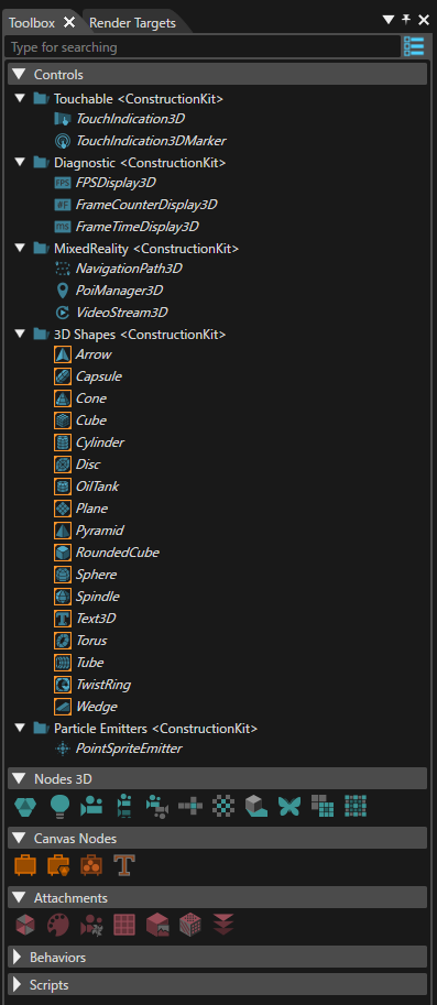
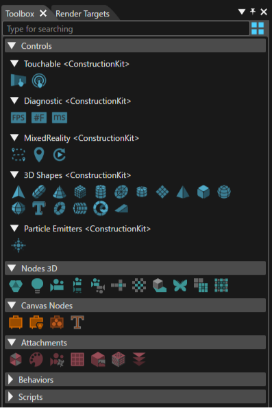
</div></div>