# 2D Scene Design

# 2D Nodes

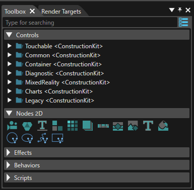
#### 2D Toolbox

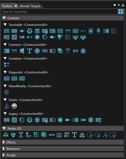
The Toolbox for 2D scenes provides the following items:

<div drawio-diagram="5618"><img src="https://doc316en.candera.eu/uploads/images/drawio/2024-04/drawing-7-1713773118.png" alt=""/></div>

<div class="contents" id="bkmrk-a-%22show-controls-as-"><div class="contents"><div class="contents"><div class="textblock"><dl class="note"><dt></dt><dd><p class="callout info">A "Show Controls as Big Icons/List" button is available in the upper right corner. If this button is used, a different presentation mode - as icons instead of a text list of items - will be made available (see the image below).</p>

</dd></dl></div></div></div></div><div drawio-diagram="5619"><img src="https://doc316en.candera.eu/uploads/images/drawio/2024-04/drawing-7-1713773199.png" alt=""/></div>

<div class="contents" id="bkmrk--1"><div class="contents"><div class="contents"><div class="textblock">  
</div></div></div></div>#### <a class="anchor" id="bkmrk--33"></a>Create 2D Nodes

Following items can be used to create a new node in the scene graph:

<div drawio-diagram="6231"><img src="https://doc316en.candera.eu/uploads/images/drawio/2024-06/drawing-5-1718374267.png" alt=""/></div>

<div class="contents" id="bkmrk-2d-camera%3A-to-be-lin"><div class="contents"><div class="textblock"><table border="0" cellspacing="10" style="width: 100%;"><tbody><tr valign="bottom"><td style="width: 4.94132%;">1

</td><td style="width: 95.0175%;">**2D Camera:** To be linked to a render target, where the render result of the camera will be drawn.   
[Candera::Camera2D](http://dev.doc.cgistudio.at/APILINK/class_candera_1_1_camera2_d.html "A camera defines the view to the scene. At least one Camera2D has to be added to a 2D scene graph and...")</td></tr><tr valign="bottom"><td style="width: 4.94132%;">2

</td><td style="width: 95.0175%;">**2D Group:** Parent item for other nodes. Child nodes are located relative to the parent group.   
[Candera::Group2D](http://dev.doc.cgistudio.at/APILINK/class_candera_1_1_group2_d.html "The class Group2D is a scene graph node that stores a set of nodes as its children. The parent-child relationship between groups and nodes is bidirectional. Whereas a group can hold a group of nodes, a node can at most have one parent at a time. Cycles are prohibited. Changing the groups transformation or alpha value affects the children nodes of the group.")</td></tr><tr valign="bottom"><td style="width: 4.94132%;">3

</td><td style="width: 95.0175%;">**Base Line Layout:** Provides a stacked layout in the horizontal direction.   
[Candera::BaseLineLayouter](http://dev.doc.cgistudio.at/APILINK/class_candera_1_1_base_line_layouter.html "A BaseLineLayouter behaves similar to a Horizontal StackLayouter but instead of aligning the objects ...")</td></tr><tr valign="bottom"><td style="width: 4.94132%;">4

</td><td style="width: 95.0175%;">**Dock Layout:** Provides an area divided into five screens (Top, Bottom, Center, Left, Right). Nodes can be placed in the screens surrounding the Center screen.   
[Candera::DockPanelLayouter](http://dev.doc.cgistudio.at/APILINK/class_candera_1_1_dock_panel_layouter.html "The Dock Panel Layouter provides an easy docking of elements to the left, right, top, bottom or center of the panel. The dock side of an element is defined by the attached dynamic DockSide property. To dock an element to the center of the panel, it must be the last child of the panel.")</td></tr><tr valign="bottom"><td style="width: 4.94132%;">5

</td><td style="width: 95.0175%;">**Grid Layout:** Each node within the group will be positioned within a grid.   
[Candera::DockPanelLayouter](http://dev.doc.cgistudio.at/APILINK/class_candera_1_1_dock_panel_layouter.html "The Dock Panel Layouter provides an easy docking of elements to the left, right, top, bottom or center of the panel. The dock side of an element is defined by the attached dynamic DockSide property. To dock an element to the center of the panel, it must be the last child of the panel.")</td></tr><tr valign="bottom"><td style="width: 4.94132%;">6

</td><td style="width: 95.0175%;">**Overlay Layout:** Allow you to place nodes on top of each other to create a layered effect.   
[Candera::OverlayLayouter](http://dev.doc.cgistudio.at/APILINK/class_candera_1_1_overlay_layouter.html "OverlayLayouter sets sizes of all child elements to fulfill the given area.")</td></tr><tr valign="bottom"><td style="width: 4.94132%;">7

</td><td style="width: 95.0175%;">**Stack Layout:** Stacks nodes in the horizontal or vertical direction.   
[Candera::StackLayouter](http://dev.doc.cgistudio.at/APILINK/class_candera_1_1_stack_layouter.html "A StackLayouter stacks its elements either in horizontal or vertical order.")</td></tr><tr valign="bottom"><td style="width: 4.94132%;">8

</td><td style="width: 95.0175%;">**RenderNode:** Can be associated with any type of effect.   
[Candera::RenderNode](http://dev.doc.cgistudio.at/APILINK/class_candera_1_1_render_node.html "RenderNode is a 2D node that links to an effect chain. Therefore this is the only type of 2D node whi...")</td></tr><tr valign="bottom"><td style="width: 4.94132%;">9

</td><td style="width: 95.0175%;">**BitmapNode:** By default associated with a BitmapBrushAlphaBlend effect.   
Candera::BitmapBrushAlphaBlend</td></tr><tr valign="bottom"><td style="width: 4.94132%;">10

</td><td style="width: 95.0175%;">**TextNode:** By default associated to a TextBrushAlphaBlend effect.   
Candera::TextBrushAlphaBlend</td></tr><tr valign="bottom"><td style="width: 4.94132%;">11

</td><td style="width: 95.0175%;">**Solid Color Node:** By default associated to a TextBrushAlphaBlend effect.   
[Candera::SolidColorBrush](http://dev.doc.cgistudio.at/APILINK/class_candera_1_1_solid_color_brush.html "Output a rectangle filled with a solid color. The rectangle is transformed to the transformation spac...")</td></tr><tr><td style="width: 4.94132%;">12

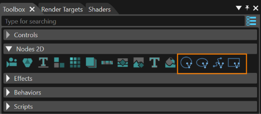
</td><td style="width: 95.0175%;">**MVG Arc Node:** can be used to display an arc  
</td></tr><tr><td style="width: 4.94132%;">13

</td><td style="width: 95.0175%;">**MVG Ellipse Node:** can be used to display ellipse  
</td></tr><tr><td style="width: 4.94132%;">14

</td><td style="width: 95.0175%;">**MVG Path Node:** can be used to display paths with a combination of instructions  
</td></tr><tr><td style="width: 4.94132%;">15

</td><td style="width: 95.0175%;">**MVG Rect Node:** can be used to display rect.  
</td></tr></tbody></table>

</div></div></div>For each of these types, refer to the Properties panel for inspecting all properties specific for the type of node. Tooltips are available to explain the purpose of the property. Refer also to the <span style="color: rgb(230, 126, 35);">[Properties Overview](https://doc316en.candera.eu/books/appendix/page/properties-overview "Properties Overview")</span> listing the Tooltip descriptions.

About MVG nodes, please refer to <span style="color: rgb(230, 126, 35);">[MVG Nodes](https://doc316en.candera.eu/link/1067#bkmrk-page-title)</span> page.

#### <a class="anchor" id="bkmrk--34"></a>Position of 2D Nodes

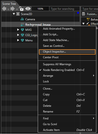
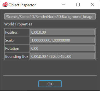
By using the so-called "Object Inspector" feature, it is possible to display the following properties of a 2D node: Position, Scale, Rotation and BoundingBox. This can be done by right-clicking on a 2D node and selecting the "Object Inspector" from the context menu.

<div drawio-diagram="7594"><img src="https://doc316en.candera.eu/uploads/images/drawio/2024-12/drawing-5-1733481496.png" alt=""/></div>

<div class="contents" id="bkmrk--6"><div class="contents"><div class="textblock">  
</div></div></div>The displayed data (visible in the "Object Inspector" panel) is always refreshed reflecting all the changes made by the user.

<div drawio-diagram="6233"><img src="https://doc316en.candera.eu/uploads/images/drawio/2024-06/drawing-5-1718374448.png" alt=""/></div>

<div class="contents" id="bkmrk--9"><div class="contents"><div class="textblock">  
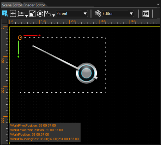
</div></div></div>WorldPivotPosition, WorldPosition and WorldBoundingBox can also be displayed in the Scene Editor panel.

<div drawio-diagram="6234"><img src="https://doc316en.candera.eu/uploads/images/drawio/2024-06/drawing-5-1718374730.png" alt=""/></div>

<div class="contents" id="bkmrk--11"><div class="contents"><div class="textblock">  
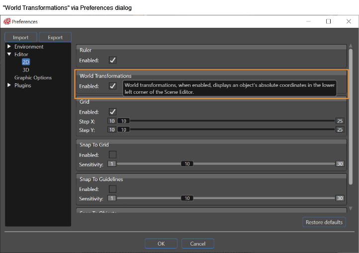
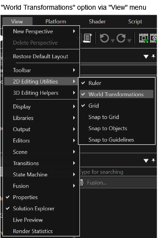
</div></div></div>This feature is disabled by default and can be enabled in "Preferences" &gt; "Editor" &gt; "2D" &gt; "World Transformations". Alternatively, it can be enabled in "View" &gt; "2D Editing Utilities" &gt; "World Transformations".

<div drawio-diagram="6235"><img src="https://doc316en.candera.eu/uploads/images/drawio/2024-06/drawing-5-1718374808.png" alt=""/></div>

<div drawio-diagram="6236"><img src="https://doc316en.candera.eu/uploads/images/drawio/2024-06/drawing-5-1718374847.png" alt=""/></div>

#### <a class="anchor" id="bkmrk--40"></a>Adding Text to the 2D Scenes

Text can be added to the scenes either by using a dedicated node called TextNode2D or by using a Render Node in conjunction with a text effect.

##### TextNode2D

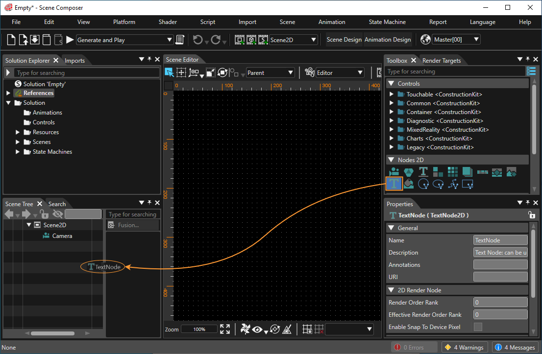
The image below shows how to drag and drop the TextNode2D from the Toolbox to the scene tree:

<div drawio-diagram="7596"><img src="https://doc316en.candera.eu/uploads/images/drawio/2024-12/drawing-5-1733485584.png" alt=""/></div>

<div class="contents" id="bkmrk--17"><div class="contents"><div class="textblock">  
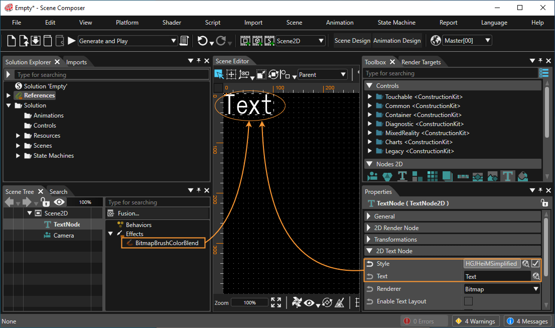
</div></div></div>The TextNode2D default properties are set so that the node is displayed after it is added to the scene tree.

<div drawio-diagram="7597"><img src="https://doc316en.candera.eu/uploads/images/drawio/2024-12/drawing-5-1733485748.png" alt=""/></div>

<div class="contents" id="bkmrk-please-consult-text-"><div class="contents"><div class="textblock"><dl class="note"><dt></dt><dd><p class="callout info">Please consult <span style="color: rgb(230, 126, 35);">[Text Style Palette](https://doc316en.candera.eu/books/solution-handling/page/text-style-palette)</span> for detailed information about adding and editing styles.</p>

</dd></dl></div></div></div>##### Multi Line Text Input

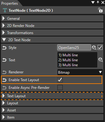
Sometimes it could be necessary to introduce a long text - structured in multiple, successive lines - into a text field. To support this, SceneComposer allows multi-line input in any text field within the Properties panel. To insert a newline press **Ctrl + Enter**. This will put the cursor at the beginning of the next line.

<div drawio-diagram="8625"><img src="https://doc316en.candera.eu/uploads/images/drawio/2025-10/drawing-5-1760691055.png" alt=""/></div>

More text layout properties are available when "Enable Text Layout" is checked .

##### Text Layout  


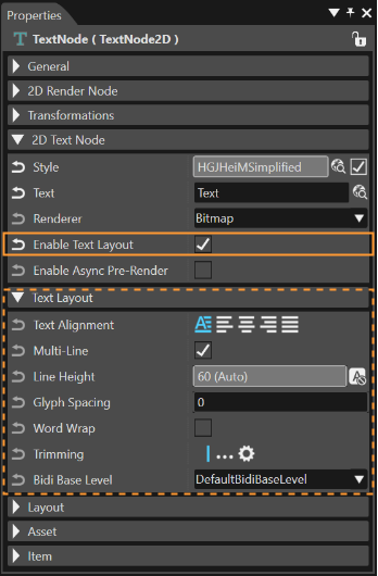
Another category called "Text Layout" includes the following properties: TextAlignment, LineSpacing, Trimming, MultiLine and WordWrap.

<div drawio-diagram="6239"><img src="https://doc316en.candera.eu/uploads/images/drawio/2024-06/drawing-5-1718375411.png" alt=""/></div>

<div class="contents" id="bkmrk--30"><div class="contents"><div class="textblock">**Multi-Line:** In some cases it may be necessary to render a multi-line text as a single line, ignoring any newline characters. This can easily be achieved by unchecking the "Multi-Line" property. The result is immediately visible in the Scene Editor.</div><div class="textblock"></div></div></div><p class="callout info">This properties section is only visible if *Enable Text Layout* is checked. If it is unchecked, the default values of the properties will determine the way the text is rendered.</p>

# Effects

Effects describe the appearance of a RenderNode in a 2D scene. The number of effects may differ on each platform. A functional overview of each effect is provided in the table below (you can navigate to the detailed pages by using the links in the titles).

<table border="1" id="bkmrk-effect-name-descript" style="border-collapse: collapse; width: 800px; height: 1174.05px; border-width: 1px;"><colgroup><col style="width: 39px;"></col><col style="width: 273px;"></col><col style="width: 487px;"></col></colgroup><tbody><tr style="height: 29.7969px;"><td style="height: 29.7969px; background-color: rgb(35, 111, 161);"></td><td class="align-center" style="height: 29.7969px; background-color: rgb(35, 111, 161);">**<span style="color: rgb(255, 255, 255);">Effect name</span>**</td><td class="align-center" style="height: 29.7969px; background-color: rgb(35, 111, 161);">**<span style="color: rgb(255, 255, 255);">Description</span>**

</td></tr><tr style="height: 46.5938px;"><td class="align-center" style="height: 46.5938px;">1

</td><td style="height: 46.5938px;"><span style="color: rgb(230, 126, 35);">[BitmapBrushBlend](https://doc316en.candera.eu/link/602#bkmrk-bitmapbrushblend)</span></td><td style="height: 46.5938px;">Renders a bitmap image as source content and blends it with the destination (store) buffer.

</td></tr><tr style="height: 46.5938px;"><td class="align-center" style="height: 46.5938px;">2</td><td style="height: 46.5938px;"><span style="color: rgb(230, 126, 35);">[BitmapBrushColorBlend](https://doc316en.candera.eu/link/602#bkmrk-bitmapbrushcolorblen)</span></td><td style="height: 46.5938px;">Renders a bitmap, modulates its color (e.g., RGBA factors) and blends the result with the destination buffer.</td></tr><tr style="height: 46.5938px;"><td class="align-center" style="height: 46.5938px;">3</td><td style="height: 46.5938px;"><span style="color: rgb(230, 126, 35);">[BitmapBrushHslBlend](https://doc316en.candera.eu/link/602#bkmrk-bitmapbrushhslblend)</span></td><td style="height: 46.5938px;">Renders a bitmap with hue/saturation/lightness adjustments and blends it with the destination buffer.</td></tr><tr style="height: 46.5938px;"><td class="align-center" style="height: 46.5938px;">4</td><td style="height: 46.5938px;"><span style="color: rgb(230, 126, 35);">[BlurBitmapBrushBlend](https://doc316en.candera.eu/link/602#bkmrk-blurbitmapbrushblend)</span></td><td style="height: 46.5938px;">Produces a blurred bitmap image (post filter) and blends it into the destination buffer.</td></tr><tr style="height: 46.5938px;"><td class="align-center" style="height: 46.5938px;">5</td><td style="height: 46.5938px;"><span style="color: rgb(230, 126, 35);">[GlBitmapBrushColorMaskBlend](https://doc316en.candera.eu/link/605#bkmrk-glbitmapbrushcolorma)</span></td><td style="height: 46.5938px;">Renders a bitmap using a color-based alpha mask and blends it with the destination buffer.</td></tr><tr style="height: 46.5938px;"><td class="align-center" style="height: 46.5938px;">6</td><td style="height: 46.5938px;"><span style="color: rgb(230, 126, 35);">[GlBitmapBrushMaskBlend](https://doc316en.candera.eu/link/605#bkmrk-glbitmapbrushmaskble)</span></td><td style="height: 46.5938px;">Renders a bitmap with an alpha mask (mask texture) and blends it with the destination buffer.</td></tr><tr style="height: 46.5938px;"><td class="align-center" style="height: 46.5938px;">7</td><td style="height: 46.5938px;"><span style="color: rgb(230, 126, 35);">[GlDropShadowBitmapBrushBlend](https://doc316en.candera.eu/link/608#bkmrk-gldropshadowbitmapbr)</span></td><td style="height: 46.5938px;">Draws a drop shadow for the input bitmap and blends both shadow and image with the destination buffer.</td></tr><tr style="height: 46.5938px;"><td class="align-center" style="height: 46.5938px;">8</td><td style="height: 46.5938px;"><span style="color: rgb(230, 126, 35);">[GlDropShadowBitmapBrushColorBlend](https://doc316en.candera.eu/link/608#bkmrk-gldropshadowbitmapbr-0)</span></td><td style="height: 46.5938px;">Draws a drop shadow and applies color modulation to the bitmap output before blending to destination.</td></tr><tr style="height: 46.5938px;"><td class="align-center" style="height: 46.5938px;">9</td><td style="height: 46.5938px;">[<span style="color: rgb(230, 126, 35);">GlFlipBitmapBrushBlend</span>](https://doc316en.candera.eu/link/607#bkmrk-glflipbitmapbrushble)</td><td style="height: 46.5938px;">Flips the bitmap horizontally and/or vertically and blends it with the destination buffer.</td></tr><tr style="height: 46.5938px;"><td class="align-center" style="height: 46.5938px;">10</td><td style="height: 46.5938px;"><span style="color: rgb(230, 126, 35);">[GlFlipBitmapBrushColorBlend](https://doc316en.candera.eu/link/607#bkmrk-glflipbitmapbrushcol)</span></td><td style="height: 46.5938px;">Flips the bitmap, applies color modulation, and blends the result with the destination buffer.</td></tr><tr style="height: 46.5938px;"><td class="align-center" style="height: 46.5938px;">11</td><td style="height: 46.5938px;"><span style="color: rgb(230, 126, 35);">[GlLinearGradientBitmapBrushBlend](https://doc316en.candera.eu/link/606#bkmrk-gllineargradientbitm)</span></td><td style="height: 46.5938px;">Applies a linear gradient over bitmap/text content and blends it to the destination buffer.</td></tr><tr style="height: 46.5938px;"><td class="align-center" style="height: 46.5938px;">12</td><td style="height: 46.5938px;"><span style="color: rgb(230, 126, 35);">[GlLinearGradientBrushBlend](https://doc316en.candera.eu/link/606#bkmrk-gllineargradientbrus)</span></td><td style="height: 46.5938px;">Generates a linear-gradient brush as source pixels and blends it with the destination buffer.</td></tr><tr style="height: 46.5938px;"><td class="align-center" style="height: 46.5938px;">13</td><td style="height: 46.5938px;"><span style="color: rgb(230, 126, 35);">[GlMultiTextureBrushBlend](https://doc316en.candera.eu/link/1191#bkmrk-glmultitexturebrushb)</span></td><td style="height: 46.5938px;">Blends two bitmap inputs (multi-texture combine) and then blends the result to the destination buffer.</td></tr><tr style="height: 46.5938px;"><td class="align-center" style="height: 46.5938px;">14</td><td style="height: 46.5938px;"><span style="color: rgb(230, 126, 35);">[GlOutlineBitmapBrushColorBlend](https://doc316en.candera.eu/link/609#bkmrk-gloutlinebitmapbrush)</span></td><td style="height: 46.5938px;">Creates an outline from the image alpha (notably for bitmap-cached text), modulates color, and blends to destination.</td></tr><tr style="height: 46.5938px;"><td class="align-center" style="height: 46.5938px;">15</td><td style="height: 46.5938px;"><span style="color: rgb(230, 126, 35);">[GlRadialGradientBrushBlend](https://doc316en.candera.eu/link/606#bkmrk-glradialgradientbrus)</span></td><td style="height: 46.5938px;">Generates a radial-gradient brush as source pixels and blends it with the destination buffer.</td></tr><tr style="height: 46.5938px;"><td class="align-center" style="height: 46.5938px;">16</td><td style="height: 46.5938px;"><span style="color: rgb(230, 126, 35);">[GlSolidColorBrushMaskBlend](https://doc316en.candera.eu/link/604#bkmrk-glsolidcolorbrushmas)</span></td><td style="height: 46.5938px;">Fills with a solid color through an alpha mask and blends it with the destination buffer.</td></tr><tr style="height: 29.7969px;"><td class="align-center" style="height: 29.7969px;">17</td><td style="height: 29.7969px;"><span style="color: rgb(230, 126, 35);">[MVGArcBrush](https://doc316en.candera.eu/link/1290#bkmrk-mvgarcbrush)</span></td><td style="height: 29.7969px;">Renders a vector arc shape (MVG) as a brush output (source pixels).</td></tr><tr style="height: 29.7969px;"><td class="align-center" style="height: 29.7969px;">18</td><td style="height: 29.7969px;"><span style="color: rgb(230, 126, 35);">[MVGEllipseBrush](https://doc316en.candera.eu/link/1290#bkmrk-mvgellipsebrush)</span></td><td style="height: 29.7969px;">Renders a vector ellipse/circle (MVG) as a brush output.</td></tr><tr style="height: 29.7969px;"><td class="align-center" style="height: 29.7969px;">19</td><td style="height: 29.7969px;"><span style="color: rgb(230, 126, 35);">[MVGPathBrush](https://doc316en.candera.eu/link/1290#bkmrk-mvgpathbrush)</span></td><td style="height: 29.7969px;">Renders a vector path (MVG) as a brush output.</td></tr><tr style="height: 29.7969px;"><td class="align-center" style="height: 29.7969px;">20</td><td style="height: 29.7969px;"><span style="color: rgb(230, 126, 35);">[MVGRectBrush](https://doc316en.candera.eu/link/1290#bkmrk-mvgrectbrush)</span></td><td style="height: 29.7969px;">Renders a vector rectangle/rounded-rect (MVG) as a brush output.</td></tr><tr style="height: 46.5938px;"><td class="align-center" style="height: 46.5938px;">21</td><td style="height: 46.5938px;"><span style="color: rgb(230, 126, 35);">[MirrorBitmapBrushBlend](https://doc316en.candera.eu/link/602#bkmrk-mirrorbitmapbrushble)</span></td><td style="height: 46.5938px;">Renders a bitmap together with its mirror reflection and blends the combined output to destination.</td></tr><tr style="height: 46.5938px;"><td class="align-center" style="height: 46.5938px;">22</td><td style="height: 46.5938px;"><span style="color: rgb(230, 126, 35);">[ShadowBitmapBrushBlend](https://doc316en.candera.eu/link/602#bkmrk-shadowbitmapbrushble)</span></td><td style="height: 46.5938px;">Produces a shadow or glow around the bitmap and blends the effect and image with destination.</td></tr><tr style="height: 46.5938px;"><td class="align-center" style="height: 46.5938px;">23</td><td style="height: 46.5938px;"><span style="color: rgb(230, 126, 35);">[ShearBitmapBrushBlend](https://doc316en.candera.eu/link/602#bkmrk-shearbitmapbrushblen)</span></td><td style="height: 46.5938px;">Shears (skews) the image by X/Y shear angles and blends it with the destination buffer.</td></tr><tr style="height: 46.5938px;"><td class="align-center" style="height: 46.5938px;">24</td><td style="height: 46.5938px;"><span style="color: rgb(230, 126, 35);">[SolidColorBrushBlend](https://doc316en.candera.eu/link/603#bkmrk-solidcolorbrushblend)</span></td><td style="height: 46.5938px;">Generates a solid-color rectangle as source pixels and blends it with the destination buffer.</td></tr><tr style="height: 46.5938px;"><td class="align-center" style="height: 46.5938px;">25</td><td style="height: 46.5938px;"><span style="color: rgb(230, 126, 35);">[SolidColorBrushColorBlend](https://doc316en.candera.eu/link/603#bkmrk-solidcolorbrushcolor)</span></td><td style="height: 46.5938px;">Generates a solid-color rectangle, applies color modulation, then blends to the destination buffer.</td></tr><tr style="height: 46.5938px;"><td class="align-center" style="height: 46.5938px;">26</td><td style="height: 46.5938px;"><span style="color: rgb(230, 126, 35);">[SolidColorBrushHslBlend](https://doc316en.candera.eu/link/603#bkmrk-solidcolorbrushhslbl)</span></td><td style="height: 46.5938px;">Generates a solid-color rectangle with HSL correction and blends it with the destination buffer.</td></tr></tbody></table>

<div class="contents" id="bkmrk--0"><div class="contents">  
</div></div><div class="contents" id="bkmrk--2"><div class="contents"><div class="textblock">---

</div></div></div>#### **Combined Effects**  


<p class="callout info">The effects provided in SceneComposer are **combined effects**. They can be dragged from the toolbox and dropped onto a RenderNode.</p>

##### Background information

Combined effects are a combination of two or three basic effect types that are combined to an effect chain.

The following three basic effect types are used to form this effect chain

- **Brush Effect:** Acts as the input effect; it defines the source data for the node (e.g. SolidColorBrush, BitmapBrush)
- **In-place Effect:** Multiple different in-place effects can be concatenated (e.g. ConstantAlphaEffect, MaskEffect)
- **Blend Effect:** e.g. AlphaBlendEffect

A correctly configured effect chain consists of the following
<div class="contents" id="bkmrk-a-brush-effect-at-fi"><div class="contents"><div class="textblock">

- a Brush effect at first
- followed by an optional In-place effect
- finished by a final Blend effect

</div></div></div><div class="contents" id="bkmrk--6"><div class="contents">  
</div></div><div class="contents" id="bkmrk--8"><div class="contents">  
</div></div>For usability reasons, Scene Composer only provides combined effects in the Toolbox by default.

<div class="contents" id="bkmrk--9"><div class="contents"><div class="textblock">---

</div></div></div>#### <a class="anchor" id="bkmrk--22"></a>Use Combined Effects

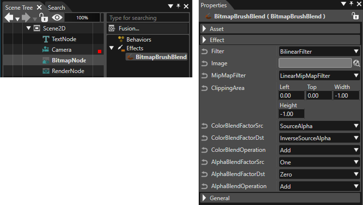
Several node types are already preconfigured with a specific combined effect. E.g when a BitmapNode is added to the scene graph, it is automatically linked to a BitmapBrushBlend combined effect

For user-defined nodes, use the following 2D node type:

<div class="contents" id="bkmrk-rendernode%3A-drag-a-c"><div class="contents"><div class="textblock">

- **RenderNode:** Drag a combined effect from the Toolbox and drop it over the desired RenderNode in the Scene Tree panel.

</div></div></div>Follow these steps to view and edit the effect:

1. Select the node in the left side of the Scene Tree panel.
2. The linked effect will appear on the right side.
3. Select the effect to display its properties in the Properties panel, where you can edit them.

<div drawio-diagram="8626"><img src="https://doc316en.candera.eu/uploads/images/drawio/2025-10/drawing-5-1760694192.png" alt=""/></div>

<div class="contents" id="bkmrk--11"><div class="contents"><div class="textblock">  
</div></div></div><div class="contents" id="bkmrk--13"></div>

# 2D Scene Editor

The "Scene Editor" is the main panel of the application in which scenes and animations are displayed ("render view"). It is the only panel that cannot be closed.

See Also : <span style="color: rgb(230, 126, 35);">[2D Editing Helpers](https://doc316en.candera.eu/books/preferences/page/2d-editing-helpers "2D Editing Helpers")</span>

---

#### <span style="color: rgb(0, 0, 0);">General</span>

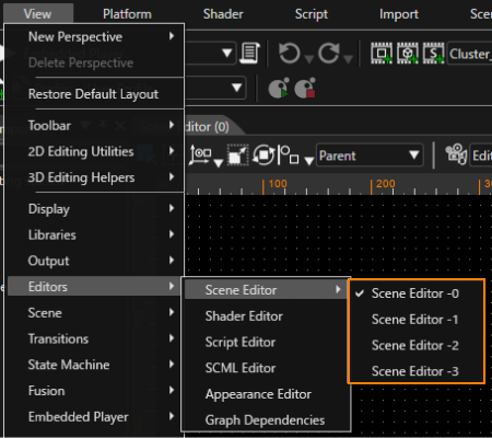
By default, only one Scene Editor is displayed (Scene Editor -0 only). You can display up to four Scene Editors (Scene Editor -0 to -4) as needed. You can show or hide them from the menu bar \[ View &gt; Editors &gt; Scene Editor \].

- Scene Editor menu on the Menu Bar  
    <div drawio-diagram="8610"><img src="https://doc316en.candera.eu/uploads/images/drawio/2025-10/drawing-7-1760593129.png" alt=""/></div>
- The \[ Display Scene Editor \] icon on the toolbar  
    <div drawio-diagram="8611"><img src="https://doc316en.candera.eu/uploads/images/drawio/2025-10/drawing-7-1760593264.png" alt=""/></div>
    
    When you click the \[ Display Scene Editor \] icon, four icons will appear for toggling the visibility of the Scene Editor. Please refer to the table below for details on each icon.
    
    <table border="1" style="border-collapse: collapse; width: 53.6082%;"><colgroup><col style="width: 20.2873%;"></col><col style="width: 79.7127%;"></col></colgroup><tbody><tr><td><div drawio-diagram="8612"><img src="https://doc316en.candera.eu/uploads/images/drawio/2025-10/drawing-7-1760593313.png" alt=""/></div>
    
    </td><td>The Scene Editor -0 is displayed.</td></tr><tr><td><div drawio-diagram="8613"><img src="https://doc316en.candera.eu/uploads/images/drawio/2025-10/drawing-7-1760593331.png" alt=""/></div>
    
    </td><td>The Scene Editors -0 and -1 are displayed.</td></tr><tr><td><div drawio-diagram="8614"><img src="https://doc316en.candera.eu/uploads/images/drawio/2025-10/drawing-7-1760593345.png" alt=""/></div>
    
    </td><td>Scene Editors -0 through -2 are displayed.</td></tr><tr><td><div drawio-diagram="8615"><img src="https://doc316en.candera.eu/uploads/images/drawio/2025-10/drawing-7-1760593361.png" alt=""/></div>
    
    </td><td>Scene Editors -0 through -3 are displayed.</td></tr></tbody></table>
    
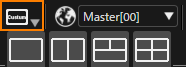
    When a display setting not listed in the table above is applied in the Scene Editor menu on the Menu Bar, the \[ Display Scene Editor \] icon will display "Custom".  
    <div drawio-diagram="8616"><img src="https://doc316en.candera.eu/uploads/images/drawio/2025-10/drawing-7-1760593389.png" alt=""/></div>

<p class="callout info">Additionally, scene editors (1) to (3) support floating display. By using floating display, you can display any scene editor on a separate display.</p>

<p class="callout info">If the displayed Scene (or Control) is updated, it will be reflected in all Scene Editors.</p>

---

The following is an explanation of the scene editor tool icons.

#### Camera Manipulation

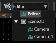
The Camera combo box provides the following camera views for a 2D scene:
<div class="contents" id="bkmrk-editor-camera%3A-a-def"><div class="contents"><div class="contents"><div class="textblock">

- **Editor camera:** A default camera named "Editor", which can be used to edit the scene including all scene cameras from an outer perspective.
- **Scene cameras:** Further, each camera part of the scene is listed in the combo box. If a scene camera is selected, the scene is displayed from that camera's perspective. Scene cameras are created by dragging an item of type "Camera" from the Toolbox panel and dropping it into the Scene Tree panel.

</div></div></div></div><div drawio-diagram="6246"><img src="https://doc316en.candera.eu/uploads/images/drawio/2024-06/drawing-5-1718376200.png" alt=""/></div>

<div class="contents" id="bkmrk-in-scene-camera-view"><div class="contents"><div class="textblock"><dl class="note"><dd><p class="callout info">In scene camera view, the camera properties can only be edited in the "Properties" panel.</p>

</dd></dl></div></div></div>##### Camera Panning and Zooming

The scene content displayed in the Scene Editor can be modified like this when in Editor mode:

<div class="contents" id="bkmrk-panning%3A-move-the-mo"><div class="contents"><div class="textblock">

- **Panning:** Move the mouse while holding the middle mouse button down;   
    or move the mouse while holding the &lt;CTRL&gt; and &lt;SHIFT&gt; keys and the left mouse button
- **Zooming:** Rotate the mouse wheel forward for zooming in and backward for zooming out

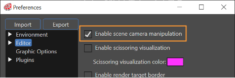
</div></div></div>To enable panning and zooming also for scene cameras, a preference option is available:

<div class="contents" id="bkmrk-tick-%22enable-scene-c"><div class="contents"><div class="contents"><div class="textblock">

- Tick **"Enable scene camera manipulation"** in the "Editor Preferences" dialog opened from File-Preferences menu option.

</div></div></div></div><div drawio-diagram="6247"><img src="https://doc316en.candera.eu/uploads/images/drawio/2024-06/drawing-5-1718376410.png" alt=""/></div>

It is possible to zoom any 2D scene oriented towards a point indicated by the cursor (similar with Google Earth zoom). By placing the cursor on any point in a 2D scene, when zooming operation is doing the whole scene towards that selected point.

##### Fit to Screen

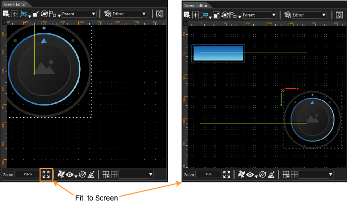
When zooming or panning the editor camera of a 2D scene or a 2D Control, parts of your scene or Control might get out of sight.

To display the entire content of your 2D scene or 2D Control in the Scene Editor window, click the "Fit to Screen" button. All objects  of the scene or control will become visible - even those outside the yellow viewport rectangle.

<div drawio-diagram="5740"><img src="https://doc316en.candera.eu/uploads/images/drawio/2024-05/drawing-5-1715937672.png" alt=""/></div>

##### Reset Camera

Use the "Reset Camera" button left to the Camera combo box to reset the selected view to the default location and orientation.

<div drawio-diagram="6250"><img src="https://doc316en.candera.eu/uploads/images/drawio/2024-06/drawing-5-1718376517.png" alt=""/></div>

##### Camera Preview Thumbnail

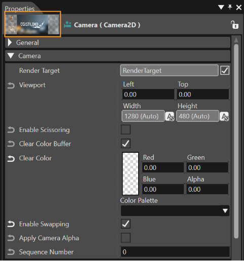
<div class="contents" id="bkmrk--0"></div>Even though the current selected camera is the Perspective camera, it is possible to see the content displayed by other camera in the thumbnail available in property grid. If the camera is not associated to a render target, the preview will be done on a fixed size virtual render target surface:

<div class="contents" id="bkmrk-512x512px-for-2d-cam"><div class="contents"><div class="textblock">

- 512x512px for 2D cameras

</div></div></div>If the camera is associated to a render target, the preview will be generated:

<div class="contents" id="bkmrk-on-a-surface-of-the-"><div class="contents"><div class="contents"><div class="textblock">

- on a surface of the same dimensions and then reduced to a thumbnail image - for 2D cameras

</div></div></div></div><div drawio-diagram="6251"><img src="https://doc316en.candera.eu/uploads/images/drawio/2024-06/drawing-5-1718376911.png" alt=""/></div>

<div class="contents" id="bkmrk--26"><div class="contents">  
</div></div>By selecting the camera whose perspective should be viewed in the Scene Tree, the camera preview thumbnail will be displayed in the property grid.

<div class="contents" id="bkmrk-the-%22alpha-blend-fac"><div class="contents"><div class="textblock"><dl class="note"><dt></dt><dd><p class="callout info">The "Alpha Blend Factor" and the "Alpha Destination Blend Factor" in the Default Render Mode Configuration should be set properly. For instance, the former value could be InverseSourceAlpha and the latter value could be DestColor.</p>

</dd></dl></div></div></div><div drawio-diagram="5043"></div>

---

#### Picking and Transforming Items

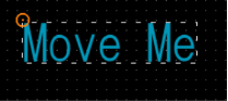
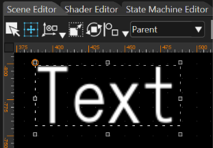
In the Scene Editor, an item can be picked by clicking on it. After picking, the bounding box of the item is displayed together with the pivot point, and it is selected in the "Scene Tree" panel:

<div drawio-diagram="5044"><img src="https://doc316en.candera.eu/uploads/images/drawio/2024-01/drawing-5-1705061460.png" alt=""/></div>

<div class="contents" id="bkmrk-groups-cannot-be-pic"><div class="contents"><div class="textblock"><dl class="note"><dt></dt><dd><p class="callout info">**Groups** cannot be picked in the render view; they need to be selected in the "Scene Tree" panel. The "Scene Editor" and "Scene Tree" panels are synchronized in terms of the selected item.</p>

</dd><dd></dd></dl>---

</div></div></div>##### Interaction Modes: Selection, Edit the margin of objects inside a layout, Translate, Rotate, Scale

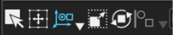
In the Toolbar, the following interaction modes are available for 2D scenes:

<div drawio-diagram="6252"><img src="https://doc316en.candera.eu/uploads/images/drawio/2024-06/drawing-5-1718376955.png" alt=""/></div>

##### Select

When the button "Select" is enabled, the selected object will be highlighted in the Scene Editor but can't be transformed.

##### Edit the margin of objects inside a layout

For more information about this, please refer to <span style="color: rgb(230, 126, 35);">[Adorners](https://doc316en.candera.eu/books/scene-design/page/adorners)</span>.

<div drawio-diagram="6255"><img src="https://doc316en.candera.eu/uploads/images/drawio/2024-06/drawing-5-1718377189.png" alt=""/></div>


##### Translate

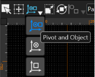
Three options are available for this mode:

<div class="contents" id="bkmrk-%22pivot-and-object%22-w"><div class="contents"><div class="contents"><div class="textblock">

- **"Pivot and Object"** will move the selected object with its pivot
- **"Only object"** will move only the object selected and
- **"Pivot only"** will move only the pivot of the selected object.

</div></div></div></div><div drawio-diagram="6253"><img src="https://doc316en.candera.eu/uploads/images/drawio/2024-06/drawing-5-1718377021.png" alt=""/></div>

<div class="contents" id="bkmrk--37"><div class="contents"><div class="textblock">  
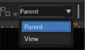
</div></div></div>In Translate mode, another feature is the "Translation System" that allows choosing between Parent and View reference system. When Parent system is selected, the reference system is the coordinate system of the scene. Otherwise, the reference system is the coordinate system of the selected object. In both cases the object can be moved by using the arrow keys.

<div drawio-diagram="6254"><img src="https://doc316en.candera.eu/uploads/images/drawio/2024-06/drawing-5-1718377063.png" alt=""/></div>

<div class="contents" id="bkmrk-the-fixed-angle-valu"><div class="contents"><div class="textblock">  
</div></div></div>##### Scale

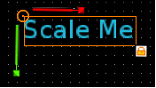
The scale gizmo is represented in a similar way as the translation gizmo:

<div drawio-diagram="930"><img src="https://doc316en.candera.eu/uploads/images/drawio/2023-02/drawing-4-1676442562.png" alt=""/></div>

<div class="contents" id="bkmrk--42"><div class="contents">  
</div></div>Move the mouse while pressing left mouse button to translate, rotate or scale the selected object in the render view. The modification of the properties is also reflected in the "Properties" panel for the selected item.

The scale gizmo contains four controllers:

<div class="contents" id="bkmrk-the-object-itself-x-"><div class="contents"><div class="contents"><div class="textblock">

- the object itself
- X axis controller - when dragging the axis, the object will be scaled on the local x axis
- Y axis controller - when dragging the axis, the object will be scaled on the local y axis
- Lock scaling controller - displayed on the lower right corner of the render node. When dragging it, the object will be scaled proportional on each axis.

</div></div></div></div>##### Rotate

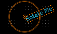
In this mode, a rotation gizmo is represented by a circle:

<div drawio-diagram="932"><img src="https://doc316en.candera.eu/uploads/images/drawio/2023-02/drawing-4-1676442583.png" alt=""/></div>

<div class="contents" id="bkmrk--45"><div class="contents">  
</div></div>Usually the object is freely rotated except the situations when the rotation angle is close to a fixed angle controlled by a tolerance. The tolerance defines the range between two multiple values where the object can freely rotate without being snapped.

<div class="contents" id="bkmrk-the-fixed-angle-valu-1"><div class="contents"><div class="textblock">

- the fixed angle values shall be multiples of 45
- the angle snapping tolerance shall be 22.5 degrees.

</div></div></div>##### Move Elements with Arrows Keys

Any element can be moved/scaled/rotated by using arrows. After the selection of the object use the Left, Right, Up and Down arrows to get the desired results.

##### Unselect an Item

The camera cannot be manipulated and vice versa when an item is selected.

Unselect an item by hitting the **Esc** key.

Please refer to section <span style="color: rgb(230, 126, 35);">[2D Editing Helpers](https://doc316en.candera.eu/books/preferences/page/2d-editing-helpers "2D Editing Helpers")</span> for further information.

# 2D Laying Out

Laying out is a feature specific to 2D scenes. Once a layout is applied to a 2D group, all children of that group will be affected by the given layout strategy.

<div class="contents" id="bkmrk-if-the-user-does-not"><div class="contents"><div class="textblock"><dl class="note"><dd><p class="callout info">If the user does not want any laying out support, thus normal editing procedure is applied and no laying out is set. If the user enables laying out for some nodes, and he does not want to move by mistake any of the child nodes which are laid out, the "strict laying out" option can be enabled from File-Preferences menu, Editor - 2D section. On-demand laying out is available by pressing CTRL+ L or by calling "Edit" &gt; "Do-Layout" menu option to trigger Candera to layout all objects in the scene</p>

</dd></dl></div></div></div>Candera supports four built-in layouts: Stack, Grid, Baseline, Overlay, and DockPanel each layout having some specific configuration parameters.

#### **General Layout Properties**

The following properties can be set to any node which is arranged by a parent layouter.

<div drawio-diagram="8794"><img src="https://doc316en.candera.eu/uploads/images/drawio/2025-11/drawing-5-1763718472.png" alt=""/></div>

<div class="contents" id="bkmrk--0"><div class="contents"><div class="textblock">  
</div></div></div>A layout can only be set on a group, having some specific properties, while final laying out is determined by the properties set on all the arrangeable items that are contained in any group on which a layout was set.

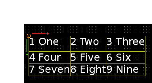
After the creation of a layout, the borders of the grid cells - including bounding boxes - can be visualized simultaneously in the Scene editor. Actually, the border of every cell of the layout will be visible as a yellow line.

<div drawio-diagram="6261"><img src="https://doc316en.candera.eu/uploads/images/drawio/2024-06/drawing-5-1718377917.png" alt=""/></div>

<div class="contents" id="bkmrk--2"><div class="contents"><div class="textblock">  
</div></div></div>This border is visible if the entire group is selected or if just one single cell is selected.

<div drawio-diagram="6262"><img src="https://doc316en.candera.eu/uploads/images/drawio/2024-06/drawing-5-1718377991.png" alt=""/></div>

<div class="contents" id="bkmrk--4"><div class="contents"><div class="textblock">  
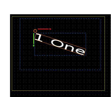
</div></div></div>Two different secondary borders - the bounding box of the parent node, and the bounding box of the effective node - will be visible, marked with blue, if some values are set.

<div drawio-diagram="6263"><img src="https://doc316en.candera.eu/uploads/images/drawio/2024-06/drawing-5-1718378021.png" alt=""/></div>

<div class="contents" id="bkmrk--6"><div class="contents"><div class="textblock">  
</div></div></div>The effective bounding box will become visible if layout values - like margin of the element - are added in Properties panel.

##### <a class="anchor" id="bkmrk--43"></a>Row, Column Number

If the parent layout is a grid, the elements position in the grid can be changed. This has same effects like arranging a node in the Grid Editor Dialog.

##### <a class="anchor" id="bkmrk--44"></a>Alignment

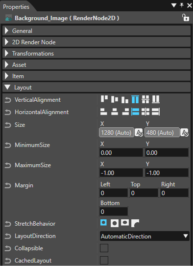
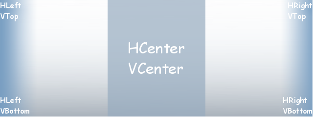
**Vertical Alignment:** Each layout-able element can specify its vertical alignment inside the area which is available by the parent layout.

<p class="callout info">The sample images below were created using an **OverlayLayout** (sized 200x100px) containing an **image** (sized 151x52px). The image's StretchBehavior property is set to **Uniform** and its HorizontalAlignment remains at the default value.   
To demonstrate the impact of different **VerticalAlignment** settings, this property has been varied across all options (from VTop to VStretchBottom). </p>

<div drawio-diagram="8805"><img src="https://doc316en.candera.eu/uploads/images/drawio/2025-12/drawing-7-1764719574.png" alt=""/></div>

<div class="contents" id="bkmrk--10"><div class="contents"><div class="textblock">  
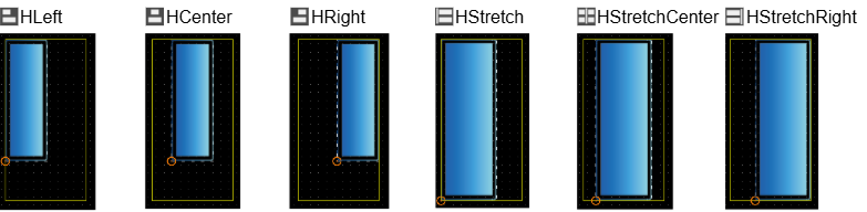
</div></div></div>**Horizontal Alignment:** Each layout-able element can specify its horizontal alignment inside the area which is available by the parent layout.

<p class="callout info">The sample images below were created using an **OverlayLayout** (sized 100x200px) containing an **image** (sized 52x151px). The image's StretchBehavior property is set to **Uniform** and its VerticalAlignment remains at the default value.   
To demonstrate the impact of different **HorizontalAlignment** settings, this property has been varied across all options (from VLeft to VStretchRight). </p>
<div drawio-diagram="8806"><img src="https://doc316en.candera.eu/uploads/images/drawio/2025-12/drawing-7-1764720921.png" alt=""/></div>

<div class="contents" id="bkmrk--11"><div class="contents">  
</div></div><div class="textblock" id="bkmrk--12"></div><div class="textblock" id="bkmrk--13"></div>##### <a class="anchor" id="bkmrk--47"></a>Size

Specify a fixed size for an element by setting the width and height. In case the element won't be asked for its preferred size.

<div class="contents" id="bkmrk-note%3A-minimum-size-a"><div class="contents"><div class="textblock"><dl class="note"><dt>**Note:**</dt><dd>Minimum Size and Maximum Size is taken into account! If the preferred size of the element should be taken set value -1;-1.</dd></dl></div></div></div>**Minimum Size:** An element won't get smaller than its minimum size.

**Maximum Size:** An element won't get larger than its maximum size. If more space is available, it will be placed according to its alignment parameter (see above).

<div class="contents" id="bkmrk-a-fixed-size-can-be-"><div class="contents"><div class="textblock"><dl class="note"><dd><p class="callout info">A fixed size can be defined by setting the same values for minimum and maximum size. (tbd: default value)</p>

</dd></dl></div></div></div>##### <a class="anchor" id="bkmrk--48"></a>Margin

The margin for an element defines some extra space around itself. Different values can be set for left, top, right and bottom margin.

##### Stretch Behavior

If the items size (size of an image, text, or colored rectangle) is smaller than the available space one of the following stretch behaviors can be set:

<div class="contents" id="bkmrk-none%3A-the-item-will-"><div class="textblock">

- None: The item will not be stretched; it will be rendered in its original size,
- Fill: The item will be stretched (or shrunk) to fill the exact available space.
- Uniform: The original aspect ratio of the item will not be changed, but all of the item will be shown. Therefore the item might not fill the whole width or height of the available space.
- UniformToFill: The original aspect ratio of the item will not be changed, but the whole available space will be filled. The image will be cut off on the right or bottom side, when Candera\_Layout\_Clipping is enabled.

</div></div>####   
**Stack Layout**

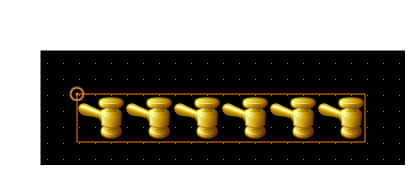
The layout type "Stack" realizes a stacked laying out either in horizontal or vertical direction. The order of the stack elements is given by the order of the child nodes within the laid out group.

<div drawio-diagram="6264"><img src="https://doc316en.candera.eu/uploads/images/drawio/2024-06/drawing-5-1718378083.png" alt=""/></div>

<div class="contents" id="bkmrk--15"><div class="contents"><div class="textblock">  
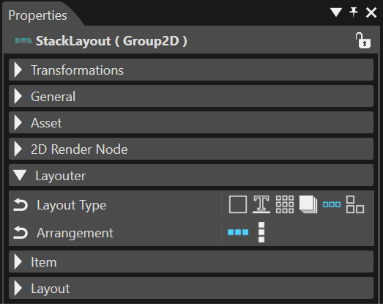
</div></div></div>Configuring the Stack Layout:

<div class="contents" id="bkmrk-select-the-group-hol"><div class="contents"><div class="textblock">

1. Select the Group holding the nodes to be laid out in the Scene Tree panel
2. Choose LayoutType "Stack" from the Properties panel
3. Choose "Horizontal" or "Vertical" value for property Arrangement in the Properties panel, depending on the desired laying out
4. Call the Do-Layout command using the shortcut keys "Ctrl+L" or from the Edit - Do-Layout menu

</div></div></div><div drawio-diagram="6265"><img src="https://doc316en.candera.eu/uploads/images/drawio/2024-06/drawing-5-1718378110.png" alt=""/></div>

<div class="contents" id="bkmrk--17"><div class="textblock">  
</div></div>#### **Grid Layout**

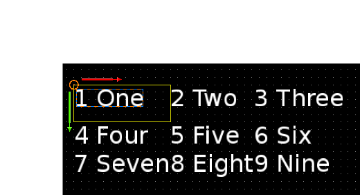
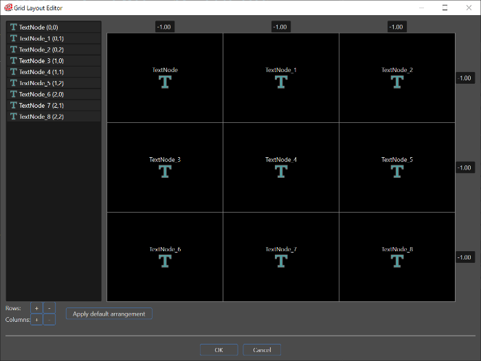
In a Grid layout, every node part of the laid out group is assigned to a cell of the grid. A Grid Layout Editor is available to configure the grid and to arrange nodes in the grid's cells by drag &amp; drop operation.

<div drawio-diagram="6267"><img src="https://doc316en.candera.eu/uploads/images/drawio/2024-06/drawing-5-1718378156.png" alt=""/></div>

<div class="contents" id="bkmrk--19"><div class="contents"><div class="textblock">  
</div></div></div>Configuring the Grid Layout:

<div class="contents" id="bkmrk-select-the-group-hol-0"><div class="contents"><div class="contents"><div class="textblock">

1. Select the Group holding the nodes to be laid out in the Scene Tree panel
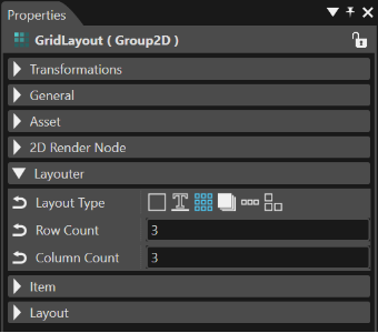
2. Choose LayoutType "Grid" from the Properties panel
3. Optional: Set the number of rows and columns of the grid by editing the properties RowCount and ColumnCount in the Properties panel
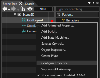
4. Use the context menu item "Configure Layout" on the selected Group in the Scene Tree panel to open the "Grid Layout Editor" dialog

</div></div></div></div><div drawio-diagram="7588"><img src="https://doc316en.candera.eu/uploads/images/drawio/2024-11/drawing-5-1732899967.png" alt=""/></div>

<div class="contents" id="bkmrk--21"><div class="contents"><div class="textblock">  
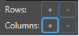
</div></div></div>Optional: Use the buttons "+","-" to configure the desired number of rows and columns in the "Grid layout editor" dialog, if not done already in the Properties panel.

<div drawio-diagram="949"><img src="https://doc316en.candera.eu/uploads/images/drawio/2023-02/drawing-4-1676443876.png" alt=""/></div>

Arrange the nodes of the group in the grid's cells by drag &amp; drop operation.

<div drawio-diagram="6269"><img src="https://doc316en.candera.eu/uploads/images/drawio/2024-06/drawing-5-1718378288.png" alt=""/></div>

<div class="contents" id="bkmrk--24"><div class="contents"><div class="textblock">  
</div></div></div>Configure width and height for rows and columns by editing the values on the border of the grid. Values within the range \[0...1\] are considered as percentages and values greater than 1 as dimensions.

Confirm the layout configuration by pressing the "OK" button of the dialog "Grid layout editor".

Call the Do-Layout command using the shortcut keys "Ctrl+L" or from the "Edit" &gt; "Do-Layout" menu.

<div drawio-diagram="6270"><img src="https://doc316en.candera.eu/uploads/images/drawio/2024-06/drawing-5-1718378315.png" alt=""/></div>

<div class="contents" id="bkmrk--26"><div class="contents"><div class="textblock">  
</div></div></div>**See also:**

<div class="contents" id="bkmrk-candera%3A%3Agridlayoute"><div class="textblock">

- [Candera::GridLayouter](http://dev.doc.cgistudio.at/APILINK/class_candera_1_1_grid_layouter.html "GridLayouter arranges its elements in a grid. The amount of rows and columns for the grid must be spe...")

</div></div>####   
**Baseline Layout**

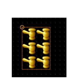
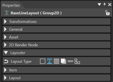
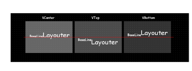
The layout type "Baseline" realizes a stacked laying out in the horizontal direction. It behaves similar to the Horizontal Stack Layout. The major difference consists in its given reference: it aligns the objects to a line instead of aligning them to the client area. The main purpose of this layouter is to align different sizes formatted texts along the same baseline. For instance, if the center is chosen for alignment, the baseline of the text will be aligned to the given line (= baseline offset). The order of the elements is given by the order of the child nodes within the laid out group.

<div drawio-diagram="6271"><img src="https://doc316en.candera.eu/uploads/images/drawio/2024-06/drawing-5-1718378353.png" alt=""/></div>

<div class="contents" id="bkmrk--28"><div class="contents"><div class="textblock">  
</div></div></div>Configure the Baseline Layout by following these steps:

<div class="contents" id="bkmrk-select-the-group-hol-1"><div class="contents"><div class="contents"><div class="textblock">

1. Select the Group holding the nodes to be laid out in the Scene Tree panel
2. Choose LayoutType "Baseline" from the Properties panel
3. Set any value for property Base Line Offset in the Properties panel, depending on the desired laying out
4. Call the Do-Layout command using the shortcut keys "Ctrl+L" or from the Edit - Do-Layout menu

</div></div></div></div><div drawio-diagram="6272"><img src="https://doc316en.candera.eu/uploads/images/drawio/2024-06/drawing-5-1718378402.png" alt=""/></div>

<div class="contents" id="bkmrk--30"><div class="contents"><div class="textblock">  
</div></div></div>**See also:**

<div class="contents" id="bkmrk-candera%3A%3Abaselinelay"><div class="textblock">

- [Candera::BaseLineLayouter](http://dev.doc.cgistudio.at/APILINK/class_candera_1_1_base_line_layouter.html "A BaseLineLayouter behaves similar to a Horizontal StackLayouter but instead of aligning the objects ...")

</div></div>####   
**Overlay Layout**

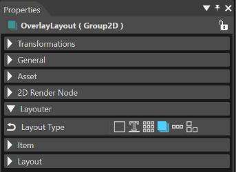
The layout type "Overlay" arranges the objects by laying out them on top of each other or by aligning the nodes according to their general layout properties. The order of the elements is given by the order of the child nodes within the laid out group.

<div drawio-diagram="6273"><img src="https://doc316en.candera.eu/uploads/images/drawio/2024-06/drawing-5-1718378443.png" alt=""/></div>

<div class="contents" id="bkmrk--32"><div class="contents"><div class="textblock">  
</div></div></div>Configuring the Overlay Layout:

<div class="contents" id="bkmrk-select-the-group-hol-2"><div class="contents"><div class="contents"><div class="textblock">

1. Select the Group holding the nodes to be laid out in the Scene Tree panel
2. Choose LayoutType "Overlay" from the Properties panel
3. Call the Do-Layout command using the shortcut keys "Ctrl+L" or from the Edit - Do-Layout menu

</div></div></div></div><div drawio-diagram="955"><img src="https://doc316en.candera.eu/uploads/images/drawio/2023-02/drawing-4-1676444073.png" alt=""/></div>

<div class="contents" id="bkmrk--34"><div class="contents"><div class="textblock">  
</div></div></div>**See also:**

<div class="contents" id="bkmrk-candera%3A%3Aoverlaylayo"><div class="textblock">

- [Candera::OverlayLayouter](http://dev.doc.cgistudio.at/APILINK/class_candera_1_1_overlay_layouter.html "OverlayLayouter sets sizes of all child elements to fulfill the given area.")

</div></div>####   
**DockPanel Layout**

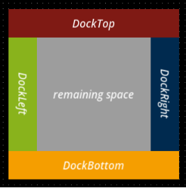
The "DockPanel" layout provides a layout area within it is possible to arrange child elements around the edge of the screen based on four direction: Top, Bottom, Left, and Right.

<div drawio-diagram="6275"><img src="https://doc316en.candera.eu/uploads/images/drawio/2024-06/drawing-5-1718378555.png" alt=""/></div>

<div class="contents" id="bkmrk--36"><div class="contents"><div class="textblock">  
</div></div></div>This type of layout arranges the elements by laying out them in the remaining space after the previous element was set. To dock an element to the center of the panel, it must be the last child of the panel.

<div drawio-diagram="8795"><img src="https://doc316en.candera.eu/uploads/images/drawio/2025-11/drawing-5-1763722666.png" alt=""/></div>

<div class="contents" id="bkmrk--38"><div class="contents"><div class="textblock">  
</div></div></div>Configure the DockPanel Layout by following these steps:

<div class="contents" id="bkmrk-select-the-group-hol-3"><div class="contents"><div class="contents"><div class="textblock">

1. Select the Group holding the nodes to be laid out in the Scene Tree panel
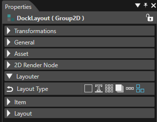
2. Choose Layout Type "DockPanel" from the Properties panel
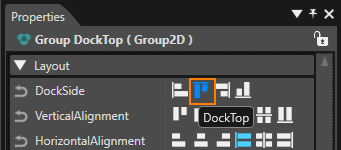
3. For any node inside the Group a new property will become available: "Dock Side". Select it and choose any of the fours available laying outs: "DockLeft", "DockTop", DockRight", "DockBottom".

</div></div></div></div><div drawio-diagram="8796"><img src="https://doc316en.candera.eu/uploads/images/drawio/2025-11/drawing-5-1763722869.png" alt=""/></div>

<div class="contents" id="bkmrk--49"><div class="contents"><div class="textblock">  
</div></div></div>**See also:**

<div class="contents" id="bkmrk-candera%3A%3Adockpanella"><div class="textblock">

- [Candera::DockPanelLayouter](http://dev.doc.cgistudio.at/APILINK/class_candera_1_1_dock_panel_layouter.html "The Dock Panel Layouter provides an easy docking of elements to the left, right, top, bottom or center of the panel. The dock side of an element is defined by the attached dynamic DockSide property. To dock an element to the center of the panel, it must be the last child of the panel.")

</div></div>

# MVG Nodes

MVG Nodes can be created in CGI Studio SceneComposer via the Toolbox. Simply drag and drop the desired MVG Node into the Scene Editor or Scene Tree Panel.

The following MVG Nodes are available:

- MVG Arc Node
- MVG Ellipse Node
- MVG Path Node
- MVG Rect Node

<div drawio-diagram="6279"><img src="https://doc316en.candera.eu/uploads/images/drawio/2024-06/drawing-5-1718378815.png" alt=""/></div>

<p class="callout info">You can see an application of MVG nodes in Scene Composer's **2D Basic sample**.</p>

#### Configure MVG Nodes

An MVG node is a RenderNode2D and therefore it has the same properties that can be configured in the properties panel:

- General. Name, Full Name, Description...
- 2D Render Node: Render Order Rank...
- Transformation: Position, Pivot Point, Pivot Offset...
- Asset: Id, Symbolic Name...
- Item: Scope Mask, Alpha Value...
- Layout: Vertical Alignment, Horizontal Alignment, Size...

Further details like the visual appearance of MVG nodes can be configured in the node's effect. Each type of MVG node has its appropriate effect:

<table border="1" id="bkmrk-mvg-node-mvg-brush-m" style="border-collapse: collapse; width: 41.8519%; height: 157px;"><colgroup><col style="width: 50.0412%;"></col><col style="width: 50.0412%;"></col></colgroup><tbody><tr><td>**MVG Node**  
</td><td>**MVG Brush**  
</td></tr><tr><td>MVG Arc Node </td><td>MVGArcBrush</td></tr><tr><td>MVG Ellipse Node </td><td>MVGEllipseBrush</td></tr><tr><td>MVG Path Node </td><td>MVGPathBrush</td></tr><tr><td>MVG Rect Node </td><td>MVGRectBrush</td></tr></tbody></table>

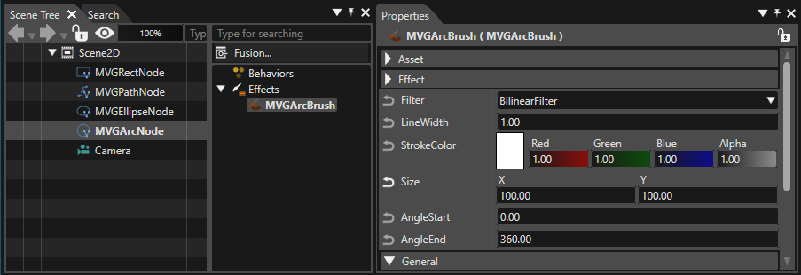
Select the MVG Node in the Scene Tree and select the attached MVG effect in the right side of the Scene Tree to view its properties in the properties panel.

<div drawio-diagram="7598"><img src="https://doc316en.candera.eu/uploads/images/drawio/2024-12/drawing-5-1733485928.png" alt=""/></div>

#### MVG Arc Node - MVGArcBrush

Can be used to render an arc.

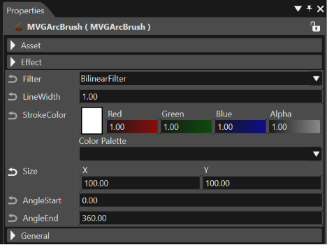
The properties of the MVG Arc Node are those of a regular RenderNode2D. For the attached effect MVGArcBrush, the following properties can be configured:

<div drawio-diagram="6282"><img src="https://doc316en.candera.eu/uploads/images/drawio/2024-06/drawing-5-1718379101.png" alt=""/></div>

<table border="1" id="bkmrk-filter-filter-for-re" style="border-collapse: collapse; width: 100%;"><colgroup><col style="width: 12.7324%;"></col><col style="width: 87.2244%;"></col></colgroup><tbody><tr><td>Filter  
</td><td>Filter for rendering (choose between BilinearFilter and NearestFilter).</td></tr><tr><td>Line Width  
</td><td>Width of the rendered line in pixels.</td></tr><tr><td>Stroke Color  
</td><td>Color of the rendered line.</td></tr><tr><td>Size  
</td><td>Vertical (X) and horizontal (Y) size of the arc to be rendered.</td></tr><tr><td>Angle Start  
</td><td>The angle of the arc's starting point.</td></tr><tr><td>Angle End  
</td><td>The angle of the arc's end point.</td></tr></tbody></table>

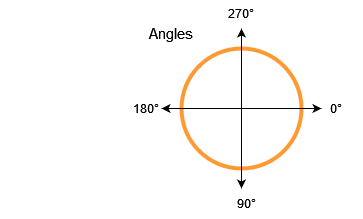
<p class="callout info">The arcs starting and end point have to be entered in degrees. Please also see the sketch below.</p>

<div drawio-diagram="4867"><img src="https://doc316en.candera.eu/uploads/images/drawio/2023-11/drawing-4-1700541631.png" alt=""/></div>

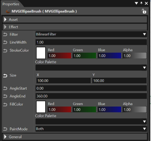
#### MVG Ellipse Node - MVGEllipseBrush

Can be used to render an ellipse.

The properties of the MVG Ellipse Node are those of a regular RenderNode2dD. For the attached effect MVGEllipseBrush, the following properties can be configured:

<div drawio-diagram="6283"><img src="https://doc316en.candera.eu/uploads/images/drawio/2024-06/drawing-5-1718379150.png" alt=""/></div>

<table border="1" id="bkmrk-filter-filter-for-re-1" style="border-collapse: collapse; width: 100%;"><colgroup><col style="width: 12.7324%;"></col><col style="width: 87.2244%;"></col></colgroup><tbody><tr><td>Filter  
</td><td>Filter for rendering (choose between BilinearFilter and NearestFilter).</td></tr><tr><td>Line Width  
</td><td>Width of the rendered line in pixels.</td></tr><tr><td>Stroke Color  
</td><td>Color of the rendered line.</td></tr><tr><td>Size  
</td><td>Vertical (X) and horizontal (Y) size of the arc to be rendered.</td></tr><tr><td>Angle Start  
</td><td>The angle of the ellipse's starting point.</td></tr><tr><td>Angle End  
</td><td>The angle of the ellipse's end point.</td></tr><tr><td>FillColor  
</td><td>Fill color of the ellipse.</td></tr><tr><td>PaintMode  
</td><td>Configures if the ellipse will be rendered with outline *and* filling or with either of those (choose between Both, Fill and Stroke).</td></tr></tbody></table>

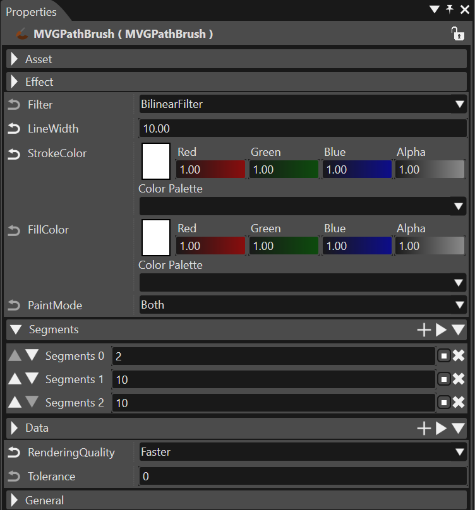
#### MVG Path Node - MVGPathBrush

Can be used to render paths with a combination of instructions.

The properties of the MVG Path Node are those of a regular RenderNode2dD. For the attached effect MVGPathBrush, the following properties can be configured:

<div drawio-diagram="6284"><img src="https://doc316en.candera.eu/uploads/images/drawio/2024-06/drawing-5-1718379295.png" alt=""/></div>

<table border="1" id="bkmrk-filter-filter-for-re-2" style="border-collapse: collapse; width: 100%;"><colgroup><col style="width: 14.8256%;"></col><col style="width: 85.1332%;"></col></colgroup><tbody><tr><td>Filter  
</td><td>Filter for rendering (choose between BilinearFilter and NearestFilter).</td></tr><tr><td>LineWidth  
</td><td>Width of the rendered line in pixels.</td></tr><tr><td>Stroke Color  
</td><td>Color of the rendered line.</td></tr><tr><td>FillColor  
</td><td>Fill color of the path.</td></tr><tr><td>PaintMode  
</td><td>Configures if the path will be rendered with outline *and* filling or with either of those (choose between Both, Fill and Stroke).</td></tr><tr><td>Segments</td><td>Defines segments.

<table border="1" style="width: 100.147%;"><tbody><tr><td class="align-center" style="width: 7.60042%;">Input value</td><td class="align-center" style="width: 17.8801%;">VGPathSegment</td><td class="align-center" style="width: 10.2862%;">number of Data</td><td class="align-center" style="width: 64.231%;">Description</td></tr><tr><td class="align-center" style="width: 7.60042%;">0</td><td style="width: 17.8801%;">ClosePath</td><td class="align-center" style="width: 10.2862%;">0</td><td style="width: 64.231%;">Closing a path by connecting a final coordinate to a start coordinate. Therefore, the required number of Data is 0.

</td></tr><tr><td class="align-center" style="width: 7.60042%;">2</td><td style="width: 17.8801%;">MoveTo</td><td class="align-center" style="width: 10.2862%;">2</td><td style="width: 64.231%;">Specify coordinates of a path starting point. Therefore, the required number of Data is two (x0, y0).

</td></tr><tr><td class="align-center" style="width: 7.60042%;">4</td><td style="width: 17.8801%;">LineTo</td><td class="align-center" style="width: 10.2862%;">2</td><td style="width: 64.231%;">Draws a straight line. Specify an end point coordinates. Therefore, the required number of Data is two (x0, y0). A straight line is drawn from a coordinates specified in the previous Segment to a coordinates specified in this Segment.

</td></tr><tr><td class="align-center" style="width: 7.60042%;">6</td><td style="width: 17.8801%;">HLineTo</td><td class="align-center" style="width: 10.2862%;">1</td><td style="width: 64.231%;">Draws a horizontal line. The required number of Data is only one (x0).

</td></tr><tr><td class="align-center" style="width: 7.60042%;">8</td><td style="width: 17.8801%;">VLineTo</td><td class="align-center" style="width: 10.2862%;">1</td><td style="width: 64.231%;">Draws a vertical line. The required number of Data is only one (y0).

</td></tr><tr><td class="align-center" style="width: 7.60042%;">10</td><td style="width: 17.8801%;">QuadTo</td><td class="align-center" style="width: 10.2862%;">4</td><td style="width: 64.231%;">Draws a quadratic Bezier curve. Specify a coordinates of a control point and an end point. Therefore, the required number of Data is 4 (x0, y0, x1, y1). Please refer the below image as an example.

</td></tr><tr><td class="align-center" style="width: 7.60042%;">12</td><td style="width: 17.8801%;">CubicTo</td><td class="align-center" style="width: 10.2862%;">6</td><td style="width: 64.231%;">Draws a cubic Bezier curve. Specify coordinates of two control points and an end point. Therefore, the required number of Data is 6 (x0, y0, x1, y1, x2, y2). Please refer the below image as an example.

</td></tr></tbody></table>

</td></tr><tr><td>Data</td><td>Defines Data according to the specified Segment.</td></tr></tbody></table>

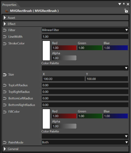
#### MVG Rect Node - MVGRectBrush

Can be used to render a rect.

The properties of the MVG Rect Node are those of a regular RenderNode2dD. For the attached MVGRectBrush, the following properties can be configured:

<div drawio-diagram="6285"><img src="https://doc316en.candera.eu/uploads/images/drawio/2024-06/drawing-5-1718379336.png" alt=""/></div>

<table border="1" id="bkmrk-filter-filter-for-re-3" style="border-collapse: collapse; width: 100%;"><colgroup><col style="width: 17.7939%;"></col><col style="width: 82.1649%;"></col></colgroup><tbody><tr><td>Filter  
</td><td>Filter for rendering (choose between BilinearFilter and NearestFilter).</td></tr><tr><td>LineWidth  
</td><td>Width of the rendered line in pixels.</td></tr><tr><td>Stroke Color  
</td><td>Color of the rendered line.</td></tr><tr><td>Size  
</td><td>Vertical (X) and horizontal (Y) size of the arc to be rendered</td></tr><tr><td>TopLeftRadius  
</td><td>Radius of the top left corner.  
</td></tr><tr><td>TopRightRadius  
</td><td>Radius of the top right corner.</td></tr><tr><td>BottomLeftRadius  
</td><td>Radius of the bottom left corner.</td></tr><tr><td>BottomRightRadius  
</td><td>Radius of the bottom right corner.</td></tr><tr><td>FillColor  
</td><td>Fill color of the path.</td></tr><tr><td>PaintMode  
</td><td>Configures if the rectangle will be rendered with outline *and* filling or with either of those (choose between Both, Fill and Stroke).</td></tr></tbody></table>

# Referencing external resource

External resources can be referenced and drawn on the scene editor. This feature is only available when launching Scene Composer on the Android platform.

#### Resource Reference Menu

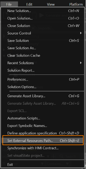
\[ Set External Resource Path... \] in the menu bar under \[ File \] to browse external resources. This menu is grayed out and not selectable for Scene Composer on non-Android platforms.

<p class="callout info">Referable external resource file formats are \*.bmp, \*.jpg, \*.jpeg, \*.gif, \*.tga, \*.png, \*.dds, \*.hdr, and \*.exr.</p>

<div drawio-diagram="6286"><img src="https://doc316en.candera.eu/uploads/images/drawio/2024-06/drawing-5-1718379539.png" alt=""/></div>

#### Basic Usage

1. Run Scene Composer and open a new or existing solution file.
2. From \[ File \] menu in the menu bar, select \[ Set External Resource Path... \].
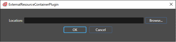
3. The ExternalResourceContainerPlugin dialog will appear.  
    <div drawio-diagram="3766"><img src="https://doc316en.candera.eu/uploads/images/drawio/2023-06/drawing-4-1686202601.png" alt=""/></div>
4. Click the \[ Browse... \] button in the dialog to select the external resource folder to be referenced.  
    
    - Select the Android Studio project folder.

<p class="callout info">The behaviors **Set External Bitmap**, **Check External Resource Change**, and **External Bitmap Provider** are used to display external resources. For details on each behavior and their usage, please refer to <span style="text-decoration: underline;"><span style="color: rgb(230, 126, 35); text-decoration: underline;">[this page](https://doc316en.candera.eu/books/controls-and-behaviors/page/external-resource)</span></span>.</p>