# Sample Solutions

This book describes the sample solutions included in Scene Composer.

- Depending on the supported platform and the package type, the set of bundled sample solutions may differ. For details, see the **[Sample/Device Correlation Table](https://doc316en.candera.eu/books/sample-solutions/page/sampledevice-correlation-table)**.
- In the **Professional Edition**, the only bundled sample that can be executed on the target is the **[Blood Pressure solution](https://doc316en.candera.eu/books/sample-solutions/page/blood-pressure-solution)**.
- Some of the other samples include data binding definitions intended for the **Enterprise Edition**, and therefore cannot be executed on a **Professional Edition** target.
- Before you start, check [**CGI Studio Editions**](https://doc316en.candera.eu/shelves/0-cgi-studio-editions) for edition-specific limitations.

# Sample/Device Correlation Table

The sample solutions included in Scene Composer vary depending on the platform (package type). This section illustrates the correlation between each platform and its corresponding sample solutions.

<table class="align-left" id="bkmrk-androidopengles30-dr" style="border-collapse:collapse;width:801px;border-width:1px;border-spacing:200px;"><colgroup><col style="width:220px;"></col><col style="width:110px;"></col><col style="width:110px;"></col><col style="width:110px;"></col><col style="width:110px;"></col><col style="width:110px;"></col></colgroup><tbody><tr style="background-color:rgb(35,111,161);"><td></td><td><span style="color:rgb(255,255,255);">Android  
OpenGLES30</span></td><td><span style="color:rgb(255,255,255);">DrmKms  
OpenGLES20</span></td><td><span style="color:rgb(255,255,255);">DrmKms  
OpenGLES30</span></td><td><span style="color:rgb(255,255,255);">Fbdev OpenGLES20</span></td><td><span style="color:rgb(255,255,255);">Fbdev OpenGLES30</span></td></tr><tr><td>[Empty](https://doc316en.candera.eu/books/sample-solutions/page/empty-solution)</td><td class="align-center">○</td><td class="align-center">○</td><td class="align-center">○</td><td class="align-center">○</td><td class="align-center">○</td></tr><tr style="background-color:rgb(236,240,241);"><td>[2D Basic](https://doc316en.candera.eu/books/sample-solutions/page/2d-basic-solution)</td><td class="align-center">○</td><td class="align-center">○</td><td class="align-center">○</td><td class="align-center">○</td><td class="align-center">○</td></tr><tr><td>[2D Effects](https://doc316en.candera.eu/books/sample-solutions/page/2d-effects-solution)</td><td class="align-center">○</td><td class="align-center">○</td><td class="align-center">○</td><td class="align-center">○</td><td class="align-center">○</td></tr><tr style="background-color:rgb(236,240,241);"><td>[3D Basic](https://doc316en.candera.eu/books/sample-solutions/page/3d-basic-solution)</td><td class="align-center">○</td><td class="align-center">○</td><td class="align-center">○</td><td class="align-center">○</td><td class="align-center">○</td></tr><tr><td>[3D Effects](https://doc316en.candera.eu/books/sample-solutions/page/3d-effects-solution)</td><td class="align-center">○</td><td class="align-center">○</td><td class="align-center">○</td><td class="align-center">○</td><td class="align-center">○</td></tr><tr style="background-color:rgb(236,240,241);"><td>[3D Getting Started](https://doc316en.candera.eu/books/sample-solutions/page/3d-getting-started-solution)</td><td class="align-center">○</td><td class="align-center">○</td><td class="align-center">○</td><td class="align-center">○</td><td class="align-center">○</td></tr><tr><td>[ADAS Template](https://doc316en.candera.eu/books/sample-solutions/page/3d-adas-control-solution)</td><td class="align-center">○</td><td class="align-center">ー</td><td class="align-center">○</td><td class="align-center">ー</td><td class="align-center">○</td></tr><tr style="background-color:rgb(236,240,241);"><td>[Advanced Cluster](https://doc316en.candera.eu/books/best-practice/chapter/advanced-cluster-solution)</td><td class="align-center">○</td><td class="align-center">○</td><td class="align-center">○</td><td class="align-center">○</td><td class="align-center">○</td></tr><tr><td>[Blood Pressure Device](https://doc316en.candera.eu/books/sample-solutions/page/blood-pressure-solution)</td><td class="align-center">○</td><td class="align-center">○</td><td class="align-center" style="border-width:1px;">○</td><td class="align-center">○</td><td class="align-center">○</td></tr><tr style="background-color:rgb(236,240,241);"><td>[GettingStartedControls](https://doc316en.candera.eu/books/best-practice/chapter/gettingstartedcontrols-solution)</td><td class="align-center">○</td><td class="align-center">○</td><td class="align-center">○</td><td class="align-center">○</td><td class="align-center">○</td></tr><tr><td>[glTF Extensions](https://doc316en.candera.eu/books/sample-solutions/page/gltf-extensions-solution)</td><td class="align-center">○</td><td class="align-center">○</td><td class="align-center">○</td><td class="align-center">○</td><td class="align-center">○</td></tr><tr style="background-color:rgb(236,240,241);"><td>[Industrial](https://doc316en.candera.eu/books/sample-solutions/page/industrial-solution)</td><td class="align-center">○</td><td class="align-center">○</td><td class="align-center">○</td><td class="align-center">○</td><td class="align-center">○</td></tr><tr><td>[Instrument Cluster](https://doc316en.candera.eu/books/sample-solutions/page/instrument-cluster-solution)</td><td class="align-center">○</td><td class="align-center">○</td><td class="align-center">○</td><td class="align-center">○</td><td class="align-center">○</td></tr><tr style="background-color:rgb(236,240,241);"><td>[In-Vehicle Infotainment](https://doc316en.candera.eu/books/sample-solutions/page/in-vehicle-infotainment-solution)</td><td class="align-center">○</td><td class="align-center">○</td><td class="align-center">○</td><td class="align-center">○</td><td class="align-center">○</td></tr><tr><td>[Layouter](https://doc316en.candera.eu/books/sample-solutions/page/layouter-solution)</td><td class="align-center">○</td><td class="align-center">○</td><td class="align-center">○</td><td class="align-center">○</td><td class="align-center">○</td></tr><tr style="background-color:rgb(236,240,241);"><td>[Materials](https://doc316en.candera.eu/books/sample-solutions/page/materials-solution)</td><td class="align-center">○</td><td class="align-center">○</td><td class="align-center">○</td><td class="align-center">○</td><td class="align-center">○</td></tr><tr><td>[MenuScreens](https://doc316en.candera.eu/books/sample-solutions/page/menuscreens-solution)</td><td class="align-center">○</td><td class="align-center">○</td><td class="align-center">○</td><td class="align-center">○</td><td class="align-center">○</td></tr><tr style="background-color:rgb(236,240,241);"><td>[MixedReality](https://doc316en.candera.eu/books/sample-solutions/page/mixedreality-solution)</td><td class="align-center">○</td><td class="align-center">ー</td><td class="align-center">ー</td><td class="align-center">ー</td><td class="align-center">ー</td></tr><tr><td>[OpenGL 2D Effects](https://doc316en.candera.eu/books/sample-solutions/page/opengl-2d-effects-solution)</td><td class="align-center">○</td><td class="align-center">○</td><td class="align-center">○</td><td class="align-center">○</td><td class="align-center">○</td></tr><tr style="background-color:rgb(236,240,241);"><td>[Physically Based Rendering](https://doc316en.candera.eu/books/sample-solutions/page/physically-based-rendering-solution)</td><td class="align-center">○</td><td class="align-center">○</td><td class="align-center">○</td><td class="align-center">○</td><td class="align-center">○</td></tr><tr><td>[Post Processing](https://doc316en.candera.eu/books/sample-solutions/page/post-processing-solution)</td><td class="align-center">○</td><td class="align-center">○</td><td class="align-center">○</td><td class="align-center">○</td><td class="align-center">○</td></tr><tr style="background-color:rgb(236,240,241);"><td>[Scripting](https://doc316en.candera.eu/books/sample-solutions/page/scripting-solution)</td><td class="align-center">○</td><td class="align-center">ー</td><td class="align-center">○</td><td class="align-center">ー</td><td class="align-center">○</td></tr><tr><td class="align-left"><span style="color:rgb(230,126,35);">[Transition](https://doc316en.candera.eu/books/sample-solutions/page/transitions-solution)</span></td><td class="align-center">○</td><td class="align-center">○</td><td class="align-center">○</td><td class="align-center">○</td><td class="align-center">○</td></tr></tbody></table>

<table class="align-left" id="bkmrk-opengles20opengles20" style="border-collapse:collapse;width:800px;border-width:1px;border-spacing:200px;"><colgroup><col style="width:220px;"></col><col style="width:110px;"></col><col style="width:110px;"></col><col style="width:110px;"></col><col style="width:110px;"></col><col style="width:110px;"></col></colgroup><tbody><tr style="background-color:rgb(35,111,161);"><td></td><td><span style="color:rgb(255,255,255);">iMX6  
OpenGLES30</span></td><td><span style="color:rgb(255,255,255);">iOS OpenGLES30</span></td><td><span style="color:rgb(255,255,255);">NullWs OpenGLES20</span></td><td><span style="color:rgb(255,255,255);">NullWs OpenGLES30</span></td><td><span style="color:rgb(255,255,255);">OpenGlEs20  
OpenGLES20</span></td></tr><tr><td>[Empty](https://doc316en.candera.eu/books/sample-solutions/page/empty-solution)</td><td class="align-center">○</td><td class="align-center">○</td><td class="align-center">○</td><td class="align-center">○</td><td class="align-center">ー</td></tr><tr style="background-color:rgb(236,240,241);"><td>[2D Basic](https://doc316en.candera.eu/books/sample-solutions/page/2d-basic-solution)</td><td class="align-center">○</td><td class="align-center">○</td><td class="align-center">○</td><td class="align-center">○</td><td class="align-center">ー</td></tr><tr><td>[2D Effects](https://doc316en.candera.eu/books/sample-solutions/page/2d-effects-solution)</td><td class="align-center">○</td><td class="align-center">○</td><td class="align-center">○</td><td class="align-center">○</td><td class="align-center">ー</td></tr><tr style="background-color:rgb(236,240,241);"><td>[3D Basic](https://doc316en.candera.eu/books/sample-solutions/page/3d-basic-solution)</td><td class="align-center">○</td><td class="align-center">○</td><td class="align-center">○</td><td class="align-center">○</td><td class="align-center">ー</td></tr><tr><td>[3D Effects](https://doc316en.candera.eu/books/sample-solutions/page/3d-effects-solution)</td><td class="align-center">○</td><td class="align-center">○</td><td class="align-center">○</td><td class="align-center">○</td><td class="align-center">ー</td></tr><tr style="background-color:rgb(236,240,241);"><td>[3D Getting Started](https://doc316en.candera.eu/books/sample-solutions/page/3d-getting-started-solution)</td><td class="align-center">○</td><td class="align-center">○</td><td class="align-center">○</td><td class="align-center">○</td><td class="align-center">ー</td></tr><tr><td>[ADAS Template](https://doc316en.candera.eu/books/sample-solutions/page/3d-adas-control-solution)</td><td class="align-center">○</td><td class="align-center">○</td><td class="align-center">ー</td><td class="align-center">○</td><td class="align-center">ー</td></tr><tr style="background-color:rgb(236,240,241);"><td>[Advanced Cluster](https://doc316en.candera.eu/books/best-practice/chapter/advanced-cluster-solution)</td><td class="align-center">○</td><td class="align-center">○</td><td class="align-center">○</td><td class="align-center">○</td><td class="align-center">ー</td></tr><tr><td>[Blood Pressure Device](https://doc316en.candera.eu/books/sample-solutions/page/blood-pressure-solution)</td><td class="align-center">○</td><td class="align-center">○</td><td class="align-center">○</td><td class="align-center">○</td><td class="align-center">ー</td></tr><tr style="background-color:rgb(236,240,241);"><td>[GettingStartedControls](https://doc316en.candera.eu/books/best-practice/chapter/gettingstartedcontrols-solution)</td><td class="align-center">○</td><td class="align-center">○</td><td class="align-center">○</td><td class="align-center">○</td><td class="align-center">ー</td></tr><tr><td>[glTF Extensions](https://doc316en.candera.eu/books/sample-solutions/page/gltf-extensions-solution)</td><td class="align-center">○</td><td class="align-center">ー</td><td class="align-center">○</td><td class="align-center">○</td><td class="align-center">ー</td></tr><tr style="background-color:rgb(236,240,241);"><td>[Industrial](https://doc316en.candera.eu/books/sample-solutions/page/industrial-solution)</td><td class="align-center">○</td><td class="align-center">○</td><td class="align-center">○</td><td class="align-center">○</td><td class="align-center">ー</td></tr><tr><td>[Instrument Cluster](https://doc316en.candera.eu/books/sample-solutions/page/instrument-cluster-solution)</td><td class="align-center">○</td><td class="align-center">ー</td><td class="align-center">○</td><td class="align-center">○</td><td class="align-center">ー</td></tr><tr style="background-color:rgb(236,240,241);"><td>[In-Vehicle Infotainment](https://doc316en.candera.eu/books/sample-solutions/page/in-vehicle-infotainment-solution)</td><td class="align-center">○</td><td class="align-center">ー</td><td class="align-center">○</td><td class="align-center">○</td><td class="align-center">ー</td></tr><tr><td>[Layouter](https://doc316en.candera.eu/books/sample-solutions/page/layouter-solution)</td><td class="align-center">○</td><td class="align-center">○</td><td class="align-center">○</td><td class="align-center">○</td><td class="align-center">ー</td></tr><tr style="background-color:rgb(236,240,241);"><td>[Materials](https://doc316en.candera.eu/books/sample-solutions/page/materials-solution)</td><td class="align-center">○</td><td class="align-center">○</td><td class="align-center">○</td><td class="align-center">○</td><td class="align-center">ー</td></tr><tr><td>[MenuScreens](https://doc316en.candera.eu/books/sample-solutions/page/menuscreens-solution)</td><td class="align-center">○</td><td class="align-center">○</td><td class="align-center">○</td><td class="align-center">○</td><td class="align-center">ー</td></tr><tr style="background-color:rgb(236,240,241);"><td>[MixedReality](https://doc316en.candera.eu/books/sample-solutions/page/mixedreality-solution)</td><td class="align-center">○</td><td class="align-center">ー</td><td class="align-center">○</td><td class="align-center">○</td><td class="align-center">ー</td></tr><tr><td>[OpenGL 2D Effects](https://doc316en.candera.eu/books/sample-solutions/page/opengl-2d-effects-solution)</td><td class="align-center">○</td><td class="align-center">○</td><td class="align-center">○</td><td class="align-center">○</td><td class="align-center">ー</td></tr><tr style="background-color:rgb(236,240,241);"><td>[Physically Based Rendering](https://doc316en.candera.eu/books/sample-solutions/page/physically-based-rendering-solution)</td><td class="align-center">○</td><td class="align-center">○</td><td class="align-center">○</td><td class="align-center">○</td><td class="align-center">ー</td></tr><tr><td>[Post Processing](https://doc316en.candera.eu/books/sample-solutions/page/post-processing-solution)</td><td class="align-center">○</td><td class="align-center">○</td><td class="align-center">○</td><td class="align-center">○</td><td class="align-center">ー</td></tr><tr style="background-color:rgb(236,240,241);"><td>[Scripting](https://doc316en.candera.eu/books/sample-solutions/page/scripting-solution)</td><td class="align-center">○</td><td class="align-center">○</td><td class="align-center">ー</td><td class="align-center">○</td><td class="align-center">ー</td></tr><tr><td>[Transition](https://doc316en.candera.eu/books/sample-solutions/page/transitions-solution)</td><td class="align-center">○</td><td class="align-center">○</td><td class="align-center">○</td><td class="align-center">○</td><td class="align-center">ー</td></tr></tbody></table>

<table class="align-left" id="bkmrk-qnxscreen-opengles20" style="border-collapse:collapse;width:800px;border-width:1px;border-spacing:200px;"><colgroup><col style="width:220px;"></col><col style="width:110px;"></col><col style="width:110px;"></col><col style="width:110px;"></col><col style="width:110px;"></col><col style="width:110px;"></col></colgroup><tbody><tr style="background-color:rgb(35,111,161);"><td></td><td><span style="color:rgb(255,255,255);">OpenGlEs30  
OpenGLES30</span></td><td><span style="color:rgb(255,255,255);">QnxScreen OpenGLES20</span></td><td><span style="color:rgb(255,255,255);">QnxScreen OpenGLES30</span></td><td><span style="color:rgb(255,255,255);">RCarD3  
OpenGLES30</span></td><td><span style="color:rgb(255,255,255);">RCarGen3 2Dover3D  
OpenGLES30</span></td></tr><tr><td>[Empty](https://doc316en.candera.eu/books/sample-solutions/page/empty-solution)</td><td class="align-center">ー</td><td class="align-center">○</td><td class="align-center">○</td><td class="align-center">○</td><td class="align-center">○</td></tr><tr style="background-color:rgb(236,240,241);"><td>[2D Basic](https://doc316en.candera.eu/books/sample-solutions/page/2d-basic-solution)</td><td class="align-center">ー</td><td class="align-center">○</td><td class="align-center">○</td><td class="align-center">○</td><td class="align-center">○</td></tr><tr><td>[2D Effects](https://doc316en.candera.eu/books/sample-solutions/page/2d-effects-solution)</td><td class="align-center">ー</td><td class="align-center">○</td><td class="align-center">○</td><td class="align-center">○</td><td class="align-center">○</td></tr><tr style="background-color:rgb(236,240,241);"><td>[3D Basic](https://doc316en.candera.eu/books/sample-solutions/page/3d-basic-solution)</td><td class="align-center">ー</td><td class="align-center">○</td><td class="align-center">○</td><td class="align-center">○</td><td class="align-center">○</td></tr><tr><td>[3D Effects](https://doc316en.candera.eu/books/sample-solutions/page/3d-effects-solution)</td><td class="align-center">ー</td><td class="align-center">○</td><td class="align-center">○</td><td class="align-center">ー</td><td class="align-center">○</td></tr><tr style="background-color:rgb(236,240,241);"><td>[3D Getting Started](https://doc316en.candera.eu/books/sample-solutions/page/3d-getting-started-solution)</td><td class="align-center">ー</td><td class="align-center">○</td><td class="align-center">○</td><td class="align-center">○</td><td class="align-center">○</td></tr><tr><td>[ADAS Template](https://doc316en.candera.eu/books/sample-solutions/page/3d-adas-control-solution)</td><td class="align-center">ー</td><td class="align-center">ー</td><td class="align-center">○</td><td class="align-center">○</td><td class="align-center">○</td></tr><tr style="background-color:rgb(236,240,241);"><td>[Advanced Cluster](https://doc316en.candera.eu/books/best-practice/chapter/advanced-cluster-solution)</td><td class="align-center">ー</td><td class="align-center">○</td><td class="align-center">○</td><td class="align-center">○</td><td class="align-center">○</td></tr><tr><td>[Blood Pressure Device](https://doc316en.candera.eu/books/sample-solutions/page/blood-pressure-solution)</td><td class="align-center">ー</td><td class="align-center">○</td><td class="align-center">○</td><td class="align-center">○</td><td class="align-center">○</td></tr><tr style="background-color:rgb(236,240,241);"><td>[GettingStartedControls](https://doc316en.candera.eu/books/best-practice/chapter/gettingstartedcontrols-solution)</td><td class="align-center">ー</td><td class="align-center">○</td><td class="align-center">○</td><td class="align-center">○</td><td class="align-center">○</td></tr><tr><td>[glTF Extensions](https://doc316en.candera.eu/books/sample-solutions/page/gltf-extensions-solution)</td><td class="align-center">ー</td><td class="align-center">○</td><td class="align-center">○</td><td class="align-center">○</td><td class="align-center">○</td></tr><tr style="background-color:rgb(236,240,241);"><td>[Industrial](https://doc316en.candera.eu/books/sample-solutions/page/industrial-solution)</td><td class="align-center">ー</td><td class="align-center">○</td><td class="align-center">○</td><td class="align-center">○</td><td class="align-center">○</td></tr><tr><td>[Instrument Cluster](https://doc316en.candera.eu/books/sample-solutions/page/instrument-cluster-solution)</td><td class="align-center">ー</td><td class="align-center">○</td><td class="align-center">○</td><td class="align-center">○</td><td class="align-center">○</td></tr><tr style="background-color:rgb(236,240,241);"><td>[In-Vehicle Infotainment](https://doc316en.candera.eu/books/sample-solutions/page/in-vehicle-infotainment-solution)</td><td class="align-center">ー</td><td class="align-center">○</td><td class="align-center">○</td><td class="align-center">○</td><td class="align-center">○</td></tr><tr><td>[Layouter](https://doc316en.candera.eu/books/sample-solutions/page/layouter-solution)</td><td class="align-center">ー</td><td class="align-center">○</td><td class="align-center">○</td><td class="align-center">○</td><td class="align-center">○</td></tr><tr style="background-color:rgb(236,240,241);"><td>[Materials](https://doc316en.candera.eu/books/sample-solutions/page/materials-solution)</td><td class="align-center">ー</td><td class="align-center">○</td><td class="align-center">○</td><td class="align-center">ー</td><td class="align-center">○</td></tr><tr><td>[MenuScreens](https://doc316en.candera.eu/books/sample-solutions/page/menuscreens-solution)</td><td class="align-center">ー</td><td class="align-center">○</td><td class="align-center">○</td><td class="align-center">○</td><td class="align-center">○</td></tr><tr style="background-color:rgb(236,240,241);"><td>[MixedReality](https://doc316en.candera.eu/books/sample-solutions/page/mixedreality-solution)</td><td class="align-center">ー</td><td class="align-center">ー</td><td class="align-center">ー</td><td class="align-center">○</td><td class="align-center">ー</td></tr><tr><td>[OpenGL 2D Effects](https://doc316en.candera.eu/books/sample-solutions/page/opengl-2d-effects-solution)</td><td class="align-center">ー</td><td class="align-center">○</td><td class="align-center">○</td><td class="align-center">○</td><td class="align-center">○</td></tr><tr style="background-color:rgb(236,240,241);"><td>[Physically Based Rendering](https://doc316en.candera.eu/books/sample-solutions/page/physically-based-rendering-solution)</td><td class="align-center">ー</td><td class="align-center">○</td><td class="align-center">○</td><td class="align-center">○</td><td class="align-center">○</td></tr><tr><td>[Post Processing](https://doc316en.candera.eu/books/sample-solutions/page/post-processing-solution)</td><td class="align-center">ー</td><td class="align-center">○</td><td class="align-center">○</td><td class="align-center">○</td><td class="align-center">○</td></tr><tr style="background-color:rgb(236,240,241);"><td>[Scripting](https://doc316en.candera.eu/books/sample-solutions/page/scripting-solution)</td><td class="align-center">ー</td><td class="align-center">ー</td><td class="align-center">○</td><td class="align-center">ー</td><td class="align-center">○</td></tr><tr><td>[Transition](https://doc316en.candera.eu/books/sample-solutions/page/transitions-solution)</td><td class="align-center">ー</td><td class="align-center">○</td><td class="align-center">○</td><td class="align-center">○</td><td class="align-center">○</td></tr></tbody></table>

<table class="align-left" id="bkmrk-rh850d1mxopengles20-" style="border-collapse:collapse;width:800px;border-width:1px;border-spacing:200px;"><colgroup><col style="width:220px;"></col><col style="width:110px;"></col><col style="width:110px;"></col><col style="width:110px;"></col><col style="width:110px;"></col><col style="width:110px;"></col></colgroup><tbody><tr style="background-color:rgb(35,111,161);"><td></td><td><span style="color:rgb(255,255,255);">RCarH3  
OpenGLES30</span></td><td><span style="color:rgb(255,255,255);">RT117X OpenGLES20</span></td><td><span style="color:rgb(255,255,255);">RZA1H  
OpenGLES20</span></td><td><span style="color:rgb(255,255,255);">SoftwareRenderer2D  
OpenGLES20</span></td><td><span style="color:rgb(255,255,255);">Traveo2  
OpenGLES20</span>  
</td></tr><tr><td>[Empty](https://doc316en.candera.eu/books/sample-solutions/page/empty-solution)</td><td class="align-center">○</td><td class="align-center">○</td><td class="align-center">○</td><td class="align-center">○</td><td class="align-center">○</td></tr><tr style="background-color:rgb(236,240,241);"><td>[2D Basic](https://doc316en.candera.eu/books/sample-solutions/page/2d-basic-solution)</td><td class="align-center">○</td><td class="align-center">○</td><td class="align-center">○</td><td class="align-center">○</td><td class="align-center">○</td></tr><tr><td>[2D Effects](https://doc316en.candera.eu/books/sample-solutions/page/2d-effects-solution)</td><td class="align-center">○</td><td class="align-center">○</td><td class="align-center">ー</td><td class="align-center">○</td><td class="align-center">○</td></tr><tr style="background-color:rgb(236,240,241);"><td>[3D Basic](https://doc316en.candera.eu/books/sample-solutions/page/3d-basic-solution)</td><td class="align-center">○</td><td class="align-center">ー</td><td class="align-center">ー</td><td class="align-center">ー</td><td class="align-center">ー</td></tr><tr><td>[3D Effects](https://doc316en.candera.eu/books/sample-solutions/page/3d-effects-solution)</td><td class="align-center">○</td><td class="align-center">ー</td><td class="align-center">ー</td><td class="align-center">ー</td><td class="align-center">ー</td></tr><tr style="background-color:rgb(236,240,241);"><td>[3D Getting Started](https://doc316en.candera.eu/books/sample-solutions/page/3d-getting-started-solution)</td><td class="align-center">○</td><td class="align-center">ー</td><td class="align-center">ー</td><td class="align-center">ー</td><td class="align-center">ー</td></tr><tr><td>[ADAS Template](https://doc316en.candera.eu/books/sample-solutions/page/3d-adas-control-solution)</td><td class="align-center">○</td><td class="align-center">ー</td><td class="align-center">ー</td><td class="align-center">ー</td><td class="align-center">ー</td></tr><tr style="background-color:rgb(236,240,241);"><td>[Advanced Cluster](https://doc316en.candera.eu/books/best-practice/chapter/advanced-cluster-solution)</td><td class="align-center">○</td><td class="align-center">ー</td><td class="align-center">ー</td><td class="align-center">ー</td><td class="align-center">ー</td></tr><tr><td>[Blood Pressure Device](https://doc316en.candera.eu/books/sample-solutions/page/blood-pressure-solution)</td><td class="align-center">○</td><td class="align-center">ー</td><td class="align-center">ー</td><td class="align-center">ー</td><td class="align-center">ー</td></tr><tr style="background-color:rgb(236,240,241);"><td>[GettingStartedControls](https://doc316en.candera.eu/books/best-practice/chapter/gettingstartedcontrols-solution)</td><td class="align-center">○</td><td class="align-center">ー</td><td class="align-center">ー</td><td class="align-center">ー</td><td class="align-center">ー</td></tr><tr><td>[glTF Extensions](https://doc316en.candera.eu/books/sample-solutions/page/gltf-extensions-solution)</td><td class="align-center">○</td><td class="align-center">ー</td><td class="align-center">ー</td><td class="align-center">ー</td><td class="align-center">ー</td></tr><tr style="background-color:rgb(236,240,241);"><td>[Industrial](https://doc316en.candera.eu/books/sample-solutions/page/industrial-solution)</td><td class="align-center">○</td><td class="align-center">ー</td><td class="align-center">ー</td><td class="align-center">ー</td><td class="align-center">ー</td></tr><tr><td>[Instrument Cluster](https://doc316en.candera.eu/books/sample-solutions/page/instrument-cluster-solution)</td><td class="align-center">○</td><td class="align-center">ー</td><td class="align-center">ー</td><td class="align-center">ー</td><td class="align-center">ー</td></tr><tr style="background-color:rgb(236,240,241);"><td>[In-Vehicle Infotainment](https://doc316en.candera.eu/books/sample-solutions/page/in-vehicle-infotainment-solution)</td><td class="align-center">○</td><td class="align-center">ー</td><td class="align-center">ー</td><td class="align-center">ー</td><td class="align-center">ー</td></tr><tr><td>[Layouter](https://doc316en.candera.eu/books/sample-solutions/page/layouter-solution)</td><td class="align-center">○</td><td class="align-center">○</td><td class="align-center">ー</td><td class="align-center">○</td><td class="align-center">○</td></tr><tr style="background-color:rgb(236,240,241);"><td>[Materials](https://doc316en.candera.eu/books/sample-solutions/page/materials-solution)</td><td class="align-center">○</td><td class="align-center">ー</td><td class="align-center">ー</td><td class="align-center">ー</td><td class="align-center">ー</td></tr><tr><td>[MenuScreens](https://doc316en.candera.eu/books/sample-solutions/page/menuscreens-solution)</td><td class="align-center">○</td><td class="align-center">ー</td><td class="align-center">ー</td><td class="align-center">ー</td><td class="align-center">ー</td></tr><tr style="background-color:rgb(236,240,241);"><td>[MixedReality](https://doc316en.candera.eu/books/sample-solutions/page/mixedreality-solution)</td><td class="align-center">ー</td><td class="align-center">ー</td><td class="align-center">ー</td><td class="align-center">ー</td><td class="align-center">ー</td></tr><tr><td>[OpenGL 2D Effects](https://doc316en.candera.eu/books/sample-solutions/page/opengl-2d-effects-solution)</td><td class="align-center">○</td><td class="align-center">ー</td><td class="align-center">ー</td><td class="align-center">ー</td><td class="align-center">ー</td></tr><tr style="background-color:rgb(236,240,241);"><td>[Physically Based Rendering](https://doc316en.candera.eu/books/sample-solutions/page/physically-based-rendering-solution)</td><td class="align-center">○</td><td class="align-center">ー</td><td class="align-center">ー</td><td class="align-center">ー</td><td class="align-center">ー</td></tr><tr><td>[Post Processing](https://doc316en.candera.eu/books/sample-solutions/page/post-processing-solution)</td><td class="align-center">○</td><td class="align-center">ー</td><td class="align-center">ー</td><td class="align-center">ー</td><td class="align-center">ー</td></tr><tr style="background-color:rgb(236,240,241);"><td>[Scripting](https://doc316en.candera.eu/books/sample-solutions/page/scripting-solution)</td><td class="align-center">○</td><td class="align-center">ー</td><td class="align-center">ー</td><td class="align-center">ー</td><td class="align-center">ー</td></tr><tr><td>[Transition](https://doc316en.candera.eu/books/sample-solutions/page/transitions-solution)</td><td class="align-center">○</td><td class="align-center">○</td><td class="align-center">ー</td><td class="align-center">○</td><td class="align-center">○</td></tr></tbody></table>

<table class="align-left" id="bkmrk-waylandopengles20-wa" style="border-collapse:collapse;width:570px;border-width:1px;border-spacing:200px;"><colgroup><col style="width:220px;"></col><col style="width:110px;"></col><col style="width:110px;"></col><col style="width:110px;"></col></colgroup><tbody><tr style="background-color:rgb(35,111,161);"><td></td><td><span style="color:rgb(255,255,255);">Wayland  
OpenGLES20</span></td><td><span style="color:rgb(255,255,255);">Wayland  
OpenGLES20   
Professional</span></td><td><span style="color:rgb(255,255,255);">Wayland  
OpenGLES30</span></td></tr><tr><td>[Empty](https://doc316en.candera.eu/books/sample-solutions/page/empty-solution)</td><td class="align-center">○</td><td class="align-center">○</td><td class="align-center">○</td></tr><tr style="background-color:rgb(236,240,241);"><td>[2D Basic](https://doc316en.candera.eu/books/sample-solutions/page/2d-basic-solution)</td><td class="align-center">○</td><td class="align-center">○</td><td class="align-center">○</td></tr><tr><td>[2D Effects](https://doc316en.candera.eu/books/sample-solutions/page/2d-effects-solution)</td><td class="align-center">○</td><td class="align-center">○</td><td class="align-center">○</td></tr><tr style="background-color:rgb(236,240,241);"><td>[3D Basic](https://doc316en.candera.eu/books/sample-solutions/page/3d-basic-solution)</td><td class="align-center">○</td><td class="align-center">○</td><td class="align-center">○</td></tr><tr><td>[3D Effects](https://doc316en.candera.eu/books/sample-solutions/page/3d-effects-solution)</td><td class="align-center">○</td><td class="align-center">○</td><td class="align-center">○</td></tr><tr style="background-color:rgb(236,240,241);"><td>[3D Getting Started](https://doc316en.candera.eu/books/sample-solutions/page/3d-getting-started-solution)</td><td class="align-center">○</td><td class="align-center">○</td><td class="align-center">○</td></tr><tr><td>[ADAS Template](https://doc316en.candera.eu/books/sample-solutions/page/3d-adas-control-solution)</td><td class="align-center">ー</td><td class="align-center">ー</td><td class="align-center">○</td></tr><tr style="background-color:rgb(236,240,241);"><td>[Advanced Cluster](https://doc316en.candera.eu/books/best-practice/chapter/advanced-cluster-solution)</td><td class="align-center">○</td><td class="align-center">○</td><td class="align-center">○</td></tr><tr><td>[Blood Pressure Device](https://doc316en.candera.eu/books/sample-solutions/page/blood-pressure-solution)</td><td class="align-center">○</td><td class="align-center">○</td><td class="align-center">○</td></tr><tr style="background-color:rgb(236,240,241);"><td>[GettingStartedControls](https://doc316en.candera.eu/books/best-practice/chapter/gettingstartedcontrols-solution)</td><td class="align-center">○</td><td class="align-center">○</td><td class="align-center">○</td></tr><tr><td>[glTF Extensions](https://doc316en.candera.eu/books/sample-solutions/page/gltf-extensions-solution)</td><td class="align-center">○</td><td class="align-center">○</td><td class="align-center">○</td></tr><tr style="background-color:rgb(236,240,241);"><td>[Industrial](https://doc316en.candera.eu/books/sample-solutions/page/industrial-solution)</td><td class="align-center">○</td><td class="align-center">○</td><td class="align-center">○</td></tr><tr><td>[Instrument Cluster](https://doc316en.candera.eu/books/sample-solutions/page/instrument-cluster-solution)</td><td class="align-center">○</td><td class="align-center">○</td><td class="align-center">○</td></tr><tr style="background-color:rgb(236,240,241);"><td>[In-Vehicle Infotainment](https://doc316en.candera.eu/books/sample-solutions/page/in-vehicle-infotainment-solution)</td><td class="align-center">○</td><td class="align-center">○</td><td class="align-center">○</td></tr><tr><td>[Layouter](https://doc316en.candera.eu/books/sample-solutions/page/layouter-solution)</td><td class="align-center">○</td><td class="align-center">○</td><td class="align-center">○</td></tr><tr style="background-color:rgb(236,240,241);"><td>[Materials](https://doc316en.candera.eu/books/sample-solutions/page/materials-solution)</td><td class="align-center">○</td><td class="align-center">○</td><td class="align-center">○</td></tr><tr><td>[MenuScreens](https://doc316en.candera.eu/books/sample-solutions/page/menuscreens-solution)</td><td class="align-center">○</td><td class="align-center">○</td><td class="align-center">○</td></tr><tr style="background-color:rgb(236,240,241);"><td>[MixedReality](https://doc316en.candera.eu/books/sample-solutions/page/mixedreality-solution)</td><td class="align-center">ー</td><td class="align-center">ー</td><td class="align-center">ー</td></tr><tr><td>[OpenGL 2D Effects](https://doc316en.candera.eu/books/sample-solutions/page/opengl-2d-effects-solution)</td><td class="align-center">○</td><td class="align-center">○</td><td class="align-center">○</td></tr><tr style="background-color:rgb(236,240,241);"><td>[Physically Based Rendering](https://doc316en.candera.eu/books/sample-solutions/page/physically-based-rendering-solution)</td><td class="align-center">○</td><td class="align-center">○</td><td class="align-center">○</td></tr><tr><td class="align-left">[Post Processing](https://doc316en.candera.eu/books/sample-solutions/page/post-processing-solution)</td><td class="align-center">○</td><td class="align-center">○</td><td class="align-center">○</td></tr><tr style="background-color:rgb(236,240,241);"><td class="align-left">[Scripting](https://doc316en.candera.eu/books/sample-solutions/page/scripting-solution)</td><td class="align-center">ー</td><td class="align-center">ー</td><td class="align-center">○</td></tr><tr><td class="align-left">[Transition](https://doc316en.candera.eu/books/sample-solutions/page/transitions-solution)</td><td class="align-center">○</td><td class="align-center">○</td><td class="align-center">○</td></tr></tbody></table>

<span style="color:rgb(255,255,255);">ソリューションとの相関を示します。プラットフォーム（パッケージ種別）単位で、Scene Composerに含まれているサンプルソリューションは異なります。ここでは、プラットフォームとサンプルソリューションとの相関を示します。プラットフォーム（パッケージ種別）単位で、Scene Composerに含まれているサンプルソリューションは異なります。ここでは、プラットフォームとサンプルソリューションとの相関を示します。プラットフォーム（パッケージ種別）単位で、Scene Composerに含まれているサンプルソリューションは異なります。ここでは、プラットフォームとサンプルソリューションとの相関を示します。プラットフォーム（パッケージ種別）単位で、Scene Composerに含まれているサンプルソリューションは異なります。ここでは、プラットフォームとサンプルソリューションとの相関を示します。プラットフォーム（パッケージ種別）単位で、Scene Composerに含まれているサンプルソリューションは異なります。ここでは、プラットフォームとサンプルソリューションとの相関を示します。プラットフォーム（パッケージ種別）単位で、Scene Composerに含まれているサンプルソリューションは異なります。ここでは、プラットフォームとサンプルソリューションとの相関を示します。プラットフォーム（パッケージ種別）単位で、Scene Composerに含まれているサンプルソリューションは異なります。ここでは、プラットフォームとサンプルソリューションとの相関を示します。</span>

<span style="color:rgb(255,255,255);">（パッケージ種別）単位で、Scene Composerに含まれているサンプルソリューションは異なります。ここでは、プラットフォームとサンプルソリューションとの相関を示します。プラットフォーム（パッケージ種別）単位で、Scene Composerに含まれているサンプルソリューションは異なります。ここでは、プラットフォームとサンプルソリューションとの相関を示します。</span>

<span style="color:rgb(255,255,255);">（パッケージ種別）単位で、Scene Composerに含まれているサンプルソリューションは異なります。ここでは、プラットフォームとサンプルソリューションとの相関を示します。プラットフォーム（パッケージ種別）単位で、Scene Composerに含まれているサンプルソリューションは異なります。ここでは、プラットフォームとサンプルソリューションとの相関を示します。</span>

# Empty Solution

#### Summary

A solution containing basic resources. It contains a 2D scene with a camera and a 3D scene with a camera and light. It is meant to be a basic solution for new ones that should start from scratch.

---

# 2D Basic Solution

#### Summary

This solution represents a basic example that shows the fundamentals of how to compose a 2D scene. This includes the basic node types (SolidColorNode, BitmapNode and TextNode) and a camera that is linked to a render-target.

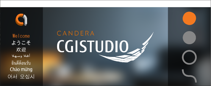
It demonstrates the outstanding possibilities of CGI Studio's TextNode with a welcome text in various languages. This shows that handling of even complex fonts and different text directions is supported.

An animation of Vector Graphics adds some gentle motion to this otherwise static 2D scene.

#### Description

##### 2D Scene

There is one 2D scene in the whole solution.

<div drawio-diagram="4893"><img src="https://doc316en.candera.eu/uploads/images/drawio/2023-11/drawing-4-1700548071.png" alt="drawing-4-1700548071.png"/></div>

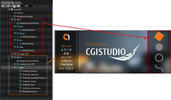
The scene is composed of three parts:

- On the left side you can see a "Menu" with welcome texts in different text styles and languages.
- The center displays the CGI Studio logo.
- On the right side there are four different Vector Graphics. An animation enhances the static 2D basic solution with motion.

Here is an overview of how to map parts of the scene tree to the individual parts of the scene.

<div drawio-diagram="7540"><img src="https://doc316en.candera.eu/uploads/images/drawio/2024-11/drawing-5-1732868703.png" alt="drawing-5-1732868703.png"/></div>

##### Camera

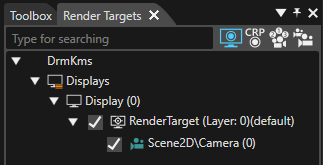
The camera is linked to a created render-target which is necessary for rendering. The render-target is linked to a display.

<div drawio-diagram="6846"><img src="https://doc316en.candera.eu/uploads/images/drawio/2024-09/drawing-5-1726825606.png" alt="drawing-5-1726825606.png"/></div>

##### Animation

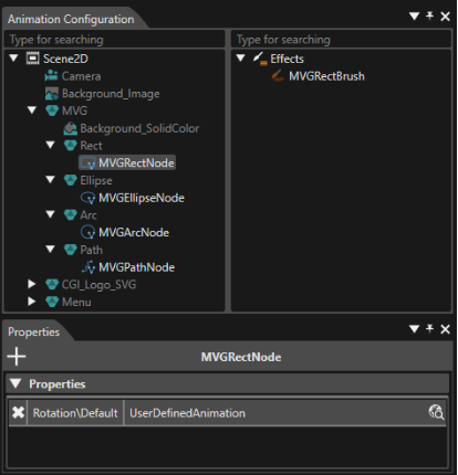
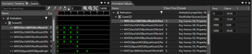
Details of the animation can be viewed in "Animation Design" mode. To switch to this mode, click the corresponding button in the menu.

<div drawio-diagram="6847"><img src="https://doc316en.candera.eu/uploads/images/drawio/2024-09/drawing-5-1726825700.png" alt="drawing-5-1726825700.png"/></div>

In "Animation Design" mode you can view the Animation Configuration, Animation Timeline and Animation Values. They allow you to analyze and modify the animation.

<div drawio-diagram="6848"><img src="https://doc316en.candera.eu/uploads/images/drawio/2024-09/drawing-5-1726825825.png" alt="drawing-5-1726825825.png"/></div>

<div drawio-diagram="6849"><img src="https://doc316en.candera.eu/uploads/images/drawio/2024-09/drawing-5-1726825932.png" alt="drawing-5-1726825932.png"/></div>

# 2D Effects Solution

#### Summary

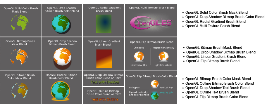
This solution shows various 2D effects applied on different node types in a 2D scene.

#### Purpose

The user can see how 2D effects are used on various node types in a 2D scene. This solution helps to understand the basic properties of the shown 2D effects.  
For platforms that support OpenGL, an additional solution for OpenGL 2D effects is available.

#### Description

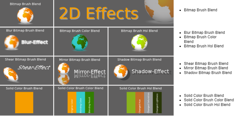
This solution contains the following effects applied on different node types:

<p class="callout info">The final amount of samples depend on the available platforms and also on the kind of package that has been received.(The figure below shows the Android case.)</p>

<p class="callout info">If the platform is Traveo2, Bitmap Brush Color Mask Blend does not exist in the sample.</p>

<div drawio-diagram="2984"><img src="https://doc316en.candera.eu/uploads/images/drawio/2023-03/drawing-7-1677828801.png" alt="drawing-7-1677828801.png"/></div>

<div class="contents" id="bkmrk--0"><div class="contents"><div class="textblock">  
</div></div></div>#### Information about 2D Effects

More information about 2D effects can be found in section <span style="color:rgb(230,126,35);">[2D Effects](https://doc316en.candera.eu/books/2d-effects)</span>.   
Effects of type Bitmap Brush Blend are described in detail in section <span style="color:rgb(230,126,35);">[Bitmap Brush Blend Effects](https://doc316en.candera.eu/link/602#bkmrk-page-title)</span>   
Information about Solid Color Blend effects can be found in section <span style="color:rgb(230,126,35);">[Solid Color Brush Blend Effects](https://doc316en.candera.eu/link/603#bkmrk-page-title)  
<span style="color:rgb(0,0,0);">Information about Bitmap Brush Color Mask Blend effect, the content of <span style="color:rgb(230,126,35);">[OpenGL Bitmap Brush Mask](https://doc316en.candera.eu/books/2d-effects/page/opengl-bitmap-brush-mask-effects)</span> <span style="color:rgb(230,126,35);"><span style="color:rgb(0,0,0);"> is helpful</span></span>.</span>  
</span>

---

# 3D Basic Solution

#### Summary

This solution represents a basic example of a 3D scene. It demonstrates several key features of 3 dimensional compositing using CGI Studio Scene Composer.

#### Purpose

The solution includes all elements that are necessary to render a basic 3D scene. It additionally contains a 2D scene, an animation and a state machine. The 3D object's appearance is enhanced using image mapping as well as bump mapping.

#### Description

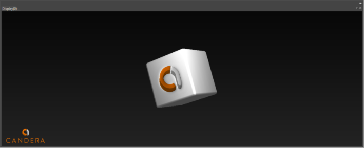
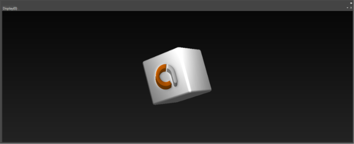
This sample solution shows a 3D scene with a rotating cube in front of a 2D scene that acts as background.

- The 3D scene contains a 3D model with two textures.
- The 2D scene with the Candera logo is rendered in the background.
- The cameras of the 3D and 2D scene are configured so that the scenes are rendered correctly.
- An Animation rotates the 3D scene's cube around the y-axis.
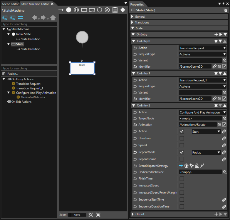
- In the State Machine both scenes are activated and the animation is started.

<div drawio-diagram="4897"><img src="https://doc316en.candera.eu/uploads/images/drawio/2023-11/drawing-4-1700548308.png" alt="drawing-4-1700548308.png"/></div>

#### Detailed Description

##### 3D Scene

There is a 3D scene in the solution.

<div drawio-diagram="4898"><img src="https://doc316en.candera.eu/uploads/images/drawio/2023-11/drawing-4-1700548320.png" alt="drawing-4-1700548320.png"/></div>

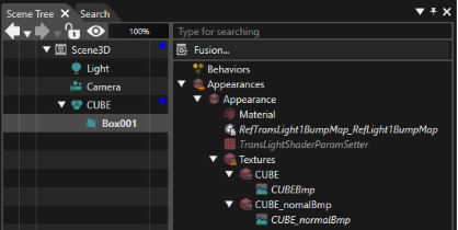
The 3D scene consists of

- a point light source
- a camera
- a 3D model that contains 2 textures (one of which is a bump map)

<div drawio-diagram="7541"><img src="https://doc316en.candera.eu/uploads/images/drawio/2024-11/drawing-5-1732868874.png" alt="drawing-5-1732868874.png"/></div>

##### 2D Scene

There is a 2D scene in the solution that is rendered in the back and acts as a background.

<div drawio-diagram="4900"><img src="https://doc316en.candera.eu/uploads/images/drawio/2023-11/drawing-4-1700548357.png" alt="drawing-4-1700548357.png"/></div>

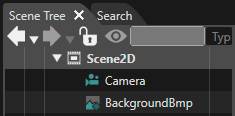
The 2D scene consists of

- a 2D camera
- a BitmapNode with a background image

<div drawio-diagram="7542"><img src="https://doc316en.candera.eu/uploads/images/drawio/2024-11/drawing-5-1732868908.png" alt="drawing-5-1732868908.png"/></div>

##### Cameras and Render Target  


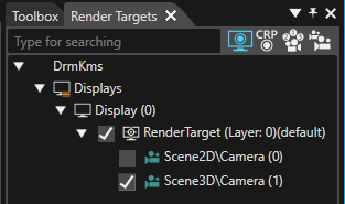
The cameras are linked to a render-target which is necessary for rendering. The render-target is linked to a display.

A correct configuration of the cameras' properties ensures that the 3d foreground scene is rendered over the 2d background scene without any visual side effects. Clearing the buffer and swapping is configured accordingly.

<div drawio-diagram="6853"><img src="https://doc316en.candera.eu/uploads/images/drawio/2024-09/drawing-5-1726827484.png" alt="drawing-5-1726827484.png"/></div>

##### Animation

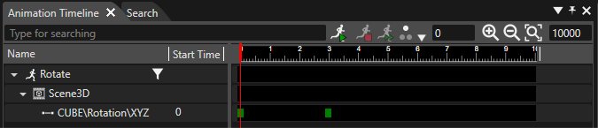
An animation rotates the cube around the y-axis. The distance of the 2 key frames define the speed of this rotation.

<div drawio-diagram="6854"><img src="https://doc316en.candera.eu/uploads/images/drawio/2024-09/drawing-5-1726827550.png" alt="drawing-5-1726827550.png"/></div>

##### State Machine

A State Machine is configured to perform the following actions when entering the State:

- activate Scene 3D
- activate Scene 2D (as background)
- configure and play the animation in replay repeat mode

<div drawio-diagram="6856"><img src="https://doc316en.candera.eu/uploads/images/drawio/2024-09/drawing-5-1726827735.png" alt="drawing-5-1726827735.png"/></div>

# 3D Effects Solution

#### Summary

This solution shows various features of a 3D scene. These are mainly the different node-types including morphing, shadows, level of detail, particles and many more. Animations that illustrate the features are included. The animations also show that control properties can be animated.

#### Purpose

The user can see how the single 3D features are realized in a scene. Own use cases, based on the features, can be created with the help of the solution and this documentation.

#### Description

This section describes the single use cases that are represented in this solution. The particle emitters and 3d skinning are in separate scenes.   
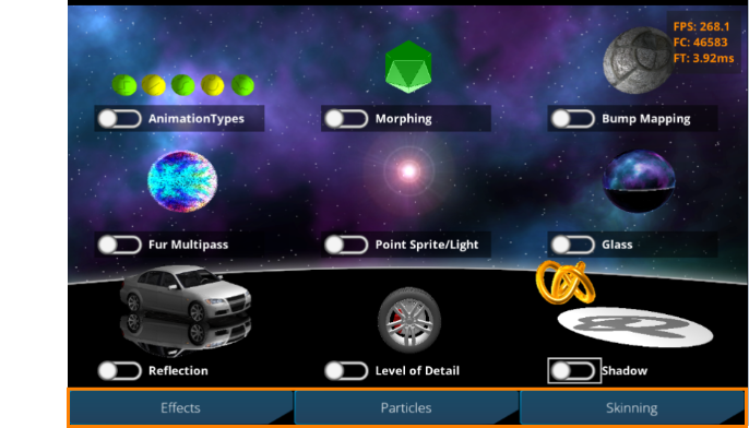
When viewing this solution in the Player, you can switch scenes using the buttons at the bottom (Effects/Particles/Skinning, orange frame in the figure below).

<div drawio-diagram="8938"><img src="https://doc316en.candera.eu/uploads/images/drawio/2026-02/drawing-7-1770940284.png" alt="drawing-7-1770940284.png"/></div>

In the Effects tab, you can play the corresponding animations by enabling the toggle buttons for each 3D effect. Once started, an animation will continue to loop until the toggle button is disabled.  
In the upper-right corner of the screen, various performance parameters are displayed, including FPS (Frames Per Second), FC (Frame Count), and FT (Frame Time). These allow you to monitor the performance impact when multiple animations are running simultaneously.  
The properties of the particle emitters are animated, which can be seen when starting the appropriate particle animation.  
Beside the use-cases, a Skybox is used in the scene to create an environment for it. The skybox is also used in the "Glass" use case. Due to the fact that this solution is a sample solution there are labels included in the Skybox (like "Left-Front") that show how it is applied.

---

#### Animation Types

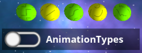
This use case shows the different animation interpolation types that can be chosen in SceneComposer. Those are from left to right: Step, Linear, Spline, Bezier, Ease. The spheres have the same keyframe values, only the animation type is different.

<div class="contents" id="bkmrk--3"><div class="contents"><div class="textblock"><div class="image"><div drawio-diagram="8939"><img src="https://doc316en.candera.eu/uploads/images/drawio/2026-02/drawing-7-1770940310.png" alt="drawing-7-1770940310.png"/></div>

</div></div></div></div>#### Morphing

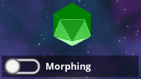
This use case shows how morphing can be realized in SceneComposer. Basically, all that is needed is a MorphingMesh-node that has the morphing vertex-buffers applied as in the sample scene. The weights of the morphing vertex-buffers are animated as well as the colors of the material. Please see<span style="color:rgb(230,126,35);"> [Morphing](https://doc316en.candera.eu/link/545#bkmrk-page-title)</span> for more information about morphing.

<div class="contents" id="bkmrk--0"><div class="contents"><div class="textblock"><div class="image"><div drawio-diagram="8940"><img src="https://doc316en.candera.eu/uploads/images/drawio/2026-02/drawing-7-1770940334.png" alt="drawing-7-1770940334.png"/></div>

</div></div></div></div>#### Bump Mapping

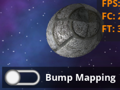
This use case shows how bump mapping can be realized. The node uses the bump-mapping appearance of the construction kit and a custom vertex buffer that has generated tangents and binormals.

<div class="contents" id="bkmrk--4"><div class="contents"><div class="textblock"><div class="image"><div drawio-diagram="8941"><img src="https://doc316en.candera.eu/uploads/images/drawio/2026-02/drawing-7-1770940357.png" alt="drawing-7-1770940357.png"/></div>

</div></div></div></div>#### Fur Multipass Appearance

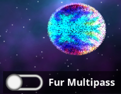
This use case shows how multipass appearances can be realized with SceneComposer. In this case a fur-material is created using multiple passes. Please see <span style="color:rgb(230,126,35);">[Fur](https://doc316en.candera.eu/link/549#bkmrk-fur)</span> for more information about fur.

<div class="contents" id="bkmrk--5"><div class="contents"><div class="textblock"><div class="image"><div drawio-diagram="8942"><img src="https://doc316en.candera.eu/uploads/images/drawio/2026-02/drawing-7-1770940396.png" alt="drawing-7-1770940396.png"/></div>

</div></div></div></div>#### Point Sprite / Light

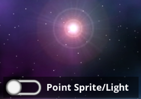
This use case shows how a PointSprite-node can be used in SceneComposer. In this case it represents a point light which will affect all other use cases by moving it.

<div class="contents" id="bkmrk--6"><div class="contents"><div class="textblock"><div class="image"><div drawio-diagram="8943"><img src="https://doc316en.candera.eu/uploads/images/drawio/2026-02/drawing-7-1770940427.png" alt="drawing-7-1770940427.png"/></div>

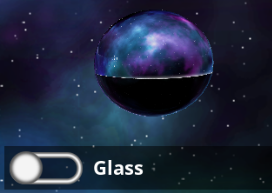
</div></div></div></div>#### Glass

This use case shows an advanced appearance on a sphere. It uses cube-mapping, reflection and refraction. As cube-map the same one as for the Skybox is used. Please see <span style="color:rgb(230,126,35);">[Reflection &amp; Refraction](https://doc316en.candera.eu/link/548#bkmrk-reflection-%26-refract)</span> for more information about reflection and refraction.

<div class="contents" id="bkmrk--7"><div class="contents"><div class="textblock"><div class="image"><div drawio-diagram="8944"><img src="https://doc316en.candera.eu/uploads/images/drawio/2026-02/drawing-7-1770940450.png" alt="drawing-7-1770940450.png"/></div>

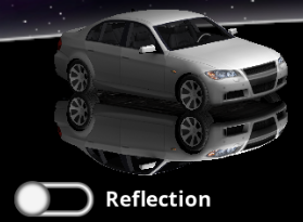
</div></div></div></div>#### Reflection

This use case shows how a reflection can be realized in SceneComposer. This is done by a ReflectionCamera that is assigned to the camera that renders the scene. Note that in this solution scope-masks are used to be able to only reflect the car. In more detail the reflection camera has a scope-mask of 2 as the reflected car has. Objects that should not be affected by the ReflectionCamera have a scope-mask of 1, just as the scene-camera has.

<div class="contents" id="bkmrk--8"><div class="contents"><div class="textblock"><div class="image"><div drawio-diagram="8945"><img src="https://doc316en.candera.eu/uploads/images/drawio/2026-02/drawing-7-1770940474.png" alt="drawing-7-1770940474.png"/></div>

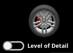
</div></div></div></div>#### Level Of Detail

This use case shows how Level of Detail (LOD) can be realized in SceneComposer. A LodNode is placed in the scene with two children that represent the different levels of detail. The lower and upper boundaries are chosen in a way that there is a fade between the different levels. The animation moves the node closer to or further from the camera, causing the models to be exchanged. Please see <span style="color:rgb(230,126,35);">[Level of Detail (LOD)](https://doc316en.candera.eu/link/544#bkmrk-page-title)</span> for more information about LOD.

<div class="contents" id="bkmrk--9"><div class="contents"><div class="textblock"><div class="image"><div drawio-diagram="8946"><img src="https://doc316en.candera.eu/uploads/images/drawio/2026-02/drawing-7-1770940496.png" alt="drawing-7-1770940496.png"/></div>

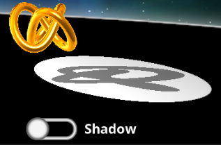
</div></div></div></div>#### Shadow

This use case shows how a shadow can be realized with SceneComposer. Especially when the light in the middle is moved (for example by playing the light-animation), the shadow-effect can be recognized. There is a PlanarShadow-node attached to the torus-node. The plance-distance of the shadow is chosen in the way that it reflects on the platform below the torus. Please see <span style="color:rgb(230,126,35);">[Planar Shadows](https://doc316en.candera.eu/link/546#bkmrk-page-title)</span> for more information about planar shadows.

<div class="contents" id="bkmrk--18"><div class="contents"><div class="textblock"><div class="image"><div drawio-diagram="8947"><img src="https://doc316en.candera.eu/uploads/images/drawio/2026-02/drawing-7-1770940520.png" alt="drawing-7-1770940520.png"/></div>

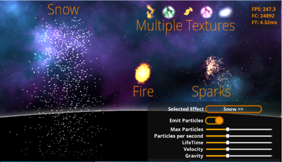
</div></div></div></div>#### Particles

This use case can be found in the "Scene\_Particles" scene. It shows how the <span style="color:rgb(230,126,35);">[Point Sprite Emitter](https://doc316en.candera.eu/link/1167#bkmrk-pointspriteemitter)</span> Control can be used to implement different particle effects. The effects shown in this sample are snow, fire, sparks and a sample for multiple textures. The animation effects for each particle emitter are controllable via the various parameters in the bottom-right section of the screen.

<div class="contents" id="bkmrk--20"><div class="contents"><div class="contents"><div class="textblock"><div class="image"><div drawio-diagram="8953"><img src="https://doc316en.candera.eu/uploads/images/drawio/2026-02/drawing-7-1771305338.png" alt="drawing-7-1771305338.png"/></div>

</div></div></div></div></div>##### Bottom-right screen parameters

- **Selected Effect:** A multistate button used to select which effect to edit.
- **Emit Particles:** A toggle to start or completely stop the particle emission.
- **Max Particles:** A slider to control the maximum number of particles.
- **Particles per second:** A slider to control the number of particles generated per second.
- **LifeTime:** A slider to control the lifetime of the particles.
- **Velocity:** A slider to control the velocity of the particles.
- **Gravity:** A slider to control the gravity applied to the particles.

<p class="callout info">The values for sliders endpoints are different for each effect. They are initially set to a default value for that effect, and moving to 0 will reduce to 50% of the default, and moving to maximum would increase to 200% of the default.</p>

<div class="contents" id="bkmrk--22"><div class="contents"><div class="contents"><div class="textblock"><div class="image">  
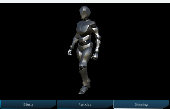
</div></div></div></div></div>#### Skinning

As a sample of skinning, skinning is set on the human body model and a walking motion is set as the animation.

<div drawio-diagram="8175"><img src="https://doc316en.candera.eu/uploads/images/drawio/2025-03/drawing-7-1743034731.png" alt="drawing-7-1743034731.png"/></div>

# 3D Getting Started Solution

#### Summary

This solution shows an innovative sample cluster using 2D and 3D scenes. To enjoy this sample, open it in Scene Composer, save it to your disk and press the "Generate and Play" button in the top toolbar below the menu.

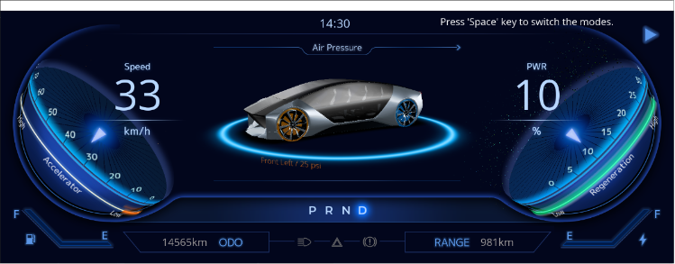
The initial scene shows a 3D cluster in an innovative design with a speed gauge on the left and an RPM gauge on the right side. In the middle sits a 3D model of a car rotating slowly. Above this, the words "Air Pressure" are displayed. The tire that comes into focus during the car's movement is highlighted and its current air pressure is displayed as the car continues to turn. Necessary indicators like odometer, battery and fuel status, turn lights etc. are positioned in a clear and intuitive way.

<div drawio-diagram="4964"><img src="https://doc316en.candera.eu/uploads/images/drawio/2023-12/drawing-4-1701655131.png" alt="drawing-4-1701655131.png"/></div>

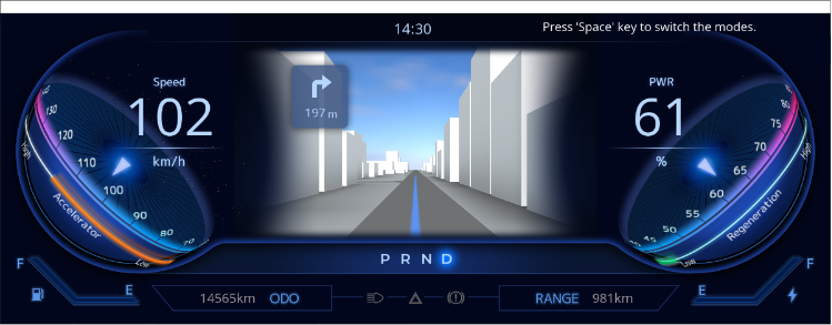
Pressing the 'Space' key (as suggested by the text in the top right corner) switches the mode to Navigation.

Now, navigation content is displayed in the center of the cluster instead of the air pressure content from the initial scene. An animation imitates navigation through a 3D scenery, displaying turning instructions.

You can press the 'Space' key again to return to the "Air Pressure" context.

<div drawio-diagram="4965"><img src="https://doc316en.candera.eu/uploads/images/drawio/2023-12/drawing-4-1701655336.png" alt="drawing-4-1701655336.png"/></div>

#### Android Version

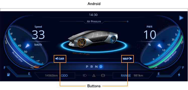
In the Android version you can use the buttons to switch the mode to Navigation and back.

<div drawio-diagram="7016"><img src="https://doc316en.candera.eu/uploads/images/drawio/2024-10/drawing-7-1728954073.png" alt="drawing-7-1728954073.png"/></div>

#### Content

This sample solution includes

- 2D and 3D scenes
- animations
- a global State Machine

---

# Advanced Cluster Solution

#### Overview

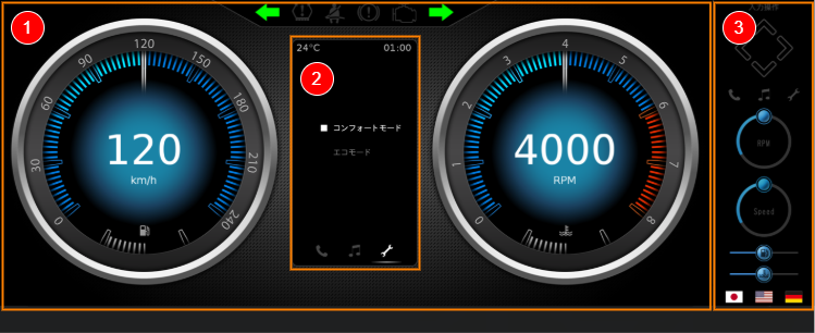
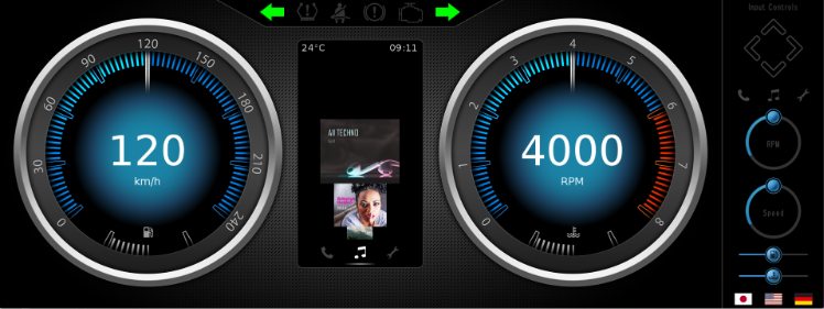
<span style="color:rgb(0,0,0);">This <span style="background-color:rgb(255,255,255);">solution shows an advanced 2D cluster example. I</span>t consists of various scenes that are necessary to represent an advanced Cluster. The Main Scene consists of gauges that can be manipulated with Controls and Behaviors. Other scenes, like ControlPanel scene, show various interactions within the solution and how this can be achieved with Behaviors. The ControlPanel scene also demonstrates how to switch between display languages. </span>

<span style="color:rgb(0,0,0);">This sample solution serves as an example of how Scene Composer can be used to easily implement an advanced 2D gauge cluster without requiring any coding.</span>

For information on how to create the main scenes of this sample solution and how to implement HMI logic using controls, please refer to<span style="color:rgb(0,0,0);"> the</span> [<span style="color:rgb(230,126,35);">Advanced Cluster Solution tutorial</span>](https://doc316en.candera.eu/books/best-practice/chapter/advanced-cluster-solution).

<div drawio-diagram="8448"><img src="https://doc316en.candera.eu/uploads/images/drawio/2025-06/drawing-7-1749619187.png" alt="drawing-7-1749619187.png"/></div>

---

#### Description

<span style="color:rgb(0,0,0);">The Advanced Cluster solution consists of multiple scenes to display an advanced 2D gauge cluster. Each scene uses controls suitable for the UI. It also uses Behaviors and a State Machine to pass data between scenes and transition between scenes. For more information about the scenes, controls, behaviors, and the state machine used in this solution, please see the following description.</span>

##### <span style="color:rgb(0,0,0);">Scene</span>

<span style="color:rgb(0,0,0);">The Advanced Cluster solution consists of five scenes, using Scene Composer's versatile built in Controls to display an advanced 2D gauge cluster.</span>

<table id="bkmrk-no.-%E3%82%AB%E3%83%86%E3%82%B4%E3%83%AA-%E3%82%B7%E3%83%BC%E3%83%B3%E5%90%8D-%E8%AA%AC%E6%98%8E-%281%29" style="border-collapse:collapse;width:100%;"><colgroup><col style="width:5.7211%;"></col><col style="width:18.1168%;"></col><col style="width:18.9565%;"></col><col style="width:57.2056%;"></col></colgroup><tbody><tr><td class="align-center" style="background-color:rgb(230,126,35);"><span style="color:rgb(255,255,255);">**No.**</span></td><td class="align-center" style="background-color:rgb(230,126,35);"><span style="color:rgb(255,255,255);">**Category**</span></td><td class="align-center" style="background-color:rgb(230,126,35);"><span style="color:rgb(255,255,255);">**Scene name**</span></td><td class="align-center" style="background-color:rgb(230,126,35);"><span style="color:rgb(255,255,255);">**Description**</span></td></tr><tr><td>(1)</td><td><span style="color:rgb(0,0,0);">Main</span></td><td><span style="color:rgb(0,0,0);">Scene2D\_Main</span></td><td><span style="color:rgb(0,0,0);">The main scene of this sample solution. Two gauges are displayed on the left and right side, various indicators are displayed in the top area. In the center some space is reserved to display one of the infotainment scenes Music, Phone or Settings.</span>

  
<span style="color:rgb(0,0,0);">The following controls are mainly used:</span>

- <span style="color:rgb(0,0,0);">Speedometer: Gauge</span>
- <span style="color:rgb(0,0,0);">Tachometer: Gauge</span>
- <span style="color:rgb(0,0,0);">Top indicators: Tell Tale</span>

</td></tr><tr><td>(2)</td><td><span style="color:rgb(0,0,0);">Infotainment</span></td><td><span style="color:rgb(0,0,0);">Scene2D\_Music</span>

<span style="color:rgb(0,0,0);">Scene2D\_Phone</span>

<span style="color:rgb(0,0,0);">Scene2D\_Settings</span>

</td><td><span style="color:rgb(0,0,0);">This area displays the active infotainment scene (Music/Phone/Settings). Only the selected scene is displayed in the center of Scene2D\_Main.</span>

<span style="color:rgb(0,0,0);">The following controls are mainly used:</span>

- <span style="color:rgb(0,0,0);">Music contents: CoverFlow</span>

</td></tr><tr><td>(3)</td><td><span style="color:rgb(0,0,0);">UI operation</span></td><td><span style="color:rgb(0,0,0);">Scene2D\_ControlPanel</span></td><td><span style="color:rgb(0,0,0);">A UI for operating the main scene and infotainment scene is displayed.</span>

<span style="color:rgb(0,0,0);">Using this UI, you can change the speedometer/tachometer values, switch infotainment scenes, change the display language, and more.</span>

<span style="color:rgb(0,0,0);">The following controls are mainly used:</span>

- <span style="color:rgb(0,0,0);">D-pad button: Button</span>
- <span style="color:rgb(0,0,0);">Buttons for each infotainment: Button</span>
- <span style="color:rgb(0,0,0);">Buttons for Speedmeter/Tachometer: CircularSlider</span>
- <span style="color:rgb(0,0,0);">Buttons for Fuel gauge/Water temperature gauge: Slider</span>

</td></tr></tbody></table>

<div drawio-diagram="8449"><img src="https://doc316en.candera.eu/uploads/images/drawio/2025-06/drawing-7-1749619207.png" alt="drawing-7-1749619207.png"/></div>

##### <span style="color:rgb(0,0,0);">Behaviors/State Machine</span>

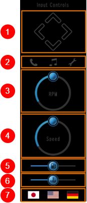
<span style="color:rgb(0,0,0);">This solution offers the possibility to change the screen display via UI operation as described in the table below. This kind of interaction is achieved without any coding, but solely by configuring behaviors and a state machine.</span>

<table id="bkmrk-%281%29-%E5%B7%A6%E5%8F%B3%E7%9F%A2%E5%8D%B0%E3%81%AB%E3%82%88%E3%82%8A%E3%80%81%E3%82%A4%E3%83%B3%E3%83%95%E3%82%A9%E3%83%86%E3%82%A4%E3%83%A1%E3%83%B3" style="border-collapse:collapse;width:100%;"><colgroup><col style="width:25.3874%;"></col><col style="width:4.41299%;"></col><col style="width:70.1996%;"></col></colgroup><tbody><tr><td rowspan="7"><div drawio-diagram="8450"><img src="https://doc316en.candera.eu/uploads/images/drawio/2025-06/drawing-7-1749619235.png" alt="drawing-7-1749619235.png"/></div>

</td><td>(1)</td><td><span style="color:rgb(0,0,0);">The left and right arrows switch infotainment (Music/Phone/Settings).</span>

<span style="color:rgb(0,0,0);">The up and down arrows change the content of each infotainment.</span>

</td></tr><tr><td>(2)</td><td><span style="color:rgb(0,0,0);">Click on the Phone/Music/Settings icon to switch the infotainment scenes.</span>

</td></tr><tr><td>(3)</td><td><span style="color:rgb(0,0,0);">The circular slider control changes the tachometer value.</span></td></tr><tr><td>(4)</td><td><span style="color:rgb(0,0,0);">The circular slider control changes the speedometer value.</span>

</td></tr><tr><td>(5)</td><td><span style="color:rgb(0,0,0);">The slider control changes the fuelmeter value.</span></td></tr><tr><td>(6)</td><td><span style="color:rgb(0,0,0);">The slider control changes the water temperature meter value.</span></td></tr><tr><td>(7)</td><td>Click the language icon to switch between languages ​​displayed on the main screen and infotainment screen.</td></tr></tbody></table>

<span style="color:rgb(0,0,0);">The user can explore and study the details of each UI's Behavior and State Machine setting using all of Extra Scene Tree, Fusion panel, and State Machine Editor of the target node.</span>

<span style="color:rgb(0,0,0);">The following description and images provide an example on how to explore a specific configuration:</span>

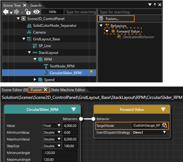
<span style="color:rgb(0,0,0);">One of the ControlPanel's CircularSlider controls (**CircularSlider\_RPM**) is used to remotely control the Main scene's tachometer value. The connection between CircularSlider\_RPM and the tachometer (Scene2D\_Main's **CustomGauge\_RPM**) is a **Forward Value** behavior with CustomGauge\_RPM as TargetNode.</span>

<span style="color:rgb(0,0,0);">When selecting the **CircularSlider\_RPM** in the Scene Tree panel, the **Forward Value** behavior can be seen in the Extra Scene Tree. Pressing on the **Fusion...** button right above the Extra Scene Tree panel, Fusion will be opened displaying the CircularSlider\_RPM's Fusion diagram. This diagram contains a Fusion Node **Forward Value** with a **TargetNode** property that can be confirmed to be set to **Scene2D\_Main's CustomGauge\_RPM.**</span>

<div drawio-diagram="8592"><img src="https://doc316en.candera.eu/uploads/images/drawio/2025-09/drawing-5-1758275723.png" alt="drawing-5-1758275723.png"/></div>


##### <span style="color:rgb(0,0,0);">Play/Operation Using the Player</span>

<span style="color:rgb(0,0,0);">Click the \[ Play selected scenario… \] icon on the toolbar to launch the Player. The Advanced Cluster solution will be displayed in the Player view. The user can operate the display of the main screen using the ControlPanel scene's UI on the right side of the display screen.</span>

---

# GettingStartedControls Solution

#### Overview

The GettingStartedControls solution is a sample solution for a gauge cluster and a center cluster. Various controls are used to realize an advanced gauge cluster and a center cluster. In addition, interactions between those controls are built to realize HMI logic.

For information on how to create the main scenes of this sample solution and how to implement HMI logic using controls, please refer to<span style="color:rgb(0,0,0);"> </span><span style="color:rgb(185,106,217);"><span style="color:rgb(0,0,0);">the</span> </span>[<span style="color:rgb(230,126,35);">GettingStartedControls tutorial</span>](https://doc316en.candera.eu/books/best-practice/chapter/gettingstartedcontrols-solution).
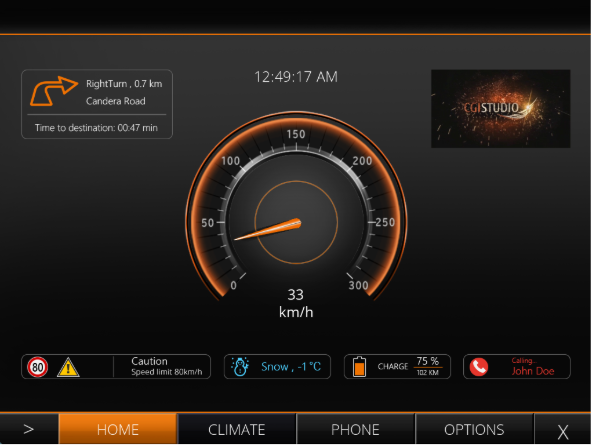
<div drawio-diagram="8451"><img src="https://doc316en.candera.eu/uploads/images/drawio/2025-06/drawing-7-1749621545.png" alt="drawing-7-1749621545.png"/></div>

---

#### Description

##### Scene

The GettingStartedControls solution consists of the scenes listed in the table below.

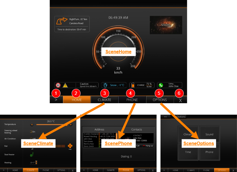
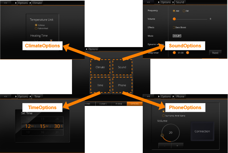
<table id="bkmrk-%E3%82%B7%E3%83%BC%E3%83%B3%E5%90%8D-%E8%AA%AC%E6%98%8E-scenehome-sc" style="border-collapse:collapse;width:100%;height:420.953px;"><colgroup><col style="width:19.1895%;"></col><col style="width:80.8105%;"></col></colgroup><tbody><tr style="height:29.7969px;"><td class="align-center" style="background-color:rgb(230,126,35);height:29.7969px;">**<span style="color:rgb(255,255,255);">Scene name</span>**</td><td class="align-center" style="background-color:rgb(230,126,35);height:29.7969px;">**<span style="color:rgb(255,255,255);">Description</span>**</td></tr><tr style="height:63.3906px;"><td style="height:63.3906px;">SceneHome</td><td style="height:63.3906px;">Scene for the main screen. The speedometer is displayed in the center of the screen, and navigation information, time, display, various indicators, etc. are displayed around it. In addition, the SceneMenuTabs scene is overlaid at the bottom of the display area.

</td></tr><tr style="height:29.7969px;"><td style="height:29.7969px;">SceneClimate</td><td style="height:29.7969px;"><span style="color:rgb(0,0,0);">Scene for the car climate settings screen with air conditioning and various heating settings.</span></td></tr><tr style="height:29.7969px;"><td style="height:29.7969px;">ScenePhone</td><td style="height:29.7969px;"><span style="color:rgb(0,0,0);">Scene for the phone screen. Displays the phone book and a contact with a call and hang up button.</span></td></tr><tr style="height:29.7969px;"><td style="height:29.7969px;">SceneOptions</td><td style="height:29.7969px;"><span style="color:rgb(0,0,0);">A scene for a screen to select one of 4 other options scenes.</span></td></tr><tr style="height:29.7969px;"><td style="height:29.7969px;">ClimateOptions</td><td style="height:29.7969px;"><span style="color:rgb(0,0,0);">Scene for the climate-related settings screen to configure the temperature unit and heating time.</span></td></tr><tr style="height:29.7969px;"><td style="height:29.7969px;">SoundOptions</td><td style="height:29.7969px;"><span style="color:rgb(0,0,0);">A scene for the audio-related settings screens with extensive possibilities.</span></td></tr><tr style="height:29.7969px;"><td style="height:29.7969px;">TimeOptions</td><td style="height:29.7969px;"><span style="color:rgb(0,0,0);">A scene for the time-related settings screen.</span></td></tr><tr style="height:29.7969px;"><td style="height:29.7969px;">PhoneOptions</td><td style="height:29.7969px;"><span style="color:rgb(0,0,0);">A scene for the phone-related settings screen.</span></td></tr><tr style="height:29.7969px;"><td style="height:29.7969px;">ConnectionOptions</td><td style="height:29.7969px;">A scene for the phone connection settings screen.</td></tr><tr style="height:29.7969px;"><td style="height:29.7969px;">SceneMenuTabs</td><td style="height:29.7969px;">Scene for the screen switching tabs of SceneHome/SceneClimate/ScenePhone/SceneOptions.

</td></tr><tr style="height:29.7969px;"><td style="height:29.7969px;">SceneBack</td><td style="height:29.7969px;">Background scene.</td></tr><tr style="height:29.7969px;"><td style="height:29.7969px;">SceneBreadcrumb</td><td style="height:29.7969px;">A scene for the breadcrumb list that appears at the top of SceneOptions.</td></tr></tbody></table>

##### Control

The following table lists the featured controls used in the GettingStartedControls solution. For more information about each control, please refer to [<span style="color:rgb(230,126,35);">Predefined Controls</span>](https://doc316en.candera.eu/books/controls-and-behaviors/chapter/predefined-controls).

<table id="bkmrk-%E3%82%B3%E3%83%B3%E3%83%88%E3%83%AD%E3%83%BC%E3%83%AB%E5%90%8D-%E8%AA%AC%E6%98%8E-breadcrum" style="border-collapse:collapse;width:100%;height:370.938px;"><colgroup><col style="width:19.1921%;"></col><col style="width:80.8079%;"></col></colgroup><tbody><tr style="height:29.7969px;"><td class="align-center" style="background-color:rgb(230,126,35);height:29.7969px;">**<span style="color:rgb(255,255,255);">Control name</span>**</td><td class="align-center" style="background-color:rgb(230,126,35);height:29.7969px;">**<span style="color:rgb(255,255,255);">Description</span>**</td></tr><tr style="height:13.375px;"><td style="height:13.375px;">BreadCrumb</td><td style="height:13.375px;"><span style="color:rgb(0,0,0);">The collection of Options scenes was mainly introduced to demonstrate the capabilities of the BreadCrumb control. There is a separate sub chart in the MenuStateMachine that handles scene transitions between the option scenes. Whenever an option scene is entered (after a transition) the BreadCrumb control will be notified to update.</span>

</td></tr><tr style="height:29.7969px;"><td style="height:29.7969px;">List</td><td style="height:29.7969px;"><span style="color:rgb(0,0,0);">The phone screen contains a dynamic list. It is important to know that in the Player some code had to be implemented that allows phone-book entries and adding them.</span>

</td></tr><tr style="height:29.7969px;"><td style="height:29.7969px;">Drawer</td><td style="height:29.7969px;"><span style="color:rgb(0,0,0);">The drawer is used twice in the sample. First of all the menu in the bottom of the screen appears as a drawer if the user hovers over the corresponding Control (at the bottom of the screen). To close the menu-drawer the "X"-Button in the right side of the menu has to be pressed.</span>

</td></tr><tr style="height:29.7969px;"><td style="height:29.7969px;">Roll</td><td style="height:29.7969px;"><span style="color:rgb(0,0,0);">The time-options screen includes three roll controls for setting the time (seconds, minutes and hours).</span></td></tr><tr style="height:29.7969px;"><td style="height:29.7969px;">Keyboard</td><td style="height:29.7969px;">When clicking on of the time-rolls an on-screen keyboard appears.</td></tr><tr><td>Various Core Controls</td><td>In the SoundOptions scene, Core controls are used to display various audio-related settings.</td></tr></tbody></table>

<p class="callout info">This Core Controls sample solution showcases a lightweight Control Set optimized for low-end devices. It includes only essential controls, enabling safe performance testing and validation on memory-constrained platforms.</p>

##### Behavior

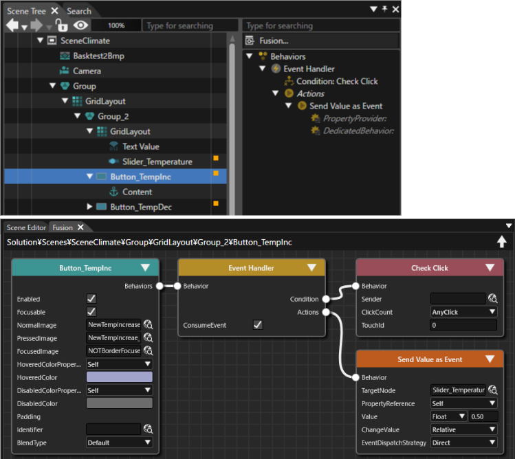
Behaviors are<span style="color:rgb(0,0,0);"> configured for each c</span>ontrol to exchange data with other nodes as needed. Behavior settings can be viewed in the Extra Scene Tree or Fusion panel of the relevant node.

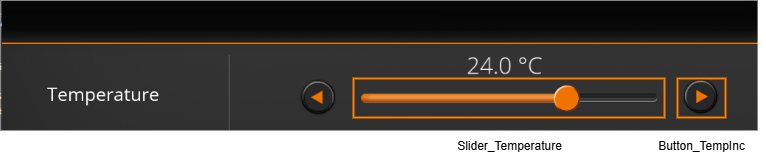
The image below shows an example of behavior settings for Button\_TempInc (Button control) in the SceneClimate scene. <span style="color:rgb(185,106,217);">The </span>Button\_TempInc is a button to increase the air conditioner's temperature setting in 0.5°C increments. Due to the behavior settings, each time Button\_TempInc is pressed, a value of 0.5 is passed to Slider\_Temperature (Slider control), synchronizing the button press action with the slider display.

<div drawio-diagram="8523"><img src="https://doc316en.candera.eu/uploads/images/drawio/2025-08/drawing-7-1755139836.png" alt="drawing-7-1755139836.png"/></div>

<div drawio-diagram="8522"><img src="https://doc316en.candera.eu/uploads/images/drawio/2025-08/drawing-7-1755139348.png" alt="drawing-7-1755139348.png"/></div>

##### State Machine

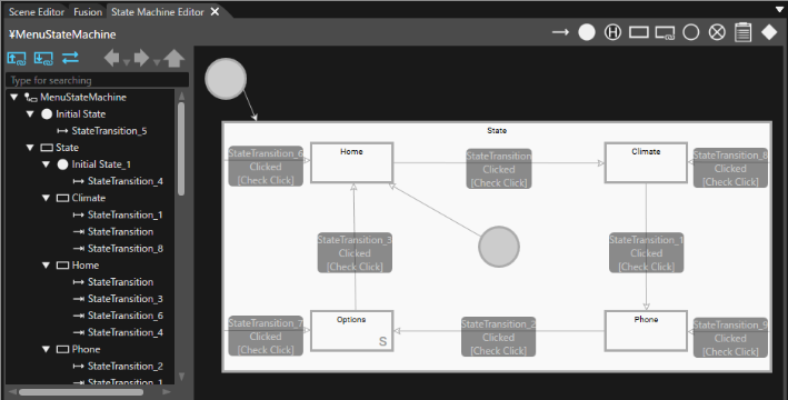
The transitions between<span style="color:rgb(0,0,0);"> different scenes are configured using a State Machine (MenuStateMachine). Transitions of the Options scenes are encapsulated into a separate Subchart to keep everything neatly arranged.</span>

<span style="color:rgb(0,0,0);">The configuration of the State Machine transitions between scenes can be vie</span>wed in the State Machine Editor.

<div drawio-diagram="8524"><img src="https://doc316en.candera.eu/uploads/images/drawio/2025-08/drawing-7-1755139949.png" alt="drawing-7-1755139949.png"/></div>

##### Transition

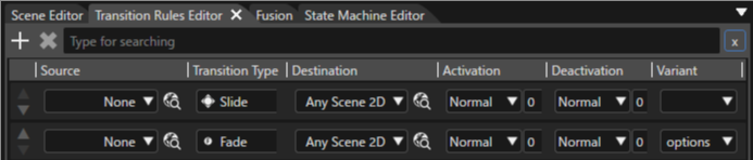
<span style="color:rgb(0,0,0);">The Transition Type is set to **Slide** for transitions between SceneHome, SceneClimate, ScenePhone, and SceneOptions scenes. This causes a scene to slide from left to right to reveal the next scene. A Fade transition is set for transitions between option-related scenes. This is achieved using a Varia</span>nt in the Transition Rule Editor.

Transition settings can be viewed in the Transition Rule Editor.

<div drawio-diagram="8525"><img src="https://doc316en.candera.eu/uploads/images/drawio/2025-08/drawing-7-1755140117.png" alt="drawing-7-1755140117.png"/></div>

##### Play/Operation using Player

<span style="color:rgb(0,0,0);">Click the \[ Play Selected Scenario... \] icon on the toolbar to launch the Player and the Advanced Cluster solution will be displayed in the Player view.</span>

<span style="color:rgb(0,0,0);">The initial screen of the GettingStartedControls solution is the SceneHome scene. If you move the cursor to the bottom of the screen, a tab menu will appear, and you can move to each scene from the tab menu. In each scene, you can check the operation of various controls used in the GettingStartedControl solution.</span>

<div drawio-diagram="8452"><img src="https://doc316en.candera.eu/uploads/images/drawio/2025-06/drawing-7-1749621596.png" alt="drawing-7-1749621596.png"/></div>

<table id="bkmrk-%281%29-%E3%82%AF%E3%83%AA%E3%83%83%E3%82%AF%E3%81%99%E3%82%8B%E5%BA%A6%E3%81%AB%E3%80%81sceneho" style="border-collapse:collapse;width:91.6667%;"><colgroup><col style="width:4.94081%;"></col><col style="width:95.0592%;"></col></colgroup><tbody><tr><td>(1)</td><td>Each time you click, the display screen will change in the following order: SceneHome -&gt; SceneClimate -&gt; ScenePhone -&gt; SceneOptions (after SceneOptions, you will return to SceneHome).</td></tr><tr><td>(2)</td><td>When clicked, SceneHome will be displayed.</td></tr><tr><td>(3)</td><td>When clicked, SceneClimate will be displayed.</td></tr><tr><td>(4)</td><td>When clicked, ScenePhone will be displayed.</td></tr><tr><td>(5)</td><td>When clicked, SceneOptions will be displayed.</td></tr><tr><td>(6)</td><td>When clicked, the SceneMenuTabs will be hidden.</td></tr></tbody></table>

From the SceneOptions scene, you can transition to scenes for various options.

<div drawio-diagram="8453"><img src="https://doc316en.candera.eu/uploads/images/drawio/2025-06/drawing-7-1749621689.png" alt="drawing-7-1749621689.png"/></div>

---

# Industrial solution

#### Summary

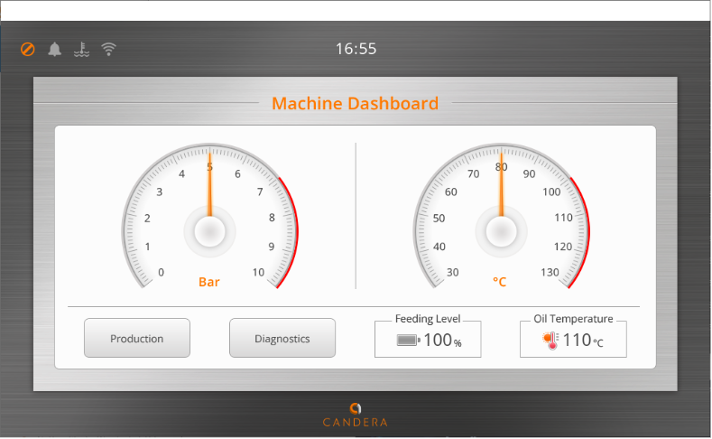
This solution presents innovative industrial samples using 2D and 3D scenes. Generate and Play\] button in the toolbar to play the solution. In the first scene, the Machine Dashboard will appear. Clicking the "Production" or "Diagnostics" button in the lower left corner will take you to the corresponding scene.

<div drawio-diagram="3668"><img src="https://doc316en.candera.eu/uploads/images/drawio/2023-06/drawing-4-1685966796.png" alt="drawing-4-1685966796.png"/></div>

#### Manual Machine Control scene

  
In the Manual Machine Control (Scene2\_Production) scene, which is displayed by pressing the Production button, multiple Button controls are arranged in group nodes. Clicking on the three buttons located in the center of the right side of the scene (red frame in the image below) will take you to the corresponding scene.

<div drawio-diagram="3669"><img src="https://doc316en.candera.eu/uploads/images/drawio/2023-06/drawing-4-1685966912.png" alt="drawing-4-1685966912.png"/></div>

<table id="bkmrk-1-buttonr1%EF%BC%9Asettings%EF%BC%88" style="border-collapse:collapse;width:100%;height:150.969px;"><colgroup><col style="width:7.66714%;"></col><col style="width:92.3329%;"></col></colgroup><tbody><tr style="height:57.7812px;"><td class="align-center" style="height:57.7812px;">1</td><td style="height:57.7812px;">ButtonR1：Settings（Scene3\_Settings）

In this scene, you can switching between the two scenes, the settings such as switching 12/24-hour time display and IP address display sceane are displayed.

</td></tr><tr style="height:63.3906px;"><td class="align-center" style="height:63.3906px;">2</td><td style="height:63.3906px;">ButtonR2：Performance（Scene6\_Performance）  
This scene displays information on machine productivity. Data is displayed using the BarGraph and LineGraph controls, respectively.

</td></tr><tr style="height:29.7969px;"><td class="align-center" style="height:29.7969px;">3</td><td style="height:29.7969px;">ButtonR3：Robot Control（Sene5\_Robot\_2D)  
This scene can activate the 3D model in the center of the screen by pressing the button on the left side of the scene. Pressing the button on the right side of the scene resets the animation playback and the display state of the 3D model.

</td></tr></tbody></table>

#### Alarm List scene

Alarm List (Scene4\_AlarmList) scene, which is displayed by pressing "Diagnostics" button, shows a list of alarms using the List control. Pressing the button in the upper right corner of the screen returns to the Machine Dashboard scene.

<div drawio-diagram="6857"><img src="https://doc316en.candera.eu/uploads/images/drawio/2024-09/drawing-5-1726828685.png" alt="drawing-5-1726828685.png"/></div>

In any of the scenes, you can return to the previous scene by pressing the button in the upper right corner of the screen (see below).

<div drawio-diagram="3671"><img src="https://doc316en.candera.eu/uploads/images/drawio/2023-06/drawing-4-1685967330.png" alt="drawing-4-1685967330.png"/></div>

#### Content

This sample solution includes

- 2D and 3D scenes
- animations
- a global State Machine

# Layouter Solution

#### Summary

A solution exemplifying the use of the layout.   
It contains several 2D scenes for all kinds of 2D layout and for central layout properties. An additional 2D scene shows how to configure layouts that automatically resize when the available space changes.  
It also contains several 3D scenes to show how to work with the different layout on a canvas to position Canvas Texts and Canvas Sprites. 3D scenes that explain the Layout Properties can also be found in this solution as well as the automatic resizing Layouts.

#### Purpose

The user can see how to use layout in 2D and 3D scenes (with canvas) and gets to know the core properties and how their values affect the layout calculation. The included "use cases" scene uses three different layouts to realize a layout that resizes automatically when the available space is changed.

#### Description

##### 2D Scenes for 2D Layout

It contains one 2D scene for each of the following layouts to demonstrate their functionalities:

<div drawio-diagram="6858"><img src="https://doc316en.candera.eu/uploads/images/drawio/2024-09/drawing-5-1726829042.png" alt="drawing-5-1726829042.png"/></div>

<div class="contents" id="bkmrk--0"><div class="contents"><div class="textblock">  
</div></div></div>#### 2D Scenes for 2D Layout Properties

To show the possibilities of the layout properties there is a 2D scene for each of the following properties:

<div drawio-diagram="2986"><img src="https://doc316en.candera.eu/uploads/images/drawio/2023-03/drawing-7-1677831750.png" alt="drawing-7-1677831750.png"/></div>

<div class="contents" id="bkmrk--2"><div class="contents"><div class="textblock">  
</div></div></div>#### 2D Scene for 2D Layout Use Cases

<div drawio-diagram="1642"><img src="https://doc316en.candera.eu/uploads/images/drawio/2023-02/drawing-7-1676611879.png" alt="drawing-7-1676611879.png"/></div>

<div class="contents" id="bkmrk--4"><div class="contents"><div class="textblock">  
</div></div></div>#### 3D Scenes for 3D Canvas Layout

##### 3D Scenes for Canvas Layout

For positioning canvas nodes (canvas texts and canvas sprites) on a canvas the same layouts are available as for 2D scenes. Several 3D scenes show the functionality of these layouts on a canvas.

<div class="contents" id="bkmrk-canvas---layouter---"><div class="contents"><div class="textblock">- Canvas - Layouter - BaseLine Layout
- Canvas - Layouter - Default Layout
- Canvas - Layouter - Dock Panel Layout
- Canvas - Layouter - Grid Layout
- Canvas - Layouter - Overlay Layout
- Canvas - Layouter - Stack Layout

</div></div></div>##### 3D Scenes for 3D Canvas Layout Properties

The possibilities of the 3D Canvas layout properties can be seen in separate 3D scenes for:

<div class="contents" id="bkmrk-canvas---properties-"><div class="contents"><div class="textblock">- Canvas - Properties - Alignment
- Canvas - Properties - Margin
- Canvas - Properties - Stretch Behavior

</div></div></div>##### 3D Scene for 3D Canvas Layout Use Cases

<div class="contents" id="bkmrk-canvas---use-cases--"><div class="contents"><div class="textblock">- Canvas - Use Cases - Automatic Resizing Layouter

</div></div></div>For more information see: <span style="color:rgb(230,126,35);">[Layouter](https://doc316en.candera.eu/books/layouter)</span>

---

# Materials Solution

#### Summary

This solution shows various materials in a 3D scene. Those are wood, fur, carbon and cube-mapping-effects for example. All of the shown materials are available as template-appearances in SceneComposer that can be applied to existing nodes.

#### Purpose

The user gets an overview of which template-appearances are provided with SceneComposer. The different spheres have the appearances attached, hence the user can experiment with their properties and get an instant visual feedback.

#### Description

This section describes the single materials and which important properties they consist of.

##### Gooch

Gooch shading between two colors, configurable via shader parameters.

<div class="contents" id="bkmrk-"><div class="contents"><div class="textblock"><div class="image"><div drawio-diagram="1646"><img src="https://doc316en.candera.eu/uploads/images/drawio/2023-02/drawing-7-1676612012.png" alt="drawing-7-1676612012.png"/></div>

</div></div></div></div>##### Wood

A fully procedural shader to achieve the look of annual rings in wooden objects. The effect can be configured via shader parameters, where the wood center defines a point along the center of the virtual tree trunk, the wood direction defines the direction of the wood grain and the multiplier affects the density of the annual rings.

<div class="contents" id="bkmrk--0"><div class="contents"><div class="textblock"><div class="image"><div drawio-diagram="1647"><img src="https://doc316en.candera.eu/uploads/images/drawio/2023-02/drawing-7-1676612029.png" alt="drawing-7-1676612029.png"/></div>

</div></div></div></div>##### Bump Mapping

For structured materials. Bump mapping requires a mesh with tangents and binormals, a color texture as well as a normal map.

<div class="contents" id="bkmrk--1"><div class="contents"><div class="textblock"><div class="image"><div drawio-diagram="1649"><img src="https://doc316en.candera.eu/uploads/images/drawio/2023-02/drawing-7-1676612047.png" alt="drawing-7-1676612047.png"/></div>

</div></div></div></div>##### Carbon Fibre

Achieves a carbon fibre look by applying specular highlights to the bright parts of the carbon texture only. The shader parameter "Tile" allows repeating the carbon fibre texture on the object. Also supports cube map reflection.

<div class="contents" id="bkmrk--2"><div class="contents"><div class="textblock"><div class="image"><div drawio-diagram="1651"><img src="https://doc316en.candera.eu/uploads/images/drawio/2023-02/drawing-7-1676612074.png" alt="drawing-7-1676612074.png"/></div>

</div></div></div></div>##### Gradient Linear

A simple linear gradient between two colors along a specified axis. Can be configured via the shader parameters: starting position, direction and magnitude.

<div class="contents" id="bkmrk--3"><div class="contents"><div class="textblock"><div class="image"><div drawio-diagram="1653"><img src="https://doc316en.candera.eu/uploads/images/drawio/2023-02/drawing-7-1676612093.png" alt="drawing-7-1676612093.png"/></div>

</div></div></div></div>##### Gradient Radial

A simple radial gradient between two colors around a specified center point. Can be configured via the shader parameters: starting position and magnitude.

<div class="contents" id="bkmrk--4"><div class="contents"><div class="textblock"><div class="image"><div drawio-diagram="1654"><img src="https://doc316en.candera.eu/uploads/images/drawio/2023-02/drawing-7-1676612122.png" alt="drawing-7-1676612122.png"/></div>

</div></div></div></div>##### Fur

A multiple pass appearance simulating hair or fur. The amount of passes is variable, each pass should be configured separately via an alpha texture (hair position), a color texture (hair color) and shader parameters.

<div class="contents" id="bkmrk--5"><div class="contents"><div class="textblock"><div class="image"><div drawio-diagram="1655"><img src="https://doc316en.candera.eu/uploads/images/drawio/2023-02/drawing-7-1676612137.png" alt="drawing-7-1676612137.png"/></div>

</div></div></div></div>##### Brushed Metal

Anisotropic lighting of brushed metal using a strand texture for the diffuse and specular intensities.

<div class="contents" id="bkmrk--6"><div class="contents"><div class="textblock"><div class="image"><div drawio-diagram="1656"><img src="https://doc316en.candera.eu/uploads/images/drawio/2023-02/drawing-7-1676612157.png" alt="drawing-7-1676612157.png"/></div>

</div></div></div></div>##### Car Paint Flip Flop

Simulates flip-flop car paint which changes color depending on the viewer's position and the direction of light. Also supports cube map reflection.

<div class="contents" id="bkmrk--7"><div class="contents"><div class="textblock"><div class="image"><div drawio-diagram="1657"><img src="https://doc316en.candera.eu/uploads/images/drawio/2023-02/drawing-7-1676612178.png" alt="drawing-7-1676612178.png"/></div>

</div></div></div></div>##### Car Paint Metallic

Simulates metallic car paint using a noise texture. Also supports cube map reflection.

<div class="contents" id="bkmrk--8"><div class="contents"><div class="textblock"><div class="image"><div drawio-diagram="1658"><img src="https://doc316en.candera.eu/uploads/images/drawio/2023-02/drawing-7-1676612200.png" alt="drawing-7-1676612200.png"/></div>

</div></div></div></div>##### Car Paint Metallic Flip Flop

Combines the effects of metallic and flip-flop car paint. Also supports cube map reflection.

<div class="contents" id="bkmrk--9"><div class="contents"><div class="textblock"><div class="image"><div drawio-diagram="1659"><img src="https://doc316en.candera.eu/uploads/images/drawio/2023-02/drawing-7-1676612222.png" alt="drawing-7-1676612222.png"/></div>

</div></div></div></div>#### Sphere Mapping

Wraps a sphere map around an object.

<div class="contents" id="bkmrk--10"><div class="contents"><div class="textblock"><div class="image"><div drawio-diagram="1660"><img src="https://doc316en.candera.eu/uploads/images/drawio/2023-02/drawing-7-1676612240.png" alt="drawing-7-1676612240.png"/></div>

</div></div></div></div>##### Cube Mapping

Wraps a cube map around an object.

<div class="contents" id="bkmrk--11"><div class="contents"><div class="textblock"><div class="image"><div drawio-diagram="1661"><img src="https://doc316en.candera.eu/uploads/images/drawio/2023-02/drawing-7-1676612259.png" alt="drawing-7-1676612259.png"/></div>

</div></div></div></div>##### Cube Mapping Reflection

Reflects a cube map in an object.

<div class="contents" id="bkmrk--12"><div class="contents"><div class="textblock"><div class="image"><div drawio-diagram="1662"><img src="https://doc316en.candera.eu/uploads/images/drawio/2023-02/drawing-7-1676612275.png" alt="drawing-7-1676612275.png"/></div>

</div></div></div></div>##### Cube Mapping Refraction

Refracts a cube map through an object achieving a lens effect, the refraction ratio shader parameter will affect the amount of distortion.

<div class="contents" id="bkmrk--13"><div class="contents"><div class="textblock"><div class="image"><div drawio-diagram="1663"><img src="https://doc316en.candera.eu/uploads/images/drawio/2023-02/drawing-7-1676612320.png" alt="drawing-7-1676612320.png"/></div>

</div></div></div></div>##### Cube Mapping Reflection Refraction

Combines the effects of reflection and refraction on a cube map.

<div class="contents" id="bkmrk--14"><div class="textblock"><div class="image"><div drawio-diagram="1664"><img src="https://doc316en.candera.eu/uploads/images/drawio/2023-02/drawing-7-1676612333.png" alt="drawing-7-1676612333.png"/></div>

</div>---

<div class="image">  
</div></div></div>

# MenuScreens Solution

#### Summary

A solution exemplifying the use of the Menu Screen Control with DataBinding using sample component.

<div drawio-diagram="4907"><img src="https://doc316en.candera.eu/uploads/images/drawio/2023-11/drawing-4-1700548572.png" alt="drawing-4-1700548572.png"/></div>

#### Purpose

The user can see how to use the *Menu Screen* Control and gets to know the core properties and how their values affect the Menu Screens' display.

#### Description

It contains a *Menu Screen* control with several items (to represent two pages).  
The data model (sample component) contains data representing more than two pages, so MenuItems are re-used on page change.  
  
Data model (component) should support:

<div class="contents" id="bkmrk-reading-items-from-f"><div class="contents"><div class="textblock">- Reading items from fixed data storage
- Updating MenuScreens when data in storage changes
- Deleting items on request from MenuScreens
- Reordering items on request from MenuScreens
- Storing items to fixed data storage on change
- Runtime creation of new items (if needed), is handled on component side

---

</div></div></div>

# MixedReality Solution

#### Purpose

This sample shows how to use the AR controls introduced in CGI Studio 3.8:

<div class="contents" id="bkmrk-navigation-path-poin"><div class="contents"><div class="textblock">- <span style="color:rgb(230,126,35);">[Navigation Path](https://doc316en.candera.eu/link/1165#bkmrk-navigationpath3d)</span>
- <span style="color:rgb(230,126,35);">[Points of Interest](https://doc316en.candera.eu/link/1165#bkmrk-poimanager3d)</span>
- <span style="color:rgb(230,126,35);">[Video Streaming](https://doc316en.candera.eu/link/1165#bkmrk-videostream)</span>

</div></div></div>#### Summary

can be used to switch between three scenes:

<div class="contents" id="bkmrk-2d-streaming%3A-tests-"><div class="contents"><div class="textblock">- 2D streaming: Tests if GStreamer is working properly.
- City example: 3D over 3D, but a good example to understand how Points of Interest can be used.
- 3D streaming: Combines the 3D elements with a background video feed. Camera can no longer be controlled manually, but tracking data must be provided.

</div></div></div>#### Description

#### 1. 2D streaming

<div class="contents" id="bkmrk-streaming-feature-is"><div class="contents"><div class="contents"><div class="textblock"><dl class="note"><dt></dt><dd><p class="callout info">Streaming feature is disabled by default. It is necessary to build your own SCHost.dll with the respective cmake flag enabled. (see <span style="color:rgb(230,126,35);">[3. Prerequisites](https://doc316en.candera.eu/link/468#bkmrk-3.-prerequisites)</span> Prerequisits)</p>

</dd><dd></dd></dl></div></div></div></div><div drawio-diagram="1674"><img src="https://doc316en.candera.eu/uploads/images/drawio/2023-02/drawing-7-1676613559.png" alt="drawing-7-1676613559.png"/></div>

<div class="contents" id="bkmrk--0"><div class="contents"><div class="textblock">  
</div></div></div>#### 2. City example

Move around with &lt;W,A,S,D&gt;, rotate with &lt;Q,E&gt;.

The path you can see is created dynamically from a file at \\cgi\_studio\_player\\src\\Player\\SampleComponents\\NavigationPathData.csv. As you move closer to a POI you should see how the <span style="color:rgb(230,126,35);">[alphadistance fading](https://doc316en.candera.eu/link/639#bkmrk-distance-alpha-fadin)</span> is handling the level of detail of the information that is displayed.

<div drawio-diagram="1675"><img src="https://doc316en.candera.eu/uploads/images/drawio/2023-02/drawing-7-1676613662.png" alt="drawing-7-1676613662.png"/></div>

<div class="contents" id="bkmrk--2"><div class="contents"><div class="textblock">  
</div></div></div>##### 2.1 Creating a new PoiControl

<div class="contents" id="bkmrk-design-the-control-a"><div class="contents"><div class="textblock">- Design the control and safe it
- Assign a name and a asset id
- Drag a <span style="color:rgb(230,126,35);">[new config](https://doc316en.candera.eu/link/639#bkmrk-poi-configuration)</span> onto the PoiManager
- Add to .csv file and use the name that you just defined in the config. The sample dictionary can be found in cgi\_studio\_player\\src\\Player\\SampleComponents\\PoiDictionary.csv and looks like this:

<div class="image"><div drawio-diagram="1676"><img src="https://doc316en.candera.eu/uploads/images/drawio/2023-02/drawing-7-1676613726.png" alt="drawing-7-1676613726.png"/></div>

---

</div></div></div></div><div class="contents" id="bkmrk--3"><div class="textblock"><div class="image">  
</div></div></div>

# OpenGL 2D Effects Solution

#### Summary

This solution shows various OpenGL 2D effects applied on different node types in a 2D scene. Additionally it includes a scene where the Mesh2D is used.

#### Purpose

The user can see how OpenGL 2D effects are used on various node types in a 2D scene. This solution helps to understand the basic properties of the shown 2D effects and the Mesh2D.  
There is another solution available for additional 2D effects that are not using OpenGL.

#### Description

This solution contains the following OpenGL 2D effects applied on different node types:

<div drawio-diagram="6218"><img src="https://doc316en.candera.eu/uploads/images/drawio/2024-06/drawing-5-1718369872.png" alt="drawing-5-1718369872.png"/></div>

This sample also demonstrates that effects can be animated. The scene can be switched with a single mouse click.

The second scene shows the possibilities of perspective warping with the Mesh2D control. The important properties of Mesh2D in order to realize perspective warping are "Mesh Rotation" and "Rotation Axis".

<div drawio-diagram="6221"><img src="https://doc316en.candera.eu/uploads/images/drawio/2024-06/drawing-5-1718370994.png" alt="drawing-5-1718370994.png"/></div>

<div class="contents" id="bkmrk--0"><div class="contents"><div class="textblock">  
</div></div></div>#### Information about 2D Effects

More information about 2D effects can be found in section <span style="color:rgb(230,126,35);">[2D Effects](https://doc316en.candera.eu/books/2d-effects)</span>.   
Descriptions for OpenGL effects in particular can be found in the following sections:

<div class="contents" id="bkmrk-opengl-solid-color-b"><div class="contents"><div class="textblock">- <span style="color:rgb(230,126,35);">[OpenGL Solid Color Brush Mask Effect](https://doc316en.candera.eu/link/604#bkmrk-page-title)</span>
- <span style="color:rgb(230,126,35);">[OpenGL Bitmap Brush Mask Effects](https://doc316en.candera.eu/link/605#bkmrk-page-title)</span>
- <span style="color:rgb(230,126,35);">[OpenGL Gradient Brush Effects](https://doc316en.candera.eu/link/606#bkmrk-page-title)</span>
- <span style="color:rgb(230,126,35);">[OpenGL Flip Effects](https://doc316en.candera.eu/link/607#bkmrk-page-title)</span>
- <span style="color:rgb(230,126,35);">[OpenGL Drop Shadow Effects](https://doc316en.candera.eu/link/608#bkmrk-page-title)</span>
- <span style="color:rgb(230,126,35);">[OpenGL Outline Effects](https://doc316en.candera.eu/link/609#bkmrk-page-title)</span>
- <span style="color:rgb(230,126,35);">[<span style="color:rgb(230,126,35);">OpenGL Multi Texture Brush Blend</span>](https://doc316en.candera.eu/books/2d-effects/page/opengl-multi-texture-brush-blend)</span>

---

</div></div></div>

# Physically Based Rendering Solution

#### Summary

This solution demonstrates Physically Based Rendering (PBR) in CGI Studio done by basic import of GLTF models.

#### Purpose

The user can see the result of using PBR and how to integrate GLTF models in a Scene Composer solution.

#### Description

This Solution features a scene that uses an glTF imported Scene as template.   
To better be able to visualize the effects of using PBR, two models and various environments are included that can be changed in the running application.  
The first model is the BoomBox, that is also displayed in the Solution Preview.

<div class="contents" id="bkmrk-"><div class="contents"><div class="textblock"><div class="image"><div drawio-diagram="1689"><img src="https://doc316en.candera.eu/uploads/images/drawio/2023-02/drawing-7-1676614245.png" alt="drawing-7-1676614245.png"/></div>

</div></div></div></div>The second model is a set of spheres with different metallic roughness properties. This Model is included to help visualize how these properties effect the reflection of the environment.

<div class="contents" id="bkmrk--0"><div class="contents"><div class="textblock"><div class="image"><div drawio-diagram="1691"><img src="https://doc316en.candera.eu/uploads/images/drawio/2023-02/drawing-7-1676614264.png" alt="drawing-7-1676614264.png"/></div>

</div></div></div></div>Changing the models and environments is done by using State Machines.

<div class="contents" id="bkmrk-please-be-sure-to-ch"><div class="contents"><div class="textblock"><dl class="note"><dt></dt><dd><p class="callout info">Please be sure to check the <span style="color:rgb(230,126,35);">[Import glTF Files](https://doc316en.candera.eu/link/60#bkmrk-page-title)</span> documentation that provides the necessary information about IBL textures and how to import and manipulate the GLTF models.</p>

</dd><dd></dd></dl></div></div></div>#### Interaction on Host

<div class="contents" id="bkmrk-change-camera-view%3A-"><div class="contents"><div class="textblock">- **Change Camera View:** Press and hold the Left Mouse Button and start moving the mouse.
- **Switching Environments:** Press and release the Left Mouse Button to change the environment (Skybox and Lighting).
- **Switching Models:** Press the tabulator key to change the displayed model.

</div></div></div>#### Interaction on Target

<div class="contents" id="bkmrk-change-camera-view%3A--0"><div class="contents"><div class="textblock">- **Change Camera View:** Touch the display and move your finger.
- **Switching Environments:** Press and release the Right Mouse Button to change the environment (Skybox and Lighting).
- **Switching Models:** Shake your device to change the displayed model. (Only supported by devices with an accelerometer)

---

</div></div></div>

# Post Processing Solution

#### Summary

This sample demonstrates how to implement and control post-processing effects in Scene Composer using scripts. It enables toggling effects on and off at runtime and allows property adjustments through UI controls like toggle buttons and sliders.

<div drawio-diagram="8276"><img src="https://doc316en.candera.eu/uploads/images/drawio/2025-04/drawing-7-1744176266.png" alt="drawing-7-1744176266.png"/></div>

#### Purpose

The goal of this sample is to showcase the simplicity and flexibility of applying post-processing effects via scripts. It provides a practical example of how to enable/disable multiple effects at runtime and animate their properties interactively using UI elements.

<table id="bkmrk-example-of-post-proc" style="border-collapse:collapse;width:100%;height:283.896px;"><colgroup><col style="width:50.0397%;"></col><col style="width:50.0397%;"></col></colgroup><tbody><tr style="height:254.438px;"><td style="height:254.438px;"><div drawio-diagram="8277"><img src="https://doc316en.candera.eu/uploads/images/drawio/2025-04/drawing-7-1744176319.png" alt="drawing-7-1744176319.png"/></div>

</td><td style="height:254.438px;"><div drawio-diagram="8278"><img src="https://doc316en.candera.eu/uploads/images/drawio/2025-04/drawing-7-1744176342.png" alt="drawing-7-1744176342.png"/></div>

</td></tr><tr style="height:29.4583px;"><td style="height:29.4583px;">Example of post-processing a 3D scene</td><td style="height:29.4583px;">Example of post-processing a 2D scene</td></tr></tbody></table>

#### Description

Key elements of this sample include the cameras in Scene3D\_FX scene (both the main and reflection camera nodes) and in Scene2D\_FX scene (Camera node). These cameras have post-processing scripts attached, taken from the **ConstructionKit** and **SampleKit\_PostProcessing** as Script Components.

<div drawio-diagram="8280"><img src="https://doc316en.candera.eu/uploads/images/drawio/2025-04/drawing-7-1744176413.png" alt="drawing-7-1744176413.png"/></div>

The scripting system for the Player can be enabled via the **State Machine** using the **Enable Scripting System** behavior or by **Toggle Scripting System** in the **CGI Panel's** menu bar.

<div drawio-diagram="8281"><img src="https://doc316en.candera.eu/uploads/images/drawio/2025-04/drawing-7-1744176475.png" alt="drawing-7-1744176475.png"/></div>

The **`Scene2D_UI`** handles switching between 2D and 3D views and provides toggle buttons for enabling/disabling individual post-processing effects. Each camera has a script (e.g., **`Camera.lua`** for 3D and **`Camera2D.lua`** for 2D) that stores its ID in a global table. Group nodes named after effects (e.g., `BloomDummy`, `FXAADummy`) have attached scripts (**`EnableCameraScript.lua`**, **`EnableCameraScript2D.lua`**) that control the activation of those effects. Post-processing scripts are toggled by enabling or disabling the rendering of these dummy nodes using the **Enable Rendering Action** behavior.

<div drawio-diagram="8282"><img src="https://doc316en.candera.eu/uploads/images/drawio/2025-04/drawing-7-1744176533.png" alt="drawing-7-1744176533.png"/></div>

Several post-processing properties are animated and can be modified at runtime using sliders in the UI. Additionally, there's a **Material Control** section where users can adjust the **PBR shader** properties of the 3D model, such as **Base Color (R, G, B)**, **Glossiness**, and the intensity of the baked **Ambient Occlusion** texture, using the same slider mechanism.

<div drawio-diagram="8283"><img src="https://doc316en.candera.eu/uploads/images/drawio/2025-04/drawing-7-1744176567.png" alt="drawing-7-1744176567.png"/></div>

For a deeper understanding of the script functionalities, refer to the comments within each script file.

<p class="callout info">The script system of the Player can be started by typing "start script" into the Player's command window or by Toggle Scripting System in the CGI Panel's menu bar.  
To stop the script system type "stop script" into the Player's command window or by Toggle Scripting System in the CGI Panel's menu bar.  
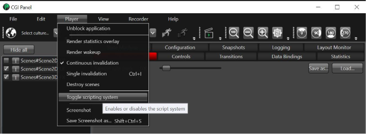
</p>

<div drawio-diagram="8284"><img src="https://doc316en.candera.eu/uploads/images/drawio/2025-04/drawing-7-1744176598.png" alt="drawing-7-1744176598.png"/></div>

<div drawio-diagram="8285"><img src="https://doc316en.candera.eu/uploads/images/drawio/2025-04/drawing-7-1744176630.png" alt="drawing-7-1744176630.png"/></div>

---

# Scripting Solution

#### Summary

This solution showcases scripting in SceneComposer. Starting the script system, the scene's camera will perform a fly-through of the city by following the blue arrow objects that are overlayed on the streets. When the camera comes into proximity of the bank/restaurant/hotel building, the respective building will fade into a greenish tint to highlight it. It will also downscale the building's billboard sign so that it does not impair readability when the camera gets close to it.

#### Purpose

The user gets an impression of what can be done by using a few simple scripts containing very little Lua code. This provides an outlook of SceneComposer becoming an integrated development environment.

#### Description

The sample solution contains the following 5 scripts:

<div class="contents" id="bkmrk-buildingfader.lua-a-"><div class="contents"><div class="textblock">- **BuildingFader.lua** A script that fades the material of the node it is attached to (bank/restaurant/hotel building) to a greenish color based on the distance of the node to the camera.
- **Id.lua** An empty script to identify the node it is attached to, so other scripts can operate on it. It is attached to blue arrow objects to make them accessible for the SplineCameraSetup script.
- **SignScaler.lua** A script that scales the node it is attached to (bank/restaurant/hotel sign) based on the distance of that node to the camera.
- **SplineCamera.lua** A script that calculates a spline defined by the given ControlPoints, and moves the camera that it is attached to along the spline.
- **SplineCameraSetup.lua** A script that sets up the camera and its spline. It gets all the scripts in its subtree, then iterates over them to get nodes called 'arrows.xxx' (where 'xxx' is a number), sorts them, and uses them as control points for the spline.

</div></div></div>The script code is documented to provide more details. For general information about Scripting see <span style="color:rgb(230,126,35);">[Introduction to Candera Lua Scripts](http://dev.jp.doc.cgistudio.at/APILINK/group___lua_tutorial.html#LuaTutorialLuaScript)</span>

<div drawio-diagram="4280"><img src="https://doc316en.candera.eu/uploads/images/drawio/2023-09/drawing-7-1695263528.png" alt="drawing-7-1695263528.png"/></div>

---

# Transitions Solution

#### Summary

This solution showcases Transitions in SceneComposer. Therefore different types of transition are used for replacing a scene with another scene. It shows how using a transition provides continuity so that the scene change is not quite so abrupt. Note that the Player has to be used to run the sample appropriately because only the Player supports Transitions.

#### Purpose

The user gets an impression of what can be done by using Transitions.

#### Tutorial

This section explains how to confirm the effect of the transitions set in this solution.

##### Confirmation and editing the set transitions

Open the **Transition Rules Editor** via the menu   
\[ View \] - \[ Transitions \] - \[ Transition Rules Editor \].

Here you can view and edit the configured transition rules.

<div drawio-diagram="7627"><img src="https://doc316en.candera.eu/uploads/images/drawio/2024-12/drawing-5-1734078193.png" alt="drawing-5-1734078193.png"/></div>

<p class="callout info">For details on how to use the Transition Rules Editor, please refer to <span style="color:rgb(230,126,35);">[Transition Rules Editor](https://doc316en.candera.eu/link/1194#bkmrk-%E3%83%88%E3%83%A9%E3%83%B3%E3%82%B8%E3%82%B7%E3%83%A7%E3%83%B3%E8%A6%8F%E5%89%87%E3%82%A8%E3%83%87%E3%82%A3%E3%82%BF%E3%83%BC)</span>.</p>

##### How to confirm the transition effects

1. Click on the play button to \[ Play the scenario... \] 
    - This will open the CGI Panel.   
        <div drawio-diagram="7798"><img src="https://doc316en.candera.eu/uploads/images/drawio/2025-01/drawing-7-1737005681.png" alt="drawing-7-1737005681.png"/></div>
2. In the left panel of the CGI Panel, check "Scene#ClearingScene" and "Scene#SwappingScene" 
    - "Scene#ClearingScene" and "Scene#SwappingScene" will be enabled.  
        <div drawio-diagram="7799"><img src="https://doc316en.candera.eu/uploads/images/drawio/2025-01/drawing-7-1737005848.png" alt="drawing-7-1737005848.png"/></div>
3. Open the "Transition" tab and  
    drag and drop "Scenes#scene1" from the left panel to \[ 'deactivation' scenes... \].  
    Similarly, drag and drop "Scenes#scene2" from the left panel to \[ 'activation' scenes... \].  
    
    - The source of the transition will be set to "scene1" and the destination to "scene2".  
        <div drawio-diagram="7800"><img src="https://doc316en.candera.eu/uploads/images/drawio/2025-01/drawing-7-1737006223.png" alt="drawing-7-1737006223.png"/></div>
4. Click \[ Run \]. 
    - You can check the transition from "scene1" to "scene2" in the Player.
5. Click \[ Swap \]. 
    - The source of the transition will be set to "scene2" and the destination to "scene1".  
        <div drawio-diagram="7801"><img src="https://doc316en.candera.eu/uploads/images/drawio/2025-01/drawing-7-1737006458.png" alt="drawing-7-1737006458.png"/></div>
6. Click \[ Run \] again.  
    
    - You can now check the transition from "scene2" to "scene1" in the Player.

<p class="callout info">Also be sure to check <span style="color:rgb(230,126,35);">[Transitions](https://doc316en.candera.eu/books/scene-design/chapter/transitions)</span> to get detailed information.</p>

---

# 3D ADAS Control Solution

#### Summary

This solution allows you to check the functions and usage of controls (ADAS-Control) that support the **A**dvanced **D**riving **A**ssistant **S**ystem.

<div drawio-diagram="7738"><img src="https://doc316en.candera.eu/uploads/images/drawio/2025-01/drawing-7-1736407108.png" alt="drawing-7-1736407108.png"/></div>

##### Marcket Demand to ADAS

- **ADAS visualization in the cockpit**: Helps users intuitively receive information about their surroundings and ADAS decisions.
- **Regulations:** Lead to more ADAS components in future cars.
- **Automated driving:** Increases the need for ADAS visualization to inform drivers of car decisions and warnings.
- **Growing demand:** There is a rapid increase in demand for HMI visualization of ADAS systems.

##### Configuration of ADAS-Control

- Adaptive Cruise Control (ACC)
- Lane Departure Detection (LDD)
- Blind Spot Detection
- Drowsiness Detection
- Collision Warning
- Traffic Sign Recognition

---

#### Description

##### Open 3D ADAS Control Solution

Open "ADAS Template" from \[Samples and Templates\] in the startup panel. ADAS-Control is used in the 3D\_ADAS\_Control scene.

<div drawio-diagram="7859"><img src="https://doc316en.candera.eu/uploads/images/drawio/2025-02/drawing-7-1738567049.png" alt="drawing-7-1738567049.png"/></div>

##### ADAS-Control Properties:

<span lang="en-us" style="font-family:'Open Sans', sans-serif;">In the properties window of the 3D ADAS control, user can activate or deactivate ADAS features and adjust the properties of each feature separately. The following properties are available:</span>

<table id="bkmrk-property-name-descri" style="border-collapse:collapse;width:100%;"><colgroup><col style="width:26.1048%;"></col><col style="width:73.8952%;"></col></colgroup><tbody><tr><td class="align-center">**Property Name**</td><td class="align-center">**Description**</td></tr><tr><td>Main Car Position

(Float type)

</td><td>Accepts values between 0 and 100. This property adjusts the Road texture u\_OffsetU position to simulate the car moving along the X-axis. The main car remains static while the road texture moves left and right based on this value.</td></tr><tr><td>LDD

(Boolean type)

</td><td>Accepts values between 0 and 100. This property adjusts the Road texture u\_OffsetU position to simulate the car moving along the X-axis. The main car remains static while the road texture moves left and right based on this value.</td></tr><tr><td>Side Assist

(Boolean type)

</td><td>Activates Blind Spot Detection (BSD). This system uses sensors to detect vehicles in the driver’s blind spot and alerts the driver with visual warnings. BSD is useful for changing lanes, merging, and overtaking. There are two attributes for Side Assist, one for the left side and one for the right side.</td></tr><tr><td>ACC

(Boolean type)

</td><td>Activates Adaptive Cruise Control. This system uses radar and cameras to maintain a safe distance from the vehicle ahead and automatically adjusts the speed to keep a safe following distance. ACC is ideal for highway driving, reducing driver fatigue, and helping to prevent rear-end collisions caused by sudden braking.</td></tr><tr><td>Set ACC Distance

(Float type)

</td><td>Allows the user to set a safe distance from the front vehicle, ranging from 1 to 4.</td></tr><tr><td>ACC Safe distance Indicator

(Boolean type)

</td><td>Activates the rendering of a mesh with a dynamic texture to demonstrate the safe distance to the front vehicle.</td></tr><tr><td>Normal Lane Texture</td><td>Texture for normal road conditions.</td></tr><tr><td>Highlight Center Lane Texture</td><td>Optional texture for highlighting the center part of the road lane.</td></tr><tr><td>Left Red Lane Texture</td><td>Changes the left lane texture to red when LDD is on and the car crosses the left lane.</td></tr><tr><td>Right Red Lane Texture</td><td>Changes the right lane texture to red when LDD is on and the car crosses the right lane.</td></tr><tr><td>Left Yellow Lane Texture</td><td>Changes the left lane texture to yellow when LDD is on and the car is close to the left lane.</td></tr><tr><td>Right Yellow Lane Texture</td><td>Changes the right lane texture to yellow when LDD is on and the car is close to the right lane.</td></tr><tr><td>Motorcycle Default Model</td><td>Deactivates the rendering of the default motorcycle 3D model, allowing users to assign their own 3D models to the ADAS control anchors.</td></tr><tr><td>Minivan Default Model</td><td>Deactivates the rendering of the default minivan 3D model, allowing users to assign their own 3D models to the ADAS control anchors.</td></tr><tr><td>Car Default Model</td><td>Deactivates the rendering of the default car 3D model, allowing users to assign their own 3D models to the ADAS control anchors.</td></tr><tr><td>Car Speed

(Float type)

</td><td>Sets the speed of the main car.</td></tr><tr><td>Car Minimum Speed

(Float type)

</td><td>Sets the minimum speed of the main car.</td></tr><tr><td>Car Maximum Speed

(Float type)

</td><td>Sets the maximum speed of the main car.</td></tr><tr><td>Forward Car Speed Value

</td><td>Sets a target node in a 2D or 3D scene to receive the Car speed value.</td></tr><tr><td>Set ACC Speed Value

(Float type)

</td><td>Changes the ACC speed.</td></tr><tr><td>ACC Minimum Speed

(Float type)

</td><td>Sets the ACC minimum speed.</td></tr><tr><td>ACC Maximum Speed

(Float type)

</td><td>Sets the ACC maximum speed.</td></tr><tr><td>Forward the ACC Speed value</td><td>Sets a target node in a 2D or 3D scene to receive the ACC speed value.</td></tr></tbody></table>

##### ADAS-Control Anchors:

Users can import their 3D models as FBX or glTF files and attach them to the anchors to replace the default ADAS 3D models. For example, a user can import a new 3D mesh for the main car and make it a child of the MainCarAnchor, as shown in the screenshot below.
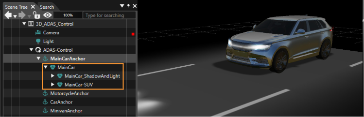
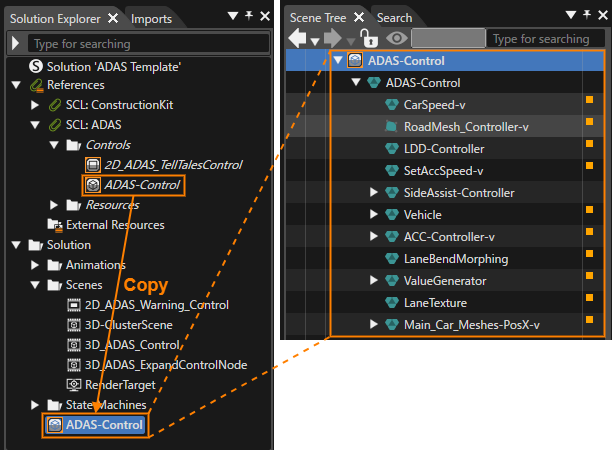
<div drawio-diagram="7862"><img src="https://doc316en.candera.eu/uploads/images/drawio/2025-02/drawing-7-1738567689.png" alt="drawing-7-1738567689.png"/></div>

##### ADAS-Control 3D models and textures:

Users can use the default vehicle 3D models (FBX files) as a bounding box and import them into DCC tools like 3Ds Max, Cinema 4D, Blender, etc., to create their 3D meshes at the same scale as the default models.

Textures can be exported from the solution explorer window or reimported with the same name and path to replace the existing ADAS control textures.

##### ADAS-Control Data Source:

A simple data source is created for ADAS control based on the ADAS properties. Each property in the ADAS control is bound to the target data type. The data source can be written in XML format and stored in an .xhcdl file. It can be extended by users based on their use cases.

This is a sample data source file "ADAS.xhcdl" that can be used with the 3D ADAS Control solution:

```xml
<?xml version="1.0" encoding="utf-8"?>

<definition
    xmlns:xsi="http://www.w3.org/2001/XMLSchema-instance"
    xsi:noNamespaceSchemaLocation="../../../../cgi_studio_cit/schema/HmiContract.xsd">

    <!-- Data binding ===============================================================================-->
    <types>
        <!--Dummy type to force the generation of code -->
        <compound name="IntRange" uid="{67DA817B-A748-4DF5-92FF-8193C1C595C6}">
            <item name="Min" type="::Courier::Int32" uid="{E7AFB591-6B09-4DD7-9396-DE75D36297F6}" defaultValue="0"/>
            <item name="Max" type="::Courier::Int32" uid="{7F9A827D-B690-46FA-BCD0-89C1FF0259D4}" defaultValue="0"/>
        </compound>
  </types>
    <bindingSources>
        <!-- Sample application specific messages -->
        <!-- Dynamic list specific messages -->
        <bindingSource name="ADAS" access="asynchronous" dataContextItem="true" uid="{86f39d72-8d42-43eb-87e7-475cdf384734}">
		    <item name="MainCarPosition" type="FeatStd::Float" uid="{7a55879f-0a01-41bf-9d96-d3048280b79f}" />
            <item name="LaneDepartureDetection" type="bool" uid="{f6ce6e18-00fc-45b7-a3fa-575179642ded}" />
			<item name="LeftSideAssist" type="bool" uid="{c973d596-d54a-4718-9b88-4c474e848a7b}" />
			<item name="RightSideAssist" type="bool" uid="{66f36b0a-2a4a-474b-8baf-d3dcd48708f3}" />
			<item name="AdaptiveCruiseControl" type="bool" uid="{e28b3baa-af17-49ff-920d-ea767bad4ef1}" />
			<item name="SetAccDistance" type="FeatStd::Int32" uid="{31fbcacd-9efe-4f42-ac2c-db68876103a0}" />
			<item name="AccSafeDistanceIndicator" type="bool" uid="{b0fa6306-e6a4-47ad-9412-e4880ddcf1ea}" />
			<item name="MotorcycleDefualtModel" type="bool" uid="{a62c4ed7-d20a-4e8e-ace7-942a60f4b71f}" />
			<item name="MinivanDefualtModel" type="bool" uid="{492abae1-dfbe-47ef-acc1-aee625b075af}" />
			<item name="CarDefualtModel" type="bool" uid="{5cb01d1b-9b9b-4982-99b2-4c82a4823d16}" />
			<item name="CarSpeed" type="FeatStd::Float" uid="{aaef9ff1-57f2-4a28-9955-4062c53773cd}" />
			<item name="CarMinSpeed" type="FeatStd::Float" uid="{AF002E21-2A9D-4617-B39B-B47B078A0C0D}" />
			<item name="CarMaxSpeed" type="FeatStd::Float" uid="{BEAF3A1F-ACB9-4EAF-A781-BB1D2094CDFA}" />
			<item name="RoadSpeed" type="FeatStd::Float" uid="{d9e793ad-fd4a-4edc-8a18-f122a8a0ce0e}" />
			<item name="AccSpeed" type="FeatStd::Float" uid="{4a6dca6e-4ad9-4f10-bc14-1bf7185a393f}" />
			<item name="AccMinSpeed" type="FeatStd::Float" uid="{C3096715-35A9-459E-9B00-9010C6090462}" />
			<item name="AccMaxSpeed" type="FeatStd::Float" uid="{B2D24547-7D01-4404-BEF9-746444CB6026}" />
        </bindingSource>
  </bindingSources>
</definition>
```

##### ADAS-Control details:

ADAS-Control is created using Behaviors and Effects from the Scene Composer Toolbox, so you can extend this control based on different use cases by copying ADAS-Control under the Solution folder in the Solution Explorer and double-clicking it.

<div drawio-diagram="7860"><img src="https://doc316en.candera.eu/uploads/images/drawio/2025-02/drawing-7-1738567349.png" alt="drawing-7-1738567349.png"/></div>

Additionally, there is a scene called 3D\_ADAS\_ExpandControlNode in the scenes folder, which provides an expanded version of the ADAS control. You can also edit this and save it as their own control.

<div drawio-diagram="7551"><img src="https://doc316en.candera.eu/uploads/images/drawio/2024-11/drawing-5-1732873488.png" alt="drawing-5-1732873488.png"/></div>

##### ADAS-Control Shaders:

Three shader program is written for ADAS control:

1. **TextureProperties-Shader:** Used in 3D meshes to add texture properties (Tiles and Offsets).
2. **VehicleShader:** Applied to vehicles to change their colors based on the main car's position.
3. **BendMesh\_2TexA\_Shader:** Accepts two textures—one normal texture and one for masking.

##### 2D\_ADAS\_TellTalesControl:

This 2D control includes telltales controls and text value. It triggers the rendering of 2D bitmap icons according to the ADAS control conditions, such as altering the Traffic Signs.

This control is optional and can be utilized alongside the 3D ADAS control in a 2D scene.

<div drawio-diagram="7861"><img src="https://doc316en.candera.eu/uploads/images/drawio/2025-02/drawing-7-1738567640.png" alt="drawing-7-1738567640.png"/></div>

---

# Blood Pressure Solution

#### Summary

The solution shows a blood pressure measurement device using 2D and various animations. To play the sample asset, open it in Scene Composer, save it to your disk and press the "Generate and Play" Button in the tool bar at the top of the Scene Composer.

The samples starts with a flip book animation that transforms to a beating heart and transitions to the measurement scene displayed below. The measurement scene starts a value animation that increases measurement values like oxygen saturation or heart rate gradually. An exemplary MEM button demonstrates a potential saving function of last measurements.

<div drawio-diagram="7462"><img src="https://doc316en.candera.eu/uploads/images/drawio/2024-11/drawing-7-1732058173.png" alt="drawing-7-1732058173.png"/></div>

When the value animation has finished, the GlobalStateMachine resets the sample and starts again with the intro animation followed by the value animation.

<p class="callout info">If the player was build with `CGIAPP_SAMPLE_SOUNDHOUND_ENABLED = ON`, the sample looks and behaves differently, as documented in the Professional Edition <span style="color:rgb(230,126,35);">[Blood Pressure Sample documentation](https://doc316en.candera.eu/books/cgi-studio-professional-edition/page/blood-pressure-sample "Blood Pressure Sample")</span>. The global state machine has one branch that start the sample normally as described above, if `CGIAPP_SAMPLE_SOUNDHOUND_ENABLED` is `OFF`. If `CGIAPP_SAMPLE_SOUNDHOUND_ENABLED` is `ON` the state machine will start another branch that includes a demo with voice activation, as described in the documentation mentioned earlier.</p>

# Instrument Cluster Solution

#### Overview

This solutions showcases an automotive instrument cluster covering several features, such as a 3D ADAS control and feature tiles.

It demonstrates a solution covering an automotive instrument cluster for an electric vehicle including advanced driving assistance systems visualization. As key feature is the ADAS control in the center of the solution and also the "floating" tiles with features such as music or phone control.
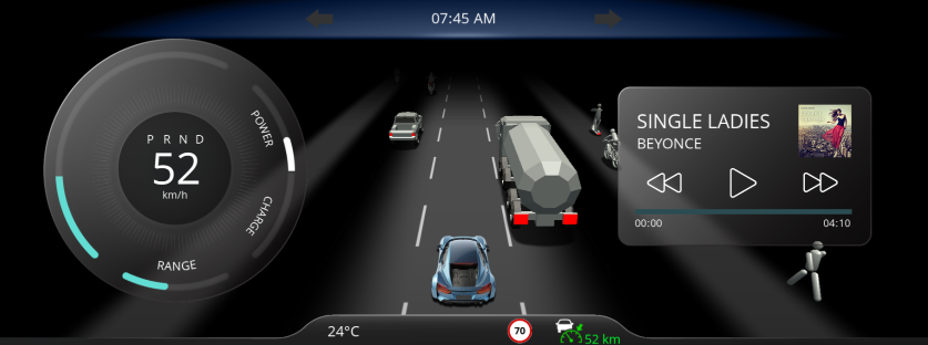
<div drawio-diagram="8787"><img src="https://doc316en.candera.eu/uploads/images/drawio/2025-11/drawing-7-1763623981.png" alt="drawing-7-1763623981.png"/></div>

---

#### Feature Description

##### Scene

<table id="bkmrk-no.-category-scene-n" style="border-collapse:collapse;width:100%;height:305.6px;"><colgroup><col style="width:8.70083%;"></col><col style="width:13.1108%;"></col><col style="width:20.3911%;"></col><col style="width:57.7973%;"></col></colgroup><thead><tr style="height:29.8px;"><td style="height:29.8px;">No.</td><td style="height:29.8px;">Category</td><td style="height:29.8px;">Scene Name</td><td style="height:29.8px;">Description</td></tr></thead><tbody><tr style="height:63.4px;"><td style="height:63.4px;">(1)</td><td style="height:63.4px;">ADAS</td><td style="height:63.4px;">3D\_ADAS\_DemoScene</td><td style="height:63.4px;">3D scene handles several objects visible on the street (such as bikes, pedestrians, trucks, cars and so on). All the objects are handled with a single ObjectControl feature. ADAS (Advanced Driver Assistance System) features were also included. For more details on ADAS features, please refer to [<span style="color:rgb(230,126,35);">3D ADAS Control Solution</span>](https://doc316en.candera.eu/books/sample-solutions/page/3d-adas-control-solution "3D ADAS Control Solution").</td></tr><tr style="height:29.8px;"><td style="height:29.8px;">(2)</td><td style="height:29.8px;">ADAS</td><td style="height:29.8px;">AdasScene2D</td><td style="height:29.8px;">2D ADAS scene links with 3D scene. For instance, if ACC set distance toggle button is enabled, then distance between car and next object on the road must be visible which can be set based on "plus" and "minus" key inputs. In a similar way, all others like LDD, Side assist, ACC indicators and so on were connected to the 3D ADAS demo scene.</td></tr><tr style="height:29.8px;"><td style="height:29.8px;">(3)</td><td style="height:29.8px;">Background</td><td style="height:29.8px;">BackgroundScene2D</td><td style="height:29.8px;">Background scene</td></tr><tr style="height:29.8px;"><td style="height:29.8px;">(4)</td><td style="height:29.8px;">Main</td><td style="height:29.8px;">ClusterHomeScene2D</td><td style="height:29.8px;">This scene has mainly cluster (circular slider based) to handle speed, power, charge and range. On increase of speed, power increases and charge (regeneration in this case) doesn't reflect the change. As and when speed starts to decrease, power drops to zero and regeneration increases. Range indicates battery of the car which reduces gradually.   
  
Another part of this scene is the car and adas telltales' control which are connected to 3D ADAS DemoScene.  
</td></tr><tr style="height:29.8px;"><td style="height:29.8px;">(5)</td><td style="height:29.8px;">Tile</td><td style="height:29.8px;">MusicScene2D</td><td style="height:29.8px;">Slider control indicates progress bar of song and on next or previous button, song information changes. At the end of every song, it automatically shifts to the next song in the list.</td></tr><tr style="height:63.4px;"><td style="height:63.4px;">(6)</td><td style="height:63.4px;">Tile</td><td style="height:63.4px;">NavigationScene2D</td><td style="height:63.4px;">The navigation scene/tile is a placeholder for a navigation solution integration, as there is no "standard" for navigation integrations and strong depend on the navigation software provider solution.</td></tr><tr style="height:29.8px;"><td style="height:29.8px;">(7)</td><td style="height:29.8px;">Tile</td><td style="height:29.8px;">PhoneScene2D</td><td style="height:29.8px;">All contacts are listed under the scene. On click of any contact, shifts to outgoing call scene where the user has the option to decline call and go back to contacts list.</td></tr></tbody></table>

##### Control

ADAS controls that is used in this solution is same as the one which is added under 3d-adas-control-solution under sample solutions. For details, please refer to <span style="color:rgb(230,126,35);">[3D ADAS Control Solution](https://doc316en.candera.eu/books/sample-solutions/page/3d-adas-control-solution)</span>.

All ADAS features added when toggle buttons in ADAS scene are enabled.

<p class="callout info">The toggle buttons for **ACC Set Speed** and **Highway Assist** are displayed, but the functionalities are not implemented at this time.</p>

##### Transition

Transition rules were used with animation as transition type for respective tiles movement and it is cyclic.  
For example:

- MusicScene2D -&gt; NavigationScene2D (MusicDownMove animation is used for movement)
- NavigationScene2D -&gt; MusicScene2D (NaviUpMove animation is used for movement)

##### State Machine

**GlobalStateMachine** activates common scenes that are used by all the other scenes such as background scene, cluster scene and 3D-ADAS scene. Few animations are configured that needs to be activated during startup like range display in cluster which indicates battery that decreases as per efficiency.

**MainCarPositionStateMachine** handles direction of central car movements. Left and Right arrow keys are used for this action.

**SetDistanceStateMachine** gets activated when ADAS tiles toggle button is enabled and the lines between central car and another object shows up as shown in below image. Plus and Minus keys are used for this action.
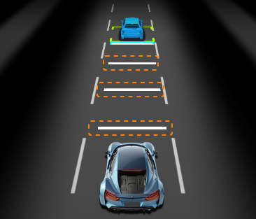
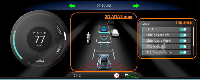
<div drawio-diagram="8868"><img src="https://doc316en.candera.eu/uploads/images/drawio/2025-12/drawing-7-1765864384.png" alt="drawing-7-1765864384.png"/></div>

**SetSpeedStateMachine** specifies speed range on which car must be, as per user settings. If set speed initially 80 and when user sets for 90, then speed ranges from 0-90.

**TileStateMachine** handles tiles movement with up and down arrow keys among Music player, Contacts, ADAS and Navigation tiles.

#### Play/Operation using Player

<div drawio-diagram="8809"><img src="https://doc316en.candera.eu/uploads/images/drawio/2025-12/drawing-7-1764747958.png" alt="drawing-7-1764747958.png"/></div>

**3D ADAS area**

1. You can control the position of the main car horizontally by pressing the Left Key and Right Key.
2. The status of LDD (Lane Departure Detection) set in the Tile area is displayed.
3. The status of ACC (Adaptive Cruise Control) set in the Tile area is displayed.

**Tile area**

1. The tiles switch by pressing the Up Arrow Key or Down Arrow Key. When the Down Arrow Key is pressed, the tiles switch in the following order:  
    AdasScene2D→NavigationScene2D→MusicScene2D→PhoneScene2D
2. The Add Key ($+$) and Subtract Key ($-$) inputs can be used to set the ACC distance in the AdasScene2D.
3. In the ADAS 2D scene, the Add and Subtract Keys are used to set the ACC speed.

# In-Vehicle Infotainment Solution

#### Overview

The in-vehicle infotainment solution showcases a full feature automotive IVI, which could be used as a solution template.

The solution has a interactive 3D digital twin, a dashboard, media phone and HVAC and also an application drawer and car settings pages. It also features a navigation scene with a navigation solution placeholder.

<div drawio-diagram="8793"><img src="https://doc316en.candera.eu/uploads/images/drawio/2025-11/drawing-7-1763625349.png" alt="drawing-7-1763625349.png"/></div>

#### Scene

<table id="bkmrk-no-category-name%28s%29-" style="border-collapse:collapse;width:95.9524%;height:697.907px;"><colgroup><col style="width:5.34161%;"></col><col style="width:12.1739%;"></col><col style="width:33.9113%;"></col><col style="width:48.5731%;"></col></colgroup><tbody><tr style="height:29.7969px;"><td class="align-center" style="height:29.7969px;">No</td><td class="align-center" style="height:29.7969px;">Category</td><td class="align-center" style="height:29.7969px;">Name(s)</td><td class="align-center" style="height:29.7969px;">Description</td></tr><tr style="height:63.3906px;"><td style="height:63.3906px;">(1)</td><td style="height:63.3906px;">Digital Twin</td><td style="height:63.3906px;">/DigitalTwin/Porsche\_Macan\_Turbo\_EW

/DigitalTwin/Scene2D-UI

/Menu/DigitalTwin

</td><td style="height:63.3906px;">The digital twin scenes.</td></tr><tr style="height:46.5938px;"><td style="height:46.5938px;">(2)</td><td style="height:46.5938px;">HVAC</td><td style="height:46.5938px;">/Menu/HVAC/HVACScene2D  
/Menu/HVAC/HVACSeatHeating3D

</td><td style="height:46.5938px;">Heat, ventilation and air conditioning related points were covered.</td></tr><tr style="height:63.3906px;"><td style="height:63.3906px;">(3)</td><td style="height:63.3906px;">Media</td><td style="height:63.3906px;">/Menu/Media/MP3AlbumScene2D

/Menu/Media/MP3PlaylistScene2D

/Menu/Media/RadioScene2D

</td><td style="height:63.3906px;">The media related playlist, album and radio scenes included</td></tr><tr style="height:63.3906px;"><td style="height:63.3906px;">(4)</td><td style="height:63.3906px;">Phone</td><td style="height:63.3906px;">/Menu/Phone/CallPopupScene2D

/Menu/Phone/ContactScene2D

/Menu/Phone/IncomingCallScene2D

</td><td style="height:63.3906px;">The phone connection scenes such as call notification, incoming call and contacts list</td></tr><tr style="height:131.188px;"><td style="height:131.188px;">(5)</td><td style="height:131.188px;">Settings</td><td style="height:131.188px;">/Menu/Settings/DisplayInterfaceScene2D

/Menu/Settings/DrivingAssistScene2D

/Menu/Settings/GeneralSettingsScene2D

/Menu/Settings/MaintenanceScene2D

/Menu/Settings/PrivacySecurityScene2D

/Menu/Settings/SettingScene2D

/Menu/Settings/VehicleSettingScene2D

</td><td style="height:131.188px;">The IVI settings scenes to configure several features of the IVI and car.</td></tr><tr style="height:46.5938px;"><td style="height:46.5938px;">(6)</td><td style="height:46.5938px;">AppDrawer</td><td style="height:46.5938px;">/Menu/AppdrawerScene2D

</td><td style="height:46.5938px;">The app drawer shows the implementation of external optional applications.</td></tr><tr style="height:46.5938px;"><td style="height:46.5938px;">(7)</td><td style="height:46.5938px;">Home</td><td style="height:46.5938px;">/Menu/HomeScene2D

</td><td style="height:46.5938px;">The home scene where main options available for quick selection rather than going into main scenes</td></tr><tr style="height:80.1875px;"><td style="height:80.1875px;">(8)</td><td style="height:80.1875px;">Navigation</td><td style="height:80.1875px;">/Menu/NavigationScene2D

</td><td style="height:80.1875px;">The navigation scene/tile is a placeholder for a navigation solution integration, as there is no "standard" for navigation integrations and strong depend on the navigation software provider solution.</td></tr><tr style="height:63.3906px;"><td style="height:63.3906px;">(9)</td><td style="height:63.3906px;">Background</td><td style="height:63.3906px;">/BackgroundScene2D

</td><td style="height:63.3906px;"><span class="TextRun SCXW247130821 BCX8" lang="en-us"><span class="NormalTextRun SCXW247130821 BCX8">Mainly c</span><span class="NormalTextRun SCXW247130821 BCX8">ontai</span><span class="NormalTextRun SCXW247130821 BCX8">ns</span> <span class="NormalTextRun SCXW247130821 BCX8">background for IVI where few bitmaps were animated and used masking effects to mimic background movement effects.</span></span></td></tr><tr style="height:63.3906px;"><td style="height:63.3906px;">(10)</td><td style="height:63.3906px;">Status</td><td style="height:63.3906px;">/StatusBarScene2D

</td><td style="height:63.3906px;">The status bar of the IVI. <span class="TextRun SCXW247130821 BCX8" lang="en-us"><span class="NormalTextRun SCXW247130821 BCX8">Bottom and top bar </span><span class="NormalTextRun SCXW247130821 BCX8">provide</span><span class="NormalTextRun SCXW247130821 BCX8"> basic information </span><span class="NormalTextRun SCXW247130821 BCX8">about</span><span class="NormalTextRun SCXW247130821 BCX8"> the profile, time, </span><span class="NormalTextRun SCXW247130821 BCX8">temperature,</span><span class="NormalTextRun SCXW247130821 BCX8"> and dashboard icons for transition.</span></span><span class="EOP SCXW247130821 BCX8"> </span></td></tr></tbody></table>


#### Scenes overview

**<span class="TextRun SCXW112088915 BCX8" lang="en-us"><span class="NormalTextRun SCXW112088915 BCX8">M</span><span class="NormalTextRun SCXW112088915 BCX8">edia</span></span>**<span class="TextRun SCXW112088915 BCX8" lang="en-us"><span class="NormalTextRun SCXW112088915 BCX8">: </span><span class="NormalTextRun SCXW112088915 BCX8">All media channels are accessible with </span><span class="NormalTextRun SCXW112088915 BCX8">a single</span><span class="NormalTextRun SCXW112088915 BCX8"> media icon in the bottom bar. Afterwards an overlay</span><span class="NormalTextRun SCXW112088915 BCX8"> screen</span> <span class="NormalTextRun SCXW112088915 BCX8">allows you</span><span class="NormalTextRun SCXW112088915 BCX8"> to select</span> <span class="NormalTextRun SCXW112088915 BCX8">among three icons: media, radio or USB.</span></span>

<div drawio-diagram="8859"><img src="https://doc316en.candera.eu/uploads/images/drawio/2025-12/drawing-7-1765775003.png" alt="drawing-7-1765775003.png"/></div>

<span class="TextRun SCXW112088915 BCX8" lang="en-us"><span class="NormalTextRun SCXW112088915 BCX8"> </span></span><span class="TextRun SCXW242567699 BCX8" lang="en-us"><span class="NormalTextRun SCXW242567699 BCX8">On</span><span class="NormalTextRun SCXW242567699 BCX8">ce </span><span class="NormalTextRun SCXW242567699 BCX8">the Bluetooth</span><span class="NormalTextRun SCXW242567699 BCX8"> button </span><span class="NormalTextRun SCXW242567699 BCX8">is pressed,</span> <span class="NormalTextRun SCXW242567699 BCX8">m</span><span class="NormalTextRun SCXW242567699 BCX8">usic information is displayed</span><span class="NormalTextRun SCXW242567699 BCX8"> with menu button selections among playlist and album</span><span class="NormalTextRun SCXW242567699 BCX8">s</span><span class="NormalTextRun SCXW242567699 BCX8">. List control </span><span class="NormalTextRun SCXW242567699 BCX8">handles</span> <span class="NormalTextRun SCXW242567699 BCX8">displaying</span> <span class="NormalTextRun SCXW242567699 BCX8">song name</span><span class="NormalTextRun SCXW242567699 BCX8">s </span><span class="NormalTextRun SCXW242567699 BCX8">with scrollbar control </span><span class="NormalTextRun SCXW242567699 BCX8">and </span><span class="NormalTextRun SCXW242567699 BCX8">besides that</span><span class="NormalTextRun SCXW242567699 BCX8"> there is </span><span class="NormalTextRun SCXW242567699 BCX8">specific design which shows album</span><span class="NormalTextRun SCXW242567699 BCX8"> and song time.</span><span class="NormalTextRun SCXW242567699 BCX8"> Slider </span><span class="NormalTextRun ContextualSpellingAndGrammarErrorV2Themed SCXW242567699 BCX8">control</span><span class="NormalTextRun SCXW242567699 BCX8"> along with animation for song time and switch from one song to another with the next and </span><span class="NormalTextRun SCXW242567699 BCX8">previous</span><span class="NormalTextRun SCXW242567699 BCX8"> button.</span> <span class="NormalTextRun SCXW242567699 BCX8">Albums screen shows </span><span class="NormalTextRun SpellingErrorV2Themed SCXW242567699 BCX8">coverflow</span><span class="NormalTextRun SCXW242567699 BCX8"> of songs that are added to the playlist.</span></span><span class="EOP SCXW242567699 BCX8"> </span>

<div drawio-diagram="8867"><img src="https://doc316en.candera.eu/uploads/images/drawio/2025-12/drawing-7-1765775772.png" alt="drawing-7-1765775772.png"/></div>

<span class="EOP SCXW242567699 BCX8">**<span class="TextRun SCXW1622548 BCX8" lang="en-us"><span class="NormalTextRun SCXW1622548 BCX8">Phone</span></span>**<span class="TextRun SCXW1622548 BCX8" lang="en-us"><span class="NormalTextRun SCXW1622548 BCX8">:</span> <span class="NormalTextRun SCXW1622548 BCX8">showcases</span> <span class="NormalTextRun SCXW1622548 BCX8">the following</span><span class="NormalTextRun SCXW1622548 BCX8"> screens along with one incoming call popup. Contact </span><span class="NormalTextRun SCXW1622548 BCX8">lists</span> <span class="NormalTextRun SCXW1622548 BCX8">are animated to scroll outgoing calls. </span><span class="NormalTextRun ContextualSpellingAndGrammarErrorV2Themed SCXW1622548 BCX8">Keypad</span><span class="NormalTextRun SCXW1622548 BCX8"> also implemented based </span><span class="NormalTextRun SCXW1622548 BCX8">on </span><span class="NormalTextRun SCXW1622548 BCX8">keyboard control. Menu buttons</span><span class="NormalTextRun SCXW1622548 BCX8"> (like favorites, contacts)</span> <span class="NormalTextRun SCXW1622548 BCX8">work</span> <span class="NormalTextRun SCXW1622548 BCX8">upon </span><span class="NormalTextRun SCXW1622548 BCX8">a </span><span class="NormalTextRun SCXW1622548 BCX8">click</span><span class="NormalTextRun SCXW1622548 BCX8">. </span><span class="NormalTextRun SCXW1622548 BCX8">Custom contact button control is used in </span><span class="NormalTextRun SCXW1622548 BCX8">the contact</span><span class="NormalTextRun SCXW1622548 BCX8"> list. </span></span></span>

<div drawio-diagram="8874"><img src="https://doc316en.candera.eu/uploads/images/drawio/2025-12/drawing-7-1766639417.png" alt="drawing-7-1766639417.png"/></div>

**<span class="TextRun SCXW229774017 BCX8" lang="en-us"><span class="NormalTextRun SpellingErrorV2Themed SpellingErrorHighlight SCXW229774017 BCX8">AppDrawe</span><span class="NormalTextRun SpellingErrorV2Themed SpellingErrorHighlight SCXW229774017 BCX8">r</span><span class="NormalTextRun SCXW229774017 BCX8"> and settings screens</span></span>**<span class="TextRun SCXW229774017 BCX8" lang="en-us"><span class="NormalTextRun SCXW229774017 BCX8">: </span><span class="NormalTextRun SpellingErrorV2Themed SCXW229774017 BCX8">Appdrawer</span> <span class="NormalTextRun ContextualSpellingAndGrammarErrorV2Themed SCXW229774017 BCX8">control</span><span class="NormalTextRun SCXW229774017 BCX8"> displays settings and other apps that are supported in the</span><span class="NormalTextRun SCXW229774017 BCX8"> feature. The icons </span><span class="NormalTextRun SCXW229774017 BCX8">on the drawer </span><span class="NormalTextRun SCXW229774017 BCX8">can be moved from one place to another via a long press of the button. </span><span class="NormalTextRun SCXW229774017 BCX8">On press of </span><span class="NormalTextRun SCXW229774017 BCX8">the Sett</span><span class="NormalTextRun SCXW229774017 BCX8">ings</span><span class="NormalTextRun SCXW229774017 BCX8"> icon, it </span><span class="NormalTextRun SCXW229774017 BCX8">navigates to settings page where </span><span class="NormalTextRun SCXW229774017 BCX8">a </span><span class="NormalTextRun SCXW229774017 BCX8">user</span><span class="NormalTextRun SCXW229774017 BCX8"> can select among different settings to be done as per requirement of user</span><span class="NormalTextRun SCXW229774017 BCX8">.</span></span><span class="EOP SCXW229774017 BCX8"> </span>

<span class="TextRun SCXW229774017 BCX8" lang="en-us"><span class="NormalTextRun SCXW229774017 BCX8">Each settings screen</span><span class="NormalTextRun SCXW229774017 BCX8"> (general, display interface, ...)</span> <span class="NormalTextRun SCXW229774017 BCX8">consists of states as text-based toggle buttons (2 and 3 states). 2 states toggle button can be of yes or </span><span class="NormalTextRun SCXW229774017 BCX8">no format. </span><span class="NormalTextRun SCXW229774017 BCX8">The Tri</span><span class="NormalTextRun SCXW229774017 BCX8">-state toggle but</span><span class="NormalTextRun SCXW229774017 BCX8">ton </span><span class="NormalTextRun SCXW229774017 BCX8">indic</span><span class="NormalTextRun SCXW229774017 BCX8">ates</span><span class="NormalTextRun SCXW229774017 BCX8"> 3 different st</span><span class="NormalTextRun SCXW229774017 BCX8">ate </span><span class="NormalTextRun SCXW229774017 BCX8">selec</span><span class="NormalTextRun SCXW229774017 BCX8">tions</span><span class="NormalTextRun SCXW229774017 BCX8"> (</span><span class="NormalTextRun SCXW229774017 BCX8">for </span><span class="NormalTextRun SCXW229774017 BCX8">instance,</span> <span class="NormalTextRun SCXW229774017 BCX8">auto, km, miles)</span><span class="NormalTextRun SCXW229774017 BCX8">.</span></span><span class="EOP SCXW229774017 BCX8"> Among 10 settings button shown in the settings main page, only 6 of them were implemented and those are General settings, Display interface, driver assistance, vehicle, maintenance and security. Other 4 are left for future addition if required.</span>

<div drawio-diagram="8869"><img src="https://doc316en.candera.eu/uploads/images/drawio/2025-12/drawing-7-1765957169.png" alt="drawing-7-1765957169.png"/></div>

<span class="TextRun SCXW229774017 BCX8" lang="en-us">**<span class="NormalTextRun SCXW229774017 BCX8">Home</span>**<span class="NormalTextRun SCXW229774017 BCX8">:</span></span><span class="TextRun SCXW229774017 BCX8" lang="en-us"><span class="NormalTextRun SCXW229774017 BCX8"> Dashboard has all the tile</span><span class="NormalTextRun SCXW229774017 BCX8">s in general such as navigation, weather information, music </span><span class="NormalTextRun SCXW229774017 BCX8">player</span><span class="NormalTextRun SCXW229774017 BCX8"> and contacts. </span><span class="NormalTextRun SCXW229774017 BCX8">On click of</span> <span class="NormalTextRun ContextualSpellingAndGrammarErrorV2Themed SCXW229774017 BCX8">home</span><span class="NormalTextRun SCXW229774017 BCX8"> button under </span><span class="NormalTextRun SCXW229774017 BCX8">navigation tile, it </span><span class="NormalTextRun SCXW229774017 BCX8">leads to</span> <span class="NormalTextRun SCXW229774017 BCX8">navigation screen. </span><span class="NormalTextRun SCXW229774017 BCX8">Music </span><span class="NormalTextRun ContextualSpellingAndGrammarErrorV2Themed SCXW229774017 BCX8">tile operates</span><span class="NormalTextRun SCXW229774017 BCX8"> in </span><span class="NormalTextRun SCXW229774017 BCX8">a</span> <span class="NormalTextRun SCXW229774017 BCX8">similar way</span><span class="NormalTextRun SCXW229774017 BCX8"> as there under </span><span class="NormalTextRun SCXW229774017 BCX8">the main</span> <span class="NormalTextRun SCXW229774017 BCX8">media </span><span class="NormalTextRun SCXW229774017 BCX8">playlist screen</span><span class="NormalTextRun SCXW229774017 BCX8">. </span><span class="NormalTextRun SCXW229774017 BCX8">Under contacts tile, </span><span class="NormalTextRun ContextualSpellingAndGrammarErrorV2Themed SCXW229774017 BCX8">message</span><span class="NormalTextRun SCXW229774017 BCX8"> popup screen overlays on top of the tiles when a user clicks </span><span class="NormalTextRun ContextualSpellingAndGrammarErrorV2Themed SCXW229774017 BCX8">message</span><span class="NormalTextRun SCXW229774017 BCX8"> icon. </span></span><span class="EOP SCXW229774017 BCX8"> </span>

<div drawio-diagram="8862"><img src="https://doc316en.candera.eu/uploads/images/drawio/2025-12/drawing-7-1765775334.png" alt="drawing-7-1765775334.png"/></div>

<span class="EOP SCXW229774017 BCX8"><span class="TextRun SCXW247073552 BCX8" lang="en-us"><span class="NormalTextRun SCXW247073552 BCX8">Navigation</span><span class="NormalTextRun SCXW247073552 BCX8">:</span></span><span class="TextRun SCXW247073552 BCX8" lang="en-us"><span class="NormalTextRun SCXW247073552 BCX8"> navigation icon in the bottom bar goes to navigation screen where search voice button receives </span><span class="NormalTextRun SCXW247073552 BCX8">destination input from user and calculates distance between source and destination timings and finally provides map connection</span><span class="NormalTextRun SCXW247073552 BCX8"> via </span><span class="NormalTextRun SCXW247073552 BCX8">Turn-by-turn</span><span class="NormalTextRun SCXW247073552 BCX8"> control.</span></span><span class="EOP SCXW247073552 BCX8"> </span></span>

<div drawio-diagram="8863"><img src="https://doc316en.candera.eu/uploads/images/drawio/2025-12/drawing-7-1765775394.png" alt="drawing-7-1765775394.png"/></div>

<span class="TextRun SCXW247130821 BCX8" lang="en-us">**<span class="NormalTextRun SCXW247130821 BCX8">HVAC </span><span class="NormalTextRun SCXW247130821 BCX8">component</span>**<span class="NormalTextRun SCXW247130821 BCX8">:</span></span><span class="TextRun SCXW247130821 BCX8" lang="en-us"><span class="NormalTextRun SCXW247130821 BCX8"> is added </span><span class="NormalTextRun SCXW247130821 BCX8">as code part to</span> <span class="NormalTextRun SCXW247130821 BCX8">handle sync operation</span><span class="NormalTextRun SCXW247130821 BCX8">. The sync</span><span class="NormalTextRun SCXW247130821 BCX8"> button will </span><span class="NormalTextRun SCXW247130821 BCX8">synchronize</span><span class="NormalTextRun SCXW247130821 BCX8"> the passenger's temperature as per the driver's temperature. On c</span><span class="NormalTextRun SCXW247130821 BCX8">lick of </span><span class="NormalTextRun SCXW247130821 BCX8">temp</span><span class="NormalTextRun SCXW247130821 BCX8"> increase or decrease button of the pass</span><span class="NormalTextRun SCXW247130821 BCX8">enger side, sync button automatically disables. </span></span><span class="EOP SCXW247130821 BCX8"> </span>

<div drawio-diagram="8864"><img src="https://doc316en.candera.eu/uploads/images/drawio/2025-12/drawing-7-1765775510.png" alt="drawing-7-1765775510.png"/></div>

#### 3D and 2D scenes interactions

<span class="TextRun SCXW1315550 BCX8" lang="en-us"><span class="NormalTextRun SCXW1315550 BCX8">Few solutions are providing such link between scenes were</span><span class="NormalTextRun SCXW1315550 BCX8">:</span></span><span class="EOP SCXW1315550 BCX8"> </span>

**<span class="TextRun SCXW1315550 BCX8" lang="en-us"><span class="NormalTextRun SCXW1315550 BCX8">Heating, Ventilation and Air conditioning (2D HVAC and 3D Seat heating)</span></span><span class="TextRun SCXW1315550 BCX8" lang="en-us"><span class="NormalTextRun SCXW1315550 BCX8"> - </span></span><span class="EOP SCXW1315550 BCX8"> </span>**

<div class="ListContainerWrapper SCXW1315550 BCX8" id="bkmrk--16"></div>**<span class="TextRun SCXW1315550 BCX8" lang="en-us"><span class="NormalTextRun SCXW1315550 BCX8">HVAC 2D Scene</span></span>**<span class="TextRun SCXW1315550 BCX8" lang="en-us"><span class="NormalTextRun SCXW1315550 BCX8">:</span> <span class="NormalTextRun SCXW1315550 BCX8">HVAC 3D seat heating</span><span class="NormalTextRun SCXW1315550 BCX8">,</span><span class="NormalTextRun SCXW1315550 BCX8"> air flow motion and its speed uses animations </span></span> <span class="TextRun SCXW1315550 BCX8" lang="en-us"><span class="NormalTextRun SCXW1315550 BCX8">for showing different effects and are linked to 2D HVAC for </span><span class="NormalTextRun SCXW1315550 BCX8">operating</span><span class="NormalTextRun SCXW1315550 BCX8"> those effects</span><span class="NormalTextRun SCXW1315550 BCX8"> using </span></span> <span class="TextRun SCXW1315550 BCX8" lang="en-us"><span class="NormalTextRun SCXW1315550 BCX8">Value generator behavior and animations along with it.</span></span><span class="EOP SCXW1315550 BCX8"> </span>

<div drawio-diagram="8865"><img src="https://doc316en.candera.eu/uploads/images/drawio/2025-12/drawing-7-1765775583.png" alt="drawing-7-1765775583.png"/></div>

<span class="TextRun SCXW1315550 BCX8" lang="en-us"><span class="NormalTextRun SCXW1315550 BCX8">Sync button is already described </span><span class="NormalTextRun ContextualSpellingAndGrammarErrorV2Themed SCXW1315550 BCX8">above</span><span class="NormalTextRun SCXW1315550 BCX8"> and </span><span class="NormalTextRun SCXW1315550 BCX8">remaining </span><span class="NormalTextRun SCXW1315550 BCX8">buttons have </span><span class="NormalTextRun SCXW1315550 BCX8">following </span><span class="NormalTextRun SCXW1315550 BCX8">logic:</span></span><span class="EOP SCXW1315550 BCX8"> </span>

<div class="ListContainerWrapper SCXW1315550 BCX8" id="bkmrk-ac-by-default-is-ena">- <span class="TextRun SCXW1315550 BCX8" lang="en-us"><span class="NormalTextRun SCXW1315550 BCX8">AC by default is enabled for all settings.</span></span><span class="EOP SCXW1315550 BCX8"> </span>

</div><div class="ListContainerWrapper SCXW1315550 BCX8" id="bkmrk-when-auto-mode-is-en">- <span class="TextRun SCXW1315550 BCX8" lang="en-us"><span class="NormalTextRun SCXW1315550 BCX8">W</span><span class="NormalTextRun SCXW1315550 BCX8">hen AUTO mode is enabled, temperature set to 24°C, sliders were set to 50 on both sides, Max AC and Max fan disabled, and air recirculation is enabled. Air recirculation is disabled on AUTO mode disable</span></span><span class="EOP SCXW1315550 BCX8"> </span>

</div><div class="ListContainerWrapper SCXW1315550 BCX8" id="bkmrk-when-max-ac-is-enabl">- <span class="TextRun SCXW1315550 BCX8" lang="en-us"><span class="NormalTextRun SCXW1315550 BCX8">When Max AC is enabled, temperature set to 16°C, and Max Fan and AUTO are disabled. When Max AC disabled, AUTO is enabled and temperatures were set to 24°C (normal).</span></span><span class="EOP SCXW1315550 BCX8"> </span>

</div><div class="ListContainerWrapper SCXW1315550 BCX8" id="bkmrk-when-max-fan-is-enab">- <span class="TextRun SCXW1315550 BCX8" lang="en-us"><span class="NormalTextRun SCXW1315550 BCX8">When Max Fan is enabled, Max AC and AUTO are disabled, and sliders were set to 100 on both sides</span></span><span class="EOP SCXW1315550 BCX8"> </span>

</div><div class="ListContainerWrapper SCXW1315550 BCX8" id="bkmrk-circulating-air-is-a">- <span class="TextRun SCXW1315550 BCX8" lang="en-us"><span class="NormalTextRun SCXW1315550 BCX8">Circulating Air is always a “auto” or “disabled” feature. It enables when the parameters are right (</span><span class="NormalTextRun SCXW1315550 BCX8">e.g.</span><span class="NormalTextRun SCXW1315550 BCX8"> dust, dirty, smell, etc.). Circulating air is either </span><span class="NormalTextRun SCXW1315550 BCX8">O</span><span class="NormalTextRun SCXW1315550 BCX8">N</span><span class="NormalTextRun SCXW1315550 BCX8"> automatic mode or </span><span class="NormalTextRun SCXW1315550 BCX8">O</span><span class="NormalTextRun SCXW1315550 BCX8">FF</span><span class="NormalTextRun SCXW1315550 BCX8">.</span></span><span class="EOP SCXW1315550 BCX8"> </span>

</div><span class="EOP SCXW1315550 BCX8"><span class="TextRun SCXW1315550 BCX8" lang="en-us">**<span class="NormalTextRun SCXW1315550 BCX8">Digital twin (</span><span class="NormalTextRun SpellingErrorV2Themed SCXW1315550 BCX8">Porsche\_Macan\_Turbo\_EW</span><span class="NormalTextRun SCXW1315550 BCX8">, Scene2D-UI and </span><span class="NormalTextRun SpellingErrorV2Themed SCXW1315550 BCX8">DigitalTwin</span>**<span class="NormalTextRun SCXW1315550 BCX8">**)** -</span><span class="NormalTextRun SCXW1315550 BCX8"> </span></span></span>

The **DigitalTwin** scene provides an interactive 3D representation of the Porsche Macan Turbo EW model, fully synchronized with the **Scene2D-UI**. In this 3D environment, users can interact directly with several **3D buttons** placed around the car model to open and close the doors, trunk, and hood, as well as toggle the front and rear indicator lights.

In addition, the **2D scene contains a Play button** that triggers a demo animation where the vehicle moves forward in presentation mode. This setup allows users to interact with both **2D and 3D buttons**, seamlessly controlling various features of the digital twin. All interactions are managed using behaviors, value changes, and predefined animations to create a smooth and realistic connection between the 2D UI and the 3D model.

<div drawio-diagram="8866"><img src="https://doc316en.candera.eu/uploads/images/drawio/2025-12/drawing-7-1765775618.png" alt="drawing-7-1765775618.png"/></div>

<div class="ListContainerWrapper SCXW1315550 BCX8" id="bkmrk--22"></div>

# glTF Extensions Solution

#### Overview

The glTF Extensions Solution is a sample solution designed to demonstrate the various glTF material extensions newly supported in CGI Studio. Each sample has been crafted to showcase advanced visual effects within the Physical Based Rendering (PBR) framework.

The goal of this sample solution is to support graphics engineers and designers in quickly understanding the latest rendering features of CGI Studio and effectively implementing them into their own projects. Each test scene allows users to directly verify the visual impact of various parameters.

#### Description

##### Anisotropy Strength Test

- Demonstrates the glTF KHR materials anisotropy effect.
- Demonstrates how surface reflection changes with anisotropy strength.
- Objects use a brushed or directional reflection look.
- Compare weak to strong anisotropy on different material surfaces.

<div drawio-diagram="8915"><img src="https://doc316en.candera.eu/uploads/images/drawio/2026-02/drawing-7-1770189191.png" alt="drawing-7-1770189191.png"/></div>

##### ClearCoat Test

- Demonstrates the glTF KHR materials clearcoat extension using a ClearCoat material.
- Shows a transparent, glossy clearcoat layer applied on top of standard PBR materials.
- Compares objects with no clearcoat, full clearcoat, and clearcoat-only rendering.
- Highlights changes in reflections and surface shine.

<div drawio-diagram="8916"><img src="https://doc316en.candera.eu/uploads/images/drawio/2026-02/drawing-7-1770189224.png" alt="drawing-7-1770189224.png"/></div>

##### Iridescence Abalone

- Demonstrates the glTF KHR materials iridescence.
- Simulates thin-film color shifts like abalone shell or soap bubbles.
- Colors change based on viewing angle and light direction.
- Shows realistic, view-dependent iridescent surface effects.

<div drawio-diagram="8917"><img src="https://doc316en.candera.eu/uploads/images/drawio/2026-02/drawing-7-1770189252.png" alt="drawing-7-1770189252.png"/></div>

##### Iridescence Metallic Spheres

- Demonstrates the glTF KHR materials iridescence.
- Shows iridescent color shifts on metallic surfaces.
- Multiple spheres compare different iridescence intensities and metalness.
- Highlights angle-dependent color changes on metals.

<div drawio-diagram="8918"><img src="https://doc316en.candera.eu/uploads/images/drawio/2026-02/drawing-7-1770189327.png" alt="drawing-7-1770189327.png"/></div>

##### Metal Rough Spheres

- Demonstrates the glTF metallic-roughness PBR material model.
- Shows how metalness and surface roughness affect reflections.
- Multiple spheres compare different metal and rough material combinations.

<div drawio-diagram="8919"><img src="https://doc316en.candera.eu/uploads/images/drawio/2026-02/drawing-7-1770189354.png" alt="drawing-7-1770189354.png"/></div>

##### Point LightIntensity Test

- Demonstrates glTF point light intensity and attenuation.
- Shows how light strength affects brightness and surface shading.
- Multiple lights compare low to high intensity values in the scene.

<div drawio-diagram="8920"><img src="https://doc316en.candera.eu/uploads/images/drawio/2026-02/drawing-7-1770189392.png" alt="drawing-7-1770189392.png"/></div>

##### Pot Of Coals

- Demonstrates emissive materials in glTF.
- Shows glowing coals using emissive textures inside a dark pot with a clearcoat material.
- Simulates heat and self-illumination through emissive maps.
- Highlights how emissive materials affect scene lighting and mood.

<div drawio-diagram="8921"><img src="https://doc316en.candera.eu/uploads/images/drawio/2026-02/drawing-7-1770190178.png" alt="drawing-7-1770190178.png"/></div>

##### SpecularTest

- Demonstrates the glTF KHR materials specular.
- Shows control over specular intensity and specular color.
- Objects compare different specular response values under the same lighting.
- Highlights realistic non-metal surface reflections.

<div drawio-diagram="8922"><img src="https://doc316en.candera.eu/uploads/images/drawio/2026-02/drawing-7-1770190210.png" alt="drawing-7-1770190210.png"/></div>

##### Texture Transform Multi Test

- Demonstrates the glTF KHR texture transformext.
- Shows multiple textures with different UV transforms.
- Objects display translation, rotation, and scaling of textures simultaneously.
- Highlights how texture mapping can be adjusted per material in a scene.

<div drawio-diagram="8923"><img src="https://doc316en.candera.eu/uploads/images/drawio/2026-02/drawing-7-1770190239.png" alt="drawing-7-1770190239.png"/></div>

##### Unlit Test

- Demonstrates the glTF KHR materials unlit.
- Shows materials that do not react to lighting.
- Objects display flat colors and textures without shading.
- Highlights emissive-like effects and simplified material appearance.

<div drawio-diagram="8924"><img src="https://doc316en.candera.eu/uploads/images/drawio/2026-02/drawing-7-1770190269.png" alt="drawing-7-1770190269.png"/></div>

##### Compare Sheen

- Demonstrates the glTF KHR materials sheen.
- Shows sheen layered on top of materials.
- Compares objects with or without sheen.
- Highlights changes in gloss.

<div drawio-diagram="8930"><img src="https://doc316en.candera.eu/uploads/images/drawio/2026-02/drawing-7-1770715378.png" alt="drawing-7-1770715378.png"/></div>

##### CompareEmissiveStrength

- Demonstrates the glTF KHR materials emissive strength.
- Shows control over emissivestrength per material.
- Compares objects with emissiveversus emissive plus emissive strength.
- Highlights changes in luminous intensity.

<div drawio-diagram="8931"><img src="https://doc316en.candera.eu/uploads/images/drawio/2026-02/drawing-7-1770715471.png" alt="drawing-7-1770715471.png"/></div>

##### Play/Operation using Player

- Use the buttons on the bottom left to switch to the previous or next scene (model).
- Drag the display area on the right to change the camera position.

<div drawio-diagram="8932"><img src="https://doc316en.candera.eu/uploads/images/drawio/2026-02/drawing-7-1770715550.png" alt="drawing-7-1770715550.png"/></div>

---

# Pollen Infoscreen

#### Description

The Pollen Infoscreen is a WebAPI based solution that displays allergy risk based on set location and contaminants. To better tailor the user experience, it is possible to set custom contaminants along with the general allergy risk input via WebAPI.

#### Run Pollen Infoscreen Sample

<p class="callout warning">This solution requires active WebAPI data binding and can only be properly run via our PlayerConnector. Is not fully functional in the built-in SceneComposer player.</p>

To run the solution with the player connector in **simulation environment** the following steps have to be executed:

- [Generate the simulation asset](https://doc316en.candera.eu/books/asset-library-generation/page/generate-asset-library) of the Pollen Infoscreen Sample Solution and save it in   
    *&lt;cgi-studio-installation-path&gt;\\bin\\CommunityEdition\\Python\\Samples\\PollenInfoScreen*
- Obtain the API Key from [Polleninformation Datenschnittstelle / API | Polleninformation](https://www.polleninformation.at/datenschnittstelle).   
    Use the [contact form](https://www.polleninformation.at/datenschnittstelle/api-key-anfordern) to request an API Key.
- After receiving your API key, replace "PUT\_YOUR\_APIKEY\_HERE" with your API key on line 276 of the script  
    ***&lt;cgi-studio-installation-path&gt;\\bin\\CommunityEdition\\Python\\Samples\\PollenInfoScreen\\PollenInfoScreen.py***, as seen below.
    
    [![image (4).png](https://doc316en.candera.eu/uploads/images/gallery/2026-07/scaled-1680-/image-4.png)](https://doc316en.candera.eu/uploads/images/gallery/2026-07/image-4.png)

    
      
    <p class="callout info">If the API Key is not set, you are still able to run the solution, but the information will not be updated.</p>
- Before executing the Python script, open a command prompt in   
    *&lt;cgi-studio-installation-path&gt;\\bin\\CommunityEdition\\Python\\Samples\\PollenInfoScreen* and, if it is not already installed, install the CanderaAppConnector Python library using:  
    ```
    python -m pip install ..\..\
    ```
- Execute the python script  
    *&lt;cgi-studio-installation-path&gt;\\bin\\CommunityEdition\\Python\\Samples\\PollenInfoScreen\\PollenInfoScreen.py*  
    **Example usage:** ```
    python PollenInfoScreen.py ^
    -lbp ..\..\..\RaspberryPi_Simulation\PlayerConnector\PlayerConnectorLibrary.dll ^
    -abp PollenInfoScreen.bin
    ```
    
    **Parameters:**
    - **-lbp** (Library Binary Path)  
        Path to the **PlayerConnector** library ```
        <cgi-studio-installation-path>\bin\CommunityEdition\RaspberryPi_Simulation\PlayerConnector\PlayerConnectorLibrary.dll
        ```
    - **-abp***: (*Asset Binary Path)   
        Path to the asset saved previously

The solution has a resolution of 1280 \* 720 and features an overview scene as well as an insights scene where further contaminants are displayed.

<p class="callout warning">To run it on the Target please follow the steps from [Run Sample with Player Connector Library.](https://doc316en.candera.eu/link/1358#bkmrk-run-blood-pressure-s-1)</p>

#### Overview scene:

The overview scene features the most important information at one glance. Via clicking the location (in this case Vienna) the user can select different countries and cities. In the top left corner the overview scene shows the general allergy risk (depending on the strongest contaminant that day) and shows the forecast for the upcoming 3 days as well in the box next to it.

[![image (2).png](https://doc316en.candera.eu/uploads/images/gallery/2026-07/scaled-1680-/image-2.png)](https://doc316en.candera.eu/uploads/images/gallery/2026-07/image-2.png)
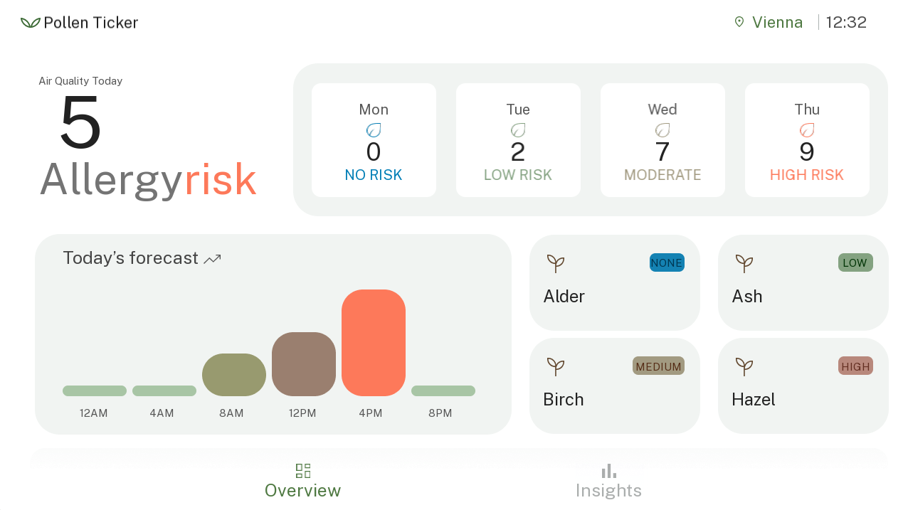
In the left bottom corner the forecast for the day is shown on a more granular level in 4-hour intervals. In addition to the general information the users can set up to 4 individual contaminants to also have the most relevant ones available at a glance.

**Dynamic Elements:**

- Clock control
- Air Quality – text value
- DayRisk control (4 week days)
- MultihourValue control (bars with 10 levels/images)
- Pollen\_Brief control (level of preselected contaminant, with 4 levels, triggers list of contaminants)
- City Button (triggers location list)
- Insights Button (switches to contaminants list scene)


#### Insights scene

The insights scene features a list of up to 8 available contaminant information available via WebAPI. The list hierarchy is taken over from the WebAPI data and is usually ranked by strongest to weakest contaminant (with the strongest contaminant on the top of the list).

[![image (3).png](https://doc316en.candera.eu/uploads/images/gallery/2026-07/scaled-1680-/image-3.png)](https://doc316en.candera.eu/uploads/images/gallery/2026-07/image-3.png)
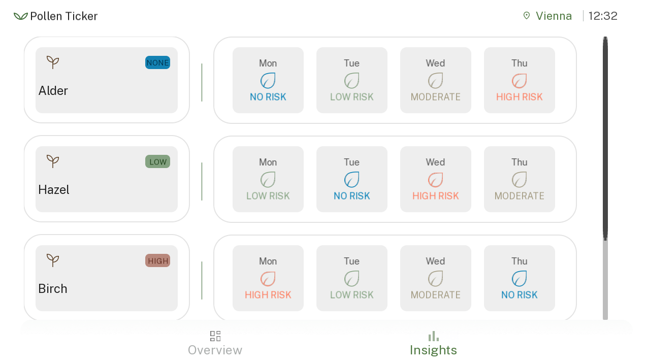
<div id="bkmrk-contaminantlisteleme">ContaminantListElement control – List element, composed of other controls:</div>- ContaminantName control
- 4 x ContaminantLevel

Since we have many similar elements, we can create a template for each type and instance it several times.

#### Controls

Below you can find detail explanations of the individual controls and properties as used for the Pollen Infoscreen solution.

<details id="bkmrk-we-have-a-background"><summary>DayRisk</summary>

We have a background, over which there is a string showing the day, an icon according to risk level, a number representing risk values from 0 to 10, and a second fixed text or icon for risk level. The risk level has only 4 values: none, low, mid, high.

[![DayRisk.png](https://doc316en.candera.eu/uploads/images/gallery/2026-05/scaled-1680-/dayrisk.png)](https://doc316en.candera.eu/uploads/images/gallery/2026-05/dayrisk.png) [![DayRisk_Structure.png](https://doc316en.candera.eu/uploads/images/gallery/2026-05/scaled-1680-/dayrisk-structure.png)](https://doc316en.candera.eu/uploads/images/gallery/2026-05/dayrisk-structure.png)
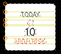
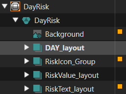
The Control only needs to receive the day text, and the risk level. For the Icons and risk level text, we can use a “Render Child Nodes” behavior to select which element to make visible, and we can setup with 11 elements, by duplicating the 4 available elements (none, low, med, high) to (none, low, low, low, med, med, med, med, high, high, high).

[![DayRisk_RiskIconBehaviors.png](https://doc316en.candera.eu/uploads/images/gallery/2026-05/scaled-1680-/gAAdayrisk-riskiconbehaviors.png)](https://doc316en.candera.eu/uploads/images/gallery/2026-05/gAAdayrisk-riskiconbehaviors.png) [![DayRisk_RiskTextBehaviors.png](https://doc316en.candera.eu/uploads/images/gallery/2026-05/scaled-1680-/D6zdayrisk-risktextbehaviors.png)](https://doc316en.candera.eu/uploads/images/gallery/2026-05/D6zdayrisk-risktextbehaviors.png)
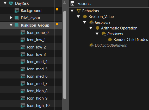
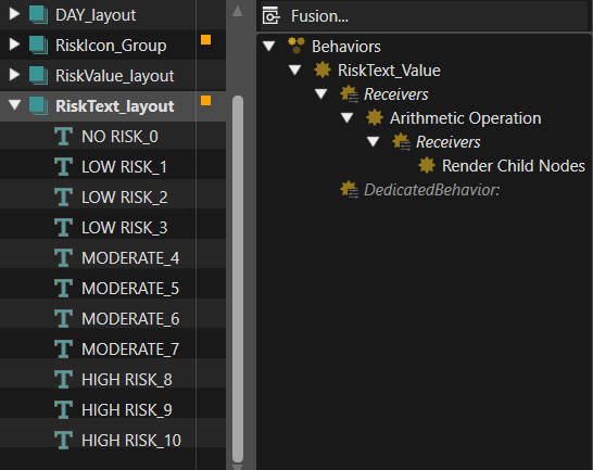
The risk value has a single entry point and is forwarded to the three controls that each need it. This could also have been done with using fewer elements and arithmetic operator behavior. This is a bit more flexible as it allows to easily add new images for each value, if needed.

[![DayRisk_Background_Behaviors.png](https://doc316en.candera.eu/uploads/images/gallery/2026-05/scaled-1680-/dayrisk-background-behaviors.png)](https://doc316en.candera.eu/uploads/images/gallery/2026-05/dayrisk-background-behaviors.png)
</details><details id="bkmrk-this-control-shows-t"><summary>PollenBrief</summary>

This control shows the contaminant name (can be multiline and word-wrapped, to handle possible long strings received), and an icon and text group showing level (low, med, high). The contaminant level here is in the interval \[0..4\], but a value of 0 for “Render Child Nodes” will show none of the children, so we added an “Arithmetic Operation” to add 1 and turn this to \[1..5\].

[![PollenBrief_Outline.png](https://doc316en.candera.eu/uploads/images/gallery/2026-05/scaled-1680-/pollenbrief-outline.png)](https://doc316en.candera.eu/uploads/images/gallery/2026-05/pollenbrief-outline.png) [![PollenBrief_Struct&Behaviors.png](https://doc316en.candera.eu/uploads/images/gallery/2026-05/scaled-1680-/pollenbrief-structbehaviors.png)](https://doc316en.candera.eu/uploads/images/gallery/2026-05/pollenbrief-structbehaviors.png)
</details><details id="bkmrk-for-the-graph-elemen"><summary>MultihourValue</summary>

For the graph elements we have 10 values and 10 images. If we have no individual properties to set, we can use a “FlipBook” control, to just switch the images. In this case we have to configure the list of images in the FlipBook control.

[![Multihour.png](https://doc316en.candera.eu/uploads/images/gallery/2026-05/scaled-1680-/multihour.png)](https://doc316en.candera.eu/uploads/images/gallery/2026-05/multihour.png) [![Multihour_structure.png](https://doc316en.candera.eu/uploads/images/gallery/2026-05/scaled-1680-/multihour-structure.png)](https://doc316en.candera.eu/uploads/images/gallery/2026-05/multihour-structure.png) [![Multihour_FlipbookControl.png](https://doc316en.candera.eu/uploads/images/gallery/2026-05/scaled-1680-/multihour-flipbookcontrol.png)](https://doc316en.candera.eu/uploads/images/gallery/2026-05/multihour-flipbookcontrol.png)
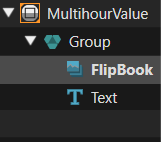
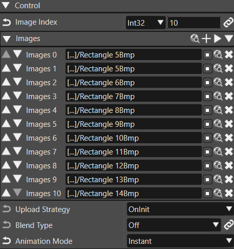
</details><details id="bkmrk-the-contaminant-leve"><summary>ContaminantLevel</summary>

The contaminant level in the insights list is similar to the DayRisk, but slightly different visuals, and no number displayed (the level is shown by color/icon and text, and we only have none, low, mid, high).

[![ContaminantLevel.png](https://doc316en.candera.eu/uploads/images/gallery/2026-05/scaled-1680-/contaminantlevel.png)](https://doc316en.candera.eu/uploads/images/gallery/2026-05/contaminantlevel.png) [![ContaminantLevel_Structure&Behaviors.png](https://doc316en.candera.eu/uploads/images/gallery/2026-05/scaled-1680-/contaminantlevel-structurebehaviors.png)](https://doc316en.candera.eu/uploads/images/gallery/2026-05/contaminantlevel-structurebehaviors.png)
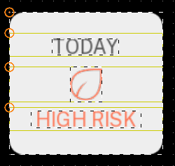
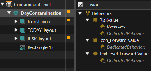
The risk value is dispatched to the icon and text groups, which have “Render Child Nodes” behaviors.

[![ContaminantsLevel_RiskBehaviors.png](https://doc316en.candera.eu/uploads/images/gallery/2026-05/scaled-1680-/ENNcontaminantslevel-riskbehaviors.png)](https://doc316en.candera.eu/uploads/images/gallery/2026-05/ENNcontaminantslevel-riskbehaviors.png) [![ContaminantsLevel_IconsBehaviors.png](https://doc316en.candera.eu/uploads/images/gallery/2026-05/scaled-1680-/iTPcontaminantslevel-iconsbehaviors.png)](https://doc316en.candera.eu/uploads/images/gallery/2026-05/iTPcontaminantslevel-iconsbehaviors.png)
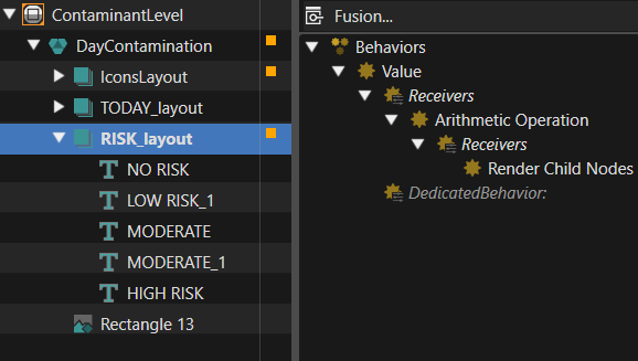
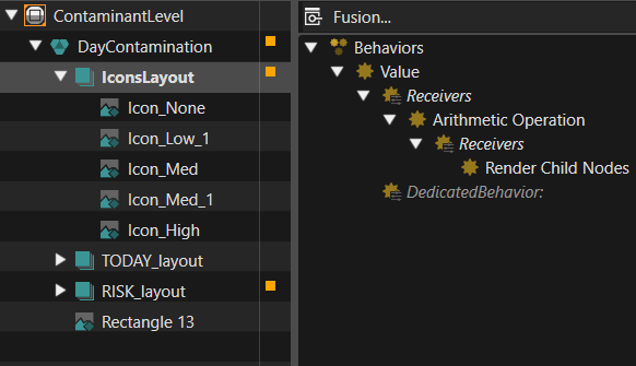
</details><details id="bkmrk-the-contaminant-desc"><summary>ContaminantName</summary>

The contaminant description in the insights list is very similar to the PollenBrief, with slightly different placement and size of elements.

[![ContaminantName_Overview.png](https://doc316en.candera.eu/uploads/images/gallery/2026-05/scaled-1680-/contaminantname-overview.png)](https://doc316en.candera.eu/uploads/images/gallery/2026-05/contaminantname-overview.png) [![ContaminantName_Structure&Behaviors.png](https://doc316en.candera.eu/uploads/images/gallery/2026-05/scaled-1680-/bpMcontaminantname-structurebehaviors.png)](https://doc316en.candera.eu/uploads/images/gallery/2026-05/bpMcontaminantname-structurebehaviors.png)
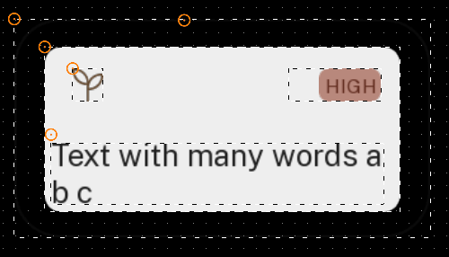
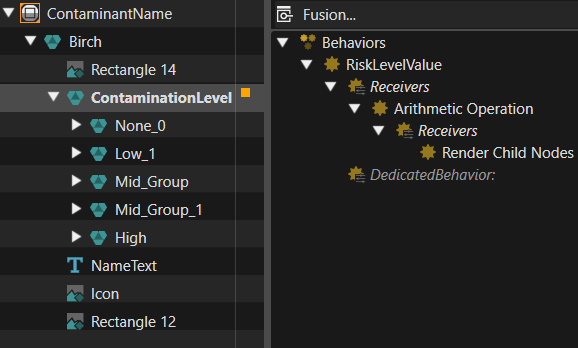
</details><details id="bkmrk-contaminantslistelem"><summary>ContaminantsListElement</summary>

This template is used to put together a ContaminantName template and 4 ContaminantLevel templates. These can be used as list elements.

[![ContaminantsListElement.png](https://doc316en.candera.eu/uploads/images/gallery/2026-05/scaled-1680-/contaminantslistelement.png)](https://doc316en.candera.eu/uploads/images/gallery/2026-05/contaminantslistelement.png) [![ContaminantsListElement_NodesStructure.png](https://doc316en.candera.eu/uploads/images/gallery/2026-05/scaled-1680-/contaminantslistelement-nodesstructure.png)](https://doc316en.candera.eu/uploads/images/gallery/2026-05/contaminantslistelement-nodesstructure.png)
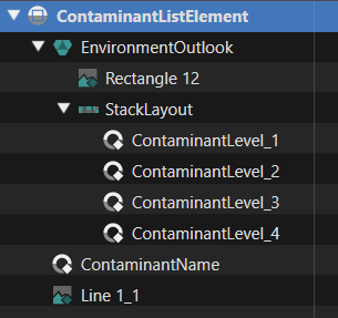
<span lang="en-us">The properties of these templates can be exposed in the larger template:</span>

<span lang="en-us">[![ContaminantsListElement_Properties.png](https://doc316en.candera.eu/uploads/images/gallery/2026-05/scaled-1680-/contaminantslistelement-properties.png)](https://doc316en.candera.eu/uploads/images/gallery/2026-05/contaminantslistelement-properties.png)</span>

As mentioned, some buttons trigger lists, which have similar designs: contaminants list and locations list. These are meant to allow selection of a list element, which will remain highlighted.

[![LocationsList.png](https://doc316en.candera.eu/uploads/images/gallery/2026-05/scaled-1680-/locationslist.png)](https://doc316en.candera.eu/uploads/images/gallery/2026-05/locationslist.png) [![ContaminantsList.png](https://doc316en.candera.eu/uploads/images/gallery/2026-05/scaled-1680-/contaminantslist.png)](https://doc316en.candera.eu/uploads/images/gallery/2026-05/contaminantslist.png)
</details><details id="bkmrk-this-template-was-de"><summary>Contaminant</summary>

This template was designed for elements of the contaminants list. The template consists of a “Radio Button”, to allow for a single element to be selected, and a “Text” control. The normal RadioButton text was set to an empty string, and the actual text is set in the “Text” control, to allow more configuration options for it’s properties (font, size, color). The white/red background images are set in the “Radio Button” control properties.

The Radio button has a “Value” behavior, which will become true when selected, and false when deselected. Under this value we have 2 “Action On Value” behaviors, one to trigger actions when becoming selected, and one to trigger actions when becoming unselected.

When unselected (value = False), we just set text color to black, via a “Set Color” behavior.

When selected, we set text color to white, and also trigger 2 actions to send 2 different string values to editable target nodes. This way, the contaminant name and scientific name can be sent to 2 nodes to display them, and, via databinding, these will be available to the controlling application.

[![CountryElementStruct&Behaviors.png](https://doc316en.candera.eu/uploads/images/gallery/2026-05/scaled-1680-/countryelementstructbehaviors.png)](https://doc316en.candera.eu/uploads/images/gallery/2026-05/countryelementstructbehaviors.png) [![ContaminantElementProperties.png](https://doc316en.candera.eu/uploads/images/gallery/2026-05/scaled-1680-/contaminantelementproperties.png)](https://doc316en.candera.eu/uploads/images/gallery/2026-05/contaminantelementproperties.png)
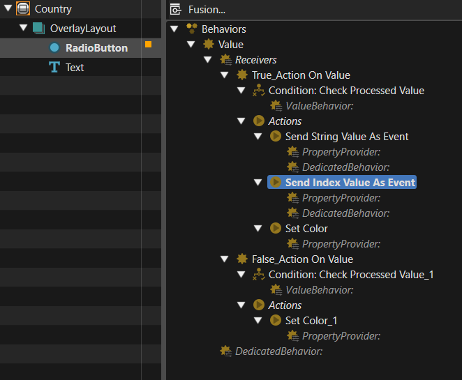
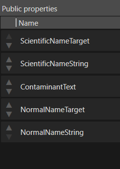
The public properties expose only what we need to configure from the outside.

</details><details id="bkmrk-the-country-list-but"><summary>Country</summary>

The country list button template sends an integer to be used as index, to select which list of cities to be shown to the right of the current country, and also a boolean false value to reset the selection in the list of associated cities. This way there will be no city selected for a country until user selects one, and the last city selected by user will be used, regardless of the state of the list, or which country is currently selected.

[![CountryElementStruct&Behaviors.png](https://doc316en.candera.eu/uploads/images/gallery/2026-05/scaled-1680-/X6Ecountryelementstructbehaviors.png)](https://doc316en.candera.eu/uploads/images/gallery/2026-05/X6Ecountryelementstructbehaviors.png) [![CountryElementProperties.png](https://doc316en.candera.eu/uploads/images/gallery/2026-05/scaled-1680-/9bkcountryelementproperties.png)](https://doc316en.candera.eu/uploads/images/gallery/2026-05/9bkcountryelementproperties.png)
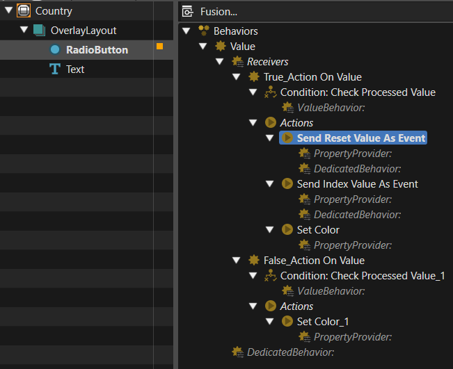
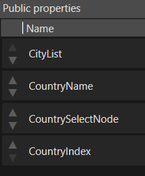
</details><details id="bkmrk-the-city-button-temp"><summary>City</summary>

The city button template has to send the city name, the country code, and the longitude and latitude of the city. These could naturally be represented as floating point numbers, but they will be needed as strings when creating a web request anyway, so we can set them to string type. The country code is sent from here and not the country list, to keep them consistent, in case the country is changed and no new city is selected.

[![CityElementStruct&Behaviors.png](https://doc316en.candera.eu/uploads/images/gallery/2026-05/scaled-1680-/mYIcityelementstructbehaviors.png)](https://doc316en.candera.eu/uploads/images/gallery/2026-05/mYIcityelementstructbehaviors.png) [![CityElementProperties.png](https://doc316en.candera.eu/uploads/images/gallery/2026-05/scaled-1680-/l9pcityelementproperties.png)](https://doc316en.candera.eu/uploads/images/gallery/2026-05/l9pcityelementproperties.png)
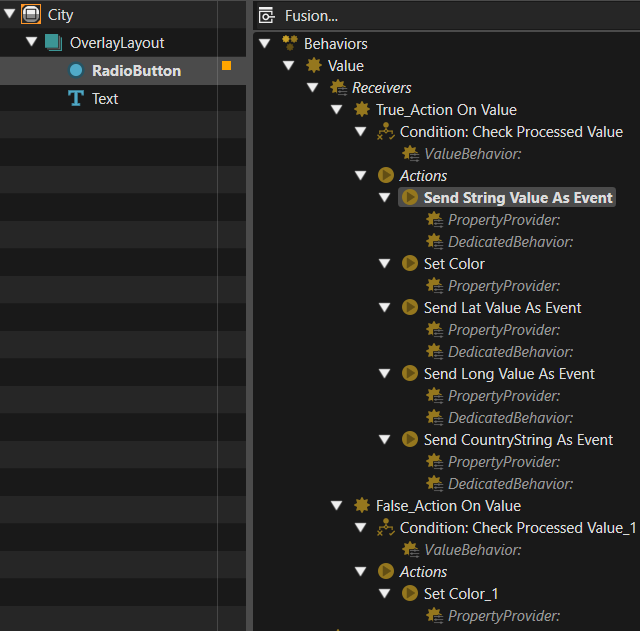
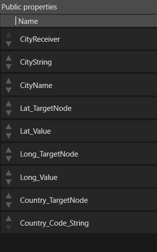
</details><details id="bkmrk-contaminants_list-th"><summary>Contaminants\_List</summary>

This is simply a List control that was locally expanded so that it’s ScrollBar can be configured with our custom graphical elements. For convenience, there are also setters for the X size and Y size, which is the size after which the list will start cutting of visibility of its elements. The anchor node will be used to set the list elements.

[![Contaminants_List_Structure&Behaviors.png](https://doc316en.candera.eu/uploads/images/gallery/2026-05/scaled-1680-/contaminants-list-structurebehaviors.png)](https://doc316en.candera.eu/uploads/images/gallery/2026-05/contaminants-list-structurebehaviors.png) [![Contaminants_List_Properties.png](https://doc316en.candera.eu/uploads/images/gallery/2026-05/scaled-1680-/contaminants-list-properties.png)](https://doc316en.candera.eu/uploads/images/gallery/2026-05/contaminants-list-properties.png)
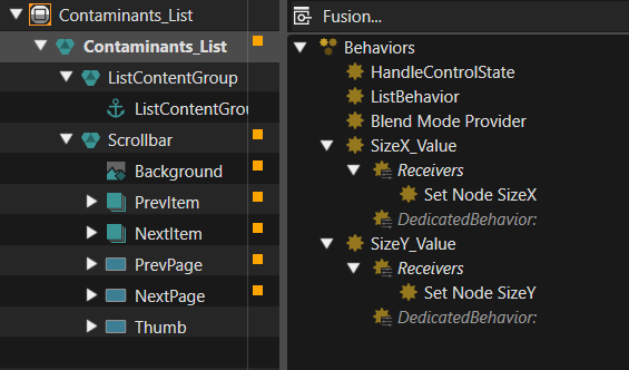
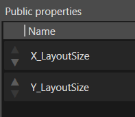
</details><details id="bkmrk-groupbox_list-this-c"><summary>GroupBox\_List</summary>

This control uses the Contaminants\_List, and further sets it into a GroupBox, so that only one radio button element will be selected. An anchor node is added under the Contaminants\_List anchor, to expose it. The properties will allow setting list size and default selected element for the GroupBox.

[![GroupBoxList_Structure.png](https://doc316en.candera.eu/uploads/images/gallery/2026-05/scaled-1680-/groupboxlist-structure.png)](https://doc316en.candera.eu/uploads/images/gallery/2026-05/groupboxlist-structure.png) [![GroupBoxList_Properties.png](https://doc316en.candera.eu/uploads/images/gallery/2026-05/scaled-1680-/groupboxlist-properties.png)](https://doc316en.candera.eu/uploads/images/gallery/2026-05/groupboxlist-properties.png)
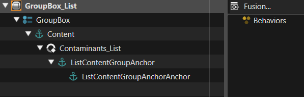
</details>#### Scenes

The app has 2 main scenes, the “Overview” and the “Insights” scene, and can switch between them using the buttons on the bottom bar. The “TopBar” and “BottomBar” scenes are always loaded and visible. For selecting items from lists, there are also two smaller scenes always loaded, and their visibility is controlled by triggering animations: “Location\_Popup” and “ContaminantsList\_Popup”.

<div id="bkmrk-overview-scene-this-"><details><summary>Overview Scene</summary>

<div id="bkmrk-this-scene-is-the-mo" style="text-align:justify;">This scene is the most complex of the solution, but it can be managed easily by using several of the templates previously described.</div><div id="bkmrk--8" style="text-align:justify;">  
</div><div id="bkmrk-topleft%3A-here-we-jus" style="text-align:justify;">TopLeft: Here we just have a number from 0 to 10, showing the allergy risk for today, and some static text around it. A default “Text Value” control is used, and configured with font style, color, format and data binding.</div><div id="bkmrk--9"></div><div id="bkmrk-%C2%A0-%C2%A0-%C2%A0-%C2%A0-%C2%A0">[![Overview_TopLeft.png](https://doc316en.candera.eu/uploads/images/gallery/2026-05/scaled-1680-/overview-topleft.png)](https://doc316en.candera.eu/uploads/images/gallery/2026-05/overview-topleft.png) [![Overview_TopLeft_Tree.png](https://doc316en.candera.eu/uploads/images/gallery/2026-05/scaled-1680-/overview-topleft-tree.png)](https://doc316en.candera.eu/uploads/images/gallery/2026-05/overview-topleft-tree.png)</div><div id="bkmrk--10"></div><div id="bkmrk-topright%3A-here-we-ha" style="text-align:justify;">TopRight: Here we have a list of allergy risk values for today and the next 3 days. Beside the value and day of the week, each also has an icon and fixed text for none, low, moderate, or high risk. For this we use the DayRisk template, and a StackLayout to allign them automatically.</div><div id="bkmrk--11"></div><div id="bkmrk-%C2%A0-%C2%A0-%C2%A0-%C2%A0-%C2%A0-1">[![Overview_TopRight.png](https://doc316en.candera.eu/uploads/images/gallery/2026-05/scaled-1680-/overview-topright.png)](https://doc316en.candera.eu/uploads/images/gallery/2026-05/overview-topright.png) [![Overview_TopRight_Tree.png](https://doc316en.candera.eu/uploads/images/gallery/2026-05/scaled-1680-/overview-topright-tree.png)](https://doc316en.candera.eu/uploads/images/gallery/2026-05/overview-topright-tree.png)</div><div id="bkmrk--12"></div><div id="bkmrk-bottom-left%3A-this-di" style="text-align:justify;">Bottom Left: This displays the allergy risk values during the current day, at 4 hour intervals. The web api provides hourly values, and we display 6 of them, using images associated for value, via the MultihourValue template. The elements are also allligned automatically using a StackLayout.</div><div id="bkmrk--13"></div><div id="bkmrk-%C2%A0-%C2%A0-%C2%A0-%C2%A0-%C2%A0-%C2%A0-%C2%A0-%C2%A0-5">[![Overview_BottomLeft.png](https://doc316en.candera.eu/uploads/images/gallery/2026-05/scaled-1680-/overview-bottomleft.png)](https://doc316en.candera.eu/uploads/images/gallery/2026-05/overview-bottomleft.png) [![Overview_BottomLeft_Tree.png](https://doc316en.candera.eu/uploads/images/gallery/2026-05/scaled-1680-/overview-bottomleft-tree.png)](https://doc316en.candera.eu/uploads/images/gallery/2026-05/overview-bottomleft-tree.png)</div><div id="bkmrk--14"></div><div id="bkmrk-bottom-right%3A-here-t" style="text-align:justify;">Bottom Right: Here the user can select a set of 4 contaminants and see the risk level associated with each of them. There are only 4 levels: none, low, mid, high, and no numeric value. We use the PollenBrief template and place them manually. Each element has an associated button, which opens a list from which a user can select a contaminant for the respective slot.</div><div id="bkmrk--15"></div><div id="bkmrk-%C2%A0-%C2%A0-%C2%A0-%C2%A0-%C2%A0-2">[![Overview_BottomRight.png](https://doc316en.candera.eu/uploads/images/gallery/2026-05/scaled-1680-/overview-bottomright.png)](https://doc316en.candera.eu/uploads/images/gallery/2026-05/overview-bottomright.png) [![Overview_BottomRight_Tree.png](https://doc316en.candera.eu/uploads/images/gallery/2026-05/scaled-1680-/overview-bottomright-tree.png)](https://doc316en.candera.eu/uploads/images/gallery/2026-05/overview-bottomright-tree.png)</div></details></div><div id="bkmrk--16"></div><details id="bkmrk-this-scene-only-cont"><summary>Insights Scene</summary>
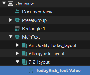
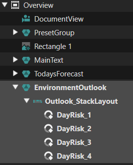
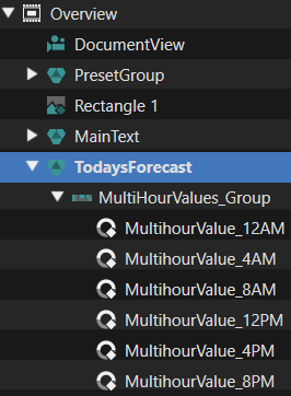
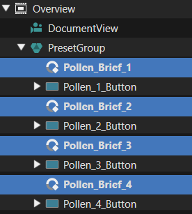
This scene only contains a list of the contaminants we know of and their level. It is only meant to be viewed, there are no buttons for interaction. The elements of the list are ContaminantListItem templates. The list has a fixed number of 8 elements. The number of received contaminants can be higher or smaller. If Higher, we only show the first 8. If lower, we disable rendering for the unused elements via a “Render Child Nodes” behavior. When there are more elements than visible in the given space, a scroll-bar will appear (and scale as well as move itself appropriately). To customize the “Scrollbar” with imported graphical elements, the Contaminants\_List template is used.

[![Insights.png](https://doc316en.candera.eu/uploads/images/gallery/2026-05/scaled-1680-/insights.png)](https://doc316en.candera.eu/uploads/images/gallery/2026-05/insights.png) [![Insights_Tree.png](https://doc316en.candera.eu/uploads/images/gallery/2026-05/scaled-1680-/ufKinsights-tree.png)](https://doc316en.candera.eu/uploads/images/gallery/2026-05/ufKinsights-tree.png)
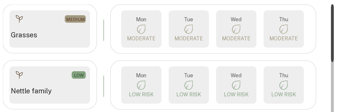
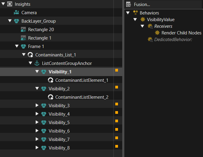
</details><details id="bkmrk-in-the-top-bar-we-ha"><summary>TopBar Scene</summary>

[![TopBar.png](https://doc316en.candera.eu/uploads/images/gallery/2026-05/scaled-1680-/topbar.png)](https://doc316en.candera.eu/uploads/images/gallery/2026-05/topbar.png)

In the top bar we have some fixed graphical elements, a digital clock, implemented using the default “DigitalClock” control, and a “TextButton”, where we set the name of the currently set city. Pressing this button will trigger an animation that will make the location list popup visible.

[![TopBar_Tree.png](https://doc316en.candera.eu/uploads/images/gallery/2026-05/scaled-1680-/topbar-tree.png)](https://doc316en.candera.eu/uploads/images/gallery/2026-05/topbar-tree.png)
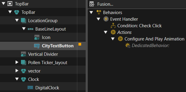
</details><details id="bkmrk-in-the-bottom-bar-we"><summary>BottomBar Scene</summary>

In the bottom bar we have buttons to switch between the 2 main scenes. When the button is clicked, the state machine transition occurs. To select between the gray and green versions, a RenderChildNodes behavior is used.

[![BottomBar.png](https://doc316en.candera.eu/uploads/images/gallery/2026-05/scaled-1680-/bottombar.png)](https://doc316en.candera.eu/uploads/images/gallery/2026-05/bottombar.png) [![BottomBar_Tree.png](https://doc316en.candera.eu/uploads/images/gallery/2026-05/scaled-1680-/O9fbottombar-tree.png)](https://doc316en.candera.eu/uploads/images/gallery/2026-05/O9fbottombar-tree.png)
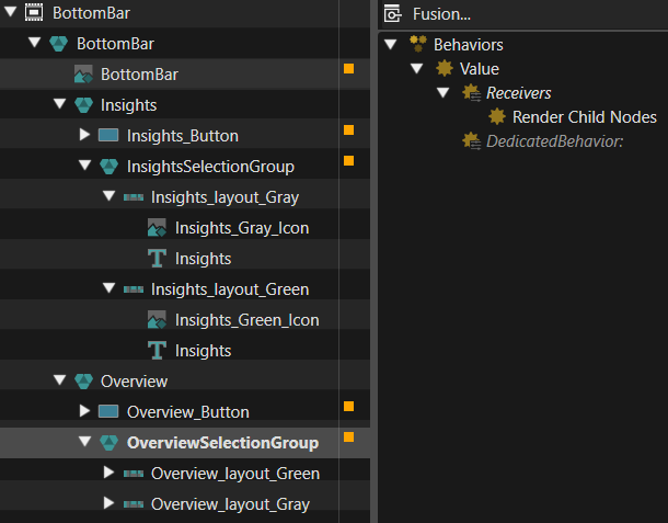
</details><details id="bkmrk-this-scene-is-very-s"><summary>ContaminantList\_Popup Scene</summary>

This scene contains 4 lists, one list for each of the front page contaminants. We could have had a single list and configure it with the currently selected one upon opening, but this way each will be opened in the same state in which it was closed. String values are sent from the Contaminant template to nodes with databound values, so new contaminants can also be added without the need to modify and recompile the code. Rendering is disabled for these 2 nodes, but could be enabled for debug purposes.

[![ContaminantList_Popup_EventHandler.png](https://doc316en.candera.eu/uploads/images/gallery/2026-05/scaled-1680-/contaminantlist-popup-eventhandler.png)](https://doc316en.candera.eu/uploads/images/gallery/2026-05/contaminantlist-popup-eventhandler.png)
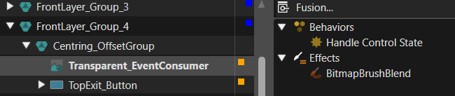
There is a Transparent\_EventConsumer node, which covers the area behind the list, and has a “Handle Control State” behavior, to avoid touch events going to elements underneath. Under this, but over all other elements, there is a transparent “TopExit\_Button” node, which is used to close the popup when touching outside the list.

[![ContaminantList_Popup_Tree.png](https://doc316en.candera.eu/uploads/images/gallery/2026-05/scaled-1680-/contaminantlist-popup-tree.png)](https://doc316en.candera.eu/uploads/images/gallery/2026-05/contaminantlist-popup-tree.png) [![ContaminantList_Popup_Control.png](https://doc316en.candera.eu/uploads/images/gallery/2026-05/scaled-1680-/contaminantlist-popup-control.png)](https://doc316en.candera.eu/uploads/images/gallery/2026-05/contaminantlist-popup-control.png)
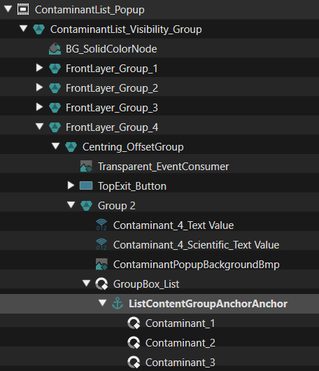
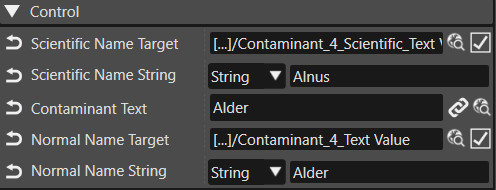
</details><details id="bkmrk-this-is-the-largest-"><summary>Location\_popup Scene</summary>

This is the largest scene in the solution. There are 2 lists visible, a countries list and a cities list. In the scene there is a list of cities for each country. The Lists of cities are under a node with a “Render Child Nodes” behavior, so only one of the lists of cities is made visible. The index of the list to show is set from the “Country” template of the first list. Like the Contaminants List Popup, this scene has a node to prevent events going to the elements under it, and a full screen button to exit when tapping outside.

[![Countries_Tree.png](https://doc316en.candera.eu/uploads/images/gallery/2026-05/scaled-1680-/Kb6countries-tree.png)](https://doc316en.candera.eu/uploads/images/gallery/2026-05/Kb6countries-tree.png) [![Country_Control.png](https://doc316en.candera.eu/uploads/images/gallery/2026-05/scaled-1680-/country-control.png)](https://doc316en.candera.eu/uploads/images/gallery/2026-05/country-control.png)
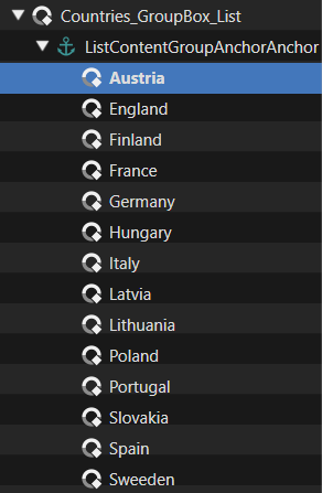
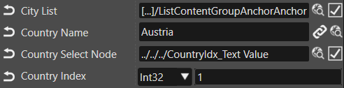
This setup makes it possible to add new countries and cities just by configuring the asset. For a country, we need the name, the node to which it must be forwarded, the index of it’s cities list in the group of city lists, and the root of the cities list, to reset their selection.

[![Cities_Tree.png](https://doc316en.candera.eu/uploads/images/gallery/2026-05/scaled-1680-/cities-tree.png)](https://doc316en.candera.eu/uploads/images/gallery/2026-05/cities-tree.png)
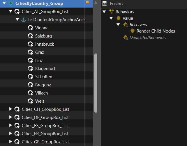
For a city, we need the name to be shown, but more importantly, we need to get it’s geographical coordinates and country code to the app. So we send a Latitude, Longitude, and country code to nodes with databindings. Having this in the asset allows to edit, remove, or add any new city to the list just by editing in SceneComposer. The source code will remain unchanged, it will just use the new values received trough databindings.

[![Cities_Control.png](https://doc316en.candera.eu/uploads/images/gallery/2026-05/scaled-1680-/cities-control.png)](https://doc316en.candera.eu/uploads/images/gallery/2026-05/cities-control.png)
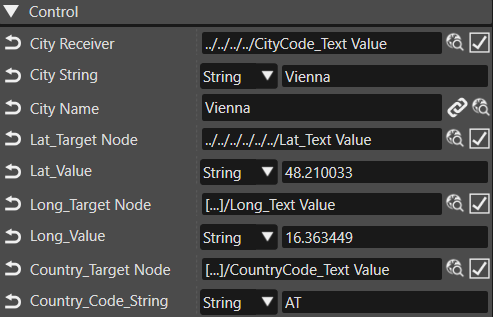
</details>#### Other elements

Below you can find more information on the remaining elements not beloning in the controls and scenes chapter.

<details id="bkmrk-this-app-is-based-on"><summary>Associated script (WebAPI)</summary>

This app is based on the Web API and data from www.polleninformation.at. <span>At [https://www.polleninformation.at/datenschnittstelle](https://www.polleninformation.at/datenschnittstelle "https://www.polleninformation.at/datenschnittstelle") you can find information about the format of the URL used to retrieve the data, and the format of the response JSON.</span> Here you can also see the data needed for API requests, and the data received. In short, to make a request we need language, country, and geographic coordinates, which we can get from databinding, from strings preset in the asset.

[![image.png](https://doc316en.candera.eu/uploads/images/gallery/2026-07/scaled-1680-/image.png)](https://doc316en.candera.eu/uploads/images/gallery/2026-07/image.png)  
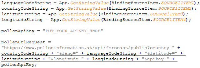
When a response is received, it is parsed and values are set to the bindings to display the danger levels and contaminants.

<div id="bkmrk--23"></div><div id="bkmrk--24"></div></details><details id="bkmrk-in-the-%E2%80%9Cglobalstatem"><summary>State Machine</summary>

In the “GlobalStateMachine”, only the transition between “Overview” and “Insights” is handled, by deactivating the source scene and activating the destination for each transition. Also, on entry of “Overview”, the other scenes are loaded.

[![StateMachine.png](https://doc316en.candera.eu/uploads/images/gallery/2026-05/scaled-1680-/statemachine.png)](https://doc316en.candera.eu/uploads/images/gallery/2026-05/statemachine.png)
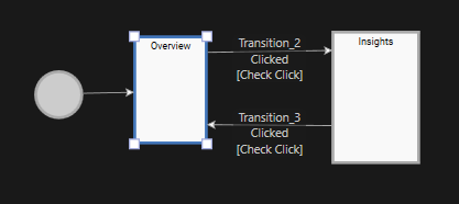
</details><details id="bkmrk-the-only-animations-"><summary>Animations</summary>

The only animations used in this solution are for the pop-up lists opening and closing. Each list has an individual animation. Currently they are identical, the list scales up from the center and scales down towards the center of the screen, and a transparent gray background fades in and out. Since each list has it’s own animation, it would also be possible to have it appear from and disappear into the associated element which triggered it.

[![Animatoins.png](https://doc316en.candera.eu/uploads/images/gallery/2026-05/scaled-1680-/animatoins.png)](https://doc316en.candera.eu/uploads/images/gallery/2026-05/animatoins.png)
</details>

# Sauna Screen

#### Overview

This solution showcases a modern smart sauna system featuring advanced control functionalities, real-time monitoring, and an interactive user interface.  
The smart sauna solution includes digital temperature and time management, ventilation control, lighting management, and automated safety monitoring. A key feature of the solution is the centralized control interface along with integrated feature panels for functionalities such as ambience control, heating management, and system status monitoring.

<p class="callout info">Please note that due to the display size the solution - when opened with the player - may exceed your computer screen. To adjust the size of the solution please use the "Zoom" options of the player CGI Panel.  
 [![Screenshot 2026-06-02 094734.png](https://doc316en.candera.eu/uploads/images/gallery/2026-06/scaled-1680-/screenshot-2026-06-02-094734.png)](https://doc316en.candera.eu/uploads/images/gallery/2026-06/screenshot-2026-06-02-094734.png)  
</p>

[![Sauna_Overview.png](https://doc316en.candera.eu/uploads/images/gallery/2026-05/scaled-1680-/sauna-overview.png)](https://doc316en.candera.eu/uploads/images/gallery/2026-05/sauna-overview.png)

---

#### Feature Description

Below you can find an overview of all scenes and their individual content.

<table id="bkmrk-no-scene-name-descri" style="border-collapse:collapse;width:100%;height:1100.55px;"><colgroup><col style="width:7.27056%;"></col><col style="width:20.0238%;"></col><col style="width:72.7056%;"></col></colgroup><tbody><tr style="height:29.7969px;"><td style="height:29.7969px;">No</td><td style="height:29.7969px;">Scene Name</td><td style="height:29.7969px;">Description</td></tr><tr style="height:63.3906px;"><td style="height:63.3906px;">(1)</td><td style="height:63.3906px;">StartUpScene2D</td><td style="height:63.3906px;text-align:justify;">This initial scene displays the Candera logo and acts as the entry point to the sauna automation solution. It allows touch interaction to transition from the startup screen to the main menu interface.</td></tr><tr style="height:29.7969px;"><td style="height:29.7969px;">(2)</td><td style="height:29.7969px;">BackgroundScene2D</td><td style="height:29.7969px;text-align:justify;">This scene features a background along with a digital time representation.</td></tr><tr style="height:115.375px;"><td style="height:115.375px;">(3)</td><td style="height:115.375px;">OptionScene2D</td><td style="height:115.375px;text-align:justify;">This scene acts as the main control interface of the sauna automation solution, providing access to different sauna modes such as Sauna, Steam, Infrared, and My Sauna. Each mode is represented through an interactive tile-based layout for simplified navigation between functionalities.  
In addition, the scene provides real-time environmental monitoring, where temperature and humidity values are displayed through circular indicators.  
</td></tr><tr style="height:147.375px;"><td style="height:147.375px;">(4)</td><td style="height:147.375px;">SaunaScene2D</td><td style="height:147.375px;text-align:justify;">This scene handles sauna temperature control through a circular slider–based interface, allowing dynamic adjustment of the sauna environment. It also includes predefined session timing options.

In the lower mid section controls for lights (including brightness and RGB settings), ventilation and music can be found. The individual menus can be cycled through via the available navigation arrow controls or swiped through by touch control.  
A preheat feature is also integrated into the interface, enabling the sauna environment to be prepared before the session starts.

</td></tr><tr style="height:48.75px;"><td style="height:48.75px;">(5)</td><td style="height:48.75px;">InfraredScene2D</td><td style="height:48.75px;text-align:justify;">In addition to the features described for (4) SaunaScene2D this scene also includes panel selection options to enable the users to tailor their infrared experience to their needs.  
</td></tr><tr style="height:46.5938px;"><td style="height:46.5938px;">(6)</td><td style="height:46.5938px;">SteamScene2D</td><td style="height:46.5938px;text-align:justify;">In addition to the features described for (4) SaunaScene2D this scene also includes a separate circular slider for adjusting the steam level according to the users' needs.  
</td></tr><tr style="height:96.9844px;"><td style="height:96.9844px;">(7)</td><td style="height:96.9844px;">MySaunaScene2D</td><td style="height:96.9844px;text-align:justify;">This scene provides personalized sauna configuration management through preset-based controls. It allows selection between multiple preset profiles, enabling quick access to predefined sauna, steam and infrared settings and preferences.  
The interface enables quick transition between customized sauna profiles while maintaining a clean and interactive layout.   
</td></tr><tr style="height:96.9844px;"><td style="height:96.9844px;">(8)</td><td style="height:96.9844px;">Preset1Scene2D</td><td style="height:96.9844px;text-align:justify;">This scene manages a predefined sauna configuration profile through dedicated controls for temperature, humidity, session timing, and ventilation management. The parameters can be modified dynamically to customize the sauna environment based on the selected preset configuration. Ventilation control and preheating functionality are also integrated to prepare the infrared environment before the session begins.  
</td></tr><tr style="height:46.5938px;"><td style="height:46.5938px;">(9)</td><td style="height:46.5938px;">Preset2Scene2D</td><td style="height:46.5938px;text-align:justify;">This scene is similar to Preset1Scene2D but features settings tailored more for a steam experience.</td></tr><tr style="height:96.9844px;"><td style="height:96.9844px;">(10)</td><td style="height:96.9844px;">Preset3Scene2D</td><td style="height:96.9844px;text-align:justify;">This scene manages a predefined infrared sauna configuration through dedicated controls for heating intensity, infrared panel selection, session timing, and ventilation management. The intensity level and panel combinations can be configured dynamically to customize the infrared sauna experience. Ventilation control and preheating functionality are also integrated to prepare the infrared environment before the session begins.</td></tr><tr style="height:147.375px;"><td style="height:147.375px;">(11)</td><td style="height:147.375px;">RunningScene2D</td><td style="height:147.375px;text-align:justify;">This scene provides real-time monitoring and management of the active sauna session by displaying essential operational parameters such as temperature, humidity, selected sauna mode, door status, and configured session duration. The interface presents all session-related information in a centralized layout for continuous tracking of the sauna environment during operation.  
A session countdown indicator is provided to display the remaining session duration before completion. Additionally, a dedicated stop control allows immediate termination of the active sauna session whenever required.   
</td></tr><tr style="height:134.547px;"><td style="height:134.547px;">(12)</td><td style="height:134.547px;">PreheatingScene2D</td><td style="height:134.547px;text-align:justify;">This scene manages the sauna preheating process by monitoring and displaying the progress of the heating cycle. It provides target temperature tracking functionality, allowing the system to indicate the current progress toward the configured sauna temperature before the session begins.  
A real-time countdown display is provided to show the remaining preheating duration, helping monitor the estimated time required for the sauna environment to reach the desired condition. A dedicated stop control is integrated into the interface to allow interruption or cancellation of the preheating operation whenever required.  
</td></tr></tbody></table>

#### Controls

- The existing controls available in the Scene Composer toolbox are utilized to create this solution such as lists, sliders, radio buttons etc.
- A customized On/Off button control is used in the Infrared scene to manage panel selections such as Top, Right, and Left. This control works similarly to a checkbox, but it is customized to display any one image. The control is customized by configuring only the required properties related to state handling, image switching.
- An own control was created for the circular sliders in the SaunaScene2D/SteamScene2D/InfraredScene2D, that extends the existing CircularSlider control with the background image and the slider value text and unit.
- As the same lists for the settings are displayed in SaunaScene2D/SteamScene2D/InfraredScene2D, it is also provided as control.

#### Transitions

Transition rules were used with Fade-shade animations are applied to the scene transitions to create smooth and continuous visual movement between Scenes.

##### Animations

The following two animations are used:

- TimeRemaining: decreases the remaining time displayed in the PreheatingScene2D
- PreheatPulsatingAnimation: takes care of the pulsating of the red background in the BackgroundScene2D.

Both animations are started in the Statemachine when the "Start Preheat" button in the SaunaScene2D is pressed.

#### State Machine

The GlobalStateMachine manages the overall navigation and operational flow of the sauna automation solution by controlling transitions between multiple scenes and interface states. It initializes the startup sequence and handles navigation from the initial screen to the main options interface, where users can access different sauna modes such as Sauna, Steam, Infrared, and MySauna. The state machine coordinates transitions between operational scenes including Pre-Heating, Current Session monitoring, and preset configuration screens such as Preset1, Preset2, and Preset3. User interactions including button selections, navigation controls, and preset switching are processed through transition rules and logic conditions to ensure smooth scene transitions. Additionally, the BackgroundScene is globally activated through the GlobalStateMachine to maintain a consistent visual appearance across all scenes while coordinating common interface animations and operational states throughout the overall sauna automation solution.

#### Operational Control Elements

- Forward and backward navigation buttons are implemented to control movement between different scenes and feature sections within the sauna automation solution. These controls enable smooth transitions across interfaces such as Sauna, Steam, Infrared, Presets, and operation monitoring scenes.
- Start buttons are used to initiate functionalities such as sauna sessions and preheating operations and Stop buttons are implemented to terminate active operations and return the system to the required operational state.
- Increment (“+”) and decrement (“−”) buttons are used to dynamically adjust operational parameters within the interface. These Buttons are applied for modifying values such as temperature, humidity and time.
- Interactive scroll bar controls are incorporated within the interface to manage configurable features such as Lighting, Ventilation, and Music functions. These controls enable precise and fluid parameter adjustment through continuous sliding interaction, with all value changes dynamically reflected during runtime based on the configured operational ranges.

# Coffee Machine

#### Overview

This sample shows an automated coffee machine HMI solution. It is designed to make preparing drinks easier, smarter, and more connected through an advanced user interface. It brings together different functions in one organized way, helping users navigate the machine efficiently and manage the preparation process.

The solution includes features such as drink selection, user profiles, drink customization, and coffee machine management. Its main strength is a central interface that connects different modules for drink preparation, maintenance, and settings. These parts work together to create a smooth workflow and a consistent user experience across the entire coffee machine system.

[![Screenshot 2026-05-27 132821.png](https://doc316en.candera.eu/uploads/images/gallery/2026-05/scaled-1680-/screenshot-2026-05-27-132821.png)](https://doc316en.candera.eu/uploads/images/gallery/2026-05/screenshot-2026-05-27-132821.png)
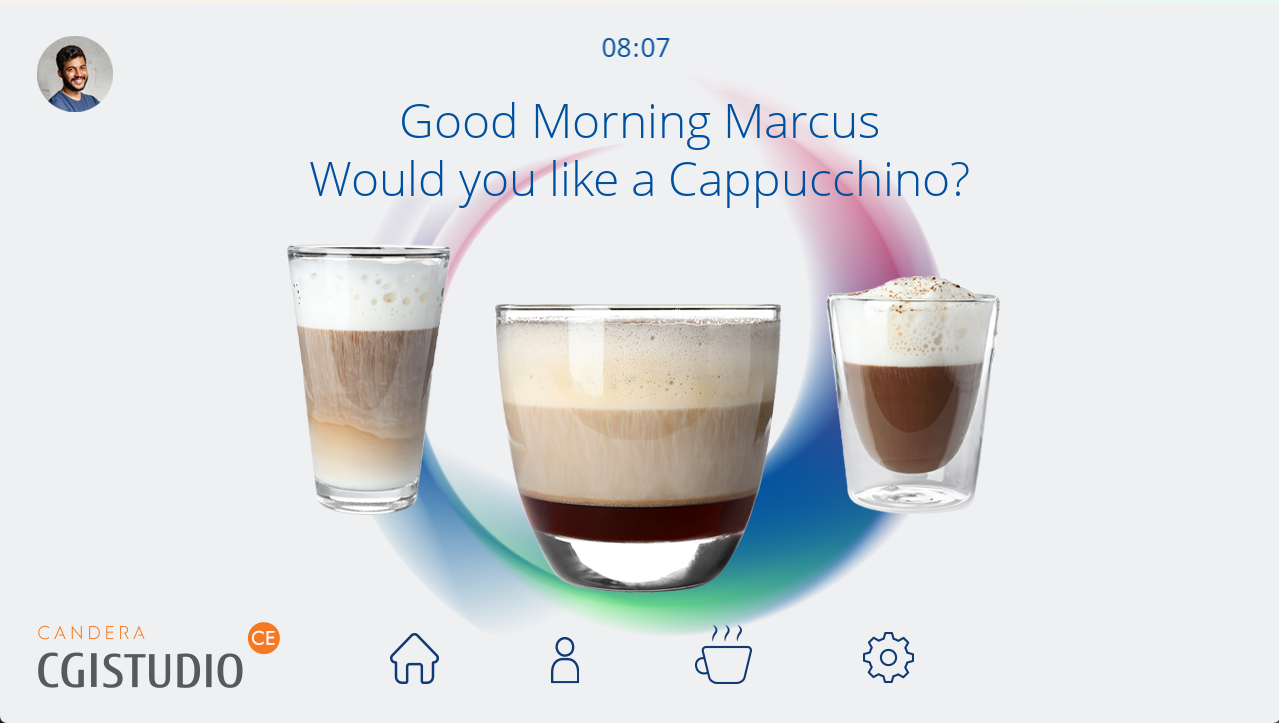
---

#### Feature Description

##### Scene

<table id="bkmrk-no.-category-scene-n" style="width:100%;height:480.172px;"><colgroup><col style="width:5.00568%;"></col><col style="width:15.0182%;"></col><col style="width:16.329%;"></col><col style="width:63.6472%;"></col></colgroup><thead><tr style="height:29.7969px;"><td style="height:29.7969px;">No.</td><td style="height:29.7969px;">Name</td><td style="height:29.7969px;">Scene Name</td><td style="height:29.7969px;">Description</td></tr></thead><tbody><tr style="height:46.5938px;"><td style="height:46.5938px;">(1)</td><td style="height:46.5938px;">Background</td><td style="height:46.5938px;">Scene\_Background</td><td style="height:46.5938px;text-align:justify;">This scene acts as a commonly used layer within the Coffee Machine solution and contains the background and the bottom buttons to switch between the scenes.</td></tr><tr><td>(2)</td><td>StatusBar</td><td>StatusBar</td><td style="text-align:justify;">This scene indicates the selected profile and the current time.</td></tr><tr style="height:63.3906px;"><td style="height:63.3906px;">(3)</td><td style="height:63.3906px;">Welcome Screen</td><td style="height:63.3906px;">Scene\_Welcome</td><td style="height:63.3906px;text-align:justify;">The main screen upon starting the demo. The screen features a "Good Morning" message that is addressed to the selected profile. This scene features three pre-selected coffee types. More coffee variants are available in the Scene\_Selection.</td></tr><tr style="height:63.3906px;"><td style="height:63.3906px;">(4)</td><td style="height:63.3906px;">Profiles</td><td style="height:63.3906px;">Scene\_Profiles</td><td style="height:63.3906px;text-align:justify;">This screen allows the selection of pre-defined profiles (Marcus, Alice). A "New Profile" button is available, however, non-functional in this demo. The changed profile is also reflected on the other scenes.</td></tr><tr style="height:63.3906px;"><td style="height:63.3906px;">(5)</td><td style="height:63.3906px;">Coffee Menu</td><td style="height:63.3906px;">Scene\_Selection</td><td style="height:63.3906px;text-align:justify;">This menu shows all available coffee variants. The selection is implemented via a horizontal scrolling list that can be navigated by swiping.</td></tr><tr style="height:154.016px;"><td style="height:154.016px;">(6)</td><td style="height:154.016px;">Adjustments</td><td style="height:154.016px;">Scene\_Adjustments</td><td style="height:154.016px;text-align:justify;">In this scene, the user can individually adapt the previously selected coffee to their needs. It allows the user to adjust the following parameters:

- Intensity (amount of coffee beans)
- Milk (amount of added milk)
- Sugar (low, medium, high)
- Foam (none, low, medium, high)

The previously selected coffee type is being displayed in the left of the screen.

</td></tr><tr style="height:29.7969px;"><td style="height:29.7969px;">(7)</td><td style="height:29.7969px;">Preparing Screen</td><td style="height:29.7969px;">Preparing Screen</td><td style="height:29.7969px;text-align:justify;">This scene contains the 2D part of the coffee preparation process after the drink configuration is completed. It shows a progress bar to indicate the progress of the coffee preparation.</td></tr><tr><td>(8)</td><td>Coffee Cup</td><td>CoffeeCup3D</td><td style="text-align:justify;">This is the only 3D scene and displays a coffee cup that gradually fills up until the process is completed. Upon completion the user is automatically re-directed back to the Welcome Screen.</td></tr><tr style="height:29.7969px;"><td style="height:29.7969px;">(9)</td><td style="height:29.7969px;">Settings</td><td style="height:29.7969px;">Scene\_Settings</td><td style="height:29.7969px;text-align:justify;">This scene contains various options for the coffee machine maintenance and setup:

- Maintenance
- Beans
- Water
- General
- Connection

The various options are currently implemented as placeholders and lead to the Restriced scene.

</td></tr><tr><td>(10)</td><td>Placeholder</td><td>Submenu</td><td style="text-align:justify;">This scene is acting as a placeholder for further functionality implementation. It currently displays a lock indicating that there is no further action possible aside from returning to the previous scene.

</td></tr></tbody></table>

##### [![3x2CoffeemachineImage.png](https://doc316en.candera.eu/uploads/images/gallery/2026-05/scaled-1680-/3x2coffeemachineimage.png)](https://doc316en.candera.eu/uploads/images/gallery/2026-05/3x2coffeemachineimage.png)

##### Control

The solution is designed using the predefined controls available in the Scene Composer toolbox, including lists, buttons, etc.

There is one customer control for the progress bar. For this custom control the interpolation behaviour was removed from the default toolbox as it conflicted with the interpolation done by the Preparing animation which also changes the values of the progress bar.

##### Transition

The default transition is used for all scenes in this solution ("Cut").

##### Animations

There is one animation that animates the coffee cup in CoffeeCup3D and activates the text in the Preparing Screen. This animation is started when the Start Button in Scene\_Adjustments is pressed.

##### State Machine

The statemachine is used to activate/deactivate the different scenes on specific button presses. Additionally correct images and text are set dependent on the button. All scenes except the Background and the StatusBar are activated when the state is entered and deactivated when left.

##### States

<table id="bkmrk-state-activated-scen" style="border-collapse:collapse;width:100%;height:496.125px;"><colgroup><col style="width:15.8522%;"></col><col style="width:16.6865%;"></col><col style="width:28.2483%;"></col><col style="width:19.3083%;"></col><col style="width:20.0238%;"></col></colgroup><thead><tr style="height:29.7969px;"><td style="height:29.7969px;">State</td><td style="height:29.7969px;">Activated Scene(s)</td><td style="height:29.7969px;">Trigger</td><td style="height:29.7969px;">Additional Actions</td><td style="height:29.7969px;">Notes

</td></tr></thead><tbody><tr style="height:96.9844px;"><td style="height:96.9844px;">Welcome</td><td style="height:96.9844px;">Scene\_Background

StatusBar

Scene\_Welcome

</td><td style="height:96.9844px;">Initial State

End of preparing animation

Scene\_Adjustments/ReturnButton/Return Welcome

</td><td style="height:96.9844px;">  
</td><td style="height:96.9844px;">Initial activation of the StatusBar.

This state is re-entered when the Preparing animation has finished.

</td></tr><tr style="height:48.5938px;"><td style="height:48.5938px;">Selection</td><td style="height:48.5938px;">Scene\_Selection</td><td style="height:48.5938px;">Scene\_Background/Buttons/Coffee Selection Button

</td><td style="height:48.5938px;">  
</td></tr><tr style="height:180.969px;"><td style="height:180.969px;">Adjustments</td><td style="height:180.969px;">Scene\_Adjustments</td><td style="height:180.969px;">Every coffee button in SceneSelection/List and

SceneWelcome

</td><td style="height:180.969px;">Dependent on the button the correct coffee image is activated and different texts are set to the "Preparing your coffee..." TextNode of the StatusBar

Additionally the back button is switched.

</td><td style="height:180.969px;">This state can be entered from 2 different scenes so it is important that the back button triggers the correct one. Therefore 2 back buttons are available and only the required one is activated when the state is triggered.

</td></tr><tr style="height:80.1875px;"><td style="height:80.1875px;">Preparing</td><td style="height:80.1875px;">Preparing Screen

CoffeeCup3D

</td><td style="height:80.1875px;">Scene\_Adjustments/Start Button

</td><td style="height:80.1875px;">Starts the Preparing animation that fills up the coffee cup in CoffeeCup3D

</td><td style="height:80.1875px;"></td></tr><tr style="height:29.7969px;"><td style="height:29.7969px;">Settings</td><td style="height:29.7969px;">Scene\_Settings</td><td style="height:29.7969px;">Scene\_Background/Buttons/Settings Button

</td><td style="height:29.7969px;"></td><td style="height:29.7969px;"></td></tr><tr style="height:29.7969px;"><td style="height:29.7969px;">Profiles</td><td style="height:29.7969px;">Scene\_Profiles</td><td style="height:29.7969px;">Scene\_Background/Buttons/Profile Button

</td><td style="height:29.7969px;"></td><td style="height:29.7969px;"></td></tr><tr><td>Settings\_Submenu</td><td>Submenu</td><td>All buttons in Scene\_Settings/List

</td><td>Sets different texts dependent on the pressed button

</td><td></td></tr></tbody></table>