# Recommended Layers Structure for Smart Importer

<span style="vertical-align: inherit;"><span style="vertical-align: inherit;">This page will explain how best to set up items so that they and their internal group items are automatically detected as controls when importing Adobe Photoshop (.psd)/Adobe XD (.xd)/Figma (.fig) files with the Smart Importer.</span></span>

<p class="callout info"><span style="vertical-align: inherit;"><span style="vertical-align: inherit;">Controls that can be automatically assigned are limited to those found in the *Touchable* and *Common* categories.  
</span></span></p>

---

#### <span style="vertical-align: inherit;"><span style="vertical-align: inherit;">For Adobe Photoshop（.psd）Files</span></span>

<span style="vertical-align: inherit;"><span style="vertical-align: inherit;">Making controls from photoshop layer data can be in the following way   
</span></span>

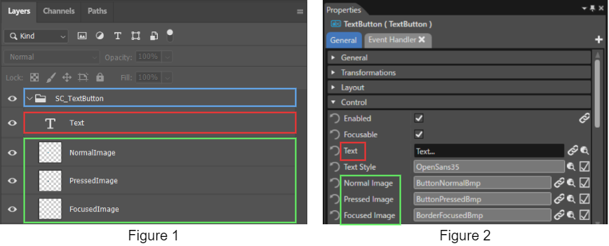
<div class="contents" id="bkmrk-create-a-group-item-"><div class="contents"><div class="contents"><div class="contents"><div class="textblock">1. <span style="vertical-align: inherit;"><span style="vertical-align: inherit;">Create a group item for the control to be assigned and name it "SC\_*&lt;name of control&gt;*". In the example below, in order to make a TextButton control, the top layer has been named "SC\_TextButton" (see blue box).</span></span>
2. <span style="vertical-align: inherit;"><span style="vertical-align: inherit;">Make property layers <span style="vertical-align: inherit;"><span style="vertical-align: inherit;">that the desired control contains</span></span> underneath the group item made in step 1 (see red and green boxes).</span></span>
3. <span style="vertical-align: inherit;"><span style="vertical-align: inherit;">Use the names of the control properties for the names of these photoshop layers. Note that any spaces in photoshop layer names should be deleted (see green boxes for comparison)</span></span>

</div></div></div></div></div><div drawio-diagram="3874"><img src="https://doc316en.candera.eu/uploads/images/drawio/2023-06/drawing-7-1686313199.png" alt=""/></div>

<div class="contents" id="bkmrk--0"><div class="contents">  
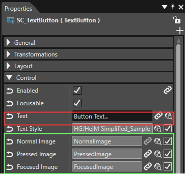
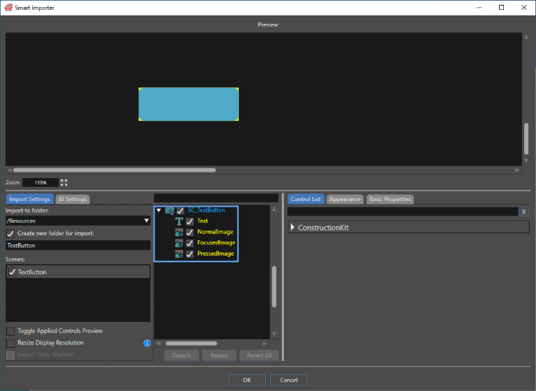
</div></div><span style="vertical-align: inherit;"><span style="vertical-align: inherit;">After observing the above method, select the finished photoshop file from the Scene Composer toolbar \[Import\] &gt; \[Smart Importer\] &gt; \[From Local File...\]. The Smart Importer panel will open, and the file will be loaded in line with the .psd file layers that were set. As seen in the image below, the TextButton control has already been confirmed and subsequently applied.  
</span></span>

<div drawio-diagram="6772"><img src="https://doc316en.candera.eu/uploads/images/drawio/2024-09/drawing-5-1726226385.png" alt=""/></div>

<div class="contents" id="bkmrk-each-property-on-the"><div class="contents"><div class="textblock">  
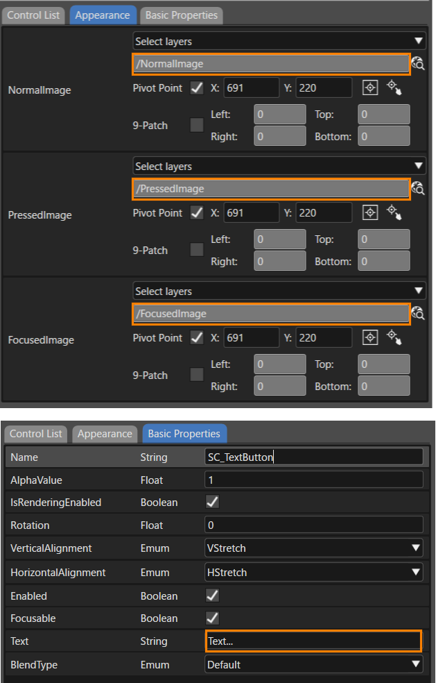
</div><div class="textblock">Each property on the Appearance and Basic Property tabs will also reflect the layers that were set in the .psd file.   
</div><div class="textblock"><div drawio-diagram="7037"><img src="https://doc316en.candera.eu/uploads/images/drawio/2024-10/drawing-4-1729219437.png" alt=""/></div>

</div></div></div><div class="contents" id="bkmrk--7"></div><span style="vertical-align: inherit;"><span style="vertical-align: inherit;">This will also be reflected on the property panel after importing is complete.   
</span></span>

<div drawio-diagram="6774"><img src="https://doc316en.candera.eu/uploads/images/drawio/2024-09/drawing-5-1726226731.png" alt=""/></div>

<div class="contents" id="bkmrk--10"><div class="contents"><div class="textblock">  
</div></div></div><div class="contents" id="bkmrk-the-size-of-the-impo"><div class="contents"><div class="textblock"><dl class="note"><dt></dt><dd><p class="callout info"><span style="vertical-align: inherit;"><span style="vertical-align: inherit;">The size of the imported control will <span style="color: rgb(0, 0, 0);">conform to the width and height of the largest image layer applied.</span>  
</span></span></p>

</dd><dd></dd></dl></div></div></div><span style="vertical-align: inherit;"><span style="vertical-align: inherit;">When importing nodes with mismatching layers and properties, new group nodes are created, and additional properties are added as child elements.  
</span></span>

<div class="contents" id="bkmrk--9"><div class="contents"><div class="contents"><div class="textblock">  
</div></div></div></div>---

#### For Adobe XD（.xd）Files

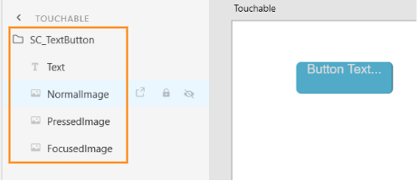
The preparation needed for .xd files is for all intents and purposes the same as with <span style="color: rgb(230, 126, 35);">[「For Adobe Photoshop（.psd）Files」](https://doc316en.candera.eu/link/84#bkmrk-adobe-photoshop%EF%BC%88.psd)</span>. As seen below with the TextButton example, structure the Adobe XD items to match the structure and property names of controls to be automatically applied.

<div drawio-diagram="3877"><img src="https://doc316en.candera.eu/uploads/images/drawio/2023-06/drawing-7-1686313818.png" alt=""/></div>

#### For Figma（.fig）Files 

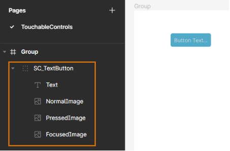
The preparation needed for .fig files is for all intents and purposes the same as with <span style="color: rgb(230, 126, 35);">[「For Adobe Photoshop（.psd）Files」](https://doc316en.candera.eu/link/84#bkmrk-adobe-photoshop%EF%BC%88.psd)</span>. As seen below with the TextButton example, structure the Figma items to match the structure and property names of controls to be automatically applied.

<div drawio-diagram="3876"><img src="https://doc316en.candera.eu/uploads/images/drawio/2023-06/drawing-7-1686313403.png" alt=""/></div>

---

<div class="contents" id="bkmrk--41"><div class="contents">  
</div></div>#### Layer Structure and Naming Guideline for Controls

In general, it is recommended to keep the PSD layer format close to the standard Controls. Below is a guide on how the layers for some Controls should be formatted and named.

<div class="contents" id="bkmrk-analogclock-secondsn"><div class="contents"><div class="textblock">- **AnalogClock**
    - SecondsNeedleImage
    - MinutesNeedleImage
    - HoursNeedleImage
    - FaceImage
- **Breadcrumb**
    - Name
    - EllipsisText
- **Button**
    - NormalImage
    - PressedImage
    - FocusImage
- **CheckBox**
    - NormalImage
    - PressedImage
    - SelectedImage
    - SelectedPressedImage
    - FocusedImage
- **CircularSlider**
    - BackgroundImage
    - ActiveImage
    - ThumbImage
    - ThumbImagePressed
    - FocusImage
- **Gauge**
    - NeedleImage
    - BackgroundImage
- **GroupBox**
    - BackgroundImage
- **IconButton**
    - NormalImage
    - PressedImage
    - FocusedImage
    - IconNormalImage
    - IconPressedImage
    - IconFocusedImage
- **InputField**
    - CaretImage
    - BackgroundImage
    - FocusedImage
- **Menu Icon**
    - Image
    - BackgroundImage
- **Menu Item**
    - FocusImageOnSelection
    - FocusImageOnDragging
    - DeleteButtonNormalImage
    - DeleteButtonPressedImage
    - Image
- **Menu Screen**
    - BackgroundImage
    - FocusBorderImage
- **Mesh2D**
    - Image
- **MultiStateButton**
    - ButtonState1Bmp
    - ButtonState2Bmp
    - ButtonState3Bmp
    - ButtonState4Bmp
    - FocusedImage
- **PageIndicator**
    - PressedImage
    - SelectedPressedImage
    - SelectedIndicatorImage
    - IndicatorImage
    - SelectedIndicatorPressedImage
    - IndicatorPressedImage
- **RadioButton**
    - NormalImage
    - PressedImage
    - SelectedImage
    - SelectedPressedImage
    - FocusedImage
- **Roll**
    - DecorationImage
    - TextEditBackground
- **SpinBox**
    - BackgroundImage
    - ArrowUpNormalImage
    - ArrowUpPressedImage
    - ArrowDownNormalImage
    - ArrowDownPressedImage
- **TextButton**
    - Text
    - NormalImage
    - PressedImage
    - FocusedImage
- **ToggleButton**
    - FirstImage
    - FirstPressedImage
    - SecondImage
    - SecondPressedImage
    - FocusedImage
- **TouchIndication**
    - Image

---

</div></div></div>