# Import of Resources

# Manage Imports

#### Manage Imports

Scene Composer’s Solution Explorer provides the possibility to manage and organize the solution’s files. Imported resources are organized in folders according to the user's needs. This folder structure is linked to the locally stored solution folder structure.

<p class="callout info">For more information on solution management using folders, please also see <span style="color:rgb(230,126,35);">[here](https://doc316en.candera.eu/books/solution-handling/page/organize-a-solution-using-folders)</span>.</p>

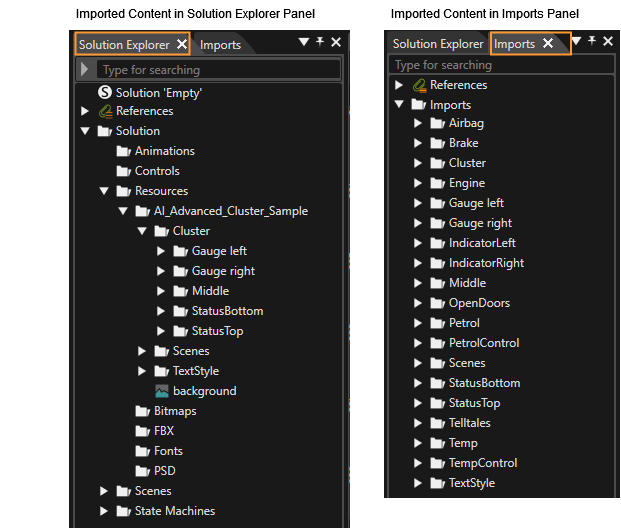
You can modify the folder structure of imported resources in the Solution Explorer panel. In addition to Solution Explorer, some of imported resources can also be made visible in the "Imports" panel.

#### Original image file retention

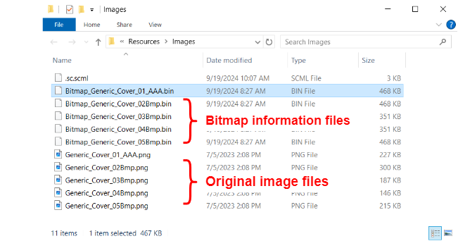
When an image file is imported using the File menu \[ Import &gt; Import Resources \], the original image file is retained along with the bitmap information file (\*.bin file) used in Scene Composer.

<p class="callout info">The original image file is not retained if the file format is FBX, glTF and so on, or if the file is imported using the **Smart Importer**.  
</p>

##### Original image file name  


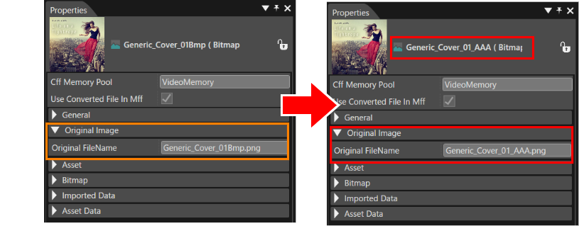
The original image file can be found in the \[ Original Image \] section of the Properties panel of the imported resource. The original image file name is "the image information name" + "the original image file extension".

When the resource file name is renamed in Solution Explorer, the original image file name is also renamed.

<div drawio-diagram="6826"><img src="https://doc316en.candera.eu/uploads/images/drawio/2024-09/drawing-4-1726708047.png" alt="drawing-4-1726708047.png"/></div>

##### Original Image File Location  


Solution Explorer displays only the bitmap information file. The original image files are stored in the local Solution folder (the same location as the folder displayed in Solution Explorer).

<div drawio-diagram="6827"><img src="https://doc316en.candera.eu/uploads/images/drawio/2024-09/drawing-4-1726708917.png" alt="drawing-4-1726708917.png"/></div>

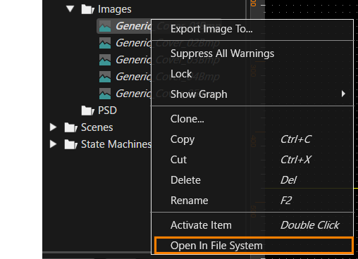
Select a resource file in Solution Explorer and use \[ Open In File System \] from the context menu to view its local location in Windows Explorer.

<div drawio-diagram="6825"><img src="https://doc316en.candera.eu/uploads/images/drawio/2024-09/drawing-4-1726707944.png" alt="drawing-4-1726707944.png"/></div>

##### Moving original image files  


When you move an imported resource in Solution Explorer, the original image file is moved along with the locally stored bitmap information file.

#### Imports Panel

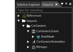
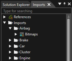
The Import panel can be shown or hidden by selecting "View &gt; Libraries &gt; Imports" from the menu bar. This panel displays imported resources in a hierarchical manner. They can be placed on the scene editor by drag-and-drop operations.

<div drawio-diagram="5921"><img src="https://doc316en.candera.eu/uploads/images/drawio/2024-05/drawing-5-1717167173.png" alt="drawing-5-1717167173.png"/></div>

#### Properties of Imported resources

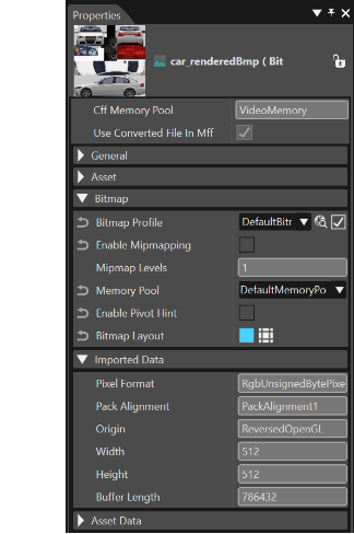
When you select an imported resource either in Solution Explorer or Import panel, its properties are shown in Properties panel. Information about the selected resource is displayed in Properties panel.

<div drawio-diagram="5922"><img src="https://doc316en.candera.eu/uploads/images/drawio/2024-05/drawing-5-1717167248.png" alt="drawing-5-1717167248.png"/></div>


#### Clone, Delete and Rename Items

Imported resources can be cloned, renamed or deleted in the Solution Explorer panel. Right-click an imported item in the Solution Explorer and choose the desired option from the context menu. You can also right-click on a folder containing imported files to bulk delete them.

For further information refer to Solution Explorer <span style="color:rgb(230,126,35);">[Context Menu](https://doc316en.candera.eu/link/46#bkmrk-copy%2C-clone%2C-rename-)</span>.

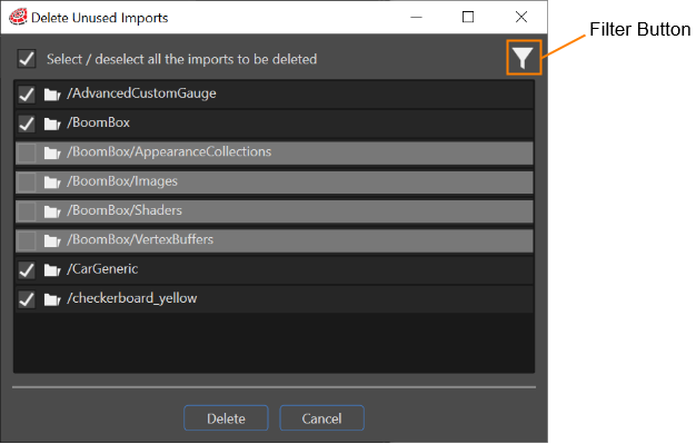
#### Delete Unused Imports  


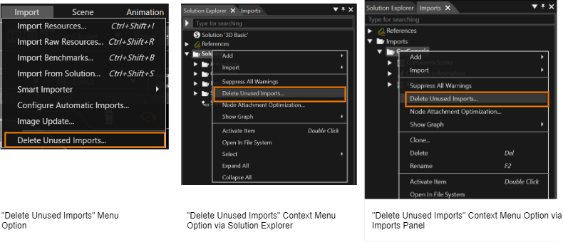
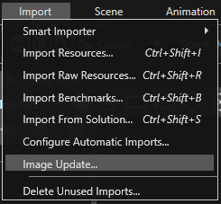
If there are unused imports or import parts, it is possible to clean up the solution by using the "Delete Unused Imports..." option. This option is available in the

<div class="contents" id="bkmrk-import-menu-solution"><div class="contents"><div class="textblock">- Import menu
- Solution Explorer
- Imports Panel

</div></div></div><div drawio-diagram="6870"><img src="https://doc316en.candera.eu/uploads/images/drawio/2024-09/drawing-4-1727160497.png" alt="drawing-4-1727160497.png"/></div>

The "Delete Unused Imports" dialog will list all the imports from a solution.

<div class="contents" id="bkmrk-the-only-imports-whi"><div class="contents"><div class="textblock"><dl class="note"><dt></dt><dd><p class="callout info">Import items that can be displayed and deleted as unused imports are images, raw resources, fonts, fragment shaders, vertex shaders, 3D model files, and scripts.</p>

</dd></dl></div></div></div>The filter button allows to hide/show the unused (= undeletable) imports. Tick the checkboxes for unused imports to delete them with the Delete button.

<div drawio-diagram="5929"><img src="https://doc316en.candera.eu/uploads/images/drawio/2024-05/drawing-5-1717168584.png" alt="drawing-5-1717168584.png"/></div>

<div class="contents" id="bkmrk-if-an-import-folder-"><div class="textblock"><dl class="note"><dt></dt><dd><p class="callout info">If an import folder contains other folders or files, which are not imported, this folder won't be deleted. Only the imported files that are unused.</p>

</dd></dl><dl class="note"><dt></dt><dd>#### Export Imported Images

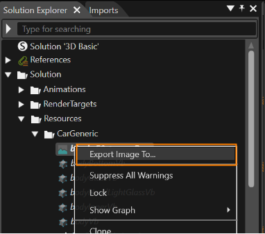
If necessary, it is possible to export any imported image from solution to a .png file. This operation can be done through the context menu which is available when right click on any image. This operation can also be performed after selecting multiple image resources.

<div drawio-diagram="5927"><img src="https://doc316en.candera.eu/uploads/images/drawio/2024-05/drawing-5-1717168526.png" alt="drawing-5-1717168526.png"/></div>

<div class="contents" id="bkmrk--13"><div class="contents"><div class="textblock">  
</div></div></div><div class="contents" id="bkmrk-the-image-can-be-exp"><div class="contents"><div class="textblock"><dl class="note"><dt></dt><dd><p class="callout info">The image can be exported even though it is locked.</p>

</dd><dd>This export operation can be done in different contexts of the application:</dd></dl></div></div></div><div class="contents"><div class="contents"><div class="textblock">- From Solution Explorer
- From Imports
- From Canvas Node
- From Canvas sprite
- From Billboard

<dl class="note"><dt></dt><dd><p class="callout info">Currently the original image is exported, not the asset one.</p>

</dd></dl></div></div></div><div class="contents" id="bkmrk-from-solution-explor"><div class="textblock"><dl class="note"><dt></dt><dd><dl class="note"><dt></dt><dd>#### Edit an imported script resource

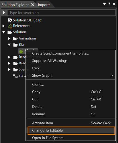
You can import any type of script by using the \[ Import Resources... \] menu. Imported scripts are read-only, but can be changed to editable format.  
Select the target script in Solution Explorer and choose \[ Change to Editable \] from the context menu.

<div drawio-diagram="5926"><img src="https://doc316en.candera.eu/uploads/images/drawio/2024-05/drawing-5-1717168517.png" alt="drawing-5-1717168517.png"/></div>

<div class="contents" id="bkmrk--16"><div class="contents"><div class="textblock">  
</div></div></div><div class="contents" id="bkmrk-please-refer-to-scri"><div class="contents"><div class="textblock"><dl class="note"><dt></dt><dd><p class="callout info">Please refer to <span style="color:rgb(230,126,35);">[Scripting](https://doc316en.candera.eu/books/scripting)</span> for instructions on how to operate script resources.</p>

</dd></dl></div></div></div></dd></dl></dd></dl></div></div></dd></dl></div></div>

# Import Dialog Options

This section describes the import dialog screen configuration that appears when importing resources.

#### Import Dialog

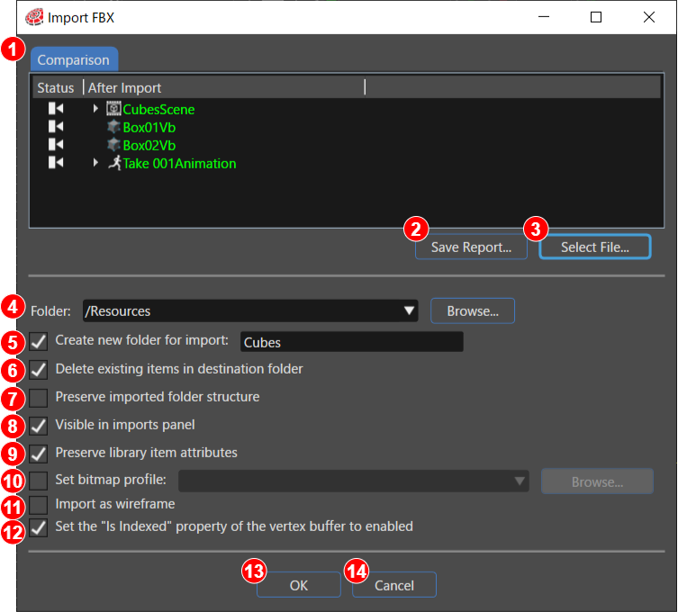
<div class="textblock" id="bkmrk-"><div drawio-diagram="8173"><img src="https://doc316en.candera.eu/uploads/images/drawio/2025-03/drawing-4-1743034103.png" alt="drawing-4-1743034103.png"/></div>

</div><div class="textblock" id="bkmrk--0"></div><table class="align-center" id="bkmrk-%281%29-%E3%82%A4%E3%83%B3%E3%83%9D%E3%83%BC%E3%83%88%E5%AF%BE%E8%B1%A1%E3%83%95%E3%82%A1%E3%82%A4%E3%83%AB%E3%81%A8%E3%81%97%E3%81%A6%E6%8C%87%E5%AE%9A" style="border-collapse:collapse;width:800px;height:1080.8px;border-width:1px;"><tbody><tr style="height:147.2px;"><td style="width:61.2812px;height:147.2px;border-width:1px;">1</td><td class="align-left" style="width:737.719px;height:147.2px;border-width:1px;">**Comparison:**

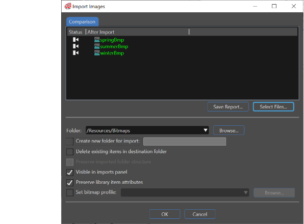
The resources that exist at the import destination are compared with the resources to be imported this time, and the update status is listed. The status of the import is indicated by icons and tooltips in \[ Status \] section. The status can also be identified by the font color of each resource name displayed in \[ After Import \] section.

Green: Indicates a new resource being added.  
Yellow: The same resource exists, but with different properties.  
Colorless: The same resource exists and has the same properties, or it is not included in the resources to be imported this time.

</td></tr><tr style="height:63.2px;"><td style="width:61.2812px;height:63.2px;border-width:1px;">2</td><td class="align-left" style="width:737.719px;height:63.2px;border-width:1px;">**Save Report…:**

Generates and saves a report file (cvs format) on the comparison of import files. The report name and save destination are set in the dialog window displayed by clicking this button.

</td></tr><tr style="height:46.4px;"><td style="width:61.2812px;height:46.4px;border-width:1px;">3</td><td class="align-left" style="width:737.719px;height:46.4px;border-width:1px;">**Select Files…:**

Select items to be imported into the solution.

</td></tr><tr style="height:63.2px;"><td style="width:61.2812px;height:63.2px;border-width:1px;">4</td><td class="align-left" style="width:737.719px;height:63.2px;border-width:1px;">**Folder:**

Select the destination folder for imported files. Use the drop-down menu or the Browse button to select any location in the Solution Explorer as root folder of the import destination. By default, the root folder "/Resources" is selected.

</td></tr><tr style="height:63.2px;"><td style="width:61.2812px;border-width:1px;height:63.2px;">5</td><td style="width:737.719px;border-width:1px;height:63.2px;">**Create new folder for import:**

Select this option if you want to create a subfolder below the destination specified in "**Folder**" section. Input the new subfolder name in the field.

</td></tr><tr style="height:46.4px;"><td style="width:61.2812px;height:46.4px;border-width:1px;">6</td><td class="align-left" style="width:737.719px;height:46.4px;border-width:1px;">**Delete existing items in destination folder:**

This option allows you to delete existing contents in the destination folder before performing the import operation.

</td></tr><tr style="height:96.8px;"><td style="width:61.2812px;height:96.8px;border-width:1px;">7</td><td class="align-left" style="width:737.719px;height:96.8px;border-width:1px;">**Preserve imported folder structure:**

This option is available only when importing Image or 3D model file types. It can only be set when "**Delete existing items in destination folder**" is enabled. When "Preserve current folder structure" option is enabled, the existing files in the import destination folder are deleted, but the subfolder structure is retained.

<span style="color:rgb(224,62,45);">\*This option is not displayed when you import file types for Font or Shader.</span>

</td></tr><tr style="height:46.4px;"><td style="width:61.2812px;border-width:1px;height:46.4px;">8</td><td style="width:737.719px;border-width:1px;height:46.4px;">**Visible in imports panel:**

This option allows you to make imported items visible in both the Import panel and the Solution Explorer.

</td></tr><tr style="height:130.4px;"><td style="width:61.2812px;border-width:1px;height:130.4px;">9</td><td style="width:737.719px;border-width:1px;height:130.4px;">**<span style="vertical-align:inherit;"><span style="vertical-align:inherit;">Preserve library item attributes:</span></span>**

This option likes export always, bitmap conversion option, etc. allows to keep all the different attributes set to an item unchanged after the re-import operation. The attributes which can be preserved are the properties associated with bitmaps - converter, target format, origin - and all the vertex buffer properties: buffer type, enable cache, position, normal, texture coordinate, tangent, bi normal etc. The preservation of any of these properties implies the fact that when an object is re-imported and any of those mentioned properties will be re-written, the "preserved" property will remain unchanged.

</td></tr><tr style="height:102.4px;"><td style="width:61.2812px;height:102.4px;border-width:1px;">10</td><td class="align-left" style="width:737.719px;height:102.4px;border-width:1px;">**Set bitmap profile:**

This option allows you to specify a default bitmap profile that can be used for all bitmaps which do not have a profile set explicitly, and can be set when importing images, FBX, and glTF files. You can set-up Bitmap Profile from Solution &gt; <span style="color:rgb(230,126,35);">[<span style="background-color:rgb(255,255,255);">Solution Options...</span>](https://doc316en.candera.eu/books/solution-handling/page/bitmap-profile)</span>[ ](http://dev.doc.candera.eu/books/solution-handling/page/solution-options)from the menu bar. In addition to this, settings can also be made from the Properties panel that appears when the target resource is selected in Solution Explorer.

</td></tr><tr style="height:85.6px;"><td style="width:61.2812px;border-width:1px;height:85.6px;">11</td><td style="width:737.719px;border-width:1px;height:85.6px;">**<a class="anchor" id="bkmrk--01"></a>Import as wireframe:**

This option appears only when importing FBX files. If checked, a wireframe vertex buffer will be created based on the triangles and rectangles in the FBX file. If checked, the vertex buffer and wireframe vertex buffer will be registered in <span style="color:rgb(230,126,35);">[Associated Vertex Buffer](https://doc316en.candera.eu/books/solution-handling/page/associated-vertex-buffer)</span> the solution options.

</td></tr><tr style="height:96.8px;"><td style="width:61.2812px;border-width:1px;height:96.8px;">12</td><td style="width:737.719px;border-width:1px;height:96.8px;">**Set the "Is Indexed" property of the vertex buffer to enabled:**

This option is only displayed when importing FBX files (this option is enabled by default).  
If this option is enabled, the buffer type is changed to an index array. As a result, Scene Composer automatically selects the appropriate index size. If this option is disabled, the buffer type is set to an array.

</td></tr><tr style="height:46.4px;"><td style="width:61.2812px;height:46.4px;border-width:1px;">13</td><td class="align-left" style="width:737.719px;height:46.4px;border-width:1px;">**OK button:**

Import the resources with the specified settings.

</td></tr><tr style="height:46.4px;"><td style="width:61.2812px;height:46.4px;border-width:1px;">14</td><td class="align-left" style="width:737.719px;height:46.4px;border-width:1px;">**Cancel button:**

Close the dialog without performing the import.

</td></tr></tbody></table>

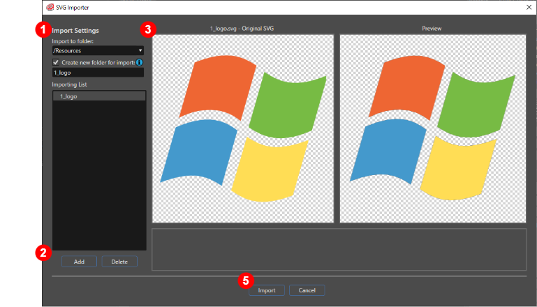
#### SVG Importer Dialog

<div drawio-diagram="6750"><img src="https://doc316en.candera.eu/uploads/images/drawio/2024-09/drawing-4-1725634633.png" alt="drawing-4-1725634633.png"/></div>

<table class="align-center" id="bkmrk-%281%29-import-settings-" style="border-collapse:collapse;width:800px;height:290px;border-width:1px;"><tbody><tr style="height:29px;"><td style="width:61.2812px;height:29px;border-width:1px;">(1)</td><td class="align-left" style="width:737.719px;height:29px;border-width:1px;">**Import Settings**

**Import to folder:**

The Solution Explorer folder into which the SVG file will be imported.

**Create new folder for import**

When importing an SVG file, enabling this will allow a new folder to be created in the Solution Explorer.

**Importing List**

A list of items selected for import. Items that cannot be imported will be displayed with an error icon. Items that can only be partially imported will be displayed with a warning icon (note that even with no icon there may be cases where certain elements cannot be loaded).

</td></tr><tr style="height:29px;"><td style="width:61.2812px;height:29px;border-width:1px;">(2)</td><td class="align-left" style="width:737.719px;height:29px;border-width:1px;">**Add/Delete:**

**Add:** Add another SVG file to be imported  
**Delete**: Remove an SVG file from the list of items to be imported

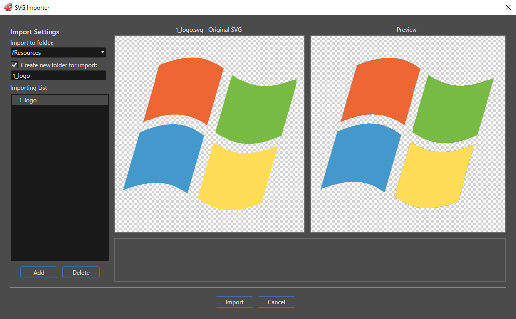
</td></tr><tr style="height:29px;"><td style="width:61.2812px;height:29px;border-width:1px;">(3)</td><td class="align-left" style="width:737.719px;height:29px;border-width:1px;">**Preview Display:**

**Left-side:** The original SVG image that has been selected from the Importing List  
**Right-side:** The SVG image that has been selected from the Importing List as it will be when imported into Scene Composer.

<p class="callout warning">In the current version of Scene Composer, there are cases where the size will not match the original SVG image. </p>

</td></tr><tr style="height:29px;"><td style="width:61.2812px;height:29px;border-width:1px;">(4)</td><td class="align-left" style="width:737.719px;height:29px;border-width:1px;">**Error Message:**

If there are warnings or errors with the selected file, a message will be displayed here.

</td></tr><tr><td style="width:61.2812px;border-width:1px;">(5)</td><td style="width:737.719px;border-width:1px;">**Import/Cancel:**

**Import:** Import the contents of the Importing List  
**Cancel:** Cancel the file import

</td></tr></tbody></table>

<div class="contents" id="bkmrk-this-feature-can-be-"><div class="contents"><div class="textblock"><dl class="note"><dt></dt><dd></dd></dl>  
</div></div></div><div drawio-diagram="3356"></div>

# How to Import Resources

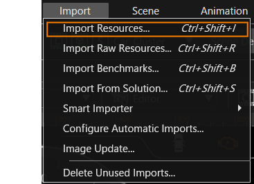
This section describes how to import resources using \[ Import Resources... \] from \[ Import \] on the menu bar.
<div drawio-diagram="6871"><img src="https://doc316en.candera.eu/uploads/images/drawio/2024-09/drawing-4-1727160599.png" alt="drawing-4-1727160599.png"/></div>

#### Import File Formats

The file formats to be imported when using this menu are as follows

- Image files (`*.bmp, *.jpg, *.jpeg, *.gif, *.tga, *.png, *.dds, *.ktx, *.hdr, *.exr`)
- Font files (`*.ttf, *.ttc,*.otf, *.fnt, *.fbm, *.*`)
- Shader files (`*.vert, *.frag`)
- SVG files (`*.svg`)
- FBX files (`*.fbx`)
- glTF files (`*.gltf, *.glb`)
- Icon files (`*.bmp, *.ico, *.jpg, *.png`)
- Script files (`*.lua`)

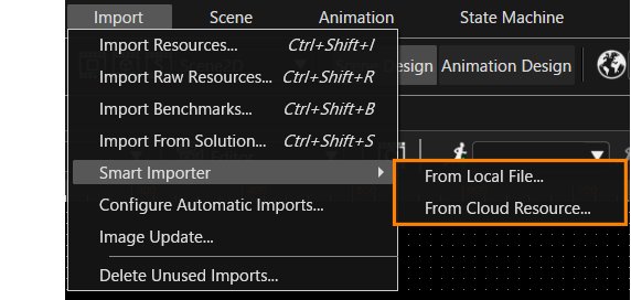
In addition to the above, Photoshop file (\*.psd), Adobe XD file (\*.xd), Axure RP file (\*.rp) and Sketch file (\*.sketch) can also be imported. For more information on these, please refer to <span style="color:rgb(230,126,35);">[Smart Importer](https://doc316en.candera.eu/books/import-of-resources/chapter/smart-importer "Smart Importer") <span style="color:rgb(0,0,0);">chapter</span></span>.

<p class="callout info">For Font files, by selecting **Font files** during file selection, they can be imported as fonts regardless of their extension. For more details, please refer to the explanation <span style="color:rgb(230,126,35);">[here](#bkmrk-image%2C-font%2C-shader%2C-1)</span>.</p>

<p class="callout info">With CGI 3.14 or later, <span style="color:rgb(230,126,35);">[skinning](https://doc316en.candera.eu/books/import-of-resources/page/skinning)</span> animations can be played back by importing skinning FBX or glTF files.</p>

<details id="bkmrk-gltf-file-format-sce"><summary>glTF file format</summary>

SceneComposer supports following glTF file formats when importing:

<div class="contents" id="bkmrk-gltf%3A-this-points-to"><div class="contents"><div class="textblock">- glTF: This points to external binary data (geometry, key frames, skins), and images.
- glTF-Embedded: This embeds base64-encoded binary data, and images inline using data URIs.
- glTF-Binary: In Binary glTF, a glTF asset (JSON, .bin, and images) can be stored in a binary blob.

</div></div></div><p class="callout info">For more detailed information on the file formats, please see <span style="color:rgb(230,126,35);">[the Khronos website: GLB File Format Specification](https://github.com/KhronosGroup/glTF/tree/master/specification/2.0#glb-file-format-specification).</span></p>

</details><details id="bkmrk-about-.ktx-file-form"><summary>About .ktx File Format</summary>

The following compressed image formats are supported:

<div class="contents" id="bkmrk-etc2compressedrgbfor"><div class="contents"><div class="textblock">- Etc2CompressedRgbFormat
- Etc2CompressedSrgbFormat
- Etc2Alpha1CompressedRgbaFormat
- Etc2Alpha1CompressedSrgbaFormat
- Etc2EacCompressedRgbaFormat
- Etc2EacCompressedSrgbaFormat

</div></div></div>To use this type of format, first of all it is necessary to convert an image with a different format (.tga, .gif, .psd, .bmp, .pgm, .png etc.) in a .ktx file. The next tools support generating KTX files:

<div class="contents" id="bkmrk-texgenpack-mali-text"><div class="contents"><div class="textblock">- Texgenpack
- Mali Texture Compression tool
- Ericcson Texture Compression Tool

</div></div></div>This tool compresses texture images to the Ericsson Texture Compression (ETC/ETC2) and Adaptive Scalable Texture Compression (ASTC). The available output file formats are .pkm - that can contain compressed textures - and .ktx – which allows the compression of a 2D texture with all its mipmap levels.

After the conversion is done, the .ktx resulted file can be imported in SceneComposer by following the same flow as in the case of other image formats.

<div class="contents" id="bkmrk-in-the-case-of-a-con"><div class="contents"><div class="textblock"><dl class="note"><dt></dt><dd><p class="callout info">In the case of a converted .ktx file which is imported in the SceneComposer application, the usage of the "DefaultBitmapConverter" property - available for any usual .bmp image - is not possible.</p>

</dd></dl></div></div></div></details><details id="bkmrk-about-bitmap-font-bi"><summary>About Bitmap Font</summary>

Bitmap fonts are supported by SceneComposer. In order to use bitmap fonts, the SCHost.dll must be compiled using BitmapFont font engine. Only one font engine can be active at a time in an SCHost.dll.

The user can import 2 types of files as bitmap fonts:

<div class="contents" id="bkmrk-.fnt-%28windows-font-f"><div class="contents"><div class="textblock">- .fnt (windows font files) - are converted to bitmap fonts
- .fbm - already converted bitmap font files

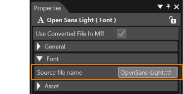
</div></div></div>When a font is imported, following specific property will be set:

<div class="contents"><div class="contents"><div class="contents"><div class="contents"><div class="textblock">- Source file names: specifies the name of the file which was imported - helps the user identify a font

</div></div></div></div></div><div drawio-diagram="5936"><img src="https://doc316en.candera.eu/uploads/images/drawio/2024-05/drawing-5-1717170340.png" alt="drawing-5-1717170340.png"/></div>

</details><p class="callout warning">On OpenGL ES1.1 platforms, such as Traveo2, it is not possible to perform import operations on shader files, SVG files, FBX files, and glTF files.</p>

---

#### Import Operation

You can open the Import Dialog to proceed importing resources in one of the following three ways.

##### Menu Bar

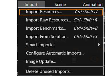
Select \[Import\] &gt; \[Import Resources...\] from the menu bar.

<div drawio-diagram="6872"><img src="https://doc316en.candera.eu/uploads/images/drawio/2024-09/drawing-4-1727160619.png" alt="drawing-4-1727160619.png"/></div>

##### Context menu

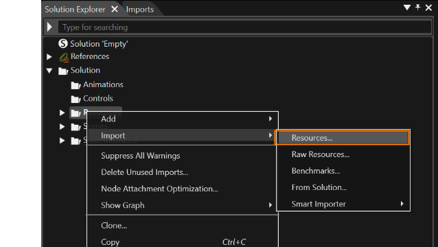
Right-click on any folder in Solution Explorer and select \[Import\] &gt; \[Resource...\] from the context menu that appears.

<div drawio-diagram="5935"><img src="https://doc316en.candera.eu/uploads/images/drawio/2024-05/drawing-5-1717170156.png" alt="drawing-5-1717170156.png"/></div>

##### Drag and Drop

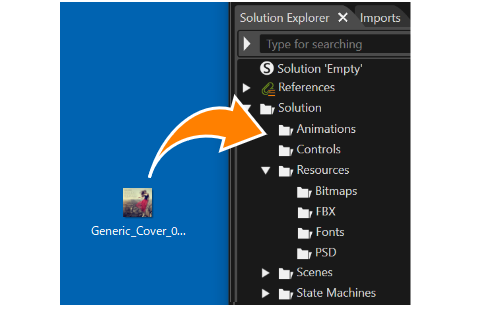
Drag and drop the target file to be imported into any folder under **Solution** in Solution Explorer.

<div drawio-diagram="5938"><img src="https://doc316en.candera.eu/uploads/images/drawio/2024-05/drawing-5-1717170521.png" alt="drawing-5-1717170521.png"/></div>

- - glTF file can also be imported by drag-and-drop to any folder under **Solution** in Solution Explorer.
    - Note that under OpenGLES1.1 environment, shader files (\*.vert, \*.frag), SVG files (\*.svg), FBX files, and glTF files cannot be imported by drag-and-drop operation.
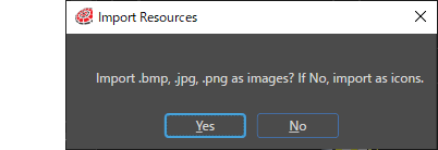
    - When an image file format (\*.bmp, \*.jpg, \*.png) that can be imported as an icon is dragged and dropped into any folder under **Solution** in Solution Explorer, the dialog box will appear as shown below, allowing you to select whether to import it as an image or icon resource. You can choose whether to import it as an image or an icon.  
        <div drawio-diagram="4336"><img src="https://doc316en.candera.eu/uploads/images/drawio/2023-09/drawing-4-1695617424.png" alt="drawing-4-1695617424.png"/></div>

#### Import operations by file format

After selecting a file, operations will vary depending on the file format. Please refer to the following links for detailed operation procedures.

- <span style="color:rgb(230,126,35);">[Image, font, shader, FBX, and script file formats](#bkmrk-image%2C-font%2C-shader%2C)</span>
- <span style="color:rgb(230,126,35);">[FBX files with multiple animations](#bkmrk-fbx-files-with-multi-1)</span>
- <span style="color:rgb(230,126,35);">[Icon file format](#bkmrk-%C2%A0-2)</span>
- <span style="color:rgb(230,126,35);">[SVG file format](#bkmrk--21)</span>
- <span style="color:rgb(230,126,35);">[glTF file format](#bkmrk-images%2C-fonts%2C-shade)</span>

##### Image, font, shader, FBX, and script files

<p class="callout info">For importing FBX files contains skinning, see <span style="color:rgb(230,126,35);">[here](https://doc316en.candera.eu/books/import-of-resources/page/skinning)</span>.</p>

<p class="callout info">When an image file is imported, the original image file is retained along with the bitmap information file (\*.bin file) used on Scene Composer. See <span style="color:rgb(230,126,35);">[here](https://doc316en.candera.eu/link/74#bkmrk-original-image-file-)</span> for details.</p>

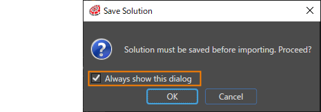
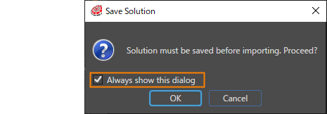
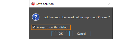
1. When the import process is executed, Scene Composer will display a message to save any unsaved changes in the solution. Press OK to proceed. If you do not want this dialog to appear during the import process, uncheck the "Always show this dialog" checkbox.
    
    <div drawio-diagram="5939"><img src="https://doc316en.candera.eu/uploads/images/drawio/2024-05/drawing-5-1717170573.png" alt="drawing-5-1717170573.png"/></div>
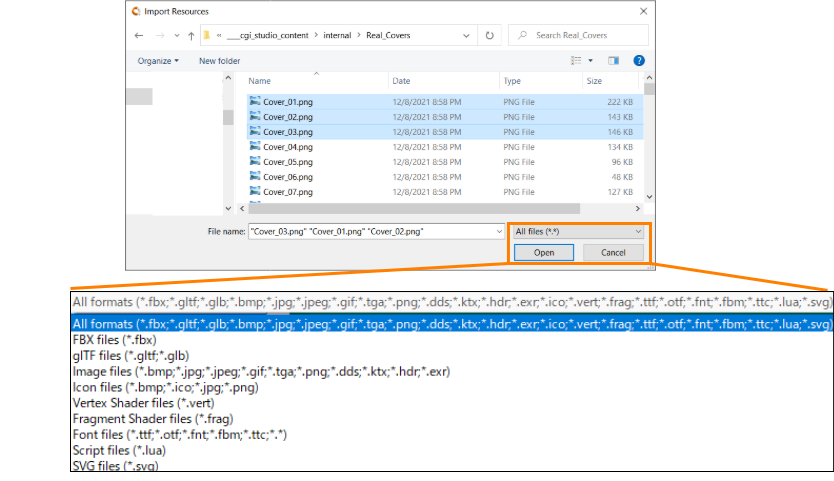
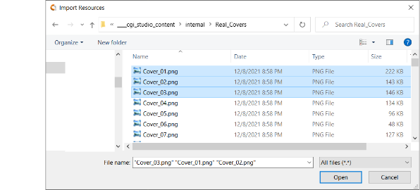
2. After saving the solution, the Import Resources dialog is opened, where you can select one or more resource files to be imported. Select your files to import and press OK.
    
    
    - You can search for supported file formats by selecting them in the drop-down menu at the bottom right of the Import Resources dialog.
    - You can import multiple files at once as long as their file format belong to the same category, such as an Image file or a Font file.
    - By selecting **Font files** from the pull-down menu below, you can import any file as a font file, regardless of its extension.  
        <div drawio-diagram="8534"><img src="https://doc316en.candera.eu/uploads/images/drawio/2025-08/drawing-4-1756260098.png" alt="drawing-4-1756260098.png"/></div>
3. After choosing your files to import, an Import dialog will be displayed depending on the file types you are importing (Image, Font, FBX, Shader…).
    
    
    - See <span style="color:rgb(230,126,35);">[Import Dialog Options](https://doc316en.candera.eu/link/73#bkmrk-import-dialog "Import Dialog Options")</span> for a description of the settings on the dialog screen.
    - Select \[ <span style="color:rgb(230,126,35);">[Import as wireframe](https://doc316en.candera.eu/books/import-of-resources/page/import-dialog-options#bkmrk--01)</span> \] check box to import the wireframe vertex buffer when importing an FBX file.
        
        <div drawio-diagram="5940"><img src="https://doc316en.candera.eu/uploads/images/drawio/2024-05/drawing-5-1717170648.png" alt="drawing-5-1717170648.png"/></div>
4. Configure import settings to your needs and click "OK" button.
    
    
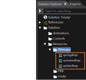
    - The file will be imported as a resource in the Solution Explorer in the location corresponding to the settings on the dialog screen.
        
        <div drawio-diagram="5941"><img src="https://doc316en.candera.eu/uploads/images/drawio/2024-05/drawing-5-1717170717.png" alt="drawing-5-1717170717.png"/></div>

<details id="bkmrk-wireframe-related-pr"><summary>Wireframe Related Properties</summary>

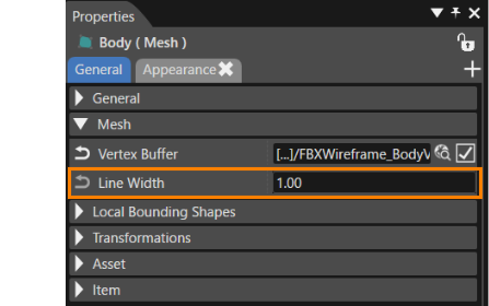
When importing an FBX file with the \[ <span style="color:rgb(230,126,35);">[Import as Wireframe](https://doc316en.candera.eu/books/import-of-resources/page/import-dialog-options#bkmrk--01)</span> \] option enabled, a \[ Line Width \] will be added to the property item ”mesh” of the target node. This specifies the line width of the mesh when it is rendered as wire.

- The actual line width is determined by rounding the specified width to the nearest integer.
- If the setting is less than “1”, it is always set to “1”.

<div drawio-diagram="6745"><img src="https://doc316en.candera.eu/uploads/images/drawio/2024-09/drawing-4-1725634285.png" alt="drawing-4-1725634285.png"/></div>

</details>##### FBX files with multiple animations

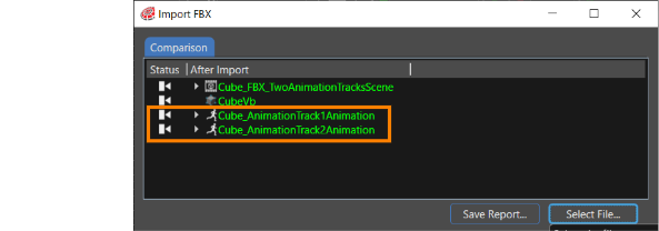
Scene Composer supports the import of FBX files that contain multiple animation tracks. The names of the imported animation tracks are automatically created from each animation track contained in the FBX file.

<div drawio-diagram="6963"><img src="https://doc316en.candera.eu/uploads/images/drawio/2024-10/drawing-4-1728536029.png" alt="drawing-4-1728536029.png"/></div>

The animations that can be imported from FBX files are as follows.

- Translation
- Rotation
- Scaling

##### Icon files

<p class="callout info">See <span style="color:rgb(230,126,35);">[Icon Picker](https://doc316en.candera.eu/books/solution-handling/page/icon-picker)</span> for information on how to use imported icon resources.</p>

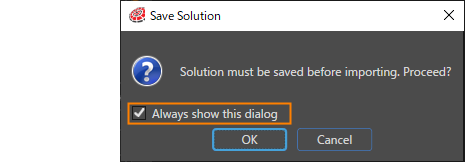
1. When the import process is executed, Scene Composer will display a message to save any unsaved changes in the solution. Press OK to proceed. If you do not want this dialog to appear during the import process, uncheck the "Always show this dialog" checkbox.
    
    <div drawio-diagram="5942"><img src="https://doc316en.candera.eu/uploads/images/drawio/2024-05/drawing-5-1717170728.png" alt="drawing-5-1717170728.png"/></div>
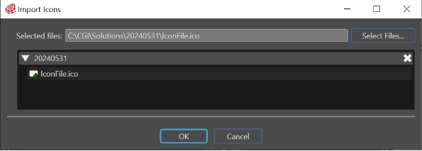
2. After saving the solution, the Import Resources dialog will open. Select the target file and press OK. If the selected file format is "\*.ico", the \[ Import Icons \] dialog will appear as shown below.
    
    
    - The path of the selected file is displayed in the \[ Selected files \] field. To re-select a file, press the \[ Select File... \] button.
    - In \[ Destination folder \], specify the location where the file will be imported as a resource.
    - As explained in the <span style="color:rgb(230,126,35);">[Drag and Drop section](#bkmrk-drag-and-drop)</span>, if you drag and drop an image file format that can be imported as an icon (\*.bmp, \*jpg, \*.png), the above dialog will appear and you can import it as an icon.  
        <div drawio-diagram="5943"><img src="https://doc316en.candera.eu/uploads/images/drawio/2024-05/drawing-5-1717170817.png" alt="drawing-5-1717170817.png"/></div>
3. Click "OK" button to complete the import operation.

##### SVG files

1. When the import process is executed, Scene Composer will display a message to save any unsaved changes in the solution. Press OK to proceed. If you do not want this dialog to appear during the import process, uncheck the "Always show this dialog" checkbox.
    
    <div drawio-diagram="5944"><img src="https://doc316en.candera.eu/uploads/images/drawio/2024-05/drawing-5-1717170829.png" alt="drawing-5-1717170829.png"/></div>
2. After saving the solution, the Import Resources dialog is opened, where you can select one or more SVG files to be imported. Select your files to import and press OK.
    
    
    - You can import multiple files at once.  
        <div drawio-diagram="4458"><img src="https://doc316en.candera.eu/uploads/images/drawio/2023-10/drawing-4-1696552970.png" alt="drawing-4-1696552970.png"/></div>
3. After choosing your files to import, an SVG Importer dialog will be displayed.
    
    
    - See <span style="color:rgb(230,126,35);">[SVG Importer Dialog](https://doc316en.candera.eu/link/73#bkmrk-%C2%A0-1 "Import Dialog Options")</span> for a description of the settings on the dialog screen.
        
        <div drawio-diagram="4361"><img src="https://doc316en.candera.eu/uploads/images/drawio/2023-09/drawing-4-1695790322.png" alt="drawing-4-1695790322.png"/></div>
4. Configure import settings to your needs and click "Import" button.
    
    
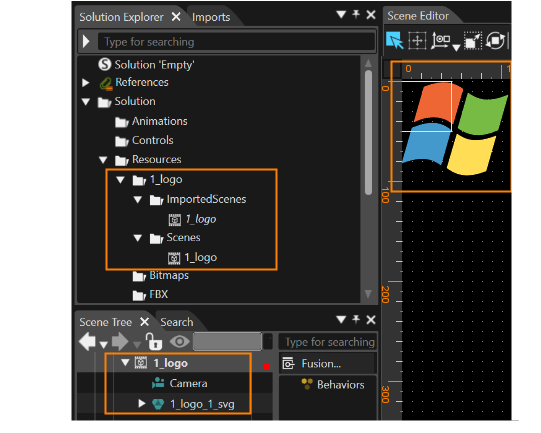
    - "ImportedScenes" and "Scenes" folders have been created at the destination folder chosen in "Solution Explorer". The former holds data imported as template scenes, while the latter holds data imported as actual scenes.
    - If multiple SVG files have been imported, the Scene Editor will display the actual scene for what was the topmost SVG file in the SVG Importer.
        
        
        - Transform &gt; Position &gt; X = 0, Y = 0 will be the item's initial position.
    - Copy group nodes within imported scenes into the desired scene and use them.
        
        <div drawio-diagram="7569"><img src="https://doc316en.candera.eu/uploads/images/drawio/2024-11/drawing-5-1732885221.png" alt="drawing-5-1732885221.png"/></div>

##### glTF files

<p class="callout warning">The CGI Studio glTF Importer does not support the following features:  
 - Morping  
 - Vertex Buffer Streams  
 - Sparse Accessors  
</p>

<p class="callout info">For additional details on handling glTF files—e.g., supported extensions, multiple UV sets, and limitations—please see the <span style="color:rgb(230,126,35);">[glTF file](https://doc316en.candera.eu/books/import-of-resources/page/gltf-files)</span> page.</p>

<p class="callout info">For importing glTF files contains skinning, see [here](https://doc316en.candera.eu/books/import-of-resources/page/skinning).</p>

1. When the import process is executed, Scene Composer will display a message to save any unsaved changes in the solution. Press OK to proceed. If you do not want this dialog to appear during the import process, uncheck the "Always show this dialog" checkbox.
    
    <div drawio-diagram="5945"><img src="https://doc316en.candera.eu/uploads/images/drawio/2024-05/drawing-5-1717170856.png" alt="drawing-5-1717170856.png"/></div>
2. After saving the solution, the Import Resources dialog is opened, where you can select one or more resource files to be imported. Select your files to import and press OK.
    
    
    - You can import multiple files at once.
3. After choosing your files to import, an Import dialog will be displayed.
    
    
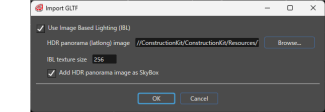
    - Use the import dialog to configure Image-Based Lighting (IBL). You cannot change these settings after the import.
    - If you do not want to use IBL, clear the **Use Image Based Lighting (IBL)** checkbox.
    - During glTF import, the Engine automatically generates the IBL from a single HDR panorama (latlong) image, so you do not need to set the radiance, irradiance, or BRDF integration textures manually.
    - When necessary, set the **HDR panorama (latlong) image** and **IBL texture size** in the import dialog.
    - The default IBL texture size is **256**. On **ES2.0**, set at least 64 and use a power-of-two value. On **ES3.0**, the minimum size is **64**.
    - You can also set IBL in **Solution Options**. For details about these settings, see [**IBL HDR**](https://doc316en.candera.eu/books/solution-handling/page/ibl-hdr). <div drawio-diagram="8603"><img src="https://doc316en.candera.eu/uploads/images/drawio/2025-10/drawing-4-1759385229.png" alt="drawing-4-1759385229.png"/></div>
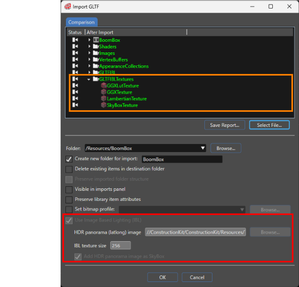
4. Then, "Import GLTF" dialog will be displayed. 
    - You can’t change IBL settings in the import dialog (red box below).
    - When you specify an HDR panorama image and run the import, the Engine automatically assigns the generated shared IBL textures to each mesh (orange box below).
    - The Engine generates the following textures: **LambertianTexture** (Diffuse/Irradiance), **GGXTexture** (Specular/Radiance), **GGXLutTexture** (BRDF 2D LUT), and **SkyBoxTexture** (Skybox).
    - For other settings on the dialog, please refer to <span style="color:rgb(230,126,35);">[Import Dialog Options](https://doc316en.candera.eu/link/73#bkmrk-import-dialog)</span>.  
        <div drawio-diagram="8604"><img src="https://doc316en.candera.eu/uploads/images/drawio/2025-10/drawing-4-1759385672.png" alt="drawing-4-1759385672.png"/></div>
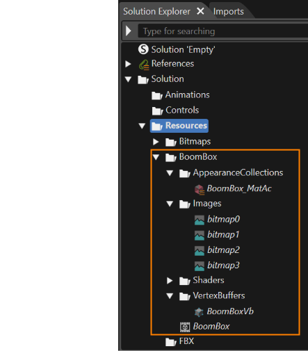
5. Configure import settings to your needs and click "OK" button.
    
    
    - The file will be imported as a resource in the Solution Explorer in the location corresponding to the settings on the dialog screen.
        
        <div drawio-diagram="5948"><img src="https://doc316en.candera.eu/uploads/images/drawio/2024-05/drawing-5-1717172418.png" alt="drawing-5-1717172418.png"/></div>

##### Shared IBL textures

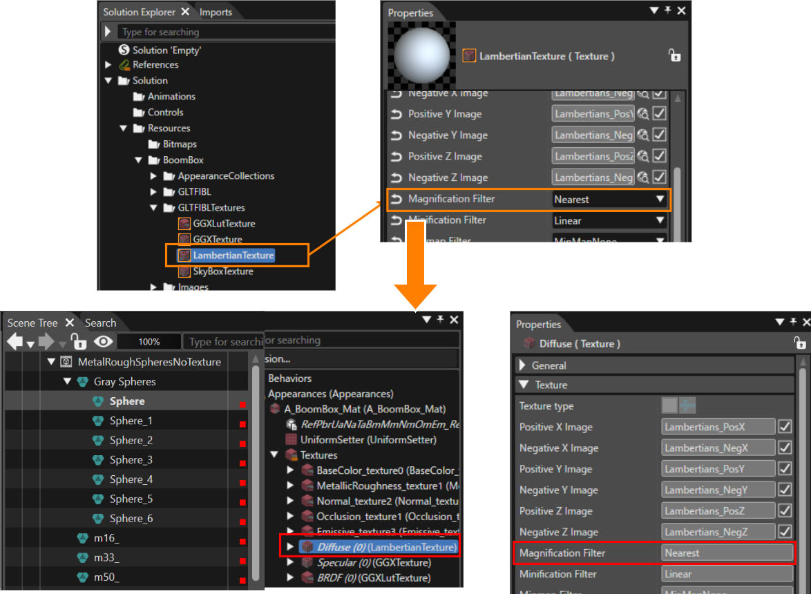
When you import a glTF and generate IBL from an HDR panorama (lat/long), the importer automatically assigns the shared IBL textures (`LambertianTexture`/`GGXTexture`/`GGXLutTexture`/`SkyBoxTexture`) to each mesh. When you change a shared IBL texture, the importer propagates the change to all meshes that reference it.

In the example below, select LambertianTexture (Diffuse/Irradiance) in Solution Explorer and set **Magnification Filter** to **Nearest** in the Properties panel; the importer applies the same setting to every mesh/material that references LambertianTexture (irradiance/diffuse slot).

<div drawio-diagram="8605"><img src="https://doc316en.candera.eu/uploads/images/drawio/2025-10/drawing-4-1759818288.png" alt="drawing-4-1759818288.png"/></div>

# Import Raw Resources

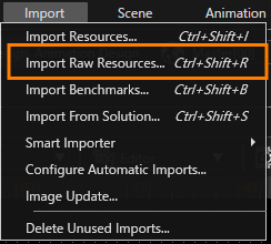
You can import any type of raw resource by selecting \[ Import &gt; Import Raw Resources... \] from the menu bar.

<dl class="note" id="bkmrk-"><dt></dt><dd><div drawio-diagram="5612"><img src="https://doc316en.candera.eu/uploads/images/drawio/2024-04/drawing-7-1713514243.png" alt="drawing-7-1713514243.png"/></div>

</dd></dl><div class="contents" id="bkmrk-it-is-possible-to-im"><div class="contents"><div class="textblock"><dl class="note"><dt></dt><dd><p class="callout info">It is possible to import raw resources in SceneComposer by dragging them on "Solution Explorer" panel.</p>

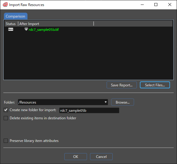
</dd></dl></div></div></div>In the "Import" dialog click the "Select Files..." button and select one or more raw resources to import in the "Open" File dialog.

<div drawio-diagram="4347"><img src="https://doc316en.candera.eu/uploads/images/drawio/2023-09/drawing-4-1695701216.png" alt="drawing-4-1695701216.png"/></div>

For a description of the checkboxes, refer to <span style="color:rgb(230,126,35);">[Import Dialog Options](https://doc316en.candera.eu/books/import-of-resources/page/import-dialog-options "Import Dialog Options")</span>.

Compare new content with already imported resources by right-clicking on a raw resource, to open the "Compare Properties" dialog.

---

#### <a class="anchor" id="bkmrk--5"></a>Problems: Import Conflicts

In the "Problems" panel, potential import conflicts are listed.

Import conflicts might appear if a raw resource has been imported and already used previously. A conflict will occur when new raw resources are imported in the same folder and the "Delete existing items in destination folder" is checked.

The content of this tab can be saved in CSV (Comma Separated Values) format by clicking the "Save Report..." button. A "Save As" file dialog appears which allows selecting the name and the location of the CSV file.

# Import Benchmarks

Render benchmarks can be calculated with CGI Analyzer. As a result, a "\*.crsms" file can be exported with CGI Analyzer, which contains the calculated render time for each node part of a given scene. Import a "\*.crsms" to make node benchmarks available on the node property "Render Benchmark". Once the benchmarks are available on the nodes of a scene, the camera render strategy "Benchmark" can be used for multi-pass rendering.

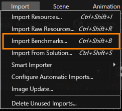
Open the "Import" dialog from the "Import" &gt; "Import Benchmarks" menu.

<div drawio-diagram="5992"><img src="https://doc316en.candera.eu/uploads/images/drawio/2024-06/drawing-5-1717742994.png" alt="drawing-5-1717742994.png"/></div>

<div class="contents" id="bkmrk--0"><div class="contents"><div class="textblock">  
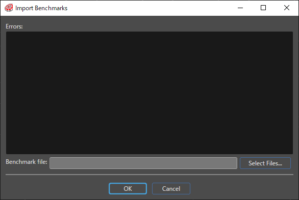
</div></div></div>Press the "Select Files..." button and choose a "\*.crsms" file from the Open dialog.

<div drawio-diagram="4348"><img src="https://doc316en.candera.eu/uploads/images/drawio/2023-09/drawing-4-1695701289.png" alt="drawing-4-1695701289.png"/></div>

<div class="contents" id="bkmrk--2"><div class="contents"><div class="textblock">  
</div></div></div>The values from the imported .crsms file will be applied to the "Render Benchmark" property of all nodes.  
The errors encountered after the .crsms file is selected are displayed in the Import Benchmark dialog.

More detailed information can be found in <span style="color:rgb(230,126,35);">[CGI Studio Application Development Tutorial](https://doc316en.candera.eu/books/candera)</span>.

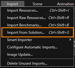
# Import from Solution

A powerful option to import different elements from a specific solution previous created in SceneComposer is "Import from Solution". This option can be accessed from Import menu.

<div drawio-diagram="5614"><img src="https://doc316en.candera.eu/uploads/images/drawio/2024-04/drawing-7-1713514370.png" alt="drawing-7-1713514370.png"/></div>

<div class="contents" id="bkmrk--0"><div class="contents"><div class="textblock">  
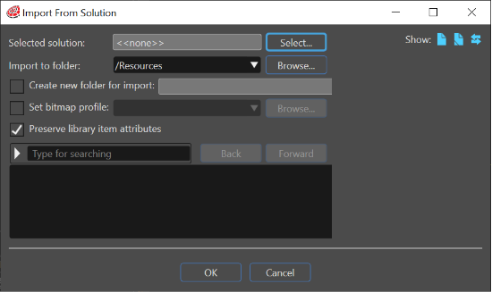
</div></div></div>The "Import from Solution" panel gives the possibility to follow a succession of three logical steps in order to import specific elements from a chosen solution.

<div drawio-diagram="5993"><img src="https://doc316en.candera.eu/uploads/images/drawio/2024-06/drawing-5-1717743135.png" alt="drawing-5-1717743135.png"/></div>

---

#### <a class="anchor" id="bkmrk--17"></a>Using the "Import from Solution"

The first step consists in selecting a desired solution from which the user needs to import some elements.   
Choose an existed folder were the desired elements from a selected solution will be imported or create a new folder for import   
Select some specific elements from a selected solution.   
Import the selected elements.

<div drawio-diagram="5994"><img src="https://doc316en.candera.eu/uploads/images/drawio/2024-06/drawing-5-1717743555.png" alt="drawing-5-1717743555.png"/></div>

<div class="contents" id="bkmrk--4"><div class="contents"><div class="textblock">  
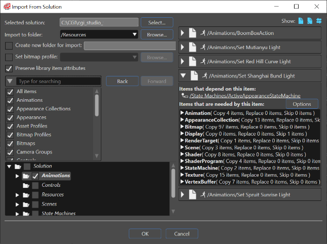
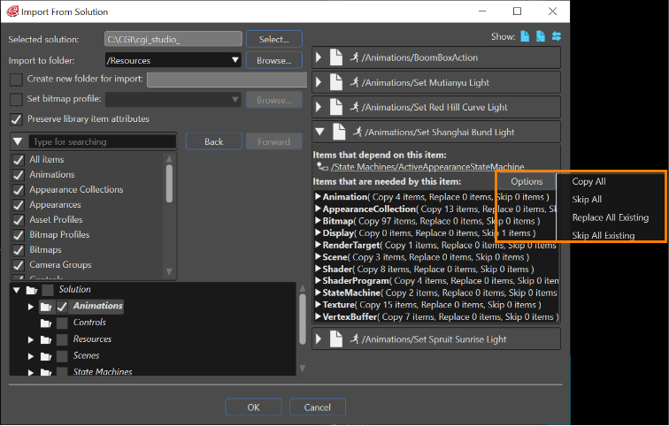
</div></div></div>If for a selected element there are dependent items, a special Options button will become available. This button is placed above the right side of the screen where all items are shown.

Four different options are available:

<div class="contents" id="bkmrk-copy-all-skip-all-re"><div class="contents"><div class="contents"><div class="textblock">- Copy all
- Skip all
- Replace all existing
- Skip all existing

</div></div></div></div><div drawio-diagram="5996"><img src="https://doc316en.candera.eu/uploads/images/drawio/2024-06/drawing-5-1717743743.png" alt="drawing-5-1717743743.png"/></div>

<div class="contents" id="bkmrk--6"><div class="contents"><div class="textblock">  
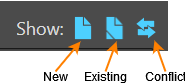
</div></div></div>For every category of imported items it is possible to see their relationship with existing imported items: New, Existing and Conflict.

<div drawio-diagram="5997"><img src="https://doc316en.candera.eu/uploads/images/drawio/2024-06/drawing-5-1717743930.png" alt="drawing-5-1717743930.png"/></div>

<div class="contents" id="bkmrk--8"><div class="contents"><div class="textblock">  
</div></div></div>By selecting one or many from these "Show" options, the user can see the new items, the existing items or the conflicts between new imported items and previous imported items. If there are different existing (\\=) items, another "Existing" button will become available. By using it a "CompareImportItemsView" dialog will be opened to show the existing items.

<div drawio-diagram="4340"><img src="https://doc316en.candera.eu/uploads/images/drawio/2023-09/drawing-4-1695692624.png" alt="drawing-4-1695692624.png"/></div>

<div class="contents" id="bkmrk--10"><div class="contents"><div class="textblock">  
</div></div></div>The "Show only differences" button allows the user to see just the differences between selected items. The comparison can be used in different modes. For instance, if the imported items are shaders, they can be seen in three different modes: Objects, Visual and Text.

<div class="contents" id="bkmrk-%22show-only-differenc"><div class="contents"><div class="textblock"><table style="width:46.1728%;"><tbody><tr><td style="width:16.3684%;">[![03_import_solution_7a.PNG](https://doc316en.candera.eu/uploads/images/gallery/2023-02/scaled-1680-/03-import-solution-7a.PNG)](https://doc316en.candera.eu/uploads/images/gallery/2023-02/03-import-solution-7a.PNG)

</td><td style="width:83.6358%;">"Show only differences" button</td></tr><tr><td style="width:16.3684%;">[![03_import_solution_7b.PNG](https://doc316en.candera.eu/uploads/images/gallery/2023-02/scaled-1680-/03-import-solution-7b.PNG)](https://doc316en.candera.eu/uploads/images/gallery/2023-02/03-import-solution-7b.PNG)

</td><td style="width:83.6358%;">"Conflict" button</td></tr></tbody></table>

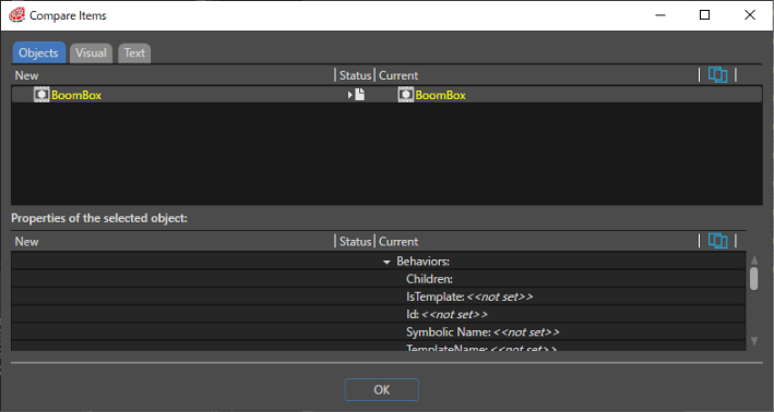
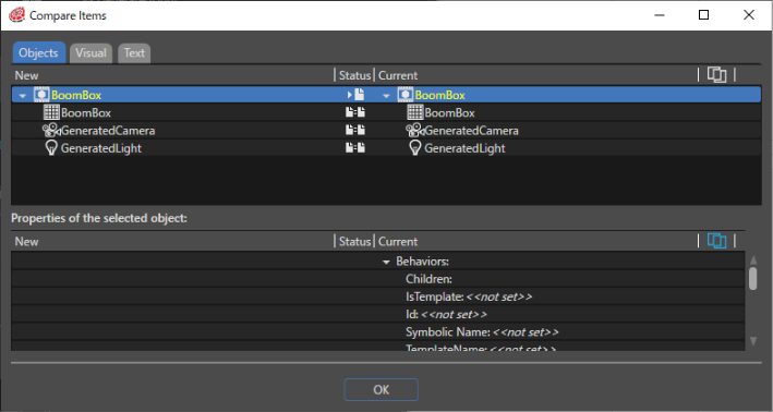
</div></div></div>If there are conflicts between items a "Conflict" button will become availI waable. By pressing it the "Compare Items" dialog will be opened and all the existing conflicts will be shown.

<div drawio-diagram="4341"><img src="https://doc316en.candera.eu/uploads/images/drawio/2023-09/drawing-4-1695692686.png" alt="drawing-4-1695692686.png"/></div>

<div class="contents" id="bkmrk--12"><div class="contents"><div class="textblock">  
</div></div></div>The status' signs show the nature of every conflict. If the "Show only differences" button is pressed, the dialogue will only show the conflicts. If the button is released, all the items will be shown. If a conflict is selected, all the properties and their differences will be shown.

<div class="contents" id="bkmrk--14"><div class="textblock">  
</div></div>

# Smart Importer

# Smart Importer UI

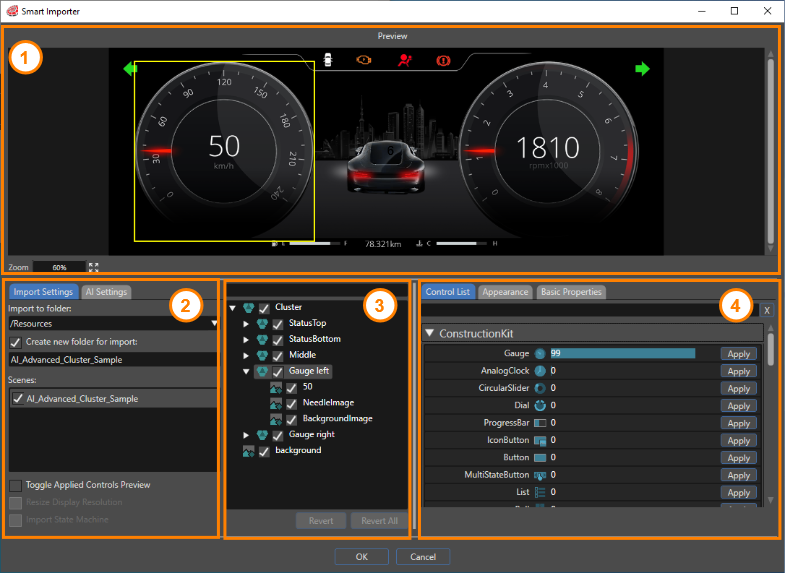
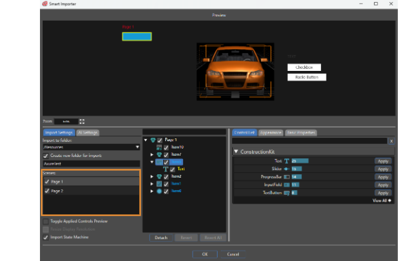
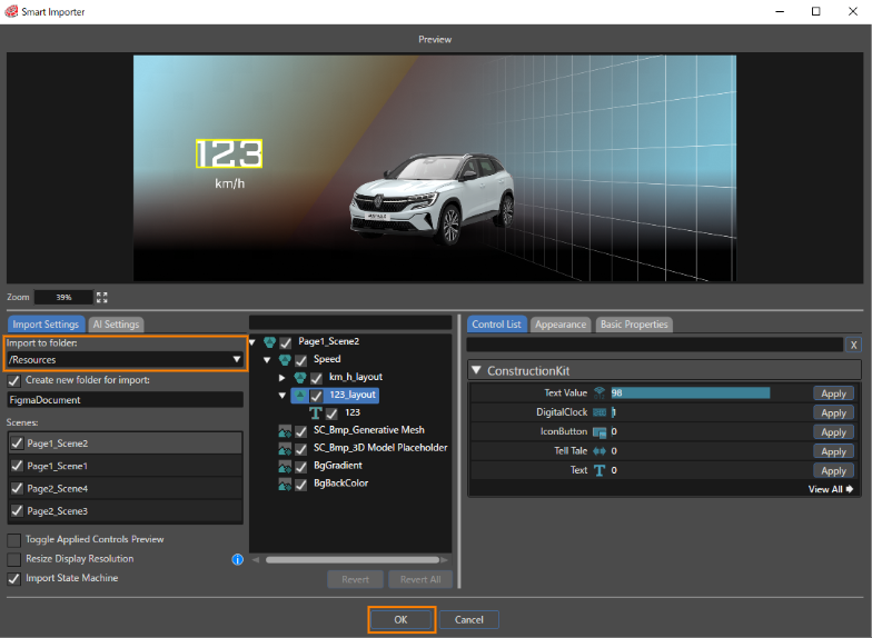
This page describes the Smart Importer dialog. The Smart Importer dialog consists of the following four parts.

1. <span style="color: rgb(230, 126, 35);">[Preview](#bkmrk-%E3%83%97%E3%83%AC%E3%83%93%E3%83%A5%E3%83%BC)</span>
2. <span style="color: rgb(230, 126, 35);">[Import](#bkmrk-%E3%82%A4%E3%83%B3%E3%83%9D%E3%83%BC%E3%83%88)</span>
3. <span style="color: rgb(230, 126, 35);">[Layer Tree](#bkmrk-%E3%83%AC%E3%82%A4%E3%83%A4%E3%83%BC%E3%83%84%E3%83%AA%E3%83%BC)</span>
4. <span style="color: rgb(230, 126, 35);">[Control](#bkmrk-%E3%82%B3%E3%83%B3%E3%83%88%E3%83%AD%E3%83%BC%E3%83%AB)</span>

<div drawio-diagram="6726"><img src="https://doc316en.candera.eu/uploads/images/drawio/2024-09/drawing-5-1725626895.png" alt=""/></div>

### Preview

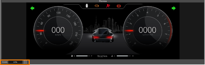
Here you will see a preview of the file to be imported. Use the mouse wheel to zoom in and out of the preview image. The zoom factor of the preview is displayed in the lower left corner of the preview section. Pressing the button with the four arrows will preview the file at the maximum zoom factor within the display area of the preview area.

<div drawio-diagram="5392"><img src="https://doc316en.candera.eu/uploads/images/drawio/2024-03/drawing-4-1710316832.png" alt=""/></div>

Select an element on the preview image, then AI detection will be performed on the selected element and the controls will be listed in the Control section.

### Import

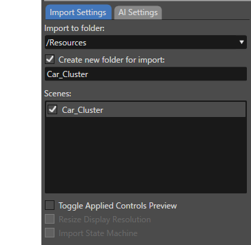
The import section consists of two tabs, \[ Import Settings \] and \[ AI Settings \].

<div drawio-diagram="5393"><img src="https://doc316en.candera.eu/uploads/images/drawio/2024-03/drawing-4-1710316951.png" alt=""/></div>

##### Import Settings Tab

The Import Settings tab contains the following settings.

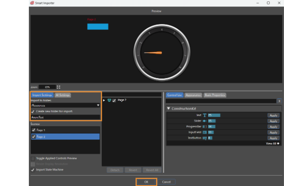
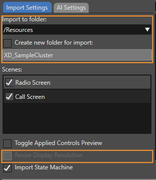
<table border="1" class="align-center" id="bkmrk-%E3%83%95%E3%82%A9%E3%83%AB%E3%83%80%E3%83%BC%E3%81%AB%E3%82%A4%E3%83%B3%E3%83%9D%E3%83%BC%E3%83%88-%E3%82%BD%E3%83%AA%E3%83%A5%E3%83%BC%E3%82%B7%E3%83%A7%E3%83%B3%E3%82%A8" style="border-collapse: collapse; width: 700px; border-width: 1px; height: 689.28px;"><colgroup><col style="width: 50%;"></col><col style="width: 50%;"></col></colgroup><tbody><tr style="height: 124.953px;"><td class="align-left" style="border-width: 1px; height: 124.953px;">Import to folder</td><td class="align-left" style="border-width: 1px; height: 124.953px;">Select a destination folder for the imported resources. The selection can be any location on the Solution Explorer. To change the destination folder, use the pull-down menu. To create a new destination folder, use the next section \[ Create new folder for import \].

</td></tr><tr style="height: 102.562px;"><td class="align-left" style="border-width: 1px; height: 102.562px;">Create new folder for import</td><td class="align-left" style="border-width: 1px; height: 102.562px;">When this option is enabled, a new import folder can be created with any name. The created folder will be located in the import destination folder specified in \[ Import to folder \].

</td></tr><tr style="height: 58.125px;"><td class="align-left" style="border-width: 1px; height: 58.125px;">Scenes</td><td class="align-left" style="border-width: 1px; height: 58.125px;">You can edit scenes with the Smart Importer. Please click here to learn how to use it.

</td></tr><tr style="height: 102.562px;"><td class="align-left" style="border-width: 1px; height: 102.562px;">Toggle Applied Controls Preview</td><td class="align-left" style="border-width: 1px; height: 102.562px;">When this option is enabled, a green frame will appear where the control is applied. This allows you to visually check where the control is applied on the preview.

</td></tr><tr style="height: 131.344px;"><td class="align-left" style="border-width: 1px; height: 131.344px;">Resize Display Resolution</td><td class="align-left" style="border-width: 1px; height: 131.344px;">This option is enabled when the resolution of the file to be imported is larger than the solution's display resolution. When this option is enabled, the resolution of the imported file will be automatically resized to fit the display resolution.

</td></tr><tr style="height: 169.734px;"><td class="align-left" style="border-width: 1px; height: 169.734px;">Import State Machine</td><td class="align-left" style="border-width: 1px; height: 169.734px;">When this option is enabled, import state machines from your design file directly to your CGI Studio solution. If a global state machine already exists within your solution, a prompt will be displayed in which you can choose whether or not to import the new state machines with the Is Global property enabled.

</td></tr></tbody></table>

##### AI Settings Tab

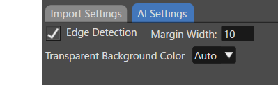
Settings for AI detection are made here.
<div drawio-diagram="7027"><img src="https://doc316en.candera.eu/uploads/images/drawio/2024-10/drawing-4-1729212783.png" alt=""/></div>

The value specified in the <span style="color: rgb(230, 126, 35);">[Preference](https://doc316en.candera.eu/link/105#bkmrk-edge-detectionwhen-t)</span> is used for \[ Edge Detection \]. For details, please refer to that.

The colour selected under \[ Transparent background color \] is used by AI to analyse the image being imported. Which transparent background colour is best for detecting controls depends greatly on the content of the image. If you are having problems with AI detecting controls, try changing this setting.

###   
Layer Tree

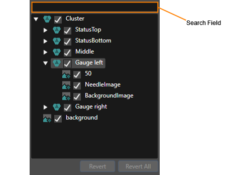
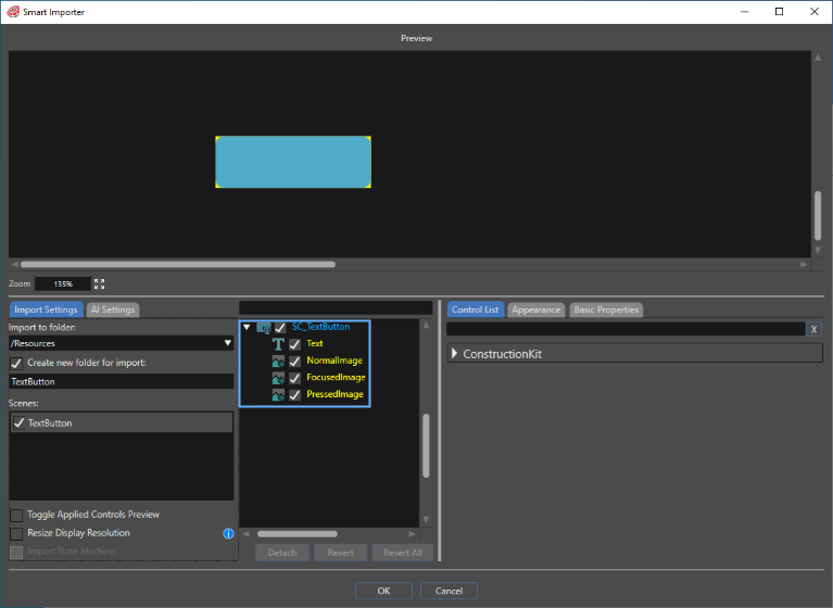
Displays a tree view of each element from the file being imported. The list displayed here corresponds to the scene tree in Scene Composer. When one or more elements are selected in this list, AI detection is performed on the selected elements and the controls are listed in the Control section.

Entering any keywords in the search field at the top of the Layer Tree will narrow down the list to only those layers that contain the entered keywords.

<div drawio-diagram="6727"><img src="https://doc316en.candera.eu/uploads/images/drawio/2024-09/drawing-5-1725626973.png" alt=""/></div>

Check the checkbox to the left of each layer element to set it as an element that constitutes a scene. Unchecked elements will not be imported.

#### Revert/Revert All button

To cancel the applied control settings, select the target item in the Layer Tree panel and press the \[ Revert \] button. Note that pressing the \[ Revert All \] button cancels all applied control settings in the layer tree. When the \[ Revert All \] button is pressed, a dialog box will appear to confirm the continuation of the operation for safety.

###   
Control

#### Control List Tab

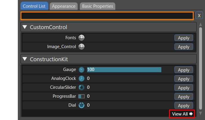
Select any layer in the Layer Tree and the AI will detect the most suitable controls. The results of this analysis are displayed in the "Control List" tab, where candidate controls are listed in order of probability.

The controls are categorised by solution and reference (such as ConstructionKit and Custom Controls).

- For controls in ConstructionKit, the probability of matching with the AI is displayed as a number (and bar) to the right of the control name, and they are listed in descending order from the highest number. 
    - For Custom controls that are not included in ConstructionKit, they are displayed in order of control name.
- By default, five controls are displayed in each category. Clicking the \[ View All \] button (red box in the image below) will display a list of all controls.
- The list of controls that is displayed can be narrowed down by entering keywords in the search field at the top (orange box in the image below).
- To apply the controls to the selected element, use the \[ Apply \] button in the control list.

<div drawio-diagram="7029"><img src="https://doc316en.candera.eu/uploads/images/drawio/2024-10/drawing-4-1729213292.png" alt=""/></div>

The displayed control list can be narrowed down by entering keywords in the search field at the top. In addition, using the settings section that appears by clicking the triangle icon on the left side of the search field, you can configure the display settings of the controls that appear according to the detection value.

To apply a control to a selected element, use the "Apply" button in the control list. When applying a control with a low probability of AI detection result, a dialog box will appear to confirm your selection.

#### Appearance Tab

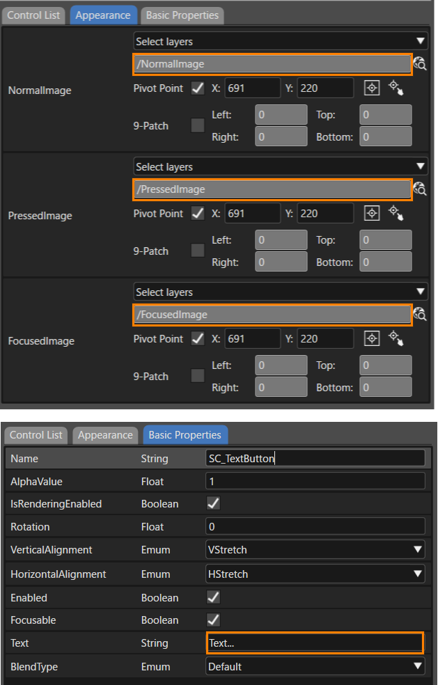
When any control is applied, the display automatically switches to the "Appearance" tab. Set the propertyies settings related to the applied control's appearance. Note that some controls such as TextValue do not require appearance settings.

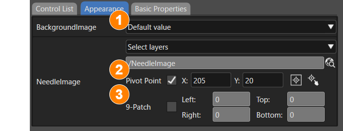
The Appearance tab is made up of the following three main sections.

1. [Image](#bkmrk-layer-mapping)
2. [Pivot Point](#bkmrk-configure-the-pivot-)
3. [9-Patch](#bkmrk-9-patch)

<div drawio-diagram="7030"><img src="https://doc316en.candera.eu/uploads/images/drawio/2024-10/drawing-4-1729213616.png" alt=""/></div>

##### Image

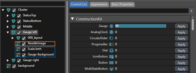
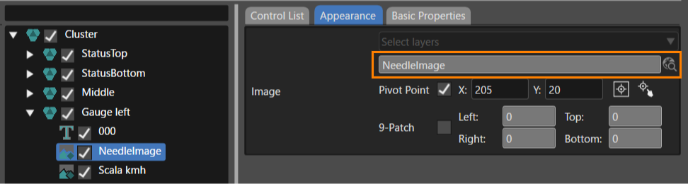
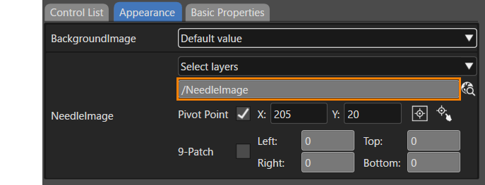
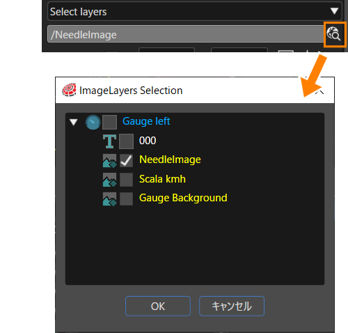
For each control image properties, set the layer image in the file to be imported. If the control image properties name and the layer name are equal, the layer image is automatically set. However, you cannot edit the image layer.

<p class="callout info">For example, when Gauge control is applied, the Control Image has a NeedleImage property. Therefore, if NeedleImage exists in the layer name of the file to be imported, it is automatically set to the NeedleImage property.</p>

<div drawio-diagram="7031"><img src="https://doc316en.candera.eu/uploads/images/drawio/2024-10/drawing-4-1729213753.png" alt=""/></div>

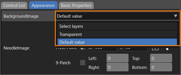
When you assign a control to a group player, you can choose from the following options for the control image.

<div drawio-diagram="7032"><img src="https://doc316en.candera.eu/uploads/images/drawio/2024-10/drawing-4-1729213848.png" alt=""/></div>

<table border="1" class="align-center" id="bkmrk-select-layers-select" style="border-collapse: collapse; width: 700px; border-width: 1px;"><colgroup><col style="width: 22.7385%;"></col><col style="width: 77.2368%;"></col></colgroup><tbody><tr><td class="align-left" style="border-width: 1px;">Select layers</td><td class="align-left" style="border-width: 1px;">Select any image layer from the group layer. You can use composite images with multiple layers. For more information, please refer to <span style="color: rgb(230, 126, 35);">[here](https://doc316en.candera.eu/link/1150#bkmrk-configure-a-control-)</span>.

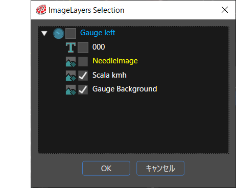
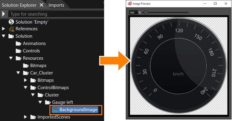
After importing, the composite image will be placed in the \[ ControlBitmaps \] folder. At this time, the bitmap name will be set to the property name specified here.

If you select a single layer, the original bitmap placed in the \[ Bitmaps \] folder will be used. For information on the location of the folder, please refer to <span style="color: rgb(230, 126, 35);">[Folder structure after import](#bkmrk-folder-structure-aft)</span>.

</td></tr><tr><td class="align-left" style="border-width: 1px;">Transparent</td><td class="align-left" style="border-width: 1px;">A transparent image will be used.</td></tr><tr><td class="align-left" style="border-width: 1px;">Default value</td><td class="align-left" style="border-width: 1px;">Uses the default image for the applied control.</td></tr></tbody></table>

You can select images included in the group player by clicking on the selection icon on the right of the image.

- You can select the images of the descendant layers and yourself as property values.
- You cannot select layers other than images (except for bitmap layers to which controls have been applied).
- After selecting, the pivot point is set to the centre of the composite image.
<div drawio-diagram="7035"><img src="https://doc316en.candera.eu/uploads/images/drawio/2024-10/drawing-4-1729214897.png" alt=""/></div>

For each control image properties, set the layer image in the file to be imported. If the control image properties name and the layer name are equal, the layer image is automatically set.

##### Image Array Properties

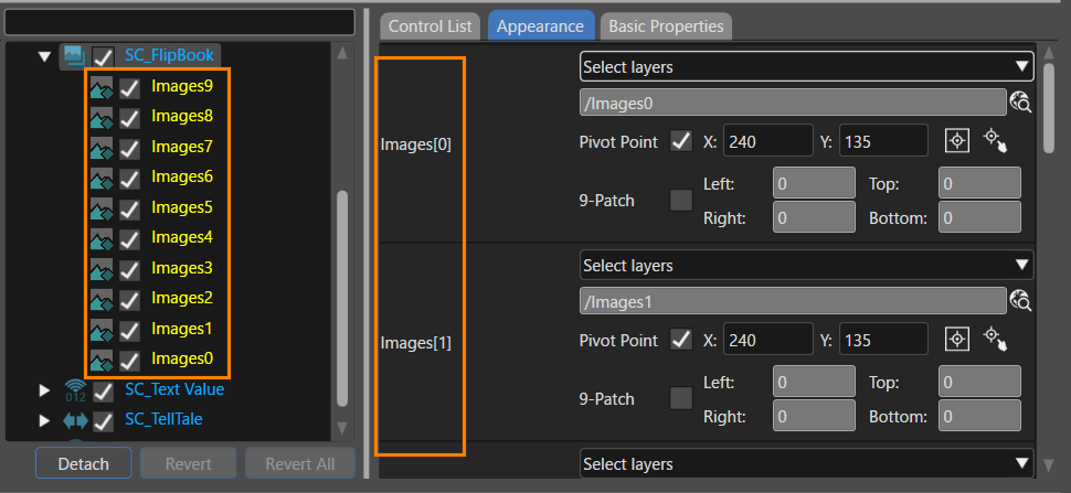
Image array properties is supported, and for example, images in FlipBook control are automatically assigned. The numbers attached to each Image element on the Appearance tab correspond to the values displayed in descending order in the layer tree.

<div drawio-diagram="7044"><img src="https://doc316en.candera.eu/uploads/images/drawio/2024-10/drawing-4-1729230884.png" alt=""/></div>

##### Folder structure after import

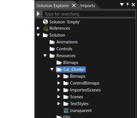
After import, the \[ Bitmaps \], \[ ControlBitmaps \], and \[ TextStyles \] folders are created in the Solution Explorer.

<table border="1" class="align-center" id="bkmrk-bitmaps-the-imported" style="border-collapse: collapse; width: 700px; border-width: 1px;"><colgroup><col style="width: 159px;"></col><col style="width: 540px;"></col></colgroup><tbody><tr><td class="align-left" style="border-width: 1px;">Bitmaps</td><td class="align-left" style="border-width: 1px;">The imported bitmap for each layer is placed.</td></tr><tr><td class="align-left" style="border-width: 1px;">ControlBitmaps</td><td class="align-left" style="border-width: 1px;">The bitmap composed of multiple layers is placed for the control properties.</td></tr><tr><td class="align-left" style="border-width: 1px;">ImportedScenes</td><td class="align-left" style="border-width: 1px;">The scene imported as a template will be placed.</td></tr><tr><td class="align-left" style="border-width: 1px;">Scenes</td><td class="align-left" style="border-width: 1px;">When you import a StateMachine (screen transition), the target scene will be placed.</td></tr><tr><td class="align-left" style="border-width: 1px;">TextStyles</td><td class="align-left" style="border-width: 1px;">The created text style is placed.</td></tr></tbody></table>

<div drawio-diagram="7136"><img src="https://doc316en.candera.eu/uploads/images/drawio/2024-10/drawing-4-1729754524.png" alt=""/></div>

##### Pivot Point

When set-up a control image with layer mapping, the pivot point is automatically set. The pivot point values set automatically are as follows. (However, if the pivot point values are specified with the layer names mentioned later, the specified values will be used as the set values.)

- Pivot point X value: 0
- Pivot point Y value: 0

In addition, by checking the Pivot Point check box (No.1 below image), the following options can be used

<div drawio-diagram="7034"><img src="https://doc316en.candera.eu/uploads/images/drawio/2024-10/drawing-4-1729214188.png" alt=""/></div>

- Can be enter any values for the X/Y coordinates of the pivot point (decimal points can be entered).
- Set the pivot point to the centre of the image (click on No.2 the above image).
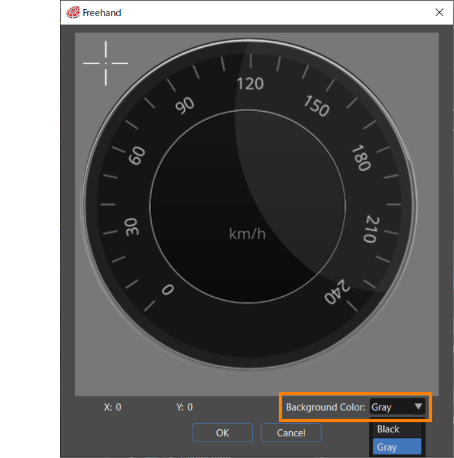
- The Freehand dialog box will appear (click on No.3 the above image). Move the crosshair cursor on the dialog box to set the pivot point as you want.
- The background color of the \[ Freehand \] dialog can be set to black or gray from \[ Background Color \] in the lower right corner of the dialog (highlighted in the orange box in the figure below). Additionally, the default background color can be configured in <span style="color: rgb(230, 126, 35);">[Preferences&gt;Smart Importer](https://doc316en.candera.eu/books/preferences/page/configure-the-smart-importer)</span>.
- <div drawio-diagram="8022"><img src="https://doc316en.candera.eu/uploads/images/drawio/2025-03/drawing-4-1741158028.png" alt=""/></div>

On the other hand, you can apply any pivot point value by specifying the pivot point value in the layer name of the image to be imported.

- If the layer name in the target file to be imported is something like "**\*\*\*@X10@Y20**", the pivot point values are automatically set as X10 and Y20.
- If the layer name in the file to be imported is "**\*\*\*@X10.5**", the pivot point value is automatically set as X10.5 and Y as ”0".

##### 9-patch

This option appears when the "Enable editing 9-patch" option is enabled in the <span style="color: rgb(230, 126, 35);">[Preferences&gt;Smart Importer](https://doc316en.candera.eu/books/preferences/page/configure-the-smart-importer)</span> settings. When enabled, the 9-patch feature can be configured (input values must be positive numbers only).


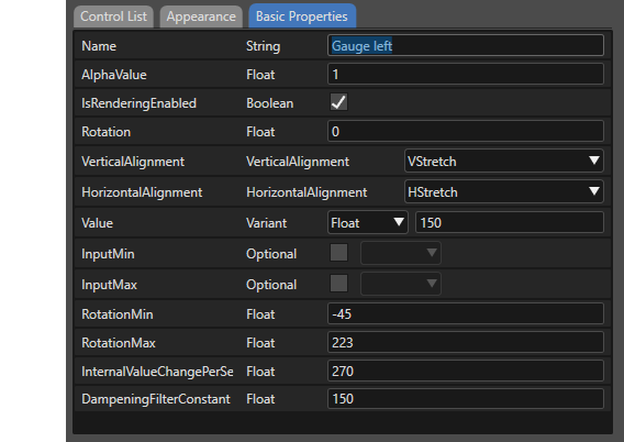
#### Basic Properties Tab

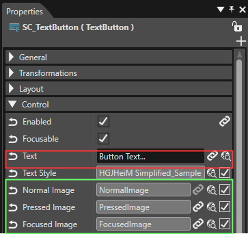
This section allows you to set some properties items for the applied control. After importing, you can also select the target control and configure it on the properties panel.

<div drawio-diagram="6735"><img src="https://doc316en.candera.eu/uploads/images/drawio/2024-09/drawing-5-1725628096.png" alt=""/></div>

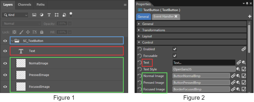
<p class="callout info">If the layer name is the same as the control's property name, the individual properties are automatically mapped from the file to be imported.</p>

# Basic Operations

This section describes the basic operations on the Smart Importer.

#### Import File Formats

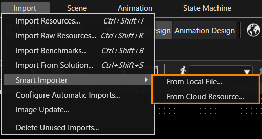
The Smart Importer uses the following two methods for import, depending on the file format to be imported.

- Local files: \*.psd, \*.xscil, \*.xd, \*.rp, \*.sketch
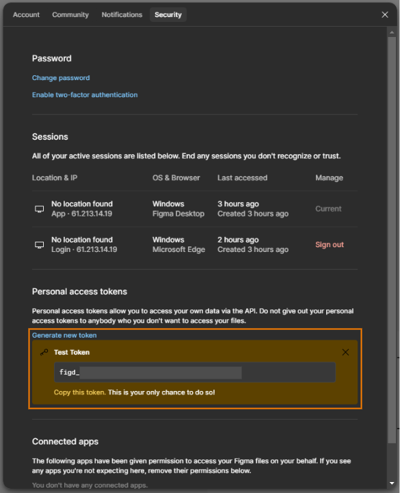
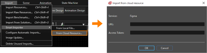
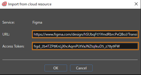
- Cloud Resource: Figma data

<div drawio-diagram="6896"><img src="https://doc316en.candera.eu/uploads/images/drawio/2024-10/drawing-4-1727940873.png" alt=""/></div>

<p class="callout info">For more information on Photoshop layer structure format, see <span style="color: rgb(230, 126, 35);">[Recommended Layers Structure for Smart Importer](https://doc316en.candera.eu/books/import-of-resources/page/recommended-layers-structure-for-smart-importer)</span>.</p>

#### Restore Settings

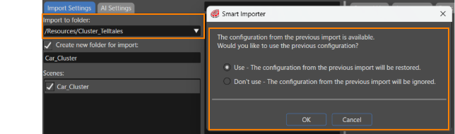
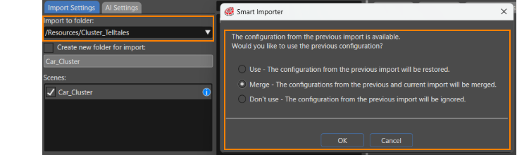
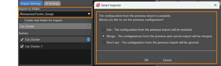
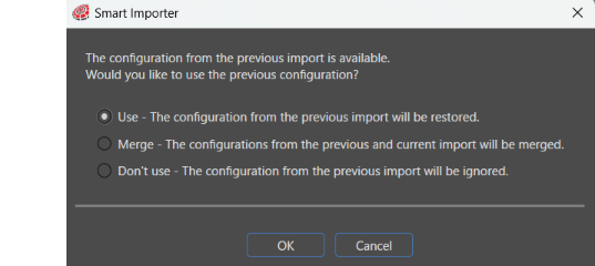
The settings that were applied when the import was performed are saved in the solution along with the imported scene. Therefore, when importing the same file again and importing to the same path in the Solution Explorer, the Smart Importer will display a dialog asking if you want to use the saved settings.

<div drawio-diagram="8929"><img src="https://doc316en.candera.eu/uploads/images/drawio/2026-02/drawing-7-1770713035.png" alt=""/></div>

<table border="1" class="align-center" id="bkmrk-restore-saved-settin" style="border-collapse: collapse; width: 700px; border-width: 1px; height: 59.4034px;"><colgroup><col style="width: 24.7475%;"></col><col style="width: 75.3648%;"></col></colgroup><tbody><tr style="height: 29.7017px;"><td class="align-left" style="border-width: 1px; height: 29.7017px;">Use</td><td class="align-left" style="border-width: 1px; height: 29.7017px;">Saved settings are applied.</td></tr><tr><td class="align-left" style="border-width: 1px;">Merge</td><td class="align-left" style="border-width: 1px;">Merges both saved and new settings.</td></tr><tr style="height: 29.7017px;"><td class="align-left" style="border-width: 1px; height: 29.7017px;">Don't use</td><td class="align-left" style="border-width: 1px; height: 29.7017px;">No saved settings are applied and new settings are made.</td></tr></tbody></table>

If an image has been replaced in an imported file, the old image in the scene can be replaced with a new, updated image while maintaining the previous mapping between layers and controls by using \[ Use \].

For other behaviors when reimporting files, see <span style="color: rgb(230, 126, 35);">[here](https://doc316en.candera.eu/link/1150#bkmrk-re-importing-a-file-)</span>.

#### Conversion to 2D Nodes

During import, specific elements (artboards/color pickers, in Photoshop) in the file to be imported are converted to optimal nodes in Scene Composer.

<table border="1" class="align-center" id="bkmrk-artboards-artboards-" style="border-collapse: collapse; width: 700px; border-width: 1px;"><colgroup><col style="width: 120px;"></col><col style="width: 580px;"></col></colgroup><tbody><tr><td class="align-left" style="border-width: 1px;">Artboards</td><td class="align-left" style="border-width: 1px;">Artboards in the file to be imported can be treated as a Group Node in Smart Importer.

</td></tr><tr><td class="align-left" style="border-width: 1px;">Color Picker</td><td class="align-left" style="border-width: 1px;">Color pickers in the file to be imported can be treated as Solid Color Nodes. In this case, the solid color layer will use the same icon as the Solid Color Node in Smart Importer.

</td></tr></tbody></table>

Under any of the following conditions, the Appearance tab cannot be edited.

- The layer of the file to be imported does not have image information.
- The applied control does not have a properties that refers to an image.

Other than the above, the same options are available as for image layers. For example, the Layer Mapping section can generate image resources once (Control) properties are mapped to a layer. Similarly, other prototyping tools will do the same with color pickers.

<p class="callout info">For each node in a 2D scene, see <span style="color: rgb(230, 126, 35);">[here](https://doc316en.candera.eu/link/147#bkmrk-create-2d-nodes)</span>.</p>

#### Control instance configured with Smart Importer

After finished applying the detected controls and configuring images, pivot points, and other properties, click the \[ OK \] button at the bottom of the Smart Importer dialog to import the configured file.

<p class="callout info">See the <span style="color: rgb(230, 126, 35);">[Smart Importer UI](https://doc316en.candera.eu/books/import-of-resources/page/smart-impoter-ui)</span> for details on what to configure in each part of the Smart Importer dialog.</p>

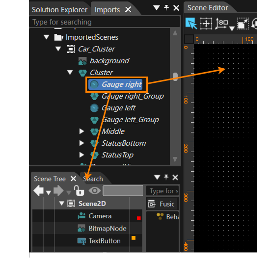
It will be imported to the location specified in the <span style="color: rgb(230, 126, 35);">[Import Settings Tab](https://doc316en.candera.eu/link/1148#bkmrk-%E3%82%A4%E3%83%B3%E3%83%9D%E3%83%BC%E3%83%88%E8%A8%AD%E5%AE%9A)</span>, with the configured settings. Note that the control instance configured in Smart Importer (e.g., "Gauge left" in the image below) can be viewed in the Import panel.

<div drawio-diagram="6738"><img src="https://doc316en.candera.eu/uploads/images/drawio/2024-09/drawing-5-1725628567.png" alt=""/></div>

Control instances configured in Smart Importer can be used in the scene editor or by dragging them into the scene tree.

<div drawio-diagram="7570"><img src="https://doc316en.candera.eu/uploads/images/drawio/2024-11/drawing-5-1732885515.png" alt=""/></div>

#### Configure Scenes

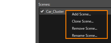
The Import Settings tab allows you to manage scenes to be imported into Scene Composer. After selecting a target scene from the \[ Scenes: \], open the context menu to see the following options

<div drawio-diagram="5367"><img src="https://doc316en.candera.eu/uploads/images/drawio/2024-03/drawing-4-1710298666.png" alt=""/></div>

<table border="1" class="align-center" id="bkmrk-%E3%82%B7%E3%83%BC%E3%83%B3%E3%82%92%E8%BF%BD%E5%8A%A0-%E6%96%B0%E8%A6%8F%E3%82%B7%E3%83%BC%E3%83%B3%E3%82%92%E8%BF%BD%E5%8A%A0%E3%81%97%E3%81%BE%E3%81%99%E3%80%82%E3%81%AA" style="border-collapse: collapse; width: 695px; border-width: 1px; height: 326.906px;"><colgroup><col style="width: 136px;"></col><col style="width: 558px;"></col></colgroup><tbody><tr style="height: 119.562px;"><td class="align-left" style="border-width: 1px; height: 119.562px;">Add Scene</td><td class="align-left" style="border-width: 1px; height: 119.562px;">Add a new scene. Note that all checks for each element displayed in the layer tree will be unchecked.

After the operation, the \[ Add Scene... \] dialog box will appear, and enter a name for the new scene.

</td></tr><tr style="height: 97.1719px;"><td class="align-left" style="border-width: 1px; height: 97.1719px;">Clone Scene</td><td class="align-left" style="border-width: 1px; height: 97.1719px;">The scene will be duplicated maintaining the configuration on the current layer tree.

After the operation, the \[ Add Scene... \] dialog box will appear, and enter a name for the new scene.

</td></tr><tr style="height: 52.3906px;"><td class="align-left" style="border-width: 1px; height: 52.3906px;">Remove Scene

</td><td class="align-left" style="border-width: 1px; height: 52.3906px;">Deletes the selected scene.</td></tr><tr style="height: 57.7812px;"><td class="align-left" style="border-width: 1px; height: 57.7812px;">Rename Scene</td><td class="align-left" style="border-width: 1px; height: 57.7812px;">Rename the scene. Can also change the name by double-clicking the target scene name.

</td></tr></tbody></table>

#### TextStyle

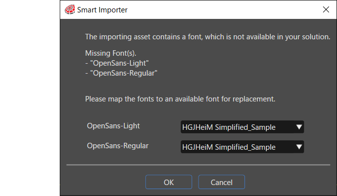
When importing a Text Layer into Scene Composer, a new TextStyle is created. Its name will be a combination of the font name and the font size used in the Text Layer of the PSD file. Upon creation of a new TextStyle Scene Composer checks if a font resource with the corresponding name is registered in the Scene Composer solution. If the appropriate font resources cannot be found in the solution, a dialog box like the below will be displayed.

If the font does not exist in the solution, you can use an existing font resource by specifying an alternative font on this dialog.

<div drawio-diagram="6869"><img src="https://doc316en.candera.eu/uploads/images/drawio/2024-09/drawing-4-1727138202.png" alt=""/></div>

#### Text and text-containing controls

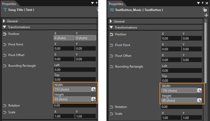
The bounding rectangle (width/height) of text and controls containing text are imported as automatic values.

<div drawio-diagram="6741"><img src="https://doc316en.candera.eu/uploads/images/drawio/2024-09/drawing-5-1725631019.png" alt=""/></div>

#### Global State Machine

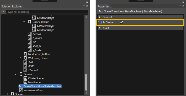
State Machine elements are all imported as Global State Machine (confirmation dialog is not displayed).

<div drawio-diagram="5371"><img src="https://doc316en.candera.eu/uploads/images/drawio/2024-03/drawing-4-1710298910.png" alt=""/></div>

<div drawio-diagram="501"></div>

# Smart Importer UseCase

This section describes various use cases for Smart Importer operations.

#### Configure Scene Contents

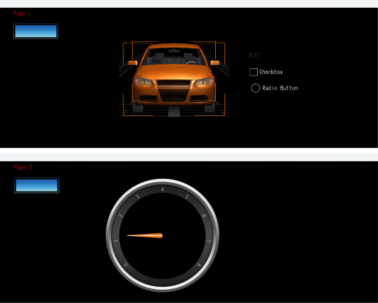
Using the example of importing an image file consisting of two scenes, an IVI scene (e.g., music player and climate control) and a cluster scene, explains how to configure the contents.

- IVI\_Sample layer: IVI scene consisting of a music player and air conditioning controls
- Cluster layer: A scene consisting of clusters only

If the import file name "IVI\_Scene" consists of the above two layers, the two scenes can hold different contents (elements) by performing the following operations.

1. Select \[ IVI\_Scene \] from \[ Scenes: \] and select \[ Clone Scene... \] from the context menu.  
    
    - In the \[ Clone Scene... \] dialog box, specify "Cluster\_Scene" as the name and press \[ OK \].
    - Two scenes, "IVI\_Scene" and "Cluster\_Scene" will appear in the \[ Scenes: \] section.
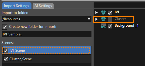
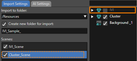
2. Select \[ IVI\_Scene \] from \[ Scenes: \] and uncheck \[ Cluster \] from within the layer tree.
    
    
    - The Cluster layer will be excluded from the IVI\_Scene scene structure.
        
        <div drawio-diagram="6755"><img src="https://doc316en.candera.eu/uploads/images/drawio/2024-09/drawing-5-1726214385.png" alt=""/></div>
3. Select \[ Cluster\_Scene \] from \[ Scenes: \] and uncheck \[ IVI\_Sample \] in the layer tree.
    
    
    - The IVI\_Sample layer will be excluded from the Cluster\_Scene scene configuration.
        
        <div drawio-diagram="6754"><img src="https://doc316en.candera.eu/uploads/images/drawio/2024-09/drawing-5-1726214339.png" alt=""/></div>
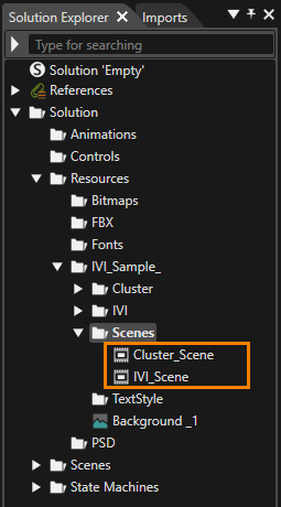
4. Press the \[ OK \] button in the Smart Importer dialog to perform the import.
    
    
    - You can see the imported scenes and resources in the Solution Explorer panel.
    - Scenes IVI\_Scene and Cluster\_Scene do not contain the layers specified in steps 2-3, respectively.
        
        <div drawio-diagram="6756"><img src="https://doc316en.candera.eu/uploads/images/drawio/2024-09/drawing-5-1726214473.png" alt=""/></div>

#### Re-importing a file containing new images

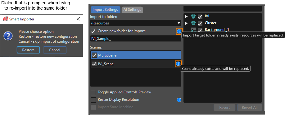
If you reopen a file that has already been imported (same file name and same path where the file was saved) using \[ Restore \], the saved settings (including applied controls and appearance settings) will be loaded. If the destination folder or scene already exists, you will be notified by blue information icons (in the orange box below). Hovering over these icons will display the necessary information in a tooltip. Running the import with the current settings will overwrite already imported resources and scenes, thus keeping the Layer Mapping settings and applied controls information and updating the images in the Scene Composer solution to the latest image.

<div drawio-diagram="6758"><img src="https://doc316en.candera.eu/uploads/images/drawio/2024-09/drawing-5-1726214928.png" alt=""/></div>

<p class="callout info">If you want to import image content into the Scene Composer solution a second time, keeping the resources and scenes from both imports, select a different import location or a different scene name.</p>

#### Re-importing a file containing images with different layers

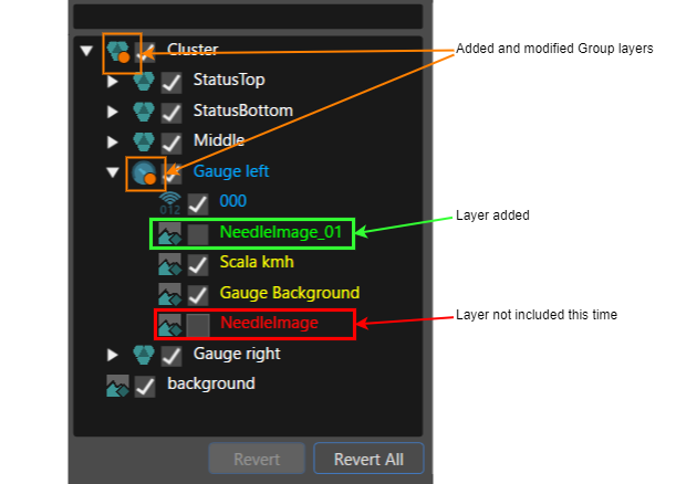
If you import a file that has already been imported (same destination path, same file name), but has a partially different layer structure, it will appear as follows on the layer tree of the Smart Importer dialog.

<table border="1" class="align-center" id="bkmrk-%E8%BF%BD%E5%8A%A0%2F%E4%BF%AE%E6%AD%A3%E3%81%95%E3%82%8C%E3%81%9F%E3%82%B0%E3%83%AB%E3%83%BC%E3%83%97%E3%83%AC%E3%82%A4%E3%83%A4%E3%83%BC-%E3%82%B0%E3%83%AB%E3%83%BC" style="border-collapse: collapse; width: 800800px; height: 105.188px; border-width: 1px;"><colgroup><col style="width: 33.2441%;"></col><col style="width: 66.7559%;"></col></colgroup><tbody><tr style="height: 45.5938px;"><td class="align-left" style="height: 45.5938px; border-width: 1px;">Added/modified group layers</td><td class="align-left" style="height: 45.5938px; border-width: 1px;">An orange icon will be added to the Group Node icon. Through this symbol, you can visually identify groups that have been modified since the last import (see orange frame in the image below).

</td></tr><tr style="height: 29.7969px;"><td class="align-left" style="height: 29.7969px; border-width: 1px;">Control Assigned Bitmap</td><td class="align-left" style="height: 29.7969px; border-width: 1px;">If a bitmap of a node to which a control has already been assigned is used within another control, it will be displayed in yellow font.

</td></tr><tr style="height: 29.7969px;"><td class="align-left" style="height: 29.7969px; border-width: 1px;">Newly added layer</td><td class="align-left" style="height: 29.7969px; border-width: 1px;">Newly added layers are displayed in green font (see green frame in the image below). Note that this layer will not appear in the \[ Preview \] because the check box in the \[ Layer Tree \] is disabled. Check the checkbox to make it appear in the \[ Preview \].

</td></tr><tr><td class="align-left" style="border-width: 1px;">Deleted Layer</td><td style="border-width: 1px;">Layers that existed in the previous file to be imported and do not exist in the current file to be imported are displayed in red font (see the red frame in the image below). Also, the checkboxes in the Layer Tree panel are disabled. Since these layers are not included in the current import file, they will not be displayed in the \[ Preview \] even if they are checked in the \[ Layer Tree \].

</td></tr></tbody></table>

<div drawio-diagram="7104"><img src="https://doc316en.candera.eu/uploads/images/drawio/2024-10/drawing-4-1729307338.png" alt=""/></div>

#### Merging multiple scene settings

The settings when applied during the import run are saved in the solution along with the imported scene. This allows you to import various configurations into the solution using a single import target file, and eventually merge them into a single configuration. The following is an example of such a setup procedure.

##### Creating Multiple Configurations

This section uses an example of import using the Car\_Cluster.psd file stored in the following location. Note that the "New SPI configuration was found" dialog will not be displayed during each import operation because the folder specified as the import destination is different.

**&lt;root&gt;\\cgi\_studio\_content\\2D\\PSD**

1. Open the Car\_Cluster file in the Smart Importer and configure the Telltale control. Then, under \[ Import to Folder \], specify the "/Resources/Cluster\_Telltales" folder as the import destination and perform the import. 
    - See "1. TellTale Settings" in the image below.
2. Re-open the same image file in the Smart Importer, this time setting the Gauge control. Specify "/Resources/Cluster\_Gauge" folder as the import destination and perform the import.
    
    
    - See "2. Gauge Settings" in the image below.
3. In the same way, set the ProgressBar control. Specify "/Resources/Cluster\_ProgressBar" folder as the import destination and perform the import.
    
    
    - See "3. ProgressBar Settings" in the image below.

<div drawio-diagram="6763"><img src="https://doc316en.candera.eu/uploads/images/drawio/2024-09/drawing-5-1726221490.png" alt=""/></div>

##### Merge of multiple scene configurations

1. Open the Car\_Cluster file in the Smart Importer.
2. Specify "/Resources/Cluster\_Telltales" in the \[ Import into folder \] and uncheck the \[ Create new folder for import \] checkbox.  
    
    - At this point, the Smart Importer dialog will appear. Select \[ Use \] and then click \[ OK \] to restore and apply the Telltale control settings.
    - A blue caution icon will appear in \[ Scenes: \].  
        <div drawio-diagram="8926"><img src="https://doc316en.candera.eu/uploads/images/drawio/2026-02/drawing-7-1770712185.png" alt=""/></div>
3. Next, change the import destination to "/Resources/Cluster\_Gauge".  
    
    - A dialog box similar to the one below will appear, so select \[ Merge \] and then click \[ OK \].
    - As a result, the configured Gauge control will be added to the previously configured Telltale control.  
        <div drawio-diagram="8934"><img src="https://doc316en.candera.eu/uploads/images/drawio/2026-02/drawing-7-1770720061.png" alt=""/></div>
4. Similarly, change the import destination to "/Resources/Cluster\_ProgressBar".  
    
    - As in step 3, a dialog box similar to the one shown below will appear, so select \[ Merge \] and then click \[ OK \].
    - As a result, the configured ProgressBar control will be added.  
        <div drawio-diagram="8935"><img src="https://doc316en.candera.eu/uploads/images/drawio/2026-02/drawing-7-1770720114.png" alt=""/></div>

The above operation results in a configuration with TellTale control, Gauge control, and ProgressBar control applied.

#### Configure a control image with multiple layers

It is possible that the image file you are importing is so complex that the Gauge background and needles are made up of multiple images for example. However, the Gauge control in Scene Composer requires only one image for the background and one for the needle. In order to balance complex image configurations and control settings, the Smart Importer allows multiple layers for each image used in the control.

The Car\_Cluster.psd file is used as an example.

The image below shows the layer tree of the imported "Car\_Cluster.psd" file in Smart Importer. The orange framed layer contains the Gauge needle and the blue framed layer contains the background.

<div drawio-diagram="7038"><img src="https://doc316en.candera.eu/uploads/images/drawio/2024-10/drawing-4-1729224666.png" alt=""/></div>

To apply Gauge control, select the root layer of the target layer group on the \[ Layer Tree \]. In the above image, "Gauge Left" is the root layer. In the \[ Control List \] Tab, the results of automatic control detection by the AI will be listed. Press \[ Apply \] button of "Gauge" control from the list and assign "Gauge" control to the layer group "Gauge Left".

<p class="callout info">By selecting the root layer to which the control is applied, the entire layer group can be set. Child layers will be set in the same way.</p>

<p class="callout info">To select multiple layers and set them all at once, hold down the &lt;ctrl&gt; key or &lt;shift&gt; key and click on the target layer with the mouse, or click and drag around the layer you wish to select.</p>

After applying the control, in the \[ Layer Mapping \] section of the \[ Appearance \] Tab, the child layer images in the layer group are set as "NeedleImage" and "Background" images to be used as images for the Gauge control. In the case of **Car\_Cluster.psd** file, the NeedleImage property is automatically set because the layer name of the file to be imported contains NeedleImage.

<div drawio-diagram="7039"><img src="https://doc316en.candera.eu/uploads/images/drawio/2024-10/drawing-4-1729225203.png" alt=""/></div>

In the **Car\_Cluster.psd** file, there are multiple layers as the background image. Thus, select \[ Select layers \] from the \[ BackgroundImage \] pull-down menu.

<div drawio-diagram="7040"><img src="https://doc316en.candera.eu/uploads/images/drawio/2024-10/drawing-4-1729225226.png" alt=""/></div>

The \[ ImageLayers Selection \] dialog box will appear, so select the layer you want to apply to \[ BackgroundImage \].

<div drawio-diagram="7041"><img src="https://doc316en.candera.eu/uploads/images/drawio/2024-10/drawing-4-1729225434.png" alt=""/></div>

After the Smart Importer import is executed, an image will be created in which the specified layers are merged into the "Background" where multiple layers existed. The merged image can be viewed by double-clicking on it in the Solution Explorer to open the Image Preview window.

<div drawio-diagram="7042"><img src="https://doc316en.candera.eu/uploads/images/drawio/2024-10/drawing-4-1729225962.png" alt=""/></div>

<p class="callout info">As shown above, bitmaps merged from multiple layers for control properties are placed in the \[ ControlBitmaps \] folder in the Solution Explorer.</p>

# Recommended Layers Structure for Smart Importer

<span style="vertical-align: inherit;"><span style="vertical-align: inherit;">This page will explain how best to set up items so that they and their internal group items are automatically detected as controls when importing Adobe Photoshop (.psd)/Adobe XD (.xd)/Figma (.fig) files with the Smart Importer.</span></span>

<p class="callout info"><span style="vertical-align: inherit;"><span style="vertical-align: inherit;">Controls that can be automatically assigned are limited to those found in the *Touchable* and *Common* categories.  
</span></span></p>

---

#### <span style="vertical-align: inherit;"><span style="vertical-align: inherit;">For Adobe Photoshop（.psd）Files</span></span>

<span style="vertical-align: inherit;"><span style="vertical-align: inherit;">Making controls from photoshop layer data can be in the following way   
</span></span>

<div class="contents" id="bkmrk-create-a-group-item-"><div class="contents"><div class="contents"><div class="contents"><div class="textblock">1. <span style="vertical-align: inherit;"><span style="vertical-align: inherit;">Create a group item for the control to be assigned and name it "SC\_*&lt;name of control&gt;*". In the example below, in order to make a TextButton control, the top layer has been named "SC\_TextButton" (see blue box).</span></span>
2. <span style="vertical-align: inherit;"><span style="vertical-align: inherit;">Make property layers <span style="vertical-align: inherit;"><span style="vertical-align: inherit;">that the desired control contains</span></span> underneath the group item made in step 1 (see red and green boxes).</span></span>
3. <span style="vertical-align: inherit;"><span style="vertical-align: inherit;">Use the names of the control properties for the names of these photoshop layers. Note that any spaces in photoshop layer names should be deleted (see green boxes for comparison)</span></span>

</div></div></div></div></div><div drawio-diagram="3874"><img src="https://doc316en.candera.eu/uploads/images/drawio/2023-06/drawing-7-1686313199.png" alt=""/></div>

<div class="contents" id="bkmrk--0"><div class="contents">  
</div></div><span style="vertical-align: inherit;"><span style="vertical-align: inherit;">After observing the above method, select the finished photoshop file from the Scene Composer toolbar \[Import\] &gt; \[Smart Importer\] &gt; \[From Local File...\]. The Smart Importer panel will open, and the file will be loaded in line with the .psd file layers that were set. As seen in the image below, the TextButton control has already been confirmed and subsequently applied.  
</span></span>

<div drawio-diagram="6772"><img src="https://doc316en.candera.eu/uploads/images/drawio/2024-09/drawing-5-1726226385.png" alt=""/></div>

<div class="contents" id="bkmrk-each-property-on-the"><div class="contents"><div class="textblock">  
</div><div class="textblock">Each property on the Appearance and Basic Property tabs will also reflect the layers that were set in the .psd file.   
</div><div class="textblock"><div drawio-diagram="7037"><img src="https://doc316en.candera.eu/uploads/images/drawio/2024-10/drawing-4-1729219437.png" alt=""/></div>

</div></div></div><div class="contents" id="bkmrk--7"></div><span style="vertical-align: inherit;"><span style="vertical-align: inherit;">This will also be reflected on the property panel after importing is complete.   
</span></span>

<div drawio-diagram="6774"><img src="https://doc316en.candera.eu/uploads/images/drawio/2024-09/drawing-5-1726226731.png" alt=""/></div>

<div class="contents" id="bkmrk--10"><div class="contents"><div class="textblock">  
</div></div></div><div class="contents" id="bkmrk-the-size-of-the-impo"><div class="contents"><div class="textblock"><dl class="note"><dt></dt><dd><p class="callout info"><span style="vertical-align: inherit;"><span style="vertical-align: inherit;">The size of the imported control will <span style="color: rgb(0, 0, 0);">conform to the width and height of the largest image layer applied.</span>  
</span></span></p>

</dd><dd></dd></dl></div></div></div><span style="vertical-align: inherit;"><span style="vertical-align: inherit;">When importing nodes with mismatching layers and properties, new group nodes are created, and additional properties are added as child elements.  
</span></span>

<div class="contents" id="bkmrk--9"><div class="contents"><div class="contents"><div class="textblock">  
</div></div></div></div>---

#### For Adobe XD（.xd）Files

The preparation needed for .xd files is for all intents and purposes the same as with <span style="color: rgb(230, 126, 35);">[「For Adobe Photoshop（.psd）Files」](https://doc316en.candera.eu/link/84#bkmrk-adobe-photoshop%EF%BC%88.psd)</span>. As seen below with the TextButton example, structure the Adobe XD items to match the structure and property names of controls to be automatically applied.

<div drawio-diagram="3877"><img src="https://doc316en.candera.eu/uploads/images/drawio/2023-06/drawing-7-1686313818.png" alt=""/></div>

#### For Figma（.fig）Files 

The preparation needed for .fig files is for all intents and purposes the same as with <span style="color: rgb(230, 126, 35);">[「For Adobe Photoshop（.psd）Files」](https://doc316en.candera.eu/link/84#bkmrk-adobe-photoshop%EF%BC%88.psd)</span>. As seen below with the TextButton example, structure the Figma items to match the structure and property names of controls to be automatically applied.

<div drawio-diagram="3876"><img src="https://doc316en.candera.eu/uploads/images/drawio/2023-06/drawing-7-1686313403.png" alt=""/></div>

---

<div class="contents" id="bkmrk--41"><div class="contents">  
</div></div>#### Layer Structure and Naming Guideline for Controls

In general, it is recommended to keep the PSD layer format close to the standard Controls. Below is a guide on how the layers for some Controls should be formatted and named.

<div class="contents" id="bkmrk-analogclock-secondsn"><div class="contents"><div class="textblock">- **AnalogClock**
    - SecondsNeedleImage
    - MinutesNeedleImage
    - HoursNeedleImage
    - FaceImage
- **Breadcrumb**
    - Name
    - EllipsisText
- **Button**
    - NormalImage
    - PressedImage
    - FocusImage
- **CheckBox**
    - NormalImage
    - PressedImage
    - SelectedImage
    - SelectedPressedImage
    - FocusedImage
- **CircularSlider**
    - BackgroundImage
    - ActiveImage
    - ThumbImage
    - ThumbImagePressed
    - FocusImage
- **Gauge**
    - NeedleImage
    - BackgroundImage
- **GroupBox**
    - BackgroundImage
- **IconButton**
    - NormalImage
    - PressedImage
    - FocusedImage
    - IconNormalImage
    - IconPressedImage
    - IconFocusedImage
- **InputField**
    - CaretImage
    - BackgroundImage
    - FocusedImage
- **Menu Icon**
    - Image
    - BackgroundImage
- **Menu Item**
    - FocusImageOnSelection
    - FocusImageOnDragging
    - DeleteButtonNormalImage
    - DeleteButtonPressedImage
    - Image
- **Menu Screen**
    - BackgroundImage
    - FocusBorderImage
- **Mesh2D**
    - Image
- **MultiStateButton**
    - ButtonState1Bmp
    - ButtonState2Bmp
    - ButtonState3Bmp
    - ButtonState4Bmp
    - FocusedImage
- **PageIndicator**
    - PressedImage
    - SelectedPressedImage
    - SelectedIndicatorImage
    - IndicatorImage
    - SelectedIndicatorPressedImage
    - IndicatorPressedImage
- **RadioButton**
    - NormalImage
    - PressedImage
    - SelectedImage
    - SelectedPressedImage
    - FocusedImage
- **Roll**
    - DecorationImage
    - TextEditBackground
- **SpinBox**
    - BackgroundImage
    - ArrowUpNormalImage
    - ArrowUpPressedImage
    - ArrowDownNormalImage
    - ArrowDownPressedImage
- **TextButton**
    - Text
    - NormalImage
    - PressedImage
    - FocusedImage
- **ToggleButton**
    - FirstImage
    - FirstPressedImage
    - SecondImage
    - SecondPressedImage
    - FocusedImage
- **TouchIndication**
    - Image

---

</div></div></div>

# Axure RP Importing example

In this section, explain how to import Axure RP file format using Smart Importer.

You can get the Axure RP file described below at the following location.

**"...\\cgi-studio-root\\cgi\_studio\_content\\Resources\\AxureRP\\AxureTest.rp"**

<div class="contents" id="bkmrk-the-sample-axure-rp-"><div class="contents"><div class="contents"><div class="textblock">- The sample Axure RP file contains a button that links to page 2, an image, a text, a checkbox and a radiobutton.

</div></div></div></div><div drawio-diagram="532"><img src="https://doc316en.candera.eu/uploads/images/drawio/2023-02/drawing-4-1676359422.png" alt=""/></div>

---

#### <a class="anchor" id="bkmrk--5"></a>How to import

1. In SceneComposer, open a solution file, and select Import &gt; Smart Importer from the main menu. And select your import target file (.xscil, .xd, .rp and .sketch).  
    <div drawio-diagram="6895"><img src="https://doc316en.candera.eu/uploads/images/drawio/2024-10/drawing-4-1727940745.png" alt=""/></div>


    - In case a font used in the Axure file was not imported to Scene Composer, a pop-up message will appear. Click OK to proceed a default font will be used in such a case.
    - Click on the items in layer tree and check the detected controls you want to assign to each in the Controls List. For this sample, the detected controls don’t need any manual assignment.
2. Click Scene 2 under “Scenes” on the lef side to show page 2.
    
    <div drawio-diagram="7669"><img src="https://doc316en.candera.eu/uploads/images/drawio/2024-12/drawing-7-1734499597.png" alt=""/></div>
3. Set the desired Import settings. Click OK.
    
    <div drawio-diagram="7670"><img src="https://doc316en.candera.eu/uploads/images/drawio/2024-12/drawing-7-1734499810.png" alt=""/></div>
4. Run in CGI Player. When the button is clicked, the scene should display page 2.
    
    <div class="contents"><div class="textblock"><div class="image"><div drawio-diagram="7671"><img src="https://doc316en.candera.eu/uploads/images/drawio/2024-12/drawing-7-1734501049.png" alt=""/></div>
    
    </div></div></div>

<div class="contents" id="bkmrk--2"><div class="contents"></div></div>

# Adobe XD Importing

#### <a class="anchor" id="bkmrk--22"></a>Description

In this section, explain about Adobe XD file format, its layer structure and naming part and the importing example by using the concrete sample file.

---

#### <a class="anchor" id="bkmrk--24"></a>Layer Structure and Naming Guideline

As same as PSD file format, the SmartImporter's AI will analyze imported files to detect/propose and create Controls for the solution. Thus, again recommended to keep Adobe XD layer format close to the standard Controls in Scene Composer. That naming guideline is as same as PSD, please refer to the <span style="color: rgb(230, 126, 35);">[Recommended Layers Structure for Smart Importer](https://doc316en.candera.eu/link/84#bkmrk-page-title "Recommended Layers Structure for Smart Importer")</span> in detail.

Additional naming conventions exist for efficient import of AdobeXD files, such as the below.

##### Control: Text

Text layer will be set as Text Control as same as AxureRP and Sketch.

<div drawio-diagram="6795"><img src="https://doc316en.candera.eu/uploads/images/drawio/2024-09/drawing-5-1726235688.png" alt=""/></div>

<div class="contents" id="bkmrk--87"><div class="contents"><div class="textblock">  
</div></div></div>##### Control: Tell Tale

The layer group name has a suffix of "\_telltale" and has a child image layer will be set as Tell Tale Control.

<div class="contents" id="bkmrk--89"><div class="contents"><div class="textblock"><div drawio-diagram="6785"><img src="https://doc316en.candera.eu/uploads/images/drawio/2024-09/drawing-5-1726233615.png" alt=""/></div>

</div></div></div>##### Control: TextButton

The layer that has either the below condition will be set as TextButton Control. There is a child text layter in a group layer. A Text layer, that name has a suffix of "\_Button".

<div drawio-diagram="6796"><img src="https://doc316en.candera.eu/uploads/images/drawio/2024-09/drawing-5-1726235918.png" alt=""/></div>

<div class="contents" id="bkmrk-the-rectangle-shape-"><div class="textblock"><dl class="note"><dd><p class="callout info">The Rectangle shape is only supported, the other shape such as polygon isn't supported.</p>

</dd></dl></div></div><div class="contents" id="bkmrk--0"><div class="contents"><div class="textblock">---

</div></div></div>#### <a class="anchor" id="bkmrk--25"></a>AdobeXD Features Supported by CGI Studio Smart Importer

The Smart Importer supports importing of following Adobe XD features:

<div class="contents" id="bkmrk-artboards-components"><div class="contents"><div class="contents"><div class="textblock">- <span style="color: rgb(230, 126, 35);">[Artboards](#bkmrk-artboards)</span>
- <span style="color: rgb(230, 126, 35);">[Components](#bkmrk-components)</span>
- <span style="color: rgb(230, 126, 35);">[Texts](#bkmrk-texts)</span>
    - Text
    - Font
    - FontStyle
    - FontSize
    - FillColor
    - Position
    - Size
- <span style="color: rgb(230, 126, 35);">[Images](#bkmrk-images)</span>
    - Position
    - Size
- <span style="color: rgb(230, 126, 35);">[Solid Rectangles](#bkmrk-solid-rectangles)</span>
    - Color
    - Position
    - Size
- <span style="color: rgb(230, 126, 35);">[Buttons](#bkmrk-buttons)</span>
    - Text
- <span style="color: rgb(230, 126, 35);">[Transitions](#bkmrk-transitions)</span>
- [<span style="color: rgb(230, 126, 35);">TellTales</span>](#bkmrk-telltales)

</div></div></div></div>##### <a class="anchor" id="bkmrk--26"></a>Artboards

Each AdobeXD Artboard is converted into a **Scene** in SceneComposer.

##### <a class="anchor" id="bkmrk--27"></a>Components

Adobe XD has a component system, where components can be defined once, and instantiated multiple times. If an artboard references a component, the Adobe XD converter looks up and instantiates components as needed.

##### <a class="anchor" id="bkmrk--28"></a>Texts

Adobe XD text areas are converted into **Text Nodes** in SceneComposer.

The Smart Importer will read the configuration of the AdobeXD text and apply the following properties to the SceneComposer Text Node:

<div class="contents" id="bkmrk-text---the-text-to-d"><div class="contents"><div class="textblock">- *Text* - the text to display
- *Font* - the font's postscript name (e.g. "OpenSans-Light")
- *FontStyle* - the font's style (e.g. "Light")
- *FontSize* - the font's point size (e.g. 72)
- *FillColor* - a fill color (if a `solid`-style is configured in the AdobeXD file)
- *Position* - the position of the text area in the scene
- *Size* - the size of the text area (might not be available, see note below)

</div></div></div><div class="contents" id="bkmrk-if-an-adobexd-text-a"><div class="contents"><div class="contents"><div class="textblock"><dl class="note"><dd><p class="callout info">If an AdobeXD text area is configured for `Auto Width` and `Auto Height`, the Smart Importer cannot calculate the size of the text area (bounding box).</p>

</dd></dl></div></div></div></div>Please also see section <span style="color: rgb(230, 126, 35);">[Text Controls](#bkmrk-text-controls)</span> of the <span style="color: rgb(230, 126, 35);">[Adobe XD import example](#bkmrk-adobe-xd-import-exam)</span>.

##### <a class="anchor" id="bkmrk--29"></a>Images

Adobe XD shapes (`"type": "shape"`) with a pattern fill (a `fill` of `"type": "solid"`) are converted to **RenderNodes**.

The Smart Importer will apply the following properties to the SceneComposer RenderNode:

<div class="contents" id="bkmrk-position-size"><div class="contents"><div class="contents"><div class="textblock">- *Position*
- *Size*

</div></div></div></div>##### <a class="anchor" id="bkmrk--30"></a>Solid Rectangles

Rectangles (`shape`s of `"type": "rect"`) with a solid fill (a `fill` of `"type": "solid"`) are converted to **SolidColorNodes**.

The following properties will be applied to the SceneComposer SolidColorNode:

<div class="contents" id="bkmrk-color-position-size"><div class="contents"><div class="textblock">- *Color*
- *Position*
- *Size*

</div></div></div>Please also see section<span style="color: rgb(230, 126, 35);"> [Rectangle](#bkmrk-rectangle)</span> of the <span style="color: rgb(230, 126, 35);">[Adobe XD import example](#bkmrk-adobe-xd-import-exam)</span>.

##### <a class="anchor" id="bkmrk--31"></a>Buttons

If the Adobe XD resource contains a group, the name of which ends with *\_Button*, the Smart Importer will create a **TextButton**.

<div class="contents" id="bkmrk-smart-importer-check"><div class="contents"><div class="textblock"><dl class="note"><dd><p class="callout info">Smart Importer checks the suffix in a **case insensitive** way, so *\_button* or *\_BUTTON* etc. will also work.</p>

</dd></dl></div></div></div>The Smart Importer will apply the following properties to the SceneComposer TextButton:

<div class="contents" id="bkmrk-text---the-first-tex"><div class="contents"><div class="contents"><div class="textblock">- *Text* - The first text label found inside the Adobe XD group will become the TextButton's Text.

</div></div></div></div><div drawio-diagram="6798"><img src="https://doc316en.candera.eu/uploads/images/drawio/2024-09/drawing-5-1726236104.png" alt=""/></div>

<div class="contents" id="bkmrk--7"><div class="contents"><div class="textblock">  
</div></div></div><div class="contents" id="bkmrk-the-button-depicted-"><div class="contents"><div class="textblock"><dl class="note"><dd><p class="callout info">The button depicted above, provokes a Scene transition. This transition is taken from the first artboard transition found inside the group (see <span style="color: rgb(230, 126, 35);">[Transitions](#bkmrk-transitions)</span>).</p>

</dd></dl></div></div></div>##### <a class="anchor" id="bkmrk--33"></a>Transitions

Adobe XD supports building interactive prototypes with serveral kinds of transitions. A button may trigger a navigation transition to a different artboard, a component may support transitions between different states etc. SceneComposer supports button-triggered scene transitions generated from artboard transitions in the XD file.

<div drawio-diagram="544"><img src="https://doc316en.candera.eu/uploads/images/drawio/2023-02/drawing-4-1676360249.png" alt=""/></div>

<div class="textblock" id="bkmrk--9"></div><div class="textblock" id="bkmrk--10"></div><div class="textblock" id="bkmrk--11"><div drawio-diagram="6791"><img src="https://doc316en.candera.eu/uploads/images/drawio/2024-09/drawing-5-1726235118.png" alt=""/></div>

</div><div class="textblock" id="bkmrk--12"></div>Please also see section<span style="color: rgb(230, 126, 35);"> [Transition](#bkmrk-transition) </span>of the Adobe XD import example.

##### <a class="anchor" id="bkmrk--36"></a>TellTales

Smart Importer creates a **TellTale Control** for an Adobe XD group, whose name ends with *\_TellTale*. If this group contains an image with *OnState* or *OffState* in its name, this image will be set as the TellTale Control's **On State Image** or **Off State Image** respectively.

<div class="contents" id="bkmrk-smart-importer-check-0"><div class="contents"><div class="textblock"><dl class="note"><dd><p class="callout info">Smart Importer checks the group name's suffix and the image names in a **case insensitive** way, so *\_Telltale* or *\_telltale* etc. and *ONSTATE\_pic*or *image\_offstate\_picture* etc. will also work.</p>

</dd></dl></div></div></div>Please also see section <span style="color: rgb(230, 126, 35);">[Tell Tale Control](#bkmrk-tell-tale-control)</span> of the Adobe XD import example.

---

#### <a class="anchor" id="bkmrk--37"></a>Adobe XD import example

Please get the mentioned sample Adobe XD file in the below location.

Using this sample, explain about the layer structure and restrictions for Adobe XD.

**"...\\cgi\_studio\_content\\2D\\XD\\XD\_SampleCluster.xd"**

##### <a class="anchor" id="bkmrk--38"></a>Rectangle

Though there is a polygon in the group "Next\_Button" of the sample, that isn't imported into a Solution in Scene Composer. This is because a rectangle shape is only supported for importing.

<div drawio-diagram="6799"><img src="https://doc316en.candera.eu/uploads/images/drawio/2024-09/drawing-5-1726236171.png" alt=""/></div>

<div class="contents" id="bkmrk--16"><div class="contents"><div class="textblock">  
</div></div></div>##### <a class="anchor" id="bkmrk--40"></a>Text Controls

Text layer will be set as Text Control as same as other file format. In this sample, the following layer are text layers.

<div class="contents" id="bkmrk-change-view-under-%22n"><div class="contents"><div class="contents"><div class="textblock">- Change view under "Next\_Button"
- The all child layers under "Textboxes".
- 72km under "Speed gauge"
- D under "Battery gauge"

</div></div></div></div><div drawio-diagram="6801"><img src="https://doc316en.candera.eu/uploads/images/drawio/2024-09/drawing-5-1726236408.png" alt=""/></div>

<div class="contents" id="bkmrk--18"><div class="contents"><div class="textblock">  
</div></div></div>##### <a class="anchor" id="bkmrk--42"></a>Tell Tale Control

Since there is "TellTale" group in the sample file and that group name has a suffix of "\_telltale", its child image layers are set as Tell Tale Control.

<div drawio-diagram="6804"><img src="https://doc316en.candera.eu/uploads/images/drawio/2024-09/drawing-5-1726236664.png" alt=""/></div>

<div class="contents" id="bkmrk--20"><div class="contents"><div class="textblock">  
</div></div></div>##### <a class="anchor" id="bkmrk--44"></a>Transition

The transition setting that is created by Adobe XD is transferred to State Machine editor.

<div drawio-diagram="541"><img src="https://doc316en.candera.eu/uploads/images/drawio/2023-02/drawing-4-1676360124.png" alt=""/></div>

<div class="contents" id="bkmrk--23"><div class="contents"><div class="textblock">  
</div></div></div>##### <a class="anchor" id="bkmrk--46"></a>Other options

If necessary, please change the setting on "Import to folder" and its related options. And, mark "Resize Display Resolution" option just in case.

<div drawio-diagram="6805"><img src="https://doc316en.candera.eu/uploads/images/drawio/2024-09/drawing-5-1726236863.png" alt=""/></div>

<div class="contents" id="bkmrk--49"><div class="contents"><div class="textblock">  
</div></div></div>##### <a class="anchor" id="bkmrk--50"></a>Perform Player

After set the above, press OK button on Smart Importer dialog to proceeding import. Then, press "Play" button with "Generate and Play" option. Player application is run, and uncheck "Scenes#Scene2D" section and then you could get the importing result. If you press "change view" button in the right bottom corner, you can make transition to the other scene accordingly to the transition in Adobe XD.

<div drawio-diagram="543"><img src="https://doc316en.candera.eu/uploads/images/drawio/2023-02/drawing-4-1676360178.png" alt=""/></div>

<div class="contents" id="bkmrk--53"><div class="textblock">  
</div></div>

# Figma

Smart Importer can import Figma data. This page explains how to to import Figma data with Smart Importer and how to work with the results.

<p class="callout warning">Please note that you cannot import Figma data for which you do not have editing privileges.</p>

---

### Preparations for Importing Figma Data  


#### Software Environment  


The following software is needed in order to perform Figma data imports with Smart Importer:

 [Node.js](https://nodejs.org/en) (Supported versions: Only 18.x.x and 19.x.x)

#### Preparing the URL/Access Token  


In order to perform Figma data imports with Smart Importer, a URL and Access Token that corresponds with the Figma Data needs to be acquired in advance.

The URL and Access Token can be acquired using the Figma desktop application as below.

<p class="callout info">Please ensure you have access to the Figma REST API (https://api.figma.com). In case of connectivity issue, please contact your IT as it might be blocked by a firewall.  
</p>

##### Acquiring the URL

At the topmost bar in the Figma desktop application, right-click the relevant project tab and from the context menu select<span style="color: rgb(224, 62, 45);"> <span style="color: rgb(0, 0, 0);">\[Copy Link\]</span></span>.

<div drawio-diagram="8004"><img src="https://doc316en.candera.eu/uploads/images/drawio/2025-02/drawing-7-1740621465.png" alt=""/></div>

##### Acquiring the Access Token

1. In the Figma desktop app, select \[ Figma Icon &gt; Help and Account &gt; Account Settings \] to open the dialog.  
    <div drawio-diagram="8005"><img src="https://doc316en.candera.eu/uploads/images/drawio/2025-02/drawing-7-1740621587.png" alt=""/></div>
2. In the Security tab of the dialog, click \[ Generate new token \] under Personal access tokens.  
    <div drawio-diagram="8006"><img src="https://doc316en.candera.eu/uploads/images/drawio/2025-02/drawing-7-1740621955.png" alt=""/></div>
3. In the "Generate new token" dialog, set the Token name, Expiration, and Scopes, and then click \[ Generate token \].  
    <div drawio-diagram="8907"><img src="https://doc316en.candera.eu/uploads/images/drawio/2026-01/drawing-7-1768380041.png" alt=""/></div>
4. The created access token will be displayed under Personal access tokens on the Security tab of the dialog.  
    <div drawio-diagram="8008"><img src="https://doc316en.candera.eu/uploads/images/drawio/2025-02/drawing-7-1740622348.png" alt=""/></div>

<p class="callout info">The instructions on how to obtain the URL and access token are for Figma Desktop App version 125.10.8.</p>

---

### How to Import Figma Data

1\. From the Scene Composer toolbar select \[Import\] &gt; \[Smart Importer\] &gt; \[From Cloud Resource...\], and a new dialog panel titled \[Import from cloud resource\] will be displayed.

<div drawio-diagram="7111"><img src="https://doc316en.candera.eu/uploads/images/drawio/2024-10/drawing-7-1729497030.png" alt=""/></div>

2\. Enter the URL and Access Token in the respective fields and click \[OK\]. Please refer to「<span style="color: rgb(0, 0, 0);">Preparing the URL/Access Token」</span> for acquiring the URL and Access Token.

<div drawio-diagram="7110"><img src="https://doc316en.candera.eu/uploads/images/drawio/2024-10/drawing-7-1729496909.png" alt=""/></div>

3\. The Smart Importer dialog panel will open. Operating Smart Importer here is no different to when importing other filetypes. For details, please see <span style="color: rgb(0, 0, 0);">「3. Scene Composer &gt; Import of Resources &gt; Smart Importer &gt; How to Use the Smart Importer」</span>. After making the necessary setting adjustments and clicking \[OK\], the data will be imported into the folder designated <span style="color: rgb(0, 0, 0);">in \[Import to folder: \].</span>

<div drawio-diagram="7112"><img src="https://doc316en.candera.eu/uploads/images/drawio/2024-10/drawing-7-1729497265.png" alt=""/></div>

<p class="callout info">If the URL or Access Token entered in the "Import from cloud resource" dialog is incorrect (or inappropriate), the import will be interrupted, and the following error dialog will appear.</p>

<div drawio-diagram="8826"><img src="https://doc316en.candera.eu/uploads/images/drawio/2025-12/drawing-7-1764920266.png" alt=""/></div>

<p class="callout info">API access limits vary depending on your subscription plan. Therefore, if that limit is exceeded, the import will be interrupted and the following error dialog will be displayed. Please check Figma’s official website for details on each plan.</p>

<div drawio-diagram="8827"><img src="https://doc316en.candera.eu/uploads/images/drawio/2025-12/drawing-7-1764920285.png" alt=""/></div>

---

### Importing Figma Data - Advanced  


#### Importing as a scene

The topmost item of each page included in the Figma data will be imported into Smart Importer as a scene. For this, use the following naming convention: <span style="color: rgb(0, 0, 0);">&lt;Page name&gt;\_&lt;Parent item name&gt;</span>

<div drawio-diagram="7113"><img src="https://doc316en.candera.eu/uploads/images/drawio/2024-10/drawing-7-1729498578.png" alt=""/></div>

#### Relationship between Figma items and Scene Composer Nodes   


When importing Figma items with Smart Importer, each item will be imported as a specific type of node, as seen in the table below.

<table border="1" id="bkmrk-scene-composer%E3%81%AE%E3%83%8E%E3%83%BC%E3%83%89%E3%82%BF%E3%82%A4" style="border-collapse: collapse; width: 100%; height: 327.766px; border-width: 1px;"><colgroup><col style="width: 23.3622%;"></col><col style="width: 25.8344%;"></col><col style="width: 17.1817%;"></col><col style="width: 16.6891%;"></col><col style="width: 16.809%;"></col></colgroup><tbody><tr style="height: 29.7969px;"><td colspan="2" rowspan="2" style="height: 59.5938px; border-width: 1px;">  
</td><td class="align-center" colspan="3" style="height: 29.7969px; border-width: 1px;">Scene Composer node type  
</td></tr><tr style="height: 29.7969px;"><td class="align-center" style="height: 29.7969px; border-width: 1px;">Group</td><td class="align-center" style="height: 29.7969px; border-width: 1px;">Bitmap</td><td class="align-center" style="height: 29.7969px; border-width: 1px;">Text</td></tr><tr style="height: 29.7969px;"><td rowspan="14" style="height: 268.172px; border-width: 1px;">Figma item type  
</td><td style="height: 29.7969px; border-width: 1px;">Component</td><td class="align-center" style="height: 29.7969px; border-width: 1px;">✓</td><td class="align-center" style="height: 29.7969px; border-width: 1px;">  
</td><td class="align-center" style="height: 29.7969px; border-width: 1px;">  
</td></tr><tr style="height: 29.7969px;"><td style="height: 29.7969px; border-width: 1px;">ComponentSet</td><td class="align-center" style="height: 29.7969px; border-width: 1px;">✓</td><td class="align-center" style="height: 29.7969px; border-width: 1px;">  
</td><td class="align-center" style="height: 29.7969px; border-width: 1px;">  
</td></tr><tr style="height: 29.7969px;"><td style="height: 29.7969px; border-width: 1px;">Ellipse</td><td class="align-center" style="height: 29.7969px; border-width: 1px;">  
</td><td class="align-center" style="height: 29.7969px; border-width: 1px;">✓</td><td class="align-center" style="height: 29.7969px; border-width: 1px;">  
</td></tr><tr style="height: 29.7969px;"><td style="height: 29.7969px; border-width: 1px;">Frame</td><td class="align-center" style="height: 29.7969px; border-width: 1px;">✓</td><td class="align-center" style="height: 29.7969px; border-width: 1px;">  
</td><td class="align-center" style="height: 29.7969px; border-width: 1px;">  
</td></tr><tr style="height: 29.7969px;"><td style="height: 29.7969px; border-width: 1px;">Group</td><td class="align-center" style="height: 29.7969px; border-width: 1px;">✓</td><td class="align-center" style="height: 29.7969px; border-width: 1px;">  
</td><td class="align-center" style="height: 29.7969px; border-width: 1px;">  
</td></tr><tr style="height: 29.7969px;"><td style="height: 29.7969px; border-width: 1px;">Instance</td><td class="align-center" style="height: 29.7969px; border-width: 1px;">✓</td><td class="align-center" style="height: 29.7969px; border-width: 1px;">  
</td><td class="align-center" style="height: 29.7969px; border-width: 1px;">  
</td></tr><tr style="height: 29.7969px;"><td style="height: 29.7969px; border-width: 1px;">Line</td><td class="align-center" style="height: 29.7969px; border-width: 1px;">  
</td><td class="align-center" style="height: 29.7969px; border-width: 1px;">✓</td><td class="align-center" style="height: 29.7969px; border-width: 1px;">  
</td></tr><tr style="height: 29.7969px;"><td style="height: 29.7969px; border-width: 1px;">Polygon</td><td class="align-center" style="height: 29.7969px; border-width: 1px;">  
</td><td class="align-center" style="height: 29.7969px; border-width: 1px;">✓</td><td class="align-center" style="height: 29.7969px; border-width: 1px;">  
</td></tr><tr style="height: 29.7969px;"><td style="height: 29.7969px; border-width: 1px;">Rectangle</td><td class="align-center" style="height: 29.7969px; border-width: 1px;">  
</td><td class="align-center" style="height: 29.7969px; border-width: 1px;">✓</td><td class="align-center" style="height: 29.7969px; border-width: 1px;">  
</td></tr><tr><td style="border-width: 1px;">Section</td><td class="align-center" style="border-width: 1px;">✓</td><td class="align-center" style="border-width: 1px;">  
</td><td class="align-center" style="border-width: 1px;">  
</td></tr><tr><td style="border-width: 1px;">Slice</td><td class="align-center" style="border-width: 1px;">  
</td><td class="align-center" style="border-width: 1px;">✓</td><td class="align-center" style="border-width: 1px;">  
</td></tr><tr><td style="border-width: 1px;">Star</td><td class="align-center" style="border-width: 1px;">  
</td><td class="align-center" style="border-width: 1px;">✓</td><td class="align-center" style="border-width: 1px;">  
</td></tr><tr><td style="border-width: 1px;">Text</td><td class="align-center" style="border-width: 1px;">  
</td><td class="align-center" style="border-width: 1px;">  
</td><td class="align-center" style="border-width: 1px;">✓</td></tr><tr><td style="border-width: 1px;">Vector</td><td class="align-center" style="border-width: 1px;">  
</td><td class="align-center" style="border-width: 1px;">✓</td><td class="align-center" style="border-width: 1px;">  
</td></tr></tbody></table>

<p class="callout info">Bitmaps and texts can only be imported when their render data is made available. For example, should a Figma item be set to "hidden", it cannot be imported.   
</p>

#### Importing as Controls or Bitmaps

It is possible with Smart Importer to import as a control or bitmap any Figma items that can hold the following child items:

- Component
- ComponentSet
- Frame
- Group
- Instance
- Section

##### Importing as a control

An item can be imported as a control when it is named <span style="color: rgb(0, 0, 0);">\[SC\_&lt;control name&gt;\]</span>. Furthermore, property values can also be set when using the names of control properties for the names of child items.

<div drawio-diagram="7115"><img src="https://doc316en.candera.eu/uploads/images/drawio/2024-10/drawing-7-1729499805.png" alt=""/></div>

<p class="callout info">This functionality is only supported with *Touchable* and *Common* controls.  
</p>

##### Importing as bitmaps

Smart Importer can import group items with child items as bitmaps when the the group item name is prefixed with <span style="color: rgb(0, 0, 0);">\[SC\_Bmp\].</span>

<div drawio-diagram="7116"><img src="https://doc316en.candera.eu/uploads/images/drawio/2024-10/drawing-7-1729501904.png" alt=""/></div>

---

#### Import as state machine  


Flows (transitions) in Figma are imported as state machines.

- After import, the flow name will be prefixed with <span style="color: rgb(0, 0, 0);">\[StateMachine&lt;flow name&gt;\]</span>.
- After import, names of states will be the same as the Figma items that were imported as scenes.

<div drawio-diagram="7120"><img src="https://doc316en.candera.eu/uploads/images/drawio/2024-10/drawing-7-1729502771.png" alt=""/></div>

<div drawio-diagram="7119"><img src="https://doc316en.candera.eu/uploads/images/drawio/2024-10/drawing-7-1729502742.png" alt=""/></div>

- Transitions will begin from the state that is set to be the Flow Starting Point.

<div drawio-diagram="7126"><img src="https://doc316en.candera.eu/uploads/images/drawio/2024-10/drawing-7-1729575408.png" alt=""/></div>

<div drawio-diagram="7122"><img src="https://doc316en.candera.eu/uploads/images/drawio/2024-10/drawing-7-1729502982.png" alt=""/></div>

- Multiple Flows can be imported as multiple state machines.

<div drawio-diagram="7125"><img src="https://doc316en.candera.eu/uploads/images/drawio/2024-10/drawing-7-1729503521.png" alt=""/></div>

<div drawio-diagram="7124"><img src="https://doc316en.candera.eu/uploads/images/drawio/2024-10/drawing-7-1729503495.png" alt=""/></div>

<p class="callout info">Should a transition in one Flow be included in a separate Flow (ie. when a transition is duplicated), the separate Flow will not be imported.   
</p>

<p class="callout info">Although in Figma the type of interaction that triggers a transition can be selected (click, drag, mouse hover, etc.), Scene Composer will upon import set these transition triggers in the following way: Event = "Clicked", Condition = "Check Click".  
</p>

---

#### Importing a Layout

##### Auto layout

If a Figma Frame has an "Auto layout" set, it will be imported as a "Stack Layout" in Scene Composer, and each setting value of the Auto layout will be inherited as a Stack Layout property.

<div drawio-diagram="8009"><img src="https://doc316en.candera.eu/uploads/images/drawio/2025-02/drawing-7-1740634409.png" alt=""/></div>

Figma Auto layout settings are inherited as properties of the Stack Layout of Scene Composer:

<div drawio-diagram="7128"><img src="https://doc316en.candera.eu/uploads/images/drawio/2024-10/drawing-7-1729578499.png" alt=""/></div>

<table border="1" id="bkmrk-figma%E3%81%AE%E3%82%AA%E3%83%BC%E3%83%88%E3%83%AC%E3%82%A4%E3%82%A2%E3%82%A6%E3%83%88%E3%81%AE%E8%A8%AD%E5%AE%9A%E5%80%A4-s" style="border-collapse: collapse; width: 97.037%; height: 648.266px;"><colgroup><col style="width: 4.45869%;"></col><col style="width: 22.0387%;"></col><col style="width: 73.5046%;"></col></colgroup><tbody><tr style="height: 57.7812px;"><td style="height: 57.7812px; background-color: rgb(230, 126, 35);">  
</td><td class="align-center" style="height: 57.7812px; background-color: rgb(230, 126, 35);"><span style="color: rgb(255, 255, 255);">**Auto layout**</span>

<span style="color: rgb(255, 255, 255);">**（Figma）**</span>

</td><td class="align-center" style="height: 57.7812px; background-color: rgb(230, 126, 35);"><span style="color: rgb(255, 255, 255);">**Stack Layout propertise**</span>

<span style="color: rgb(255, 255, 255);">**（Scene Coposer）**</span>

</td></tr><tr style="height: 57.7812px;"><td rowspan="2" style="height: 214.422px; background-color: rgb(230, 126, 35);"><span style="color: rgb(255, 255, 255);">**1**</span>  
<span style="color: rgb(255, 255, 255);">  
</span><span style="color: rgb(255, 255, 255);">  
</span></td><td style="height: 57.7812px;">Direction

</td><td style="height: 57.7812px;">Stack Layout

\[ Layouter &gt; Arrangement \]

</td></tr><tr style="height: 156.641px;"><td colspan="2" style="height: 156.641px;"><table border="1" style="width: 100.137%; height: 119.188px;"><colgroup><col style="width: 22.5412%;"></col><col style="width: 77.4588%;"></col></colgroup><tbody><tr style="height: 29.7969px;"><td class="align-center" style="background-color: rgb(230, 126, 35); height: 29.7969px;"><span style="color: rgb(255, 255, 255);">Direction</span></td><td class="align-center" style="background-color: rgb(230, 126, 35); height: 29.7969px;"><span style="color: rgb(255, 255, 255);">Arrangement</span></td></tr><tr style="height: 29.7969px;"><td style="height: 29.7969px;">Vertical layout</td><td style="height: 29.7969px;">Vertical</td></tr><tr style="height: 29.7969px;"><td style="height: 29.7969px;">Horizontal layout</td><td rowspan="2" style="height: 59.5938px;">Horizontal  
</td></tr><tr style="height: 29.7969px;"><td style="height: 29.7969px;">Wrap</td></tr></tbody></table>

</td></tr><tr style="height: 46.0156px;"><td rowspan="2" style="background-color: rgb(230, 126, 35); height: 202.719px;"><span style="color: rgb(255, 255, 255);">**2**</span>  
<span style="color: rgb(255, 255, 255);">  
</span></td><td style="height: 46.0156px;">Gap</td><td style="height: 46.0156px;">The node that is placed second or later in the Stack Layout  
 \[Layout &gt; Margin &gt; Left or Top \]

</td></tr><tr style="height: 156.703px;"><td colspan="2" style="height: 156.703px;"><table border="1" style="border-collapse: collapse; width: 100.137%;"><colgroup><col style="width: 22.4044%;"></col><col style="width: 77.5956%;"></col></colgroup><tbody><tr><td class="align-center" style="height: 29.8785px; background-color: rgb(230, 126, 35);"><span style="color: rgb(255, 255, 255);">Direction</span></td><td class="align-center" style="height: 29.8785px; background-color: rgb(230, 126, 35);"><span style="color: rgb(255, 255, 255);">Margin</span></td></tr><tr><td>Vertical layout</td><td>Top</td></tr><tr><td>Horizontal layout</td><td rowspan="2">Left  
</td></tr><tr><td>Wrap</td></tr></tbody></table>

</td></tr><tr style="height: 57.7812px;"><td style="background-color: rgb(230, 126, 35); height: 57.7812px;"><span style="color: rgb(255, 255, 255);">**3**</span></td><td style="height: 57.7812px;">Alignment</td><td style="height: 57.7812px;">Nodes included in a Stack Layout

\[ Layout &gt; VerticalAlignment and HorizontalAlignment \]

</td></tr><tr style="height: 57.7812px;"><td style="height: 57.7812px; background-color: rgb(230, 126, 35);"><span style="color: rgb(255, 255, 255);">**4**</span></td><td style="height: 57.7812px;">Padding (Horizontal)</td><td style="height: 57.7812px;">The node to be placed at the leftmost position of the Stack Layout  
\[ Layout &gt; Margin &gt; Left \]

</td></tr><tr style="height: 57.7812px;"><td style="height: 57.7812px; background-color: rgb(230, 126, 35);"><span style="color: rgb(255, 255, 255);">**5**</span></td><td style="height: 57.7812px;">Padding (Vertical)</td><td style="height: 57.7812px;">The node to be placed at the most top of the Stack Layout  
\[ Layout &gt; Margin &gt; Top \]

</td></tr></tbody></table>

Below is an example of Auto layout (horizontal) from Figma imported into Scene Composer.

<div drawio-diagram="7189"><img src="https://doc316en.candera.eu/uploads/images/drawio/2024-10/drawing-7-1730094273.png" alt=""/></div>

##### Text Layout

When Figma text layer is imported in Scene Composer, a Group node with LayoutType "Overlay" is created, and a text node is created under it.

<div drawio-diagram="7574"><img src="https://doc316en.candera.eu/uploads/images/drawio/2024-11/drawing-5-1732891835.png" alt=""/></div>

Also, the Typography Alignment of the text layer from Figma is inherited as a layout property of the text node in Scene Composer.

<div drawio-diagram="7575"><img src="https://doc316en.candera.eu/uploads/images/drawio/2024-11/drawing-5-1732891908.png" alt=""/></div>

---

# The example file of Figma

This section describes how to use the instrument cluster as a Figma design file example. The example file is stored in the following location.

<span style="color: rgb(186, 55, 42);">**&lt;root&gt;/cgi\_studio\_content/2D/Figma/AI\_Cluster\_Sample.fig**</span>

Due to technical limitations, Figma design files cannot be opened directly in CGI Studio. For this reason, the first step is to import them into your personal Figma account.

1. Log-in your Figma account.  
    <div drawio-diagram="3723"><img src="https://doc316en.candera.eu/uploads/images/drawio/2023-06/drawing-4-1686099974.png" alt=""/></div>
2. In your Figma account, click on "Import Files" and load the ***AI\_Cluster\_Sample.fig*** file.  
    <div drawio-diagram="3724"><img src="https://doc316en.candera.eu/uploads/images/drawio/2023-06/drawing-4-1686099989.png" alt=""/></div>
3. The ***AI\_Cluster\_Sample.fig*** will be uploaded to your account.  
    <div drawio-diagram="3725"><img src="https://doc316en.candera.eu/uploads/images/drawio/2023-06/drawing-4-1686100005.png" alt=""/></div>
4. After uploading, you will see AI\_Cluster\_Sample in the file.  
    <div drawio-diagram="3726"><img src="https://doc316en.candera.eu/uploads/images/drawio/2023-06/drawing-4-1686100021.png" alt=""/></div>

To import this sample file using the Smart Importer, select the Import from Cloud option from the menu and follow the settings. See <span style="background-color: rgb(255, 255, 255);"><span style="color: rgb(230, 126, 35);">[Figma](https://doc316en.candera.eu/books/import-of-resources/page/figma)</span> </span>for import instructions.

# Automatic Imports

If necessary, it is possible to configure monitored folders for automatic imports - both images and fbx files. To use this feature it is mandatory to enable it. This operation is possible in two different ways:

1. By checking the "Enable automatic import" box in the "Automatic Imports Configuration" panel (see the image below). This window can be opened through the menu "Import" - "Configure Automatic Imports..."  
    <div drawio-diagram="6812"><img src="https://doc316en.candera.eu/uploads/images/drawio/2024-09/drawing-5-1726239930.png" alt="drawing-5-1726239930.png"/></div>
    
    Each item in "Automatic Import Configuration" dialog allows you to set the details of automatic import.
    
    <table style="border-collapse:collapse;width:100%;"><colgroup><col style="width:25.5363%;"></col><col style="width:74.5979%;"></col></colgroup><tbody><tr><td>Monitored Folder</td><td>Set the folder for monitoring</td></tr><tr><td>Import Destination</td><td>Set the destination folder for import.</td></tr><tr><td>Include subfolders</td><td>Enable this option if you want to monitor files under the sub-folders of the folder you set as the Monitoring Folder.</td></tr><tr><td>Sync on startup</td><td>Enable this option allows you that \[ Auto Import \] dialog box will appear when the solution is started and when this *configuration is performed* to synchronize the monitored folders.
    
    </td></tr></tbody></table>
    
    <p class="callout info">The "configuration is performed" is the following two timming.  
    - Enable \[ Sync on start \] on "Automatic Imports Configuration" dialog but if any synchronization hasn't been done at a solution startup.  
    - If \[ Sync on startup \] is changed from disabled to enabled.</p>
2. By checking the "Enable automatic import" box in the General Configuration section of the "Solution Options" panel (see the image bellow):  
    <div drawio-diagram="6811"><img src="https://doc316en.candera.eu/uploads/images/drawio/2024-09/drawing-5-1726239874.png" alt="drawing-5-1726239874.png"/></div>

<div class="contents" id="bkmrk-"><div class="contents"><div class="textblock">  
</div></div></div>When the content of a folder is modified, SceneComposer notifies that there are pending imports and the user can choose to import the new/modified files with "preview changes" or "without preview changes". "Without preview" means that the import cannot be stopped. With "Preview Changes" the usual import workflow is meant.

The configured paths are specific for each solution and are saved in

```
	USER_DIR\ AppData\Roaming\SceneComposer\Solutions\
```

<div drawio-diagram="6813"><img src="https://doc316en.candera.eu/uploads/images/drawio/2024-09/drawing-5-1726240359.png" alt="drawing-5-1726240359.png"/></div>

<div class="contents" id="bkmrk-when-a-solution-is-c"><div class="contents"><div class="textblock"><dl class="note"><dt></dt><dd></dd><dd><p class="callout info">When a solution is converted to another version or is migrated to another platform, the configurations for automatic imports will be lost.</p>

</dd><dd></dd></dl></div></div></div>Best practice for using this feature is that the user should configure the folders that will be monitored in such a matter that they only contain image files or fbx files and the images needed by the fbx. If the modified files in the folder on disk contain a fbx file, only a FBX import will be done, so any images files modified that are not needed by the fbx will not be imported.

# Image Update

#### Image Update

This feature allows importing whole folders of images instead of only images. After importing, the imported folder and the subfolders have the same structure in the solution as the source folders that were used for import.

Open "Image Update" dialog via the menu to update the images.

<div drawio-diagram="6815"><img src="https://doc316en.candera.eu/uploads/images/drawio/2024-09/drawing-5-1726240488.png" alt="drawing-5-1726240488.png"/></div>

<div class="contents" id="bkmrk--0"><div class="contents"><div class="textblock">  
</div></div></div>In the "Image Update" dialog the solution's folder containing the images to be updated can be selected using the "Solution Folder" dropdown-menu. The folder that contains the images to update the ones in the solution with can be selected using the "Select Update Folder..." button. By clicking on the "Read Folder" button, the selected folder and its subfolders are recursively scanned for images to import. A warning is shown in case the folder is empty or does not contain any images.

The images can be searched by different criteria selectable from the "Search by" dropdown-menu. The options that are selectable in the dropdown-menu correspond to the column headers of the table below it in which the names of the images are shown. If a text is inserted in the textfield (the search is case-insensitive) to the right of the dropdown-menu, the according search result found in the column defined by the value in the dropdown-menu is shown.

The available options in the "Search by" dropdown-menu are:

<div class="contents" id="bkmrk-image-to-update%3A-the"><div class="contents"><div class="textblock">- Image to update: the image in the solution that is to be updated  
    <div drawio-diagram="6817"><img src="https://doc316en.candera.eu/uploads/images/drawio/2024-09/drawing-5-1726240850.png" alt="drawing-5-1726240850.png"/></div>
- Status: the status of the images  
    <div drawio-diagram="3353"><img src="https://doc316en.candera.eu/uploads/images/drawio/2023-04/drawing-4-1682645044.png" alt="drawing-4-1682645044.png"/></div>
- Update with: the images to update the solution with  
    <div drawio-diagram="434"><img src="https://doc316en.candera.eu/uploads/images/drawio/2023-02/drawing-4-1676352432.png" alt="drawing-4-1676352432.png"/></div>

</div></div></div>The checkbox "Add new images" selects if only existing images should be updated or newfound ones should be added to the solution as well.

<div drawio-diagram="435"><img src="https://doc316en.candera.eu/uploads/images/drawio/2023-02/drawing-4-1676352460.png" alt="drawing-4-1676352460.png"/></div>

<div class="contents" id="bkmrk--2"><div class="contents"><div class="textblock">  
</div></div></div>The content of the image comparison can be saved in CSV (Comma Separated Values) format by clicking the "Save Report..." button. A "Save Image Update Report" dialog appears which allows selecting the name and the location of the CSV file.

If the folder used to update the solution with contains less images than the solution itself, only the images that are found in that folder are updated. The other images are shown in the report as "Missing images" and are not changed.

---

#### <a class="anchor" id="bkmrk--11"></a>Summary of the update process

After updating the images, a summary is opened showing the performed actions. The content of the summary can be saved in CSV (Comma Separated Values) format by clicking the "Save Report..." button. A "Image Update Summary" dialog appears which allows selecting the name and the location of the CSV file.

<div drawio-diagram="3354"><img src="https://doc316en.candera.eu/uploads/images/drawio/2023-04/drawing-4-1682645087.png" alt="drawing-4-1682645087.png"/></div>

<div class="contents" id="bkmrk--5"><div class="textblock">  
</div></div>

# glTF Files

This section provides additional information on the use of glTF files.

<div class="contents" id="bkmrk--4"><div class="contents">  
</div></div>#### <a class="anchor" id="bkmrk--38"></a>Animations

There is a working sample available showing the usage of glTF animations. For this, please refer to <span style="color:rgb(230,126,35);">[Physically Based Rendering Solution](https://doc316en.candera.eu/books/sample-solutions/page/physically-based-rendering-solution "Physically Based Rendering Solution")</span>

Interpolation animation is available, however Morphing and the channel path "weights" are not available.

Animation of:

<div class="contents" id="bkmrk-translation-rotation"><div class="contents"><div class="textblock">- translation
- rotation
- scale is available.

</div></div></div>Also, the following Interpolation strategies are available:

<div class="contents" id="bkmrk-linear-step-cubicspl"><div class="contents"><div class="contents"><div class="textblock">- linear
- step
- cubicspline

</div></div></div></div><p class="callout info">In glTF rotation angles are specified in quaternions, for usage in CGIStudio, the values are converted to Euler-angles.  
</p>

For a more detailed description on animations please refer to<span style="color:rgb(230,126,35);"> [the Khronos website: animations](https://github.com/KhronosGroup/glTF/tree/master/specification/2.0#animations)</span>. For a more detailed description on interpolation types please refer to <span style="color:rgb(230,126,35);">[the Khronos website: animation sampler](https://github.com/KhronosGroup/glTF/tree/master/specification/2.0#reference-animation-sampler)</span>.

<div class="contents" id="bkmrk--15"><div class="contents"><div class="textblock">  
</div></div></div>---

#### <a class="anchor" id="bkmrk--39"></a>SDK version

The glTF importer uses the Microsoft glTF-SDK in version v1.9.1.0. It can be downloaded from <span style="color:rgb(230,126,35);">[Github](https://github.com/microsoft/glTF-SDK)</span>.

<div class="contents" id="bkmrk--17"><div class="contents"><div class="textblock">  
</div></div></div>---

#### <a class="anchor" id="bkmrk--40"></a>Reference models

A reference model that is being used is the boombox. The glTF file is available at the folder cgi\_studio\_content/3D/glTF/. Available reference models can be found at: [<span style="color:rgb(230,126,35);">The Khronos website: glTF Sample Models</span>](https://github.com/KhronosGroup/glTF-Sample-Models).

<div class="contents" id="bkmrk--19"><div class="contents"><div class="contents"><div class="textblock"><div drawio-diagram="291"><img src="https://doc316en.candera.eu/uploads/images/drawio/2023-02/drawing-4-1676342296.png" alt="drawing-4-1676342296.png"/></div>

</div><div class="textblock">  
</div></div></div></div>#### Supported glTF Extensions and Multi UV

Scene Composer’s glTF import supports the following glTF 2.0 extensions as well as multiple UV sets (Multi UV).

<table id="bkmrk-khr_lights_punctual-" style="border-collapse:collapse;width:800px;height:444.617px;border-width:0px;"><colgroup><col style="width:239px;"></col><col style="width:561px;"></col></colgroup><tbody><tr style="height:63.3097px;"><td style="height:63.3097px;border-width:0px;">KHR\_lights\_punctual</td><td style="height:63.3097px;border-width:0px;">Imports point, spot, and directional lights defined in the glTF file as lights in Scene Composer.</td></tr><tr style="height:46.5057px;"><td style="height:46.5057px;border-width:0px;">KHR\_materials\_anisotropy</td><td style="height:46.5057px;border-width:0px;">Reproduce materials with anisotropic highlights, such as brushed metal.</td></tr><tr style="height:46.5057px;"><td style="height:46.5057px;border-width:0px;">KHR\_materials\_clearcoat</td><td style="height:46.5057px;border-width:0px;">Reproduces materials that have a clear-coat layer (clear paint).</td></tr><tr style="height:46.5057px;"><td style="height:46.5057px;border-width:0px;">KHR\_materials\_ior</td><td style="height:46.5057px;border-width:0px;">Specifies the Index of Refraction (IOR) and improves refraction for materials such as glass.</td></tr><tr style="height:46.5057px;"><td style="height:46.5057px;border-width:0px;">KHR\_materials\_iridescence</td><td style="height:46.5057px;border-width:0px;">Represents iridescence effects where the color changes depending on the viewing and incident angles.</td></tr><tr style="height:46.5057px;"><td style="height:46.5057px;border-width:0px;">KHR\_materials\_specular

</td><td style="height:46.5057px;border-width:0px;">Supports materials that independently control the intensity and color of specular reflection.</td></tr><tr style="height:45.5966px;"><td style="height:45.5966px;border-width:0px;">KHR\_materials\_unlit</td><td style="height:45.5966px;border-width:0px;">Supports “unlit” materials that are not affected by lighting calculations.

</td></tr><tr style="height:45.5966px;"><td style="height:45.5966px;border-width:0px;">KHR\_texture\_transform</td><td style="height:45.5966px;border-width:0px;">Interprets UV transforms such as offset, scale, and rotation per texture.

</td></tr><tr style="height:28.7926px;"><td style="border-width:0px;height:45.5966px;">KHR\_materials\_emissive\_strength</td><td style="border-width:0px;height:28.7926px;">This extension scales the emissive color or texture by a scalar *emissiveStrength* factor, allowing materials to represent much brighter emission, especially in HDR rendering environments.

</td></tr><tr style="height:28.7926px;"><td style="border-width:0px;height:28.7926px;">KHR\_materials\_sheen</td><td style="border-width:0px;height:28.7926px;">This extension adds a sheen layer on top of an existing PBR material to simulate soft, fabric-like highlights caused by fine microfibers such as cloth or velvet.

</td></tr></tbody></table>

Even when UV sets other than `uv0` are specified in these extensions, Scene Composer imports multiple UV sets (Multi UV) and assigns them to the corresponding textures.

##### Limitations

- In ES 2.0 environments, due to the limitations of ES 2.0, importing some sample glTF files that use these extensions may not produce the expected visual results.
- Some extensions, such as **KHR\_materials\_anisotropy**, **KHR\_materials\_iridescence**, **KHR\_materials\_specular**, **KHR\_materials\_ior**, **KHR\_materials\_emissive\_strength** and **KHR\_materials\_sheen** cannot be used together with KHR\_materials\_unlit by design.
- Meshes that use **KHR\_materials\_anisotropy** must have normal and tangent attributes, or the base material must have a normal map. If these conditions are not met, the anisotropy effect may not be rendered correctly.

For details on the properties and parameters of each extension, refer to the <span style="color:rgb(241,196,15);">[glTF 2.0 extension specifications](https://github.com/KhronosGroup/glTF/tree/main/extensions/2.0/Khronos)</span> provided by Khronos.

---

#### <a class="anchor" id="bkmrk--42"></a>Pyhsically Based Shading (PBS)

On the imported 3d model the metal roughness material model is applied. If no IBL textures are defined a default material is applied. The shaders are provided for OpenGL ES 2.0 and 3.0.

In SceneComposer the properties are called differently from the glTF standard:

<div class="contents" id="bkmrk-the-standard-propert"><div class="contents"><div class="textblock">- the standard property baseColor is called u\_Base Color Factor
- the standard property metallic is determined by the X value in the u\_Metallic Roughness Values
- the standard property roughness is determined by the Y value in the u\_Metallic Roughness Values

</div></div></div>The following properties of the appearance and shader are automatically set by the Importer, but can also be configured manually:

##### Uniforms:

<div class="contents" id="bkmrk-%22u_metallicroughness"><div class="contents"><div class="contents"><div class="textblock">- "u\_MetallicRoughnessValues" holds the metallic factor in X, and roughness factor in Y. These values are multiplied with the metallic and roughness values from the metallic-roughness texture on a per pixel basis. If there is no such texture, the values from the uniform are used instead.
- "u\_BaseColorFactor" (RGBA) is multiplied with the value from the albedo texture on a per pixel basis. If there is no such texture, the values from the uniform are used instead.
- "u\_MipmapCount" The number of mipmaps (excluding level 0) from the specular/radiance texture.
- (Optional) "u\_NormalScale" is a factor that is multiplied with the X and Y component of the normal. This uniform is only available if HAS\_NORMALMAP has been defined in the fragment and vertex shader.
- (Optional) "u\_OcclusionStrength" is a factor for the linear interpolation between the color and the color times ambient occlusion. This uniform is only available if HAS\_OCCLUSIONMAP is defined in the fragment and vertex shader.
- (Optional) "u\_EmissiveFactor" (RGB) is multiplied with the value from the emissive texture on a per pixel basis. This uniform is only available if HAS\_ HAS\_EMISSIVEMAP is defined in the fragment and vertex shader.
</div></div></div></div><div drawio-diagram="6818"><img src="https://doc316en.candera.eu/uploads/images/drawio/2024-09/drawing-5-1726241135.png" alt="drawing-5-1726241135.png"/></div>

#####  Textures:

<div class="contents" id="bkmrk-%28optional%29-the-albed"><div class="contents"><div class="textblock">- (Optional) The albedo texture (RGBA) must be set at texture unit 0, and HAS\_BASECOLORMAP must be defined in the fragment shader.
- (Optional) The metallic-roughness texture (GB) must be set at texture unit 1, and HAS\_METALROUGHNESSMAP must be defined in the fragment shader. The metallic values must be stored in blue channel. The roughness values must be stored in the green channel of the texture.
- (Optional) The tangent-space normal (RGB) texture must be set at texture unit 2, and HAS\_NORMALMAP must be defined in the fragment and vertex shader.
- (Optional) The occlusion texture (R) must be set at texture unit 3, and HAS\_OCCLUSIONMAP must be defined in the fragment and vertex shader. The occlusion values are stored in the red channel of the texture.
- (Optional) The emissive texture (RGB) must be set at texture unit 4, and HAS\_EMISSIVEMAP must be defined in the fragment and vertex shader.
- (Optional) IBL textures. The following textures must be present for IBL to work correctly. 
    - The diffuse/irradiance cubemap (RGB) must be set at texture unit 5, and USE\_IBL must be defined in the fragment shader.
    - The specular/radiance cubemap (RGB) must be set at texture unit 6, and USE\_IBL must be defined in the fragment shader. The specular pre-convolved environment must be built into the mipmaps. The number of mipmaps (excluding level 0) is set in the shader uniform "u\_MipmapCount" automatically by the importer, or must be configured manually if this cubemap is set manually.
    - The BRDF texture (RG) must be set at texture unit 7, and USE\_IBL must be defined in the fragment shader.
</div></div></div>Details of the imported appearance are shown in the scene tree:

<div drawio-diagram="7576"><img src="https://doc316en.candera.eu/uploads/images/drawio/2024-11/drawing-5-1732892596.png" alt="drawing-5-1732892596.png"/></div>

<div class="contents" id="bkmrk--24"><div class="contents">  
</div></div>##### Mesh:

<div class="contents" id="bkmrk-position-is-mandator"><div class="contents"><div class="contents"><div class="textblock">- Position is mandatory.
- (Optional) If the mesh has normals, HAS\_NORMALS must be defined in the fragment and vertex shader.
- (Optional) If the mesh has tangents, HAS\_TANGENTS must be defined in the fragment and vertex shader.
- (Optional) If the mesh as a uv set, HAS\_UV must be defined in the vertex shader.

</div></div></div></div><div class="textblock" id="bkmrk--25"></div>[![glTF_shader_variants.png](https://doc316en.candera.eu/uploads/images/gallery/2023-02/scaled-1680-/gltf-shader-variants.png)](https://doc316en.candera.eu/uploads/images/gallery/2023-02/gltf-shader-variants.png)

<div class="textblock" id="bkmrk-different-shader-var" style="padding-left:40px;">*different shader variants (Click to enlarge image)*  
</div><div class="textblock" id="bkmrk--27"></div>##### Uniform Setter:

<div class="contents" id="bkmrk-model-view-projectio"><div class="contents"><div class="textblock">- Model View Projection matrix is mandatory.
- Model matrix is mandatory.
- Normal model matrix is mandatory if HAS\_NORMALS and HAS\_TANGENTS are defined in the shader.

</div></div></div>##### Optimization tips:

<div class="contents" id="bkmrk-use-one-texture-for-"><div class="contents"><div class="textblock">- Use one texture for occlusion, roughness, and metallic values, stored as an RGB texture.
- Providing tangents in the mesh avoids calculating the tangent space matrix on a per pixel basis.

</div></div></div>For a more detailed description on Pysically Based Rendering please refer to [the Khronos website: metallic roughness](https://github.com/KhronosGroup/glTF/tree/master/specification/2.0#reference-pbrmetallicroughness).

<div class="textblock" id="bkmrk-">  
</div>---

#### <a class="anchor" id="bkmrk--45"></a>Useful links

Khronos References

<div class="contents" id="bkmrk-gltf-overview-%28https"><div class="contents"><div class="textblock">- glTF Overview ([https://www.khronos.org/gltf/](https://www.khronos.org/gltf/))
- glTF 2.0 Specification ([https://github.com/KhronosGroup/glTF/tree/master/specification/2.0](https://github.com/KhronosGroup/glTF/tree/master/specification/2.0))
- glTF 2.0 Sample Models ([https://github.com/KhronosGroup/glTF-Sample-Models/tree/master/2.0](https://github.com/KhronosGroup/glTF-Sample-Models/tree/master/2.0))

</div></div></div>Khronos Specification

<div class="contents" id="bkmrk-specification-%28https"><div class="contents"><div class="textblock">- Specification ([https://github.com/KhronosGroup/glTF](https://github.com/KhronosGroup/glTF))

</div></div></div>Viewers

<div class="contents" id="bkmrk-babylonjs-sandbox-%28h"><div class="textblock">- BabylonJS Sandbox ([https://sandbox.babylonjs.com/](https://sandbox.babylonjs.com/))
- donmccurdy glTF viewer ([https://gltf-viewer.donmccurdy.com/](https://gltf-viewer.donmccurdy.com/))
- Khronos glTF Sample Viewer ([https://github.khronos.org/glTF-Sample-Viewer-Release/](https://github.khronos.org/glTF-Sample-Viewer-Release/))
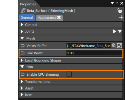
</div></div>

# Skinning

Since CGI 3.14, skinning animations can be played by importing skinning FBX or glTF files. However, the following limitations exist.

- The maximum number of joints associated with each vertex is 4.
- If the number of joints associated with a skinning mesh is 100 or less, skinning is performed using a shader.
- If the number of joints associated with the skinning mesh is 101 to a maximum of 255, skinning processing will be performed on the CPU, but performance will decrease.
- CGI Studio manages rotation using Euler, so it may not be possible to reproduce the animation.
- If SkinningMesh and the SkinningMesh's parent Transform are not identity matrices and the SkinningMesh's posture does not give the expected result, please set the identity matrix for SkinningMesh and the SkinningMesh's parent Transform.
- If SkinningMesh and Joint Nodes are placed under a Group, the changes made in the Group's Transform will be applied to the SkinningMesh twice.

In addition to the above, please note the following limitations when importing skinning in FBX file format.

- FBX format FbxSkin::eDualQuaternion and FbxSkin::eBlend are not supported.
- FbxCluster::eAdditive in FBX format is not supported.

#### SkinningMesh

Note that you can create a SkinningMesh that can be used on Scene Composer by importing an FBX/glTF file that contains at least one skinning. The properties of a SkinningMesh created by importing is as follows.

##### Skin (Common Properties)

<div drawio-diagram="6748"><img src="https://doc316en.candera.eu/uploads/images/drawio/2024-09/drawing-4-1725634469.png" alt="drawing-4-1725634469.png"/></div>

<table class="align-center" id="bkmrk-enable-cpu-skinning-" style="border-collapse:collapse;width:700px;border-width:1px;"><colgroup><col style="width:189px;"></col><col style="width:511px;"></col></colgroup><tbody><tr><td class="align-left" style="border-width:1px;">Line Width</td><td style="border-width:1px;">It is only added if the \[ <span style="color:rgb(230,126,35);">[Import as wireframe](https://doc316en.candera.eu/books/import-of-resources/page/import-dialog-options#bkmrk--01)</span> \] option is enabled when importing an FBX file that contains skinning. This specifies the line width of the mesh when it is rendered as wire.

- The actual line width is determined by rounding the specified width to the nearest integer.
- If the setting is less than “1”, it is always set to “1”.

</td></tr><tr><td class="align-left" style="border-width:1px;">Enable CPU Skinning</td><td class="align-left" style="border-width:1px;">Specifies if CPU Skinning is enabled or not. If enabled, vertex shaders other than those provided for skin can be used with Skinning Mesh.

Note: CPU skinning calculations are slow and should thus be avoided. If enabled, the shader must be edited or configured so that skinning is not done in the shader.

</td></tr></tbody></table>

##### Other Properies items

The following property items are set at importing and cannot be changed.
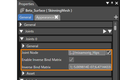
<div drawio-diagram="5732"><img src="https://doc316en.candera.eu/uploads/images/drawio/2024-05/drawing-4-1715328271.png" alt="drawing-4-1715328271.png"/></div>

<table class="align-center" id="bkmrk-joint-node-sets-a-jo" style="border-collapse:collapse;width:700px;border-width:1px;"><colgroup><col style="width:202px;"></col><col style="width:498px;"></col></colgroup><tbody><tr><td class="align-left" style="border-width:1px;">Joint Node</td><td class="align-left" style="border-width:1px;">Sets a joint node.</td></tr><tr><td class="align-left" style="border-width:1px;">Enable Inverse Bind Matrix</td><td class="align-left" style="border-width:1px;">Specifies if Inverse Bind Matrix is enabled or not. If enabled, then the joint uses the Inverse Bind Matrix. If disabled, then the joint uses the identity matrix.

</td></tr><tr><td class="align-left" style="border-width:1px;">Inverse Bind Matrix</td><td class="align-left" style="border-width:1px;">Used to bring coordinates being skinned into the same space as joint.</td></tr></tbody></table>

#### Adding imported scenes

Import of FBX or glTF files, including skinning, is performed using the standard procedure (<span style="color:rgb(230,126,35);">[FBX import procedure](https://doc316en.candera.eu/link/1101#bkmrk-image%2C-font%2C-shader%2C-1)</span>, [<span style="color:rgb(230,126,35);">glTF import procedure</span>](https://doc316en.candera.eu/link/1101#bkmrk-images%2C-fonts%2C-shade)). After importing, creating new scenes and animations from the scenes and animations contained in the imported resources.

1. Select a scene contained in the imported resource and choose \[ Add Scene From Template... \] from the context menu. 
    - The \[ Add New Scene 3D \] dialog will appear.
    - For more information on the \[ Add Scene From Template... \] feature, see <span style="color:rgb(230,126,35);">[here](https://doc316en.candera.eu/link/41#bkmrk-imported-scene)</span>.
2. Make the necessary settings on the \[ Add New Scene 3D \] dialog and press \[ OK \] button. 
    - The scene will be added as a new scene in the Solution Explorer panel, in the Solution&gt;Scenes folder.
    - The scene tree panel will display the added scene.  
          
        <div drawio-diagram="7577"><img src="https://doc316en.candera.eu/uploads/images/drawio/2024-11/drawing-5-1732893834.png" alt="drawing-5-1732893834.png"/></div>

<p class="callout info"><span style="color:rgb(230,126,35);">[SkinningMesh](#bkmrk-skinningmesh)</span> is added to the imported scene (red frame in the right figure above). </p>

<p class="callout info">If the imported scene does not contain any <span style="color:rgb(230,126,35);">[camera](https://doc316en.candera.eu/link/130#bkmrk-camera)</span> or <span style="color:rgb(230,126,35);">[light](https://doc316en.candera.eu/link/130#bkmrk-light)</span> nodes, add them to the new scene from Node 3D in the Toolbox panel and make the necessary settings.</p>


#### Add Render Target

Adds the camera of the added scene to the render target.

##### When a camera node is added

1. Displays the Render Targets panel.  
    
    - A camera with the added scene name has already been added in the panel.
2. Check the checkboxes for the added cameras.

##### If the imported scene contains a camera

1. In the Render Targets panel, select Render Target and then \[ Add Camera to Render Target... \] from the context menu.  
    
    - The \[ Choose Item \] dialog will appear.
2. Expand the Scenes folder in the \[ Choose Item \] dialog and select the cameras in the scene you added.
3. Press the \[ OK \] button in the dialog.

#### Add imported animations

To play the skinning animation in Player, add the animation in the imported resource.

1. Select an animation contained in the imported resource and choose \[ Add Animation From Template... \] from the context menu. 
    - The \[ Add New Animations \] dialog will appear.
    - For more information on the \[ Add Animation From Template... \] feature, see <span style="color:rgb(230,126,35);">[here](https://doc316en.candera.eu/books/animation-design/page/create-animation-from-template)</span>.
2. Make the necessary settings on the \[ Add New Animations \] dialog and press \[ OK \] button. 
    - The scene will be added as a new scene in the Solution Explorer panel, in the Solution&gt;Animations folder.  
        <div drawio-diagram="6498">  
        </div>

#### Play skinning animation

Player is used to play back skinning animations in a composed scene.

1. Press the \[ Play selected scenario... \] icon on the toolbar to launch Player.  
    
    - If you have not saved the solution before this operation, the \[ Save Solution \] dialog will appear and you will be asked to save the solution.
    - By pressing the \[ OK \] button in the dialog, the asset file will be automatically generated and opened in CGI Player.
2. In the CGI Panel, check the target scene from the scene list on the left side.  
    <div drawio-diagram="5727"><img src="https://doc316en.candera.eu/uploads/images/drawio/2024-05/drawing-4-1715316125.png" alt="drawing-4-1715316125.png"/></div>
3. Select the animation to be played from the toolbar pull-down menu.  
    <div drawio-diagram="5728"><img src="https://doc316en.candera.eu/uploads/images/drawio/2024-05/drawing-4-1715316183.png" alt="drawing-4-1715316183.png"/></div>
4. Press the Play button on the toolbar to execute the animation playback.  
    
    - The skinning animation specified in the display panel is played.  
        <div drawio-diagram="5734"><img src="https://doc316en.candera.eu/uploads/images/drawio/2024-05/drawing-4-1715328731.png" alt="drawing-4-1715328731.png"/></div>
        
        [![SkinningAnime.gif](https://doc316en.candera.eu/uploads/images/gallery/2024-05/skinninganime.gif)](https://doc316en.candera.eu/uploads/images/gallery/2024-05/skinninganime.gif)