General Concepts
This chapter provides a set of subchapters about the general concepts used in CGI Studio.
- 9-patch image
- Dynamic List
- Integration of Monotype
- Text engine: Shaping
- Monotype's Spark Engine
- Colored Glyph Support
- Integration of CGI Player
- Input Handling
- Warping
- Introduction
- Configuration
- Default Adjustments
- Enabling Warping
- Warping Sequence
- Warping Library API
- Warping Candera API
- RenderTarget Alpha Blending
9-patch image
Description
The 4-slice scaling technique has been around in desktop graphics software for some years already and is well known to users of Flash and Illustrator. It's a brilliant technique for scaling images by dividing them using 5 slices into sections that have a fixed size (the corners) and sections that are flexible (the edges and the center). There are many names in use for this technique: 9-slice-sprite, 9-slice-scaling, 9-patch-bitmap.
The following image shows the 9 patches areas of an image using different colors:

The basic rules are that the corners will not scale at all, the edges will only scale in their respective direction and the center will scale in all directions.
The green area usually is the content area and the other 8 areas are the border areas. It will be clear why the center area is named content area when we show a few example applications of 9-patch images.
Examples

The images are very often used as background in controls like buttons for example. The big advantage is the low amount of memory needed. It is only necessary to store a small minimum version of the image and it can be reused in many different sizes without losing too much of its quality.
9-patch is mainly used for controls, if you have a text field or a button you can basically stretch it infinitely, but you want certain areas to not stretch like the borders so that in the visual sense it will look much better.
In a layouter (Overlay, Grid…), the 9-patch images will still have the same rules even if the Size properties of the layouter are changed. Using layouters to control the size of a node/control 9-patch images are very often the best way to adapt nodes/controls dynamically to the required space, which is then, adapted to the 9-patch-image as expected.
For BitmapNode sample of the 9-patch click here.
Configuration and special properties
Because not all images are suitable for use as 9-patch-images SceneComposer allows the user to classify an imported bitmap as 9-patch-images using the bitmap properties. To configure the 9-patch, when a bitmap is selected from the Solution Explorer, in the Properties window, in Bitmap section, Bitmap Layout property must be set to NinePatch. If an image is a classified 9-patch-image, 4 additional properties are available. These properties define where the slices are going through the bitmap. For every slice the distance in pixel from the border has to be specified resulting in:
- Top-Border
- Left-Border
- Right-Border
- Bottom-Border

When using an image as a nine-patch image you should disable bilinear filtering (within the BitmapBrushBlend effect for example) by setting the bitmaps filter property to NearestFilter. This is necessary to have sharp borders between the 9 patches.

When using 9-patch-images on a BitmapNode or inside a control changing the size of the node or control will stretch the image as described above. The scale property of a node/control will be applied as an additional step AFTER adapting the image to the size of the node/control!
Scale properties X and Y will scale the whole image and don’t have unscaled areas. 9-patch does not work with the Scale properties, but with the Size properties X and Y. To scale an image with the 9-patch rules, in the node Properties window, in Layout section, changing the values X and Y from Size property will stretch the image according to 9-patch.
If the Size properties X or Y is smaller than the sum of the borders (9-patch Stretchable Area: Left, Top, Right and Bottom), then the borders themselves will also start scaling down.
Dynamic List
Overview and characteristics
- The size of the list exceeds the limit to process/render all items in the view or just not known at design time in SceneComposer.
- The view sees the list items only as a fragment/subset of the original list.
- The items in the model may be inhomogeneous. In this case special behavior have to switch the presentation of the item in the view corresponding to the provided item data.
- The items in the view have homogeneous size.
- The list model is bound via Courier databinding.
- The list model has to be implemented in the Courier Model Component.
- The list view is generic. This means the list does not require to implement a specific data structure for the item data. Only a generic base class is required which can be achieved by a simple flag in data description XML file.
- (also for static list) The list view allows horizontal/vertical lists
- (also for static list) The list view allows to swipe (scrolling/ moving the list while touching and moving the finger slowly) / flick (fast move of the finger and releasing the touch screen result is an automatic scrolling of the list for a specified duration and a velocity that epends on the speed of the flick) the list by touch.
- (also for static list) The list view positioning is decoupled from the list view itself. This enables a customizable list navigation (e.g. scrollbar/sidebar)
- The list view requests a list fragment from the model
- The list model provides this list fragment (subset of the list at the requested start index and a specified buffer size). It has to be filled with data from external data sources (e.g. CAN bus or blutooth).
- The list model can provide a default list fragment to the view component before any specific view is loaded (can be done asynchronously if the model is deployed in a separate thread). This enables the view scene to immediately show the list content without the need to request the fragment first.
- The list view items can again be bound by Courier data binding to specific data items in special binding sources for data items. Those binding sources have to be marked in XML (dataContextItem="true").
Create a list in a binding source (all samples are included in cgi_studio_player)
- First of all create a new binding source or reuse an existing.
<bindingSource name="SampleBindingSource" access="asynchronous" uid="{5fb25ecc-8223-42b5-8f00-edce8fe042f3}"> </bindingSource> - This binding source does not yet provide a list. Hence, we have to add a list item to that binding source.
<bindingSource name="SampleBindingSource" access="asynchronous" uid="{5fb25ecc-8223-42b5-8f00-edce8fe042f3}"> <list name="SampleList" uid="{1241d345-07af-46ec-b0cd-90a687c56140}" /> </bindingSource> - By default this list will be able to support any fragment size that is requested. Hence, the fragment has not a fixed size capacity but a dynamically growing capacity. This implies the use of allocating memory with different block sizes.
- By providing the windowSize attribute for the list item you can easily define a list fragment with a fixed capacity. This implies that the fragment is not able to be larger than the capacity specified by windowSize (for the sample we did not use a fixed capacity).
<list name="SampleList" windowSize="30" uid="{1241d345-07af-46ec-b0cd-90a687c56140}" /> - In addition you can also define a complete list of a fixed size by providing the attribute maxCount. If both attributes are provided the attribute maxCount will be ignored and a list fragment will be used.
<list name="SampleList" maxCount="100" uid="{1241d345-07af-46ec-b0cd-90a687c56140}" />
- By providing the windowSize attribute for the list item you can easily define a list fragment with a fixed capacity. This implies that the fragment is not able to be larger than the capacity specified by windowSize (for the sample we did not use a fixed capacity).
- At this point we are already able to define the list binding itself in SceneComposer.
Create the List view binding to the list data model
- Drag the List control from the toolbox to the Scene Tree.

- Define the size of the List Control (e.g., 400x280). If the size is undefined, the list will be infinite in size and display as many items as you set.
- At this point, the List will not display any content because the items have not yet been set.

- At this point, the List will not display any content because the items have not yet been set.
- Before defining Binding, the binding source for the application must be set. Each application must have a central XML file (like cgi_studio_player) that references all included XML files (it is also the starting point for the code generator).
-
See here for Binding source configuration instructions .
-
In CGI Studio 3.6.0, you must close and reopen the solution to reload the Data Binding.

-
- Next, set the List bindings. Press the white bind button on the right side of the List Control's properties “Control > Items” to display the [ Define Data Bindings ] dialog.
- From Data Items, select the target data and press the [ OK ] button.

- From Data Items, select the target data and press the [ OK ] button.
- When the Data Binding operation is completed, the Bind button in the Properties panel turns blue. Also, when you mouse over the bind button, the current binding item is displayed in a tooltip.
- For more information on displaying the bind button, click here.

- For more information on displaying the bind button, click here.
Create the binding source for the list item
- Since we have not yet defined how the data items will look like we have to go back to the data binding description in the XML file and add a new binding source for the list item itself.
<bindingSource name="SampleListEntry" access="asynchronous" uid="{86f39d72-8d42-43eb-87e7-475cdf384734}"> </bindingSource> - To mark it as a binding source that can be used as a list item we have to enable the attribute dataContextItem. DataContext items are a more generic concept in CGI Studio that can be used to define scene node local data context containing one or more local binding sources. The list item is an example that uses this concept to enable the binding of view list item properties to list data items.
<bindingSource name="SampleListEntry" access="asynchronous" dataContextItem="true" uid="{86f39d72-8d42-43eb-87e7-475cdf384734}"> </bindingSource> - Now we have to add some data items to that binding source.
<bindingSource name="SampleListEntry" access="asynchronous" dataContextItem="true" uid="{86f39d72-8d42-43eb-87e7-475cdf384734}">
    <item name="UInt64Value" type="FeatStd::UInt64" uid="{5cb01d1b-9b9b-4982-99b2-4c82a4823d16}" />
    <item name="FloatValue" type="FeatStd::Float" uid="{7a55879f-0a01-41bf-9d96-d3048280b79f}" />
Create the List item view binding to the list item data model
After defining the List item structure, set up the Bindings in Scene Composer.
- First, Nodes for the List item are required. Drag a Stack Layout node from the Node 2D section of the Toolbox to the Scene Tree and rename it "Item_1".

- Next, drag a Text Value Control and a Slider Control onto that stack node. In addition, change the "Format Text" property of Text Value to “Item %05d”.
- In the Scene Editor, the text "Item" should be followed by the number that binds to the UInt64 data binding item you just added.

- Add a little margin to the top, bottom, left and right of the Slider Control.

- Bind the Value property of the Text Value Control to /SampleListEntry/UInt64Value.

- In addition, bind the Value property of the Slider control to /SampleListEntry/FloatValue.

- This completes the binding settings for this item.
- After selecting the List control in the Scene Tree, select [ Clone ] from the context menu.
- When the [ Clone Item ] dialog box appears, select the [ Multiple Clone ] tab, enter “6” for the "Number of Copies", and perform the clone.
- A scroll bar will appear because the seventh item is outside the visible area due to the size setting set earlier.

This completes the scene configuration. You can now generate the assets.
Handling the List model code
- First we have to generate the code for the binding sources. In cgi_studio_player this can be done by starting the command script: cgi_studio_player/src/generate.cmd
- You will find the list sample code of the model (DynamicListComponent.cpp and DynamicListComponent.h) located in this folder: cgi_studio_player/src/Player/SampleComponents
- So, what we do here is we provide a list fragment at the startup to enable the view as soon as possible to show the list content:
bool DynamicListComponent::OnMessage(const Courier::Message & msg)
    {
        bool rc = false;
        switch (msg.GetId()) {
        case Courier::StartupMsg::ID:
            (*mSampleBindingSource).mVariantValue = FeatStd::Variant(10.0F);
            LoadSampleListFragmentMissingItems(0, 30);
            (*mSampleBindingSource).mSampleList.UpdateListItemCount(SAMPLE_LIST_SIZE);
            mSampleBindingSource.MarkItemModified(ItemKey::SampleBindingSource::SampleListItem);
            mSampleBindingSource.SendUpdate(true);
            break;
- The call of LoadSampleListFragmentMissingItems simply initializes the list content of the default fragment.
- With the call of UpdateListItemCount we define the virtual size of the complete list.
- The call of MarkItemModified will mark the list as modified. Hence, only the list is updated by the SendUpdate call (which will post a message to the view).
- The handling of the UpdateModelMsg will do two things. The first one handles requests of new fragments from the list view. The second one handles modification of data items with the list items that are requested by the view (e.g. by the slider)
case UpdateModelMsg::ID: {
- When we handle new fragments we will receive the start index(request.NewIndex) the size (request.OldIndex) of the requested fragment. Hence, we will update the fragment with these values. We do not yet send the update message because other messages may require further modification of the model. Hence we will send the update in the OnExecute method where we can be sure that the modifications are complete.
                case Courier::ListRequestType::NewFragment:
                    switch (request.ItemKey()) {
                    case ItemKey::SampleBindingSource::SampleListItem:
                        LoadSampleListFragmentMissingItems(request.NewIndex(), request.OldIndex());
                        break;
                    }
                    break;
- When we handle the change of an data item we will get the exact information which list has been modified, which item, which data item in the item and the new value. The model still can reject this modification. In both cases the model should send an update of that data item to either reset the list that requested the change and/or update other views that are bound to the list but not yet visible (NOTE: for fragment lists only one bound list is allowed to be active because only one fragment per list is handled in the model).
        case Courier::ListRequestType::ChangeDataItem:
            switch (request.ItemKey()) {
            case ItemKey::SampleBindingSource::SampleListItem:
                switch (request.InnerItemKey()) {
                case ItemKey::SampleListEntry::FloatValueItem: {
                    const FeatStd::Float* value = request.GetItem<FeatStd::Float>();
                    SetSampleListTestListValue(request.NewIndex(), *value);
                }
                break;
                }
                break;
            }
            break;
Integration of Monotype
This section provides an overview of the Monotype integration.
The current integration is a hardwired solution. Therefore, the choice of which engine shall be used, has to be made at precompile-time (CMake decision).
The following features have been integrated:
- Font engine: iType
The font engine: iType
iType is a font engine which main purpose is fast and qualitative rasterization of fonts.
To see, which version of iType is currently supported, please have a look at the [3rd Party Software section].
There are two different approaches to integrate the third party code iType into CGIStudio:
- adding prebuilt libraries
- add the third party code into the build process
CGIStudio supports both by CMake settings.
Monotype/iType has a special porting API with which target and OS specifics can be overridden.
CGIStudio provides a single solution for all targets. For this, the framework links the API to the device and operating system layers.
It is also possible to use an own customized port instead of the CGIStudio solution.
Cache support
The iType integration concentrates on the most performant cache types: BitmapCache and GlyphAtlas. Therefore, only these two cache types are fully supported.
Overview: CMake settings
Currently CMake supports general iType integration flags to include Monotype.
To switch to the font engine the following CMake flag has to be set:
| Flag | Value |
|---|---|
| CANDERA_FONTENGINE | Monotype |
If HarfBuzz is selected as the current TextShaper, the flag CANDERA_TEXTSHAPER automatically will change to WorldType-Shaper. Shaping can also be disabled.
-
HarfBuzz requires Freetype and is not available for iType.
This flag is called Monotype to switch to the available Monotype engines. The concrete font engine will be iType.
By enabling Monotype, several CMake flags become available.
The flag MONOTYPE_USE_BINARIES can be used to switch between the different building modes.
They have their own flags which will be described within the corresponding build process description.
Build process: iType as source code
For this mode, MONOTYPE_USE_BINARIES has to be disabled.
- ONOTYPE_FONT_ENGINE_SRC_PATH - This path defines the location where to find the source code for iType. By default this will be cgi_studio_3psw/src/Monotype/iType and the folder structure may look like the following:

The FileList.txt which defines all the files should contain the following three Lists:-
- MONOTYPE_PUBLIC_HEADERS
- MONOTYPE_PRIVATE_HEADERS
- MONOTYPE_SOURCES
-
It does not matter how the source code is distributed on these lists. Only the names should be in use
-
- MONOTYPE_FEATSTD_PORT_ENABLED - This flag toggles the port API implementation between a CGIStudio version and the default win32_lib including the settings which are required for Candera. The win32_lib represents a default implementation of the framework, separated from any Candera relations. This enables an easy possibility to build iType in a separated environment and link it to Candera.
- MONOTYPE_FONT_ENGINE_PORT_PATH - This path is directly links to the port API which shall be used for the build. By default it links to the default location of the default CGIStudio implementation: cgi_studio_3psw/src/Monotype/iType/source/port/CGIStudio However, this can be changed to different implementations, too. If MONOTYPE_FEATSTD_PORT_ENABLED is false, this will link to the win32_lib definition.
Build process iType as prebuilt library
For this mode, MONOTYPE_USE_BINARIES has to be enabled.
In general using the prebuilt library is similar to the source code version.
The flags MONOTYPE_FEATSTD_PORT_ENABLED, MONOTYPE_FONT_ENGINE_PORT_PATH and MONOTYPE_FONT_ENGINE_SRC_PATH are equal in usage as in the source code version. The only difference is, that the prebuilt library only requires header files.
The port files and header have to match with the build settings of the prebuilt library.
MONOTYPE_ITYPE_LIBRARY_FILEPATH is the path to the prebuilt library. And has to be defined by the user.
Monotype – Prepopulated font engine cache
This feature shall be used to load font bitmap data into the font engine cache.
CMAKE Configuration
- Set CANDERA -> CANDERA_FONTENGINE to Monotype
- Configure
- Check MONOTYPE -> MONOTYPE_PREPOPULATED_CACHE_ENABLED
Usage
- Include the previously created cache dump header file.
- Include the “MtInclude” header
#include <Candera/TextEngine/Monotype/MtInclude.h> - Create an instance of a font that is present in the asset. The name of the font must match the “Candera Name” property of the font resource in the scene composer. The font size parameter of the Setup call is irrelevant.
Candera::TextRendering::Font font;
font.Setup("ConstructionKit##ConstructionKit#Resources#Fonts#Open Sans Light", 20); - Call FontEngine::InitPrepopulatedCache with the font and a reference to the utilCache variable from the cache dump file.
Candera::TextRendering::FontEngine::Instance().InitPrepopulatedCache(font, &utilCache);
Possible Pitfalls
- The cache should be prepopulated during startup of the application. Thus, the above methods shall be called when the Courier::StartupMsg is received.
- The “faceName” property of the Font::Setup call must match the “Candera Name” property of the font in the composer.
- The font size used when displaying the text, e.g. with a TextNode, must match the font size used when generating the cache dump file.
- While generating the cache dump file, the glyph maps must be retrieved as GRAYMAP’s by calling
map = FS_get_glyphmap(FS_state_ptr, glyphIDs[i], FS_MAP_GRAYMAP8); - When generating the cache dump file, fs_config.h should match the configuration in cgi_studio_3psw\src\Monotype\iType\source\common\fs_config.h
Text engine: Shaping
Shaping
Stored texts are ordered by the reading flow. This means that every text is placed from left to right within the memory. It does not matter which language it is. There is also no other information stored besides the text itself. Therefore, the memory representation of text has only logical information but no visual representation information.
The goal of shaping is to find the correct representation of the given text. For example Arabic letters differ in their visual representation depending on their position. Therefore, characters usually have four different forms: Isolated, Final, Medial and Initial. Additionally, there are many more tasks for a shaper to handle: Diacritics, ligatures, kerning...
All different languages have their own characteristics when it comes to shaping. Even Latin has some shaping cases.
For more detailed information about shaping:
WT-Shaper, HarfBuzz as well as different sources, e.g. Unicode.org and w3.org provides abundant information.
Supported shaper
Candera supports different shaper:
- No shaping
- Complex Script
- HarfBuzz (in combination with FreeType)
- WorldType Shaper WorldType-Shaper (in combination with iType)
To see, which versions of shapers are currently supported, please have a look at the [3rd Party Software section].
WorldType Shaper
Integration of WT-Shaper
The integration is based on the same approach iType uses. (Reference to iType)
CMake Integration
In CMake WT-Shaper can only be selected when Monotype is set as CANDERA_FONTENGINE.
To switch to the shaper the following CMake flag has to be set:
| Flag | Value |
|---|---|
| CANDERA_FONTENGINE | Monotype |
| CANDERA_TEXTSHAPER | WorldType-Shaper |
If Freetype + HarfBuzz is slected, the flag CANDERA_TEXTSHAPER will automatically change to WorldType-Shaper.
Using prebuilt binaries or not is bound to the same CMake flag as The font engine: iType iType.
The flag MONOTYPE_USE_BINARIES can be used to switch between the different building modes.
Build process: WT-Shaper as source code
For this mode, MONOTYPE_USE_BINARIES has to be disabled.
- MONOTYPE_WTSHAPER_SRC_PATH - This path defines the location where to find the source code for WT-Shaper. By default this will be cgi_studio_3psw/src/Monotype/WTShaper and the folder structure may look like the following:

The FileList.txt which defines all the files should contain the following three Lists:- WTSHAPER_ALL_HEADERS
- WTSHAPER_ALL_SOURCES
- WTSHAPER_INCLUDE_PATHS
-
It does not matter how the source code is distributed on the first two lists. Only the names should be in use. The third list shall include the directories of WT-Shaper to add them to the linking system.
- MONOTYPE_FEATSTD_PORT_ENABLED - This flag toggles the port API implementation between a CGIStudio version and the default win32_lib including the settings which are required for Candera. The win32_lib represents a default implementation of the framework, separated from any Candera relations. This enables an easy possibility to build WT-Shaper in a separated environment and link it to Candera. This flag is shared between iType and WT-Shaper.
- MONOTYPE_WTSHAPER_PORT_PATH - This path is directly links to the port API which shall be used for the build. By default it links to the default location of the default CGIStudio implementation: cgi_studio_3psw/src/Monotype/WTShaper/source/port/CGIStudio However, this can be changed to different implementations, too. If MONOTYPE_FEATSTD_PORT_ENABLED is false, this will link to the win32_lib definition.
Build process WT-Shaper as prebuilt library
For this mode, MONOTYPE_USE_BINARIES has to be enabled.
In general using the prebuilt library is similar to the source code version.
The flags MONOTYPE_FEATSTD_PORT_ENABLED, MONOTYPE_WTSHAPER_PORT_PATH and MONOTYPE_WTSHAPER_SRC_PATH are equal in usage as in the source code version. The only difference is, that the prebuilt library only requires header files.
The port files and header have to match with the build settings of the prebuilt library.
MONOTYPE_WTSHAPER_LIBRARY_FILEPATH is the path to the prebuilt library. And has to be defined by the user.
Monotype's Spark Engine
Introduction to Monotype’s Spark engine
The Spark engine is Monotype’s lightweight font engine, with a focus on devices with a limited feature set.
This is a powerful engine with many capabilities able to provide high quality font rasterization and shaping.
However, to support resource constrained devices, certain restrictions have been placed on the font forming.
For more details regarding the types of restrictions in place, please contact Monotype directly.
Integrating the Spark engine
Copy the source package provided by Monotype for the Spark engine to the following location,
- cgi_studio_3psw/src/Monotype/spark
The final folder’s substructure should be as follows,
- cgi_studio_3psw/src/Monotype/spark/itypespark
- cgi_studio_3psw/src/Monotype/spark/shaperspark
Additional content may differ depending on the package received from Monotype.
By completing these steps, the Spark engine has now been integrated into CGI Studio.
Configuring the Spark engine
Configure the following entries within CMake as listed below,
- Go to the CANDERA group, then change CANDERA_FONTENGINE to Monotype.
- This setting is necessary as the Spark engine is comprised of the iType Shaper and WorldType Shaper software.
- After changing this setting, perform a reconfigure to update the available text shaper options based on the newly selected font engine.
- If you are planning on using a shaper, change CANDERA_TEXTSHAPER to WorldType-Shaper.
- Perform another reconfigure after updating this entry.
- To switch to the Spark engine, go to the MONOTYPE group, then enable the MONOTYPE_SPARK_LIGHTENGINE_ENABLED flag.
- Perform a reconfigure to complete the configuration process.
- CMake also provides an optional configuration flag, MONOTYPE_SPARK_ENGINE_INSTANCE_COUNT, which can impact both overall performance and memory usage.
- For improved performance, this flag must be set to the number of fonts concurrently in use within your asset. For example, if your asset contains a total of 50 fonts, but at a maximum only 5 fonts are in simultaneous use, then this flag should be set to 5.
- However, this flag also creates instances of the engine, including caches. This will in turn lead to more memory usage.
- For improved performance, this flag must be set to the number of fonts concurrently in use within your asset. For example, if your asset contains a total of 50 fonts, but at a maximum only 5 fonts are in simultaneous use, then this flag should be set to 5.
- After making the stipulated updates, click the Generate button to complete the process.
-
The version of the Spark engine provided by Monotype must contain the MS_STORE_SOURCE_INDEX feature.
If this feature is not present, some text features may not work as intended, such as truncation.
Which versions of the Spark engine support this feature are listed in the “Versions” text file contained in the following file path: cgi_studio_3psw\src\Monotype\Versions.txt
By integrating the Spark engine into CGI Studio,
- Basic support for text shaping using the Spark engine will be available.
- FontMaps are currently supported at this time.
- Supported glyph caching methods are provided by the iType Shaper.
- Bitmap and GlyphAtlas are supported.
- MI_SYNC_MODE is currently not supported.
Updating the Spark engine configuration files
The following configuration flag must be present within the shaper’s configuration file (msconfig.h),
#define MS_STORE_SOURCE_INDEX
If this flag is not present, a warning message will be shown requesting that this flag be set.
General limitations
As a result of the Spark engine containing a minimal set of features, many optional features are not available. Some of these features include,
- Handling different type faces.
- Retrieving font style names.
- Family name inside the font.
- Complex runtime hint flags.
- Complex shaping flags (for example, turning on or off different ligature features).
- OpenType is not supported. Please contact Monotype for support converting fonts into equivalent internal table structures.
-
Another limitation arises when importing a Photoshop files using the Smart Importer or Import from Photoshop option. Due to a difference in how text positioning is calculated within the Spark engine and Photoshop, the positioning of the text within CGI Studio may differ from the original Photoshop file.
Colored Glyph Support
With the integration of Monotype’s iType library, the CGI Studio text engine now supports colored bitmaps from the CBDT table of truetype/opentype fonts.
Scope of new functionality
- Monotype must be configured as a font engine (for further details, please reference the CMake configuration section below)
- TextNode2D must be used (this feature is not supported with CanvasText, or by the deprecated TextEffect)
- Two renders are available for TextNode2D when using Monotype: Bitmap and GlyphAtlas. The option Bitmap must be used.
- Colored glyph bitmaps are taken from the font file in their raw format. No scaling is applied. To match different font sizes, you will need to add different sized glyph bitmaps to the font file.
- Text color will always be applied as color multiplication. For this reason, the colored bitmaps are colorized with the text color. Only white text color will preserve the colors from the original image.
CMake configuration
- Choose Monotype for CANDERA_FONTENGINE
- Activate the new flag CANDERA_TEXTENGINE_COLORBITMAP_ENABLED
A third party library ”lodepng” has been added to decode images in PNG format, and is licensed under the ”zlib License”. This library is available within the cgi_studio_3psw folder, with its path set to the CMake variable CGISTUDIO_LODEPNG_INCLUDE_PATH.
Cache: You can change the cache size for the maximum number of cached colored bitmap elements. The macro is defined as: CANDERA_TEXTENGINE_COLORBITMAP_CACHE_ELEMENT_COUNT - default value: 20 This macro can be changed using a compiler flag (-D... or cmake add_definitions). Alternatively, you can directly add this macro to the generated config headers.
-
The colored glyphs will use a 32 bit per pixel RGBA format, while regular glyphs use an 8 bit per pixel alpha format. If a text contains one or more colored glyphs, the bitmap generated by TextNode2D will be in RGBA format. As a result, bitmaps generated by TextNode2D instances containing colored glyphs will require 4 times the necessary memory required by TextNode2D instances without colored glyphs. Colored glyphs are cached internally by the text engine in RGBA format. This cache also contributes to increased memory consumption.
Integration of CGI Player
Integration of the Player into SceneComposer
The Player can be started directly from SceneComposer through the new functionality: Play button starts the Player. New configuration panel has been added to define if and how asset is generated and how the Player is started.
Player integration as screen content into SceneComposer is currently not possible. Therefore the Player will still be used as the external player.
SceneComposer is able to start and stop the Player and provides an updated asset during runtime. If the update of the asset is not possible the Player will be restarted. The Player will be preconfigured with the currently selected scene. If no scene is selected another preconfigured or the first scene will be used. The platform configuration of the Player will be done by SceneComposer. To speed up the asset export there will be the possibilty to just export the current selected scene and all dependent scenes.
The Player execution into SceneComposer includes:
- Play button in toolbar to start the Player (pause, stop)
- Automated generation of asset (e.g. in temporary folder)
- Automated loading and execution of asset
- Configuration of default scene to load (Current selected scene, specific scene)
-
The integration of Player into SceneComposer is an intermediate step towards full integration of Live Preview as a panel in SceneComposer. This Live Preview will then substitute current display preview.
Input Handling
Touch Input Handling
Description
This chapter gives a detailed, technical overview of how the user touch input is handled internally which is important to understand further concepts like the Control States. The base part therefore is the CgiStudioControl::ControlTouchSession which handles the TouchEvent and emits several Events received by Controls with a Handle Control State Behavior (e.g. Control States).

Touch Event
The Touch Event is emitted by Courier and contains TouchInfo with following states:
- Move
- Down
- Up
- Hover
-
Touch input can be tested with the Player which reacts to mouse input and emits Touch Events.
ControlTouchSession
To simplify the process especially for Control developers, the states of a TouchInfo are mapped to several, more specific Events. Therefore the ControlTouchSession generates kind of virtual input events in the sense that a combination of touch events result in a new input event (e.g. Touch Down and Touch Up on the same Control leads to a Click Event). To be able to generate these events and to send them to the right Control the ControlTouchSession contains a list to register all Control State Behaviors. So be sure that each Control which should be handled by the Control Touch Session has to contain a Control State Behavior. For each of the following events it is important to know that the events are generated by the ControlTouchSession but they are dispatched from the Control which gets touched. To understand how Events get sent also check chapter Behaviors and Events .
-
Controls must have a Handle Control State Behavior to receive Events from the Control Touch Session even if the Event is not sent locally to this Behavior (e.g. the Click Event).
Pressed Event
Basically the Pressed Event which has two different states is triggered by the users touch down (state: Pressed) or by the users touch up (state: Released).
Furthermore the TouchSession reacts to the move of the touch. So if the touch moves and the primarily touched Control is not touched any longer, the ControlTouchSession emits a Pressed Event with the state Released.
If the touch is still down and enters the primarily touched Control, the TouchSession again emits a Pressed Event with the state Pressed.

In many cases, especially concerning Controls, the Pressed Event gets received by the Handle Control State Behavior (see chapter Control States).
The Handle Control State Behavior even receives the Event via Local Dispatch Strategy (see Behaviors and Events). But the Event also gets dispatched via BubbleStrategy from the Control which enables other Behaviors of the Control to receive the event (e.g. PressedCondition).
Hovered Event
Emitting the Hovered Event works similar to the Pressed Event. But in difference to the Pressed Event the Hovered Event has an additional state in case of keep hovering over the same object.
Additionally the Event is emitted when the Hover leaves the currently hovered object (HoverLeave) and when the Hover enters and object (HoverEnter).
As for the Pressed Event also the Hover Event basically gets received by the Handle Control State Behavior (see chapter Control States). But the Event can also be received by another Behavior like the HoveredCondition.
Click Event
As the previously described Events also the Click Event is generated by the ControlTouchSession but it is dispatched from the Control which gets clicked.
But different to the PressedEvent and the HoveredEvent, the ClickEvent is not sent to the Handle Control State Behavior via Local Dispatch Strategy as it is not relevant for the states of a Control. But again the Event gets dispatched from the Handle Control State Behavior which enables the user to directly react on the Event via an EventHandler (also see EventHandler Tab). Furthermore it is important to know that the Click Event is emitted only on release of the touch point. Moreover the the Control of the touch down must be the same as the Control of the touch up. So following example would not trigger a Click Event:

The Click Event is often used in combination with a EventHandler Tab as shown below:

-
Be sure to read chapter Control States and Control Examples to see how the described Events can be used.
Focus Management
Focus Navigation on Computer
The user of the created HMI wants to move the focus from one control to another. When using the computer, usually a keyboard is used for focus navigation.
On a computer, the user can use the following keys to move the focus from one control to the other:
| - TAB | move the focus to the next control |
| - CTRL + TAB | move the focus to the previous control |
On targets without a keyboard, different input methods can be used for changing the focused control. Automotive targets use the rotary for focus navigation. Therefore, focus navigation is only loosely coupled with a keyboard.
Focus Navigation in CGI Studio
This section uses a phone keypad like the one below to demonstrate the focus changes.


Next/Previous Navigation in CGI Studio
-
If no focusable control has the focus and a key that navigates the focus (e.g. a key of the cursor control pad or the TAB key) is pressed, the focusable control that has the lowest TAB-order gets the focus.
Geometrical Navigation in CGI Studio
The following describes the focus change that happens when repeatedly clicking the noted navigation key in the example keypad above. Initally, for every noted navigation key, the focus is on the fifth focusable control as in the image of the keypad above.
|
|
|
|
|
|
|
|
|
|
|
|
|


Managing the Focusable Nodes
Each keyboard focusable behavior notifies the KeyboardFocusManager about its view getting activated or deactivated.
Concept of the Next/Previous Navigation
The logical order of the focusable nodes is defined by the following criteria:
- The tab order of its scene: This order is stored as a dynamic property and can be set by a KeyboardFocusTabOrderBehavior.
- The asset order of its scene: This order is defined by the order in which the scene is stored in the asset.
- Its tab order: This order is stored as a dynamic property and can be set by a KeyboardFocusTabOrderBehavior.
- Its tree order: The tree order in pre-order tree traversal.
KeyboardFocusTabOrderBehavior
The tab order of a node is defined as relative or absolute. The default order is relative.
- relative considering the parent inherited tab order
- absolute will stop the inherited tab order
The next/previous navigation updates the logical order for each next/previous navigation event and sorts the focusable nodes, finds the currently focused node in that list and transfers the focus to the next/previous entry in the list.
Concept of the Geometrical Navigation (Left, Right, Up, Down, Up Left, Up Right, Down Left, Down Right)
For each geometrical navigation event the bounding box in the display of the node is calculated per camera in the scene. Each keyboard focusable node has one entry in the lookup list for each camera.
The keyboard focused node is extended by the camera that is responsible for the focus. A scene may have several cameras and the focus will be caused by one of them.
The following events may trigger a change of the keyboard focus:
|
|
|
|
|
|
|
|
|
|
|
|
|

 |
Navigate to the Left: |
1. Find the nearest node of the nodes that are at least partially within the top and the bottom boundary of the keyboard focused node. The distance of the right node boundary to the left boundary of the keyboard focused node is minimal. Limit the right node boundary to the left boundary of the keyboard focused node. For multiple matches use the same order criteria as for the previous/next navigation and take the first one.
2. If no node was found, find the nearest node (where the corner to corner distance is minimal) of the nodes that intersect the left sectors:
- corner to corner distance for nodes in the top left sector: take the node's bottom right corner (limit that corner to the left boundary of the keyboard focused node) and the keyboard focused node top left corner and calculate the square distance.
- corner to corner distance for nodes in the bottom left sector: take the node's top right corner (limit that corner to the left boundary of the keyboard focused node) and the keyboard focused node bottom left corner and calculate the square distance.
- All other sectors are not on the left of the keyboard focused node.
- For multiple matches use the same order criteria as for the previous/next navigation and take the first one.
|
|
Navigate to the Right: |

|
|
Navigate Up: |

|
|
Navigate Down: |

|
|
Navigate to the UpLeft direction: |

Find the nearest node (corner to corner distance is minimal) of the nodes the intersect the top left sector:
- corner to corner distance: take the node's bottom right corner (limit that corner to the left and top boundary of the keyboard focused node) and the keyboard focused node top left corner and calculate the square distance.
- For multiple matches use the same order criteria as for the previous/next navigation and take the first one.
|
|
Navigate to the UpRight direction: |

The same as UpLeft navigation but left is right, right is left, top is top and bottom is bottom in the description. Imagine a mirrored image.
|
|
Navigate to the DownLeft direction: |

The same as UpLeft navigation but left is bottom, right is top, top is left and bottom is right in the description. This is a rotation by 90° counter clock wise.
|
|
Navigate to the DownRight direction: |

The same as UpLeft navigation but left is top, right is bottom, top is right and bottom is left in the description. This is a rotation by 90° clock wise.
GestureDetector
How to implement a custom GestureDetector
The ControlTouchSession supports GestureDetectors. You simply register your own detector and register it at the ControlTouchSession.
- The ClickGestureDetector is one of the existing detectors. It detects click, drag and press related gestures.
- Since it only detects the gestures it is clear that the ControlTouchSession is the only place where it is referenced (and also only because it is registered by default).
- GestureDetector::OnEvent is the only interaction interface with the ControlTouchSession.
The ControlTouchSession will send these events to the gesture detector:
UpdateEvent
This event indicates an update iteration (one per frame)
GestureDetector::TouchInput
This is a single/multi touch event extended by this information:
- The state of the gesture detector session (FirstDown, LastUp).
- The behavior that has currently the touch focus (which is the touchable behavior that was hit by the first finger that touched the screen during a gesture detector session)
- The behavior that is currently touched by the touch event (also updated by Drag).
The following states of the gesture detector session are available:
- FirstDown: The gesture detector session begins when the first finger touches the screen.
- LastUp: The gesture detector session ends when the last finger is removed from the screen.
In between you will get updates in the following cases:
- Down: another finger touched the screen
- Drag: a finger has been moved.
- Up: one finger has been removed from the screen. But at least one more is on the screen.
GestureDetector::AbortEvent
This event tells that another behavior has taken the exclusive touch control. Hence, no gesture detector will participate in the current gesture detector session and therefore has to reset all internal states and wait for the next session.
GestureDetector::DeregisterEvent
The provided behavior is removed from the ControlTouchSession. Hence the gesture detector also has to remove all references to that behavior.
See also:
Warping
Introduction
Image warping is the process of digitally manipulating an image such that shapes portrayed in the image have been distorted. Warping may be used for correcting image distortion as well as for creative purposes (e.g., morphing). The same techniques are equally applicable to video. CGI Studio warping is intended to be used for correction image distortion only. The following two components are involved in the process:
- Warping Library: compute the warping matrix
- Candera: maps a displays image as texture to a mesh created from the warping matrix information and displays the correspondingly distorted result.
Following is a diagram depicting the information flow for warping:

Configuration
Description
Configuration information passed to the warping library is used to check constraints and as basis for computations.
Following is a description of the warping configuration parameters:
Reference Points
The reference points are represented by a 2D array with coordinates inside the display area to be warped. There are NumOfRefPointsX in horizontal direction and NumOfRefPointsY in vertical direction, both having values in the range 0..255. These are equally distributed over Bitmap-pixel.
Example:
- NumOfRefPointsX: 21 (0x15)
- NumOfRefPointsY: 11 (0x0B)
The number of reference points used influence to output of the distorted image with regard to Bitmap size. The output image will be less jagged the higher the number of reference points are used for warping computation
PixResolution
The Resolution of warping parameters determinine the warping accuracy. The final displacement of the reference points is the product of warping parameter by parameter resolution. Therefore, a warping parameter is given by the desired displacement divided by resolution.
The warping library supports the following pixel:
- 0: 1/16 px
- 1: 1/8 px
- 2: ¼ px
- 3: ½ px
- 4: 1 px
- 5: 2 px
- 6: 4 px
- 7: 8 px
Example:
If a texture point at (0,0) should be mapped at (10,10) the corresponding X[0] and Y[0] coordinates can be calculated by dividing the desired displacement by pixel resolution.
For a pixel resolution of 1/16 px (0.0625):
X[0] = Xnew[0] – Xold[0] / 0.0625 = 160 (0xA0)
Y[0] = Ynew[0] –Yold[0] / 0.0625 = 160 (0xA0)
For a pixel resolution of ¼ px (0.25):
X[0] = Xnew[0] – Xold[0] / 0.25 = 40 (0x28)
Y[0] = Ynew[0] –Yold[0] / 0.25 = 40 (0x28)
NumOfBitsPerParam
Represents the number of bits used for each parameter (n-bit representation = bit length of each parameter).
The value should be in the range is 1..16.
Example:
- If NumOfBitsPerParam is 8 the warping parameters corresponding to X[0]Y[0] are represented as 0xA0 0xA0.
- If NumOfBitsPerParam is 12 the warping parameters corresponding to X[0]Y[0] are represented as 0x0A 0x00 0xA0.
-
The NumOfBitsPerParam and PixResolution are represented on 8 bits, upper three bits are used for NumOfBitsPerParam and lower bit for PixResolution.
Example::
- 0x96 -> NumOfBitsPerParam: 12, PixResolution 0 (1/16 px)
- 0x98 -> NumOfBitsPerParam: 12, PixResolution 2 (¼ px)
DisplaySizeX and DisplaySizeY
Width and height data (in pixel) of the display hardware (range: 0..65535).
Example:
- 0x01 0xE0 – DisplaySizeX – 480px width
- 0X00 0XF0- DisplaySizeY – 240 px height
BitmapAreaX and BitmapAreaY
Width and height data (in pixels) of source surface used as input for warp. The reference points are equally distributed over this range in x and y direction with values in the range 0..65535.
Example:
- 0x01 0x98 – BitmapAreaX – 408px width
- 0X00 0XBE- BitmapAreaY– 190 px height
-
Condition:
BitmapAreaX≤ DisplaySizeX
BitmapAreaY≤DisplaySizeY
BitmapAreaCenter
The Bitmap Area Center Point describes the center point of the image area used by ABK.
BitmapAreaShift
The Bitmap Area Shift describes the connection vector between the origin of the bitmap coordinate system (0,0) and the center point of the bitmap area - i.e. the Bitmap Area Center Point.
BitmapAreaShiftX and BitmapAreaShiftY
Shift values of bitmap area center point in horizontal and vertical direction (range 0..65535).
- ”0” BitmapAreaShiftX means the application window starts at the left edge on the display.
- ”0” BitmapAreaShiftY means the application window starts at the upper edge on the display.
Example:
- 0x00 0xCC – BitmapShiftAreaX – 204px
- 0X00 0X5F- BitmapShiftAreaY– 95 px
-
Condition:
(BitmapAreaY/2+BitmapAreaShiftY≤DisplaySizeY) AND (BitmapAreaY/2– BitmapAreaShiftY ≥0
(BitmapAreaX/2+BitmapAreaShiftX≤DisplaySizeX) AND (BitmapAreaX/2– BitmapAreaShiftX ≥0
IlluminatedDisplayAreaX and IlluminatedDisplayAreaY
Width and height data (in pixel) for illuminated area. This represents the region in which the warped surface will be rendered. If the source surface size extends beyond the IlluminatedDisplayArea it will be scaled down with regards to display size.
Example:
- 0x01 0xE0 – IlluminatedDisplayAreaX – 480px width
- 0X00 0XF0- IlluminatedDisplayAreaY– 240 px height
-
Condition:
IlluminatedDisplayAreaX ≤ DisplaySizeY
IlluminatedDisplayAreaY ≤ DisplaySizeY
IlluminatedDisplayAreaShiftX and IlluminatedDisplayAreaShiftY
Shift values of illuminatedDisplay area center point in horizontal and vertical direction (range 0..65535).
Example:
- 0x00 0xF0 – BitmapShiftAreaX – 240px
- 0X00 0X78- BitmapShiftAreaY– 120 px
-
Condition:
(IllDisplayAreaX/2+IllDisplayAreaShiftX≤DisplaySizeX) AND (IllDisplayAreaX/2– IllDisplayAreaShiftX ≥0)
(IllDisplayAreaY/2+IllDisplayAreaShiftY≤DisplaySizeY) AND (IllDisplayAreaY/2– IllDisplayAreaShiftY ≥0)
RotationValue
The rotation value is represented in grad *100 with values in the range -18000 .. +18000. This is the default rotation value which will be applied to the warp image.
The rotation takes place around the warped center point of the bitmap area used. With an uneven number of reference points in x- and y-direction, this point coincides with the middle reference grid point, and the coordinates of the rotation axis are present. If an even number of reference grid points is used, the coordinates of the warped center point of the image are be calculated.
Example:
- 0x01 0xF4 – RotationValue: 500/100 = 50
ParamSet
Set of reference point shift vectors column-ordered.
The warping parameter correspond to the shift vectors (in pixels) of warping interpolation points in warped images in comparison to reference points in non-warped images (divided by the specified resolution). To save memory space and computing time, the absolute coordinates are not saved as warping parameters, but rather only the distance from the reference points (without rotation and shifting).
ParamSetLength
Length of ParamSet in bytes. This is calculated by:
ParamSetLength = NumRefPointsX * NumRefPointsY * 2 * NumBitsPerParam
RotationLimit
This value represents the maximal rotation angle in grad – both positive and negative values are accepted. If the RotationLimit value is chosen such that at maxim rotation point, the image will extend beyond display size, it will be scaled down to the size that fits inside the display area when a rotation equal to RotationLimit is applied.
The display area comprises the whole image including the grey border.
The bitmap image area is the area within the grey border. This is the area we are interested in and which should be warped.
The reference points are evenly distributed over the bitmap image area.
-
The illuminated display area is the part of the display, which is backlit and projected to the windshield.

Reference Point Shift Vectors
The warping parameters are based on reference point. These points are mapped by a 2D array containing coordinates inside the display area to be warped. For ++-each reference point, a shift vector is stored by the application. Every shift vector determines the amount of distortion to be applied to the corresponding point in x- and y-direction. Figure 2 shows a reference point grid with corresponding shift vectors.
To preserve memory, the shift vectors are stored in a compressed format. The format is determined by configuration information passed to warping library (number of bits used, value resolution) and is used by warping library to de- and encode shift vectors. The decoded shift vectors are cached in the warping library.

Warp Matrix
The warp matrix is computed by the warping library. It is a 2-dimensional matrix. Each point corresponds to a reference point. The value of each point is the vector-addition of the reference point and corresponding shift vector. All values of the warp matrix are normalized to the range [0..1].
Warp Image Bounds
Warp image bounds can be computed by the warping library. Warp image bounds comprise upper left corner point of the bitmap image area, its width, and height (normalized to the range [0..1]). They are used to specify to Candera which part of the rendered image shall be mapped to the warping mesh.
Default Adjustments
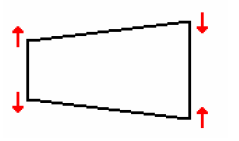
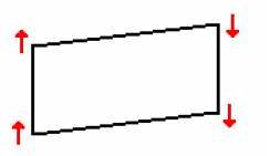
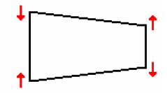
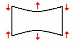
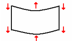
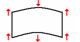
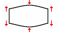
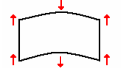
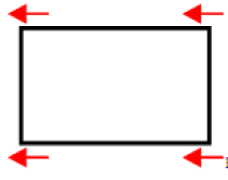
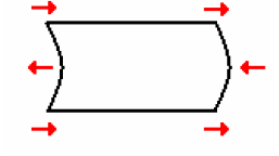
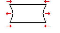
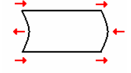
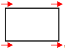
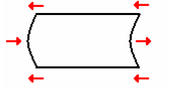
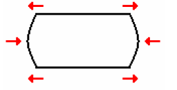
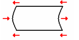
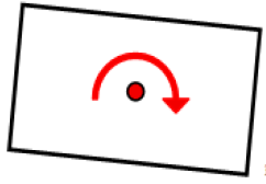
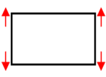
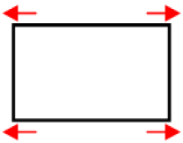
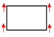
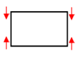
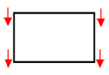
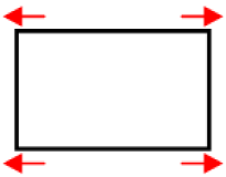
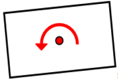
An adjustment is specified by a mode and a delta. Mode defines the way of the distortion, delta defines the amount. The following modes are available:
- Parallelogram
- Trapezoid
- Pin balance
- Pincushion
- Shift
- Width
- Height
- Rotation (around bitmap image center point)
For each reference point and corresponding shift vector, the adjustment is computed and applied. The resulting shift vector is again cached in the warping library. This way of implementation allows incremental adjustments.
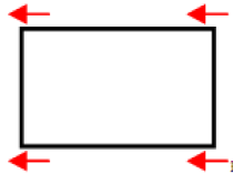
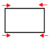
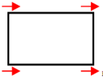
Following are tables detailing supported adjustments:
| Mode Direction |
Trapezoid | Parallelogram | Pincushion | Pin balance |
|---|---|---|---|---|
| Up |
 |
 |
|
|
|
|
 |
|
|
|
| Left |
|
|
|
|
| Right |
|
|
|
|
| Mode Direction |
Height | Width | Rotation | Shift |
|---|---|---|---|---|
| Up |
|
|
|
|
| Down |
|
|
||
| Left |
|
|
|
|
| Right |
|
 |
|
Enabling Warping
Following are the display settings required to enable warping in Candera:
- Enable warping
- Set warp matrix
- Set warp image bounds
- Apply display settings
Candera’s Display class uses a transaction based execution model for setting properties. Several changes can be queued. Changes have to be applied explicitly via a call to Display::ApplyChanges(). Warping matrix data from the warping library can be used directly in Candera.
Warping Sequence
- Distribute reference points over the bitmap according to the specifications in the parameter list. Parameterized through: Bitmap Area and the associated Bitmap Area Shift
- Bitmap predistortion (warping) Parameterized through: the active Parameter Set
- Rotate predistorted image data according to the parameter list. The rotation of the warped reference points must take place around the center point of the warped bitmap. Parameterized through: rotation of the warping area and warped bitmap area center point.
- Shift rotated and warped image data according to the parameter list. Parameterized through: shift of warped bitmap area center point.
- Display warped, rotated and shifted image data on the display
Warping Library API
The public interface of the Warping Library is presented below:
| Method | Parameters |
|---|---|
| en_warp_result_t CalculateWarpMatrix()
|
|
| en_warp_result_t AdjustWarpMatrix()
|
|
| en_warp_result_t GetRefPoints()
|
|
| en_warp_result_t ComputeWarpImageBoundsFromConfig()
|
|
Warping Candera API
| Methods |
|---|
| void SetWarpMatrix(WarpMatrix &warpMatrix, UInt index=0) |
| const WarpMatrix & GetWarpMatrix(UInt index=0) const |
| void ResetWarpMatrix(UInt index) |
| void SetWarpMatrixWeight(UInt index, Float weight) |
| Float GetWarpMatrixWeight(UInt index) const |
| void SetWarpImageBounds(Rectangle &warpImageBounds) |
| const Rectangle & GetWarpImageBounds() const |
| void SetWarpOrientation(DisplayOrientation::Enum orientation) |
| DisplayOrientation::Enum GetWarpOrientation() const |
| bool SetWarpingEnabled(bool isEnabled) |
| bool IsWarpingEnabled() const |
RenderTarget Alpha Blending
Using the icons in the toolbar the user can switch between "Normal Scene Editor Rendering" and "Alpha Blending Scene Editor Rendering".

The alpha blending render mode shows the check pattern in the background. The actual scene is rendered to an offscreen buffer and then blended against the background, that displays the check pattern.

This approach enables the user to immediately test certain blend settings.