# Input Handling

# Touch Input Handling

#### <a class="anchor" id="bkmrk--6"></a>Description

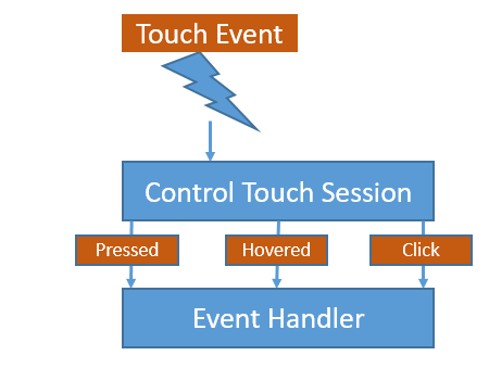
This chapter gives a detailed, technical overview of how the user touch input is handled internally which is important to understand further concepts like the Control States. The base part therefore is the [CgiStudioControl::ControlTouchSession](http://dev.doc.cgistudio.at/APILINK/class_cgi_studio_control_1_1_control_touch_session.html) which handles the TouchEvent and emits several Events received by Controls with a Handle Control State Behavior (e.g. <span style="color: rgb(230, 126, 35);">[Control States](https://doc316en.candera.eu/books/controls-and-behaviors/page/control-states "Control States")</span>).

<div drawio-diagram="1484"><img src="https://doc316en.candera.eu/uploads/images/drawio/2023-02/drawing-4-1676536656.png" alt=""/></div>

<div class="contents" id="bkmrk--0"><div class="contents"><div class="textblock">  
</div></div></div>#### <a class="anchor" id="bkmrk--8"></a>Touch Event

The Touch Event is emitted by [Courier](http://dev.doc.cgistudio.at/APILINK/namespace_courier.html) and contains TouchInfo with following states:

<div class="contents" id="bkmrk-move-down-up-hover-t"><div class="contents"><div class="textblock">- Move
- Down
- Up
- Hover

</div><div class="textblock"><dl class="note"><dd><p class="callout info">Touch input can be tested with the Player which reacts to mouse input and emits Touch Events.</p>

</dd></dl></div></div></div>#### <a class="anchor" id="bkmrk--9"></a>ControlTouchSession

To simplify the process especially for Control developers, the states of a TouchInfo are mapped to several, more specific Events. Therefore the ControlTouchSession generates kind of virtual input events in the sense that a combination of touch events result in a new input event (e.g. Touch Down and Touch Up on the same Control leads to a Click Event). To be able to generate these events and to send them to the right Control the ControlTouchSession contains a list to register all Control State Behaviors. So be sure that each Control which should be handled by the Control Touch Session has to contain a Control State Behavior. For each of the following events it is important to know that the events are generated by the ControlTouchSession but they are dispatched from the Control which gets touched. To understand how Events get sent also check chapter <span style="color: rgb(230, 126, 35);">[Behaviors and Events](https://doc316en.candera.eu/books/controls-and-behaviors/page/behaviors-and-events "Behaviors and Events")</span> .

<div class="contents" id="bkmrk-controls-must-have-a"><div class="contents"><div class="textblock"><dl class="note"><dd><p class="callout info">Controls must have a Handle Control State Behavior to receive Events from the Control Touch Session even if the Event is not sent locally to this Behavior (e.g. the Click Event).</p>

</dd><dd></dd></dl></div></div></div>#### <a class="anchor" id="bkmrk--10"></a>Pressed Event

Basically the Pressed Event which has two different states is triggered by the users touch down (state: Pressed) or by the users touch up (state: Released).   
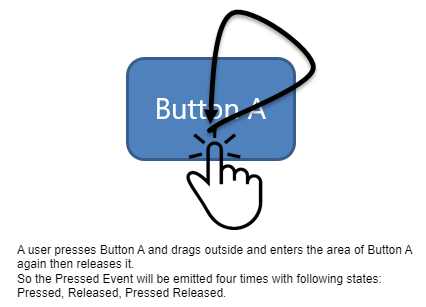
Furthermore the TouchSession reacts to the move of the touch. So if the touch moves and the primarily touched Control is not touched any longer, the ControlTouchSession emits a Pressed Event with the state Released.   
If the touch is still down and enters the primarily touched Control, the TouchSession again emits a Pressed Event with the state Pressed.

<div drawio-diagram="1488"><img src="https://doc316en.candera.eu/uploads/images/drawio/2023-02/drawing-4-1676536784.png" alt=""/></div>

<div class="contents" id="bkmrk--2"><div class="contents"><div class="textblock">  
</div></div></div>In many cases, especially concerning Controls, the Pressed Event gets received by the Handle Control State Behavior (see chapter <span style="color: rgb(230, 126, 35);">[Control States](https://doc316en.candera.eu/books/controls-and-behaviors/page/control-states "Control States")</span>).

The Handle Control State Behavior even receives the Event via Local Dispatch Strategy (see <span style="color: rgb(230, 126, 35);">[Behaviors and Events](https://doc316en.candera.eu/books/controls-and-behaviors/page/behaviors-and-events "Behaviors and Events")</span>). But the Event also gets dispatched via BubbleStrategy from the Control which enables other Behaviors of the Control to receive the event (e.g. PressedCondition).

#### <a class="anchor" id="bkmrk--12"></a>Hovered Event

Emitting the Hovered Event works similar to the Pressed Event. But in difference to the Pressed Event the Hovered Event has an additional state in case of keep hovering over the same object.

Additionally the Event is emitted when the Hover leaves the currently hovered object (**HoverLeave**) and when the Hover enters and object (**HoverEnter**).   
As for the Pressed Event also the Hover Event basically gets received by the Handle Control State Behavior (see chapter [Control States](http://dev.doc.cgistudio.at/APILINK/_p_i_d_control_states.html)). But the Event can also be received by another Behavior like the HoveredCondition.

#### <a class="anchor" id="bkmrk--13"></a>Click Event

As the previously described Events also the Click Event is generated by the ControlTouchSession but it is dispatched from the Control which gets clicked.   
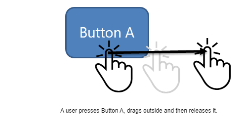
But different to the PressedEvent and the HoveredEvent, the ClickEvent is not sent to the Handle Control State Behavior via Local Dispatch Strategy as it is not relevant for the states of a Control. But again the Event gets dispatched from the Handle Control State Behavior which enables the user to directly react on the Event via an EventHandler (also see <span style="color: rgb(230, 126, 35);">[EventHandler Tab](https://doc316en.candera.eu/books/controls-and-behaviors/page/eventhandler-tab "EventHandler Tab")</span>). Furthermore it is important to know that the Click Event is emitted only on release of the touch point. Moreover the the Control of the touch down must be the same as the Control of the touch up. So following example would not trigger a Click Event:

<div drawio-diagram="1490"><img src="https://doc316en.candera.eu/uploads/images/drawio/2023-02/drawing-4-1676536828.png" alt=""/></div>

<div class="contents" id="bkmrk--4"><div class="contents"><div class="textblock">  
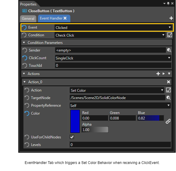
</div></div></div>The Click Event is often used in combination with a [<span style="color: rgb(230, 126, 35);">EventHandler Tab</span>](https://doc316en.candera.eu/books/controls-and-behaviors/page/eventhandler-tab "EventHandler Tab") as shown below:

<div drawio-diagram="1492"><img src="https://doc316en.candera.eu/uploads/images/drawio/2023-02/drawing-4-1676536878.png" alt=""/></div>

<div class="contents" id="bkmrk-be-sure-to-read-chap"><div class="textblock"><dl class="note"><dt></dt><dd><p class="callout info">Be sure to read chapter <span style="color: rgb(230, 126, 35);">[Control States](https://doc316en.candera.eu/books/controls-and-behaviors/page/control-states "Control States")</span> and <span style="color: rgb(230, 126, 35);">[Control Examples](https://doc316en.candera.eu/books/controls-and-behaviors/page/control-examples "Control Examples")</span> to see how the described Events can be used.</p>

</dd></dl></div></div>

# Focus Management

#### <a class="anchor" id="bkmrk--7"></a>Focus Navigation on Computer

The user of the created HMI wants to move the focus from one control to another. When using the computer, usually a keyboard is used for focus navigation.

On a computer, the user can use the following keys to move the focus from one control to the other:

<div class="contents" id="bkmrk---tab-move-the-focus"><div class="contents"><div class="textblock"><table border="0"><tbody><tr><td>**- TAB** </td><td>move the focus to the next control</td></tr><tr><td>**- CTRL + TAB** </td><td>move the focus to the previous control</td></tr></tbody></table>

</div></div></div>On targets without a keyboard, different input methods can be used for changing the focused control. Automotive targets use the rotary for focus navigation. Therefore, focus navigation is only loosely coupled with a keyboard.

---

#### <a class="anchor" id="bkmrk--8"></a>Focus Navigation in CGI Studio

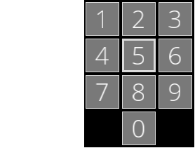
This section uses a phone keypad like the one below to demonstrate the focus changes.

<div drawio-diagram="1495"><img src="https://doc316en.candera.eu/uploads/images/drawio/2023-02/drawing-4-1676537028.png" alt=""/></div>

<div class="contents" id="bkmrk--1"><div class="contents"><div class="textblock"><div class="image">  
</div></div></div></div>The focused button in the example keypad above is the fifth button (Button 5), whose border is significantly wider.

Focus navigation can be performed in the Player. To start the Player click the play button next to "Generate and Play" in the toolbar below the menubar.

<div drawio-diagram="1496"><img src="https://doc316en.candera.eu/uploads/images/drawio/2023-02/drawing-4-1676537050.png" alt=""/></div>

<div class="contents" id="bkmrk--3"><div class="contents"><div class="textblock"><div class="image">  
</div><div class="image"></div></div></div></div>##### <a class="anchor" id="bkmrk--11"></a>Next/Previous Navigation in CGI Studio

**Next Navigation:** After selecting a focusable control the focus can be moved to the next focusable control by pressing the **TAB** key of the keyboard. If you repeat pressing the TAB key, the focus will move to the next until the last focusable node is reached. Pressing TAB on the last focusable node will bring the focus back to the first node again.  
Focus order when continuing pressing the TAB key: 5-6-7-8-9-0-1-2-3-4-5-6-7-...

**Previous:** To navigate the focus back to the previous focusable control, press the **CTRL + TAB** keys on the keyboard. If you repeat pressing the CTRL + TAB keys, the focus will move to the previous until the first focusable node is reached. Pressing CTRL + TAB on the first focusable node will bring the focus back to the last node.  
Focus order when continuing pressing the CTRL + TAB keys: 5-4-3-2-1-0-9-8-7-6-5-4-3-2-1-...

<div class="contents" id="bkmrk-if-no-focusable-cont"><div class="contents"><div class="textblock"><dl class="note"><dd><p class="callout info">If no focusable control has the focus and a key that navigates the focus (e.g. a key of the cursor control pad or the TAB key) is pressed, the focusable control that has the lowest TAB-order gets the focus.</p>

</dd><dd></dd></dl></div></div></div>##### <a class="anchor" id="bkmrk--12"></a>Geometrical Navigation in CGI Studio

Geometrical Navigation means a navigation in one of the following directions: Left, Right, Up, Down, Up Left, Up Right, Down Left, Down Right  
On the computer, navigations in those directions can be performed using the cursor control pad or the numeric pad (for diagonal navigation) of the keyboard.

The following describes the focus change that happens when repeatedly clicking the noted navigation key in the example keypad above. Initally, for every noted navigation key, the focus is on the fifth focusable control as in the image of the keypad above.

<div class="contents" id="bkmrk-navigate-left%3A-5-4-n"><div class="contents"><div class="contents"><div class="textblock"><table border="0" style="width: 42.963%;"><tbody><tr><td rowspan="2" style="width: 71.1816%;">- **Navigate Left:** 5-4
- **Navigate Right:** 5-6
- **Navigate Up:** 5-2
- **Navigate Down:** 5-8-0

</td><td style="width: 14.4092%;">[![focus_left.png](https://doc316en.candera.eu/uploads/images/gallery/2023-02/scaled-1680-/focus-left.png)](https://doc316en.candera.eu/uploads/images/gallery/2023-02/focus-left.png)

</td><td style="width: 14.4092%;">[![focus_right.png](https://doc316en.candera.eu/uploads/images/gallery/2023-02/scaled-1680-/focus-right.png)](https://doc316en.candera.eu/uploads/images/gallery/2023-02/focus-right.png)

</td></tr><tr><td style="width: 14.4092%;">[![focus_up.png](https://doc316en.candera.eu/uploads/images/gallery/2023-02/scaled-1680-/focus-up.png)](https://doc316en.candera.eu/uploads/images/gallery/2023-02/focus-up.png)

</td><td style="width: 14.4092%;">[![focus_down.png](https://doc316en.candera.eu/uploads/images/gallery/2023-02/scaled-1680-/focus-down.png)](https://doc316en.candera.eu/uploads/images/gallery/2023-02/focus-down.png)

</td></tr><tr><td rowspan="2" style="width: 71.1816%;">- **Navigate UpLeft:** 5-1
- **Navigate UpRight:** 5-3
- **Navigate DownLeft:** 5-7
- **Navigate DownRight:** 5-9

</td><td style="width: 14.4092%;">[![focus_upleft.png](https://doc316en.candera.eu/uploads/images/gallery/2023-02/scaled-1680-/focus-upleft.png)](https://doc316en.candera.eu/uploads/images/gallery/2023-02/focus-upleft.png)

</td><td style="width: 14.4092%;">[![focus_upright.png](https://doc316en.candera.eu/uploads/images/gallery/2023-02/scaled-1680-/focus-upright.png)](https://doc316en.candera.eu/uploads/images/gallery/2023-02/focus-upright.png)

</td></tr><tr><td style="width: 14.4092%;"></td><td style="width: 14.4092%;">[![focus_downright.png](https://doc316en.candera.eu/uploads/images/gallery/2023-02/scaled-1680-/focus-downright.png)](https://doc316en.candera.eu/uploads/images/gallery/2023-02/focus-downright.png)

</td></tr></tbody></table>

</div></div></div></div><div class="contents" id="bkmrk--4"><div class="contents"><div class="textblock">---

</div></div></div>#### <a class="anchor" id="bkmrk--13"></a>Managing the Focusable Nodes

Each keyboard focusable behavior notifies the KeyboardFocusManager about its view getting activated or deactivated.

<div class="contents" id="bkmrk-registernavigation-i"><div class="contents"><div class="contents"><div class="textblock">- *RegisterNavigation* is called when the view gets activated.
- *DeregisterNavigation* is called when the view gets deactivated.

</div></div></div></div><div class="contents" id="bkmrk--5"><div class="contents"><div class="textblock">---

</div></div></div>#### <a class="anchor" id="bkmrk--14"></a>Concept of the Next/Previous Navigation

The logical order of the focusable nodes is defined by the following criteria:

<div class="contents" id="bkmrk-the-tab-order-of-its"><div class="contents"><div class="textblock">1. The tab order of its scene: This order is stored as a dynamic property and can be set by a *KeyboardFocusTabOrderBehavior*.
2. The asset order of its scene: This order is defined by the order in which the scene is stored in the asset.
3. Its tab order: This order is stored as a dynamic property and can be set by a *KeyboardFocusTabOrderBehavior*.
4. Its tree order: The tree order in pre-order tree traversal.

</div></div></div>**KeyboardFocusTabOrderBehavior**  
The tab order of a node is defined as relative or absolute. The default order is *relative*.

<div class="contents" id="bkmrk-relative-considering"><div class="contents"><div class="textblock">- *relative* considering the parent inherited tab order
- *absolute* will stop the inherited tab order

</div></div></div>The next/previous navigation updates the logical order for each next/previous navigation event and sorts the focusable nodes, finds the currently focused node in that list and transfers the focus to the next/previous entry in the list.

<div class="contents" id="bkmrk--6"><div class="contents"><div class="textblock">---

</div></div></div>#### <a class="anchor" id="bkmrk--15"></a>Concept of the Geometrical Navigation (Left, Right, Up, Down, Up Left, Up Right, Down Left, Down Right)

For each geometrical navigation event the bounding box in the display of the node is calculated per camera in the scene. Each keyboard focusable node has one entry in the lookup list for each camera.

The keyboard focused node is extended by the camera that is responsible for the focus. A scene may have several cameras and the focus will be caused by one of them.

The following events may trigger a change of the keyboard focus:

<div class="contents" id="bkmrk-navigate-to-the-left"><div class="contents"><div class="textblock"><table border="0"><tbody><tr><td rowspan="2">- Navigate to the Left
- Navigate to the Right
- Navigate Up
- Navigate Down

</td><td>[![focus_left.png](https://doc316en.candera.eu/uploads/images/gallery/2023-02/scaled-1680-/focus-left.png)](https://doc316en.candera.eu/uploads/images/gallery/2023-02/focus-left.png)

</td><td>[![focus_right.png](https://doc316en.candera.eu/uploads/images/gallery/2023-02/scaled-1680-/focus-right.png)](https://doc316en.candera.eu/uploads/images/gallery/2023-02/focus-right.png)

</td></tr><tr><td>[![focus_up.png](https://doc316en.candera.eu/uploads/images/gallery/2023-02/scaled-1680-/focus-up.png)](https://doc316en.candera.eu/uploads/images/gallery/2023-02/focus-up.png)

</td><td>[![focus_down.png](https://doc316en.candera.eu/uploads/images/gallery/2023-02/scaled-1680-/focus-down.png)](https://doc316en.candera.eu/uploads/images/gallery/2023-02/focus-down.png)

</td></tr><tr><td rowspan="2">- Navigate to the UpLeft direction
- Navigate to the UpRight direction
- Navigate to the DownLeft direction
- Navigate to the DownRight direction

</td><td style="width: 14.4092%;">[![focus_upleft.png](https://doc316en.candera.eu/uploads/images/gallery/2023-02/scaled-1680-/focus-upleft.png)](https://doc316en.candera.eu/uploads/images/gallery/2023-02/focus-upleft.png)

</td><td style="width: 14.4092%;">[![focus_upright.png](https://doc316en.candera.eu/uploads/images/gallery/2023-02/scaled-1680-/focus-upright.png)](https://doc316en.candera.eu/uploads/images/gallery/2023-02/focus-upright.png)

</td></tr><tr><td style="width: 14.4092%;">[![focus_downleft.png](https://doc316en.candera.eu/uploads/images/gallery/2023-02/scaled-1680-/focus-downleft.png)](https://doc316en.candera.eu/uploads/images/gallery/2023-02/focus-downleft.png)

</td><td style="width: 14.4092%;">[![focus_downright.png](https://doc316en.candera.eu/uploads/images/gallery/2023-02/scaled-1680-/focus-downright.png)](https://doc316en.candera.eu/uploads/images/gallery/2023-02/focus-downright.png)

</td></tr></tbody></table>

<table border="0"><tbody><tr><td><div class="image"><div class="image">[![focus_left.png](https://doc316en.candera.eu/uploads/images/gallery/2023-02/scaled-1680-/RKnfocus-left.png)](https://doc316en.candera.eu/uploads/images/gallery/2023-02/RKnfocus-left.png)  
</div></div></td><td>**Navigate to the Left:**</td></tr></tbody></table>

</div></div></div>1\. Find the nearest node of the nodes that are at least partially within the top and the bottom boundary of the keyboard focused node. The distance of the right node boundary to the left boundary of the keyboard focused node is minimal. Limit the right node boundary to the left boundary of the keyboard focused node. For multiple matches use the same order criteria as for the previous/next navigation and take the first one.  
2\. If no node was found, find the nearest node (where the corner to corner distance is minimal) of the nodes that intersect the left sectors:

<div class="contents" id="bkmrk-corner-to-corner-dis"><div class="contents"><div class="textblock">- corner to corner distance for nodes in the top left sector: take the node's bottom right corner (limit that corner to the left boundary of the keyboard focused node) and the keyboard focused node top left corner and calculate the square distance.
- corner to corner distance for nodes in the bottom left sector: take the node's top right corner (limit that corner to the left boundary of the keyboard focused node) and the keyboard focused node bottom left corner and calculate the square distance.
- All other sectors are not on the left of the keyboard focused node.
- For multiple matches use the same order criteria as for the previous/next navigation and take the first one.

<table border="0"><tbody><tr><td>[![focus_right.png](https://doc316en.candera.eu/uploads/images/gallery/2023-02/scaled-1680-/Erufocus-right.png)](https://doc316en.candera.eu/uploads/images/gallery/2023-02/Erufocus-right.png)

</td><td>**Navigate to the Right:**</td></tr></tbody></table>

</div></div></div>The same as navigation to the left but in this case, left is right, right is left, top is top and bottom is bottom in the description. Imagine a mirrored image.

<div class="contents" id="bkmrk-navigate-up%3A"><div class="contents"><div class="textblock"><table border="0"><tbody><tr><td>[![focus_up.png](https://doc316en.candera.eu/uploads/images/gallery/2023-02/scaled-1680-/9sWfocus-up.png)](https://doc316en.candera.eu/uploads/images/gallery/2023-02/9sWfocus-up.png)

</td><td>**Navigate Up:**</td></tr></tbody></table>

</div></div></div>The same as Left navigation but left is bottom, right is top, top is left and bottom is right in the description. This is a rotation by 90° counter clock wise

<div class="contents" id="bkmrk-navigate-down%3A"><div class="contents"><div class="textblock"><table border="0"><tbody><tr><td>[![focus_down.png](https://doc316en.candera.eu/uploads/images/gallery/2023-02/scaled-1680-/XmAfocus-down.png)](https://doc316en.candera.eu/uploads/images/gallery/2023-02/XmAfocus-down.png)

</td><td>**Navigate Down:**</td></tr></tbody></table>

</div></div></div>**Navigate Down:** The same as Left navigation but left is top, right is bottom, top is right and bottom is left in the description. Which is a rotation by 90° clock wise.

<div class="contents" id="bkmrk-navigate-to-the-uple"><div class="contents"><div class="textblock"><table border="0"><tbody><tr><td>[![focus_upleft.png](https://doc316en.candera.eu/uploads/images/gallery/2023-02/scaled-1680-/UmJfocus-upleft.png)](https://doc316en.candera.eu/uploads/images/gallery/2023-02/UmJfocus-upleft.png)

</td><td>**Navigate to the UpLeft direction:**</td></tr></tbody></table>

</div></div></div>Find the nearest node (corner to corner distance is minimal) of the nodes the intersect the top left sector:

<div class="contents" id="bkmrk-corner-to-corner-dis-0"><div class="contents"><div class="textblock">- corner to corner distance: take the node's bottom right corner (limit that corner to the left and top boundary of the keyboard focused node) and the keyboard focused node top left corner and calculate the square distance.
- For multiple matches use the same order criteria as for the previous/next navigation and take the first one.

<table border="0"><tbody><tr><td>[![focus_upright.png](https://doc316en.candera.eu/uploads/images/gallery/2023-02/scaled-1680-/2sZfocus-upright.png)](https://doc316en.candera.eu/uploads/images/gallery/2023-02/2sZfocus-upright.png)

</td><td>**Navigate to the UpRight direction:**</td></tr></tbody></table>

</div></div></div>The same as UpLeft navigation but left is right, right is left, top is top and bottom is bottom in the description. Imagine a mirrored image.

<div class="contents" id="bkmrk-navigate-to-the-down"><div class="contents"><div class="textblock"><table border="0"><tbody><tr><td>[![focus_downleft.png](https://doc316en.candera.eu/uploads/images/gallery/2023-02/scaled-1680-/Ub1focus-downleft.png)](https://doc316en.candera.eu/uploads/images/gallery/2023-02/Ub1focus-downleft.png)

</td><td>**Navigate to the DownLeft direction:**</td></tr></tbody></table>

</div></div></div>The same as UpLeft navigation but left is bottom, right is top, top is left and bottom is right in the description. This is a rotation by 90° counter clock wise.

<div class="contents" id="bkmrk-navigate-to-the-down-0"><div class="contents"><div class="textblock"><table border="0"><tbody><tr><td>[![focus_downright.png](https://doc316en.candera.eu/uploads/images/gallery/2023-02/scaled-1680-/Seefocus-downright.png)](https://doc316en.candera.eu/uploads/images/gallery/2023-02/Seefocus-downright.png)

</td><td>**Navigate to the DownRight direction:**</td></tr></tbody></table>

</div></div></div>The same as UpLeft navigation but left is top, right is bottom, top is right and bottom is left in the description. This is a rotation by 90° clock wise.

# GestureDetector

#### <a class="anchor" id="bkmrk-"></a>How to implement a custom GestureDetector

The ControlTouchSession supports GestureDetectors. You simply register your own detector and register it at the ControlTouchSession.

<div class="contents" id="bkmrk-the-clickgesturedete"><div class="contents"><div class="textblock">- The ClickGestureDetector is one of the existing detectors. It detects click, drag and press related gestures.
- Since it only detects the gestures it is clear that the ControlTouchSession is the only place where it is referenced (and also only because it is registered by default).
- GestureDetector::OnEvent is the only interaction interface with the ControlTouchSession.

</div></div></div>The ControlTouchSession will send these events to the gesture detector:

#### <a class="anchor" id="bkmrk--0"></a>UpdateEvent

This event indicates an update iteration (one per frame)

#### <a class="anchor" id="bkmrk--1"></a>GestureDetector::TouchInput

This is a single/multi touch event extended by this information:

<div class="contents" id="bkmrk-the-state-of-the-ges"><div class="contents"><div class="textblock">1. The state of the gesture detector session (FirstDown, LastUp).
2. The behavior that has currently the touch focus (which is the touchable behavior that was hit by the first finger that touched the screen during a gesture detector session)
3. The behavior that is currently touched by the touch event (also updated by Drag).

</div></div></div>The following states of the gesture detector session are available:

<div class="contents" id="bkmrk-firstdown%3A-the-gestu"><div class="contents"><div class="textblock">- FirstDown: The gesture detector session begins when the first finger touches the screen.
- LastUp: The gesture detector session ends when the last finger is removed from the screen.

</div></div></div>In between you will get updates in the following cases:

<div class="contents" id="bkmrk-down%3A-another-finger"><div class="contents"><div class="textblock">- Down: another finger touched the screen
- Drag: a finger has been moved.
- Up: one finger has been removed from the screen. But at least one more is on the screen.

</div></div></div>#### <a class="anchor" id="bkmrk--2"></a>GestureDetector::AbortEvent

This event tells that another behavior has taken the exclusive touch control. Hence, no gesture detector will participate in the current gesture detector session and therefore has to reset all internal states and wait for the next session.

#### <a class="anchor" id="bkmrk--3"></a>GestureDetector::DeregisterEvent

The provided behavior is removed from the ControlTouchSession. Hence the gesture detector also has to remove all references to that behavior.

See also:

<div class="contents" id="bkmrk-check-click-check-dr"><div class="textblock">- <span style="color: rgb(230, 126, 35);">[Check Click](https://doc316en.candera.eu/link/597#bkmrk-check-click)</span>
- <span style="color: rgb(230, 126, 35);">[Check Drag Drop](https://doc316en.candera.eu/link/597#bkmrk-check-drag-drop)</span>
- <span style="color: rgb(230, 126, 35);">[Check Hover](https://doc316en.candera.eu/link/597#bkmrk-check-hover)</span>
- <span style="color: rgb(230, 126, 35);">[Check Pressed](https://doc316en.candera.eu/link/597#bkmrk-check-pressed)</span>
- <span style="color: rgb(230, 126, 35);">[Swipe Gesture Condition](https://doc316en.candera.eu/link/597#bkmrk-swipe-gesture-condit)</span>
- <span style="color: rgb(230, 126, 35);">[Transform Gesture](https://doc316en.candera.eu/link/597#bkmrk-transform-gesture)</span>
- <span style="color: rgb(230, 126, 35);">[Transform Gesture Action](https://doc316en.candera.eu/link/582#bkmrk--8)</span>

</div></div>