# Use Controls

#### Use Controls

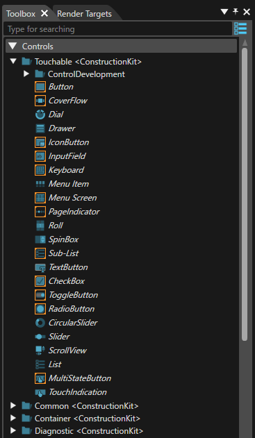
Controls are displayed in Toolbox panel from where they can be dropped into scenes which will result in control nodes.

<div drawio-diagram="7017"><img src="https://doc316en.candera.eu/uploads/images/drawio/2024-10/drawing-7-1729124703.png" alt=""/></div>

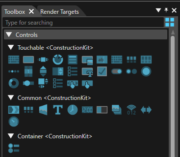
<div class="contents" id="bkmrk--2"><div class="contents"></div></div>A "Show Controls as Big Icons/List" button is available in the upper right corner. If this button is used, a different presentation mode - as icons instead of a text list of items - will be made available (see the image below).

<div drawio-diagram="7018"><img src="https://doc316en.candera.eu/uploads/images/drawio/2024-10/drawing-7-1729130157.png" alt=""/></div>

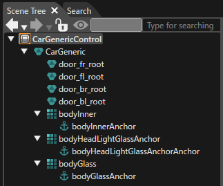
<div class="contents" id="bkmrk--0"><div class="contents"></div></div>The Scene Tree panel of a scene lists a control node as a single entity with all the anchors defined as children.

<div class="contents" id="bkmrk--5"><div class="contents"><div class="textblock"><div drawio-diagram="7019"><img src="https://doc316en.candera.eu/uploads/images/drawio/2024-10/drawing-7-1729130207.png" alt=""/></div>

</div></div></div>New content (other nodes) can be added from the Import or Toolbox panels to anchors by dropping a new node over an anchor and editing it in the Properties panel as usual.

#### Control Properties

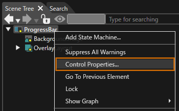
By using the context menu the "Configure Public Control Properties" panel will get opened. This can be done by selecting the "Control Properties..." operation from the context menu.

<div class="contents" id="bkmrk-the-%22configure-prope"><div class="contents"><div class="contents"><div class="textblock"><dl class="note"><dd><p class="callout info">The "Configure Public Control Properties" panel can be opened just when a control scene is selected - as can be seen in the image below.</p>

</dd></dl></div></div></div></div><div drawio-diagram="7020"><img src="https://doc316en.candera.eu/uploads/images/drawio/2024-10/drawing-7-1729130308.png" alt=""/></div>

<div class="contents" id="bkmrk--8"><div class="contents"></div></div>In this way, a new dialog "Configure Public Control Properties" opens where the user can choose which properties of the widget should be available (i.e. public) in the control.

<div class="contents" id="bkmrk-all-the-properties-o"><div class="contents"><div class="textblock"><dl class="note"><dt></dt><dd><p class="callout info">All the properties of those control nodes (i.e. instances of controls) which are present within a control scene - in conjunction with behaviors and widgets - are displayed in the "Configure Public Control Properties" dialog</p>

</dd><dd></dd></dl></div></div></div>If necessary, the user can use the fields available under the "Name" and "Tooltip" sections to introduce any useful piece of information. The values filled by the user in the "Configure Public Control Properties" dialog will be visible in the "Properties" panel.
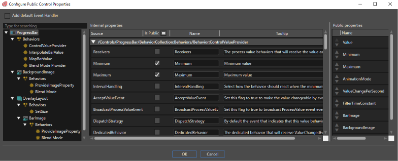
<div class="contents" id="bkmrk--9"><div class="contents"><div class="textblock"><div drawio-diagram="7021"><img src="https://doc316en.candera.eu/uploads/images/drawio/2024-10/drawing-7-1729130387.png" alt=""/></div>

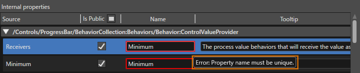
</div></div></div>All the name of the properties have to be distinct/different. If not, a "Property name must be unique." warning message will be displayed.

<div class="contents" id="bkmrk--10"><div class="contents"><div class="textblock"><div drawio-diagram="7026"><img src="https://doc316en.candera.eu/uploads/images/drawio/2024-10/drawing-7-1729132215.png" alt=""/></div>

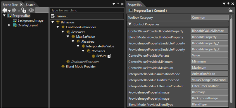
</div></div></div>If all the names are different, the properties which were selected as "public" will be displayed as public properties in the Properties panel. It is possible to remove any of these properties by using the "X" button.

<div class="contents" id="bkmrk--12"><div class="contents"><div class="textblock"><div drawio-diagram="7023"><img src="https://doc316en.candera.eu/uploads/images/drawio/2024-10/drawing-7-1729130677.png" alt=""/></div>

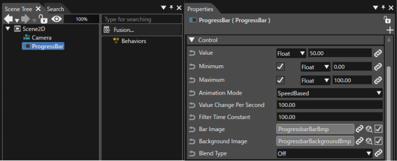
</div></div></div>If the control with public properties is used in a scene, those properties will be visible in the Properties panel, too.

<div class="contents" id="bkmrk--16"><div class="contents"><div class="textblock"><div drawio-diagram="7024"><img src="https://doc316en.candera.eu/uploads/images/drawio/2024-10/drawing-7-1729130864.png" alt=""/></div>

</div></div></div>When the control is used in a scene, any of the public properties can be set or modified but none of the properties can be removed.

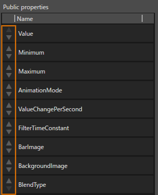
The display order of public properties in the property panel can be set in the \[ Public Control Property Configuration \] dialog. You can change the display order by clicking the button to the left of each property name displayed in the Public properties, or by dragging and dropping each property.

<div drawio-diagram="7025"><img src="https://doc316en.candera.eu/uploads/images/drawio/2024-10/drawing-7-1729131038.png" alt=""/></div>

#### Control Updates

When a control is being edited, the changes are reflected in all the scenes using that control.

---