# Core

The Core Controls are a set of [Controls](https://doc316en.candera.eu/books/controls-and-behaviors/chapter/predefined-controls "Predefined Controls"), designed to provide a minimal core set of functionality. Therefore, the Core Controls also reduce their size and provide increased performance, by limiting its feature set and reducing the number of used behaviors.

The Core Controls are designed for

- **Low-End Platforms**  
    Low memory footprint and increased performance by reduced feature set
- **Basis for custom Controls**  
    As the Core Controls cover basic features, it is easy possible to extend them for custom behavior (e.g. a specific custom behavior for a custom button) instead of stripping down a full featured Control

Please note, that the not all Controls have a Core Control variant, as it is not suitable for all available Controls.

#### CoreDial

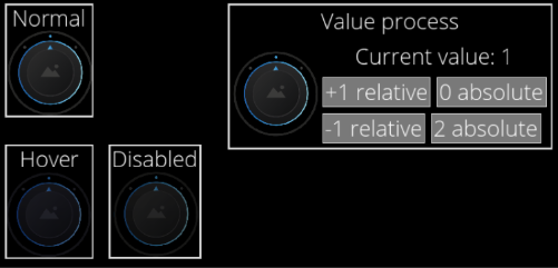
This control is used to set values within a specified range. Rotating the knob changes the value and updates the corresponding display. The degree of rotation is adjusted according to the configured Step Size and snaps to predefined positions. The knob's state is represented by displaying an image from the BackgroundImages list corresponding to the current value. For example, in a three-step rotation setup where the minimum rotation is -45 degrees, the maximum rotation is +45 degrees, and the step size is 45 degrees, three BackgroundImages need to be assigned. Additionally, values can be adjusted using specified keyboard keys (Increment Key Code, Decrement Key Code).

In the Core version, focus and color blending functionalities are not included, and the design is specialized for basic rotational operations.

<div drawio-diagram="7972"><img src="https://doc316en.candera.eu/uploads/images/drawio/2025-02/drawing-4-1739774950.png" alt=""/></div>

**Properties**

<table border="1" id="bkmrk-property-name-type-d-4" style="border-collapse: collapse; width: 100%; height: 428px;"><colgroup><col style="width: 25.0298%;"></col><col style="width: 25.0298%;"></col><col style="width: 50.0596%;"></col></colgroup><tbody><tr style="height: 29.6px;"><td style="height: 29.6px;">**Property Name**  
</td><td style="height: 29.6px;">**Type**  
</td><td style="height: 29.6px;">**Description**  
</td></tr><tr style="height: 46.4px;"><td style="height: 46.4px;">Enabled</td><td style="height: 46.4px;">bool</td><td style="height: 46.4px;">If set to false it will not react on focus events and does not have to support different visualizations for the different states.</td></tr><tr><td style="height: 46.5938px;">Focusable  
</td><td style="height: 46.5938px;">bool  
</td><td style="height: 46.5938px;">If true, the control is focusable. Otherwise the control can not be focused.</td></tr><tr style="height: 29.6px;"><td style="height: 29.6px;">Current Value  
</td><td style="height: 29.6px;">FeatStd::Int32</td><td style="height: 29.6px;">Current value for the dial.  
</td></tr><tr style="height: 29.6px;"><td style="height: 29.6px;">Step Size  
</td><td style="height: 29.6px;">FeatStd::Float</td><td style="height: 29.6px;">Step size in degrees.  
</td></tr><tr style="height: 29.6px;"><td style="height: 29.6px;">Minimum Rotation  
</td><td style="height: 29.6px;">FeatStd::Float</td><td style="height: 29.6px;">Minimum rotation of the dial.  
</td></tr><tr style="height: 29.6px;"><td style="height: 29.6px;">Maximum Rotation  
</td><td style="height: 29.6px;">FeatStd::Float</td><td style="height: 29.6px;">Maximum rotation of the dial.  
</td></tr><tr style="height: 35.2px;"><td style="height: 35.2px;">Knob Image  
</td><td style="height: 35.2px;">[Candera::Image2D](http://dev.doc.cgistudio.at/APILINK/class_candera_1_1_image2_d.html "Image2D encapsulates a surface handle which is retrieved when uploading an image.")</td><td style="height: 35.2px;">The image to set on the effect.  
</td></tr><tr style="height: 35.2px;"><td style="height: 35.2px;">BackgroundImages  
</td><td style="height: 35.2px;">[Candera::Image2D](http://dev.doc.cgistudio.at/APILINK/class_candera_1_1_image2_d.html "Image2D encapsulates a surface handle which is retrieved when uploading an image.")</td><td style="height: 35.2px;">A list of images which should be available for selection.</td></tr><tr style="height: 35.2px;"><td style="height: 35.2px;">Disabled Color  
</td><td style="height: 35.2px;">[Candera::Color](http://dev.doc.cgistudio.at/APILINK/class_candera_1_1_color.html)</td><td style="height: 35.2px;">The color which can be used from other Behaviors.  
</td></tr><tr style="height: 46.4px;"><td style="height: 46.4px;">Increment Key Code  
</td><td style="height: 46.4px;">Candera::KeyboardKeyCode::Enum</td><td style="height: 46.4px;">Check the KeyCode of the pressed key (can also be modifier).  
</td></tr><tr style="height: 46.4px;"><td style="height: 46.4px;">Decrement Key Code  
</td><td style="height: 46.4px;">Candera::KeyboardKeyCode::Enum</td><td style="height: 46.4px;">Check the KeyCode of the pressed key (can also be modifier).

</td></tr></tbody></table>

#### CoreRoll

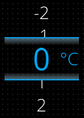
CoreRoll is a control that provides an interface for displaying numeric values as a vertical list within a defined range, allowing users to select or change values. The current value is emphasized in the center "lens" area. An option for changing via touch, pointer is kept, but the keyboard input has been removed to optimize the control. It is optimized for lightweight and intuitive UI implementations that focus on numeric display and selection. Essential visual customizations, such as color, font style, lens display control, and unit text settings, are retained.

<div drawio-diagram="8458"><img src="https://doc316en.candera.eu/uploads/images/drawio/2025-06/drawing-4-1749888897.png" alt=""/></div>

**Properties**

<table border="1" id="bkmrk-property-name-type-d-12" style="border-collapse: collapse; width: 100%; height: 1076.93px;"><colgroup><col style="width: 24.9588%;"></col><col style="width: 29.4069%;"></col><col style="width: 45.5931%;"></col></colgroup><tbody><tr style="height: 29.4667px;"><td style="height: 29.4667px;">**Property Name**  
</td><td style="height: 29.4667px;">**Type**  
</td><td style="height: 29.4667px;">**Description**  
</td></tr><tr style="height: 46.2667px;"><td style="width: 21.508%; height: 46.2667px;">Focusable  
</td><td style="width: 28.9203%; height: 46.2667px;">bool  
</td><td style="width: 49.5716%; height: 46.2667px;">If true, the control is focusable. Otherwise the control cannot be focused.  
</td></tr><tr style="height: 29.4667px;"><td style="width: 21.508%; height: 29.4667px;">Value</td><td style="width: 28.9203%; height: 29.4667px;">Float</td><td style="width: 49.5716%; height: 29.4667px;">The value which will be changed using the roll</td></tr><tr style="height: 46.2667px;"><td style="width: 21.508%; height: 46.2667px;">Min</td><td style="width: 28.9203%; height: 46.2667px;">Float</td><td style="width: 49.5716%; height: 46.2667px;">The minimum value which can be reached. This value is always smaller or equal to the MaxValue.</td></tr><tr style="height: 46.2667px;"><td style="width: 21.508%; height: 46.2667px;">Max</td><td style="width: 28.9203%; height: 46.2667px;">Float</td><td style="width: 49.5716%; height: 46.2667px;">The maximum value which can be reached. This value is always bigger or equal to MinValue</td></tr><tr style="height: 29.4667px;"><td style="width: 21.508%; height: 29.4667px;">Step</td><td style="width: 28.9203%; height: 29.4667px;">Float</td><td style="width: 49.5716%; height: 29.4667px;">The increment/decrement of the value.</td></tr><tr style="height: 46.2667px;"><td style="width: 21.508%; height: 46.2667px;">LensVisible</td><td style="width: 28.9203%; height: 46.2667px;">bool</td><td style="width: 49.5716%; height: 46.2667px;">Is lens group visible? Enables highlighting of the current value, default zooming and bordering it.   
</td></tr><tr style="height: 46.2667px;"><td style="width: 21.508%; height: 46.2667px;">Use Cyclic Roll</td><td style="width: 28.9203%; height: 46.2667px;">bool</td><td style="width: 49.5716%; height: 46.2667px;">Is roll cyclic? If true the MinValue of the Control can be reached after the MaxValue of the Control and vice versa</td></tr><tr style="height: 124.667px;"><td style="width: 21.508%; height: 124.667px;">Allow Dragging Past Limit</td><td style="width: 28.9203%; height: 124.667px;">bool</td><td style="width: 49.5716%; height: 124.667px;">Allow temporary over-dragging (dragging to blank values before first and after last entry).

If true there is visible animation of the Control being „out of range“ while moving below minimum and above maximum value.

</td></tr><tr style="height: 29.4667px;"><td style="width: 21.508%; height: 29.4667px;">Value Style</td><td style="width: 28.9203%; height: 29.4667px;">Candera::TextRendering::Style</td><td style="width: 49.5716%; height: 29.4667px;">Sets the text style for the values outside the Lens.</td></tr><tr style="height: 46.2667px;"><td style="width: 21.508%; height: 46.2667px;">Value Color</td><td style="width: 28.9203%; height: 46.2667px;">[Candera::Color](http://dev.doc.cgistudio.at/APILINK/class_candera_1_1_color.html)</td><td style="width: 49.5716%; height: 46.2667px;">Specifies color of values in the vertical list outside the Lens</td></tr><tr style="height: 29.4667px;"><td style="width: 21.508%; height: 29.4667px;">Lens Style</td><td style="width: 28.9203%; height: 29.4667px;">Candera::TextRendering::Style</td><td style="width: 49.5716%; height: 29.4667px;">Sets the text style for the values inside the Lens.</td></tr><tr style="height: 46.2667px;"><td style="width: 21.508%; height: 46.2667px;">Unit Text</td><td style="width: 28.9203%; height: 46.2667px;">String</td><td style="width: 49.5716%; height: 46.2667px;">Text used in lens (it means: when the lens is used at all) to present a unit of the value</td></tr><tr style="height: 29.4667px;"><td style="width: 21.508%; height: 29.4667px;">Unit Style</td><td style="width: 28.9203%; height: 29.4667px;">Candera::TextRendering::Styler</td><td style="width: 49.5716%; height: 29.4667px;">Sets the text style for the Unit Text.</td></tr><tr style="height: 35.0667px;"><td style="width: 21.508%; height: 35.0667px;">Unit Margin</td><td style="width: 28.9203%; height: 35.0667px;">[Candera::Margin](http://dev.doc.cgistudio.at/APILINK/class_candera_1_1_margin.html "A non-zero margin applies space outside the element layout's width and height. The values can be set ...")</td><td style="width: 49.5716%; height: 35.0667px;">Specifies margin of the UnitText</td></tr><tr style="height: 29.4667px;"><td style="width: 21.508%; height: 29.4667px;">Unit Color</td><td style="width: 28.9203%; height: 29.4667px;">[Candera::Color](http://dev.doc.cgistudio.at/APILINK/class_candera_1_1_color.html)</td><td style="width: 49.5716%; height: 29.4667px;">Specifies color of the UnitText</td></tr><tr style="height: 35.0667px;"><td style="width: 21.508%; height: 35.0667px;">Decoration Image</td><td style="width: 28.9203%; height: 35.0667px;">[Candera::Image2D](http://dev.doc.cgistudio.at/APILINK/class_candera_1_1_image2_d.html "Image2D encapsulates a surface handle which is retrieved when uploading an image.")</td><td style="width: 49.5716%; height: 35.0667px;">Specifies a border image of the Lens</td></tr></tbody></table>


#### CoreSpinBox

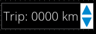
CoreSpinBox is a control that allows users to increment or decrement numeric values using up/down arrow buttons. The values can be modified via the arrow buttons only and The option for changing the values via keyboard inputs has been removed to optimize the control, with support for basic parameters such as minimum, maximum, and step size.  
This control prioritizes simplified visual presentation and user interaction. Compared to <span style="color: rgb(230, 126, 35);">[SpinBox](https://doc316en.candera.eu/link/1156#bkmrk-spinbox)</span>, it is more lightweight and suited for cases where UI performance and streamlined layout are important.

<div drawio-diagram="8459"><img src="https://doc316en.candera.eu/uploads/images/drawio/2025-06/drawing-4-1749888908.png" alt=""/></div>

**Properties**

<table border="1" id="bkmrk-property-name-type-d-13" style="border-collapse: collapse; width: 100%; height: 836.453px;"><colgroup><col style="width: 24.9106%;"></col><col style="width: 29.4398%;"></col><col style="width: 45.6496%;"></col></colgroup><tbody><tr style="height: 29.7969px;"><td style="height: 29.7969px;">**Property Name**  
</td><td style="height: 29.7969px;">**Type**  
</td><td style="height: 29.7969px;">**Description**</td></tr><tr style="height: 63.3906px;"><td style="height: 63.3906px;">Enabled  
</td><td style="height: 63.3906px;">bool  
</td><td style="height: 63.3906px;">If set to false it will not react on focus events and does not have to support different visualizations for the different states.</td></tr><tr style="height: 46.5938px;"><td style="height: 46.5938px;">Focusable  
</td><td style="height: 46.5938px;">bool  
</td><td style="height: 46.5938px;">If true, the control is focusable. Otherwise the control can not be focused.</td></tr><tr style="height: 29.7969px;"><td style="height: 29.7969px;">Value  
</td><td style="height: 29.7969px;">Variant</td><td style="height: 29.7969px;">The value to be formatted</td></tr><tr style="height: 29.7969px;"><td style="height: 29.7969px;">Step Size  
</td><td style="height: 29.7969px;">Variant  
</td><td style="height: 29.7969px;">Increment/Decrement step value.</td></tr><tr style="height: 29.7969px;"><td style="height: 29.7969px;">Minimum Value  
</td><td style="height: 29.7969px;">Variant</td><td style="height: 29.7969px;">Minimum value</td></tr><tr style="height: 29.7969px;"><td style="height: 29.7969px;">Maximum Value  
</td><td style="height: 29.7969px;">Variant</td><td style="height: 29.7969px;">Maximum value</td></tr><tr style="height: 46.5938px;"><td style="height: 46.5938px;">Text Format  
</td><td style="height: 46.5938px;">String  
</td><td style="height: 46.5938px;">The format string which includes one format specifier (beginning with %). See C printf() function.</td></tr><tr style="height: 63.3906px;"><td style="height: 63.3906px;">Text Alignment  
</td><td style="height: 63.3906px;">Enum (Left, Centered, Right, Automatic)</td><td style="height: 63.3906px;">The horizontal text alignment, using the culture text direction, is used to define how text will be horizontally aligned within its layout area.</td></tr><tr style="height: 29.7969px;"><td style="height: 29.7969px;">Multiline</td><td style="height: 29.7969px;">bool</td><td style="height: 29.7969px;">If multi line is disabled then the new line control characters will be ignored and text will always be rendered in one line.</td></tr><tr style="height: 35.3906px;"><td style="height: 35.3906px;">Text Color  
</td><td style="height: 35.3906px;">[Candera::Color](http://dev.doc.cgistudio.at/APILINK/class_candera_1_1_color.html)</td><td style="height: 35.3906px;">Text color.</td></tr><tr style="height: 35.3906px;"><td style="height: 35.3906px;">Text Disabled Color  
</td><td style="height: 35.3906px;">[Candera::Color](http://dev.doc.cgistudio.at/APILINK/class_candera_1_1_color.html)</td><td style="height: 35.3906px;">Disabled text color.</td></tr><tr style="height: 29.7969px;"><td style="height: 29.7969px;">Text Style  
</td><td style="height: 29.7969px;">Candera::TextRendering::Style</td><td style="height: 29.7969px;">The Style that will be used.</td></tr><tr style="height: 35.3906px;"><td style="height: 35.3906px;">Background Image  
</td><td style="height: 35.3906px;">[Candera::Color](http://dev.doc.cgistudio.at/APILINK/class_candera_1_1_color.html)  
</td><td style="height: 35.3906px;">The image to set on the effect.</td></tr><tr style="height: 35.3906px;"><td style="height: 35.3906px;">Arrow Image  
</td><td style="height: 35.3906px;">[Candera::Color](http://dev.doc.cgistudio.at/APILINK/class_candera_1_1_color.html)</td><td class="xl67" height="18" style="height: 13.2pt; width: 253pt;" width="337">The increment/Decrement button arrow image.</td></tr><tr style="height: 35.3906px;"><td style="height: 35.3906px;">Pressed Image  
</td><td style="height: 35.3906px;">[Candera::Image2D](http://dev.doc.cgistudio.at/APILINK/class_candera_1_1_image2_d.html "Image2D encapsulates a surface handle which is retrieved when uploading an image.")</td><td class="xl67" height="18" style="height: 13.2pt; border-top: none; width: 253pt;" width="337">The increment/Decrement button pressed image.</td></tr><tr style="height: 35.3906px;"><td style="height: 35.3906px;">Arrow Disabled Image

</td><td style="height: 35.3906px;">[Candera::Image2D](http://dev.doc.cgistudio.at/APILINK/class_candera_1_1_image2_d.html "Image2D encapsulates a surface handle which is retrieved when uploading an image.")</td><td class="xl67" height="18" style="height: 13.2pt; border-top: none; width: 253pt;" width="337">The increment/Decrement button disabled arrow image.</td></tr></tbody></table>

---

#### <span style="color: rgb(0, 0, 0);">CoreText</span>

Displays a given text like a label. It supports properties to set the Text, Text Style, Text Color. A Bindable Property is provided to set the Text by Data Binding. And Supports language translation.

<div drawio-diagram="7975"><img src="https://doc316en.candera.eu/uploads/images/drawio/2025-02/drawing-4-1740025088.png" alt=""/></div>

**Properties**

<table border="1" id="bkmrk-property-name-type-d-2" style="width: 100%;"><colgroup><col style="width: 17.3975%;"></col><col style="width: 20.25%;"></col><col style="width: 62.3286%;"></col></colgroup><tbody><tr><td>**Property Name**  
</td><td>**Type**  
</td><td>**Description**  
</td></tr><tr><td>Text</td><td>String</td><td>The Text that will be set to the Text Node.</td></tr><tr><td>Text Color</td><td>[Candera::Color](http://dev.doc.cgistudio.at/APILINK/class_candera_1_1_color.html "Represents a color by its red-, green-, blue- and alpha-value. Provides color arithmetic functions an...")</td><td>The color of the text.</td></tr><tr><td>Text Style</td><td>Candera::TextRendering::Style</td><td>The Text that will be set to the Text Node.</td></tr></tbody></table>

#### <span style="color: rgb(0, 0, 0);">CoreButton</span>

Defines the basic states of a button and the actions executed when clicked. The button's appearance is determined by setting different images for each state. Additionally, text, icons, and other content can be placed inside the button, and spacing between the content and the button can be adjusted. However, the Core version does not include advanced visual effects or focus-related features.

<div drawio-diagram="7964"><img src="https://doc316en.candera.eu/uploads/images/drawio/2025-02/drawing-4-1739766300.png" alt=""/></div>


**Properties**

<table border="1" id="bkmrk-property-name-type-d" style="width: 100%;"><colgroup><col style="width: 22.0501%;"></col><col style="width: 24.9106%;"></col><col style="width: 53.0393%;"></col></colgroup><tbody><tr><td>**Property Name**  
</td><td>**Type**  
</td><td>**Description**  
</td></tr><tr><td>Enabled  
</td><td>bool  
</td><td>If this option is set to false, the button will be disabled and will no longer accept clicks.</td></tr><tr><td style="height: 46.5938px;">Focusable  
</td><td style="height: 46.5938px;">bool  
</td><td style="height: 46.5938px;">If true, the control is focusable. Otherwise the control can not be focused.</td></tr><tr><td>Normal Image</td><td>9 Patch Image</td><td>The image used as the button image.</td></tr><tr><td>Pressed Image</td><td>9 Patch Image</td><td>The image used as the button image when the pressed state is applied.  
</td></tr><tr><td>Disabled Image</td><td>9 Patch Image</td><td>The button image displayed when the button is disabled.</td></tr><tr><td>Padding</td><td>[Candera::Margin](http://dev.doc.cgistudio.at/APILINK/class_candera_1_1_margin.html "A non-zero margin applies space outside the element layout's width and height. The values can be set ...")</td><td>The padding (margin) of the button. Used when content is attached.</td></tr><tr><td>Identifier</td><td>Candera::AbstractNodePointer</td><td>The identifier used when an event such as Click Event occurs.</td></tr></tbody></table>

#### <span style="color: rgb(0, 0, 0);">CoreDigitalClock</span>

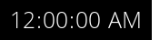
Represents a digital clock, whereas the time-values (hours, minutes, seconds) are rendered as text. A data-bound value from the player can be used to represent the current time. The control offers properties to customize the clock, like showing the hours in 12h.

<div drawio-diagram="7971"><img src="https://doc316en.candera.eu/uploads/images/drawio/2025-02/drawing-4-1739766594.png" alt=""/></div>

**Properties**

<table border="1" id="bkmrk-property-name-type-d-5" style="border-collapse: collapse; width: 100%; height: 502.922px;"><colgroup><col style="width: 24.9588%;"></col><col style="width: 24.9588%;"></col><col style="width: 50.0412%;"></col></colgroup><tbody><tr style="height: 29.7969px;"><td style="height: 29.7969px;">**Property Name**  
</td><td style="height: 29.7969px;">**Type**  
</td><td style="height: 29.7969px;">**Description**  
</td></tr><tr style="height: 46.5938px;"><td style="height: 46.5938px;">Time</td><td style="height: 46.5938px;">Variant</td><td style="height: 46.5938px;">Specifies the type and the value to pass onto Process Value Behavior.</td></tr><tr style="height: 29.7969px;"><td style="height: 29.7969px;">AM Text  
</td><td style="height: 29.7969px;">String  
</td><td style="height: 29.7969px;">The string of the AM label.</td></tr><tr style="height: 29.7969px;"><td style="height: 29.7969px;">PM Text  
</td><td style="height: 29.7969px;">String  
</td><td style="height: 29.7969px;">The string of the PM label.</td></tr><tr style="height: 29.7969px;"><td style="height: 29.7969px;">Show Seconds  
</td><td style="height: 29.7969px;">bool  
</td><td style="height: 29.7969px;">If true, seconds will be shown.</td></tr><tr style="height: 29.7969px;"><td style="height: 29.7969px;">Show AMPM</td><td style="height: 29.7969px;">bool</td><td style="height: 29.7969px;">If ture, shows AM or PM depending on time.</td></tr><tr style="height: 29.7969px;"><td style="height: 29.7969px;">Hours Text Style  
</td><td style="height: 29.7969px;">Candera::TextRendering::Style</td><td style="height: 29.7969px;">The style set for the “hour” text.</td></tr><tr style="height: 46.5938px;"><td style="height: 46.5938px;">Minutes Colon Text Style  
</td><td style="height: 46.5938px;">Candera::TextRendering::Style</td><td style="height: 46.5938px;">The style applied to the separator between the “hour” and “minute” text.</td></tr><tr style="height: 29.7969px;"><td style="height: 29.7969px;">Minutes Text Style  
</td><td style="height: 29.7969px;">Candera::TextRendering::Style</td><td style="height: 29.7969px;">The style set for the “minute” text.</td></tr><tr style="height: 29.7969px;"><td style="height: 29.7969px;">Seconds Text Style  
</td><td style="height: 29.7969px;">Candera::TextRendering::Style</td><td style="height: 29.7969px;">The style set for the “second” text.</td></tr><tr style="height: 29.7969px;"><td style="height: 29.7969px;">AMPM Text Style  
</td><td style="height: 29.7969px;">Candera::TextRendering::Style</td><td style="height: 29.7969px;">The style set for the AM/PM text.</td></tr><tr style="height: 35.3906px;"><td style="height: 35.3906px;">Hours Color  
</td><td style="height: 35.3906px;">[Candera::Color](http://dev.doc.cgistudio.at/APILINK/class_candera_1_1_color.html "Represents a color by its red-, green-, blue- and alpha-value. Provides color arithmetic functions an...")</td><td style="height: 35.3906px;">The color set for the “hour” text.</td></tr><tr style="height: 35.3906px;"><td style="height: 35.3906px;">Minutes Color  
</td><td style="height: 35.3906px;">[Candera::Color](http://dev.doc.cgistudio.at/APILINK/class_candera_1_1_color.html "Represents a color by its red-, green-, blue- and alpha-value. Provides color arithmetic functions an...")</td><td style="height: 35.3906px;">The color set for the “minute” text.</td></tr><tr style="height: 35.3906px;"><td style="height: 35.3906px;">Seconds Color  
</td><td style="height: 35.3906px;">[Candera::Color](http://dev.doc.cgistudio.at/APILINK/class_candera_1_1_color.html "Represents a color by its red-, green-, blue- and alpha-value. Provides color arithmetic functions an...")</td><td style="height: 35.3906px;">The color set for the “second” text.</td></tr><tr style="height: 35.3906px;"><td style="height: 35.3906px;">AM PM Color</td><td style="height: 35.3906px;">[Candera::Color](http://dev.doc.cgistudio.at/APILINK/class_candera_1_1_color.html "Represents a color by its red-, green-, blue- and alpha-value. Provides color arithmetic functions an...")</td><td style="height: 35.3906px;">The color set for the AM/PM text.</td></tr></tbody></table>

#### CoreProgressBar

Represents a bar that changes size according to the input value. It is possible to set background and bar images, with a 9-patch image recommended for the bar. In the Core version, animation for value changes is not included, focusing solely on simple progress display functionality.

<div drawio-diagram="5510"><img src="https://doc316en.candera.eu/uploads/images/drawio/2024-03/drawing-5-1711719428.png" alt=""/></div>

**Properties**

<table border="1" id="bkmrk-property-name-type-d-6" style="border-collapse: collapse; width: 100%; height: 176.8px;"><colgroup><col style="width: 24.9588%;"></col><col style="width: 24.9588%;"></col><col style="width: 50.0412%;"></col></colgroup><tbody><tr style="height: 29.4667px;"><td style="height: 29.4667px;">**Property Name**  
</td><td style="height: 29.4667px;">**Type**  
</td><td style="height: 29.4667px;">**Description**  
</td></tr><tr><td>Value</td><td>Float</td><td>The current value of the Progress Bar.</td></tr><tr><td>Minimum  
</td><td>bool/Variant  
</td><td>Minimum value</td></tr><tr><td>Maximum  
</td><td>bool/Variant  
</td><td>Maximum value</td></tr><tr><td>Bar Image  
</td><td>[Candera::Image2D](http://dev.doc.cgistudio.at/APILINK/class_candera_1_1_image2_d.html "Image2D encapsulates a surface handle which is retrieved when uploading an image.")</td><td>The image of the Progress Bar that will be scaled.</td></tr><tr><td>Background Image  
</td><td>[Candera::Image2D](http://dev.doc.cgistudio.at/APILINK/class_candera_1_1_image2_d.html "Image2D encapsulates a surface handle which is retrieved when uploading an image.")</td><td>The background image of the Progress Bar.</td></tr></tbody></table>

#### <span style="color: rgb(0, 0, 0);">CoreTextButton  
</span>

Defines the basic behavior of a button and the actions executed when clicked. In the Core version, visual customization features are limited, and the button's appearance is determined by the specified image and text. Properties are provided to adjust the display and style of the text. The button's behavior when pressed can be easily configured using the EventHandler.

<div drawio-diagram="7966"><img src="https://doc316en.candera.eu/uploads/images/drawio/2025-02/drawing-4-1739766412.png" alt=""/></div>

**Properties**

<table border="1" id="bkmrk-property-name-type-d-15" style="width: 100%; height: 439.2px;"><colgroup><col style="width: 20.5006%;"></col><col style="width: 17.1633%;"></col><col style="width: 62.3361%;"></col></colgroup><tbody><tr style="height: 29.6px;"><td style="height: 29.6px;">**Property Name**  
</td><td style="height: 29.6px;">**Type**  
</td><td style="height: 29.6px;">**Description**</td></tr><tr style="height: 46.4px;"><td style="height: 46.4px;">Enabled  
</td><td style="height: 46.4px;">bool  
</td><td style="height: 46.4px;">If this option is set to false, the button will be disabled and will no longer accept clicks.</td></tr><tr><td style="height: 46.5938px;">Focusable  
</td><td style="height: 46.5938px;">bool  
</td><td style="height: 46.5938px;">If true, the control is focusable. Otherwise the control can not be focused.</td></tr><tr style="height: 46.4px;"><td style="height: 46.4px;">Normal Image  
</td><td style="height: 46.4px;">[Candera::Image2D](http://dev.doc.cgistudio.at/APILINK/class_candera_1_1_image2_d.html "Image2D encapsulates a surface handle which is retrieved when uploading an image.")</td><td style="height: 46.4px;">The image displayed when the button is in its normal state.

</td></tr><tr style="height: 35.2px;"><td style="height: 35.2px;">Pressed Image  
</td><td style="height: 35.2px;">[Candera::Image2D](http://dev.doc.cgistudio.at/APILINK/class_candera_1_1_image2_d.html "Image2D encapsulates a surface handle which is retrieved when uploading an image.")</td><td style="height: 35.2px;">The image displayed when the button is pressed.</td></tr><tr style="height: 29.6px;"><td style="height: 29.6px;">Disabled Image</td><td style="height: 29.6px;">9 Patch Image</td><td style="height: 29.6px;">The image displayed when the button is disabled.</td></tr><tr style="height: 29.6px;"><td style="height: 29.6px;">Text  
</td><td style="height: 29.6px;">String  
</td><td style="height: 29.6px;">Text to be displayed in the button.</td></tr><tr style="height: 46.4px;"><td style="height: 46.4px;">Text Style  
</td><td style="height: 46.4px;">Candera::TextRendering::Style</td><td style="height: 46.4px;">Set the style of the text.</td></tr><tr style="height: 35.2px;"><td style="height: 35.2px;">Text Enabled Color  
</td><td style="height: 35.2px;">[Candera::Color](http://dev.doc.cgistudio.at/APILINK/class_candera_1_1_color.html)</td><td style="height: 35.2px;">Text to be set in the text node.</td></tr><tr style="height: 35.2px;"><td style="height: 35.2px;">Text Disabled Color  
</td><td style="height: 35.2px;">[Candera::Color](http://dev.doc.cgistudio.at/APILINK/class_candera_1_1_color.html)</td><td style="height: 35.2px;">Text color when disabled.</td></tr></tbody></table>

#### <span style="color: rgb(0, 0, 0);">CoreCheckBox</span>

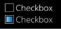
A simple UI element that indicates the selection status. In the Core version, the normal and selected states can be configured using a combination of text and images. The behavior when the state of this control changes can be set using the EventHandler.  
Note that features related to Focus and Blend effects are not included.

<div drawio-diagram="7967"><img src="https://doc316en.candera.eu/uploads/images/drawio/2025-02/drawing-4-1739766439.png" alt=""/></div>

<span style="color: rgb(0, 0, 0);">**Properties**</span>

<table border="1" id="bkmrk-property-name-type-d-16" style="width: 100%; height: 429.719px;"><colgroup><col style="width: 19.6663%;"></col><col style="width: 21.0965%;"></col><col style="width: 59.2372%;"></col></colgroup><tbody><tr style="height: 29.7969px;"><td style="height: 29.7969px;"><span style="color: rgb(0, 0, 0);">**Property Name**</span>  
</td><td style="height: 29.7969px;"><span style="color: rgb(0, 0, 0);">**Type**</span>  
</td><td style="height: 29.7969px;"><span style="color: rgb(0, 0, 0);">**Description**</span></td></tr><tr style="height: 29.7969px;"><td style="height: 29.7969px;"><span style="color: rgb(0, 0, 0);">Enabled</span>  
</td><td style="height: 29.7969px;"><span style="color: rgb(0, 0, 0);">bool</span>  
</td><td style="height: 29.7969px;"><span style="color: rgb(0, 0, 0);">If this option is set to false, the checkbox will </span><span style="color: rgb(0, 0, 0);">not respond to clicks.  
</span>

</td></tr><tr style="height: 23.5938px;"><td style="height: 23.5938px;">Focusable  
</td><td style="height: 23.5938px;">bool  
</td><td style="height: 23.5938px;">If true, the control is focusable. Otherwise the control can not be focused.</td></tr><tr style="height: 46.5938px;"><td style="height: 46.5938px;"><span style="color: rgb(0, 0, 0);">Value</span>  
</td><td style="height: 46.5938px;"><span style="color: rgb(0, 0, 0);">bool/Variant</span>  
</td><td style="height: 46.5938px;"><span style="color: rgb(0, 0, 0);">Specifies the initial selection state of the checkbox (true = selected, false = not selected).</span></td></tr><tr style="height: 29.7969px;"><td style="height: 29.7969px;"><span style="color: rgb(0, 0, 0);">Text</span>  
</td><td style="height: 29.7969px;"><span style="color: rgb(0, 0, 0);">String</span>  
</td><td style="height: 29.7969px;"><span style="color: rgb(0, 0, 0);">The text of the checkbox.</span></td></tr><tr style="height: 46.5938px;"><td style="height: 46.5938px;"><span style="color: rgb(0, 0, 0);">Text Style</span>  
</td><td style="height: 46.5938px;"><span style="color: rgb(0, 0, 0);">Candera::TextRendering::Style</span></td><td style="height: 46.5938px;"><span style="color: rgb(0, 0, 0);">The style set for the text node.</span></td></tr><tr style="height: 35.3906px;"><td style="height: 35.3906px;"><span style="color: rgb(0, 0, 0);">Normal Image</span>  
</td><td style="height: 35.3906px;"><span style="color: rgb(0, 0, 0);">[Candera::Image2D](http://dev.doc.cgistudio.at/APILINK/class_candera_1_1_image2_d.html "Image2D encapsulates a surface handle which is retrieved when uploading an image.")</span></td><td style="height: 35.3906px;"><span style="color: rgb(0, 0, 0);">The checkbox image displayed when in the normal state.</span></td></tr><tr style="height: 35.3906px;"><td style="height: 35.3906px;"><span style="color: rgb(0, 0, 0);">Selected Image</span>  
</td><td style="height: 35.3906px;"><span style="color: rgb(0, 0, 0);">[Candera::Image2D](http://dev.doc.cgistudio.at/APILINK/class_candera_1_1_image2_d.html "Image2D encapsulates a surface handle which is retrieved when uploading an image.")</span></td><td style="height: 35.3906px;"><span style="color: rgb(0, 0, 0);">The checkbox image displayed when in the selected state.</span></td></tr><tr style="height: 35.3906px;"><td style="height: 35.3906px;"><span style="color: rgb(0, 0, 0);">Normal Disabled Image</span>  
</td><td style="height: 35.3906px;"><span style="color: rgb(0, 0, 0);">[Candera::Image2D](http://dev.doc.cgistudio.at/APILINK/class_candera_1_1_image2_d.html "Image2D encapsulates a surface handle which is retrieved when uploading an image.")</span></td><td style="height: 35.3906px;"><span style="color: rgb(0, 0, 0);">The checkbox image displayed when in the invalid state.</span>

</td></tr><tr style="height: 46.5938px;"><td style="height: 46.5938px;"><span style="color: rgb(0, 0, 0);">Selected Disabled Image</span>  
</td><td style="height: 46.5938px;"><span style="color: rgb(0, 0, 0);">[Candera::Image2D](http://dev.doc.cgistudio.at/APILINK/class_candera_1_1_image2_d.html "Image2D encapsulates a surface handle which is retrieved when uploading an image.")</span></td><td style="height: 46.5938px;"><span style="color: rgb(0, 0, 0);">The image of a selected checkbox in the invalid state.</span></td></tr><tr style="height: 35.3906px;"><td style="height: 35.3906px;"><span style="color: rgb(0, 0, 0);">Normal Text Color</span></td><td style="height: 35.3906px;"><span style="color: rgb(0, 0, 0);">[Candera::Image2D](http://dev.doc.cgistudio.at/APILINK/class_candera_1_1_image2_d.html "Image2D encapsulates a surface handle which is retrieved when uploading an image.")</span></td><td style="height: 35.3906px;"><span style="color: rgb(0, 0, 0);">The text color when in the valid state.</span></td></tr><tr style="height: 35.3906px;"><td style="height: 35.3906px;"><span style="color: rgb(0, 0, 0);">Disabled Text Color</span></td><td style="height: 35.3906px;"><span style="color: rgb(0, 0, 0);">[Candera::Image2D](http://dev.doc.cgistudio.at/APILINK/class_candera_1_1_image2_d.html "Image2D encapsulates a surface handle which is retrieved when uploading an image.")</span></td><td style="height: 35.3906px;"><span style="color: rgb(0, 0, 0);">The text color when in the invalid state.</span></td></tr></tbody></table>

#### <span style="color: rgb(0, 0, 0);">CoreToggleButton</span>

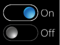
A simple UI element that toggles the button state. It is typically used to enable or disable specific functions. The structure is simple, allowing you to configure two images corresponding to the ON/OFF states of the toggle and their associated text. The behavior when the button is clicked can be set in the EventHandler tab. Note that features related to Focus and Blend effects are not included.

<div drawio-diagram="7968"><img src="https://doc316en.candera.eu/uploads/images/drawio/2025-02/drawing-4-1739766464.png" alt=""/></div>

<span style="color: rgb(0, 0, 0);">**Properties**</span>

<table border="1" id="bkmrk-property-name-type-d-17" style="width: 100%; height: 454.4px;"><colgroup><col style="width: 22.1692%;"></col><col style="width: 22.646%;"></col><col style="width: 55.1847%;"></col></colgroup><tbody><tr style="height: 29.6px;"><td style="height: 29.6px;"><span style="color: rgb(0, 0, 0);">**Property Name**</span>  
</td><td style="height: 29.6px;"><span style="color: rgb(0, 0, 0);">**Type**</span>  
</td><td style="height: 29.6px;"><span style="color: rgb(0, 0, 0);">**Description**</span></td></tr><tr style="height: 46.4px;"><td style="height: 46.4px;"><span style="color: rgb(0, 0, 0);">Enabled</span>  
</td><td style="height: 46.4px;"><span style="color: rgb(0, 0, 0);">bool</span>  
</td><td style="height: 46.4px;"><span style="color: rgb(0, 0, 0);">If this option is set to disabled, the toggle button will be disabled and will no longer accept click operations.</span></td></tr><tr><td style="height: 46.5938px;">Focusable  
</td><td style="height: 46.5938px;">bool  
</td><td style="height: 46.5938px;">If true, the control is focusable. Otherwise the control can not be focused.</td></tr><tr style="height: 29.6px;"><td style="height: 29.6px;"><span style="color: rgb(0, 0, 0);">Value</span>  
</td><td style="height: 29.6px;"><span style="color: rgb(0, 0, 0);">bool/Variant</span>  
</td><td style="height: 29.6px;"><span style="color: rgb(0, 0, 0);">Specify the initial state of the toggle (true = enabled, false = disabled).</span></td></tr><tr style="height: 46.4px;"><td style="height: 46.4px;"><span style="color: rgb(0, 0, 0);">First Text</span>  
</td><td style="height: 46.4px;"><span style="color: rgb(0, 0, 0);">String</span>  
</td><td style="height: 46.4px;"><span style="color: rgb(0, 0, 0);">The text that will be displayed when the toggle is set to On (the first toggle image).</span></td></tr><tr style="height: 46.4px;"><td style="height: 46.4px;"><span style="color: rgb(0, 0, 0);">Second Text</span>  
</td><td style="height: 46.4px;"><span style="color: rgb(0, 0, 0);">String</span>  
</td><td style="height: 46.4px;"><span style="color: rgb(0, 0, 0);">The text that will be displayed when the toggle is set to Off (the second toggle image).</span></td></tr><tr><td><span style="color: rgb(0, 0, 0);">Text Style</span>  
</td><td><span style="color: rgb(0, 0, 0);">Candera::TextRendering::Style</span></td><td><span style="color: rgb(0, 0, 0);">The style set for the text node.</span></td></tr><tr style="height: 46.4px;"><td style="height: 46.4px;"><span style="color: rgb(0, 0, 0);">First Image</span>  
</td><td style="height: 46.4px;"><span style="color: rgb(0, 0, 0);">[Candera::Image2D](http://dev.doc.cgistudio.at/APILINK/class_candera_1_1_image2_d.html "Image2D encapsulates a surface handle which is retrieved when uploading an image.")</span></td><td style="height: 46.4px;"><span style="color: rgb(0, 0, 0);">The image that will be displayed when the toggle is set to On (the first toggle image).</span></td></tr><tr style="height: 46.4px;"><td style="height: 46.4px;"><span style="color: rgb(0, 0, 0);">Second Image</span>  
</td><td style="height: 46.4px;"><span style="color: rgb(0, 0, 0);">[Candera::Image2D](http://dev.doc.cgistudio.at/APILINK/class_candera_1_1_image2_d.html "Image2D encapsulates a surface handle which is retrieved when uploading an image.")</span></td><td style="height: 46.4px;"><span style="color: rgb(0, 0, 0);">The image displayed when the toggle is in the Off state (second toggle image).</span></td></tr><tr style="height: 46.4px;"><td style="height: 46.4px;"><span style="color: rgb(0, 0, 0);">First Disabled Image</span>  
</td><td style="height: 46.4px;"><span style="color: rgb(0, 0, 0);">[Candera::Image2D](http://dev.doc.cgistudio.at/APILINK/class_candera_1_1_image2_d.html "Image2D encapsulates a surface handle which is retrieved when uploading an image.")</span></td><td style="height: 46.4px;"><span style="color: rgb(0, 0, 0);">The image displayed when the toggle is in the On state when it is disabled.</span></td></tr><tr style="height: 46.4px;"><td style="height: 46.4px;"><span style="color: rgb(0, 0, 0);">Second Disabled Image</span>  
</td><td style="height: 46.4px;"><span style="color: rgb(0, 0, 0);">[Candera::Image2D](http://dev.doc.cgistudio.at/APILINK/class_candera_1_1_image2_d.html "Image2D encapsulates a surface handle which is retrieved when uploading an image.")</span></td><td style="height: 46.4px;"><span style="color: rgb(0, 0, 0);">The image displayed when the toggle is in the Off state when it is disabled.</span></td></tr><tr style="height: 35.2px;"><td style="height: 35.2px;"><span style="color: rgb(0, 0, 0);">Text Enabled Color</span></td><td style="height: 35.2px;"><span style="color: rgb(0, 0, 0);">[Candera::Image2D](http://dev.doc.cgistudio.at/APILINK/class_candera_1_1_image2_d.html "Image2D encapsulates a surface handle which is retrieved when uploading an image.")</span></td><td style="height: 35.2px;"><span style="color: rgb(0, 0, 0);">The text color when it is enabled.</span></td></tr><tr style="height: 35.2px;"><td style="height: 35.2px;"><span style="color: rgb(0, 0, 0);">Text Disabled Color</span></td><td style="height: 35.2px;"><span style="color: rgb(0, 0, 0);">[Candera::Image2D](http://dev.doc.cgistudio.at/APILINK/class_candera_1_1_image2_d.html "Image2D encapsulates a surface handle which is retrieved when uploading an image.")</span></td><td style="height: 35.2px;"><span style="color: rgb(0, 0, 0);">The text color when it is disabled.</span></td></tr></tbody></table>


#### <span style="color: rgb(0, 0, 0);">CoreRadioButton</span>

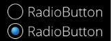
A simple UI element that allows the user to select one option from multiple choices. In the Core version, the normal and selected states can be configured using a combination of text and images. The behavior when the state of the CoreRadioButton control changes can be set using the EventHandler.

The functionality of the CoreRadioButton is similar to that of the CoreCheckBox, but it is designed to allow only one selection among multiple options.

<div drawio-diagram="7969"><img src="https://doc316en.candera.eu/uploads/images/drawio/2025-02/drawing-4-1739766490.png" alt=""/></div>

<span style="color: rgb(0, 0, 0);">**Properties**</span>

<table border="1" id="bkmrk-property-name-type-d-18" style="width: 100%;"><colgroup><col style="width: 19.9046%;"></col><col style="width: 25.8641%;"></col><col style="width: 54.2312%;"></col></colgroup><tbody><tr><td><span style="color: rgb(0, 0, 0);">**Property Name**</span>  
</td><td><span style="color: rgb(0, 0, 0);">**Type**</span>  
</td><td><span style="color: rgb(0, 0, 0);">**Description**</span></td></tr><tr><td><span style="color: rgb(0, 0, 0);">Enabled</span>  
</td><td><span style="color: rgb(0, 0, 0);">bool</span>  
</td><td><span style="color: rgb(0, 0, 0);">If you set this option to disabled, the radio buttons will not work and will not accept clicks.</span></td></tr><tr><td style="height: 46.5938px;">Focusable  
</td><td style="height: 46.5938px;">bool  
</td><td style="height: 46.5938px;">If true, the control is focusable. Otherwise the control can not be focused.</td></tr><tr><td><span style="color: rgb(0, 0, 0);">Text</span>  
</td><td><span style="color: rgb(0, 0, 0);">String</span>  
</td><td><span style="color: rgb(0, 0, 0);">The text of the radio buttons.</span></td></tr><tr><td><span style="color: rgb(0, 0, 0);">TextStyle</span>  
</td><td><span style="color: rgb(0, 0, 0);">Candera::TextRendering::Style</span></td><td><span style="color: rgb(0, 0, 0);">Set the style of the text.</span></td></tr><tr><td><span style="color: rgb(0, 0, 0);">Normal Image</span>  
</td><td><span style="color: rgb(0, 0, 0);">[Candera::Image2D](http://dev.doc.cgistudio.at/APILINK/class_candera_1_1_image2_d.html "Image2D encapsulates a surface handle which is retrieved when uploading an image.")</span></td><td><span style="color: rgb(0, 0, 0);">The image of the radio buttons displayed in the normal state.</span></td></tr><tr><td><span style="color: rgb(0, 0, 0);">Selected Image</span>  
</td><td><span style="color: rgb(0, 0, 0);">[Candera::Image2D](http://dev.doc.cgistudio.at/APILINK/class_candera_1_1_image2_d.html "Image2D encapsulates a surface handle which is retrieved when uploading an image.")</span></td><td><span style="color: rgb(0, 0, 0);">The image of the radio buttons displayed when selected.</span></td></tr><tr><td><span style="color: rgb(0, 0, 0);">Normal Disabled Image</span>  
</td><td><span style="color: rgb(0, 0, 0);">[Candera::Image2D](http://dev.doc.cgistudio.at/APILINK/class_candera_1_1_image2_d.html "Image2D encapsulates a surface handle which is retrieved when uploading an image.")</span></td><td><span style="color: rgb(0, 0, 0);">The image of the normal radio buttons in the disabled state.</span>

</td></tr><tr><td><span style="color: rgb(0, 0, 0);">Selected Disabled Image</span>  
</td><td><span style="color: rgb(0, 0, 0);">[Candera::Image2D](http://dev.doc.cgistudio.at/APILINK/class_candera_1_1_image2_d.html "Image2D encapsulates a surface handle which is retrieved when uploading an image.")</span></td><td><span style="color: rgb(0, 0, 0);">The image of the selected radio buttons in the disabled state.</span></td></tr><tr><td><span style="color: rgb(0, 0, 0);">Text Enabled Color</span></td><td><span style="color: rgb(0, 0, 0);">[Candera::Image2D](http://dev.doc.cgistudio.at/APILINK/class_candera_1_1_image2_d.html "Image2D encapsulates a surface handle which is retrieved when uploading an image.")</span></td><td><span style="color: rgb(0, 0, 0);">The color of the text in the enabled state.</span></td></tr><tr><td><span style="color: rgb(0, 0, 0);">Text Disabled Color</span></td><td><span style="color: rgb(0, 0, 0);">[Candera::Image2D](http://dev.doc.cgistudio.at/APILINK/class_candera_1_1_image2_d.html "Image2D encapsulates a surface handle which is retrieved when uploading an image.")</span></td><td><span style="color: rgb(0, 0, 0);">The color of the text in the disabled state.</span></td></tr><tr><td><span style="color: rgb(0, 0, 0);">Selected</span>  
</td><td><span style="color: rgb(0, 0, 0);">bool/Variant</span>  
</td><td>Specify the type and value to pass to the Process Value behavior.</td></tr></tbody></table>


#### <span style="color: rgb(0, 0, 0);">CoreTextValue</span>

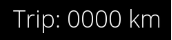
Generates a formatted string by combining Value and Format Text. It supports formatting numbers and text in a manner similar to the C++ printf() function. The value can be set directly or modified through events. Events are provided through behaviors that send or transfer values.

<div drawio-diagram="7970"><img src="https://doc316en.candera.eu/uploads/images/drawio/2025-02/drawing-4-1739766548.png" alt=""/></div>

<span style="color: rgb(0, 0, 0);">**Properties**</span>

<table border="1" id="bkmrk-property-name-type-d-8" style="width: 100%;"><colgroup><col style="width: 16.9209%;"></col><col style="width: 25.6165%;"></col><col style="width: 57.4388%;"></col></colgroup><tbody><tr><td><span style="color: rgb(0, 0, 0);">**Property Name**</span>  
</td><td><span style="color: rgb(0, 0, 0);">**Type**</span>  
</td><td><span style="color: rgb(0, 0, 0);">**Description**</span>  
</td></tr><tr><td><span style="color: rgb(0, 0, 0);">Value</span></td><td><span style="color: rgb(0, 0, 0);">Variant</span></td><td><span style="color: rgb(0, 0, 0);">The value to be formatted</span></td></tr><tr><td><span style="color: rgb(0, 0, 0);">Format Text</span>  
</td><td><span style="color: rgb(0, 0, 0);">String</span>  
</td><td><span style="color: rgb(0, 0, 0);">The format string which includes one format specifier (beginning with %). See C printf() function.</span></td></tr><tr><td><span style="color: rgb(0, 0, 0);">Style</span>  
</td><td><span style="color: rgb(0, 0, 0);">Candera::TextRendering::Style</span></td><td><span style="color: rgb(0, 0, 0);">The style of the text to be used.</span></td></tr><tr><td><span style="color: rgb(0, 0, 0);">Text Color</span>  
</td><td><span style="color: rgb(0, 0, 0);">[Candera::Color](http://dev.doc.cgistudio.at/APILINK/class_candera_1_1_color.html "Represents a color by its red-, green-, blue- and alpha-value. Provides color arithmetic functions an...")</span></td><td><span style="color: rgb(0, 0, 0);">Specify the color of the text.</span></td></tr></tbody></table>

#### CoreSlider

This is a control where the value changes based on the position of the knob. The knob can be operated by dragging, and values can be set directly or modified through events (e.g., using the Send Value as Event Behavior).

In the Core version, focus and blend effect functionalities are not included, and the design is specialized for basic slider operations.

<div drawio-diagram="5497"><img src="https://doc316en.candera.eu/uploads/images/drawio/2024-03/drawing-5-1711110887.png" alt=""/></div>

**Properties**

<table border="1" id="bkmrk-property-name-type-d-20" style="border-collapse: collapse; width: 100%; height: 630.2px;"><colgroup><col style="width: 25.0298%;"></col><col style="width: 29.4398%;"></col><col style="width: 45.6496%;"></col></colgroup><tbody><tr style="height: 29.6px;"><td style="height: 29.6px;">**Property Name**  
</td><td style="height: 29.6px;">**Type**  
</td><td style="height: 29.6px;">**Description**</td></tr><tr style="height: 63.2px;"><td style="height: 63.2px;">Enabled</td><td style="height: 63.2px;">bool</td><td style="height: 63.2px;">If set to false it will not react on focus events and does not have to support different visualizations for the different states.</td></tr><tr><td style="height: 46.5938px;">Focusable  
</td><td style="height: 46.5938px;">bool  
</td><td style="height: 46.5938px;">If true, the control is focusable. Otherwise the control can not be focused.</td></tr><tr style="height: 29.6px;"><td style="height: 29.6px;">Value  
</td><td style="height: 29.6px;">Variant  
</td><td style="height: 29.6px;">The bindable value of the slider</td></tr><tr style="height: 29.6px;"><td style="height: 29.6px;">Minimum  
</td><td style="height: 29.6px;">bool/Variant  
</td><td style="height: 29.6px;">Minimum Range</td></tr><tr style="height: 29.6px;"><td style="height: 29.6px;">Maximum  
</td><td style="height: 29.6px;">bool/Variant  
</td><td style="height: 29.6px;">Maximum Range</td></tr><tr style="height: 35.2px;"><td style="height: 35.2px;">Track Image  
</td><td style="height: 35.2px;">[Candera::Image2D](http://dev.doc.cgistudio.at/APILINK/class_candera_1_1_image2_d.html "Image2D encapsulates a surface handle which is retrieved when uploading an image.")</td><td style="height: 35.2px;">The image used for the slider track.</td></tr><tr style="height: 35.2px;"><td style="height: 35.2px;">Track Disabled Image</td><td style="height: 35.2px;">[Candera::Image2D](http://dev.doc.cgistudio.at/APILINK/class_candera_1_1_image2_d.html "Image2D encapsulates a surface handle which is retrieved when uploading an image.")</td><td style="height: 35.2px;">The image used for the slider track when disabled.</td></tr><tr style="height: 35.2px;"><td style="height: 35.2px;">Track Fill Image  
</td><td style="height: 35.2px;">[Candera::Image2D](http://dev.doc.cgistudio.at/APILINK/class_candera_1_1_image2_d.html "Image2D encapsulates a surface handle which is retrieved when uploading an image.")</td><td style="height: 35.2px;">The image indicating the progress of the slider.</td></tr><tr style="height: 46.4px;"><td style="height: 46.4px;">Track Disabled Fill Image</td><td style="height: 46.4px;">[Candera::Image2D](http://dev.doc.cgistudio.at/APILINK/class_candera_1_1_image2_d.html "Image2D encapsulates a surface handle which is retrieved when uploading an image.")</td><td style="height: 46.4px;">The image indicating the progress of the slider when disabled.</td></tr><tr style="height: 35.2px;"><td style="height: 35.2px;">Knob Normal Image  
</td><td style="height: 35.2px;">[Candera::Image2D](http://dev.doc.cgistudio.at/APILINK/class_candera_1_1_image2_d.html "Image2D encapsulates a surface handle which is retrieved when uploading an image.")</td><td style="height: 35.2px;">The image used for the knob in its normal state.</td></tr><tr style="height: 35.2px;"><td style="height: 35.2px;">Knob Pressed Image  
</td><td style="height: 35.2px;">[Candera::Image2D](http://dev.doc.cgistudio.at/APILINK/class_candera_1_1_image2_d.html "Image2D encapsulates a surface handle which is retrieved when uploading an image.")</td><td style="height: 35.2px;">The image used for the knob when pressed.</td></tr><tr style="height: 35.2px;"><td style="height: 35.2px;">Knob Disabled Image</td><td style="height: 35.2px;">[Candera::Image2D](http://dev.doc.cgistudio.at/APILINK/class_candera_1_1_image2_d.html "Image2D encapsulates a surface handle which is retrieved when uploading an image.")</td><td style="height: 35.2px;">The image used for the knob when disabled.</td></tr><tr style="height: 80px;"><td style="height: 80px;">Knob Center Margin  
</td><td style="height: 80px;">Candera::Margin</td><td style="height: 80px;">The center margin of the knob. Used to position the knob around the slider value. To avoid clipping issues in standalone sliders, ensure that the margin does not exceed the boundary.</td></tr><tr style="height: 47.2px;"><td style="height: 47.2px;">Track Margin

</td><td style="height: 47.2px;">Candera::Margin</td><td style="height: 47.2px;">The margin of the track. Ensures sufficient space for displaying the knob around the track.

</td></tr><tr style="height: 63.8px;"><td style="height: 63.8px;">Use Center  
</td><td style="height: 63.8px;">bool  
</td><td style="height: 63.8px;">If set to true, the knob's alignment is based on its predefined center value in the bitmap. If false, a calculated center value is used.

</td></tr></tbody></table>

#### CoreScrollView

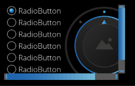
UI component that provides a scrollable area where arbitrary nodes (including controls) can be placed. If the attached node's size exceeds the layout size of the ScrollView, a scrollbar is automatically displayed.

In the Core version, node layout functionality is not included, and the component is specialized for displaying scrollable content. Therefore, automatic alignment features like those found in lists are not provided, but freely positioned controls and nodes can be made scrollable.

<div drawio-diagram="7973"><img src="https://doc316en.candera.eu/uploads/images/drawio/2025-02/drawing-4-1739775073.png" alt=""/></div>

<div drawio-diagram="5499"></div>


**Properties**

<table border="1" id="bkmrk-property-name-type-d-21" style="border-collapse: collapse; width: 100%; height: 58.9334px;"><colgroup><col style="width: 24.9588%;"></col><col style="width: 29.4069%;"></col><col style="width: 45.5931%;"></col></colgroup><tbody><tr style="height: 29.4667px;"><td style="height: 29.4667px;">**Property Name**  
</td><td style="height: 29.4667px;">**Type**  
</td><td style="height: 29.4667px;">**Description**</td></tr><tr style="height: 29.4667px;"><td style="height: 29.4667px;">Vertical Scrollbar Visibility</td><td style="height: 29.4667px;">ScrollbarVisibility::Enum (Automatic, Collapsed, Visible)</td><td style="height: 29.4667px;">Configure the visibility of the scrollbar. By default it is set to Automatic which will determine the visibility based on the actual content.</td></tr><tr><td>Horizontal Scrollbar Visibility  
</td><td>ScrollbarVisibility::Enum (Automatic, Collapsed, Visible)</td><td>Configure the visibility of the scrollbar. By default it is set to Automatic which will determine the visibility based on the actual content.</td></tr></tbody></table>

#### <span style="color: rgb(0, 0, 0);">CoreMultiStateButton</span>


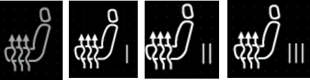
A UI element that allows for the easy definition of buttons with multiple states. Each click changes the state, and once the maximum value is reached, it loops back to the initial state. The corresponding image is selected based on the button's state, and the displayed text can also be modified using the Text property. The behavior of the MultiStateButton can be set in the EventHandler, and actions corresponding to the current state can be executed using the Process Value Changed Event behavior.

<div drawio-diagram="7974"><img src="https://doc316en.candera.eu/uploads/images/drawio/2025-02/drawing-4-1739943004.png" alt=""/></div>

**Properties**

<table border="1" id="bkmrk-property-name-type-d-23" style="width: 100%; height: 107.984px;"><colgroup><col style="width: 18.3552%;"></col><col style="width: 18.1168%;"></col><col style="width: 63.528%;"></col></colgroup><tbody><tr style="height: 29.7969px;"><td style="height: 29.7969px;">**Property Name**  
</td><td style="height: 29.7969px;">**Type**  
</td><td style="height: 29.7969px;">**Description**</td></tr><tr style="height: 18.5938px;"><td style="height: 18.5938px;">Focusable  
</td><td style="height: 18.5938px;">bool  
</td><td style="height: 18.5938px;">If true, the control is focusable. Otherwise the control can not be focused.</td></tr><tr style="height: 29.7969px;"><td style="height: 29.7969px;">Current State  
</td><td style="height: 29.7969px;">Variant  
</td><td style="height: 29.7969px;">Current state of the MultiStateButton (starts with 0).</td></tr><tr style="height: 29.7969px;"><td style="height: 29.7969px;">Maximum State  
</td><td style="height: 29.7969px;">bool/Variant  
</td><td style="height: 29.7969px;">Maximum value of MultiStateButton (starts with 0).</td></tr></tbody></table>