# Common

#### Breadcrumb

A Breadcrumb shows the history/flow through the screen hierarchy and allows user, for example, to navigate between scenes using breadcrumb's elements. As a part of breadcrumb it's possible to use all elements that contain text control (for example Text, TextValue or TextButton).

For each breadcrumb element (for example a text button) user should assign a proper <span style="color: rgb(230, 126, 35);">[Breadcrumb Action](https://doc316en.candera.eu/link/582#bkmrk-breadcrumb-action)</span> in its behavior list.

It is possible to create your own control for your own needs (e.g. adding a separator between items), that will work properly with the breadcrumb. Remember to add *breadcrumb action* behavior in own control.

<p class="callout info">When breadcrumb gets more value than it can display it will always collapse elements, replacing the display of the name with the ellipsis text (e.g. three dots). First element is always fully visible.</p>

**Properties**

<table border="1" id="bkmrk-property-name-type-d-3" style="border-collapse: collapse; width: 100%; height: 147.334px;"><colgroup><col style="width: 24.9588%;"></col><col style="width: 24.9588%;"></col><col style="width: 50.0412%;"></col></colgroup><tbody><tr style="height: 29.4667px;"><td style="height: 29.4667px;">**Property Name**  
</td><td style="height: 29.4667px;">**Type**  
</td><td style="height: 29.4667px;">**Description**  
</td></tr><tr style="height: 29.4667px;"><td style="height: 29.4667px;">State Machine Node</td><td style="height: 29.4667px;">Node</td><td style="height: 29.4667px;">State machine node.</td></tr><tr style="height: 29.4667px;"><td style="height: 29.4667px;">Ellipsis Text  
</td><td style="height: 29.4667px;">String  
</td><td style="height: 29.4667px;">When more elements are added than the breadcrumb can show, then one element will be replaced with the text from this field (collapse effect).</td></tr><tr style="height: 29.4667px;"><td style="height: 29.4667px;">Path Delimiter  
</td><td style="height: 29.4667px;">String  
</td><td style="height: 29.4667px;">Tag that separates elements contained in a path.</td></tr><tr style="height: 29.4667px;"><td style="height: 29.4667px;">Blend Type  
</td><td style="height: 29.4667px;">BlendType::Enum</td><td style="height: 29.4667px;">The blend type that will be set.</td></tr></tbody></table>

<p class="callout info">Breadcrumb is not a standalone control, it does not trigger internally any scene transitions so it should be always connected with external state machine. For that purpose, breadcrumb property *State Machine Node* should be set to a node that contains a *State Machine* behavior. Please check out the [<span style="color: rgb(230, 126, 35);">workflow</span>](https://doc316en.candera.eu/books/controls-and-behaviors/page/breadcrumb-statemachine-workflow) chapter for more information.  
</p>


---

#### Menu Icon

The main rationale behind the MenuIcon Control is an encapsulation and abstraction of an “icon” like in graphical environments of most known operating systems. It stores a bitmap and a string (label) together and provides single configuration of common behavior like positioning or highlighting.

It is designed to use inside the MenuItem Control and most probably one would like to use the MenuItem instead of plain MenuIcon.

<div drawio-diagram="5505"><img src="https://doc316en.candera.eu/uploads/images/drawio/2024-03/drawing-5-1711706885.png" alt=""/></div>

**Properties**

<table border="1" id="bkmrk-property-name-type-d" style="border-collapse: collapse; width: 100%; height: 276.534px;"><colgroup><col style="width: 24.9588%;"></col><col style="width: 24.9588%;"></col><col style="width: 50.0412%;"></col></colgroup><tbody><tr style="height: 29.4667px;"><td style="height: 29.4667px;">**Property Name**  
</td><td style="height: 29.4667px;">**Type**  
</td><td style="height: 29.4667px;">**Description**  
</td></tr><tr style="height: 35.0667px;"><td style="height: 35.0667px;">Image</td><td style="height: 35.0667px;">[Candera::Image2D](http://dev.doc.cgistudio.at/APILINK/class_candera_1_1_image2_d.html "Image2D encapsulates a surface handle which is retrieved when uploading an image.")</td><td style="height: 35.0667px;">The image to set on the effect.</td></tr><tr style="height: 29.4667px;"><td style="height: 29.4667px;">Label  
</td><td style="height: 29.4667px;">String  
</td><td style="height: 29.4667px;">The Text that will be set to the Text Node.</td></tr><tr style="height: 10px;"><td style="height: 10px;">Label Color  
</td><td style="height: 10px;">[Candera::Color](http://dev.doc.cgistudio.at/APILINK/class_candera_1_1_color.html "Represents a color by its red-, green-, blue- and alpha-value. Provides color arithmetic functions an...")</td><td style="height: 10px;">The color of the text.</td></tr><tr style="height: 29.4667px;"><td style="height: 29.4667px;">Label Style  
</td><td style="height: 29.4667px;">Candera::TextRendering::Style</td><td style="height: 29.4667px;">The Style that will be used.</td></tr><tr style="height: 29.4667px;"><td class="align-left" style="width: 24.2274%; height: 46.2667px;">Label Trimming  
</td><td style="width: 21.1386%; height: 46.2667px;">Enum (None, Ellipsis, Custom Text)</td><td style="height: 29.4667px;">Trimming defines the behavior to employ when content overflows the content area.</td></tr><tr style="height: 37.8667px;"><td style="height: 37.8667px;">Background Image  
</td><td style="height: 37.8667px;">[Candera::Image2D](http://dev.doc.cgistudio.at/APILINK/class_candera_1_1_image2_d.html "Image2D encapsulates a surface handle which is retrieved when uploading an image.")</td><td style="height: 37.8667px;">The image to set on the effect.</td></tr><tr style="height: 46.2667px;"><td style="height: 46.2667px;">Background Enable Rendering  
</td><td style="height: 46.2667px;">bool  
</td><td style="height: 46.2667px;">If true, Rendering is enabled.</td></tr><tr style="height: 29.4667px;"><td style="height: 29.4667px;">Blend Type  
</td><td style="height: 29.4667px;">BlendType::Enum</td><td style="height: 29.4667px;">The blend type that will be set on the affected nodes.</td></tr></tbody></table>

---

#### Mesh2D

Performs a perspective projection of a 3D rotated effect (e.g. Bitmap or SolidColor effects) based on the configured origin, rotation and field of view.

**Properties**

<table border="1" id="bkmrk-property-name-type-d-1" style="border-collapse: collapse; width: 100%; height: 176.8px;"><colgroup><col style="width: 24.9588%;"></col><col style="width: 24.9588%;"></col><col style="width: 50.0412%;"></col></colgroup><tbody><tr style="height: 29.4667px;"><td style="height: 29.4667px;">**Property Name**  
</td><td style="height: 29.4667px;">**Type**  
</td><td style="height: 29.4667px;">**Description**  
</td></tr><tr><td>Mesh Rotation</td><td>Float</td><td>Defines the rotation angle in degree around configured rotation axis at the configured origin.</td></tr><tr><td>Camera Distance  
</td><td>Float  
</td><td>Defines a normalized camera distance (the projection is based on a normalized geometry of width and height 1) with a default value of 1. </td></tr><tr><td>Rotation Axis  
</td><td>Candera::Vector3  
</td><td>Defines the axis (default is the y axis) for the rotation as a 3D direction vector (the vector will be internally normalized).</td></tr><tr><td>Field of View  
</td><td>Float  
</td><td>The area on the Y axis view field in degrees. It influences the perspective distortion of the projection. Higher angles will result in more distorted projection. Lower angles will result in less perspective distorted projections. The angle has to be higher than 0 and less than 180.</td></tr><tr><td>Fit Strategy  
</td><td>Enum (None, FitTopActualSize, FitToMaximumSize)  
</td><td>Defines how the perspective projected mesh should fit into the original boundaries.</td></tr><tr><td>Horizontal Origin  
</td><td>Enum (Left, Center, Right, Custom)  
</td><td>The origin influences where the rotation is performed and how the perspective projection looks. It is defined as a normalized (bitmap resolution independent) origin on the y axis as Left (0), Center (0.5), Right (1.0) or Custom (see CustomHorizontalOrigin).</td></tr><tr><td>Vertical Origin  
</td><td>Enum (Top, Center, Bottom, Custom)  
</td><td>The origin influences where the rotation is performed and how the perspective projection looks. It is defined as a normalized (bitmap resolution independent) origin on the y axis as Top (0), Center (0.5), Bottom (1.0) or Custom (see CustomVerticalOrigin).</td></tr><tr><td>Origin Offset  
</td><td>Candera::Vector2  
</td><td>In addition to the configured normalized origin this pixel based origin offset is added.</td></tr><tr><td>Image  
</td><td>[Candera::Image2D](http://dev.doc.cgistudio.at/APILINK/class_candera_1_1_image2_d.html "Image2D encapsulates a surface handle which is retrieved when uploading an image.")</td><td>The image to set on the effect.</td></tr><tr><td>Blend Type  
</td><td>BlendType::Enum</td><td>The blend type that will be set on the affected nodes.</td></tr></tbody></table>

---

#### Text

Displays a given text like a label.

It supports properties to set the Text, Text Style, Text Color, horizontal Text Alignment, flag for Multi Line, Line Spacing, flag for Word Wrap, choice for Trimming, and the used Trimming Text.

A Bindable Property is provided to set the Text by Data Binding.

<div drawio-diagram="5506"><img src="https://doc316en.candera.eu/uploads/images/drawio/2024-03/drawing-5-1711717000.png" alt=""/></div>

**Properties**

<table border="1" id="bkmrk-property-name-type-d-2" style="border-collapse: collapse; width: 100%; height: 176.8px;"><colgroup><col style="width: 24.9588%;"></col><col style="width: 24.9588%;"></col><col style="width: 50.0412%;"></col></colgroup><tbody><tr style="height: 29.4667px;"><td style="height: 29.4667px;">**Property Name**  
</td><td style="height: 29.4667px;">**Type**  
</td><td style="height: 29.4667px;">**Description**  
</td></tr><tr><td>Text</td><td>String</td><td>The Text that will be set to the Text Node.</td></tr><tr><td>Text Color</td><td>[Candera::Color](http://dev.doc.cgistudio.at/APILINK/class_candera_1_1_color.html "Represents a color by its red-, green-, blue- and alpha-value. Provides color arithmetic functions an...")</td><td>The color of the text.</td></tr><tr><td>Text Style</td><td>Candera::TextRendering::Style</td><td>The Text that will be set to the Text Node.</td></tr><tr><td>Text Alignment</td><td>Enum (Left, Center, Right)</td><td>The horizontal text alignment, using the culture text direction, is used to define how text will be horizontally aligned within its layout area.</td></tr><tr><td>Multiline</td><td>bool  
</td><td>If multi line is disabled then the new line control characters will be ignored and text will always be rendered in one line.</td></tr><tr><td>Line Spacing  
</td><td>UInt16  
</td><td>Defines the distance between the baselines of successive lines of text.</td></tr><tr><td>Word Wrap  
</td><td>bool  
</td><td>If word wrapping is enabled then the lines that exceed the client area will be split during arrangement into multiple lines.</td></tr><tr><td>Trimming  
</td><td>Enum (None, Ellipsis, Custom Text)</td><td>Trimming defines the behavior to employ when content overflows the content area.</td></tr><tr><td>Disabled Color  
</td><td>[Candera::Color](http://dev.doc.cgistudio.at/APILINK/class_candera_1_1_color.html "Represents a color by its red-, green-, blue- and alpha-value. Provides color arithmetic functions an...")</td><td>The color to set on the effect of the Text.</td></tr><tr><td>Blend Type  
</td><td>BlendType::Enum</td><td>The blend type that will be set.</td></tr></tbody></table>

---

#### AnalogClock

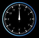
Represents an analog clock with images for the certain needles (hours, minutes, seconds). A data-bound value from the Player can be used to represent the current time. To see how to use the data-binding in combination with the clock please see [<span style="color: rgb(230, 126, 35);">GettingStartedControls Part 4</span>](https://doc316en.candera.eu/link/311#bkmrk-page-title)

There are properties to customize the visual representation of the analog clock. Every needle can be replaced by a custom image, as well as the background-image. A pivot-offset needs to be applied to the needle-images to be able to rotate them around the correct pivot point.

<div drawio-diagram="5507"><img src="https://doc316en.candera.eu/uploads/images/drawio/2024-03/drawing-5-1711717247.png" alt=""/></div>

**Properties**

<table border="1" id="bkmrk-property-name-type-d-4" style="border-collapse: collapse; width: 100%; height: 176.8px;"><colgroup><col style="width: 24.9588%;"></col><col style="width: 24.9588%;"></col><col style="width: 50.0412%;"></col></colgroup><tbody><tr style="height: 29.4667px;"><td style="height: 29.4667px;">**Property Name**  
</td><td style="height: 29.4667px;">**Type**  
</td><td style="height: 29.4667px;">**Description**  
</td></tr><tr><td>Time</td><td>Variant</td><td>Specifies the type and the value to pass onto Process Value Behavior.</td></tr><tr><td>Offset In Minutes  
</td><td>Int32  
</td><td>Offset in minutes to add to time (i.e. for different time zones).</td></tr><tr><td>Show Seconds  
</td><td>bool  
</td><td>If true, seconds will be shown.</td></tr><tr><td>Seconds Needle Image  
</td><td>[Candera::Image2D](http://dev.doc.cgistudio.at/APILINK/class_candera_1_1_image2_d.html "Image2D encapsulates a surface handle which is retrieved when uploading an image.")</td><td>The image to set on the effect.</td></tr><tr><td>Minutes Needle Image  
</td><td>[Candera::Image2D](http://dev.doc.cgistudio.at/APILINK/class_candera_1_1_image2_d.html "Image2D encapsulates a surface handle which is retrieved when uploading an image.")</td><td>The image to set on the effect.</td></tr><tr><td>Hours Needle Image  
</td><td>[Candera::Image2D](http://dev.doc.cgistudio.at/APILINK/class_candera_1_1_image2_d.html "Image2D encapsulates a surface handle which is retrieved when uploading an image.")</td><td>The image to set on the effect.</td></tr><tr><td>Face Image  
</td><td>[Candera::Image2D](http://dev.doc.cgistudio.at/APILINK/class_candera_1_1_image2_d.html "Image2D encapsulates a surface handle which is retrieved when uploading an image.")</td><td>The image to set on the effect.</td></tr><tr><td>Blend Type  
</td><td>BlendType::Enum</td><td>The blend type that will be set on the affected nodes.</td></tr></tbody></table>

---

#### DigitalClock

Represents a digital clock, whereas the time-values (hours, minutes, seconds) are rendered as text. A data-bound value from the Player can be used to represent the current time. The control offers properties to customize the clock , like showing the hours in 12h or 24h. To see how to use the data-binding in combination with the clock please see <span style="color: rgb(230, 126, 35);">[GettingStartedControls Part 4](https://doc316en.candera.eu/link/311#bkmrk-page-title)</span>

<span style="color: rgb(0, 0, 0);">The remaining properties are there to customize the visual representation of the digital clock. For every text-node a color and text-style can be set.</span>

<div drawio-diagram="5509"><img src="https://doc316en.candera.eu/uploads/images/drawio/2024-03/drawing-5-1711718906.png" alt=""/></div>

**Properties**

<table border="1" id="bkmrk-property-name-type-d-5" style="border-collapse: collapse; width: 100%; height: 559.867px;"><colgroup><col style="width: 24.9588%;"></col><col style="width: 24.9588%;"></col><col style="width: 50.0412%;"></col></colgroup><tbody><tr style="height: 29.4667px;"><td style="height: 29.4667px;">**Property Name**  
</td><td style="height: 29.4667px;">**Type**  
</td><td style="height: 29.4667px;">**Description**  
</td></tr><tr style="height: 29.4667px;"><td style="height: 29.4667px;">Time</td><td style="height: 29.4667px;">Variant</td><td style="height: 29.4667px;">Specifies the type and the value to pass onto Process Value Behavior.</td></tr><tr style="height: 29.4667px;"><td style="height: 29.4667px;">Offset In Minutes  
</td><td style="height: 29.4667px;">Int32  
</td><td style="height: 29.4667px;">Offset in minutes to add to time (i.e. for different time zones).</td></tr><tr style="height: 29.4667px;"><td style="height: 29.4667px;">Show Full 24 Hours  
</td><td style="height: 29.4667px;">bool  
</td><td style="height: 29.4667px;">If true, hours will be shown from 0-23, otherwise in AM/PM format.</td></tr><tr style="height: 29.4667px;"><td style="height: 29.4667px;">AM Text  
</td><td style="height: 29.4667px;">String  
</td><td style="height: 29.4667px;">The string of the AM label.</td></tr><tr style="height: 29.4667px;"><td style="height: 29.4667px;">PM Text  
</td><td style="height: 29.4667px;">String  
</td><td style="height: 29.4667px;">The string of the PM label.</td></tr><tr style="height: 29.4667px;"><td style="height: 29.4667px;">Show Seconds  
</td><td style="height: 29.4667px;">bool  
</td><td style="height: 29.4667px;">If true, seconds will be shown.</td></tr><tr style="height: 29.4667px;"><td style="height: 29.4667px;">Hours Text Style  
</td><td style="height: 29.4667px;">Candera::TextRendering::Style</td><td style="height: 29.4667px;">The Style that will be set to the Text Node.</td></tr><tr style="height: 29.4667px;"><td style="height: 29.4667px;">Minutes Colon Text Style  
</td><td style="height: 29.4667px;">Candera::TextRendering::Style</td><td style="height: 29.4667px;">The Style that will be set to the Text Node.</td></tr><tr style="height: 29.4667px;"><td style="height: 29.4667px;">Minutes Text Style  
</td><td style="height: 29.4667px;">Candera::TextRendering::Style</td><td style="height: 29.4667px;">The Style that will be set to the Text Node.</td></tr><tr style="height: 29.4667px;"><td style="height: 29.4667px;">Seconds Colon Text Style  
</td><td style="height: 29.4667px;">Candera::TextRendering::Style</td><td style="height: 29.4667px;">The Style that will be set to the Text Node.</td></tr><tr style="height: 29.4667px;"><td style="height: 29.4667px;">Seconds Text Style  
</td><td style="height: 29.4667px;">Candera::TextRendering::Style</td><td style="height: 29.4667px;">The Style that will be set to the Text Node.</td></tr><tr style="height: 29.4667px;"><td style="height: 29.4667px;">AM PM Text Style  
</td><td style="height: 29.4667px;">Candera::TextRendering::Style</td><td style="height: 29.4667px;">The Style that will be set to the Text Node.</td></tr><tr style="height: 29.4667px;"><td style="height: 29.4667px;">Hours Color  
</td><td style="height: 29.4667px;">[Candera::Color](http://dev.doc.cgistudio.at/APILINK/class_candera_1_1_color.html "Represents a color by its red-, green-, blue- and alpha-value. Provides color arithmetic functions an...")</td><td style="height: 29.4667px;">The color to set on the effect.</td></tr><tr style="height: 29.4667px;"><td style="height: 29.4667px;">Minutes Colon Color  
</td><td style="height: 29.4667px;">[Candera::Color](http://dev.doc.cgistudio.at/APILINK/class_candera_1_1_color.html "Represents a color by its red-, green-, blue- and alpha-value. Provides color arithmetic functions an...")</td><td style="height: 29.4667px;">The color to set on the effect.</td></tr><tr><td>Minutes Color  
</td><td>[Candera::Color](http://dev.doc.cgistudio.at/APILINK/class_candera_1_1_color.html "Represents a color by its red-, green-, blue- and alpha-value. Provides color arithmetic functions an...")</td><td>The color to set on the effect.</td></tr><tr style="height: 29.4667px;"><td style="height: 29.4667px;">Seconds Colon Color  
</td><td style="height: 29.4667px;">[Candera::Color](http://dev.doc.cgistudio.at/APILINK/class_candera_1_1_color.html "Represents a color by its red-, green-, blue- and alpha-value. Provides color arithmetic functions an...")</td><td style="height: 29.4667px;">The color to set on the effect.</td></tr><tr style="height: 29.4667px;"><td style="height: 29.4667px;">Seconds Color  
</td><td style="height: 29.4667px;">[Candera::Color](http://dev.doc.cgistudio.at/APILINK/class_candera_1_1_color.html "Represents a color by its red-, green-, blue- and alpha-value. Provides color arithmetic functions an...")</td><td style="height: 29.4667px;">The color to set on the effect.</td></tr><tr style="height: 29.4667px;"><td style="height: 29.4667px;">AM PM Color</td><td style="height: 29.4667px;">[Candera::Color](http://dev.doc.cgistudio.at/APILINK/class_candera_1_1_color.html "Represents a color by its red-, green-, blue- and alpha-value. Provides color arithmetic functions an...")</td><td style="height: 29.4667px;">The color to set on the effect.</td></tr><tr style="height: 29.4667px;"><td style="height: 29.4667px;">Blend Type</td><td style="height: 29.4667px;">BlendType::Enum</td><td style="height: 29.4667px;">The blend type that will be set.</td></tr></tbody></table>

---

#### ProgressBar

The ProgressBar represents a bar that in- or decreases in its layout-size depending on the input-value.

Any value change is animated by interpolating intermediate values.

Images for background and bar can be set, whereas for the bar-image a nine-patch image is recommended.

<div drawio-diagram="5510"><img src="https://doc316en.candera.eu/uploads/images/drawio/2024-03/drawing-5-1711719428.png" alt=""/></div>

**Properties**

<table border="1" id="bkmrk-property-name-type-d-6" style="border-collapse: collapse; width: 100%; height: 176.8px;"><colgroup><col style="width: 24.9588%;"></col><col style="width: 24.9588%;"></col><col style="width: 50.0412%;"></col></colgroup><tbody><tr style="height: 29.4667px;"><td style="height: 29.4667px;">**Property Name**  
</td><td style="height: 29.4667px;">**Type**  
</td><td style="height: 29.4667px;">**Description**  
</td></tr><tr><td>Value</td><td> </td><td>The current value of the Progress Bar.</td></tr><tr><td>Minimum  
</td><td>bool/Variant  
</td><td>Minimum value</td></tr><tr><td>Maximum  
</td><td>bool/Variant  
</td><td>Maximum value</td></tr><tr><td>Animation Mode  
</td><td>Enum (SpeedBased, TimeBased, Instant)  
</td><td>Animation mode sets a specific interpolation type.</td></tr><tr><td>Value Change Per Second  
</td><td>Float  
</td><td>How many values per second become interpolated.</td></tr><tr><td>Filter Time Constant  
</td><td>Float  
</td><td>The moment before the value is reached, the changing speed slows down. This prevents a sudden end of movement that can be felt as artificial in some cases.</td></tr><tr><td>Bar Image  
</td><td>[Candera::Image2D](http://dev.doc.cgistudio.at/APILINK/class_candera_1_1_image2_d.html "Image2D encapsulates a surface handle which is retrieved when uploading an image.")</td><td>The image of the Progress Bar that will be scaled.</td></tr><tr><td>Background Image  
</td><td>[Candera::Image2D](http://dev.doc.cgistudio.at/APILINK/class_candera_1_1_image2_d.html "Image2D encapsulates a surface handle which is retrieved when uploading an image.")</td><td>The background image of the Progress Bar.</td></tr><tr><td>Blend Type  
</td><td>BlendType::Enum</td><td>The blend type that will be set on the affected nodes.</td></tr></tbody></table>

---

#### FlipBook

The FlipBook flips through a list of images. Depending on the input value it renders the images in between with a given speed. The control can be used for playing animations that are stored as images.

**Properties**

<table border="1" id="bkmrk-property-name-type-d-7" style="border-collapse: collapse; width: 100%; height: 176.8px;"><colgroup><col style="width: 24.9588%;"></col><col style="width: 24.9588%;"></col><col style="width: 50.0412%;"></col></colgroup><tbody><tr style="height: 29.4667px;"><td style="height: 29.4667px;">**Property Name**  
</td><td style="height: 29.4667px;">**Type**  
</td><td style="height: 29.4667px;">**Description**  
</td></tr><tr><td>Image Index</td><td>Variant</td><td>The index of the image to animate to.</td></tr><tr><td>Flip Speed  
</td><td>Float  
</td><td>How often in a second the images should be flipped.

*This property is only available if AnimationMode is set to "SpeedBased".*

</td></tr><tr><td>Images  
</td><td>List of [Candera::Image2D](http://dev.doc.cgistudio.at/APILINK/class_candera_1_1_image2_d.html "Image2D encapsulates a surface handle which is retrieved when uploading an image.")  
</td><td>A list of images which should be available for flipping.</td></tr><tr><td>Upload Strategy  
</td><td>Enum (OnInit, OnDemand)  
</td><td>Specifies if images are uploaded on demand or when the behavior is instantiated. OnInit may cause an initial delay and keeps all images loaded. OnDemand avoids an initial delay and only keeps one image loaded.</td></tr><tr><td>Blend Type</td><td>BlendType::Enum</td><td>The blend type that will be set on the affected nodes.</td></tr><tr><td>Animation Mode  
</td><td>Enum (SpeedBased, TimeBased, Instant)  
</td><td>Animation mode sets a specific interpolation type.</td></tr></tbody></table>

**How to Add Images**

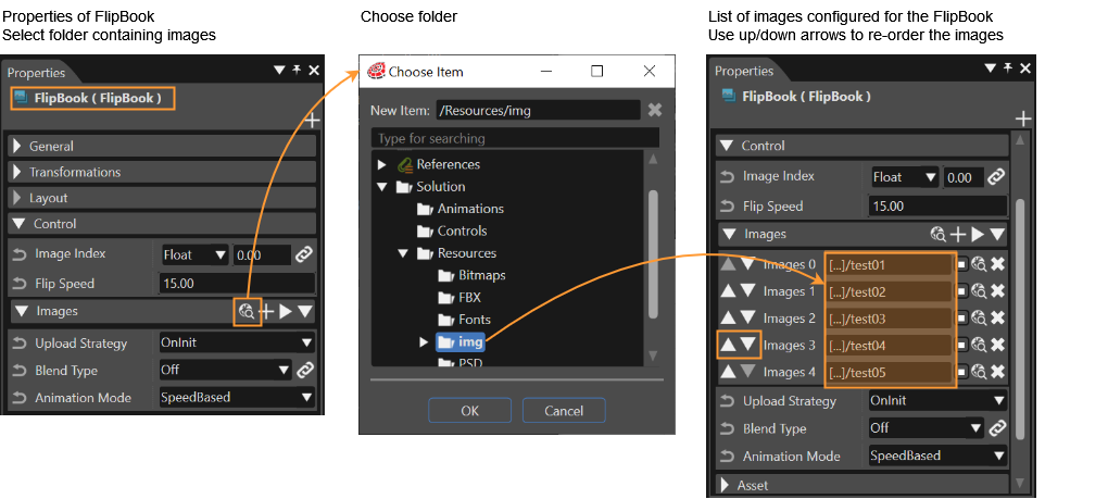
Import the image resources to be set into *one single folder* of the SceneComposer solution.

1. Select the FlipBook Control in your scene
2. In the Properties Panel: Click the icon \[ Select folder containing images \] in the \[ Images \] section of the FlipBook's Properties.
3. This will open the \[ Choose Item \] dialog.
4. Select a folder that contains the image resource to be set, and click the \[ OK \] button.
5. All image files contained in the selected folder will be set as images of the FlipBook control.
6. The images are ordered alphabetically by file name. They can be re-ordered manually as necessary using the up and down arrow buttons.

<div drawio-diagram="5562"><img src="https://doc316en.candera.eu/uploads/images/drawio/2024-04/drawing-5-1712909527.png" alt=""/></div>

**Animation Mode**

The *AnimationMode* property can be set to *SpeedBased*, *TimeBased* or *Instant*.

<table border="1" id="bkmrk-value-description-sp" style="border-collapse: collapse; width: 100%;"><colgroup><col style="width: 15.6174%;"></col><col style="width: 84.5063%;"></col></colgroup><tbody><tr><td>**Value**  
</td><td>**Description**  
</td></tr><tr><td>SpeedBased  
</td><td>Starting with the image configured in property *Image Index,* the FlipBook's images are flipped through one by one until it reaches the image of the received destination value. The destination value is received e.g. by a *Value* Behavior or a *SwitchImage* Behavior. (see also [SwitchImage Example](https://doc316en.candera.eu/books/controls-and-behaviors/page/examples-using-predefined-behaviors#bkmrk-switch-image-example))

The speed of the flipped images can be configured in property *FlipSpeed.* It defines the frames/images displayed per second.

</td></tr><tr><td>TimeBased  
</td><td>Starting with the image configured in property *Image Index*, the FlipBook's images are flipped though one by one until it reaches the image of the received destination value. The destination value is received e.g. by a *Value* Behavior or a *SwitchImage* Behavior. (see also [SwitchImage Example](https://doc316en.candera.eu/books/controls-and-behaviors/page/examples-using-predefined-behaviors#bkmrk-switch-image-example))

The speed of the flipped images is defined by the InterpolationTime. It defines the time (in ms), which every single image will be displayed.

</td></tr><tr><td>Instant  
</td><td>Starting with the image configured in property *Image Index*, the FlipBook's image instantly switches to the image of the received destination value (without any interpolation).

AnimationMode *Instant* can be used for creating animations in SceneComposer, defining which image to display at certain key frames.

</td></tr></tbody></table>

**Create Animations Using FlipBook Control**

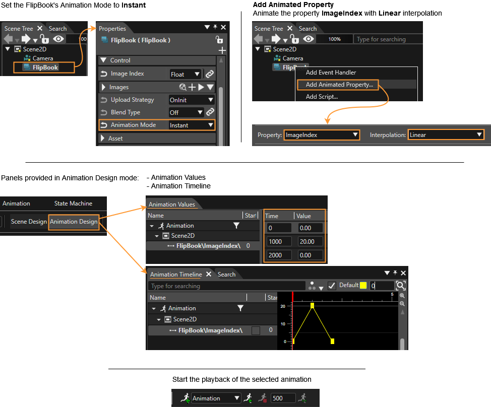
The FlipBook can be used to configure a set of images. These images can be animated using SceneComposer animation as follows:

1. Select the FlipBook control of your scene in the Scene Tree Panel and set the *Animation Mode* property to *Instant.*
2. Right-click on the FlipBook control in the Scene Tree Panel and choose \[ Add Animated Property... \] from the context menu.
3. Choose to animate the property \[ ImageIndex \] and select \[ Linear \] Interpolation.
4. Please note that you have now left the \[ Scene Design \] mode are now in \[ Animation Design \] mode.
5. Right click into the right side of the *Animation Value* panel and choose \[ Insert Key Frame \].
6. Configure the keyframes at timestamps 0, 1000 and 2000. Set the values 0.00, 20.00 and 0.00.
7. In the Animation Timeline panel you can check your animation. (Double-click your animation to switch to a more intuitive view.)
8. Press the button \[ Start the playback of the selected animation \] button to watch your animation. It should start from picture with index 0 and continue to picture with index 20 and then reverse (from picture with index 20 back to picture with index 0).

<div drawio-diagram="6888"><img src="https://doc316en.candera.eu/uploads/images/drawio/2024-09/drawing-5-1727447094.png" alt=""/></div>

**Result:** Animation with the FlipBook's images

[![FlipBook_loop.gif](https://doc316en.candera.eu/uploads/images/gallery/2024-09/4fPflipbook-loop.gif)](https://doc316en.candera.eu/uploads/images/gallery/2024-09/4fPflipbook-loop.gif)

---

#### Text Value

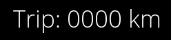
Uses a Value and a Text as format string.

Result is the formatted string. See C++ printf() function.

The value can be set directly or by an event. Event input can be provided by e.g. the Send Value as Event Behavior or the Forward Value Behavior.

<div drawio-diagram="5511"><img src="https://doc316en.candera.eu/uploads/images/drawio/2024-03/drawing-5-1711721461.png" alt=""/></div>

**Properties**

<table border="1" id="bkmrk-property-name-type-d-8" style="border-collapse: collapse; width: 100%; height: 176.8px;"><colgroup><col style="width: 24.9588%;"></col><col style="width: 24.9588%;"></col><col style="width: 50.0412%;"></col></colgroup><tbody><tr style="height: 29.4667px;"><td style="height: 29.4667px;">**Property Name**  
</td><td style="height: 29.4667px;">**Type**  
</td><td style="height: 29.4667px;">**Description**  
</td></tr><tr><td>Value</td><td>Variant</td><td>The value to be formatted</td></tr><tr><td>Interval Handling  
</td><td>Enum (Limit, Cycle, Ignore)  
</td><td>Select how the behavior should react when the minimum or maximum limit is exceeded.</td></tr><tr><td>Minimum Value  
</td><td>bool/Variant  
</td><td>Minimum value</td></tr><tr><td>Maximum Value  
</td><td>bool/Variant  
</td><td>Maximum value</td></tr><tr><td>Format Text  
</td><td>String  
</td><td>The format string which includes one format specifier (beginning with %). See C printf() function.</td></tr><tr><td>Style  
</td><td>Candera::TextRendering::Style</td><td>The Style that will be used.</td></tr><tr><td>Text Alignment  
</td><td>Enum (Left, Center, Right)</td><td>The horizontal text alignment, using the culture text direction, is used to define how text will be horizontally aligned within its layout area.</td></tr><tr><td>Multiline  
</td><td>bool  
</td><td>If multi line is disabled then the new line control characters will be ignored and text will always be rendered in one line.</td></tr><tr><td>Enabled  
</td><td>bool  
</td><td>If set to false it will not react on focus events and does not have to support different visualizations for the different states.</td></tr><tr><td>Text Color  
</td><td>[Candera::Color](http://dev.doc.cgistudio.at/APILINK/class_candera_1_1_color.html "Represents a color by its red-, green-, blue- and alpha-value. Provides color arithmetic functions an...")</td><td>The color which can be used from other Behaviors.</td></tr><tr><td>Disabled Color  
</td><td>[Candera::Color](http://dev.doc.cgistudio.at/APILINK/class_candera_1_1_color.html "Represents a color by its red-, green-, blue- and alpha-value. Provides color arithmetic functions an...")</td><td>The color which can be used from other Behaviors.</td></tr><tr><td>Blend Type  
</td><td>BlendType::Enum</td><td>The blend type that will be set.</td></tr></tbody></table>

---

#### Tell Tale

The TellTale Control is a often used control. It's for example used for turn light indication (blinking tell tale) or seat belt indication (static on/off tell tale) in the automotive area.

In general, a telltale is a control where two image can be defined: one for the off-state and one for the on-state. It can be set to On or Off or it can be set to blinking mode (as it is needed for the turn light indication). When in blinking mode, you can configure its behavior: for how long you want the On State Image to be displayed and for how long you want the Off State Image displayed individually.

<div drawio-diagram="5512"><img src="https://doc316en.candera.eu/uploads/images/drawio/2024-03/drawing-5-1711721850.png" alt=""/></div>

**Properties**

<table border="1" id="bkmrk-property-name-type-d-9" style="border-collapse: collapse; width: 100%; height: 176.8px;"><colgroup><col style="width: 24.9588%;"></col><col style="width: 24.9588%;"></col><col style="width: 50.0412%;"></col></colgroup><tbody><tr style="height: 29.4667px;"><td style="height: 29.4667px;">**Property Name**  
</td><td style="height: 29.4667px;">**Type**  
</td><td style="height: 29.4667px;">**Description**  
</td></tr><tr><td>State</td><td>Enum (On, Off, Blinking)</td><td>If set to On, sends only On value to Trigger Behaviors in the same node. If set to Off, sends only Off value to Trigger Behaviors in the same node. If set to Blinking, alternates between sending On or Off values. Use On Time Ms and Off Time Ms to specify the speed of blinking.</td></tr><tr><td>On Time Ms  
</td><td>UInt32  
</td><td>If State is set to Blinking, IntervalSwitchBehavior will be sending On value for On Time Ms milliseconds before switching to sending Off value.</td></tr><tr><td>Off Time Ms  
</td><td>UInt32  
</td><td>If State is set to Blinking, IntervalSwitchBehavior will be sending Off value for Off Time Ms milliseconds before switching to sending On value.</td></tr><tr><td>On State Image  
</td><td>[Candera::Image2D](http://dev.doc.cgistudio.at/APILINK/class_candera_1_1_image2_d.html "Image2D encapsulates a surface handle which is retrieved when uploading an image.")</td><td>Tell Tale control displays selected image on its On state.</td></tr><tr><td>Off State Image  
</td><td>[Candera::Image2D](http://dev.doc.cgistudio.at/APILINK/class_candera_1_1_image2_d.html "Image2D encapsulates a surface handle which is retrieved when uploading an image.")</td><td>Tell Tale control displays selected image on its Off state.</td></tr><tr><td>Blend Type  
</td><td>BlendType::Enum</td><td>The blend type that will be set on the affected nodes.</td></tr></tbody></table>

---

#### Gauge

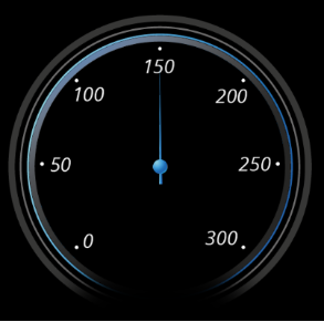
The Gauge allows to rotate a needle on a background according to its input value. Setting a value animates the rotation from the last one. The right pivot of the needle-image can be set via the pivot hint for a proper rotation. The minimum and maximum rotation can be set in the control as well as the minimum and maximum input. Further wise interpolation properties can be set.

<div drawio-diagram="5513"><img src="https://doc316en.candera.eu/uploads/images/drawio/2024-03/drawing-5-1711722177.png" alt=""/></div>

**Properties**

<table border="1" id="bkmrk-property-name-type-d-10" style="border-collapse: collapse; width: 100%; height: 176.8px;"><colgroup><col style="width: 24.9588%;"></col><col style="width: 24.9588%;"></col><col style="width: 50.0412%;"></col></colgroup><tbody><tr style="height: 29.4667px;"><td style="height: 29.4667px;">**Property Name**  
</td><td style="height: 29.4667px;">**Type**  
</td><td style="height: 29.4667px;">**Description**  
</td></tr><tr><td>Value</td><td>Variant</td><td>Specifies the input value.</td></tr><tr><td>Input Min  
</td><td>bool/Variant  
</td><td>The smallest possible input value.</td></tr><tr><td>Input Max</td><td>bool/Variant  
</td><td>The largest possible input value.</td></tr><tr><td>Rotation Min  
</td><td>Float  
</td><td>The smallest possible angle in degrees.</td></tr><tr><td>Rotation Max  
</td><td>Float  
</td><td>The largest possible angle in degrees.</td></tr><tr><td>Background Image  
</td><td>[Candera::Image2D](http://dev.doc.cgistudio.at/APILINK/class_candera_1_1_image2_d.html "Image2D encapsulates a surface handle which is retrieved when uploading an image.")</td><td>The background image, which might be a scale.</td></tr><tr><td>Needle Image  
</td><td>[Candera::Image2D](http://dev.doc.cgistudio.at/APILINK/class_candera_1_1_image2_d.html "Image2D encapsulates a surface handle which is retrieved when uploading an image.")</td><td>The needle-image of the needle that will be rotated.</td></tr><tr><td>Animation Mode</td><td>  
</td><td>Animation mode sets the interpolation type (Instant, Speed-based, or Time-based).</td></tr><tr><td>Blend Type  
</td><td>BlendType::Enum</td><td>The blend type that will be set on the affected nodes.</td></tr></tbody></table>

---