# Predefined Controls
This chapter is about how to use the predefined Controls that come with CGI Studio.
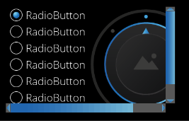
The controls available in SceneComposer can be seen in the SceneComposer Toolbox View:
# Touchable
### ControlDevelopment
#### KeyboardKey
Keyboard key is building block of Keyboard Control.
**Properties**
This Control does not have any configurable properties.
---
#### Scrollbar
The Scrollbar is used internally in List and ScrollView and shows up when the layout-size of those controls is smaller than its actual content. It can be used by custom scrollable controls.
**Properties**
| **Property Name**
| **Type**
| **Description**
|
| Scroll Direction
| Enum (Vertical, Horizontal) | The direction in which the Scrollbar scrolls. |
| Handle Minimum Size
| Integer
| The minimum height (for vertical scrollbar) or minimum width (for horizontal scrollbar) of the handle in pixels. |
| Scrollbar Visibility
| Enum (Automatic, Collapsed, Visible) | Configure the visibility of the scrollbar. By default it is set to Automatic which will determine the visibility based on the actual content. |
| Min Movement To Scrolling
| Integer
| Minimum distance a touch gesture needs to move to start scrolling. |
| Blend Type
| BlendType::Enum
| Sets the blend option. |
**Functionality**
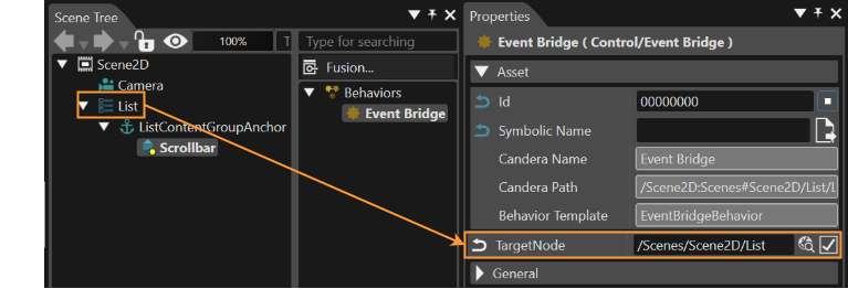
The Scrollbar emits a ScrollableEvent which can be forwarded to a Behavior (f.e. List Behavior, Scroll View Behavior) via the Event Bridge Behavior.
| **Behavior Name**
| **Type**
| **predefined/userdefined**
| **Description**
|
| Event Bridge
| Control Behavior
| predefined in List and ScrollView Control
| Forwards the ScrollableEvent from the Scrollbar to a Behavior |
| List
| Control ConstructionKit Behavior
| predefined in List Control
| Internally receives the ScrollableEvent from the Scrollbar. |
| Scroll View
| Control ConstructionKit Behavior | predefined in ScrollView Control
| Internally receives the ScrollableEvent from the Scrollbar. |
---
#### PageIndicatorElement
A PageIndicatorElement is a Control that is part of the Page Indicator Control. The Page Indicator Control indicates the currently displayed page. PageIndicatorElement is intended to be used as component of Page Indicator and therefore is not focusable as individual element.
The Control offers the possibility to customize it’s appearance through 9 patch image and color properties.

| **Property Name**
| **Type**
| **Description**
|
| Selected Indicator Image | [Candera::Image2D](http://dev.doc.cgistudio.at/APILINK/class_candera_1_1_image2_d.html "Image2D encapsulates a surface handle which is retrieved when uploading an image.") | Image displayed when the control is in selected state. |
| Indicator Image | [Candera::Image2D](http://dev.doc.cgistudio.at/APILINK/class_candera_1_1_image2_d.html "Image2D encapsulates a surface handle which is retrieved when uploading an image.") | Image displayed when the control is in base deselected state. |
| Selected Indicator Pressed Image | [Candera::Image2D](http://dev.doc.cgistudio.at/APILINK/class_candera_1_1_image2_d.html "Image2D encapsulates a surface handle which is retrieved when uploading an image.") | Image displayed when the control is in selected state and pressed. |
| Indicator Pressed Image | [Candera::Image2D](http://dev.doc.cgistudio.at/APILINK/class_candera_1_1_image2_d.html "Image2D encapsulates a surface handle which is retrieved when uploading an image.") | Image displayed when the control is in deselected state and pressed. |
| Hovered Color | [Candera::Color](http://dev.doc.cgistudio.at/APILINK/class_candera_1_1_color.html "Represents a color by its red-, green-, blue- and alpha-value. Provides color arithmetic functions an...") | The color to blend with the current control image when the control is hovered. |
| Disabled Color | [Candera::Color](http://dev.doc.cgistudio.at/APILINK/class_candera_1_1_color.html "Represents a color by its red-, green-, blue- and alpha-value. Provides color arithmetic functions an...") | The color to blend with the current control image when the control is disabled. |
---
### Button
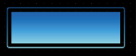
The Button Control offers an easy way to define all different states of a button and an action that is performed when clicking it.
The visual appearance can be configured with three images depending on the button's state and a hovered color that can be defined including an alpha value.
Additionally the Button offers an Anchor to attach content. Therefore you can also set the padding of the Button and its content.
| **Property Name**
| **Type**
| **Description**
|
| Enabled
| bool
| If true, the control is enabled. Otherwise the visual representation of the control will be changed to the disabled colors. Also disable the focus to avoid receiving input. |
| Focusable | bool | If true, the control is focusable. Otherwise the control can not be focused. |
| Normal Image | 9 Patch Image | The image which is used as Button Image for the color multiplication of other states like Hovered. |
| Pressed Image | 9 Patch Image | The image which is used as Button Image if the pressed state applies. |
| Focused Image | 9 Patch Image | Transparent image contained in the center (border) of the control which is activated if the control has the current focus. The control must be set as focusable. Note that the focused image will always be contained in the top layer of the control. |
| Hovered Color Property Reference | Enum (Self, Other) | Choose how the property gets set. Via own property or from another Behavior. |
| Hovered Color | [Candera::Color](http://dev.doc.cgistudio.at/APILINK/class_candera_1_1_color.html "Represents a color by its red-, green-, blue- and alpha-value. Provides color arithmetic functions an...") | The color which is used as hovered color for blending with the Button Image.
This property is only available if Hovered Color Property Reference is configured for "Self".
|
| Hovered Color Property Provider
| [Candera::Behavior](http://dev.doc.cgistudio.at/APILINK/class_candera_1_1_behavior.html "Behaviors are small re-usable functional blocks that communicate via events. Behaviors are based on W...") | Property Behavior which contains the color which has to be set on the effect.
This property is only available if Hovered Color Property Reference is configured for "Other".
|
| Disabled Color Property Reference
| Enum (Self, Other) | Choose how the property gets set.Via own property or from another Behavior.
|
| Disabled Color | [Candera::Color](http://dev.doc.cgistudio.at/APILINK/class_candera_1_1_color.html "Represents a color by its red-, green-, blue- and alpha-value. Provides color arithmetic functions an...") | The color to set on the disabled Button.
This property is only available if Disabled Color Property Reference is configured for "Self".
|
| Disabled Color Property Provider
| [Candera::Behavior](http://dev.doc.cgistudio.at/APILINK/class_candera_1_1_behavior.html "Behaviors are small re-usable functional blocks that communicate via events. Behaviors are based on W...") | Property Behavior which contains the color which has to be set on the effect.
This property is only available if Disabled Color Property Reference is configured for "Other".
|
| Padding | [Candera::Margin](http://dev.doc.cgistudio.at/APILINK/class_candera_1_1_margin.html "A non-zero margin applies space outside the element layout's width and height. The values can be set ...") | Padding of the Button. Used when a content is attached. |
| Blend Type | BlendType::Enum | Sets the blend option. |
**Functionality**
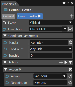
The functionality of the button can be edited in the Behaviors panel or in the EventHandler Tab (see chapter [EventHandler Tab](https://doc316en.candera.eu/link/569#bkmrk-page-title)). An EventHandler that checks for Clicks will perform the user defined action.
| **Behavior Name**
| **Type**
| **predefined/userdefined**
| **Description**
|
| EventHandler | Control Behavior | predefined | Checks a defined condition and invokes a defined action behavior if that condition is true.
|
| CheckClick | Input Condition Behavior | predefined | Condition checks if the button has been clicked |
| Action | Action Behavior | userdefined | Userdefined action that will be performed when the button is clicked. |
---
#### CoverFlow
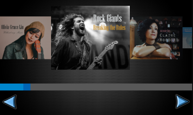
A CoverFlow is a proof-of-concept control that allows for horizontal swiping of child items. The items are scaled according to their location.
Child items are placed in provided anchor. It is possible to add padding by placing blank items at the beginning and at the end of the anchor content.
By default, the CoverFlow works horizontally.
| **Property Name**
| **Type**
| **Description**
|
| Value | Float/Variant | Current value (position) of the CoverFlow. |
| Minimum | Float/Variant | The minimum value of CoverFlow. |
| Maximum | Float/Variant | The maximum value of CoverFlow. |
| Zoom Minimum
| Float/Variant
| Zoom effect minimum value.
|
| Zoom Maximum
| Float/Variant | Zoom effect maximum value.
|
| Zoom By Layout | bool | Wethere zoom accomplished by layout size. |
| Increase Swipe Direction
| Enum (Left, Right, Up, Down)
| The direction of the swipe to increase value
|
| Decrease Swipe Direction
| Enum (Left, Right, Up, Down)
| The direction of the swipe to decrease value
|
| Orientation | StackLayouter::Arrangement | Selects arrangement for cover flow. See [Set Layout](https://doc316en.candera.eu/link/598#bkmrk-set-layout) for more information. |
| Blend Type | BlendType::Enum | Sets the blend option. |
---
#### Dial
A dial is used to set a value within a specified range or to select between different options which are represented by the value of the dial. The control knob changes the value when the user touches and turns it. The degree of rotation corresponds to the desired value change. The dial snaps into its predefined positions defined by its step size.
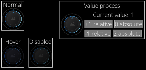
The below figure shows an example using a 3-step rotation, with a Minimum Rotation of -45 degrees, Maximum Rotation of +45 degrees, and Step Size of 45 degrees. In this example, BackgroundImages 0 is displayed corresponding to Current Value = 0. Similarly, Current Value = 1 displays BackgroundImages 1 and Current Value = 2 displays BackgroundImages 2.
For a 5-step rotation with a Minimum Rotation of -90 degrees, Maximum Rotation of +90 degrees, and Step Size of 45 degrees, you will need to set 5 BackgroundImages.
The rotary knob supports events. If it receives an event of value change (ValueChangeEvent), the knob will be set accordingly. When the control is focused it is possible to control it using the keyboard (up/down arrow).
| **Property Name**
| **Type**
| **Description**
|
| Enabled | bool | If set to false it will not react on focus events and does not have to support different visualizations for the different states. |
| Focusable | bool | If true, the control is focusable. Otherwise the control can not be focused. |
| Current Value
| FeatStd::Int32 | Current value for the dial.
|
| Step Size
| FeatStd::Float | Step size in degrees.
|
| Minimum Rotation
| FeatStd::Float | Minimum rotation of the dial.
|
| Maximum Rotation
| FeatStd::Float | Maximum rotation of the dial.
|
| Knob Image
| [Candera::Image2D](http://dev.doc.cgistudio.at/APILINK/class_candera_1_1_image2_d.html "Image2D encapsulates a surface handle which is retrieved when uploading an image.") | The image to set on the effect.
|
| BackgroundImages
| [Candera::Image2D](http://dev.doc.cgistudio.at/APILINK/class_candera_1_1_image2_d.html "Image2D encapsulates a surface handle which is retrieved when uploading an image.") | A list of images which should be available for selection. |
| Focus Image
| [Candera::Image2D](http://dev.doc.cgistudio.at/APILINK/class_candera_1_1_image2_d.html "Image2D encapsulates a surface handle which is retrieved when uploading an image.") | The image to set on the effect.
|
| Disabled Color
| [Candera::Color](http://dev.doc.cgistudio.at/APILINK/class_candera_1_1_color.html) | The color which can be used from other Behaviors.
|
| Hovered Color
| [Candera::Color](http://dev.doc.cgistudio.at/APILINK/class_candera_1_1_color.html) | The color which can be used from other Behaviors.
|
| Increment Key Code
| Candera::KeyboardKeyCode::Enum | Check the KeyCode of the pressed key (can also be modifier).
|
| Decrement Key Code
| Candera::KeyboardKeyCode::Enum | Check the KeyCode of the pressed key (can also be modifier).
|
| Blend Type
| BlendType::Enum | The blend type that will be set on the affected node.
|
---
#### Drawer
The Drawer Control provides a retractable area controlled via events. It offers an Anchor, where any kind of nodes can be attached to.
If the Drawer receives a Drawer Event, the Control will open or close itself. The "Change Drawer State" action allows to send these events and also provide the functionality to toggle the state of the Drawer Control.
When the "Drag Enabled" Property is set to true, then the Drawer can also be opened/closed by dragging the Knob.
All nodes that are attached to the Anchor will be displayed in the same way as they would be displayed when attached to an Overlay Layouter.
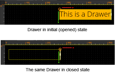
The image below shows a Drawer Control with "Appear Direction" left in initial state and in closed state. When the drawer gets closed, it slides to the left and gets hidden like closing a desk drawer.
Nine-Patch-Images are not supported by Drawer Image properties (Knob Pressed Image, Knob Normal Image).
Properties
| **Property Name**
| **Type**
| **Description**
|
| Open | bool | If true, the control is shown in it's opened state. Otherwise the visual representation of the control will be it's closed state. |
| Appear Direction | Enum (Left, Right, Top, Bottom)
| Specifies the direction from which the content will appear. |
| Knob Pressed Image | [Candera::Image2D](http://dev.doc.cgistudio.at/APILINK/class_candera_1_1_image2_d.html "Image2D encapsulates a surface handle which is retrieved when uploading an image.") | Specifies the look of the dragable Knob when it is pressed. Note: Should have the same or a bigger size than the Normal Image. |
| Knob Normal Image | [Candera::Image2D](http://dev.doc.cgistudio.at/APILINK/class_candera_1_1_image2_d.html "Image2D encapsulates a surface handle which is retrieved when uploading an image.") | Specifies the look of the dragable Knob when it is not pressed. Note: Should have the same or a smaller size than the Pressed Image. |
| Drag Enabled | bool | If true, then the dragable Knob is active and visible. |
| Blend Type | BlendType::Enum | Sets the blend option. |
---
#### IconButton
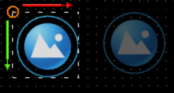
IconButton has similar functionality as the standard button, but in addition an icon (image) (defined via multiple properties per control state) is placed on top of the button.
| **Property Name**
| **Type**
| **Description**
|
| Identifier
| String
| Identifier which is used when emitting an Event (e.g. Click Event).
|
| Enabled
| bool
| If set to false, it will not react on focus events and does not have to support different visualizations for the different states.
|
| Focusable
| bool
| If true, the control is focusable. Otherwise the control can not be focused.
|
| Normal Image | 9 patch image | The Image which is used if the normal state applies. |
| Pressed Image | 9 patch image | The Image which is used if the pressed state applies. |
| Focused Image | 9 patch image | Image which is transparent in the center (border). It gets activated if the control has the current focus. Therefore be sure that the Button is focusable.
|
| Hovered Color | [Candera::Color](http://dev.doc.cgistudio.at/APILINK/class_candera_1_1_color.html) | The color which is used as hovered color for blending with the Button Image.
|
| Disabled Color | [Candera::Color](http://dev.doc.cgistudio.at/APILINK/class_candera_1_1_color.html) | The color which is used for blending with the disabled Button Image.
|
| Padding
| [Candera::Margin](http://dev.doc.cgistudio.at/APILINK/class_candera_1_1_margin.html "A non-zero margin applies space outside the element layout's width and height. The values can be set ...") | Padding of the button. Used when a content is attached.
|
| Icon Horizontal Alignment | Enum (Left, Center, Right) | The horizontal alignment of the icon. |
| Icon Vertical Alignment | Enum (Top, Center, Bottom) | The vertical alignment of the icon. |
| Icon Normal Image | [Candera::Image2D](http://dev.doc.cgistudio.at/APILINK/class_candera_1_1_image2_d.html "Image2D encapsulates a surface handle which is retrieved when uploading an image.") | The image which is used as Icon on the button if not pressed or hovered. |
| Icon Pressed Image | [Candera::Image2D](http://dev.doc.cgistudio.at/APILINK/class_candera_1_1_image2_d.html "Image2D encapsulates a surface handle which is retrieved when uploading an image.") | The image which is used as Icon on the button if the pressed state applies. |
| Icon Focused Image
| [Candera::Image2D](http://dev.doc.cgistudio.at/APILINK/class_candera_1_1_image2_d.html "Image2D encapsulates a surface handle which is retrieved when uploading an image.") | The image to set on the effect.
|
| Icon Hovered Color
| [Candera::Color](http://dev.doc.cgistudio.at/APILINK/class_candera_1_1_color.html) | The color which is used as hovered color for blending with the button Icon image.
|
| Icon Disabled Color
| [Candera::Color](http://dev.doc.cgistudio.at/APILINK/class_candera_1_1_color.html) | The color which is used for blending with the disabled button Icon Image.
|
| Blend Type | BlendType::Enum | Sets the blend option. |
---
#### InputField
The InputField contains an editable text. If the Control has the keyboard focus it can be modified by receiving “Key Events”. This events can e.g. be sent from a “Virtual Key Behavior”. Additionally the InputField contains a caret which can be shifted by “Key Events” (KeyCode: Key\_LeftArrow or Key\_RightArrow). Furthermore the InputField sends “Enter Exit" Events in case of losing the focus. This events can be checked by an Event Handler with the “Check Enter Or Exit Behavior” e.g. to activate a virtual keyboard. As other Controls it contains a value (string) which can be forwarded. Therefore just use the “Forward Value” Behavior and set another Control as Target Node.
The default text and the placeholder text have got additional properties for customizing them visually.
**Properties**
| **Property Name**
| **Type**
| **Description**
|
| Enabled | bool | If true, the control is enabled. Otherwise the visual representation of the control will be changed to the disabled colors. Also disable the focus to avoid receiving input. |
| Focusable | bool | If true, the control is focusable. Otherwise the control can not be focused and will not receive any inputs. |
| DefaultText | String | Text which will be set as default text. |
| Text Color
| [Candera::Color](http://dev.doc.cgistudio.at/APILINK/class_candera_1_1_color.html) | The color set on the text.
|
| Text Style
| Text Style
| The Style that will be set to the Text Node.
|
| Text Disabled Color
| [Candera::Color](http://dev.doc.cgistudio.at/APILINK/class_candera_1_1_color.html)
| The color to set on the text if the control is disabled.
|
| Placeholder Text | String | The Text that will be set to the Text Node. |
| Placeholder Text Color
| [Candera::Color](http://dev.doc.cgistudio.at/APILINK/class_candera_1_1_color.html) | The color of the placeholder text.
|
| Placeholder Text Style
| Text Style
| The Style that will be used.
|
| Placeholder Disabled Color
| [Candera::Color](http://dev.doc.cgistudio.at/APILINK/class_candera_1_1_color.html)
| The color to set on the effect of the Text.
|
| Caret Image | [Candera::Image2D](http://dev.doc.cgistudio.at/APILINK/class_candera_1_1_image2_d.html "Image2D encapsulates a surface handle which is retrieved when uploading an image.") | The image to set as caret. |
| Off Time Ms | Integer | Milliseconds before switching the blinking caret to On state. |
| On Time Ms | Integer | Milliseconds before switching the blinking caret to Off state. |
| Background Image | [Candera::Image2D](http://dev.doc.cgistudio.at/APILINK/class_candera_1_1_image2_d.html "Image2D encapsulates a surface handle which is retrieved when uploading an image.") | The image to set as Background. |
| BG Disabled Color | [Candera::Color](http://dev.doc.cgistudio.at/APILINK/class_candera_1_1_color.html) | The color to set on the BG if the control is disabled. |
| Focused Image | [Candera::Image2D](http://dev.doc.cgistudio.at/APILINK/class_candera_1_1_image2_d.html "Image2D encapsulates a surface handle which is retrieved when uploading an image.") | The image to set as FocusBorder. |
| Set Value On Enter
| bool
| If true, the value will be set when the Enter key is pressed.
|
| Set Value On Each Change | bool | If true, the value will be set on each input. |
| Max Text Length | Integer | Maximum count of characters. |
| Just Digits | bool | If true, the InputField will receive just digits. |
| Blend Type | BlendType::Enum | The blend type that will be set on the affected nodes.
|
| Keyboard Node
| Node
| Keyboard node.
|
| Keyboard Layout Name
| String
| Layout name.
|
---
#### Keyboard
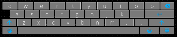
The Keyboard Control emulates physical computer keyboard that enables a user to enter characters into an InputField Control. The Keyboard Control is highly customizable via Configuration Script described below.
To use the Control one needs to connect an InputField with a keyboard via KeyboardAction with Action Open. When the InputField send the event, the Keyboard appears and sends pressed characters to the InputField that activates it.
| **Property Name**
| **Type**
| **Description**
|
| Configuration Script | String | Keyboard layout configuration script - key definitions (strings, KeyboardCodes or KeyboardActions) separated by spaces and newlines; may have parameters in parentheses and width specifiers in square brackets. See documentation and examples for reference.
See [Keyboard Behavior](https://doc316en.candera.eu/link/598#bkmrk-keyboard-behavior) for more information.
|
| State Machine Node
| Node
| Node containing State Machine Behavior, that will be sent a ValueChanged event with layout name, when layout switching occurs. In turn, State Machine may send SetConfiguration KeyboardAction to the Keyboard, to set new Keyboard layout configuration string. If left empty, layout changes will trigger ValueChanged on Keyboard node itself - in this case layout configuration string may be updated using Value change conditions attached to Keyboard node. |
| Navigate Up Key Code
| Candera::KeyboardKeyCode::Enum | Key used for navigating up |
| Navigate Down Key Code
| Candera::KeyboardKeyCode::Enum | Key used for navigating down |
| Navigate Next Key Code
| Candera::KeyboardKeyCode::Enum | Key used for navigating right |
| Navigate Previous Key Code
| Candera::KeyboardKeyCode::Enum | Key used for navigating left |
| Navigate Start On Down Key
| bool
| Enter navigation mode when pressing down key for the first time |
| Navigate End On Up Key
| bool
| Exit navigation mode when pressing up key on the first row |
| Navigate Start Key Code
| Candera::KeyboardKeyCode::Enum | Key used for entering navigation mode |
| Navigate End Key Code
| Candera::KeyboardKeyCode::Enum | Key used for exiting navigation mode |
| Navigate Close Key Code
| Candera::KeyboardKeyCode::Enum | Key used for closing keyboard |
| Navigate Invoke Key Code
| Candera::KeyboardKeyCode::Enum | Key used for invoking key action |
| Blend Type
| BlendType::Enum | The blend type that will be set.
|
---
#### MenuItem
A MenuItem is a basic building block of MenuScreens. It can represent for example an application or a deeper level in a menu hierarchy. It consists of an icon for graphical representation and a label for textual description.
A proper usage is to place or create it inside a MenuScreen control because of internal events that communicate with it. Those events handle runtime repositioning an instance of MenuItem or deleting it from a MenuScreen.

| **Property Name**
| **Type**
| **Description**
|
| Enabled | bool | If true, then item is visible
|
| Focus Image On Selection | 9-patch image | The border image is set while the MenuItem is selected |
| Focus Image On Dragging | 9-patch image | The border image is set while the MenuItem is in edit mode |
| Delete Button Normal Image | 9-patch image | The image will be shown in top-right of the Control in edit mode to enable deletion of the instance of MenuItem |
| Delete Button Pressed Image | 9-patch image | The image will be set while Delete Button is pressed |
| Delete Button Hovered Color | [Candera::Color](http://dev.doc.cgistudio.at/APILINK/class_candera_1_1_color.html) | The color will be blend with Delete Button images while a user has his cursor over the Delete Button |
| Focusable
| bool
| If true then focus node will be visible
|
| Image | 9-patch image | A bitmap that is the icon of the Control |
| Label | String | A text that will be set to the Text Node.
|
| Label Color | [Candera::Color](http://dev.doc.cgistudio.at/APILINK/class_candera_1_1_color.html)
| A color of the Icon Label. |
| Label Style | Text Style | A font style of the Text. |
| Label Trimming | Enum (None, Ellipsis, Custom Text)
| Trimming defines the behavior to employ when content overflows the content area
|
| Blend Type | BlendType::Enum | The blend type that will be set.
|
---
#### Menu Screen
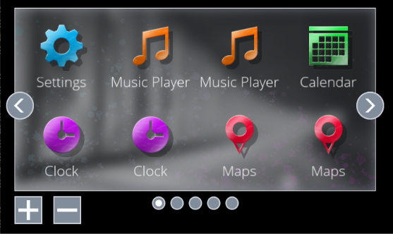
The Menu Screen Control represents a menu in the form of a grid of icons (instances of the Menu Item Control).
It has configurable number of rows and columns as well as default and maximum number of screens. A user can swipe between neighboring screens. The Control handles user input and forwards proper information to children MenuItem nodes. The children nodes may be removed and reordered at run time.
| **Property Name**
| **Type**
| **Description**
|
| ActiveScreenIndex | FeatStd::UInt32 | Index (starting at 0) of the current visible screen. |
| NumberOfScreens | FeatStd::UInt32 | Default number of screens (can be changed in runtime) |
| Rows | FeatStd::UInt32 | Number of rows of a grid in a single screen |
| Columns | FeatStd::UInt32 | Number of columns of a grid in a single screen |
| Items | Binding Source | Binding to a list containing icons and labels that should be accessible in the MenuScreen |
| Swap Item Animation Easing Function | EasingFunctions::Enum | Interpolation method for animations of swapping items |
| Swap Item Animation Length | FeatStd::Float | Length of the swapping animation |
| Change Screen Animation Easing Function | EasingFunctions::Enum | Interpolation method for animations of changing screens |
| Change Screen Animation Length | FeatStd::Float | Length of the changing animation |
| Key Code To Move Selection Left | Candera::KeyboardKeyCode::Enum | Key that changes focus from an item to its left neighbor |
| Key Code To Move Selection Right | Candera::KeyboardKeyCode::Enum | Key that changes focus from an item to its right neighbor |
| Key Code To Move Selection Up | Candera::KeyboardKeyCode::Enum | Key that changes focus from an item to its top neighbor |
| Key Code To Move Selection Down | Candera::KeyboardKeyCode::Enum | Key that changes focus from an item to its bottom neighbor |
| Focusable | bool | Enables grabbing focus by the Control |
| Screen Change Timeout | FeatStd::Float | Time of dragging a Menu Item outside the Control to fire Change Screen |
| Background Image | [Candera::Image2D](http://dev.doc.cgistudio.at/APILINK/class_candera_1_1_image2_d.html "Image2D encapsulates a surface handle which is retrieved when uploading an image.") | Background image of screens |
| Focus Border Image | [Candera::Image2D](http://dev.doc.cgistudio.at/APILINK/class_candera_1_1_image2_d.html "Image2D encapsulates a surface handle which is retrieved when uploading an image.") | Image of the border rendered when the Control grabs focus |
| Limit Of Screens | FeatStd::UInt32 | Maximum number of screens that may be handled by the Control in runtime |
| Page Indicator Node | Node | Page indicator that helps in navigation between screens of the Control |
| Blend Type | BlendType::Enum | The blend type that will be set.
|
---
#### PageIndicator
A Page Indicator is a control that indicates currently visible page of set and provides method to switch to another page directly by click or if focused in a stepping manner using rotary action input.
The control interacts with MenuScreens through exchange of ValueChange and ChangeValue events. The cooperating control is set in *Target Node* property.
The action keys will move the focus in/out of the control and when in then will switch pages until first or last page is reached. Continued action will pass the focus out of the control.
By default the control supports up to 8 pages, support for more pages requires manual addition of additional PageIndicatorElements in the control.

| **Property Name**
| **Type**
| **Description**
|
| Target Node | Node | A node to exchanging events. |
| Active Page Index | FeatStd::UInt32 | Index of currently visible page. Must be in range from 0 to `Number Of Pages - 1` . |
| Number Of Pages | FeatStd::UInt32 | Number of available pages. |
| Decrement Key Code | Candera::KeyboardKeyCode::Enum | The Key Code triggering decrement of the value. |
| Increment Key Code | Candera::KeyboardKeyCode::Enum | The Key Code triggering increment of the value. |
| Blend Type | BlendType::Enum | Sets the blend option. |
---
#### Roll
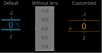
The Control represents a vertical list of numeric values from a specified range with a specified step. Current value of the Control is visible in the middle of the control and can be zoomed like using lens. Changing the current value can be animated and can be done using touch/pointer or configurable keys of a keyboard. One can edit the current value of the Control by entering it with a keyboard.
To use the Control simply put it in a scene and configure all desirable properties. A roll can *forward value* as well as receive a *send value as event*.
The range is implemented in a way that it starts at Minimum Value, increases by (positive) StepSize but no further than Maximum Value. This conforms to the way range stepping is usually implemented, and gives configuration flexibility.
| **Property Name**
| **Type**
| **Description**
|
| Focusable
| bool
| If true, the control is focusable. Otherwise the control cannot be focused.
|
| Value | Float | The value which will be changed using the roll |
| Min | Float | The minimum value which can be reached. This value is always smaller or equal to the MaxValue. |
| Max | Float | The maximum value which can be reached. This value is always bigger or equal to MinValue |
| Step | Float | The increment/decrement of the value. |
| LensVisible | bool | Is lens group visible? Enables highlighting of the current value, default zooming and bordering it.
|
| Use Cyclic Roll | bool | Is roll cyclic? If true the MinValue of the Control can be reached after the MaxValue of the Control and vice versa |
| Allow Dragging Past Limit | bool | Allow temporary over-dragging (dragging to blank values before first and after last entry).
If true there is visible animation of the Control being „out of range“ while moving below minimum and above maximum value.
|
| Value Style | Candera::TextRendering::Style | Sets the text style for the values outside the Lens. |
| Value Color | [Candera::Color](http://dev.doc.cgistudio.at/APILINK/class_candera_1_1_color.html) | Specifies color of values in the vertical list outside the Lens |
| Lens Style | Candera::TextRendering::Style | Sets the text style for the values inside the Lens. |
| Unit Text | String | Text used in lens (it means: when the lens is used at all) to present a unit of the value |
| Unit Style | Candera::TextRendering::Styler | Sets the text style for the Unit Text. |
| Unit Margin | [Candera::Margin](http://dev.doc.cgistudio.at/APILINK/class_candera_1_1_margin.html "A non-zero margin applies space outside the element layout's width and height. The values can be set ...") | Specifies margin of the UnitText |
| Unit Color | [Candera::Color](http://dev.doc.cgistudio.at/APILINK/class_candera_1_1_color.html) | Specifies color of the UnitText |
| Decoration Image | [Candera::Image2D](http://dev.doc.cgistudio.at/APILINK/class_candera_1_1_image2_d.html "Image2D encapsulates a surface handle which is retrieved when uploading an image.") | Specifies a border image of the Lens |
| Text Input Color | [Candera::Color](http://dev.doc.cgistudio.at/APILINK/class_candera_1_1_color.html) | Specifies color of the text entered in the InputField while editing the current value of the Control |
| Text Edit Background | [Candera::Image2D](http://dev.doc.cgistudio.at/APILINK/class_candera_1_1_image2_d.html "Image2D encapsulates a surface handle which is retrieved when uploading an image.") | The background image used for the Input Field when entering Text Edit mode. |
| Max Text Length | Unsigned Int 16 | Specifies maximum count of characters that may be entered while editing the current value of the Control |
| Decrement Key Code | Candera::KeyboardKeyCode::Enum | Key used to decrement the current value of the Control |
| Increment Key Code | Candera::KeyboardKeyCode::Enum | Key used to increment the current value of the Control |
| Edit Key Code | Candera::KeyboardKeyCode::Enum | Key used to enter edit mode (show InputField) of the current value of the Control |
| Blend Type | BlendType::Enum | Sets the blend option. |
| Keyboard Node | Node | Specifies which Keyboard control should be used when entering edit mode. |
| Keyboard Layout Name | String | Layout name.
|
---
#### SpinBox
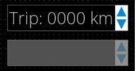
A spin box or spin button is a control that enables users to increase or decrease the number value by a specific increment (often by 1, 5 or 10) via clicking an up or down arrow button.
The action key/s will move the focus in/out of the control and informs via event about the confirmed value.
| **Property Name**
| **Type**
| **Description** |
| Enabled
| bool
| If set to false it will not react on focus events and does not have to support different visualizations for the different states. |
| Focusable
| bool
| If true, the control is focusable. Otherwise the control can not be focused. |
| Value
| Variant | The value to be formatted |
| Step Size
| Variant
| Increment/Decrement step value. |
| Minimum Value
| Variant | Minimum value |
| Maximum Value
| Variant | Maximum value |
| Text Format
| String
| The format string which includes one format specifier (beginning with %). See C printf() function. |
| Text Alignment
| Enum (Left, Centered, Right, Automatic) | The horizontal text alignment, using the culture text direction, is used to define how text will be horizontally aligned within its layout area. |
| Text Color
| [Candera::Color](http://dev.doc.cgistudio.at/APILINK/class_candera_1_1_color.html) | Text color. |
| Disabled Text Color
| [Candera::Color](http://dev.doc.cgistudio.at/APILINK/class_candera_1_1_color.html) | Disabled text color. |
| Text Style
| Candera::TextRendering::Style | The Style that will be used. |
| Spinbox Color Hovered
| [Candera::Color](http://dev.doc.cgistudio.at/APILINK/class_candera_1_1_color.html)
| The color for hovered SpinBox. |
| Spinbox Color Disabled
| [Candera::Color](http://dev.doc.cgistudio.at/APILINK/class_candera_1_1_color.html) | The color for disabled SpinBox overlay. |
| Background Image
| [Candera::Image2D](http://dev.doc.cgistudio.at/APILINK/class_candera_1_1_image2_d.html "Image2D encapsulates a surface handle which is retrieved when uploading an image.") | The image to set on the effect. |
| Arrow Up Normal Image
| [Candera::Image2D](http://dev.doc.cgistudio.at/APILINK/class_candera_1_1_image2_d.html "Image2D encapsulates a surface handle which is retrieved when uploading an image.") | The increment button image. |
| Arrow Up Pressed Image
| [Candera::Image2D](http://dev.doc.cgistudio.at/APILINK/class_candera_1_1_image2_d.html "Image2D encapsulates a surface handle which is retrieved when uploading an image.") | The increment button pressed image. |
| Arrow Down Normal Image
| [Candera::Image2D](http://dev.doc.cgistudio.at/APILINK/class_candera_1_1_image2_d.html "Image2D encapsulates a surface handle which is retrieved when uploading an image.") | The decrement button image. |
| Arrow Down Pressed Image
| [Candera::Image2D](http://dev.doc.cgistudio.at/APILINK/class_candera_1_1_image2_d.html "Image2D encapsulates a surface handle which is retrieved when uploading an image.") | The decrement button pressed image. |
| Increment Key Code
| Candera::KeyboardKeyCode::Enum | KeyCode of the key used to increase value. |
| Decrement Key Code
| Candera::KeyboardKeyCode::Enum | KeyCode of the key used to decrease value. |
| Blend Type
| BlendType::Enum | The blend type that will be set on the affected nodes. |
---
#### Sub-List
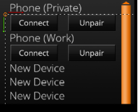
You can create a submenu in your solution by configuring this control as a child node of a List control.
With this control, you can easily invoke a submenu that can be expanded or collapsed. Key navigation is also built-in.
For detailed usage, please refer to “Getting Started > Sample Solutions > GettingStartedControls Solution > GettingStartedControls Part 3”.
| **Property Name**
| **Type**
| **Description** |
| Enabled
| bool
| If set to false the List will not react to Focus events. It also sets the Visibility of the list. |
| Visible
| bool
| If true, the List is being rendered. |
| Parent List Node
| Candera::AbstractNodePointer | The node with a ListBehavior that acts as a parent to this SubListBehavior. |
| Handle Keyboard Events
| bool
| Makes the behavior handle KeyboardFocusNavigation events internally. |
| Scroll Direction
| ScrollDirection::Enum (Vertical, Horizontal)
| The direction in which the SubListBehavior scrolls. |
| Animation Duration
| UInt32
| Duration of the scrolling animation. |
| Deceleration Factor
| Float
| Loss of flick animation speed over time. |
| Max Speed Per Flick
| Float
| Maximum amount of speed each flick motion adds to the flick animation. |
| Min Speed Per Flick
| Float
| Minimum speed required to count a touch gesture as a flick and start or continue the flick animation. |
| Min Movement To Scrolling
| UInt32
| Minimum distance a touch gesture needs to move to start a scrolling animation. |
| Max Touch Sample Age
| UInt32
| Maximum age in milliseconds of touch movement speed counted towards generating flick animation speed. |
| Items
| Items
| The items property is used for binding of dynamic items. It can only be set via databinding. Only one visible list control should be bound to a fragment list in the model. Otherwise the list fragments in the model are not able to provide data for both list controls. Use a separate list model that is filled with the same data if such a use case is required. |
| Blend Type
| BlendType::Enum | The blend type that will be set. |
---
#### TextButton
The TextButton Control offers an easy way to define all different states of a button and an action that is performed when clicking it.
As for the simple Button Control the visual appearance of the TextButton can also be configured with three images depending on the button's state and a hovered color that can be defined including an alpha value.
Additionally the TextButton offers a predefined TextNode which can be modified via the Text and the Text Style properties.
The action that is performed when pressing the TextButton can easily be defined in the [EventHandler Tab](https://doc316en.candera.eu/link/569#bkmrk-page-title). The functionality of the TextButton is similar to the [Button](#bkmrk-button). An example configuration of the Event Handler is given in the [Button section](#bkmrk-button).
**Properties**
| **Property Name**
| **Type**
| **Description** |
| Enabled
| bool
| If set to false it will not react on focus events and does not have to support different visualizations for the different states. |
| Focusable
| bool
| If true, the control is focusable. Otherwise the control can not be focused. |
| Text
| String
| The Text that will be set to the Text Node. |
| Text Style
| Candera::TextRendering::Style | The Style that will be used. |
| Normal Image
| [Candera::Image2D](http://dev.doc.cgistudio.at/APILINK/class_candera_1_1_image2_d.html "Image2D encapsulates a surface handle which is retrieved when uploading an image.") | The image which is used as Button Image for the color multiplication of other states like Hovered. |
| Pressed Image
| [Candera::Image2D](http://dev.doc.cgistudio.at/APILINK/class_candera_1_1_image2_d.html "Image2D encapsulates a surface handle which is retrieved when uploading an image.") | The image which is used as Button Image if the pressed state applies. |
| Focused Image
| [Candera::Image2D](http://dev.doc.cgistudio.at/APILINK/class_candera_1_1_image2_d.html "Image2D encapsulates a surface handle which is retrieved when uploading an image.") | Image which is transparent in the center (border). It is used for the control with the current focus (only one of the HMI) |
| Hovered Color
| [Candera::Color](http://dev.doc.cgistudio.at/APILINK/class_candera_1_1_color.html) | The color which is used as hovered color for blending with the Button Image. |
| Disabled Color
| [Candera::Color](http://dev.doc.cgistudio.at/APILINK/class_candera_1_1_color.html) | The color to set on the disabled Button. |
| Text Color
| [Candera::Color](http://dev.doc.cgistudio.at/APILINK/class_candera_1_1_color.html) | The color of the text. |
| Disabled Text Color
| [Candera::Color](http://dev.doc.cgistudio.at/APILINK/class_candera_1_1_color.html) | The color to set on the effect of the Text. |
| Blend Type
| BlendType::Enum | The blend type that will be set. |
---
#### CheckBox
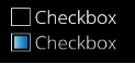
The CheckBox Control can easily be configured with a text, images for a normal and a pressed state as well as for a selected and a selected pressed state. Additionally a focused image can be defined. The action that is performed when the value changed can easily be defined in the [EventHandler Tab](https://doc316en.candera.eu/link/569#bkmrk-page-title).
| **Property Name**
| **Type**
| **Description** |
| Enabled
| bool
| If set to false it will not react on focus events and does not have to support different visualizations for the different states. |
| Focusable
| bool
| If true, the control is focusable. Otherwise the control can not be focused. |
| Value
| bool/Variant
| Selected or not (true/false). |
| Text
| String
| Text of the CheckBox. |
| Text Style
| Candera::TextRendering::Style | The Style that will be set to the Text Node. |
| Normal Image
| [Candera::Image2D](http://dev.doc.cgistudio.at/APILINK/class_candera_1_1_image2_d.html "Image2D encapsulates a surface handle which is retrieved when uploading an image.") | The image which is used as CheckBox Image if the normal state applies. |
| Pressed Image
| [Candera::Image2D](http://dev.doc.cgistudio.at/APILINK/class_candera_1_1_image2_d.html "Image2D encapsulates a surface handle which is retrieved when uploading an image.") | The image which is used as CheckBox Image if the not selected CheckBox is pressed. |
| Selected Image
| [Candera::Image2D](http://dev.doc.cgistudio.at/APILINK/class_candera_1_1_image2_d.html "Image2D encapsulates a surface handle which is retrieved when uploading an image.") | The image which is used as CheckBox Image if the selected state applies. |
| Selected Pressed Image
| [Candera::Image2D](http://dev.doc.cgistudio.at/APILINK/class_candera_1_1_image2_d.html "Image2D encapsulates a surface handle which is retrieved when uploading an image.") | The image which is used as CheckBox Image if the selected CheckBox is pressed. |
| Focused Image
| [Candera::Image2D](http://dev.doc.cgistudio.at/APILINK/class_candera_1_1_image2_d.html "Image2D encapsulates a surface handle which is retrieved when uploading an image.") | Image which is transparent in the middle (border). Used for the control with the current KeyboardFocus (only one of the HMI)
Frames the entire control (including text) |
| Hovered Color
| [Candera::Color](http://dev.doc.cgistudio.at/APILINK/class_candera_1_1_color.html)
| The color which is used as highlighted color for blending with the Selected/Normal image. |
| Disabled Color
| [Candera::Color](http://dev.doc.cgistudio.at/APILINK/class_candera_1_1_color.html)
| The color to set on the effect. |
| Blend Type
| BlendType::Enum | The blend type that will be set. |
**Functionality**
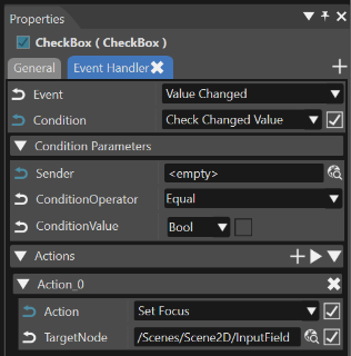
The functionality of the CheckBox can be edited in the Behaviors panel or in the EventHandler Tab (see also chapter [EventHandler Tab](https://doc316en.candera.eu/link/569#bkmrk-page-title)). An EventHandler that checks for the Value Changed Event will perform the user defined action.
| **Behavior Name** | **Type** | **predefined/ userdefined** | **Description** |
|---|
| EventHandler | Control Behavior | predefined | Checks a defined condition and invokes a defined action behavior if that condition is true. |
| Check changed Value | Control Condition Behavior | userdefined | Condition checks the changed value of the CheckBox. |
| Action | Action Behavior | userdefined | Userdefined action that will be performed when the checkbox is clicked. |
---
#### ToggleButton
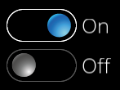
The ToggleButton Control offers an easy way to define all different states of a toggle button and an action that is performed when clicking it.
It is typically used for activating and deactivating a persisting functionality.
As for the simple Button Control the visual appearance of the ToggleButton can also be configured with four images depending on the button's state and a hovered color that can be defined including an alpha value.
Additionally the ToggleButton offers two predefined TextNode that can be modified via the First Text and the Second Text properties.
The action that is performed when pressing the ToggleButton can easily be defined in the [EventHandler Tab](https://doc316en.candera.eu/link/569#bkmrk-page-title). The functionality of the ToggleButton is similar to the [Button](#bkmrk-button) (when reacting on mouse clicks) or to the [CheckBox ](#bkmrk-checkbox)(when reacting on a value change). Corresponding sample configuration of the Event Handler are given in the [Button section](#bkmrk-button) and in the [CheckBox section](#bkmrk-checkbox).
| **Property Name**
| **Type**
| **Description** |
| Enabled
| bool
| If set to false it will not react on focus events an |
| Focusable
| bool
| If true, the control is focusable. Otherwise the control can not be focused. |
| Value
| bool/Variant
| Toggled or not (true/false). |
| First Text
| String
| The Text that will be set with the first toggle image. |
| Second Text
| String
| The Text that will be set with the second toggle image. |
| First Image
| [Candera::Image2D](http://dev.doc.cgistudio.at/APILINK/class_candera_1_1_image2_d.html "Image2D encapsulates a surface handle which is retrieved when uploading an image.") | The image which is used as ToggleButton Image if the first state applies. |
| First Pressed Image
| [Candera::Image2D](http://dev.doc.cgistudio.at/APILINK/class_candera_1_1_image2_d.html "Image2D encapsulates a surface handle which is retrieved when uploading an image.") | The image which is used as ToggleButton Image if the first toggle image is pressed. |
| Second Image
| [Candera::Image2D](http://dev.doc.cgistudio.at/APILINK/class_candera_1_1_image2_d.html "Image2D encapsulates a surface handle which is retrieved when uploading an image.") | The image which is used as ToggleButton Image if the second toggle state applies. |
| Second Pressed Image
| [Candera::Image2D](http://dev.doc.cgistudio.at/APILINK/class_candera_1_1_image2_d.html "Image2D encapsulates a surface handle which is retrieved when uploading an image.") | The image which is used as ToggleButton Image if the second toggle image is pressed. |
| Focused Image
| [Candera::Image2D](http://dev.doc.cgistudio.at/APILINK/class_candera_1_1_image2_d.html "Image2D encapsulates a surface handle which is retrieved when uploading an image.") | Image which is transparent in the middle (border). Used for the control with the current KeyboardFocus (only one of the HMI)
Frames the entire control (including text) |
| Hovered Color
| [Candera::Color](http://dev.doc.cgistudio.at/APILINK/class_candera_1_1_color.html) | The color which is used as highlighted color for blending with the first and second toggle image. |
| Disabled Color
| [Candera::Color](http://dev.doc.cgistudio.at/APILINK/class_candera_1_1_color.html) | The color which is used as disabled color for blending with the first and second toggle image. |
| Click Count
| ClickCount::Enum (AnyClick, SingleClick, DoubleClick, TripleClick)
| If the value ClickConditionBehavior receives matches the Click Count set, it will return a positive response. |
| Blend Type
| BlendType::Enum | The blend type that will be set on the affected nodes. |
---
#### RadioButton
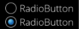
The RadioButton Control can easily be configured with a text, images for a normal and a pressed state as well as for a selected and a selected pressed state. Additionally a focused image can be defined. The action that is performed when the value changed can easily be defined in the [EventHandler Tab](https://doc316en.candera.eu/link/569#bkmrk-page-title).
The functionality of the RadioButton is similar to the [CheckBox ](#bkmrk-checkbox)(when reacting on a value change). A corresponding sample configuration of the Event Handler is given in the [CheckBox section](#bkmrk-checkbox).
| **Property Name**
| **Type**
| **Description** |
| Enabled
| bool
| If set to false it will not react on focus events and does not have to support different visualizations for the different states. |
| Focusable
| bool
| If true, the control is focusable. Otherwise the control can not be focused. |
| Text
| String
| Text of the RadioButton. |
| TextStyle
| Candera::TextRendering::Style | The Style that will be set to the Text Node. |
| Normal Image
| [Candera::Image2D](http://dev.doc.cgistudio.at/APILINK/class_candera_1_1_image2_d.html "Image2D encapsulates a surface handle which is retrieved when uploading an image.") | The image which is used as RadioButton Image if the normal state applies. |
| Pressed Image
| [Candera::Image2D](http://dev.doc.cgistudio.at/APILINK/class_candera_1_1_image2_d.html "Image2D encapsulates a surface handle which is retrieved when uploading an image.") | The image which is used as RadioButton Image if the not selected RadioButton is pressed. |
| Selected Image
| [Candera::Image2D](http://dev.doc.cgistudio.at/APILINK/class_candera_1_1_image2_d.html "Image2D encapsulates a surface handle which is retrieved when uploading an image.") | The image which is used as RadioButton Image if the selected state applies. |
| Selected Pressed Image
| [Candera::Image2D](http://dev.doc.cgistudio.at/APILINK/class_candera_1_1_image2_d.html "Image2D encapsulates a surface handle which is retrieved when uploading an image.") | The image which is used as RadioButton Image if the selected RadioButton is pressed. |
| Focused Image
| [Candera::Image2D](http://dev.doc.cgistudio.at/APILINK/class_candera_1_1_image2_d.html "Image2D encapsulates a surface handle which is retrieved when uploading an image.") | Image which is transparent in the middle (border). Used for the control with the current KeyboardFocus (only one of the HMI). Frames the entire control (including text) |
| Hovered Color
| [Candera::Color](http://dev.doc.cgistudio.at/APILINK/class_candera_1_1_color.html) | The color which is used as highlighted color for blending with the Selected/Normal image. |
| Disabled Color
| [Candera::Color](http://dev.doc.cgistudio.at/APILINK/class_candera_1_1_color.html) | The color to set on the effect. |
| Blend Type
| BlendType::Enum | The blend type that will be set on the affected nodes. |
| Selected
| bool/Variant
| Specifies the type and the value to pass onto Process Value Behavior. |
---
#### CircularSlider
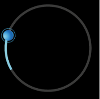
Circular slider is a control that allows user to set the value using circular slide movement or directly indicate value on slider's bar.
In default version the slider is a full circle, but using properties user easily can operate on e.g. quarter of the circle. In case of circular slider user can set the start angle and the end angle and map that to output value which is also customizable.
User can use the circular slider's value as an input for another control using "Forward Value Behavior".
Change of the value is indicated by slider's bar and thumb position. Thumb is optional (please check UseThumb property)
Circular slider can be connected with all controls that support "changeValueEvent". For example: progress bar, gauge, text value.
| **Property Name**
| **Type**
| **Description** |
| Value | Variant | Value of the slider |
| Minimum Value
| Variant
| Minimum value of the slider |
| Maximum Value
| Variant
| Maximum value of the slider |
| Step Size
| Variant
| Step size for value increment/decrement by keyboard |
| Minimum Angle
| Float
| Minimum rotation of the slider. |
| Maximum Angle
| Float
| Maximum rotation of the slider. |
| Increment Key Code
| Candera::KeyboardKeyCode::Enum | Increment value KeyCode |
| Decrement Key Code
| Candera::KeyboardKeyCode::Enum | Decrement value KeyCode |
| Background Image
| [Candera::Image2D](http://dev.doc.cgistudio.at/APILINK/class_candera_1_1_image2_d.html "Image2D encapsulates a surface handle which is retrieved when uploading an image.") | Background image |
| Active Image
| [Candera::Image2D](http://dev.doc.cgistudio.at/APILINK/class_candera_1_1_image2_d.html "Image2D encapsulates a surface handle which is retrieved when uploading an image.") | Image showing current value, will be masked, must have GlBitmapColorMaskBlend |
| Thumb Image
| [Candera::Image2D](http://dev.doc.cgistudio.at/APILINK/class_candera_1_1_image2_d.html "Image2D encapsulates a surface handle which is retrieved when uploading an image.") | Thumb image |
| Thumb Image Pressed
| [Candera::Image2D](http://dev.doc.cgistudio.at/APILINK/class_candera_1_1_image2_d.html "Image2D encapsulates a surface handle which is retrieved when uploading an image.") | Thumb image during touch |
| Thumb Hover Color
| [Candera::Color](http://dev.doc.cgistudio.at/APILINK/class_candera_1_1_color.html) | Hover color blend for thumb image |
| Focus Image
| [Candera::Image2D](http://dev.doc.cgistudio.at/APILINK/class_candera_1_1_image2_d.html "Image2D encapsulates a surface handle which is retrieved when uploading an image.") | Focus node image |
| Disabled Color
| [Candera::Color](http://dev.doc.cgistudio.at/APILINK/class_candera_1_1_color.html) | Disabled color blend for control |
| Enabled
| bool
| If set to false it will not react on focus events and does not have to support different visualizations for the different states. |
| Focusable
| bool
| If true, the control is focusable. Otherwise the control can not be focused. |
| Use Thumb
| bool
| Should thumb node be visible? |
| Active Image Hover Color
| [Candera::Color](http://dev.doc.cgistudio.at/APILINK/class_candera_1_1_color.html) | Hover color blend for active image.
|
| Blend Type
| BlendType::Enum | The blend type that will be set on the affected nodes. |
Using "Pivot hint" images' property it is possible to create customized slider control similar to customized gauge control. Please check the [Advanced Cluster Solution part 1-4](https://doc316en.candera.eu/books/best-practice/chapter/advanced-cluster-solution).
---
#### Slider
The Slider provides a value which changes corresponding to the position of the knob. This knob can be dragged. Additionally the value can be set directly or by an event (e.g. by using the Send Value as Event Behavior). Furthermore the Slider offers to define the visual representation of different states (f.e. Pressed, Hovered).

| **Property Name**
| **Type**
| **Description** |
| Enabled | bool | If set to false it will not react on focus events and does not have to support different visualizations for the different states. |
| Focusable
| bool
| If true, the control is focusable. Otherwise the control can not be focused. |
| Value
| Variant
| The bindable value of the slider |
| Minimum
| bool/Variant
| Minimum Range |
| Maximum
| bool/Variant
| Maximum Range |
| Knob Normal Image
| [Candera::Image2D](http://dev.doc.cgistudio.at/APILINK/class_candera_1_1_image2_d.html "Image2D encapsulates a surface handle which is retrieved when uploading an image.") | The image of the knob in normal state. |
| Knob Pressed Image
| [Candera::Image2D](http://dev.doc.cgistudio.at/APILINK/class_candera_1_1_image2_d.html "Image2D encapsulates a surface handle which is retrieved when uploading an image.") | The image of the knob in pressed state. |
| Knob Center Margin
| Candera::Margin | Knob Center Margin, used for positioning the Knob around the Slider value. Should not exceed the contorl boundary to avoid clipping issues of standalone Slider. |
| Track Image
| [Candera::Image2D](http://dev.doc.cgistudio.at/APILINK/class_candera_1_1_image2_d.html "Image2D encapsulates a surface handle which is retrieved when uploading an image.") | The image of the slider track. |
| Track Fill Image
| [Candera::Image2D](http://dev.doc.cgistudio.at/APILINK/class_candera_1_1_image2_d.html "Image2D encapsulates a surface handle which is retrieved when uploading an image.") | The image to set on the effect. |
| Track Margin
| Candera::Margin | Track Margin, can be used to provide space to display Knob around the track, so it fits within Control boundary and Focus Rectangle. |
| Fill Color
| [Candera::Color](http://dev.doc.cgistudio.at/APILINK/class_candera_1_1_color.html) | Color that gets blended with the fill color |
| Focused Image
| [Candera::Image2D](http://dev.doc.cgistudio.at/APILINK/class_candera_1_1_image2_d.html "Image2D encapsulates a surface handle which is retrieved when uploading an image.") | Image which is transparent in the center (border). It is used for the control with the current focus |
| Hovered Color
| [Candera::Color](http://dev.doc.cgistudio.at/APILINK/class_candera_1_1_color.html) | The color which is used as hovered color for blending with the Track Image. |
| Disabled Color
| [Candera::Color](http://dev.doc.cgistudio.at/APILINK/class_candera_1_1_color.html) | The color which can be used from other Behaviors. |
| Use Center
| bool
| If true, the center value defined for the knob bitmap is used to align the knob to the value position, otherwise the calculated center. |
| Blend Type
| BlendType::Enum | The blend type that will be set on the affected nodes. |
Slider control does not support external clipping set by ClippingSetterTraverser. The Knob may be incorrectly clipped when placed inside a control that recursively imposes clipping on its children (e.g. List).
**Functionality**
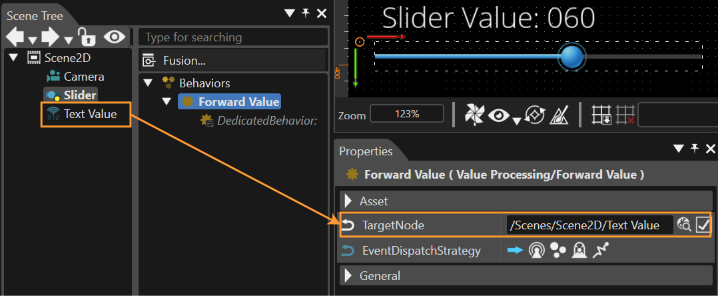
The functionality of the slider can be extended by the Forward Value Behavior. Therefore attach the behavior to the Slider which offers you to set a Target Node. The Behavior will then forward the changed value to the defined control. (Control needs a Value Behavior where "Accept Value Behavior" is enabled.)
| **Behavior Name** | **Type** | **predefined/ userdefined** | **Description** |
|---|
| Forward Value Behavior | Value Processing | userdefined | Forwards a received value. Associated controls with a value property receive the value. |
| Value Behavior | Value Processing | predefined | Control which has to receive the value has to have a Value Behavior where "Accept Value Behavior" is enabled. |
---
#### ScrollView
Similar to the [List](#bkmrk-listst) the ScrollView offers an Anchor where any node (also Controls) can be attached to.
The size of the ScrollView can be set using the Layout of the Control. If the size of the attached nodes is bigger than the layout size of the ScrollView, Scrollbars will appear. In difference to the [List](#bkmrk-list) the ScrollView doesn't layout the attached nodes. So Controls and other nodes can be placed at any position. (Also the hierarchy doesn't matter which means that an additional Layouter or GroupBox can be added.)
**Properties**
| **Property Name**
| **Type**
| **Description** |
| Vertical Scrollbar Visibility | ScrollbarVisibility::Enum (Automatic, Collapsed, Visible) | Configure the visibility of the scrollbar. By default it is set to Automatic which will determine the visibility based on the actual content. |
| Horizontal Scrollbar Visibility
| ScrollbarVisibility::Enum (Automatic, Collapsed, Visible) | Configure the visibility of the scrollbar. By default it is set to Automatic which will determine the visibility based on the actual content. |
| Blend Type
| BlendType::Enum | The blend type that will be set. |
---
#### List
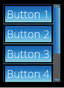
The List offers an Anchor where any nodes (also Controls) can be attached to. The list then automatically layouts these child nodes.
When setting the layout size of the List, a Scrollbar will appear as soon as the layout size is smaller than the list of items. Whether the Scrollbar appears sideward or at the bottom depends on the Scroll Direction Property.
Be sure that the list items are child nodes (just first level) of the anchor. So no additional Layouter or GroupBox is possible.
| **Property Name**
| **Type**
| **Description** |
| Handle Keyboard Events | bool | Makes the behavior react to KeyboardFocusNavigation events. |
| Scroll Direction
| Enum (Vertical, Horizontal) | The direction in which the List scrolls. |
| Animation Duration
| UInt32
| Duration of the scrolling animation. |
| Deceleration Factor
| Float
| Loss of flick animation speed over time. |
| Max Speed Per Flick
| Float
| Maximum amount of speed each flick motion adds to the flick animation. |
| Min Speed Per Flick
| Float
| Minimum speed required to count a touch gesture as a flick and start or continue the flick animation. |
| Min Movement to Scrolling
| UInt32
| Minimum distance a touch gesture needs to move to start a scrolling animation. |
| Max Touch Sample Age
| UInt32
| Maximum age in miliseconds of touch movement speed counted towards generating flick animation speed. |
| Scrollbar Handle Minimum Size
| UInt32
| The minimum height (for vertical scrollbar) or minimum width (for horizontal scrollbar) of the handle in pixels. |
| Scrollbar Visibility
| ScrollbarVisibility::Enum (Automatic, Collapsed, Visible) | Configure the visibility of the scrollbar. By default it is set to Automatic which will determine the visibility based on the actual content. |
| Scrollbar Min Movement to Scrolling
| UInt32
| Minimum distance a touch gesture needs to move to start scrolling. |
| Items
| ItemsType
| The items property is used for binding of dynamic items. It can only be set via databinding. Only one visible list control should be bound to a fragment list in the model. Otherwise the list fragments in the model are not able to provide data for both list controls. Use a separate list model that is filled with the same data if such a use case is required. |
| Blend Type
| BlendType::Enum | The blend type that will be set. |
For a more advanced application and extended functionality of the list control, please also see the [List Control - Snapping Mechanism](https://doc316en.candera.eu/books/controls-and-behaviors/page/list-control-snapping-mechanism).
---
#### MultiStateButton
The MultiStateButton Control offers an easy way to define all different states of a button. Additionally the MultiStateButton provides a value for the number of different representations (images). Each click increases this value (value cycles when reaching the maximum). Corresponding to this value the current image of the Button will be chosen out of an array of images.
Similar to the TextButton also the MultistateButton offers a TextNode which can be modified via the Text and the Text Style properties.
The functionality of the MultiStateButton can be edited in the Behaviors panel or in the EventHandler Tab (see also chapter [EventHandler Tab](https://doc316en.candera.eu/books/controls-and-behaviors/page/eventhandler-tab)). An EventHandler that checks for the Value Changed Event will perform the user defined action corresponding to the current value.
This functionality is similar to the [CheckBox ](#bkmrk-checkbox)(when reacting on a value change). A corresponding sample configuration of the Event Handler is given in the [CheckBox section](#bkmrk-checkbox).
**Properties**
| **Property Name**
| **Type**
| **Description** |
| Enabled | bool | If set to false it will not react on focus events and does not have to support different visualizations for the different states. |
| Focusable
| bool
| If true, the control is focusable. Otherwise the control can not be focued. |
| Current State
| Variant
| Current state of the MultiStateButton (starts with 0). |
| Maximum State
| bool/Variant
| Maximum value of MultiStateButton (starts with 0). |
| Text
| String
| Text of the Button. |
| Text Style
| Candera::TextRendering::Style | The Style that will be set to the Text Node. |
| StateImages
| list of [Candera::Image2D](http://dev.doc.cgistudio.at/APILINK/class_candera_1_1_image2_d.html "Image2D encapsulates a surface handle which is retrieved when uploading an image.")
| A list of images which should be available for selection. |
| Focused Image
| [Candera::Image2D](http://dev.doc.cgistudio.at/APILINK/class_candera_1_1_image2_d.html "Image2D encapsulates a surface handle which is retrieved when uploading an image.") | Image which is transparent in the middle (border). Used for the control with the current focus. Frames the entire control (including text) |
| Pressed Color
| [Candera::Color](http://dev.doc.cgistudio.at/APILINK/class_candera_1_1_color.html) | The color which get multiplied to the current Button image to represent the Pressed State. |
| Hovered Color
| [Candera::Color](http://dev.doc.cgistudio.at/APILINK/class_candera_1_1_color.html) | The color which get multiplied to the current Button image to represent the Hover State. |
| Disabled Color
| [Candera::Color](http://dev.doc.cgistudio.at/APILINK/class_candera_1_1_color.html) | The color to set on the disabled Control. |
| Blend Type
| BlendType::Enum | The blend type that will be set on the affected nodes. |
---
#### TouchIndication
The TouchIndication indicates the location of touch events. The indicator appears offset from the touch location by its distance to the origin point in the scene. Furthermore on and off animations can be set for animating the TouchIndication.
Also an area can be defined where the TouchIndication is allowed to take place.

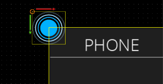
The Indicators offset to the touch position is set by the offset to the origin point of the scene (0,0). So if the TouchIndication should be centered at the touch position be sure to position the TouchIndication as shown in the image beneath.
| **Property Name**
| **Type**
| **Description** |
| Touchable Id | String | Can be packaged into an event or message to identify its sender. |
| On Animation
| Animation
| Optional animation played on placing a touch (touch Down). Note: This controls modifies its own Position to indicate the touch location. Please avoid animating its position. |
| Off Animation
| Animation
| Optional animation played on releasing the touch (touch Up). The indicator will be hidden after the animation stops (its rendering will be disabled). Note: This controls modifies its own Position to indicate touch location. Please avoid animating its position. |
| Hide Indicator On Move
| bool
| Hide the touch indicator when a move is detected, otherwise the indicator will stay visible during movement until the finger is lifted from the screen. |
| Touch Area Node
| Node
| Limits to the Touch Area Node's bounding rectangle - the area the Touch Indication Behavior indicates touch on. |
| Camera
| Camera Node
| The camera used to render the touch indicator. Will be used to correctly match touch position with object position in case the camera has a position offset. |
| Image
| [Candera::Image2D](http://dev.doc.cgistudio.at/APILINK/class_candera_1_1_image2_d.html "Image2D encapsulates a surface handle which is retrieved when uploading an image.") | The image BitmapActionBehavior will set on RenderNode. |
| Blend Type
| BlendType::Enum | The blend type that will be set on the affected nodes. |
---
#### TouchIndication3D
Indicates the location of touch events in a 3D scene.
The minimum configuration required for TouchIndication3D includes setting its camera property. Optional on and off animations can be set for animating the TouchIndication.
**Properties**
| **Property Name**
| **Type**
| **Description** |
| On Animation | Animation | Optional animation played on placing a touch (touch Down). Note: This controls modifies its own Position to indicate the touch location. Please avoid animating its position. |
| Touchable Id
| String
| Can be packaged into an event or message to identify its sender. |
| Off Animation
| Animation
| Optional animation played when the indicator is hidden. |
| Hide Indicator On Move
| bool
| Hide the touch indicator when a move is detected, otherwise the indicator will stay visible during movement until the finger is lifted from the screen. |
| Camera
| Camera Node
| TouchIndication3D modifies its own position to place itself in front of this camera so to appear under the touch location on the screen. Disclamer: The minimum configuration required for TouchIndication3D includes setting its camera property. |
| Touch Area Node
| Node
| The node whose area the Touch Indication Behavior should indicate touch events on. |
| Distance From Camera
| Float
| How far from the camera should the touch indication node be rendered. |
| Blend Type
| BlendType::Enum | The blend type that will be set. |
---
#### TouchIndication3DMarker
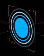
The TouchIndication3D uses the TouchIndication3DMarker as TouchIndication3DAnchor. The TouchIndication3DMarker's function is to visually mark the location of a detected touch.
| **Property Name**
| **Type**
| **Description** |
| Blend Type
| BlendType::Enum | The blend type that will be set. |
# Common
#### Breadcrumb
A Breadcrumb shows the history/flow through the screen hierarchy and allows user, for example, to navigate between scenes using breadcrumb's elements. As a part of breadcrumb it's possible to use all elements that contain text control (for example Text, TextValue or TextButton).
For each breadcrumb element (for example a text button) user should assign a proper [Breadcrumb Action](https://doc316en.candera.eu/link/582#bkmrk-breadcrumb-action) in its behavior list.
It is possible to create your own control for your own needs (e.g. adding a separator between items), that will work properly with the breadcrumb. Remember to add *breadcrumb action* behavior in own control.
When breadcrumb gets more value than it can display it will always collapse elements, replacing the display of the name with the ellipsis text (e.g. three dots). First element is always fully visible.
**Properties**
| **Property Name**
| **Type**
| **Description**
|
| State Machine Node | Node | State machine node. |
| Ellipsis Text
| String
| When more elements are added than the breadcrumb can show, then one element will be replaced with the text from this field (collapse effect). |
| Path Delimiter
| String
| Tag that separates elements contained in a path. |
| Blend Type
| BlendType::Enum | The blend type that will be set. |
Breadcrumb is not a standalone control, it does not trigger internally any scene transitions so it should be always connected with external state machine. For that purpose, breadcrumb property *State Machine Node* should be set to a node that contains a *State Machine* behavior. Please check out the [workflow](https://doc316en.candera.eu/books/controls-and-behaviors/page/breadcrumb-statemachine-workflow) chapter for more information.
---
#### Menu Icon
The main rationale behind the MenuIcon Control is an encapsulation and abstraction of an “icon” like in graphical environments of most known operating systems. It stores a bitmap and a string (label) together and provides single configuration of common behavior like positioning or highlighting.
It is designed to use inside the MenuItem Control and most probably one would like to use the MenuItem instead of plain MenuIcon.

| **Property Name**
| **Type**
| **Description**
|
| Image | [Candera::Image2D](http://dev.doc.cgistudio.at/APILINK/class_candera_1_1_image2_d.html "Image2D encapsulates a surface handle which is retrieved when uploading an image.") | The image to set on the effect. |
| Label
| String
| The Text that will be set to the Text Node. |
| Label Color
| [Candera::Color](http://dev.doc.cgistudio.at/APILINK/class_candera_1_1_color.html "Represents a color by its red-, green-, blue- and alpha-value. Provides color arithmetic functions an...") | The color of the text. |
| Label Style
| Candera::TextRendering::Style | The Style that will be used. |
| Label Trimming
| Enum (None, Ellipsis, Custom Text) | Trimming defines the behavior to employ when content overflows the content area. |
| Background Image
| [Candera::Image2D](http://dev.doc.cgistudio.at/APILINK/class_candera_1_1_image2_d.html "Image2D encapsulates a surface handle which is retrieved when uploading an image.") | The image to set on the effect. |
| Background Enable Rendering
| bool
| If true, Rendering is enabled. |
| Blend Type
| BlendType::Enum | The blend type that will be set on the affected nodes. |
---
#### Mesh2D
Performs a perspective projection of a 3D rotated effect (e.g. Bitmap or SolidColor effects) based on the configured origin, rotation and field of view.
**Properties**
| **Property Name**
| **Type**
| **Description**
|
| Mesh Rotation | Float | Defines the rotation angle in degree around configured rotation axis at the configured origin. |
| Camera Distance
| Float
| Defines a normalized camera distance (the projection is based on a normalized geometry of width and height 1) with a default value of 1. |
| Rotation Axis
| Candera::Vector3
| Defines the axis (default is the y axis) for the rotation as a 3D direction vector (the vector will be internally normalized). |
| Field of View
| Float
| The area on the Y axis view field in degrees. It influences the perspective distortion of the projection. Higher angles will result in more distorted projection. Lower angles will result in less perspective distorted projections. The angle has to be higher than 0 and less than 180. |
| Fit Strategy
| Enum (None, FitTopActualSize, FitToMaximumSize)
| Defines how the perspective projected mesh should fit into the original boundaries. |
| Horizontal Origin
| Enum (Left, Center, Right, Custom)
| The origin influences where the rotation is performed and how the perspective projection looks. It is defined as a normalized (bitmap resolution independent) origin on the y axis as Left (0), Center (0.5), Right (1.0) or Custom (see CustomHorizontalOrigin). |
| Vertical Origin
| Enum (Top, Center, Bottom, Custom)
| The origin influences where the rotation is performed and how the perspective projection looks. It is defined as a normalized (bitmap resolution independent) origin on the y axis as Top (0), Center (0.5), Bottom (1.0) or Custom (see CustomVerticalOrigin). |
| Origin Offset
| Candera::Vector2
| In addition to the configured normalized origin this pixel based origin offset is added. |
| Image
| [Candera::Image2D](http://dev.doc.cgistudio.at/APILINK/class_candera_1_1_image2_d.html "Image2D encapsulates a surface handle which is retrieved when uploading an image.") | The image to set on the effect. |
| Blend Type
| BlendType::Enum | The blend type that will be set on the affected nodes. |
---
#### Text
Displays a given text like a label.
It supports properties to set the Text, Text Style, Text Color, horizontal Text Alignment, flag for Multi Line, Line Spacing, flag for Word Wrap, choice for Trimming, and the used Trimming Text.
A Bindable Property is provided to set the Text by Data Binding.
| **Property Name**
| **Type**
| **Description**
|
| Text | String | The Text that will be set to the Text Node. |
| Text Color | [Candera::Color](http://dev.doc.cgistudio.at/APILINK/class_candera_1_1_color.html "Represents a color by its red-, green-, blue- and alpha-value. Provides color arithmetic functions an...") | The color of the text. |
| Text Style | Candera::TextRendering::Style | The Text that will be set to the Text Node. |
| Text Alignment | Enum (Left, Center, Right) | The horizontal text alignment, using the culture text direction, is used to define how text will be horizontally aligned within its layout area. |
| Multiline | bool
| If multi line is disabled then the new line control characters will be ignored and text will always be rendered in one line. |
| Line Spacing
| UInt16
| Defines the distance between the baselines of successive lines of text. |
| Word Wrap
| bool
| If word wrapping is enabled then the lines that exceed the client area will be split during arrangement into multiple lines. |
| Trimming
| Enum (None, Ellipsis, Custom Text) | Trimming defines the behavior to employ when content overflows the content area. |
| Disabled Color
| [Candera::Color](http://dev.doc.cgistudio.at/APILINK/class_candera_1_1_color.html "Represents a color by its red-, green-, blue- and alpha-value. Provides color arithmetic functions an...") | The color to set on the effect of the Text. |
| Blend Type
| BlendType::Enum | The blend type that will be set. |
---
#### AnalogClock
Represents an analog clock with images for the certain needles (hours, minutes, seconds). A data-bound value from the Player can be used to represent the current time. To see how to use the data-binding in combination with the clock please see [GettingStartedControls Part 4](https://doc316en.candera.eu/link/311#bkmrk-page-title)
There are properties to customize the visual representation of the analog clock. Every needle can be replaced by a custom image, as well as the background-image. A pivot-offset needs to be applied to the needle-images to be able to rotate them around the correct pivot point.
| **Property Name**
| **Type**
| **Description**
|
| Time | Variant | Specifies the type and the value to pass onto Process Value Behavior. |
| Offset In Minutes
| Int32
| Offset in minutes to add to time (i.e. for different time zones). |
| Show Seconds
| bool
| If true, seconds will be shown. |
| Seconds Needle Image
| [Candera::Image2D](http://dev.doc.cgistudio.at/APILINK/class_candera_1_1_image2_d.html "Image2D encapsulates a surface handle which is retrieved when uploading an image.") | The image to set on the effect. |
| Minutes Needle Image
| [Candera::Image2D](http://dev.doc.cgistudio.at/APILINK/class_candera_1_1_image2_d.html "Image2D encapsulates a surface handle which is retrieved when uploading an image.") | The image to set on the effect. |
| Hours Needle Image
| [Candera::Image2D](http://dev.doc.cgistudio.at/APILINK/class_candera_1_1_image2_d.html "Image2D encapsulates a surface handle which is retrieved when uploading an image.") | The image to set on the effect. |
| Face Image
| [Candera::Image2D](http://dev.doc.cgistudio.at/APILINK/class_candera_1_1_image2_d.html "Image2D encapsulates a surface handle which is retrieved when uploading an image.") | The image to set on the effect. |
| Blend Type
| BlendType::Enum | The blend type that will be set on the affected nodes. |
---
#### DigitalClock
Represents a digital clock, whereas the time-values (hours, minutes, seconds) are rendered as text. A data-bound value from the Player can be used to represent the current time. The control offers properties to customize the clock , like showing the hours in 12h or 24h. To see how to use the data-binding in combination with the clock please see [GettingStartedControls Part 4](https://doc316en.candera.eu/link/311#bkmrk-page-title)
The remaining properties are there to customize the visual representation of the digital clock. For every text-node a color and text-style can be set.
| **Property Name**
| **Type**
| **Description**
|
| Time | Variant | Specifies the type and the value to pass onto Process Value Behavior. |
| Offset In Minutes
| Int32
| Offset in minutes to add to time (i.e. for different time zones). |
| Show Full 24 Hours
| bool
| If true, hours will be shown from 0-23, otherwise in AM/PM format. |
| AM Text
| String
| The string of the AM label. |
| PM Text
| String
| The string of the PM label. |
| Show Seconds
| bool
| If true, seconds will be shown. |
| Hours Text Style
| Candera::TextRendering::Style | The Style that will be set to the Text Node. |
| Minutes Colon Text Style
| Candera::TextRendering::Style | The Style that will be set to the Text Node. |
| Minutes Text Style
| Candera::TextRendering::Style | The Style that will be set to the Text Node. |
| Seconds Colon Text Style
| Candera::TextRendering::Style | The Style that will be set to the Text Node. |
| Seconds Text Style
| Candera::TextRendering::Style | The Style that will be set to the Text Node. |
| AM PM Text Style
| Candera::TextRendering::Style | The Style that will be set to the Text Node. |
| Hours Color
| [Candera::Color](http://dev.doc.cgistudio.at/APILINK/class_candera_1_1_color.html "Represents a color by its red-, green-, blue- and alpha-value. Provides color arithmetic functions an...") | The color to set on the effect. |
| Minutes Colon Color
| [Candera::Color](http://dev.doc.cgistudio.at/APILINK/class_candera_1_1_color.html "Represents a color by its red-, green-, blue- and alpha-value. Provides color arithmetic functions an...") | The color to set on the effect. |
| Minutes Color
| [Candera::Color](http://dev.doc.cgistudio.at/APILINK/class_candera_1_1_color.html "Represents a color by its red-, green-, blue- and alpha-value. Provides color arithmetic functions an...") | The color to set on the effect. |
| Seconds Colon Color
| [Candera::Color](http://dev.doc.cgistudio.at/APILINK/class_candera_1_1_color.html "Represents a color by its red-, green-, blue- and alpha-value. Provides color arithmetic functions an...") | The color to set on the effect. |
| Seconds Color
| [Candera::Color](http://dev.doc.cgistudio.at/APILINK/class_candera_1_1_color.html "Represents a color by its red-, green-, blue- and alpha-value. Provides color arithmetic functions an...") | The color to set on the effect. |
| AM PM Color | [Candera::Color](http://dev.doc.cgistudio.at/APILINK/class_candera_1_1_color.html "Represents a color by its red-, green-, blue- and alpha-value. Provides color arithmetic functions an...") | The color to set on the effect. |
| Blend Type | BlendType::Enum | The blend type that will be set. |
---
#### ProgressBar
The ProgressBar represents a bar that in- or decreases in its layout-size depending on the input-value.
Any value change is animated by interpolating intermediate values.
Images for background and bar can be set, whereas for the bar-image a nine-patch image is recommended.

| **Property Name**
| **Type**
| **Description**
|
| Value | | The current value of the Progress Bar. |
| Minimum
| bool/Variant
| Minimum value |
| Maximum
| bool/Variant
| Maximum value |
| Animation Mode
| Enum (SpeedBased, TimeBased, Instant)
| Animation mode sets a specific interpolation type. |
| Value Change Per Second
| Float
| How many values per second become interpolated. |
| Filter Time Constant
| Float
| The moment before the value is reached, the changing speed slows down. This prevents a sudden end of movement that can be felt as artificial in some cases. |
| Bar Image
| [Candera::Image2D](http://dev.doc.cgistudio.at/APILINK/class_candera_1_1_image2_d.html "Image2D encapsulates a surface handle which is retrieved when uploading an image.") | The image of the Progress Bar that will be scaled. |
| Background Image
| [Candera::Image2D](http://dev.doc.cgistudio.at/APILINK/class_candera_1_1_image2_d.html "Image2D encapsulates a surface handle which is retrieved when uploading an image.") | The background image of the Progress Bar. |
| Blend Type
| BlendType::Enum | The blend type that will be set on the affected nodes. |
---
#### FlipBook
The FlipBook flips through a list of images. Depending on the input value it renders the images in between with a given speed. The control can be used for playing animations that are stored as images.
**Properties**
| **Property Name**
| **Type**
| **Description**
|
| Image Index | Variant | The index of the image to animate to. |
| Flip Speed
| Float
| How often in a second the images should be flipped.
*This property is only available if AnimationMode is set to "SpeedBased".*
|
| Images
| List of [Candera::Image2D](http://dev.doc.cgistudio.at/APILINK/class_candera_1_1_image2_d.html "Image2D encapsulates a surface handle which is retrieved when uploading an image.")
| A list of images which should be available for flipping. |
| Upload Strategy
| Enum (OnInit, OnDemand)
| Specifies if images are uploaded on demand or when the behavior is instantiated. OnInit may cause an initial delay and keeps all images loaded. OnDemand avoids an initial delay and only keeps one image loaded. |
| Blend Type | BlendType::Enum | The blend type that will be set on the affected nodes. |
| Animation Mode
| Enum (SpeedBased, TimeBased, Instant)
| Animation mode sets a specific interpolation type. |
**How to Add Images**
Import the image resources to be set into *one single folder* of the SceneComposer solution.
1. Select the FlipBook Control in your scene
2. In the Properties Panel: Click the icon \[ Select folder containing images \] in the \[ Images \] section of the FlipBook's Properties.
3. This will open the \[ Choose Item \] dialog.
4. Select a folder that contains the image resource to be set, and click the \[ OK \] button.
5. All image files contained in the selected folder will be set as images of the FlipBook control.
6. The images are ordered alphabetically by file name. They can be re-ordered manually as necessary using the up and down arrow buttons.
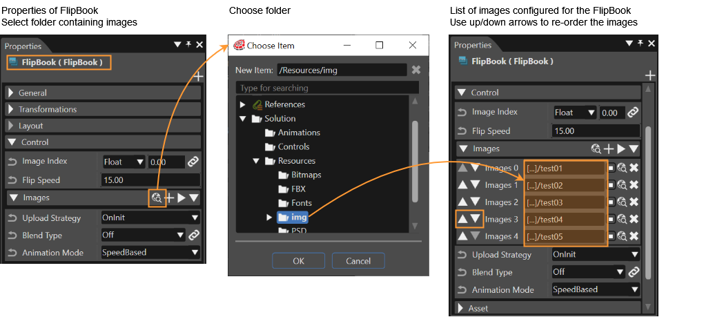
| **Value**
| **Description**
|
| SpeedBased
| Starting with the image configured in property *Image Index,* the FlipBook's images are flipped through one by one until it reaches the image of the received destination value. The destination value is received e.g. by a *Value* Behavior or a *SwitchImage* Behavior. (see also [SwitchImage Example](https://doc316en.candera.eu/books/controls-and-behaviors/page/examples-using-predefined-behaviors#bkmrk-switch-image-example))
The speed of the flipped images can be configured in property *FlipSpeed.* It defines the frames/images displayed per second.
|
| TimeBased
| Starting with the image configured in property *Image Index*, the FlipBook's images are flipped though one by one until it reaches the image of the received destination value. The destination value is received e.g. by a *Value* Behavior or a *SwitchImage* Behavior. (see also [SwitchImage Example](https://doc316en.candera.eu/books/controls-and-behaviors/page/examples-using-predefined-behaviors#bkmrk-switch-image-example))
The speed of the flipped images is defined by the InterpolationTime. It defines the time (in ms), which every single image will be displayed.
|
| Instant
| Starting with the image configured in property *Image Index*, the FlipBook's image instantly switches to the image of the received destination value (without any interpolation).
AnimationMode *Instant* can be used for creating animations in SceneComposer, defining which image to display at certain key frames.
|
**Create Animations Using FlipBook Control**
The FlipBook can be used to configure a set of images. These images can be animated using SceneComposer animation as follows:
1. Select the FlipBook control of your scene in the Scene Tree Panel and set the *Animation Mode* property to *Instant.*
2. Right-click on the FlipBook control in the Scene Tree Panel and choose \[ Add Animated Property... \] from the context menu.
3. Choose to animate the property \[ ImageIndex \] and select \[ Linear \] Interpolation.
4. Please note that you have now left the \[ Scene Design \] mode are now in \[ Animation Design \] mode.
5. Right click into the right side of the *Animation Value* panel and choose \[ Insert Key Frame \].
6. Configure the keyframes at timestamps 0, 1000 and 2000. Set the values 0.00, 20.00 and 0.00.
7. In the Animation Timeline panel you can check your animation. (Double-click your animation to switch to a more intuitive view.)
8. Press the button \[ Start the playback of the selected animation \] button to watch your animation. It should start from picture with index 0 and continue to picture with index 20 and then reverse (from picture with index 20 back to picture with index 0).
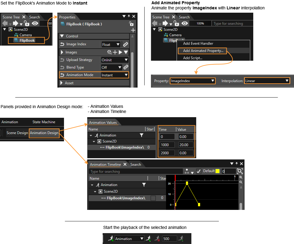
| **Property Name**
| **Type**
| **Description**
|
| Value | Variant | The value to be formatted |
| Interval Handling
| Enum (Limit, Cycle, Ignore)
| Select how the behavior should react when the minimum or maximum limit is exceeded. |
| Minimum Value
| bool/Variant
| Minimum value |
| Maximum Value
| bool/Variant
| Maximum value |
| Format Text
| String
| The format string which includes one format specifier (beginning with %). See C printf() function. |
| Style
| Candera::TextRendering::Style | The Style that will be used. |
| Text Alignment
| Enum (Left, Center, Right) | The horizontal text alignment, using the culture text direction, is used to define how text will be horizontally aligned within its layout area. |
| Multiline
| bool
| If multi line is disabled then the new line control characters will be ignored and text will always be rendered in one line. |
| Enabled
| bool
| If set to false it will not react on focus events and does not have to support different visualizations for the different states. |
| Text Color
| [Candera::Color](http://dev.doc.cgistudio.at/APILINK/class_candera_1_1_color.html "Represents a color by its red-, green-, blue- and alpha-value. Provides color arithmetic functions an...") | The color which can be used from other Behaviors. |
| Disabled Color
| [Candera::Color](http://dev.doc.cgistudio.at/APILINK/class_candera_1_1_color.html "Represents a color by its red-, green-, blue- and alpha-value. Provides color arithmetic functions an...") | The color which can be used from other Behaviors. |
| Blend Type
| BlendType::Enum | The blend type that will be set. |
---
#### Tell Tale
The TellTale Control is a often used control. It's for example used for turn light indication (blinking tell tale) or seat belt indication (static on/off tell tale) in the automotive area.
In general, a telltale is a control where two image can be defined: one for the off-state and one for the on-state. It can be set to On or Off or it can be set to blinking mode (as it is needed for the turn light indication). When in blinking mode, you can configure its behavior: for how long you want the On State Image to be displayed and for how long you want the Off State Image displayed individually.

| **Property Name**
| **Type**
| **Description**
|
| State | Enum (On, Off, Blinking) | If set to On, sends only On value to Trigger Behaviors in the same node. If set to Off, sends only Off value to Trigger Behaviors in the same node. If set to Blinking, alternates between sending On or Off values. Use On Time Ms and Off Time Ms to specify the speed of blinking. |
| On Time Ms
| UInt32
| If State is set to Blinking, IntervalSwitchBehavior will be sending On value for On Time Ms milliseconds before switching to sending Off value. |
| Off Time Ms
| UInt32
| If State is set to Blinking, IntervalSwitchBehavior will be sending Off value for Off Time Ms milliseconds before switching to sending On value. |
| On State Image
| [Candera::Image2D](http://dev.doc.cgistudio.at/APILINK/class_candera_1_1_image2_d.html "Image2D encapsulates a surface handle which is retrieved when uploading an image.") | Tell Tale control displays selected image on its On state. |
| Off State Image
| [Candera::Image2D](http://dev.doc.cgistudio.at/APILINK/class_candera_1_1_image2_d.html "Image2D encapsulates a surface handle which is retrieved when uploading an image.") | Tell Tale control displays selected image on its Off state. |
| Blend Type
| BlendType::Enum | The blend type that will be set on the affected nodes. |
---
#### Gauge
The Gauge allows to rotate a needle on a background according to its input value. Setting a value animates the rotation from the last one. The right pivot of the needle-image can be set via the pivot hint for a proper rotation. The minimum and maximum rotation can be set in the control as well as the minimum and maximum input. Further wise interpolation properties can be set.
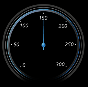
| **Property Name**
| **Type**
| **Description**
|
| Value | Variant | Specifies the input value. |
| Input Min
| bool/Variant
| The smallest possible input value. |
| Input Max | bool/Variant
| The largest possible input value. |
| Rotation Min
| Float
| The smallest possible angle in degrees. |
| Rotation Max
| Float
| The largest possible angle in degrees. |
| Background Image
| [Candera::Image2D](http://dev.doc.cgistudio.at/APILINK/class_candera_1_1_image2_d.html "Image2D encapsulates a surface handle which is retrieved when uploading an image.") | The background image, which might be a scale. |
| Needle Image
| [Candera::Image2D](http://dev.doc.cgistudio.at/APILINK/class_candera_1_1_image2_d.html "Image2D encapsulates a surface handle which is retrieved when uploading an image.") | The needle-image of the needle that will be rotated. |
| Animation Mode |
| Animation mode sets the interpolation type (Instant, Speed-based, or Time-based). |
| Blend Type
| BlendType::Enum | The blend type that will be set on the affected nodes. |
---
# Container
#### GroupBox
The GroupBox offers an easy way to combine [RadioButtons ](https://doc316en.candera.eu/link/1156#bkmrk-radiobutton)to a RadioButtonGroup. The special functionality of this Control is to select just one selection object ([RadioButton](https://doc316en.candera.eu/link/1156#bkmrk-radiobutton)) at the same time. So if one of the objects get selected, the others automatically get deselected.
Furthermore it is possible to set a node as default selected object.
There can also be a Layouter attached as child of the GroupBox to order the RadioButtons.
The visual appearance can be configured with a background image (9Patch Image) which can be resized by using the Layout.
**Properties**
| **Property Name**
| **Type**
| **Description**
|
| Default Selected Object | Node | Selection Object (e.g. RadioButton) which shall be selected by default. |
| Enable Background
| bool
| If true, Background gets rendered. |
| Background Image
| [Candera::Image2D](http://dev.doc.cgistudio.at/APILINK/class_candera_1_1_image2_d.html "Image2D encapsulates a surface handle which is retrieved when uploading an image.") | Background Image of the GroupBox. Can be resized by Layout Settings of the Control. |
| Blend Type
| BlendType::Enum | The blend type that will be set on the affected nodes. |
# Diagnostic
#### FPS Display
The FPS Display Control provides a Text Node that displays the currently rendered frames per second, which allows to benchmark running applications.
**Properties**
| **Property Name**
| **Type**
| **Description**
|
| Render Target | RenderTargetType | The render target which FPS should be monitored. |
| Text Style
| Candera::TextRendering::Style | The Style that will be set to the Text Node. |
| Text Color
| [Candera::Color](http://dev.doc.cgistudio.at/APILINK/class_candera_1_1_color.html "Represents a color by its red-, green-, blue- and alpha-value. Provides color arithmetic functions an...") | The color to set. |
| Text
| String | Text that TextBehavior will change the Node to. Supports formatting for one variable that corresponds to the value TextProcessValueBehavior2D receives. |
| Blend Type
| BlendType::Enum | The blend type that will be set. |
---
#### FrameCounterDisplay
The Frame Counter Display Control provides a Text Node that displays how many frames were already rendered.
**Properties**
| **Property Name**
| **Type**
| **Description**
|
| Render Target
| RenderTargetType | The render target which FPS should be monitored. |
| Text Style
| Candera::TextRendering::Style | The Style that will be set to the Text Node. |
| Text Color
| [Candera::Color](http://dev.doc.cgistudio.at/APILINK/class_candera_1_1_color.html "Represents a color by its red-, green-, blue- and alpha-value. Provides color arithmetic functions an...") | The color to set. |
| Text
| String | Text that TextBehavior will change the Node to. Supports formatting for one variable that corresponds to the value TextProcessValueBehavior2D receives. |
| Blend Type | BlendType::Enum | The blend type that will be set. |
---
#### FrameTimeDisplay
The Frame Time Display Control provides a Text Node that displays the time it takes between frames to be rendered, which allows to benchmark running applications.
**Properties**
| **Property Name**
| **Type**
| **Description**
|
| Render Target | RenderTargetType | The render target which FPS should be monitored. |
| Text Style
| Candera::TextRendering::Style | The Style that will be set to the Text Node. |
| Text Color
| [Candera::Color](http://dev.doc.cgistudio.at/APILINK/class_candera_1_1_color.html "Represents a color by its red-, green-, blue- and alpha-value. Provides color arithmetic functions an...") | The color to set. |
| Text
| String | Text that TextBehavior will change the Node to. Supports formatting for one variable that corresponds to the value TextProcessValueBehavior2D receives. |
| Blend Type
| BlendType::Enum | The blend type that will be set. |
---
#### FPSDisplay3D
The FPS Display 3D Control provides a CanvasText that displays the currently rendered frames per second, which allows to benchmark running applications. This control is available for 3D scenes.
**Properties**
| **Property Name**
| **Type**
| **Description**
|
| Render Target | RenderTargetType | The render target which FPS should be monitored. |
| Text Style
| Candera::TextRendering::Style | The Style that will be set to the Text Node. |
| Text Color
| [Candera::Color](http://dev.doc.cgistudio.at/APILINK/class_candera_1_1_color.html "Represents a color by its red-, green-, blue- and alpha-value. Provides color arithmetic functions an...") | The color to set. |
| Text
| String | Text that TextBehavior will change the Node to. Supports formatting for one variable that corresponds to the value TextProcessValueBehavior2D receives. |
| Blend Type
| BlendType::Enum | The blend type that will be set. |
---
#### FrameCounterDisplay3D
The Frame Counter Display 3D Control provides a CanvasText that displays how many frames were already rendered. This control is available for 3D scenes.
**Properties**
| **Property Name**
| **Type**
| **Description**
|
| Render Target
| RenderTargetType | The render target which FPS should be monitored. |
| Text Style
| Candera::TextRendering::Style | The Style that will be set to the Text Node. |
| Text Color
| [Candera::Color](http://dev.doc.cgistudio.at/APILINK/class_candera_1_1_color.html "Represents a color by its red-, green-, blue- and alpha-value. Provides color arithmetic functions an...") | The color to set. |
| Text
| String | Text that TextBehavior will change the Node to. Supports formatting for one variable that corresponds to the value TextProcessValueBehavior2D receives. |
| Blend Type | BlendType::Enum | The blend type that will be set. |
---
#### FrameTimeDisplay3D
The Frame Time Display 3D Control provides a CanvasText that displays the time it takes between frames to be rendered, which allows to benchmark running applications. This control is available for 3D scenes.
**Properties**
| **Property Name**
| **Type**
| **Description**
|
| Render Target | RenderTargetType | The render target which FPS should be monitored. |
| Text Style
| Candera::TextRendering::Style | The Style that will be set to the Text Node. |
| Text Color
| [Candera::Color](http://dev.doc.cgistudio.at/APILINK/class_candera_1_1_color.html "Represents a color by its red-, green-, blue- and alpha-value. Provides color arithmetic functions an...") | The color to set. |
| Text
| String
| Text that TextBehavior will change the Node to. Supports formatting for one variable that corresponds to the value TextProcessValueBehavior2D receives. |
| Blend Type
| BlendType::Enum | The blend type that will be set. |
# Mixed Reality
#### VideoStream
A control that makes it possible to render a video source into a texture.
**Properties**
| **Property Name**
| **Type**
| **Description**
|
| Video Source | String | URI to video resource (e.g. path to file or URL).
Please also see example strings below.
|
| Scale To Video Source
| bool
| If enabled the texture will be resized to the video size, otherwise the size of the current texture will persist. |
| Flip Vertically
| bool
| Flips video vertically. |
| Timestamp
| UInt32
| Can be used to bind the timestamp of the video to an external timestamp data (e.g. a camera tracker that needs to be synchronized with the video). |
| Target Node
| Node | The node on which the video will be displayed. If nothing is selected, the node on the anchor will be used. |
| Blend Type
| BlendType::Enum | The blend type that will be set. |
**Examples of valid Video Source strings**
| **Source**
| **Example Video Source String**
|
| From asset
| asset://Resources#Videos#VideoSourceSample1.mp4 |
| From website
| http://www.cgistudio.at/VideoSourceSample2.mp4 |
| From file
| file:///C:/Videos/Streaming/VideoSourceSample3.mp4 |
---
#### NavigationPath3D
Visualizes the proposed route of the navigation system. Input points are received via data binding. This control is available for 3D scenes.
**Properties**
| **Property Name**
| **Type**
| **Description**
|
| Mesh Appearance | AppearanceType | The appearance used for the navigation path mesh. |
| Color Mode
| ColorMode::Enum (Color, RGBA)
| Select how color is displayed. |
| Color
| [Candera::Color](http://dev.doc.cgistudio.at/APILINK/class_candera_1_1_color.html "Represents a color by its red-, green-, blue- and alpha-value. Provides color arithmetic functions an...") | Determines the color of the mesh. |
| Path Width
| Float
| Determines the width of the mesh. |
| Path Length
| Float
| Determines the length of the mesh. |
| Y Offset
| Float
| Applies y-offset to the mesh. |
| Input Points
| InputPointsType | This property is used to bind input points. |
| Input Point Handling
| InputPointHandling::Enum (Attach, Replace)
| Determines how new input points are used for the mesh. |
| Interpolation Type
| InterpolationType::Enum (Linear, Bezier, Spline, None)
| Determines which interpolation method is used. |
| Path Mesh Type
| MeshType::Enum (Solid, Points)
| Determines which primitive type is used. |
| Advanced
| bool
| Enables advanced settings of the behavior. (see next 6 properties in this table)
|
| Input Point Min Distance | Float | Minimum distance of two control points. Input points that are closer together will be rejected. |
| Req Fragment Size
| SizeType
| Size of the fragment that is requested from the input point list. |
| Req Threshold Distance
| Float
| If the distance between camera and the last point is below this threshold, request a new fragment of input points. |
| Num Of Rows Per Input Point
| UInt32
| Determines how many vertex rows are used to interpolate between two input points. Increasing this value makes the mesh smoother, but will also shorten the distance of the overlay, as number of vertices per row remain constant. |
| Num Of Vertex Rows
| UInt32 | Amount of vertical vertices in the mesh. |
| Num Of Vertex Columns
| UInt32 | Amount of horizontal vertices in the mesh. |
| Blend Type
| BlendType::Enum | The blend type that will be set. |
---
#### PoiManager3D
The PoiManager handles the creation and destruction of POIs. It receives the camera position via event and uses that information to request all POIs in a certain perimeter from the model. The model responds with a list POIs from a dictionary.
For each type of POI, a custom control that serves as a template has to be created and configured with a valid Asset ID. The PoiManager can then instantiate the correct control according to the dictionary from the Asset ID as a child node. However, the PoiManager does not handle the metadata of its children, but simply forwards metadata messages to them. (For more information on metadata handling see [Poi Metadata Handler](https://doc316en.candera.eu/link/639#bkmrk-poi-metadata-handler-1))
This control is available for 3D scenes.
**Properties**
| **Property Name**
| **Type**
| **Description**
|
| Street Points
| StreetPointsType
| List of points of the street. Used to align the rotation of POIs. |
| Street Points Min Distance
| Float
| Minimum distance between two street points. Street points that are closer together will be rejected. |
| Req Distance
| Float
| The distance in which POIs are requested from the model. |
| Req Threshold Distance
| Float
| Once the camera has moved this specified distance a new request will be sent. |
| PoiMetaData
| PoiMetaDataType | Use databinding to receive metadata updates for the POIs |
| Poi Street Name | String | Name of this poi. |
| Street Control Id
| Candera::Id
| ID of the control that is associated with PoiName. |
| Poi Parking Name
| String | Name of this poi. |
| Parking Control Id
| Candera::Id | ID of the control that is associated with PoiName. |
| Poi Building Name
| String | Name of this poi. |
| Building Control Id
| Candera::Id | ID of the control that is associated with PoiName. |
| Blend Type
| BlendType::Enum | The blend type that will be set. |
---
#### VideoStream3D
This Control makes it possible to render a video source into a texture. The VideoStream3D Control is available for 3D scenes.
It is similar to the [VideoStream ](https://doc316en.candera.eu/books/controls-and-behaviors/page/mixed-reality#bkmrk-videostream)Control, offering the same properties.
# Charts
#### BarGraph
Bar Graph Control is The Control that graphically displays some value depending on the length of the Bar. This is useful for visually comparing multiple values. You can set up to multiple bars on a graph. In addition, can also set a bar width, bar color and space width (between bar and bar). The value on each bar can be changed dynamically using Data Binding.
- The Values for the bars are defined by a property named "Value List".
- The number of bars equals the number of items in "Value List". The maximum number of bars that can be set is 100.
- Value List can be bound via DataBinding.
| **Property Name**
| **Type**
| **Description**
|
| Values List | ListPropertyType< FeatStd::Float >
| List of values |
| Bar Width
| UInt16
| Width of each bar |
| Bar Height
| UInt16
| Height of each bar |
| Space Width
| UInt16
| Width of space between each bar |
| Color
| [Candera::Color](http://dev.doc.cgistudio.at/APILINK/class_candera_1_1_color.html "Represents a color by its red-, green-, blue- and alpha-value. Provides color arithmetic functions an...") | Color |
---
#### LineGraph
Line Graph Control is The Control that draws a line graph in a coordinate area consisting of X and Y axes. This is useful for showing the transition of data increase / decrease. In addition, can also set a graph line width, line color and interpolation method between points to make the line graph more readable.
- Alpha channel is not used for color. (The line is always solid, not blend-able)
- Line chart only works with OpenGL – so native 2D devices are not supported
| **Property Name**
| **Type**
| **Description**
|
| Values | ListPropertyType< Candera::Vector2 > | List of values which will create the graph. |
| Line Width
| Float
| The line width defines the thickness of the line. |
| Interpolation
| GraphInterpolationType::Enum (Linear, Spline)
| Defines the interpolation type of the line chart. |
| Interpolation Steps
| UInt16
| Defines the amount of interpolation points between each value. This increases the spline resolution by the cost of performance and memory. |
| Color
| [Candera::Color](http://dev.doc.cgistudio.at/APILINK/class_candera_1_1_color.html "Represents a color by its red-, green-, blue- and alpha-value. Provides color arithmetic functions an...") | Color
|
# Particle Emitters
#### PointSpriteEmitter
The PointSpriteEmitter offers an easy "out of the box" way to create a Particle Effect.
As the name suggests, the appearance of a particle is similar to a [Candera::PointSprite](http://dev.doc.cgistudio.at/APILINK/class_candera_1_1_point_sprite.html "PointSprite represents a GL point primitive. The size (glPointSize) of the point is calculated by def...")
For functionality please refer to [3D Effects Solution](https://doc316en.candera.eu/link/270#bkmrk-page-title).
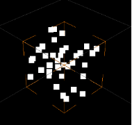
| **Property Name**
| **Type**
| **Description**
|
| Emit Particles | bool | If set to true then the behavior will emit particles |
| Emitter Type
| ParticleEmitterType::Enum (BoxEmitter, SphereEmitter)
| Specifies the behavior of the emitted Particle |
| Maximum Particles
| UInt32
| Determines the maximum number of particles that can be displayed (Requires Scene Refresh) |
| Particles Per Second
| UInt32
| Determines how many particles will be generated each second |
| Life Time
| UInt32
| Determines how long a particle will live in Milliseconds |
| Random Life Time
| UInt32
| Determines how long a particle will live in Milliseconds |
| Velocity
| Candera::Vector3 | Determines the initial velocity of an emitted particle |
| Gravity
| Candera::Vector3 | Determines the gravity effects for all emitted particles |
| Random Spread
| Float
| Determines how the randomness of the initial velocity angle |
| Start Size
| Float
| Determines how big a particle will be when it is emitted |
| End Size
| Float
| Determines how big a particle will be when it vanishes |
| Start Color
| [Candera::Color](http://dev.doc.cgistudio.at/APILINK/class_candera_1_1_color.html "Represents a color by its red-, green-, blue- and alpha-value. Provides color arithmetic functions an...") | Determines what color a particle has be when it is emitted |
| End Color
| [Candera::Color](http://dev.doc.cgistudio.at/APILINK/class_candera_1_1_color.html "Represents a color by its red-, green-, blue- and alpha-value. Provides color arithmetic functions an...") | Determines what color a particle has when it vanishes |
| Fade In Time
| bool/UInt32
| Determines how long a new particle needs to be alive until it is fully visible. |
| Fade Out Time
| bool/UInt32
| Determines how long a particle will fade out before it vanishes |
| Appearance
| AppearanceType | The appearance to set on the node. |
| Blend Type
| BlendType::Enum | The blend type that will be set. |
# Core
The Core Controls are a set of [Controls](https://doc316en.candera.eu/books/controls-and-behaviors/chapter/predefined-controls "Predefined Controls"), designed to provide a minimal core set of functionality. Therefore, the Core Controls also reduce their size and provide increased performance, by limiting its feature set and reducing the number of used behaviors.
The Core Controls are designed for
- **Low-End Platforms**
Low memory footprint and increased performance by reduced feature set
- **Basis for custom Controls**
As the Core Controls cover basic features, it is easy possible to extend them for custom behavior (e.g. a specific custom behavior for a custom button) instead of stripping down a full featured Control
Please note, that the not all Controls have a Core Control variant, as it is not suitable for all available Controls.
#### CoreDial
This control is used to set values within a specified range. Rotating the knob changes the value and updates the corresponding display. The degree of rotation is adjusted according to the configured Step Size and snaps to predefined positions. The knob's state is represented by displaying an image from the BackgroundImages list corresponding to the current value. For example, in a three-step rotation setup where the minimum rotation is -45 degrees, the maximum rotation is +45 degrees, and the step size is 45 degrees, three BackgroundImages need to be assigned. Additionally, values can be adjusted using specified keyboard keys (Increment Key Code, Decrement Key Code).
In the Core version, focus and color blending functionalities are not included, and the design is specialized for basic rotational operations.
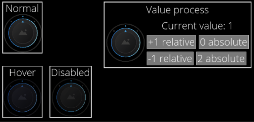
| **Property Name**
| **Type**
| **Description**
|
| Enabled | bool | If set to false it will not react on focus events and does not have to support different visualizations for the different states. |
| Focusable
| bool
| If true, the control is focusable. Otherwise the control can not be focused. |
| Current Value
| FeatStd::Int32 | Current value for the dial.
|
| Step Size
| FeatStd::Float | Step size in degrees.
|
| Minimum Rotation
| FeatStd::Float | Minimum rotation of the dial.
|
| Maximum Rotation
| FeatStd::Float | Maximum rotation of the dial.
|
| Knob Image
| [Candera::Image2D](http://dev.doc.cgistudio.at/APILINK/class_candera_1_1_image2_d.html "Image2D encapsulates a surface handle which is retrieved when uploading an image.") | The image to set on the effect.
|
| BackgroundImages
| [Candera::Image2D](http://dev.doc.cgistudio.at/APILINK/class_candera_1_1_image2_d.html "Image2D encapsulates a surface handle which is retrieved when uploading an image.") | A list of images which should be available for selection. |
| Disabled Color
| [Candera::Color](http://dev.doc.cgistudio.at/APILINK/class_candera_1_1_color.html) | The color which can be used from other Behaviors.
|
| Increment Key Code
| Candera::KeyboardKeyCode::Enum | Check the KeyCode of the pressed key (can also be modifier).
|
| Decrement Key Code
| Candera::KeyboardKeyCode::Enum | Check the KeyCode of the pressed key (can also be modifier).
|
#### CoreRoll
CoreRoll is a control that provides an interface for displaying numeric values as a vertical list within a defined range, allowing users to select or change values. The current value is emphasized in the center "lens" area. An option for changing via touch, pointer is kept, but the keyboard input has been removed to optimize the control. It is optimized for lightweight and intuitive UI implementations that focus on numeric display and selection. Essential visual customizations, such as color, font style, lens display control, and unit text settings, are retained.
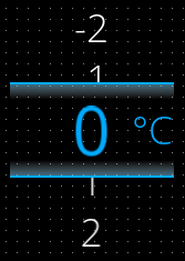
| **Property Name**
| **Type**
| **Description**
|
| Focusable
| bool
| If true, the control is focusable. Otherwise the control cannot be focused.
|
| Value | Float | The value which will be changed using the roll |
| Min | Float | The minimum value which can be reached. This value is always smaller or equal to the MaxValue. |
| Max | Float | The maximum value which can be reached. This value is always bigger or equal to MinValue |
| Step | Float | The increment/decrement of the value. |
| LensVisible | bool | Is lens group visible? Enables highlighting of the current value, default zooming and bordering it.
|
| Use Cyclic Roll | bool | Is roll cyclic? If true the MinValue of the Control can be reached after the MaxValue of the Control and vice versa |
| Allow Dragging Past Limit | bool | Allow temporary over-dragging (dragging to blank values before first and after last entry).
If true there is visible animation of the Control being „out of range“ while moving below minimum and above maximum value.
|
| Value Style | Candera::TextRendering::Style | Sets the text style for the values outside the Lens. |
| Value Color | [Candera::Color](http://dev.doc.cgistudio.at/APILINK/class_candera_1_1_color.html) | Specifies color of values in the vertical list outside the Lens |
| Lens Style | Candera::TextRendering::Style | Sets the text style for the values inside the Lens. |
| Unit Text | String | Text used in lens (it means: when the lens is used at all) to present a unit of the value |
| Unit Style | Candera::TextRendering::Styler | Sets the text style for the Unit Text. |
| Unit Margin | [Candera::Margin](http://dev.doc.cgistudio.at/APILINK/class_candera_1_1_margin.html "A non-zero margin applies space outside the element layout's width and height. The values can be set ...") | Specifies margin of the UnitText |
| Unit Color | [Candera::Color](http://dev.doc.cgistudio.at/APILINK/class_candera_1_1_color.html) | Specifies color of the UnitText |
| Decoration Image | [Candera::Image2D](http://dev.doc.cgistudio.at/APILINK/class_candera_1_1_image2_d.html "Image2D encapsulates a surface handle which is retrieved when uploading an image.") | Specifies a border image of the Lens |
#### CoreSpinBox
CoreSpinBox is a control that allows users to increment or decrement numeric values using up/down arrow buttons. The values can be modified via the arrow buttons only and The option for changing the values via keyboard inputs has been removed to optimize the control, with support for basic parameters such as minimum, maximum, and step size.
This control prioritizes simplified visual presentation and user interaction. Compared to [SpinBox](https://doc316en.candera.eu/link/1156#bkmrk-spinbox), it is more lightweight and suited for cases where UI performance and streamlined layout are important.
| **Property Name**
| **Type**
| **Description** |
| Enabled
| bool
| If set to false it will not react on focus events and does not have to support different visualizations for the different states. |
| Focusable
| bool
| If true, the control is focusable. Otherwise the control can not be focused. |
| Value
| Variant | The value to be formatted |
| Step Size
| Variant
| Increment/Decrement step value. |
| Minimum Value
| Variant | Minimum value |
| Maximum Value
| Variant | Maximum value |
| Text Format
| String
| The format string which includes one format specifier (beginning with %). See C printf() function. |
| Text Alignment
| Enum (Left, Centered, Right, Automatic) | The horizontal text alignment, using the culture text direction, is used to define how text will be horizontally aligned within its layout area. |
| Multiline | bool | If multi line is disabled then the new line control characters will be ignored and text will always be rendered in one line. |
| Text Color
| [Candera::Color](http://dev.doc.cgistudio.at/APILINK/class_candera_1_1_color.html) | Text color. |
| Text Disabled Color
| [Candera::Color](http://dev.doc.cgistudio.at/APILINK/class_candera_1_1_color.html) | Disabled text color. |
| Text Style
| Candera::TextRendering::Style | The Style that will be used. |
| Background Image
| [Candera::Color](http://dev.doc.cgistudio.at/APILINK/class_candera_1_1_color.html)
| The image to set on the effect. |
| Arrow Image
| [Candera::Color](http://dev.doc.cgistudio.at/APILINK/class_candera_1_1_color.html) | The increment/Decrement button arrow image. |
| Pressed Image
| [Candera::Image2D](http://dev.doc.cgistudio.at/APILINK/class_candera_1_1_image2_d.html "Image2D encapsulates a surface handle which is retrieved when uploading an image.") | The increment/Decrement button pressed image. |
| Arrow Disabled Image
| [Candera::Image2D](http://dev.doc.cgistudio.at/APILINK/class_candera_1_1_image2_d.html "Image2D encapsulates a surface handle which is retrieved when uploading an image.") | The increment/Decrement button disabled arrow image. |
---
#### CoreText
Displays a given text like a label. It supports properties to set the Text, Text Style, Text Color. A Bindable Property is provided to set the Text by Data Binding. And Supports language translation.
**Properties**
| **Property Name**
| **Type**
| **Description**
|
| Text | String | The Text that will be set to the Text Node. |
| Text Color | [Candera::Color](http://dev.doc.cgistudio.at/APILINK/class_candera_1_1_color.html "Represents a color by its red-, green-, blue- and alpha-value. Provides color arithmetic functions an...") | The color of the text. |
| Text Style | Candera::TextRendering::Style | The Text that will be set to the Text Node. |
#### CoreButton
Defines the basic states of a button and the actions executed when clicked. The button's appearance is determined by setting different images for each state. Additionally, text, icons, and other content can be placed inside the button, and spacing between the content and the button can be adjusted. However, the Core version does not include advanced visual effects or focus-related features.
**Properties**
| **Property Name**
| **Type**
| **Description**
|
| Enabled
| bool
| If this option is set to false, the button will be disabled and will no longer accept clicks. |
| Focusable
| bool
| If true, the control is focusable. Otherwise the control can not be focused. |
| Normal Image | 9 Patch Image | The image used as the button image. |
| Pressed Image | 9 Patch Image | The image used as the button image when the pressed state is applied.
|
| Disabled Image | 9 Patch Image | The button image displayed when the button is disabled. |
| Padding | [Candera::Margin](http://dev.doc.cgistudio.at/APILINK/class_candera_1_1_margin.html "A non-zero margin applies space outside the element layout's width and height. The values can be set ...") | The padding (margin) of the button. Used when content is attached. |
| Identifier | Candera::AbstractNodePointer | The identifier used when an event such as Click Event occurs. |
#### CoreDigitalClock
Represents a digital clock, whereas the time-values (hours, minutes, seconds) are rendered as text. A data-bound value from the player can be used to represent the current time. The control offers properties to customize the clock, like showing the hours in 12h.
| **Property Name**
| **Type**
| **Description**
|
| Time | Variant | Specifies the type and the value to pass onto Process Value Behavior. |
| AM Text
| String
| The string of the AM label. |
| PM Text
| String
| The string of the PM label. |
| Show Seconds
| bool
| If true, seconds will be shown. |
| Show AMPM | bool | If ture, shows AM or PM depending on time. |
| Hours Text Style
| Candera::TextRendering::Style | The style set for the “hour” text. |
| Minutes Colon Text Style
| Candera::TextRendering::Style | The style applied to the separator between the “hour” and “minute” text. |
| Minutes Text Style
| Candera::TextRendering::Style | The style set for the “minute” text. |
| Seconds Text Style
| Candera::TextRendering::Style | The style set for the “second” text. |
| AMPM Text Style
| Candera::TextRendering::Style | The style set for the AM/PM text. |
| Hours Color
| [Candera::Color](http://dev.doc.cgistudio.at/APILINK/class_candera_1_1_color.html "Represents a color by its red-, green-, blue- and alpha-value. Provides color arithmetic functions an...") | The color set for the “hour” text. |
| Minutes Color
| [Candera::Color](http://dev.doc.cgistudio.at/APILINK/class_candera_1_1_color.html "Represents a color by its red-, green-, blue- and alpha-value. Provides color arithmetic functions an...") | The color set for the “minute” text. |
| Seconds Color
| [Candera::Color](http://dev.doc.cgistudio.at/APILINK/class_candera_1_1_color.html "Represents a color by its red-, green-, blue- and alpha-value. Provides color arithmetic functions an...") | The color set for the “second” text. |
| AM PM Color | [Candera::Color](http://dev.doc.cgistudio.at/APILINK/class_candera_1_1_color.html "Represents a color by its red-, green-, blue- and alpha-value. Provides color arithmetic functions an...") | The color set for the AM/PM text. |
#### CoreProgressBar
Represents a bar that changes size according to the input value. It is possible to set background and bar images, with a 9-patch image recommended for the bar. In the Core version, animation for value changes is not included, focusing solely on simple progress display functionality.
| **Property Name**
| **Type**
| **Description**
|
| Value | Float | The current value of the Progress Bar. |
| Minimum
| bool/Variant
| Minimum value |
| Maximum
| bool/Variant
| Maximum value |
| Bar Image
| [Candera::Image2D](http://dev.doc.cgistudio.at/APILINK/class_candera_1_1_image2_d.html "Image2D encapsulates a surface handle which is retrieved when uploading an image.") | The image of the Progress Bar that will be scaled. |
| Background Image
| [Candera::Image2D](http://dev.doc.cgistudio.at/APILINK/class_candera_1_1_image2_d.html "Image2D encapsulates a surface handle which is retrieved when uploading an image.") | The background image of the Progress Bar. |
#### CoreTextButton
Defines the basic behavior of a button and the actions executed when clicked. In the Core version, visual customization features are limited, and the button's appearance is determined by the specified image and text. Properties are provided to adjust the display and style of the text. The button's behavior when pressed can be easily configured using the EventHandler.
| **Property Name**
| **Type**
| **Description** |
| Enabled
| bool
| If this option is set to false, the button will be disabled and will no longer accept clicks. |
| Focusable
| bool
| If true, the control is focusable. Otherwise the control can not be focused. |
| Normal Image
| [Candera::Image2D](http://dev.doc.cgistudio.at/APILINK/class_candera_1_1_image2_d.html "Image2D encapsulates a surface handle which is retrieved when uploading an image.") | The image displayed when the button is in its normal state.
|
| Pressed Image
| [Candera::Image2D](http://dev.doc.cgistudio.at/APILINK/class_candera_1_1_image2_d.html "Image2D encapsulates a surface handle which is retrieved when uploading an image.") | The image displayed when the button is pressed. |
| Disabled Image | 9 Patch Image | The image displayed when the button is disabled. |
| Text
| String
| Text to be displayed in the button. |
| Text Style
| Candera::TextRendering::Style | Set the style of the text. |
| Text Enabled Color
| [Candera::Color](http://dev.doc.cgistudio.at/APILINK/class_candera_1_1_color.html) | Text to be set in the text node. |
| Text Disabled Color
| [Candera::Color](http://dev.doc.cgistudio.at/APILINK/class_candera_1_1_color.html) | Text color when disabled. |
#### CoreCheckBox
A simple UI element that indicates the selection status. In the Core version, the normal and selected states can be configured using a combination of text and images. The behavior when the state of this control changes can be set using the EventHandler.
Note that features related to Focus and Blend effects are not included.
**Properties**
| **Property Name**
| **Type**
| **Description** |
| Enabled
| bool
| If this option is set to false, the checkbox will not respond to clicks.
|
| Focusable
| bool
| If true, the control is focusable. Otherwise the control can not be focused. |
| Value
| bool/Variant
| Specifies the initial selection state of the checkbox (true = selected, false = not selected). |
| Text
| String
| The text of the checkbox. |
| Text Style
| Candera::TextRendering::Style | The style set for the text node. |
| Normal Image
| [Candera::Image2D](http://dev.doc.cgistudio.at/APILINK/class_candera_1_1_image2_d.html "Image2D encapsulates a surface handle which is retrieved when uploading an image.") | The checkbox image displayed when in the normal state. |
| Selected Image
| [Candera::Image2D](http://dev.doc.cgistudio.at/APILINK/class_candera_1_1_image2_d.html "Image2D encapsulates a surface handle which is retrieved when uploading an image.") | The checkbox image displayed when in the selected state. |
| Normal Disabled Image
| [Candera::Image2D](http://dev.doc.cgistudio.at/APILINK/class_candera_1_1_image2_d.html "Image2D encapsulates a surface handle which is retrieved when uploading an image.") | The checkbox image displayed when in the invalid state.
|
| Selected Disabled Image
| [Candera::Image2D](http://dev.doc.cgistudio.at/APILINK/class_candera_1_1_image2_d.html "Image2D encapsulates a surface handle which is retrieved when uploading an image.") | The image of a selected checkbox in the invalid state. |
| Normal Text Color | [Candera::Image2D](http://dev.doc.cgistudio.at/APILINK/class_candera_1_1_image2_d.html "Image2D encapsulates a surface handle which is retrieved when uploading an image.") | The text color when in the valid state. |
| Disabled Text Color | [Candera::Image2D](http://dev.doc.cgistudio.at/APILINK/class_candera_1_1_image2_d.html "Image2D encapsulates a surface handle which is retrieved when uploading an image.") | The text color when in the invalid state. |
#### CoreToggleButton
A simple UI element that toggles the button state. It is typically used to enable or disable specific functions. The structure is simple, allowing you to configure two images corresponding to the ON/OFF states of the toggle and their associated text. The behavior when the button is clicked can be set in the EventHandler tab. Note that features related to Focus and Blend effects are not included.
**Properties**
| **Property Name**
| **Type**
| **Description** |
| Enabled
| bool
| If this option is set to disabled, the toggle button will be disabled and will no longer accept click operations. |
| Focusable
| bool
| If true, the control is focusable. Otherwise the control can not be focused. |
| Value
| bool/Variant
| Specify the initial state of the toggle (true = enabled, false = disabled). |
| First Text
| String
| The text that will be displayed when the toggle is set to On (the first toggle image). |
| Second Text
| String
| The text that will be displayed when the toggle is set to Off (the second toggle image). |
| Text Style
| Candera::TextRendering::Style | The style set for the text node. |
| First Image
| [Candera::Image2D](http://dev.doc.cgistudio.at/APILINK/class_candera_1_1_image2_d.html "Image2D encapsulates a surface handle which is retrieved when uploading an image.") | The image that will be displayed when the toggle is set to On (the first toggle image). |
| Second Image
| [Candera::Image2D](http://dev.doc.cgistudio.at/APILINK/class_candera_1_1_image2_d.html "Image2D encapsulates a surface handle which is retrieved when uploading an image.") | The image displayed when the toggle is in the Off state (second toggle image). |
| First Disabled Image
| [Candera::Image2D](http://dev.doc.cgistudio.at/APILINK/class_candera_1_1_image2_d.html "Image2D encapsulates a surface handle which is retrieved when uploading an image.") | The image displayed when the toggle is in the On state when it is disabled. |
| Second Disabled Image
| [Candera::Image2D](http://dev.doc.cgistudio.at/APILINK/class_candera_1_1_image2_d.html "Image2D encapsulates a surface handle which is retrieved when uploading an image.") | The image displayed when the toggle is in the Off state when it is disabled. |
| Text Enabled Color | [Candera::Image2D](http://dev.doc.cgistudio.at/APILINK/class_candera_1_1_image2_d.html "Image2D encapsulates a surface handle which is retrieved when uploading an image.") | The text color when it is enabled. |
| Text Disabled Color | [Candera::Image2D](http://dev.doc.cgistudio.at/APILINK/class_candera_1_1_image2_d.html "Image2D encapsulates a surface handle which is retrieved when uploading an image.") | The text color when it is disabled. |
#### CoreRadioButton
A simple UI element that allows the user to select one option from multiple choices. In the Core version, the normal and selected states can be configured using a combination of text and images. The behavior when the state of the CoreRadioButton control changes can be set using the EventHandler.
The functionality of the CoreRadioButton is similar to that of the CoreCheckBox, but it is designed to allow only one selection among multiple options.
**Properties**
| **Property Name**
| **Type**
| **Description** |
| Enabled
| bool
| If you set this option to disabled, the radio buttons will not work and will not accept clicks. |
| Focusable
| bool
| If true, the control is focusable. Otherwise the control can not be focused. |
| Text
| String
| The text of the radio buttons. |
| TextStyle
| Candera::TextRendering::Style | Set the style of the text. |
| Normal Image
| [Candera::Image2D](http://dev.doc.cgistudio.at/APILINK/class_candera_1_1_image2_d.html "Image2D encapsulates a surface handle which is retrieved when uploading an image.") | The image of the radio buttons displayed in the normal state. |
| Selected Image
| [Candera::Image2D](http://dev.doc.cgistudio.at/APILINK/class_candera_1_1_image2_d.html "Image2D encapsulates a surface handle which is retrieved when uploading an image.") | The image of the radio buttons displayed when selected. |
| Normal Disabled Image
| [Candera::Image2D](http://dev.doc.cgistudio.at/APILINK/class_candera_1_1_image2_d.html "Image2D encapsulates a surface handle which is retrieved when uploading an image.") | The image of the normal radio buttons in the disabled state.
|
| Selected Disabled Image
| [Candera::Image2D](http://dev.doc.cgistudio.at/APILINK/class_candera_1_1_image2_d.html "Image2D encapsulates a surface handle which is retrieved when uploading an image.") | The image of the selected radio buttons in the disabled state. |
| Text Enabled Color | [Candera::Image2D](http://dev.doc.cgistudio.at/APILINK/class_candera_1_1_image2_d.html "Image2D encapsulates a surface handle which is retrieved when uploading an image.") | The color of the text in the enabled state. |
| Text Disabled Color | [Candera::Image2D](http://dev.doc.cgistudio.at/APILINK/class_candera_1_1_image2_d.html "Image2D encapsulates a surface handle which is retrieved when uploading an image.") | The color of the text in the disabled state. |
| Selected
| bool/Variant
| Specify the type and value to pass to the Process Value behavior. |
#### CoreTextValue
Generates a formatted string by combining Value and Format Text. It supports formatting numbers and text in a manner similar to the C++ printf() function. The value can be set directly or modified through events. Events are provided through behaviors that send or transfer values.
**Properties**
| **Property Name**
| **Type**
| **Description**
|
| Value | Variant | The value to be formatted |
| Format Text
| String
| The format string which includes one format specifier (beginning with %). See C printf() function. |
| Style
| Candera::TextRendering::Style | The style of the text to be used. |
| Text Color
| [Candera::Color](http://dev.doc.cgistudio.at/APILINK/class_candera_1_1_color.html "Represents a color by its red-, green-, blue- and alpha-value. Provides color arithmetic functions an...") | Specify the color of the text. |
#### CoreSlider
This is a control where the value changes based on the position of the knob. The knob can be operated by dragging, and values can be set directly or modified through events (e.g., using the Send Value as Event Behavior).
In the Core version, focus and blend effect functionalities are not included, and the design is specialized for basic slider operations.
| **Property Name**
| **Type**
| **Description** |
| Enabled | bool | If set to false it will not react on focus events and does not have to support different visualizations for the different states. |
| Focusable
| bool
| If true, the control is focusable. Otherwise the control can not be focused. |
| Value
| Variant
| The bindable value of the slider |
| Minimum
| bool/Variant
| Minimum Range |
| Maximum
| bool/Variant
| Maximum Range |
| Track Image
| [Candera::Image2D](http://dev.doc.cgistudio.at/APILINK/class_candera_1_1_image2_d.html "Image2D encapsulates a surface handle which is retrieved when uploading an image.") | The image used for the slider track. |
| Track Disabled Image | [Candera::Image2D](http://dev.doc.cgistudio.at/APILINK/class_candera_1_1_image2_d.html "Image2D encapsulates a surface handle which is retrieved when uploading an image.") | The image used for the slider track when disabled. |
| Track Fill Image
| [Candera::Image2D](http://dev.doc.cgistudio.at/APILINK/class_candera_1_1_image2_d.html "Image2D encapsulates a surface handle which is retrieved when uploading an image.") | The image indicating the progress of the slider. |
| Track Disabled Fill Image | [Candera::Image2D](http://dev.doc.cgistudio.at/APILINK/class_candera_1_1_image2_d.html "Image2D encapsulates a surface handle which is retrieved when uploading an image.") | The image indicating the progress of the slider when disabled. |
| Knob Normal Image
| [Candera::Image2D](http://dev.doc.cgistudio.at/APILINK/class_candera_1_1_image2_d.html "Image2D encapsulates a surface handle which is retrieved when uploading an image.") | The image used for the knob in its normal state. |
| Knob Pressed Image
| [Candera::Image2D](http://dev.doc.cgistudio.at/APILINK/class_candera_1_1_image2_d.html "Image2D encapsulates a surface handle which is retrieved when uploading an image.") | The image used for the knob when pressed. |
| Knob Disabled Image | [Candera::Image2D](http://dev.doc.cgistudio.at/APILINK/class_candera_1_1_image2_d.html "Image2D encapsulates a surface handle which is retrieved when uploading an image.") | The image used for the knob when disabled. |
| Knob Center Margin
| Candera::Margin | The center margin of the knob. Used to position the knob around the slider value. To avoid clipping issues in standalone sliders, ensure that the margin does not exceed the boundary. |
| Track Margin
| Candera::Margin | The margin of the track. Ensures sufficient space for displaying the knob around the track.
|
| Use Center
| bool
| If set to true, the knob's alignment is based on its predefined center value in the bitmap. If false, a calculated center value is used.
|
#### CoreScrollView
UI component that provides a scrollable area where arbitrary nodes (including controls) can be placed. If the attached node's size exceeds the layout size of the ScrollView, a scrollbar is automatically displayed.
In the Core version, node layout functionality is not included, and the component is specialized for displaying scrollable content. Therefore, automatic alignment features like those found in lists are not provided, but freely positioned controls and nodes can be made scrollable.
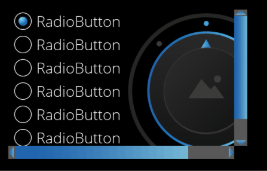
| **Property Name**
| **Type**
| **Description** |
| Vertical Scrollbar Visibility | ScrollbarVisibility::Enum (Automatic, Collapsed, Visible) | Configure the visibility of the scrollbar. By default it is set to Automatic which will determine the visibility based on the actual content. |
| Horizontal Scrollbar Visibility
| ScrollbarVisibility::Enum (Automatic, Collapsed, Visible) | Configure the visibility of the scrollbar. By default it is set to Automatic which will determine the visibility based on the actual content. |
#### CoreMultiStateButton
A UI element that allows for the easy definition of buttons with multiple states. Each click changes the state, and once the maximum value is reached, it loops back to the initial state. The corresponding image is selected based on the button's state, and the displayed text can also be modified using the Text property. The behavior of the MultiStateButton can be set in the EventHandler, and actions corresponding to the current state can be executed using the Process Value Changed Event behavior.
**Properties**
| **Property Name**
| **Type**
| **Description** |
| Focusable
| bool
| If true, the control is focusable. Otherwise the control can not be focused. |
| Current State
| Variant
| Current state of the MultiStateButton (starts with 0). |
| Maximum State
| bool/Variant
| Maximum value of MultiStateButton (starts with 0). |
# Navigation
#### TurnByTurn Control
The TurnByTurn Control is designed as an overlay to provide information about the distance to the next turn in the following way:
- **Absolute distance**
- Value and unit of absolute distance to the next turn, the value gets automatically rounded to the next 10.
- **Relative distance**
- Bargraph indicating the distance to the next turn from 100 to 0. The colour of the bargraph can be changed if the next turn gets close.
- **Street name**
- Name of the street related to the next turn
- **Direction icon**
- Icon to indicate the type of the next turn
| **Property Name**
| **Type**
| **Description**
|
| Show Street Name | bool | Whether or not the street name is shown |
| Show Relative Indication
| bool
| Whether or not the bargraph indicating the relative distance to next turn is shown |
| Show Absolute Indication | bool | Whether or not the absolute value for the distance to the next turn is shown |
| Text Style | TextStyle | The text style of street and distance value |
| Text Style Unit | TextStyle | The text style of the distance unit |
| Street Name | String | Street name |
| Distance To Turn | UInt32 | Absolute distance to the next turn, the value is automatically rounded to the nearest 10. |
| Relative Distance Value | Float in range \[0, 100\] | Relative distance to the next turn, indicated by the bargraph |
| Distance Unit Text | String | Unit of the absolute value |
| Direction Icon Index | UInt8 | Index of direction icons, see also Direction Images |
| Direction Images | Array of Images | Array of turn by turn icons, the displayed icon is set via the "Direction Icon Index" property |
| Total Bargraph Size | Float | Size of the total bargraph (active + background part) |
| Max Active Bargraph Size | Float | Maximum size of the bargraph indicating the distance ("Relative Distance Value" == 100) |
| Color Change Threshold | UInt8 | Threshold to indicate that the next turn is close, the bargraph color will change to "Bargraph Color Below Threshold" |
| Bargraph Color Normal | Color | Color of the bargraph if not close to the turn, determined by the "Value Close To Turn" property |
| Bargraph Color Below Threshold | Color | Color of the bargraph if close to the turn, determined by the "Color Change Threshold" property |
| Bargraph Background Color | Color | Color of the bargraph background |
| Max Street Name Text Size | UInt32 | Maximum size of the street name text |