Predefined Behaviors
- Examples Using Predefined Behaviors
- Action Behaviors
- Condition Behaviors
- Control Behaviors
- Demonstration
- External Resource
- Graph
- IdentifierValueMap
- Layer
- Map
- Mixed Reality Behaviors
- Particle
- Scripting Behaviors
- State Machine Behaviors
- Streaming Behaviors
- Value Processing Behaviors
- Set Uniform
- BehaviorGroup
Examples Using Predefined Behaviors
Thermometer Example
1. Drag&drop a Slider Control and a Text Value Control from the Controls Panel of the Toolbox to the Scene Editor or the Scene Tree.

2. Set the Slider's Minimum to "-50,00" and the maximum to "+50,00".

3. Change the Text Value Control's "Format Text" Property to "%d °C".

4. Drag&drop a Forward Value Behavior (which is a Value Processing Behavior) from the Behaviors Panel of the Toolbox onto the Slider in the Scene Tree.

This is what the Scene Tree should look like now:

5. Select the Forward Value Behavior in the right side of the Scene Tree view. Set the Forward Value Behavior's Target Node to the Text Value Control you have added to the scene in step 1 by clicking on the magnifying glass on the right of the input field and selecting the Text Value Control in the "Choose Item" dialog.

After that, the Forward Value Behavior's Properties will look as follows.

6. Drag&drop a Value Behavior (which is a Value Processing Behavior) from the Behaviors Panel of the Toolbox onto the Text Value Control in the Scene Tree.

7. Select the Value Behavior on the right side of the Scene Tree View. Set the Value Behavior's AcceptValueEvent Property to "true" by checking the checkbox.

8. Select the "Text Value" Control in the Scene Tree Panel and drag&drop two Action on Value Behaviors (which are Value Processing Behaviors) from the Behaviors Panel of the Toolbox onto the "Receivers" of the "Value Behavior" in right side of the SceneTree Panel.

9. Add a condition to the Action on Value Behaviors you have just added by dragging&dropping a Check processed Value Behavior (which is a Condition - Control Behavior) onto each of the Action on Value Behaviors you have just added.

10. Configure one of the Conditions to "LowerThan 0,00" and the other one to "GreaterThan 0,00".

11. Drag&drop a Set Color SetColor Action (which is a Action - Property Behavior) from the Toolbox view onto the Actions of each of the Action on Value Behaviors in the SceneTree.

12. Set the color to Blue on the Action on Value Behavior with the Condition Lower Than 0,00 and set the Color to Red on the Action on Value Behavior with the Condition Greater Than 0,00.

13. Save your solution and start the Player through the Play button (with the option "Generate and Play") in the Toolbar on the top to see the result.

14. The text color of the Text Value Control displaying the temperature in degrees celcius will turn blue once the value of the slider gets lower than zero and it will turn red once the value becomes greater than zero.

Align Pivot Example
1. Drag&drop a Group from the "Nodes 2D" Panel of the Toolbox to the SceneEditor or the Scene Tree. Choose the follwing two Images from the Construction Kit (in the Solution Explorer) and drag&drop them onto the Group node in the SceneTree: GaugeBmP and GaugeNeedleBmp

2. Arrange the Controls in the SceneEditor so that "GaugeNeedleBmp" is the last entry of the Group Node in the Scene Tree.

3. Select the "Pivot only" Translation tool in the toolbar and move the pivot of "GaugeBmP" to the center of the image and the pivot of "GaugeNeedleBmp" to the usual center of rotation of a gauge needle.

4. Drag&drop the Align Pivot Behavior (which is a Control Behavior) from the Toolbox view onto the Group node in the SceneTree.

5. The Align Pivot Behavior does not have any properties to set. The pivots of the Bitmap Nodes are aligned and the result can be seen in the SceneEditor: The Needle image is positioned correctly in the Gauge image.

-
Don't forget to reset the Translation tool to "Pivot and Object".

Arc Align Example
1. Drag&drop a Group from the "Nodes 2D" Panel of the Toolbox to the SceneEditor or the Scene Tree. And add four Text Nodes to this group by dragging&dropping them onto the Group node in the SceneTree.

2. Change the texts of the Text Nodes to "Text", "Text_1" etc. according to their names in the Scene Tree View.

3. Drag&drop the Arc Align Behavior (which is a Control Behavior) from the Toolbox view onto the Group node in the SceneTree.

4. Configure the Arc Align Behavior with a radius of 50 and AngleMinMax values of 0 and 90.

5. The result can be seen in the Scene Editor view: All nodes are aligned like an arc from 0 to 90 degrees.

Enable Rendering Example
1. Drag&drop a TextButton Control from the Controls Panel of the Toolbox to the SceneEditor or the Scene Tree.

2. Drag&drop the OnClick Behavior (which is a Control Behavior) from the Toolbox view onto the TextButton node in the SceneTree. Additionally, drag&drop the Enable Rendering Behavior (which is a Action - Property Behavior) from the Toolbox view onto the "Actions" field of the OnClick Behavior on the right side of the Scene Tree.

3. Check the properties of the Enable Rendering Behavior. We want to change the visibility of the TextButton to invisible when it has been clicked (onClick), so the checkbox "Visible" has to remain unchecked.

4. Save your solution and start the Player through the Play button (with the option "Generate and Play") in the Toolbar on the top to see the result.

Format String Example
1. Drag&drop a TextButton Control from the Controls panel and a TextNode from the "Nodes 2D" Panel of the Toolbox to the SceneEditor or the Scene Tree. Set the TextButton's Text to "Format String".

2. Drag&drop a Value Behavior (which is a Value Processing Behavior) from the Toolbox view onto the TextNode in the SceneTree. Set the Value Behavior's "AcceptValueEvent" property to true.

3. Drag&drop a Format String Behavior (which is a Value Processing Behavior) from the Toolbox view onto the Value Behavior's Receivers.

4. Set the Format String Behavior's "Text" property to "Score: %0.2f", in order to represent the value as formatted string.

5. Drag&drop a Send Value as Event Behavior (which is a Action - Property Behavior) from the Toolbox view onto the TextButton's Actions on the right side of the SceneTree view.

6. Configure the Send Value as Event Behavior's Value property to datatype Int32 and value 10. Adjust the behavior's TargetNode by clicking on the magnifying glass on the right of the property.

7. Set the scene's TextNode as TargetNode for the Send Value as Event Behavior: After clicking the magnifying glass in the properties panel, the "Select Item" Dialog is opened. Select the scene's TextNode and press OK.

8. Save your solution and start the Player through the Play button (with the option "Generate and Play") in the Toolbar on the top to see the result.

9. When the TextButton is pressed, the Int32 value of 10 will be sent to the TextNode. This value is accepted by the TextNode and the behavior FormatString formats it to "Score: 10.00".

Forward Value Example

2. Position the Slider Control and Text Value Control in the Scene Editor View.

3. Change the Text Value Control's "Format Text" Property to "Value: %d".

4. Drag&drop a Forward Value Behavior (which is a Value Processing Behavior) from the Behaviors Panel of the Toolbox onto the Slider in the Scene Tree.

5. Select the Forward Value Behavior in the right side of the Scene Tree view. Set the Forward Value Behavior's Target Node to the Text Value Control you have added to the scene in step 1 by clicking on the magnifying glass on the right of the input field and selecting the Text Value Control in the Choose Item dialog.

After that, the Forward Value Behavior's Properties will look as follows.

6. Save your solution and start the Player through the Play button (with the option "Generate and Play") in the Toolbar on the top to see the result.

7. When manipulating the slider, the Value of the Text Value Control changes according to the alteration on the slider.

Hover - Hover Leave Example
1. Drag&drop a Text Control from the Controls Panel of the Toolbox to the Scene Editor or the Scene Tree and change its text to "Hover".

2. Drag&drop a Hover Behavior (which is a Control Behavior) and a Handle Control State Behavior (which is a Control - Internal Behavior) from the Behaviors Panel of the ToolBox onto the Text Control in the SceneTree. The Handle Control State Behavior is needed in order for the Text Control to receive Input Events.

3. Drag&drop a SetColor Behavior (which is an Action - Property Behavior) onto the Actions of the Hover Behavior on the right side of the SceneTree view.

4. Select the Set Color Behavior and change the Color to red.

5. Save your solution and start the Player through the Play button (with the option "Generate and Play") in the Toolbar on the top to see the result.

6. When moving the mouse over the Text Control, the text color changes to red.

7. Drag&drop a Hover Leave Behavior (which is a Control Behavior) onto the TextNode.

8. Drag&drop a Set Color Behavior (which is an Action - Property Behavior) onto the Actions of the HoverLeave Behavior on the right side of the SceneTree view.

9. Select the Set Color Behavior and change the Color to green.

10. Save your solution and start the Player through the Play button (with the option "Generate and Play") in the Toolbar on the top to see the result.

11. When moving the mouse over the Text Control, the text color changes to red (as it did before). When moving the mouse away again, the Text Control's color changes to green. Whenever you hover, it's getting red, when leaving, it's turning green.

Interpolate Value Example
1. Drag&drop a TextButton Control from the Controls panel and a TextNode from the "Nodes 2D" Panel of the Toolbox to the SceneEditor or the Scene Tree. Set the TextButton's Text to "Count to 10".

2. Drag&drop a Value Behavior (which is a Value Processing Behavior) from the Behaviors Panel of the Toolbox onto the TextNode in the Scene Tree.

3. Select the Value Behavior in the right side of the Scene Tree view. Set the Value Behavior's AcceptValueEvent Property to "true" by checking the checkbox.

4. Drag&drop an Interpolate Value Behavior (which is a Value Processing Behavior) onto the Value Behavior's Receivers in the right side of the Scene Tree Panel.

5. Select the Interpolate Value Behavior on the right side of the Scene Tree View and set the UnitsPerSecond to 1,00 in the Properties view on the bottom right.

6. Drag&drop a Format String Behavior (which is a Value Processing Behavior) from the Toolbox onto the Interpolate Value Behavior's Receivers on the right side of the Scene Tree Panel.

7. Select the Format String Behavior on the right side of the Scene Tree view and set the Text property to "%d" in the Properties view.

8. Drag&drop a Send Value as Event Behavior (which is a Action - Property Behavior) from the Toolbox view onto the TextButton's Actions on the right side of the SceneTree view.

9. Select the Send Value as Event Behavior on the right side of the Scene Tree Panel. Set the Value property to datatype "Float" and value "10" in the Properties view. Adjust the behavior's TargetNode by clicking on the magnifying glass on the right of the property.

10. Set the scene's TextNode as TargetNode for the Send Value as Event Behavior: After clicking the magnifying glass in the properties panel, the "Select Item" Dialog is opened. Select the scene's TextNode and press OK.

11. Save your solution and start the Player through the Play button (with the option "Generate and Play") in the Toolbar on the top to see the result.

12. When clicking on the TextButton, the value 10 gets sent to the TextNode, but the TextNode doesn't change to 10 immediately. The Interpolate Value Behavior makes the TextNode count up from 0 to 10 in one step per second.

Move Node Example
1. Drag&drop a TextButton Control from the Controls Panel of the Toolbox to the SceneEditor or the Scene Tree and change the Text to "Move Node"

2. Select the TextButton in the Scene Tree View and delete all Behaviors that are automatically attached to the TextButton from the right side of the Scene Tree View.

3. Drag&drop a Value Behavior (which is a Value Processing Behavior) and a Handle Control State Behavior (which is a Control - Internal Behavior) from the Behaviors Panel of the ToolBox onto the TextButton Control in the SceneTree. The Handle Control State Behavior is needed in order for the TextButton Control to receive Input Events.

4. Select the Value Behavior on the right of the Scene Tree View and set the Value Behavior's AcceptValueEvent Property to "true" by checking the checkbox.

5. Drag&drop the Move Node Behavior (which is a Value Processing - Transformation Behavior) from the Behaviors Panel of the ToolBox onto the Value Behavior's Receivers.

6. Drag&drop an OnClick Behavior (which is a Control Behavior) from the Behaviors Panel of the ToolBox onto the TextButton Control.

7. Drag&drop a Send Value as Event Behavior (which is a Action - Property Behavior) from the Behaviors Panel of the ToolBox onto the OnClick Behavior's Actions Property.

8. Select the Send Value as Event Behavior on the right side of the Scene Tree View and set the value to datatype "Float" value "100,00" in the Properties view.

9. Save your solution and start the Player through the Play button (with the option "Generate and Play") in the Toolbar on the top to see the result.

10. When Clicking on the TextButton in the Player, the Button moves to position 50, 50.

OnClick Example
1. Drag&drop a SolidColorNode from the "Nodes 2D" Panel of the Toolbox to the SceneEditor or the Scene Tree.

2. Drag&drop a OnClick Behavior (which is a Control Behavior) and a Handle Control State Behavior (which is a Control - Internal Behavior) from the Behaviors Panel of the ToolBox onto the SolidColorNode in the SceneTree. The Handle Control State Behavior is needed in order for the TextButton Control to receive Input Events.

3. Drag&drop a Set Color SetColor Behavior (which is a Action - Property Behavior) from the Toolbox view onto the Actions of the OnClick Behaviors in the SceneTree.

4. Select the Set Color Behavior and change the Color to red.

5. Save your solution and start the Player through the Play button (with the option "Generate and Play") in the Toolbar on the top to see the result.

6. When clicking on the SolidColorNode, the SolidColorNode's color changes to red.

OnPressed Example
1. Drag&drop a SolidColorNode from the "Nodes 2D" Panel of the Toolbox to the SceneEditor or the Scene Tree.

2. Drag&drop a OnPressed Behavior (which is a Control Behavior) and a Handle Control State Behavior (which is a Control - Internal Behavior) from the Behaviors Panel of the ToolBox onto the SolidColorNode in the SceneTree. The Handle Control State Behavior is needed in order for the TextButton Control to receive Input Events.

3. Drag&drop a Set Color SetColor Behavior (which is a Action - Property Behavior) from the Toolbox view onto the Actions of the OnPressed Behaviors in the SceneTree.

4. Select the Set Color Behavior and change the Color to red.

5. Save your solution and start the CGIPlayer through the Play button (with the option "Generate and Play") in the Toolbar on the top to see the result.

6. When pressing the mouse left button on the SolidColorNode, the SolidColorNode's color changes to red.

Perform Transition Requests Example
1. Drag&drop a SolidColorNode from the "Nodes 2D" Panel of the Toolbox to the 2D scene "Scene2D" in the SceneEditor or the Scene Tree view. Change the Scale X and Scale Y propertes to 3,0 each in the Properties view.

2. Open the already existing 3D scene "Scene3D" by double-clicking it in the Solution Explorer on the left.

3. Drag&drop a Cube Control from the Controls Panel of the Toolbox to the 3D Scene "Scene3D" in SceneEditor or the Scene Tree view.

4. Select the Cube Control in the Scene Tree view and set the Position properties to (0, 0, 0).

5. Switch back to the 2D scene "Scene2D" by double-clicking it in the Solution Explorer on the left.

6. Drag&drop a OnClick Behavior (which is a Control Behavior) and a Handle Control State Behavior (which is a Control - Internal Behavior) from the Behaviors Panel of the ToolBox onto the SolidColorNode in the SceneTree. The Handle Control State Behavior is needed in order for the TextButton Control to receive Input Events.

7. Drag&drop a Perform Transition Requests Perform Transition Requests Behavior (which is a Action - Transition Behavior) from the Toolbox view onto the Actions of the OnClick Behaviors in right side of the SceneTree view.

8. Drag&drop two Transition Request Transition Request Behaviors (which are Action - Transition Behaviors) from the Toolbox view onto the Requests of the Perform Transition Requests Perform Transition Requests Behavior in the right side of the SceneTree view.

9. Select the first one of the two Transition Request Transition Request Behaviors. Set the Transition Request Transition Request Behavior's Identifier to the current scene (Scene2D) by clicking on the magnifying glass on the right of the input field and selecting the current 2D Scene (Scene2D) in the "Choose Item" dialog.

After that, the Transition Request Transition Request Behavior's Properties will look as follows.

10. Now, select the second Transition Request Transition Request Behaviors. Set the Transition Request Transition Request Behavior's Identifier to the 3D scene (Scene3D) by clicking on the magnifying glass on the right of the input field and selecting the 3D Scene (Scene3D) in the "Choose Item" dialog.

After that, the Transition Request Transition Request Behavior's Properties will look as follows.

11. Save your solution and start the Player through the Play button (with the option "Generate and Play") in the Toolbar on the top to see the result.

12. You can see your 2D scene with the white SolidColorNode. When clicking on the SolidColorNode, a transition to the 3D scene is performed.
 |
 |
| Initially displaying Scene2D | After Clicking, displaying Scene3D |
Render Child Nodes Example
1. Drag&drop two TextButton Controls from the Controls Panel of the Toolbox to the already existing Group Node of the Scene Tree and change their texts to "Button 1" and "Button 2".

2. Drag&drop an Event Handler Behavior (which is a Control Behavior) from the Toolbox view onto the Group Node in the Scene Tree view.

3. Select the Group Node in the Scene Tree view and drag&drop a Check Click Behavior (which is a Condition - Input Behavior) from the Toolbox view onto the Condition of the Group Node's EventHandler in the right side of the Scene Tree view.

4. Keep the Group Node selected in the Scene Tree view and drag&drop a Render Child Nodes Behavior (which is a Action - Property Behavior) from the Toolbox view onto the "Actions" of the Group Node's EventHandler on the right side of the Scene Tree view.

5. Select the "Render Child Nodes" Behavior in the right side of the Scene Tree view. In the Properties view set Index to "1,0" and OperationMode to to "SingleNode".

6. Save your solution and start the Player through the Play button (with the option "Generate and Play") in the Toolbar on the top to see the result.

7. After clicking on one of the two buttons (no matter which one), "Button 2" will disappear and "Button 1" will get rendered.

8. Stop the Player by pressing on the Stop Button (next to the option "Generate and Play") and change the "Render Child Nodes" Behavior's Property: Set Index to "2,0".

9. Save your solution and start the Player through the Play button (with the option "Generate and Play") in the Toolbar on the top to see the result.

10. After clicking on one of the two buttons (no matter which one), "Button 1" will disappear and "Button 2" will get rendered.

Send Value As Event Example

2. Rename the TextButton Controls to "DecreaseButton" and "IncreaseButton". Change the text of the DecreaseButton to "-" and the text of the IncreaseButton to "+".

3. Change the Text of the TextValue Control to "Count: %d" and arrange the three Controls as in the right picture below.

4. The value of the TextValue Control should be increased or decreased according to the pressed Button. To connect the TextButton Controls with the TextValue Control select one of the TextButtons. Drag&drop a Send Value as Event Behavior (which is a Action - Property Behavior) onto the Actions sections of both of the TextButton Controls' EventHandler.

5. Select the "SendValueAsEvent" Behavior of the "DecreaseButton" and change the Value to "-1,00" in the Properties view. As the value should change relative to the current value, the "ChangeValue" property has to be set to "Relative". Select the "SendValueAsEvent" Behavior of the "IncreaseButton" and change the Value to "1,00" in the Properties view. Again, the "ChangeValue" property has to be set to "Relative"

6. Both "SendValueAsEvent" Behaviors need to be configured with the "Text Value" Control as TargetNode by clicking on the magnifying glass on the right of the property.

7. Set the scene's TextValue Node as TargetNode for the Send Value as Event Behavior: After clicking the magnifying glass in the properties panel, the "Select Item" Dialog is opened. Select the scene's TextValue Node and press OK. Repeat this for the second "SendValueAsEvent" Behavior.

8. Save your solution and start the Player through the Play button (with the option "Generate and Play") in the Toolbar on the top to see the result.

9. When pressing the "-" Button, the Count value is decreased by one. When pressing the "+" Button, the Count value is increased by one.

Set Alpha Value Example
1. Drag&drop a TextButton Control from the Controls Panel of the Toolbox to the SceneEditor or the Scene Tree and change the Text to "Set Alpha Value"

2. Select the TextButton in the Scene Tree View and delete all Behaviors that are automatically attached to the TextButton from the right side of the Scene Tree View.
 |
 |
| before deleting all behaviors | after deleting behaviors |
3. Select the TextButton Control in the SceneTree View and decrease its Alpha Value e.g. to 0,5 in the Item Tab of the Properties Panel.

4. Drag&drop a Value Behavior (which is a Value Processing Behavior) and a Handle Control State Behavior (which is a Control - Internal Behavior) from the Behaviors Panel of the ToolBox onto the TextButton Control in the SceneTree. The Handle Control State Behavior is needed in order for the TextButton Control to receive Input Events.

5. Select the Value Behavior on the right of the Scene Tree View and set the Value Behavior's AcceptValueEvent Property to "true" by checking the checkbox.

6. Drag&drop the Set Alpha Value Behavior (which is a Value Processing - Effects Behavior) from the Behaviors Panel of the ToolBox onto the Value Behavior's Receivers.

7. Drag&drop an OnClick Behavior (which is a Control Behavior) from the Behaviors Panel of the ToolBox onto the TextButton Control.

8. Drag&drop a Send Value as Event Behavior (which is a Action - Property Behavior) from the Behaviors Panel of the ToolBox onto the OnClick Behavior's Actions Property.

9. Select the Send Value as Event Behavior on the right side of the Scene Tree View and set the value to datatype "Float" value "1,00" in the Properties view.

10. Save your solution and start the Player through the Play button (with the option "Generate and Play") in the Toolbar on the top to see the result.

11. When Clicking on the TextButton in the Player, the Button moves to position 50, 50.

Set Image Example
1. Drag&drop a TextButton Control from the Controls Panel and a BitmapNode from the "Nodes 2D" Panel of the Toolbox to the SceneEditor or the Scene Tree.

2. Position the TextButton Control and the BitmapNode next to each other in the Scene Editor.

3. Drag&Drop a Provide Image Behavior (which is a Control - Public Property Behavior) from the Behaviors Panel of the ToolBox onto the BitmapNode in the Scene Tree view.

4. Select the TextButton Control in the Scene Tree view and change its Text to "Set Image" in the Properties view.

5. Drag&Drop a Set Image Behavior (which is a Action - Property Behavior) from the Behaviors Panel of the ToolBox onto the "Actions" field of the TextButton Control's EventHandler on the right side of the Scene Tree.

6. Select the newly added Set Image Behavior in right side of the Scene Tree view. Adjust the "Set Image" Behavior's Image Property by clicking the magnifying glass on the right of the input field.

7. Set the "Set Image" Behavior's image property: After clicking the magnifying glass in the properties panel, the "Select Item" Dialog is opened. Select an image from the construction kit (a preview of the image is shown when moving the mouse over the image) and press OK.

8. Select the Set Image Behavior on the right side of the Scene Tree view and drag&drop it onto the BitmapNode on the left side of the Scene Tree view (you can see a little arrow and "Set Image").

9. Save your solution and start the Player through the Play button (with the option "Generate and Play") in the Toolbar on the top to see the result.

10. When the TextButton is pressed, the configured image will be set to the BitmapNode and the image will appear.

Set Position Example
1. Drag&drop a TextButton Control from the Controls Panel of the Toolbox to the SceneEditor or the Scene Tree and change the Text to "Change Position".

2. Select the TextButton in the Scene Tree View and delete all Behaviors that are automatically attached to the TextButton from the right side of the Scene Tree View.
 |
 |
| before deleting all behaviors | after deleting behaviors |
3. Drag&drop a Value Behavior (which is a Value Processing Behavior) and a Handle Control State Behavior (which is a Control - Internal Behavior) from the Behaviors Panel of the ToolBox onto the TextButton Control in the SceneTree. The Handle Control State Behavior is needed in order for the TextButton Control to receive Input Events.

4. Select the Value Behavior on the right side of the Scene Tree View and set the Value Behavior's AcceptValueEvent Property to "true" by checking the checkbox.

5. Drag&drop a Set Position Behavior (which is a Value Processing - Transformation Behavior) from the Behaviors Panel of the ToolBox onto the Value Behavior's Receivers.

6. Select the Set Position Behavior on the right side of the Scene Tree view and set its TranslationAxis Property to "AxisX"

7. Drag&drop an OnClick Behavior (which is a Control Behavior) from the Behaviors Panel of the ToolBox onto the TextButton Control.

8. Drag&drop a Send Value as Event Behavior (which is a Action - Property Behavior) from the Behaviors Panel of the ToolBox onto the OnClick Behavior's Actions Property.

9. Select the Send Value as Event Behavior on the right side of the Scene Tree View and set the value to datatype "Float" value "100,00" in the Properties view.

10. Save your solution and start the Player through the Play button (with the option "Generate and Play") in the Toolbar on the top to see the result.

11. When Clicking on the TextButton in the Player, the Button's horizontal position (x coordinate) is set to 100, so it moves to the right.

Set Rotation Example
1. Drag&drop a TextButton Control from the Controls Panel of the Toolbox to the SceneEditor or the Scene Tree and change the Text to "Set Rotation".

2. Select the TextButton in the Scene Tree View and delete all Behaviors that are automatically attached to the TextButton from the right side of the Scene Tree View.
 |
 |
| before deleting all behaviors | after deleting behaviors |
3. Drag&drop a Value Behavior (which is a Value Processing Behavior) and a Handle Control State Behavior (which is a Control - Internal Behavior) from the Behaviors Panel of the ToolBox onto the TextButton Control in the SceneTree. The Handle Control State Behavior is needed in order for the TextButton Control to receive Input Events.

4. Select the Value Behavior on the right side of the Scene Tree View and set the Value Behavior's AcceptValueEvent Property to "true" by checking the checkbox.

5. Drag&drop a Set Rotation Behavior (which is a Value Processing - Transformation Behavior) from the Behaviors Panel of the ToolBox onto the Value Behavior's Receivers.

6. Drag&drop an OnClick Behavior (which is a Control Behavior) from the Behaviors Panel of the ToolBox onto the TextButton Control.

7. Drag&drop a Send Value as Event Behavior (which is a Action - Property Behavior) from the Behaviors Panel of the ToolBox onto the OnClick Behavior's Actions Property.

8. Select the Send Value as Event Behavior on the right side of the Scene Tree View and set the value to datatype "Float" value "40,00" in the Properties view.

9. Save your solution and start the Player through the Play button (with the option "Generate and Play") in the Toolbar on the top to see the result.

10. When Clicking on the TextButton in the Player, the Button is rotated 40° clockwise.

Set Scale Example
1. Drag&drop a SolidColorNode from the "Nodes 2D" Panel of the Toolbox to the SceneEditor or the Scene Tree.

2. Drag&drop a Value Behavior (which is a Value Processing Behavior) from the Behaviors Panel of the Toolbox onto the Text Value Control in the Scene Tree.

3. Select the Value Behavior on the right side of the Scene Tree View. Set the Value Behavior's AcceptValueEvent Property to "true" by checking the checkbox in the Properties view. Check the Minimum Checkbox and set the Minimum Value to 0,50. Check the Maximum Checkbox and set the Maximum Value to 3,00. Also, set the Variant Value to 1,00.

4. Select the SolidColorNode in the Scene Tree view and drag&drop an Interpolate Value Behavior (which is a Value Processing Behavior) onto the Value Behavior's Receivers in the right side of the Scene Tree Panel.

5. Select the Interpolate Value Behavior on the right side of the Scene Tree view and set the property "Units Per Second" to 1,00 in the Properties view.

6. Drag&Drop a Set Scale Behavior (which is a Value Processing - Transformation Behavior) onto the Interpolate Value Behavior's Receivers in the right side of the Scene Tree Panel.

7. Select the Set Scale Behavior and check the ScaleAlongY checkbox in the Properties view. Set the ScaleVextor2D Property to (1, 1).

8. Drag&drop two TextButton Controls from the Controls Panel of the Toolbox to the SceneEditor or the Scene Tree.

9. Configure the first TextButton Control to have the Text "Decrease". Configure the second TextButton Control to have the Text "Increase" and set it's Enabled Property to "false" by unchecking the Checkbox.

10. Drag&drop a Send Value as Event Behavior (which is a Action - Property Behavior) from the Toolbox view onto the TextButton's Actions on the right side of the SceneTree view. Do this for both of the TextButton Controls.

11. Select the first TextButton Control (the one with text "Decrease") and then select its Send Value as Event Behavior on the right side of the Scene Tree view. Set the Value Property to 0,50. Adjust the behavior's TargetNode by clicking on the magnifying glass on the right of the property.

12. Set the scene's TextNode as SolidColorNode for the Send Value as Event Behavior: After clicking the magnifying glass in the properties panel, the "Select Item" Dialog is opened. Select the scene's SolidColorNode and press OK.

13. Select the second TextButton Control (the one with text "Increase") and then select its Send Value as Event Behavior on the right side of the Scene Tree view. Set the Value Property to 3,00. Set the behavior's TargetNode to the scene's SolidColorNode as you just did for the first TextButton Control.

14. Save your solution and start the Player through the Play button (with the option "Generate and Play") in the Toolbar on the top to see the result.

15. When clicking on the TextButton "Increase" in the Player, the size of the SolidColorNode is slowly increased. When clicking on the TextButton "Decrease", the size of the SolidColorNode is slowly decreased.

Set Text Example
1. Drag&drop a TextButton Control from the Controls panel and a TextNode from the "Nodes 2D" Panel of the Toolbox to the SceneEditor or the Scene Tree. Set the TextButton's Text to "Change Text".

2. Position the TextButton Control and the TextNode nicely in the Scene Editor.

3. Drag&Drop a Provide Text Behavior (which is a Control - Public Property Behavior) from the Behaviors Panel of the ToolBox onto the TextNode in the Scene Tree view.

4. Select the TextButton Control and drag&drop a Set Text Behavior (which is a Action - Property Behavior) from the Behaviors Panel of the ToolBox onto the "Actions" field of the TextButton Control's EventHandler on the right side of the Scene Tree.

5. Select the newly added Set Text Behavior in right side of the Scene Tree view and change the Text property to "Hallo" in the Properties view.

6. Select the Set Text Behavior on the right side of the Scene Tree view and drag&drop it onto the TextNode on the left side of the Scene Tree view (you can see a little arrow and "Set Text").

7. Save your solution and start the Player through the Play button (with the option "Generate and Play") in the Toolbar on the top to see the result.

8. When the TextButton is pressed, the text of the TextNode will be changed to "Hallo".

Start Timer Example
1. Drag&drop a TextButton Control and a Text Control from the Controls panel of the Toolbox to the SceneEditor or the Scene Tree.

2. Select the TextButton in the Scene Tree View and delete all Behaviors that are automatically attached to the TextButton from the right side of the Scene Tree View.
 |
 |
| before deleting all behaviors | after deleting behaviors |
3. Set the TextButton Control's text to "Start Timer" and the Text Control's text to "Wait for Timer".

4. Drag&drop an OnClick Behavior (which is a Control Behavior) and a Handle Control State Behavior (which is a Control - Internal Behavior) from the Behaviors Panel of the ToolBox onto the TextButton Control in the SceneTree. The Handle Control State Behavior is needed in order for the Text Control to receive Input Events.

5. Select the TextButton Control in the Scene Tree view and drag&drop a Start Timer Behavior (which is a Action - Control Behavior) from the Toolbox view onto the Actions of the TextButton Control's OnClick Behavior in the right side of the Scene Tree view.

6. Select the Start Timer Behavior in the right side of the Scene Tree view and set the Delay property to "1000" in the properties view. Set the Start Timer Behavior's Target Node to the Text Control you have added to the scene in step 1 by clicking the magnifying glass on the right side of the input filed and selecting the Text Value Control in "Choose Item" dialog.

After that, the Start Timer Behavior's Properties will look as follows.

7. Drag&drop an On Timer Behavior (which is a Control Behavior) and a Handle Control State Behavior (which is a Control - Internal Behavior) from the Behaviors Panel of the ToolBox onto the TextButton Control in the SceneTree. The Handle Control State Behavior is needed in order for the Text Control to receive Input Events.

8. Select the Text Control in the Scene Tree view and drag&drop a Set Color Behavior (which is a Action - Property Behavior) from the Toolbox view onto the Actions of the Text Control's On Timer Behavior in the right side of the Scene Tree view.

9. Select the Set Color Behavior and change the Color to red.

10. Save your solution and start the Player through the Play button (with the option "Generate and Play") in the Toolbar on the top to see the result.

11. When the TextButton "Start Timer" is pressed, a timer is started and after some time the Text Control's text changes its color.

Switch Image Example
1. Drag&drop a FlipBook Control from the Controls panel of the Toolbox to the SceneEditor or the Scene Tree.

2. Drag&drop a Value Behavior (which is a Value Processing Behavior) and a Handle Control State Behavior (which is a Control - Internal Behavior) from the Behaviors Panel of the ToolBox onto the TextButton Control in the SceneTree. The Handle Control State Behavior is needed in order for the Text Control to receive Input Events.

3. Select the Value Behavior in the right side of the Scene Tree view and set the "AcceptValueEvent" property to "True" in the Properties view.

4. Select the FlipBook Control in the Scene Tree view and drag&drop a Switch Image Behavior (which is a Value Processing - Effects Behavior) from the Toolbox view onto the Receivers of the FlipBook Control's Value Behavior in the right side of the Scene Tree view.

5. Drag&drop an OnClick Behavior (which is a Control Behavior) from the Behaviors Panel of the ToolBox onto the FlipBook Control in the SceneTree.

6. Select the FlipBook Control in the Scene Tree view and drag&drop a Send Value as Event Behavior (which is a Action - Property Behavior) from the Toolbox view onto the Actions of the FlipBook Control's OnClick Behavior in the right side of the Scene Tree view.

7. Select the Send Value as Event Behavior in the right side of the Scene Tree view and set the "Value" propert to "5,00".

8. Save your solution and start the Player through the Play button (with the option "Generate and Play") in the Toolbar on the top to see the result.

9. When the FlipBook Control is clicked in the Player, the image of the FlipBook is switched.

Transform Gesture Action Example
1. Drag&drop a SolidColorNode from the "Nodes 2D" Panel of the Toolbox to the SceneEditor or the Scene Tree.

2. Select the SolidColorNode's SolodColorBushBlend effect and change the Size properties to 100,00 and 100,0 in the Properties view.
The SolidColorNode is going to be our touchable content, which should be large enough to touch it with two fingers. This could also be achieved by extending the touchable area of the RenderNode (defining the Bounding Rectangle). But please beware that this will have consequences on the laid out size.

3. Drag&drop a Transform Gesture Action Behavior (which is a Action - Gesture Behavior) and a Handle Control State Behavior (which is a Control - Internal Behavior) from the Behaviors Panel of the ToolBox onto the SolidColorNode in the SceneTree. The Handle Control State Behavior is needed in order for the TextButton Control to receive Input Events.

4. Select the Transform Gesture Action Behavior and configure Panning Minimum and Maximum values for x and y coordinate.

5. Save your solution and start the Player through the Play button (with the option "Generate and Play") in the Toolbar on the top to see the result.

6. When panning the SolidColorNode you can drag it around in the area that has been defined in the Transform Gesture Action Behavior's Panning Properties. If you do have a touch screen available, you can also try pinching and rotating the SolidColorNode.

Transform Gesture Condition Example
1. Drag&drop a SolidColorNode from the "Nodes 2D" Panel of the Toolbox to the SceneEditor or the Scene Tree.

2. Select the SolidColorNode's SolidColorBushBlend effect and change the Size properties to 100,00 and 100,0 in the Properties view.
The SolidColorNode is going to be our touchable content, which should be large enough to touch it with two fingers. This could also be achieved by extending the touchable area of the RenderNode (defining the Bounding Rectangle). But please beware that this will have consequences on the laid out size.

3. Drag&drop a Event Handler Behavior (which is a Control Behavior) and a Handle Control State Behavior (which is a Control - Internal Behavior) from the Behaviors Panel of the ToolBox onto the SolidColorNode in the SceneTree. The Handle Control State Behavior is needed in order for the TextButton Control to receive Input Events.

4. Drag&drop an Event Handler Behavior (which is a Control Behavior) from the Toolbox view onto the SolidColorNode or its parent node in the Scene Tree view.

5. Select the SolidColorNode and drag&drop a Transform Gesture Condition Behavior (which is a Condition - Input Behavior) onto the Event Handler EventHandler's Condition on the right side of the Scene Tree View.

6. Select the SolidColorNode and drag&drop a Set Color Behavior (which is a Action - Property Behavior) onto the Event Handler EventHandler's Actions on the right side of the Scene Tree View.

7. Select the Set Color Behavior and change the Color to red.

8. Save your solution and start the Player through the Play button (with the option "Generate and Play") in the Toolbar on the top to see the result.

9. When a transform gesture is detected, a TransformEvent is sent to the touched node. If the event matches the condition, the configured action will be performed. In our case, when a transform gesture is detected, the SetColor Action will be performed and the SolidColorNode changes its color.

Swipe Gesture Example
1. Drag&drop a SolidColorNode from the "Nodes 2D" Panel of the Toolbox to the SceneEditor or the Scene Tree.

2. Select the SolidColorNode's SolidColorBushBlend effect and change the Size properties to 100,00 and 100,0 in the Properties view.
The SolidColorNode is going to be our touchable content, which should be large enough to touch it with two fingers. This could also be achieved by extending the touchable area of the RenderNode (defining the Bounding Rectangle). But please beware that this will have consequences on the laid out size.

3. Drag&drop a Event Handler Behavior (which is a Control Behavior) and a Handle Control State Behavior (which is a Control - Internal Behavior) from the Behaviors Panel of the ToolBox onto the SolidColorNode in the SceneTree. The Handle Control State Behavior is needed in order for the TextButton Control to receive Input Events.

4. Select the SolidColorNode and drag&drop a Swipe Gesture Condition Behavior (which is a Condition - Input Behavior) onto the Event Handler EventHandler's Condition on the right side of the Scene Tree View.

5. Select the Swipe Gesture Condition Behavior and configure its direction to "Right".

6. Select the SolidColorNode and drag&drop a Set Color Behavior (which is a Action - Property Behavior) onto the Event Handler EventHandler's Actions on the right side of the Scene Tree View.

7. Select the Set Color Behavior and change the Color to red.

8. Copy the EventHandler (with both its Condition and its Action you configured in steps 3 - 6 of this example) by right-clicking on the EventHandler in the right side of the Scene Tree View and choosing "Copy" (or via keyboard shortcut use Ctrl+C). Paste the EventHandler by right-clicking on the Behaviors (the topmost entry, where it says "Behaviors") in the right side of the Scene Scene Tree view and choosing "Paste" (or via keyboard shortcut select the topmost entry where it says "Behaviors" and press Ctrl+V).

9. By duplicating the EventHandler you have created "Event Handler_1" with Condition "Swipe Gesture_1" and Action "Set Color_1".

10. Select the "Swipe Gesture_1" Condition and set its Direction to "Left". Select the "Set Color_1" Action and configure its color to Green.

11. Save your solution and start the Player through the Play button (with the option "Generate and Play") in the Toolbar on the top to see the result.

12. In the beginning the SolidColorNode is white. But after a swipe to the right, the SolidColorNode is gets red. If you swipe to the left, the SolidColorNode gets green.
 |
 |
 |
| Initial color | After swipe right | After swipe left |
Scroll View Example
1. Drag&drop a ScrollView Control from the Controls Panel of the Toolbox to the Scene Editor or the Scene Tree.

2. Drag&drop a StackLayout from the "Nodes2D" Panel of the ToolBox onto the ContentAnchor of the ScrollView Control in the Scene Tree.

3. Change the Layouter Arrangement of the StackLayout to "vertical".

4. Drag&drop a Text Control from the Controls Panel, a BitmapNode from the "Nodes2D" Panel of the ToolBox and another Text Control from the Control Panel onto the StackLayout in the Scene Tree.

5. Select a Text Control in the Scene Tree View and set its width to "500" in the Layout Size Properties.

6. In the Control Properties change the Text Property to a longer, several lines long text (newlines can be achieved via Ctrl+Enter). Also set the Text Control to be Multiline and enable Word Wrap.

7. Repeat the previous two steps for the second Text Control.

8. Select the BitmapNode in the Scene Tree View before selecting the BitmapBrushBlend Effect on the right side of the Scene Tree View. Adjust the BitmapBrushBlend Effect's image by clicking on the magnifying glass on the right of the input field.

9. Set the BitmapBrushBlend Effect's image property: After clicking the magnifying glass in the properties panel, the "Select Item" Dialog is opened. Select an image from the construction kit (a preview of the image is shown when moving the mouse over the image) and press OK.

10. The SceneEditor now displays the ScrollView and its contents without the possibility to scroll.

11. Select the ScrollView Control in the Scene Tree View and set its Layout Size to a height of "400". After that, a vertical scrollbar is displayed in the SceneEditor.

12. Save your solution and start the Player through the Play button (with the option "Generate and Play") in the Toolbar on the top to see the result.

13. The ScrollView is displayed with a full functional scrollbar. When scrolling, you can check that all configured content is available: both Text Controls and one BitmapNode.

Process Value Changed Event - Slider Example
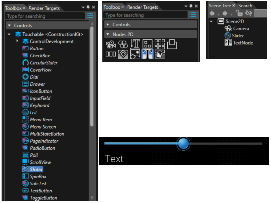
- Drag&drop a Slider and a TextNode2D from the Toolbox into the Scene Editor or the Scene Tree and arrange them in a way that both are clearly visible.

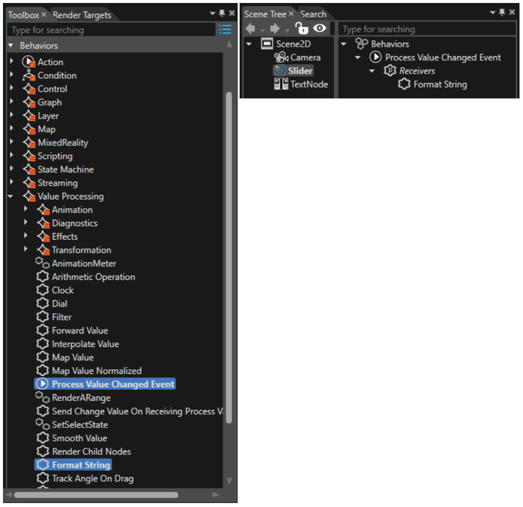
- Drag&drop a Process Value Changed Event from the Toolbox onto the Slider in the Scene Tree.
- Select the Slider in the Scene Tree and drag&drop a Format String Behavior into the right side of the Scene Tree onto the Receivers part of the Process Value Changed Event.

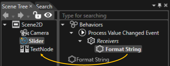
-
Drag the Format String Behavior from the Slider's Process Value Changed Event's Receivers and drop it onto the TextNode in the Scene tree.

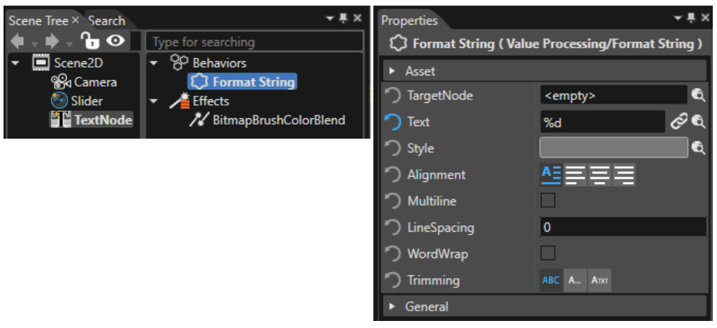
- Select the TextNode2D in the Scene Tree, so that its behaviors get visible on the right side of the Scene Tree and select the Format String Behavior. In the Properties panel configure the Text to "%d" so that the TextNode2D can correctly display the value given by the Slider

-
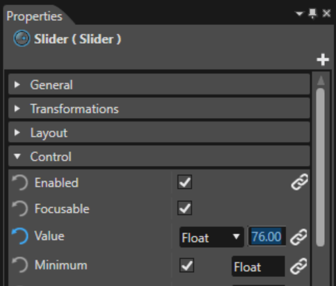
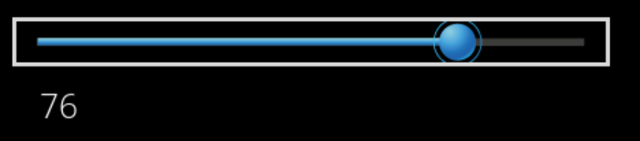
You can test the functionality already without starting the Player: Select the Slider and change its Value in the Properties panel (confirm the value by hitting the <Enter> key). The TextNode2D will always display the current value of the Slider.

-
You can also start the Player. Manipulating the Slider knob will change the Slider's value. The TextNode2D will get updated whenever the Slider's value is changed, it will always display the Slider's value.

Process Value Changed Event - State Machine Example
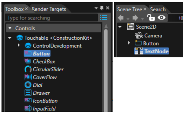
1. Drag&drop a Button and a TextNode2D from the Toolbox into the Scene Editor or Scene Tree and arrange them in a way that both are clearly visible.
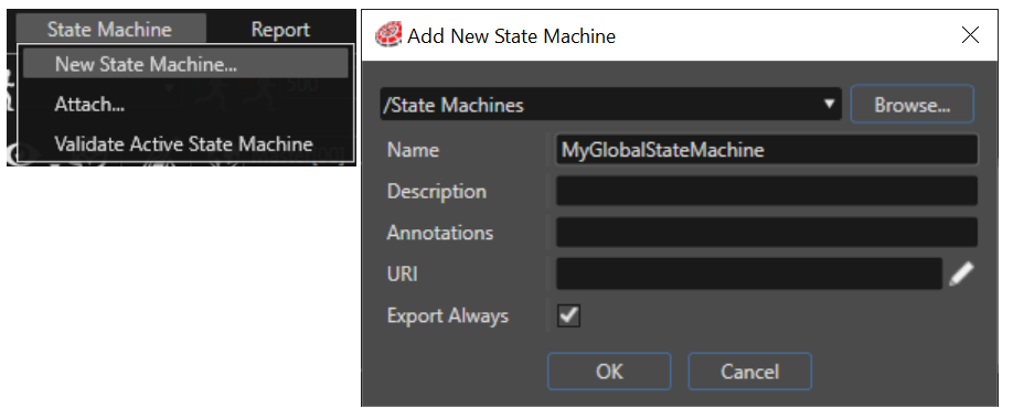
2. Create a new State Machine through the menu "State Machine" - "New State Machine...", which will open the "Add New State Machine" dialog. Adapt the State Machine's name to your needs and press "OK".
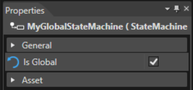
3. Select the created State Machine and make it a global State Machine by checking the "Is Global" property in the Properties panel.
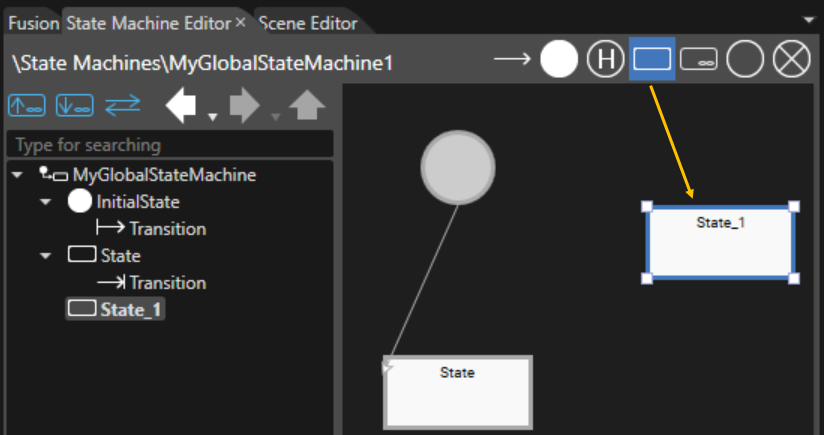
4. Double-click your Global State Machine to open it in the State Machine Editor. Drag&drop a State from the tools in the top right corner of the State Machine Editor into the State Machine diagram.
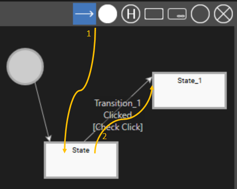
5. Drag&drop a Transition from the tools in the top right corner onto one of the States in the diagram, then move the mouse and click the second state of the diagram, which will draw a Transition from one State to the other.
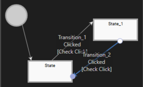
6. Perform the same action again, drawing a Transition in the other direction.
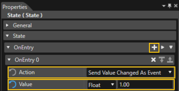
7. Select a State and add an OnEntry Action. To do this, press the "+" sign. Choose the "Send Value Changed As Event" from the drop-down list and configure a Float value of "1.00".
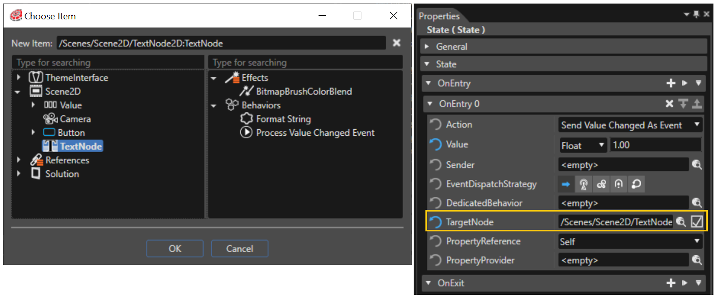
8. Click the magnifying glass next to the Target Node property to open the "Choose Item" dialog, where you can select the Scene's TextNode2D.
9. Now, select the other State and perform the same action again, but configure a different value in the "Send Value Changed As Event", e.g. a Float value of "2.00".
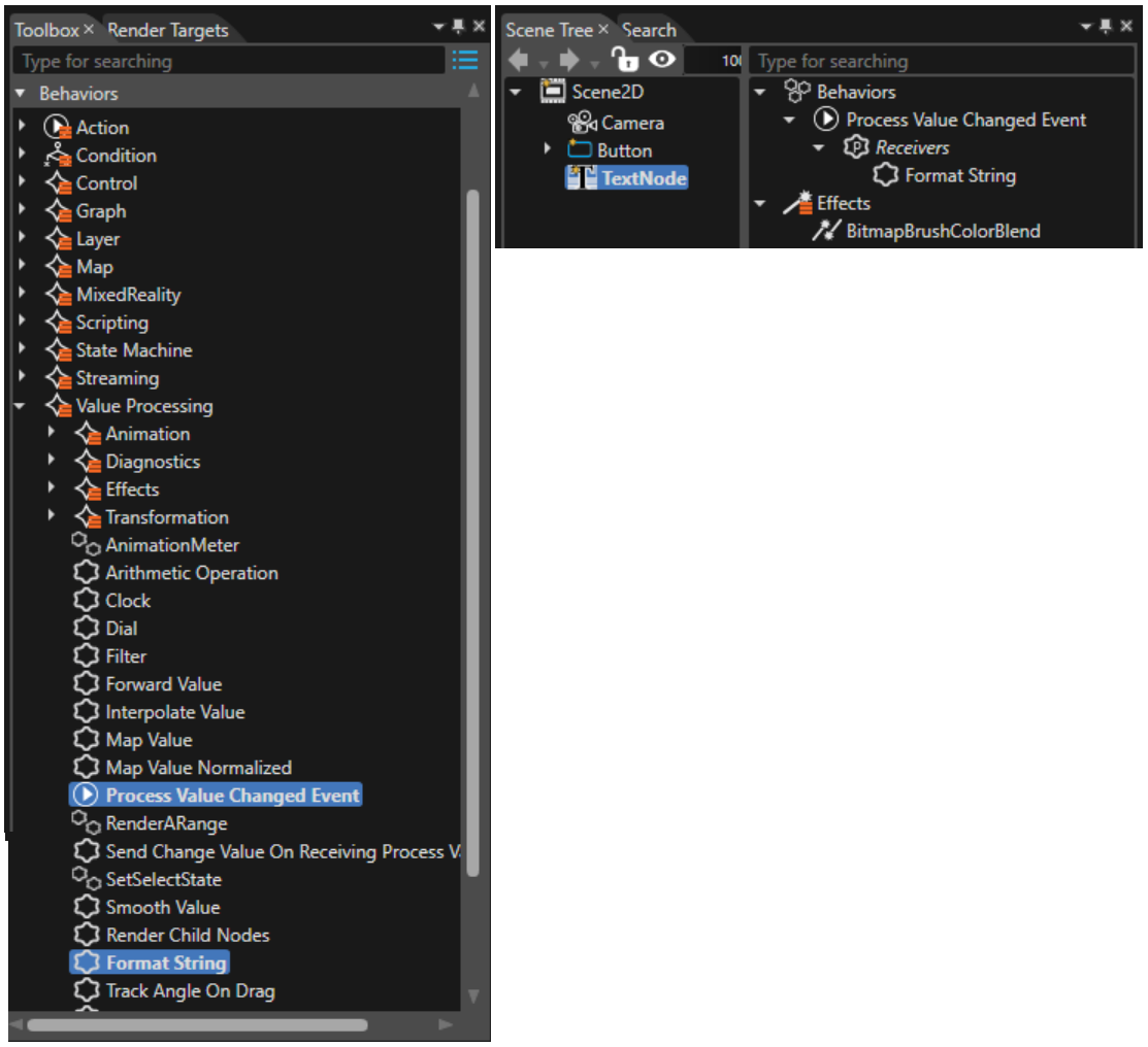
10. Drag&drop a "Process Value Changed Event" from the Toolbox onto the TextNode2D in the Scene Tree and drag&drop a "Format String" behavior onto the Receiver's part of the "Process Value Changed Event".
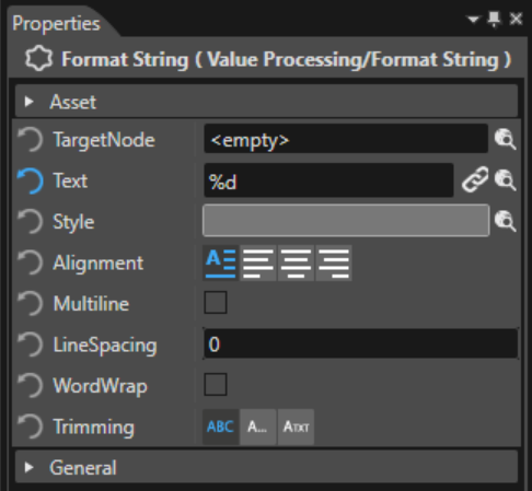
11. Select the Format String Behavior and enter "%d" in the Text Property.
12. Save your solution and start the Player. Whenever you press the button, a state transition will be performed. Each of the two states is configured with a different value (1.00 or 2.00), which will be sent as event. The TextNode2D will receive this value and display it. So, repeatedly pressing the button will change the displayed value from 1 to 2 and back to 1 etc.
Usecase for Send Value Changed as Event and reception in state machine(s)
Triggering State Transitions using Buttons
This example demonstrates the usage of "Send Value Changed as Event" in combination with a local as well as a global state machine.
Setting up the Scene
For this example, two groups are used each with two buttons and a color node. The buttons are used to send events with values "0" and "1". The color node is used to display the corresponding state of the associated state machine.
1. Drag&Drop a StackLayout onto the scene and rename to "Group"
2. Drag&Drop a StackLayout onto the root group and rename to "GlobalGroup". Set the property "Layouter > Arrangement" to "Vertical"
3. Drag&Drop a TextNode into the GlobalGroup and change name and text to "Global". Add two TextButtons rename to "GlobalButton_Send_0" and "GlobalButton_Send_1" and change the text to "0" and "1". Add a SolidColorNode and rename to "GlobalTarget". Set property "StretchBehavior" to "Fill".
4. Repeat Step 2. and 3. using "Local" for the names (as displayed in the screenshot).

Setting up the State Machines
1. In Solution Explorer in "Solution > State Machines" from the context menu use "Add > New Item…". In the dialog select "StateMachine" and change name to "GlobalChangeColorOnEvent"
2. Open State Machine Editor by double clicking on the created state machine. It shows an initial state and a state with a transition.
3. Drag&Drop a new State onto StateMachine canvas. Rename the two states to "Value_Is_0" and "Value_Is_1".
4. Drag&Drop a Transition starting from State "Value_Is_0" to "Value_Is_1". Rename it to "If_Value_1". In the property panel in the "Transition" section set the property "Event" to "Value Changed" and property "Condition" to "Check Changed Value". In the "Condition parameters" section set "ConditionOperator" to "Equal" and "ConditionValue" to "Int32" and value "1".
5. Repeat Step 4. for the transition in opposite direction. Use "If_Value_0" as a name, and for the "ConditionValue" property use value "0".
6. In the "Solution Explorer" clone the state machine "GlobalChangeColorOnEvent" naming it "LocalChangeColorOnEvent".
7. Set the property settings of the cloned state machine (set "Transition > Event" to "Value Changed", "Transition > Condition" to "Check Changed Value", "Condition parameters > ConditionOperator" to "Equal" and "Condition parameters > ConditionValue" to "Int32" and value "0" and "1", respectively).
Connecting Scene and StateMachines
1. In Scene Tree open "GlobalButton_Send_1". From "Behaviors > Action > Property" drag&drop a "Send Value Changed As Event" action onto the buttons "Actions" section in the "Behaviors" tree. In the property panel of the added action, change "Value" to "Int32" and value "1" and "EventDispatchStrategy" to "Bubble".
2. Repeat Step 1 for the other buttons "GlobalButton_Send_0", "LocalButton_Send_1", and "LocalButton_Send_1", with values set accordingly.
3. In Solution Explorer open state machine "GlobalChangeColorOnEvent". Select Transition "If_Value_1". In the properties panel set "Condition Parameters > Sender" to "Scene2D > Group > GlobalGroup > GlobalButton_Send_1".
4. Repeat Step 3 for Transition "If_Value_0" using "GlobalButton_Send_0".
5. In the State Machine Editor, select state "Value_Is_0". From "Behaviors > Action > Property" drag&Drop a "Set Color" action onto the "On Entry Actions" section in the transition’s actions editor.
6. Select the new action and in the properties panel set "TargetNode" to "Scene2D > Group > GlobalGroup > GlobalTarget" and "Color" to a color that is associated with the global value "0" (for example #FFD900FF)
7. Repeat step 5 and 6 for state "Value_Is_1" (using a different color, such as #0E00FFFF)
8. Repeat Step 3 – 7 for state machine "LocalChangeColorOnEvent" referring to the nodes in "LocalGroup" instead and using different colors (for example #00FF00FF for value "0" and #FF0000FF for value "1").
9. Select the state machine "GlobalChangeColorOnEvent" and change its property "Is Global" to "true".
10. In Scene Tree select "Scene2D > Group" and drag&drop a StateMachine behavior onto its behavior tree. In the properties panel set "StateMachine" to "Solution > State Machines > LocalChangeColorOnEvent".
Result and Conclusion
Generate and play the solution to see the following result:

The following aspects have been considered in this example:
- A combination of "Send Value Changed as Event" action and "Check Changed Value" behavior are used to trigger state transitions in a global and a local state machine.
- The "Send Value Changed as Event" action provides variants for the "EventDispatchStrategy" property. Please refer to Behaviors and Events. In this example, the "Bubble" strategy was applied as it is very simple to understand.
- The global state machine receives all bubbling events that have not been consumed already.
- To avoid that the two state machines react on the same events, the "Sender" property in the condition parameters of the state transitions should be used.
Set MVG Fill Colour
- Drag and drop TextButton (Controls > Touchable) and MVG Rect Node (Nodes 2D) from the Toolbox onto the Scene Editor or Scene Tree.

- Select the TextButton node in the Scene Tree.
In the Properties panel, under Control > Text, set the value to “Change Color.”

- Select the TextButton node again in the Scene Tree.
In the Extra Scene Tree, add a Set MVG Fill Color (Behavior: Action > Property) to Event Handler > Actions by dragging and dropping it from the Toolbox.

- Select the newly added Set MVG Fill Color.
In the Properties panel, change Color to any desired color. - In the Set MVG Fill Color properties, for TargetNode, click the item-selection icon.
- The Choose Item dialog opens.
- The Choose Item dialog opens.
- In Scenes, choose Scene2D > MVG Rect.
- The MVG Rect node is now set as the target node.
- The MVG Rect node is now set as the target node.
- Next, in the Extra Scene Tree, select Condition: Check Click.
- Its properties appear in the Properties panel.
- Its properties appear in the Properties panel.
- For the Sender property, click the item-selection icon.
- The Choose Item dialog opens.
- The Choose Item dialog opens.
- In Scenes, choose Scene2D > TextButton.
- Click the Player button on the top toolbar to launch the Player and verify the result.
- When you press the TextButton, the MVG node’s fill color changes.
Set MVG Stroke Color
- Drag and drop TextButton (Controls > Touchable) and MVG Rect Node (Nodes 2D) from the Toolbox onto the Scene Editor or Scene Tree.
- Select the TextButton node in the Scene Tree.
In the Properties panel, under Control > Text, set the value to “Change Stroke Color.”

- Select the TextButton node again in the Scene Tree.
In the Extra Scene Tree, add a Set MVG Stroke Color (Behavior: Action > Property) to Event Handler > Actions by dragging and dropping it from the Toolbox.

- Select the newly added Set MVG Stroke Color.
In the Properties panel, change Color to any desired color. - In the Set MVG Stroke Color properties, for TargetNode, click the item-selection icon.
- The Choose Item dialog opens.
- The Choose Item dialog opens.
- In Scenes, choose Scene2D > MVG Rect.
- The MVG Rect node is now set as the target node.
- The MVG Rect node is now set as the target node.
- Next, in the Extra Scene Tree, select Condition: Check Click.
- Its properties appear in the Properties panel.
- Its properties appear in the Properties panel.
- For the Sender property, click the item-selection icon.
- The Choose Item dialog opens.
- The Choose Item dialog opens.
- In Scenes, choose Scene2D > TextButton.
- Click the Player button on the top toolbar to launch the Player and verify the result.
- When you press the TextButton, the MVG Rect node’s stroke color changes.
Action Behaviors
Animation Action Behaviors
Configure and Play Animation
Starts, stops, pauses, resumes animations and offers additional properties for configuration. Also sends AnimationEvents with the state of the animation. These Events can be received by an AnimationStateCondition.
Common Properties
| Property Name | Type | Description |
|---|---|---|
| TargetNode |
Candera::AbstractNodePointer | The Node which is modified. If not set, then the node where the behavior is attached to, will be modified. |
| Animation | Candera::Animation::AnimationPlayer | The animation that should be controlled. |
| Action | CgiStudioControl::AnimationAction::Enum | Action that shall be executed on the animation: Start, Stop, Pause, Resume, Speedup, Finish, Change. |
| Direction | CgiStudioControl::AnimationDirection::Enum | Playback direction of the animation. |
| Speed | FeatStd::Float | Playback speed of the animation. |
| RepeatMode |
FeatStd::Optional<AnimationRepeatMode::Enum> |
Defines how the animation shall be repeated. Possible values: Replay, Bounce |
| RepeatCount |
FeatStd::Optional<FeatStd::UInt32> | Count of replays. If set to 0 the animation loops till it gets stopped. |
| EventDispatchStrategy |
EventDispatchStrategyType::Enum | The way the event gets sent. |
| DedicatedBehavior |
Candera::Behavior* |
A dedicated process value behavior that will receive the animation event. This property can be set in the right side of the Scene Tree Panel. |
Advanced Properties
| Property Name | Type | Description |
|---|---|---|
| FinishTime |
FeatStd::Optional<Candera::Animation::WorldTimeType> |
Finish time in milliseconds. This property is only available if the property "Action" is checked and set to "Finish". |
| IncreaseSdpeed |
FeatStd::Optional<FeatStd::Float> |
Increased playback speed of the animation. If set and Play is executed again during playback, animation will speed up (can be used only once per animation!). Zero means immediate position seek. This property is only available in the following configuration: an "Animation" is configured "Action" is set to "Start" or "SpeedUp" "RepeatMode" is not checked "RepeatCount" is not checked |
| IncreasedSpeedRevertMargin |
FeatStd::Optional<Candera::Animation::WorldTimeType> |
Defines trailing part of animation (in milliseconds) that will be played at normal speed again. If not set, speedup will last until the end of animation. This property is only available if property "IncreasedSpeed" is checked. |
| SequenceStartTime |
FeatStd::Optional<Candera::Animation::SequenceTimeType> |
The start point of the animation. [ms] This property is only available if an animation is set in the property "Animation". |
| SequenceDurationTime |
FeatStd::Optional<Candera::Animation::SequenceTimeType> |
The duration of the animation. [ms] This property is only available if an animation is set in the property "Animation". |
Control Action Behaviors
Breadcrumb Action
An Action Behavior that sends breadcrumb action events. It allows you to control a Breadcrumb or a node with a Breadcrumb Behavior attached. This behavior is available for 2D scenes only.
The operations that can be performed are:
- SetPath - sets elements contained in the breadcrumb.
- BackToPrevious - calls breadcrumb to create a path without the last element from the ones existing in the breadcrumb.
- BackToElement - the action will be called if the element exists in the breadcrumb. It will create a path from beginning to the selected element from the breadcrumb.
Common Properties
| Property Name | Type | Description |
|---|---|---|
| Action | CgiStudioControl::AnimationAction::Enum |
Action that will be called on the breadcrumb. Possible values: SetPath, BackToPrevious, BackToElement |
| Path | String |
The path with a separator that will be passed when the action is called. The separator is defined in the receiving breadcrumb. |
| BreadcrumbNode | Candera::AbstractNodePointer | Breadcrumb Control Node. |
Change Selection
Sends a ChangeSelectionEvent to the SelectionGroup. The SelectionGroup then sends a ChangeSelectionEvent to all of its receivers. The event is emitted via BubbleEventDispatchStrategy to a SelectionGroupBehavior.
Common Properties
This behavior does not have any configurable properties.
Conditional Action
A conditional action can be used to add further checking of conditions while actions are already performed. E.g. a click may trigger one action in a specific control state and another if this state is not set.
Common Properties
| Property Name | Type | Description |
|---|---|---|
| Condition | Candera::ConditionBehavior* | The ConditionBehavior that TriggerBehavior passes a value to and expect a response from to see if Action needs to be invoked. |
| Actions | Candera::ActionBehaviorArrayProperty | The set of ActionBehaviors that TriggerBehavior invokes in the even that it receives a positive response from Condition. |
| Postpone | bool | Set this flag to true to perform the actions after all other actions have been performed. This may become necessary if the actions alter the state and other conditional actions may be invoked due to that changed state. |
Change Drawer State
An Action that allows to hide/show the contents of a Drawer or a Node with a Drawer Behavior attached. This behavior is available for 2D scenes only.
The operation that can be performed are: Close, Open or Toggle.
Common Properties
| Property Name | Type | Description |
|---|---|---|
| TargetNode | Candera::AbstractNodePointer | The Node which is modified. If not set, then the node where the behavior is attached to, will be modified. |
| Action | CgiStudioControl::DrawerEventType::Enum |
The action that should be performed. Possible values: Open, Close, Toggle |
| EventDispatchStrategy | CgiStudioControl::EventDispatchStrategyType::Enum |
The way the event gets sent. Possible values: Direct, Broadcast, Bubble, Tunnel, DedicatedBehavior |
Advanced Properties
| Property Name | Type | Description |
|---|---|---|
| DedicatedBehavior | Candera::Behavior* | A dedicated behavior that will receive the event. Only available when Dispatch Strategy is set to 'DedicatedBehavior'. |
Set Focus
Sets keyboard focus to the selected control when triggered. Can be used for example to change focus between List controls.
Common Properties
| Property Name | Type | Description |
|---|---|---|
| TargetNode | Candera::AbstractNodePointer | The Node which is modified. If not set, then the node where the behavior is attached to, will be modified. |
| FocusCamera | Candera::AbstractNodePointer | Set the camera node for this focus Action. |
Interpolate Value Action
Changes the animation mode (for example, SpeedBased) of the InterpolateProcessValue behavior when the relevant action is triggered.
Common Properties
| Property Name | Type | Description |
|---|---|---|
| TargetNode | Candera::AbstractNodePointer | The Node which is modified. If not set, then the node where the behavior is attached to, will be modified. |
| Action | InterpolateValueAction::Enum |
Action that will be called on the interpolate value behavior. Possible values: SetMode, Reset |
| AnimationMode | InterpolationAnimationMode::Enum |
Use the InterpolationAnimationMode to select the desired type of animation in the InterpolateProcessValueBehavior. Possible values: SpeedBased, TimeBased, Instant |
Interval Switch Action
This action changes the state of the interval switch behavior (by selecting a target Node). With this behavior we can set the state to the following values: on, off, blinking.
Common Properties
| Property Name | Type | Description |
|---|---|---|
| TargetNode | Candera::AbstractNodePointer | The Node which is modified. If not set, then the node where the behavior is attached to, will be modified. |
| SwitchState | IntervalSwitchState::Enum |
SwitchState: IntervalSwitchState: Enum Possible values: On, Off, Blinking |
Keyboard Action
Manages keyboard control by executing configured actions such as open, close, toggle, and layout switch on the target keyboard node, using defined layout and auto-hide settings when triggered.
Common Properties
| Property Name | Type | Description |
|---|---|---|
| Action | KeyboardAction::Enum |
Keyboard action to execute. Possible values: Open, Close, Toggle, InvokeKey, ShiftLayout, SwitchLayout, SetConfiguration |
| KeyboardNode | Candera::AbstractNodePointer | Keyboard Node. |
| AutoHideKeyboard | bool | Should keyboard be hidden when node loses focus and show again when node is focused? |
Advanced Properties
| Property Name | Type | Description |
|---|---|---|
| Layout | String |
Layout name. This property is only available if "Action" is set to "Open", "ShiftLayout" or "SwitchLayout". |
| Notifier |
Candera::AbstractNodePointer |
Event sender. If Notifier is invalid then default is node which has attached behavior. This property is only available if "Action" is set to "InvokeKey". |
| TextNode |
Candera::AbstractNodePointer |
Text node. This property is only available if "Action" is set to "InvokeKey". |
| ImageNode |
Candera::AbstractNodePointer |
ImageNode node. This property is only available if "Action" is set to "InvokeKey". |
| FocusNode |
Candera::AbstractNodePointer |
FocusNode node. This property is only available if "Action" is set to "InvokeKey". |
| Configuration |
String |
Keyboard configuration. This property is only available if "Action" is set to "SetConfiguration". |
Map Action
Call a specified action on selected MapBehavior.
Common Properties
| Property Name | Type | Description |
|---|---|---|
| MapNode | Candera::AbstractNodePointer | Map node on which this action should be called. |
| Action | MapAction::Enum |
Action that will be called on the MapBehavior. Possible values: Reset, Pan, Zoom, Tilt, LookAt, CenterAtLocation, Rotate, SetRotation, ChangeTheme. |
| Latitude | Float | GPS latitude at which the camera looks at. |
| Longitude | Float | GPS longitude at which the camera looks at. |
| Zoomlevel | Float | Determines how close is the camera to the ground level. |
| Bearing | Float | Determines the bearing angle at which the camera is rotated relative to north. |
| Tilt | Float | Determines the tilt angle at which the camera looks at specified location. |
| SyleUrl | String | Theme that describes how the map looks like and how is styled. |
Map Location Action
Represents a location on the map which can be sent to MapBehavior.
Common Properties
| Property Name | Type | Description |
|---|---|---|
| TargetNode | Candera::AbstractNodePointer | Map node on which this action should be called. |
| Latitude | Float | Latitude of the location. |
| Longitude | Float | Longitude of the location. |
| LocationName |
String |
Human-readable name of the location. |
| Address | String | Address of the location (usually street name). |
Navigation Action
Invoke a specified navigation action on selected Map
Common Properties
| Property Name | Type | Description |
|---|---|---|
| MapNode | Candera::AbstractNodePointer | Map node on which this action should be called. |
| Action | MapNavigationAction::Enum |
Action that will be called on the MapNode. Possible values: StartNavi, StopNavi, ReverseRoute |
MenuScreenAction
Description
Action Behavior which sends MenuScreen action event allows you control the menu screen. The operations it can do are: add, delete element and change screen page. This behavior is available for 2D scenes only.
Common Properties
| Property Name | Type | Description |
|---|---|---|
| Action | MenuScreenAction::Enum |
Action that will be called on the menu screen. Possible values: EditMode, Delete, SwapRight, SwapLeft, AddScreen, DeleteLastScreen |
| MenuItemNode | Candera::AbstractNodePointer | Needed to identify which node should be deleted. |
| MenuScreenNode | Candera::AbstractNodePointer | MenuScreen node to which event will be sent. |
Page Indicator Action
Sends an event to PageIndicator from external control (change number of pages, change active index)
It is also used by PageIndicatorElement (ActivateDot) to activate clicked element and to define visual properties of the PageIndicatorElement. This behavior is available for 2D scenes only.
Common Properties
| Property Name | Type | Description |
|---|---|---|
| Action | PageIndicatorAction::Enum |
Action to perform on PageIndicator (change number of pages, change active index) Possible values: ChangeActiveIndex, ChangeNumberOfPages, ActiveDot |
Properties available when Action is set to ChangeActiveIndex or ChangeNumberOf Pages
| Property Name | Type | Description |
|---|---|---|
| Value | FeatStd::Int32 | Value to be sent to PageIndicator (for ChangeActiveIndex and ChangeNumberOfPages actions) |
| ChangeValue | ChangeValue::Enum |
Type of value change to be sent to PageIndicator (for ChangeActiveIndex and ChangeNumberOfPages actions) Possible values: Absolute or Relative |
| PageIndicatorNode | Candera::AbstractNodePointer | PageIndicator node to communicate with. |
Properties for usage within PageIndicatorElement (ActivateDot)
These properties are used only when the behavior is used within PageIndicatorElement and action is set to ActivateDot.
| Property Name | Type | Description |
|---|---|---|
| RenderNode |
Candera::AbstractNodePointer | Render node for current PageIndicatorElement (used only for PageIndicatorElement) |
| NormalImagePropertyProvider |
CgiStudioControl::PropertyProviderBehavior* |
Property Behavior which contains the image of normal (unselected) PageIndicatorElement (defines visual aspect of current PageIndicatorElement). This property can be set in the right side of the Scene Tree panel. |
| ActiveImagePropertyProvider |
CgiStudioControl::PropertyProviderBehavior* |
Property Behavior which contains the image of active (selected) PageIndicatorElement (defines visual aspect of current PageIndicatorElement). This property can be set in the right side of the Scene Tree panel. |
Set Control State
Sets the state of a control by sending an Event to a control considering the selected EventDispatchStrategy.
Supports: Any Node with a Handle Control State attached.
Used in: SpinBox
See also: Set Image, Set Text, Set Color
Example Usage
Common Properties
| Property Name | Type | Description |
|---|---|---|
| State | ControlStateEnum::Enum |
Choose the State which has to be changed to True or False. Possible values: Selected, Pressed, Enabled, Highlighted, KeyboardFocused, ScopeFocused, Hover, Touched |
| ChangeTo | bool | Switch the state of the control to True or False. |
| UseForChildNodes |
bool |
State change will also affect all child nodes of the target node |
| EventDispatchStrategy | EventDispatchStrategyType::Enum |
The way the event gets sent. Possible values: Direct, Broadcast, Bubble, Tunnel, DedicatedBehavior |
| TargetNode | Candera::AbstractNodePointer | The Node which is modified. If not set, then the node where the behavior is attached to, will be modified. |
Advanced Properties
| Property Name | Type | Description |
|---|---|---|
| DedicatedBehavior | Candera::Behavior* |
A dedicated behavior that will receive the event. This property is only available when Dispatch Strategy is set to 'DedicatedBehavior'. |
Start Timer
Start Timer Behavior starts a timer. If the delay time is passed the behavior's node or target node will receive a Timer Event. The Timer Event can then be handled by an Event Handler with a Check Timer Behavior to trigger an action.
Used in: ScrollBar
See also: Check Timer, OnTimer
Example Usage
Common Properties
| Property Name | Type | Description |
|---|---|---|
| TargetNode | Candera::AbstractNodePointer | The Node which is modified. If not set, then the node where the behavior is attached to, will be modified. |
| Delay | FeatStd::UInt32 | Delay time for the timer event (specification in milliseconds) |
Custom Action Behaviors
Click to Message
Sends a custom message on invoke action event.
Common Properties
| Property Name | Type | Description |
|---|---|---|
| Identifier | String | The identifier of the click message. |
Copy Textures
When triggered, the textures of an appearance are used on the appearance of the node. This behavior is available for 3D scenes only.
Common Properties
| Property Name | Type | Description |
|---|---|---|
| TargetNode | Candera::AbstractNodePointer | The Node which is modified. If not set, then the node where the behavior is attached to, will be modified. |
| Appearance |
SharedPointer<Candera::Appearance> | The appearance to set on the node. |
Gesture Action Behaviors
Transform Gesture
Use the transform gesture action to apply the transformation of a transform gesture event (pan, pinch and rotate) to a node. You can use this behavior as an action or directly without an event handler. This behavior is available for 2D scenes only.
Pan
If you touch the Render Node with one finger, the content that you have touched will follow your finger. If you touch it with two fingers the point of the content that hits the center between your fingers will follow the center between your fingers.
- Use the Maximum/Minimum properties for X/Y to limit the movement of the position to a certain area.
- Use the Pan mode selector to limit the transformation to X or Y axis.
- Deactivate the Pan to disallow any position change.
Pinch
If you pinch/stretch the content with your fingers the content will be scaled down/up.
- Use the Maximum/Minimum properties to limit the absolute scale of the node.
- Use the Pinch mode selector to either limit the scaling to X or Y axis or to switch to non-uniform scaling where both axis are scaled individually.
- Deactivate the Pinch to disallow any scale change.
Rotate
If you touch the content with two fingers and drag them around the rotation change of the line between your fingers will be applied on the content.
- Use the Maximum/Minimum properties to limit the absolute scale of the node.
- Use the Pinch mode selector to either limit the scaling to X or Y axis or to switch to none uniform scaling where both axis are scaled individually.
Only if all transformations are allowed the content is able to follow your fingers. Otherwise there may be a displacement that matches the configuration but not the finger position (e.g. if the pan/scale is locked to an axis or Rotation is disabled but scale is still set to uniform scale). The default values are chosen to most fit the common use cases (e.g. it is more likely that uniform scale is required than a non-uniform scale).
Example Usage
Common Properties
| Property Name | Type | Description |
|---|---|---|
| TargetNode | Candera::AbstractNodePointer | The Node which is modified. If not set, then the node where the behavior is attached to, will be modified. |
| Pan | FeatStd::Optional<PanGestureType::Enum> | The pan transformation of a pan gesture is applied to the node. |
| Pinch | FeatStd::Optional<PinchGestureType::Enum> | The scale transformation of a pinch gesture is applied to the node. |
| Rotate | bool | The rotate transformation of a rotate gesture is applied to the node. |
Advanced Properties
| Property Name | Type | Description |
|---|---|---|
| PanMinimumX | FeatStd::Optional<FeatStd::Float> |
The minimum pan X value. This property is only available if panning in x direction is enabled. |
| PanMinimumY | FeatStd::Optional<FeatStd::Float> |
The minimum pan Y value. This property is only available if panning in y direction is enabled. |
| PanMaximumY | FeatStd::Optional<FeatStd::Float> |
The maximum pan X value. This property is only available if panning in x direction is enabled. |
| PanMaximumX | FeatStd::Optional<FeatStd::Float> |
The maximum pan Y value. This property is only available if panning in y direction is enabled. |
| PinchMinimumX | FeatStd::Optional<FeatStd::Float> |
The minimum pinch X value. This property is only available if pinching in x direction is enabled. |
| PinchMinimumY | FeatStd::Optional<FeatStd::Float> |
The minimum pinch Y value. This property is only available if pinching in y direction is enabled. |
| PinchMaximumX | FeatStd::Optional<FeatStd::Float> |
The maximum pinch X value. This property is only available if pinching in x direction is enabled. |
| PinchMaximumY | FeatStd::Optional<FeatStd::Float> |
The maximum pinch Y value. This property is only available if pinching in y direction is enabled. |
| PinchMinimumUniform | FeatStd::Optional<FeatStd::Float> |
The minimum pinch uniform value. This property is only available if pinching is enabled and configured for ScaleUniform. |
| PinchMaximumUniform | FeatStd::Optional<FeatStd::Float> |
The maximum pinch uniform value. This property is only available if pinching is enabled and configured for ScaleUniform. |
| RotateMinimum | FeatStd::Optional<FeatStd::Float> |
The minimum rotate value This property is only available if rotation is enabled. |
| RotateMaximum | FeatStd::Optional<FeatStd::Float> |
The maximum rotate value This property is only available if rotation is enabled. |
Property Action Behaviors
Set Appearance
Sets or changes the appearance of a 3D node. Adjusts its material, color, transparency, or texture to update how the node looks when triggered. This behavior is available for 3D scenes only.
Common Properties
| Property Name | Type | Description |
|---|---|---|
| TargetNode | Candera::AbstractNodePointer | The Node which is modified. If not set, then the node where the behavior is attached to, will be modified. |
| PropertyReference |
PropertyReference::Enum |
Choose how the property gets set. Via own property or from another Behavior. Possible values: Self, Other |
| Appearance |
SharedPointer<Candera::Appearance> |
The appearance to set on the node. This property is only available if the PropertyReference is set to "Self". |
| PropertyProvider |
PropertyProviderBehavior* |
Property Behavior which contains the color which has to be set on the effect. This property is only available if the PropertyReference is set to "Other". |
| UseAsDefault |
bool |
True if the image shall be used as default image. |
Send Value as Event
Sends out a new value. Associated controls with a value property receive the new value.
Example Usage
Common Properties
| Property Name | Type | Description |
|---|---|---|
| TargetNode | Candera::AbstractNodePointer | The Node which is modified. If not set, then the node where the behavior is attached to, will be modified. |
| PropertyReference | CgiStudioControl::PropertyReference::Enum |
Choose how the property gets set. Via own property or from another Behavior. Possible values: Self, Other |
| ChangeValue | ChangeValue::Enum |
How the event value shall be handled by the receiving. Possible values: Absolute, Relative |
| EventDispatchStrategy | EventDispatchStrategyType::Enum |
The way the event gets sent. Possible values: Direct, Broadcast, Bubble, Tunnel, DedicatedBehavior |
Advanced Properties
| Property Name | Type | Description |
|---|---|---|
| Value | FeatStd::Variant |
The value of the event which gets sent. This property is only available when the PropertyReference is set to "Self". |
| PropertyProvider | PropertyProviderBehavior* |
Property provider which contains the value which has to be set on the send value as event action. This property can be set in the right side of the Scene Tree panel. It is only available when the PropertyReference is set to "Other". |
| DedicatedBehavior | Candera::ProcessValueBehavior* |
The dedicated process value behavior that will receive the change value event. This property can be set in the right side of the Scene Tree panel. It is only available if the EventDispatchStrategy is set to "DedicatedBehavior". |
Set Color
Sets the color of a node with a Color effect attached (e.g. BitmapBrushColorBlend or SolidColorBrush). In 3D, it sets the diffuse color of the material.
Supports
- Controls:
- Text
- Text Value
- Effects:
- BitmapBrushColorBlend (as used in TextNode)
- GlBitmapBrushColorMaskBlend
- GlDropShadowBitmapBrushColorBlend
- GlFlipBitmapBrushColorBlend
- GlOutlineBitmapBrushColorBlend
- SolidColorBrushColorBlend (as used in SolidColorNode)
See also: Set Image, Set Text, Set Control State
Example Usage
Common Properties
| Property Name | Type | Description |
|---|---|---|
| Property Reference | PropertyReference::Enum |
Choose how the property gets set. Via own property or from another Behavior. Possible values: Self, Other |
| Color | Candera::Color |
The color to set. This property is only available if PropertyReference is set to "Self". |
| Use For Child Nodes | bool | If set to true, also child nodes are affected by this action. |
| Levels | UInt8 |
Number of levels to step down through groups. Default is zero. This property is only available if UseForChildNodes is checked. |
| TargetNode | Candera::AbstractNodePointer | The node which is modified. If not set, then the node where the behavior is attached to, will be modified. |
Advanced Properties
| Property Name | Type | Description |
|---|---|---|
| Property Provider | PropertyProviderBehavior* |
Property Provider which contains the color which has to be set on the effect. This property can be set in the right side of the Scene Tree panel. It is only available if PropertyReference is set to"Other". |
Set Image
Sets or changes the image of a node (such as Bitmap) with an attached effect (BitmapBrush) when an action is triggered. Can be used to update the image property of a BitmapBrush effect when used with OnClick.
See also: Set Text, Set Color, Set Control State
Example Usage
Common Properties
| Property Name | Type | Description |
|---|---|---|
| Target Node | Candera::AbstractNodePointer | The node which gets the given image. If not set, then the node where the behavior is attached too, will be modified. |
| Property Reference | PropertyReference::Enum |
Choose how the property gets set. Via own property or from another Behavior. Possible values: Self, Other |
| Image | SharedPointer<Image2D> |
The image to set on the effect. This property is only available for 2D scenes. |
| Use As Default | bool | True if the image shall be used as default image. |
Advanced Properties
| Property Name | Type | Description |
|---|---|---|
| Texture | SharedPointer<Candera::TextureImage> |
The image to set on the appearance. This property is only available for 3D scenes. |
| PropertyProvider | PropertyProviderBehavior* |
Property Provider which contains the color which has to be set on the effect. This property can be set in the right side of the Scene Tree panel. It is only available if PropertyReference is set to "Other" |
Set MVG Fill Color
Sets the fill color of an MVG node using an MVG brush effect (for example, MVGRectBrush) when an action behavior is triggered.
| Property Name | Type | Description |
|---|---|---|
| PropertyReference | CgiStudioControl::PropertyReference::Enum | Choose how the property gets set. Via own property or from another Behavior. |
| Color | Candera::Color | The fill color to be set. |
| PropertyProvider | CgiStudioControl::PropertyProviderBehavior |
Property Behavior which contains the color which has to be set on the effect. |
Set MVG Stroke Color
| Property Name | Type | Description |
|---|---|---|
| PropertyReference | CgiStudioControl::PropertyReference::Enum | Choose how the property gets set. Via own property or from another Behavior. |
| Color | Candera::Color | The fill color to be set. |
| PropertyProvider | CgiStudioControl::PropertyProviderBehavior |
Property Behavior which contains the color which has to be set on the effect. |
Render Child Nodes
Enables or disables child nodes of a group according to the operation mode. The same float input is used to select a single node or affect multiple nodes. When the action triggred.
Example Usage
Common Properties
| Property Name | Type | Description |
|---|---|---|
| TargetNode | Candera::AbstractNodePointer | The node which switches child nodes. If not set, then the node where the behavior is attached to, will modified its children. |
| Index | Float | Index of the child node which shall be active. |
| OperationMode | OperationMode::Enum |
When set to MultipleNodes, EnableChildNodes will enable the first N children of Group Node. When Operation Mode is set to SingleNode, only the Nth node is enabled. Possible values: MultipleNodes, SingleNode |
| Levels | UInt8 | Number of levels to step down through groups. Default is zero. |
| NormalizeValue | bool | If set to true, the received value has to be between 0 and 1 and will be mapped to the number of children. Otherwise the value has to be the index of the child. |
Set Text
Sets/Changes the text of a TextNode.
See also: Set Image, Set Color, Set Control State
Example Usage
Common Properties
| Property Name | Type | Description |
|---|---|---|
| TargetNode | Candera::AbstractNodePointer | The Node which gets the given text. If not set, then the node where the behavior is attached to, will be modified. |
| PropertyReference | PropertyReference::Enum |
Choose how the property gets set. Via own property or from another Behavior. Possible values: Self, Other |
| Text | String |
The text that will be set to the Text Node. This property is available if the PropertyReference is set to "Self". |
Advanced Properties
| Property Name | Type | Description |
|---|---|---|
| PropertyProvider | PropertyProviderBehavior* |
Property Behavior which contains the color which has to be set on the effect. This property can be set in the right side of the Scene Tree panel. It is only available if the PropertyReference is configured with "Other". |
Set Text Style
Sets the configured text style to a text node when the action is triggered.
Common Properties
| Property Name | Type | Description |
|---|---|---|
| TargetNode | Candera::AbstractNodePointer | The Node which gets the given text. If not set, then the node where the behavior is attached to, will be modified. |
| Style | SharedPointer<TextRendering::SharedStyle> | The Style that will be set to the Text Node. |
Enable Rendering
If invoked by a TriggerBehavior, changes the visibility of a node.
Example Usage
Common Properties
| Property Name | Type | Description |
|---|---|---|
| TargetNode | Candera::AbstractNodePointer | The node which gets the visibility flag. If not set, then the node where the behavior is attached to, will be modified. |
| Visible | bool | According to this value, the affected node gets rendered or not. |
Send Value Changed As Event
Sends out a new value. Associated controls with a value property receive the new value.
Example Usage
Common Properties
| Property Name | Type | Description |
|---|---|---|
| Value |
FeatStd::Variant |
The value of the event which gets sent. This property is only available if PropertyReference is set to "Self". |
| Sender |
Candera::AbstractNodePointer | The node for which the event shall be emitted. If it is not set then the TargetNode or Node (if TargetNode is not set) will be taken instead. |
| EventDispatchStrategy |
c |
The way the event gets sent. Possible values: Direct, Broadcast, Bubble, Tunnel, DedicatedBehavior |
| TargetNode |
Candera::AbstractNodePointer | The node on which the for which the EventDispatchStrategy will be applied. If it is not set then the Node will be taken instead. |
| PropertyReference |
PropertyReference::Enum |
Choose how the property gets set. Via own property or from another Behavior. Possible values: Self, Other |
| Target Node | Candera::AbstractNodePointer | The target node to which the events are routed from the source node. If this property is not set, the event will be routed to the node of the behavior. |
Advanced Properties
| Property Name | Type | Description |
|---|---|---|
| DedicatedBehavior |
ProcessValueBehavior* |
The dedicated process value behavior that will receive the change value event. This property can be set in the right side of the Scene Tree panel. It is only available if the EventDispatchStrategy is set to "DedicatedBehavior". |
| PropertyProvider | PropertyProviderBehavior* |
Property Behavior which contains the color which has to be set on the effect. This property can be set in the right side of the Scene Tree panel. It is only available if the PropertyReference is set to "Other". |
Scroll Action Behaviors
Send Scrollable Event
Enables a scrollable behavior (for example, a List behavior) to scroll to a specific target position based on the selected scrolling type (horizontal or vertical) and value (item-wise or page-wise) when triggered. Can be used to manage the scroll direction of a list control.
Common Properties
| Property Name | Type | Description |
|---|---|---|
| Target Node | Candera::AbstractNodePointer | The node which is modified. If not set, then the node where the behavior is attached to, will be modified. |
| Direction | Optional<ScrollDirection::Enum> |
The direction in which the scroll should be performed. Possible values: Vertical, Horizontal |
| Type | ScrollableEventType::Enum | The scrolling type. It can be either relative or absolute scrolling in combination of being either itemwise or pagewise scrolling. |
| Value | Float | The number of items or pages scrolled to. |
| TreatAnimationDurationZeroAsNotSet |
bool |
When the AnimationDuration is set to 0 it will not be used as a valid animation duration. If a immediate scroll to the target position is intended this flag has to be set to false. |
| AnimationDuration |
UInt32 |
Duration of the scrolling animation. |
| EventDispatchStrategy |
EventDispatchStrategyType::Enum |
The way the event gets sent. Possible values: Direct, Broadcast, Bubble, Tunnel, DedicatedBehavior |
Advanced Properties
| Property Name | Type | Description |
|---|---|---|
| DedicatedBehavior |
Behavior* |
The dedicated process value behavior that will receive the change value event. This property can be set in the right side of the Scene Tree panel. It is only available if the EventDispatchStrategy is set to "DedicatedBehavior". |
Streaming Action Behaviors
Configure and Play Stream
Starts, stops, pauses, resumes video streams by emitting an VideoControl Event. These Events can be received by Video Stream Behaviors.
Common Properties
| Property Name | Type | Description |
|---|---|---|
| TargetNode | Candera::AbstractNodePointer | The node which receives the event. If not set, then the node where the behavior is attached to, will receive it. |
| Action | VideoControl::Enum |
Action that will be executed on the stream. Possible values: Play, Replay, Pause, Resume, Stop. |
| EventDispatchStrategy | EventDispatchStrategyType::Enum |
The strategy in which the event is sent. Possible values: Direct, Broadcast, Bubble, Tunnel, DedicatedBehavior. |
Advanced Properties
| Property Name | Type | Description |
|---|---|---|
| DedicatedBehavior | Candera::Behavior* |
A dedicated behavior that will receive the event. This property can be set in the right side of the Scene Tree panel. It is only available if the EventDispatchStrategy is set to "DedicatedBehavior". |
Transition Action Behaviors
Perform Transition Requests
Used to specify whether a node should be activated or deactivated by the transition framework when the associated TransitionActionBehavior is triggered.
Used to execute transitions via TransitionRequestBehaviors.
See also: Transition Request
Example Usage
Common Properties
| Property Name | Type | Description |
|---|---|---|
| Requests | ArrayProperty<TransitionRequestBehavior *> | The first TransitionRequestBehavior in the request-set. |
| Variant | String | Default Variant which will be used for attached Requests. Not that Requests can also have their own Variant. |
Transition Request
Used to specify whether a node should be activated or deactivated by the transition framework when the associated TransitionActionBehavior is triggered.
Example Usage
Common Properties
| Property Name | Type | Description |
|---|---|---|
| RequestType | CgiStudioControl::TransitionRequestType::Enum |
Whether a node should be Activated or Deactivated by the transition. Currently running transitions on a node can be ended using the Finish transition type. Possible values: Activate, Deactivate, Finish |
| Variant | FeatStd::String | Variant which will be used for this Request. |
| Identifier | Candera::Transitions::Identifier | The Node or Scene that will be subject to the transition. |
Views
Jump to View
Use this action to request jump/switching to the configured view (via the configured node). Depending on the view state setup (e.g. with view trees or a state machine) the request will be accepted or denied. The action itself will emit a JumpToViewEvent on the configured node.
Common Properties
| Property Name | Type | Description |
|---|---|---|
| TargetNode | Candera::AbstractNodePointer | The Node which is modified. If not set, then the node where the behavior is attached to, will be modified. |
| View | ViewIdentifier | Identifier of the view that is requested to be shown. |
There is no documentation for behaviors of the Internal subcategory as they are used internally by Scene Composer and not intended for customer use.
Send Virtual Key
When triggered the action behavior sends a KeyEvent for down and one frame later a KeyEvent for up
Common Properties
| Property Name | Type | Description |
|---|---|---|
| KeyType | KeyType::Enum |
Choose the type of the key. With KeyCode you can select any key. Possible values: KeyCode, Modifier |
| Modifier |
KeyModifierEnum::Enum |
Modifier Key (e.g. Shift) Possible values: None, Key_Shift, Key_Alt, Key_Ctrl, Key_CapsLock, Key_Num This property is only available if "KeyType" is set to "Modifier". |
| KeyCode |
KeyboardKeyCode::Enum |
With KeyCode you can select any key. Possible values: Key_None, ...<all keyboard key codes>... Key_OEM8 This property is only available if "KeyType" is set to "KeyCode". |
Set Culture
Action Behavior which activates a culture based on its 'locale' value. Receives a locale as value. Invoking the action changes the application culture to a culture fitting to this locale.
Common Properties
| Property Name | Type | Description |
|---|---|---|
| Locale | FeatStd::String | Locale of a culture. Invoking the action will set the culture active. |
Condition Behaviors
Control Condition Behaviors
Check Animation State
Checks the current state of an animation (for example, play, paused, or direction changed) from the Configure and Play Animation behavior and triggers an action behavior when the condition is met.
Common Properties
| Property Name | Type | Description |
|---|---|---|
| AnimationState | AnimationState::Enum |
State of the AnimationEvent which fulfills the Condition. Possible values: PastEnd, Start, Stop, Finish, Resume, Pause, ApplyChanges, DirectionChange |
| Sender |
SharedPointer<Candera::Animation::AnimationPlayer> | The sender of AnimationEvent. |
When this condition is used in a global state machine, the event dispatch strategy of 'Configure and Play Animation Behavior' must be set to bubble or tunnel.
Check Enter or Exit
Expects an EnterExit Event (generated by Edit Text Behavior) and returns either a positive or negative response.
Common Properties
| Property Name | Type | Description |
|---|---|---|
| EnterOrExit | bool | True means Enter, false means Exit. |
Check Interval Switch
Checks if the visualization state from the IntervalSwitch behavior matches the configured state (On or Off). Triggers an action when the condition is met. Can be used to check the state of a IntervalSwitch behavior.
Common Properties
| Property Name | Type | Description |
|---|---|---|
| VisualizationState | IntervalSwitchState::Enum |
If the value (received by the IntervalSwitchConditionBehavior) matches the Visualization State set, it will return a positive response. Possible values: On, Off, Blinking |
Check Selection ID
Compares the ID from the ChangeSelectionEvent with the ID from its own Control.
Common Properties
| Property Name | Type | Description |
|---|---|---|
| SelectionCondition | SelectionConditionEnum::Enum |
The condition that the ID from the ChangeSelectionEvent has to fulfill. Possible values: Same, NotSame |
Check Control State
Checks a specific state event generated by the ControlState behavior (pressed, enabled, etc.) in conjunction with the configured state and condition (e.g. pressed and is true). If the condition is met, an action behavior is triggered.
Common Properties
| Property Name | Type | Description |
|---|---|---|
| State | ControlStateEnum::Enum |
State which has to be checked. Possible values: Selected, Pressed, Enabled, Highlighted, KeyboardFocused, ScopeFocused, Hover, Touched |
| StateCondition | StateConditionEnum::Enum |
The condition the state has to fulfill. Possible values: ChangedToTrue, ChangedToFalse, IsTrue, IsFalse |
Check Timer
See also: Start Timer, OnTimer
Checks the time (in milliseconds) received from the StartTimer behavior. If the timer reaches the configured delay, it invokes an Action behavior. Can be used as a transition condition in a state machine.
Common Properties
| Property Name | Type | Description |
|---|---|---|
| Sender | AbstractNodePointer | The node from which the event has to be emitted. If it is not set then all events of the proper event type are handled. |
Check Changed Value
Evaluates the configured value condition. To be used within a trigger behavior to trigger a certain action if the value matches the condition.
Common Properties
| Property Name | Type | Description |
|---|---|---|
| Sender | AbstractNodePointer | The node from which the event has to be emitted. If it is not set then all events of the proper event type are handled. |
| ConditionOperator | Operators::Enum |
The condition operator. Possible values: GreaterThan, LowerThan, Equal, AlmostEqual, GreaterOrEqual, LowerOrEqual |
| ConditionValue | FeatStd::Variant | The condition value. |
Check Processed Value
Checks whether a Value meets certain condition.
The following values can take part in the comparison, depending on the Operation Mode selected:
- Value sent in Process Value
- External value from ValueBehavior
- Value set directly in this ValueConditionBehavior
Example Usage
Common Properties
| Property Name | Type | Description |
|---|---|---|
| OperationMode | Operators::Enum |
Operation mode of behavior, defining which values should be compared. Possible values: CompareProcessedValueWithConditionValue, CompareExternalValueWithConditionValue, CompareProcessedValueWithExternalValue |
| ConditionOperator | Operators::Enum |
The condition operator. Possible values: GreaterThan, LowerThan, Equal, AlmostEqual, GreaterOrEqual, LowerOrEqual |
| ConditionValue | FeatStd::Variant |
The condition value. This property is only available if "OperationMode" is set to "CompareProcessedValueWithConditionValue" or "CompareExternalValueWithConditionValue". |
| ValueBehavior | CgiStudioControl::ValueBehavior * |
Value behavior to be checked for changes if OperationMode requires external value. This property is only available if "OperationMode" is set to "CompareExternalValueWithConditionValue" or "CompareProcessedValueWithExternalValue". This property can be set in the right side of the Scene Tree Panel. |
Check Video State
Checks the state of an VideoStateEvent received from an 'Video Stream Behavior'.
Expects a VideoState event (generated by Video Stream Behavior) and evaluates the configured state condition. To be used within a trigger behavior.
Common Properties
| Property Name | Type | Description |
|---|---|---|
| VideoState | VideoState::Enum |
State of the VideoEvent which fulfills the Condition. Possible values: Null, Ready, Playing, Paused, EndOfStream |
Input Condition Behaviors
Check Click
Evaluates the configured click event condition. To be used within a trigger behavior to trigger a certain action.
Example Usage
Common Properties
| Property Name | Type | Description |
|---|---|---|
| Sender | AbstractNodePointer | The node from which the event has to be emitted. If it is not set then all events of the proper event type are handled. |
| ClickCount | CgiStudioControl::ClickCount::Enum |
If the value ClickConditionBehavior receives matches the Click Count set, it will return a positive response. Possible values: AnyClick, SingleClick, DoubleClick, TripleClick |
| TouchId | FeatStd::UInt | The id of the finger that performed the click (the default value of 0 indicates the first finger, 1 the second ...). |
Check Drag Drop
Evaluates the configured DragDrop event condition. To be used within a trigger behavior to trigger a certain action.
Common Properties
| Property Name | Type | Description |
|---|---|---|
| Sender | AbstractNodePointer | The node from which the event has to be emitted. If it is not set then all events of the proper event type are handled. |
| Type | FeatStd::Optional<DragDropEventType::Enum> |
The optional type of the event. If not provided then any DragDropEvent will be evaluated to true. Possible values: Drag, DragMove, Drop, DragEnter, DragLeave |
| TouchId | FeatStd::UInt | The id of the finger that performed the drag (the default value of 0 indicates the first finger, 1 the second ...). |
Check Hover
Evaluates the configured Hover event condition. To be used within a trigger behavior to trigger a certain action.
Common Properties
| Property Name | Type | Description |
|---|---|---|
| Sender | AbstractNodePointer | The node from which the event has to be emitted. If it is not set then all events of the proper event type are handled. |
| Type | FeatStd::Optional<DragDropEventType::Enum> |
The optional type of the event. If not provided then any DragDropEvent will be evaluated to true. Possible values: Hover, HoverEnter, HoverLeave |
| TouchId | FeatStd::UInt | The id of the finger that performed the drag (the default value of 0 indicates the first finger, 1 the second ...). |
Check Key Input
Checks a received KeyEvent (Control or Node with ControlStateBehavior / 'Handle Control State' must have focus).
Common Properties
| Property Name | Type | Description |
|---|---|---|
| KeyType | CgiStudioControl::KeyType::KeyCode |
Choose type of key. Possible values: KeyCode, Modifier |
| KeyCode | Candera::KeyboardKeyCode::Enum |
Check the KeyCode of the pressed key (can also be modifier). Possible values: Key_None, ...<all keyboard key codes>... Key_OEM8 This property is only available if "KeyType" is set to "KeyCode". |
Advanced Properties
| Property Name | Type | Description |
|---|---|---|
| Modifier | Candera::KeyModifierEnum::Enum |
Check a modifier key. Possible values: None, Key_Shift, Key_Alt, Key_Ctrl, Key_CapsLock, Key_Num This property is only available if "KeyType" is set to "Modifier". |
Check Pressed
Evaluates the configured Pressed event condition. To be used within a trigger behavior to trigger a certain action.
Common Properties
| Property Name | Type | Description |
|---|---|---|
| Sender | AbstractNodePointer | The node from which the event has to be emitted. If it is not set then all events of the proper event type are handled. |
| Type | FeatStd::Optional<DragDropEventType::Enum> |
The optional type of the event. If not provided then any DragDropEvent will be evaluated to true. Possible values: Pressed, Released, LongPressed |
| TouchId | FeatStd::UInt | The id of the finger that performed the drag (the default value of 0 indicates the first finger, 1 the second ...). |
Swipe Gesture
The swipe condition checks if a swipe/flick has been performed according to the configured settings.
Configuration
The type of swipe event and the direction can be configured. By default, it is configured to the end of the swipe (removing the finger from the screen) in any direction. Other configurations are:
Begin
The finger has touched the control and moved over the threshold.
- The threshold in pixel is independent of the unit size of the control local coordinate system. You do not have to take care of that transformation.
- The default threshold is set to 10 pixel.
- The threshold can be changed by calling this method:
CgiStudioControl::SwipeGestureDetector:: GetInstance().SetSwipeDistanceThreshold(…).
Swiping
The swipe is in progress and the finger is moving over the screen.
Flick
In addition to the Swipe End a Swipe Flick will be sent if the velocity at the Swipe End exceeds the flick velocity threshold.
- The threshold is in pixel per second independent of the unit size of the control local coordinate system. You do not have to take care of that transformation.
- The default threshold is set to 0,01 pixel per second.
- The threshold can be changed by calling this method
CgiStudioControl::SwipeGestureDetector:: GetInstance().SetFlickVelocityThreshold(…).
Abort
An external actor has aborted the swipe. The finger is still on the screen. But the gesture detector will no longer process the swipe gesture. This can be caused for example when a behavior is taking exclusive control over the touch event handling. Like the list behavior does it when it enters touch based scrolling mode.
To limit the condition to a certain direction just enable the direction. The default will be set to left (e.g. a next gesture in a menu screen or delete gesture in a message list). You can change it to Right, Up or Down. The direction is always in the local coordinate system of your control (e.g. if you have to implement a UI for a rotated display you will still receive the swipe up event even if it is swipe right in the display coordinate system).
Common Properties
| Property Name | Type | Description |
|---|---|---|
| Type | FeatStd::Optional<SwipeType::Enum> |
The type of the swipe gesture. Possible values: Begin, Swiping, End, Flick, Abort |
| Direction | FeatStd::Optional<SwipeDirection::Enum> |
The direction of the swipe. Possible values: Left, Right, Up, Down |
Transform Gesture
Use this condition to trigger actions in an event handler whenever a transform gesture has been detected (pan, pinch and rotate).
Common Properties
This behavior does not have any configurable properties.
Logic Condition Behaviors
Check Logic Condition
The logic condition combines multiple conditions with the configured logical operation.
Common Properties
| Property Name | Type | Description |
|---|---|---|
| Operation | LogicConditionBehaviorOperator::Enum |
Specifies logical operator that is used on values returned by the Conditions. The resulting value is returned. Possible values: And, Or, XOr |
| Conditions | Candera::ConditionBehaviorArrayProperty | ConditionBehaviors that are combined with the ConditionOperator. |
Check Not Condition
Acts as a 'NOT' operand by inverting a value returned by a ConditionBehavior and returns it.
Common Properties
| Property Name | Type | Description |
|---|---|---|
| Condition | Candera::ConditionBehavior* | ConditionBehavior whose value NotConditionBehavior inverts. |
Scroll Condition Behaviors
Check Scroll Condition
Evaluates the configured ScrollableDirectionChanged event condition. The event gets sent from Scroll View Behavior. To be used within a trigger behavior to trigger a certain action.
Common Properties
| Property Name | Type | Description |
|---|---|---|
| ScrollDirection | ScrollDirection::Enum |
If the value that the ScrollDirectionConditionBehavior receives matches the set ScrollDirection, it will return a positive response. Possible values: Vertical, Horizontal |
Check Culture Change
Checks if the culture has changed. This condition is satisfied when the culture matches the culture ID specified in the Local property, and an action behavior is subsequently invoked. Can be used to change the text culture with a button press.
Common Properties
| Property Name | Type | Description |
|---|---|---|
| Locale | FeatStd::String | Locale of a culture which will be checked. |
Control Behaviors
Construction Kit Control Behaviors
Map Control Behaviors
Map
Provides the map rendering and navigation functionality.
Common Properties
| Property Name | Type | Description |
|---|---|---|
| TouchableId |
String |
Touchable Id of the behavior. |
| Bearing | Float | Clockwise angle relative to North that the users currently faces. |
| Longitude | Candera::Variant | Longitude of current users location. |
| Latitude | Candera::Variant | Latitude of current users location. |
| SimulateDriving | bool | Simulate driving along computed route when in navigation mode. |
| NaviMessageNode | AbstractNodePointer | Node to which navigation instructions will be sent. |
| LocationMesh | AbstractNodePointer | Node containing mesh(es) used to render the location indicator. |
| RouteOverlayColor | Candera::Color | Color used by the route overlay. |
| AvoidTolls | bool | Avoid tolls during route computation. |
| AvoidMotorways | bool | Avoid motorways during route computation. |
| AvoidFerry | bool | Avoid ferrys during route computation. |
Map Bridge
Builds a bridge to MapBehavior forwarding touch events.
Common Properties
| Property Name | Type | Description |
|---|---|---|
| TouchableId |
String |
Touchable Id of the behavior. |
| TargetNode | AbstractNodePointer | Node containing the target MapBehavior to which events will be forwarded. |
Scroll Control Behaviors
List Behavior
ListBehavior is a list supporting scrolling itemwise and pagewise combined with either relative or absolute scrolling.
About implicit roles of ChildNodes
The first child node is used as content (Group2D) and the second as scrollable (Scrollbar).
Common Properties
| Property Name | Type | Description |
|---|---|---|
| TouchableId |
String |
Touchable Id of the behavior. |
| ScrollDirection | ScrollDirection::Enum |
The direction in which the ListBehavior scrolls. Possible values: Vertical, Horizontal |
| Position | FeatStd::Float | The pixel position of the visible content within the list content. |
| AnimationDuration | FeatStd::UInt32 | Duration of the scrolling animation. |
| DecelerationFactor | FeatStd::Float | Loss of flick animation speed over time. |
| MaxSpeedPerFlick | FeatStd::Float | Maximum amount of speed each flick motion adds to the flick animation. |
| MinSpeedPerFlick | FeatStd::Float | Minimum speed required to count a touch gesture as a flick and start or continue the flick animation. |
| MinMovementToScrolling | FeatStd::UInt32 | Minimum distance a touch gesture needs to move to start a scrolling animation. |
| MaxTouchSampleAge | FeatStd::UInt32 | Maximum age in milliseconds of touch movement speed counted towards generating flick animation speed. |
| Items | ListPropertyType<DataContextItem::SharedPointer> |
The items property is used for binding of dynamic items. It can only be set via databinding. Only one visible list control should be bound to a fragment list in the model. Otherwise the list fragments in the model are not able to provide data for both list controls. Use a separate list model that is filled with the same data if such a use case is required. |
| ListFragmentTriggerOffset | FeatStd::SizeType | A dynamic list is requested in fragments to reduce memory consumption and overall performance overhead. This trigger offset value defines an area at the begin and end of the list fragment. Whenever the list shows a part of these areas a new fragment is requested from the model. |
| ListFragmentSize | FeatStd::SizeType | A dynamic list is requested in fragments to reduce memory consumption and overall performance overhead. This buffer size defines how large this fragment should be. By default it is set to 0 which results in an automatic calculation. The automatic calculation assumes the number of item nodes is configured to match the maximum number of visible nodes for one page. By multiplying this number by three and adding the trigger offset one time for the begin and one additional time for the end to calculate for the automatic buffer size the list has a spare page on each side before a new fragment has to be requested |
| HandleKeyboardEvents |
bool |
Makes the behavior handle KeyboardFocusNavigation events internally. |
| WrapAround |
bool |
Set this flag to true for static list to wrap around the list items on the top and bottom of the list |
Scrollbar
Reflects the position of the scrollable behavior. E.g. ListBehavior2D.
About implicit roles of ChildNodes
A variable number of child nodes is used to control the following features.
- background: a RenderNode2D used as background
- prevItem: a control to navigate to the previous item
- nextItem: a control to navigate to the next item
- prevPage: a control to navigate to the previous page
- nextPage: a control to navigate to the next page
- marker: a control used as a thumb
Depending on the number of provided child nodes, the nodes are interpreted as follows.
- 1 child: marker
- 2 children: background, marker
- 3 children: prevPage, nextPage, marker
- 4 children: background, prevPage, nextPage, marker
- 5 children: prevItem, nextItem, prevPage, nextPage, marker
- 6 children: background, prevItem, nextItem, prevPage, nextPage, marker
Common Properties
| Property Name | Type | Description |
|---|---|---|
| TouchableId |
String |
Touchable Id of the behavior. |
| TouchListenerNode | Candera::AbstractNodePointer | This node defines the area on which the ScrollbarBehavior will listen for the touch events. |
| ScrollDirection | FeatStd::Optional< ScrollDirection::Enum > | The direction in which the ListBehavior scrolls. By default it is configured as a vertical scrollbar. |
| ScrollbarVisibility | ScrollbarVisibility::Enum |
Configure the visibility of the scrollbar. By default it is set to Automatic which will determine the visibility based on the actual content. Possible values: Automatic, Collapsed, Visible |
| HandleMinimumSize | FeatStd::UInt32 | The minimum height (for vertical scrollbar) or minimum width (for horizontal scrollbar) of the handle in pixels. |
| MinMovementToScrolling | FeatStd::UInt32 | Minimum distance a touch gesture needs to move to start scrolling. |
| ScrollableNode |
Candera::AbstractNodePointer | Node of the scrollable behavior. |
Scroll View
Scroll View is a Touchable Control that has a ContentAnchor which can be filled with various content. Depending on the size of the content and the configured Scroll View's Layout Size, a horizontal and/or vertical scrollbar appears.
Because of the fact that Scroll View supports horizontal and vertical scrolling, it receives the ScrollableEvent from Send Scrollable Event Behavior (can also be forwarded from a Scrollbar Behavior Scrollbar via Event Bridge Behavior).
Example Usage
Common Properties
This behavior does not have any configurable properties.
About implicit roles of ChildNodes
The first child node is used as content (Group2D), the second as vertical scrollbar (Scrollbar) and the third as horizontal scrollbar (Scrollbar).
Snap List Item Configuration
Allows the user to define the snap position of a list or list item by setting its item alignment (for example, Center) and offset. This is then applied when navigating or scrolling to align the list item. Can be used with the List Control.
Common Properties
| Property Name | Type | Description |
|---|---|---|
| ItemAlignment | SnapAlignmentOrientation::Enum |
The location of the alignment base point within the list item. Possible values: Begin, Center, End |
| ItemAlignmentOffset | FeatStd::Float |
The offset of the alignment point from the configured alignment base point. For End alignment a positive offset will move the alignment point from the list item end towards the list item begin. |
| ItemAlignmentOffsetInPercent | bool |
The offset is either in percent (when set to true) or in pixel (when set to false). In case of percent the item size will be taken to calculate the pixel offset. |
Snap List Item Extension
SnapListItemExtensionBehavior registers a ListBehaviorExtension on the given ListBehavior for snapping the focused item to the configured list according to the snapping configuration of the list and the list item node.
Information on how to use this behavior can be found in the chapter of the List Control.
Common Properties
| Property Name | Type | Description |
|---|---|---|
| ListBehavior | ListBehavior* |
The ListBehavior that shall be extended. This property can be set in the right side of the Scene Tree Panel. |
| ListAlignment | SnapAlignmentOrientation::Enum |
The location of the alignment base point within the list item. Possible values: Begin, Center, End |
| ListAlignmentOffset | FeatStd::Float | The offset of the alignment point from the configured alignment base point. For End alignment a positive offset will move the alignment point from the list item end towards the list item begin. |
| ListAlignmentOffsetInPercent | bool | The offset is either in percent (when set to true) or in pixel (when set to false). In case of percent the item size will be taken to calculate the pixel offset. |
| ItemAlignment | SnapAlignmentOrientation::Enum | The location of the alignment base point within the list item.
Possible values: Begin, Center, End |
| ItemAlignmentOffset | FeatStd::Float | The offset of the alignment point from the configured alignment base point. For End alignment a positive offset will move the alignment point from the list item end towards the list item begin. |
| ItemAlignmentOffsetInPercent | bool | The offset is either in percent (when set to true) or in pixel (when set to false). In case of percent the item size will be taken to calculate the pixel offset. |
SubList Behavior
SubListBehavior extends the ListBehavior by special handling when being used in a child node of a ListBehavior.
SubListBehavior is a list supporting scrolling itemwise and pagewise combined with either relative or absolute scrolling.
Common Properties
| Property Name | Type | Description |
|---|---|---|
| TouchableId |
String |
Touchable Id of the behavior. |
| ScrollDirection | ScrollDirection::Enum |
The direction in which the SubListBehavior scrolls. Possible values: Vertical, Horizontal |
| Position | FeatStd::Float | The pixel position of the visible content within the list content. |
| AnimationDuration | FeatStd::UInt32 | Duration of the scrolling animation. |
| DecelerationFactor | FeatStd::Float | Loss of flick animation speed over time. |
| MaxSpeedPerFlick | FeatStd::Float | Maximum amount of speed each flick motion adds to the flick animation. |
| MinSpeedPerFlick | FeatStd::Float | Minimum speed required to count a touch gesture as a flick and start or continue the flick animation. |
| MinMovementToScrolling | FeatStd::UInt32 | Minimum distance a touch gesture needs to move to start a scrolling animation. |
| MaxTouchSampleAge | FeatStd::UInt32 | Maximum age in milliseconds of touch movement speed counted towards generating flick animation speed. |
| Items | ListPropertyType< ::Courier::DataContextItem::SharedPointer > | The items property is used for binding of dynamic items. It can only be set via databinding. Only one visible list control should be bound to a fragment list in the model. Otherwise the list fragments in the model are not able to provide data for both list controls. Use a separate list model that is filled with the same data if such a use case is required. |
| ListFragmentTriggerOffset | FeatStd::SizeType | A dynamic list is requested in fragments to reduce memory consumption and overall performance overhead. This trigger offset value defines an area at the begin and end of the list fragment. Whenever the list shows a part of these areas a new fragment is requested from the model. |
| ListFragmentSize | FeatStd::SizeType | A dynamic list is requested in fragments to reduce memory consumption and overall performance overhead. This buffer size defines how large this fragment should be. By default it is set to 0 which results in an automatic calculation. The automatic calculation assumes the number of item nodes is configured to match the maximum number of visible nodes for one page. By multiplying this number by three and adding the trigger offset one time for the begin and one additional time for the end to calculate for the automatic buffer size the list has a spare page on each side before a new fragment has to be requested |
| HandleKeyboardEvents |
bool |
Makes the behavior handle KeyboardFocusNavigation events internally. |
| ParentListNode |
Candera::AbstractNodePointer | The node with a ListBehavior that acts as a parent to this SubListBehavior. |
Circular Slider Behavior
This behavior provides the functionality of CircularSlider control by creating a radial mask and setting a rotation of knob node. This behavior is available for 2D scenes only.
Common Properties
| Property Name | Type | Description |
|---|---|---|
| Receivers |
Candera::ProcessValueBehaviorArrayProperty |
The process value behaviors that will receive the value as next in the value processing chain. This property can be set in the right side of the Scene Tree Panel. |
| Value | FeatStd::Variant | Value of the slider |
| MinimumValue | FeatStd::Variant | Minimum value of the slider |
| MaximumValue | FeatStd::Variant | Maximum value of the slider |
| StepSize | FeatStd::Variant | Step size for Value |
| MinimumAngle | FeatStd::Float | Angle of the slider, corresponding to minimum value. |
| MaximumAngle | FeatStd::Float | Angle of the slider, corresponding to maximum value. |
| ThumbNode | Candera::AbstractNodePointer | Thumb node which will be rotated. |
| ImageNode | Candera::AbstractNodePointer | Image node which will be masked. |
Drawer Behavior
The Drawer is a Layouting Behavior that can hide or show its content via Events or Touch Inputs. This will only work if the Node has a Group called 'Content' as Child. To support Touch Inputs there needs to be a Node called 'Knob' as Child.
Drawer Behavior to switch node on/off.
This behavior is available for 2D scenes only.
About implicit roles of ChildNodes
The first child node is used as content (Group2D) and the second as knob (RenderNode2D).
The knob node must be named "Knob" for proper dragging support (Touch).
Common Properties
| Property Name | Type | Description |
|---|---|---|
| Receivers |
Candera::ProcessValueBehaviorArrayProperty |
The process value behaviors that will receive the value as next in the value processing chain. This property can be set in the right side of the Scene Tree Panel. |
| Open | bool | Shows the Drawer in its opened appearance. |
| AppearDirection | AppearDirection::Enum |
The direction from which the Drawer will open. Possible values: Top, Left, Right, Bottom |
| DragEnabled | bool | Set to true to allow the Drawer to be controlled by Touch Inputs. |
Linear Slider Behavior
This behavior provides the functionality of a linear Slider control. It must be used as a receiver in a process value chain and expects a normalized value in the range of 0.0 to 1.0.
This behavior is available for 2D scenes only.
Common Properties
| Property Name | Type | Description |
|---|---|---|
| Receivers |
Candera::ProcessValueBehaviorArrayProperty |
The process value behaviors that will receive the value as next in the value processing chain. This property can be set in the right side of the Scene Tree Panel. |
| KnobNode |
Candera::AbstractNodePointer | Knob node which will be shifted. |
| SliderBarNode | Candera::AbstractNodePointer | Image node which will be scaled according to value. |
| BackgroundNode | Candera::AbstractNodePointer | Image node which will provide background image and also control slider total size. |
| UseBitmapClipping | bool | If true, the slider bar image will be resized using bitmap clipping instead of the layouter. |
Internal Control Behaviors
Caret
Behavior which receives the CaretPositionChanged Event from the EditTextBehavior. It forwards the value to other behaviors (e.g. SetSize) and switches the blinking state.
Common Properties
| Property Name | Type | Description |
|---|---|---|
| Receivers |
Candera::ProcessValueBehaviorArrayProperty |
The process value behaviors that will receive the value as next in the value processing chain. This property can be set in the right side of the Scene Tree Panel. |
| CaretNode | Candera::AbstractNodePointer | Node which will be set as caret.. |
| IntervalSwitchBehavior | Candera::Behavior* |
The Caret Behavior will change the state of the given IntervalSwitch Behavior. This property can be set in the right side of the Scene Tree Panel. |
Handle Control State
Manages how a control responds to user actions like clicks, touches, or hover. Sends state events when the control is pressed, selected, or highlighted. State conditions behaviors react to these events to update the control accordingly.
Example Usage
Common Properties
| Property Name | Type | Description |
|---|---|---|
| TouchableId |
String |
Touchable Id of the behavior. |
| Enabled | bool | If set to false it will not react on focus events and does not have to support different visualizations for the different states. |
| Highlighted | bool | If true, the controls state Highlighted is set to true. |
| Selected |
bool |
If true, the controls state Selected is set to true. |
| Focusable | bool | If true, the control is focusable. Otherwise the control can not be focused. |
| Identifier | Candera::AbstractNodePointer | Identifier which is used when emitting an Event (e.g. Click Event). |
DataContext
This behavior provides a local data context on the associated node that can act as a set of binding sources (if a binding source is set at that data context). It is internally used by other behaviors like the list behavior to set individual binding sources for items.
Common Properties
This behavior does not have any configurable properties.
Edit Text
Control Behavior to make a TextNode editable. Receives KeyEvents and emits CaretPositionChanged Events. These can be received by the CaretBehavior to set the position of the caret node.
Common Properties
| Property Name | Type | Description |
|---|---|---|
| Receivers |
Candera::ProcessValueBehaviorArrayProperty |
The process value behaviors that will receive the value as next in the value processing chain. This property can be set in the right side of the Scene Tree Panel. |
| InputText | FeatStd::String | Text which will be set as default text. |
| TextNode | Candera::AbstractNodePointer | Text Node which will be edited. |
| Placeholder | Candera::AbstractNodePointer | Text which will be shown as placeholder. |
| SetValueOnEachChange | bool | If true, the value will be set on each input. |
| MaxTextLength | FeatStd::UInt16 | Maximum count of characters. |
| JustDigits | bool | If true, the Inputfield will receive just digits. |
Selection Group
Provides an ArrayProperty for Selection Objects. If one of them gets selected the others get deselected (Objects need a ChangeSelectionActionBehavior). Needs to be attached to a value Behavior.
Common Properties
| Property Name | Type | Description |
|---|---|---|
| DefaultSelectedObject | Candera::AbstractNodePointer | Selection Object (e.g. RadioButton) which shall be selected by default. |
Public Property Control Behaviors
Provide Alignment
Provides properties to set the horizontal and vertical alignment. Especially for Controls.
Common Properties
| Property Name | Type | Description |
|---|---|---|
| HorizontalAlignment | Candera::HorizontalAlignment |
Provides property to set the Horizontal Alignment (especially for Controls). Possible values: HLeft, HCenter, HRight, Hstretch, HstrechRight, HstrechCenter |
| VerticalAlignment | Candera::VerticalAlignment |
Provides property to set the Vertical Alignment (especially for Controls). Possible values: VTop, VCenter, VBottom, Vstretch, VstrechCenter, VstrechBottom |
Copy Size
Copies the layout size to a target node. Especially for Controls to transfer the size from the control node to an inner node.
Common Properties
| Property Name | Type | Description |
|---|---|---|
| TargetNode | Candera::AbstractNodePointer | The target node to which the events are routed from the source node. If the property is not set, the event will be routed to the node of the behavior |
Provide Color
Sets the color of a 2D node with a Color effect (e.g. BitmapBrushColorBlend, SolidColorBrush, MVGRender) or the diffuse color of a material in 3D.
Common Properties
| Property Name | Type | Description |
|---|---|---|
| PropertyReference | CgiStudioControl::PropertyReference::Enum |
Choose how the property gets set. Via own property or from another Behavior. Possible values: Self, Other |
| Color | Candera::Color |
The color to set. This property is only available if the PropertyReference is set to "Self". |
Advanced Properties
| Property Name | Type | Description |
|---|---|---|
| PropertyProvider | Behavior* |
Property Behavior which contains the color which has to be set on the effect. This property can be set in the right side of the Scene Tree Panel. This property is only available if PropertyReference is set to "Other". |
Provide Margin
Provides property to set the margin. Especially for Controls.
Common Properties
| Property Name | Type | Description |
|---|---|---|
| Margin | Candera::Margin | Provides property to set the Margin (especially for Controls). |
Property Provider
Offers to set a property of a selectable type. This property can then be used for other Behaviors (e.g. an image for Set Image or Provide Image).
Common Properties
| Property Name | Type | Description |
|---|---|---|
| PropertyDataType | CgiStudioControl::PropertyDataTypes::Enum |
Choose the type which should be offered by this behavior. Possible values: Color, Text, Style, Image, Appearance, Value, BlendType, Layout, VertexBuffer |
Advanced Properties
| Property Name | Type | Description |
|---|---|---|
| Color | Candera::Color |
The color which can be used from other Behaviors. This property is only available if PropertyDataType is set to "Color". |
| Text | FeatStd::String |
The Text that will be set to the Text Node. This property is only available if PropertyDataType is set to "Text". |
| Style |
SharedPointer<Candera::TextRendering::SharedStyle> |
The Style that will be set to the Text Node. This property is only available if PropertyDataType is set to "Style". |
| Image | SharedPointer<Candera::Image2D> |
The image to set on the effect. This property is only available for 2D scenes if PropertyDataType is set to "Image". |
| Texture | SharedPointer<Candera::TextureImage> |
The texture to set on the effect. This property is only available for 3D scenes if PropertyDataType is set to "Image". |
| Appearance | SharedPointer<Candera::Appearance> |
The appearance to set on the node. This property is only available for 3D scenes if PropertyDataType is set to "Appearance". |
| Value | FeatStd::Variant |
The value that will be set to the Send Value as Event action. This property is only available if PropertyDataType is set to "Value". |
| BlendType |
BlendType::Enum |
The blend type that will be set. Possible values: Default, DefaultPremultiplied, DefaultTransparentLayer, Add, Multiply, Screen, Darken, Lighten, SourceAtop, SourceIn, SourceOut, SourceOver, DestinationIn, DestinationOut, DestinationOver, Off. This property is only available if PropertyDataType is set to "BlendType". |
| Layout | CgiStudioControl::LayoutType::Enum |
The layouter type for node. See Set Layout for more information. Possible values: Horizontal, Vertical This property is only available for 2D scenes if PropertyDataType is set to "Layout". |
| StackArrangement |
StackLayouter::Arrangement |
Selects arrangement for stack layouter. This property is only available for 2D scenes if PropertyDataType is set to "Layout" and the property Layout is set to "Stack". |
| VertexBuffer | SharedPointer<Candera::VertexBuffer> |
You can set the VertexBuffer held by the mesh created when importing FBX. This property is only available for 3D scenes if PropertyDataType is set to "VertexBuffer". |
Render Node
Sets rendering of a node to enabled or disabled and provides the setting as a property for Controls.
Common Properties
| Property Name | Type | Description |
|---|---|---|
| EnableRendering | bool | If true, rendering is enabled. |
| PostponeChange | bool | If set to true the render change will be handled during the next Update cyle, if false it will be handled immediately. |
Provide Appearance
Sets the Appearance of a Render Node and provides the Appearance as a property for Controls.
This behavior is available for 3D scenes only.
Common Properties
| Property Name | Type | Description |
|---|---|---|
| PropertyReference | CgiStudioControl::PropertyReference::Enum |
Choose how the property gets set. Via own property or from another Behavior. Possible values: Self, Other |
| Appearance |
This property is only available if "PropertyReference" is set to "Self". | |
| PropertyProvider | Behavior* |
Property Behavior which contains the color which has to be set on the effect. This property is only available if "PropertyReference" is set to "Other". This property can be set in the right side of the Scene Tree Panel. |
Provide Image
Sets the image of a node and provides the Image as a property for Controls.
Example Usage
Common Properties
| Property Name | Type | Description |
|---|---|---|
| PropertyReference | CgiStudioControl::PropertyReference::Enum |
Choose how the property gets set. Via own property or from another Behavior. Possible values: Self, Other |
Advanced Properties
| Property Name | Type | Description |
|---|---|---|
| PropertyProvider | Behavior* |
Property Behavior which contains the color which has to be set on the effect. This property is only available if "PropertyReference" is set to "Other". This property can be set in the right side of the Scene Tree Panel. |
| Image | SharedPointer<Candera::Image2D> |
The image to set on the effect. This property is only available for 2D scenes if "PropertyReference" is set to "Self". |
| Texture | SharedPointer<Candera::TextureImage> |
The image to set on the appearance. This property is only available for 3D scenes if "PropertyReference" is set to "Self". |
Set Layout
Provides a published property to set the layout for Controls.
Limitations
- Only certain built-in layout mechanisms are supported
- Scene Composer does not support displaying layout-related properties when layouter is assigned using SetLayout behavior.
Common Properties
| Property Name | Type | Description |
|---|---|---|
| Layout | CgiStudioControl::LayoutType::Enum |
Selects layout type for node. Possible values: None, Overlay, Stack, Baseline. This property is only available if "PropertyReference" is set to "Self". |
| PropertyReference | CgiStudioControl::PropertyReference::Enum |
Choose how the property gets set. Via own property or from another Behavior. Possible values: Self, Other |
Advanced Properties
| Property Name | Type | Description |
|---|---|---|
| StackArrangement | Candera::StackLayouter::Arrangement |
Selects arrangement for stack layouter. This property is only available if Layout is set to "Stack". |
| PropertyProvider | Behavior* |
Property Behavior which contains the layout which has to be set on the effect. See Property Provider for more information. This property is only available if "PropertyReference"" is set to "Other". |
Provide Text
Modifies the text of a TextNode or CanvasText and provides the text as property for Controls.
Example Usage
Common Properties
| Property Name | Type | Description |
|---|---|---|
| PropertyReference | CgiStudioControl::PropertyReference::Enum | Choose how the property gets set. Via own property or from another Behavior. |
| Text | FeatStd::String | The Text that will be set to the Text Node. |
| Style | SharedPointer<Candera::TextRendering::SharedStyle> |
The Style that will be set to the Text Node. |
| Alignment | Candera::TextNode2DLayouter::TextAlignment |
The horizontal text alignment, using the culture text direction, is used to define how text will be horizontally aligned within its layout area. Possible values: Auto, Left, Center, Right. |
| Multiline | bool |
If multi line is disabled then the new line control characters will be ignored and text will always be rendered in one line. |
| LineSpacing | Candera::TextRendering::PixelSize |
Defines the distance between the baselines of successive lines of text. |
| WordWrap | bool |
If word wrapping is enabled then the lines that exceed the client area will be split during arrangement into multiple lines. |
| Trimming | Candera::TextNode2DLayouter::Trimming |
Trimming defines the behavior to employ when content overflows the content area. Possible values: None, Ellipsis, CustomText. |
Advanced Properties
| Property Name | Type | Description |
|---|---|---|
| PropertyProvider | Behavior* |
Property Behavior which contains the color which has to be set on the effect. This property is only available if "PropertyReference"" is set to "Other". |
| TrimmingText | FeatStd::String |
Trimming text defines the text which replaces content overflowing the content area. This property is only available if "Trimming" is set to "CustomText". |
Align Pivot
Aligns all child nodes according to their pivot point.
Example Usage
Common Properties
This behavior does not have any configurable properties.
Android Event Bridge
Builds a bridge for events between CGIStudio and an Android application. Receives JsonEvents from an Android Control and transforms them to an equivalent CGI Studio event.
This behavior is only available for Android platform.
Common Properties
| Property Name | Type | Description |
|---|---|---|
| TargetNode | Candera::AbstractNodePointer | The target node to which the events are sent. If the property is not set, the event will be routed to the node of the behavior. |
Arc Align
Aligns child nodes in a circular layout. Provides properties for the radius, orientation offset and the min and max angle.
Example Usage
Common Properties
| Property Name | Type | Description |
|---|---|---|
| Radius | Float | Radius of the digital needle indicators. |
| Orientation Offset | Float | Offset in the orientation of the needle indicators. |
| Angle Min Max | Vector2 | Min/Max angle values (e.g. indicators displayed from -25 to 210 degrees). |
Blend Mode
Sets a blend mode from a given list of options. Depending on that option the behavior chooses the appropriate blend factors and operations. In 2D it sets the values on the effect and in 3D on the render-mode if one is attached on the same node.
The following blend modes are available:

|
The default blend mode comes in different variations, e.g. pre-multiplied, which should be applied if the alpha channel is pre-multiplied. The other blend modes are implemented according to the Porter-Duff composition modes.
In 3D there are two additional blend modes available:
- Lighten
- Darken
Common Properties
| Property Name | Type | Description |
|---|---|---|
| PropertyReference | CgiStudioControl::PropertyReference::Enum |
Choose how the property gets set. Via own property or from another Behavior. Possible values: Self, Other |
| PropertyProvider | PropertyProviderBehavior* |
Property Behavior which contains the color which has to be set on the effect. This property is only available if PropertyReference is set to "Other". This property can be set in the right side of the Scene Tree Panel. |
| Mode | BlendType::Enum |
Sets a blend mode from a given list of options. Possible values: Default, DefaultPremultiplied, DefaultTransparentLayer, Add, Multiply, Screen, Darken (3D only), Lighten (3D only), Source Atop, Source In, SourceOut, Source Over, Destination Atop, Destination In, Destination Out, Destination Over, Off |
Breadcrumb Behavior
Common Properties
| Property Name | Type | Description |
|---|---|---|
| StateMachineNode | Candera::AbstractNodePointer | The node of the State Machine |
| EllipsisText | FeatStd::String | When more elements are added than the breadcrumb can show, one element will be replaced with the text from this field (collapse effect). |
| PathDelimiter | FeatStd::String | Tag that separates the elements that a path contains. |
Disable Control
This behavior is a Behavior Block. It can be dragged&dropped on nodes just like any Behavior.
A set of actions can be configured, which will be executed when the node gets disabled.
Enable Control
This behavior is a Behavior Block. It can be dragged&dropped on nodes just like any Behavior.
A set of actions can be configured, which will be executed when the node gets enabled.
Event Bridge
Builds a bridge for events between two nodes for direct event dispatching. The events are routed from the source node to the target node (only in one direction).
Common Properties
| Property Name | Type | Description |
|---|---|---|
| TargetNode | Candera::AbstractNodePointer | The target node to which the events are routed from the source node. If the property is not set, the event will be routed to the node of the behavior. |
Focus
This behavior is a Behavior Block. It can be dragged&dropped on nodes just like any Behavior.
A set of actions can be configured, which will be executed when the node gets focused.
Focus Leave
This behavior is a Behavior Block. It can be dragged&dropped on nodes just like any Behavior.
A set of actions can be configured, which will be executed when the node's focus is left.
Hover
See also: HoverLeave
This behavior is a Behavior Block. It can be dragged&dropped on nodes just like any Behavior.
A set of actions can be configured, which will be executed when the node gets hovered.
Example Usage
HoverLeave
This behavior is a Behavior Block. It can be dragged&dropped on nodes just like any Behavior.
A set of actions can be configured, which will be executed when the node's hovering is left.
Example Usage
IntervalSwitch
Sends Off or On value to Trigger Behaviors that belong to same node.
Common Properties
| Property Name | Type | Description |
|---|---|---|
| State | IntervalSwitchState::Enum |
If set to On, sends only On value to Trigger Behaviors in the same node. If set to Off, sends only Off value to Trigger Behaviors in the same node. If set to Blinking, alternates between sending On or Off values. Use On Time Ms and Off Time Ms to specify the speed of blinking. Possible values: On, Off, Blinking |
| OnTimeMs | FeatStd::UInt32 | If State is set to Blinking, IntervalSwitchBehavior will be sending On value for On Time Ms milliseconds before switching to sending Off value. |
| OffTimeMs | FeatStd::UInt32 | If State is set to Blinking, IntervalSwitchBehavior will be sending Off value for Off Time Ms milliseconds before switching to sending On value. |
| AcceptValueEvent |
bool |
Set this flag to true to make the behavior changeable by events/actions. |
Keyboard
This behavior provides the functionality of Keyboard control by managing the Keyboard Keys and setting their properties according to the Configuration Script.
This behavior is available for 2D scenes only.
Common Properties
| Property Name | Type | Description |
|---|---|---|
| ConfigurationScript | FeatStd::String | String that specifies symbols and layout of the Control |
| KeyContent |
AbstractNodePointer | Node containing Keyboard Keys. |
| StateMachineNode | AbstractNodePointer | State machine that reacts on events sent by a special key to change keyboard layout |
| KeyBackContentType | CgiStudioControl::KeyContent::Enum |
Switch for Content of KEY_BACK special key. Possible values: Text, Icon |
| KeyBackText | FeatStd::String |
KEY_BACK is labeled with the text. This property is only visible if KeyBackContentType is set to "Text". |
| KeyBackImage | SharedPointer<Candera::Image2D> |
KEY_BACK is labeled with the image. This property is only visible if KeyBackContentType is set to "Icon". |
| KeyEnterContentType | CgiStudioControl::KeyContent::Enum |
Switch for Content of KEY_ENTER special key. Possible values: Text, Icon |
| KeyEnterText | FeatStd::String |
KEY_ENTER is labeled with the text. This property is only visible if KeyBackContentType is set to "Text". |
| KeyEnterImage | SharedPointer<Candera::Image2D> |
KEY_ENTER is labeled with the image. This property is only visible if KeyBackContentType is set to "Icon". |
| KeySpaceContentType | CgiStudioControl::KeyContent::Enum |
Switch for Content of KEY_SPACE special key. Possible values: Text, Icon |
| KeySpaceText | FeatStd::String |
KEY_SPACE is labeled with the text. This property is only visible if KeyBackContentType is set to "Text". |
| KeySpaceImage | SharedPointer<Candera::Image2D> |
KEY_SPACE is labeled with the image. This property is only visible if KeyBackContentType is set to "Icon". |
| KeySwitchContentType | CgiStudioControl::KeyContent::Enum | Switch for Content of SWITCH special key |
| KeySwitchText | FeatStd::String |
SWITCH is labeled with the text. This property is only visible if KeySwitchContentType is set to "Text". |
| KeySwitchImage | SharedPointer<Candera::Image2D> |
SWITCH is labeled with the image. This property is only visible if KeySwitchContentType is set to "Icon". |
| KeyShiftContentType | CgiStudioControl::KeyContent::Enum | Switch for Content of SHIFT special key |
| KeyShiftText | FeatStd::String |
SHIFT is labeled with the text. This property is only visible if KeyShiftContentType is set to "Text". |
| KeyShiftImage | SharedPointer<Candera::Image2D> |
SHIFT is labeled with the image. This property is only visible if KeyShiftContentType is set to "Icon". |
| KeyShiftOnceContentType | CgiStudioControl::KeyContent::Enum | Switch for Content of SHIFT ONCE special key |
| KeyShiftOnceText | FeatStd::String |
SHIFT ONCE is labeled with the text: This property is only visible if KeyShiftOnceContentType is set to "Text". |
| KeyShiftOnceImage | SharedPointer<Candera::Image2D> |
SHIFT ONCE is labeled with the image. This property is only visible if KeyShiftOnceContentType is set to "icon". |
| KeyShiftLockContentType | CgiStudioControl::KeyContent::Enum | Switch for Content of SHIFT LOCK special key |
| KeyShiftLockText | FeatStd::String |
SHIFT LOCK is labeled with the text. This property is only visible if KeyShiftLockContentType is set to "Text". |
| KeyShiftLockImage | SharedPointer<Candera::Image2D> |
LEFT is labeled with the image. This property is only visible if KeyShiftLockContentType is set to "Icon". |
| KeyCloseContentType | CgiStudioControl::KeyContent::Enum | Switch for Content of SHIFT LOCK special key |
| KeyCloseText | FeatStd::String |
CLOSE is labeled with the text. This property is only visible if KeyCloseContentType is set to "Text". |
| KeyCloseImage | SharedPointer<Candera::Image2D> |
CLOSE is labeled with the image. This property is only visible if KeyCloseContentType is set to "Icon". |
| KeyLeftContentType | CgiStudioControl::KeyContent::Enum | Switch for Content of LEFT special key |
| KeyLeftText |
FeatStd::String |
LEFT is labeled with the text. This property is only visible if KeyLeftContentType is set to "Text". |
| KeyLeftImage |
SharedPointer<Candera::Image2D> |
LEFT is labeled with the image. This property is only visible if KeyLeftContentType is set to "Icon". |
| KeyRightContentType |
CgiStudioControl::KeyContent::Enum | Switch for Content of RIGHT special key |
| KeyRightText |
FeatStd::String |
RIGHT is labeled with the text. This property is only visible if KeyRightContentType is set to "Text". |
| KeyRightImage |
SharedPointer<Candera::Image2D> |
RIGHT is labeled with the image. This property is only visible if KeyRightContentType is set to "Icon". |
| NavigateUpKeyCode | Candera::KeyboardKeyCode::Enum | Key from a physical keyboard that moves focus to a key above the current focused |
| NavigateDownKeyCode | Candera::KeyboardKeyCode::Enum | Key from a physical keyboard that moves focus to a key below the current focused |
| NavigateNextKeyCode | Candera::KeyboardKeyCode::Enum | Key from a physical keyboard that moves focus to a key on the right from the current focused |
| NavigatePreviousKeyCode | Candera::KeyboardKeyCode::Enum | Key from a physical keyboard that moves focus to a key on the left from the current focused |
| NavigateStartOnDown | bool | Enables starting navigation with the same key as NavigateDownKeyCode |
| NavigateEndOnUp | bool | Enables finishing navigation with the same key as NavigateUpKeyCode |
| NavigateStartKeyCode | Candera::KeyboardKeyCode::Enum | Key from a physical keyboard that starts navigation within the Control |
| NavigateEndKeyCode | Candera::KeyboardKeyCode::Enum | Key from a physical keyboard that finishes navigation within the Control |
| NavigateCloseKeyCode | Candera::KeyboardKeyCode::Enum | Key from a physical keyboard that hides the Control |
| NavigateInvokeKeyCode | Candera::KeyboardKeyCode::Enum | Key from a physical keyboard that emulates clicking the current focused Key from the Control |
Configuration String
The most important feature of the Keyboard Control is Configuration Script. It is parsed during layouting a scene which a keyboard is embedded on and keys (their appearance and their special functionalities) are arranged according to it.
The configuration script is simply a string. Each line of the string specifies a row of keys in the instance of keyboard and consists of space-separated list of key strings. A key string specifies a value that will be sent to a connected InputField. The most typical key string is simply a character or figure but it is not limited to it.
Following key strings have a special meaning:
| Key String | Meaning |
|---|---|
| enum from Candera::KeyboardKeyCode::Enum: KEY_BACK, KEY_SPACE, KEY_ENTER |
For most keys KEY_* has the same meaning as * (e.g. „KEY_A“ is the same as simply „A“); it enables keys with non-printable characters like backspace etc. |
| CLOSE() | Represents a key that sends Close KeyboardAction to a state machine; it is designed to enable hiding (setting EnableRendering to false) an instance of the Control |
| SWITCH(layoutName) | Represents a key that sends ¬¬to a state machine an event with its argument; it is designed to enable permanent changing layout e.g. to uppercase letters, symbols or digits |
| SHIFT(layoutName) | Mostly the same as SWITCH() but is separated to enable changing layout only for a single input, it means after entering a single letter (e.g. first capital letter in a sentence) the layout will be reset to the previous one |
| NULL() | Represents a key that will NOT be rendered; it is designed for a layouting/padding purpose |
Keyboard Control has public properties that customize labels of keys with the special meaning described above. One can set them custom text or image label.
Each key string (both regular and special) can be extended by a scaling factor in square brackets, e.g. SHIFT(Uppercase/en/US)[2] defines a key that sends to a state machine event with “Uppercase/en/US” string and the key itself is counted “2” times (like two different keys) when counting default width of a key in its row.
It is not obligatory to connect the Control to a state machine. There is a default set of layouts with lower- and uppercase english letters as well as digits and symbols with full switching support without a state machine.
Menu Item
Menu Item Behavior defines the attached Node as an Menu Item. A Menu Item can interact with the Menu Screen Behavior. Sends Off or On value to Trigger Behaviors that belong to same node.
This behavior is available for 2D scenes only.
Common Properties
| Property Name | Type | Description |
|---|---|---|
| DeleteButtonNode | Candera::AbstractNodePointer | Delete button node needed to control visibility (render on/off). |
| Focusable | bool | If true then focus node will be visible. |
| FocusNode | Candera::AbstractNodePointer | Focus node needed to control visibility (render on/off) and change focus image. |
| Enabled | bool | If true then item is visible. |
| FocusImageOnSelection | SharedPointer<Candera::Image2D> | The image to set on the effect. |
| FocusImageOnDragging | SharedPointer<Candera::Image2D> | The image to set on the effect. |
MenuScreen
The Control represents a menu in the form of a grid of icons (instances of the Menu Item Control). It has configurable number of rows and columns as well as default and maximum number of screens. A user can swipe between neighbouring screens. The Control handles user input and forwards proper information to children MenuItem nodes. The children nodes may be removed and reordered in runtime.
This behavior is available for 2D scenes only.
Common Properties
| Property Name | Type | Description |
|---|---|---|
| ActiveScreenIndex |
UInt32 |
Currently active index. |
| NumberOfScreens |
UInt32 | Number of active screens. |
| LimitOfScreens |
UInt32 | Limit of active screens. |
| Rows |
UInt32 | Number of rows. |
| Columns |
UInt32 | Number of columns. |
| ScreenChangeTime |
Float |
Time of dragging a Menu Item outside boundaries of the Menu Screen to change its screen to a neighbour. |
| SwapItemAnimationEasingFunction |
EasingFunctions::Enum |
Swap item animation easing function. Possible values: CircularInOut, Linear, SineIn, SineOut, SineInOut |
| SwapItemAnimationLength |
Float |
Swap item animation length |
| ChangeScreenAnimationEasingFunction |
EasingFunctions::Enum |
Change screen animation easing function. Possible values: CircularInOut, Linear, SineIn, SineOut, SineInOut |
| ChangeScreenAnimationLength |
Float |
Change screen animation length. |
| KeyCodeToMoveSelectionLeft |
KeyboardKeyCode::Enum |
Key code to move selection left. Possible values: Key_None, ...<all keyboard key codes>... Key_OEM8 |
| KeyCodeToMoveSelectionRight | KeyboardKeyCode::Enum |
Key code to move selection right. Possible values: Key_None, ...<all keyboard key codes>... Key_OEM8 |
| KeyCodeToMoveSelectionUp | KeyboardKeyCode::Enum |
Key code to move selection up. Possible values: Key_None, ...<all keyboard key codes>... Key_OEM8 |
| KeyCodeToMoveSelectionDown | KeyboardKeyCode::Enum |
Key code to move selection down. Possible values: Key_None, ...<all keyboard key codes>... Key_OEM8 |
| PageIndicatorNode | Candera::AbstractNodePointer | Page indicator node. |
| Items | ListPropertyType<::Courier::DataContextItem::SharedPointer> | The items property is used for binding of dynamic items. It can only be set via databinding. Only one visible list control should be bound to a fragment list in the model. Otherwise the list fragments in the model are not able to provide data for both list controls. Use a separate list model that is filled with the same data if such a use case is required. |
| ContentNode | Candera::AbstractNodePointer | Content node. |
Navigation Instruction View
Behavior for displaying the instructions during navigation.
Common Properties
| Property Name | Type | Description |
|---|---|---|
| SignDisplayNode | Candera::AbstractNodePointer | Node used to display the graphical sign. |
| PrimaryTextNode | Candera::AbstractNodePointer | Node used to display the primary message. |
| SecondaryTextNode | Candera::AbstractNodePointer | Node used to display the secondary message. |
| ManeuverTypeTextNode | Candera::AbstractNodePointer | Node used to display the maneuver type (as text). |
OnClick
This behavior is a Behavior Block. It can be dragged&dropped on nodes just like any Behavior.
A set of actions can be configured, which will be executed when the node is clicked.
OnClick behavior allows to check for single, double or tripple (or any) Click events.
- Note:
- Click is a synthetic event composed by combining two basic events: Press and Release.
Example Usage
OnPressed
This behavior is a Behavior Block. It can be dragged&dropped on nodes just like any Behavior.
A set of actions can be configured, which will be executed when the node is pressed.
OnPressed behavior allows to check for Pressed and Released (and LongPressed) events.
Example Usage
OnTimer
This behavior is a Behavior Block. It can be dragged&dropped on nodes just like any Behavior.
A timer node and a set of actions can be configured. These actions will be executed when the timer expires.
See also: Check Timer, Start Timer
This behavior is a Behavior Block.
Example Usage
Orbit Camera Transform
When attached to a Node, the specified camera will orbit around that Node. PLAYER USE ONLY.
And the options to limit the movement of the camera to specific parts of the spherical orbit. Setting the flag IsOrbitLimited allows the user to set minimum and maximum angles between the camera and the axes of the coordinate system, preventing the camera from moving too close to an axis. In this way, the user can define unwanted areas that the camera cannot move to, e.g., below the ground.
Common Properties
| Property Name | Type | Description |
|---|---|---|
| TouchableId |
String |
Touchable Id |
| Camera | CameraType | The camera that looks at the associated node. |
Advanced Properties
| Property Name | Type | Description |
|---|---|---|
| IsOrbitLimited |
bool |
Enables setting of boundaries for the camera within the orbit. |
| AngleMinX | FeatStd::Float | Min angle between camera and X-axis (from 0 to 180 degrees). Must be less than AngleMaxX. |
| AngleMaxX | FeatStd::Float | Max angle between camera and X-axis (from 0 to 180 degrees). Must be greater than AngleMinX. |
| AngleMinY | FeatStd::Float | Min angle between camera and Y-axis (from 0 to 180 degrees). Must be less than AngleMaxY. |
| AngleMaxY | FeatStd::Float | Max angle between camera and Y-axis (from 0 to 180 degrees). Must be greater than AngleMinY. |
| AngleMinZ | FeatStd::Float | Min angle between camera and Z-axis (from 0 to 180 degrees). Must be less than AngleMaxZ. |
| AngleMaxZ | FeatStd::Float | Max angle between camera and Z-axis (from 0 to 180 degrees). Must be greater than AngleMinZ. |
Page Indicator
Send events to a PageIndicator behavior to update its state. Can change the number of pages, set the active page, or activate a specific dot via external controls or PageIndicatorElement. This behavior is available for 2D scenes only.
Common Properties
| Property Name | Type | Description |
|---|---|---|
| TargetNode | Candera::AbstractNodePointer | Target node that will receive a ChangeValueEvent when ActivePageIndex changes |
| ActivePageIndex | FeatStd::Int32 | Index of active page (range from 0 to NumberOfPages - 1) |
| NumberOfPages | FeatStd::Int32 | Total number of pages (you have to ensure that PageIndicator has at least this number of child elements) |
| DecrementKeyCode | Candera::KeyboardKeyCode::Enum |
Key used for decrementing value (if value is actually decremented, focus handling is suspended) Possible values: Key_None, ...<all keyboard key codes>... Key_OEM8 |
| IncrementKeyCode | Candera::KeyboardKeyCode::Enum |
Key used for incrementing value (if value is actually incremented, focus handling is suspended) Possible values: Key_None, ...<all keyboard key codes>... Key_OEM8 |
Rectangle Clipping Behavior
Clips the control to given rectangle.
Common Properties
| Property Name | Type | Description |
|---|---|---|
| Width | Float | Width of the clipping rectangle. |
| Height | Float | Height of the clipping rectangle. |
| ClipPositionEnabled | bool | Enable Clipping Position. |
| ClipPosition |
Candera::Vector2 |
Position of the clipping rectangle. This property is only available if ClipPositionEnabled is set to true. |
Roll
Displays a list of float values within a specified range, and lets the user select a value by rolling with touch or scrolling via configured arrow keys. This behavior is available for 2D scenes only.
Common Properties
| Property Name | Type | Description |
|---|---|---|
| ValueGroup | Candera::AbstractNodePointer | Node containing a range of displayed values |
| LensGroup | Candera::AbstractNodePointer |
Node containing current value. This property is only available if 'LensVisible' is set to 'true'. |
| DecorationGroup | Candera::AbstractNodePointer |
Node containing lens decoration. This property is only available if 'LensVisible' is set to 'true'. |
| Value | FeatStd::Float | Current value |
| Min | FeatStd::Float | Minimum value |
| Max | FeatStd::Float | Maximum value |
| LensVisible | bool | Is lens group visible? |
| UseCyclicRoll | bool | Is roll cyclic? |
| AllowDraggingPastLimit | bool |
Allow temporary over-dragging (dragging to blank values before first and after last entry) This property is only available if 'UseCyclicRoll' is set to 'false'. |
| DecrementKeyCode | Candera::KeyboardKeyCode::Enum |
Key used for decrementing value (if value is actually decremented, focus handling is suspended) Possible values: Key_None, ...<all keyboard key codes>... Key_OEM8 |
| IncrementKeyCode | Candera::KeyboardKeyCode::Enum |
Key used for incrementing value (if value is actually incremented, focus handling is suspended) Possible values: Key_None, ...<all keyboard key codes>... Key_OEM8 |
| TextEditNode | Candera::AbstractNodePointer | Node containing text edit field |
| Step | FeatStd::Float | Value step (positive float value). |
Advanced Properties
| Property Name | Type | Description |
|---|---|---|
| Format | FeatStd::String |
Value display format (use '%f' for value) This property is only available if 'LensVisible' is set to 'false'. |
| EditKeyCode | Candera::KeyboardKeyCode::Key_Enter |
Key used for entering text edit mode Possible values: Key_None, ...<all keyboard key codes>... Key_OEM8 This property is only available if 'LensVisible' is set to 'true' and a 'TextEditNode' is configured. |
Touch Indication
Used to display a touch indicator at the position where the screen is touched. Control must be positioned at position (0;0) if no offset to the touch location is desired.
Common Properties
| Property Name | Type | Description |
|---|---|---|
| TouchableId |
String |
Touchable Id |
| IndicationNode | Candera::AbstractNodePointer | The node moved by the Touch Indication Behavior. It is moved to the touch location to point it out. |
| TouchAreaNode | Candera::AbstractNodePointer | The node whose area the Touch Indication Behavior should indicate touch events on. |
| Camera | Candera::AbstractNodePointer | The camera used to render the touch indicator. Will be used to correctly match touch position with object position in case the camera has a position offset. |
| DistanceFromCamera | FeatStd::Float |
How far from the camera should the touch indication node be rendered. This property is only available for 3D scenes. |
| OnAnimation | Candera::MemoryManagement::SharedPointer<Candera::Animation::AnimationPlayer> | Optional animation played when the indicator is shown. |
| OffAnimation | Candera::MemoryManagement::SharedPointer<Candera::Animation::AnimationPlayer> | Optional animation played when the indicator is hidden. |
| HideIndicatorOnMove | bool | Hide the touch indicator when a move is detected, otherwise the indicator will stay visible during movement until the finger is lifted from the screen. |
Transform Mesh2D
Performs a perspective projection of a 3D rotated effect (e.g. Bitmap or SolidColor effects) based on the configured origin, rotation and field of view.
This behavior is available for 2D scenes only.
Common Properties
| Property Name | Type | Description |
|---|---|---|
| Rotation | FeatStd::Float | Defines the rotation angle in degree around configured rotation axis at the configured origin |
| CameraDistance | FeatStd::Float | Defines a normalized camera distance (the projection is based on a normalized geometry of widht and height 1) with a default value of 1. |
| FitToMaximumSizeRotation | FeatStd::Float | Defines the rotation angle in degree that will be uses as maximum for the FitToMaximumSize fit strategy. Default is an angle of 90 degree. |
| RotationAxis | Candera::Vector3 | Defines the axis (default is the y axis) for the rotation as a 3D direction vector (the vector will be internally normalized). |
| FieldOfView | FeatStd::Float | The area on the Y axis view field in degrees. It influences the perspective distortion of the projection. Higher angles will result in more distorted projection. Lower angles will result in less perspective distorted projections. The angle has to be higher than 0 and less than 180. |
| FitStrategy | TransformMesh2DFitStrategy::Enum | Defines how the perspective projected mesh should fit into the original boundaries. |
| HorizontalOrigin | CgiStudioControl::HorizontalOrigin::Enum | The origin influences where the rotation is performed and how the perspective projection looks. It is defined as a normalized (bitmap resolution independent) origin on the y axis as Left (0), Center (0.5), Right (1.0) or Custom (see CustomHorizontalOrigin). |
| VerticalOrigin | CgiStudioControl::VerticalOrigin::Enum | The origin influences where the rotation is performed and how the perspective projection looks. It is defined as a normalized (bitmap resolution independent) origin on the y axis as Top (0), Center (0.5), Bottom (1.0) or Custom (see CustomVerticalOrigin). |
| CustomHorizontalOrigin | FeatStd::Float | Defines a normalized (bitmap resolution independent) custom origin that can not be defined with Left, Center or Right. |
| CustomVerticalOrigin | FeatStd::Float | Defines a normalized (bitmap resolution independent) custom origin that can not be defined with Top, Center or Bottom. |
| OriginOffset | Candera::Vector2 | In addition to the configured normalized origin this pixel based origin offset is added. |
Event Handler
Passes a value to a Condition Behavior and if the response is positive, invokes an Action behavior.
Example Usage
Common Properties
| Property Name | Type | Description |
|---|---|---|
| Condition | Candera::ConditionBehavior* | The ConditionBehavior that TriggerBehavior passes a value to and expect a response from to see if Action needs to be invoked. |
| Actions | ActionBehaviorArrayProperty | The set of ActionBehaviors that TriggerBehavior invokes in the even that it receives a positive response from Condition. |
| ConsumeEvent |
bool |
Set this flag to false if the event should not be consumed by the trigger. By default it is set to true and if the trigger evaluates to true the event will not be routed to any other behavior. |
Virtual Key
Receives a Change Value Event with a boolean. True will start emitting Key Events, false will stop emitting Key Events.
Common Properties
| Property Name | Type | Description |
|---|---|---|
| KeyType |
CgiStudioControl::KeyType::Enum |
Choose the type of key. With KeyCode you can select any key. Possible values: Modifier, KeyCode |
| KeyCode | Candera::KeyboardKeyCode::Enum |
With KeyCode you can select any key. Possible values: Key_None, ...<all keyboard key codes>... Key_OEM8 This property is only available if "KeyType" is set to "KeyCode". |
| Modifier | Candera::KeyModifierEnum::Enum |
Modifier Key (e.g. Shift) Possible values: None, Key_Shift, Key_Alt, Key_Ctrl, Key_CapsLock, Key_Num This property is only available if "KeyType" is set to "Modifier". |
Demonstration
Demo Mode Action
Action to start or end the demo mode.
Common Properties
| Property Name | Type | Description |
|---|---|---|
| Activate | bool | Activates or deactivates a demo mode |
| DemoModeExecutor | CgiStudioControl::DemoModeBehavior* | Target demo mode behavior receiving the action |
Demo Mode Execution
Execution of user input simulation.
Common Properties
| Property Name | Type | Description |
|---|---|---|
| ExecutionResource | FeatStd::String | Resource containing the simulation instructions. |
| RestartDelay | FeatStd::UInt32 | Delay in milliseconds between each repeat loop. |
Demo Mode Changed
Condition which reacts on 'activated' or 'deactivated' demo mode.
Common Properties
| Property Name | Type | Description |
|---|---|---|
| Activated | bool | Condition matches if input is activated (ON) or deactivated (OFF) |
Demo Mode Check Input type
Condition behavior which reacts on input in respect of whether it is simulated input or not.
Common Properties
| Property Name | Type | Description |
|---|---|---|
| SimulatedInput | bool | Condition matches if input is simulated (ON) or user generated (OFF) |
| MatchOnHover | bool | Condition matches in case of hover input (ON) or not (OFF) |
Demo Mode Record Action
Action to start or end the demo mode recording.
Common Properties
| Property Name | Type | Description |
|---|---|---|
| Activate | bool | Activates or deactivates a demo mode recording |
| DemoModeRecorder | CgiStudioControl::DemoModeRecordBehavior* | Target demo mode record behavior receiving the action. |
Demo Mode Recording
Execution of user input recording.
Common Properties
| Property Name | Type | Description |
|---|---|---|
| OutputFilePath | FeatStd::String | Location in which the output shall be stored. |
External Resource
This page explains how to use the behaviors that operate on external resources (such as images) located outside the Scene Composer solution: External Bitmap Provider, Set External Bitmap and Check External Resource Change.
For how to reference external resource files, see Referencing external resource.
A new FileSystemResourceManager (identified as FileSystem) has been introduced, extending the functionality of the External Resource Behaviors (such as Set External Bitmap and External Bitmap Provider), removing execution device restrictions. These behaviors are now available across all platforms. This allows users to dynamically load image files, such as PNG and JPEG files, from the file system at runtime using relative paths, without embedding them in the asset binary file. This functionality is primarily used for setting images on 2D Bitmap Nodes. Since the ExternalResourceManager ID property defaults to AndroidSystem, users must manually enter "FileSystem" as the value to enable file system resource support.
For further details and limitations, please refer to the External Image Behavior page.
Use cases
-
Render external images: Preview images residing under an Android Studio project in Scene Composer and verify the display in Player.
-
Switch the displayed image from the UI: Attach External Bitmap Provider to a bitmap node, then use a button with Set External Bitmap to switch the image according to
ExternalResourceId. -
Detect external-resource changes: Use Check External Resource Change to detect changes in the external resource setup and reload cached external objects as needed.
Action External Resource Behavior
Set External Bitmap
Sets ExternalResourceId and ExternalResourceManagerId properties of an associated ExternalBitmapProvider when its action is triggered.
Common Properties
| Property Name | Type | Description |
|---|---|---|
| ExternalResourceId | String |
Full path to resource. (A unique ID to be provided.) If the ExternalResourceManagerId is Android, provide the full path to the resource (a unique ID should be specified). If the ExternalResourceManagerId is FileSystemExternal, provide the file system path in .png or .jpg format. |
| ExternalResourceManagerId | String |
External resource manager ID. (e.g., Android, FileSystem) used to retrieve the external resource. |
| ImageProvider | ExternalBitmapProviderBehavior* |
External Bitmap Provider Behavior which sets an external image on a node and is the target receiving set resource on action. |
Condition External Resource Behavior
Check External Resource Change
Checks is external resource setup changed if test pass need to reload extand whole cache for external objects needs reload.
Reacts on ExternalResourceEvent if and only if the ExternalResourceId and ExternalResourceManagerId of the event match the condition’s properties, triggering the associated action.
Common Properties
| Property Name | Type | Description |
|---|---|---|
| ExternalResourceId | String | External resource name ID. (A unique ID to be provided.) |
| ExternalResourceManagerId | String |
External resource manager ID. (A unique ID to retrieve the external resource from.) |
Value Processing External Resource Behavior
External Bitmap Provider
Sets an image on a Render Node based on External resource Id. Retrieves an external bitmap with ExternalResourceId from an external resource provider with ExternalResourceManagerId and provides the bitmap to an associated bitmap node.
Common Properties
| Property Name | Type | Description |
|---|---|---|
| TargetNode | Candera::AbstractNodePointer |
The Node which is modified. If not set, then the node where the behavior is attached to, will be modified. |
| ExternalResourceId | String |
Full path to resource. (A unique id of an external resource to be provided.) If the ExternalResourceManagerId is Android, provide the full path to the resource (a unique ID should be specified). If the ExternalResourceManagerId is FileSystemExternal, provide the file system path in *.*png or .jpg format. |
| ExternalResourceManagerId | String |
External resource manager ID. (e.g., Android, FileSystem) used to retrieve the external resource. |
Example Usage of External Resource Behaviors
Here is an example of the use of each External Resource behavior.
How to reference external resources
For information on referencing external resource files, see Referencing external resource. The following usage example uses an external resource that was loaded into the solution during this operation.
External Bitmap Provider
- Drag and drop the [ Node 2D > Bitmap Node ] from the toolbox onto the scene editor, or the scene tree.
- Attach [ Behavior > External Resource > Value Processing > External Bitmap Provider ] in the Toolbox to the Behavior in the Extra Scene Tree of the placed bitmap node by drag-and-drop operation.

- Click External Bitmap Provider behavior and and specify the target image file to ExternalResourceId in the properties panel that appears. ExternalResourceId can be set in the following two ways.
-
- Enter the resource ID directly into the ExternalResourceId text box.
- Press the select item button on the right side of ExternalResourceId, select the target file from the displayed dialog box, and press the [ OK ] button.

-
- The selected external resource will appear in the scene editor.
- Save the solution and launch Player to confirm that this external resource is displayed.
Set External Bitmap
- Drag and drop the [ Node 2D > Bitmap Node ] from the toolbox onto the scene editor, or the scene tree.
- Attach [ Behavior > External Resource > Value Processing > External Bitmap Provider ] in the Toolbox to the Behavior in the Extra Scene Tree of the placed bitmap node by drag-and-drop operation.

- Drag and drop the [ Controls > Touchable > Button ] from the toolbox onto the scene editor, or the scene tree. Take place this operation twice (add two button control nodes).
- Attach [ Behavior > External Resource > Action > Set External Bitmap ] in the Toolbox to the Actions in the Extra Scene Tree of the placed Button control nodes by drag-and-drop operation.

- Select the Button control, then select the Set External Bitmap behavior in the Extra Scene tree that appears.
- Click the select item button on the ImageProvider in the properties panel that appears and select the External Bitmap Provider connected to the BitmapNode (this operation is performed for the two Button controls).

- Select the Button control, then select the Set External Bitmap behavior in the Extra Scene tree that appears.
- Click the select item button on the ExternalResourceId in the properties panel that appears and select the External Bitmap Provider connected to the BitmapNode (this operation is performed for the two Button controls).

- Run the player and press the placed buttons. By pressing each button, the image specified in Set External Bitmap will be displayed.

Check External Resource Change
- Drag and drop the [ Node 2D > Bitmap Node ] from the toolbox onto the scene editor, or the scene tree.
- Attach [ Behavior > External Resource > Value Processing > External Bitmap Provider ] in the Toolbox to the Behavior in the Extra Scene Tree of the placed bitmap node by drag-and-drop operation.
- Select Scene2D in the scene tree and attach [ Behaviors > Control > Event Handler ] to the displayed extra scene tree by drag-and-drop operation.

- Select the Scene2D in the scene tree, in the displayed extra scene tree, attach [ Behavior > External Resource > Condition > Check External Resource Change ] to the Condition of the Event Handler by drag-and-drop operation.

- Select the Scene2D in the scene tree, in the displayed extra scene tree, attach [ Behavior > External Resource > Action > Set External Bitmap ] to the Actions of the Event Handler by drag-and-drop operation.

- Select the Set External Bitmap behavior you added.
- Click the select item button on the ImageProvider in the properties panel that appears and select the External Bitmap Provider connected to the BitmapNode.

- Select the Set External Bitmap behavior you added.
- Click External Bitmap Provider behavior and and specify the target image file to ExternalResourceId in the properties panel that appears. ExternalResourceId can be set in the following two ways.
- Enter the resource ID directly into the ExternalResourceId text box.
- Press the select item button on the right side of ExternalResourceId, select the target file from the displayed dialog box, and press the [ OK ] button.
- Select Check External Resource Change in the Event Handler.
- Click the Select Item button for ExternalResourceId in the Properties panel that appears and select any external resource specified in step 9.
- Each time the image definition is changed, the displayed image should be updated.
Graph
Bar Graph
Creates a bar graph based on a provided list of numeric values, with configurable bar width, height, spacing between bars, and color for each value. This behavior is available for 2D scenes only.
Common Properties
| Property Name | Type | Description |
|---|---|---|
| TemplateNode |
||
| BarWidth | FeatStd::UInt16 | Width of each bar. |
| BarHeight | FeatStd::UInt16 | Height of each bar. |
| SpaceWidth | FeatStd::UInt16 | Width of space between each bar. |
| Color | Candera::Color | Color of bars. |
| Value List | Courier::ListPropertyType< FeatStd::Float > | List of values. |
Line Graph
Draws a 2D line using a list of values with a specified width and color. Displays the result in the scene. Can be attached to a group node. This behavior is available for 2D scenes only.
Common Properties
| Property Name | Type | Description |
|---|---|---|
| Values | Courier::ListPropertyType< Candera::Vector2 > | List of values which will create the graph. |
| MinX | FeatStd::Optional<FeatStd::Float> | The minimal X value restricts the graph's X value range and creates its lower bounds. |
| MaxX | FeatStd::Optional<FeatStd::Float> | The maximal X value restricts the graph's X value range and creates its upper bounds. |
| MinY | FeatStd::Optional<FeatStd::Float> | The minimal Y value restricts the graph's Y value range and creates its lower bounds. |
| MaxY | FeatStd::Optional<FeatStd::Float> | The maximal Y value restricts the graph's Y value range and creates its upper bounds. |
| Line Width | FeatStd::Float | The line width defines the thickness of the line. |
| Interpolation | GraphInterpolationType::Enum | Defines the interpolation type of the line chart. |
| Interpolation Steps | FeatStd::UInt16 | Defines the amount of interpolation points between each value. This increase the spline resolution by the cost of performance and memory. |
| Color of line | Candera::Color | Color of line. |
IdentifierValueMap
Behaviors that can be used to check for certain keys and values in IdentifierValueMapEvents and execute actions accordingly. Such events are sent from application code to the node or behavior.
Mapped Value Action
Extracts and sends the value from a key-value pair inside an incoming map as value changed event.
Common Properties
| Property Name | Type | Description |
|---|---|---|
| TargetNode | Candera::AbstractNodePointer | The Node which is modified. If not set, then the node where the behavior is attached to, will be modified. |
| Keyword | FeatStd::String | Specifies the keyword of the map entry which value should be sent as value changed event. |
Advanced Properties
| Property Name | Type | Description |
|---|---|---|
| Action | Candera::ActionBehaviorArrayProperty | The set of ActionBehaviors that receive the value changed event. |
Mapped Key Condition
Checks the key from a key-value pair inside an incoming Identifier Value Map Event.
Common Properties
| Property Name | Type | Description |
|---|---|---|
| Keyword | FeatStd::String | Specifies the keyword which shall be present in the map. |
| ValueCondition | Candera::ConditionBehavior | Condition which is checked on the value of matching keyword. The value can be checked by "Check Value Changed". |
Layer
Switch Layer Image
Sets on an Image Layer. This special functionality is only available for Amber and Traveo2 platform due to hardware support.
This behavior is available for 2D scenes only.
Common Properties
| Property Name | Type | Description |
|---|---|---|
| Images | SharedPointer<Candera::Image2D> | Images: Candera:ArrayProperty<FeatStd::MemoryManagement::SharedPointer<Candera::Image2d>>. |
| Rendertarget | RenderTarget2D* | Rendertarget:Candera::RenderTarget2D*. |
Map
Geocoding
Provides forward and reverse geocoding functionality.
About implicit roles of ChildNodes
- For forward geocoding the text from a child node with name "Name" is used.
- For backward geocoding the text from a child node with name "Address" is used.
- The child nodes should be of type Node2D with one child TextNode2D.
Common Properties
| Property Name | Type | Description |
|---|---|---|
| LocationList | Candera::AbstractNodePointer | List to populate with matched locations. |
| ItemTemplate | Candera::AbstractNodePointer | Template used to populate the list. |
| MaxItems | FeatStd::Int16 | Maximum number of matches to show. |
| DelayBetweenRequests | FeatStd::UInt32 | Number of milliseconds to wait between geocoding requests. |
Mixed Reality Behaviors
Internal
Poi Metadata Handler
Behavior that handles the meta data of a single poi.
This behavior is available for 3D scenes only.
Common Properties
| Property Name | Type | Description |
|---|---|---|
| IconNodes | ArrayProperty<Candera::AbstractNodePointer> | A process value event is sent to this nodes, if a respective poi update event arrives. |
| NameNodes |
ArrayProperty<Candera::AbstractNodePointer> | A process value event is sent to this nodes, if a respective poi update event arrives. |
| OpenNowNodes |
ArrayProperty<Candera::AbstractNodePointer> | A process value event is sent to this nodes, if a respective poi update event arrives. |
| RatingNodes |
ArrayProperty<Candera::AbstractNodePointer> | A process value event is sent to this nodes, if a respective poi update event arrives. |
| PriceLevelNodes |
ArrayProperty<Candera::AbstractNodePointer> | A process value event is sent to this nodes, if a respective poi update event arrives. |
| InfoTextNodes |
ArrayProperty<Candera::AbstractNodePointer> | A process value event is sent to this nodes, if a respective poi update event arrives. |
Distance Alpha Fading
Description
Distance Alpha Fading is a Behavior Building Block available in Construction Kit.
It receives a value representing the camera position and performs arithmetic operations on it to calculate target node alpha value.
The following operations are performed on input value:
- Map (scale) value from initial range (default 0.00..100.00) to target range (default 0.00..1.00)
- Negate scaled value (changes the range to 0.00..-1.00) by multiplication (default multiplicand is -1.00)
- Increase negated value (changes the range to 1.00..0.00) by addition (default addend is +1.00)
-
Sets calculated alpha value on target node using Set Alpha Value
Common Properties
| Property Name | Type | Description |
|---|---|---|
| Input Min | FeatStd::Optional<FeatStd::Variant> |
This minimum value has to be set for input value scaling to take effect. FeatStd::Float expected. |
| Input Max | FeatStd::Optional<FeatStd::Variant> |
This maximum value has to be set for input value scaling to take effect. FeatStd::Float expected. |
| Multiplication Value | FeatStd::Variant |
Multiplies received value by this number (after scaling). FeatStd::Float expected. |
| Addition Value | FeatStd::Variant |
Adds this number to received value (after multiplication). FeatStd::Float expected. |
| Target Node | Candera::AbstractNodePointer | Target node that will have its alpha value set. |
Navigation Path
This behavior is available for 3D scenes only.
Common Properties
| Property Name | Type | Description |
|---|---|---|
| ColorMode | ColorMode::Enum |
Select how color is displayed. Possible values: Color, RGBA |
| Color |
Candera::Color | Determines the color of the mesh. |
| Width |
FeatStd::Float | Determines the width of the mesh. |
| Length |
FeatStd::Float | Determines the length of the mesh |
| YOffset |
FeatStd::Float | Applies y-offset to the mesh. |
| InputPoints |
ListPropertyType< CgiStudioControl::Internal::AR::ArPoint> | This property is used to bind input points. |
| InputPointHandling |
InputPointHandling::Enum |
Determines how new input points are used for the mesh. Possible values. Attach, Replace |
| InterpolationType |
InterpolationType::Enum |
Determines which interpolation method is used. Possible values: Linear, Bezier, Spline, None |
| MeshType |
MeshType::Enum |
Determines which primitive type is used. Possible values: Solid, Points |
| IsAdvanced |
bool |
Enables advanced settings of the behavior. |
Advanced Properties
| Property Name | Type | Description |
|---|---|---|
| Red |
FeatStd::UInt32 |
Red color channel. This property is only available if 'ColorMode' is set to 'RGBA'. |
| Green |
FeatStd::UInt32 |
Green color channel. This property is only available if 'ColorMode' is set to 'RGBA'. |
| Blue |
FeatStd::UInt32 |
Blue color channel. This property is only available if 'ColorMode' is set to 'RGBA'. |
| Alpha |
FeatStd::UInt32 |
Alpha color channel. This property is only available if 'ColorMode' is set to 'RGBA'. |
| InputPointMinDistance |
FeatStd::Float |
Minimum distance of two control points. Input points that are closer together will be rejected. This property is only available if 'IsAdvanced' is checked. |
| ReqFragmentSize |
FeatStd::SizeType |
Size of the fragment that is requested from the input point list. This property is only available if 'IsAdvanced' is checked. |
| ReqThresholdDistance |
FeatStd::Float |
If the distance between camera and the last point is below this threshold, request a new fragment of input points. This property is only available if 'IsAdvanced' is checked. |
| PointSize |
FeatStd::Float |
Determines the point size. This property is only available if 'MeshType' is set to 'Points'. |
| NumOfRowsPerInputPoint |
FeatStd::UInt32 |
Determines how many vertex rows are used to interpolate between two input points. Increasing this value makes the mesh smoother, but will also shorten the distance of the overlay, as number of vertices per row remain constant. This property is only available if 'IsAdvanced' is checked and 'InterpolationType' is set to 'None'. |
| NumOfVertexRows |
FeatStd::UInt32 |
Amount of vertical vertices in the mesh. This property is only available if 'IsAdvanced' is checked. |
| NumOfVertexColums |
FeatStd::UInt32 |
Amount of horizontal vertices in the mesh. This property is only available if 'IsAdvanced' is checked. |
Poi Configuration
Behavior that configures the mapping of a name to a assetId, such that it can be found by the PoiFactory.
This behavior is available for 3D scenes only.
Common Properties
| Property Name | Type | Description |
|---|---|---|
| PoiName | FeatStd::UInt32 | Name of this poi. |
| PoiControlAssetId |
FeatStd::UInt32 | ID of the control that is associated with PoiName. |
Poi Manager
Manager of the poi control nodes.
This behavior is available for 3D scenes only.
Common Properties
| Property Name | Type | Description |
|---|---|---|
| StreetPoints | ListPropertyType<CgiStudioControl::Internal::AR::ArPoint> | List of points of the street. Used to align the rotation of POIs. |
| StreetPointsMinDistance | FeatStd::Float | Minimum distance between two street points. Street points that are closer together will be rejected. |
| ReqDistance | FeatStd::Float | The distance in which POIs are requested from the model. |
| ReqThresholdDistance | FeatStd::Float | Once the camera has moved this specified distance a new request will be sent. |
| PoiMetaData | ArrayProperty<FeatStd::String> | Use databinding to receive metadata updates for the POIs |
Pose Tracking
Behavior that sets the pose of a target node.
This behavior is available for 3D scenes only.
Common Properties
| Property Name | Type | Description |
|---|---|---|
| Position | Candera::Vector3 | Position on the target node. |
| Rotation | Candera::Vector3 | Rotation on the target node. |
| EnableUserControl | bool |
Enable to use WASD control to navigate the camera instead of databinding. |
| EventReceivers | ArrayProperty<Candera::AbstractNodePointer> | List of nodes that will receive position and rotation update events. |
Particle
Particle Emitter
Emits Particles when attached to a Node with a Bounding Box. The Appearance of the Node will be used for the Particles and needs to be configured as specified in the Documentation.
This behavior is available for 3D scenes only.
Emitter Settings
| Property Name | Type | Description |
|---|---|---|
| Emit Particles | bool | If set to true then the behavior will emit particles. |
| Emitter Type | ParticleEmitterType::Enum |
Specifies the behavior of the emitted Particle. Possible values: BoxEmitter, SphereEmitter |
| Maximum Particles |
UInt32 |
Determines the maximum number of particles that can be displayed (Requires Scene Refresh). |
| Particles Per Second |
UInt32 |
Determines how many particles will be generated each second |
Particle Settings
| Property Name | Type | Description |
|---|---|---|
| Life Time | UInt32 | Determines how long a particle will live in Milliseconds. |
| Random Life Time | UInt32 | Determines how long a particle will live in Milliseconds. |
| Velocity |
Candera::Vector3 |
Determines the initial velocity of an emitted particle. |
| Gravity |
Candera::Vector3 | Determines the gravity effects for all emitted particles. |
| Random Spread |
Float |
Determines how the randomness of the initial velocity angle. |
| Start Size |
Float |
Determines how big a particle will be when it is emitted. |
| End Size |
Float |
Determines how big a particle will be when it vanishes. |
| Start Color |
Candera::Color |
Determines what color a particle has be when it is emitted. |
| End Color |
Candera::Color | Determines what color a particle has when it vanishes. |
| Fade In Time |
Optional<FeatStd::UInt32> |
Determines how long a new particle needs to be alive until it is fully visible. |
| Fade Out Time |
Optional<FeatStd::UInt32> | Determines how long a particle will fade out before it vanishes. |
Scripting Behaviors
Enable Scripting System
Enables or disables the scripting system. For example, dragging and dropping to the scene tree disables script system execution at runtime using a checkbox, and it can be enabled again using the same checkbox.
| Property Name | Type | Description |
|---|---|---|
| Enabled | bool | Enables/disables the scripting system. |
Set Script Parameters
This behavior allows users to set public variables of Lua scripts.
- The value to set. Lua variables can have the following types:
- bool
- int64
- double (if you have floats in the behavior, cast them to double)
- char* (a null-terminated character string).
| Property Name | Type | Description |
|---|---|---|
| ScriptParameterName | FeatStd::String |
The name of the script parameter whose value will be set. |
| NodeWithScript | Candera::AbstractNodePointer |
Node whose script parameter will be changed. |
Set Script Property as Animation Property
Binds an Animation to a declared Animation property inside a script's table. The 'PropertyName' has to match the Animation property name in the script and 'Animation' sets the actual Animation value. This Behavior as well as the script need to be placed on the same node. Multiple instances of this Behavior on a node can handle the respective amount of script Animation properties.
Common Properties
| Property Name | Type | Description |
|---|---|---|
| PropertyName | FeatStd::String | The name of the property in the script. |
| Animation | SharedPointer<Candera::Animation::AnimationPlayer> | The animation that should be set as the value of the script animation property. |
State Machine Behaviors
State Machine
A state machine is able to implement the complex states of a node/scene/application (including sub state machines and history state machines). Transitions with conditions and actions are used to change between states.
Common Properties
| Property Name | Type | Description |
|---|---|---|
| StateMachine | Candera::Internal::StateMachineBehaviorData* | A state machine is able to implement the complex states of a node/scene/application (including sub state machines and history state machines). Transitions with conditions and actions are used to change between states. |
| ConsumeEvent | bool | Set this flag to false if the event should not be consumed by the trigger. By default it is set to true and if the trigger evaluates to true the event will not be routed to any other behavior. |
| ExecutePostponedActions | bool | When set to true (default is true) this event handler is the one that will execute the postponed asynchronous actions that are part of this event handler (directly or indirectly). When set to false the surrounding event handler will execute the postponed actions. |
Streaming Behaviors
Video Stream
Displays a video stream from a given source on a texture. Reacts on VideoControl events (see also Configure and Play Stream), and emits VideoState events (see also Check Video State).
Common Properties
| Property Name | Type | Description |
|---|---|---|
| TargetNode | Candera::AbstractNodePointer | The node on which the video will be displayed. If nothing is selected, the node on the anchor will be used. |
| VideoSource | FeatStd::String | URI to video resource (e.g. path to file or URL). |
| ScaleToVideoSource | bool | If enabled the texture will be resized to the video size, otherwise the size of the current texture will persist. |
| FlipVertically | bool | Flips video vertically. |
| Timestamp | FeatStd::UInt32 |
Plays a video from a given source (file path or URL) on a texture or image, with the option to play it normally or flipped vertically. |
Value Processing Behaviors
Animation Value Processing Behaviors
Jump to Animation Keyframe
Expects a Float value between 0 and 1 (inclusive) as an event. Sets a selected animation to a frame corresponding to the value that the AnimationProcessValueBehavior receives.
Common Properties
| Property Name | Type | Description |
|---|---|---|
| Animation | SharedPointer<Candera::Animation::AnimationPlayer> | The animation controlled. AnimationProcessValueBehavior sets the animation to the frame corresponding to the value it receives. |
| SequenceStartTime | FeatStd::Optional<Candera::Animation::SequenceTimeType> | The start point of the animation. [ms] |
| SequenceDurationTime | FeatStd::Optional<Candera::Animation::SequenceTimeType> | The duration of the animation. [ms] |
| ControlNode |
Candera::AbstractNodePointer |
Diagnostics Value Processing Behaviors
Frame Measurement
Outputs Frame Measure information of the specified Render Target. These Measurements can be Frames Per Seconds, Current Frame and Frame Time. This Behavior acts as Source for Process Value Behaviors.
Common Properties
| Property Name | Type | Description |
|---|---|---|
| RenderTarget | Candera::GraphicDeviceUnit* | The render target which FPS should be monitored. |
| Output | OutputType::Enum | Specifies which information will be output. |
| DispatchThreshold | FeatStd::Optional< FeatStd::Variant > | Specifies how much the Output has to change to dispatch an event to its receivers. |
| Receivers |
Candera::ProcessValueBehaviorArrayProperty |
The process value behaviors that will receive the value as next in the value processing chain. This property can be set in the right side of the Scene Tree panel. |
Effects Value Processing Behaviors
Set Alpha Value
Sets the Alpha value of a node (expects a Float value).
Common Properties
| Property Name | Type | Description |
|---|---|---|
| Target Node | Candera::AbstractNodePointer | The Node which gets the resulting alpha value. If not set, then the node where the behavior is attached to, will be modified. |
Switch Image
Sets an image on a Render Node based on a float index received as event.
Supports
- Controls:
Example Usage
Common Properties
| Property Name | Type | Description |
|---|---|---|
| Upload Strategy | Enum (OnInit, OnDemand) |
Specifies if images are uploaded on demand or when the behavior is instantiated. OnInit may cause an initial delay and keeps all images loaded. OnDemand avoids an initial delay and only keeps one image loaded. Possible values: OnInit, OnDemand |
| Target Node | RenderNode * | The Render Node SwitchImageProcessValueBehavior will switch images on. |
| Images |
SharedPointer<Candera::Image2D> |
A list of images which should be available for selection. This property is only available for 2D scenes. |
| Textures |
SharedPointer<Candera::TextureImage> |
A list of images which should be available for selection. This property is only available for 3D scenes. |
| OutOfBoundsHandlingMode |
OutOfBoundsHandlingMode::Enum |
Behavior when an index greater than the number of images is given. Possible values: Hold, Clamping |
Switch Text
Sets a text on a Render Node based on a float index received as event.
Common Properties
| Property Name | Type | Description |
|---|---|---|
| Target Node | Candera::AbstractNodePointer | The Render Node SwitchTextProcessValueBehavior will switch the text on. |
| Texts |
ArrayProperty<FeatStd::String> | Use list of texts (strings) and switch between them. |
Zoom Effect
Expects a Float value between 0 and 1 (inclusive) as an event. Applies scale and alpha on children of a group.
Common Properties
| Property Name | Type | Description |
|---|---|---|
| Target Node |
Candera::AbstractNodePointer | The node whose children are enabled or disabled by ZoomProcessValueBehavior. If not set, then the node where the behavior is attached to will be considered. |
| Alpha Factors | Vector2 | Min/Max transparency factors |
| Zoom Factors | Vector2 | Min/Max zoom factors |
| Zoom Distribution | Float | Distribution of Zoom/Alpha to each side of the selection. |
| ZoomByLayout | bool | Whether the zoom is accomplished by layout size. |
Transformation Value Processing Behaviors
Resize Group Node
Expects a Float value as an event, and changes the layout size of a group node it is placed on. When mode is 'Relative' it scales the layout size (expected value is a normalized value). When mode is 'Absolute' the layout size is set in pixels.
Common Properties
| Property Name | Type | Description |
|---|---|---|
| AffectXAxis | bool | Enables or disables scaling in horizontal direction. |
| AffectYAxis | bool | Enables or disables scaling in vertical direction. |
| Mode |
Mode::Enum | Determines how the received value will be interpreted. |
| ScaleVector |
Vector2 |
This vector is multiplied by the received value and specifies the magnitude by which the node is scaled. |
Set Node Size
Expects a Float value as an event. Sets the layout size of a node on a given axis by the received value in pixels.
Common Properties
| Property Name | Type | Description |
|---|---|---|
| Target Node | Candera::AbstractNodePointer | The target node which is modified. if not set, then the node where the behavior is attached to, will be modified. |
| Size Axis | AxisType2D::Enum |
The axis along which the size is set. Possible values: AxisX, AxisY |
Set Position
Expects a Float value as an event. Translates Position Node along given axis by the received value in pixels.
Example Usage
Common Properties
| Property Name | Type | Description |
|---|---|---|
| Target Node | Candera::AbstractNodePointer | The target node to which the events are routed from the source node. |
| Translation Axis 2D |
AxisType2D::Enum |
The axis along which the position is set. Possible values: AxisX, AxisY This property is only available for 2D scenes. |
| Translation Axis 3D |
AxisType3D::Enum |
The axis along which the position is set. Possible values: AxisX, AxisY,, AxisZ This property is only available for 3D scenes. |
Set Rotation
Expects a Float value as an event. Rotates Rotation Node clockwise by the received value in degrees.
Example Usage
Common Properties
| Property Name | Type | Description |
|---|---|---|
| Target Node | Candera::AbstractNodePointer | The node which is modified. If not set, then the node where the behavior is attached to, will be modified. |
| RotationAxis |
AxisType3D::Enum |
The axis to rotate the node around. Possible values: AxisX, AxisY,, AxisZ This property is only available for 3D scenes. |
Set Scale
Expects a Float value as an event. Scales Scaled Node by the received (scalar) value multiplied by Vector (X value for horizontal scaling, Y value for vertical scaling). Scaling along either axis can be enabled or disabled.
Example Usage
Common Properties
| Property Name | Type | Description |
|---|---|---|
| TargetNode | Candera::AbstractNodePointer | The Node which is modified. If not set, then the node where the behavior is attached to, will be modified. |
| ScaleAlongX | bool | Enables or disables scaling in horizontal direction. |
| ScaleAlongY | bool | Enables or disables scaling in vertical direction. |
| ScaleAlongZ | bool |
Enables or disables scaling in Z-direction. This property is only available for 3D scenes. |
| ScaleVector2D | Vector2 |
This vector is multiplied by the received value and specifies the magnitude by which the node is scaled. This property is only available for 2D scenes. |
| ScaleVector3D | Vector3 |
This vector is multiplied by the received value and specifies the magnitude by which the node is scaled. This property is only available for 3D scenes. |
Move Node
Expects a Float value as an event. Translates Translated Node by the received (scalar) value multiplied by Vector X Y (Z).
Example Usage
Common Properties
| Property Name | Type | Description |
|---|---|---|
| Target Node | Candera::AbstractNodePointer | The node TranslateProcessBehavior moves. |
| Multiplied Vector | Vector3 | This vector is multiplied by the value TranslateProcessValueBehavior receives and specifies direction and magnitude by which TranslateProcessValueBehavior moves Translated Node. If not set, then the node where the behavior is attached to, will be modified. |
AnimationMeter
This behavior is a Behavior Block. It can be dragged&dropped on nodes just like any Behavior. Controls an animation according to the passed value.
| Property Name | Type | Description |
|---|---|---|
| Animation | Candera::Animation::AnimationPlayer |
TThe animation controlled. AnimtionMeter sets the animation to the frame corresponding to a mapped value it receives. |
| Minimum | FeatStd::Variant |
Minimum of the Variant value which will be mapped between 0 and 1. |
| Maximum | FeatStd::Variant |
Maximum of the Variant value which will be mapped between 0 and 1. |
Arithmetic Operation
Arithmetic operation behavior allows to perform addition, subtraction, multiplication and division operations on the passed value.
Common Properties
| Property Name | Type | Description |
|---|---|---|
| Operation | ArithmeticOperationType::Enum |
Arithmetic operation to be performed. Possible values: Addition, Subtraction, Multiplication, Division, Modulo, Absolute |
| Operand | FeatStd::Variant | A number to be used as addend/subtrahend/multiplicant/divisor on provided value. |
| OutputType | VariantValueType::Enum |
Type of the Variant forwarded as result. Possible values: FloatValue, Int32Value, UInt32Value, BoolValue, DoubleValue, Int8Value, Int16Value, Int64Value, UInt8Value, UInt16Value, UInt64Value, StringValue |
| Receivers |
Candera::ProcessValueBehaviorArrayProperty |
The process value behaviors that will receive the value as next in the value processing chain. This property can be set in the right side of the Scene Tree panel. |
Clock
Converts a time integer into seconds, minutes and hours and passes those values to behavior-properties.
Common Properties
| Property Name | Type | Description |
|---|---|---|
| SecondsProcessValueBehavior | Candera::ProcessValueBehavior* |
The behavior that receives the seconds. This property can be set in the right side of the Scene Tree panel. |
| MinutesProcessValueBehavior | Candera::ProcessValueBehavior* |
The behavior that receives the minutes. This property can be set in the right side of the Scene Tree panel. |
| HoursProcessValueBehavior | Candera::ProcessValueBehavior* |
The behavior that receives the hours. This property can be set in the right side of the Scene Tree panel. |
| OffsetInMinutes | FeatStd::Int32 | Offset in minutes to add to time (i.e. for different time zones). |
| ShowFull24Hours | bool | If true, hours will be shown from 0-23, otherwise in AM/PM format. |
| AMText | FeatStd::String | The string of the AM label. |
| PMText | FeatStd::String | The string of the PM label. |
| AMPMTextBehavior | Candera::Behavior* |
Sets text 'AM' or 'PM'. This property can be set in the right side of the Scene Tree panel. |
| ShowSeconds | bool | If true, seconds will be shown. |
| SecondsNode | Candera::AbstractNodePointer | The node that will be turned off if showing of seconds is disabled. |
Dial
Receives an angle from a ProcessValueEvent or a value in a ChangeValueEvent. The knob changes its rotation according to that angle. The Behavior Transmits the changed value through events (ValueChangedEvent and ProcessValueEvent).
This behavior is available for 2D scenes only.
Common Properties
| Property Name | Type | Description |
|---|---|---|
| CurrentValue | FeatStd::Int32 | Current value for the dial. |
| MinimumRotation | FeatStd::Float | Minimum rotation of the dial. |
| MaximumRotation | FeatStd::Float | Maximum rotation of the dial. |
| StepSize | FeatStd::Float | Step size in degrees. |
| KnobNode | Candera::AbstractNodePointer | Knob node which will be rotated. |
| Receivers |
Candera::ProcessValueBehaviorArrayProperty |
The process value behaviors that will receive the value as next in the value processing chain. This property can be set in the right side of the Scene Tree panel. |
Filter
Filters the processed value via an attached Condition (e.g. Check processed Value).
Common Properties
| Property Name | Type | Description |
|---|---|---|
| Condition | Candera::ConditionBehavior* | ConditionBehavior for passing the value to the next process value behavior. |
| Receivers |
Candera::ProcessValueBehaviorArrayProperty |
The process value behaviors that will receive the value as next in the value processing chain. This property can be set in the right side of the Scene Tree panel. |
Forward Value
Forwards a received value to the associated target (associated controls with a value property). Receives a ValueChanged-Event (change notification) and forwards it as a ChangeValue-Event(change request) to the target. The common usecase is to send the Value from a Value behavior to another Value behavior(or Control with a Value).
Emits a ChangeValueEvent which will be received by a Value Behavior.
Note that the target Value - Behavior must have 'Accept Value Event' property enabled.
Example Usage
Common Properties
| Property Name | Type | Description |
|---|---|---|
| Event Dispatch Strategy | EventDispatchStrategyType::Enum |
The way the event gets sent. Possible values: Direct, Broadcast, Bubble, Tunnel, DedicatedBehavior |
| Target Node | Candera::AbstractNodePointer | The target node to which the events are routed. If this property is not set, the event will be routed to the node of the behavior. |
| Dedicated Behavior |
Candera::ProcessValueBehavior* |
The dedicated process value behavior that will receive the change value event. This property can be set in the right side of the Scene Tree panel. |
Interpolate Value
Expects a Float value as an event. This behavior holds an internal Float value. It changes this internal value with given speed (Units Per Second) until it reaches the received value. Unless received value matches internal value, it sends internal value to a Process Value Behavior every frame.
If the Animation Mode property is set to Instant, no interpolation will be taking place - the received value will be applied immediately.
Example Usage
Common Properties
| Property Name | Type | Description |
|---|---|---|
| Animation Mode | InterpolationAnimationMode::Enum |
Animation mode sets a specific interpolation type. Possible values: SpeedBased, TimeBased, Instant |
| Units Per Second | Float |
Speed at which InterpolateProcessValueBehavior changes its internal value. This property can only be set when AnimationMode is set to "SpeedBased". |
| Interpolation Time |
UInt32 |
Time in ms the InterpolateProcessValueBehavior changes its internal value. This Property can only be set when AnimationMode is set to "TimeBased" |
| Filter Time Constant | Float |
The moment before InterpolateProcessValueBehavior’s internal value reaches the received value, the speed at which the former is changing slows down. This prevents a sudden end of movement that can be felt as artificial in some cases. This property can only be set when AnimationMode is set to either "SpeedBased" or "Timebased". |
| Receivers |
Candera::ProcessValueBehaviorArrayProperty |
The process value behaviors that will receive the value as next in the value processing chain. This property can be set in the right side of the Scene Tree panel. |
Map Value
Expects a Float value as an event. Maps the received value from one interval to another.
Common Properties
| Property Name | Type | Description |
|---|---|---|
| InputMin | FeatStd::Optional< FeatStd::Variant > | [Optional] Smallest value of the interval to check. If Minimum is given as greater than Maximum then the values are internally swapped. |
| InputMax | FeatStd::Optional< FeatStd::Variant > | [Optional] Largest value of the interval to check. If Maximum is given as smaller than Minimum then the values are internally swapped. |
| OutputMin | FeatStd::Float | Smallest value of the interval mapped to. |
| OutputMax | FeatStd::Float | Largest value of the interval mapped to. |
| OutputType | VariantValueType::Enum |
Type of the Variant forwarded as result. Possible values: FloatValue, Int32Value, UInt32Value, BoolValue, DoubleValue, Int8Value, Int16Value, Int64Value, UInt8Value, UInt16Value, UInt64Value, StringValue |
| Receivers |
Candera::ProcessValueBehaviorArrayProperty |
The process value behaviors that will receive the value as next in the value processing chain. This property can be set in the right side of the Scene Tree panel. |
Map Value Normalized
Maps the numeric value received via 'ProcessValueEvent' within an arbitrary range to the normalized range from 0.0 to 1.0 and dispatches the result locally to its receivers. Receivers of this Behavior must therefore be value processing behaviors operating on normalized values.
Common Properties
| Property Name | Type | Description |
|---|---|---|
| Reverse | bool | Toggles the mapping direction. If this property is true, the received value is assumed to be within range from 0.0 to 1.0 and the emitted value is mapped accordingly. |
| ValueForRange | ValueBehaviorBase* |
The input value behavior for defining the mapped range. This property can be set in the right side of the Scene Tree panel. |
| Receivers |
Candera::ProcessValueBehaviorArrayProperty |
The process value behaviors that will receive the value as next in the value processing chain. This property can be set in the right side of the Scene Tree panel. |
Process Value Changed Event
This behavior handles ValueChanged events and processes the new value within a set of ProcessValueBehaviors chains. By default ProcessValueChangedBehavior does consume the event, which will result in dispatching the event any further in the dispatching strategy. If further dispatching of the ValueChangedEvent is required set the ConsumeEvent flag to false.
Example Usage
Common Properties
| Property Name | Type | Description |
|---|---|---|
| Sender | Candera::AbstractNodePointer | The node for which the event shall be emitted. If it is not set then the TargetNode or Node (if TargetNode is not set) will be taken instead. |
| Minimum | Optional<FeatStd::Variant> | Minimum threshold of the processed values. |
| Maximum |
Optional<FeatStd::Variant> |
Maximum threshold of the processed values. |
| ConsumeEvent |
bool |
Set this flag to false if the event should not be consumed by the trigger. By default it is set to true and if the trigger evaluates to true the event will not be routed to any other behavior. |
| Receivers |
ProcessValueBehavior ArrayProperty |
The process value behaviors that will receive the value as next in the value processing chain. This property can be set in the right side of the Scene Tree panel. |
Render a Range
This behavior is a Behavior Block. It can be dragged&dropped on nodes just like any Behavior. Renders a range of nodes according to the passed value.
| Property Name | Type | Description |
|---|---|---|
| OperationMode | OperationModeType Enum | When set to MultipleNodes, EnableNodesProcessValueBehavior will enable the first N children of Group Node. When Operation Mode is set to SingleNode, only Nth node is enabled. N is a number from 0 to number of all children nodes of Group Node. It corresponds linearly to the value EnableNodesProcessValueBehavior receives. |
| Minimum | Optional< FeatStd::Variant > | Minimum of the Variant value which gets mapped between 0 and 1. |
| Maximum |
Optional< FeatStd::Variant > | Maximum of the Variant value which gets mapped between 0 and 1. |
Send ChangeValue on receiving ProcessValue event
Sends out a new value. Associated controls with a value property receive the new values.
Common Properties
| Property Name | Type | Description |
|---|---|---|
| ChangeValue | ChangeValue::Enum | How the event value shall be handled by the receiving behavior |
| Target Node |
Candera::AbstractNodePointer |
The target node to which the events are routed. If this property is not set, the event will be routed to the node of the behavior. This property is only visible if EventDispatchStrategy is set to "Direct", "Broadcast", "Bubble" or "Tunnel". |
| EventDispatchStrategy | CgiStudioControl::EventDispatchStrategyType::Enum |
The way the event gets sent Possible values: Direct, Broadcast, Bubble, Tunnel, DedicatedBehavior |
| DedicatedBehavior | Candera::ProcessValueBehavior* |
The dedicated process value behavior that will receive the change value event. This property can be set in the right side of the Scene Tree panel. This property only visible if EventDispatchStrategy is set to "DedicatedBehavior". |
| Receivers |
ProcessValueBehavior ArrayProperty |
The process value behaviors that will receive the value as next in the value processing chain. This property can be set in the right side of the Scene Tree panel. |
Set Selected State
This behavior is a Behavior Block. It can be dragged&dropped on nodes just like any Behavior.
Sets the state to selected or deselected according to the passed value.
Smooth Value
Expects a numeric value as an event and applies exponent smoothing to that value and the previous calculated one.
Common Properties
| Property Name | Type | Description |
|---|---|---|
| SmoothingFactor | FeatStd::Float | The factor how fast the output value should adapt to the input value. Valid values are between 0.0 and 1.0 |
| Receivers |
ProcessValueBehavior ArrayProperty |
The process value behaviors that will receive the value as next in the value processing chain. This property can be set in the right side of the Scene Tree panel. |
Render Child Nodes
Enables/Disables Child nodes corresponding to the received value and the behavior settings.
Common Properties
| Property Name | Type | Description |
|---|---|---|
| TargetNode | Candera::AbstractNodePointer | The Node which is modified. If not set, then the node where the behavior is attached to, will be modified. |
| OperationMode | OperationMode::Enum |
When set to MultipleNodes, EnableChildNodes will enable the first N children of Group Node. When Operation Mode is set to SingleNode, only the Nth node is enabled. Possible values: MultipleNodes, SingleNode |
| Levels | FeatStd::UInt8 | Number of levels to step down through groups. Default is zero. |
| NormalizeValue | bool | If set to true, the received value has to be between 0 and 1 and will be mapped to the number of children. Otherwise the value has to be the index of the child. |
Format String
'Format String' modifies the Text of a TextNode Node and provides the Text as property for Controls. It supports formatted text that can display one variable.
Example Usage
Common Properties
| Property Name | Type | Description |
|---|---|---|
| Text | String | Text that TextBehavior will change the Node to. Supports formatting for one variable that corresponds to the value TextProcessValueBehavior2D receivers. |
| Style | SharedPointer <Candera::TextRendering::SharedStyle> | The style that will be set to the Text Node. |
| Alignment | TextNode2DLayouter::TextAlignment |
The horizontal text alignment, using the culture text direction, is used to define how text will be horizontally aligned within its layout area. Possible values: Auto, Left, Center, Right |
| Multiline | bool | If multi line is disabled, then the new line control characters will be ignored and text will always be rendered in one line. |
| Line Spacing | PixelSize (UInt16) | Defines the distance between the baselines of successive lines of type. |
| Word Wrap | Bool | If word wrapping is enabled then the lines that exceed the client area will be split during arrangement into multiple lines. |
| Trimming | TextNode2DLayouter::Trimming |
Trimming defines the behavior to employ when content overflows the content area. Possible values: None, Ellipsis, CustomText |
| TrimmingText | FeatStd::String |
Trimming text defines the text which replaces content overflowing the content area. This property is only visible if Trimming is set to "CustomText". |
| TargetNode | Candera::AbstractNodePointer | The Node which gets the given text. If not set, then the node where the behavior is attached to, will be modified. |
Track Angle on Drag
Listens to the touch of the selected node, returns the angle between pressing, moving and releasing.
Common Properties
| Property Name | Type | Description |
|---|---|---|
| TouchNode | Candera::AbstractNodePointer | A node that is used to collect information about the touch. |
| Receivers |
ProcessValueBehavior ArrayProperty |
The process value behaviors that will receive the value as next in the value processing chain. This property can be set in the right side of the Scene Tree panel. |
Drag on Track to Value
Determines the position of a touch move in relation to the associated node and provides it as value in range from 0.0 to 1.0 (normalized). The horizontal boundary of the associated node is the track. The Dragged Node is used to determine the hit area and to determine the position change relative to its center. This behavior can be used as a source to a Value Behavior. Add a Value Behavior as a receiver.
Common Properties
| Property Name | Type | Description |
|---|---|---|
| TargetNode | Candera::AbstractNodePointer | The Node which gets the given text. If not set, then the node where the behavior is attached to, will be modified. |
| UseCenter | bool | If true, the center value defined for the knob bitmap is used to align the knob to the value position, otherwise the calculated center. |
| TrackDirection | TrackDirection::Enum |
Defines if the position will be tracked horizontally or vertically Possible values: Vertical, Horizontal |
| LeftTouchMargin | FeatStd::Float | Defines the size for extending or shrinking the touch-sensitive area at the left border of the knob. The size is given in percentage of the knob width. Positive values extend, negative values shrink the area. |
| RightTouchMargin | FeatStd::Float | Defines the size for extending or shrinking the touch-sensitive area at the right border of the knob. The size is given in percentage of the knob width. Positive values extend, negative values shrink the area. |
| TopTouchMargin | FeatStd::Float | Defines the size for extending or shrinking the touch-sensitive area at the top border of the knob. The size is given in percentage of the knob height. Positive values extend, negative values shrink the area. |
| BottomTouchMargin | FeatStd::Float | Defines the size for extending or shrinking the touch-sensitive area at the bottom border of the knob. The size is given in percentage of the knob height. Positive values extend, negative values shrink the area. |
| OnKnobDragOnly | bool | The position will only be updated when the Knob gets dragged, otherwise clicking on the control will move the knob to the position. |
| UseExcclusiveMode |
bool |
Enabling the option prevents some controls (e.g. Slider) from loosing the touch when leaving the node area. |
| DraggedNode |
Candera::AbstractNodePointer |
Defines the node to move along the track, to determine the hit area and to determine the position change relative to its center. |
| Receivers |
ProcessValueBehavior ArrayProperty |
The process value behaviors that will receive the value as next in the value processing chain. This property can be set in the right side of the Scene Tree panel. |
Action on Value
Passes a Process Value to a Condition Behavior and if the response is positive, invokes an Action behavior.
Example Usage
Common Properties
| Property Name | Type | Description |
|---|---|---|
| Condition | ConditionBehavior* | The ConditionBehavior that TriggerBehavior passes a value to and expect a response from to see if Action needs to be invoked. |
| Actions | ActionBehaviorArrayProperty | The set of ActionBehaviors that TriggerBehavior invokes in the event that it receives a positive response form Condition. |
| Consume Event | bool | Set this flag to false if the event should not be consumed by the trigger. By default it is set to true and if the trigger evaluates to true the event will not be routed to any other behavior. |
Value
ValueBehavior sends a value to any behavior derived from ProcessValueBehavior type. It supplies an input to process value behaviors via event.
Example Usage
Common Properties
| Property Name | Type | Description |
|---|---|---|
| Minimum | FeatStd::Optional< FeatStd::Variant > |
Minimum of the Variant value. If Minimum is given as greater than Maximum then the values are internally swapped. |
| Maximum | FeatStd::Optional< FeatStd::Variant > | Maximum of the Variant value. If Maximum is given as smaller than Minimum then the values are internally swapped. |
| IntervalHandling | IntervalHandling::Enum |
Select how the behavior should react when the minimum or maximum limit is exceeded. Possible values: Limit, Cycle, Ignore |
| AcceptValueEvent | bool | Set this flag to true to make the value changeable by events/actions. |
| BroadcastProcessValueEvent | bool | Set this flag to true to broadcast ProcessValue event even if value did not change. |
| DispatchStrategy |
CgiStudioControl::EventDispatchStrategyType::Enum |
By default the event that indicates that this value behavior has been changed (ValueChangedEvent) is dispatched only on the node to which the value behavior is attached (CgiStudioControl::EventDispatchStrategyType::Direct). To change this you have to select a different dispatch strategy. Possible values: Direct, Broadcast, Bubble, Tunnel, DedicatedBehavior |
| DedicatedBehavior |
Candera::Behavior* |
The dedicated behavior that will receive ValueChangedEvent when DedicatedBehavior dispatch strategy is selected. This property is only visible if DispatchStrategy is set to "DedicatedBehavior". This property can be set in the right side of the Scene Tree panel. |
| TargetNode |
Candera::AbstractNodePointer |
The node on which the for which the EventDispatchStrategy will be applied. If it is not set then the Node will be taken instead. This property is only visible if DispatchStrategy is set to "Direct", "Broadcast", "Bubble" or "Tunnel". |
| Variant |
Candera::Variant | Specifies the type and the value to pass onto Process Value Behavior. |
| Receivers |
ProcessValueBehavior ArrayProperty |
The process value behaviors that will receive the value as next in the value processing chain. This property can be set in the right side of the Scene Tree panel. |
Value Generator
The Value Generator is a demo behavior. It allows you to configure minimum and maximum values, period, and update interval, and is used for UI verification and simulation purposes. It appears in the tool when CONTROLS_DEMO_BEHAVIORS_ENABLED is enabled via CMake.
Common Properties
| Property Name | Type | Description |
|---|---|---|
| GeneratorFunction | Enum | The type of function used to generate values (linear, sin, etc.) |
| Minimum | Float | The minimum for the generated values. |
| Maximum | Float | The maximum for the generated values. |
| OffsetMs | Int | The time offset where the function is evaluated. |
| PeriodMs | Int | The time period after which the generated values repeat. |
| SamplerateMs | Int | The update rate of the generated value. |
| GenerateValues | bool |
Set this flag to true to generates values at sample rate. If set to false, no values are generated. |
| Event Dispatch Strategy | EventDispatchStrategyType::Enum |
The way the event gets sent. Possible values: Direct, Broadcast, Bubble, Tunnel, DedicatedBehavior |
| Dedicated Behavior | Candera::ProcessValueBehavior* |
The dedicated process value behavior that will receive the change value event. This property can be set in the right side of the Scene Tree panel. |
| Target Node | Candera::AbstractNodePointer |
The target node to which the events are routed. If this property is not set, the event will be routed to the node of the behavior. |
Set Uniform
Set Uniform
Sets the value of a specified uniform using the received input on a shader associated with a given node (NodeWithShader). The input value can be received from a value behavior. This behavior is available for 3D scenes only.
Common Properties
| Property Name | Type | Description |
|---|---|---|
| Uniform Name | FeatStd::String | The name of the uniform whose value will be set. |
| Node With Shader | Candera::Node* | Node whose uniform setter's property will be changed. |
BehaviorGroup
BehaviorGroup (Fusion Group) is used to group multiple behaviors (Fusion nodes). This simplifies the organization of behaviors (Fusion nodes) in the extra scene tree and on the Fusion diagram, and makes overall management easier. Once created, BehaviorGroups can be renamed to anything you want and duplicated for other uses.
A similar function is the BehaviorBuildingBlock, which can be instantiated by creating a template. For this reason, BehaviorGroup is easier and faster to use.
How to use
- Add a BehaviorGroup to the extra scene tree of the target node by dragging and dropping it from the Behaviors in the Toolbox panel.
- A Fusion Group node will also be added on the target node's Fusion diagram (connected to the top node).
- A Fusion Group node will also be added on the target node's Fusion diagram (connected to the top node).
- After selecting the behavior to be added, copy and paste it into the BehaviorGroup.
- It will be added in the same way on the Fusion diagram.
Renaming
After selecting the target BehaviorGroup in the extrascene tree, rename it in one of the following ways
- Select [ Rename ] from the context menu.
- Change [ General > Name ] in the properties panel.
Copy
After selecting the target BehaviorGroup in the extrascene tree, select [ Copy ] from the context menu and execute [ Paste ] at the any location.