# Part 1: Smart Importer

This section describes the creation of a new Solution. We will use the Smart Importer to import a Photoshop .psd file. Smart Importer will analyze the PSD file and try to identify which controls are included in the picture. The final assignment of controls (such as RadioButtons, DigitalClocks, CheckBoxes, etc.) however has to be performed manually. After some configuration effort Scene Composer Controls can be imported into your Scene Composer solution.

### Creating a new Solution

1. Start Scene Composer and double-click on **\[Empty\]** from **\[Samples and Templates\]** on the startup screen. 
    - A new solution will be created based on the Empty solution template.
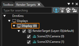
2. In the **Render Targets** panel, select **\[Display (0)\]**.
    
    
    - - The **\[Properties\]** panel will display **\[Display\]** properties.
            
            <div drawio-diagram="8399"><img src="https://doc316en.candera.eu/uploads/images/drawio/2025-05/drawing-5-1746775102.png" alt=""/></div>
3. In the **\[Display\]** section of the **\[Properties\]** panel configure the resolution as in the table below. <table><tbody><tr><td style="width: 100px; background-color: rgb(35, 111, 161);"><span style="color: rgb(255, 255, 255);">X Resolution  
    </span></td><th style="width: 50px;">640</th></tr><tr><td style="width: 100px; background-color: rgb(35, 111, 161);"><span style="color: rgb(255, 255, 255);">Y Resolution</span></td><td style="width: 50px;">960</td></tr></tbody></table>
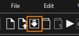
4. Click **\[Save solution...\]** in the toolbar.
    
    
    - The Windows **\[Save As\]** dialog will appear.
        
        <div drawio-diagram="8400"><img src="https://doc316en.candera.eu/uploads/images/drawio/2025-05/drawing-5-1746775292.png" alt=""/></div>
5. In the **\[Save As\]** dialog choose a location and name for your solution and click **\[Save\]**. 
    - The solution is saved.


### Using Smart Importer

In our example we will use the Smart Importer to import a Photoshop .psd file. Smart Importer will analyze the PSD file and try to identify which controls are included in the picture. After some configuration effort you can directly create CGI Studio Controls wherever it is applicable.

#### Configuration of Header

1. Select **\[Import &gt; Smart Importer &gt; From Local File...\]** from the menu bar. 
    - A Windows Open dialog titled **Smart Importer** will be opened.
2. Select the following Photoshop file and press **\[Open\]**. 
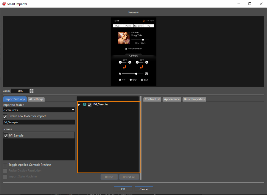
    - The **\[Smart Importer\]** window is opened (please be patient, this may take a while).
    - The Photoshop file's layers will be displayed in the **Layer Tree** area marked in orange in the image below.
    - The **Layer Tree** is displayed in tree style. Initially it is collapsed, but it can be expanded via double-clicking or using the triangle to the \[IVI\_Sample\]'s left.  
        <table border="1" class="align-left" style="border-collapse: collapse; border-width: 1px; width: 522px;"><tbody><tr><td style="background-color: rgb(35, 111, 161); width: 121.667px;"><span style="color: rgb(236, 240, 241);">File path  
        </span></td><td style="width: 414.667px;">&lt;cgi-studio-root&gt;\\cgi\_studio\_content\\2D\\PSD\\IVI\_Sample.psd</td></tr></tbody></table>
        
        <div drawio-diagram="8401"><img src="https://doc316en.candera.eu/uploads/images/drawio/2025-05/drawing-5-1746777849.png" alt=""/></div>
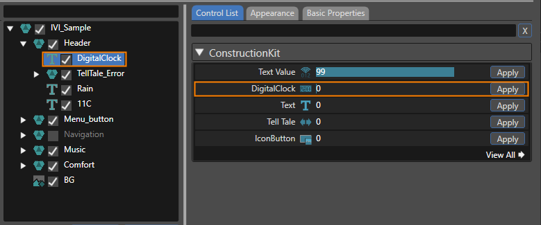
3. Expanding the **Layer Tree** navigate to **\[IVI\_Sample &gt; Header &gt; DigitalClock\]** and select **\[DigitalClock\]**. 
    - In the **Smart Importer's Preview** the DigitalClock on the top left is marked with a yellow border.
    - The **Control List** to the right displays applicable Controls.
4. In the **\[Control List\]** click on the **\[Apply\]** button on the right side of the **\[DigitalClock\]** control (see image below). 
    - Based on the Photoshop file's DigitalClock the Scene Composer control **DigitalClock** will be created when the import is done.
    - **DigitalClock** will be displayed in a different color and with a different icon in the **Layer Tree** to indicate successful assignment of a Scene Composer control. <div drawio-diagram="8404"><img src="https://doc316en.candera.eu/uploads/images/drawio/2025-05/drawing-5-1746782115.png" alt=""/></div>
5. Switch to the **\[Basic Properties\]** tab and tick the checkboxes noted in the table below. 
    - After import the created SceneComposer Control **DigitalClock** will be configured with these property values.  
        <table border="1" class="align-left" style="border-collapse: collapse; border-width: 1px; width: 230px;"><tbody><tr><td style="background-color: rgb(35, 111, 161); width: 150px;"><span style="color: rgb(236, 240, 241);">ShowFull24Hours</span></td><td style="width: 100;">TRUE</td></tr><tr><td style="background-color: rgb(35, 111, 161); width: 150px;"><span style="color: rgb(236, 240, 241);">ShowSeconds</span></td><td style="width: 100;">TRUE</td></tr></tbody></table>
6. In the **Layer Tree** select **\[TellTale\_Error\].**
    - In the **Smart Importer's Preview** the TellTale\_Error on the top right is marked with a yellow border.
    - The **Control List** panel to the right displays applicable Controls.
7. In the **Control List** panel click the **\[Apply\]** button next to **\[Tell Tale\]**.  
    
    - The Scene Composer Control **TellTale** is applied to the Photoshop file's **TellTale\_Error** layers.
    - In the **Appearance Tab** you can see that the **Telltale**'s properties **OnStateImage** and **OffStateImage** are automatically configured with the Photoshop file's layers OnStateImage and OffStateImage.
    - **TellTale\_Error** as well as its OnStateImage and OffStateImage will be displayed in a different color and with different icon in the **Layer Tree** to indicate successful assignment of a Scene Composer control.


#### Configuration of Menu Buttons

1. In the **Layer Tree** expand **\[Menu\_button\]**. 
    - The **Layer Tree** displays 4 **TextButtons**, each of which has 3 images (NormalImage, PressedImage and FocussedImage).
2. In the **Layer Tree** select **TextButton\_Car**.   
    
    - The **Control List** offers a list of Controls to apply.
3. In the **Control List** apply the Scene Composer control **TextButton**. 
    - In the **Appearance** tab you can see that NormalImage, PressedImage and FocussedImage have been configured automatically.
    - In the **Layer Tree** the **TextButton** has changed its color and its icon.
4. In the **\[Basic Properties\]** tab empty the textfield of the Text property (delete "Text..."). 
    - The textfield of property Text is empty.
5. Repeat the 3 steps above with the other **TextButtons** to achieve a configuration as in the table below. 
    - The menu buttons are configured for importing.  
        <table border="1" style="border-collapse: collapse; width: 69.3827%;"><colgroup><col style="width: 33.3333%;"></col><col style="width: 33.3333%;"></col><col style="width: 11.2847%;"></col><col style="width: 22.0486%;"></col></colgroup><tbody><tr><td class="align-center" style="background-color: rgb(35, 111, 161);"><span style="color: rgb(255, 255, 255);">**Target Layer**</span></td><td class="align-center" style="background-color: rgb(35, 111, 161);"><span style="color: rgb(255, 255, 255);">**Control List**</span></td><td class="align-center" colspan="2" style="background-color: rgb(35, 111, 161);"><span style="color: rgb(255, 255, 255);">**Basic Properties**</span></td></tr><tr><td>TextButton\_Car</td><td>TextButton</td><td>Text</td><td>(blank space)</td></tr><tr><td>TextButton\_Navigation</td><td>TextButton</td><td>Text</td><td>(blank space)</td></tr><tr><td>TextButton\_Phone</td><td>TextButton</td><td>Text</td><td>(blank space)</td></tr><tr><td>TextButton\_Music</td><td>TextButton</td><td>Text</td><td>(blank space)</td></tr></tbody></table>

#### Configuration of Music Tree  


<div class="contents" id="bkmrk-in-the%C2%A0layer-tree-ex-1"><div class="contents"><div class="textblock">1. In the **Layer Tree** expand **\[Music\]**. 
    - The **Layer Tree** displays among other things a Slider, DigitalClock\_Time, DigitalClock\_Total\_Time and a CheckBox.
2. In the **Layer Tree** select the target layer. Apply the controls in the **\[Control List\]** tab and configure the property values in the **\[Basic Properties\]** tab according to the table below. 
    - The controls of the Music part are configured for importing.  
        <table border="1" style="border-collapse: collapse; width: 600px;"><colgroup><col style="width: 130px;"></col><col style="width: 80px;"></col><col style="width: 110px;"></col><col style="width: 70px;"></col><col style="width: 80px;"></col></colgroup><tbody><tr><td class="align-center" style="background-color: rgb(35, 111, 161);"><span style="color: rgb(255, 255, 255);">**Target Layer**</span></td><td class="align-center" style="background-color: rgb(35, 111, 161);"><span style="color: rgb(255, 255, 255);">**Control List**</span></td><td class="align-center" colspan="3" style="background-color: rgb(35, 111, 161);"><span style="color: rgb(255, 255, 255);">**Basic Properties**</span></td></tr><tr><td rowspan="3">Slider</td><td rowspan="3">Slider</td><td>Value</td><td>Float</td><td>9000</td></tr><tr><td>Minimum</td><td>Float</td><td>0</td></tr><tr><td>Maximum</td><td>Float</td><td>18000</td></tr><tr><td rowspan="2">DigitalClock\_Time</td><td rowspan="2">DigitalClock</td><td>ShowFull24Hours</td><td>Boolean</td><td>TRUE</td></tr><tr><td>ShowSeconds  
        </td><td>Boolean</td><td>FALSE  
        </td></tr><tr><td rowspan="3">DigitalClock\_Total\_Time  
        </td><td rowspan="3">DigitalClock  
        </td><td>Time</td><td>UInt32</td><td>18000</td></tr><tr><td>ShowFull24Hours</td><td>Boolean</td><td>TRUE</td></tr><tr><td>ShowSeconds</td><td>Boolean</td><td>FALSE</td></tr><tr><td>CheckBox  
        </td><td>CheckBox  
        </td><td>Text</td><td>String</td><td>(blank space)</td></tr></tbody></table>

</div></div></div>#### Configuration of Comfort Tree  


<div class="contents" id="bkmrk-target-layer-control-0"><div class="contents">  
</div></div><div class="contents" id="bkmrk--17"><div class="contents"><div class="textblock">1. In the **Layer Tree** expand **\[Comfort &gt; Seat\_Left\]**. 
    - The **Layer Tree** displays among other things Seat\_Left with TextValue\_Temperature, Icon\_Button\_+, Icon\_Button\_-, ProgressBar and SeatHeating\_Left.
2. In the **Layer Tree** select the **Seat\_Left**'s target layer. Apply the controls in the **\[Control List\]** tab and configure the property values in the **\[Basic Properties\]** tab according to the table below. 
    - The controls of Comfort's Seat\_Left are configured for importing. <table border="1" style="border-collapse: collapse; width: 600px;"><colgroup><col style="width: 130px;"></col><col style="width: 80px;"></col><col style="width: 110px;"></col><col style="width: 70px;"></col><col style="width: 80px;"></col></colgroup><tbody><tr><td class="align-center" colspan="5" style="background-color: rgb(0,0,0);">**<span style="color: rgb(255,255,255);">Seat\_Left</span>**</td></tr><tr><td class="align-center" style="background-color: rgb(35, 111, 161);"><span style="color: rgb(255, 255, 255);">**Target Layer**</span></td><td class="align-center" style="background-color: rgb(35, 111, 161);"><span style="color: rgb(255, 255, 255);">**Control List**</span></td><td class="align-center" colspan="3" style="background-color: rgb(35, 111, 161);"><span style="color: rgb(255, 255, 255);">**Basic Properties**</span></td></tr><tr><td rowspan="2">TextValue\_Temperature</td><td rowspan="2">Text Value</td><td>Value</td><td>Float</td><td>23</td></tr><tr><td>FormatText</td><td>String</td><td>%02d</td></tr><tr><td>Icon\_Button\_+</td><td>IconButton</td><td> </td><td> </td><td> </td></tr><tr><td>Icon\_Button\_-</td><td>IconButton</td><td> </td><td> </td><td> </td></tr><tr><td rowspan="3">ProgressBar</td><td rowspan="3">ProgressBar</td><td>Value</td><td>Float</td><td>23</td></tr><tr><td>Minimum</td><td>Float</td><td>16</td></tr><tr><td>Maximum</td><td>Float</td><td>28</td></tr><tr><td>SeatHeating\_Left</td><td>CheckBox</td><td>Text</td><td>String</td><td>(blank space)</td></tr></tbody></table>
3. In the **Layer Tree** expand **\[Comfort &gt; Seat\_Right\]**. 
    - The **Layer Tree** displays among other things Seat\_Right with TextValue\_Temperature, Icon\_Button\_+, Icon\_Button\_-, ProgressBar and SeatHeating\_Left.
4. In the **Layer Tree** select the **Seat\_Right**'s target layer. Apply the controls in the **\[Control List\]** tab and configure the property values in the **\[Basic Properties\]** tab according to the table below. 
    - The controls of Comfort's Seat\_Right are configured for importing. <table border="1" style="border-collapse: collapse; width: 600px;"><colgroup><col style="width: 166px;"></col><col style="width: 102px;"></col><col style="width: 140px;"></col><col style="width: 89px;"></col><col style="width: 102px;"></col></colgroup><tbody><tr><td class="align-center" colspan="5" style="background-color: rgb(0,0,0);">**<span style="color: rgb(255,255,255);">Seat\_Right</span>**</td></tr><tr><td class="align-center" style="background-color: rgb(35, 111, 161);"><span style="color: rgb(255, 255, 255);">**Target Layer**</span></td><td class="align-center" style="background-color: rgb(35, 111, 161);"><span style="color: rgb(255, 255, 255);">**Control List**</span></td><td class="align-center" colspan="3" style="background-color: rgb(35, 111, 161);"><span style="color: rgb(255, 255, 255);">**Basic Properties**</span></td></tr><tr><td rowspan="2">TextValue\_Temperature</td><td rowspan="2">Text Value</td><td>Value</td><td>Float</td><td>23</td></tr><tr><td>FormatText</td><td>String</td><td>%02d</td></tr><tr><td>Icon\_Button\_+</td><td>IconButton</td><td> </td><td> </td><td> </td></tr><tr><td>Icon\_Button\_-</td><td>IconButton</td><td> </td><td> </td><td> </td></tr><tr><td rowspan="3">ProgressBar</td><td rowspan="3">ProgressBar</td><td>Value</td><td>Float</td><td>23</td></tr><tr><td>Minimum</td><td>Float</td><td>16</td></tr><tr><td>Maximum</td><td>Float</td><td>28</td></tr><tr><td>SeatHeating\_Right</td><td>CheckBox</td><td>Text</td><td>String</td><td>(blank space)</td></tr></tbody></table>
5. In the Layer Tree expand **\[Comfort &gt; Fan\]**. 
    - The **Layer Tree** displays among other things a Slider.
6. In the **Layer Tree** select **Fan**. Apply the control in the **\[Control List\]** tab and configure the property values in the **\[Basic Properties\]** tab according to the table below. 
    - The controls of the Comfort's Fan are configured for importing. <table border="1" style="border-collapse: collapse; width: 600px;"><colgroup><col style="width: 166px;"></col><col style="width: 102px;"></col><col style="width: 140px;"></col><col style="width: 89px;"></col><col style="width: 102px;"></col></colgroup><tbody><tr><td class="align-center" colspan="5" style="background-color: rgb(0,0,0);">**<span style="color: rgb(255,255,255);">Fan</span>**</td></tr><tr><td class="align-center" style="background-color: rgb(35, 111, 161);"><span style="color: rgb(255, 255, 255);">**Target Layer**</span></td><td class="align-center" style="background-color: rgb(35, 111, 161);"><span style="color: rgb(255, 255, 255);">**Control List**</span></td><td class="align-center" colspan="3" style="background-color: rgb(35, 111, 161);"><span style="color: rgb(255, 255, 255);">**Basic Properties**</span></td></tr><tr><td>Slider</td><td>Slider</td><td> </td><td> </td><td> </td></tr></tbody></table>
7. In the Layer Tree expand **\[Comfort &gt; Air\]**. 
    - The **Layer Tree** displays among other things a RadioButton\_Outside air, RadioButton\_Inside air and RadioButton\_AUTO.
8. In the **Layer Tree** select **Air**. Apply the control in the **\[Control List\]** tab and configure the property values in the **\[Basic Properties\]** tab according to the table below. 
    - The RadioButtons are configured for importing. <table border="1" style="border-collapse: collapse; width: 600px;"><colgroup><col style="width: 171px;"></col><col style="width: 97px;"></col><col style="width: 78px;"></col><col style="width: 106px;"></col><col style="width: 147px;"></col></colgroup><tbody><tr><td class="align-center" colspan="5" style="background-color: rgb(0,0,0);">**<span style="color: rgb(255,255,255);">Air</span>**</td></tr><tr><td class="align-center" style="background-color: rgb(35, 111, 161);"><span style="color: rgb(255, 255, 255);">**Target Layer**</span></td><td class="align-center" style="background-color: rgb(35, 111, 161);"><span style="color: rgb(255, 255, 255);">**Control List**</span></td><td class="align-center" colspan="3" style="background-color: rgb(35, 111, 161);"><span style="color: rgb(255, 255, 255);">**Basic Properties**</span></td></tr><tr><td>RadioButton\_Outside air</td><td>RadioButton</td><td>Text</td><td>String</td><td>(blank space)</td></tr><tr><td>RadioButton\_Inside air  
        </td><td>RadioButton  
        </td><td>Text  
        </td><td>String  
        </td><td>(blank space)</td></tr><tr><td>RadioButton\_AUTO  
        </td><td>RadioButton  
        </td><td>Text  
        </td><td>String  
        </td><td>(blank space)</td></tr></tbody></table>
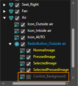
9. When expanding these **RadioButtons** in the Layer Tree, you can see that each of them contains a **Control\_Background**. **Uncheck the checkbox** of these Control\_Background images in the Layer Tree as seen in the image below. 
    - All images for the RadioButtons are configured for importing  
        <table border="1" style="border-collapse: collapse; width: 635px;"><colgroup><col style="width: 301px;"></col><col style="width: 334px;"></col></colgroup><tbody><tr><td class="align-center" colspan="2" style="background-color: rgb(0,0,0);">**<span style="color: rgb(255,255,255);">\[Air\] In the Layer Tree Panel  
        </span>**</td></tr><tr><td class="align-center" style="background-color: rgb(35, 111, 161);"><span style="color: rgb(255, 255, 255);">**Target Layer**</span></td><td class="align-center" style="background-color: rgb(35, 111, 161);"><span style="color: rgb(255, 255, 255);">**Configuration Details** </span></td></tr><tr><td>RadioButton\_Outside air/Control\_Background</td><td>disable (uncheck checkbox in Layer Tree)  
        </td></tr><tr><td>RadioButton\_Inside air/Control\_Background  
        </td><td>disable (uncheck checkbox in Layer Tree)</td></tr><tr><td>RadioButton\_AUTO/Control\_Background  
        </td><td>disable (uncheck checkbox in Layer Tree)</td></tr></tbody></table>
        
        <div drawio-diagram="8405"><img src="https://doc316en.candera.eu/uploads/images/drawio/2025-05/drawing-5-1746798417.png" alt=""/></div>

</div></div></div><div class="contents" id="bkmrk-target-layer-control-3"></div>#### Configuration of Navigation Tree

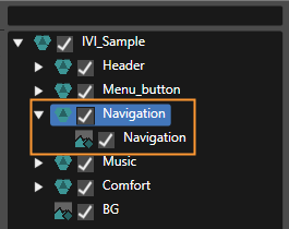
<div class="contents" id="bkmrk--42"><div class="contents">1. In the Layer Tree enable the Navigation tree by checking the checkbox to the left of **Navigation**. 
    - Navigation will be enabled as seen in the image below.  
        <div drawio-diagram="7102"><img src="https://doc316en.candera.eu/uploads/images/drawio/2024-10/drawing-5-1729262508.png" alt=""/></div>

</div></div>#### Completing the Import

1. Since configuration is done now, click the **\[OK\]** button on the bottom of the **Smart Importer** window. 
    - The Photoshop file will be imported with all configured controls and settings.
    - The imported content can be viewed in the Scene Composer's Solution Explorer.
    - The imported scene IVI\_Sample will be displayed in the Scene Editor.
    - In the Scene Tree panel you can confirm that all configured controls and settings made in Smart Importer have been applied during the import.
2. In the Scene Tree panel right-click on the Navigation GroupNode and uncheck "Node Rendering Enabled" in the context menu. Alternatively press &lt;Ctrl + E&gt; on your keyboard. 
    - The Navigation GroupNode will not be rendered (i.e. displayed) by default.
3. In the Render Targets panel enable displaying the imported "IVI\_Sample\\DocumentView" camera in display design. 
    - Rendering of camera "IVI\_Sample\\DocumentView" is enabled.

<div class="contents" id="bkmrk--50"><div class="contents">  
</div></div>