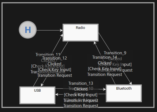
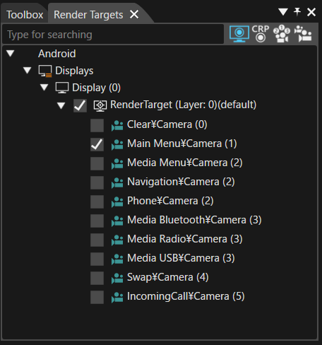
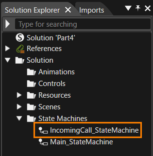
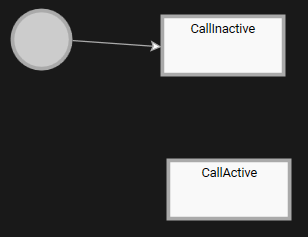
# Best Practice

# State Machine Solution

# Overview

This tutorial aims to help users master the state transition and behavior control mechanisms between multiple scenes using the state machine functionality in CGI Studio. Specifically, the tutorial covers a step-by-step approach to developing practical HMI (Human-Machine Interface) applications, including UI construction, scene management, switching behaviors based on user interactions, managing history, conditional branching, and displaying the number of incoming calls.

Through this tutorial, users will learn the following:

<table border="1" id="bkmrk-page-theme-main-work" style="border-collapse: collapse; width: 800px; height: 148.403px; border-width: 0px;"><colgroup><col style="width: 7.98464%;"></col><col style="width: 31.9668%;"></col><col style="width: 60.0353%;"></col></colgroup><tbody><tr><td class="align-center" style="border-width: 0px; background-color: rgb(35, 111, 161);">**<span style="color: rgb(255, 255, 255);">Page</span>**</td><td class="align-center" style="border-width: 0px; background-color: rgb(35, 111, 161);">**<span style="color: rgb(255, 255, 255);">Theme</span>**</td><td class="align-center" style="border-width: 0px; background-color: rgb(35, 111, 161);">**<span style="color: rgb(255, 255, 255);">Main work content</span>**

</td></tr><tr style="height: 29.6806px;"><td style="height: 29.6806px; border-width: 0px;">Part 1</td><td style="height: 29.6806px; border-width: 0px;">Basics of Scene Composition and UI Design</td><td style="height: 29.6806px; border-width: 0px;">Understanding how to create and manage multi-scene UIs in CGI Studio.

- Building 9 scenes including Main Menu, Navigation, Media, Phone, etc.
- Manipulating text nodes, overlay layouts, and node positioning.
- Adding Clear/Swap scenes to manage buffers and control sequences.

</td></tr><tr style="height: 29.6806px;"><td style="height: 29.6806px; border-width: 0px;">Part 2</td><td style="height: 29.6806px; border-width: 0px;">Basics of State Machine and Transition Control</td><td style="height: 29.6806px; border-width: 0px;">Learning how to control scene transitions using a state machine.

- Recreating a global state machine and linking it to scenes.
- Controlling scene visibility using OnEntry/OnExit actions.
- Configuring transitions using key inputs (left/right arrow keys).
- Verifying transitions and behaviors in the Player.

</td></tr><tr style="height: 29.6806px;"><td style="height: 29.6806px; border-width: 0px;">Part 3</td><td style="height: 29.6806px; border-width: 0px;">Transition Optimization with Subcharts and History State</td><td style="height: 29.6806px; border-width: 0px;">Using Subcharts and History State for advanced scene management.

- Converting the Media State into a Subchart to manage sub-scenes for Radio, Bluetooth, and USB.
- Implementing History State to retain information about the previously active scene.
- Configuring bidirectional transitions and state restoration between scenes.
- Verifying scene selection and behavior using the up/down arrow keys.

</td></tr><tr style="height: 29.6806px;"><td style="height: 29.6806px; border-width: 0px;">Part 4</td><td style="height: 29.6806px; border-width: 0px;">Adding Incoming Call Scene and Popup Control</td><td style="height: 29.6806px; border-width: 0px;">Implementing popup control and state transitions for incoming calls.

- Creating an IncomingCall scene based on the existing Phone scene.
- Controlling the display with the Enter key for call display and the ESC key for hiding.
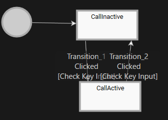
- Constructing CallActive/CallInactive state machines.
- Customizing the visuals using SolidColorNode.

</td></tr><tr style="height: 29.6806px;"><td style="height: 29.6806px; border-width: 0px;">Part 5</td><td style="height: 29.6806px; border-width: 0px;">Counting Incoming Calls and Updating UI</td><td style="height: 29.6806px; border-width: 0px;">Understanding how to send events through the state machine and update the UI.

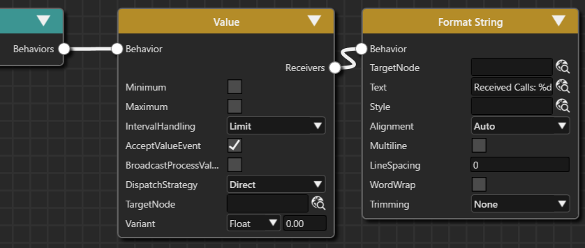
- Adding a text node with “Received Calls: %d” to the Main Menu scene.
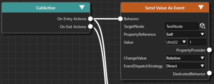
- Counting the number of incoming calls when entering the CallActive State.
- Sending relative values as events using Send Value As Event.
- Displaying call count information in real time using Format String.

</td></tr></tbody></table>

# Part 1: Prepare Scenes

This page explains the procedure for creating and configuring a multi-scene user interface (UI) using CGI Studio.

It covers the creation, duplication, and editing of nine scenes, including Main Menu, Navigation, Media Menu, and Phone, where text nodes and overlay layouts are placed to build the UI. The process also includes deleting unnecessary scenes, configuring rendering settings, optimizing buffer management (introducing Clear/Swap scenes), and setting camera sequence numbers. Ultimately, the necessary preparations for state transitions (state machine configuration) between scenes will be completed.

The scenes you create will be used when you actually construct the State Machine in Part 2 and beyond.

### Creating the Main Menu Scene

The Main Menu scene is used to display the current context (Navigation, Media, Phone).

### Renaming the Scene and Placing Nodes

1. Start Scene Composer and select **\[Empty\]** from **\[Samples and Templates\]** on the startup screen.
    
    
    - A new solution will open as an Empty solution.
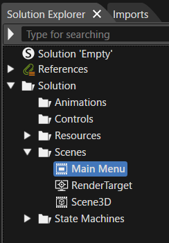
2. In the **Solution Explorer**, select **\[Scene2D\]** under the **\[Scenes\]** folder, then choose **\[Rename\]** from the context menu.
    
    
    - Scene2D will enter rename mode.
3. Rename it to **\[Main Menu\]**.
    
    <div drawio-diagram="8072"><img src="https://doc316en.candera.eu/uploads/images/drawio/2025-03/drawing-4-1742205749.png" alt=""/></div>
4. Drag and drop **\[Overlay Layout\]** from **\[Nodes 2D\]** in the **\[Toolbox\]** panel onto the **\[Main Menu\]** scene tree.
    
    
    - **\[OverlayLayout\]** will be added to the scene tree.
    - The **\[Position\]** under **\[Transform\]** in the **\[Properties\]** panel will be automatically set to X=0, Y=0.
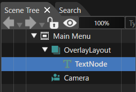
5. Similarly, drag and drop **\[Text Node\]** from **\[Nodes 2D\]** onto **\[Overlay Layout\]**.
    
    
    - **\[TextNode\]** will be added as a child node of **\[OverlayLayout\]**.
        
        <div drawio-diagram="8073"><img src="https://doc316en.candera.eu/uploads/images/drawio/2025-03/drawing-4-1742205791.png" alt=""/></div>
6. Select **\[TextNode\]**, then choose **\[Clone\]** from the context menu.
    
    
    - The **\[Clone Item\]** dialog will appear.
        
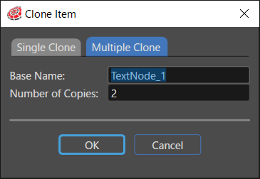
        <div drawio-diagram="8074"><img src="https://doc316en.candera.eu/uploads/images/drawio/2025-03/drawing-4-1742205824.png" alt=""/></div>
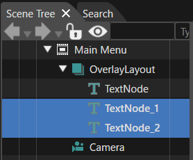
7. In the **\[Clone Item\]** dialog, select the **\[Multiple Clone\]** tab, set **\[ Number of Copies \]** to **2**, and click **\[OK\]**.
    
    
    - **\[TextNode\_1\]** and **\[TextNode\_2\]** will be added as child nodes of **\[OverlayLayout\]**.
        
        <div drawio-diagram="8075"><img src="https://doc316en.candera.eu/uploads/images/drawio/2025-03/drawing-4-1742205850.png" alt=""/></div>

### Renaming Text Nodes

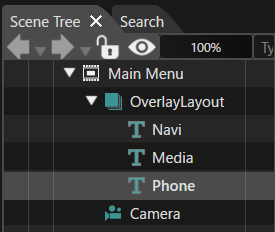
1. Rename the three added text nodes to **Navi**, **Media**, and **Phone**.
    
    
    - To rename, select the node, choose **\[Rename\]** from the context menu, or press **F2**.
        
        <div drawio-diagram="8076"><img src="https://doc316en.candera.eu/uploads/images/drawio/2025-03/drawing-4-1742205899.png" alt=""/></div>
2. Select **\[Navi\]** in the scene tree.
    
    
    - The **\[Properties\]** panel will display **\[Navi\]** properties.
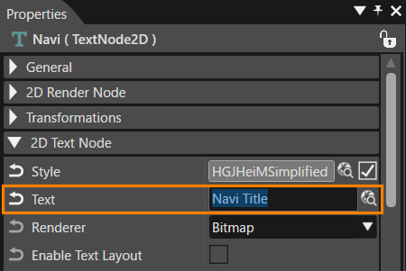
3. In the **\[2D Text Node\]** section of the **\[Properties\]** panel, change **\[Text\]** to **"Navi Title"**.
    
    
    - "Navi Title" will be displayed in the Scene Editor (overlapping with other text nodes).
        
        <div drawio-diagram="8077"><img src="https://doc316en.candera.eu/uploads/images/drawio/2025-03/drawing-4-1742205954.png" alt=""/></div>
4. Similarly, update **\[Text\]** for **\[Media\]** and **\[Phone\]**.
    
    
    - The Scene Editor will display the text nodes overlapping.
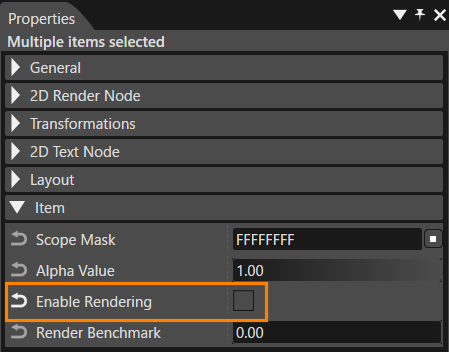
5. Select **\[Media\]** and **\[Phone\]** together in the scene tree, then uncheck **\[Enable Rendering\]** in the **\[Properties\]** panel under **\[Item\]**.
    
    
    - Rendering for **\[Media\]** and **\[Phone\]** will be disabled, displaying only **"Navi Title"** in the Scene Editor.
        
        <div drawio-diagram="8078"><img src="https://doc316en.candera.eu/uploads/images/drawio/2025-03/drawing-4-1742206021.png" alt=""/></div>

### Deleting Unnecessary Scenes

Delete unnecessary scenes from the Empty sample solution that are not needed for this tutorial.

1. In **\[Solution Explorer\]**, select **\[Scene3D\]** under the **\[Scenes\]** folder, then press **Delete**.
    
    
    - The **\[Delete Item\]** dialog will appear.
2. Click **\[OK\]** in the dialog to proceed with deletion.
    
    
    - **\[Scene3D\]** will be removed from the **\[Scenes\]** folder in **\[Solution Explorer\]**.

The Main Menu scene setup is now complete.

### Adding the Navigation Scene

Add two new scenes, setting them as **Navigation** and **Phone**, with text displaying "Navigation" and "Phone" respectively.

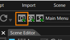
1. Click **\[Add a new 2D Scene\]** in the toolbar.
    
    
    - The **\[Add New Scene 2D\]** dialog will appear.
        
        <div drawio-diagram="8079"><img src="https://doc316en.candera.eu/uploads/images/drawio/2025-03/drawing-4-1742206065.png" alt=""/></div>
2. In the **\[Add New Scene 2D\]** dialog, rename **\[Name\]** to **"Navigation"**, then click **\[OK\]**.
    
    
    - The **\[Navigation\]** scene will be added under **\[Scenes\]** in **\[Solution Explorer\]**.
    - The **Navigation** scene will appear in the scene tree.
3. Drag and drop **\[Text Node\]** from **\[2D Nodes\]** in the **\[Toolbox\]** onto the **Navigation** scene tree.
    
    
    - **"Text"** will be displayed in the Scene Editor.
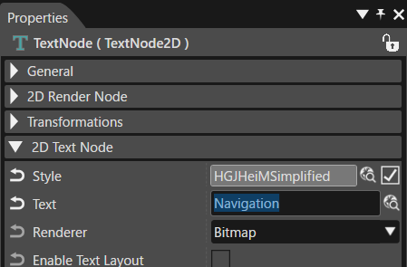
4. In the **\[Properties\]** panel, change **\[Text\]** under **\[2D Text Node\]** to **"Navigation"**.
    
    
    - The text displayed in the Scene Editor will change to "Navigation".
        
        <div drawio-diagram="8080"><img src="https://doc316en.candera.eu/uploads/images/drawio/2025-03/drawing-4-1742206143.png" alt=""/></div>
5. Set the text node position using **\[Transform\]** in the **\[Properties\]** panel as the below table.
    
    <table style="width: 20.6186%;"><tbody><tr><td style="width: 66.5529%; background-color: rgb(35, 111, 161);"><span style="color: rgb(255, 255, 255);">Position X</span></td><th style="width: 33.2764%;">25</th></tr><tr><td style="width: 66.5529%; background-color: rgb(35, 111, 161);"><span style="color: rgb(255, 255, 255);">Position Y</span></td><td style="width: 33.2764%;">150</td></tr></tbody></table>

The Navigation scene setup is now complete.

### Adding the Phone Scene

The Phone scene is created by duplicating the Navigation scene.

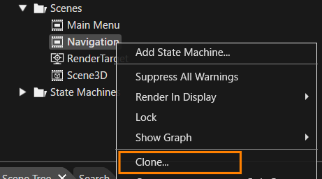
1. In **\[Solution Explorer\]**, select **\[Scenes &gt; Navigation\]**, then choose **\[Clone\]** from the context menu.
    
    
    - The **\[Clone Item\]** dialog will appear.
        
        <div drawio-diagram="8081"><img src="https://doc316en.candera.eu/uploads/images/drawio/2025-03/drawing-4-1742206203.png" alt=""/></div>
2. In the **\[Clone Item\]** dialog, select **\[Single Clone\]**, rename **\[Name\]** to **"Phone"**, then click **\[OK\]**.
    
    
    - The **Phone** scene will be created.
    - The scene tree will display the newly created **Phone** scene.
3. Select the text node in the **Phone** scene tree, then update **\[Text\]** in the **\[Properties\]** panel under **\[2D Text Node\]** to **"Phone"**.
    
    
    - The text displayed in the Scene Editor will change to "Phone".

The Phone scene setup is now complete.

### Adding the Media Menu Scene

This scene is similar to the Main Menu scene. It includes an overlay layout node with three child text nodes: Radio, Bluetooth, and USB. Therefore, the Main Menu scene will be duplicated and set up it as Media Menu scene.

1. In **Solution Explorer**, select **\[Scenes &gt; Main Menu\]**, then choose **\[Clone\]** from the context menu.
    
    
    - The **\[Clone Item\]** dialog will appear.
2. In the **\[Clone Item\]** dialog, select **\[Single Clone\]**, rename **\[Name\]** to **"Media Menu"**, and click **\[OK\]**.
    
    
    - A new scene named **Media Menu** will be created.
    - The scene tree panel will display the **Media Menu** scene.
    - The scene tree will contain an overlay layout node with three text nodes.
3. Select the **Overlay Layout** in the scene tree, then update the **\[Position\]** under **\[Transform\]** in the **Properties** panel:
    
    <table style="width: 23.8402%;"><tbody><tr><td style="width: 70.9001%; background-color: rgb(35, 111, 161);"><span style="color: rgb(255, 255, 255);">Position X</span></td><th style="width: 28.9766%;">0</th></tr><tr><td style="width: 70.9001%; background-color: rgb(35, 111, 161);"><span style="color: rgb(255, 255, 255);">Position Y</span></td><td style="width: 28.9766%;">50</td></tr></tbody></table>
4. Select each text node in the scene tree and update the **Properties** as follows:
    
    <table style="width: 43.0412%;"><tbody><tr><td style="width: 45.4827%; background-color: rgb(35, 111, 161);"><span style="color: rgb(255, 255, 255);">General &gt; Name</span></td><td style="width: 54.4554%; background-color: rgb(35, 111, 161);"><span style="color: rgb(255, 255, 255);">2D Text Node &gt; Text</span></td></tr><tr><td style="width: 45.4827%;">Radio</td><td style="width: 54.4554%;">Radio Title</td></tr><tr><td style="width: 45.4827%;">Bluetooth</td><td style="width: 54.4554%;">Bluetooth Title</td></tr><tr><td style="width: 45.4827%;">USB</td><td style="width: 54.4554%;">USB Title</td></tr></tbody></table>

The **Media Menu** scene setup is now complete. Since this was duplicated from the **Main Menu** scene, the **Enable Rendering** setting for **Bluetooth** and **USB** text nodes is disabled, so only "Radio Title" will be displayed in the Scene Editor.

### Creating the Media Radio Scene

The **Media Radio** scene is displayed when the **Media Menu** is selected. This scene is created by duplicating the previously created **Navigation** scene.

1. In **Solution Explorer**, select **\[Scenes &gt; Navigation\]**, then choose **\[Clone\]** from the context menu.
    
    
    - The **\[Clone Item\]** dialog will appear.
2. In the **\[Clone Item\]** dialog, select **\[Single Clone\]**, rename **\[Name\]** to **"Media Radio"**, and click **\[OK\]**.
    
    
    - A new scene named **Media Radio** will be created.
    - The scene tree panel will display the **Media Radio** scene.
3. Select the **Text Node** in the scene tree and update the **\[Text\]** under **\[2D Text Node\]** in the **Properties** panel to **"Radio"**.
    
    
    - The text displayed in the Scene Editor will change to "Radio".

The **Media Radio** scene setup is now complete.

### Adding the Media Bluetooth and Media USB Scenes

Two additional scenes, **Media Bluetooth** and **Media USB**, will be created similarly to the **Media Radio** scene by duplicating it.

1. In **Solution Explorer**, select **\[Scenes &gt; Media Radio\]**, then choose **\[Clone\]** from the context menu.
    
    
    - The **\[Clone Item\]** dialog will appear.
2. In the **\[Clone Item\]** dialog, select **\[Multiple Clone\]**, set **\[Number of Copies\]** to **2**, and click **\[OK\]**.
    
    
    - Two new scenes named **Media Radio\_1** and **Media Radio\_2** will be created.
    - The scene tree panel will display the newly created **Media Radio\_1** scene.
3. In **Solution Explorer**, rename **Media Radio\_1** to **Media Bluetooth** and **Media Radio\_2** to **Media USB**.
4. Select the text node in the **Media Bluetooth** scene tree and update the **\[Text\]** under **\[2D Text Node\]** in the **Properties** panel to **"Bluetooth"**.
    
    
    - The text displayed in the Scene Editor will change to "Bluetooth".}
5. Similarly, select the text node in the **Media USB** scene tree and update the **\[Text\]** to **"USB"**.
    
    
    - The text displayed in the Scene Editor will change to "USB".

The **Media Bluetooth** and **Media USB** scene setups are now complete.

### Adding the Clear Scene

A **Clear Scene** containing only a camera is added to erase the contents of the old framebuffer. This scene is always rendered to ensure that previous frame contents do not appear.

1. Click the **\[Add a new 2D Scene\]** button in the toolbar.
    
    
    - The **\[Add New Scene 2D\]** dialog will appear.
2. In the dialog, set **\[Name\]** to **"Clear"**, then click **\[OK\]**.
    
    
    - The **Clear** scene will be added under the **\[Scenes\]** hierarchy in **Solution Explorer**.

The **Clear Scene** setup is now complete.

### Adding the Swap Scene

An additional **Swap Scene** is required to ensure proper rendering (switching of render target buffers) and correct display in **Scene Composer**.

<p class="callout info">However, this scene is only necessary for Scene Composer display purposes and is not required for the Courier application, as buffer swapping is handled automatically in Courier.</p>

1. Click the **\[Add a new 2D Scene\]** button in the toolbar.
    
    
    - The **\[Add New Scene 2D\]** dialog will appear.
2. In the dialog, set **\[Name\]** to **"Swap"**, then click **\[OK\]**.
    
    
    - The **Swap** scene will be added under the **\[Scenes\]** hierarchy in **Solution Explorer**.
    - The scene tree panel will display the newly created **Swap** scene.

The **Swap Scene** setup is now complete.

### Disabling Clear Color Buffer

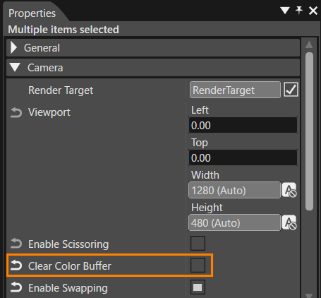
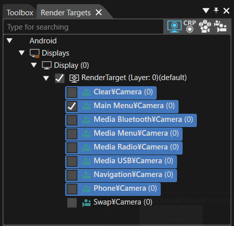
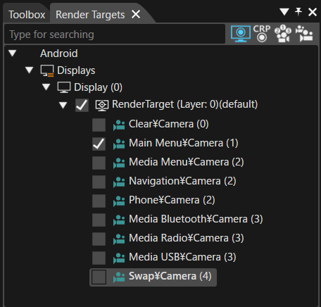
Since the **Clear Scene** erases the contents of the old framebuffer, the **Clear Color Buffer** setting should be disabled for all scene cameras **except the Clear Scene camera**. This is necessary as all scene cameras overlap.

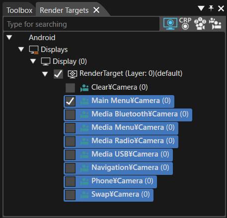
1. In the **\[Render Targets\]** panel, select all cameras except the **Clear Camera**.
    
    
    - Hold down **Shift** key while selecting to choose multiple cameras.
        
        <div drawio-diagram="8082"><img src="https://doc316en.candera.eu/uploads/images/drawio/2025-03/drawing-4-1742207857.png" alt=""/></div>
2. In the **Properties** panel, under the **\[Camera\]** category, uncheck **\[Clear Color Buffer\]**.
    
    
    - This will disable the **Clear Color Buffer** setting for all selected cameras at once.
        
        <div drawio-diagram="8083"><img src="https://doc316en.candera.eu/uploads/images/drawio/2025-03/drawing-4-1742207897.png" alt=""/></div>

### Setting Enable Swapping

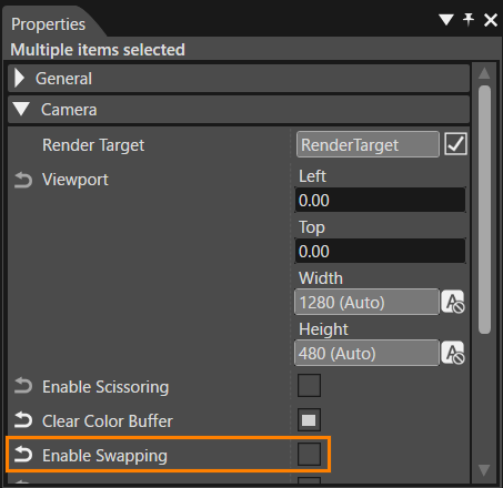
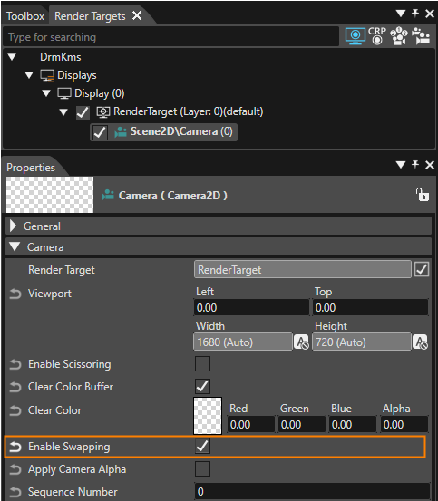
The **Swap Scene** executes buffer swapping. Therefore, the **Enable Swapping** setting must be disabled for all scene cameras except the **Swap Scene**.

1. In the **\[Render Targets\]** panel, select all cameras except the **Swap Camera**.
    
    
    - Hold down **Shift** key while selecting to choose multiple cameras.
        
        <div drawio-diagram="8084"><img src="https://doc316en.candera.eu/uploads/images/drawio/2025-03/drawing-4-1742207923.png" alt=""/></div>
2. In the **Properties** panel, under the **\[Camera\]** category, uncheck **\[Enable Swapping\]**.
    
    
    - This will disable the **Enable Swapping** setting for all selected cameras at once.
        
        <div drawio-diagram="8085"><img src="https://doc316en.candera.eu/uploads/images/drawio/2025-03/drawing-4-1742208003.png" alt=""/></div>

### Setting Camera Sequence Number

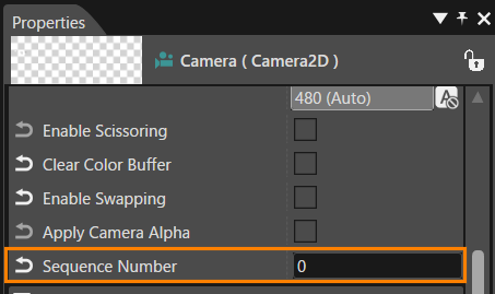
The rendering order of cameras is determined by the **\[Sequence Number\]** property. Cameras with smaller sequence numbers are rendered as backgrounds for those with larger numbers.

In the **Render Targets** panel, each camera's **\[Sequence Number\]** is displayed next to its name in parentheses, indicating their rendering order.

#### How to Set Sequence Number

The **Sequence Number** can be set using the following steps:

1. In the **Render Targets** panel, select the target camera(s) to be configured.
    
    
    - The **Properties** panel will display the properties of the selected camera.
    - To select multiple cameras, hold down **Shift** or **Ctrl** key while clicking.
2. In the **Properties** panel, under the **\[Camera\]** category, change the **\[Sequence Number\]** value.
    
    <div drawio-diagram="8086"><img src="https://doc316en.candera.eu/uploads/images/drawio/2025-03/drawing-4-1742208075.png" alt=""/></div>

#### Sequence Number Configuration

For this tutorial, set the **Sequence Number** for each camera as follows:

<div drawio-diagram="8087"><img src="https://doc316en.candera.eu/uploads/images/drawio/2025-03/drawing-4-1742208120.png" alt=""/></div>

<table id="bkmrk-sequence-number-came"><tbody><tr><th style="background-color: rgb(35, 111, 161);"><span style="color: rgb(255, 255, 255);">Sequence Number</span></th><th style="background-color: rgb(35, 111, 161);"><span style="color: rgb(255, 255, 255);">Camera Name</span></th></tr><tr><td class="align-center">0</td><td>Clear</td></tr><tr><td class="align-center">1</td><td>Main Menu</td></tr><tr><td class="align-center">2</td><td>Media Menu, Navigation, Phone</td></tr><tr><td class="align-center">3</td><td>Media Bluetooth, Media Radio, Media USB</td></tr><tr><td class="align-center">4</td><td>Swap</td></tr></tbody></table>

With this, all necessary scenes are now prepared for the **State Machine Configuration** in the next section.

# Part 2: Configuring State Machine

This page explains the steps for building state transitions (state machines) between multiple scenes in CGI Studio.

It begins by recreating the Global State Machine for the scenes created in Part 1 and configuring state transitions for Main Menu, Navigation, Phone, Media Menu, and other scenes. Each state uses OnEntry/OnExit actions to control scene activation and deactivation, as well as the rendering of related text nodes. It also covers setting screen transitions using left and right key inputs (Key\_RightArrow/Key\_LeftArrow), configuring transitions using Fusion nodes, and defining transition conditions for each scene. Finally, transition behavior is verified using the Player.

### Creating a new State Machine

The solution created in Part 1 (created based on the Empty solution) includes a GlobalStateMachine by default. In this part, we will delete this existing Global State Machine and create a new State Machine to deepen our understanding of custom settings.

#### Deleting the existing Global State Machine

1. Select the GlobalStateMachine in the \[ State Machines \] folder in the Solution Explorer, and then select \[ Delete \] from the context menu.
- The \[ Delete Items \] dialog will appear.

3. Click the \[ OK \] button in the dialog to delete the item.

#### Creating a new State Machine

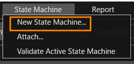
1. Select \[ State Machines &gt; New State Machine \] from the menu bar.
- The \[ New State Machine \] dialog will appear.  
    <div drawio-diagram="8097"><img src="https://doc316en.candera.eu/uploads/images/drawio/2025-03/drawing-4-1742280430.png" alt=""/></div>

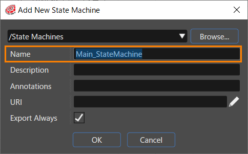
3. Click \[ Browse \] at the top of the dialog.
- The \[ Select Location \] dialog will appear.

5. Select StateMachines and click \[ OK \].
- The location “/State Machines” is selected as the save location for the new State Machine.

7. Set \[ Name \] in the dialog to "Main\_StateMachine" and click the \[ OK \] button.
- The Main\_StateMachine is newly created in the \[ State Machines \] folder in the Solution Explorer.  
    <div drawio-diagram="8098"><img src="https://doc316en.candera.eu/uploads/images/drawio/2025-03/drawing-4-1742280486.png" alt=""/></div>


#### Setting the Global State Machine  


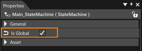
1. Select the Main\_StateMachine in the \[ State Machines \] folder in the Solution Explorer.
- The Main\_StateMachine properties will be displayed in the Properties panel.

3. Enable the \[ Is Global \] checkbox in the \[ General \] category of the properties.
- The Main\_StateMachine will be set as a Global State Machine.  
    <div drawio-diagram="8099"><img src="https://doc316en.candera.eu/uploads/images/drawio/2025-03/drawing-4-1742280545.png" alt=""/></div>


<p class="callout info">For details on the functions of the Global State Machine, please refer to <span style="color: rgb(230, 126, 35);">[this page](https://doc316en.candera.eu/link/203#bkmrk-globalstatemachine-%E3%81%AE)</span>.</p>

### Basic Structure

Using the Main\_StateMachine we created earlier, we will add a State to configure the initial state of the Main Menu scene, and then set the appropriate rendering settings. In addition, when the Main Menu State is entered, the Main Menu scene will be activated, and the Clear and Swap scenes will also be activated so that they are rendered correctly.

#### Initial State and State Addition for Main Menu

1. Double-click on the Main\_StateMachine in the \[ State Machines \] folder in the Solution Explorer.
- The **State Machine Editor** panel will be displayed.
- There is already an Initial State and one State.

3. Select the State on the State Machine Editor.
- The properties of the selected State will be displayed in the Properties Panel.

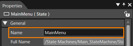
5. Change the \[ Name \] in the \[ General \] category of the Properties Panel to MainMenu.
- The State name on the State Machine Editor will change to MainMenu.  
    <div drawio-diagram="8100"><img src="https://doc316en.candera.eu/uploads/images/drawio/2025-03/drawing-4-1742280601.png" alt=""/></div>


#### Adding an OnEntry Action  


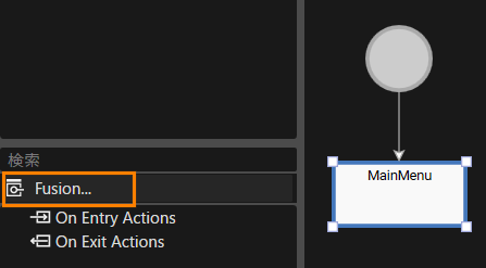
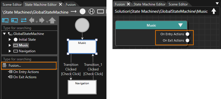
1. With the MainMenu State selected, click \[ Fusion \] at the bottom left of the State Machine Editor panel.
- The Fusion panel for the MainMenu State will be displayed.  
    <div drawio-diagram="8101"><img src="https://doc316en.candera.eu/uploads/images/drawio/2025-03/drawing-4-1742280622.png" alt=""/></div>

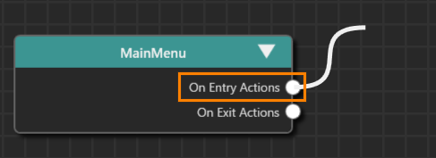
3. Drag the \[ On Entry Actions \] connector on the right of the MainMenu Fusion node and move the mouse.  
    <div drawio-diagram="8102"><img src="https://doc316en.candera.eu/uploads/images/drawio/2025-03/drawing-4-1742280643.png" alt=""/></div>
4. A link will appear as you move the mouse, so release the left mouse button at the any location.
- The \[ Select Behavior \] dialog will be displayed.
- The selectable behaviors will be displayed by category.

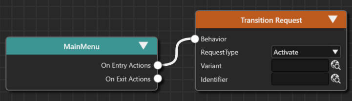
6. Select “Action &gt; Transition &gt; Transition Request” from the list and connect it to the top node.
- You can also narrow down the list of behaviors in the dialog by entering “Transition Request” in the search field at the top of the dialog.
- Transition Request is connected to MainMenu.
- The default Activate is selected for the \[RequestType\] of Transition Request.  
    <div drawio-diagram="8103"><img src="https://doc316en.candera.eu/uploads/images/drawio/2025-03/drawing-4-1742280666.png" alt=""/></div>

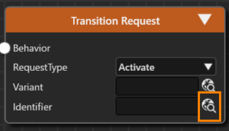
8. Press the select item button to the right of the \[ Identifier \] of the Transition Request.
- The \[ Choose Item \] dialog box will appear.  
    <div drawio-diagram="8104"><img src="https://doc316en.candera.eu/uploads/images/drawio/2025-03/drawing-4-1742280681.png" alt=""/></div>

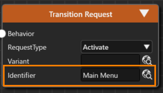
10. Select \[ Scenes &gt; Main Menu \] from the left window.
- The Main Menu you selected will be registered in the \[ Identifier \] of the Transition Request.  
    <div drawio-diagram="8105"><img src="https://doc316en.candera.eu/uploads/images/drawio/2025-03/drawing-4-1742280701.png" alt=""/></div>

12. Select the Transition Request Fusion node you set up, and execute \[ Close \] from the context menu.
13. On the \[ Clone Item \] dialog, select the \[ Multiple Clone \] tab, specify 2 for \[ Number of Copies \] and click the \[ OK \] button.
- The duplicated Fusion nodes overlap, so move them using the mouse.
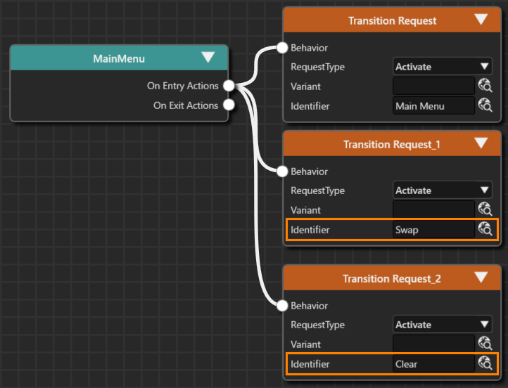
- The Fusion nodes named Transition Request\_1 and Transition Request\_2 are connected to the MainMenu Fusion node.
- The \[ RequestType \] of each Fusion node is set to the default Activate.

15. For the \[ Identifier \] of the added Transition Request Fusion nodes, select the **Swap** and **Clear** scenes respectively.  
    <div drawio-diagram="8106"><img src="https://doc316en.candera.eu/uploads/images/drawio/2025-03/drawing-4-1742280721.png" alt=""/></div>

This completes the settings for the OnEntry action for the MainMenu State. When you transition to the MainMenu State, the Clear and Swap scenes will be activated in addition to the Main Menu scene, so things like clearing the render will be executed at the same time.

### Main Menu State Structure

#### Adding a State  


1. Double-click on Main\_StateMachine in the \[ State Machines \] folder in the Solution Explorer.
- The State Machine Editor will appear.

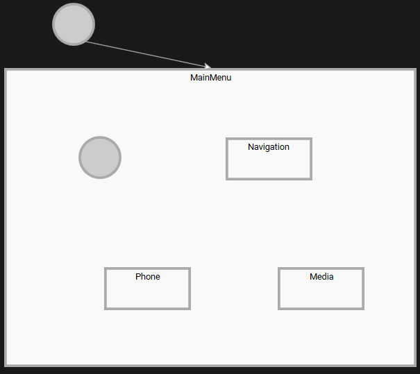
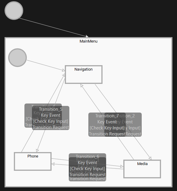
3. After selecting the MainMenu State, drag the resizing handles displayed in the four corners of the state with the mouse to expand the size of the MainMenu State.
4. Place one Initial State and three States in the MainMenu State from the toolbar at the top right of the State Machine Editor.
5. Change the names of the three added States to Navigation, Phone and Media respectively.
- For instructions on how to change State names, please refer to [here](#bkmrk-initial-state-and-st).  
    <div drawio-diagram="8107"><img src="https://doc316en.candera.eu/uploads/images/drawio/2025-03/drawing-4-1742280742.png" alt=""/></div>


#### OnEntry/OnExit settings

When transitioning to each State (entering and exiting States), it is necessary to activate and deactivate the corresponding scenes. In addition, when each scene is activated or deactivated, it is necessary to set the Main Menu scene text to be displayed or hidden in conjunction with this.

##### Scene display settings  


1. With the Navigation State selected, click \[ Fusion \] in the lower left of the State Machine Editor panel.
- The Fusion panel for the Navigation State will be displayed.

3. Drag the \[ On Entry Actions \] connector on the right of the Navigation Fusion node and move the mouse.
4. A link will appear as you move the mouse, so release the left mouse button at the any location.
- The \[ Select Behavior \] dialog will be displayed.
- The selectable behaviors will be displayed by category.

6. Select “Action &gt; Transition &gt; Transition Request” from the list and connect it to the top node.
- You can also narrow down the list of behaviors in the dialog by entering “Transition Request” in the search field at the top of the dialog.
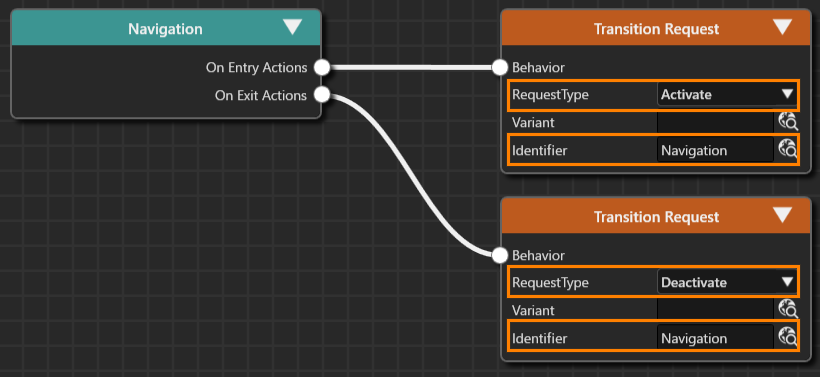
- The Transition Request is connected to \[Navigation &gt; On Exit Actions\].

8. Repeat the same process for the \[On Exit Actions\] of the Navigation Fusion node to connect the Transition Request Fusion node.
9. Make the following settings for the two Transition Requests that you have connected.  
    <div drawio-diagram="8108"><img src="https://doc316en.candera.eu/uploads/images/drawio/2025-03/drawing-4-1742280768.png" alt=""/></div>
    
      
    <table border="1" style="border-collapse: collapse; width: 51.6753%; height: 118.4px;"><colgroup><col style="width: 34.7326%;"></col><col style="width: 28.974%;"></col><col style="width: 36.4932%;"></col></colgroup><tbody><tr style="height: 29.6px;"><td rowspan="2" style="height: 59.2px; background-color: rgb(35, 111, 161);"><span style="color: rgb(255, 255, 255);">On Entry Actions</span></td><td style="height: 29.6px; background-color: rgb(194, 224, 244);">RequestType</td><td style="height: 29.6px;">Activate</td></tr><tr style="height: 29.6px;"><td style="height: 29.6px; background-color: rgb(194, 224, 244);">Identifier</td><td style="height: 29.6px;">Navigation</td></tr><tr style="height: 29.6px;"><td rowspan="2" style="height: 59.2px; background-color: rgb(35, 111, 161);"><span style="color: rgb(255, 255, 255);">On Exit Actions</span></td><td style="height: 29.6px; background-color: rgb(194, 224, 244);">RequestType</td><td style="height: 29.6px;">Deactivate</td></tr><tr style="height: 29.6px;"><td style="height: 29.6px; background-color: rgb(194, 224, 244);">Identifier</td><td style="height: 29.6px;">Navigation</td></tr></tbody></table>
10. Repeat the same procedure to make similar settings for Phone and Media State.  
    <table border="1" style="border-collapse: collapse; width: 51.6753%; height: 118.4px;"><colgroup><col style="width: 34.7326%;"></col><col style="width: 28.9855%;"></col><col style="width: 36.4818%;"></col></colgroup><tbody><tr><td class="align-center" colspan="3" style="background-color: rgb(0, 0, 0);">**<span style="color: #ffffff;">Phone State</span>**</td></tr><tr style="height: 29.6px;"><td rowspan="2" style="height: 59.2px; background-color: rgb(35, 111, 161);"><span style="color: rgb(255, 255, 255);">On Entry Actions</span></td><td style="height: 29.6px; background-color: rgb(194, 224, 244);">RequestType</td><td style="height: 29.6px;">Activate</td></tr><tr style="height: 29.6px;"><td style="height: 29.6px; background-color: rgb(194, 224, 244);">Identifier</td><td style="height: 29.6px;">Phone</td></tr><tr style="height: 29.6px;"><td rowspan="2" style="height: 59.2px; background-color: rgb(35, 111, 161);"><span style="color: rgb(255, 255, 255);">On Exit Actions</span></td><td style="height: 29.6px; background-color: rgb(194, 224, 244);">RequestType</td><td style="height: 29.6px;">Deactivate</td></tr><tr style="height: 29.6px;"><td style="height: 29.6px; background-color: rgb(194, 224, 244);">Identifier</td><td style="height: 29.6px;">Phone</td></tr><tr><td class="align-center" colspan="3" style="background-color: rgb(0, 0, 0);">**<span style="color: #ffffff;">Media State</span>**</td></tr><tr><td rowspan="2" style="height: 59.2px; background-color: rgb(35, 111, 161);"><span style="color: rgb(255, 255, 255);">On Entry Actions</span></td><td style="height: 29.6px; background-color: rgb(194, 224, 244);">RequestType</td><td style="height: 29.6px;">Activate</td></tr><tr><td style="height: 29.6px; background-color: rgb(194, 224, 244);">Identifier</td><td style="height: 29.6px;">Media Menu</td></tr><tr><td rowspan="2" style="height: 59.2px; background-color: rgb(35, 111, 161);"><span style="color: rgb(255, 255, 255);">On Exit Actions</span></td><td style="height: 29.6px; background-color: rgb(194, 224, 244);">RequestType</td><td style="height: 29.6px;">Deactivate</td></tr><tr><td style="height: 29.6px; background-color: rgb(194, 224, 244);">Identifier</td><td style="height: 29.6px;">Media Menu</td></tr></tbody></table>

##### Text Display Settings

1. With the Navigation State selected, click \[ Fusion \] at the bottom left of the State Machine Editor panel.
- The Fusion panel for the Navigation State will be displayed.

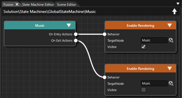
3. Drag the \[ On Entry Actions \] connector on the right of the Navigation Fusion node and move the mouse.
4. A link will appear as you move the mouse, so release the left mouse button at the any location.
- The 'Select Behavior' dialog will appear.
- The available behaviors will be displayed in categories.

6. Select "Action &gt; Property &gt; Enable Rendering" from the list and connect it to the top node.
- You can also narrow down the list of behaviors in the dialog by entering "Enable Rendering" in the search field at the top of the dialog.
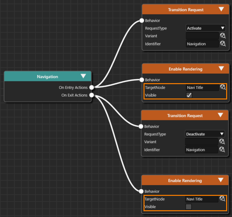
- Enable Rendering is connected to \[Navigation &gt; On Exit Actions\].

8. Repeat the same process for the \[On Exit Actions\] of the Navigation Fusion node to connect the Enable Rendering Fusion node.
9. Make the following settings for the two Enable Renderings that have been connected.  
    <div drawio-diagram="8109"><img src="https://doc316en.candera.eu/uploads/images/drawio/2025-03/drawing-4-1742280800.png" alt=""/></div>
    
      
    <table border="1" style="border-collapse: collapse; width: 83.3763%; height: 118.4px;"><colgroup><col style="width: 21.2009%;"></col><col style="width: 17.3667%;"></col><col style="width: 61.2467%;"></col></colgroup><tbody><tr style="height: 29.6px;"><td rowspan="2" style="height: 29.6px; background-color: rgb(35, 111, 161);"><span style="color: rgb(255, 255, 255);">On Entry Actions</span></td><td style="height: 29.6px; background-color: rgb(194, 224, 244);">TargetNode</td><td style="height: 29.6px;">Scenes&gt;Main Menu&gt;OverlayLayout&gt;Navi Title</td></tr><tr style="height: 29.6px;"><td style="height: 29.6px; background-color: rgb(194, 224, 244);">Visible</td><td style="height: 29.6px;">Enable (check box selected)</td></tr><tr style="height: 29.6px;"><td rowspan="2" style="height: 29.6px; background-color: rgb(35, 111, 161);"><span style="color: rgb(255, 255, 255);">On Exit Actions</span></td><td style="height: 29.6px; background-color: rgb(194, 224, 244);">TargetNode</td><td style="height: 29.6px;">Scenes&gt;Main Menu&gt;OverlayLayout&gt;Navi Title</td></tr><tr style="height: 29.6px;"><td style="height: 29.6px; background-color: rgb(194, 224, 244);">Visible</td><td style="height: 29.6px;">Disable (uncheck)</td></tr></tbody></table>
10. Follow the same procedure to make similar settings for Phone State and Media State.   
    <table border="1" style="border-collapse: collapse; width: 83.3763%; height: 118.4px;"><colgroup><col style="width: 21.2009%;"></col><col style="width: 17.3321%;"></col><col style="width: 61.4361%;"></col></colgroup><tbody><tr><td class="align-center" colspan="3" style="background-color: rgb(0, 0, 0);"><span style="color: rgb(255, 255, 255);">**<span style="color: #ffffff;">Phone State</span>**</span></td></tr><tr style="height: 29.6px;"><td rowspan="2" style="height: 29.6px; background-color: rgb(35, 111, 161);"><span style="color: rgb(255, 255, 255);">On Entry Actions</span></td><td style="height: 29.6px; background-color: rgb(194, 224, 244);">TargetNode</td><td style="height: 29.6px;">Scenes&gt;Main Menu&gt;OverlayLayout&gt;Phone Title</td></tr><tr style="height: 29.6px;"><td style="height: 29.6px; background-color: rgb(194, 224, 244);">Visible</td><td style="height: 29.6px;">Enable</td></tr><tr style="height: 29.6px;"><td rowspan="2" style="height: 29.6px; background-color: rgb(35, 111, 161);"><span style="color: rgb(255, 255, 255);">On Exit Actions</span></td><td style="height: 29.6px; background-color: rgb(194, 224, 244);">TargetNode</td><td style="height: 29.6px;">Scenes&gt;Main Menu&gt;OverlayLayout&gt;Phone Title</td></tr><tr style="height: 29.6px;"><td style="height: 29.6px; background-color: rgb(194, 224, 244);">Visible</td><td style="height: 29.6px;">Disable</td></tr><tr><td class="align-center" colspan="3" style="background-color: rgb(0, 0, 0);"><span style="color: rgb(255, 255, 255);">**<span style="color: #ffffff;">Media State</span>**</span></td></tr><tr><td rowspan="2" style="height: 29.6px; background-color: rgb(35, 111, 161);"><span style="color: rgb(255, 255, 255);">On Entry Actions</span></td><td style="height: 29.6px; background-color: rgb(194, 224, 244);">TargetNode</td><td style="height: 29.6px;">Scenes&gt;Main Menu&gt;OverlayLayout&gt;Media Title</td></tr><tr><td style="height: 29.6px; background-color: rgb(194, 224, 244);">Visible</td><td style="height: 29.6px;">Enable</td></tr><tr><td rowspan="2" style="height: 29.6px; background-color: rgb(35, 111, 161);"><span style="color: rgb(255, 255, 255);">On Exit Actions</span></td><td style="height: 29.6px; background-color: rgb(194, 224, 244);">TargetNode</td><td style="height: 29.6px;">Scenes&gt;Main Menu&gt;OverlayLayout&gt;Media Title</td></tr><tr><td style="height: 29.6px; background-color: rgb(194, 224, 244);">Visible</td><td style="height: 29.6px;">Disable</td></tr></tbody></table>

#### Adding a Transition

We will now create a transition between the states we have created so far.

##### Setting the Initial State

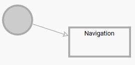
We will set the transition from the Initial State to the Navigation State, which is the initial state.

1. Double-click on Main\_StateMachine in the \[ State Machines \] folder in the Solution Explorer.
- The State Machine Editor will appear.

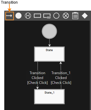
3. Drag and drop \[ Transition \] from the toolbar at the top of the panel to the Initial State in the MaiMenu State.
- The Transition will be connected to the Initial State, and it will be ready to be placed.

5. While the Transition is ready to be placed, click on the Navigation State.
- The Initial State and Navigation State will be connected by the Transition.
- The direction of the Transition connection is from the Initial State to the Navigation State.  
    <div drawio-diagram="8110"><img src="https://doc316en.candera.eu/uploads/images/drawio/2025-03/drawing-4-1742280823.png" alt=""/></div>


With this setting, the transition to the Navigation State has been configured as the initial state of the MainMenu State.

##### Transition settings between each State

Next, we will set up the transitions between each State (Navigation, Phone, Media).

1. From the toolbar at the top right of the State Machine Editor, drag the Transition and drop it onto the Navigation State (the starting side of the transition).   
    
    - The Transition (arrow) will appear on the State Machine Editor and be ready to be dragged.
2. Extend the Transition (arrow) to the Media State (end of transition) and click.  
    
    - The two states, Navigation and Media, will be connected by an arrow.
3. With the added Transition selected, click \[ Fusion... \] at the bottom left of the State Machine Editor panel.   
    
    - The Fusion panel will open, and the Fusion diagram for the Transition will be displayed.
    - The Check Click Fusion node is connected to the connector (Condition) at the top right of the Transition Fusion node.
4. Select the Check Click Fusion node that is connected by default, and press the Delete key. 
    - The Check Click Fusion node will be deleted.
5. Drag the connector (Condition) at the upper right of the Transition Fusion node, move the mouse, and release the left mouse button at the any location. 
    - The \[Select Behavior\] dialog will open.
6. Enter “Check Key Input” in the search field at the top of the dialog.   
    
    - The list of behaviors in the dialog will be narrowed down, and Condition &gt; Input &gt; Check Key Input will be displayed.
7. Double-click Check Key Input. 
    - The Check Key Input Fusion node will be linked to the Condition connector of the Transition Fusion node.
8. Drag the connector (Actions) at the bottom right of the Transition Fusion node, move the mouse, and release the left mouse button at the any location. 
    - The \[Select Behavior\] dialog will open.
9. Enter “Transition Request” in the search field at the top of the dialog.   
    
    - The list of behaviors in the dialog will be narrowed down, and Action &gt; Transition &gt; Transition Request will be displayed.
10. Double-click Transition Request. 
    - The Transition Request Fusion node will be linked to the Actions connector of the Transition Fusion node.
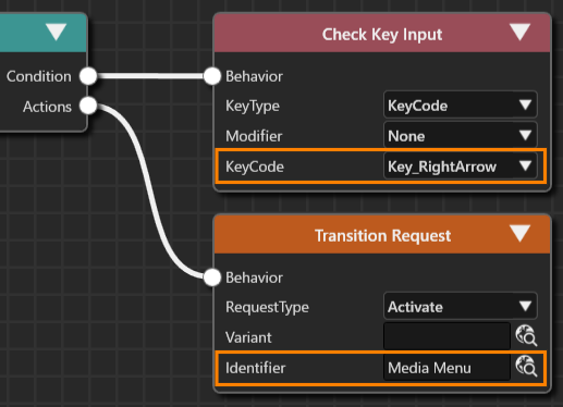
11. Make the following settings for the Transition Request Fusion node.  
    <div drawio-diagram="8111"><img src="https://doc316en.candera.eu/uploads/images/drawio/2025-03/drawing-4-1742280855.png" alt=""/></div>


    - Clicking the upward-pointing arrow icon in the upper right of the Fusion panel will switch the display to the State.  
        <table border="1" class="align-left" id="bkmrk-items-setting-value--0" style="border-collapse: collapse; width: 393px; height: 89.3907px; border-width: 1px;"><colgroup><col style="width: 197px;"></col><col style="width: 197px;"></col></colgroup><tbody><tr><td class="align-center" colspan="2" style="border-width: 1px; background-color: rgb(0, 0, 0);"><span style="color: rgb(255, 255, 255);">**<span style="vertical-align: inherit;"><span style="vertical-align: inherit;">Check Key Input</span></span>**</span></td></tr><tr><td style="border-width: 1px; background-color: rgb(35, 111, 161);"><span style="vertical-align: inherit; color: rgb(255, 255, 255);"><span style="vertical-align: inherit;">KeyCode</span></span></td><td style="border-width: 1px;"><span style="vertical-align: inherit;"><span style="vertical-align: inherit;">Key\_RightArrow</span></span></td></tr><tr><td class="align-center" colspan="2" style="border-width: 1px; background-color: rgb(0, 0, 0);"><span style="color: rgb(255, 255, 255);">**<span style="vertical-align: inherit;"><span style="vertical-align: inherit;">Transition Request</span></span>**</span></td></tr><tr style="height: 29.7969px;"><td style="border-width: 1px; height: 29.7969px; background-color: rgb(35, 111, 161);"><span style="vertical-align: inherit; color: rgb(255, 255, 255);"><span style="vertical-align: inherit;">RequestType</span></span></td><td style="border-width: 1px; height: 29.7969px;"><span style="vertical-align: inherit;"><span style="vertical-align: inherit;">Activate</span></span></td></tr><tr style="height: 29.7969px;"><td style="border-width: 1px; height: 29.7969px; background-color: rgb(35, 111, 161);"><span style="vertical-align: inherit; color: rgb(255, 255, 255);"><span style="vertical-align: inherit;">Identifier</span></span></td><td style="border-width: 1px; height: 29.7969px;"><span style="vertical-align: inherit;"><span style="vertical-align: inherit;">Scenes＞Media Menu</span></span></td></tr></tbody></table>
12. Repeat the above steps 1 to 11 to set the following five transitions. 
    - The RequestType for all of these is Activate (default).  
        <table border="1" class="align-left" style="border-collapse: collapse; width: 610px; border-width: 1px;"><colgroup><col style="width: 168px;"></col><col style="width: 215px;"></col><col style="width: 226px;"></col></colgroup><tbody><tr><td style="border-width: 1px; background-color: rgb(35, 111, 161);">**<span style="color: rgb(255, 255, 255);">Transition</span>**
        
        </td><td style="border-width: 1px; background-color: rgb(35, 111, 161);">**<span style="vertical-align: inherit; color: rgb(255, 255, 255);"><span style="vertical-align: inherit;"><span style="vertical-align: inherit; color: rgb(255, 255, 255);"><span style="vertical-align: inherit;">Check Key Input＞KeyCode</span></span></span></span>**</td><td style="border-width: 1px; background-color: rgb(35, 111, 161);">**<span style="vertical-align: inherit; color: rgb(255, 255, 255);"><span style="vertical-align: inherit;"><span style="vertical-align: inherit; color: rgb(255, 255, 255);"><span style="vertical-align: inherit;">Transition Request&gt;Identifier</span></span></span></span>**</td></tr><tr><td class="align-left" style="border-width: 1px;">Media to Phone</td><td rowspan="2" style="border-width: 1px;"><span style="vertical-align: inherit;"><span style="vertical-align: inherit;">  
        </span></span><span style="vertical-align: inherit;"><span style="vertical-align: inherit;">Key\_RightArrow</span></span></td><td class="align-left" style="border-width: 1px;"><span style="vertical-align: inherit;"><span style="vertical-align: inherit;">Scenes＞Phone</span></span></td></tr><tr><td class="align-left" style="border-width: 1px;">Phone to Navigation</td><td class="align-left" style="border-width: 1px;"><span style="vertical-align: inherit;"><span style="vertical-align: inherit;">Scenes＞Navigation</span></span></td></tr><tr><td class="align-left" style="border-width: 1px;">Navigation to Phone</td><td rowspan="3" style="border-width: 1px;"><span style="vertical-align: inherit;"><span style="vertical-align: inherit;">  
        </span></span>
        
        <span style="vertical-align: inherit;"><span style="vertical-align: inherit;">Key\_LeftArrow  
        </span></span><span style="vertical-align: inherit;"><span style="vertical-align: inherit;">  
        </span></span></td><td class="align-left" style="border-width: 1px;"><span style="vertical-align: inherit;"><span style="vertical-align: inherit;">Scenes＞Phone</span></span>
        
        </td></tr><tr><td class="align-left" style="border-width: 1px;">Phone to Media</td><td class="align-left" style="border-width: 1px;"><span style="vertical-align: inherit;"><span style="vertical-align: inherit;">Scenes＞Media Menu</span></span></td></tr><tr><td class="align-left" style="border-width: 1px;">Media to Navigation</td><td class="align-left" style="border-width: 1px;"><span style="vertical-align: inherit;"><span style="vertical-align: inherit;">Scenes＞Navigation</span></span></td></tr></tbody></table>
13. When all settings are complete, the screen will look like the one below.  
    <div drawio-diagram="8112"><img src="https://doc316en.candera.eu/uploads/images/drawio/2025-03/drawing-4-1742280883.png" alt=""/></div>

With the above settings, the scene that is displayed when a transition occurs from each scene has been set.

### Checking the transition state

Use the Player to check the transition between the states set in the previous section.

#### Starting the Player   


To start the Player, click the \[ Play selected scenario \] icon in the toolbar.

<div drawio-diagram="8113"><img src="https://doc316en.candera.eu/uploads/images/drawio/2025-03/drawing-4-1742280923.png" alt=""/></div>

If you have not saved the solution before performing this operation, a dialog box will appear prompting you to save the solution. In this case, click the \[ OK \] button in the dialog box. The asset file will be automatically generated and opened in the CGI Player.

#### Checking the screen transition

Use the Player to check the screen transition.

1. Click the \[ Play selected scenario \] icon on the toolbar to start the Player.
- Three windows will open, and you can see that the simulation display, one of the windows, displays the “Navi Title” and “Navigation” text, and that the initial transition has occurred to the Main Menu and Navigation scenes.

3. By pressing the left and right arrow keys on the keyboard, you can switch the text on the screen and see that you have transitioned to the specified scene.
4. Close the CGI Panel and exit the Player.
- All three windows that were open will close.

# Part 3: Subchart and History State

This page explains the procedure for setting up complex scene transitions using Subchart and History State in CGI Studio.

Media State is converted into a Subchart, and bidirectional transitions between the three sub-scenes—Radio, Bluetooth, and USB—are configured. Up and down key inputs (Key\_UpArrow/Key\_DownArrow) are used to switch scenes, and OnEntry/OnExit actions control the visibility of each scene. Additionally, to retain the previous selection state when returning to the Media scene after transitioning to another scene, the Initial State is replaced with a History State to track the media device state. Finally, scene transition operations are verified and simulated using the Player.

### Configure SubChart

The Media States that exist in Main\_StateMachine are configured as SubCharts. Within the Media States configured as SubCharts, the States for Radio, Bluetooth, and USB are placed.

#### Converting a Media State to a Subchart

1. Double-click on Main\_StateMachineSolution in the \[ State Machines \] folder in the Solution Explorer.
- The State Machine Editor will open and display the Main\_StateMachine diagram.

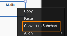
3. After selecting the Media State, select \[ Convert to Subchart \] from the context menu.
- The Media State will be converted to a Subchart (the “S” indicating that it is a Subchart will be displayed in the lower right of the State).  
    <div drawio-diagram="8096"><img src="https://doc316en.candera.eu/uploads/images/drawio/2025-03/drawing-4-1742280362.png" alt=""/></div>


The operation to convert Media State to SubChart is now complete.

- To move to the SubChart, select Media State and double-click.
- To return to the original State Diagram from the SubChart, use the \[Hierarchy Navigation Button\] in the State/Transition view screen in the upper right of the State Machine Editor panel.

#### Adding an Initial State and States

1. Double-click on the Main\_StateMachine in the \[ State Machines \] folder in the Solution Explorer.   
    
    - The **State Machine Editor** panel will be displayed.
2. After selecting the Media State, double-click to move it into the SubChart. 
    - As this is immediately after the SubChart conversion, only the Subchart frame will be displayed.
3. Expand the size of the Subchart by dragging the Subchart frame handle with the mouse. 
    - Expand it to a sufficient size to add the Initial State and States.
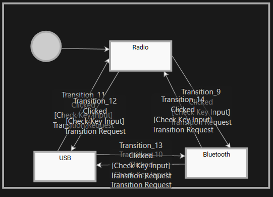
4. In the Subchart, place one Initial State and three States from the toolbar at the top right of the State Machine Editor.
5. Change the names of the three States you added to Radio, Bluetooth, and USB, respectively.

The placement of the basic components is now complete. Continue to configure the OnEntry action and Transition settings.

#### Structure of each State

When transitioning to each State in the Subchart (entering and exiting States), the corresponding scene must be made active or inactive. In addition, when each scene is made active or inactive, the Media Menu scene text must be set to be displayed or hidden accordingly.

##### Scene display settings  


1. With the Radio State selected, click \[ Fusion \] in the lower left of the State Machine Editor panel.
- The Fusion panel for the Radio State will be displayed.

3. Drag the \[ On Entry Actions \] connector on the right of the Radio Fusion node and move the mouse.
4. A link will appear as you move the mouse, so release the left mouse button at the any location.
- The \[ Select Behavior \] dialog will be displayed.
- The selectable behaviors will be displayed by category.

6. Select “Action &gt; Transition &gt; Transition Request” from the list and connect it to the top node.
- You can also narrow down the list of behaviors in the dialog by entering “Transition Request” in the search field at the top of the dialog.
- The Transition Request is connected to \[Radio &gt; On Exit Actions\].

8. Repeat the same process for the \[On Exit Actions\] of the Radio Fusion node to connect the Transition Request Fusion node.
9. Make the following settings for the two Transition Requests that you have connected.  
    <table border="1" style="border-collapse: collapse; width: 51.6753%; height: 118.4px;"><colgroup><col style="width: 34.7326%;"></col><col style="width: 28.974%;"></col><col style="width: 36.4932%;"></col></colgroup><tbody><tr style="height: 29.6px;"><td rowspan="2" style="height: 59.2px; background-color: rgb(35, 111, 161);"><span style="color: rgb(255, 255, 255);">On Entry Actions</span></td><td style="height: 29.6px; background-color: rgb(194, 224, 244);">RequestType</td><td style="height: 29.6px;">Activate</td></tr><tr style="height: 29.6px;"><td style="height: 29.6px; background-color: rgb(194, 224, 244);">Identifier</td><td style="height: 29.6px;">Media Radio scene</td></tr><tr style="height: 29.6px;"><td rowspan="2" style="height: 59.2px; background-color: rgb(35, 111, 161);"><span style="color: rgb(255, 255, 255);">On Exit Actions</span></td><td style="height: 29.6px; background-color: rgb(194, 224, 244);">RequestType</td><td style="height: 29.6px;">Deactivate</td></tr><tr style="height: 29.6px;"><td style="height: 29.6px; background-color: rgb(194, 224, 244);">Identifier</td><td style="height: 29.6px;">Media Radio scene</td></tr></tbody></table>
10. Repeat the same procedure to make similar settings for Bluetooth and USB State.  
    <table border="1" style="border-collapse: collapse; width: 56.5722%; height: 118.4px;"><colgroup><col style="width: 34.6874%;"></col><col style="width: 26.0209%;"></col><col style="width: 39.4743%;"></col></colgroup><tbody><tr><td class="align-center" colspan="3" style="background-color: rgb(0, 0, 0);">**<span style="color: #ffffff;">Phone State</span>**</td></tr><tr style="height: 29.6px;"><td rowspan="2" style="height: 59.2px; background-color: rgb(35, 111, 161);"><span style="color: rgb(255, 255, 255);">On Entry Actions</span></td><td style="height: 29.6px; background-color: rgb(194, 224, 244);">RequestType</td><td style="height: 29.6px;">Activate</td></tr><tr style="height: 29.6px;"><td style="height: 29.6px; background-color: rgb(194, 224, 244);">Identifier</td><td style="height: 29.6px;">Media Bluetooth scene</td></tr><tr style="height: 29.6px;"><td rowspan="2" style="height: 59.2px; background-color: rgb(35, 111, 161);"><span style="color: rgb(255, 255, 255);">On Exit Actions</span></td><td style="height: 29.6px; background-color: rgb(194, 224, 244);">RequestType</td><td style="height: 29.6px;">Deactivate</td></tr><tr style="height: 29.6px;"><td style="height: 29.6px; background-color: rgb(194, 224, 244);">Identifier</td><td style="height: 29.6px;">Media Bluetooth scene</td></tr><tr><td class="align-center" colspan="3" style="background-color: rgb(0, 0, 0);">**<span style="color: #ffffff;">Media State</span>**</td></tr><tr><td rowspan="2" style="height: 59.2px; background-color: rgb(35, 111, 161);"><span style="color: rgb(255, 255, 255);">On Entry Actions</span></td><td style="height: 29.6px; background-color: rgb(194, 224, 244);">RequestType</td><td style="height: 29.6px;">Activate</td></tr><tr><td style="height: 29.6px; background-color: rgb(194, 224, 244);">Identifier</td><td style="height: 29.6px;">Media USB scene</td></tr><tr><td rowspan="2" style="height: 59.2px; background-color: rgb(35, 111, 161);"><span style="color: rgb(255, 255, 255);">On Exit Actions</span></td><td style="height: 29.6px; background-color: rgb(194, 224, 244);">RequestType</td><td style="height: 29.6px;">Deactivate</td></tr><tr><td style="height: 29.6px; background-color: rgb(194, 224, 244);">Identifier</td><td style="height: 29.6px;">Media USB scene</td></tr></tbody></table>

##### Text Display Settings

1. With the Radio State selected, click \[ Fusion \] at the bottom left of the State Machine Editor panel.
- The Fusion panel for the Radio State will be displayed.

3. Drag the \[ On Entry Actions \] connector on the right of the Radio Fusion node and move the mouse.
4. A link will appear as you move the mouse, so release the left mouse button at the any location.
- The 'Select Behavior' dialog will appear.
- The available behaviors will be displayed in categories.

6. Select "Action &gt; Property &gt; Enable Rendering" from the list and connect it to the top node.
- You can also narrow down the list of behaviors in the dialog by entering "Enable Rendering" in the search field at the top of the dialog.
- Enable Rendering is connected to \[Radio &gt; On Exit Actions\].

8. Repeat the same process for the \[On Exit Actions\] of the Radio Fusion node to connect the Enable Rendering Fusion node.
9. Make the following settings for the two Enable Renderings that have been connected.  
    <table border="1" style="border-collapse: collapse; width: 83.3763%; height: 118.4px;"><colgroup><col style="width: 21.2009%;"></col><col style="width: 17.3667%;"></col><col style="width: 61.2467%;"></col></colgroup><tbody><tr style="height: 29.6px;"><td rowspan="2" style="height: 29.6px; background-color: rgb(35, 111, 161);"><span style="color: rgb(255, 255, 255);">On Entry Actions</span></td><td style="height: 29.6px; background-color: rgb(194, 224, 244);">TargetNode</td><td style="height: 29.6px;">Scenes&gt;Main Menu&gt;OverlayLayout&gt;Radio</td></tr><tr style="height: 29.6px;"><td style="height: 29.6px; background-color: rgb(194, 224, 244);">Visible</td><td style="height: 29.6px;">Enable (check box selected)</td></tr><tr style="height: 29.6px;"><td rowspan="2" style="height: 29.6px; background-color: rgb(35, 111, 161);"><span style="color: rgb(255, 255, 255);">On Exit Actions</span></td><td style="height: 29.6px; background-color: rgb(194, 224, 244);">TargetNode</td><td style="height: 29.6px;">Scenes&gt;Main Menu&gt;OverlayLayout&gt;Radio</td></tr><tr style="height: 29.6px;"><td style="height: 29.6px; background-color: rgb(194, 224, 244);">Visible</td><td style="height: 29.6px;">Disable (uncheck)</td></tr></tbody></table>
10. Follow the same procedure to make similar settings for Bluetooth and USB State.   
    <table border="1" style="border-collapse: collapse; width: 83.3763%; height: 118.4px;"><colgroup><col style="width: 21.2009%;"></col><col style="width: 17.3321%;"></col><col style="width: 61.4361%;"></col></colgroup><tbody><tr><td class="align-center" colspan="3" style="background-color: rgb(0, 0, 0);"><span style="color: rgb(255, 255, 255);">**<span style="color: #ffffff;">Phone State</span>**</span></td></tr><tr style="height: 29.6px;"><td rowspan="2" style="height: 29.6px; background-color: rgb(35, 111, 161);"><span style="color: rgb(255, 255, 255);">On Entry Actions</span></td><td style="height: 29.6px; background-color: rgb(194, 224, 244);">TargetNode</td><td style="height: 29.6px;">Scenes&gt;Main Menu&gt;OverlayLayout&gt;Bluetooth</td></tr><tr style="height: 29.6px;"><td style="height: 29.6px; background-color: rgb(194, 224, 244);">Visible</td><td style="height: 29.6px;">Enable</td></tr><tr style="height: 29.6px;"><td rowspan="2" style="height: 29.6px; background-color: rgb(35, 111, 161);"><span style="color: rgb(255, 255, 255);">On Exit Actions</span></td><td style="height: 29.6px; background-color: rgb(194, 224, 244);">TargetNode</td><td style="height: 29.6px;">Scenes&gt;Main Menu&gt;OverlayLayout&gt;Bluetooth</td></tr><tr style="height: 29.6px;"><td style="height: 29.6px; background-color: rgb(194, 224, 244);">Visible</td><td style="height: 29.6px;">Disable</td></tr><tr><td class="align-center" colspan="3" style="background-color: rgb(0, 0, 0);"><span style="color: rgb(255, 255, 255);">**<span style="color: #ffffff;">Media State</span>**</span></td></tr><tr><td rowspan="2" style="height: 29.6px; background-color: rgb(35, 111, 161);"><span style="color: rgb(255, 255, 255);">On Entry Actions</span></td><td style="height: 29.6px; background-color: rgb(194, 224, 244);">TargetNode</td><td style="height: 29.6px;">Scenes&gt;Main Menu&gt;OverlayLayout&gt;USB</td></tr><tr><td style="height: 29.6px; background-color: rgb(194, 224, 244);">Visible</td><td style="height: 29.6px;">Enable</td></tr><tr><td rowspan="2" style="height: 29.6px; background-color: rgb(35, 111, 161);"><span style="color: rgb(255, 255, 255);">On Exit Actions</span></td><td style="height: 29.6px; background-color: rgb(194, 224, 244);">TargetNode</td><td style="height: 29.6px;">Scenes&gt;Main Menu&gt;OverlayLayout&gt;USB</td></tr><tr><td style="height: 29.6px; background-color: rgb(194, 224, 244);">Visible</td><td style="height: 29.6px;">Disable</td></tr></tbody></table>

#### Adding a Transition

We will now create a transition between the states we have created so far.

##### Setting the Initial State

We will set the transition from the Initial State to the Radio State, which is the initial state.

1. Double-click on Main\_StateMachine in the \[ State Machines \] folder in the Solution Explorer.
- The State Machine Editor will appear.

3. After selecting Media State, double-click on it and move it into the SubChart.
4. Drag and drop \[ Transition \] from the toolbar at the top of the panel to the Initial State in the Subchart.
- The Transition will be connected to the Initial State, and it will be ready to be placed.

6. While the Transition is ready to be placed, click on the Radio State.
- The Initial State and Radio State will be connected by the Transition.
- The direction of the Transition connection is from the Initial State to the Radio State.


With this setting, the transition to the Radio State has been configured as the initial state of the Media State (Subchart).

##### Transition settings between each State

Next, we will set up the transitions between each State (Radio, Bluetooth, USB).

1. From the toolbar at the top right of the State Machine Editor, drag the Transition and drop it onto the Radio State (the starting side of the transition).   
    
    - The Transition (arrow) will appear on the State Machine Editor and be ready to be dragged.
2. Extend the Transition (arrow) to the Bluetooth State (end of transition) and click.  
    
    - The two states, Radio and Bluetooth, will be connected by an arrow.
3. With the added Transition selected, click \[ Fusion... \] at the bottom left of the State Machine Editor panel.   
    
    - The Fusion panel will open, and the Fusion diagram for the Transition will be displayed.
    - The Check Click Fusion node is connected to the connector (Condition) at the top right of the Transition Fusion node.
4. Select the Check Click Fusion node that is connected by default, and press the Delete key. 
    - The Check Click Fusion node will be deleted.
5. Drag the connector (Condition) at the upper right of the Transition Fusion node, move the mouse, and release the left mouse button at the any location. 
    - The \[Select Behavior\] dialog will open.
6. Enter “Check Key Input” in the search field at the top of the dialog.   
    
    - The list of behaviors in the dialog will be narrowed down, and Condition &gt; Input &gt; Check Key Input will be displayed.
7. Double-click Check Key Input. 
    - The Check Key Input Fusion node will be linked to the Condition connector of the Transition Fusion node.
8. Drag the connector (Actions) at the bottom right of the Transition Fusion node, move the mouse, and release the left mouse button at the any location. 
    - The \[Select Behavior\] dialog will open.
9. Enter “Transition Request” in the search field at the top of the dialog.   
    
    - The list of behaviors in the dialog will be narrowed down, and Action &gt; Transition &gt; Transition Request will be displayed.
10. Double-click Transition Request. 
    - The Transition Request Fusion node will be linked to the Actions connector of the Transition Fusion node.
11. Make the following settings for the Transition Request Fusion node.   
    
    - Clicking the upward-pointing arrow icon in the upper right of the Fusion panel will switch the display to the State.  
        <table border="1" class="align-left" id="bkmrk-items-setting-value--0" style="border-collapse: collapse; width: 393px; height: 89.3907px; border-width: 1px;"><colgroup><col style="width: 197px;"></col><col style="width: 197px;"></col></colgroup><tbody><tr><td class="align-center" colspan="2" style="border-width: 1px; background-color: rgb(0, 0, 0);"><span style="color: rgb(255, 255, 255);">**<span style="vertical-align: inherit;"><span style="vertical-align: inherit;">Check Key Input</span></span>**</span></td></tr><tr><td style="border-width: 1px; background-color: rgb(35, 111, 161);"><span style="vertical-align: inherit; color: rgb(255, 255, 255);"><span style="vertical-align: inherit;">KeyCode</span></span></td><td style="border-width: 1px;"><span style="vertical-align: inherit;"><span style="vertical-align: inherit;">Key\_DownArrow</span></span></td></tr><tr><td class="align-center" colspan="2" style="border-width: 1px; background-color: rgb(0, 0, 0);"><span style="color: rgb(255, 255, 255);">**<span style="vertical-align: inherit;"><span style="vertical-align: inherit;">Transition Request</span></span>**</span></td></tr><tr style="height: 29.7969px;"><td style="border-width: 1px; height: 29.7969px; background-color: rgb(35, 111, 161);"><span style="vertical-align: inherit; color: rgb(255, 255, 255);"><span style="vertical-align: inherit;">RequestType</span></span></td><td style="border-width: 1px; height: 29.7969px;"><span style="vertical-align: inherit;"><span style="vertical-align: inherit;">Activate</span></span></td></tr><tr style="height: 29.7969px;"><td style="border-width: 1px; height: 29.7969px; background-color: rgb(35, 111, 161);"><span style="vertical-align: inherit; color: rgb(255, 255, 255);"><span style="vertical-align: inherit;">Identifier</span></span></td><td style="border-width: 1px; height: 29.7969px;"><span style="vertical-align: inherit;"><span style="vertical-align: inherit;">Scenes＞Media Bluetooth</span></span></td></tr></tbody></table>
12. Repeat the above steps 1 to 11 to set the following five transitions. 
    - The RequestType for all of these is Activate (default).  
        <table border="1" class="align-left" style="border-collapse: collapse; width: 610px; border-width: 1px; height: 177.6px;"><colgroup><col style="width: 168px;"></col><col style="width: 215px;"></col><col style="width: 226px;"></col></colgroup><tbody><tr style="height: 29.6px;"><td style="border-width: 1px; background-color: rgb(35, 111, 161); height: 29.6px;">**<span style="color: rgb(255, 255, 255);">Transition</span>**
        
        </td><td style="border-width: 1px; background-color: rgb(35, 111, 161); height: 29.6px;">**<span style="vertical-align: inherit; color: rgb(255, 255, 255);"><span style="vertical-align: inherit;"><span style="vertical-align: inherit; color: rgb(255, 255, 255);"><span style="vertical-align: inherit;">Check Key Input＞KeyCode</span></span></span></span>**</td><td style="border-width: 1px; background-color: rgb(35, 111, 161); height: 29.6px;">**<span style="vertical-align: inherit; color: rgb(255, 255, 255);"><span style="vertical-align: inherit;"><span style="vertical-align: inherit; color: rgb(255, 255, 255);"><span style="vertical-align: inherit;">Transition Request&gt;Identifier</span></span></span></span>**</td></tr><tr style="height: 29.6px;"><td class="align-left" style="border-width: 1px; height: 29.6px;">Bluetooth to USB</td><td rowspan="2" style="border-width: 1px; height: 59.2px;"><span style="vertical-align: inherit;"><span style="vertical-align: inherit;">  
        </span></span><span style="vertical-align: inherit;"><span style="vertical-align: inherit;">Key\_DownArrow</span></span></td><td class="align-left" style="border-width: 1px; height: 29.6px;"><span style="vertical-align: inherit;"><span style="vertical-align: inherit;">Scenes＞Media USB</span></span></td></tr><tr style="height: 29.6px;"><td class="align-left" style="border-width: 1px; height: 29.6px;">USB to Radio</td><td class="align-left" style="border-width: 1px; height: 29.6px;"><span style="vertical-align: inherit;"><span style="vertical-align: inherit;">Scenes＞Media Radio</span></span></td></tr><tr style="height: 29.6px;"><td class="align-left" style="border-width: 1px; height: 29.6px;">Radio to USB</td><td rowspan="3" style="border-width: 1px; height: 88.8px;"><span style="vertical-align: inherit;"><span style="vertical-align: inherit;">  
        </span></span>
        
        <span style="vertical-align: inherit;"><span style="vertical-align: inherit;">Key\_UpArrow  
        </span></span><span style="vertical-align: inherit;"><span style="vertical-align: inherit;">  
        </span></span></td><td class="align-left" style="border-width: 1px; height: 29.6px;"><span style="vertical-align: inherit;"><span style="vertical-align: inherit;">Scenes＞Media USB</span></span>
        
        </td></tr><tr style="height: 29.6px;"><td class="align-left" style="border-width: 1px; height: 29.6px;">USB to Bluetooth</td><td class="align-left" style="border-width: 1px; height: 29.6px;"><span style="vertical-align: inherit;"><span style="vertical-align: inherit;">Scenes＞Media Bluetooth</span></span></td></tr><tr style="height: 29.6px;"><td class="align-left" style="border-width: 1px; height: 29.6px;">Bluetooth to Radio</td><td class="align-left" style="border-width: 1px; height: 29.6px;"><span style="vertical-align: inherit;"><span style="vertical-align: inherit;">Scenes＞Media Radio</span></span></td></tr></tbody></table>
13. When all settings are complete, the screen will look like the one below.  
    <div drawio-diagram="8094"><img src="https://doc316en.candera.eu/uploads/images/drawio/2025-03/drawing-4-1742280223.png" alt=""/></div>

With the above settings, the scene that is displayed when a transition occurs from each scene in the subchart has been set.


#### Checking the screen transition

Use the Player to check the screen transition.

1. Click the \[ Play selected scenario \] icon on the toolbar to start the Player.
- Three windows will open, and you can see that the simulation display, one of the windows, displays the “Navi Title” and “Navigation” text, and that the initial transition has occurred to the Main Menu and Navigation scenes.

3. Pressing the right arrow key on the keyboard switches the text on the screen, and “Media Title”, “Radio Title”, and “Radio” are displayed in the simulation display, and the transition to the Media Menu scene (Subchart) is performed.
4. Pressing the up and down arrow keys on the keyboard switches the text on the screen, and the transition to the “Radio”, “Bluetooth”, and “USB” scenes in the Subchart is performed sequentially.
5. Close the CGI Panel and exit the Player.
- All three windows that were open will close.


In addition to the switching between the Navigation, Phone and Media scenes set in Part 2, we were able to confirm that it is also possible to switch between the Radio, Bluetooth and USB scenes, which are subcharts. However, at present, even if you switch to a scene placed in a subchart in the Media scene, when you transition back to the Navigation or Phone scene (using the left and right directional keys) and then return to the Media scene, the Radio scene, which is always set as the initial scene of the Media scene, will be displayed.

If you want to display the scene that was displayed immediately before, you can do this by placing a History State in the Subchart.

### Configure History State

#### Placing the History State

1. Double-click on Main\_StateMachine in the \[ State Machines \] folder in the Solution Explorer.
- The State Machine Editor will appear.

3. After selecting the Media State, double-click to move it into the SubChart.
4. Select the Initial State in the Subchart and press the Delete key.
- The Initial State in the Subchart will be deleted.

6. Drag and drop \[ History State \] from the toolbar at the top of the panel into the Subchart.
- The History State will be placed in the Subchart.

8. Drag and drop \[Transition\] from the toolbar at the top of the panel into the Subchart.
- The Transition will be connected to the Initial State, and it will be ready to be placed.

10. While the Transition is ready to be placed, click on the Radio State.
- The History State and Radio State will be connected by the Transition.  
    <div drawio-diagram="8095"><img src="https://doc316en.candera.eu/uploads/images/drawio/2025-03/drawing-4-1742280290.png" alt=""/></div>


#### Checking the screen transition

Use the Player to check the screen transition.

1. Press the \[Play selected scenario...\] icon on the toolbar to start the Player.
- Three windows will open, and you can see that the simulation display shows “Navi Title” and “Navigation” text, and that the initial transition has occurred to the Main Menu and Navigation scenes.

3. Press the right arrow key on the keyboard once.
- The text “Media Title”, “Radio Title” and “Radio” will appear, and you will be taken to the Media Menu scene (Subchart).

5. Press the down arrow key on the keyboard once.
- The text on the screen will change, and “Bluetooth Title” and “Bluetooth” will appear.

7. Press the right arrow key on the keyboard once, and then press the left arrow key once.
- On the simulation display, “Phone Title” will be displayed, and then “Media Title” will be displayed again.
- In this case, “Bluetooth” will be displayed.

9. Close the CGI Panel and exit the Player.
- All three windows that were open will close.


By replacing the Initial State in the Subchart with the History State, you can see that the scene transition in the Subchart has become a state that remembers the state of the previous transition.

# Part 4: Add an Incoming Call

This page explains the procedure for adding an Incoming Call scene and configuring the state machine to display the scene with the Enter key and hide it with the ESC key in CGI Studio.

The existing Phone scene is duplicated to create the IncomingCall scene, and the background is customized by placing a SolidColorNode. A new Global State Machine (IncomingCall\_StateMachine) is created, and transitions between the CallInactive and CallActive states are configured. Conditions are set for transitioning to CallActive (displaying the call) with the Enter key and to CallInactive (hiding the call) with the ESC key. OnEntry/OnExit actions are used to control the activation and deactivation of the IncomingCall scene. Finally, screen transition operations are verified using the Player.

### Creatig the IncomingCall scene

#### Configure the IncomingCall Scene

The IncomingCall scene is created by duplicating the Phone scene.

1. In **\[Solution Explorer\]**, select **\[Scenes &gt; Phone\]**, then choose **\[Clone\]** from the context menu.
    
    
    - The **\[Clone Item\]** dialog will appear.
2. In the **\[Clone Item\]** dialog, select **\[Single Clone\]**, rename **\[Name\]** to **"IncomingCall"**, then click **\[OK\]**.
    
    
    - The **IncomingCall** scene will be created.
    - The scene tree will display the newly created **IncomingCall** scene.
3. Select the text node in the **IncomingCall** scene tree, then update **\[Text\]** in the **\[Properties\]** panel under **\[2D Text Node\]** to **"Incoming Call"**.
    
    
    - The text displayed in the Scene Editor will change to "Incoming Call".
4. To change the position of the text node on the Scene Editor, change the \[Transform\] setting in the text node's properties panel to the following.
    
    <table border="1" class="align-left" style="border-collapse: collapse; border-width: 1px; width: 300px;"><colgroup><col style="width: 41.8121%;"></col><col style="width: 58.1125%;"></col></colgroup><tbody><tr><td style="background-color: rgb(35, 111, 161);"><span style="color: rgb(236, 240, 241);">Position X</span></td><td>28</td></tr><tr><td style="background-color: rgb(35, 111, 161);"><span style="color: rgb(236, 240, 241);">Position Y</span></td><td>220</td></tr></tbody></table>
5. Drag and drop a \[Solid Color Node\] from \[Node 2D\] in the \[Toolbox\] panel onto the TextNode in the \[IncomingCall\] scene tree.
    
    
    - The SolidColorNode will be placed on the scene tree.
    - By placing it above the TextNode on the scene tree, the added SolidColorNode can be used as the background for the TextNode.
    - If you are unable to place it below the TextNode, you can adjust its position by dragging and dropping it after placing it on the scene tree.
    - The node added to the scene tree by this operation will have its \[Position\] set to X=0, Y=0 automatically in the \[Transform\] section of the Properties panel.
6. To change the position of the SolidColorNode on the scene editor, change the \[Transform\] setting in the SolidColorNode's property panel to the following.  
    <table border="1" class="align-left" style="border-collapse: collapse; border-width: 1px; width: 300px;"><colgroup><col style="width: 41.8121%;"></col><col style="width: 58.1125%;"></col></colgroup><tbody><tr><td style="background-color: rgb(35, 111, 161);"><span style="color: rgb(236, 240, 241);">Position X</span></td><td>5</td></tr><tr><td style="background-color: rgb(35, 111, 161);"><span style="color: rgb(236, 240, 241);">Position Y</span></td><td>200</td></tr></tbody></table>
7. After selecting the SolidColorNode on the scene tree, select the SolidColorBrushBlend that appears in the extra scene tree.  
    
    - The properties of the SolidColorBrushBlend effect will be displayed in the Properties panel.
8. To change the color and size of the SolidColorNode, set the following items in the Properties panel as shown in the table below.  
    <table border="1" style="border-collapse: collapse; width: 42.0103%; height: 207.2px;"><colgroup><col style="width: 26.4453%;"></col><col style="width: 23.9852%;"></col><col style="width: 49.508%;"></col></colgroup><tbody><tr style="height: 29.6px;"><td class="align-center" colspan="3" style="background-color: rgb(35, 111, 161); height: 29.6px;"><span style="color: rgb(255, 255, 255);">**Effect**</span>
    
    </td></tr><tr style="height: 29.6px;"><td rowspan="4" style="height: 29.6px;">FillColor</td><td style="height: 29.6px;">Red
    
    </td><td style="height: 29.6px;">1.0
    
    </td></tr><tr style="height: 29.6px;"><td style="height: 29.6px;">Green
    
    </td><td style="height: 29.6px;">0.0
    
    </td></tr><tr style="height: 29.6px;"><td style="height: 29.6px;">Blue
    
    </td><td style="height: 29.6px;">0.0
    
    </td></tr><tr style="height: 29.6px;"><td style="height: 29.6px;">Alpha
    
    </td><td style="height: 29.6px;">1.0
    
    </td></tr><tr style="height: 29.6px;"><td rowspan="2" style="height: 29.6px;">Size</td><td style="height: 29.6px;">X</td><td style="height: 29.6px;">380</td></tr><tr style="height: 29.6px;"><td style="height: 29.6px;">Y</td><td style="height: 29.6px;">90</td></tr></tbody></table>

The settings for the Incoming Call scene are now complete.


#### Sequence Number Configuration

Set the rendering order for the new scene created in the previous section. In this case, we will set it to 4, so we will also change the rendering order of the Swap Scene Camera, which was originally set to 4.

1. In the Render Target panel, select IncomingCall/Camera. 
    - The properties of the IncomingCall camera will be displayed in the Properties panel.
2. In the Properties panel, change the value of \[Sequence Number\] in the \[Camera\] category to 4.
3. Next, select Swap\\Camera in the Render Target panel.
    
    
    - The properties of the Swap camera will be displayed in the Properties panel.
4. In the Properties panel, change the value of \[Sequence Number\] in the \[Camera\] category to 5.
    
    <div drawio-diagram="8093"><img src="https://doc316en.candera.eu/uploads/images/drawio/2025-03/drawing-4-1742280096.png" alt=""/></div>

####   


### Creating an IncomingCall State Machine

We will create and configure a new State Machine for the IncomingCall scene.

#### Creating a new State Machine

1. Select \[ State Machines &gt; New State Machine \] from the menu bar.
- The \[ New State Machine \] dialog will appear.

3. Click \[ Browse \] at the top of the dialog.
- The \[ Select Location \] dialog will appear.

5. Select StateMachines and click \[ OK \].
- The location “/State Machines” is selected as the save location for the new State Machine.

7. Set \[ Name \] in the dialog to "IncomingCall\_StateMachine" and click the \[ OK \] button.
- The IncomingCall\_StateMachine is newly created in the \[ State Machines \] folder in the Solution Explorer.  
    <div drawio-diagram="8092"><img src="https://doc316en.candera.eu/uploads/images/drawio/2025-03/drawing-4-1742280069.png" alt=""/></div>


#### Setting the Global State Machine  


1. Select the IncomingCall\_StateMachine in the \[ State Machines \] folder in the Solution Explorer.
- The IncomingCall\_StateMachine properties will be displayed in the Properties panel.

3. Enable the \[ Is Global \] checkbox in the \[ General \] category of the properties.
- The IncomingCall\_StateMachine will be set as a Global State Machine.


#### Adding a State  


1. Double-click on IncomingCall\_StateMachine in the \[ State Machines \] folder in the Solution Explorer. 
    - The State Machine Editor will appear.
    - There is already one Initial State and one State.
2. Select a State on the State Machine Editor.
    
    
    - The properties of the selected State will be displayed in the Properties Panel.
3. Change the \[Name\] in the \[General\] category of the Properties Panel to CallInactive.
    
    
    - The State name on the State Machine Editor will change to CallInactive.
4. Next, place a State from the toolbar at the top right of the State Machine Editor.
5. Change the names of the added States to CallInActive.
6. Drag and drop \[Transition\] from the toolbar at the top of the panel to the Initial State in IncomingCall\_State. 
    - Transition will be connected to the Initial State and become ready to be placed.
7. While Transition is ready to be placed, click on CallInactive State.  
    <div drawio-diagram="8091"><img src="https://doc316en.candera.eu/uploads/images/drawio/2025-03/drawing-4-1742280026.png" alt=""/></div>

#### OnEntry/OnExit settings

When transitioning to each State (entering and exiting States), it is necessary to activate and deactivate the corresponding scenes.

##### Scene display settings  


1. With the CallActive State selected, click \[ Fusion \] in the lower left of the State Machine Editor panel.
- The Fusion panel for the Navigation State will be displayed.

3. Drag the \[ On Entry Actions \] connector on the right of the CallActive Fusion node and move the mouse.
4. A link will appear as you move the mouse, so release the left mouse button at the any location.
- The \[ Select Behavior \] dialog will be displayed.
- The selectable behaviors will be displayed by category.

6. Select “Action &gt; Transition &gt; Transition Request” from the list and connect it to the top node.
- You can also narrow down the list of behaviors in the dialog by entering “Transition Request” in the search field at the top of the dialog.
- The Transition Request is connected to \[CallActive &gt; On Exit Actions\].

8. Repeat the same process for the \[On Exit Actions\] of the CallActive Fusion node to connect the Transition Request Fusion node.
9. Make the following settings for the two Transition Requests that you have connected.  
    <table border="1" style="border-collapse: collapse; width: 51.6753%; height: 118.4px;"><colgroup><col style="width: 34.7326%;"></col><col style="width: 28.974%;"></col><col style="width: 36.4932%;"></col></colgroup><tbody><tr style="height: 29.6px;"><td rowspan="2" style="height: 59.2px; background-color: rgb(35, 111, 161);"><span style="color: rgb(255, 255, 255);">On Entry Actions</span></td><td style="height: 29.6px; background-color: rgb(194, 224, 244);">RequestType</td><td style="height: 29.6px;">Activate</td></tr><tr style="height: 29.6px;"><td style="height: 29.6px; background-color: rgb(194, 224, 244);">Identifier</td><td style="height: 29.6px;">IncomingCall scene</td></tr><tr style="height: 29.6px;"><td rowspan="2" style="height: 59.2px; background-color: rgb(35, 111, 161);"><span style="color: rgb(255, 255, 255);">On Exit Actions</span></td><td style="height: 29.6px; background-color: rgb(194, 224, 244);">RequestType</td><td style="height: 29.6px;">Deactivate</td></tr><tr style="height: 29.6px;"><td style="height: 29.6px; background-color: rgb(194, 224, 244);">Identifier</td><td style="height: 29.6px;">IncomingCall scene</td></tr></tbody></table>

##### Transition settings between each State

Next, we will set up the transitions between each State (CallInactive and CallActive).

1. From the toolbar at the top right of the State Machine Editor, drag the Transition and drop it onto the CallInactive State (the starting side of the transition).   
    
    - The Transition (arrow) will appear on the State Machine Editor and be ready to be dragged.
2. Extend the Transition (arrow) to the CallActive State (end of transition) and click.  
    
    - The two states, CallInactive and CallActive, will be connected by an arrow.
3. With the added Transition selected, click \[ Fusion... \] at the bottom left of the State Machine Editor panel.   
    
    - The Fusion panel will open, and the Fusion diagram for the Transition will be displayed.
    - The Check Click Fusion node is connected to the connector (Condition) at the top right of the Transition Fusion node.
4. Select the Check Click Fusion node that is connected by default, and press the Delete key. 
    - The Check Click Fusion node will be deleted.
5. Drag the connector (Condition) at the upper right of the Transition Fusion node, move the mouse, and release the left mouse button at the any location. 
    - The \[Select Behavior\] dialog will open.
6. Enter “Check Key Input” in the search field at the top of the dialog.   
    
    - The list of behaviors in the dialog will be narrowed down, and Condition &gt; Input &gt; Check Key Input will be displayed.
7. Double-click Check Key Input. 
    - The Check Key Input Fusion node will be linked to the Condition connector of the Transition Fusion node.
8. Make the following settings for the Check Key Input Fusion node. 
    - Clicking the upward-pointing arrow icon in the upper right of the Fusion panel will switch the display to the State.  
        <table border="1" class="align-left" id="bkmrk-items-setting-value--0" style="border-collapse: collapse; width: 393px; height: 89.3907px; border-width: 1px;"><colgroup><col style="width: 197px;"></col><col style="width: 197px;"></col></colgroup><tbody><tr><td class="align-center" colspan="2" style="border-width: 1px; background-color: rgb(0, 0, 0);"><span style="color: rgb(255, 255, 255);">**<span style="vertical-align: inherit;"><span style="vertical-align: inherit;">Check Key Input</span></span>**</span></td></tr><tr><td style="border-width: 1px; background-color: rgb(35, 111, 161);"><span style="vertical-align: inherit; color: rgb(255, 255, 255);"><span style="vertical-align: inherit;">KeyCode</span></span></td><td style="border-width: 1px;"><span style="vertical-align: inherit;"><span style="vertical-align: inherit;">Key\_Enter</span></span></td></tr></tbody></table>
9. Repeat the above operations 1 to 8, this time connecting the Transition from CallActive State to CallInactive State, and set the Check Key Input Fusion as shown in the table below.   
    <table border="1" class="align-left" id="bkmrk-check-key-input-keyc" style="border-collapse: collapse; width: 393px; height: 89.3907px; border-width: 1px;"><colgroup><col style="width: 197px;"></col><col style="width: 197px;"></col></colgroup><tbody><tr><td class="align-center" colspan="2" style="border-width: 1px; background-color: rgb(0, 0, 0);"><span style="color: rgb(255, 255, 255);">**<span style="vertical-align: inherit;"><span style="vertical-align: inherit;">Check Key Input</span></span>**</span></td></tr><tr><td style="border-width: 1px; background-color: rgb(35, 111, 161);"><span style="vertical-align: inherit; color: rgb(255, 255, 255);"><span style="vertical-align: inherit;">KeyCode</span></span></td><td style="border-width: 1px;"><span style="vertical-align: inherit;"><span style="vertical-align: inherit;">Key\_ESC</span></span></td></tr></tbody></table>
10. When all settings are complete, the screen will look like the one below.   
    <div drawio-diagram="8090"><img src="https://doc316en.candera.eu/uploads/images/drawio/2025-03/drawing-4-1742279942.png" alt=""/></div>

### Checking the transition state

Use the Player to check the transition between the states set in the previous section.

<span style="color: rgb(34, 34, 34); font-family: var(--font-heading, var(--font-body)); font-size: 1.666em; font-weight: 400;">Checking the screen transition</span>

Use the Player to check the screen transition.

1. Click the \[ Play selected scenario \] icon on the toolbar to start the Player.  
    
    - Three windows will open, and you can see that the simulation display, one of the windows, displays the “Navi Title” and “Navigation” text, and that the initial transition has occurred to the Main Menu and Navigation scenes.
2. By pressing the **Enter key** on the keyboard, the text “Incoming Call” will appear on the screen. 
    - Using the left and right directional keys in this state will move the scene, but the “Incoming Call” text will remain displayed.
3. Pressing the **ESC key** on the keyboard hides the “Incoming Call” text displayed on the screen.
4. Close the CGI Panel and exit the Player. 
    - All three windows that were open will close.

# Part 5: Count Received Calls

This page explains the procedure for adding an incoming call count function and displaying the count on a text node in the Main Menu scene in CGI Studio.

A "Received Calls: %d" text node is added to the Main Menu scene, and the call count is updated as a relative value each time the IncomingCall\_StateMachine enters the CallActive state using the Send Value As Event behavior. Furthermore, the Value and Format String behaviors are connected to the Fusion node of the TextNode to format and dynamically display the counted incoming calls on the screen. Finally, the operation of displaying calls with the Enter key, hiding them with the ESC key, and verifying that the incoming call count is correctly updated is performed using the Player.

### Incoming Call Count Configuration

#### Adding a TextNode

1. After selecting the \[ Scenes &gt; Main Menu \] scene in the Solution Explorer, double-click it. 
    - The Main Menu scene will be displayed in the Scene Tree panel.
2. Drag and drop the Text Node from the \[Node 2D\] in the Toolbox panel onto the Main Menu scene in the Scene Tree.
    
    
    - The Text Node will be displayed in the Scene Editor as "Text".
3. Set the following properties for the added Text Node in the Properties panel.
    
    <table border="1" style="border-collapse: collapse; width: 45.3608%;"><colgroup><col style="width: 50.4004%;"></col><col style="width: 11.9739%;"></col><col style="width: 37.5723%;"></col></colgroup><tbody><tr><td style="background-color: rgb(35, 111, 161);"><span style="color: rgb(255, 255, 255);">Transformations&gt;Position</span></td><td class="align-center" style="background-color: rgb(35, 111, 161);"><span style="color: rgb(255, 255, 255);">X</span></td><td>325</td></tr><tr><td style="background-color: rgb(35, 111, 161);">  
    </td><td class="align-center" style="background-color: rgb(35, 111, 161);"><span style="color: rgb(255, 255, 255);">Y</span></td><td>0</td></tr><tr><td colspan="2" style="background-color: rgb(35, 111, 161);"><span style="color: rgb(255, 255, 255);">2D Text Node&gt;Text</span></td><td>Received Calls: %d</td></tr></tbody></table>

#### OnEntry Settings

1. Double-click IncomingCall\_StateMachine in the \[ State Machines \] folder in the Solution Explorer.
    
    
    - The State Machine Editor will be displayed.
2. With the CallActive State selected, click \[ Fusion \] at the bottom left of the State Machine Editor panel.
    
    
    - The Fusion panel for the CallActive State will be displayed.
3. Drag the \[ On Entry Actions \] connector on the right of the CallActive Fusion node and move the mouse.
4. A link will appear as you move the mouse, so release the left mouse button at the any location.  
    
    - The \[ Select Behavior \] dialog will be displayed.
    - The selectable behaviors will be displayed by category.
5. Select “Action &gt; Property &gt; Send Value As Event” from the list and connect it to the top node.
    
    
    - You can also narrow down the list of behaviors in the dialog by entering “Send Value As Event” in the search field at the top of the dialog.
    - Send Value As Event is connected to \[ CallActive &gt; On Exit Actions \].
6. The settings in the table below are made for the connected Send Value As Event.
    
    
    - When the CallActive State is entered, a relative value (Relative) 1 is sent to the TextNode that was just added.
        
        <table border="1" style="border-collapse: collapse; width: 47.0361%;"><colgroup><col style="width: 34.0671%;"></col><col style="width: 65.878%;"></col></colgroup><tbody><tr><td style="background-color: rgb(35, 111, 161);"><span style="color: rgb(255, 255, 255);">TargetNode</span></td><td>Scenes&gt;Main Menu&gt;TextNode</td></tr><tr><td style="background-color: rgb(35, 111, 161);"><span style="color: rgb(255, 255, 255);">Value</span></td><td>Ulnt32, 1</td></tr><tr><td style="background-color: rgb(35, 111, 161);"><span style="color: rgb(255, 255, 255);">ChangeValue</span></td><td>Relative</td></tr></tbody></table>
        
          
        <div drawio-diagram="8088"><img src="https://doc316en.candera.eu/uploads/images/drawio/2025-03/drawing-4-1742279518.png" alt=""/></div>


#### Adding a TextNode

1. Double-click IncomingCall\_StateMachine in the \[ State Machines \] folder in the Solution Explorer.
    
    
    - The State Machine Editor will be displayed.
2. After selecting a TextNode on the scene tree, click \[Fusion\] displayed in the Extra Scene Tree on the left side of the scene tree. 
    - The Fusion panel will open, and the Fusion diagram for TextNode Fusion will open.
3. Drag the \[ Behaviors \] connector on the right of the TextNode Fusion node and move the mouse.
4. A link will appear as you move the mouse, so release the left mouse button at the any location.  
    
    - The \[ Select Behavior \] dialog will be displayed.
    - The selectable behaviors will be displayed by category.
5. Select “Value Processing &gt; Value” from the list and connect it to the top node.
    
    
    - You can also narrow down the list of behaviors in the dialog by entering “Value” in the search field at the top of the dialog.
    - Send Value As Event is connected to \[ TextNode &gt; Behaviors \].
6. Drag the \[ Receivers \] connector on the right of the Value Behavior Fusion node and move the mouse.
7. A link will appear as you move the mouse, so release the left mouse button at the any location.
8. Select “Value Processing &gt; Format String” from the list and connect it to the top node.
    
    
    - You can also narrow down the list of behaviors in the dialog by entering “Format String” in the search field at the top of the dialog.
    - Send Value As Event is connected to \[ Value &gt; Receivers \].
9. Enter “Received Calls: %d” in the \[ Text \] of the Format String Behavior Fusion node.  
    <div drawio-diagram="8089"><img src="https://doc316en.candera.eu/uploads/images/drawio/2025-03/drawing-4-1742279571.png" alt=""/></div>

### Verifying Action

Use the Player to check the operation of the configuration you have set in the previous section.

#### Checking the incoming call count operation

1. Click the \[ Play selected scenario \] icon on the toolbar to start the Player.  
    
    - Three windows will open, and in one of them, the simulation display, in addition to “Navi Title” and “Navigation”, “Received Call: 0” will be displayed to the right of “Navi Title”.
2. By pressing the **Enter key** on the keyboard, the text “Incoming Call” will appear on the screen. 
    - As a result, “Received Call: 0” changes to “Received Call: 1”.
3. Pressing the **ESC key** on the keyboard hides the “Incoming Call” text displayed on the screen.
4. Press the Enter key on the keyboard again to make “Incoming Call” reappear, and it will change to “Received Call: 2”. 
    - As a result, you can confirm that the number of incoming calls is being counted correctly.
5. Close the CGI Panel and exit the Player. 
    - All three windows that were open will close.

# IVI Sample Solution

# Overview

This tutorial describes how to configure a simple IVI solution using the file IVI\_sample.psd. This file can be found in the following location:

**...\\2D\\PSD\\IVI\_Sample.psd**

<div class="contents" id="bkmrk-this-sample-uses-the"><div class="contents"><div class="textblock">- This sample uses the Smart Importer to import necessary images and create pre-configured Controls.
- RadioButtons will be organized inside a GroupBox so that only one RadioButton can be selected at a time.
- Behaviors will be configured using Fusion to create simple interactions.
- An animation will be created configuring key frames in Scene Composer's Animation Design.
- State Machine Editor is used to create transitions, and switching between Music and Navigation context. Necessary behaviors will be configured in Fusion.

</div></div></div>Through this tutorial, users will learn the following:

<table border="1" id="bkmrk-page-theme-main-work" style="border-collapse: collapse; width: 800px; height: 148.403px; border-width: 0px;"><colgroup><col style="width: 7.98464%;"></col><col style="width: 31.9668%;"></col><col style="width: 60.0353%;"></col></colgroup><tbody><tr><td class="align-center" style="border-width: 0px; background-color: rgb(35, 111, 161);">**<span style="color: rgb(255, 255, 255);">Page</span>**</td><td class="align-center" style="border-width: 0px; background-color: rgb(35, 111, 161);">**<span style="color: rgb(255, 255, 255);">Theme</span>**</td><td class="align-center" style="border-width: 0px; background-color: rgb(35, 111, 161);">**<span style="color: rgb(255, 255, 255);">Main work content</span>**

</td></tr><tr style="height: 29.6806px;"><td style="height: 29.6806px; border-width: 0px;">Part 1</td><td style="height: 29.6806px; border-width: 0px;">Basics of using Smart Importer to import a PSD file  
</td><td style="height: 29.6806px; border-width: 0px;">Understanding how to use the Smart Importer to import a PSD file that was especially designed to be imported into Scene Composer.

- Identify various Controls and apply them in Smart Importer.
- Configure Control's properties like values, texts, alternative graphics for e.g. Slider, RadioButtons
- Finally import the scene and prepare it for use in Scene Composer.

</td></tr><tr><td style="border-width: 0px;">Part 2  
</td><td style="border-width: 0px;">Realization of a working RadioButtonGroup  
</td><td style="border-width: 0px;">Implementing a RadioButtonGroup where only one RadioButton can be selected at a time.

- Configuring a GroupBox with a group of RadioButtons
- Defining one of the RadioButtons will be defined to be the default selected object.

</td></tr><tr><td style="border-width: 0px;">Part 3  
</td><td style="border-width: 0px;">Interaction using Slider, Progressbars and Buttons  
</td><td style="border-width: 0px;">Learning how to use Fusion to react on value changes and forward values using Scene Composer's predefined behaviors.

- Creating interactivity between a Slider and a DigitalClock using the Forward Value behavior.
- More interactivity between IconButtons sending a value to a ProgressBar which forwards the value to a TextValue Control.
- Verify the correct functionality of the configured interactions in the Player.

</td></tr><tr><td style="border-width: 0px;">Part 4  
</td><td style="border-width: 0px;">Creating an Animation  
</td><td style="border-width: 0px;">Exploring the creation of an animation in Scene Composer.

- Introduction of Scene Composer's Animation Design and its panels.
- Configuring animated properties for position and size.
- Editing key frames.
- Verify the animation in the Player.

</td></tr><tr><td style="border-width: 0px;">Part 5  
</td><td style="border-width: 0px;">Basics of State Machine and Transition Control</td><td style="border-width: 0px;">Learning how to control state transitions using a state machine.

- Configuring a global state machine and setting up transitions.
- Controlling group nodes' visibility using OnEntry/OnExit actions.
- Configuring the transitions to be triggered by button presses.
- Verifying transitions and behaviors in the Player.

</td></tr></tbody></table>

# Part 1: Smart Importer

This section describes the creation of a new Solution. We will use the Smart Importer to import a Photoshop .psd file. Smart Importer will analyze the PSD file and try to identify which controls are included in the picture. The final assignment of controls (such as RadioButtons, DigitalClocks, CheckBoxes, etc.) however has to be performed manually. After some configuration effort Scene Composer Controls can be imported into your Scene Composer solution.

### Creating a new Solution

1. Start Scene Composer and double-click on **\[Empty\]** from **\[Samples and Templates\]** on the startup screen. 
    - A new solution will be created based on the Empty solution template.
2. In the **Render Targets** panel, select **\[Display (0)\]**.
    
    
    - - The **\[Properties\]** panel will display **\[Display\]** properties.
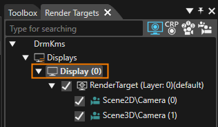
            
            <div drawio-diagram="8399"><img src="https://doc316en.candera.eu/uploads/images/drawio/2025-05/drawing-5-1746775102.png" alt=""/></div>
3. In the **\[Display\]** section of the **\[Properties\]** panel configure the resolution as in the table below. <table><tbody><tr><td style="width: 100px; background-color: rgb(35, 111, 161);"><span style="color: rgb(255, 255, 255);">X Resolution  
    </span></td><th style="width: 50px;">640</th></tr><tr><td style="width: 100px; background-color: rgb(35, 111, 161);"><span style="color: rgb(255, 255, 255);">Y Resolution</span></td><td style="width: 50px;">960</td></tr></tbody></table>
4. Click **\[Save solution...\]** in the toolbar.
    
    
    - The Windows **\[Save As\]** dialog will appear.
        
        <div drawio-diagram="8400"><img src="https://doc316en.candera.eu/uploads/images/drawio/2025-05/drawing-5-1746775292.png" alt=""/></div>
5. In the **\[Save As\]** dialog choose a location and name for your solution and click **\[Save\]**. 
    - The solution is saved.


### Using Smart Importer

In our example we will use the Smart Importer to import a Photoshop .psd file. Smart Importer will analyze the PSD file and try to identify which controls are included in the picture. After some configuration effort you can directly create CGI Studio Controls wherever it is applicable.

#### Configuration of Header

1. Select **\[Import &gt; Smart Importer &gt; From Local File...\]** from the menu bar. 
    - A Windows Open dialog titled **Smart Importer** will be opened.
2. Select the following Photoshop file and press **\[Open\]**. 
    - The **\[Smart Importer\]** window is opened (please be patient, this may take a while).
    - The Photoshop file's layers will be displayed in the **Layer Tree** area marked in orange in the image below.
    - The **Layer Tree** is displayed in tree style. Initially it is collapsed, but it can be expanded via double-clicking or using the triangle to the \[IVI\_Sample\]'s left.  
        <table border="1" class="align-left" style="border-collapse: collapse; border-width: 1px; width: 522px;"><tbody><tr><td style="background-color: rgb(35, 111, 161); width: 121.667px;"><span style="color: rgb(236, 240, 241);">File path  
        </span></td><td style="width: 414.667px;">&lt;cgi-studio-root&gt;\\cgi\_studio\_content\\2D\\PSD\\IVI\_Sample.psd</td></tr></tbody></table>
        
        <div drawio-diagram="8401"><img src="https://doc316en.candera.eu/uploads/images/drawio/2025-05/drawing-5-1746777849.png" alt=""/></div>
3. Expanding the **Layer Tree** navigate to **\[IVI\_Sample &gt; Header &gt; DigitalClock\]** and select **\[DigitalClock\]**. 
    - In the **Smart Importer's Preview** the DigitalClock on the top left is marked with a yellow border.
    - The **Control List** to the right displays applicable Controls.
4. In the **\[Control List\]** click on the **\[Apply\]** button on the right side of the **\[DigitalClock\]** control (see image below). 
    - Based on the Photoshop file's DigitalClock the Scene Composer control **DigitalClock** will be created when the import is done.
    - **DigitalClock** will be displayed in a different color and with a different icon in the **Layer Tree** to indicate successful assignment of a Scene Composer control. <div drawio-diagram="8404"><img src="https://doc316en.candera.eu/uploads/images/drawio/2025-05/drawing-5-1746782115.png" alt=""/></div>
5. Switch to the **\[Basic Properties\]** tab and tick the checkboxes noted in the table below. 
    - After import the created SceneComposer Control **DigitalClock** will be configured with these property values.  
        <table border="1" class="align-left" style="border-collapse: collapse; border-width: 1px; width: 230px;"><tbody><tr><td style="background-color: rgb(35, 111, 161); width: 150px;"><span style="color: rgb(236, 240, 241);">ShowFull24Hours</span></td><td style="width: 100;">TRUE</td></tr><tr><td style="background-color: rgb(35, 111, 161); width: 150px;"><span style="color: rgb(236, 240, 241);">ShowSeconds</span></td><td style="width: 100;">TRUE</td></tr></tbody></table>
6. In the **Layer Tree** select **\[TellTale\_Error\].**
    - In the **Smart Importer's Preview** the TellTale\_Error on the top right is marked with a yellow border.
    - The **Control List** panel to the right displays applicable Controls.
7. In the **Control List** panel click the **\[Apply\]** button next to **\[Tell Tale\]**.  
    
    - The Scene Composer Control **TellTale** is applied to the Photoshop file's **TellTale\_Error** layers.
    - In the **Appearance Tab** you can see that the **Telltale**'s properties **OnStateImage** and **OffStateImage** are automatically configured with the Photoshop file's layers OnStateImage and OffStateImage.
    - **TellTale\_Error** as well as its OnStateImage and OffStateImage will be displayed in a different color and with different icon in the **Layer Tree** to indicate successful assignment of a Scene Composer control.


#### Configuration of Menu Buttons

1. In the **Layer Tree** expand **\[Menu\_button\]**. 
    - The **Layer Tree** displays 4 **TextButtons**, each of which has 3 images (NormalImage, PressedImage and FocussedImage).
2. In the **Layer Tree** select **TextButton\_Car**.   
    
    - The **Control List** offers a list of Controls to apply.
3. In the **Control List** apply the Scene Composer control **TextButton**. 
    - In the **Appearance** tab you can see that NormalImage, PressedImage and FocussedImage have been configured automatically.
    - In the **Layer Tree** the **TextButton** has changed its color and its icon.
4. In the **\[Basic Properties\]** tab empty the textfield of the Text property (delete "Text..."). 
    - The textfield of property Text is empty.
5. Repeat the 3 steps above with the other **TextButtons** to achieve a configuration as in the table below. 
    - The menu buttons are configured for importing.  
        <table border="1" style="border-collapse: collapse; width: 69.3827%;"><colgroup><col style="width: 33.3333%;"></col><col style="width: 33.3333%;"></col><col style="width: 11.2847%;"></col><col style="width: 22.0486%;"></col></colgroup><tbody><tr><td class="align-center" style="background-color: rgb(35, 111, 161);"><span style="color: rgb(255, 255, 255);">**Target Layer**</span></td><td class="align-center" style="background-color: rgb(35, 111, 161);"><span style="color: rgb(255, 255, 255);">**Control List**</span></td><td class="align-center" colspan="2" style="background-color: rgb(35, 111, 161);"><span style="color: rgb(255, 255, 255);">**Basic Properties**</span></td></tr><tr><td>TextButton\_Car</td><td>TextButton</td><td>Text</td><td>(blank space)</td></tr><tr><td>TextButton\_Navigation</td><td>TextButton</td><td>Text</td><td>(blank space)</td></tr><tr><td>TextButton\_Phone</td><td>TextButton</td><td>Text</td><td>(blank space)</td></tr><tr><td>TextButton\_Music</td><td>TextButton</td><td>Text</td><td>(blank space)</td></tr></tbody></table>

#### Configuration of Music Tree  


<div class="contents" id="bkmrk-in-the%C2%A0layer-tree-ex-1"><div class="contents"><div class="textblock">1. In the **Layer Tree** expand **\[Music\]**. 
    - The **Layer Tree** displays among other things a Slider, DigitalClock\_Time, DigitalClock\_Total\_Time and a CheckBox.
2. In the **Layer Tree** select the target layer. Apply the controls in the **\[Control List\]** tab and configure the property values in the **\[Basic Properties\]** tab according to the table below. 
    - The controls of the Music part are configured for importing.  
        <table border="1" style="border-collapse: collapse; width: 600px;"><colgroup><col style="width: 130px;"></col><col style="width: 80px;"></col><col style="width: 110px;"></col><col style="width: 70px;"></col><col style="width: 80px;"></col></colgroup><tbody><tr><td class="align-center" style="background-color: rgb(35, 111, 161);"><span style="color: rgb(255, 255, 255);">**Target Layer**</span></td><td class="align-center" style="background-color: rgb(35, 111, 161);"><span style="color: rgb(255, 255, 255);">**Control List**</span></td><td class="align-center" colspan="3" style="background-color: rgb(35, 111, 161);"><span style="color: rgb(255, 255, 255);">**Basic Properties**</span></td></tr><tr><td rowspan="3">Slider</td><td rowspan="3">Slider</td><td>Value</td><td>Float</td><td>9000</td></tr><tr><td>Minimum</td><td>Float</td><td>0</td></tr><tr><td>Maximum</td><td>Float</td><td>18000</td></tr><tr><td rowspan="2">DigitalClock\_Time</td><td rowspan="2">DigitalClock</td><td>ShowFull24Hours</td><td>Boolean</td><td>TRUE</td></tr><tr><td>ShowSeconds  
        </td><td>Boolean</td><td>FALSE  
        </td></tr><tr><td rowspan="3">DigitalClock\_Total\_Time  
        </td><td rowspan="3">DigitalClock  
        </td><td>Time</td><td>UInt32</td><td>18000</td></tr><tr><td>ShowFull24Hours</td><td>Boolean</td><td>TRUE</td></tr><tr><td>ShowSeconds</td><td>Boolean</td><td>FALSE</td></tr><tr><td>CheckBox  
        </td><td>CheckBox  
        </td><td>Text</td><td>String</td><td>(blank space)</td></tr></tbody></table>

</div></div></div>#### Configuration of Comfort Tree  


<div class="contents" id="bkmrk-target-layer-control-0"><div class="contents">  
</div></div><div class="contents" id="bkmrk--17"><div class="contents"><div class="textblock">1. In the **Layer Tree** expand **\[Comfort &gt; Seat\_Left\]**. 
    - The **Layer Tree** displays among other things Seat\_Left with TextValue\_Temperature, Icon\_Button\_+, Icon\_Button\_-, ProgressBar and SeatHeating\_Left.
2. In the **Layer Tree** select the **Seat\_Left**'s target layer. Apply the controls in the **\[Control List\]** tab and configure the property values in the **\[Basic Properties\]** tab according to the table below. 
    - The controls of Comfort's Seat\_Left are configured for importing. <table border="1" style="border-collapse: collapse; width: 600px;"><colgroup><col style="width: 130px;"></col><col style="width: 80px;"></col><col style="width: 110px;"></col><col style="width: 70px;"></col><col style="width: 80px;"></col></colgroup><tbody><tr><td class="align-center" colspan="5" style="background-color: rgb(0,0,0);">**<span style="color: rgb(255,255,255);">Seat\_Left</span>**</td></tr><tr><td class="align-center" style="background-color: rgb(35, 111, 161);"><span style="color: rgb(255, 255, 255);">**Target Layer**</span></td><td class="align-center" style="background-color: rgb(35, 111, 161);"><span style="color: rgb(255, 255, 255);">**Control List**</span></td><td class="align-center" colspan="3" style="background-color: rgb(35, 111, 161);"><span style="color: rgb(255, 255, 255);">**Basic Properties**</span></td></tr><tr><td rowspan="2">TextValue\_Temperature</td><td rowspan="2">Text Value</td><td>Value</td><td>Float</td><td>23</td></tr><tr><td>FormatText</td><td>String</td><td>%02d</td></tr><tr><td>Icon\_Button\_+</td><td>IconButton</td><td> </td><td> </td><td> </td></tr><tr><td>Icon\_Button\_-</td><td>IconButton</td><td> </td><td> </td><td> </td></tr><tr><td rowspan="3">ProgressBar</td><td rowspan="3">ProgressBar</td><td>Value</td><td>Float</td><td>23</td></tr><tr><td>Minimum</td><td>Float</td><td>16</td></tr><tr><td>Maximum</td><td>Float</td><td>28</td></tr><tr><td>SeatHeating\_Left</td><td>CheckBox</td><td>Text</td><td>String</td><td>(blank space)</td></tr></tbody></table>
3. In the **Layer Tree** expand **\[Comfort &gt; Seat\_Right\]**. 
    - The **Layer Tree** displays among other things Seat\_Right with TextValue\_Temperature, Icon\_Button\_+, Icon\_Button\_-, ProgressBar and SeatHeating\_Left.
4. In the **Layer Tree** select the **Seat\_Right**'s target layer. Apply the controls in the **\[Control List\]** tab and configure the property values in the **\[Basic Properties\]** tab according to the table below. 
    - The controls of Comfort's Seat\_Right are configured for importing. <table border="1" style="border-collapse: collapse; width: 600px;"><colgroup><col style="width: 166px;"></col><col style="width: 102px;"></col><col style="width: 140px;"></col><col style="width: 89px;"></col><col style="width: 102px;"></col></colgroup><tbody><tr><td class="align-center" colspan="5" style="background-color: rgb(0,0,0);">**<span style="color: rgb(255,255,255);">Seat\_Right</span>**</td></tr><tr><td class="align-center" style="background-color: rgb(35, 111, 161);"><span style="color: rgb(255, 255, 255);">**Target Layer**</span></td><td class="align-center" style="background-color: rgb(35, 111, 161);"><span style="color: rgb(255, 255, 255);">**Control List**</span></td><td class="align-center" colspan="3" style="background-color: rgb(35, 111, 161);"><span style="color: rgb(255, 255, 255);">**Basic Properties**</span></td></tr><tr><td rowspan="2">TextValue\_Temperature</td><td rowspan="2">Text Value</td><td>Value</td><td>Float</td><td>23</td></tr><tr><td>FormatText</td><td>String</td><td>%02d</td></tr><tr><td>Icon\_Button\_+</td><td>IconButton</td><td> </td><td> </td><td> </td></tr><tr><td>Icon\_Button\_-</td><td>IconButton</td><td> </td><td> </td><td> </td></tr><tr><td rowspan="3">ProgressBar</td><td rowspan="3">ProgressBar</td><td>Value</td><td>Float</td><td>23</td></tr><tr><td>Minimum</td><td>Float</td><td>16</td></tr><tr><td>Maximum</td><td>Float</td><td>28</td></tr><tr><td>SeatHeating\_Right</td><td>CheckBox</td><td>Text</td><td>String</td><td>(blank space)</td></tr></tbody></table>
5. In the Layer Tree expand **\[Comfort &gt; Fan\]**. 
    - The **Layer Tree** displays among other things a Slider.
6. In the **Layer Tree** select **Fan**. Apply the control in the **\[Control List\]** tab and configure the property values in the **\[Basic Properties\]** tab according to the table below. 
    - The controls of the Comfort's Fan are configured for importing. <table border="1" style="border-collapse: collapse; width: 600px;"><colgroup><col style="width: 166px;"></col><col style="width: 102px;"></col><col style="width: 140px;"></col><col style="width: 89px;"></col><col style="width: 102px;"></col></colgroup><tbody><tr><td class="align-center" colspan="5" style="background-color: rgb(0,0,0);">**<span style="color: rgb(255,255,255);">Fan</span>**</td></tr><tr><td class="align-center" style="background-color: rgb(35, 111, 161);"><span style="color: rgb(255, 255, 255);">**Target Layer**</span></td><td class="align-center" style="background-color: rgb(35, 111, 161);"><span style="color: rgb(255, 255, 255);">**Control List**</span></td><td class="align-center" colspan="3" style="background-color: rgb(35, 111, 161);"><span style="color: rgb(255, 255, 255);">**Basic Properties**</span></td></tr><tr><td>Slider</td><td>Slider</td><td> </td><td> </td><td> </td></tr></tbody></table>
7. In the Layer Tree expand **\[Comfort &gt; Air\]**. 
    - The **Layer Tree** displays among other things a RadioButton\_Outside air, RadioButton\_Inside air and RadioButton\_AUTO.
8. In the **Layer Tree** select **Air**. Apply the control in the **\[Control List\]** tab and configure the property values in the **\[Basic Properties\]** tab according to the table below. 
    - The RadioButtons are configured for importing. <table border="1" style="border-collapse: collapse; width: 600px;"><colgroup><col style="width: 171px;"></col><col style="width: 97px;"></col><col style="width: 78px;"></col><col style="width: 106px;"></col><col style="width: 147px;"></col></colgroup><tbody><tr><td class="align-center" colspan="5" style="background-color: rgb(0,0,0);">**<span style="color: rgb(255,255,255);">Air</span>**</td></tr><tr><td class="align-center" style="background-color: rgb(35, 111, 161);"><span style="color: rgb(255, 255, 255);">**Target Layer**</span></td><td class="align-center" style="background-color: rgb(35, 111, 161);"><span style="color: rgb(255, 255, 255);">**Control List**</span></td><td class="align-center" colspan="3" style="background-color: rgb(35, 111, 161);"><span style="color: rgb(255, 255, 255);">**Basic Properties**</span></td></tr><tr><td>RadioButton\_Outside air</td><td>RadioButton</td><td>Text</td><td>String</td><td>(blank space)</td></tr><tr><td>RadioButton\_Inside air  
        </td><td>RadioButton  
        </td><td>Text  
        </td><td>String  
        </td><td>(blank space)</td></tr><tr><td>RadioButton\_AUTO  
        </td><td>RadioButton  
        </td><td>Text  
        </td><td>String  
        </td><td>(blank space)</td></tr></tbody></table>
9. When expanding these **RadioButtons** in the Layer Tree, you can see that each of them contains a **Control\_Background**. **Uncheck the checkbox** of these Control\_Background images in the Layer Tree as seen in the image below. 
    - All images for the RadioButtons are configured for importing  
        <table border="1" style="border-collapse: collapse; width: 635px;"><colgroup><col style="width: 301px;"></col><col style="width: 334px;"></col></colgroup><tbody><tr><td class="align-center" colspan="2" style="background-color: rgb(0,0,0);">**<span style="color: rgb(255,255,255);">\[Air\] In the Layer Tree Panel  
        </span>**</td></tr><tr><td class="align-center" style="background-color: rgb(35, 111, 161);"><span style="color: rgb(255, 255, 255);">**Target Layer**</span></td><td class="align-center" style="background-color: rgb(35, 111, 161);"><span style="color: rgb(255, 255, 255);">**Configuration Details** </span></td></tr><tr><td>RadioButton\_Outside air/Control\_Background</td><td>disable (uncheck checkbox in Layer Tree)  
        </td></tr><tr><td>RadioButton\_Inside air/Control\_Background  
        </td><td>disable (uncheck checkbox in Layer Tree)</td></tr><tr><td>RadioButton\_AUTO/Control\_Background  
        </td><td>disable (uncheck checkbox in Layer Tree)</td></tr></tbody></table>
        
        <div drawio-diagram="8405"><img src="https://doc316en.candera.eu/uploads/images/drawio/2025-05/drawing-5-1746798417.png" alt=""/></div>

</div></div></div><div class="contents" id="bkmrk-target-layer-control-3"></div>#### Configuration of Navigation Tree

<div class="contents" id="bkmrk--42"><div class="contents">1. In the Layer Tree enable the Navigation tree by checking the checkbox to the left of **Navigation**. 
    - Navigation will be enabled as seen in the image below.  
        <div drawio-diagram="7102"><img src="https://doc316en.candera.eu/uploads/images/drawio/2024-10/drawing-5-1729262508.png" alt=""/></div>

</div></div>#### Completing the Import

1. Since configuration is done now, click the **\[OK\]** button on the bottom of the **Smart Importer** window. 
    - The Photoshop file will be imported with all configured controls and settings.
    - The imported content can be viewed in the Scene Composer's Solution Explorer.
    - The imported scene IVI\_Sample will be displayed in the Scene Editor.
    - In the Scene Tree panel you can confirm that all configured controls and settings made in Smart Importer have been applied during the import.
2. In the Scene Tree panel right-click on the Navigation GroupNode and uncheck "Node Rendering Enabled" in the context menu. Alternatively press &lt;Ctrl + E&gt; on your keyboard. 
    - The Navigation GroupNode will not be rendered (i.e. displayed) by default.
3. In the Render Targets panel enable displaying the imported "IVI\_Sample\\DocumentView" camera in display design. 
    - Rendering of camera "IVI\_Sample\\DocumentView" is enabled.

<div class="contents" id="bkmrk--50"><div class="contents">  
</div></div>

# Part 2: Set-up Scene

This section uses the scene imported in Part 1. The steps describe how to group RadioButtons with a GroupBox so that only one of the RadioButtons can be selected at a time.

#### Activating the Imported Scene

1. In the Solution Explorer navigate to the imported **IVI\_Sample scene** and **move** it to the solution's scene folder via drag and drop. Please see the origin and destination paths in the table below. 
    - The IVI\_Sample scene has been moved to the Solution's Scenes folder, where you can also find Scene2D and Scene3D.
        
        <table style="width: 600px;"><tbody><tr><td style="width: 150px; background-color: rgb(35, 111, 161);"><span style="color: rgb(255, 255, 255);">Origin Path  
        </span></td><td>Solution &gt; Resources &gt; IVI\_Sample &gt; Scenes &gt; **IVI\_Sample**  
        </td></tr><tr><td style="background-color: rgb(35, 111, 161);"><span style="color: rgb(255, 255, 255);">Destination Path  
        </span></td><td>Solution &gt; Scenes &gt; **IVI\_Sample**  
        </td></tr></tbody></table>
2. Delete the Scene2D and Scene3D that are in folder Solutions &gt; Scenes. 
    - Scene2D and Scene3D are deleted, IVI\_Sample scene is the only scene in this folder.
3. Double-click the **IVI\_Sample scene** to **open** it. 
    - IVI\_Sample scene is displayed in the Scene Editor.
    - IVI\_Sample scene is displayed in the Scene Tree panel.
4. In the **Scene Tree** panel expand to **\[IVI\_Sample &gt; IVI\_Sample &gt; Comfort &gt; Air\]**. 
    - In the Scene Tree panel the air flow RadioButtons are visible.
5. From the Toolbox panel's **\[Nodes 2D\]** section drag a **\[Group\]** node into the **Scene Tree** panel directly onto the **\[Air\]** Group node. 
    - In the Scene Tree panel a new **\[Group\]** node has been created inside the **\[Air\]** Group node.
6. In the Scene Tree panel select the following **RadioButtons** and move them into the newly created **\[Group\]** node via drag and drop. 
    - The respective RadioButton nodes are grouped together in the **\[Group\]** node.
        
        <table style="width: 400px;"><tbody><tr><td style="width: 150px; background-color: rgb(35, 111, 161);"><span style="color: rgb(255, 255, 255);">RadioButtons  
        </span></td><td>RadioButton\_Outside air</td></tr><tr><td style="background-color: rgb(35, 111, 161);"><span style="color: rgb(255, 255, 255);">  
        </span></td><td>RadioButton\_Inside air</td></tr><tr><td style="background-color: rgb(35, 111, 161);"><span style="color: rgb(255, 255, 255);">  
        </span></td><td>RadioButton\_AUTO  
        </td></tr></tbody></table>
7. From the Toolbox panel's **\[Controls\]** section under **\[Container\]** drag a **GroupBox** into the Scene Tree panel directly onto the **\[Air\]** Group node. 
    - A **GroupBox** node is created and is visible in the Scene Tree panel as last entry of the **\[Air\]** Group node.
8. In the Scene Tree panel click on the **little triangle** on the left of the newly created **GroupBox** node. 
    - The **GroupBox** node is **expanded** in the Scene Tree panel and a **Content** anchor gets visible.
9. In the Scene Tree panel drag the **\[Group\]** node with the RadioButtons onto the **\[GroupBox\]**'s Content anchor. 
    - The RadioButtons are now grouped together.
    - You can select **only one** of the grouped radio buttons at a time.
10. In the Scene Tree panel select the **GroupBox** node. In the Properties panel's **\[Control\]** section configure the properties according to the table below.  
    
    - **Enable Background** is set to FALSE.
    - The GroupBox node's background is disabled.  
        <p class="callout info">To easily configure the Default Selected Object lock the Properties panel to the **GroupBox** by clicking on the padlock in the Properties panel's top right corner. From the Scene Tree panel drag **RadioButton\_AUTO** onto the **Default Selected Object** property and release as soon as the cursor changes. Unlock the Properties panel by clicking on the padlock again.</p>
        
        <table style="width: 600px;"><tbody><tr><td style="width: 450px; background-color: rgb(35, 111, 161);"><span style="color: rgb(255, 255, 255);">Default Selected Object  
        </span></td><td style="width: 150px; background-color: rgb(35, 111, 161);"><span style="color: rgb(255, 255, 255);">Enable Background</span>  
        </td></tr><tr><td>IVI\_Sample &gt; Comfort &gt; Air &gt; GroupBox &gt; Content &gt; Group &gt; RadioButton\_AUTO</td><td>FALSE  
        </td></tr></tbody></table>

<div class="contents" id="bkmrk--0"><div class="contents">  
</div></div>

# Part 3: Configure Behaviors

This page explains how to configure interaction between various components of the scene with Behaviors using Fusion.

<div class="contents" id="bkmrk-changing-the-playbac"><div class="contents"><div class="textblock">- Changing the playback time value by moving the slider knob for playback music
- Changing the state of the temperature progress bar by pressing the seat heater buttons

</div></div></div>### Configuring the Music's Playback Time Slider  


1. In the Scene Tree panel navigate to and select the **Slider** control, which can be found following the path below. 
    - The Slider Control is selected.  
        <table border="1" class="align-left" style="border-collapse: collapse; border-width: 1px; width: 570px;"><tbody><tr><td style="background-color: rgb(35, 111, 161); width: 150px;"><span style="color: rgb(236, 240, 241);">Scene Tree Path  
        </span></td><td style="width: 419px;">IVI\_Sample &gt; IVI\_Sample &gt; Music &gt; **Slider**  
        </td></tr></tbody></table>
2. In the Menu select **\[View &gt; Fusion &gt; Fusion\]**.  
    
    - The Fusion editor will be opened, hiding the Scene Editor.
    - The **Slider Fusion Node** is displayed as Top node with a set of properties.
3. In the **\[Slider\]** Fusion Node drag the Behaviors connector circle to the right and release the mouse. 
    - A **Select Behavior** dialog will be opened.
    - This dialog has an input field on top and a list of behaviors organized as a tree on the bottom.
    - This list of behaviors is similar to the one in the Toolbox panel's **\[Behaviors\]** section.
4. In the Select Behavior dialogue's input field start typing "**Forward Value**".  
    
    - While you are typing the list of behaviors gets smaller as the content of the input field serves as a filter.
5. In the Select Behaviors dialog **double-click** the **Forward Value** behavior. 
    - In Fusion a new **\[Forward Value\]** node is created, which is connected to the Slider's Behaviors connector.
6. In the **\[Forward Value\]** node click the search icon next to the property "Target Node". 
    - The **Choose Item** dialog will be opened.
7. Select the IVI\_Sample scene's **DigitalClock\_Time** control, which can be found following the path below and click **\[OK\]**. 
    - **DigitalClock\_Time** is set as Forward Value's TargetNode.
    - When the Slider's value is changed, the value will be forwarded to DigitalClock\_Time.  
        <table border="1" class="align-left" style="border-collapse: collapse; border-width: 1px; width: 570px;"><tbody><tr><td style="background-color: rgb(35, 111, 161); width: 100px;"><span style="color: rgb(236, 240, 241);">Path</span></td><td>IVI\_Sample &gt; IVI\_Sample &gt; Music &gt; **DigitalClock\_Time**</td></tr></tbody></table>

<div class="contents" id="bkmrk--1"><div class="contents">  
</div></div>### Configuring Seat Heater Setting

#### Creating Fusion Nodes

1. In the Scene Tree panel select the Seat\_Right's "**Icon\_Button\_-**", which can be found following the path below. 
    - Fusion displays the Fusion Node for "**Icon\_Button\_-**".  
        <table border="1" class="align-left" style="border-collapse: collapse; border-width: 1px; width: 570px;"><tbody><tr><td style="background-color: rgb(35, 111, 161); width: 100px;"><span style="color: rgb(236, 240, 241);">Path</span></td><td>IVI\_Sample &gt; IVI\_Sample &gt; Comfort&gt; Seat\_Right &gt; **Icon\_Button\_-**</td></tr></tbody></table>
2. In Fusion drag the Fusion Node's Behaviors connector to the right and release the mouse button.  
    
    - The Select Behavior dialog will open.
3. Find the "**Event Handler**" behavior and double-click it. 
    - A Fusion node for the **Event Handler** behavior is created.
4. Using the Event Handler's Condition connector connect a **Check Click** condition. 
    - A Fusion node for the Check Click condition is created.
5. Using the Event Handler's Actions connector, connect a **Send Value As Event** behavior.  
    
    - A Fusion node for the **Send Value As Event** behavior is created.
    - The Fusion diagram will look like in the image below. <div drawio-diagram="8468"><img src="https://doc316en.candera.eu/uploads/images/drawio/2025-06/drawing-5-1751007068.png" alt=""/></div>
6. Select the 3 Fusion Nodes you have just created **(Event Handler, Check Click, Send Value As Event)** and copy them either using the context menu "Copy" or via the keyboard shortcut &lt;Ctrl + C&gt;. 
    - Fusion Nodes are copied and ready to be pasted into another Fusion diagram.
7. Select the IconButtons in the table below one by one and paste these Fusion Nodes into their Fusion diagrams either using the context menu "Paste" or via the keyboard shortcut &lt;Ctrl + P&gt;. 
    - EventHandler, Check Click condition and Send Value As Event behavior have been created for all 4 seat heating Icon\_Buttons.  
        <table border="1" class="align-left" style="border-collapse: collapse; border-width: 1px; width: 570px;"><tbody><tr><td style="background-color: rgb(35, 111, 161); width: 100px;"><span style="color: rgb(236, 240, 241);">Path</span></td><td>IVI\_Sample &gt; IVI\_Sample &gt; Comfort&gt; Seat\_Right &gt; **Icon\_Button\_+**</td></tr><tr><td style="background-color: rgb(35, 111, 161); width: 100px;"><span style="color: rgb(236, 240, 241);">Path  
        </span></td><td>IVI\_Sample &gt; IVI\_Sample &gt; Comfort&gt; Seat\_Left &gt; **Icon\_Button\_-**</td></tr><tr><td style="background-color: rgb(35, 111, 161); width: 100px;"><span style="color: rgb(236, 240, 241);">Path  
        </span></td><td>IVI\_Sample &gt; IVI\_Sample &gt; Comfort&gt; Seat\_Left &gt; **Icon\_Button\_+**</td></tr></tbody></table>

#### Configuring Value Behaviors  


When pressing Icon\_Button\_-, the value should be decreased (-1,00) and when pressing Icon\_Button\_+, the value should be increased (+1,00). These value changes need to be reflected in the corresponding ProgressBar, which will be set as TargetNode.

1. In Scene Tree panel select the Icon\_Buttons of Seat\_Right and Seat\_Left one by one. In Fusion configure their **Send Value As Event** Nodes that you created in "Creating fusion nodes" as in the table below. 
    - The Send Value As Event Nodes are fully configured and functional.  
        <table border="1" class="align-left" style="border-collapse: collapse; border-width: 1px; width: 570px;"><tbody><tr><td style="background-color: rgb(35, 111, 161); width: 110px;"><span style="color: rgb(255, 255, 255);">**Seat\_Right**  
        </span></td><td style="background-color: rgb(35, 111, 161); width: 200px;"><span style="color: rgb(255, 255, 255);">Icon\_Button\_-</span>  
        </td><td style="background-color: rgb(35, 111, 161); width: 200px;"><span style="color: rgb(255, 255, 255);">Icon\_Button\_+</span></td></tr><tr><td style="background-color: rgb(35, 111, 161); width: 110px;"><span style="color: rgb(236, 240, 241);">TargetNode  
        </span></td><td>Seat\_Right &gt; ProgressBar  
        </td><td>Seat\_Right &gt; ProgressBar  
        </td></tr><tr><td style="background-color: rgb(35, 111, 161); width: 110px;"><span style="color: rgb(236, 240, 241);">Value  
        </span></td><td>-1,00  
        </td><td>1,00  
        </td></tr><tr><td style="background-color: rgb(35, 111, 161); width: 110px;"><span style="color: rgb(236, 240, 241);">Change Value  
        </span></td><td>Relative  
        </td><td>Relative  
        </td></tr></tbody></table>


        <table border="1" class="align-left" style="border-collapse: collapse; border-width: 1px; width: 570px;"><tbody><tr><td style="background-color: rgb(35, 111, 161); width: 110px;"><span style="color: rgb(255, 255, 255);">**Seat\_Left**  
        </span></td><td style="background-color: rgb(35, 111, 161); width: 200px;"><span style="color: rgb(255, 255, 255);">Icon\_Button\_-</span>  
        </td><td style="background-color: rgb(35, 111, 161); width: 200px;"><span style="color: rgb(255, 255, 255);">Icon\_Button\_+</span></td></tr><tr><td style="background-color: rgb(35, 111, 161); width: 110px;"><span style="color: rgb(236, 240, 241);">TargetNode  
        </span></td><td>Seat\_Left &gt; ProgressBar  
        </td><td>Seat\_Left &gt; ProgressBar  
        </td></tr><tr><td style="background-color: rgb(35, 111, 161); width: 110px;"><span style="color: rgb(236, 240, 241);">Value  
        </span></td><td>-1,00  
        </td><td>1,00  
        </td></tr><tr><td style="background-color: rgb(35, 111, 161); width: 110px;"><span style="color: rgb(236, 240, 241);">Change Value  
        </span></td><td>Relative  
        </td><td>Relative  
        </td></tr></tbody></table>
2. In the Scene Tree panel select the **Seat\_Right &gt; ProgressBar**. In Fusion drag the ProgressBar's Behaviors connector to the right and release the mouse button.   
    
    - The Select Behavior dialog box will open.
3. Find the "**ForwardValue**" behavior and double-click it. 
    - A Fusion node for **ForwardValue** behavior is created.
4. Configure the ForwardValue behavior's **TargetNode** to the Seat\_Right's TextValue\_Temperature node. 
    - The ProgressBar is configured to forward its value to the respective TextValue\_Temperature node.  
        <table border="1" class="align-left" style="border-collapse: collapse; border-width: 1px; width: 570px;"><tbody><tr><td style="background-color: rgb(35, 111, 161); width: 90px;"><span style="color: rgb(236, 240, 241);">  
        </span></td><td style="background-color: rgb(35, 111, 161); width: 480.333px;"><span style="color: rgb(255, 255, 255);">**Seat\_Right &gt; ProgressBar --&gt; Fusion ForwardValue Node**</span>  
        </td></tr><tr><td style="background-color: rgb(35, 111, 161); width: 90px;"><span style="color: rgb(236, 240, 241);">TargetNode</span></td><td style="width: 480.333px;">IVI\_Sample &gt; IVI\_Sample &gt; Comfort&gt; Seat\_Right &gt; TextValue\_Temperature  
        </td></tr></tbody></table>
5. Repeat steps 2 - 4 with **Seat\_Left &gt; ProgressBar** configure the TargetNode as in the table below.  
    
    - The ProgressBar is configured to forward its value to the respective TextValue\_Temperate node.  
        <table border="1" class="align-left" style="border-collapse: collapse; border-width: 1px; width: 570px;"><tbody><tr><td style="background-color: rgb(35, 111, 161); width: 90px;"><span style="color: rgb(236, 240, 241);">  
        </span></td><td style="background-color: rgb(35, 111, 161); width: 480.333px;"><span style="color: rgb(255, 255, 255);">**Seat\_Left &gt; ProgressBar --&gt; Fusion ForwardValue Node**</span></td></tr><tr><td style="background-color: rgb(35, 111, 161); width: 90px;"><span style="color: rgb(236, 240, 241);">TargetNode</span></td><td style="width: 480.333px;">IVI\_Sample &gt; IVI\_Sample &gt; Comfort&gt; Seat\_Left &gt; TextValue\_Temperature  
        </td></tr></tbody></table>

<div class="contents" id="bkmrk--6"></div>### Checking the Configuration in Player  


Use the Player to check the functionality of the behaviors configured in Fusion.

#### Checking the Behavior's Functionality

In the Player you can test the interactivity between the music Slider and the numeric display of the playback time.

1. Save your solution and click the \[Play selected scenario...\] icon on the toolbar to start the Player.  
    
    - Three windows will open, and you can see that the simulation display shows the IVI\_Sample scene,
2. In the simulation display drag the slider's knob below the "Song Title".  
    
    - While dragging you can watch the digital playback time, which is displayed below the slider, increase and decrease accordingly.
3. In the scene's lower "Comfort" part click on the \[+\] and \[-\] buttons for seat heating.
    
    
    - The progress bar will change its value
    - The numeric temperature displayed above the progress bar will be updated according to your operation.  
        <div drawio-diagram="8408"><img src="https://doc316en.candera.eu/uploads/images/drawio/2025-05/drawing-5-1748000000.png" alt=""/></div>

<div class="contents" id="bkmrk-drag-a-progress-bar-"><div class="contents"><div class="textblock">  
</div></div></div>

# Part 4: Animation settings

This section describes how to create an animation that animates the position and size of an object. Here, the thumbnail image of the music is animated.

### Configuring the Animation

1. In the Scene Tree panel navigate to the RenderNode2D **Cover** and right-click it. Select \[Add Animated Property...\] from the context menu. The **Cover** node can be found in the path below. 
    - The **Property Animation Configuration** dialog will be opened.  
        <table border="1" class="align-left" style="border-collapse: collapse; border-width: 1px; width: 570px;"><tbody><tr><td style="background-color: rgb(35, 111, 161); width: 150px;"><span style="color: rgb(236, 240, 241);">Scene Tree Path  
        </span></td><td>IVI\_Sample &gt; IVI\_Sample &gt; Music &gt; **Cover**</td></tr></tbody></table>
2. In the **Property Animation Configuration** apply the settings as in the table below and press **\[OK\]**. 
    - A new animation **MyAnimation** has been created.
    - The new animation is visible in the Solution Explorer.
    - Scene Composer switches to **Animation Design**. Three new panels are visible: 
        - **Animation Configuration** panel
        - **Animation Timeline** panel
        - **Animation Values** panel
        
        <p class="callout info">To switch back to Scene Design press the **\[Scene Design\]** button in Scene Composer's main toolbar.</p>
        
        <table border="1" class="align-left" style="border-collapse: collapse; border-width: 1px; width: 570px;"><tbody><tr><td style="background-color: rgb(35, 111, 161); width: 213px;"><span style="color: rgb(236, 240, 241);">Create new Animation  
        </span></td><td style="width: 356.333px;">MyAnimation</td></tr><tr><td style="background-color: rgb(35, 111, 161); width: 213px;"><span style="color: rgb(236, 240, 241);">Location  
        </span></td><td style="width: 356.333px;">/Animations  
        </td></tr><tr><td style="background-color: rgb(35, 111, 161); width: 213px;"><span style="color: rgb(236, 240, 241);">Property  
        </span></td><td style="width: 356.333px;">Position  
        </td></tr><tr><td style="background-color: rgb(35, 111, 161); width: 213px;"><span style="color: rgb(236, 240, 241);">Interpolation  
        </span></td><td style="width: 356.333px;">Spline</td></tr><tr><td style="background-color: rgb(35, 111, 161); width: 213px;"><span style="color: rgb(236, 240, 241);">Create new keyframe sequence  
        </span></td><td style="width: 356.333px;">X and Y  
        </td></tr></tbody></table>
        
        <div drawio-diagram="8411"><img src="https://doc316en.candera.eu/uploads/images/drawio/2025-05/drawing-5-1748007940.png" alt=""/></div>
        
        <div class="contents" id="bkmrk--2"></div>
3. In the **Animation Configuration** panel's scene tree select the same **Cover** node as before. In the Properties panel click on the **\[+\]** button. 
    - The Property Animation Configuration will be opened.
4. In the **Property Animation Configuration** apply the settings as in the table below and press **\[OK\]**. 
    - A new keyframe sequence for the property "scale" has been added to the existing animation **MyAnimation.**
    - This can be seen in the **Animation Timeline**, in the **Animation Values** panel and in the **Properties** panel.  
        <table border="1" class="align-left" style="border-collapse: collapse; border-width: 1px; width: 570px;"><tbody><tr><td style="background-color: rgb(35, 111, 161); width: 213px;"><span style="color: rgb(236, 240, 241);">Selected Animation  
        </span></td><td style="width: 356.333px;">MyAnimation</td></tr><tr><td style="background-color: rgb(35, 111, 161); width: 213px;"><span style="color: rgb(236, 240, 241);">Property  
        </span></td><td style="width: 356.333px;">Scale  
        </td></tr><tr><td style="background-color: rgb(35, 111, 161); width: 213px;"><span style="color: rgb(236, 240, 241);">Interpolation  
        </span></td><td style="width: 356.333px;">Spline</td></tr><tr><td style="background-color: rgb(35, 111, 161); width: 213px;"><span style="color: rgb(236, 240, 241);">Create new keyframe sequence  
        </span></td><td style="width: 356.333px;">X and Y  
        </td></tr></tbody></table>
5. In the **Animation Values** panel select the animated properties and enter the configurations from the table below. 
    - The keyframes for the animated properties are fully configured.  
        <table border="1" class="align-left" style="border-collapse: collapse; border-width: 1px; width: 250px;"><tbody><tr><td colspan="3" style="background-color: rgb(35, 111, 161);"><span style="color: rgb(255, 255, 255);">IVI\_Sample\\Music\\Cover\\**Position**\\XY</span></td></tr><tr><td style="background-color: rgb(53, 152, 219);"><span style="color: rgb(255, 255, 255);">**Time**</span></td><td style="background-color: rgb(53, 152, 219);"><span style="color: rgb(255, 255, 255);">**X**</span></td><td style="background-color: rgb(53, 152, 219);"><span style="color: rgb(255, 255, 255);">**Y**</span></td></tr><tr><td>0</td><td>138.00</td><td>140.00</td></tr><tr><td>1000</td><td>104.00  
        </td><td>207.00</td></tr></tbody></table>
        
        <table border="1" class="align-left" style="border-collapse: collapse; border-width: 1px; width: 250px;"><tbody><tr><td colspan="3" style="background-color: rgb(35, 111, 161);"><span style="color: rgb(255, 255, 255);">IVI\_Sample\\Music\\Cover\\**Scale**\\XY</span></td></tr><tr><td style="background-color: rgb(53, 152, 219);"><span style="color: rgb(255, 255, 255);">**Time**</span></td><td style="background-color: rgb(53, 152, 219);"><span style="color: rgb(255, 255, 255);">**X**</span></td><td style="background-color: rgb(53, 152, 219);"><span style="color: rgb(255, 255, 255);">**Y**</span></td></tr><tr><td>0</td><td>0.50</td><td>0.50</td></tr><tr><td>1000</td><td>1.00</td><td>1.00</td></tr></tbody></table>

### Check Animation in Player

Use the Player to check the configured animation.

1. Save your solution and click the \[Play selected scenario...\] icon on the toolbar to start the Player.  
    
    - Three windows will open, and you can see that the simulation display shows the IVI\_Sample scene.
2. In CGI Panel below the menu select your animation from the drop-down list and press the "run animation" button right next to the drop-down list.  
    
    - The configured animation of the Cover image will be started and played once in the simulation display.
    
    <div drawio-diagram="4428"><img src="https://doc316en.candera.eu/uploads/images/drawio/2023-09/drawing-5-1696002805.png" alt=""/></div>

# Part 5: Configure State Machine

State Machine feature is used to configure a Music State and a Navigation State. Transitions are created from one state to the other. Behaviors are set up using the powerful Fusion Editor. These behaviors trigger the configured transitions and set GroupNodes visible and invisible.

### Configuring the State Machine

Using the State Machine Editor configure the already existing GlobalStateMachine to incorporate 2 states: Music and Navigation. Connect these states with transitions in both directions. Define these transitions to be triggered by TextButton\_Music and TextButton\_Navigation.

1. In Solution Explorer navigate to the **GlobalStateMachine** which can be found following the path below. **Double-click** the **GlobalStateMachine**. 
    - The **State Machine Editor** will be opened and GlobalStateMachine will be displayed.
    - GlobalStateMachine consists of an Initial State (circle) and a State (rectangle) called "State" and a transition from the Initial State to the State.  
        <table border="1" class="align-left" style="border-collapse: collapse; border-width: 1px; width: 570px;"><tbody><tr><td style="background-color: rgb(35, 111, 161); width: 160px;"><span style="color: rgb(236, 240, 241);">Solution Explorer Path  
        </span></td><td style="width: 409.333px;">Solution &gt; State Machines &gt; **GlobalStateMachine**  
        </td></tr></tbody></table>
2. In **State Machine Editor** add another state by dragging a State from the upper right toolbar and dropping it into the State Machine diagram below the already existing state. 
    - A new state "State\_1" will be created in the State Machine Editor.  
        <div drawio-diagram="7175"><img src="https://doc316en.candera.eu/uploads/images/drawio/2024-10/drawing-5-1729864735.png" alt=""/></div>
3. In State Machine Editor add a transition from "State" to "State\_1" and another transition from "State\_1" to "State". To do this drag a Transition from the toolbar onto the outgoing state (e.g. State) then click onto the second state (e.g. State\_1). 
    - 2 Transitions will be added from State to State\_1 and back  
        <div drawio-diagram="8416"><img src="https://doc316en.candera.eu/uploads/images/drawio/2025-05/drawing-5-1748252301.png" alt=""/></div>
4. In **State Machine Editor** select the **State** and **State\_1** one by one. In the **Properties panel**'s **\[General\]** section change their Name properties according to the table below. 
    - In State Machine Editor you can see that the states have been renamed.  
        <table border="1" class="align-left" style="border-collapse: collapse; border-width: 1px; width: 570px;"><tbody><tr><td style="background-color: rgb(35, 111, 161);"> </td><td style="background-color: rgb(35, 111, 161);">**<span style="color: rgb(236, 240, 241);">Target State "State"</span>**</td><td style="background-color: rgb(35, 111, 161);">**<span style="color: rgb(236, 240, 241);">Target State "State\_1"</span>**</td></tr><tr><td style="background-color: rgb(35, 111, 161); width: 160px;"><span style="color: rgb(236, 240, 241);">General &gt; Name  
        </span></td><td style="width: 115.333px;">Music  
        </td><td style="width: 703.333px;">Navigation  
        </td></tr></tbody></table>
5. In State Machine Editor select the transitions one by one. In the Properties panel's \[Transition\] section configure the Sender property according to the table below. 
    - Both transitions are configured to be executed whenever the corresponding TextButton is pressed. <p class="callout info">To easily configure this property lock the **Properties panel** clicking the **padlock** icon in the panel's top right corner. **Drag** the desired node **from** the **Scene Tree onto** the input field of the **property** to be configured. Release the mouse button when the mouse cursor is changed. The input field will be filled. Finally click the padlock icon again to **unlock** the Properties panel.</p>
        
        <table border="1" class="align-left" style="border-collapse: collapse; border-width: 1px; width: 600px;"><colgroup><col style="width: 143px;"></col><col style="width: 456px;"></col></colgroup><tbody><tr><td style="background-color: rgb(35, 111, 161);">**<span style="color: rgb(236, 240, 241);">Transition</span>**</td><td class="align-center" style="background-color: rgb(35, 111, 161);"><span style="color: rgb(236, 240, 241);">Sender \[Event Filter\]</span>
        
        </td></tr><tr><td style="background-color: rgb(35, 111, 161);"><span style="color: rgb(236, 240, 241);">Music -&gt; Navigation</span>
        
        </td><td>IVI\_Sample &gt; IVI\_Sample &gt; Menu\_button &gt; TextButton\_Navigation</td></tr><tr><td style="background-color: rgb(35, 111, 161);"><span style="color: rgb(236, 240, 241);">Navigation -&gt; Music</span>
        
        </td><td>IVI\_Sample &gt; IVI\_Sample &gt; Menu\_button &gt; TextButton\_Menu</td></tr></tbody></table>

### Configuring Behaviors using Fusion

Here we are using Fusion to define the actions to be performed when entering and exiting the Music and Navigation State. In the Fusion diagram of TextButton\_Music and TextButton\_Navigation we connect a HandleControlState behavior.

1. While the state "Music" is selected in the State Machine Editor click on the **\[Fusion...\]** button on the bottom left. 
    - Fusion will be opened, displaying the **Fusion node "Music".**
    - The displayed Fusion node offers 2 behavior connectors: one for \[On Entry Actions\] and one for \[On Exit Actions\].  
        <div drawio-diagram="8469"><img src="https://doc316en.candera.eu/uploads/images/drawio/2025-06/drawing-5-1751008175.png" alt=""/></div>
2. In the **\[Music\]** Fusion Node drag the \[On Entry Actions\] connector circle to the right and release the mouse. 
    - A **Select Behavior** dialog will be opened.
    - This dialog has an input field on top and a list of behaviors organized as a tree on the bottom.
    - This list of behaviors is similar to the one in the Toolbox panel's **\[Behaviors\]** section.
3. In the Select Behavior dialogue find the "Enable Rendering" behavior and double-click it.   
    
    - In Fusion a new **\[Enable Rendering\]** node is created, which is connected to the Music's \[On Entry Actions\] connector. <p class="callout info">Use the dialogue's input field and start typing "Enable Rendering". While you are typing, the list of behaviors decreases as the content of the input field serves as a filter.</p>
4. In Fusion configure the **\[Enable Rendering\]** node according to the table below. 
    - The \[Enable Rendering\] node is fully configured.
    - Whenever GlobalStateMachine **enters** the **state "Music"**, the GroupNode "Music" will get **visible**.  
        <table border="1" class="align-left" style="border-collapse: collapse; border-width: 1px; width: 570px;"><colgroup> <col style="width: 150px;"></col> <col style="width: 420px;"></col> </colgroup><tbody><tr><td style="background-color: rgb(35, 111, 161);"><span style="color: rgb(236, 240, 241);">**Music Node**  
        </span></td><td style="background-color: rgb(35, 111, 161);"><span style="color: rgb(236, 240, 241);">On Entry Actions &gt; EnableRendering  
        </span></td></tr><tr><td style="background-color: rgb(35, 111, 161);"><span style="color: rgb(236, 240, 241);">TargetNode  
        </span></td><td>IVI\_Sample &gt; IVI\_Sample &gt; Music  
        </td></tr><tr><td style="background-color: rgb(35, 111, 161);"><span style="color: rgb(236, 240, 241);">Visible  
        </span></td><td>TRUE  
        </td></tr></tbody></table>
5. Repeat similar steps to create an **\[EnableRendering\]** Fusion Node for the \[Music\] node's **\[On Exit Action\]** connector. Configure this new \[EnableRendering\] node according to the table below. 
    - The \[Enable Rendering\] node is fully configured.
    - Whenever GlobalStateMachine **exits** the **state "Music"**, the GroupNode "Music" will get **invisible**.  
        <table border="1" class="align-left" style="border-collapse: collapse; border-width: 1px; width: 570px;"><colgroup> <col style="width: 150px;"></col> <col style="width: 420px;"></col> </colgroup><tbody><tr><td style="background-color: rgb(35, 111, 161);"><span style="color: rgb(236, 240, 241);">**Music Node**  
        </span></td><td style="background-color: rgb(35, 111, 161);"><span style="color: rgb(236, 240, 241);">On Exit Actions &gt; EnableRendering  
        </span></td></tr><tr><td style="background-color: rgb(35, 111, 161);"><span style="color: rgb(236, 240, 241);">TargetNode  
        </span></td><td>IVI\_Sample &gt; IVI\_Sample &gt; Music  
        </td></tr><tr><td style="background-color: rgb(35, 111, 161);"><span style="color: rgb(236, 240, 241);">Visible  
        </span></td><td>FALSE  
        </td></tr></tbody></table>
        
        <div drawio-diagram="8415"><img src="https://doc316en.candera.eu/uploads/images/drawio/2025-05/drawing-5-1748248693.png" alt=""/></div>
6. In State Machine Editor select the **\[Navigation\]** state, switch to Fusion and configure a similar **\[On Entry Action\]** and **\[On Exit Action\]**. Necessary configuration details are given in the table below. 
    - The \[Navigation\] State has been configured similar to the \[Music\] State.
    - Whenever GlobalStateMachine enters the state "Navigation", the GroupNode "Navigation" will get visible.
    - Whenever GlobalStateMachine exits the state "Navigation", the GroupNode "Navigation" will get invisible.  
        <table border="1" class="align-left" style="border-collapse: collapse; border-width: 1px; width: 570px;"><colgroup> <col style="width: 150px;"></col> <col style="width: 420px;"></col> </colgroup><tbody><tr><td style="background-color: rgb(35, 111, 161);"><span style="color: rgb(236, 240, 241);">**Navigation Node**  
        </span></td><td style="background-color: rgb(35, 111, 161);"><span style="color: rgb(236, 240, 241);">On Entry Actions &gt; EnableRendering  
        </span></td></tr><tr><td style="background-color: rgb(35, 111, 161);"><span style="color: rgb(236, 240, 241);">TargetNode  
        </span></td><td>IVI\_Sample &gt; IVI\_Sample &gt; Navigation  
        </td></tr><tr><td style="background-color: rgb(35, 111, 161);"><span style="color: rgb(236, 240, 241);">Visible  
        </span></td><td>TRUE  
        </td></tr></tbody></table>


        <table border="1" class="align-left" style="border-collapse: collapse; border-width: 1px; width: 570px;"><colgroup> <col style="width: 150px;"></col> <col style="width: 420px;"></col> </colgroup><tbody><tr><td style="background-color: rgb(35, 111, 161);"><span style="color: rgb(236, 240, 241);">**NavigationNode**  
        </span></td><td style="background-color: rgb(35, 111, 161);"><span style="color: rgb(236, 240, 241);">On Exit Actions &gt; EnableRendering  
        </span></td></tr><tr><td style="background-color: rgb(35, 111, 161);"><span style="color: rgb(236, 240, 241);">TargetNode  
        </span></td><td>IVI\_Sample &gt; IVI\_Sample &gt; Navigation  
        </td></tr><tr><td style="background-color: rgb(35, 111, 161);"><span style="color: rgb(236, 240, 241);">Visible  
        </span></td><td>FALSE  
        </td></tr></tbody></table>
7. In the Scene Tree panel navigate to TextButton\_Music which can be found following the path below and select it. Click on the Fusion button on the top right of the Scene Tree panel.  
    
    - Fusion will be opened, displaying the TextButton\_Music's Fusion node with a Behaviors connector.  
        <table border="1" class="align-left" style="border-collapse: collapse; border-width: 1px; width: 570px;"><tbody><tr><td style="background-color: rgb(35, 111, 161); width: 117px;"><span style="color: rgb(236, 240, 241);">Scene Tree Path  
        </span></td><td style="width: 452.333px;">IVI\_Sample &gt; IVI\_Sample &gt; Menu\_button &gt; **TextButton\_Music**  
        </td></tr></tbody></table>
8. Drag the **Behaviors connector** to the right and release the mouse button. 
    - The Select Behaviors dialog will be opened
9. Find the "**Handle Control State**" behavior and double-click it. 
    - A new Fusion node **\[Handle Control State\]** will be created.
10. Repeat these steps for TextButton\_Navigation which can be found following the path below. 
    - A new Fusion node **\[Handle Control State\]** will be created.  
        <table border="1" class="align-left" style="border-collapse: collapse; border-width: 1px; width: 570px;"><tbody><tr><td style="background-color: rgb(35, 111, 161); width: 120px;"><span style="color: rgb(236, 240, 241);">Scene Tree Path  
        </span></td><td style="width: 449.333px;">IVI\_Sample &gt; IVI\_Sample &gt; Menu\_button &gt; **TextButton\_Navigation**  
        </td></tr></tbody></table>

<div class="contents" id="bkmrk--5"></div>### Check the Transitions in Player

Use the Player to check the configured transitions between Music and Navigation.

1. Save your solution and click the \[Play selected scenario...\] icon on the toolbar to start the Player.  
    
    - Three windows will open, and you can see that the simulation display shows the IVI\_Sample scene.
    - The Music GroupNode will be displayed.
2. In the simulation display click the Navigation menu button. 
    - The Navigation GroupNode will be displayed.
3. In the simulation display click the Music menu button. 
    - The Music GroupNode will be displayed again.  
        <div drawio-diagram="4498"><img src="https://doc316en.candera.eu/uploads/images/drawio/2023-10/drawing-5-1696587974.png" alt=""/></div>

# Advanced Cluster Solution

# Overview

This solution represents an advanced 2D cluster example. It consists of various scenes that are necessary to represent an advanced Cluster. The Main Scene consists of gauges that can be manipulated with Controls and Behaviors. This documentation includes a tutorial of how this advanced gauges can be implemented without coding. Other scenes, like the coverflow, show some other interactions in the solution and how this can be achieved with Behaviors. Culture is also used to support switching between display languages. Furthermore, a scene with a dynamic list is included in the sample. The dynamic list is the result of the tutorial that can be found under <span style="color: rgb(230, 126, 35);">[Dynamic List](https://doc316en.candera.eu/link/293#bkmrk-page-title)<span style="color: rgb(0, 0, 0);">.</span></span>

Advanced Cluster Part 1 to Part 4 are step-by-step tutorial of customizing a gauge by using the built in controls as a base. More design elements and behaviors are used to change its look and extend its logic. The gauges represent the main scene of this sample solution.

<div class="contents" id="bkmrk-advanced-cluster-par"><div class="contents"><div class="textblock">- <span style="color: rgb(230, 126, 35);">[Advanced Cluster Part 1](https://doc316en.candera.eu/link/275#bkmrk-page-title)</span>
- <span style="color: rgb(230, 126, 35);">[Advanced Cluster Part 2](https://doc316en.candera.eu/link/277#bkmrk-page-title)</span>
- <span style="color: rgb(230, 126, 35);">[Advanced Cluster Part 3](https://doc316en.candera.eu/link/278#bkmrk-page-title)</span>
- <span style="color: rgb(230, 126, 35);">[Advanced Cluster Part 4](https://doc316en.candera.eu/link/280#bkmrk-page-title)</span>

---

</div></div></div>

# Advanced Cluster Part 1

This section of the Best Practice describes how to configure the **render target** for this solution. It shows how to imported images via **\[Import Resources\]**. Some of these images will be used in controls later. In order for them to correctly fit e.g. into a Gauge control they need to have their **pivot point** adjusted. Finally, a **Custom Gauge** control will be created based on Scene Composer's built-in Gauge control.

#### Create Solution and Setup Render Target

A new empty solution will be created and the render target configuration is performed.

1. Create a **new solution** using the Empty Solution template and save it as shown in<span style="color: rgb(230, 126, 35);"> [Creating a new Solution](http://cgi3151en.candera.eu/books/getting-started/page/creating-a-new-solution "Creating a new Solution")<span style="color: rgb(0, 0, 0);">.</span></span>
    - A new solution is created and saved.
2. In the Solution Explorer panel on the top left select "Scene3D" (under "Solution - Scenes") and delete it either using the &lt;Del&gt; key or via the context menu **\[Delete\]** as described in <span style="color: rgb(230, 126, 35);">[Delete a Scene](http://cgi3151en.candera.eu/books/scene-design/page/delete-a-scene "Delete a Scene")</span>. 
    - A **\[Delete Items\]** dialog will popup.
3. Please resolve all dependencies with **\[Delete Usage Item\]** (which is the default) and click **\[OK\]**. 
    - Scene3D will be deleted.
4. Activate the Render Targets panel on the top right and select **\[Display (0)\]**. In the Properties panel below change the display's X and Y Resolution. 
    - The horizontal and vertical resolution of the display is defined.
    - The aspect ratio of the display will be calculated automatically.  
        <table border="1" class="align-center" style="border-collapse: collapse; width: 600px; border-width: 1px;"><colgroup><col style="width: 50%;"></col><col style="width: 50%;"></col></colgroup><thead><tr><td style="background-color: rgb(53, 152, 219);"><span style="color: rgb(255, 255, 255);">**Target Item**</span></td><td style="background-color: rgb(53, 152, 219);"><span style="color: rgb(255, 255, 255);">**Setting Value**</span></td></tr></thead><tbody><tr><td>X Resolution  
        </td><td>1680</td></tr><tr><td>Y Resolution  
        </td><td>720
        
        </td></tr></tbody></table>
        
        <div drawio-diagram="8497"><img src="https://doc316en.candera.eu/uploads/images/drawio/2025-08/drawing-5-1754040396.png" alt=""/></div>
5. In the Render Targets panel select Scene2D\\Camera (0). In the Properties panel check the checkbox to **Enable Swapping**. 
    - Swapping has been enabled for Scene2D's camera.
    - The display will be refreshed after each time this scene is rendered. <table border="1" class="align-center" style="border-collapse: collapse; width: 600px; border-width: 1px;"><tbody><tr><td style="background-color: rgb(53, 152, 219);"><span style="color: rgb(255, 255, 255);">**Camera**</span></td><td style="background-color: rgb(53, 152, 219);">**<span style="color: rgb(255, 255, 255);">Enable Swapping</span>**</td></tr><tr><td>Scene2D\\Camera(0)</td><td>TRUE</td></tr></tbody></table>
        
        <div drawio-diagram="8498"><img src="https://doc316en.candera.eu/uploads/images/drawio/2025-08/drawing-5-1754040778.png" alt=""/></div>

#### Import Images and Configure Pivot Hints

The images needed for this solution will be imported. They will later be used to build up the gauge control. For correct positioning and alignment inside the control, the <span style="color: rgb(230, 126, 35);">[Pivot Hints](https://doc316en.candera.eu/books/scene-design/page/pivot-hint "Pivot Hint")</span> for these images need to be configured. Additionally, the Custom\_Gauge control will be created.

1. In the menu bar choose **\[Import\] - \[Import Resources...\]** as described in <span style="color: rgb(230, 126, 35);">[How to Import Resources](http://cgi3151en.candera.eu/books/import-of-resources/page/how-to-import-resources "How to Import Resources")</span>. 
    - **\[Import Resources\]** dialog will be opened
2. Navigate to the following folder, select all files provided in this folder and press **\[Open\]**.  
    **&lt;cgi-studio-root&gt;/cgi\_studio\_content/Resources/AdvancedCustomGauge**
    - **\[Import Images\]** dialog will be opened as seen in the image below the next step.
3. Use the settings as shown in the screenshot below and press **\[OK\]**. 
    - The images have been imported into the solution and are ready to be used. <p class="callout info">Select an item in the Solution Explorer panel to access its properties in the Properties panel.</p>
        
        <div drawio-diagram="8494"><img src="https://doc316en.candera.eu/uploads/images/drawio/2025-08/drawing-5-1754027219.png" alt=""/></div>
4. To configure the <span style="color: rgb(230, 126, 35);">[Pivot Hint](https://doc316en.candera.eu/books/scene-design/page/pivot-hint "Pivot Hint")</span>, select the image in the **Solution Explorer** panel. In the **Properties panel** under **\[Bitmap\]** you can adjust the image's **Pivot Hint settings**. Configure the images with the values given in the table below. 
    - The images' Pivot Hints are correctly configured to be used in Scene Composer's Gauge Control: The needle images' Pivot Hints are their **central point of rotation**. The other images' Pivot Hints are configured to align the images correctly in the Gauge Control. <table border="1" class="align-center" style="border-collapse: collapse; width: 617px; border-width: 1px;"><thead><tr><td rowspan="2" style="background-color: rgb(53, 152, 219); width: 185.083px;"><span style="color: rgb(255, 255, 255);">**Image**</span></td><td rowspan="2" style="background-color: rgb(53, 152, 219); width: 152.083px;"><span style="color: rgb(255, 255, 255);">**Enable Pivot Hint**</span></td><td colspan="2" style="background-color: rgb(53, 152, 219); width: 279.166px;"><span style="color: rgb(255, 255, 255);">**Pivot Hint**</span></td></tr><tr><td style="background-color: rgb(53, 152, 219); width: 125.083px;"><span style="color: rgb(255, 255, 255);">**X**</span></td><td style="background-color: rgb(53, 152, 219); width: 154.083px;"><span style="color: rgb(255, 255, 255);">**Y**</span></td></tr></thead><tbody><tr><td style="width: 185.083px;">NeedleBmp</td><td style="width: 152.083px;">TRUE</td><td style="width: 125.083px;">17.50</td><td style="width: 154.083px;">250.00</td></tr><tr><td style="width: 185.083px;">Needle\_Lighter</td><td style="width: 152.083px;">TRUE</td><td style="width: 125.083px;">241.00</td><td style="width: 154.083px;">245.00</td></tr><tr><td style="width: 185.083px;">Numbers\_0-24Bmp</td><td style="width: 152.083px;">TRUE</td><td style="width: 125.083px;">325.00</td><td style="width: 154.083px;">329.00</td></tr><tr><td style="width: 185.083px;">Numbers\_0-8Bmp</td><td style="width: 152.083px;">TRUE</td><td style="width: 125.083px;">325.00
        
        </td><td style="width: 154.083px;">329.00</td></tr><tr><td style="width: 185.083px;">Points\_BlueBmp</td><td style="width: 152.083px;">TRUE</td><td style="width: 125.083px;">282.00</td><td style="width: 154.083px;">282.00</td></tr><tr><td style="width: 185.083px;">Points\_Blue\_RedBmp</td><td style="width: 152.083px;">TRUE</td><td style="width: 125.083px;">282.00</td><td style="width: 154.083px;">282.00</td></tr></tbody></table>
        
        <div drawio-diagram="8501"><img src="https://doc316en.candera.eu/uploads/images/drawio/2025-08/drawing-5-1754049472.png" alt=""/></div>
5. In the Toolbox panel's **\[Controls\]** section under "Common" **copy** the **Gauge Control** either via the context menu entry "Copy" or via the keyboard &lt;Ctrl&gt;+C. **Paste** the Gauge Control into the Solution Explorer's folder "Solution &gt; Controls" either via the context menu entry "Paste" or via the keyboard &lt;Ctrl&gt;+V. 
    - A copy of the Gauge Control has been created in the Scene Composer solution's Controls folder.
6. In the Solution Explorer panel **rename** the newly copied Gauge to **"Custom\_Gauge"** either via the context menu entry "Rename" or via the keyboard &lt;F2&gt;. 
    - The copy of the Gauge Control in the Solution Explorer's Controls folder is called "Custom\_Gauge". <p class="callout info">The image below shows where to copy the Gauge Control from and where to copy it to.</p>
        
        <div drawio-diagram="8500"><img src="https://doc316en.candera.eu/uploads/images/drawio/2025-08/drawing-5-1754044266.png" alt=""/></div>

# Advanced Cluster Part 2

In this part of the Advanced Cluster Best Practice the Custom\_Gauge control will be extended with a ForegroundImage and a NeedleEffectImage and new images will be configured to change the control's appearance completely.

#### Restructuring Custom\_Gauge Control

1. In the Solution Explorer double-click the "**Custom\_Gauge**". 
    - The control "**Custom\_Gauge**" will be opened in the Scene Editor, ready to be edited.
    - Scene Tree will display the tree of nodes the control is composed of.
2. In the Scene Tree panel rename the "Group" node to "**Group\_Bitmaps**". 
    - In the Scene Tree panel the Group node has been renamed.  
        <table border="1" class="align-center" id="bkmrk-property-path-image-" style="border-collapse: collapse; width: 600px; border-width: 1px; height: 59.6px;"><tbody><tr style="height: 29.8px;"><td style="background-color: rgb(53, 152, 219); width: 320.583px; height: 29.8px;"><span style="color: rgb(255, 255, 255);">**Rename from**</span></td><td style="background-color: rgb(53, 152, 219); width: 278.75px; height: 29.8px;"><span style="color: rgb(255, 255, 255);">**Rename to**</span></td></tr><tr style="height: 29.8px;"><td style="width: 320.583px; height: 29.8px;">Group</td><td style="width: 278.75px; height: 29.8px;">Group\_Bitmaps</td></tr></tbody></table>
3. In the Scene Tree panel select the root node Custom\_Gauge. In the Properties panel's **\[Layouter\]** section change the Layout type from "Overlay" to "None". 
    - The Layout Type has been changed.
4. In the Scene Tree panel right-click on the "BackgroundImage" and choose **\[Clone...\]** from the context menu. In the opening "Clone Item" dialog enter "ForegroundImage" as name and press **\[OK\]**. 
    - A clone of "BackgroundImage" has been created. Its name is "ForegroundImage". The Scene Tree now looks as in the image below. <div drawio-diagram="8502"><img src="https://doc316en.candera.eu/uploads/images/drawio/2025-08/drawing-5-1754051266.png" alt=""/></div>

#### Exchanging Custom\_Gauge Control's Images

In steps 1 - 3 of this section the Custom\_Gauge new images for the **ForegroundImage** and **BackgroundImage** nodes will be configured. These steps need to be performed for the BackgroundImage node as well as for the Foreground Image node.

In steps 4 - 5 of this section the NeedleImage will be cloned and the images of NeedleImage and NeedleEffectImage will be exchanged.

1. In the Scene Tree panel select the image. In the right side of the Scene Tree click on the **\[Fusion...\]** button. 
    - Fusion will be opened, displaying the Fusion diagram for the image.  
        <div drawio-diagram="8503"><img src="https://doc316en.candera.eu/uploads/images/drawio/2025-08/drawing-5-1754052639.png" alt=""/></div>
2. In the Fusion diagram change the ProvideImageProperty's image by clicking the magnifying glass icon to the property's right. 
    - The **\[Choose Item\]** dialog will be displayed.
3. In the **\[Choose Item\]** dialog choose the appropriate new image given in the table below and click **\[OK\]**. 
    - The images displayed by the BackgroundImage and ForegroundImage nodes have been changed.
    - When activating the Scene Editor the Custom\_Gauge with new Foreground and Background image can be viewed. It should look like the image below. <p class="callout info">To switch to the Fusion diagram of the second image simply double click it in the Scene Tree panel.</p>
        
        <table border="1" class="align-center" id="bkmrk-node-provideimagepro" style="border-collapse: collapse; width: 600px; border-width: 1px; height: 59.6px;"><tbody><tr style="height: 29.8px;"><td style="background-color: rgb(53, 152, 219); width: 212.583px; height: 29.8px;"><span style="color: rgb(255, 255, 255);">**Node**</span></td><td style="background-color: rgb(53, 152, 219); width: 386.75px; height: 29.8px;"><span style="color: rgb(255, 255, 255);">**new ProvideImageProperty image**</span></td></tr><tr style="height: 29.8px;"><td style="width: 212.583px; height: 29.8px;">BackgroundImage</td><td style="width: 386.75px; height: 29.8px;">Solution &gt; Resources &gt; Bitmaps &gt; Points\_Blue\_RedBmp</td></tr><tr><td style="width: 212.583px;">ForegroundImage</td><td style="width: 386.75px;">Solution &gt; Resources &gt; Bitmaps &gt; Numbers\_0-8Bmp</td></tr></tbody></table>
        
        <div drawio-diagram="8505"><img src="https://doc316en.candera.eu/uploads/images/drawio/2025-08/drawing-5-1754054007.png" alt=""/></div>
4. In the Scene Tree panel create a clone of the "NeedleImage" and name it "NeedleEffectImage". 
    - A clone of "NeedleImage" has been created. Its name is "NeedleEffectImage". The Scene tree looks as in the image below. <p class="callout info">Please follow the order of the nodes in the scene tree to ensure their proper visibility.</p>
        
        <div drawio-diagram="8506"><img src="https://doc316en.candera.eu/uploads/images/drawio/2025-08/drawing-5-1754054833.png" alt=""/></div>
5. Let's change the images displayed by NeedleImage and NeedleEffectImage. This can be done similarly to above. Select the image, open Fusion and click on the magnifying glass next to the ProvideImageProperty's image property. Configure the images given in the table below. 
    - The images displayed by the NeedleImage and NeedleEffectImage nodes have been changed.
    - When activating the Scene Editor the Custom\_Gauge with new Needle and NeedleEffect image can be viewed. It should look like the image below (the needle is pointing to 3 o'clock). <table border="1" class="align-center" id="bkmrk-node-provideimagepro-1" style="border-collapse: collapse; width: 600px; border-width: 1px; height: 59.6px;"><tbody><tr style="height: 29.8px;"><td style="background-color: rgb(53, 152, 219); width: 212.583px; height: 29.8px;"><span style="color: rgb(255, 255, 255);">**Node**</span></td><td style="background-color: rgb(53, 152, 219); width: 386.75px; height: 29.8px;"><span style="color: rgb(255, 255, 255);">**ProvideImageProperty's image**</span></td></tr><tr style="height: 29.8px;"><td style="width: 212.583px; height: 29.8px;">NeedleImage</td><td style="width: 386.75px; height: 29.8px;">Solution &gt; Resources &gt; Bitmaps &gt; NeedleBmp</td></tr><tr><td style="width: 212.583px;">NeedleEffectImage</td><td style="width: 386.75px;">Solution &gt; Resources &gt; Bitmaps &gt; Needle\_LighterBmp</td></tr></tbody></table>
        
        <div drawio-diagram="8507"><img src="https://doc316en.candera.eu/uploads/images/drawio/2025-08/drawing-5-1754055485.png" alt=""/></div>

#### Configuring the Gauge Needle's Rotation Behavior

1. In the Scene Tree panel select the NeedleImage node. In the Scene Tree panel's right side rename the existing SetRotation behavior according to the table below. Repeat the same steps for the NeedleEffectImage node. 
    - The SetRotation behaviors of NeedleImage and NeedleEffectImage have been renamed. <table border="1" class="align-center" id="bkmrk-node-new-name-of-set" style="border-collapse: collapse; width: 600px; border-width: 1px; height: 59.6px;"><tbody><tr style="height: 29.8px;"><td style="background-color: rgb(53, 152, 219); width: 212.583px; height: 29.8px;"><span style="color: rgb(255, 255, 255);">**Node**</span></td><td style="background-color: rgb(53, 152, 219); width: 386.75px; height: 29.8px;"><span style="color: rgb(255, 255, 255);">**New Name of SetRotation Behavior**</span></td></tr><tr style="height: 29.8px;"><td style="width: 212.583px; height: 29.8px;">NeedleImage</td><td style="width: 386.75px; height: 29.8px;">SetRotation\_Needle</td></tr><tr><td style="width: 212.583px;">NeedleEffectImage</td><td style="width: 386.75px;">SetRotation\_Effect</td></tr></tbody></table>
2. In the Scene Tree panel select the **Custom\_Gauge** node. In the Scene Tree panel's right side select the **InterpolateValue** behavior. In the Properties panel's **\[Receivers\]** section press the **\[+\]** button in the top right corner. This **\[+\]** button is marked in orange in the image of step 4. 
    - In the Properties panel's Receivers section you can see that a new line for a **new Receiver** is added for the InterpolateValue behavior.
3. Press the magnifying glass icon next to the new **Receivers 1** entry. 
    - The **\[Choose Item\]** dialog will be opened.
4. Select the behavior SetRotation\_Effect, which can be found under the path given below, and click **\[OK\]**. 
    - The NeedleEffectImage's **SetRotation\_Effect** is referenced as one of the Receivers of the **CustomGauge's InterpolateValue** behavior as you can see in the imaged below. <table border="1" class="align-center" id="bkmrk-import-resources-pat" style="border-collapse: collapse; width: 600px; border-width: 1px; height: 59.6px;"><tbody><tr style="height: 29.8px;"><td style="background-color: rgb(53, 152, 219); width: 153.583px; height: 29.8px;"><span style="color: rgb(255, 255, 255);">**Set Rotation\_Effect**</span></td><td style="background-color: rgb(53, 152, 219); width: 445.75px; height: 29.8px;"><span style="color: rgb(255, 255, 255);">**Path** </span></td></tr><tr style="height: 29.8px;"><td style="width: 153.583px; height: 29.8px;">  
        </td><td style="width: 445.75px; height: 29.8px;">Custom\_Gauge &gt; Group\_Bitmaps &gt; NeedleEffectImage &gt; **SetRotation\_Effect**</td></tr></tbody></table>
        
        <div drawio-diagram="8537"><img src="https://doc316en.candera.eu/uploads/images/drawio/2025-08/drawing-5-1756470270.png" alt=""/></div>

#### Configuring Effects and MapValue Behavior's Limits

<div class="image" id="bkmrk--12"></div><div class="image" id="bkmrk-in-the-scene-tree-pa-2">1. In the Scene Tree panel select the **NeedleEffectImage** node. In the Scene Tree panel's right side under **\[Behaviors\]** select "**Blend Mode**" and press Delete on your keyboard to delete this behavior. 
    - The behavior Blend Mode has been deleted.
2. While **NeedleEffectImage** is selected in the Scene Tree panel select the **BitmapBrushColorBlend** effect in the Scene Tree panel's right side and adjust its properties in the Properties panel according to the table below. 
    - The BitmapBrushColorBlend effect is configured correctly.
    - In the Scene Editor you can see that the **NeedleEffectImage** is not a white gradient anymore. You can rather **perceive a slight change of color** compared to the original BackgroundImage (see image below, the needle is pointing to 3 o'clock). <table border="1" class="align-center" id="bkmrk-bitmapbrushcolorblen" style="border-collapse: collapse; width: 600px; border-width: 1px; height: 59.6px;"><tbody><tr style="height: 29.8px;"><td style="background-color: rgb(53, 152, 219); width: 212.583px; height: 29.8px;"><span style="color: rgb(255, 255, 255);">**BitmapBrushColorBlend**</span>
        
        <span style="color: rgb(255, 255, 255);">**Property**</span>
        
        </td><td style="background-color: rgb(53, 152, 219); width: 386.75px; height: 29.8px;"><span style="color: rgb(255, 255, 255);">**Value**</span></td></tr><tr style="height: 29.8px;"><td style="width: 212.583px; height: 29.8px;">ColorBlendFactorSrc</td><td style="width: 386.75px; height: 29.8px;">DestColor</td></tr><tr><td style="width: 212.583px;">ColorBlendFactorDst</td><td style="width: 386.75px;">SourceAlpha</td></tr></tbody></table>
        
        <div drawio-diagram="8538"><img src="https://doc316en.candera.eu/uploads/images/drawio/2025-08/drawing-5-1756473802.png" alt=""/></div>
3. In the Scene Tree panel select the **Custom\_Gauge** node. In the Scene Tree panel's right side select the **MapValue** behavior. In the **Properties** panel configure its properties according to the table below. 
    - The MapValue behavior's minimum and maximum value have been configured. <table border="1" class="align-center" id="bkmrk-mapvalue-properties-" style="border-collapse: collapse; width: 600px; border-width: 1px; height: 59.6px;"><tbody><tr style="height: 29.8px;"><td style="background-color: rgb(53, 152, 219); width: 212.583px; height: 29.8px;"><span style="color: rgb(255, 255, 255);">**MapValue Properties**</span>
        
        </td><td style="background-color: rgb(53, 152, 219); width: 386.75px; height: 29.8px;"><span style="color: rgb(255, 255, 255);">**Value**</span></td></tr><tr style="height: 29.8px;"><td style="width: 212.583px; height: 29.8px;">OutputMin</td><td style="width: 386.75px; height: 29.8px;">-128.50</td></tr><tr><td style="width: 212.583px;">OutputMax</td><td style="width: 386.75px;">128.50</td></tr></tbody></table>

</div>

# Advanced Cluster Part 3

In part 3 of this Best Practice the Custom\_Gauge control will be further customized adding controls:

- A **TextValue control** to display the gauge's current value numerically
- A **Text control** above of the numeric value to display the gauge's scope (e.g. speed)
- Another **Text control** below the numeric value, which can be used to display the unit (e.g. km/h)

In order to make our control more versatile, various properties of our configured Custom\_Gauge (like all images and text styles) will be made public.

<p class="callout info">**Public Control Properties** are those that can be configured when using a Custom\_Gauge in a scene. </p>

#### Create and Configure Two TextNodes and a TextValue Node

1. In Scene Composer's Solution Explorer navigate to the path below and double-click on the "Custom\_Gauge" control. 
    - The Scene Tree panel shows the Custom\_Gauge control's tree.
    - Scene editor displays the Custom\_Gauge control.  
        <table border="1" class="align-center" id="bkmrk-property-image-norma-1" style="border-collapse: collapse; width: 600px; border-width: 1px;"><tbody><tr><td style="background-color: rgb(53, 152, 219); width: 283.667px;"><span style="color: white;">**Path in Solution Explorer**</span></td><td style="background-color: rgb(53, 152, 219); width: 315.667px;"><span style="color: white;">**Control**</span></td></tr><tr><td style="width: 283.667px;">Solution/Controls</td><td style="width: 315.667px;">Custom\_Gauge</td></tr></tbody></table>
2. From the **Toolbox** panel's **Nodes 2D** section drag and drop a **StackLayout** into the Scene Tree panel directly onto the Custom\_Gauge node. 
    - In the Scene Tree panel you can see that a **StackLayout** has been created directly under the Custom\_Gauge node.
3. From the **Toolbox** panel's **Controls** section under Common drag and drop **2 Text** controls and **1 Text Value** control into the Scene Tree panel directly onto the StackLayout. 
    - In the Scene Tree panel you can see the **2 Text** controls and the **Text Value** control directly under the StackLayout.
4. In the Scene Tree panel select the **StackLayout** as well as the **2 Text** controls one after the other and rename them according to the table below either via the context menu entry "Rename" or by pressing &lt;F2&gt; on your keyboard. 
    - In the Scene Tree panel you can see that the Controls have been renamed.  
        <table border="1" class="align-center" id="bkmrk-target-item-new-name" style="border-collapse: collapse; width: 600px; border-width: 1px;"><tbody><tr><td style="background-color: rgb(53, 152, 219); width: 283.667px;"><span style="color: white;">**Target Item**</span></td><td style="background-color: rgb(53, 152, 219); width: 315.667px;"><span style="color: white;">**New Name**</span></td></tr><tr><td style="width: 283.667px;">StackLayout</td><td style="width: 315.667px;">StackLayout\_Texts</td></tr><tr><td style="width: 283.667px;">Text</td><td style="width: 315.667px;">Text\_Top</td></tr><tr><td style="width: 283.667px;">Text\_1</td><td style="width: 315.667px;">Text\_Bottom</td></tr></tbody></table>
5. In the Scene Tree panel re-arrange StackLayout\_Texts and its contents via drag and drop until it looks like in the image below. 
    - The Scene Tree looks as in the image below. <div drawio-diagram="8563"><img src="https://doc316en.candera.eu/uploads/images/drawio/2025-09/drawing-5-1757057054.png" alt=""/></div>
6. In the Scene Tree panel select StackLayout\_Texts controls. In the **Properties** panel under **Layouter** and **Layout** adjust the properties as in the table below. 
    - In the Properties panel you can see that the correct values are set.  
        <table border="1" class="align-center" id="bkmrk-property-value-layou" style="border-collapse: collapse; width: 600px; border-width: 1px;"><tbody><tr><td style="background-color: rgb(53, 152, 219); width: 300px;"><span style="color: white;">**Property**</span></td><td colspan="2" style="background-color: rgb(53, 152, 219); width: 300px;"><span style="color: white;">**Value**</span></td></tr><tr><td colspan="3" style="background-color: rgb(35, 111, 161);">**<span style="color: rgb(255, 255, 255);">Layouter</span>**</td></tr><tr><td style="width: 300px;">Arrangement</td><td colspan="2" style="width: 300px;">Vertical</td></tr><tr><td colspan="3" style="width: 600px; background-color: rgb(35, 111, 161);">**<span style="color: rgb(255, 255, 255);">Layout</span>**</td></tr><tr><td style="width: 300px;">Vertical Alignment</td><td colspan="2" style="width: 300px;">VCenter</td></tr><tr><td style="width: 300px;">MinimumSize</td><td style="width: 50px;">**X**</td><td style="width: 250px;">250.00</td></tr><tr><td style="width: 300px;"> </td><td style="width: 50px;">**Y**</td><td style="width: 250px;">0.00</td></tr></tbody></table>
7. In the Scene tree panel select **Text\_Top**, **Text Value** and **Text\_Bottom** one after the other. In the **Properties** panel under Layout and Control configure the properties as in the table below. 
    - In the Properties panel you can see that the correct values are set.
    - In the Scene Editor the texts are centered and the Text Value appears in a bigger font.
    
    <table border="1" class="align-center" id="bkmrk-property-text_top-te" style="border-collapse: collapse; width: 634px; border-width: 1px;"><tbody><tr><td style="background-color: rgb(53, 152, 219); width: 186px;"><span style="color: white;">**Property**</span></td><td style="background-color: rgb(53, 152, 219); width: 130.667px;"><span style="color: white;">**Text\_Top**</span></td><td style="background-color: rgb(53, 152, 219); width: 135.667px;"><span style="color: white;">**Text Value**</span></td><td colspan="2" style="background-color: rgb(53, 152, 219); width: 181px;"><span style="color: white;">**Text\_Bottom**</span></td></tr><tr><td colspan="5" style="background-color: rgb(35, 111, 161); width: 633.334px;">**<span style="color: rgb(255, 255, 255);">Layout</span>**</td></tr><tr><td style="width: 186px;">VerticalAlignment</td><td style="width: 130.667px;">VCenter</td><td style="width: 135.667px;">VCenter</td><td colspan="2" style="width: 181px;">VCenter</td></tr><tr><td style="width: 186px;">HorizontalAlignment</td><td style="width: 130.667px;">HCenter</td><td style="width: 135.667px;">HCenter</td><td colspan="2" style="width: 181px;">HCenter</td></tr><tr><td colspan="5" style="width: 633.334px; background-color: rgb(35, 111, 161);"><span style="color: rgb(255, 255, 255);">**Control**</span></td></tr><tr><td style="width: 186px;">Text</td><td style="width: 130.667px;">RPM</td><td style="width: 135.667px;">-</td><td colspan="2" style="width: 181px;">&lt;empty String&gt;</td></tr><tr><td style="width: 186px;">Text Style</td><td style="width: 130.667px;">OpenSans35
    
    </td><td style="width: 135.667px;">Vera96</td><td colspan="2" style="width: 181px;">OpenSans35</td></tr><tr><td style="width: 186px;">Text Alignment</td><td style="width: 130.667px;">Center</td><td style="width: 135.667px;">Center</td><td colspan="2" style="width: 181px;">Center</td></tr><tr><td style="width: 186px;">Text Format</td><td style="width: 130.667px;">-</td><td style="width: 135.667px;">%04d</td><td colspan="2" style="width: 181px;">-</td></tr></tbody></table>

#### Configure the TextNodes' and TextValue Node's Position

1. In the Scene Tree panel select **StackLayout\_Texts**. In the Scene Tree panel's right side click on the **\[Fusion...\]** button. 
    - Fusion will be opened covering the Scene Editor.
    - StackLayout\_Texts Fusion diagram will be displayed. It only has one Fusion Node.
2. In Fusion use the StackLayout\_Texts' "Behaviors" connector to add 2 new Fusion Nodes: Connect **2 Value Processing &gt; Value** behaviors to the StackLayout\_Texts Fusion Node. <p class="callout info">Please check <span style="color: rgb(230, 126, 35);">[Fusion's Basic Operations ](https://doc316en.candera.eu/books/fusion/page/basic-operations#bkmrk-adding-a-fusion-node)</span>documentation on how to add Fusion Nodes. </p>
    
    
    - In Fusion 2 new Fusion Nodes "**Value**" and "**Value\_1**" have been created.
3. In Fusion select and right-click on the behavior nodes and rename them according to the table below. 
    - In Fusion the Value behavior fusion nodes have been renamed.  
        <table border="1" class="align-center" id="bkmrk-target-item-new-name-1" style="border-collapse: collapse; width: 600px; border-width: 1px;"><tbody><tr><td style="background-color: rgb(53, 152, 219); width: 283.667px;"><span style="color: white;">**Target Item**</span></td><td style="background-color: rgb(53, 152, 219); width: 315.667px;"><span style="color: white;">**New Name**</span></td></tr><tr><td style="width: 283.667px;">Value</td><td style="width: 315.667px;">Value\_TextPos\_X</td></tr><tr><td style="width: 283.667px;">Value\_1</td><td style="width: 315.667px;">Value\_TextPos\_Y</td></tr></tbody></table>
4. In Fusion use the Value behaviors' "Receivers" connectors to add a **Value Processing &gt; Transformation &gt; SetPosition** Fusion Node to each of them.  
    
    - In Fusion 2 new Fusion Nodes "**Set Position**" have been created, one of which is connected to Value\_TextPos\_X, the other to Value\_TextPos\_Y.
5. In Fusion select and right-click on the behavior nodes and rename them according to the table below. 
    - In Fusion the **Set Position** behavior fusion nodes have been renamed.  
        <table border="1" class="align-center" id="bkmrk-target-item-new-name-2" style="border-collapse: collapse; width: 600px; border-width: 1px;"><tbody><tr><td style="background-color: rgb(53, 152, 219); width: 283.667px;"><span style="color: white;">**Target Item**</span></td><td style="background-color: rgb(53, 152, 219); width: 315.667px;"><span style="color: white;">**New Name**</span></td></tr><tr><td style="width: 283.667px;">Value\_TextPos\_X &gt; Set Position</td><td style="width: 315.667px;">Set Position\_X</td></tr><tr><td style="width: 283.667px;">Value\_TextPos\_Y &gt; Set Position</td><td style="width: 315.667px;">Set Position\_Y</td></tr></tbody></table>
6. In Fusion configure the behaviors' Fusion Nodes according to the table below. 
    - In Fusion the Fusion Nodes' Properties have been changed.
    - In Scene Editor the position of StackLayout\_Texts has been changed. The texts are now neatly placed inside the Custom\_Gauge control as you can see in the image below. <table border="1" class="align-center" id="bkmrk-fusion-node-property" style="border-collapse: collapse; width: 600px; border-width: 1px;"><tbody><tr><td style="background-color: rgb(53, 152, 219); width: 145.333px;"><span style="color: white;">  
        </span></td><td colspan="2" style="background-color: rgb(53, 152, 219); width: 454px;"><span style="color: white;">**Fusion Node**</span></td></tr><tr><td style="background-color: rgb(53, 152, 219); width: 145.333px;"><span style="color: white;">**Property**</span></td><td style="background-color: rgb(53, 152, 219); width: 218.5px;"><span style="color: white;">**Set Position\_X**</span></td><td style="background-color: rgb(53, 152, 219); width: 235.5px;"><span style="color: white;">**Set Position\_Y**</span></td></tr><tr><td style="width: 145.333px;">TargetNode</td><td style="width: 218.5px;">Custom\_Gauge &gt; StackLayout\_Texts
        
        </td><td style="width: 235.5px;">Custom\_Gauge &gt; StackLayout\_Texts</td></tr><tr><td style="width: 145.333px;">TranslationAxis2D</td><td style="width: 218.5px;">AxisX</td><td style="width: 235.5px;">AxisY</td></tr><tr><td style="background-color: rgb(53, 152, 219); width: 145.333px;"><span style="color: white;">**Property**</span></td><td style="background-color: rgb(53, 152, 219); width: 218.5px;"><span style="color: white;">**Value\_TextPosX**</span></td><td style="background-color: rgb(53, 152, 219); width: 235.5px;"><span style="color: white;">**Value\_TextPosY**</span></td></tr><tr><td style="width: 145.333px;">Variant</td><td style="width: 218.5px;">(Float) 205</td><td style="width: 235.5px;">(Float) 230</td></tr></tbody></table>
        
        <div drawio-diagram="8594"><img src="https://doc316en.candera.eu/uploads/images/drawio/2025-09/drawing-5-1758889195.png" alt=""/></div>

#### Configure Value Forwarding and Maximum Value

1. In Fusion add a **Value Processing &gt; Forward Value** behavior to the **Behaviors** connector of the **Custom\_Gauge** Fusion Node. Configure its **TargetNode** according to the table below. 
    - In Fusion the property will be changed accordingly.  
        <table border="1" class="align-center" id="bkmrk-forward-value-fusion" style="border-collapse: collapse; width: 600px; border-width: 1px;"><tbody><tr><td style="background-color: rgb(53, 152, 219); width: 211.667px;"><span style="color: white;">**Forward Value Fusion Node**</span></td><td style="background-color: rgb(53, 152, 219); width: 387.667px;"> </td></tr><tr><td style="background-color: rgb(53, 152, 219); width: 211.667px;"><span style="color: white;">**Property**</span></td><td style="background-color: rgb(53, 152, 219); width: 387.667px;"><span style="color: white;">**Value**</span></td></tr><tr><td style="width: 211.667px;">TargetNode</td><td style="width: 387.667px;">Custom\_Gauge &gt; StackLayout\_Texts &gt; Text Value</td></tr></tbody></table>
2. In Fusion in the **ControlValueProvider** Fusion Node configure the property **Maximum** according to the table below. 
    - In Fusion the the property is changed accordingly.
    - Custom\_Gauge's Fusion diagram will look as in the image below. <table border="1" class="align-center" id="bkmrk-controlvalueprovider" style="border-collapse: collapse; width: 600px; border-width: 1px;"><tbody><tr><td style="background-color: rgb(53, 152, 219); width: 211.667px;"><span style="color: white;">**ControlValueProvider**</span></td><td style="background-color: rgb(53, 152, 219); width: 387.667px;"><span style="color: white;">  
        </span></td></tr><tr><td style="background-color: rgb(53, 152, 219); width: 211.667px;"><span style="color: white;">**Property**</span></td><td style="background-color: rgb(53, 152, 219); width: 387.667px;"><span style="color: white;">**Value**</span></td></tr><tr><td style="width: 211.667px;">Maximum</td><td style="width: 387.667px;">(Float) 8000.00</td></tr></tbody></table>
        
        <div drawio-diagram="8593"><img src="https://doc316en.candera.eu/uploads/images/drawio/2025-09/drawing-5-1758889102.png" alt=""/></div>

#### Configure Public Control Properties

1. In the Scene Tree panel right click "Custom\_Gauge" and select "**Control Properties...**" from the context menu. 
    - The Configure Public Control Properties dialog will be opened.
2. In the Configure Public Properties dialog the Properties which should be public to the user of the Custom\_Gauge control need to be marked with the "Is Public" checkbox. Check the "Is Public" checkbox and eventually change the image properties' names according to the table and images below. 
    - Image properties necessary for using and configuring the Custom\_Gauge will be made public.
    - The Custom\_Gauge control is now fully configured and ready to use.  
        <table border="1" class="align-center" id="bkmrk-custom_gauge-%3E-group" style="border-collapse: collapse; width: 600px; border-width: 1px;"><tbody><tr><td class="align-left" colspan="4" style="background-color: rgb(53, 152, 219); width: 599.332px;"><span style="color: white;">**Custom\_Gauge &gt; Group\_Bitmaps &gt;** </span></td></tr><tr><td style="background-color: rgb(53, 152, 219); width: 238.833px;"><span style="color: white;">**Property** </span></td><td style="background-color: rgb(53, 152, 219); width: 60.833px;"><span style="color: white;">**Is Public**</span></td><td style="background-color: rgb(53, 152, 219); width: 149.833px;"><span style="color: white;">**Source**</span></td><td style="background-color: rgb(53, 152, 219); width: 149.833px;"><span style="color: white;">**Name**</span></td></tr><tr><td style="width: 238.833px;">BackgroundImage &gt; ProvideImageProperty</td><td style="width: 60.833px;">x</td><td style="width: 149.833px;">Image</td><td style="width: 149.833px;">BackgroundImage</td></tr><tr><td style="width: 238.833px;">NeedleImage &gt; ProvideImageProperty</td><td style="width: 60.833px;">x</td><td style="width: 149.833px;">Image</td><td style="width: 149.833px;">NeedleImage</td></tr><tr><td style="width: 238.833px;">NeedleEffectImage &gt; ProvideImageProperty</td><td style="width: 60.833px;">x</td><td style="width: 149.833px;">Image</td><td style="width: 149.833px;">NeedleEffectImage</td></tr><tr><td style="width: 238.833px;">ForegroundImage &gt; ProvideImageProperty</td><td style="width: 60.833px;">x</td><td style="width: 149.833px;">Image</td><td style="width: 149.833px;">ForegroundImage</td></tr></tbody></table>
        
        <div drawio-diagram="8574"><img src="https://doc316en.candera.eu/uploads/images/drawio/2025-09/drawing-5-1757075534.png" alt=""/></div>
3. In the Configure Public Properties dialog check the "Is Public" checkbox and perform other configurations according to the table and images below. 
    - Image properties necessary for using and configuring the Custom\_Gauge will be made public.
    - The Custom\_Gauge control is now fully configured and ready to use. <p class="callout info">The properties made public in this **Configure Public Properties** dialog will be configurable in the **Properties panel's Controls section**.</p>

<table border="1" class="align-center" id="bkmrk-custom_gauge-%3E-stack" style="border-collapse: collapse; width: 600px; border-width: 1px;"><tbody><tr><td class="align-left" colspan="4" style="background-color: rgb(53, 152, 219); width: 599.332px;"><span style="color: white;">**Custom\_Gauge &gt; StackLayout\_Texts &gt;**</span></td></tr><tr><td style="background-color: rgb(53, 152, 219); width: 179.833px;"><span style="color: white;">**Property**</span></td><td style="background-color: rgb(53, 152, 219); width: 119.833px;"><span style="color: white;">**IsPublic**</span></td><td style="background-color: rgb(53, 152, 219); width: 149.833px;"><span style="color: white;">**Source**</span></td><td style="background-color: rgb(53, 152, 219); width: 149.833px;"><span style="color: white;">**Name**</span></td></tr><tr><td style="width: 179.833px;">TextBottom</td><td style="width: 119.833px;">x</td><td style="width: 149.833px;">Text</td><td style="width: 149.833px;">Bottom\_Text</td></tr><tr><td style="width: 179.833px;">  
</td><td style="width: 119.833px;">x</td><td style="width: 149.833px;">TextColor</td><td style="width: 149.833px;">Bottom\_TextColor</td></tr><tr><td style="width: 179.833px;">  
</td><td style="width: 119.833px;">x</td><td style="width: 149.833px;">TextStyle</td><td style="width: 149.833px;">Bottom\_TextStyle</td></tr><tr><td style="width: 179.833px;">Text\_Top</td><td style="width: 119.833px;">x</td><td style="width: 149.833px;">Text</td><td style="width: 149.833px;">Top\_Text</td></tr><tr><td style="width: 179.833px;">  
</td><td style="width: 119.833px;">x</td><td style="width: 149.833px;">TextColor</td><td style="width: 149.833px;">Top\_TextColor</td></tr><tr><td style="width: 179.833px;">  
</td><td style="width: 119.833px;">x</td><td style="width: 149.833px;">TextStyle</td><td style="width: 149.833px;">Top\_TextStyle</td></tr><tr><td style="width: 179.833px;">Text Value</td><td style="width: 119.833px;">x</td><td style="width: 149.833px;">FormatText</td><td style="width: 149.833px;">Value\_FormatText</td></tr><tr><td style="width: 179.833px;">  
</td><td style="width: 119.833px;">x</td><td style="width: 149.833px;">Style</td><td style="width: 149.833px;">Value\_Style</td></tr><tr><td style="width: 179.833px;">  
</td><td style="width: 119.833px;">x</td><td style="width: 149.833px;">TextColor</td><td style="width: 149.833px;">Value\_TextColor</td></tr><tr><td style="width: 179.833px;">Behaviors &gt; Value\_TextPos\_X</td><td style="width: 119.833px;">x</td><td style="width: 149.833px;">Variant</td><td style="width: 149.833px;">TextPosX</td></tr><tr><td style="width: 179.833px;">Behaviors &gt; Value\_TextPos\_Y</td><td style="width: 119.833px;">x</td><td style="width: 149.833px;">Variant</td><td style="width: 149.833px;">TextPosY</td></tr></tbody></table>

<div drawio-diagram="8573"><img src="https://doc316en.candera.eu/uploads/images/drawio/2025-09/drawing-5-1757075516.png" alt=""/></div>

# Advanced Cluster Part 4

The following steps describe how to use the Custom\_Gauge control in a scene. Speed gauge and RPM gauge are realized with the same control. Using the public properties for customization these Gauge controls appear similar yet different.

Once the advanced cluster scene is fully configured, it's time to test its functionality using the Scene Composer's <span style="color: rgb(230, 126, 35);">[Player](https://doc316en.candera.eu/books/player "Player")</span>.

#### Create a Cluster Scene with 2 Custom\_Gauge Controls

1. In the Solution Explorer navigate to the Scene2D and double click it. 
    - Scene2D will be opened and visible in Scene Editor and Scene Tree panel.
    - In Scene Tree panel you can see that the scene contains a camera.
2. In the **Scene Editor's bottom toolbar** make sure that "**active rendering**" and "**widgets updating**" is enabled. 
    - In the Scene Editor's bottom toolbar "**active rendering**" and "**widgets updating**" are highlighted as seen in the image below.  
        <div drawio-diagram="8581"><img src="https://doc316en.candera.eu/uploads/images/drawio/2025-09/drawing-5-1757669749.png" alt=""/></div>
3. From the Toolbox panel under **\[Nodes 2D\]** drag a **Group node** into the Scene Tree panel or the Scene Editor. 
    - In the Scene Tree panel you can see the newly created Group node.
    - In the Scene Editor you can see an indicator of the Group node's current position.
4. **Rename** the **Group node** according to the table below either via the context menu "Rename" or the keyboard shortcut &lt;F2&gt;. 
    - The Group node has been renamed accordingly. <table border="1" class="align-center" id="bkmrk-target-item-image-my-1" style="border-collapse: collapse; width: 601px; border-width: 1px; height: 58.9334px;"><tbody><tr><td style="background-color: rgb(53, 152, 219);"><span style="color: white;">**Old Name**</span></td><td style="background-color: rgb(53, 152, 219);"><span style="color: white;">**New Name**</span></td></tr><tr><td>Group</td><td>Group\_Content</td></tr></tbody></table>
5. In the Scene Tree panel select the Group node. In the Properties panel's **\[Transformations\]** section reset the Position property according to the table below. 
    - In the Scene Editor you can see the Group node's current position. <p class="callout info">A property can easily be **reset** in the Properties panel by clicking on the **curled arrow icon** on the property's left.</p>
        
        <table border="1" class="align-center" id="bkmrk-target-item-position" style="border-collapse: collapse; width: 601px; border-width: 1px; height: 58.9334px;"><tbody><tr><td rowspan="2" style="background-color: rgb(53, 152, 219); width: 200.1px;"><span style="color: white;">**Target Item**</span></td><td colspan="2" style="background-color: rgb(53, 152, 219); width: 200.1px;"><span style="color: white;">**Position**</span></td></tr><tr><td style="background-color: rgb(53, 152, 219); width: 200.1px;"><span style="color: white;">**X**</span></td><td style="background-color: rgb(53, 152, 219); width: 200.1px;"><span style="color: white;">**Y**</span></td></tr><tr><td style="width: 200.1px;">Group\_Content</td><td style="width: 200.1px;">0.00</td><td style="width: 200.1px;">0.00</td></tr></tbody></table>
6. From the Solution Explorer **drag** the **image** according to the table below into the Scene Tree panel **directly onto the Group\_Content** node. 
    - In Scene Tree panel you can see that a new RenderNode2D with a BitmapBrushBlend effect has been created inside Group\_Content.
    - In Scene Editor you can see the rendered background image. <table border="1" class="align-center" id="bkmrk-path-in-solution-exp" style="border-collapse: collapse; width: 601px; border-width: 1px; height: 58.9334px;"><tbody><tr><td style="background-color: rgb(53, 152, 219); width: 244.167px;"><span style="color: white;">**Path in Solution Explorer**</span></td><td style="background-color: rgb(53, 152, 219); width: 356.167px;"><span style="color: white;">**Image**</span></td></tr><tr><td style="width: 244.167px;">Solution &gt; Resources &gt; Bitmaps</td><td style="width: 356.167px;">BackgroundBmp</td></tr></tbody></table>
7. From the Solution Explorer drag **two** **Custom\_Gauge** into the Scene Tree panel directly onto the **Group\_Content**. The path to the Custom\_Gauge control is given in the table below. 
    - In the Scene Editor only one Custom\_Gauge will be displayed since both controls are located at the same position and therefore are completely overlapping. One Custom\_Gauge is hiding the other.
    - In the Scene Tree panel the Group\_Content node contains a RenderNode2D and the newly created Custom\_Gauges. <table border="1" class="align-center" id="bkmrk-path-in-solution-exp-1" style="border-collapse: collapse; width: 601px; border-width: 1px; height: 58.9334px;"><tbody><tr><td style="background-color: rgb(53, 152, 219); width: 244.167px;"><span style="color: white;">**Path in Solution Explorer**</span></td><td style="background-color: rgb(53, 152, 219); width: 356.167px;"><span style="color: white;">**Control**</span></td></tr><tr><td style="width: 244.167px;">Solution &gt; Controls</td><td style="width: 356.167px;">Custom\_Gauge</td></tr></tbody></table>
8. **Rename** the **Custom\_Gauge** nodes according to the table below either via the context menu "Rename" or the keyboard shortcut &lt;F2&gt;. 
    - The Custom\_Gauge node has been renamed accordingly. <table border="1" class="align-center" id="bkmrk-old-name-new-name-cu" style="border-collapse: collapse; width: 601px; border-width: 1px; height: 58.9334px;"><tbody><tr><td style="background-color: rgb(53, 152, 219);"><span style="color: white;">**Old Name**</span></td><td style="background-color: rgb(53, 152, 219);"><span style="color: white;">**New Name**</span></td></tr><tr><td>Custom\_Gauge</td><td>Custom\_Gauge\_Speed</td></tr><tr><td>Custom\_Gauge\_1</td><td>Custom\_Gauge\_RPM</td></tr></tbody></table>
9. Select the **Custom\_Gauge controls** one after the other. In the Properties panel **configure the properties** as given in the tables below. 
    - In the Scene Editor the gauge controls for RPM and Speed are both visible.
    - The Scene2D starts to look like a cluster, see image below. <table border="1" class="align-center" id="bkmrk-custom_gauge_rpm-pro" style="border-collapse: collapse; width: 601px; border-width: 1px; height: 58.9334px;"><tbody><tr><td style="background-color: rgb(53, 152, 219);"><span style="color: white;">**Custom\_Gauge\_RPM Property**</span></td><td style="background-color: rgb(53, 152, 219);"><span style="color: white;">**Value**</span></td></tr><tr><td colspan="2" style="background-color: rgb(35, 111, 161); width: 300.167px;"><span style="color: white;">**Transformation**</span></td></tr><tr><td>Position X</td><td>965.00</td></tr><tr><td>Position Y</td><td>30.00</td></tr></tbody></table>
        
        <table border="1" class="align-center" id="bkmrk-custom_gauge_speed-p" style="border-collapse: collapse; width: 601px; border-width: 1px; height: 58.9334px;"><tbody><tr><td style="background-color: rgb(53, 152, 219); width: 273.167px;"><span style="color: white;">**Custom\_Gauge\_Speed Property**</span></td><td style="background-color: rgb(53, 152, 219); width: 327.167px;"><span style="color: white;">**Value**</span></td></tr><tr><td colspan="2" style="background-color: rgb(35, 111, 161); width: 600.334px;"><span style="color: white;">**Transformation**</span></td></tr><tr><td style="width: 273.167px;">Position X</td><td style="width: 327.167px;">60.00</td></tr><tr><td style="width: 273.167px;">Position Y</td><td style="width: 327.167px;">30.00</td></tr><tr><td colspan="2" style="background-color: rgb(35, 111, 161); width: 600.334px;"><span style="color: white;">**Control**</span></td></tr><tr><td style="width: 273.167px;">Value</td><td style="width: 327.167px;">120</td></tr><tr><td style="width: 273.167px;">Input Max</td><td style="width: 327.167px;">240</td></tr><tr><td style="width: 273.167px;">Top\_Text</td><td style="width: 327.167px;">Speed</td></tr><tr><td style="width: 273.167px;">Value\_Format Text</td><td style="width: 327.167px;">%d</td></tr><tr><td style="width: 273.167px;">Bottom\_Text</td><td style="width: 327.167px;">km/h</td></tr><tr><td style="width: 273.167px;">BackgroundImage</td><td style="width: 327.167px;">Solution/Resources/Bitmaps/Points\_BlueBmp</td></tr><tr><td style="width: 273.167px;">ForegroundImage</td><td style="width: 327.167px;">Solution/Resources/Bitmaps/Numbers\_0-240Bmp</td></tr></tbody></table>
        
        <div drawio-diagram="8595"><img src="https://doc316en.candera.eu/uploads/images/drawio/2025-09/drawing-5-1758890507.png" alt=""/></div>

#### Check the Scene in the Player

1. **Save** your work and **start** the **Player** to test the functionality of your configuration. To do this, please perform similar steps to the ones described in the <span style="color: rgb(230, 126, 35);">[GettingStartedControls Best Practice](https://doc316en.candera.eu/books/best-practice/page/gettingstartedcontrols-part-1#bkmrk-check-the-first-scen)<span style="color: rgb(0, 0, 0);">. </span></span>
    - <span style="color: rgb(230, 126, 35);"><span style="color: rgb(0, 0, 0);">The Speed Gauge can be tested by manipulating Custom\_Gauge\_Speed's Value Property (The property is changed to 50 in the image below).</span></span>
    - <span style="color: rgb(230, 126, 35);"><span style="color: rgb(0, 0, 0);">The RPM Gauge can be tested by manipulating Custom\_Gauge\_RPM's Value Property.</span></span><div drawio-diagram="8584"><img src="https://doc316en.candera.eu/uploads/images/drawio/2025-09/drawing-5-1757685817.png" alt=""/></div>

<div class="contents" id="bkmrk--0"><div class="contents">  
</div></div><div class="contents" id="bkmrk--12"><div class="textblock"><div class="image">  
</div></div></div>

# GettingStartedControls Solution

# Overview

The GettingStartedControls solution is a sample solution primarily focused on gauge clusters and center clusters. It consists of various scenes for displaying advanced gauge clusters and center clusters.

GettingStartedControls Parts 1 to 4 introduce the basics of using controls. In addition to using individual controls, we also show how to connect them to each other to implement basic HMI logic.

<div class="contents" id="bkmrk-gettingstartedcontro-1"><div class="contents"><div class="textblock">- <span style="color: rgb(230, 126, 35);">[GettingStartedControls Part 1](https://doc316en.candera.eu/link/284#bkmrk-page-title)</span>
- <span style="color: rgb(230, 126, 35);">[GettingStartedControls Part 2](https://doc316en.candera.eu/link/290#bkmrk-page-title)</span>
- <span style="color: rgb(230, 126, 35);">[GettingStartedControls Part 3](https://doc316en.candera.eu/link/310#bkmrk-page-title)</span>
- <span style="color: rgb(230, 126, 35);">[GettingStartedControls Part 4](https://doc316en.candera.eu/link/311#bkmrk-page-title)</span>
- <span style="color: rgb(230, 126, 35);">[GettingStartedControls Part 5](https://doc316en.candera.eu/link/312#bkmrk-page-title)</span>

---

</div></div></div>

# GettingStartedControls Part 1

This part of the tutorial describes how to configure the Home Scene of this solution.

The scene is built up using imported images and configuring various controls (such as TellTale, Gauge, DigitalClock, TextValue, Text, FlipBook). The use of a ForwardValue behavior will ensure that the Speed Gauge and an additional textual display will show the same value at any time.

Finally, the Panel is started to verify the coherency of the Speed Gauge and the speed's textual display.

<div drawio-diagram="7940"><img src="http://cgi3151en.candera.eu/uploads/images/drawio/2025-02/drawing-5-1739530517.png" alt=""/></div>

---

#### Setting up the SceneComposer Solution

1. Create a new solution using the Empty Solution template and save it as shown in<span style="color: rgb(230, 126, 35);"> [Creating a new Solution](http://cgi3151en.candera.eu/books/getting-started/page/creating-a-new-solution "Creating a new Solution")<span style="color: rgb(0, 0, 0);">.</span></span>
    - A new solution is created and saved.
2. Activate the Render Targets panel on the top right and select \[ Display (0) \]. In the Properties panel below change the display's X and Y Resolution. 
    - The horizontal and vertical resolution of the display will be defined.
    - The aspect ratio of the display will be calculated automatically.  
        <table border="1" class="align-center" style="border-collapse: collapse; width: 600px; border-width: 1px;"><colgroup><col style="width: 50%;"></col><col style="width: 50%;"></col></colgroup><thead><tr><td style="background-color: rgb(53, 152, 219);"><span style="color: rgb(255, 255, 255);">**Target Item**</span></td><td style="background-color: rgb(53, 152, 219);"><span style="color: rgb(255, 255, 255);">**Setting Value**</span></td></tr></thead><tbody><tr><td>X Resolution  
        </td><td>1024  
        </td></tr><tr><td>Y Resolution  
        </td><td>768  
        </td></tr></tbody></table>
        
        <div drawio-diagram="7939"><img src="http://cgi3151en.candera.eu/uploads/images/drawio/2025-02/drawing-5-1739530492.png" alt=""/></div>

#### Preparing the Scene

1. In the Solution Explorer panel on the top left select "Scene3D" (under "Solution - Scenes") and delete it either using the &lt;delete&gt; key or via the context menu \[ Delete \] as described in <span style="color: rgb(230, 126, 35);">[Delete a Scene](http://cgi3151en.candera.eu/books/scene-design/page/delete-a-scene "Delete a Scene")</span>. 
    - A "Delete Items" dialog will popup.
2. Please resolve all dependencies with "Delete Usage Item" and click \[ OK \]. 
    - Scene3D will be deleted.
3. Select "Scene2D" and rename it to "SceneHome" either by pressing &lt;F2&gt; on your keyboard or via the context menu "Rename". 
    - The scene's name has been changed to "SceneHome" <div drawio-diagram="7938"><img src="http://cgi3151en.candera.eu/uploads/images/drawio/2025-02/drawing-5-1739530470.png" alt=""/></div>
4. In the Solution Explorer panel double-click the "SceneHome" to open it in the Scene Editor (see also <span style="color: rgb(230, 126, 35);">[2D Scene Editor](http://cgi3151en.candera.eu/books/scene-design/page/2d-scene-editor "2D Scene Editor")</span>). 
    - "Scene Home" will be displayed in the Scene Editor on the right of the Solution Explorer panel.
    - The content of this scene will be displayed in the Scene Tree panel below the Solution Explorer panel.
5. Save the solution using the &lt;Ctrl+S&gt; keyboard combination or via the menu bar File - Save Solution. 
    - The asterisk next to the filename in the SceneComposer window's titlebar will disappear, indicating that the solution has been saved.

<p class="callout info">It might be a good idea to make a backup of your solution now! If you destroy something during execution of the following steps you always have the possibility to restart with a clean solution. To make a copy just make a copy of the GettingStartedControls folder or create a copy by archiving into a zip file.</p>

#### Import Images

The images needed for this solution will be imported. Some of them will be used as plain static images, but most will be used to configure controls.

1. In the menu bar choose \[ Import \] - \[ Import Resources... \] as described in <span style="color: rgb(230, 126, 35);">[How to Import Resources](http://cgi3151en.candera.eu/books/import-of-resources/page/how-to-import-resources "How to Import Resources")</span>. 
    - \[ Import Resources \] dialog will be opened
2. Navigate to the following folder, select all files provided in this "Cluster" folder and press \[ Open \].  
    **&lt;cgi-studio-root&gt;/cgi\_studio\_content/Resources/GettingStartedControls/Cluster**
    - \[ Import Images \] dialog will be opened
3. Use the settings as shown in the screenshot and press \[ OK \]. 
    - The images have been imported into the solution and are ready to be used in SceneHome.  
        <div drawio-diagram="7944"><img src="http://cgi3151en.candera.eu/uploads/images/drawio/2025-02/drawing-5-1739533483.png" alt=""/></div>

<div class="contents" id="bkmrk--26"><div class="contents"><div class="textblock">  
</div></div></div>#### Position Images

1. In the Solution Explorer select the Bitmap "Navi60Bmp" and drag it into the Scene Editor.  
    
    - The image with the curved orange arrow will be placed in the Scene Editor.
    - It also appears in the Scene Tree panel.
2. Select "NewWarning80Bmp" in the Solution Explorer and drag it into the Scene Editor too. 
    - The image with the speed limit will be placed in the Scene Editor.
    - It also appears in the Scene Tree panel.
3. In the Scene Editor or in the Scene Tree panel select the images individually and modify their Transformation Position X and Y in the Properties panel on the bottom right. 
    - Navi60Bmp and NewWarning80Bmp are on their final position.  
        <table border="1" class="align-center" style="border-collapse: collapse; width: 600px; border-width: 1px;"><colgroup><col style="width: 50%;"></col><col style="width: 25%;"></col><col style="width: 25%;"></col></colgroup><thead><tr><td rowspan="2" style="background-color: rgb(53, 152, 219);"><span style="color: rgb(255, 255, 255);">**Render Node**</span>
        
        </td><td colspan="2" style="background-color: rgb(53, 152, 219);"><span style="color: rgb(255, 255, 255);">**Transformations** </span></td></tr><tr><td style="background-color: rgb(53, 152, 219);"><span style="color: rgb(255, 255, 255);">**Position X**</span></td><td style="background-color: rgb(53, 152, 219);"><span style="color: rgb(255, 255, 255);">**Position Y**</span></td></tr></thead><tbody><tr><td>Navi60Bmp  
        </td><td>38  
        </td><td>121  
        </td></tr><tr><td>NewWarning80Bmp</td><td>38  
        </td><td>612  
        </td></tr></tbody></table>
        
        <div drawio-diagram="7947"><img src="http://cgi3151en.candera.eu/uploads/images/drawio/2025-02/drawing-5-1739538655.png" alt=""/></div>

<div class="contents" id="bkmrk--27"><div class="contents">  
</div></div>#### Configure Tell Tale Controls

Controls are special types of nodes that already contain logic for handling of user actions (touch, click) and state changes. They can be found in the Controls section of the Toolbox, which is by default located in the top right corner.

<div class="contents" id="bkmrk--34"><div class="contents"><div class="textblock">This tutorial uses "<span style="color: rgb(230, 126, 35);">[Tell Tale](http://cgi3151en.candera.eu/books/controls-and-behaviors/page/common#bkmrk-tell-tale)</span>" Controls to indicate weather alerts, charging status information and incoming calls.</div></div></div>1. From the Toolbox panel in the Controls section drag and drop 3 "Tell Tale" Controls into the Scene Editor. 
    - 3 Tell Tale Controls with the default images are visible in Scene Editor
    - These 3 Tell Tale Controls also appear in the Scene Tree. <div drawio-diagram="7950"><img src="http://cgi3151en.candera.eu/uploads/images/drawio/2025-02/drawing-5-1739540253.png" alt=""/></div>
2. Select the 3 "Tell Tale" Controls individually to rename each of them in the Scene Tree panel and configure their properties in the Properties panel according to the table below. Position X and Y can be changed in the Properties panel's \[ Transformations \] section. The State property in can be changed in the \[ Control \] section. 
    - The properties are applied to the "Tell Tale" Controls.  
        <table border="1" class="align-center" style="border-collapse: collapse; width: 600px; border-width: 1px;"><colgroup><col style="width: 40%;"></col><col style="width: 20%;"></col><col style="width: 20%;"></col><col style="width: 20%;"></col></colgroup><thead><tr><td style="background-color: rgb(53, 152, 219);"><span style="color: rgb(255, 255, 255);">**Scene Tree**</span></td><td colspan="2" style="background-color: rgb(53, 152, 219);"><span style="color: rgb(255, 255, 255);">**Transformations** </span></td><td style="background-color: rgb(53, 152, 219);"><span style="color: rgb(255, 255, 255);">**Control** </span></td></tr><tr><td style="background-color: rgb(53, 152, 219);"><span style="color: rgb(255, 255, 255);">**Rename Node to**</span></td><td style="background-color: rgb(53, 152, 219);"><span style="color: rgb(255, 255, 255);">**Position X**</span></td><td style="background-color: rgb(53, 152, 219);"><span style="color: rgb(255, 255, 255);">**Position Y**</span></td><td style="background-color: rgb(53, 152, 219);"><span style="color: rgb(255, 255, 255);">**State** </span></td></tr></thead><tbody><tr><td>Tell Tale\_Snow</td><td>387  
        </td><td>612</td><td>Off</td></tr><tr><td>Tell Tale\_Gas</td><td>594  
        </td><td>612</td><td>Off</td></tr><tr><td>Tell Tale\_Call</td><td>800</td><td>612</td><td>Blinking</td></tr></tbody></table>
3. Select the 3 "Tell Tale" Controls individually again to apply new OnState and OffState Images to the "TellTale" Controls in the \[ Controls \] section of Properties panel according to the table below. To change "On State Image" and "Off State Image" click on the respective magnifying glass. 
    - The \[ Choose Item \] dialog will be opened.
4. Navigate to your desired image, select it and click \[ OK \].  
    <table border="1" class="align-center" style="border-collapse: collapse; width: 600px; border-width: 1px;"><colgroup><col style="width: 33%;"></col><col style="width: 33%;"></col><col style="width: 33%;"></col></colgroup><thead><tr><td style="background-color: rgb(53, 152, 219);"><span style="color: rgb(255, 255, 255);">**Scene Tree**</span></td><td colspan="2" style="background-color: rgb(53, 152, 219);"><span style="color: rgb(255, 255, 255);">**Control** </span></td></tr><tr><td style="background-color: rgb(53, 152, 219);"><span style="color: rgb(255, 255, 255);">**Node**</span></td><td style="background-color: rgb(53, 152, 219);"><span style="color: rgb(255, 255, 255);">**On State Image** </span></td><td style="background-color: rgb(53, 152, 219);"><span style="color: rgb(255, 255, 255);">**Off State Image** </span></td></tr></thead><tbody><tr><td>Tell Tale\_Snow</td><td>NewWeather\_BBmp</td><td>NewWeather\_HBmp</td></tr><tr><td>Tell Tale\_Gas</td><td>Ev\_HBmp</td><td>Ev\_Bmp\_HBmp</td></tr><tr><td>Tell Tale\_Call</td><td>NewCall\_HBmp</td><td>NewCallBmp</td></tr></tbody></table>
    
      
    <div drawio-diagram="8010"><img src="http://cgi3151en.candera.eu/uploads/images/drawio/2025-02/drawing-5-1740726932.png" alt=""/></div>
5. In the Scene Tree or in the Scene Editor select "Tell Tall\_Call". This Tell Tale Control is configured to keep blinking. Therefore, the speed of blinking has to be configured.   
    
    - The blinking interval of "Tell Tale\_Call" is configured
    - When "active rendering" is activated, this Tell Tale will be blinking in Scene Editor. "Active rendering" can be toggled using pinwheel button in the Scene Editor's bottom toolbar (see image below).
    
    <table border="1" class="align-center" style="border-collapse: collapse; width: 600px; border-width: 1px;"><colgroup><col style="width: 33%;"></col><col style="width: 33%;"></col><col style="width: 33%;"></col></colgroup><thead><tr><td style="background-color: rgb(53, 152, 219);"><span style="color: rgb(255, 255, 255);">**Item Name**</span></td><td style="background-color: rgb(53, 152, 219);"><span style="color: rgb(255, 255, 255);">**On Time Ms**</span></td><td style="background-color: rgb(53, 152, 219);"><span style="color: rgb(255, 255, 255);">**Off Time Ms**</span></td></tr></thead><tbody><tr><td>Tell Tale\_Call  
    </td><td>800</td><td>800</td></tr></tbody></table>
    
    <div drawio-diagram="7957"><img src="http://cgi3151en.candera.eu/uploads/images/drawio/2025-02/drawing-5-1739546379.png" alt=""/></div>

#### Configure a Gauge Control

To display the current speed of the car a "[<span style="color: rgb(230, 126, 35);">Gauge Control</span>](http://cgi3151en.candera.eu/books/controls-and-behaviors/page/common#bkmrk-gauge "Gauge Control")" will be used.

1. From the Toolbox panel in the Controls section drag and drop "Gauge" Controls into the Scene Editor. 
    - A Gauge control with default images will be visible in the Scene Editor.
    - The Gauge Control also appears in the Scene Tree.  
        <div drawio-diagram="7955"><img src="http://cgi3151en.candera.eu/uploads/images/drawio/2025-02/drawing-5-1739545645.png" alt=""/></div>
2. In the Properties panel's \[ Transformations \] section configure the Gauge Control's position according to the table.  
    
    - Gauge Control will be on it final position.  
        <table border="1" class="align-center" style="border-collapse: collapse; width: 600px; border-width: 1px;"><colgroup><col style="width: 33%;"></col><col style="width: 33%;"></col><col style="width: 33%;"></col></colgroup><thead><tr><td style="background-color: rgb(53, 152, 219);"><span style="color: rgb(255, 255, 255);">**Item Name** </span></td><td style="background-color: rgb(53, 152, 219);"><span style="color: rgb(255, 255, 255);">**Position X** </span></td><td style="background-color: rgb(53, 152, 219);"><span style="color: rgb(255, 255, 255);">**Position Y** </span></td></tr></thead><tbody><tr><td>Gauge  
        </td><td>319</td><td>217
        
        </td></tr></tbody></table>
3. Adapt the Background Image and Needle Image by clicking the corresponding magnifying glass icon.  
    
    - The \[ Choose Item \] dialog will be opened.
4. Navigate to your desired image, select it and click \[ OK \]. 
    - The newly configured images will be displayed in the Scene Editor.  
        <table border="1" class="align-center" style="border-collapse: collapse; width: 600px; border-width: 1px;"><colgroup><col style="width: 30%;"></col><col style="width: 30%;"></col><col style="width: 30%;"></col></colgroup><thead><tr><td style="background-color: rgb(53, 152, 219);"><span style="color: rgb(255, 255, 255);">**Item Name** </span></td><td style="background-color: rgb(53, 152, 219);"><span style="color: rgb(255, 255, 255);">**Background Image** </span></td><td style="background-color: rgb(53, 152, 219);"><span style="color: rgb(255, 255, 255);">**Needle Image** </span></td></tr></thead><tbody><tr><td>Gauge  
        </td><td>NewClusterBmp</td><td>NewNeedleBmp</td></tr></tbody></table>
        
        <div drawio-diagram="7960"><img src="http://cgi3151en.candera.eu/uploads/images/drawio/2025-02/drawing-5-1739546992.png" alt=""/></div>
5. The image "NewClusterBmp" needs to be repositioned in order to be in the center of the Gauge. In the Solution Explorer select NewClusterBmp. In the Properties panel's \[ Bitmap \] section tick the checkbox "Enable Pivot Hint" and configure the Pivot Hint according to the table below.  
    
    - After defining the Pivot Hints for both images, the needle will be displayed in the center of the gauge.
6. If no change is visible, try to forcing a screen invalidation by pressing the &lt;F5&gt; key.  
    <table border="1" class="align-center" style="border-collapse: collapse; width: 600px; border-width: 1px;"><colgroup><col style="width: 30%;"></col><col style="width: 30%;"></col><col style="width: 30%;"></col></colgroup><thead><tr><td style="background-color: rgb(53, 152, 219);"><span style="color: rgb(255, 255, 255);">**Solution Explorer** </span></td><td colspan="2" style="background-color: rgb(53, 152, 219);"><span style="color: rgb(255, 255, 255);">**Properties panel \[ Bitmap \]** </span></td></tr><tr><td style="background-color: rgb(53, 152, 219);"><span style="color: rgb(255, 255, 255);">**Item Name**</span></td><td style="background-color: rgb(53, 152, 219);"><span style="color: rgb(255, 255, 255);">**Pivot Hint X** </span></td><td style="background-color: rgb(53, 152, 219);"><span style="color: rgb(255, 255, 255);">**Pivot Hint Y** </span></td></tr></thead><tbody><tr><td>NewClusterBmp  
    </td><td>194</td><td>194</td></tr><tr><td>NewNeedleBmp  
    </td><td>112  
    </td><td>8  
    </td></tr></tbody></table>
    
    <div drawio-diagram="7963"><img src="http://cgi3151en.candera.eu/uploads/images/drawio/2025-02/drawing-5-1739548998.png" alt=""/></div>

<dl class="note" id="bkmrk-you-may-need-to-trig"><dd><p class="callout info">You may need to trigger a refresh by hitting the &lt;F5&gt; button on your keyboard if the images' positions are not updated automatically.</p>

</dd></dl>

#### Configure Digital Speed Display

A "<span style="color: rgb(255, 128, 0);">[Text Value](http://cgi3151en.candera.eu/books/controls-and-behaviors/page/common#bkmrk-text-value)</span>" Control will be used to display the current speed as digits

1. From the Toolbox panel under \[ Controls \] - \[ Common \] drag a "<span style="color: rgb(0, 0, 0);">Text Value</span>" control to the Scene Editor just below the Gauge Control. 
    - The control will be visible in the Scene Editor and in the Scene Tree panel.
2. While the Text Value control is selected, adjust its position in the Properties panel's \[ Transformation \] section as follows:  
    
    - The control will be positioned as configured.  
        <table border="1" class="align-center" style="border-collapse: collapse; width: 600px; border-width: 1px;"><colgroup><col style="width: 30%;"></col><col style="width: 30%;"></col><col style="width: 30%;"></col></colgroup><thead><tr><td style="background-color: rgb(53, 152, 219);"><span style="color: rgb(255, 255, 255);">**Item Name** </span></td><td style="background-color: rgb(53, 152, 219);"><span style="color: rgb(255, 255, 255);">**Position X** </span></td><td style="background-color: rgb(53, 152, 219);"><span style="color: rgb(255, 255, 255);">**Position Y** </span></td></tr></thead><tbody><tr><td>Text Value</td><td>486</td><td>492</td></tr></tbody></table>
3. In the Properties panel's \[ Control \] section configure properties from the table below.
    
    
    - The *Format Text* property is a template for the text using the standard printf value formatter syntax (%d for int or %03d for a 3 digit integer).
    - The Text Value control is now positioned and configured correctly.  
        <table border="1" class="align-center" style="border-collapse: collapse; width: 601px; border-width: 1px;"><colgroup><col style="width: 25%;"></col><col style="width: 25%;"></col><col style="width: 25%;"></col><col style="width: 25%;"></col></colgroup><thead><tr><td style="background-color: rgb(53, 152, 219);"><span style="color: rgb(255, 255, 255);">**Item Name** </span></td><td style="background-color: rgb(53, 152, 219);"><span style="color: rgb(255, 255, 255);">**Format Text** </span></td><td style="background-color: rgb(53, 152, 219);"><span style="color: rgb(255, 255, 255);">**Style** </span></td><td style="background-color: rgb(53, 152, 219);"><span style="color: rgb(255, 255, 255);">**Text Alignment** </span></td></tr></thead><tbody><tr><td>Text Value  
        </td><td>%3d</td><td>OpenSans25</td><td>Center</td></tr></tbody></table>
        
          
        <div drawio-diagram="7997"><img src="http://cgi3151en.candera.eu/uploads/images/drawio/2025-02/drawing-5-1740150745.png" alt=""/></div>
4. From the Toolbox panel under \[ Controls \] - \[ Common \] drag a "<span style="color: rgb(255, 128, 0);">[Text](http://cgi3151en.candera.eu/books/controls-and-behaviors/page/common#bkmrk-text)</span>" control to the Scene Editor and perform the following configurations in the Properties panel's \[ Transformation \] and \[ Control \] section. 
    - The Text control that displays a static text is now positioned and configured correctly.  
        <table border="1" class="align-center" style="border-collapse: collapse; width: 601px; border-width: 1px;"><colgroup><col style="width: 30%;"></col><col style="width: 16%;"></col><col style="width: 16%;"></col><col style="width: 16%;"></col><col style="width: 16%;"></col></colgroup><thead><tr><td style="background-color: rgb(53, 152, 219);"><span style="color: rgb(255, 255, 255);">  
        </span></td><td colspan="2" style="background-color: rgb(53, 152, 219);"><span style="color: rgb(255, 255, 255);">**Transformation** </span></td><td colspan="2" style="background-color: rgb(53, 152, 219);"><span style="color: rgb(255, 255, 255);">**Control**</span></td></tr><tr><td style="background-color: rgb(53, 152, 219);"><span style="color: rgb(255, 255, 255);">**Item Name** </span></td><td style="background-color: rgb(53, 152, 219);"><span style="color: rgb(255, 255, 255);">**Position X** </span></td><td style="background-color: rgb(53, 152, 219);"><span style="color: rgb(255, 255, 255);">**Position Y**</span></td><td style="background-color: rgb(53, 152, 219);"><span style="color: rgb(255, 255, 255);">**Text** </span></td><td style="background-color: rgb(53, 152, 219);"><span style="color: rgb(255, 255, 255);">**Text Style** </span></td></tr></thead><tbody><tr><td>Text  
        </td><td>482</td><td>522</td><td>km/h
        
        </td><td>OpenSans25</td></tr></tbody></table>
        
        <div drawio-diagram="7999"><img src="http://cgi3151en.candera.eu/uploads/images/drawio/2025-02/drawing-5-1740151080.png" alt=""/></div>

#### Connect TextValue Control and Gauge Control

The Text Value control will now be connected to the Gauge control, so that both controls display the same value.

1. Select the Gauge Control in the Scene Tree panel and click on the \[Fusion...\] button in the right side of the Scene Tree panel. 
    - Fusion will be opened and Scene Editor will be put to the background.
    - The Fusion diagram displays the Fusion node of the Gauge control. <div drawio-diagram="8435"><img src="https://doc316en.candera.eu/uploads/images/drawio/2025-06/drawing-5-1749194495.png" alt=""/></div>
2. In Fusion drag the Fusion node's Behaviors connector to the right and release the mouse button. 
    - The Select Behavior dialog will be opened displaying a list of behaviors.
    - The list of behaviors is organized similar to the behaviors in the Toolbox.
    - There is an input field just above the behaviors list.
3. Click into the Select Behavior's input field and start typing "Forward Value". 
    - While typing the list of behaviors will be filtered so you can easier find the desired behavior.
4. Double-click the "Forward-Value" behavior. 
    - The Select Behavior dialog will be closed.
    - Fusion has added a Forward Value node to its diagram.
    - This behavior is responsible for copying the speed value from the Gauge control to the TextValue control.
5. Configure a TargetNode for the Forward Value behavior, so it knows, where it should forward the value to. Click on the magnifying glass in the Forward Value Fusion Node. 
    - The Choose Item dialog will be opened.
6. Navigate to the Text Value control, select it and click \[ OK \]. 
    - The Text Value control is selected as TargetNode for the Forward Value behavior.  
        <table border="1" class="align-center" style="border-collapse: collapse; width: 601px; border-width: 1px;"><colgroup><col style="width: 30%;"></col><col style="width: 60%;"></col></colgroup><thead><tr><td style="background-color: rgb(53, 152, 219);"><span style="color: rgb(255, 255, 255);">**Item Name** </span></td><td style="background-color: rgb(53, 152, 219);"><span style="color: rgb(255, 255, 255);">**TargetNode**</span></td></tr></thead><tbody><tr><td>Forward Value  
        </td><td>Scenes/SceneHome/CompositeNode2D:Text Value</td></tr></tbody></table>

#### Add a FlipBook

The top center of our home screen is decorated with a "<span style="color: rgb(255, 128, 0);">[DigitalClock](http://cgi3151en.candera.eu/books/controls-and-behaviors/page/common#bkmrk-digitalclock)</span>" control. We will also add a "<span style="color: rgb(255, 128, 0);">[FlipBook](http://cgi3151en.candera.eu/books/controls-and-behaviors/page/common#bkmrk-flipbook)</span>" control to the upper right corner of the scene.

1. Drag and dro<span style="color: rgb(0, 0, 0);">p a DigitalClock control from the ToolBox (under \[ Controls \] - \[ Common \]) to the Scene Editor.</span>
    - A DigitalClock control will be placed into the scene.
2. Configure its Position properties in the Properties panel's \[ Transformation \] section. 
    - The DigitalClock control will be positioned as configured.  
        <table border="1" class="align-center" style="border-collapse: collapse; width: 601px; border-width: 1px;"><colgroup><col style="width: 50%;"></col><col style="width: 25%;"></col><col style="width: 25%;"></col></colgroup><thead><tr><td style="background-color: rgb(53, 152, 219);"><span style="color: rgb(255, 255, 255);">**Item Name** </span></td><td style="background-color: rgb(53, 152, 219);"><span style="color: rgb(255, 255, 255);">**Position X** </span></td><td style="background-color: rgb(53, 152, 219);"><span style="color: rgb(255, 255, 255);">**Position Y**</span></td></tr></thead><tbody><tr><td>DigitalClock  
        </td><td>439</td><td>116</td></tr></tbody></table>
3. <span style="color: rgb(0, 0, 0);">Drag and drop a FlipBook fr</span>om the ToolBox (under \[ Controls \] - \[ Common \]) to the Scene Editor. Place it in the upper right corner.  
    
    - A FlipBook control will be placed into the scene.
4. Configure its properties in the Properties panel's \[ Transformation \] section. 
    - The FlipBook control will be positioned as configured.  
        <table border="1" class="align-center" style="border-collapse: collapse; width: 601px; border-width: 1px;"><colgroup><col style="width: 30%;"></col><col style="width: 15%;"></col><col style="width: 15%;"></col><col style="width: 15%;"></col><col style="width: 15%;"></col></colgroup><thead><tr><td style="background-color: rgb(53, 152, 219);"><span style="color: rgb(255, 255, 255);">**Item Name** </span></td><td style="background-color: rgb(53, 152, 219);"><span style="color: rgb(255, 255, 255);">**Position X** </span></td><td style="background-color: rgb(53, 152, 219);"><span style="color: rgb(255, 255, 255);">**Position Y**</span></td><td style="background-color: rgb(53, 152, 219);"><span style="color: rgb(255, 255, 255);">**Scale X** </span></td><td style="background-color: rgb(53, 152, 219);"><span style="color: rgb(255, 255, 255);">**Scale Y** </span></td></tr></thead><tbody><tr><td>FlipBook  
        </td><td>745</td><td>121</td><td>0.50</td><td>0.50</td></tr></tbody></table>

#### Check the First Scene

The first screen/scene is now finished.

1. To check the result of configuring the first scene, open the display view. This view represents the final rendered result and can be opened via the menu bar: View - Display - Display-0. 
    - The display panel will be opened in a floating way displaying the scene configured in the steps above.  
        <div drawio-diagram="8000"><img src="http://cgi3151en.candera.eu/uploads/images/drawio/2025-02/drawing-5-1740151124.png" alt=""/></div>
2. In the Toolbar make sure that the item "Generate and Play" is selected in the drop-down menu and click the \[ &gt; \] button to the left. 
    - This will generate the asset so it is available as input for the Player. After that the CGI Panel will be started.  
        <div drawio-diagram="8001"><img src="http://cgi3151en.candera.eu/uploads/images/drawio/2025-02/drawing-5-1740151171.png" alt=""/></div>
3. In the CGI Panel select "Scenes#SceneHome" on the left and click on the \[ Controls \] tab. 
    - All of the scene's controls are listed.
4. Select the Gauge control. 
    - The Gauge control's properties are displayed in a table on the right.
5. To check the functionality of the configured ForwardValue behavior click in the table's field of the property "Value" and manipulate its "Value" to e.g. 35. 
    - The Gauge's needle will adjust its rotation to display 35.
    - The TextValue control will also update its value to 35.  
        <div drawio-diagram="8002"><img src="http://cgi3151en.candera.eu/uploads/images/drawio/2025-02/drawing-5-1740151286.png" alt=""/></div>

<div class="contents" id="bkmrk--69"><div class="contents">  
</div></div><div class="contents" id="bkmrk--88"></div>

# GettingStartedControls Part 2

<div class="contents" id="bkmrk-climate-scene-settin"><div class="contents"><div class="textblock">  
</div></div></div>Part 2 of the GettingStartedControls Tutorial covers the creation of a scene for climate control using various predefined Scene Composer controls. As basis for part 2 of our GettingStartedControls creation tutorial please use your own created solution from part 1.

The final result of our ClimateControl Scene will look like this:

<div class="contents" id="bkmrk--0"><div class="contents"><div class="textblock"><div class="image"><div drawio-diagram="1336"><img src="http://cgi3151en.candera.eu/uploads/images/drawio/2023-02/drawing-7-1676530817.png" alt=""/></div>

</div></div></div></div>---

#### Preparing the Climate Scene

1. Create a new scene via the menu bar "Scene" - "New 2D Scene" or press &lt; Ctrl+2 &gt; on your keyboard  
    
    - The "Add New Scene 2D" dialog will be opened.
2. In the first row select "/Scenes" from the drop-down menu. Enter "SceneClimate" as name and press \[OK\]. We use the prefix "Scene" to have all scenes listed next to each other in the Solution Explorer panel. 
    - A new scene "SceneClimate" is created and visible in the Solution Explorer panel in folder "Scenes".
    - The new scene is opened in the Scene Editor and in the Scene Tree panel.
    - In the Scene Tree panel you can see that the scene already has a camera.
    - In the Render Targets panel you can see that the camera is already added to the RenderTarget.  
        <div drawio-diagram="8014"><img src="http://cgi3151en.candera.eu/uploads/images/drawio/2025-02/drawing-5-1740742661.png" alt=""/></div>
3. In the Render Targets panel check the checkbox of "SceneClimate\\Camera" in order to enable rendering.
4. In the Render Targets panel select the SceneClimate\\Camera. In the Properties panel's \[ Camera \] section change the sequence number to 1. 
    - The camera's sequence number is set to 1.
    - In the Scene Tree panel the red Information/Warning/Error square disappears.

<div class="contents" id="bkmrk--6"><div class="contents"><div class="textblock"><div class="image">  
</div></div></div></div>#### Configure the ClimateScene's Layout

For the climate scene we will use a more realistic setup of the scene than before, because very often the layout of the elements of a scene are dependent to the screen size or language. Some languages for example are written from right to left and others from left to right. This for sure will influence the layout of texts and controls. Instead of absolute positioning of all elements, we will use a <span style="color: rgb(255, 128, 0);">[GridLayout](http://cgi3151en.candera.eu/books/layouter/page/types-of-layouters#bkmrk-grid-layouter)</span>.

1. In the Toolbox panel under \[ Nodes 2D \] drag and drop a GridLayout (see image below) into the Scene Editor or into the Scene Tree panel on the SceneClimate node. 
    - A GridLayout is visible in the Scene Tree panel.
    - It is also available in the Scene Editor, but only its pivot point is visible when it is selected. <div drawio-diagram="8017"><img src="http://cgi3151en.candera.eu/uploads/images/drawio/2025-02/drawing-5-1740746353.png" alt=""/></div>
2. In the Scene Tree panel right-click on the GridLayout to open the context menu and choose "Configure Layouter...". 
    - The "Grid Layouter Editor" will popup where the GridLayout can be configured. <div drawio-diagram="8016"><img src="http://cgi3151en.candera.eu/uploads/images/drawio/2025-02/drawing-5-1740746340.png" alt=""/></div>
3. On the Grid Layout Editor's lower left corner, use the \[ + \] buttons to add rows and columns (see image below). Configure 6 rows and 4 columns. 
    - The GridLayout is configured with 6 rows and 4 columns. <div drawio-diagram="8018"><img src="http://cgi3151en.candera.eu/uploads/images/drawio/2025-02/drawing-5-1740747781.png" alt=""/></div>
4. Configure the columns' widths and the rows' heights according to the table below using the input fields on the top and right. 
    - Rows and columns are configured as in the image above. <table border="1" class="align-center" style="border-collapse: collapse; border-width: 1px; width: 600px;"><colgroup><col style="width: 25%;"></col><col style="width: 25%;"></col><col style="width: 1%;"></col><col style="width: 25%;"></col><col style="width: 24%;"></col></colgroup><thead><tr><td style="background-color: rgb(53, 152, 219);"><span style="color: rgb(255, 255, 255);">**Column**</span></td><td style="background-color: rgb(53, 152, 219);"><span style="color: rgb(255, 255, 255);">**Width**</span></td><td>  
        </td><td style="background-color: rgb(53, 152, 219);"><span style="color: rgb(255, 255, 255);">**Row**</span></td><td style="background-color: rgb(53, 152, 219);"><span style="color: rgb(255, 255, 255);">**Width** </span></td></tr></thead><tbody><tr><td>Column 1  
        </td><td>0.05</td><td>  
        </td><td>Row 1</td><td>0.20</td></tr><tr><td>Column 2  
        </td><td>0.30</td><td>  
        </td><td>Row 2  
        </td><td>0.20</td></tr><tr><td>Column 3  
        </td><td>0.50</td><td>  
        </td><td>Row 3  
        </td><td>0.20</td></tr><tr><td>Column 4  
        </td><td>0.05  
        </td><td>  
        </td><td>Row 4  
        </td><td>0.20</td></tr><tr><td>  
        </td><td>  
        </td><td>  
        </td><td>Row 5  
        </td><td>0.20</td></tr><tr><td> </td><td> </td><td>  
        </td><td>Row 6  
        </td><td>0.20</td></tr></tbody></table>
5. When you're done configuring, press the \[OK\] button. 
    - The Grid Layout Editor will be closed. <p class="callout info">Be aware that you cannot see the GridLayout. Its size is 0 as long as no size and no content for its cells has been configured.</p>
6. In the Properties panel's \[ Transformations \] section configure the following position of the GridLayout.  
    
    - The position of the GridLayout in the Scene Editor has changed.  
        <table border="1" class="align-center" id="bkmrk-target-item-setting-" style="border-collapse: collapse; width: 600px; border-width: 1px;"><tbody><tr><td style="background-color: rgb(53, 152, 219);"><span style="color: rgb(255, 255, 255);">**Target Item**</span></td><td style="background-color: rgb(53, 152, 219);"><span style="color: rgb(255, 255, 255);">**Setting Value**</span></td></tr><tr><td>Position X</td><td>0</td></tr><tr><td>Position Y</td><td>0</td></tr></tbody></table>
7. In the Properties panel's \[ Transformations \] section configure the following size of the GridLayout.
    
    <p class="callout info">The size is currently calculated automatically. In order to be able to change the values for the size, you have to click on the \[ A \] button to disable the automatic calculation of the size.</p>
    
    
    - The size of the GridLayout has changed.
    - The GridLayout's grid is now visible.  
        <table border="1" class="align-center" id="bkmrk-target-item-setting--1" style="border-collapse: collapse; width: 600px; border-width: 1px;"><tbody><tr><td style="background-color: rgb(53, 152, 219);"><span style="color: rgb(255, 255, 255);">**Target Item**</span></td><td style="background-color: rgb(53, 152, 219);"><span style="color: rgb(255, 255, 255);">**Setting Value**</span></td></tr><tr><td>Size X  
        </td><td>1024</td></tr><tr><td>Size Y</td><td>714</td></tr></tbody></table>
        
        <div drawio-diagram="8020"><img src="http://cgi3151en.candera.eu/uploads/images/drawio/2025-02/drawing-5-1740758687.png" alt=""/></div>
8. It is recommended to save the Scene Composer solution.

<div class="contents" id="bkmrk--10"></div>---

#### Creating and Configuring the Labels

Each of the Controls in the Climate Control Scene has a label, telling the user which setting he is able to change with it.

1. From the Toolbox panel drag and drop a "<span style="color: rgb(255, 128, 0);">[Text](http://cgi3151en.candera.eu/books/controls-and-behaviors/page/common#bkmrk-text)</span>" control into the Scene Tree panel directly onto the "GridLayout" node. The "Text" control can be found in the Toolbox panel's \[ Control \] section in the list of "Common" controls. 
    - The "Text" Control can be seen in the Scene Editor's top left corner.
    - It is also visible in the SceneTree panel, hierarchically ordered below the GridLayout.
2. In the Properties panel's \[ Control \] section click on the magnifying glass icon next to the "Text Style" property.  
    
    - The "Text Style Palette" dialog will be opened displaying a list of text styles. The currently configured "OpenSans35" is selected. <div drawio-diagram="8025"><img src="http://cgi3151en.candera.eu/uploads/images/drawio/2025-03/drawing-5-1741335570.png" alt=""/></div>
3. In this "Text Style Palette" dialog select "OpenSans25" and click \[OK\] 
    - In the Scene Editor the size of the "Text" control's text has decreased.
4. In the Scene Tree right-click on the "Text" control to open the context menu and select "Clone". 
    - The "Clone Item" dialog is opened.
5. In the "Clone Item" dialog set the "Number of Copies" to 5 and click \[OK\]. 
    - In the Scene Tree panel you can see that 5 new "Text" controls have been added, named "Text\_1", "Text\_2" ... <div drawio-diagram="8051"><img src="http://cgi3151en.candera.eu/uploads/images/drawio/2025-03/drawing-5-1741935184.png" alt=""/></div>
6. In the Scene Tree panel right-click on the "GridLayout" and choose "Configure Layouter..." from the context menu. 
    - The Grid Layout Editor will be opened.
    - The 6 "Text" controls are listed in the panel on the left.
    - By default the 6 "Text" controls are also positioned in the top left cell of the GridLayout.
7. In the "Grid Layout Editor" drag and drop the "Text" controls from the left into their destination cells one by one as seen in the image below and click \[OK\]. 
    - The "Text" controls' position in the GridLayout are now configured correctly.
    - In the Scene Editor you can see that the "Text" controls are now neatly positioned in the Scene.
    - The layout is done by the GridLayout according to its configuration. <div drawio-diagram="8038"><img src="http://cgi3151en.candera.eu/uploads/images/drawio/2025-03/drawing-5-1741344470.png" alt=""/></div>
8. In the Scene Tree panel select all "Text" nodes. Keeping the &lt;SHIFT&gt; key pressed allows you to add items to your selection. In the Properties panel's \[ Layout \] section configure VerticalAlignment to "VCenter" 
    - "VertigalAlignment" is configured to "VCenter" for all "Text" controls.
    - In the Scene Editor all "Text" controls are vertically centered in their cell.  
        <div drawio-diagram="8052"><img src="http://cgi3151en.candera.eu/uploads/images/drawio/2025-03/drawing-5-1741935250.png" alt=""/></div>
9. In the Scene Tree panel select the "Text" controls one after the other and rename them either via the context menu entry "Rename" or by pressing &lt;F2&gt; on your keyboard. Apply the names provided in the table below. 
    - In the Scene Tree panel you can see that the "Text" controls have been renamed. <table border="1" class="align-center" id="bkmrk-target-item-name-tex" style="border-collapse: collapse; width: 600px; border-width: 1px;"><tbody><tr><td style="background-color: rgb(53, 152, 219); width: 299.5px;"><span style="color: rgb(255, 255, 255);">**Target Item**</span></td><td style="background-color: rgb(53, 152, 219); width: 299.5px;"><span style="color: rgb(255, 255, 255);">**Name** </span></td></tr><tr><td style="width: 299.5px;">Text  
        </td><td style="width: 299.5px;">Text\_Temperature</td></tr><tr><td style="width: 299.5px;">Text\_1</td><td style="width: 299.5px;">Text\_Steering wheel heating</td></tr><tr><td style="width: 299.5px;">Text\_2</td><td style="width: 299.5px;">Text\_Air Condition  
        </td></tr><tr><td style="width: 299.5px;">Text\_3</td><td style="width: 299.5px;">Text\_Fan  
        </td></tr><tr><td style="width: 299.5px;">Text\_4</td><td style="width: 299.5px;">Text\_Seat heater  
        </td></tr><tr><td style="width: 299.5px;">Text\_5</td><td style="width: 299.5px;">Text\_Heating  
        </td></tr></tbody></table>
10. In the Scene Tree panel select the "Text" controls one after the other again and change text that is displayed by the "Text" controls according to the table below. This can be done in the Property panel's \[ Control \] section.  
    
    - In the Scene Editor you can see that the "Text" controls display different texts. <table border="1" class="align-center" id="bkmrk-target-item-text-tex" style="border-collapse: collapse; width: 600px; border-width: 1px;"><tbody><tr><td style="background-color: rgb(53, 152, 219); width: 299.5px;"><span style="color: rgb(255, 255, 255);">**Target Item** </span></td><td style="background-color: rgb(53, 152, 219); width: 299.5px;"><span style="color: rgb(255, 255, 255);">**Text**</span></td></tr><tr><td style="width: 299.5px;">Text\_Temperature</td><td style="width: 299.5px;">Temperature</td></tr><tr><td style="width: 299.5px;">Text\_Steering wheel heating</td><td style="width: 299.5px;">Steering wheel heating</td></tr><tr><td style="width: 299.5px;">Text\_Air Condition  
        </td><td style="width: 299.5px;">Air Condition  
        </td></tr><tr><td style="width: 299.5px;">Text\_Fan  
        </td><td style="width: 299.5px;">Fan  
        </td></tr><tr><td style="width: 299.5px;">Text\_Seat heater  
        </td><td style="width: 299.5px;">Seat heater  
        </td></tr><tr><td style="width: 299.5px;">Text\_Heating  
        </td><td style="width: 299.5px;">Heating  
        </td></tr></tbody></table>
        
        <div drawio-diagram="8050"><img src="http://cgi3151en.candera.eu/uploads/images/drawio/2025-03/drawing-5-1741934993.png" alt=""/></div>

#### Importing Images

This scene uses the built-in Scene Composer controls but they will be customized with new images. Therefore these images have to be imported into the Scene Composer solution.

1. In the menu bar select Import &gt; Import Resources... 
    - The "Import Resources" dialog will be opened.
2. In the "Import Resources" dialog navigate to the path given in the table below. Select all 36 files and press \[ Open \] 
    - The "Import Images" dialog will be opened. <table border="1" class="align-center" id="bkmrk-import-resources-pat" style="border-collapse: collapse; width: 600px; border-width: 1px; height: 59.6px;"><tbody><tr style="height: 29.8px;"><td style="background-color: rgb(53, 152, 219); width: 137.5px; height: 29.8px;"><span style="color: rgb(255, 255, 255);">**Import Resources** </span></td><td style="background-color: rgb(53, 152, 219); width: 461.5px; height: 29.8px;"><span style="color: rgb(255, 255, 255);">**Path** </span></td></tr><tr style="height: 29.8px;"><td style="width: 137.5px; height: 29.8px;">  
        </td><td style="width: 461.5px; height: 29.8px;">/cgi\_studio\_content/Resources/GettingStartedControls/Climate</td></tr></tbody></table>
3. In the "Import Images" dialog select folder "/Resources", make sure to create a new folder "Climate" for the imported images and click \[OK\]. 
    - In the Solution Explorer you can see that there is a new folder "Climate" in folder "Resources" that contains the 36 imported images.
    - The images have been imported and can be used in the Scene Composer solution.  
        <div drawio-diagram="8040"><img src="http://cgi3151en.candera.eu/uploads/images/drawio/2025-03/drawing-5-1741348711.png" alt=""/></div>

### Configuration of Temperature Controls

The temperature settings of this scene are composed of a multitude of different controls that are arranged by a GridLayout. The currently set temperature value can be increased and decreased using the buttons on the left and right side of the Slider. The temperature value can also be controlled dragging the Slider knob.

The configured temperature value is displayed in digits above the Slider. Therefore the Slider and the Text Value Control displaying the value will be connected with a ForwardValue behavior.

To finish the configuration of the temperature controls, the look and feel of the configured temperature controls will be adjusted by exchanging the Slider's and Buttons' default images to be consistent with the scene's design.

#### Configuring the Layout for the Temperature  


The temperature setting for this sample is composed by

- a Text Value control that will displays the current value
- a Slider control that shows the current value as well as the range of the possible values
- a Button control to decrease the currently set value
- a Button control to increase the currently set value
- a GridLayout that layouts the controls above.

The following steps show how to arrange all these fragments to a temperature configuration item.

1. From the Toolbox panel's \[ 2D Nodes \] drag and drop a "<span style="color: rgb(255, 128, 0);">[GridLayout](http://cgi3151en.candera.eu/books/layouter/page/types-of-layouters#bkmrk-grid-layouter)</span>" into the Scene Tree panel directly onto the already configured "GridLayout" node.   
    
    - In the Scene Tree the new GridLayout will be inserted as element of the already existing GridLayout.
2. From the Toolbox panel drag and drop a "<span style="color: rgb(255, 128, 0);">[Text Value](http://cgi3151en.candera.eu/books/controls-and-behaviors/page/common#bkmrk-text-value)</span>" control into the Scene Tree panel directly onto the new GridLayout. The "TextValue" control can be found in the Toolbox panel's \[ Controls \] section under "Common". 
    - In the Scene Tree panel the "Text Value" control is visible as subordinates to the new GridLayout.
3. From the Toolbox panel drag and drop 2 "<span style="color: rgb(255, 128, 0);">[Button](http://cgi3151en.candera.eu/books/controls-and-behaviors/page/touchable#bkmrk-button)</span>" controls and a "<span style="color: rgb(255, 128, 0);">[Slider](http://cgi3151en.candera.eu/books/controls-and-behaviors/page/touchable#bkmrk-slider)</span>" control into the Scene Tree panel directly onto the new GridLayout. "Button" and "Slider" control can be found in the Toolbox panel's \[ Controls \] section under "Touchable". 
    - In the Scene Tree panel the Buttons and the Slider are visible as subordinates to the new GridLayout.
4. In the Scene Tree panel rename the newly created controls according to the table below using the context menu or pressing &lt;F2&gt; on your keyboard. 
    - In the Scene Tree panel the controls appear with their new names. <table border="1" class="align-center" id="bkmrk-target-item-name-gri" style="border-collapse: collapse; width: 600px; border-width: 1px;"><tbody><tr><td style="background-color: rgb(53, 152, 219);"><span style="color: rgb(255, 255, 255);">**Target Item** </span></td><td style="background-color: rgb(53, 152, 219);"><span style="color: rgb(255, 255, 255);">**Name**</span></td></tr><tr><td>GridLayout  
        </td><td>GridLayout\_Slider  
        </td></tr><tr><td>Text Value  
        </td><td>Text Value  
        </td></tr><tr><td>Button</td><td>Button\_TempDec</td></tr><tr><td>Button\_1</td><td>Button\_TempInc</td></tr><tr><td>Slider  
        </td><td>Slider\_Temperature  
        </td></tr></tbody></table>
5. In the Scene Tree panel right-click on GridLayout\_Slider and choose "Configure Layouter..." from the context menu. 
    - The "Grid Layout Editor" will be opened.
6. In the "Grid Layout Editor" configure 2 rows and 5 columns using the buttons on the bottom left. 
    - In the "Grid Layout Editor" a grid with rows and columns will be displayed as configured.
7. In the "Grid Layout Editor" drag and drop the controls to their destination position as seen in the image below and click \[OK\]. 
    - The "Grid Layout Editor" is configured as in the image. <div drawio-diagram="8043"><img src="http://cgi3151en.candera.eu/uploads/images/drawio/2025-03/drawing-5-1741357031.png" alt=""/></div>
8. In the Scene Tree panel right-click on the (outer, older) GridLayout and choose "Configure Layouter..." from the context menu.  
    
    - The "Grid Layout Editor" will be opened.
9. In the "Grid Layout Editor" drag and drop GridLayout\_Slider into the cell right next to the "Text\_Temperature" Text control. Then click \[OK\]. 
    - In Scene Editor GridLayout\_Slider and all its content is now placed at the correct position. <div drawio-diagram="8044"><img src="http://cgi3151en.candera.eu/uploads/images/drawio/2025-03/drawing-5-1741358144.png" alt=""/></div>

#### Connect Slider and Text Value Control  


The Temperature controls' functionality will be configured in the following steps: The slider's default, minimum and maximum values, the Text Value control's formatting text as well as the "<span style="color: rgb(255, 128, 0);">[Forward Value Behavior](http://cgi3151en.candera.eu/books/controls-and-behaviors/page/value-processing-behaviors#bkmrk-forward-value)</span>" that takes care that Slider and Text Value will display the same value at all times.

1. In the Scene Tree panel select the "Text Value" control. In the Properties panel apply the changes according to the table below.  
    
    - In the Scene Editor, the "Text Value" will display "0.0°C" in the center.  
        <table border="1" class="align-center" id="bkmrk-gauge-left-123" style="border-collapse: collapse; width: 600px; border-width: 1px;"><tbody><tr><td style="border-width: 1px; background-color: rgb(53, 152, 219);"><span style="color: white;">**Item Name**</span></td><td style="border-width: 1px; background-color: rgb(53, 152, 219);">**<span style="color: white;">Section  
        </span>**</td><td style="border-width: 1px; background-color: rgb(53, 152, 219);">**<span style="color: white;">Property</span>**</td><td style="border-width: 1px; background-color: rgb(53, 152, 219);">**<span style="color: white;">Value</span>**</td></tr><tr><td rowspan="2">Text Value</td><td>Control  
        </td><td>Format Text</td><td>%2.1f°C</td></tr><tr><td>Layout  
        </td><td>HorizontalAlignment  
        </td><td>HCenter  
        </td></tr></tbody></table>
2. In the Scene Tree panel select the Slider\_Temperature. In the Properties panel in the \[ Control \] section apply the changes according to the table below.  
    
    - The slider's current value, its minimum and maximum value are configured.
    - In the Scene Editor the knob of the slider is on a different position than before.  
        <table border="1" class="align-center" id="bkmrk-item-name-section-pr" style="border-collapse: collapse; width: 600px; border-width: 1px;"><tbody><tr><td style="border-width: 1px; background-color: rgb(53, 152, 219);"><span style="color: white;">**Item Name**</span></td><td style="border-width: 1px; background-color: rgb(53, 152, 219);">**<span style="color: white;">Section  
        </span>**</td><td style="border-width: 1px; background-color: rgb(53, 152, 219);">**<span style="color: white;">Property</span>**</td><td style="border-width: 1px; background-color: rgb(53, 152, 219);">**<span style="color: white;">Value</span>**</td></tr><tr><td rowspan="3">Slider\_Temperature</td><td>Control  
        </td><td>Value</td><td>22</td></tr><tr><td>  
        </td><td>Minimum</td><td>15</td></tr><tr><td>  
        </td><td>Maximum  
        </td><td>28  
        </td></tr></tbody></table>
3. In the Scene Tree panel select the Slider\_Temperature and click on the **\[Fusion...\]** button on the right side of the Scene Tree. 
    - Fusion will be opened, hiding the Scene Editor.
    - The Fusion diagram displays the Slider\_Temperature's Fusion node. <div drawio-diagram="8438"><img src="https://doc316en.candera.eu/uploads/images/drawio/2025-06/drawing-5-1749199710.png" alt=""/></div>
4. In Fusion drag the Slider\_Temperature node's Behaviors connector to the right and then release the mouse button.  
    
    - The Select Behaviors dialog will be opened, which displays a list of behaviors. The behaviors in this list are organized in categories similar to the list of behaviors in the Toolbox panel's \[Behaviors\] section.
    - Directly above the list of behaviors is an input field.
5. Click into the input field above the behaviors list and start typing "Forward Value". 
    - While typing the list of behaviors will be narrowed down, so that you can easily find the Forward Value behavior.
6. As soon as you can find the "Forward Value" behavior, double-click it. 
    - A \[Forward Value\] node will be added to the Fusion diagram.
7. In the \[ForwardValue\] Fusion node click on the magnifying glass icon next to the property "TargetNode". 
    - The Choose Item dialog will be opened.
8. Select the TargetNode as in the table below and click \[OK\]. 
    - The \[Forward Value\] Fusion node's TargetNode is configured.  
        <table border="1" class="align-center" id="bkmrk-targetnode-path-%C2%A0-%2Fs" style="border-collapse: collapse; width: 600px; border-width: 1px; height: 59.6px;"><tbody><tr style="height: 29.8px;"><td style="background-color: rgb(53, 152, 219); width: 137.5px; height: 29.8px;"><span style="color: rgb(255, 255, 255);">**TargetNode** </span></td><td style="background-color: rgb(53, 152, 219); width: 461.5px; height: 29.8px;"><span style="color: rgb(255, 255, 255);">**Path** </span></td></tr><tr style="height: 29.8px;"><td style="width: 137.5px; height: 29.8px;"> </td><td style="width: 461.5px; height: 29.8px;">/Scenes/SceneClimate/GridLayout/GridLayout\_Slider/Text Value</td></tr></tbody></table>
9. Switch back to the Scene Editor and press the &lt;F5&gt; key to trigger a refresh. 
    - In the Scene Editor you can see that the Text Value will display "22°C", which is the value currently configured in the Slider control. <div drawio-diagram="8053"><img src="http://cgi3151en.candera.eu/uploads/images/drawio/2025-03/drawing-5-1741938346.png" alt=""/></div>

#### Beautifying Temperature Setting Controls

The default visual appearance of the Scene Composer's Slider does not fit to this sample's design. Luckily the Slider's images are exchangeable, so are the Button's images.

1. In the Scene Tree panel select Button\_TempDec. In the Properties panel press the magnifying glass icon next to the property "Normal Image" to open the "Choose Item" dialog. 
    - The "Choose Item" dialog will be opened.
2. Select image "/Resources/Climate/NewTempDecreaseBmp" and press OK. 
    - The "Choose Item" dialog will be closed.
    - Property "Normal Image" is set to "NewTempDecreasBmp".
    - In the Scene Editor a new image will be displayed differently. <div drawio-diagram="8056"><img src="http://cgi3151en.candera.eu/uploads/images/drawio/2025-03/drawing-5-1741944782.png" alt=""/></div>
3. Repeat steps 1 and 2 to set a new "Pressed Image" for Button\_TempDec. Finally, Button\_TempDec should be configured according to the table below.  
    
    - Button\_TempDec is configured with new "Normal Image" and "Pressed Image" which completely changed its appearance.  
        <table border="1" class="align-center" id="bkmrk-target-item-property" style="border-collapse: collapse; width: 600px; border-width: 1px;"><tbody><tr><td style="background-color: rgb(53, 152, 219); width: 125px;"><span style="color: white;">**Target Item** </span></td><td style="background-color: rgb(53, 152, 219); width: 125px;"><span style="color: white;">**Property** </span></td><td style="background-color: rgb(53, 152, 219); width: 350px;"><span style="color: white;">**Image**</span></td></tr><tr><td rowspan="2">Button\_TempDec</td><td>Normal Image  
        </td><td>/Resources/Climate/NewTempDecreaseBmp</td></tr><tr><td>Pressed Image  
        </td><td>/Resources/Climate/NewTempDecrease\_pressedBmp</td></tr></tbody></table>
        
        <div drawio-diagram="8054"><img src="http://cgi3151en.candera.eu/uploads/images/drawio/2025-03/drawing-5-1741944378.png" alt=""/></div>
4. In the Scene Tree panel select Button\_TempInc and repeat steps 1 to 3 above to configure new images for "Button\_TempInc" according to the table below.  
    
    - Button\_TempInc is configured with new "Normal Image" and "Pressed Image" changing its appearance completely.  
        <table border="1" class="align-center" id="bkmrk-target-item-property-1" style="border-collapse: collapse; width: 600px; border-width: 1px;"><tbody><tr><td style="background-color: rgb(53, 152, 219); width: 125px;"><span style="color: white;">**Target Item** </span></td><td style="background-color: rgb(53, 152, 219); width: 125px;"><span style="color: white;">**Property** </span></td><td style="background-color: rgb(53, 152, 219); width: 350px;"><span style="color: white;">**Image**</span></td></tr><tr><td rowspan="2">Button\_TempInc</td><td>Normal Image  
        </td><td>/Resources/Climate/NewTempIncreaseBmp</td></tr><tr><td>Pressed Image  
        </td><td>/Resources/Climate/NewTempIncreae\_pressedBmp</td></tr></tbody></table>
        
        <div drawio-diagram="8055"><img src="http://cgi3151en.candera.eu/uploads/images/drawio/2025-03/drawing-5-1741944431.png" alt=""/></div>
5. In the Scene Tree panel select "Slider\_Temperature". In the \[ Control \] section of the Properties panel set new images according to the table below. 
    - In the Properties panel the Slider Control's image properties are configured with new images.
    - In the Scene Editor you can see the final result of the configured Temperature Slider Control. <table border="1" class="align-center" id="bkmrk-property-image-knob-" style="border-collapse: collapse; width: 600px; border-width: 1px;"><tbody><tr><td style="background-color: rgb(53, 152, 219); width: 247.667px;"><span style="color: white;">**Property** </span></td><td style="background-color: rgb(53, 152, 219); width: 351.667px;"><span style="color: white;">**Image**</span></td></tr><tr><td style="width: 247.667px;">Knob Normal Image  
        </td><td style="width: 351.667px;">/Resources/Climate/NewSliderKnobBmp</td></tr><tr><td style="width: 247.667px;">Knob Pressed Image  
        </td><td style="width: 351.667px;">/Resources/Climate/NewSliderKnobPressedBmp  
        </td></tr><tr><td style="width: 247.667px;">Track Image  
        </td><td style="width: 351.667px;">/Resources/Climate/NewSliderBackgroundBmp</td></tr><tr><td style="width: 247.667px;">Track Fill Image  
        </td><td style="width: 351.667px;">/Resources/Climate/NewSliderBmp</td></tr></tbody></table>
        
        <div drawio-diagram="8062"><img src="http://cgi3151en.candera.eu/uploads/images/drawio/2025-03/drawing-5-1741951638.png" alt=""/></div>

### Configuration of Steering Wheel Heating CheckBox  


<div class="textblock" id="bkmrk-steering-wheel-heati-1">Steering wheel heating is easy to configure. It uses a simple <span style="color: rgb(255, 128, 0);">[CheckBox ](http://cgi3151en.candera.eu/books/controls-and-behaviors/page/touchable#bkmrk-checkbox)</span>Control for turning the steering wheel heating on and off.  
</div><div class="textblock" id="bkmrk-from-the-toolbox-pan-2">1. From the Toolbox panel's \[ Controls \] section under "Touchable" drag and drop a "CheckBox" into the Scene Tree panel directly onto the already configured "GridLayout" node. 
    - The CheckBox will appear in the Scene Tree panel.
    - The CheckBox will also be visible in the Scene Editor.
2. In the Scene Tree panel select the CheckBox and rename it to "CheckBox\_Steering heater" either via the context menu entry "Rename" or by pressing &lt;F2&gt; on your keyboard. 
    - In the Scene Tree panel, the "CheckBox\_Steering heater" can be seen.
3. In the Scene Tree panel right-click on the "GridLayout". In the opened context menu choose "Configure Layouter...". 
    - The Grid Layout Editor will be opened.
    - The newly added CheckBox will be placed in the grid's top left cell.
4. In the Grid Layout Editor drag and drop the CheckBox into the cell to the right of "Text\_Steering wheel heating". When you're done, press \[OK\]. 
    - The Grid Layout Editor will be closed.
    - In Scene Editor the CheckBox will be positioned in the correct cell of the GridLayout.
5. In the Properties panel's \[ Layout \] section change the "Vertical Alignment" to VCenter. 
    - In the Scene Editor the CheckBox's position has changed, it is now in the same line as the text "Steering wheel heating".
6. In the Properties panel's \[ Control \] section change the Text to "On" and configure the CheckBox's images as in the table below. 
    - In the Scene Editor the CheckBox has a different visual appearance with the new images.
    - The Steering Wheel heating Controls have been configured correctly. <table border="1" class="align-center" id="bkmrk-property-image-norma" style="border-collapse: collapse; width: 600px; border-width: 1px;"><tbody><tr><td style="background-color: rgb(53, 152, 219); width: 221.667px;"><span style="color: white;">**Property** </span></td><td style="background-color: rgb(53, 152, 219); width: 377.667px;"><span style="color: white;">**Image**</span></td></tr><tr><td style="width: 221.667px;">Normal Image</td><td style="width: 377.667px;">/Resources/Climate/NewCheckBoxDeselectedBmp</td></tr><tr><td style="width: 221.667px;">Pressed Image</td><td style="width: 377.667px;">/Resources/Climate/NewCheckBoxDeselectedPressedBmp  
        </td></tr><tr><td style="width: 221.667px;">Selected Image</td><td style="width: 377.667px;">/Resources/Climate/NewCheckBoxSelectedBmp</td></tr><tr><td style="width: 221.667px;">Selected Pressed Image</td><td style="width: 377.667px;">/Resources/Climate/NewCheckBoxSelectedPressedBmp</td></tr></tbody></table>
        
        <div drawio-diagram="8061"><img src="http://cgi3151en.candera.eu/uploads/images/drawio/2025-03/drawing-5-1741951610.png" alt=""/></div>

</div>### Configuration of Air Conditioning RadioButtons

This scene uses RadioButtons to configure Air Conditioning values. RadioButtons need to be put into a common GroupBox in order to ensure their functionality.

Since these RadioButtons should fit into the scene's design, we will exchange the images for various states like normal, pressed, selected and selected pressed.

#### Setting up the Air Conditioning Controls

In this section we focus on the Radio Buttons for Air Condition (AC). Two [<span style="color: rgb(255, 128, 0);">Radio Buttons </span>](http://cgi3151en.candera.eu/books/controls-and-behaviors/page/touchable#bkmrk-radiobutton)are configured inside a horizontal <span style="color: rgb(255, 128, 0);">[Stack Layout](http://cgi3151en.candera.eu/books/scene-design/page/2d-laying-out#bkmrk-stack-layouter)</span>. They are grouped together in a <span style="color: rgb(255, 128, 0);">[GroupBox ](http://cgi3151en.candera.eu/books/controls-and-behaviors/page/container "Container")</span>to help with the RadioButtons' functionality.

<div class="textblock" id="bkmrk-from-the-toolbox-pan-3"><div class="contents"><div class="contents"><div class="textblock"><div class="image">1. From the Toolbox panel's \[ Controls \] section under "Container" drag and drop a "<span style="color: rgb(255, 128, 0);">[GroupBox](http://cgi3151en.candera.eu/books/controls-and-behaviors/page/container "Container")</span>" into the Scene Tree panel directly onto the configured "GridLayout" node. 
    - In the Scene Tree panel the GroupBox is visible, hierarchically below the GridLayout.
2. In the Scene Tree panel click the triangle on the left of the GroupBox to open the GroupBox. 
    - "Content" gets visible below "GroupBox". <div drawio-diagram="8066"><img src="http://cgi3151en.candera.eu/uploads/images/drawio/2025-03/drawing-5-1741958892.png" alt=""/></div>
3. From the Toolbox panel's \[ Nodes 2D \] section drag and drop a "Stack Layout" into the Scene Tree panel directly onto the "Content" anchor of the GroupBox that has been added in the first step. 
    - In the Scene Tree panel the Stack Layout has been added as the GroupBox's content.
4. From the Toolbox panel's \[ Controls \] section under "Touchable" drag and drop 2 "Radio Buttons" into the Scene Tree panel directly onto the "Stack Layout" that has been added in the previous step. 
    - In the Scene Tree panel the RadioButtons have been added to the Stack Layout.
5. In the Scene Tree panel select the "GroupBox" and "RadioButtons" individually and rename them according to the table below either via the context menu entry "Rename" or by pressing &lt;F2&gt; on your keyboard. 
    - In the Scene Tree panel, "RadioButton\_AC On" and "RadioButton\_AC Off" can be seen as in the image below. <table border="1" class="align-center" id="bkmrk-target-item-name-gro" style="border-collapse: collapse; width: 600px; border-width: 1px;"><tbody><tr><td style="background-color: rgb(53, 152, 219);"><span style="color: white;">**Target Item** </span></td><td style="background-color: rgb(53, 152, 219);"><span style="color: white;">**Name**</span></td></tr><tr><td>GroupBox</td><td>GroupBox\_AC</td></tr><tr><td>RadioButton</td><td>RadioButton\_AC Off</td></tr><tr><td>RadioButton\_1</td><td>RadioButton\_AC On</td></tr></tbody></table>
        
        <div drawio-diagram="8065"><img src="http://cgi3151en.candera.eu/uploads/images/drawio/2025-03/drawing-5-1741957809.png" alt=""/></div>
6. In the Scene Tree panel right-click on the GridLayout and choose "Configure Layouter..." from the context menu.  
    
    - The Grid Layout Editor will be opened.
7. In the Grid Layout Editor drag and drop GroupBox\_AC onto its correct position to the right of "Text\_Air Condition". When you're done press \[OK\]. 
    - In the Scene Editor you can see that GroupBox (and its RadioButton content) is in the correct cell in the GridLayout's grid.
8. In the Scene Tree panel select the Stack Layout. In the Properties panel's \[ Layout \] section set the Vertical Alignment property to "VCenter". 
    - In Scene Editor the Radio Buttons appear in correctly aligned with the text "Air Condition". <div drawio-diagram="8067"><img src="http://cgi3151en.candera.eu/uploads/images/drawio/2025-03/drawing-5-1741965425.png" alt=""/></div>
9. In the Scene Tree panel select GroupBox\_AC. In the Properties panel's \[ Control \] section uncheck the "Enable Background" property.  
    
    - In Scene Editor you can see that a border around the Radio Buttons disappears.

</div></div></div></div></div>#### Configure the Air Conditioning RadioButtons

To adjust the Radio Buttons to the general look and feel of the scene we will configure new images for them.

<p class="callout info">Remember: If you select both RadioButtons in a "multiple selection" in the Scene Tree panel, you can configure the properties that are the same for both RadioButtons at once.</p>

<div class="textblock" id="bkmrk-in-the-scene-tree-pa-2"><div class="contents"><div class="contents"><div class="textblock"><div class="image">1. In the Scene Tree panel select the Radio Buttons individually. In the Property panel's \[ Control \] section change the "Text" property according to the table below. 
    - In the Scene Editor the Radio Buttons' texts appear as configured. <table border="1" class="align-center" id="bkmrk-target-item-text-rad" style="border-collapse: collapse; width: 600px; border-width: 1px;"><tbody><tr><td style="background-color: rgb(53, 152, 219);"><span style="color: white;">**Target Item** </span></td><td style="background-color: rgb(53, 152, 219);"><span style="color: white;">**Text**</span></td></tr><tr><td>RadioButton\_AC On  
        </td><td>On</td></tr><tr><td>RadioButton\_AC Off  
        </td><td>Off</td></tr></tbody></table>
2. In the Scene Tree panel select both Radio Buttons. This can be achieved by selecting one Radio Button and click on the second Radio Button while keeping the &lt;Shift&gt; key pressed.  
    
    - In the Scene Tree panel and in the Scene Editor you can see that both Radio Buttons are selected.
    - In the Properties panel it says "Multiple items selected".
3. In the Properties panel's \[ Control \] section define new images according to the table below. To do this, click the magnifying glass icon next to the image property to open the "Choose Item" dialog, where you select the corresponding image. 
    - New images of the Radio Buttons have been configured. <table border="1" class="align-center" id="bkmrk-property-image-norma-1" style="border-collapse: collapse; width: 600px; border-width: 1px;"><tbody><tr><td style="background-color: rgb(53, 152, 219); width: 209.667px;"><span style="color: white;">**Property** </span></td><td style="background-color: rgb(53, 152, 219); width: 389.667px;"><span style="color: white;">**Image**</span></td></tr><tr><td style="width: 209.667px;">Normal Image</td><td style="width: 389.667px;">/Resources/Climate/NewRadioButtonNormalBmp</td></tr><tr><td style="width: 209.667px;">Pressed Image</td><td style="width: 389.667px;">/Resources/Climate/NewRadioButtonNormalPressedBmp  
        </td></tr><tr><td style="width: 209.667px;">Selected Image</td><td style="width: 389.667px;">/Resources/Climate/NewRadioButtonActivatedBmp</td></tr><tr><td style="width: 209.667px;">Selected Pressed Image</td><td style="width: 389.667px;">/Resources/Climate/NewRadioButtonActivatedPressedBmp</td></tr></tbody></table>
        
        <div drawio-diagram="8070"><img src="http://cgi3151en.candera.eu/uploads/images/drawio/2025-03/drawing-5-1741966676.png" alt=""/></div>
4. In the Properties panel's \[ Layout \] section configure the Margin property of both Radio Buttons according to the table below.  
    
    - In Scene Editor the two Radio Buttons are further apart than before.
    - The configuration of the Air Condition Radio Buttons and GroupBox is now complete.  
        <table border="1" class="align-center" id="bkmrk-margin-value-left-0-" style="border-collapse: collapse; width: 600px; border-width: 1px;"><tbody><tr><td style="background-color: rgb(53, 152, 219);"><span style="color: white;">**Margin** </span></td><td style="background-color: rgb(53, 152, 219);"><span style="color: white;">**Value**</span></td></tr><tr><td>Left</td><td>0</td></tr><tr><td>Top</td><td>0</td></tr><tr><td>Right</td><td>100</td></tr><tr><td>Bottom</td><td>0</td></tr></tbody></table>
        
        <div drawio-diagram="8071"><img src="http://cgi3151en.candera.eu/uploads/images/drawio/2025-03/drawing-5-1741968565.png" alt=""/></div>

</div></div></div></div></div><div class="textblock" id="bkmrk--50"><div class="contents" id="bkmrk--61"><div class="contents">  
</div></div></div>### Configuration of Fan Controls

In our scenario the value of the fan can be controlled by two Buttons and a MultiStateButton. These Controls are arranged by a GridLayout.

The MultiStateButton is configured to have 8 different states, for which 8 different images are provided.

The Buttons' images are updated as well, matching to the scene's design and their functionality.

Interactivity between each Button and the MultiStateButton is provided by an EventHandler. A SendValueByEvent behavior will send a configured value to the TargetNode "MultiStateButton" whenever a button is clicked.

#### Setting up the Fan Controls

<div class="textblock" id="bkmrk-from-the-toolbox-pan-4"><div class="contents"><div class="contents">1. From the ToolBox panel's \[ Nodes 2D \] section drag and drop a GridLayout into the Scene Tree panel directly onto the already existing "GridLayout" node. 
    - In the Scene Tree panel you can see that a GridLayout has been created under the already existing GridLayout. The newly created GridLayout is hierarchically below the older GridLayout.
2. From the ToolBox panel's \[ Controls \] section under "Touchable" drag and drop 2 Buttons and 1 <span style="color: rgb(255, 128, 0);">[MultiStateButton ](http://cgi3151en.candera.eu/books/controls-and-behaviors/page/touchable#bkmrk-multistatebutton)</span>into the Scene Tree panel directly onto the node "GridLayout" that was created in the previous step.  
    
    - In the Scene Tree panel you can see that 2 Buttons and 1 <span style="color: rgb(0, 0, 0);">MultiStateButton </span>have been created below the GridLayout that has been created in the previous step.
3. In the Scene Tree panel create a multiple selection of all Fan Buttons (the 2 Buttons and the MultiStateButton) by clicking on the first one, holding the &lt;Shift&gt;-key on your keyboard and then clicking on the last one.  
    
    - In the Scene Tree panel 3 items are selected.
    - In the Properties panel's top it says "Multiple items selected".
4. In the Properties panel's \[ Layout \] section change the VerticalAlignment to VCenter. 
    - Vertical Alignment of all 3 nodes is set to center.
5. In the Scene Tree panel select the newly created GridLayout, Buttons and MultiStateButton individually and rename them according to the table below either via the context menu entry "Rename" or by pressing &lt;F2&gt; on your keyboard. 
    - In the Scene Tree panel the newly created Controls appear as in the image below. <table border="1" class="align-center" id="bkmrk-target-item-name-gri-1" style="border-collapse: collapse; width: 600px; border-width: 1px;"><tbody><tr><td style="background-color: rgb(53, 152, 219);"><span style="color: white;">**Target Item** </span></td><td style="background-color: rgb(53, 152, 219);"><span style="color: white;">**Name**</span></td></tr><tr><td>GridLayout</td><td>GridLayout\_Fan</td></tr><tr><td>Button</td><td>Button\_Fan Off</td></tr><tr><td>Button\_1</td><td>Button\_Fan Max</td></tr><tr><td>MultiStateButton  
        </td><td>MultiStateButton\_Fan  
        </td></tr></tbody></table>
        
        <div drawio-diagram="8149"><img src="http://cgi3151en.candera.eu/uploads/images/drawio/2025-03/drawing-5-1742547308.png" alt=""/></div>
6. In the Scene Tree panel right-click on the "older" GridLayout and choose "Configure Layouter..." from the context menu. 
    - The "Grid Layout Editor" will be opened.
7. In the "Grid Layout Editor" drag and drop GridLayout\_Fan into the cell right next to the "Text\_Fan" Text control. Then click \[OK\]. 
    - In Scene Editor GridLayout\_Fan and its content is now placed at the correct position.
    - The MultiStateButton and the 2 Buttons are still overlapping. This will be solved by configuring the layout of GridLayout\_Fan in the next steps.

</div></div></div>#### Configuring GridLayout\_Fan

<div class="textblock" id="bkmrk-in-the-scene-tree-pa-3"><div class="contents" id="bkmrk--65"><div class="contents">1. In the Scene Tree panel right-click on the GridLayout\_Fan and choose "Configure Layouter..." from the context menu. 
    - The "Grid Layout Editor" will be opened.
2. In the "Grid Layout Editor" configure 1 row and 6 columns using the buttons on the bottom left. 
    - In the "Grid Layout Editor" a grid with rows and columns will be displayed as configured.
3. In the "Grid Layout Editor" adjust the width of the columns on the top of the grid. Then drag and drop the controls to their destination position as seen in the image below and click \[OK\]. 
    - The "Grid Layout Editor" is configured as in the image.
    - After pressing \[OK\], the controls of GridLayout\_Fan are arranged as in the image below. <div drawio-diagram="8155"><img src="http://cgi3151en.candera.eu/uploads/images/drawio/2025-03/drawing-5-1742553022.png" alt=""/></div>

</div></div></div>#### Configuring MultiStateButton\_Fan  


1. In the Properties panel's \[ Control \] section set "Maximum State" to the value of "7". 
    - In the properties panel the Maximum State property is set to 7.
2. In the Properties panel's \[ Control \] section click on the "StateImages" property. 
    - In the Properties panel the StateImage property will be expanded.
3. Press the \[ + \] button on the right of the "StateImages" property until there are 8 StateImages in the list below. 
    - In the Properties panel the list of StateImages will consist of entries from "StateImages 0" to "StateImages 7".
4. In the Properties panel click on the magnifying glass next to "StateImages 0". 
    - The "Choose Item" dialog will be opened.
5. In the Choose Item dialog navigate to "/Resources/Climate/NewClimate-0Bmp", select this image and click \[OK\]. 
    - In the Properties panel the first StateImage has been configured.
6. Repeat steps 4 and 5 to configure the remaining StateImages as in the table below. 
    - In Properties panel all StateImages are configured.
    - In Scene Editor you can see the newly configured images.
    - <p class="callout info">If the new images are not visible try refreshing the screen by pressing the &lt;F5&gt; key on your keyboard.</p>
        
        <table border="1" class="align-center" id="bkmrk-stateimages-image-pa" style="border-collapse: collapse; width: 600px; border-width: 1px;"><tbody><tr><td style="background-color: rgb(53, 152, 219);"><span style="color: white;">**StateImages** </span></td><td style="background-color: rgb(53, 152, 219);"><span style="color: white;">**Image Path** </span></td></tr><tr><td>StateImages 0</td><td>/Resources/Climate/NewClimate-0Bmp</td></tr><tr><td>StateImages 1  
        </td><td>/Resources/Climate/NewClimate-1Bmp</td></tr><tr><td>StateImages 2  
        </td><td>/Resources/Climate/NewClimate-2Bmp</td></tr><tr><td>StateImages 3  
        </td><td>/Resources/Climate/NewClimate-3Bmp</td></tr><tr><td>StateImages 4  
        </td><td>/Resources/Climate/NewClimate-4Bmp</td></tr><tr><td>StateImages 5  
        </td><td>/Resources/Climate/NewClimate-5Bmp</td></tr><tr><td>StateImages 6  
        </td><td>/Resources/Climate/NewClimate-6Bmp</td></tr><tr><td>StateImages 7  
        </td><td>/Resources/Climate/NewClimate-7Bmp</td></tr></tbody></table>
        
        <div drawio-diagram="8154"><img src="http://cgi3151en.candera.eu/uploads/images/drawio/2025-03/drawing-5-1742552581.png" alt=""/></div>

#### Configuring Fan Buttons

1. In the Scene Tree panel select "Button\_Fan Off". In the Properties panel's \[ Control \] section click the magnifying glass icon next to the "Normal Image" property. 
    - The "Choose Item" dialog will be opened.
2. In the Choose Item dialog select "/Resources/Climate/NewButton offBmp" and click \[OK\]. 
    - A new image is configured for "Button\_Fan Off".
    - In the Scene Editor the new image for the button is displayed.
3. Repeat steps 1 and 2 above to configure the images for "Button\_Fan Off" and "Button\_Fan Max" according to the table below 
    - The images for the Fan Buttons have been changed.
    - In Scene Editor the new normal images can are visible.  
        <table border="1" class="align-center" id="bkmrk-target-item-property-2" style="border-collapse: collapse; width: 600px; border-width: 1px;"><tbody><tr><td style="background-color: rgb(53, 152, 219); width: 130px;"><span style="color: white;">**Target Item** </span></td><td style="background-color: rgb(53, 152, 219); width: 130px;"><span style="color: white;">**Property** </span></td><td style="background-color: rgb(53, 152, 219);"><span style="color: white;">**Image Path**</span></td></tr><tr><td rowspan="2">Button\_Fan Off</td><td>Normal Image</td><td>/Resources/Climate/NewButton offBmp</td></tr><tr><td>Pressed Image  
        </td><td>/Resources/Climate/NewButton offselectedBmp</td></tr><tr><td rowspan="2">Button\_Fan Max</td><td>Normal Image  
        </td><td>/Resources/Climate/NewButton maxBmp</td></tr><tr><td>Pressed Image  
        </td><td>/Resources/Climate/NewButton max\_selectedBmp</td></tr></tbody></table>
        
        <div drawio-diagram="8156"><img src="http://cgi3151en.candera.eu/uploads/images/drawio/2025-03/drawing-5-1742556198.png" alt=""/></div>

#### Add Interactivity to Fan Controls  


<div class="textblock" id="bkmrk--59"><div class="contents" id="bkmrk--70"><div class="contents"><div class="textblock">  
</div></div></div></div><div class="textblock" id="bkmrk-in-scene-tree-panel-"><div class="contents"><div class="contents"><div class="textblock"><div class="image">1. In Scene Tree panel select "Button\_Fan Off" and click on the \[Fusion...\] button on the right side of the Scene Tree. 
    - Fusion will be opened, displaying a Fusion diagram as shown in the image below. <div drawio-diagram="8440"><img src="https://doc316en.candera.eu/uploads/images/drawio/2025-06/drawing-5-1749209005.png" alt=""/></div>
2. Drag the Event Handler Fusion Node's Actions connector of the right and release the mouse button. 
    - The Select Behavior dialog will be displayed.
3. Position the mouse cursor into the input field above the behaviors list and start typing "<span style="color: rgb(255, 128, 0);">[Send Value as Event](http://cgi3151en.candera.eu/books/controls-and-behaviors/page/action-behaviors#bkmrk-send-value-as-event)</span>". As soon as you find the behavior in the list, which is narrowed down while typing, double-click it. 
    - A new Fusion Node is added to the Fusion diagram: Send Value as Event Fusion Node.
4. Configure the Send Value as Event Event Node's TargetNode by pressing the magnifying glass icon next to it. In the opened Select Item dialog navigate to the MultiStateButton\_Fan, which can be found at the path given in the table below. Select MultiStateButton\_Fan and press \[OK\]. 
    - MultiStateButton\_Fan is configured as TargetNode, where the value will be sent to when a click action occurs on "Button\_Fan Off".
5. Configure the Send Value As Event Fusion Node's value according to the table below. 
    - \[Button\_Fan Off\] is configured to send a value of 0.00 to MultiStateButton\_Fan whenever it is pressed.  
        <table border="1" class="align-center" id="bkmrk-button_fan-off-fusio" style="border-collapse: collapse; width: 600px; border-width: 1px; height: 59.6px;"><tbody><tr style="height: 29.8px;"><td style="background-color: rgb(53, 152, 219); width: 129.583px; height: 29.8px;"><span style="color: rgb(255, 255, 255);">**Fusion diagram of   
        Button\_Fan Off**</span></td><td style="background-color: rgb(53, 152, 219); width: 469.75px; height: 29.8px;"><span style="color: rgb(255, 255, 255);">**Send Value As Event Fusion Node** </span></td></tr><tr style="height: 29.8px;"><td style="width: 129.583px; height: 29.8px;"> TargetNode</td><td style="width: 469.75px; height: 29.8px;">/Scenes/SceneClimate/GridLayout/GridLayout\_Fan/MultiStateButton\_Fan</td></tr><tr><td style="width: 129.583px;">Value  
        </td><td style="width: 469.75px;">Float 0.00  
        </td></tr></tbody></table>
6. Repeat steps 1 to 5 with "Button\_Fan Max" setting the Send Value As Event Fusion Node's value to the maximum fan value of "7". 
    - \[Button\_Fan Max\] is configured to send a value of 7.00 to MultiStateButton\_Fan whenever it is pressed. <table border="1" class="align-center" id="bkmrk-button_fan-off-fusio-1" style="border-collapse: collapse; width: 600px; border-width: 1px; height: 59.6px;"><tbody><tr style="height: 29.8px;"><td style="background-color: rgb(53, 152, 219); width: 129.583px; height: 29.8px;"><span style="color: rgb(255, 255, 255);">**Fusion diagram of   
        Button\_Fan Max**</span></td><td style="background-color: rgb(53, 152, 219); width: 469.75px; height: 29.8px;"><span style="color: rgb(255, 255, 255);">**Send Value As Event Fusion Node** </span></td></tr><tr style="height: 29.8px;"><td style="width: 129.583px; height: 29.8px;"> TargetNode</td><td style="width: 469.75px; height: 29.8px;">/Scenes/SceneClimate/GridLayout/GridLayout\_Fan/MultiStateButton\_Fan</td></tr><tr><td style="width: 129.583px;">Value  
        </td><td style="width: 469.75px;">Float 7.00  
        </td></tr></tbody></table>
        
        <div drawio-diagram="8441"><img src="https://doc316en.candera.eu/uploads/images/drawio/2025-06/drawing-5-1749210399.png" alt=""/></div>

</div></div></div></div></div>### Configuration of Seat Heater MultiStateButton

<div class="textblock" id="bkmrk-from-the-toolbox-pan-5"><div class="contents"><div class="contents"><div class="textblock"><div class="image">1. From the ToolBox panel's \[ Controls \] section under "Touchable" drag and drop 1 <span style="color: rgb(255, 128, 0);">[MultiStateButton ](http://cgi3151en.candera.eu/books/controls-and-behaviors/page/touchable#bkmrk-multistatebutton)</span>into the Scene Tree panel directly onto the scene's GridLayout.  
    
    - In the Scene Tree panel you can see that a <span style="color: rgb(0, 0, 0);">MultiStateButton </span>has been created below the scene's GridLayout that has been created in one of our first steps on this page.
2. In the Scene Tree panel select the MultiStateButton and rename it to "MultiStateButton\_Seat" either via the context menu entry "Rename" or by pressing &lt;F2&gt; on your keyboard. 
    - In the Scene Tree panel, the "MultiStateButton\_Seat" can be seen.
3. In the Scene Tree panel select MultiStateButton\_Seat. In the Properties panel's \[ Layout \] section change the VerticalAlignment to VCenter. 
    - In the Scene Editor MultiStateButton\_Seat is displayed vertically centered inside its cell.
4. In the Scene Tree panel right-click on the scene's GridLayout and choose "Configure Layouter..." from the context menu. 
    - The "Grid Layout Editor" will be opened.
5. In the "Grid Layout Editor" drag and drop MultiStateButton\_Seat into the cell right next to the "Text\_Seat heater" Text control. Then click \[OK\]. 
    - In Scene Editor MultiStateButton\_Seat is now placed at the correct position. <div drawio-diagram="8161"><img src="http://cgi3151en.candera.eu/uploads/images/drawio/2025-03/drawing-5-1742565408.png" alt=""/></div>
6. In the Scene Tree panel select MultiStateButton\_Seat. In the Properties panel's \[ Control \] section under "StateImages" click on the magnifying glass next to "StateImages 0". 
    - The "Choose Item" dialog will be opened.
7. In the Choose Item dialog navigate to "/Resources/Climate/NewButtonState1Bmp", select this image and click \[OK\]. 
    - In the Properties panel the first StateImage has been configured.
8. Repeat steps 6 and 7 to configure the remaining StateImages as in the table below. 
    - In Properties panel all StateImages are configured.
    - In Scene Editor you can see the newly configured images.
    - <p class="callout info">If the new images are not visible try refreshing the screen by pressing the &lt;F5&gt; key on your keyboard.</p>
        
        <table border="1" class="align-center" id="bkmrk-stateimages-image-pa-1" style="border-collapse: collapse; width: 600px; border-width: 1px;"><tbody><tr><td style="background-color: rgb(53, 152, 219);"><span style="color: white;">**StateImages** </span></td><td style="background-color: rgb(53, 152, 219);"><span style="color: white;">**Image Path** </span></td></tr><tr><td>StateImages 0</td><td>/Resources/Climate/NewButtonState1Bmp</td></tr><tr><td>StateImages 1  
        </td><td>/Resources/Climate/NewButtonState2Bmp</td></tr><tr><td>StateImages 2  
        </td><td>/Resources/Climate/NewButtonState3Bmp</td></tr><tr><td>StateImages 3  
        </td><td>/Resources/Climate/NewButtonState4Bmp</td></tr></tbody></table>
9. You can check the functionality by changing the Control's "Current State" property to any value from 0 to 3 in the Properties panel's \[ Control \] section.  
    
    - In the Scene Editor a different image will be displayed for the Seat heater depending on the configured value of the "Current State" property.
    - Below you can see the MultiStateButton\_Seat when "Current State" is 3.  
        <div drawio-diagram="8192"><img src="http://cgi3151en.candera.eu/uploads/images/drawio/2025-03/drawing-5-1743147149.png" alt=""/></div>

</div></div></div></div></div>### Configuration of Heating SpinBox  


In this section we will configure the Heating control. The SpinBox allows the user to change the values by clicking the uptick and downtick buttons.

<div class="textblock" id="bkmrk-from-the-toolbox-pan-6"><div class="contents"><div class="contents"><div class="textblock"><div class="image">1. From the Toolbox panel's \[ Controls \] section under "Touchable" drag and drop a <span style="color: rgb(255, 128, 0);">[SpinBox ](http://cgi3151en.candera.eu/books/controls-and-behaviors/page/touchable#bkmrk-spinbox)</span>into the Scene Tree directly onto the scene's GridLayout.  
    
    - In the Scene Tree panel you can see that SpinBox<span style="color: rgb(0, 0, 0);"> </span>has been created below the scene's GridLayout that has been created in one of our first steps on this page.
2. In the Scene Tree panel select the SpinBox and rename it to "SpinBox\_Heating" either via the context menu entry "Rename" or by pressing &lt;F2&gt; on your keyboard. 
    - In the Scene Tree panel, the "SpinBox\_Heating" can be seen.
3. In the Scene Tree panel select SpinBox\_Heating. In the Properties panel's \[ Layout \] section change the VerticalAlignment to VCenter and change the Size's X property to "150".   
    
    - <p class="callout info">To change the Size's X property you might have to click the disabled \[ A \] button first.</p>
    - In the Scene Editor SpinBox\_Heating is displayed vertically centered inside its cell and its width is reduced to 150px. <table border="1" class="align-center" id="bkmrk-target-item-value-ve" style="border-collapse: collapse; width: 600px; border-width: 1px;"><tbody><tr><td style="background-color: rgb(53, 152, 219);"><span style="color: white;">**Target Item** </span></td><td style="background-color: rgb(53, 152, 219);"><span style="color: white;">**Value** </span></td></tr><tr><td>Vertical Alignment</td><td>VCenter</td></tr><tr><td>Size X</td><td>150,00</td></tr></tbody></table>
4. In the Scene Tree panel right-click on the scene's GridLayout and choose "Configure Layouter..." from the context menu. 
    - The "Grid Layout Editor" will be opened.
5. In the "Grid Layout Editor" drag and drop SpinBox\_Heating into the cell right next to the "Text\_Heating" Text control. Then click \[OK\]. 
    - In Scene Editor SpinBox\_Heating is now placed at the correct position.
6. In the Scene Tree panel select Spinbox\_Heating. In the Properties panel's \[ Control \] section adjust the properties given in table below.  
    
    - SpinBox\_Heating is configured according to the table.
    - In Scene Editor the displayed text is changed to "22°C".
    - <p class="callout info">If the displayed value doesn't change to "22°C" try refreshing the screen by pressing the &lt;F5&gt; key on your keyboard</p>
        
        <table border="1" class="align-center" id="bkmrk-target-item-value-va" style="border-collapse: collapse; width: 600px; border-width: 1px;"><tbody><tr><td style="background-color: rgb(53, 152, 219);"><span style="color: white;">**Target Item** </span></td><td style="background-color: rgb(53, 152, 219);"><span style="color: white;">**Value** </span></td></tr><tr><td>Value</td><td>Float 22.00</td></tr><tr><td>Minimum Value</td><td>Float 15,00</td></tr><tr><td>Maximum Value</td><td>Float 28,00</td></tr><tr><td>Text Format</td><td>%02d°C</td></tr></tbody></table>
7. In the Properties panel's \[ Control \] section click on the magnifying glass icon next to "Arrow Up Normal Image". 
    - The "Choose Item" dialog will be opened.
8. In the Choose Item dialog select /Resources/Climate/New\_arrow\_incrementBmp 
    - In Scene Editor you can see that a new image has been configured for the SpinBox.
9. Repeat steps 7 and 8 to configure new images according to the table below. 
    - In Properties panel new images are configured for the SpinBox\_Heating as seen in the image below.
    - In the Scene Editor new images are visible for the SpinBox.  
        <table border="1" class="align-center" id="bkmrk-target-item-value-ar" style="border-collapse: collapse; width: 600px; border-width: 1px;"><tbody><tr><td style="background-color: rgb(53, 152, 219); width: 200px;"><span style="color: white;">**Target Item** </span></td><td style="background-color: rgb(53, 152, 219);"><span style="color: white;">**Value** </span></td></tr><tr><td>Arrow Up Normal Image</td><td>/Resources/Climate/New\_arrow\_incrementBmp</td></tr><tr><td>Arrow Up Pressed Image</td><td>/Resources/Climate/New\_arrow\_increment\_activeBmp</td></tr><tr><td>Arrow Down Normal Image</td><td>/Resources/Climate/New\_arrow\_decrementBmp</td></tr><tr><td>Arrow Down Pressed Image</td><td>/Resources/Climate/New\_arrow\_decrement\_activeBmp</td></tr></tbody></table>
        
        <div drawio-diagram="8164"><img src="http://cgi3151en.candera.eu/uploads/images/drawio/2025-03/drawing-5-1742571558.png" alt=""/></div>

</div></div></div></div></div>### Check the Climate Scene  


<div class="textblock" id="bkmrk--83"><div class="contents" id="bkmrk--144"><div class="contents"><div class="textblock"><div class="image">The Climate scene is now finished.</div><div class="image">1. To check the result of configuring the first scene, open the display view. This view represents the final rendered result and can be opened via the menu bar: View - Display - Display-0. 
    - The display panel will be opened in a floating way displaying the scene configured in the steps above. <div drawio-diagram="8193"><img src="http://cgi3151en.candera.eu/uploads/images/drawio/2025-03/drawing-5-1743147225.png" alt=""/></div>
2. In the Scene Composer's Toolbar make sure that the item "Generate and Play" is selected in the drop-down menu and click the \[ &gt; \] button to the left. 
    - This will generate the asset so it is available as input for the Player. After that the CGI Panel will be started. <div drawio-diagram="8171"><img src="http://cgi3151en.candera.eu/uploads/images/drawio/2025-03/drawing-5-1742573876.png" alt=""/></div>
3. In the CGI Panel tick the checkbox next to "Scenes#SceneClimate" and uncheck "Scenes#SceneHome". 
    - SceneClimate will become visible in the Player. <div drawio-diagram="8194"><img src="http://cgi3151en.candera.eu/uploads/images/drawio/2025-03/drawing-5-1743147304.png" alt=""/></div>
4. You can now play around with the configured Climate Controls in the scene and watch the results. 
    - Temperature slider is working and the displayed temperature is updated.
    - Steering wheel heating CheckBox can be checked and unchecked
    - Air Conditioning RadioButtons can be toggled
    - Fan Buttons and MultiStateButton can be clicked and are functional.
    - Seat heater MultiStateButton can be clicked and will change its image
    - Heating SpinBox can be configured for values from 15 to 28°C

</div></div></div></div></div>

# GettingStartedControls Part 3

In Part 3 of the GettingStartedControls Sample we will create a (Phone Connection) Options scene. This scene offers the possibility to choose the connection type (Cable, Bluetooth and other) from a <span style="color: rgb(255, 128, 0);">[<span style="color: rgb(255, 128, 0);">Dial</span>](http://cgi3151en.candera.eu/books/controls-and-behaviors/page/touchable#bkmrk-dial) </span>Control on the left side. The right side displays a <span style="color: rgb(255, 128, 0);">[List](http://cgi3151en.candera.eu/books/controls-and-behaviors/page/touchable#bkmrk-list)</span> of devices. When a device gets selected, an associated <span style="color: rgb(255, 128, 0);">[Sub-List](http://cgi3151en.candera.eu/books/controls-and-behaviors/page/touchable#bkmrk-sub-list)</span> Control with two TextButtons will be shown.

As basis for step 3 of our GettingStartedControls tutorial, please use your own created solution from the previous "GettingStartedControls" tutorial.

And this is what the final scene will look like:

<div class="contents" id="bkmrk--0"><div class="contents"><div class="textblock"><div class="image"><div drawio-diagram="8379"><img src="http://cgi3151en.candera.eu/uploads/images/drawio/2025-04/drawing-5-1745577307.png" alt=""/></div>

</div></div></div></div>---

### Preparing the Options scene  


A scene will be created and the camera will be configured in the Render Targets panel.

1. Create a new scene via the menu bar "Scene" - "New 2D Scene" or press &lt; Ctrl+2 &gt; on your keyboard  
    
    - The "Add New Scene 2D" dialog will be opened.
2. In the first row select "/Scenes" from the drop-down menu. Enter "SceneOptions" as name and press **\[OK\]**. We use the prefix "Scene" to have all scenes listed next to each other in the Solution Explorer panel. 
    - A new scene "SceneOptions" is created and visible in the Solution Explorer panel in folder "Scenes".
    - The new scene is opened in the Scene Editor and in the Scene Tree panel.
    - In the Scene Tree panel you can see that the scene already has a camera.
    - In the Render Targets panel you can see that the camera is already added to the RenderTarget. <div drawio-diagram="8197"><img src="http://cgi3151en.candera.eu/uploads/images/drawio/2025-03/drawing-5-1743151576.png" alt=""/></div>
3. In the Render Targets panel check the checkbox of "SceneOptions\\Camera" in order to enable rendering. 
    - Rendering of the scene is enabled.
4. In the Render Targets panel select the SceneOptions\\Camera. In the Properties panel's **\[Camera\]** section change the sequence number to 2. 
    - The camera's sequence number is set to 2.
    - In the Scene Tree panel the red Information/Warning/Error square disappears. <div drawio-diagram="8200"><img src="http://cgi3151en.candera.eu/uploads/images/drawio/2025-03/drawing-5-1743153260.png" alt=""/></div>

### Importing Images

This scene uses the built-in Scene Composer controls but they will be customized with new images. Therefore these images have to be imported into the Scene Composer solution.

<div class="contents" id="bkmrk-in-the-main-menu-sel"><div class="contents"><div class="textblock"><div class="image">1. In the menu bar select Import &gt; Import Resources... 
    - The "Import Resources" dialog will be opened.
2. In the "Import Resources" dialog navigate to the path given in the table below. Select all 16 files and press **\[Open\]**
    - The "Import Images" dialog will be opened. <table border="1" class="align-center" id="bkmrk-import-resources-pat" style="border-collapse: collapse; width: 600px; border-width: 1px; height: 59.6px;"><tbody><tr style="height: 29.8px;"><td style="background-color: rgb(53, 152, 219); width: 137.5px; height: 29.8px;"><span style="color: rgb(255, 255, 255);">**Import Resources** </span></td><td style="background-color: rgb(53, 152, 219); width: 461.5px; height: 29.8px;"><span style="color: rgb(255, 255, 255);">**Path** </span></td></tr><tr style="height: 29.8px;"><td style="width: 137.5px; height: 29.8px;">  
        </td><td style="width: 461.5px; height: 29.8px;">/cgi\_studio\_content/Resources/GettingStartedControls/Options</td></tr></tbody></table>
3. In the "Import Images" dialog select folder "/Resources", make sure to create a new folder "Options" for the imported images and click **\[OK\]**. 
    - In the Solution Explorer you can see that there is a new folder "Options" in folder "Resources" that contains the 16 imported images.
    - The images have been imported and can be used in the Scene Composer solution. <div drawio-diagram="8201"><img src="http://cgi3151en.candera.eu/uploads/images/drawio/2025-03/drawing-5-1743158462.png" alt=""/></div>

</div></div></div></div>### Configuring the Background  


This scene is composed of two parts: Connection and Devices. For each of these parts a 2D Group node will be created. To position the background image a BitmapNode will be configured with one of the images imported in the previous section.

1. From the Toolbox panel's **\[Node 2D\]** section drag a <span style="color: rgb(255, 128, 0);">[2D Group](http://cgi3151en.candera.eu/books/scene-design/page/2d-nodes#bkmrk-create-2d-nodes)</span> node into the Scene Tree directly onto the node "SceneOptions". 
    - In the Scene Tree panel you can see a 2D Group node.
2. From the Toolbox panel's **\[Node 2D\]** section drag a <span style="color: rgb(255, 128, 0);">[BitmapNodes](http://cgi3151en.candera.eu/books/scene-design/page/2d-nodes#bkmrk-create-2d-nodes)</span> onto the 2D Group node. 
    - In the Scene Tree panel you can see that a BitmapNodes has been created.
3. In the Scene Tree panel select the 2D Group and create a copy either via the context menu entries "Copy" and "Paste" or via the keyboard &lt;Ctrl&gt;+C and &lt;Ctrl&gt;+V. 
    - A copy of the 2D Group with its BitmapNode has been created.
    - In Scene Tree panel the name of the copy is "Group\_1".
4. In the Scene Tree panel select the nodes added in the steps before one after the other and rename them either via the context menu entry "Rename" or by pressing &lt;F2&gt; on your keyboard. Apply the names provided in the table below. 
    - In the Scene Tree panel you can see that the nodes have been renamed. <table border="1" class="align-center" id="bkmrk-target-item-name-tex" style="border-collapse: collapse; width: 600px; border-width: 1px;"><tbody><tr><td colspan="2" style="background-color: rgb(53, 152, 219); width: 228.767px;"><span style="color: rgb(255, 255, 255);">**Target Item**</span></td><td style="background-color: rgb(53, 152, 219); width: 370.567px;"><span style="color: rgb(255, 255, 255);">**Name** </span></td></tr><tr><td style="width: 99.8833px;">Group</td><td style="width: 128.883px;">  
        </td><td style="width: 370.567px;">Connection</td></tr><tr><td style="width: 99.8833px;"> </td><td style="width: 128.883px;">BitmapNode</td><td style="width: 370.567px;">Background</td></tr><tr><td style="width: 99.8833px;">Group\_1</td><td style="width: 128.883px;">  
        </td><td style="width: 370.567px;">Devices</td></tr><tr><td style="width: 99.8833px;"> </td><td style="width: 128.883px;">BitmapNode</td><td style="width: 370.567px;">Background</td></tr></tbody></table>
        
        <div drawio-diagram="8203"><img src="http://cgi3151en.candera.eu/uploads/images/drawio/2025-03/drawing-5-1743165446.png" alt=""/></div>
5. In the Scene Tree panel select the BitmapNodes called "Background" one after the other and perform the following instructions on both background nodes: In Scene Tree panel's right side select the "BitmapBrushBlend" effect. In the Properties panel's **\[Effect\]** section click on the magnifying glass icon next to the Image property. 
    - The "Choose Item" dialog will be opened.  
        <div drawio-diagram="8580"><img src="https://doc316en.candera.eu/uploads/images/drawio/2025-09/drawing-5-1757661495.png" alt=""/></div>
6. In the "Choose Item" dialog select the image as in the table below and click **\[OK\]**. 
    - The Choose Item dialog will be closed.
    - In the Scene Editor a background image is visible displaying a vertical grey-black gradient. <table border="1" class="align-center" id="bkmrk-property-path-image-" style="border-collapse: collapse; width: 600px; border-width: 1px; height: 59.6px;"><tbody><tr style="height: 29.8px;"><td style="background-color: rgb(53, 152, 219); width: 107.783px;"><span style="color: rgb(255, 255, 255);">**Node**</span></td><td style="background-color: rgb(53, 152, 219); width: 124.383px;"><span style="color: rgb(255, 255, 255);">**Effect**</span></td><td style="background-color: rgb(53, 152, 219); width: 85.3833px; height: 29.8px;"><span style="color: rgb(255, 255, 255);">**Property** </span></td><td style="background-color: rgb(53, 152, 219); width: 281.783px; height: 29.8px;"><span style="color: rgb(255, 255, 255);">**Path** </span></td></tr><tr style="height: 29.8px;"><td style="width: 107.783px;">Connection &gt; Background</td><td style="width: 124.383px;">BitmapBrush Blend</td><td style="width: 85.3833px; height: 29.8px;">Image  
        </td><td style="width: 281.783px; height: 29.8px;">/Resources/Options/ConnectionOptionsENBOSBmp</td></tr><tr><td style="width: 107.783px;">Connection &gt; Background</td><td style="width: 124.383px;">BitmapBrush Blend</td><td style="width: 85.3833px; height: 29.8px;">Image  
        </td><td style="width: 281.783px; height: 29.8px;">/Resources/Options/ConnectionOptionsENBOSBmp</td></tr></tbody></table>
        
        <div drawio-diagram="8207"><img src="http://cgi3151en.candera.eu/uploads/images/drawio/2025-03/drawing-5-1743171365.png" alt=""/></div>
7. In the Scene Tree panel select the "Connection" group. In the Properties panel's **\[Transformations\]** section adjust the "Position" property according to the table below. Repeat this step with the "Devices" group. 
    - In Scene Editor two rectangles with a gradient background are visible. <table border="1" class="align-center" id="bkmrk-target-name-position" style="border-collapse: collapse; width: 600px; border-width: 1px; height: 59.6px;"><tbody><tr style="height: 29.8px;"><td style="background-color: rgb(53, 152, 219); width: 137.583px; height: 29.8px;"><span style="color: rgb(255, 255, 255);">**Target Name** </span></td><td style="background-color: rgb(53, 152, 219); width: 230.883px; height: 29.8px;"><span style="color: rgb(255, 255, 255);">**Position X** </span></td><td style="background-color: rgb(53, 152, 219); width: 230.867px;"><span style="color: rgb(255, 255, 255);">**Position Y** </span></td></tr><tr style="height: 29.8px;"><td style="width: 137.583px; height: 29.8px;">Connection
        
        </td><td style="width: 230.883px; height: 29.8px;">78.00  
        </td><td style="width: 230.867px;">58.00  
        </td></tr><tr><td style="width: 137.583px;">Devices
        
        </td><td style="width: 230.883px;">551.00  
        </td><td style="width: 230.867px;">58.00  
        </td></tr></tbody></table>
        
        <div drawio-diagram="8208"><img src="http://cgi3151en.candera.eu/uploads/images/drawio/2025-03/drawing-5-1743172201.png" alt=""/></div>

### Configuration of the "Connection" Nodes

The left side of the scene offers the possibility to choose the connection type. The Scene Composer's built-in Dial control will be customized with new images that fit to the scene's design. TextNodes will be added as labels.

#### Creation and Positioning of the Dial Control

1. From the Toolbox panel's **\[Controls\]** section under Touchable drag a <span style="color: rgb(255, 128, 0);">[Dial](http://cgi3151en.candera.eu/books/controls-and-behaviors/page/touchable#bkmrk-dial)</span> control into the Scene Tree panel directly onto the "Connection" group. 
    - In the Scene Tree panel a Dial control has been added into the "Connection" group.
    - In the Scene Editor the Dial control is visible in the top left corner of the left gradient image.
2. In the Scene Tree panel select the Dial control. In the Properties panel's **\[Transformation\]** section adjust its position according to the table below. 
    - In the Scene Editor the Dial control is positioned in the lower center of the gradient image. <table border="1" class="align-center" id="bkmrk-target-name-position-1" style="border-collapse: collapse; width: 600px; border-width: 1px; height: 59.6px;"><tbody><tr style="height: 29.8px;"><td style="background-color: rgb(53, 152, 219); width: 137.583px; height: 29.8px;"><span style="color: rgb(255, 255, 255);">**Target Name** </span></td><td style="background-color: rgb(53, 152, 219); width: 230.883px; height: 29.8px;"><span style="color: rgb(255, 255, 255);">**Position X** </span></td><td style="background-color: rgb(53, 152, 219); width: 230.867px;"><span style="color: rgb(255, 255, 255);">**Position Y** </span></td></tr><tr style="height: 29.8px;"><td style="width: 137.583px; height: 29.8px;">Dial
        
        </td><td style="width: 230.883px; height: 29.8px;">72.00  
        </td><td style="width: 230.867px;">163.00  
        </td></tr></tbody></table>

#### Configuration of the Dial Control

The following steps show how to configure the Dial control with new images.

1. In the Properties panel's **\[Control\]** section click on the magnifying glass icon next to property "Knob Image". 
    - The "Choose Item" dialog will be opened.
2. In the "Choose Item" dialog select the image as in the table below and click \[OK\]. 
    - The "Choose Item" dialog will be closed.
    - In the Scene Editor an orange ring will become visible. <table border="1" class="align-center" id="bkmrk-property-path-knob-i" style="border-collapse: collapse; width: 600px; border-width: 1px; height: 59.6px;"><tbody><tr style="height: 29.8px;"><td style="background-color: rgb(53, 152, 219); width: 137.5px; height: 29.8px;"><span style="color: rgb(255, 255, 255);">**Property** </span></td><td style="background-color: rgb(53, 152, 219); width: 461.5px; height: 29.8px;"><span style="color: rgb(255, 255, 255);">**Path** </span></td></tr><tr style="height: 29.8px;"><td style="width: 137.5px; height: 29.8px;">Knob Image  
        </td><td style="width: 461.5px; height: 29.8px;">/Resources/Options/NewDial\_arrow\_middleBmp</td></tr></tbody></table>
3. In the Properties panel's **\[Control\]** section click on the the "BackgroundImages" section. 
    - In the Properties panel the "BackgroundImages" section will be expanded.
4. In the Properties panel's **\[BackgroundImages\]** section click on the magnifying glass next to "BackgroundImages 0". 
    - The "Choose Item" dialog will be opened.
5. In the "Choose Item" dialog select the image as in the table below and click \[OK\].  
    
    - The "Choose Item" dialog will be closed.
    - In the Properties panel the first one of the BackgroundImages has been configured. <table border="1" class="align-center" id="bkmrk-property-path-backgr" style="border-collapse: collapse; width: 600px; border-width: 1px; height: 59.6px;"><tbody><tr style="height: 29.8px;"><td style="background-color: rgb(53, 152, 219); width: 149.583px; height: 29.8px;"><span style="color: rgb(255, 255, 255);">**Property** </span></td><td style="background-color: rgb(53, 152, 219); width: 449.75px; height: 29.8px;"><span style="color: rgb(255, 255, 255);">**Path** </span></td></tr><tr style="height: 29.8px;"><td style="width: 149.583px; height: 29.8px;">BackgroundImages 0  
        </td><td style="width: 449.75px; height: 29.8px;">/Resources/Options/NewDial\_background\_leftBmp</td></tr></tbody></table>
6. Repeat steps 4 and 5 to configure the remaining BackgroundImages. After this step the BackgroundImages are configured according to the table below. 
    - In Properties panel all BackgroundImages are configured.
    - In Scene Editor you can see the newly configured images. <p class="callout info">If the new images are not visible try refreshing the screen by pressing the &lt;F5&gt; key on your keyboard.</p>
        
        <table border="1" class="align-center" id="bkmrk-stateimages-image-pa" style="border-collapse: collapse; width: 600px; border-width: 1px;"><tbody><tr><td style="background-color: rgb(53, 152, 219); width: 205.667px;"><span style="color: white;">**StateImages** </span></td><td style="background-color: rgb(53, 152, 219); width: 393.667px;"><span style="color: white;">**Image Path** </span></td></tr><tr><td style="width: 205.667px;">BackgroundImages 0</td><td style="width: 393.667px;">/Resources/Options/NewDial\_background\_leftBmp</td></tr><tr><td style="width: 205.667px;">BackgroundImages 1  
        </td><td style="width: 393.667px;">/Resources/Options/NewDial\_background\_middleBmp</td></tr><tr><td style="width: 205.667px;">BackgroundImages 2  
        </td><td style="width: 393.667px;">/Resources/Options/NewDial\_background\_rightBmp</td></tr></tbody></table>
        
        <div drawio-diagram="8209"><img src="http://cgi3151en.candera.eu/uploads/images/drawio/2025-03/drawing-5-1743176307.png" alt=""/></div>
7. In the Solution Explorer panel select the new Knob Image "/Resources/Options/NewDial\_arrow\_middleBmp". In the Properties panel's **\[Bitmap\]** section enable "Pivot Hint" by checking the respective checkbox. 
    - A new property "Pivot Hint" becomes visible.
8. Configure the "Pivot Hint" as in the table below. 
    - The Pivot Hint for the Knob Image is configured correctly. <table border="1" class="align-center" id="bkmrk-target-name-enable-p" style="border-collapse: collapse; width: 600px; border-width: 1px; height: 59.6px;"><tbody><tr><td style="background-color: rgb(53, 152, 219); width: 300px;"><span style="color: rgb(255, 255, 255);">**Target Name** </span></td><td style="background-color: rgb(53, 152, 219); width: 100px;"><span style="color: rgb(255, 255, 255);">**Enable Pivot Hint**</span></td><td style="background-color: rgb(53, 152, 219); width: 100px;"><span style="color: rgb(255, 255, 255);">**Pivot Hint X** </span></td><td style="background-color: rgb(53, 152, 219); width: 100px;"><span style="color: rgb(255, 255, 255);">**Pivot Hint Y** </span></td></tr><tr><td>NewDial\_arrow\_middleBmp</td><td>true</td><td>84,50  
        </td><td>88,00
        
        </td></tr></tbody></table>
9. In the Solution Explorer select the three images that were configured as BackgroundImages. In the Properties panel proceed similar to steps 7 and 8, enabling and configuring the Pivot Hint of these three images according to the table below. 
    - The Pivot Hint is configured correctly.
    - In Scene Editor the Dial's images are neatly aligned. The images have a common center. <p class="callout info">If the the images are still not aligned correctly try refreshing the screen by pressing the &lt;F5&gt; key on your keyboard.</p>
        
        <table border="1" class="align-center" id="bkmrk-target-name-enable-p-1" style="border-collapse: collapse; width: 600px; border-width: 1px; height: 59.6px;"><tbody><tr><td style="background-color: rgb(53, 152, 219); width: 300px;"><span style="color: rgb(255, 255, 255);">**Target Name** </span></td><td style="background-color: rgb(53, 152, 219); width: 100px;"><span style="color: rgb(255, 255, 255);">**Enable Pivot Hint**</span></td><td style="background-color: rgb(53, 152, 219); width: 100px;"><span style="color: rgb(255, 255, 255);">**Pivot Hint X** </span></td><td style="background-color: rgb(53, 152, 219); width: 100px;"><span style="color: rgb(255, 255, 255);">**Pivot Hint Y** </span></td></tr><tr><td>NewDial\_background\_leftBmp</td><td>true  
        </td><td>130,50  
        </td><td>130,50</td></tr><tr><td>NewDial\_background\_middleBmp</td><td>true  
        </td><td>130,50</td><td>130,50</td></tr><tr><td>NewDial\_Background\_rightBmp</td><td>true  
        </td><td>130,50</td><td>130,50</td></tr></tbody></table>

#### Adding TextNodes as Connection Labels

TextNodes will be configured with an attractive font and positioned as labels for choosing the connection type.

1. From the Toolbox panel's **\[Nodes 2D\]** drag and drop a <span style="color: rgb(255, 128, 0);">[TextNode ](http://cgi3151en.candera.eu/books/scene-design/page/2d-nodes#bkmrk-create-2d-nodes)</span>into the Scene Tree panel directly onto the "Connection" group node. 
    - In the Scene Tree panel a TextNode will become visible.
    - In the Scene Editor the text "Text" will appear. <p class="callout info">If the text does not appear in Scene Editor, the BitmapNode "Background" might be covering the TextNode. Make sure that "Background" is the first (top) item inside the "Connection" group. Nodes can be re-arranged in the Scene Tree panel via drag&amp;drop.  
        </p>
2. In the Scene Tree panel select the new TextNode. In the Properties panel's **\[2D Text Node\]** section click on the magnifying glass icon next to property "Style". 
    - The "Text Style Palette" dialog will be opened.
3. In the "Text Style Palette" dialog select "OpenSans25" and click **\[OK\]**. 
    - In Scene Editor the Text Style of the TextNode will change.
4. In the Scene Tree panel right click onto the TextNode and select "Clone..." from the context menu. 
    - The "Clone Item" dialog will be opened.
5. In the "Clone Item" dialog change to the "Multiple Clone" tab. Configure "Number of Copies" to "3" and click **\[OK\]**.  
    
    - In the Scene Tree panel 4 TextNodes are now available inside the "Connection" group.  
        <div drawio-diagram="8211"><img src="http://cgi3151en.candera.eu/uploads/images/drawio/2025-03/drawing-5-1743178223.png" alt=""/></div>
6. In the Scene Tree panel select the newly created TextNodes one after the other and configure their names in the Scene Tree panel and the remaining properties in the Properties panel as in the table below. 
    - The TextNodes are fully configured.
    - The final result of the Connection part can be seen in the images below. <table border="1" class="align-center" id="bkmrk-textnode-name-2d-tex" style="border-collapse: collapse; width: 600px; border-width: 1px; height: 59.6px;"><tbody><tr><td rowspan="2" style="background-color: rgb(53, 152, 219); width: 250px;"><span style="color: rgb(255, 255, 255);">**TextNode Name**</span></td><td style="background-color: rgb(53, 152, 219); width: 150px;"><span style="color: rgb(255, 255, 255);">**2D Text Node**</span></td><td colspan="2" style="background-color: rgb(53, 152, 219); width: 200px;"><span style="color: rgb(255, 255, 255);">**Transformations**</span></td></tr><tr><td style="background-color: rgb(53, 152, 219); width: 150px;"><span style="color: rgb(255, 255, 255);">**Text**</span></td><td style="background-color: rgb(53, 152, 219); width: 100px;"><span style="color: rgb(255, 255, 255);">**Position X**</span></td><td style="background-color: rgb(53, 152, 219); width: 100px;"><span style="color: rgb(255, 255, 255);">**Position Y**</span></td></tr><tr><td style="width: 250px;">TextNode\_Connection</td><td style="width: 150px;">Connection</td><td style="width: 100px;">141</td><td style="width: 100px;">61</td></tr><tr><td>TextNode\_Bluetooth</td><td>Bluetooth</td><td>149</td><td>134</td></tr><tr><td>TextNode\_Cable</td><td>Cable</td><td>20</td><td>200</td></tr><tr><td>TextNode\_Other</td><td>Other</td><td>315</td><td>200</td></tr></tbody></table>
        
        <div drawio-diagram="8219"><img src="http://cgi3151en.candera.eu/uploads/images/drawio/2025-03/drawing-5-1743180340.png" alt=""/></div>

<div class="contents" id="bkmrk--21"><div class="contents"><div class="textblock">  
</div></div></div>### Setting up the "Devices" nodes

The right side of the scene displays a list of devices. Scene Composer's built-in List control will be expanded to facilitate customization later on. Based on the existing List control a new reusable MyList control template will be created.

1. In the Scene Tree panel copy the TextNode\_Connection from the Connection Group2D either via the context menu "Copy" or via the keyboard shortcut &lt;Ctrl + C&gt;. Paste the TextNode into the Devices Group2D either via the context menu "Paste" or via the keyboard shortcut &lt;Ctrl + V&gt;.  
    
    - In the Scene Tree panel you can see that TextNode\_Connection has been copied to the Devices group.
    - In the Scene Editor another Textnode with "Connection" is visible.
2. In the Scene Tree panel select the new TextNode\_Connection from the Devices group and rename it to TextNode\_Devices either via the context menu "rename" or via the keyboard shortcut &lt;F2&gt;. 
    - In the Scene Tree panel you can see a TextNode called TextNode\_Devices inside of the Devices Group2D.
3. In the Scene Tree panel select TextNode\_Devices. In the Properties panel's **\[2D Text Node\]** section change the TextNode's Text property and in the **\[Transformation\]** section adapt its Position according to the table below. 
    - Text and position of the TextNode are configured.
    - In the Scene Editor you can see that the devices part has got a headline. <table border="1" class="align-center" id="bkmrk-textnode-name-2d-tex-1" style="border-collapse: collapse; width: 600px; border-width: 1px; height: 59.6px;"><tbody><tr><td rowspan="2" style="background-color: rgb(53, 152, 219); width: 250px;"><span style="color: rgb(255, 255, 255);">**TextNode Name**</span></td><td style="background-color: rgb(53, 152, 219); width: 150px;"><span style="color: rgb(255, 255, 255);">**2D Text Node**</span></td><td colspan="2" style="background-color: rgb(53, 152, 219); width: 200px;"><span style="color: rgb(255, 255, 255);">**Transformations**</span></td></tr><tr><td style="background-color: rgb(53, 152, 219); width: 150px;"><span style="color: rgb(255, 255, 255);">**Text**</span></td><td style="background-color: rgb(53, 152, 219); width: 100px;"><span style="color: rgb(255, 255, 255);">**Position X**</span></td><td style="background-color: rgb(53, 152, 219); width: 100px;"><span style="color: rgb(255, 255, 255);">**Position Y**</span></td></tr><tr><td style="width: 250px;">TextNode\_Devices</td><td style="width: 150px;">Devices</td><td style="width: 100px;">145</td><td style="width: 100px;">61</td></tr></tbody></table>
4. From the Toolbox panel's **\[Control\]** section under "Touchable" drag a <span style="color: rgb(255, 128, 0);">[List ](http://cgi3151en.candera.eu/books/controls-and-behaviors/page/touchable#bkmrk-list)</span>Control into the Scene Tree panel directly onto the "Devices" group node. 
    - In the Scene Tree panel a "List" node is visible directly under the "Background" node.
    - This list node contains a "ListContentGroupAnchor", that is visible in Scene Tree panel by expanding the List node via a click on the triangle on its left.
5. In the Scene Tree panel right-click on the newly created List node and choose **\[Expand Control Node\]** from the context menu. 
    - In the Scene Tree panel the expanded List now shows a "ListContentGroup" and a "Scrollbar".
6. In the Scene Tree panel right-click on the "Scrollbar" and once again choose **\[Expand Control Node\]** from the context menu. 
    - In the Scene Tree panel the expanded Scrollbar shows 6 sub-nodes. <div drawio-diagram="8375"><img src="http://cgi3151en.candera.eu/uploads/images/drawio/2025-04/drawing-5-1745575189.png" alt=""/></div>
7. In the Scene Tree panel right-click on the List node and choose **\[Save as Control...\]** from the context menu. 
    - The "Add New Templates" dialog will be opened.
8. In the "Add New Templates" dialog select the "/Controls" folder to store the new control in, enter "MyList" as name and click **\[OK\]**. 
    - A new customizable control "MyList" has been created. It is visible in the Solution Explorer panel in the Controls folder and in the Toolbox panel's **\[Controls\]** section as last item of the list.
    - The Scene Editor doesn't display SceneOptions any more, it displays the control MyList.
    - The Scene Tree panel shows the structure of MyList.
    - The Properties panel shows the properties of "MyList (Control)".
        
        <div drawio-diagram="8245"><img src="http://cgi3151en.candera.eu/uploads/images/drawio/2025-04/drawing-5-1743764698.png" alt=""/></div>

### Configure MyList Control

#### Expose MyList's ScrollBarVisibility

Scene Composer's List internally holds a property for the scrollbar's visibility, which is not shown in the Properties panel by default. The following steps show how to access a list of hidden properties. For this sample solution we will make the scrollbar's visibility property publicly editable in the Properties panel.

1. In the Solution Explorer right-click on the newly created control "MyList" and choose **\[Control Properties...\]** from the context menu. 
    - The "Configure Public Control Properties" dialog will be opened. <div drawio-diagram="8240"><img src="http://cgi3151en.candera.eu/uploads/images/drawio/2025-04/drawing-5-1743758575.png" alt=""/></div>
2. In the "Configure Public Control Properties" dialog's tree on the left side select the following item MyList &gt; List &gt; Scrollbar &gt; Behaviors &gt; ScrollbarBehavior. In the dialog's centered panel "Internal properties" find property "ScrollbarVisibility", check the "Is Public" checkbox and click **\[OK\]**. 
    - The "Configure Public Control Properties" dialog will be closed.
    - For every instance of the MyList control, there will be a property available to configure the visibility of the scrollbar.  
        <div drawio-diagram="8241"><img src="http://cgi3151en.candera.eu/uploads/images/drawio/2025-04/drawing-5-1743759778.png" alt=""/></div>
3. In the Scene Tree navigate back to SceneOptions by pressing the arrow in the top left corner. 
    - The Scene Tree panel navigates back to SceneOptions and displays SceneOptions and its nodes.
    - The Scene Editor displays SceneOptions.  
        <div drawio-diagram="8243"><img src="http://cgi3151en.candera.eu/uploads/images/drawio/2025-04/drawing-5-1743763279.png" alt=""/></div>
4. In the Scene Tree delete the List node. 
    - The "Delete Item" dialog will be opened.
5. In the "Delete Item" dialog press **\[OK\]**. 
    - The List node is deleted.
6. From the Toolbox panel's **\[Control\]** section drag and drop a MyList control into the Scene Tree panel directly onto the Devices group. 
    - In the Scene Tree panel, a new MyList node will be visible.
7. In the Scene Tree panel select "MyList". In the Properties panel's **\[Control\]** section set the "Scrollbar Visibility" to "Visible". 
    - In the Scene Editor a small blue scrollbar becomes visible.  
        <div drawio-diagram="8377"><img src="http://cgi3151en.candera.eu/uploads/images/drawio/2025-04/drawing-5-1745575444.png" alt=""/></div>

#### Customize MyList's Scrollbar  


Scene Composer's default scrollbar has a blue base color. For our orange based design the scrollbar will be customized in the steps below.

1. In the Scene Tree panel double-click on the MyList node. 
    - Scene Tree panel will switch from displaying SceneOptions to displaying the MyList template.
2. In the Scene Tree panel select the "Thumb" button node. In the Properties panel change the button's image properties according to the table below by clicking the magnifying glass icon and selecting the appropriate image in the "Select Item" dialog. 
    - New images for the scrollbar's "Thumb" have been defined. <table border="1" class="align-center" id="bkmrk-mylist-%3E-list-%3E-scro" style="border-collapse: collapse; width: 600px; border-width: 1px;"><colgroup><col width="200px"></col> <col width="400px"></col> </colgroup><tbody><tr><td colspan="2" style="background-color: rgb(53, 152, 219);"><span style="color: white;">MyList &gt; List &gt; Scrollbar &gt; **Thumb** </span></td></tr><tr><td style="background-color: rgb(53, 152, 219); width: 150px;"><span style="color: white;">**Thumb Images** </span></td><td style="background-color: rgb(53, 152, 219); width: 450px;"><span style="color: white;">**Image Path** </span></td></tr><tr><td>Normal Image</td><td>/Resources/Options/ThumbNormalBmp2Bmp</td></tr><tr><td>Pressed Image</td><td>/Resources/Options/ThumbPressedBmp2Bmp</td></tr><tr><td>Focused Image</td><td>/Resources/Options/ThumbNormalBmp2Bmp</td></tr></tbody></table>
3. In the Scene Tree panel select the "VerticalPrevItem" button node. In the Properties panel change the button's image properties according to the table below by clicking the magnifying glass icon and selecting the appropriate image in the "Select Item" dialog. 
    - New images for the scrollbar's "VerticalPrevItem" have been defined. <table border="1" class="align-center" id="bkmrk-mylist-%3E-list-%3E-scro-1" style="border-collapse: collapse; width: 600px; border-width: 1px;"><colgroup><col width="200px"></col> <col width="400px"></col> </colgroup><tbody><tr><td colspan="2" style="background-color: rgb(53, 152, 219); width: 599.334px;"><span style="color: white;">MyList &gt; List &gt; Scrollbar &gt; PrevItem &gt; **VerticalPrevItem**</span></td></tr><tr><td style="background-color: rgb(53, 152, 219); width: 150px;"><span style="color: white;">**VerticalPrevItem Images** </span></td><td style="background-color: rgb(53, 152, 219); width: 450px;"><span style="color: white;">**Image Path** </span></td></tr><tr><td>Normal Image</td><td>/Resources/Options/ArrowUpNormalBmp2Bmp</td></tr><tr><td>Pressed Image</td><td>/Resources/Options/ArrowUpPressedBmp2Bmp</td></tr><tr><td>Focused Image</td><td>/Resources/Options/ArrowUpNormalBmp2Bmp</td></tr></tbody></table>
4. In the Scene Tree panel select the "VerticalNextItem" button node. In the Properties panel change the button's image properties according to the table below by clicking the magnifying glass icon and selecting the appropriate image in the "Select Item" dialog. 
    - New images for the scrollbar's "VerticalNextItem" have been defined. <table border="1" class="align-center" id="bkmrk-mylist-%3E-list-%3E-scro-2" style="border-collapse: collapse; width: 600px; border-width: 1px;"><colgroup><col width="200px"></col> <col width="400px"></col> </colgroup><tbody><tr><td colspan="2" style="background-color: rgb(53, 152, 219); width: 150px;"><span style="color: white;">MyList &gt; List &gt; Scrollbar &gt; NextItem &gt; **VerticalNextItem**</span></td></tr><tr><td style="background-color: rgb(53, 152, 219); width: 150px;"><span style="color: white;">**VerticalNextItem Images** </span></td><td style="background-color: rgb(53, 152, 219); width: 450px;"><span style="color: white;">**Image Path** </span></td></tr><tr><td>Normal Image</td><td>/Resources/Options/ArrowDownNormalBmp2Bmp</td></tr><tr><td>Pressed Image</td><td>/Resources/Options/ArrowDownPressedBmp2Bmp</td></tr><tr><td>Focused Image</td><td>/Resources/Options/ArrowDownNormalBmp2Bmp</td></tr></tbody></table>
5. In the Scene Tree navigate back to SceneOptions by pressing the arrow in the top left corner.  
    
    - The Scene Tree displays SceneOptions.
    - In the Scene Editor the scroll bar is now rendered with the new images in orange color.  
        <div drawio-diagram="8253"><img src="http://cgi3151en.candera.eu/uploads/images/drawio/2025-04/drawing-5-1743776784.png" alt=""/></div>

#### Configure MyList's Main Item  


Our MyList control will be composed of MainItems. Whenever a certain MainItem gets selected, the appropriate Sub-List will be displayed. The following steps explain how to build up a MainItem.

1. In the Scene Tree panel double-click on the MyList node. 
    - Scene Tree panel switches from SceneOptions to MyList.
    - You are now able to edit the MyList template.
2. From the Toolbox panel's **\[2D Nodes\]** section drag an <span style="color: rgb(255, 128, 0);">[OverlayLayout ](http://cgi3151en.candera.eu/books/scene-design/page/2d-laying-out#bkmrk-overlay-layouter)</span>into the Scene Tree panel directly onto the List's "ListContentGroup" (MyList &gt; List &gt; ListContentGroup). 
    - In the Scene Tree panel there is an OverlayLayout inside of "ListContentGroup".
3. From the Toolbox panel's **\[2D Nodes\]** section drag a <span style="color: rgb(255, 128, 0);">[RenderNode ](http://cgi3151en.candera.eu/books/scene-design/page/2d-nodes#bkmrk-create-2d-nodes)</span>and a <span style="color: rgb(255, 128, 0);">[TextNode ](http://cgi3151en.candera.eu/books/scene-design/page/2d-nodes#bkmrk-adding-text-to-the-2)</span>into the Scene Tree panel directly onto the OverlayLayout that was created in the previous step. 
    - In the Scene Tree panel there are a RenderNode and a TextNode inside the OverlayLayout that was created in the previous step.
    - In the Scene Editor the TextNode is visible displaying the TextNode's default text "Text". <div drawio-diagram="8255"><img src="http://cgi3151en.candera.eu/uploads/images/drawio/2025-04/drawing-5-1743780067.png" alt=""/></div>
4. In the Scene Tree panel select the nodes created in the previous steps and rename them either via the context menu entry "Rename" or by pressing &lt;F2&gt; on your keyboard according to the table below. 
    - In the Scene Tree panel the nodes are renamed according to the following table. <table border="1" class="align-center" id="bkmrk-initial-name-new-nam" style="border-collapse: collapse; width: 600px; border-width: 1px;"><colgroup><col width="300px"></col> <col width="300px"></col> </colgroup><tbody><tr><td style="background-color: rgb(53, 152, 219);"><span style="color: white;">**Initial Name** </span></td><td style="background-color: rgb(53, 152, 219);"><span style="color: white;">**New Name** </span></td></tr><tr><td>OverlayLayout</td><td>MainItem</td></tr><tr><td>TextNode</td><td>EntryName</td></tr><tr><td>RenderNode</td><td>FocusImage</td></tr></tbody></table>
5. In the Scene Tree panel select the List (Group2D). In the Properties panel's **\[Transformation\]** section configure the position and size according to the following table.  
    
    - In Scene Editor the Position and size of the selected rectangle is adjusted according to the new settings. <p class="callout info">Size X and Size Y properties are initially set to "Automatic" and greyed out. Clicking onto the "A" next to the greyed-out input field allows you to edit these properties.</p>
        
        <table border="1" class="align-center" id="bkmrk-target-item-transfor" style="border-collapse: collapse; width: 601px; border-width: 1px;"><colgroup> <col style="width: 150px;"></col> <col style="width: 112px;"></col> <col style="width: 112px;"></col> <col style="width: 112px;"></col> <col style="width: 112px;"></col></colgroup><tbody><tr><td rowspan="2" style="background-color: rgb(53, 152, 219);"><span style="color: white;">**Target Item** </span></td><td colspan="2" style="background-color: rgb(53, 152, 219);"><span style="color: white;">**Transformation** </span></td><td colspan="2" style="background-color: rgb(53, 152, 219);"><span style="color: white;">**Layout** </span></td></tr><tr><td style="background-color: rgb(53, 152, 219);"><span style="color: white;">**Position X**</span></td><td style="background-color: rgb(53, 152, 219);"><span style="color: white;">**Position Y**</span></td><td style="background-color: rgb(53, 152, 219);"><span style="color: white;">**Size X**</span></td><td style="background-color: rgb(53, 152, 219);"><span style="color: white;">**Size Y**</span></td></tr><tr><td>List (Group2D)  
        </td><td>58  
        </td><td>134  
        </td><td>300  
        </td><td>300  
        </td></tr></tbody></table>

#### Configure MyList's Highlight for Selected Item

In a list it is useful to highlight the selected item. This will be done using a FocusImage drawing a border around the focused MainItem.

1. From the Toolbox panel's \[Effects\] section drag a <span style="color: rgb(255, 128, 0);">[BitmapBrushColorBlend ](http://cgi3151en.candera.eu/link/602#bkmrk-bitmapbrushcolorblen)</span>effect into the Scene Tree panel directly onto the MainItem's FocusImage. 
    - In the Scene Tree panel's right side you can see BitmapBrushColorBlend effect under "Effects" when FocusImage is selected.
2. In the Scene Tree panel select FocusImage. In the Scene Tree panel's right side select the BitmapBrushColorBlend effect. In the Properties panel click on the magnifying glass icon next to the "Image" property. 
    - The "Choose Item" dialog will be opened.
3. In the "Choose Item" dialog select the image as in the table below and click **\[OK\]**. 
    - The "Choose Item" dialog will be closed. <table border="1" class="align-center" id="bkmrk-target-item-image-my-1" style="border-collapse: collapse; width: 600px; border-width: 1px; height: 58.9334px;"><colgroup><col width="300px"></col><col width="300px"></col></colgroup><tbody><tr style="height: 29.4667px;"><td style="background-color: rgb(53, 152, 219); height: 29.4667px;"><span style="color: white;">**Target Item** </span></td><td style="background-color: rgb(53, 152, 219); height: 29.4667px;"><span style="color: white;">**Image** </span></td></tr><tr style="height: 29.4667px;"><td style="height: 29.4667px;">MyList &gt; List &gt; &gt;ListContentGroup &gt; MainItem &gt; FocusImage &gt; BitmapBrushColorBlend</td><td style="height: 29.4667px;">//ConstructionKit/ConstructionKit/Controls/Images/Common/BorderFocusedBmp</td></tr></tbody></table>
4. In the Properties panel change the Color property by entering new values for "Red", "Green" and "Blue" according to the table below. 
    - In the Properties panel the configured orange color will be visible. <p class="callout info">The Color property can also be edited in the Color Palette window, which can be opened by clicking on the color preview rectangle next to the Color property.</p>
        
        <table border="1" class="align-center" id="bkmrk-target-item-color-re" style="border-collapse: collapse;"><colgroup><col style="width: 300px;"></col><col style="width: 100px;"></col><col style="width: 100px;"></col><col style="width: 100px;"></col></colgroup><tbody><tr><td style="background-color: rgb(53, 152, 219);"><span style="color: white;">**Target Item** </span></td><td colspan="3" style="background-color: rgb(53, 152, 219);"><span style="color: white;">**Color** </span></td></tr><tr><td style="background-color: rgb(53, 152, 219);"><span style="color: white;">  
        </span></td><td style="background-color: rgb(53, 152, 219);"><span style="color: white;">**Red** </span></td><td style="background-color: rgb(53, 152, 219);"><span style="color: white;">**Green** </span></td><td style="background-color: rgb(53, 152, 219);"><span style="color: white;">**Blue** </span></td></tr><tr><td>MyList &gt; List &gt; &gt;ListContentGroup &gt; MainItem &gt; FocusImage &gt; BitmapBrushColorBlend</td><td>1.0  
        </td><td>0.62  
        </td><td>0.00  
        </td></tr></tbody></table>
        
        <div drawio-diagram="8297"><img src="http://cgi3151en.candera.eu/uploads/images/drawio/2025-04/drawing-5-1744359604.png" alt=""/></div>
5. In the Scene Tree panel select the FocusImage node. In the Properties panel's **\[Layout\]** section set the StretchBehavior to "Fill" according to the table below.  
    
    - In the Scene Editor the FocusImage RenderNode will appear highlighted with an orange outline. <table border="1" class="align-center" id="bkmrk-target-item-layout-%3E" style="border-collapse: collapse; width: 600px; border-width: 1px; height: 58.9334px;"><colgroup><col width="300px"></col><col width="300px"></col></colgroup><tbody><tr style="height: 29.4667px;"><td style="background-color: rgb(53, 152, 219); height: 29.4667px;"><span style="color: white;">**Target Item** </span></td><td style="background-color: rgb(53, 152, 219); height: 29.4667px;"><span style="color: white;">**Layout &gt; StretchBehavior** </span></td></tr><tr style="height: 29.4667px;"><td style="height: 29.4667px;">MyList &gt; List &gt; &gt;ListContentGroup &gt; MainItem &gt; FocusImage   
        </td><td style="height: 29.4667px;">Fill  
        </td></tr></tbody></table>
        
        <div drawio-diagram="8374"><img src="http://cgi3151en.candera.eu/uploads/images/drawio/2025-04/drawing-5-1745571777.png" alt=""/></div>

#### Create MyList's Sub-List

A Sub-List will be used to display 2 TextButtons to "Connect" or "Unpair" the associated device. The TextButtons will be positioned by a StackLayout. New images for normal, pressed and focused image will be defined.

1. From the Toolbox panel's **\[Controls\]** section under "Touchable" drag a <span style="color: rgb(255, 128, 0);">[Sub-List ](http://cgi3151en.candera.eu/books/controls-and-behaviors/page/touchable#bkmrk-sub-list)</span>into the Scene Tree panel directly onto the List's ListContentGroup 
    - In the Scene Tree panel the Sub-List node is positioned inside of ListContentGroup just below the MainItem.
    - The Sub-List has a SubListAnchor.  
        <div drawio-diagram="8300"><img src="http://cgi3151en.candera.eu/uploads/images/drawio/2025-04/drawing-5-1744363377.png" alt=""/></div>
2. From the Toolbox panel's **\[Node 2D\]** section drag a <span style="color: rgb(255, 128, 0);">[StackLayout ](http://cgi3151en.candera.eu/books/scene-design/page/2d-laying-out#bkmrk-stack-layouter)</span>into the Scene Tree panel directly onto the Sub-List's SubListAnchor. 
    - In the Scene Tree panel the StackLayout appears beneath the Sub-List's SubListAnchor.
3. From the Toolbox panel's **\[Controls\]** section under "Touchable" drag a <span style="color: rgb(255, 128, 0);">[TextButton ](http://cgi3151en.candera.eu/books/controls-and-behaviors/page/touchable#bkmrk-textbutton)</span>Into the Scene Tree panel directly onto the StackLayout you added in the step before. 
    - In the Scene Tree panel the TextButton appears beneath the StackLayout.
4. In the Scene Tree panel select the StackLayout. In the Properties panel's **\[Transformation\]** and **\[Layout\]** section configure the properties as in the table below. 
    - In the Scene Editor the dashed line of the TextButton's boundings will decrease.  
        <table border="1" class="align-center" id="bkmrk-target-item-transfor-1" style="border-collapse: collapse; width: 600px; border-width: 1px;"><colgroup><col width="200"></col><col width="100px"></col><col width="100px"></col><col width="200px"></col></colgroup><tbody><tr><td rowspan="2" style="background-color: rgb(53, 152, 219);"><span style="color: white;">**Target Item** </span></td><td colspan="2" style="background-color: rgb(53, 152, 219);"><span style="color: white;">**Transformations** </span></td><td style="background-color: rgb(53, 152, 219);"><span style="color: white;">**Layout** </span></td></tr><tr><td style="background-color: rgb(53, 152, 219);"><span style="color: white;">**Scale X** </span></td><td style="background-color: rgb(53, 152, 219);"><span style="color: white;">**Scale Y** </span></td><td style="background-color: rgb(53, 152, 219);"><span style="color: white;">**Margin Left** </span></td></tr><tr><td>TextButton  
        </td><td>0,75  
        </td><td>0,75  
        </td><td>12  
        </td></tr></tbody></table>
5. In the Properties panel's **\[Control\]** section click on the magnifying glass icon next to the TextButton's "Normal Image" property. 
    - The "Choose Item" dialog will be opened.
6. In the "Choose Item" dialog select the image according to the table below and click **\[OK\]**. 
    - A new image for "Normal Image" has been configured.
7. Repeat steps 5 and 6 for the TextButton's "Pressed Image" and "Focused Image". 
    - New images are configured for the TextButton.  
        <table border="1" class="align-center" id="bkmrk-target-item-image-pa" style="border-collapse: collapse; width: 600px; border-width: 1px;"><colgroup><col width="250px"></col><col width="350px"></col></colgroup><tbody><tr><td style="background-color: rgb(53, 152, 219);"><span style="color: white;">**Target Item** </span></td><td style="background-color: rgb(53, 152, 219);"><span style="color: white;">**Image Path** </span></td></tr><tr><td>Normal Image  
        </td><td>/Resources/Options/ButtonNorma\_BkBmp  
        </td></tr><tr><td>Pressed Image  
        </td><td>/Resources/Options/ButtonNorma\_Prss\_OreBmp</td></tr><tr><td>Focused Image  
        </td><td>/Resources/Options/NOTBorderFocusedBmp</td></tr></tbody></table>
8. In the Scene Tree panel select the TextButton and create a copy either via the context menu entries "Copy" and "Paste" or via the keyboard &lt;Ctrl&gt;+C and &lt;Ctrl&gt;+V. 
    - A copy of the TextButton has been created.
    - In Scene Tree panel the name of the copy is "TextButton\_1".
9. In Scene Tree panel rename the TextButtons according to the table below. Renaming can be done either via the context menu "Rename" or pressing &lt;F2&gt; on your keyboard. 
    - In Scene Tree panel the TextButtons are renamed.
10. In Scene Tree panel select the TextButtons individually and change the text they are displaying in the Properties panel's **\[Control\]** section according to the table below. 
    - The texts of the TextButtons have been changed.  
        <table border="1" class="align-center" id="bkmrk-target-item-new-name" style="border-collapse: collapse; width: 600px; border-width: 1px;"><colgroup><col width="200px"></col><col width="200px"></col><col width="200px"></col></colgroup><tbody><tr><td style="background-color: rgb(53, 152, 219);"><span style="color: white;">**Target Item** </span></td><td style="background-color: rgb(53, 152, 219);"><span style="color: white;">**New Name** </span></td><td style="background-color: rgb(53, 152, 219);"><span style="color: white;">**Control - Text** </span></td></tr><tr><td>TextButton</td><td>TextButton\_Connect</td><td>Connect</td></tr><tr><td>TextButton\_1</td><td>TextButton\_Unpair</td><td>Unpair</td></tr></tbody></table>
        
        <div drawio-diagram="8301"><img src="http://cgi3151en.candera.eu/uploads/images/drawio/2025-04/drawing-5-1744368683.png" alt=""/></div>

#### Configure Behaviors for the Focus Handling of MyList's MainItem  


Whenever MyList's MainItem gets focused, an orange border shall be displayed. Focus and FocusLeave behaviors are used to enable or disable the rendering of the FocusImage. The behaviors are configured using <span style="color: rgb(230, 126, 35);">[Fusion](https://doc316en.candera.eu/books/fusion "Fusion")</span>.

<p class="callout info">A detailed explanation about Fusion, how to operate Fusion (how to add Fusion Nodes) and a configuration example can be found in the documentation about <span style="color: rgb(230, 126, 35);">[Fusion](https://doc316en.candera.eu/books/fusion "Fusion")</span>. </p>

1. In the Scene Tree panel select the MainItem's FocusImage. In the Properties panel's **\[Item\]** section uncheck "Enable Rendering". 
    - In the Scene Editor FocusImage (the orange rectangle) is not visible any more.
    - In the Scene Tree panel an icon indicates the FocusImage node's disabled rendering. <div drawio-diagram="8302"><img src="http://cgi3151en.candera.eu/uploads/images/drawio/2025-04/drawing-5-1744371732.png" alt=""/></div>
2. In the Scene Tree panel select the MainItem GroupNode. Then press the **\[Fusion...\]** button on the right side of the Scene Tree. 
    - Fusion panel is opened displaying the Fusion diagram with the MainItem Fusion Node.
    - The MainItem Fusion node has a Behaviors connector on its right side.
3. Add Fusion Nodes to the MainMenu Fusion Node using its Behaviors connector according to the table below. 
    - Three new Fusion node will be added to the Fusion diagram: Handle Control State, Focus, FocusLeave.
    - Focus Fusion Node and FocusLeave Fusion Node can be configured with \[Action\] connectors.  
        <table border="1" class="align-center" id="bkmrk-target-name-visible-" style="border-collapse: collapse; width: 601px; border-width: 1px; height: 134.667px;"><colgroup><col style="width: 162px;"></col><col style="width: 154px;"></col><col style="width: 284px;" width="390px"></col></colgroup><tbody><tr style="height: 29.4667px;"><td style="background-color: rgb(53, 152, 219);"><span style="color: rgb(255, 255, 255);">**Connect to** </span></td><td style="background-color: rgb(53, 152, 219);"><span style="color: rgb(255, 255, 255);">**Connector** </span></td><td style="background-color: rgb(53, 152, 219); height: 29.4667px;"><span style="color: rgb(255, 255, 255);">**Add Fusion Nodes** </span></td></tr><tr style="height: 29.4667px;"><td>MainItem Fusion Node  
        </td><td>Behaviors  
        </td><td style="height: 29.4667px;">Handle Control State  
        </td></tr><tr><td>  
        </td><td>Behaviors  
        </td><td>Focus</td></tr><tr style="height: 29.4667px;"><td>  
        </td><td>Behaviors  
        </td><td style="height: 29.4667px;">FocusLeave</td></tr></tbody></table>
4. Add Fusion Nodes to the Focus Fusion Node and the FocusLeave Fusion Node using their Actions connectors according to the table below.  
    
    - An EnableRendering Fusion Node will be connected to the Focus Fusion Node.
    - An EnableRendering Fusion Node will be connected to the FocusLeave Fusion Node. <table border="1" class="align-center" id="bkmrk-connect-to-connector" style="border-collapse: collapse; width: 601px; border-width: 1px; height: 134.667px;"><colgroup><col style="width: 179px;"></col><col style="width: 137px;"></col><col style="width: 284px;" width="390px"></col></colgroup><tbody><tr style="height: 29.4667px;"><td style="background-color: rgb(53, 152, 219);"><span style="color: rgb(255, 255, 255);">**Connect to** </span></td><td style="background-color: rgb(53, 152, 219);"><span style="color: rgb(255, 255, 255);">**Connector** </span></td><td style="background-color: rgb(53, 152, 219); height: 29.4667px;"><span style="color: rgb(255, 255, 255);">**Add Fusion Nodes** </span></td></tr><tr style="height: 29.4667px;"><td>Focus Fusion Node  
        </td><td>Actions</td><td style="height: 29.4667px;">EnableRendering</td></tr><tr><td>FocusLeave Fusion Node  
        </td><td>Actions</td><td>EnableRendering</td></tr></tbody></table>
5. Configure the properties "Visible" and "Target Node" for both EnableRendering Fusion Nodes nodes according to the table below. 
    - MyList's behaviors for focus handling are configured.
    - Whenever the MainItem gets the focus, the FocusImage will get visible.
    - Whenever the MainItem looses the focus, the FocusImage will get invisible.  
        <table border="1" class="align-center" id="bkmrk-behavior-visible-tar" style="border-collapse: collapse; width: 601px; border-width: 1px;"><colgroup><col style="width: 140px;" width="140px"></col><col style="width: 70px;" width="70px"></col><col style="width: 390px;" width="390px"></col></colgroup><tbody><tr><td style="background-color: rgb(53, 152, 219);"><span style="color: rgb(255, 255, 255);">**Behavior** </span></td><td style="background-color: rgb(53, 152, 219);"><span style="color: rgb(255, 255, 255);">**Visible** </span></td><td style="background-color: rgb(53, 152, 219);"><span style="color: rgb(255, 255, 255);">**Target Node** </span></td></tr><tr><td>Focus - EnableRendering
        
        </td><td>True</td><td>MyList &gt; List &gt; ListContentGroup &gt; MainItem &gt; FocusImage</td></tr><tr><td>FocusLeave - EnableRendering
        
        </td><td>False</td><td>MyList &gt; List &gt; ListContentGroup &gt; MainItem &gt; FocusImage</td></tr></tbody></table>
        
        <div drawio-diagram="8444"><img src="https://doc316en.candera.eu/uploads/images/drawio/2025-06/drawing-5-1749231125.png" alt=""/></div>

#### Configure Behaviors for MyList's MainItem  


When an item in the Devices list is clicked, a Sub-List will become visible. This Sub-List contains buttons for connecting/disconnecting.

1. In the Scene Tree panel select item MyList &gt; List &gt; ListContentGroup &gt; MainItem. Then press the **\[Fusion...\]** button on the right side of the Scene Tree. 
    - Fusion is opened displaying the Fusion diagram with the MainItem Fusion Node.
    - The MainItem Fusion Node has a Behaviors connector on its right side.
2. Add Fusion Nodes to the MainItem Fusion Node using its Behaviors connector according to the table below. 
    - A new Fusion node will be added to the Fusion diagram: Event Handler Fusion Node.
    - The Event Handler Fusion node has 2 connectors on its right: a Condition connector and an Action connector. <table border="1" class="align-center" id="bkmrk-connect-to-fusion-no" style="border-collapse: collapse; width: 601px; border-width: 1px; height: 134.667px;"><colgroup><col style="width: 191px;"></col><col style="width: 125px;"></col><col style="width: 284px;" width="390px"></col></colgroup><tbody><tr style="height: 29.4667px;"><td style="background-color: rgb(53, 152, 219);"><span style="color: rgb(255, 255, 255);">**Connect to Fusion Node** </span></td><td style="background-color: rgb(53, 152, 219);"><span style="color: rgb(255, 255, 255);">**Connector** </span></td><td style="background-color: rgb(53, 152, 219); height: 29.4667px;"><span style="color: rgb(255, 255, 255);">**Add Fusion Nodes** </span></td></tr><tr style="height: 29.4667px;"><td>MainItem   
        </td><td>Behaviors  
        </td><td style="height: 29.4667px;">Event Handler</td></tr></tbody></table>
3. Add Fusion Nodes to the Event Handler Fusion Node according to the table below. 
    - A new Fusion node will be added to the Fusion diagram: Check Logic Condition Fusion Node. <p class="callout info">With the Check Logic Condition you can combine 2 conditions with a configurable logic operation (And, Or, Xor).</p>
        
        <table border="1" class="align-center" id="bkmrk-connect-to-fusion-no-1" style="border-collapse: collapse; width: 601px; border-width: 1px; height: 134.667px;"><colgroup><col style="width: 197px;"></col><col style="width: 155px;"></col><col style="width: 248px;" width="390px"></col></colgroup><tbody><tr><td style="background-color: rgb(53, 152, 219);"><span style="color: rgb(255, 255, 255);">**Connect to Fusion Node** </span></td><td style="background-color: rgb(53, 152, 219);"><span style="color: rgb(255, 255, 255);">**Connector** </span></td><td style="background-color: rgb(53, 152, 219);"><span style="color: rgb(255, 255, 255);">**Add Fusion Nodes** </span></td></tr><tr><td>Event Handler  
        </td><td>Condition  
        </td><td>Check Logic Condition  
        </td></tr></tbody></table>
4. Add two Fusion Nodes to the Check Logic Condition Fusion Node using its Conditions connector according to the table below.  
    
    - 2 new Fusion Nodes will be added to the Fusion diagram: Check Key Input Fusion Node and Check Click Fusion Node.  
        <table border="1" class="align-center" id="bkmrk-connect-to-fusion-no-2" style="border-collapse: collapse; width: 601px; border-width: 1px; height: 134.667px;"><colgroup><col style="width: 197px;"></col><col style="width: 155px;"></col><col style="width: 248px;" width="390px"></col></colgroup><tbody><tr style="height: 29.4667px;"><td style="background-color: rgb(53, 152, 219);"><span style="color: rgb(255, 255, 255);">**Connect to Fusion Node** </span></td><td style="background-color: rgb(53, 152, 219);"><span style="color: rgb(255, 255, 255);">**Connector** </span></td><td style="background-color: rgb(53, 152, 219); height: 29.4667px;"><span style="color: rgb(255, 255, 255);">**Add Fusion Nodes** </span></td></tr><tr><td>Check Logic Condition  
        </td><td>Condition  
        </td><td>Check Key Input</td></tr><tr><td>  
        </td><td>Condition  
        </td><td>Check Click</td></tr></tbody></table>
5. Configure the Condition Fusion Nodes according to the table below. 
    - Check Click and Check Key Input condition are logically combined through Check Logic condition.
    - The Check Logic condition will evaluate to TRUE if either the Check Click condition or the Check Key Input condition is TRUE.  
        <table border="1" class="align-center" id="bkmrk-condition-property-v" style="border-collapse: collapse; width: 601px; border-width: 1px;"><colgroup><col style="width: 158px;" width="140px"></col><col style="width: 144px;" width="70px"></col><col style="width: 298px;" width="390px"></col></colgroup><tbody><tr><td style="background-color: rgb(53, 152, 219);"><span style="color: rgb(255, 255, 255);">**Condition** </span></td><td style="background-color: rgb(53, 152, 219);"><span style="color: rgb(255, 255, 255);">**Property** </span></td><td style="background-color: rgb(53, 152, 219);"><span style="color: rgb(255, 255, 255);">**Value** </span></td></tr><tr><td>Check Logic Condition  
        </td><td>Operation  
        </td><td>Or  
        </td></tr><tr><td>Check Key Input</td><td>KeyCode</td><td>Key\_Enter</td></tr><tr><td>Check Click</td><td> -</td><td>-   
        </td></tr></tbody></table>
6. Add a Fusion Node the Event Handler Fusion Node using its Action connector according to the table below.  
    
    - A new Fusion Node will be added to the Fusion diagram: Send Value as Event Fusion Node. <table border="1" class="align-center" id="bkmrk-connect-to-fusion-no-3" style="border-collapse: collapse; width: 601px; border-width: 1px; height: 134.667px;"><colgroup><col style="width: 197px;"></col><col style="width: 155px;"></col><col style="width: 248px;" width="390px"></col></colgroup><tbody><tr><td style="background-color: rgb(53, 152, 219);"><span style="color: rgb(255, 255, 255);">**Connect to Fusion Node** </span></td><td style="background-color: rgb(53, 152, 219);"><span style="color: rgb(255, 255, 255);">**Connector** </span></td><td style="background-color: rgb(53, 152, 219);"><span style="color: rgb(255, 255, 255);">**Add Fusion Nodes** </span></td></tr><tr><td>Event Handler  
        </td><td>Action  
        </td><td>Send Value As Event  
        </td></tr></tbody></table>
7. Configure the \[Send Value as Event\] Fusion node according to the table below. 
    - Send Value As Event is configured according to the table.
    - On every click or enter key press a boolean value will be sent to the Sub-List control. <p class="callout info">To configure the TargetNode click on the magnifying glass icon to open the \[Choose Item\] dialog. Navigate to the desired object and press \[OK\].</p>
        
        <table border="1" class="align-center" id="bkmrk-behavior-property-va-1" style="border-collapse: collapse; width: 600.666px; border-width: 1px;"><colgroup><col style="width: 150px;"></col><col style="width: 120px;"></col><col style="width: 330px;"></col></colgroup><tbody><tr><td style="background-color: rgb(53, 152, 219);"><span style="color: rgb(255, 255, 255);">**Behavior** </span></td><td style="background-color: rgb(53, 152, 219);"><span style="color: rgb(255, 255, 255);">**Property** </span></td><td style="background-color: rgb(53, 152, 219);"><span style="color: rgb(255, 255, 255);">**Value** </span></td></tr><tr><td rowspan="3">Send Value As Event</td><td>Target Node</td><td>/Controls/MyList/List/ListContentGroup/Sub-List</td></tr><tr><td>Value</td><td>Bool - TRUE</td></tr><tr><td>Change Value  
        </td><td>Relative</td></tr></tbody></table>
        
        <div drawio-diagram="8445"><img src="https://doc316en.candera.eu/uploads/images/drawio/2025-06/drawing-5-1749231160.png" alt=""/></div>

1. 

#### Configure Behaviors for MyList's Sub-List

The visibility of the Sub-List shall be toggled by clicking the MainItem. Let's configure the necessary behaviors to the Sub-List.

1. In the Scene Tree panel select item MyList &gt; List &gt; ListContentGroup &gt; Sub-List node. Then click the **\[Fusion...\]** button on the right side of the Scene Tree. 
    - Fusion is opened displaying the Fusion diagram with the Sub-List's Fusion Node.
    - The Fusion node has a Behaviors connector on its right side.
2. Add a Fusion Node the Sub-List Fusion Node using its Behaviors connector according to the table below.  
    
    - A new Fusion Node will be added to the Fusion diagram: Value Fusion Node. <table border="1" class="align-center" id="bkmrk-connect-to-fusion-no-4" style="border-collapse: collapse; width: 601px; border-width: 1px; height: 134.667px;"><colgroup><col style="width: 197px;"></col><col style="width: 155px;"></col><col style="width: 248px;" width="390px"></col></colgroup><tbody><tr><td style="background-color: rgb(53, 152, 219);"><span style="color: rgb(255, 255, 255);">**Connect to Fusion Node** </span></td><td style="background-color: rgb(53, 152, 219);"><span style="color: rgb(255, 255, 255);">**Connector** </span></td><td style="background-color: rgb(53, 152, 219);"><span style="color: rgb(255, 255, 255);">**Add Fusion Nodes** </span></td></tr><tr><td>Sub-List  
        </td><td>Behaviors  
        </td><td>Value  
        </td></tr></tbody></table>
3. Configure the Value Fusion Node according to the table below. 
    - The Value behavior's type has been changed to Bool.  
        <table border="1" class="align-center" id="bkmrk-behavior-property-va-2" style="border-collapse: collapse; width: 600.666px; border-width: 1px;"><tbody><tr><td style="background-color: rgb(53, 152, 219);"><span style="color: rgb(255, 255, 255);">**Behavior** </span></td><td style="background-color: rgb(53, 152, 219);"><span style="color: rgb(255, 255, 255);">**Property** </span></td><td style="background-color: rgb(53, 152, 219);"><span style="color: rgb(255, 255, 255);">**Value** </span></td></tr><tr><td>Value  
        </td><td>Variant</td><td>Bool - FALSE  
        </td></tr></tbody></table>
4. Add a Fusion Node the Value Fusion Node using its Receivers connector according to the table below.  
    
    - A new Fusion Node will be added to the Fusion diagram: Action On Value Fusion Node. <table border="1" class="align-center" id="bkmrk-connect-to-fusion-no-5" style="border-collapse: collapse; width: 601px; border-width: 1px; height: 134.667px;"><colgroup><col style="width: 197px;"></col><col style="width: 155px;"></col><col style="width: 248px;" width="390px"></col></colgroup><tbody><tr><td style="background-color: rgb(53, 152, 219);"><span style="color: rgb(255, 255, 255);">**Connect to Fusion Node** </span></td><td style="background-color: rgb(53, 152, 219);"><span style="color: rgb(255, 255, 255);">**Connector** </span></td><td style="background-color: rgb(53, 152, 219);"><span style="color: rgb(255, 255, 255);">**Add Fusion Nodes** </span></td></tr><tr><td>Value  
        </td><td>Receivers  
        </td><td>Action On Value  
        </td></tr></tbody></table>
5. Add two Fusion Node the Action On Value Fusion Node according to the table below.  
    
    - 2 new Fusion Nodes will be added to the Fusion diagram: Check Processed Value Fusion Node and Set Control State Fusion Node.  
        <table border="1" class="align-center" id="bkmrk-connect-to-fusion-no-6" style="border-collapse: collapse; width: 601px; border-width: 1px; height: 134.667px;"><colgroup><col style="width: 197px;"></col><col style="width: 155px;"></col><col style="width: 248px;" width="390px"></col></colgroup><tbody><tr><td style="background-color: rgb(53, 152, 219);"><span style="color: rgb(255, 255, 255);">**Connect to Fusion Node** </span></td><td style="background-color: rgb(53, 152, 219);"><span style="color: rgb(255, 255, 255);">**Connector** </span></td><td style="background-color: rgb(53, 152, 219);"><span style="color: rgb(255, 255, 255);">**Add Fusion Nodes** </span></td></tr><tr><td>Action On Value  
        </td><td>Condition  
        </td><td>Check Processed Value  
        </td></tr><tr><td>  
        </td><td>Actions  
        </td><td>Set Control State  
        </td></tr></tbody></table>
6. Configure the newly added Fusion Nodes according to the table below. 
    - The Action On Value Fusion Node is configured with an action that will be executed whenever a new value is received. In our case the Sub-List's Control State is set to enabled when the Bool value "TRUE" is received.  
        <table border="1" class="align-center" id="bkmrk-behavior-property-va" style="border-collapse: collapse; width: 600.666px; border-width: 1px;"><colgroup><col style="width: 200px;"></col><col style="width: 200px;"></col><col style="width: 200px;"></col></colgroup><tbody><tr><td style="background-color: rgb(53, 152, 219);"><span style="color: rgb(255, 255, 255);">**Behavior** </span></td><td style="background-color: rgb(53, 152, 219);"><span style="color: rgb(255, 255, 255);">**Property** </span></td><td style="background-color: rgb(53, 152, 219);"><span style="color: rgb(255, 255, 255);">**Value** </span></td></tr><tr><td rowspan="2">Check Processed Value  
        </td><td>ConditionOperator</td><td>Equal</td></tr><tr><td>ConditionValue</td><td>Bool, TRUE</td></tr><tr><td rowspan="2">Set Control State  
        </td><td>State</td><td>Enabled</td></tr><tr><td>ChangeTo</td><td>TRUE</td></tr></tbody></table>
7. Repeat steps 4 and 5 to configure another set of Fusion Nodes to the Value Fusion Node using its Receivers connector according to the table below. 
    - 3 new Fusion Nodes will be added to the Fusion diagram: Action On Value\_1 Fusion Node, Check Processed Value\_1 Fusion Node and Set Control State\_1 Fusion Node. <table border="1" class="align-center" id="bkmrk-connect-to-fusion-no-7" style="border-collapse: collapse; width: 601px; border-width: 1px; height: 134.667px;"><colgroup><col style="width: 197px;"></col><col style="width: 155px;"></col><col style="width: 248px;" width="390px"></col></colgroup><tbody><tr><td style="background-color: rgb(53, 152, 219);"><span style="color: rgb(255, 255, 255);">**Connect to Fusion Node** </span></td><td style="background-color: rgb(53, 152, 219);"><span style="color: rgb(255, 255, 255);">**Connector** </span></td><td style="background-color: rgb(53, 152, 219);"><span style="color: rgb(255, 255, 255);">**Add Fusion Nodes** </span></td></tr><tr><td>Value  
        </td><td>Receivers  
        </td><td>Action On Value\_1  
        </td></tr><tr><td>Action On Value  
        </td><td>Condition  
        </td><td>Check Processed Value\_1  
        </td></tr><tr><td>  
        </td><td>Actions  
        </td><td>Set Control State\_1  
        </td></tr></tbody></table>
8. Configure the newly added Fusion Nodes according to the table below. 
    - The Action On Value\_1 Fusion Node is configured with an action that will be executed whenever a new value is received. In our case the Sub-List's Control State is set to disabled (enabled = FALSE) when the Bool value "FALSE" is received.  
        <table border="1" class="align-center" id="bkmrk-behavior-property-va-3" style="border-collapse: collapse; width: 600.666px; border-width: 1px;"><colgroup><col style="width: 200px;"></col><col style="width: 200px;"></col><col style="width: 200px;"></col></colgroup><tbody><tr><td style="background-color: rgb(53, 152, 219);"><span style="color: rgb(255, 255, 255);">**Behavior** </span></td><td style="background-color: rgb(53, 152, 219);"><span style="color: rgb(255, 255, 255);">**Property** </span></td><td style="background-color: rgb(53, 152, 219);"><span style="color: rgb(255, 255, 255);">**Value** </span></td></tr><tr><td rowspan="2">Check Processed Value\_1  
        </td><td>ConditionOperator</td><td>Equal</td></tr><tr><td>ConditionValue</td><td>Bool, FALSE</td></tr><tr><td rowspan="2">Set Control State\_1  
        </td><td>State</td><td>Enabled</td></tr><tr><td>ChangeTo</td><td>FALSE</td></tr></tbody></table>
        
        <div drawio-diagram="8443"><img src="https://doc316en.candera.eu/uploads/images/drawio/2025-06/drawing-5-1749228543.png" alt=""/></div>

#### Test MyList in the Player

Let's test if the configured behaviors of MyList control are functional.

1. Save your solution either via the menu bar "File - Save Solution" or via the keyboard &lt;Ctrl + S&gt;.  
    
    - The solution has been saved.
2. In the Scene Composer's Toolbar click on "Play selected scenario...". 
    - The resources will be generated and the Player will be started. <div drawio-diagram="8344"><img src="http://cgi3151en.candera.eu/uploads/images/drawio/2025-04/drawing-5-1744988707.png" alt=""/></div>
3. In the CGI Panel check Scenes#SceneOptions and uncheck SceneHome and SceneClimate 
    - In the Player window SceneOptions will be displayed with the Connection Dial on the left side and the empty Devices List on the right side, displaying the scrollbar. <div drawio-diagram="8347"><img src="http://cgi3151en.candera.eu/uploads/images/drawio/2025-04/drawing-5-1744988866.png" alt=""/></div>
4. In the Player window click the first item of the Devices List, the text of which is "Text". 
    - In the Player window's Devices List an orange border will be displayed indicating the selected MainItem.
    - Additionally, the Sub-List with the TextButtons "Connect" and "Unpair" will be displayed below the selected MainItem. <div drawio-diagram="8378"><img src="http://cgi3151en.candera.eu/uploads/images/drawio/2025-04/drawing-5-1745576606.png" alt=""/></div>
5. In the Player window click the selected MainItem again. 
    - The TextButtons of the Sub-List will disappear.
6. In the Scene Composer's Toolbar click the "Close the Player" button. 
    - The Player and CGI Panel window will be closed. <div drawio-diagram="8346"><img src="http://cgi3151en.candera.eu/uploads/images/drawio/2025-04/drawing-5-1744988794.png" alt=""/></div>

#### Configure a Devices List using MyList

So far we have been working on our MyList control with only one single list entry. Now that this first list entry is fully configured, we can create more of them.

1. In the Scene Tree panel select the Main Item and the Sub-List. Copy and paste them to create 4 more instances. This can be done either via the context menu **\[Copy\]** and **\[Paste\]** or via the keyboard shortcuts &lt;Ctrl + c&gt; and &lt;Ctrl + v&gt;. 
    - In the Scene Tree panel you can see that MyList's ListContentGroup now contains 5 MainItems and 5 Sub-Lists. <div drawio-diagram="8351"><img src="http://cgi3151en.candera.eu/uploads/images/drawio/2025-04/drawing-5-1744989442.png" alt=""/></div>
2. In the Scene Tree panel select the MainItems individually. Use Fusion to configure the appropriate TargetNode for the \[Send Value As Event\] Fusion nodes (see table below).  
    
    - The "Send Value As Event" behaviors' TargetNodes are configured with the respective MainItems. <p class="callout info">To easily set the Target Node lock the Properties panel using the pad lock icon in the top right corner. From the Scene Tree panel drag the Sub-List node into the Properties panel directly onto the input field next to "TargetNode". Finally, don't forget to unlock the Properties panel clicking the pad lock icon once again.</p>
        
        <table border="1" class="align-center" id="bkmrk-sendvalueasevent-of%C2%A0" style="border-collapse: collapse; width: 601px; border-width: 1px;"><colgroup><col style="width: 150px;"></col><col style="width: 350px;"></col></colgroup><tbody><tr><td style="background-color: rgb(53, 152, 219);"><span style="color: rgb(255, 255, 255);">**SendValueAsEvent of** </span></td><td style="background-color: rgb(53, 152, 219);"><span style="color: rgb(255, 255, 255);">**TargetNode** </span></td></tr><tr><td>MainItem</td><td>/Controls/MyList/Group2D:List/Group2D:ListContentGroup/CompositeNode2D:Sub-List</td></tr><tr><td>MainItem\_1</td><td>/Controls/MyList/Group2D:List/Group2D:ListContentGroup/CompositeNode2D:Sub-List\_1</td></tr><tr><td>MainItem\_2</td><td>/Controls/MyList/Group2D:List/Group2D:ListContentGroup/CompositeNode2D:Sub-List\_2</td></tr><tr><td>MainItem\_3  
        </td><td>/Controls/MyList/Group2D:List/Group2D:ListContentGroup/CompositeNode2D:Sub-List\_3</td></tr><tr><td>MainItem\_4  
        </td><td>/Controls/MyList/Group2D:List/Group2D:ListContentGroup/CompositeNode2D:Sub-List\_4
        
        </td></tr></tbody></table>
3. In the Scene Tree panel select MainItem's EntryName. In the Properties panel's **\[2D Render Node\]** section change the property "Text" according to the table below.  
    
    - In the Scene Editor you can see the changed texts.  
        <table border="1" class="align-center" id="bkmrk-textnode2d-text-main" style="border-collapse: collapse; width: 601px; border-width: 1px;"><colgroup><col style="width: 300px;"></col><col style="width: 300px;"></col></colgroup><tbody><tr><td style="background-color: rgb(53, 152, 219);"><span style="color: rgb(255, 255, 255);">**TextNode2D** </span></td><td style="background-color: rgb(53, 152, 219);"><span style="color: rgb(255, 255, 255);">**Text** </span></td></tr><tr><td>MainItem &gt; EntryName  
        </td><td>Phone (Private)</td></tr><tr><td>MainItem\_1 &gt; EntryName</td><td>Phone (Work)</td></tr><tr><td>MainItem\_2 &gt; EntryName</td><td>New Device</td></tr><tr><td>MainItem\_3 &gt; EntryName  
        </td><td>New Device</td></tr><tr><td>MainItem\_4 &gt; EntryName  
        </td><td>New Device</td></tr></tbody></table>

<div class="contents" id="bkmrk--66"><div class="contents"><div class="textblock">  
</div></div></div>### Check the Options Scene

<div class="image" id="bkmrk-the-options-scene-is">The Options scene is now finished.</div><div class="image" id="bkmrk-to-check-the-result-">1. To check the result of configuring the first scene, open the display view. This view represents the final rendered result and can be opened via the menu bar: View - Display - Display-0. 
    - The display panel will be opened in a floating way displaying the scene configured in the steps above. <div drawio-diagram="8380"><img src="http://cgi3151en.candera.eu/uploads/images/drawio/2025-04/drawing-5-1745577902.png" alt=""/></div>
2. In the Scene Composer's Toolbar make sure that the item "Generate and Play" is selected in the drop-down menu and click the **\[&gt;\]** button to the left. 
    - This will generate the asset so it is available as input for the Player. After that the CGI Panel will be started. <div drawio-diagram="8171"><img src="http://cgi3151en.candera.eu/uploads/images/drawio/2025-03/drawing-5-1742573876.png" alt=""/></div>
3. In the CGI Panel tick the checkbox next to "Scenes#SceneOptions" and uncheck "Scenes#SceneHome". 
    - SceneOptions will become visible in the Player. <div drawio-diagram="8381"><img src="http://cgi3151en.candera.eu/uploads/images/drawio/2025-04/drawing-5-1745579387.png" alt=""/></div>
4. You can now play around with the configured Options Controls in the scene and watch the results. 
    - Grab the Connection Dial Control and switch between Cable, Bluetooth and Other.
    - Click into the Devices List to open the Sub-List.
    - Click on the Sub-List's "Connect" and "Unpair" TextButtons and watch the configuredhover and click effects.
    - Click on several devices in the Devices List to make multiple Sub-Lists visible. Now you can test the scrollbar.

</div><div id="bkmrk--69">  
</div>

# GettingStartedControls Part 4

<div class="contents" id="bkmrk-menu-using-tabs-crea"><div class="contents">  
</div></div>In the first 3 parts of this sample we have created 3 individual scenes. In the Player it was necessary to enable and disable the displayed scenes manually. In this part we will add menu tabs to the bottom of the screen so the user can switch between scenes as he likes.

As basis for step 4 of our GettingStartedControls tutorial, please use your own created solution from the previous "GettingStartedControls" tutorial.

Our menu tabs scene can be seen on the bottom of the climate scene in below image.

<div class="contents" id="bkmrk--0"><div class="contents"><div class="textblock"><div class="image"><div drawio-diagram="1531"><img src="http://cgi3151en.candera.eu/uploads/images/drawio/2023-02/drawing-7-1676537789.png" alt=""/></div>

</div></div></div></div>Our goal is to create a tab bar to enable the user to switch between different scenes. As this bar shouldn't be displayed permanently, it will be put into a drawer control. This way it can be made visible by hovering an image and it can be hidden again by clicking on a close button. The buttons will be realized using customized radio buttons.

This tab bar will be placed on the bottom of every screen. To avoid having to create this bar inside every scene where it should be displayed, we will define a separate scene, which we can reuse on all screens.

### Importing Images

We will use the built-in Scene Composer controls but they will be customized with new images. Therefore these images have to be imported into the Scene Composer solution.

<div class="contents" id="bkmrk-in-the-main-menu-sel"><div class="contents"><div class="textblock"><div class="image">1. In the menu bar select **Import &gt; Import Resources...**
    - The Windows **"Import Resources"** dialog will be opened.
2. In the **"Import Resources"** dialog navigate to the path given in the table below. Select all 5 files and press **\[Open\]**
    - The Windows **"Import Resources"** dialog will be closed.
    - Scene Composer's **"Import Images"** dialog will be opened. <table border="1" class="align-center" id="bkmrk-import-resources-pat" style="border-collapse: collapse; width: 600px; border-width: 1px; height: 59.6px;"><tbody><tr><td style="background-color: rgb(53, 152, 219); width: 137.5px;"><span style="color: rgb(255, 255, 255);">**Import Resources** </span></td><td style="background-color: rgb(53, 152, 219); width: 461.5px;"><span style="color: rgb(255, 255, 255);">**Path** </span></td></tr><tr><td>  
        </td><td>/cgi\_studio\_content/Resources/GettingStartedControls/MenuTabs</td></tr></tbody></table>
3. In the **"Import Images"** dialog select folder "/Resources", make sure to create a new folder "MenuTabs" for the imported images and click **\[OK\]**. 
    - In the Solution Explorer you can see that there is a new folder "MenuTabs" in folder "Resources" that contains the 5 imported images.
    - The **images have been imported** and can be used in the Scene Composer solution. <div drawio-diagram="8384"><img src="http://cgi3151en.candera.eu/uploads/images/drawio/2025-04/drawing-5-1745824642.png" alt=""/></div>

</div></div></div></div>### Creating the TabButton

We will use Scene Composer's built-in RadioButtons as controls for our tab bar. Since the usual RadioButtons' appearance doesn't fit into a tab bar optically, we are going to customize the RadioButton to create a TabButton. We will use the radio button control as our base template.

#### Remove the RadioButton's Knob

The RadioButton control will be customized to look like buttons: the typical RadioButton circle icon will be replaced by background images for the button's various states (normal, selected, pressed...).

1. In the Solution Explorer navigate to "References &gt; SCL: ConstructionKit &gt; ConstructionKit &gt; Controls &gt; RadioButton" and **copy the RadioButton control** either via the context menu "Copy" or the keyboard shortcut &lt;Ctrl + C&gt;. 
    - The RadioButton control is in the clipboard and ready to be pasted.
2. In the Solution Explorer navigate to "Solution &gt; Controls" and **paste the RadioButton control** either via the context menu "Paste" or the keyboard shortcut &lt;Ctrl + V&gt; into the Controls folder. 
    - In Solution Explorer you can see that the RadioButton has been pasted into the Solution/Controls folder.
3. In the Solution Explorer **rename the RadioButton control** in the Solutions/Controls folder **to "TabButton"** either via the context menu "Rename" or the keyboard shortcut &lt;F2&gt;. 
    - In the Solution Explorer you can see that the RadioButton in the Solutions/Controls folder is renamed to "TabButton".
    - In the Toolbox panel's \[ Controls \] section you can see a new folder "Touchable" with the newly created TabButton. <div drawio-diagram="8387"><img src="http://cgi3151en.candera.eu/uploads/images/drawio/2025-04/drawing-5-1745831130.png" alt=""/></div>
4. In the Solution Explorer or in the Toolbox **double-click** the newly created **TabButton**. 
    - In the Scene Editor you can see the TabButton, which currently looks like Scene Composer's RadioButton.
    - In the Scene Tree panel you can see the complete design of the TabButton, which is a copy of the RadioButton. On the Scene Tree panel's left side you can see the node structure, on the right side you can see the applied behaviors that form the control's logic. <p class="callout info">The important thing to know is that all changes you perform here will be applied to ALL instances of this control class immediately.   
        This is also valid when changing properties as long as your control class is opened. You can close it by clicking the left arrow at the top of the Scene Tree or by using the context menu of the Control in the SceneTree and choosing "Go To Previous Element".  
        If you are outside of the control's "Edit mode", all changes in the properties or behavior panel will influence a single instance of the control.</p>
5. In the Scene Tree panel navigate to and **select** the **RadioButtonNode** (TabButton &gt; StackLayout &gt; OverlayLayout &gt; RadioButtonNode). In the Scene Tree panel's right side select the RadioButtonNode **behavior actions** for setting images one by one as (see the table in the next step below). For each of the behaviors **click on the magnifying glass icon** next to the Image property in the Properties panel. 
    - The Choose Item dialog will be opened
6. In the "Choose Item" dialog **select the image** as in the table below and click \[ OK \]. 
    - The "Choose Item" dialog will be closed.
    - The respective **image** has been **changed**.
    - In the Scene Editor the TabButton (former RadioButton) has changed as you can see in the image below.  
        <table border="1" class="align-center" id="bkmrk-target-item-image-my-1" style="border-collapse: collapse; width: 601px; border-width: 1px; height: 58.9334px;"><colgroup><col style="width: 235px;"></col><col style="width: 365px;"></col></colgroup><tbody><tr><td style="background-color: rgb(53, 152, 219);"><span style="color: white;">**RadioButtonNode - Behavior**</span></td><td style="background-color: rgb(53, 152, 219);"><span style="color: white;">**Image** </span></td></tr><tr><td>SetNormalImage</td><td>/Resources/MenuTabs/ButtonNorma\_BkBmp</td></tr><tr><td>SetSelectedImage</td><td>/Resources/MenuTabs/ButtonNorma\_Prss\_OreBmp</td></tr><tr><td>SetSelectedPressedImage</td><td>/Resources/MenuTabs/ButtonNorma\_Prss\_OreBmp</td></tr><tr><td>SetNormalPressedImage
        
        </td><td>/Resources/MenuTabs/ButtonNorma\_Prss\_OreBmp</td></tr></tbody></table>
        
        <div drawio-diagram="8388"><img src="http://cgi3151en.candera.eu/uploads/images/drawio/2025-04/drawing-5-1745834607.png" alt=""/></div>

#### Configure the Text's Position

The positioning of text and background is not quite right. The following steps will correct that.

1. In the Scene Tree panel **select** the **TextNode** (TabButton &gt; StackLayout &gt; TextNode). In the **Properties panel's \[Layout\]** section change the HorizontalAlignment and the Margin according to the table below.  
    
    - In the Scene Editor panel minor changes in text positioning are visible.  
        <table border="1" class="align-center" id="bkmrk-target-node-horizont" style="border-collapse: collapse; width: 602px; border-width: 1px; height: 58.9334px;"><colgroup><col style="width: 200px;"></col><col style="width: 200px;"></col><col style="width: 100px;"></col><col style="width: 100px;"></col></colgroup><tbody><tr><td rowspan="2" style="background-color: rgb(53, 152, 219);"><span style="color: white;">**Target Node** </span></td><td rowspan="2" style="background-color: rgb(53, 152, 219);"><span style="color: white;">**HorizontalAlignment** </span></td><td colspan="2" style="background-color: rgb(53, 152, 219);"><span style="color: white;">**Margin** </span></td></tr><tr><td style="background-color: rgb(53, 152, 219);"><span style="color: white;">**Left**</span></td><td style="background-color: rgb(53, 152, 219);"><span style="color: white;">**Right**</span></td></tr><tr><td>RadioButtonNode</td><td>HCenter</td><td>6</td><td>6</td></tr></tbody></table>
2. In the Scene Tree panel **select** the **TextNode** (TabButton &gt; StackLayout &gt; TextNode). In the Scene Tree panel's right side select the ProvideTextProperty. In the **Property panel** change the Text property to "TabButton".  
    
    - In the Scene Editor the TabButton's text is changed to "TabButton".
3. In the Scene Tree panel **select** the **TextNode** and **drag it onto** the root node **TabButton**, which is called "TabButton". 
    - In the Scene Tree panel you can see that the TextNode is now directly under the TabButton.
    - In the Scene Editor the TextNode with the text "TabButton" is visible. It is hidden behind the Image of the RadioButtonNode.
4. In the Scene Tree panel **select** the **RadioButtonNode** and **drag it onto** the root node **TabButton** as well. 
    - In the Scene Tree panel you can see that the RadioButtonNode is now between the TabButton and the TextNode.
    - In the Scene Editor the TextNode with the text "TabButton" is visible again as in the picture below.
5. In the Scene Tree panel **select** the **StackLayout** (with the OverlayLayout) and **delete** it either via the context menu "Delete" or by pressing the delete key on your keyboard. 
    - The Delete Item dialog will be opened displaying which items are going to be deleted.
6. In the Delete Item dialog **press** the **\[OK\]** button. 
    - In the Scene Tree panel you can see that StackLayout and OverlayLayout have been deleted.
    - The Scene Tree looks as in the image below. <div drawio-diagram="8390"><img src="http://cgi3151en.candera.eu/uploads/images/drawio/2025-04/drawing-5-1745839879.png" alt=""/></div>
7. In the Scene Tree panel **select** the **RadioButtonNode**. In the **Properties panel's \[Layout\]** section change Alignment and Margin properties as well as the StretchBehavior according to the table below. 
    - In the Scene Editor the TextNode's text "TabButton" is neatly positioned in the center of the button (see image below).
    - We have successfully created and customized our own TabButton control, which can be used like any other control.  
        <table border="1" class="align-center" id="bkmrk-target-node-vertical" style="border-collapse: collapse; width: 602px; border-width: 1px;"><colgroup><col style="width: 100px;"></col><col style="width: 60px;"></col><col style="width: 60px;"></col> <col style="width: 40px;"></col><col style="width: 40px;"></col><col style="width: 100px;"></col></colgroup><tbody><tr><td rowspan="2" style="background-color: rgb(53, 152, 219);"><span style="color: white;">**Target Node** </span></td><td style="background-color: rgb(53, 152, 219);"><span style="color: white;">**Vertical** </span></td><td style="background-color: rgb(53, 152, 219);"><span style="color: white;">**Horizontal** </span></td><td colspan="2" style="background-color: rgb(53, 152, 219);"><span style="color: white;">**Margin** </span></td><td rowspan="2" style="background-color: rgb(53, 152, 219);"><span style="color: white;">**StretchBehavior** </span></td></tr><tr><td colspan="2" style="background-color: rgb(53, 152, 219);"><span style="color: white;">**Alignment** </span></td><td style="background-color: rgb(53, 152, 219);"><span style="color: white;">**Left**</span></td><td style="background-color: rgb(53, 152, 219);"><span style="color: white;">**Right**</span></td></tr><tr><td>RadioButtonNode</td><td>VStretch</td><td>HStretch</td><td>0</td><td>0</td><td>Fill</td></tr></tbody></table>
        
        <div drawio-diagram="8391"><img src="http://cgi3151en.candera.eu/uploads/images/drawio/2025-04/drawing-5-1745906588.png" alt=""/></div>

### Creating MenuTabs Scene

A MenuTabs scene will be created and configured with a GridLayout holding various Buttons.

##### Setting up the Scene

In the following steps a scene is created and the camera as well as the viewport are configured.

1. **Create a new scene** via the menu bar "Scene" - "New 2D Scene" or press &lt; Ctrl+2 &gt; on your keyboard  
    
    - The "Add New Scene 2D" dialog will be opened.
2. In the first row select "/Scenes" from the drop-down menu. Enter "**SceneMenuTabs**" as name and press **\[OK\]**. We use the prefix "Scene" to have all scenes listed next to each other in the Solution Explorer panel. 
    - A new scene "SceneMenuTabs" is created and visible in the Solution Explorer panel in folder "Scenes".
    - The new scene is opened in the Scene Editor and in the Scene Tree panel.
    - In the Scene Tree panel you can see that the scene has a camera.
    - In the Render Targets panel you can see that the camera is already added to the RenderTarget. <div drawio-diagram="8392"><img src="http://cgi3151en.candera.eu/uploads/images/drawio/2025-04/drawing-5-1745908028.png" alt=""/></div>
3. In the **Render Targets** panel check the checkbox of "SceneMenuTabs\\Camera" in order to **enable rendering**. 
    - Rendering of the scene is enabled.
4. In the Scene Tree panel select the Camera. In the Properties panel's **\[Camera\]** section configure the Viewport height to 54. <p class="callout info">The value of this property is calculated automatically. In order to be able to edit it, you have to click on the **\[A\]** button to the property's right, which will switch auto off.</p>
    
    
    - In the Scene Editor you can see that the height of the viewport is reduced to 54, which is about the height of the TabButton control.
5. In the Scene Tree panel select the Camera. In the **Properties panel's \[Camera\]** section change the **sequence number** to **3**. 
    - The camera's sequence number is set to 3.
    - In the Scene Tree panel the red Information/Warning/Error square disappears. <div drawio-diagram="8394"><img src="http://cgi3151en.candera.eu/uploads/images/drawio/2025-04/drawing-5-1745912910.png" alt=""/></div>

#### Adding and Arranging Buttons

A GridLayout is configured to arrange 3 different kinds of buttons forming our menu of our configured car HMI.

1. From the **Toolbox panel's \[Controls\]** section under "Container" drag a **GroupBox** into the Scene Tree panel directly onto SceneMenuTabs. 
    - In the Scene Tree panel you can see that there is a GroupBox node.
    - In the Scene Editor you can see a square with a white dashed outline.
2. In the Scene Tree panel **select the GroupBox** node. In the **Properties panel's \[Layout\]** section configure the Size according to the table below. <p class="callout info">The value of this property is calculated automatically. In order to be able to edit it, you have to click on the **\[A\]** button to the property's right, which will switch auto off.</p>
    
    
    - In the Scene Editor the white dashed outline will match the yellow line that marks the viewport.  
        <table border="1" class="align-center" id="bkmrk-target-node-size-x-y" style="border-collapse: collapse; width: 600px; border-width: 1px; height: 88.4001px;"><tbody><tr><td rowspan="2" style="background-color: rgb(53, 152, 219); width: 200px;"><span style="color: rgb(255, 255, 255);">**Target Node** </span></td><td colspan="2" style="background-color: rgb(53, 152, 219); width: 400px;"><span style="color: rgb(255, 255, 255);">**Size** </span></td></tr><tr><td style="background-color: rgb(53, 152, 219); width: 200px; height: 29.4667px;"><span style="color: rgb(255, 255, 255);">**X** </span></td><td style="background-color: rgb(53, 152, 219); width: 200px; height: 29.4667px;"><span style="color: rgb(255, 255, 255);">**Y** </span></td></tr><tr><td>GroupBox  
        </td><td>1024  
        </td><td>54  
        </td></tr></tbody></table>
3. In the Scene Tree panel click on the little triangle to the left of the GroupBox to expand its content.  
    
    - In the Scene Tree panel the GroupBox node will open and you can see the Content anchor below.
4. From the **Toolbox panel's \[Node 2D\]** section drag a **GridLayout** into the Scene Tree panel directly onto the **GroupBox's Content anchor**. 
    - In the Scene Tree panel you can see the GridLayout node.
5. In the Scene Tree panel **select** the **GridLayout**. In the Proper**ties panel's \[Layouter\]** section change the Column Count to 6. 
    - The Column Count has been changed to 6.
6. From the **Toolbox panel's \[Controls\]** section **drag Controls into the Scene Tree panel** directly onto the GridLayout according to the table below. 
    - In the Scene Tree panel you can see that a Button, 4 TabButtons and a TextButton have been added to the GridLayout.
    - In the Scene Editor the blue Button and 4 TabButtons (with the dark background) are rendered directly over each other, so that not all of them are visible.  
          
        <table border="1" class="align-center" id="bkmrk-controls-section-con" style="border-collapse: collapse; width: 603px; border-width: 1px; height: 58.9334px;"><colgroup><col style="width: 301px;"></col><col style="width: 301px;"></col></colgroup><tbody><tr><td rowspan="2" style="background-color: rgb(53, 152, 219);"><span style="color: white;">**Controls Section** </span></td><td rowspan="2" style="background-color: rgb(53, 152, 219);"><span style="color: white;">**Controls** </span></td></tr><tr></tr><tr><td>Touchable &lt;ConstructionKit&gt;  
        </td><td>1 Button  
        </td></tr><tr><td>Touchable  
        </td><td>4 TabButtons  
        </td></tr><tr><td>Touchable &lt;ConstructionKit&gt;  
        </td><td>1 TextButton  
        </td></tr></tbody></table>
        
        <div drawio-diagram="8395"><img src="http://cgi3151en.candera.eu/uploads/images/drawio/2025-04/drawing-5-1745914043.png" alt=""/></div>
7. In the Scene Tree panel **select** the **GridLayout**. In the **Properties panel's \[Layout\]** section configure **GridAutoArrangement** for **"horizontal"**. 
    - In the Scene Editor you can see that the Button, TabButtons and TextButton are neatly arranged. <div drawio-diagram="8396"><img src="http://cgi3151en.candera.eu/uploads/images/drawio/2025-04/drawing-5-1745914326.png" alt=""/></div>
8. In the Scene Tree panel right-click on the **GridLayout** and choose **\[Configure Layouter...\]** from the context menu. 
    - The Grid Layout Editor will be opened.
    - In the Grid Layout Editor you can see that the Controls are bunched together inside of the first cell.
    
    <p class="callout info">The Controls don't have to be configured for a certain column. The Controls will be arranged at runtime using the GridAutoArrangement property that we configured in the previous step.</p>
9. In the Grid Layout Editor **configure** the **columns' widths** according to the table below and press **\[OK\]**.  
    
    - In the Scene Editor you can see that the columns widths have changed.  
        <table border="1" class="align-center" id="bkmrk-column-1-column-2-co" style="border-collapse: collapse; width: 604px; border-width: 1px; height: 58.9334px;"><colgroup><col style="width: 100px;"></col><col style="width: 100px;"></col><col style="width: 100px;"></col><col style="width: 100px;"></col><col style="width: 100px;"></col><col style="width: 100px;"></col></colgroup><tbody><tr><td style="background-color: rgb(53, 152, 219);"><span style="color: white;">**Column 1** </span></td><td style="background-color: rgb(53, 152, 219);"><span style="color: white;">**Column 2** </span></td><td style="background-color: rgb(53, 152, 219);"><span style="color: white;">**Column 3** </span></td><td style="background-color: rgb(53, 152, 219);"><span style="color: white;">**Column 4** </span></td><td style="background-color: rgb(53, 152, 219);"><span style="color: white;">**Column 5** </span></td><td style="background-color: rgb(53, 152, 219);"><span style="color: white;">**Column 6** </span></td></tr><tr><td>0.10</td><td>0.20</td><td>0.20</td><td>0.20  
        </td><td>0.20  
        </td><td>0.10  
        </td></tr></tbody></table>
        
        <div drawio-diagram="8397"><img src="http://cgi3151en.candera.eu/uploads/images/drawio/2025-04/drawing-5-1745916751.png" alt=""/></div>

#### Configuring the Menu Bar's Buttons

The following steps will adapt the Buttons' visual appearance to the intended design and configure the Buttons' texts.

1. In the Scene Tree panel **expand** the **Button** by clicking on the little triangle on its left.  
    
    - In Scene Tree panel a Content anchor will get visible.
2. From the **Toolbox panel's \[Controls\]** section under "Common &lt;ConstructionKit&gt;" **drag** a **Text control** and drop it directly **onto** the **Button's Content anchor**. 
    - In the Scene Tree panel the Text control appears beneath the Content anchor.
    - In the Scene Editor the Button is displayed with the text "Text" on it.
3. In the Scene Tree panel **select** the **Text control**. In the **Properties panel** change the properties according to the table below. 
    - In the Scene Editor the Button is displayed with the centered sign "&gt;".  
        <table border="1" class="align-center" id="bkmrk-properties-section-p" style="border-collapse: collapse; width: 600px; border-width: 1px; height: 58.9334px;"><colgroup><col style="width: 100px;"></col><col style="width: 100px;"></col><col style="width: 100px;"></col></colgroup><tbody><tr><td style="background-color: rgb(53, 152, 219);"><span style="color: white;">**Properties Section** </span></td><td style="background-color: rgb(53, 152, 219);"><span style="color: white;">**Property**</span></td><td style="background-color: rgb(53, 152, 219);"><span style="color: white;">**Value** </span></td></tr><tr><td>Control</td><td>Text</td><td>&gt;</td></tr><tr><td>Layout  
        </td><td>Vertical Alignment  
        </td><td>VCenter  
        </td></tr><tr><td>  
        </td><td>Horizontal Alignment  
        </td><td>HCenter</td></tr></tbody></table>
4. In the Scene Tree panel **select** the **Button**. In the **Properties panel's \[Control\]** section change the Button's Image properties according to the table below. To change the images click on the magnifying glass icon to open the Choose Item dialog, select the appropriate image and click **\[OK\]**. 
    - In the Scene Editor the Button's background will be displayed in almost black color.  
        <table border="1" class="align-center" id="bkmrk-properties-section-p-1" style="border-collapse: collapse; width: 600px; border-width: 1px; height: 58.9334px;"><colgroup><col style="width: 140px;"></col><col style="width: 119px;"></col><col style="width: 341px;"></col></colgroup><tbody><tr><td style="background-color: rgb(53, 152, 219);"><span style="color: white;">**Properties Section** </span></td><td style="background-color: rgb(53, 152, 219);"><span style="color: white;">**Property**</span></td><td style="background-color: rgb(53, 152, 219);"><span style="color: white;">**Value** </span></td></tr><tr><td>General  
        </td><td>Name  
        </td><td>Next  
        </td></tr><tr><td>Control</td><td>Normal Image</td><td>/Resources/MenuTabs/ButtonNorma\_BkBmp</td></tr><tr><td> </td><td>Pressed Image</td><td>/Resources/MenuTabs/ButtonNorma\_Prss\_OreBmp</td></tr><tr><td>  
        </td><td>Focused Image  
        </td><td>/Resources/MenuTabs/ButtonNorma\_Prss\_OreBmp  
        </td></tr></tbody></table>
5. In the Scene Tree panel **select** the **TabButtons** one by one (from top to bottom) and apply the properties in the **Properties** panel according to the table below. 
    - In the Scene Tree panel all TabButtons are renamed.
    - In the Scene Editor you can see the TabButtons' texts (from left to right): HOME, CLIMATE, PHONE, OPTIONS.  
        <table border="1" class="align-center" id="bkmrk-general-%3E-name-contr" style="border-collapse: collapse; width: 600px; border-width: 1px; height: 58.9334px;"><colgroup><col style="width: 299px;"></col><col style="width: 300px;"></col></colgroup><tbody><tr><td style="background-color: rgb(53, 152, 219);"><span style="color: white;">**General &gt; Name**</span></td><td style="background-color: rgb(53, 152, 219);"><span style="color: white;">**Control &gt; Text** </span></td></tr><tr><td>TabHome</td><td>HOME</td></tr><tr><td>TabClimate</td><td>CLIMATE</td></tr><tr><td>TabPhone</td><td>PHONE</td></tr><tr><td>TabOptions</td><td>OPTIONS</td></tr></tbody></table>
6. In the Scene Tree panel **select** the **TextButton**. In the **Properties** panel apply the properties as given in the table below. 
    - In the Scene Editor the TextButton's Text and Background have changed according to the configuration
    - In the Scene Tree panel the TextButton is renamed.  
        <table border="1" class="align-center" id="bkmrk-properties-section-p-2" style="border-collapse: collapse; width: 600px; border-width: 1px; height: 58.9334px;"><colgroup><col style="width: 144px;"></col><col style="width: 120px;"></col><col style="width: 335px;"></col></colgroup><tbody><tr><td style="background-color: rgb(53, 152, 219);"><span style="color: white;">**Properties Section** </span></td><td style="background-color: rgb(53, 152, 219);"><span style="color: white;">**Property** </span></td><td style="background-color: rgb(53, 152, 219);"><span style="color: white;">**Control &gt; Text** </span></td></tr><tr><td>General  
        </td><td>Name  
        </td><td>CloseButton</td></tr><tr><td>Control  
        </td><td>Text  
        </td><td>X</td></tr><tr><td>  
        </td><td>Normal Image  
        </td><td>/Resources/MenuTabs/ButtonNorma\_BkBmp</td></tr><tr><td>  
        </td><td>Pressed Image  
        </td><td>/Resources/MenuTabs/ButtonNorma\_Prss\_OreBmp</td></tr><tr><td>  
        </td><td>Focused Image  
        </td><td>/Resources/MenuTabs/ButtonNorma\_Prss\_OreBmp  
        </td></tr></tbody></table>
7. In the Scene Tree panel **select** the **GroupBox**. In the **Properties panel's \[Control\]** section click on the magnifying glass icon next to property "**Default Selected Object**". 
    - The "Choose Item" dialog will be opened.
8. In the Choose Item dialog navigate to and **select** the **"TabHome"** TabButton which can be found via the path below, and click **\[OK\]**. 
    - In the Scene Editor the "TabHome" TabButton will be displayed selected as in the image below.  
        <table border="1" class="align-center" id="bkmrk-default-selected-obj" style="border-collapse: collapse; width: 600px; border-width: 1px; height: 59.6px;"><tbody><tr><td style="background-color: rgb(53, 152, 219); width: 137.5px;"><span style="color: rgb(255, 255, 255);">**Default Selected Object** </span></td><td style="background-color: rgb(53, 152, 219); width: 461.5px;"><span style="color: rgb(255, 255, 255);">**Path** </span></td></tr><tr><td>  
        </td><td>/Scenes/SceneMenuTabs/GroupBox/Content/GridLayout/TabHome</td></tr></tbody></table>
        
        <div drawio-diagram="8457"><img src="https://doc316en.candera.eu/uploads/images/drawio/2025-06/drawing-5-1749814003.png" alt=""/></div>

### Integration of SceneMenuTabs  


To integrate the SceneMenuTabs into the Display we have to reduce the height of our Home and Climate scenes.

1. In the **Render Targets panel select** the **cameras** one by one and change the properties in the **Properties panel's \[Camera\]** section according to the table below. 
    - In the Scene Editor for SceneHome, SceneClimate and SceneOptions you can see that the height of the yellow camera viewport rectangle is reduced to 714.  
        <table border="1" class="align-center" id="bkmrk-camera-left-top-heig" style="border-collapse: collapse; width: 603px; border-width: 1px;"><colgroup><col style="width: 172px;"></col><col style="width: 92px;"></col><col style="width: 119px;"></col><col style="width: 94px;"></col><col style="width: 125px;"></col></colgroup><tbody><tr><td rowspan="2" style="background-color: rgb(53, 152, 219);"><span style="color: white;">**Camera**</span></td><td colspan="3" style="background-color: rgb(53, 152, 219);"><span style="color: white;">**Viewport**</span></td><td rowspan="2" style="background-color: rgb(53, 152, 219);"><span style="color: white;">**Enable Swapping** </span></td></tr><tr><td style="background-color: rgb(53, 152, 219);"><span style="color: white;">**Left** </span></td><td style="background-color: rgb(53, 152, 219);"><span style="color: white;">**Top** </span></td><td style="background-color: rgb(53, 152, 219);"><span style="color: white;">**Height**</span></td></tr><tr><td>SceneHome\\Camera</td><td>0</td><td>0  
        </td><td>714</td><td>TRUE  
        </td></tr><tr><td>SceneClimate\\Camera</td><td>0</td><td>0  
        </td><td>714</td><td>TRUE  
        </td></tr><tr><td>SceneOptions\\Camera</td><td>0</td><td>0  
        </td><td>714  
        </td><td>TRUE  
        </td></tr><tr><td>SceneMenuTabs\\Camera</td><td>0  
        </td><td>714  
        </td><td>54  
        </td><td>FALSE  
        </td></tr></tbody></table>
2. In the menu bar go to **View &gt; Display &gt; Display-0**. 
    - The **Display(0)** window will be opened.
3. In the **Render Targets panel** check the SceneMenuTabs\\Camera and one of the other cameras. 
    - In the Display(0) window you should be able to see the SceneMenuTabs on the bottom of the window and the other scene on the top just like in the image below. <div drawio-diagram="8461"><img src="https://doc316en.candera.eu/uploads/images/drawio/2025-06/drawing-5-1750058590.png" alt=""/></div>

#### Adding Functionality to the MenuTabs

When pressing a TabButton the respective scene should be displayed. This will be solved by configuring conditions and behaviors using <span style="color: rgb(230, 126, 35);">[Fusion](https://doc316en.candera.eu/books/fusion "Fusion")</span> to trigger scene activation and deactivation.

<p class="callout info">A detailed explanation about Fusion, how to operate Fusion (how to add Fusion Nodes) and a configuration example can be found in the documentation about <span style="color: rgb(230, 126, 35);">[Fusion](https://doc316en.candera.eu/books/fusion "Fusion")</span>. </p>

1. In the Solution Explorer **double-click** on **SceneMenuTabs**. 
    - In the Scene Editor and in the Scene Tree panel SceneMenuTabs will be opened.
2. In the Scene Tree panel navigate to SceneMenuTabs &gt; GroupBox &gt; Content &gt; GridLayout &gt; TabHome. Click on the **Fusion button** on the Scene Tree panel's right side. 
    - Fusion will be opened with the TabHome Fusion Node in the center.
    - The TabHome Fusion Node has a Behaviors connector.
3. **Add Fusion Nodes** to Fusion diagram the according to the table below. 
    - 3 new Fusion node will be added to the Fusion diagram: Event Handler Fusion Node, Check Control State Fusion Node and Transition Request Fusion Node. <table border="1" class="align-center" id="bkmrk-connect-to-fusion-no" style="border-collapse: collapse; width: 601px; border-width: 1px; height: 134.667px;"><tbody><tr style="height: 29.4667px;"><td style="background-color: rgb(53, 152, 219);"><span style="color: rgb(255, 255, 255);">**Connect to Fusion Node** </span></td><td style="background-color: rgb(53, 152, 219);"><span style="color: rgb(255, 255, 255);">**Connector** </span></td><td style="background-color: rgb(53, 152, 219); height: 29.4667px;"><span style="color: rgb(255, 255, 255);">**Add Fusion Nodes** </span></td></tr><tr style="height: 29.4667px;"><td>TabHome  
        </td><td>Behaviors  
        </td><td style="height: 29.4667px;">Event Handler</td></tr><tr><td>Event Handler  
        </td><td>Condition  
        </td><td>Check Control State  
        </td></tr><tr><td>  
        </td><td>Action  
        </td><td>Transition Request  
        </td></tr></tbody></table>
4. **Configure** the newly added **Fusion nodes** according to the table below. 
    - If TabHome's selected state changes to true, a transition to activate SceneHome is requested. <table border="1" class="align-center" id="bkmrk-fusion-node-property" style="border-collapse: collapse; width: 401.333px; border-width: 1px;"><colgroup><col style="width: 200px;"></col><col style="width: 150px;"></col><col style="width: 150px;"></col></colgroup><tbody><tr><td style="background-color: rgb(53, 152, 219);"><span style="color: white;">**Fusion Node** </span></td><td style="background-color: rgb(53, 152, 219);"><span style="color: white;">**Property** </span></td><td style="background-color: rgb(53, 152, 219);"><span style="color: white;">**Value** </span></td></tr><tr><td>Check Control State  
        </td><td>State  
        </td><td>Selected  
        </td></tr><tr><td>  
        </td><td>StateCondition  
        </td><td>ChangedToTrue  
        </td></tr><tr><td>Transition Request  
        </td><td>RequestType  
        </td><td>Activate  
        </td></tr><tr><td>  
        </td><td>Identifier  
        </td><td>SceneHome  
        </td></tr></tbody></table>
        
        <div drawio-diagram="8462"><img src="https://doc316en.candera.eu/uploads/images/drawio/2025-06/drawing-5-1750064868.png" alt=""/></div>
5. In Fusion **select** the 3 newly added EventHandler Fusion Node, the Check Control State Fusion Node and Transition Request Fusion Node. **Now copy and paste** these nodes into the Fusion diagram (either via the context menu or via the keyboard shortcuts &lt;Ctrl&gt;+c and &lt;Ctrl&gt;+v). 
    - The Fusion nodes are copied, resulting in: Event Handler\_1 Fusion Node, Check Control State\_1 Fusion Node and Transition Request\_1 Fusion Node.
6. Change the **configuration of the Fusion Nodes** created via Copy&amp;Paste according to the table below. 
    - If TabHome's selected state changes to false, a transition to deactivate SceneHome is requested. <table border="1" class="align-center" id="bkmrk-fusion-node-property-1" style="border-collapse: collapse; width: 401.333px; border-width: 1px;"><colgroup><col style="width: 200px;"></col><col style="width: 150px;"></col><col style="width: 150px;"></col></colgroup><tbody><tr><td style="background-color: rgb(53, 152, 219);"><span style="color: white;">**Fusion Node** </span></td><td style="background-color: rgb(53, 152, 219);"><span style="color: white;">**Property** </span></td><td style="background-color: rgb(53, 152, 219);"><span style="color: white;">**Value** </span></td></tr><tr><td>Check Control State\_1  
        </td><td>State  
        </td><td>Selected  
        </td></tr><tr><td>  
        </td><td>StateCondition  
        </td><td>ChangedToFalse  
        </td></tr><tr><td>Transition Request\_1  
        </td><td>RequestType  
        </td><td>Deactivate  
        </td></tr><tr><td>  
        </td><td>Identifier  
        </td><td>SceneHome  
        </td></tr></tbody></table>
7. **Copy** all **Fusion Nodes** of this Fusion diagram except for the TabHome Fusion Node and paste them into the Fusion diagrams of TabClimate and TabOptions. Adapt the TransitionRequest Fusion Nodes' Identifier to SceneClimate or SceneOptions respectively according to the table below.  
    
    - If TabClimate's selected state changes to true, a transition to activate SceneClimate is requested.
    - If TabClimate's selected state changes to false, a transition to deactivate SceneClimate is requested.
    - The same is true for TabOptions and SceneOptions.
    - With these configurations done, the SceneMenuTabs works as a navigation bar, enabling the user to switch between different scenes.  
        <p class="callout info">For this tutorial, ScenePhone has been skipped, since most controls have already been covered by other scenes.</p>
        
        <table border="1" class="align-center" id="bkmrk-fusion-diagram-of%C2%A0-f" style="border-collapse: collapse; width: 401.333px; border-width: 1px;"><colgroup><col style="width: 157px;"></col><col style="width: 193px;"></col><col style="width: 150px;"></col></colgroup><tbody><tr><td style="background-color: rgb(53, 152, 219);"><span style="color: white;">**Fusion Diagram of** </span></td><td style="background-color: rgb(53, 152, 219);"><span style="color: white;">**Fusion Node** </span></td><td style="background-color: rgb(53, 152, 219);"><span style="color: white;">**Identifier Value** </span></td></tr><tr><td>TabClimate  
        </td><td>Transition Request</td><td>SceneClimate</td></tr><tr><td>  
        </td><td>Transition Request\_1</td><td>SceneClimate</td></tr><tr><td>TabOptions  
        </td><td>Transition Request</td><td>SceneOptions  
        </td></tr><tr><td>  
        </td><td>Transition Request\_1  
        </td><td>SceneOptions  
        </td></tr></tbody></table>
8. **Save** your work and **start** the **Player** to test the functionality of your configuration. 
    - Pressing TabClimate will activate SceneClimate, Pressing TabOptions will activate SceneOptions and Pressing TabHome will activate SceneHome.

### Configuring the Menu Bar to Hide/Reappear

We want to make our menu bar with our TabButtons appear on hovering an indicator and disappear when clicking a button. To achieve this, the GroupBox will be moved into a Drawer Control. The indicator RenderNode2D will be enhanced with Control functionality.

#### Configuring a Drawer Control

Our menu bar will be encapsulated into a Drawer Control that can then be opened and closed like a drawer at a desk, hiding or showing its contents according to its opened/closed state.

1. Open **SceneMenuTabs**. From the **Toolbox panel's \[Controls\]** section under "Touchable &lt;ConstructionKit&gt;" **drag** a **Drawer** control and drop it into the Scene Tree panel directly onto the SceneMenuTabs. 
    - In the Scene Tree panel you can see that a Drawer control has been added to your scene.
2. In the Scene Tree panel **expand** the newly added **Drawer control**. 
    - A ContentAnchor will be displayed.
3. In the Scene Tree panel drag the **SceneMenuTabs &gt; GroupBox** directly onto the **Drawer's ContentAnchor.**
    - The GroupBox and all its content will be moved into the Drawer control. <div drawio-diagram="8488"><img src="https://doc316en.candera.eu/uploads/images/drawio/2025-07/drawing-5-1753426307.png" alt=""/></div>
4. **Configure** the **Drawer Control**'s properties in the Properties panel according to the table below. 
    - The Drawer is configured to only appear if needed and to appear from the Bottom.
    - The Drawer is configured closed and its content won't be visible.  
        <p class="callout info">By unchecking the "Open" property, the Drawer Control will be closed, so it will hide its content. The content is still available, just hidden in a drawer (like in a desk drawer, where you can put away stuff).  
        You can check and uncheck this property during editing as you like and watch it appear and disappear, but please make sure to uncheck it in the end.   
        If there is no visual change when toggling the "Open" property, try forcing a refresh by pressing &lt;F5&gt; on your keyboard.</p>
        
        <table border="1" class="align-center" id="bkmrk-drawer-properties-se" style="border-collapse: collapse; width: 401.333px; border-width: 1px;"><colgroup><col style="width: 200px;"></col><col style="width: 150px;"></col><col style="width: 150px;"></col></colgroup><tbody><tr><td style="background-color: rgb(53, 152, 219);"><span style="color: white;">**Drawer Properties Section** </span></td><td style="background-color: rgb(53, 152, 219);"><span style="color: white;">**Property** </span></td><td style="background-color: rgb(53, 152, 219);"><span style="color: white;">**Value** </span></td></tr><tr><td>Control  
        </td><td>Open</td><td>False</td></tr><tr><td>  
        </td><td>Appear Direction</td><td>Bottom</td></tr></tbody></table>
5. In the Solution Explorer panel **navigate** to the image **arrowTabsBmp** which can be found following the path below and drag this image into the Scene Editor or into the Scene Tree panel. 
    - In Scene Editor the arrowTabsBmp image will be displayed.
    - In Scene Tree panel a new RenderNode2D with the arrowTabBmp image will be available.  
        <table border="1" class="align-center" id="bkmrk-arrowtabsbmp-solutio" style="border-collapse: collapse; width: 600px; border-width: 1px; height: 59.6px;"><tbody><tr><td style="background-color: rgb(53, 152, 219); width: 137.5px;"><span style="color: rgb(255, 255, 255);">**arrowTabsBmp** </span></td><td style="background-color: rgb(53, 152, 219); width: 461.5px;"><span style="color: rgb(255, 255, 255);">**Solution Explorer Path** </span></td></tr><tr><td>  
        </td><td>Solution &gt; Resources &gt; MenuTabs &gt; arrowsTabBmp  
        </td></tr></tbody></table>
6. In the **Scene Tree panel** make sure that **arrowsTabBmp** is **positioned** above the Drawer control as seen in the image below. 
    - The indicator is now hidden while the drawer is open and our menu bar is displayed.  
        <div drawio-diagram="8465"><img src="https://doc316en.candera.eu/uploads/images/drawio/2025-06/drawing-5-1750152290.png" alt=""/></div>
7. In the Scene Tree panel select the newly created **RenderNode2D arrowsTabBmp**. In the **Properties panel** change the properties as in the table below. 
    - The RenderNode2D is positioned correctly. <table border="1" class="align-center" id="bkmrk-arrowstabbmp-propert" style="border-collapse: collapse; width: 501px; border-width: 1px;"><colgroup><col style="width: 250px;"></col><col style="width: 100px;"></col><col style="width: 100px;"></col><col style="width: 150px;"></col></colgroup><tbody><tr><td style="background-color: rgb(53, 152, 219);"><span style="color: white;">**arrowsTabBmp Properties Section** </span></td><td colspan="2" style="background-color: rgb(53, 152, 219);"><span style="color: white;">**Property** </span></td><td style="background-color: rgb(53, 152, 219);"><span style="color: white;">**Value** </span></td></tr><tr><td>Transformations</td><td>Position</td><td>X  
        </td><td>469</td></tr><tr><td> </td><td>Position</td><td>Y  
        </td><td>21</td></tr><tr><td>  
        </td><td>Scale  
        </td><td>X  
        </td><td>0.5  
        </td></tr><tr><td>  
        </td><td>Scale  
        </td><td>Y  
        </td><td>0.5  
        </td></tr></tbody></table>

#### Opening and closing the Drawer Control

The Drawer Control shall be opened when hovering or clicking the indicator and it shall be closed when the Close Button is pressed. This functionality is configured using <span style="color: rgb(230, 126, 35);">[Fusion](https://doc316en.candera.eu/books/fusion "Fusion")</span>.

<p class="callout info">A detailed explanation about Fusion, how to operate Fusion (how to add Fusion Nodes) and a configuration example can be found in the documentation about <span style="color: rgb(230, 126, 35);">[Fusion](https://doc316en.candera.eu/books/fusion "Fusion")</span>. </p>

1. While arrowsTabBmp is selected in the Scene Tree panel click on the **\[Fusion...\]** button on the right side of the Scene Tree.  
    
    - Fusion will be opened, displaying the **arrowsTabBmp** Fusion Node.
2. Add a **HandleControlState** Fusion Node to the arrowTabBmp Fusion Node using its Behaviors connector according to the table below.  
    
    - A new HandleControlState Fusion Node will be added to the Fusion diagram.
    - RenderNode2D is now enhanced with control functionality. <table border="1" class="align-center" id="bkmrk-connect-to-fusion-no-1" style="border-collapse: collapse; width: 601px; border-width: 1px; height: 134.667px;"><tbody><tr><td style="background-color: rgb(53, 152, 219);"><span style="color: rgb(255, 255, 255);">**Connect to Fusion Node** </span></td><td style="background-color: rgb(53, 152, 219);"><span style="color: rgb(255, 255, 255);">**Connector** </span></td><td style="background-color: rgb(53, 152, 219);"><span style="color: rgb(255, 255, 255);">**Add Fusion Nodes** </span></td></tr><tr><td>arrowsTabBmp  
        </td><td>Behaviors  
        </td><td>HandleControlState  
        </td></tr></tbody></table>
3. **Add Fusion Nodes** to the Fusion diagram according to the table below to build up the Fusion diagram shown in the image below. 
    - 4 new Fusion nodes have been created: OnClick Fusion Node, Hover Fusion Node, Change Drawer State Fusion Node and Change Drawer State\_1 Fusion Node. <table border="1" class="align-center" id="bkmrk-connect-to-fusion-no-2" style="border-collapse: collapse; width: 601px; border-width: 1px; height: 134.667px;"><tbody><tr><td style="background-color: rgb(53, 152, 219);"><span style="color: rgb(255, 255, 255);">**Connect to Fusion Node** </span></td><td style="background-color: rgb(53, 152, 219);"><span style="color: rgb(255, 255, 255);">**Connector** </span></td><td style="background-color: rgb(53, 152, 219);"><span style="color: rgb(255, 255, 255);">**Add Fusion Nodes** </span></td></tr><tr><td>arrowsTabBmp  
        </td><td>Behaviors  
        </td><td>Hover  
        </td></tr><tr><td>  
        </td><td>Behaviors  
        </td><td>OnClick  
        </td></tr><tr><td>OnClick  
        </td><td>Actions  
        </td><td>Change Drawer State  
        </td></tr><tr><td>Hover</td><td>Actions</td><td>Change Drawer State\_1</td></tr></tbody></table>
        
          
        <div drawio-diagram="8464"><img src="https://doc316en.candera.eu/uploads/images/drawio/2025-06/drawing-5-1750152137.png" alt=""/></div>
4. In Fusion **configure** the **TargetNode** of Change Drawer State Fusion Node and Change Drawer State\_1 Fusion Node according to the table below. To do this, click on the magnifying glass icon on the right side of the **TargetNode** property and follow the path to the Drawer control given in the table below.  
    
    - The Drawer will now be opened when the indicator is hovered or clicked. <table border="1" class="align-center" id="bkmrk-targetnode-choose-it" style="border-collapse: collapse; width: 600px; border-width: 1px; height: 59.6px;"><tbody><tr><td style="background-color: rgb(53, 152, 219); width: 175.583px;"><span style="color: rgb(255, 255, 255);">**TargetNode** </span></td><td style="background-color: rgb(53, 152, 219); width: 423.75px;"><span style="color: rgb(255, 255, 255);">**Choose Item Path** </span></td></tr><tr><td style="width: 175.583px;">Change Drawer State  
        </td><td style="width: 423.75px;">Scenes &gt; SceneMenuTabs &gt; Drawer  
        </td></tr><tr><td style="width: 175.583px;">Change Drawer State\_1  
        </td><td style="width: 423.75px;">Scenes &gt; SceneMenuTabs &gt; Drawer</td></tr></tbody></table>
5. In the Scene Tree panel **select** the **CloseButton**, which can be found in the path below. Then click on the **\[Fusion...\]** button on the Scene Tree panel's right side. 
    - Fusion will be opened with the CloseButton's Fusion diagram.
    - The CloseButton is already a Control and has an EventHandler and a Check Click condition.  
        <table border="1" class="align-center" id="bkmrk-closebutton-scene-tr" style="border-collapse: collapse; width: 600px; border-width: 1px; height: 59.6px;"><tbody><tr><td style="background-color: rgb(53, 152, 219); width: 137.5px;"><span style="color: rgb(255, 255, 255);">**CloseButton** </span></td><td style="background-color: rgb(53, 152, 219); width: 461.5px;"><span style="color: rgb(255, 255, 255);">**Scene Tree Path** </span></td></tr><tr><td>  
        </td><td>SceneMenuTabs &gt; Drawer &gt; ContentAnchor &gt; GroupBox &gt; Content &gt; GridLayout &gt; **CloseButton**  
        </td></tr></tbody></table>
6. **Add a Fusion Node** to the Event Handler Fusion Node using its Actions connector according to the table below.Change Drawer State action. 
    - In Fusion a new Fusion Node has been added to the Fusion diagram: Change Drawer State Fusion Node.  
        <table border="1" class="align-center" id="bkmrk-connect-to-fusion-no-3" style="border-collapse: collapse; width: 601px; border-width: 1px; height: 134.667px;"><tbody><tr><td style="background-color: rgb(53, 152, 219);"><span style="color: rgb(255, 255, 255);">**Connect to Fusion Node** </span></td><td style="background-color: rgb(53, 152, 219);"><span style="color: rgb(255, 255, 255);">**Connector** </span></td><td style="background-color: rgb(53, 152, 219);"><span style="color: rgb(255, 255, 255);">**Add Fusion Nodes** </span></td></tr><tr><td>Event Handler  
        </td><td>Actions  
        </td><td>Change Drawer State  
        </td></tr></tbody></table>
7. In Fusion **configure** the **Change Drawer State** Fusion Node as in the table below. 
    - The Close Button is now configured to close the drawer.
    - The Fusion diagram looks like in the image below.  
        <table border="1" class="align-center" id="bkmrk-change-drawer-state-" style="border-collapse: collapse; width: 600px; border-width: 1px; height: 59.6px;"><tbody><tr><td style="background-color: rgb(53, 152, 219); width: 235.583px;"><span style="color: rgb(255, 255, 255);">**Change Drawer State** </span>
        
        <span style="color: rgb(255, 255, 255);">**Property**</span>
        
        </td><td style="background-color: rgb(53, 152, 219); width: 363.75px;"><span style="color: rgb(255, 255, 255);">**Value** </span></td></tr><tr><td style="width: 235.583px;">TargetNode  
        </td><td style="width: 363.75px;">Scenes &gt; SceneMenuTabs &gt; Drawer</td></tr><tr><td style="width: 235.583px;">Action  
        </td><td style="width: 363.75px;">Close  
        </td></tr></tbody></table>
        
          
        <div drawio-diagram="8470"><img src="https://doc316en.candera.eu/uploads/images/drawio/2025-06/drawing-5-1751010735.png" alt=""/></div>
8. **Save** your work and **start the Player** to test the functionality of your configuration. 
    - The Drawer will close when the \[Close\] button is pressed.
    - The Drawer will open when the indicator is hovered. <div drawio-diagram="1617"><img src="http://cgi3151en.candera.eu/uploads/images/drawio/2023-02/drawing-7-1676541122.png" alt=""/></div>

# GettingStartedControls Part 5

#### Data-bound clock

In this step we will add a new Control that represents a clock. This clock works via data-binding. The Player that comes with CGI Studio provides one sample data-source that represents the current UTC time. This value will be bound to the clock Control. Scene Composer offers an analog and a digital clock control. In this example digital clock will be used. Note that the following steps work similarly for the analog clock.

##### Application specification

The data-source is defined in the Player. Therefore a connection between the Player and the Scene Composer Solution has to be defined. The following approach needs to be followed if data-binding should be used.

1. In the menu bar go to \[File\] &gt;\[Define application specification\]. 
    - The "Courier Editor Parameters" dialog will pop up. See image below
    - This dialog requires two paths. <table border="1" class="align-center" id="bkmrk-connect-to-fusion-no-2" style="border-collapse: collapse; width: 601px; border-width: 1px; height: 134.667px;"><tbody><tr style="height: 29.4667px;"><td style="background-color: rgb(53, 152, 219); width: 135.167px;"><span style="color: rgb(255, 255, 255);">**File** </span></td><td style="width: 465.167px;">This is the path to the XHCDL file where the binding sources are stored</td></tr><tr><td style="background-color: rgb(53, 152, 219); width: 135.167px;"><span style="color: rgb(255, 255, 255);">**Include Path** </span></td><td style="width: 465.167px;">This is root path to the source of CGI Studio [Courier](http://dev.doc.cgistudio.at/APILINK/namespace_courier.html).
        
        </td></tr></tbody></table>
        
        <div drawio-diagram="8479"><img src="https://doc316en.candera.eu/uploads/images/drawio/2025-07/drawing-5-1751633050.png" alt=""/></div>
2. Enter the paths as given in the table below and press \[OK\]. 
    - The specification is saved.
    - The Output panel will show whether the validation is valid (Validation finished!) or not (Validation failed!).  
        <table border="1" class="align-center" id="bkmrk-file-..%2F..%2F..%2F..%2Fcgi" style="border-collapse: collapse; width: 601px; border-width: 1px; height: 134.667px;"><tbody><tr style="height: 29.4667px;"><td style="background-color: rgb(53, 152, 219); width: 135.167px;"><span style="color: rgb(255, 255, 255);">**File** </span></td><td class="align-left" style="width: 465.167px;">\\cgi\_studio\_player\\src\\Player\\xhcdl\\PlayerDataBinding.xhcdl</td></tr><tr><td style="background-color: rgb(53, 152, 219); width: 135.167px;"><span style="color: rgb(255, 255, 255);">**Include Path** </span></td><td class="align-left" style="width: 465.167px;">\\cgi\_studio\_courier\\src</td></tr></tbody></table>

<div class="contents" id="bkmrk--2"><div class="contents"><div class="textblock">  
</div></div></div>##### Add Data-Binding to the DigitalClock Control

1. In the Solutions Explorer **double-click SceneHome**, which can be found under path given in the table below. 
    - Scene Tree panel displays the scene tree of SceneHome. There is a DigitalClock control under the root node (SceneHome &gt; DigitalClock).
    - Scene Editor displays the editable scene. There is a DigitalClock control in the top center above the gauge.  
        <table border="1" class="align-center" id="bkmrk-import-resources-pat" style="border-collapse: collapse; width: 600px; border-width: 1px; height: 59.6px;"><tbody><tr style="height: 29.8px;"><td style="background-color: rgb(53, 152, 219); width: 137.5px; height: 29.8px;"><span style="color: rgb(255, 255, 255);">**Open Scene** </span></td><td style="background-color: rgb(53, 152, 219); width: 461.5px; height: 29.8px;"><span style="color: rgb(255, 255, 255);">**Solution Explorer Path** </span></td></tr><tr style="height: 29.8px;"><td style="width: 137.5px; height: 29.8px;">SceneHome  
        </td><td style="width: 461.5px; height: 29.8px;">Solution &gt; Scenes &gt; SceneHome  
        </td></tr></tbody></table>
2. Either in Scene Editor or in Scene Tree panel **select** the **DigitalClock** control and view the configurable properties in the **Properties panel**.  
    
    - In the Properties panel under \[Control\] there is a **Time** property.
    - The Time property has a button with a chain icon on its right side. Its tooltip says "Bind property to a data source item". <div drawio-diagram="8481"><img src="https://doc316en.candera.eu/uploads/images/drawio/2025-07/drawing-5-1751634634.png" alt=""/></div>
3. Click on this button. 
    - The **Define Data Binding** dialog will be opened.
    - In the top of this dialog you can see that for the property "**Time**" the datatype "**Variant**" is preselected.
4. From the list of Data items **choose** the **Time binding source** and click **\[OK\]**. 
    - The Data Binding has been configured successfully. <p class="callout info">To find the binding source more easily, the dialog offers a search field.</p>
        
        <div drawio-diagram="8482"><img src="https://doc316en.candera.eu/uploads/images/drawio/2025-07/drawing-5-1751634970.png" alt=""/></div>
5. You can now generate a new asset library and try it out in the Player.

<div class="contents" id="bkmrk--0"><div class="contents"><div class="textblock">  
</div></div></div>#### Conclusion

This concludes the Getting Started Controls tutorial. However, by providing your own custom images and further modifying the layout of the controls, you can create even more visually stunning solutions. The GettingStartedControls sample provided in CGI Studio is just one example of what can be achieved using this tutorial as a basis.

<div class="contents" id="bkmrk--8"><div class="contents"><div class="textblock"><div class="image"><div drawio-diagram="1624"><img src="https://doc316en.candera.eu/uploads/images/drawio/2023-02/drawing-7-1676541303.png" alt=""/></div>

---

</div></div></div></div>

# Content Design Best Practices

# Introduction

<span lang="EN-US">CGI Studio - Scene Composer, and the Candera Graphics Engine - provides a tool chain which is targeted at embedded real-time 2D/3D graphics. As embedded platforms do not have the computing power of modern desktop hardware it is often necessary to adapt 2D/3D graphical content to fit the platform demands.</span>

<span lang="EN-US">The scope of this document is to explain best practices regarding ***design of graphical content***, to meet specific needs of the CGI Studio tool chain importing such content.</span>

<span style="mso-bookmark: _Toc298846322;"><span lang="EN-US">Further, experiences and potential pitfalls by using specific content generation tools are described.</span></span>

<span lang="EN-US">After reading this document, a Graphics Designer shall know how to benefit from the key features of CGI Studio.</span>

# Content Design Guidelines

<span lang="EN-US">Embedded 2D/3D hardware is optimized for low power consumptions and reliable operation in industrial environments (e.g. very low or very high temperature). The processing power of embedded devices thus can’t be compared to desktop graphics hardware which has significantly less limitations in computing power, memory, power consumption, and cooling requirements.</span>

<span lang="EN-US">Generally, 3D models need to be optimized to make use of the strengths, and to minimize the impact of limitations set by the embedded graphics hardware. With 3D models tailored specifically to the capabilities of the embedded hardware, it is possible to achieve a high visual appeal and also a high frame rate. </span>

<span lang="EN-US">This chapter explains, what has to be considered in the very early design phases regarding the graphical composition of an application, to meet the requirements of an embedded 2D/3D system.</span>

### <span lang="EN-US">Content Design in the Planning Phase</span>

#### <span lang="EN-US">Optimized Screen Updates</span>

<span lang="EN-US">If possible, avoid effects/animations etc. that would change all content of the screen at the same time. This allows updating only parts of the screen that really changed. Partial screen updates will improve performance compared to full screen updates.</span>

#### <span lang="EN-US">Define 2D and 3D Content</span>

<span lang="EN-US">Consider which parts of the content have to be a fully modeled 3D mesh and which can be flat 2D/3D-Surfaces. If it is possible to use a dedicated 2D-Core, then this would be the preferred way to realize 2D or flat surfaces. If only a 3D-Core is available, it is often preferable to use flat meshes with textures instead of complex 3D meshes. Good candidates for flat surfaces are objects that are only seen and lit from one direction.  
</span>

#### <span lang="EN-US">Anti-Aliasing Requirements  
</span>

<span lang="EN-US">Anti-Aliasing is a costly technique and should therefore only be used sparsely. If the platform supports layers, it is advised to make the layers with content which needs to be anti-aliased as small as possible. The need for anti-aliasing can also be avoided if textures are used that are fully transparent on the edges of a mesh which can be easily done for most flat objects.  
</span>

#### <span lang="EN-US">Content Separation by Dynamics  
</span>

<span lang="EN-US">Enable separation of content regarding its dynamic during runtime. Less dynamic content can be rendered less frequently which leaves more performance headroom for rendering high dynamic content.   
If the target platform supports (hardware) layers, it’s advised to put content like background images on separate layers. E.g. background content doesn’t need to be heavily optimized as much if it can be rendered only once and never updated again.   
</span>

#### <span lang="EN-US">Zooming Requirements (Level of Detail)  
</span>

<span lang="EN-US">If objects are seen from varying distances additional low-poly variants can be used when the object is far away. A high-poly version should only be used when the object is close to the camera.</span>

### Content Creation Guidelines  


#### Simplify Meshes  


Often high-Polygon versions of meshes are reduced with the help of automated tools. While this gets fast results the reduced meshes are also often sub optimal. A low poly mesh created from scratch often has fewer polygons than one made with an optimizer while still having the same visual appearance.  
Small geometric details of meshes can also be imitated with textures to reduce the polygon count further.

#### Optimized Billboards  


To avoid drawing fully transparent pixels, create special meshes that have no geometry where the texture would be transparent. These meshes don’t have to fit the texture exactly since they should only have very few polygons.   
Refer to the following example: Instead of a single Billboard with 2 triangles this mesh uses 40, but also avoids a lot of transparent pixels in the center that otherwise would be drawn:

<div drawio-diagram="3141"><img src="https://doc316en.candera.eu/uploads/images/drawio/2023-03/drawing-4-1678257354.png" alt=""/></div>

#### Optimize Number of Nodes  


To reduce the number of draw calls object parts that share the same material and are not transparent can be combined into one single object.

#### Use Level of Detail (LoD)  


For the best possible results, it’s also advised to create LoD-Meshes manually instead of using optimizer tools.

#### Lighting  


Lighting is a costly operation so as few light sources as possible should be used. In terms of performance an ambient light is faster than a directional light which in turn is faster than a point light. The slowest light is a spotlight. In the Candera Graphics Engine, all light types can act as an implicit ambient light so in most cases there is no need to create an explicit one.  
In any case, avoid scenes with partly covered lights (as might be done in real life). The same effect can usually be achieved with other but less costly techniques.

#### Textures  


The general rule for textures is to make them as small as possible. Textures shouldn’t be bigger than the size they have when displayed on the target system. Though, depending on hardware limitations texture dimensions could be restricted to a power of 2.  
Textures can often be reduced further in size through clever usage of texture coordinates and stretching. If the texture is regular, it could be stretched or repeated or mirrored.

<div drawio-diagram="3142"><img src="https://doc316en.candera.eu/uploads/images/drawio/2023-03/drawing-4-1678257453.png" alt=""/></div>

Also, large empty areas inside of textures should be avoided. This can be done by chopping up the texture and packing the filled parts as close as possible. Then adapt the mesh texture coordinates accordingly. A mesh with a few more polygons and a small texture is often faster than one with a big texture.

<div drawio-diagram="3143"><img src="https://doc316en.candera.eu/uploads/images/drawio/2023-03/drawing-4-1678257515.png" alt=""/></div>

In above example, the texture is reduced to ¼ of the original size by cutting and packing parts closer together to avoid large empty areas. To display the object without errors again a special mesh needs to be created much like the one displayed in Figure 1.  
Another possibility is to use 16-Bit Textures instead of 24/32-Bit to reduce the size of the content.

#### DCC Tool Specific Features and Capabilities  


DCC Tool specific features and capabilities such as path extrusion, bone animations, shape morphing, particle effects, shadow casting, etc. are often either not transferable by simple export-import process or achieved in a different way on the target system. It is recommended to completely avoid these features or – if desired for early preview – not to rely on the availability of exactly these features on the target system. Nevertheless, most desired effects can be realized using specifically modeled objects and adding the regarding effect implementation with CGI Studio. How to implement a certain effect best needs to be clarified case by case with the Technical Artist implementing that effect for the target.

# Content Creation

### Formats supported by CGI Studio  


#### 3D File Format: FBX  


While import software (Autodesk FBX SDK) supports several file formats, due to limitations of different formats, Scene Composer supports FBX import only.

#### Supported 3D Content  


- Mesh: Geometry as Array Buffer, indexed Array Buffer
- Nurb: converted to Mesh
- Patch: converted to Mesh
- Material: Ambient color, Diffuse, Emissive, Specular, Specular Power
- Light: Spot, Directional, Point
- Camera: field of View, near Plane, far Plane, aspect Ratio
- Animation: Translation, Rotation, Scaling, Visibility
- Scene Graph: Object position, deep Groups, flat Groups (i.e. linked objects)
- <span style="vertical-align: inherit;"><span style="vertical-align: inherit;">Skeleton: converted to Group</span></span>

#### 2D Image and Texture Formats  


A wide range of 2D content is supported for texture generation:

- Jpeg - .jpg, .jpe, .jpeg
- Portable Network Graphics - .png
- Graphics Interchange Format - .gif
- Truevision Targa - .tga
- Windows Bitmap - .bmp
- Tagged Image File Format - .tif
- Various others

<p class="callout info">During image export, **gamma correction must be disabled!**  
</p>

####   


### Content Creation Rules   


#### Procedural Shaders  


Procedural shaders and special hardware shaded materials are not supported by Candera and not exported by FBX plug-in. Use only textures and standard material properties like diffuse color, specular, emissive and ambient.

#### Procedural Meshes  


Procedural generated meshes are not supported by Candera and not exported by FBX plug-in. Convert your procedural generated meshes to static meshes before exporting.

#### Reflective Materials  


Reflective materials are ignored by Candera and not exported by FBX plug-in. Reflective effects have to be done by environment mapping in Candera.

#### Material Count  


Only the first material of a mesh will be considered by Candera. All other materials are ignored.

#### Animations  


A keyframe sequence cannot contain keyframes with different interpolation types. If a keyframe sequence has different interpolation types Candera takes only the interpolation type of the first keyframe into account. (linear, spline or step)

### Different Handling of 3D Coordinate Systems  


Almost every 3D DCC tool uses an own interpretation of the 3D coordinate system. Due to this mix-up of coordinate systems, it is not always possible to mix the content of this DCC tools without any problems. Here some examples:

#### Autodesk 3ds Max  


Autodesk 3ds Max uses +Z as up-vector and a right-handed coordinate system.

#### Autodesk Maya  


Autodesk Maya uses +Y as up-vector and a right-handed coordinate system.

#### MAXON Cinema 4D  


MAXON Cinema 4D uses +Y as up-vector and a left-handed coordinate system.

#### CGI Studio   


The Scene Composer and the Candera rendering engine are using the default OpenGL coordinate system which is Y as up-vector and a right-handed coordinate system.

# Creating Content with various DCC Tools

As CGI-Studio is building on standard data formats like FBX, PNG, TIFF or TGA it is possible to use almost all modern digital content creation tools (DCC tools) to create 2D/3D content. Examples for 3D content tools are Autodesk 3DS Max, Autodesk Maya or MAXON Cinema 4D. Examples for 2D DCC Tools are Adobe Photoshop or Corel Draw. Usually, it is no problem to use many of them for one project but sometimes it can lead to problems because of the different creation methods these tools prefer. In this chapter we want to explain best practices in the CGI-Studio tool chain and how to overcome different obstacles you may face.

### General Recommendations  


#### Use a single 3D DCC Tool  


It is recommended to use only one 3D DCC tool for one project and not to mix content created from e.g. Cinema 4D and 3ds Max. This guarantees the best outcome without import problems. If there is a need to use more than one tool you have to be aware to fix import/export problems afterwards.

#### Mixing Content from 3ds Max and Cinema 4D  


If you are forced to mix the content from 3ds Max and Cinema 4D you have to be aware that the handling of the coordinate systems is totally different. If you use an exported camera from Cinema 4D this camera usually has Y as up vector. So, if you load a 3D object from 3ds Max in the Scene Composer into a scene which was created by Cinema 4D you will see that your object is maybe rotated 90 degrees around the X axis. A simple fix is to rotate the object back -90 degrees around the X axis. However, by exporting the FBX file with option “Up Vector: Y” this can also be handled easy.

#### Use same FBX Plugin Version in whole Workflow  


Using different FBX plugins within the workflow will may result in strange behavior and appearance of objects after importing them into CGI-Studio or when editing them in your 3D DCC tool after re-import with another plugin version.

The FBX versions are recommended as in the following table:

<table border="1" class="align-center" id="bkmrk-scene-composer-versi" style="border-collapse: collapse; width: 82.2222%; border-width: 1px;"><colgroup><col style="width: 50.0618%;"></col><col style="width: 50.0618%;"></col></colgroup><tbody><tr><td style="border-width: 1px; background-color: rgb(35, 111, 161);"><span style="color: rgb(255, 255, 255);">**Scene Composer Version**</span></td><td style="border-width: 1px; background-color: rgb(35, 111, 161);"><span style="color: rgb(255, 255, 255);">**FBX Version**</span></td></tr><tr><td style="border-width: 1px;">3.3.0</td><td style="border-width: 1px;">7.4 or newer</td></tr><tr><td style="border-width: 1px;">3.3.1 or newer</td><td style="border-width: 1px;">7.4 or newer</td></tr></tbody></table>

#### FBX Export Settings  


In general, we recommend starting with the default preset “Autodesk Media &amp; Entertainment” and then manually setting the following options (Figure 4):

- Include -&gt; Geometry -&gt; Triangulate \[ON\]   
    (To ensure conversion of all polygons to triangles. Not available in some older FBX plugin versions.)
- Include -&gt; Animation -&gt; Bake Animation \[ON\]  
    (To preserve non-standard animations such as camera movement along a spline.)
- Advanced Options -&gt; FBX File Format -&gt; Type: ASCII   
    (Is human readable and easier to version in SCM tools.)  
    Only if you use a virtual Y-up axis” in 3ds Max (as shown in <span style="color: rgb(230, 126, 35);">[Switching to a virtual Y-up Axis in 3ds Max](#bkmrk-switching-to-a-virtu)</span>) then you should also set:
- Advanced Options -&gt; Axis Conversion -&gt; Up Axis: Z-up <p class="callout info">Tip: It’s advisable to save the modified export settings as new preset.</p>

<div drawio-diagram="3145"><img src="https://doc316en.candera.eu/uploads/images/drawio/2023-03/drawing-4-1678258156.png" alt=""/></div>

### Best Practice for 3ds Max  


If you use 3ds Max alone for the whole project, then it is best to stay with its Z-up coordinate system. This means that you do not have to rotate every single object till it fits the OpenGL coordinate system used by CGI-Studio. The only thing you must consider when exporting a scene with the Autodesk 3ds Max FBX plug-in you have to choose Y as up vector to match the OpenGL coordinate system.   
However, in some cases you may need to work with a Y-up coordinate system in 3ds Max. Examples are animations in 3ds Max which are to be combined with Cinema 4D content in Scene Composer. The following chapter shows how to setup a virtual Y-up axis.

#### Switching to a virtual Y-up Axis in 3ds Max  


As 3ds Max uses “Z” as default up axis it is not possible with an in-built option to switch to another up axis. But with some tweaks you can change the up axis to “Y” and work within 3ds Max the same as you are working in a usual OpenGL coordinate system:

1\. Create a new Grid in the 3ds Max menu “Create” -&gt; “Helpers” -&gt; “Grid” and span the new Grid over the already existing one (refer to following two figures)

<div drawio-diagram="3146"><img src="https://doc316en.candera.eu/uploads/images/drawio/2023-03/drawing-4-1678258687.png" alt=""/></div>

2\. Remove the existing Grid with the shortcut “G” in 3ds Max. (see the result in Figure 3)

<div drawio-diagram="3147"><img src="https://doc316en.candera.eu/uploads/images/drawio/2023-03/drawing-4-1678258726.png" alt=""/></div>

3\. Right click on the new grid an select “Activate Grid” from the context menu:

<div drawio-diagram="3148"><img src="https://doc316en.candera.eu/uploads/images/drawio/2023-03/drawing-4-1678258755.png" alt=""/></div>

4\. Go to the “Modifier” Tab and change the Grid orientation to “ZX Plane”:

<div drawio-diagram="3149"><img src="https://doc316en.candera.eu/uploads/images/drawio/2023-03/drawing-4-1678258866.png" alt=""/></div>

5\. Right click on the Grid, in the context menus select “Freeze Selection”.

6\. Orbit the whole view to see the world axis like in OpenGL, which is Y-up, X-right, Z-front:

<div drawio-diagram="3150"><img src="https://doc316en.candera.eu/uploads/images/drawio/2023-03/drawing-4-1678258916.png" alt=""/></div>

7\. Click “Top” on the View Cube to fix the view to a 100% “top view”. Please take care that the North-South-East-West is the same as in Figure 8.

<div drawio-diagram="3151"><img src="https://doc316en.candera.eu/uploads/images/drawio/2023-03/drawing-4-1678258951.png" alt=""/></div>

8\. As last step, click on the small plus (“+”) sign in the top left corner and select “View Cube” -&gt; “Select current view as front”

<div drawio-diagram="3152"><img src="https://doc316en.candera.eu/uploads/images/drawio/2023-03/drawing-4-1678259187.png" alt=""/></div>

You have created now a new “virtual” OpenGL view coordinate system and can work in 3ds Max with “Y” as up axis. (Hint: the easiest way to orbit around the scene is now with the help of the View Cube).  
But please remember to export with the Option “Z” as up axis in the FBX Exporter when working in this way.

#### Render Settings Width and Height   


The 3ds Max FBX import plug in does not read out the film width and height stored in the FBX file. So, if you open a FBX file in 3ds Max and save it back again you have to take care to type in always the correct width and height of your project. Otherwise, the aspect ratio of the camera will not be calculated correctly, and you will have a distorted view in your project.

<div drawio-diagram="3153"><img src="https://doc316en.candera.eu/uploads/images/drawio/2023-03/drawing-4-1678259242.png" alt=""/></div>

#### Camera “Near Range” and “Far Range”  


3ds Max has camera properties “Near Range” and “Far Range”. These values are imported correctly by CGI-Studio Scene Composer but 3ds Max does not take these values into account.   
This means: If you create a camera in 3ds Max and look through the Camera on your scene then you can see always infinitely far into your scene. The Far Range has no limiting effect in 3ds Max. Please consider this when exporting the camera – it could be that you see your scene in 3ds Max but nothing in the Scene Composer because the Scene Composer (i.e., the Candera engine) always takes the near and far range into account.

<div drawio-diagram="3154"><img src="https://doc316en.candera.eu/uploads/images/drawio/2023-03/drawing-4-1678259284.png" alt=""/></div>

####    
Camera FOV  


Sometimes, especially at wide angles, the camera field of view may appear different in SceneComposer from how it has been set up in 3ds Max:

<div drawio-diagram="3155"><img src="https://doc316en.candera.eu/uploads/images/drawio/2023-03/drawing-4-1678259393.png" alt=""/></div>

That’s because in OpenGL the FOV angle is defined vertically while in 3ds Max the default is horizontal. Therefore, when working with CGI content always set the camera FOV to vertical within the 3ds Max camera parameters:

<div drawio-diagram="3156"><img src="https://doc316en.candera.eu/uploads/images/drawio/2023-03/drawing-4-1678259424.png" alt=""/></div>

#### Multi/Sub-Object Materials  


If multi materials have been assigned to (sub objects of) a mesh, only the first material is taken over into Scene Composer.

<div drawio-diagram="3157"><img src="https://doc316en.candera.eu/uploads/images/drawio/2023-03/drawing-4-1678259512.png" alt=""/></div>

The easiest way to overcome this is to run the <span style="color: rgb(230, 126, 35);">[Detach by Material ID](http://www.scriptspot.com/3ds-max/scripts/detach-by-material-id)</span> script by Jefferson Lim. It splits the mesh into sub objects based on the different sub-object materials assigned to it.

<div drawio-diagram="3158"><img src="https://doc316en.candera.eu/uploads/images/drawio/2023-03/drawing-4-1678259542.png" alt=""/></div>

#### Material Brightness Discrepancies  


Often a scene which is lit just right in 3ds Max appears overexposed in Scene Composer:

<div drawio-diagram="3159"><img src="https://doc316en.candera.eu/uploads/images/drawio/2023-03/drawing-4-1678259673.png" alt=""/></div>

That’s due to differences how 3ds Max and Scene Composer handle Ambient and Specular material settings. To fix that kind of overexposure just make sure that Ambient and Specular are set to a dark color. Black might be a good start if no explicit highlights and ambient tones are used in the scene.

<div drawio-diagram="3160"><img src="https://doc316en.candera.eu/uploads/images/drawio/2023-03/drawing-4-1678259761.png" alt=""/></div>

#### Affect Pivot only / Affect Object only / Affect Hierarchy only  


3ds Max has tools to move the pivot point of an object independent from the object itself. (Affect Pivot only / Affect Object only / Affect Hierarchy only) They are can be found in the Adjust Pivot section under the Hierarchy tab.

<div drawio-diagram="3161"><img src="https://doc316en.candera.eu/uploads/images/drawio/2023-03/drawing-4-1678259797.png" alt=""/></div>

Our recommendation is to not use these tools but to create additional Groups in 3ds Max if Pivot functionality is needed. The reason for this is that 3D-Engines usually (like Candera) do not support independent Pivot Points from Objects. The recommended way to realize this feature is to generate empty Groups or Dummy Objects (“Null”-Nodes) and make the 3D object a child of the Group. After the 3D Object is a child of the (Pivot) Group or Dummy object the position of the Group serves as Pivot point for the object.

#### Fix 3ds Max files with translated Pivot Points  


If you come across a 3ds Max or FBX file which already has translated (moved) Pivot Points, it can happen that this FBX file is not correctly imported by the Scene Composer. The experienced effect is seen as objects that are floating around in the scene at arbitrary positions. There are two ways to fix this:

- Use the free <span style="color: rgb(230, 126, 35);">[ResetXForm plugin](https://www.scriptspot.com/3ds-max/scripts/reset-xform)</span> by PEN-Productions. For installation drag and drop the \*.mzp file into a Max viewport. Then go to “Customize – Customize User Interface… – Tab Toolbars – Category ‘PEN Tools’. Select ‘Reset XForm UI’ and drop it as new button on the Max toolbar. For correct script usage and configuration please see the following screenshots:

<div drawio-diagram="3162"><img src="https://doc316en.candera.eu/uploads/images/drawio/2023-03/drawing-4-1678261477.png" alt=""/></div>

The most important option in the plug-in for fixing the wrong import of Pivot Points is the “Preserve Pivot Orientation” option in the ResetXForm plug-in (Figure 25). This option has to be **de-selected** to create a correct 3D Object for importing in the Scene Composer. (Tipp: You may permanently set the default state of this checkbox by changing the text entry “preserveOrientation=true” to “false” in the script file “PEN\_resetXformV2.ms”.)  
Then you may select the objects you wish to reset – or just hit ‘Select All’ – and press ‘Reset X Form’.

<p class="callout warning">You must ensure that none of the selected elements in the plugin’s object listing has an active sublevel selection (vertex, edge, border, polygon or element, as shown in Figure 26) otherwise single scene elements might be placed, scaled or rotated in an unwanted way.  
</p>

- For scenes with flat object hierarchy, you may also use the ResetXForm functionality from 3ds Max (see 3ds Max documentation). Please keep in mind that objects in groups cannot be reset correctly by 3ds Max. You will have to move the object outside of any group to fix the Transform. You can move back the object into the group after the transform has been fixed.

#####   


#### Animations are cut-off in Scene Composer  


100 frames is the default animation length in 3ds Max. If you import an FBX file in 3ds Max which contains an animation with e.g. 200 frames, the animation will be cut off upon re-saving at frame #100 if you didn’t manually change the timeline length. (In fact the keys after #100 are not deleted but still remain in the FBX. They are just ‘hidden’ by a lower “TimeLineStopTime” value.)  
**Solution:**

- Activate „Fill Timeline” (Figure 28) when importing an FBX into 3ds Max. Then the animation timeline is automatically updated in 3ds Max to the correct length.
- Unfortunately this is not the default setting within the importer but remembered if changed once.  
       
    <div drawio-diagram="3164"><img src="https://doc316en.candera.eu/uploads/images/drawio/2023-03/drawing-4-1678261678.png" alt=""/></div>

##### Animations along a Path don’t work after FBX Export  


In 3ds Max you can animate objects along a path or spline. After FBX export this kind of animation may not work anymore.   
**Solution:** Activate “Bake Animation” as described in <span style="color: rgb(230, 126, 35);">[‎FBX Export Settings](#bkmrk-fbx-export-settings)</span>.

#### Best Practice for Cinema 4D  


Cinema 4D uses Y-Axis by default as an up-vector and it can be changed to X-Axis or Z-Axis when exporting to FBX in the Geometry section as demonstrated in Figure 29.

<div drawio-diagram="3165"><img src="https://doc316en.candera.eu/uploads/images/drawio/2023-03/drawing-4-1678261767.png" alt=""/></div>

#### Best Practice for Maya  


##### Pivot Point  


The Local Rotate Pivot and Local Scale Pivot of an object can’t be exported to CGI Studio; all transformations need to be done in the world coordinate system. To simulate a local rotate or scale point, the object can be put under an additional group which translates the objects to the desired position of the local pivot, while the translation of the object itself reverses this translation. See the screenshot for an example. Animating the group will then have the same effect as using a local pivot point.

<div drawio-diagram="3166"><img src="https://doc316en.candera.eu/uploads/images/drawio/2023-03/drawing-4-1678261846.png" alt=""/></div>

### General Pitfalls  


#### Empty FBX Import in Scene Composer  


Sometimes instead of showing the new content the Scene Composer import dialogue stays empty after importing an FBX file. This happens mainly on Windows XP systems and seems to be a problem with external system components which may be resolved by future updates. Until then following workarounds may help:

1. Close the import dialogue and retry a few times to import the FBX. Sometimes each 2nd to 5th try may work.
2. If your scene contains special geometry like NURBS convert it all to meshes before exporting to FBX.
3. Only export part of the scene and try to import into Scene Composer part by part.

# Creating a 3D Font for CGI Studio

The scope of this section is providing step-by-step instructions for creating a 3D font which can be used within the CGI Studio tool chain.

### Overview

Any TrueType font can easily be adapted for use within the CGI tool chain. All needed is an FBX file containing a set of meshes which represent the 3D letters of the font. The name of each character mesh within the set must end with a four-digit code, the so called “code point”, which identifies a character in Unicode space.   
All character meshes within the set must be aligned at the same baseline and at their left ends, resulting in a 3D scene with all character meshes being stacked on top of each other.  
A single helper object, a “dummy” in 3ds max, is placed at the left end and baseline of the meshes. It not only serves as the root object within the scene hierarchy but will also become the anchor point, a kind of “physical” pivot, for character manipulation (moving, rotating, resizing) within CGI font widgets at a later step.

### Creating a 3D Font in 3ds Max 2023  


#### Get Name Suffix for the Character Mesh  


For being automatically identified within CGI Studio the name of each character’s mesh must end with the four digits Unicode code point. If working in Windows, you can find this hex value using the Charmap (Windows -&gt; Start -&gt; Run… “Charmap”). Just select a letter and look up its four-digit code point in the bottom left corner.

<div drawio-diagram="3167"><img src="https://doc316en.candera.eu/uploads/images/drawio/2023-03/drawing-4-1678324301.png" alt=""/></div>

In Figure 29, the value of the selected letter “M” is “004D”.  
The code points may also be found on the Internet (e.g.: <span style="color: rgb(230, 126, 35);">[http://www.utf8-chartable.de/](http://www.utf8-chartable.de/)</span>).

#### Create First Character  


1. Start 3ds Max.
2. Create -&gt; Shapes -&gt; Text  
    Choose desired font (in our example “Arial Black”), set Size to e.g., 100, type a character into the text field (e.g. “A”) and then, preferably in the “Front” viewport, place the character on the grid.
3. Give the mesh a meaningful name (without using special characters or spaces) and as suffix add the Unicode code point explained in chapter <span style="color: rgb(230, 126, 35);">[Get Name Suffix for the Character Mesh](#bkmrk-get-name-suffix-for-)</span>. Valid names would be “Letter\_A\_0041”, “PlusSign002B” or just “007A”.
4. Finally set the mesh position to 0,0,0.  
    <div drawio-diagram="3168"><img src="https://doc316en.candera.eu/uploads/images/drawio/2023-03/drawing-4-1678324766.png" alt=""/></div>

#### Extrude Character  


Modifiers -&gt; Mesh Editing -&gt; Extrude -&gt; Set “Amount” to e.g., “-10”.

<div drawio-diagram="3169"><img src="https://doc316en.candera.eu/uploads/images/drawio/2023-03/drawing-4-1678324814.png" alt=""/></div>

#### Clone and Create Remaining Characters  


1. Select the character mesh -&gt; Edit -&gt; Clone
2. Set “Object” to “Copy” and enter a name for the new character.  
    <div drawio-diagram="3170"><img src="https://doc316en.candera.eu/uploads/images/drawio/2023-03/drawing-4-1678324844.png" alt=""/></div>
3. Go to the Modify panel -&gt; select the “Text” object -&gt; replace the character in the text field with new one. You should now see two overlapping character meshes in your viewport.
4. Repeat until all needed characters are created.  
    <div drawio-diagram="3171"><img src="https://doc316en.candera.eu/uploads/images/drawio/2023-03/drawing-4-1678324886.png" alt=""/></div>

#### Anchor Object  


Currently the pivot point of each mesh is set to 0,0,0 – therefore positioned at each character’s Z-baseline Y-front and X-center (given that Z is the up axis in the scene).  
However, for usage within CGI Studio we need an anchor at the left side of the characters and at the center of their Y (depth) dimension. Moving the pivot point won’t serve that purpose because pivot settings will be ignored later in the tool chain. So, we have to introduce a dummy which will become the root object of all character meshes and will serve as pivot or anchor point for object manipulation within CGI Studio.

##### Align the Character Meshes  


To ease the process, we first align all character meshes along their left minimum:

1. 1. Select all character meshes -&gt; Tools -&gt; Align -&gt; Align… -&gt; Edit -&gt; Select by -&gt; Name
    2. While the align cursor still is visible select any character mesh in the “Pick Object” dialog and press “Pick”.
    3. In the “Align Selection” dialog remove all checkmarks except for “X Position”. Set “Current Object” and “Target Object” to “Minimum” and press “Apply”.  
        <div drawio-diagram="3173"><img src="https://doc316en.candera.eu/uploads/images/drawio/2023-03/drawing-4-1678325011.png" alt=""/></div>

##### Anchor Creation and Positioning  


1. 1. Create -&gt; Helpers -&gt; Dummy   
        Drag the mouse inside the viewport until a rectangle – or in perspective view a cube – becomes visible. Tipp: Always keep dummies very small in relation to the meshes to prevent their bounding boxes from cluttering the viewport later on.
    2. Assign some meaningful name to the dummy, e.g., in our case the font name: “Arial\_Black”.
    3. Set the dummy’s Z position to “0”, so its pivot is aligned with the character baseline.
    4. For aligning X and Y we again need the align tool. Select the dummy and as learned in ‎<span style="color: rgb(230, 126, 35);">5.2.5.1</span>, pick any character mesh as target object.
2. 1. In the “Align Selection” dialog again remove all checkmarks except “X Position” but this time as “Current Object” set “Pivot Point”, as shown in Figure 36. “Target Object” again is “Minimum”. Click “Apply” to leave the dialog open after X alignment.
    2. Now remove the “X Position” checkmark and check “Y Position”. Change “Target Object” to “Center” and click “OK”. (Note: If Y is your up axis you might have to align along Z instead of Y.)  
        <div drawio-diagram="3174"><img src="https://doc316en.candera.eu/uploads/images/drawio/2023-03/drawing-4-1678325080.png" alt=""/></div>
        
           
        <div drawio-diagram="3175"><img src="https://doc316en.candera.eu/uploads/images/drawio/2023-03/drawing-4-1678325287.png" alt=""/></div>

##### Create Object Hierarchy  


1. 1. Go to Tools -&gt; Open Explorer: Container Explorer  
        <div drawio-diagram="3176"><img src="https://doc316en.candera.eu/uploads/images/drawio/2023-03/drawing-4-1678325360.png" alt=""/></div>
    2. Disable display of helpers via toolbar button (or Display -&gt; Object Types -&gt; Display Helpers).
    3. Select all objects (Ctrl + A) and re-enable display of helpers.
    4. Now move the mouse to the yellow highlighted line -&gt; drag the icon at the left -&gt; drop it in the line of the dummy helper object . After this step the explorer view should look similar to Figure 38.  
        <div drawio-diagram="3177"><img src="https://doc316en.candera.eu/uploads/images/drawio/2023-03/drawing-4-1678325424.png" alt=""/></div>

#### Export as FBX  


The final step is to export the scene as FBX. Please ensure that in the FBX export dialog “Y-up” is set as “Up Axis”.

# CGI Studio Smart Importer

### Overview  


Use the Smart Importer to quickly and easily import digital assets to your solution. With AI assistance you can assign functional HMI controls to elements within your design in a straightforward manner. Several other useful features are included, such as layer merging or multiple scene support.  
With the Smart Importer you can import Photoshop files or files in Candera’s “XML Scene Composer Intermediate Format” (xscil) into your Scene Composer solution.  
The Smart Importer uses Artificial Intelligence (AI) to analyze the content of the imported PSD or XSCIL file.

### How to Use the Smart Importer  


#### Select File for Smart Importer  


The Smart Importer will analyze imported files with the assistance of AI to detect, propose and create controls for your Scene Composer solution. Use the Import &gt; Smart Importer… option from the menu bar to open the dialog box for the Smart Importer.

<div drawio-diagram="7180"><img src="https://doc316en.candera.eu/uploads/images/drawio/2024-10/drawing-5-1729866912.png" alt=""/></div>

After choosing “Smart Importer” from the menu, choose your import location.

Importing "From Local File..." will open the Windows "Open" dialog box, allowing to select the following file types:

- \*.psd
- \*.xscil
- \*.xd
- \*.rp
- \*.sketch

#### Smart Importer Windows  


Once you have selected a file to import, the Smart Importer window will be opened.

<div drawio-diagram="7181"><img src="https://doc316en.candera.eu/uploads/images/drawio/2024-10/drawing-5-1729868256.png" alt=""/></div>

The Smart Importer window consists of the following panels:

<table border="1" class="align-center" id="bkmrk-%281%29-preview-the-prev" style="border-collapse: collapse; width: 96.1728%; height: 1279.2px; border-width: 1px; border-style: none;"><colgroup><col style="width: 7.06048%;"></col><col style="width: 21.4382%;"></col><col style="width: 71.5035%;"></col></colgroup><tbody><tr style="height: 171.6px;"><td style="border-width: 1px; height: 171.6px;">(1)</td><td class="align-left" style="border-width: 1px; height: 171.6px;">Preview</td><td class="align-left" style="border-width: 1px; height: 171.6px;">The preview panel displays a preview of the graphics file o be imported. You can use the mouse wheel to zoom in and out, with the zoom percentage displayed in the lower left corner of the preview panel. By pressing the button displaying four arrows, you can modify the preview image’s size within the panel’s maximum available space.  
By clicking within the preview panel, you can select design elements from the displayed image. The AI will then attempt to detect and define a suitable control for the selected element.

</td></tr><tr style="height: 440.4px;"><td style="border-width: 1px; height: 440.4px;">(2)</td><td class="align-left" style="border-width: 1px; height: 440.4px;">Import Settings</td><td class="align-left" style="border-width: 1px; height: 440.4px;">The import settings panel will allow you to select a destination folder to import template solutions. You can choose to create a custom imports folder, which will be created inside the destination folder.  
In the Scenes section below, you can edit template scenes you are configuring with the Smart Importer. Use the shortcut menu to add, clone, remove, or rename scenes. To make modifications to the content from a particular scene, select the scene in the import settings panel (2), then check or uncheck the checkboxes next to the desired layers and controls in the layer tree (3).  
With the “Toggle Applied Controls Preview” checkbox enabled, you can verify which portions of the displayed graphic already have a control applied to them. Portions which already have a control applied will be marked with a green outline in the preview panel (1).  
By checking the “Resize Display Resolution” checkbox, the imported design will automatically resize itself to fit within the display resolution configured for your solution.  
The “Import State Machine” option allows you to import state machines from your design file directly to your CGI Studio solution. If a global state machine already exists within your solution, a prompt will be displayed in which you can choose whether or not to import the new state machines with the **IsGlobal** property enabled.

</td></tr><tr style="height: 194px;"><td style="border-width: 1px; height: 194px;">(3)</td><td class="align-left" style="border-width: 1px; height: 194px;">Layer Tree</td><td class="align-left" style="border-width: 1px; height: 194px;">The layer tree panel will display the elements imported from your graphic file as a branching list. The list displayed within this panel is equivalent to the template scene’s Scene Tree within Scene Composer. You can select one or multiple items within this list to begin the AI detection process. The filter bar located on top of the layer tree will allow you to more easily identify a specific layer when dealing with multiple layers.  
Using the checkboxes, you can decide if a layer is part of the scene that is currently selected in the import settings panel (2). If you uncheck a layer’s checkbox for all scenes, the layer will not be imported.

</td></tr><tr style="height: 242px;"><td style="border-width: 1px; height: 242px;">(4)</td><td class="align-left" style="border-width: 1px; height: 242px;">Control List, Appearance and Basic Properties</td><td class="align-left" style="border-width: 1px; height: 242px;">By selecting a layer, the AI will attempt to detect which controls are suitable for the selected elements. The result of this analysis will be displayed in the **ControlList** panel, listing the candidate control from greatest to least probability. The list of controls can also be filtered using the input field on the top. Use the “Apply” button in the control list to apply a control to the selected element. If the AI has detected only a weak probability for your selected control, you will be prompted to confirm your choice.  
After applying a control to a design element, you can then configure the control’s properties using the **Appearance Tab**. For example, you could select two images to represent both TellTale states, or modify the position of the pivot point for the gauge’s needle image. You can modify additional properties in the **Basic Properties** tab.

</td></tr><tr style="height: 104.4px;"><td style="border-width: 1px; height: 104.4px;">(5)</td><td class="align-left" style="border-width: 1px; height: 104.4px;">Revert &amp; Revert All</td><td class="align-left" style="border-width: 1px; height: 104.4px;">You can select an item in the layer tree panel (3) and revert the already applied control using the “Revert” button. You can choose to revert all applied controls in the “Layer Tree” by pressing the **Revert All** button. You will be prompted to confirm this action in order to keep you safe.

</td></tr><tr style="height: 126.8px;"><td style="border-width: 1px; height: 126.8px;">(6)</td><td class="align-left" style="border-width: 1px; height: 126.8px;">AI Settings</td><td style="border-width: 1px; height: 126.8px;">In the AI Settings you can change the Transparent Background Color for AI detection. The selected color is used by the AI to analyze the graphics to be improved. It pretty much depends on the content of the image, which transparent background color works best for detecting controls. IN case the AI is having problems in detection controls, you can try to change this setting.

</td></tr></tbody></table>

#### Configure Scenes  


In the Import Settings Panel you can manage the scenes you want to import into Scene Composer. Opening the shortcut menu, you will see the available options: Add Scene, Close Scene, Remove Scene, and Rename Scene. Double-clicking on the scene’s name allows you to rename an existing scene.
<div drawio-diagram="4501"><img src="https://doc316en.candera.eu/uploads/images/drawio/2023-10/drawing-5-1696591207.png" alt=""/></div>

If you choose to add a new scene or clone the existing scene, you will be prompted to input the name for the new scene.

<div drawio-diagram="4502"><img src="https://doc316en.candera.eu/uploads/images/drawio/2023-10/drawing-5-1696591234.png" alt=""/></div>

<p class="callout info">The AddScene and Remove Scene options will be disabled when multiple scenes are included within the imported Intermediate Language file.</p>

##### Configure the Scene’s Content  


Let’s assume you got a graphic file from your designer with 2 scenes, an **IVI scene** (e.g. with a music player and climate control) and a **Cluster scene**. You will create two scenes in the **Import Settings** panel: an “IVI\_Scene” and a “Cluster\_Scene”. Select the “IVI\_Scene” and adjust the visibility of the layers in the **Layer Tree** panel – only “IVI” and “Background\_1” will be checked. Handle the “Cluster Scene” similarly – only “Cluster” and “Background\_1” will be checked.

Clus

<div drawio-diagram="3209"><img src="https://doc316en.candera.eu/uploads/images/drawio/2023-03/drawing-4-1678341283.png" alt=""/></div>

<div drawio-diagram="3210"><img src="https://doc316en.candera.eu/uploads/images/drawio/2023-03/drawing-4-1678341315.png" alt=""/></div>

When clicking the **OK** button, the import is started. You can then see the imported scenes and resources in the Solution Explorer panel and in the Imports panel of Scene Composer.

<div drawio-diagram="4506"><img src="https://doc316en.candera.eu/uploads/images/drawio/2023-10/drawing-5-1696592011.png" alt=""/></div>

#### Detection, Configuration and Import of a GaugeControl  


When you import a graphics file that includes a gauge using the Smart Importer the AI will detect this control and import the template scene including the correctly identified gauge control-  
To make the AI detect the gauge in your graphics file, open the graphics file with the Smart Importer (via the Menu: Import – Smart Importer and choose your graphics file). Your graphics file will be displayed in the “Preview” panel.  
Now you can select your gauge by clicking on the corresponding graphics in the “Preview” panel. The Layer Tree panel will expand the layers and mark the layer you selected.  
As an alternative, you can browse to the desired layer in the “Layer Tree” panel. If you know at least part the layer’s name, you may use the filter field in the top of the Layer Tree panel to find the correct layer more easily. The content you select in the “Layer Tree” panel will be highlighted with a yellow frame in the “Preview” panel.

<div drawio-diagram="4508"><img src="https://doc316en.candera.eu/uploads/images/drawio/2023-10/drawing-5-1696592259.png" alt=""/></div>

Whenever you select any content – no matter if selecting single layers or multiple layers – the AI tries to detect known controls. You can see the list of detected controls in the “Control List” panel on the bottom right.  
In our example the AI correctly detected a Gauge Control, so you will press the “Apply” button on the right. The Appearance Tab is put to the foreground, offering you the possibility to configure the GaugeControl’s NeedleImage and BackgroundImage. After performing this Layer Mapping, you will see the GaugeControl Layer in the “Layer Tree” panel and its content will be colored, indicating a successful application of the GaugeControl (blue font) and a successful mapping of the image (yellow font).

<div drawio-diagram="4509"><img src="https://doc316en.candera.eu/uploads/images/drawio/2023-10/drawing-5-1696592437.png" alt=""/></div>

##### Configure the Pivot Point  


For all images configured in the Layer Mapping, you can configure the pivot point in the Appearance Tab on the bottom right. In our example for the GaugeControl it is important that the pivot point of the needle image is set correctly in order to guarantee the correct movement of the needle in Scene Composer.  
There are 3 ways to configure the pivot point:

<div drawio-diagram="4510"><img src="https://doc316en.candera.eu/uploads/images/drawio/2023-10/drawing-5-1696592597.png" alt=""/></div>

- Enter digits for the **X/Y** coordinate.
- **Freehand** position a crosshair cursor using the mouse.
- Configure the pivot point to be in the center of the image.

- **X/Y:** You can choose this option to enter the X/Y coordinates for the pivot point in the following editor.  
       
    <div drawio-diagram="4511"><img src="https://doc316en.candera.eu/uploads/images/drawio/2023-10/drawing-5-1696592673.png" alt=""/></div>
- **Freehand:** If you choose this option, you can move the crosshair cursor to the desired pivot point in the “Bitmap Preview” panel.  
       
    <div drawio-diagram="4512"><img src="https://doc316en.candera.eu/uploads/images/drawio/2023-10/drawing-5-1696592794.png" alt=""/></div>

<div drawio-diagram="3230"><img src="https://doc316en.candera.eu/uploads/images/drawio/2023-03/drawing-4-1678347761.png" alt=""/></div>

- **Center:** With this option, the pivot point will be configured to the center of the image. A center configuration of the pivot point will be indicated by the text “centered” in the Appearance tab.  
      
    <div drawio-diagram="4513"><img src="https://doc316en.candera.eu/uploads/images/drawio/2023-10/drawing-5-1696592942.png" alt=""/></div>

##### Configure Basic Properties  


The controls have been detected by the AI and you have applied them to your layers. In the appearance tab you have mapped your layers to images that are part of the controls (i.e. the gauge’s needle image and the background image). You can also define values for basic properties of the applied control.  
The following basic properties are available for the gauge control. To easily find our gauge control instance in Scene Composer after the import, you may also change its name to e.g. “Gauge\_for\_speed”.

<div drawio-diagram="4514"><img src="https://doc316en.candera.eu/uploads/images/drawio/2023-10/drawing-5-1696593008.png" alt=""/></div>

<p class="callout info">Individual properties from your design will be automatically mapped if the property’s name is the same as the control’s property name.</p>

##### Import to Scene Composer  


Once you are finished applying the detected controls and configuring images, pivot points and other properties, click the OK button to import your configured file.  
You can now see that the folder “AI\_Advanced\_Cluster\_Sample§ has been created and the content of your psd file has been imported. The gauge control instance “Gauge\_for\_speed” you configured using the Smart Importer can be found in the “Imports” panel.

<div drawio-diagram="4515"><img src="https://doc316en.candera.eu/uploads/images/drawio/2023-10/drawing-5-1696593550.png" alt=""/></div>

You may create an instance of your “Gauge\_for\_speed” by dragging it into your scene – either into the Scene Editor panel or into the Scene Tree panel.

<div drawio-diagram="4516"><img src="https://doc316en.candera.eu/uploads/images/drawio/2023-10/drawing-5-1696593706.png" alt=""/></div>

#### 7.3.5. Layer Merging

Sometimes the graphics file to import will be quite complex, having several images for a gauge’s background and a few images for a gauge’s needle to achieve a brilliant HMI. The built in GaugeControl of Scene Composer however requires only one image for the background and one image for the needle. To meet the needs of both, complex graphics files and a clear implementation and configuration of the control, the Smart Importer is able to configure several layers for a single image of the control.  
In the following example the layers for the gauge’s background are marked in orange and the layers for the needle are marked in red.

<div drawio-diagram="4519"><img src="https://doc316en.candera.eu/uploads/images/drawio/2023-10/drawing-5-1696617491.png" alt=""/></div>

Select the root of the gauge in the “Layer Tree” panel that includes both the background images and the needle images. In our example this layer is called “LayerGroup”. In the “Control List” panel you will see that the AI has detected the GaugeControl. After pressing the “Apply” button next to the GaugeControl you can map the layers to the GaugeControl’s background and needle image.

**Useful Hints:**

- You can configure a complex layer group by selecting and configuring only the root. All its children will be configured similarly.
- You can select multiple layers and configure them all at once. For multi selection you can keep the &lt;ctrl&gt; or &lt;shift&gt; key pressed while selecting the layers with a mouse click or you can click-and-drag a box around the layers you want to select.

<div drawio-diagram="3226"><img src="https://doc316en.candera.eu/uploads/images/drawio/2023-03/drawing-4-1678345165.png" alt=""/></div>

Finalize the configuzration of your GaugeControl by setting the NeedleImage’s pivot point to exactly that point where the needle should rotate around as described in <span style="color: rgb(230, 126, 35);">[Configure the Pivot Point](#bkmrk-configure-the-pivot-)</span>.  
After the configuration is complete you can press the “OK” Button of the Smart Importer to import your graphics file and the configured GaugeControl Instance into SceneComposer.  
Smart Importer has created a single image for the needle and a single image for the background as you can see in the Solution Explorer.

<div drawio-diagram="3227"><img src="https://doc316en.candera.eu/uploads/images/drawio/2023-03/drawing-4-1678345328.png" alt=""/></div>

To test the functionality of the GaugeControl, drag and drop the configured GaugeControl instance to the scene (as described in <span style="color: rgb(230, 126, 35);">[Import to Scene Composer](#bkmrk-import-to-scene-comp)</span>). When altering the GaugeControl’s value in the Properties panel, the needle of the GaugeControl in the Scene Editor panel will rotate in front of the background according to the alteration of the Control’s value.

<div drawio-diagram="3228"><img src="https://doc316en.candera.eu/uploads/images/drawio/2023-03/drawing-4-1678345415.png" alt=""/></div>

#### Re-Importing of Graphics Content  


When importing the same content to the same location once again, the resources and scenes in Scene Composer are overwritten. This allows you to replace outdated graphics of your scene with newly updated graphics from your designer while maintaining the mapping between layers and controls.

##### Reload Configuration for New Graphics File  


If you use the Smart Importer to open the same graphics file (same path, same filename) again, which you have already made configurations to, you will see your configurations are available again (marked with orange font in the layer tree panel). The applied controls as well as the Layer Mapping have been loaded.  
You will be notified by blue information icons that the import target folder or the scene already exist (A tooltip gives you the necessary information once you hover those icons). Starting the import as currently configured will overwrite already imported resources and scenes and therefore update the graphics of your Scene Composer solution to the newest graphics version, while keeping the information of mapped layers and applied controls.

<div drawio-diagram="3231"><img src="https://doc316en.candera.eu/uploads/images/drawio/2023-03/drawing-4-1678347983.png" alt=""/></div>

<p class="callout info">If you want to import graphics content to your Scene Composer solution for a second time, maintaining the resources and scenes from both imports, you can choose a different import location or a different scene name.  
</p>

##### Re-Import of a Graphics File with Different Layers  


When importing a graphics file with the same path and filename but partially different layers, you will see the configuration of the layers that are still available has been loaded.

- The orange font indicates that a bitmap from the node assigned to the control is currently in use within another control.
- Layers that had not been part of the graphics file before will be displayed in green font. They are not visible in the preview panel since they are disabled by the layer tree panel’s checkbox.
- Layers that are missing in the currently loaded file are displayed in red font in the layer tree panel. The content of layers that are not available in the currently loaded graphics file cannot be displayed since the image data is simply missing. Checking the checkbox in the layer tree panel won’t make any change in the preview panel.

<div drawio-diagram="3232"><img src="https://doc316en.candera.eu/uploads/images/drawio/2023-03/drawing-4-1678348051.png" alt=""/></div>

##### Restore a Configuration  


If you have already imported a graphics file into a certain folder and you are attempting to import the same graphics file to the same folder again, the Smart Importer will load the configuration you applied last time. If you are reverting your configuration using the Revert All button, the loaded configuration is gone. However, the configuration of the last successful import is still saved with the lastly imported scene. So, changing the import location and changing it back to the original import location, where the configuration is saved, makes a dialog pop up asking you whether you want to restore the saved configuration.  
Choose Restore to restore the configuration from your last import or Cancel to start configuring all over again.

<div drawio-diagram="4517"><img src="https://doc316en.candera.eu/uploads/images/drawio/2023-10/drawing-5-1696616160.png" alt=""/></div>

##### Merge Configurations  


A configuration that has been imported to Scene Composer is saved to the imported scene. You can use one graphics file, import various configurations to Scene Composer and merge them together into one final configuration.

**I. Create Configurations**

1. Open your Cluster graphics file using the Smart Importer, configure the Telltale controls and import them to folder Cluster\_Telltales for example.
2. Open the graphics file again and configure the Gauge Controls; import them to folder Cluster\_Gauge.
3. Once again open the graphics file and configure the ProgressBar Controls; import them to folder Cluster\_ProgressBar.

<div drawio-diagram="3236"><img src="https://doc316en.candera.eu/uploads/images/drawio/2023-03/drawing-4-1678348328.png" alt=""/></div>

**II. Merge Configurations**

1. If you now open the Cluster graphics file again and set the import folder to Cluster\_Telltale you can restore the configuration for your Telltale controls by clicking Restore in the <span style="color: rgb(230, 126, 35);">[Restore a Configuration](#bkmrk-7.3.6.3.-restore-a-c)</span> dialog.
2. Now, change the import folder to Cluster\_Gauge, which triggers the following dialog, where you choose Merge to add the Gauge configuration to the currently loaded Telltale configuration.  
       
    <div drawio-diagram="4918"><img src="https://doc316en.candera.eu/uploads/images/drawio/2023-12/drawing-5-1701417649.png" alt=""/></div>
3. Change the import folder to Cluster\_Progressbar and merge the configuration of the progressbars to your currently loaded and merged configurations.  
    And finally, you’ll end up with a configuration having applied TellTale Controls, Gauge Controls and ProgressBar Controls.

<div drawio-diagram="3238"><img src="https://doc316en.candera.eu/uploads/images/drawio/2023-03/drawing-4-1678348536.png" alt=""/></div>

#### Advanced Configuration of PSD Content for Import to Scene Composer  


##### Import Bitmap Resources  


Images of Image Layers in psd data are imported as Bitmap Resources. By default, the value of the Pivot Hint of imported Bitmap Resources is calculated to be in the center as follows:

Pivot Hint X = Image Layer width /2  
Pivot Hint Y = Image Layer height /2

You can set the Pivot Hint in Photoshop by embedding the token into the layer’s name. The Pivot Hint tokens are removed from the Bitmap Resource name upon import.

**E.g. 1:** If the layer’s name in the photoshop file is "Image@X30.5@Y40"  
the Bitmap resource name will be “Image”,

Pivot Hint X = 30.50  
Pivot Hint Y = 40.00

**E.g. 2:** If the layer’s name in the photoshop file is "ImageData@Y40.55"  
the Bitmap resource name will be “ImageData”,

Pivot Hint X = "ImageData@Y40.5" layer width / 2  
Pivot Hint Y = 40.55

##### TextStyle  


When importing a Text Layer into Scene Composer, a new TextStyle is created. Its name will be a combination of the font name and the font size used in the Text Layer of the PSD file. Upon creation of a new TextStyle Scene Composer checks if a font resource with the corresponding name is registered in the Scene Composer solution. In case no suitable font resource has been found in the solution, a new TextStyle will be created using the font resources displayed in the “Not imported font” dialog.

<div drawio-diagram="4518"><img src="https://doc316en.candera.eu/uploads/images/drawio/2023-10/drawing-5-1696616513.png" alt=""/></div>

Fonts that are not imported are also marked with a warning sign in the “Layer Tree” panel. A tooltip offers additional information:

<div drawio-diagram="3240"><img src="https://doc316en.candera.eu/uploads/images/drawio/2023-03/drawing-4-1678348728.png" alt=""/></div>

### Technical Details  


#### Collaboration of Scene Composer, ControlsAIService and ControlsAIApp  


Scene Composer comes with two additional applications that are needed to make the AI detection work:

- **ControlsAIService:** A windows service application that provides the AI data for Scene Composer.
- **ControlsAIApp:** A tray icon application that controls the service.

The following diagram explains the collaboration of the Scene Composer, the ControlsAIService and the ControlsAIApp:

<div drawio-diagram="3241"><img src="https://doc316en.candera.eu/uploads/images/drawio/2023-03/drawing-4-1678351768.png" alt=""/></div>

#### XML Scene Composer Intermediate Format – XSCIL  


XML Scene Composer Intermediate Format (XSCIL) is an open and well-defined format which has been invented to export graphics data from various user experience design tools (Axure RP, Adobe XY, Sketch etc.) and import them into Scene Composer via the Smart Importer. An API is available which you can use to implement an exporter for your favorite graphics editor, if it isn’t already available.

#### Recommended Photoshop (.PSD) Layer Structure for Smart Importer  


These are the recommended steps for Photoshop layers’ naming and structure of a Control when creating a PSD file with Adobe Photoshop. Tis procedure makes it easier to apply properties to a Control via the Smart Importer.

1. Create a group for the target Control – in this case, a TextButton (blue highlight in Figure below)
2. Create layers for the properties of the Control under the group created in step 1. (red and green highlight in Figure 88 below)
3. Set the names of the layers to be the same as the property names of the target Control. (layers names in Figure 88 below correspond to property names in Figure 89)  
    <div drawio-diagram="3242"><img src="https://doc316en.candera.eu/uploads/images/drawio/2023-03/drawing-4-1678351943.png" alt=""/></div>

How to set appropriate group and layer names:

- The group name is arbitrary.
- For the layer name, use the property name but remove the spaces. For example, “Normal Image” becomes “NormalImage”.

Figure 90 shows the Smart Importer dialog when a PSD file following the correct format is opened.  
It is imported according to the layer structure of the PSD file.

<div drawio-diagram="3243"><img src="https://doc316en.candera.eu/uploads/images/drawio/2023-03/drawing-4-1678352016.png" alt=""/></div>

In the Smart Importer dialog, if you apply the TextButton control to the TextButton node, the layers of the PSD file will be reflected in each property as shown in Figure 91.

<div drawio-diagram="3244"><img src="https://doc316en.candera.eu/uploads/images/drawio/2023-03/drawing-4-1678352065.png" alt=""/></div>

Figure shows the Properties panel after import settings shown in Figure 91. The contents/layers of the PSD file are reflexted in the Properties panel.

<div drawio-diagram="3245"><img src="https://doc316en.candera.eu/uploads/images/drawio/2023-03/drawing-4-1678352108.png" alt=""/></div>

<p class="callout info">The size of the imported Control will be adjusted to the Width and Height of the largest image layer applied to a property.</p>

In Figure 92, when Button is applied instead of TextButton, Text property is not applied correctly since a Button control does not have this property.
<div drawio-diagram="3246"><img src="https://doc316en.candera.eu/uploads/images/drawio/2023-03/drawing-4-1678352169.png" alt=""/></div>

If you import a node whose layers and properties do not match, a new Group node will be created and the extra property is added as its child element.

<div drawio-diagram="7564"><img src="https://doc316en.candera.eu/uploads/images/drawio/2024-11/drawing-5-1732877900.png" alt=""/></div>

####   
7.5.1. Layer Structure and Naming Guideline for Controls  


In general, it is recommended to keep the PSD layer format close to the standard Controls. Below is a guide on how the layers for some Controls should be formatted and named.

<table border="1" id="bkmrk-analogclock-%C2%A0breadcr" style="border-collapse: collapse; width: 100%; height: 1094.52px; border-width: 0px; border-style: hidden;"><colgroup><col style="width: 33.3745%;"></col><col style="width: 34.3622%;"></col><col style="width: 32.3869%;"></col></colgroup><tbody><tr style="height: 29.7969px;"><td style="height: 29.7969px; background-color: rgb(35, 111, 161); border-width: 0px;"><span style="color: rgb(255, 255, 255);">**AnalogClock**</span></td><td style="height: 29.7969px; background-color: rgb(35, 111, 161); border-width: 0px;"><span style="color: rgb(255, 255, 255);"> **Breadcrumb**</span></td><td style="height: 29.7969px; background-color: rgb(35, 111, 161); border-width: 0px;"><span style="color: rgb(255, 255, 255);">**CheckBox**</span></td></tr><tr style="height: 137.219px;"><td style="height: 137.219px; border-width: 0px;">- SecondsNeedleImage
- MinutesNeedleImage
- HoursNeedleImage
- FaceImage

</td><td style="height: 137.219px; border-width: 0px;">- Name
- EllipsisText
- Button
- NormalImage
- PressedImage
- FocusImage

</td><td style="height: 137.219px; border-width: 0px;">- NormalImage
- PressedImage
- SelectedImage
- SelectedPressedImage
- FocusedImage

</td></tr><tr style="height: 29.7969px;"><td style="height: 29.7969px; background-color: rgb(35, 111, 161); border-width: 0px;"><span style="color: rgb(255, 255, 255);">**CircularSlider**</span></td><td style="height: 29.7969px; background-color: rgb(35, 111, 161); border-width: 0px;"><span style="color: rgb(255, 255, 255);"> **Gauge**</span></td><td style="height: 29.7969px; background-color: rgb(35, 111, 161); border-width: 0px;"><span style="color: rgb(255, 255, 255);"> **GroupBox**</span></td></tr><tr style="height: 120.422px;"><td style="height: 120.422px; border-width: 0px;">- BackgroundImage
- ActiveImage
- ThumbImage
- ThumbImagePressed
- FocusImage

</td><td style="height: 120.422px; border-width: 0px;">- NeedleImage
- BackgroundImage

</td><td style="height: 120.422px; border-width: 0px;">- BackgroundImage

</td></tr><tr style="height: 29.7969px;"><td style="height: 29.7969px; background-color: rgb(35, 111, 161); border-width: 0px;"><span style="color: rgb(255, 255, 255);"> IconButton</span></td><td style="height: 29.7969px; background-color: rgb(35, 111, 161); border-width: 0px;"><span style="color: rgb(255, 255, 255);"> InputField</span></td><td style="height: 29.7969px; background-color: rgb(35, 111, 161); border-width: 0px;"><span style="color: rgb(255, 255, 255);">Menu Icon</span></td></tr><tr style="height: 137.219px;"><td style="height: 137.219px; border-width: 0px;">- NormalImage
- PressedImage
- FocusedImage
- IconNormalImage
- IconPressedImage
- IconFocusedImage

</td><td style="height: 137.219px; border-width: 0px;">- CaretImage
- BackgroundImage
- FocusedImage

</td><td style="height: 137.219px; border-width: 0px;">- Image
- BackgroundImage

</td></tr><tr style="height: 29.7969px;"><td style="height: 29.7969px; background-color: rgb(35, 111, 161); border-width: 0px;"><span style="color: rgb(255, 255, 255);">**Menu Item**</span></td><td style="height: 29.7969px; background-color: rgb(35, 111, 161); border-width: 0px;"><span style="color: rgb(255, 255, 255);">**Menu Screen**</span></td><td style="height: 29.7969px; background-color: rgb(35, 111, 161); border-width: 0px;"><span style="color: rgb(255, 255, 255);">**Mesh2D**</span></td></tr><tr style="height: 113.016px;"><td style="height: 113.016px; border-width: 0px;">- FocusImageOnSelection
- FocusImageOnDragging
- DeleteButtonNormalImage
- DeleteButtonPressedImage
- Image

</td><td style="height: 113.016px; border-width: 0px;">- BackgroundImage
- FocusBorderImage

</td><td style="height: 113.016px; border-width: 0px;">- Image

</td></tr><tr style="height: 29.7969px;"><td style="height: 29.7969px; background-color: rgb(35, 111, 161); border-width: 0px;">**<span style="color: rgb(255, 255, 255);">MultiStateButton</span>**</td><td style="height: 29.7969px; background-color: rgb(35, 111, 161); border-width: 0px;">**<span style="color: rgb(255, 255, 255);">PageIndicator</span>**</td><td style="height: 29.7969px; background-color: rgb(35, 111, 161); border-width: 0px;">**<span style="color: rgb(255, 255, 255);">RadioButton</span>**</td></tr><tr style="height: 137.219px;"><td style="height: 137.219px; border-width: 0px;">- ButtonState1Bmp
- ButtonState2Bmp
- ButtonState3Bmp
- ButtonState4Bmp
- FocusedImage

</td><td style="height: 137.219px; border-width: 0px;">- PressedImage
- SelectedPressedImage
- SelectedIndicatorImage
- IndicatorImage
- SelectedIndicatorPressedImage
- IndicatorPressedImage

</td><td style="height: 137.219px; border-width: 0px;">- NormalImage
- PressedImage
- SelectedImage
- SelectedPressedImage
- FocusedImage

</td></tr><tr style="height: 29.7969px;"><td style="height: 29.7969px; background-color: rgb(35, 111, 161); border-width: 0px;">**<span style="color: rgb(255, 255, 255);"> Roll</span>**</td><td style="height: 29.7969px; background-color: rgb(35, 111, 161); border-width: 0px;">**<span style="color: rgb(255, 255, 255);">SpinBox</span>**</td><td style="height: 29.7969px; background-color: rgb(35, 111, 161); border-width: 0px;">**<span style="color: rgb(255, 255, 255);"> TextButton</span>**</td></tr><tr style="height: 120.422px;"><td style="height: 120.422px; border-width: 0px;">- DecorationImage
- TextEditBackground

</td><td style="height: 120.422px; border-width: 0px;">- BackgroundImage
- ArrowUpNormalImage
- ArrowUpPressedImage
- ArrowDownNormalImage
- ArrowDownPressedImage

</td><td style="height: 120.422px; border-width: 0px;">- Text
- NormalImage
- PressedImage
- FocusedImage

</td></tr><tr style="height: 29.7969px;"><td style="height: 29.7969px; background-color: rgb(35, 111, 161); border-width: 0px;">**<span style="color: rgb(255, 255, 255);">ToggleButton</span>**</td><td style="height: 29.7969px; background-color: rgb(35, 111, 161); border-width: 0px;">**<span style="color: rgb(255, 255, 255);">TouchIndication</span>**</td><td style="height: 29.7969px; background-color: rgb(35, 111, 161); border-width: 0px;">  
</td></tr><tr style="height: 120.422px;"><td style="height: 120.422px; border-width: 0px;">- FirstImage
- FirstPressedImage
- SecondImage
- SecondPressedImage
- FocusedImage

</td><td style="height: 120.422px; border-width: 0px;">- Image

</td><td style="height: 120.422px; border-width: 0px;">  
</td></tr></tbody></table>

# Smart Importer Best Practices

# Introduction

<span lang="EN-US">The Smart Importer will allow you to easily and quickly import digital assets to your solution. With AI assistance, you can assign functional HMI controls to elements within your design in a straightforward manner. Several other useful features are included, such as layer merging or multi-scene support. </span>

<span lang="EN-US"> </span><span lang="EN-US">This document explains how to configure the layer structure on PSD file in order to effectively use Control mapping by Smart Importer.</span>

<span lang="EN-US"> </span><span lang="EN-US">The IVI sample, which is partially explained in this document, is attached on this PDF.</span>

# Recommended PSD Layers Structure for Smart Importer

<span lang="EN-US">When creating PSD files using Adobe Photoshop, it is recommended that the naming and structure of the Photoshop layer controls be pre-matched to SceneComposer. </span><span lang="EN-US">This will allow for smooth application of controls and their properties when importing with SmartImporter. </span><span lang="EN-US">The list below shows the Controls that will be assigned in Scene Composer via Smart Importer. Press the links on each Control to jump to the page showing the recommended layer structure in detail. </span>

<span lang="EN-US">It is important to note that the Smart Importer cannot process effects, masks, filters in Photoshop. Therefore, if you want to use these features, please rasterize the images in advance. </span>

<span lang="EN-US"> </span><span lang="EN-US">Some Controls are included in the sample file "IVI\_Sample.psd" and are explained with specific examples.</span>

<div align="center" id="bkmrk-"></div>---

#### <span style="mso-bookmark: _Toc60916595;"><span style="mso-bookmark: _Toc1141787;"><span style="mso-bookmark: _Toc535854259;"><span style="mso-bookmark: _Toc535852673;"><span style="mso-bookmark: _Toc531273511;"><span style="mso-bookmark: _Toc531273498;"><span lang="EN-US">PSD layer settings for Control</span></span></span></span></span></span></span>

<span lang="EN-US">In this section, the recommended layer configuration in PSD file is described for each control. And, you can confirm its configuration in the sample file about CheckBox, Gauge, IconButton, RadioButton, and TextButton.</span>

- <span lang="EN-US">Setting Group name is optional, but it is recommended to use the Control name (as seen in Scene Composer)</span>
- <span lang="EN-US">It is also recommended to use the property names (as seen in Scene Composer) as layer names (in Photoshop), but please don't use spaces in the layer names.</span>

<div drawio-diagram="7182"><img src="https://doc316en.candera.eu/uploads/images/drawio/2024-10/drawing-5-1729869873.png" alt=""/></div>

<span lang="EN-US" style="mso-fareast-language: ZH-CN;"> </span>

#### <span style="mso-bookmark: _Toc108634651;"><span style="mso-bookmark: _Toc108695611;"><span lang="EN-US">CheckBox</span></span></span>

<span lang="EN-US">The CheckBox Control can easily be configured with a text, images for a normal and a pressed state as well as for a selected and a selected pressed state.</span><span lang="EN-US"> </span>

<div drawio-diagram="2994"><img src="https://doc316en.candera.eu/uploads/images/drawio/2023-03/drawing-4-1678067559.png" alt=""/></div>

<span lang="EN-US"> </span>

<div align="center" id="bkmrk-group-name-checkbox-"><table border="1" cellpadding="0" cellspacing="0" class="align-left" style="border-collapse: collapse; width: 47.9012%; height: 116.953px; border-width: 1px; border-spacing: 0px; background-color: #ffffff; border-color: #000000;"><tbody><tr style="height: 23.3906px;"><td style="width: 32.0886%; border: 1px solid rgb(0, 0, 0); background: rgb(31, 73, 125); padding: 0mm 5.4pt; height: 23.3906px;" valign="top" width="132"><span lang="EN-US" style="color: white; mso-themecolor: background1;">Group name</span>

</td><td style="width: 67.9154%; border-width: 1px; border-style: solid solid solid none; border-color: rgb(0, 0, 0); border-image: initial; background: transparent; padding: 0mm 5.4pt; height: 23.3906px;" valign="top" width="255"><span lang="EN-US">CheckBox</span>

</td></tr><tr style="height: 23.3906px;"><td rowspan="4" style="width: 32.0886%; border-width: 1px; border-style: none solid solid; border-color: rgb(0, 0, 0); border-image: initial; background: rgb(31, 73, 125); padding: 0mm 5.4pt; height: 93.5624px;" valign="top" width="132"><span lang="EN-US" style="color: white; mso-themecolor: background1;">Layer</span>

</td><td style="width: 67.9154%; border-width: 1px; border-style: none solid solid none; border-color: rgb(0, 0, 0); background: transparent; padding: 0mm 5.4pt; height: 23.3906px;" valign="top" width="255"><span lang="EN-US">SelectedImage</span>

</td></tr><tr style="height: 23.3906px;"><td style="width: 67.9154%; border-width: 1px; border-style: none solid solid none; border-color: rgb(0, 0, 0); background: transparent; padding: 0mm 5.4pt; height: 23.3906px;" valign="top" width="255"><span lang="EN-US">SelectedPressedImage</span>

</td></tr><tr style="height: 23.3906px;"><td style="width: 67.9154%; border-width: 1px; border-style: none solid solid none; border-color: rgb(0, 0, 0); background: transparent; padding: 0mm 5.4pt; height: 23.3906px;" valign="top" width="255"><span lang="EN-US">NormalImage</span>

</td></tr><tr style="height: 23.3906px;"><td style="width: 67.9154%; border-width: 1px; border-style: none solid solid none; border-color: rgb(0, 0, 0); background: transparent; padding: 0mm 5.4pt; height: 23.3906px;" valign="top" width="255"><span lang="EN-US">PressedImage</span>

</td></tr></tbody></table>

</div><span lang="EN-US"> </span>

<div drawio-diagram="2997"><img src="https://doc316en.candera.eu/uploads/images/drawio/2023-03/drawing-4-1678067649.png" alt=""/></div>

<span lang="EN-US"> </span>

<div align="center" id="bkmrk--4"></div>#### <span style="mso-bookmark: _Toc108634652;"><span style="mso-bookmark: _Toc108695612;"><span lang="EN-US">Gauge</span></span></span>

<span lang="EN-US">The Gauge allows to rotate a needle on a background according to its input value.</span>

<span lang="EN-US"> </span>

<div drawio-diagram="2995"><img src="https://doc316en.candera.eu/uploads/images/drawio/2023-03/drawing-4-1678067570.png" alt=""/></div>

<span lang="EN-US"> </span>

<div align="center" id="bkmrk-group-name-gauge-lay"><table border="1" cellpadding="0" cellspacing="0" class="align-left" style="border-collapse: collapse; border-width: 1px; border-spacing: 0px;"><tbody><tr style="mso-yfti-irow: 0; mso-yfti-firstrow: yes;"><td style="width: 99.25pt; border-width: 1px; border-style: solid; border-image: initial; background: rgb(31, 73, 125); padding: 0mm 5.4pt;" valign="top" width="132"><span lang="EN-US" style="color: white; mso-themecolor: background1;">Group name</span>

</td><td style="width: 191.35pt; border-width: 1px; border-style: solid solid solid none; border-image: initial; padding: 0mm 5.4pt;" valign="top" width="255"><span lang="EN-US">Gauge</span>

</td></tr><tr style="mso-yfti-irow: 1;"><td rowspan="2" style="width: 99.25pt; border-width: 1px; border-style: none solid solid; border-image: initial; background: rgb(31, 73, 125); padding: 0mm 5.4pt;" valign="top" width="132"><span lang="EN-US" style="color: white; mso-themecolor: background1;">Layer</span>

</td><td style="width: 191.35pt; border-width: 1px; border-style: none solid solid none; padding: 0mm 5.4pt;" width="255"><span lang="EN-US">NeedleImage </span>

</td></tr><tr style="mso-yfti-irow: 2; mso-yfti-lastrow: yes;"><td style="width: 191.35pt; border-width: 1px; border-style: none solid solid none; padding: 0mm 5.4pt;" width="255"><span lang="EN-US">BackgroundImage </span>

</td></tr></tbody></table>

</div><span lang="EN-US"> </span>

<div drawio-diagram="7183"><img src="https://doc316en.candera.eu/uploads/images/drawio/2024-10/drawing-5-1729870561.png" alt=""/></div>

<div align="center" id="bkmrk-layer-structure-in-p"></div><span lang="EN-US"> </span>

<span lang="EN-US" style="mso-fareast-language: ZH-CN;"><span lang="EN-US" style="font-size: 10.0pt; font-family: 'Calibri',sans-serif; mso-fareast-font-family: 'Meiryo UI'; mso-bidi-font-family: 'Segoe UI'; mso-bidi-theme-font: major-latin; mso-ansi-language: EN-US; mso-fareast-language: JA; mso-bidi-language: AR-SA;">  
</span></span>

<span lang="EN-US"> </span>

#### <span style="mso-bookmark: _Toc108634653;"><span style="mso-bookmark: _Toc108695613;"><span lang="EN-US">IconButton</span></span></span>

<span lang="EN-US">IconButton has similar functionality as the standard button, but in addition an icon (image) is placed on top of the button.</span>

<span lang="EN-US"> </span>

<div drawio-diagram="2998"><img src="https://doc316en.candera.eu/uploads/images/drawio/2023-03/drawing-4-1678067698.png" alt=""/></div>

<span lang="EN-US"> </span>

<div align="center" id="bkmrk-group-name-iconbutto"><table border="1" cellpadding="0" cellspacing="0" class="align-left" style="border-collapse: collapse; border-spacing: 0px; border: 1px none initial;"><tbody><tr style="mso-yfti-irow: 0; mso-yfti-firstrow: yes;"><td style="width: 99.25pt; border: 1px solid; background: rgb(31, 73, 125); padding: 0mm 5.4pt;" valign="top" width="132"><span lang="EN-US" style="color: white; mso-themecolor: background1;">Group name</span>

</td><td style="width: 191.35pt; border-width: 1px; border-style: solid solid solid none; border-color: initial; border-image: initial; padding: 0mm 5.4pt;" valign="top" width="255"><span lang="EN-US">IconButton</span>

</td></tr><tr style="mso-yfti-irow: 1;"><td rowspan="5" style="width: 99.25pt; border-width: 1px; border-style: none solid solid; border-color: initial; border-image: initial; background: rgb(31, 73, 125); padding: 0mm 5.4pt;" valign="top" width="132"><span lang="EN-US" style="color: white; mso-themecolor: background1;">Layer</span>

</td><td style="width: 191.35pt; border-width: 1px; border-style: none solid solid none; border-color: initial; padding: 0mm 5.4pt;" width="255"><span lang="EN-US">NormalImage </span>

</td></tr><tr style="mso-yfti-irow: 2;"><td style="width: 191.35pt; border-width: 1px; border-style: none solid solid none; border-color: initial; padding: 0mm 5.4pt;" width="255"><span lang="EN-US">PressedImage </span>

</td></tr><tr style="mso-yfti-irow: 3;"><td style="width: 191.35pt; border-width: 1px; border-style: none solid solid none; border-color: initial; padding: 0mm 5.4pt;" width="255"><span lang="EN-US">FocusedImage </span>

</td></tr><tr style="mso-yfti-irow: 4;"><td style="width: 191.35pt; border-width: 1px; border-style: none solid solid none; border-color: initial; padding: 0mm 5.4pt;" width="255"><span lang="EN-US">IconNormalImage </span>

</td></tr><tr style="mso-yfti-irow: 5; mso-yfti-lastrow: yes;"><td style="width: 191.35pt; border-width: 1px; border-style: none solid solid none; border-color: initial; padding: 0mm 5.4pt;" width="255"><span lang="EN-US">IconPressedImage </span>

</td></tr></tbody></table>

</div><span lang="EN-US"> </span>

<div drawio-diagram="7185"><img src="https://doc316en.candera.eu/uploads/images/drawio/2024-10/drawing-5-1729870805.png" alt=""/></div>

<div align="center" id="bkmrk-layer-structure-in-p-0"></div><span lang="EN-US"> </span>

#### <span style="mso-bookmark: _Toc108634654;"><span style="mso-bookmark: _Toc108695614;"><span lang="EN-US">RadioButton</span></span></span>

<span lang="EN-US">The RadioButton Control can easily be configured with a text, images for a normal and a pressed state as well as for a selected and a selected pressed state.</span>

<span lang="EN-US"> </span>

<div drawio-diagram="3000"><img src="https://doc316en.candera.eu/uploads/images/drawio/2023-03/drawing-4-1678071560.png" alt=""/></div>

<span lang="EN-US"> </span>

<div align="center" id="bkmrk-group-name-radiobutt"><table border="1" cellpadding="0" cellspacing="0" class="align-left" style="border-collapse: collapse; width: 47.9012%; height: 140.344px; border-spacing: 0px; border: 1px none initial;"><tbody><tr style="height: 23.3906px;"><td style="width: 0%; border: 1px solid; background: rgb(31, 73, 125); padding: 0mm 5.4pt; height: 23.3906px;" valign="top" width="132"><span lang="EN-US" style="color: white; mso-themecolor: background1;">Group name</span>

</td><td style="width: 0%; border-width: 1px; border-style: solid solid solid none; border-color: initial; border-image: initial; padding: 0mm 5.4pt; height: 23.3906px;" valign="top" width="255"><span lang="EN-US">RadioButton</span>

</td></tr><tr style="height: 23.3906px;"><td rowspan="5" style="width: 0%; border-width: 1px; border-style: none solid solid; border-color: initial; border-image: initial; background: rgb(31, 73, 125); padding: 0mm 5.4pt; height: 116.953px;" valign="top" width="132"><span lang="EN-US" style="color: white; mso-themecolor: background1;">Layer</span>

</td><td style="width: 0%; border-width: 1px; border-style: none solid solid none; border-color: initial; padding: 0mm 5.4pt; height: 23.3906px;" width="255"><span lang="EN-US">NormalImage </span>

</td></tr><tr style="height: 23.3906px;"><td style="width: 0%; border-width: 1px; border-style: none solid solid none; border-color: initial; padding: 0mm 5.4pt; height: 23.3906px;" width="255"><span lang="EN-US">PressedImage </span>

</td></tr><tr style="height: 23.3906px;"><td style="width: 0%; border-width: 1px; border-style: none solid solid none; border-color: initial; padding: 0mm 5.4pt; height: 23.3906px;" width="255"><span lang="EN-US">SelectedImage </span>

</td></tr><tr style="height: 23.3906px;"><td style="width: 0%; border-width: 1px; border-style: none solid solid none; border-color: initial; padding: 0mm 5.4pt; height: 23.3906px;" width="255"><span lang="EN-US">SelectedPressedImage </span>

</td></tr><tr style="height: 23.3906px;"><td style="width: 0%; border-width: 1px; border-style: none solid solid none; border-color: initial; padding: 0mm 5.4pt; height: 23.3906px;" width="255"><span lang="EN-US">FocusedImage </span>

</td></tr></tbody></table>

</div><span lang="EN-US"> </span>

<span lang="EN-US">RadioButton (In the image, it is RadioButton\_Outside\_air to distinguish it.)  
  
</span>

<div drawio-diagram="7186"><img src="https://doc316en.candera.eu/uploads/images/drawio/2024-10/drawing-5-1729870914.png" alt=""/></div>

 <span lang="EN-US"> </span>

#### <span style="mso-bookmark: _Toc108634655;"><span style="mso-bookmark: _Toc108695615;"><span lang="EN-US">TextButton</span></span></span>

<span lang="EN-US">The TextButton Control offers an easy way to define all different states of a button and an action that is performed when clicking it.</span>

<div drawio-diagram="3004"><img src="https://doc316en.candera.eu/uploads/images/drawio/2023-03/drawing-4-1678071726.png" alt=""/></div>

<span lang="EN-US"> </span>

<div align="center" id="bkmrk-group-name-textbutto"><table border="1" cellpadding="0" cellspacing="0" class="align-left" style="border-collapse: collapse; border-spacing: 0px; border: 1px none initial;"><tbody><tr style="mso-yfti-irow: 0; mso-yfti-firstrow: yes;"><td style="width: 99.25pt; border: 1px solid; background: rgb(31, 73, 125); padding: 0mm 5.4pt;" valign="top" width="132"><span lang="EN-US" style="color: white; mso-themecolor: background1;">Group name</span>

</td><td style="width: 191.35pt; border-width: 1px; border-style: solid solid solid none; border-color: initial; border-image: initial; padding: 0mm 5.4pt;" valign="top" width="255"><span lang="EN-US">TextButton </span>

</td></tr><tr style="mso-yfti-irow: 1;"><td rowspan="3" style="width: 99.25pt; border-width: 1px; border-style: none solid solid; border-color: initial; border-image: initial; background: rgb(31, 73, 125); padding: 0mm 5.4pt;" valign="top" width="132"><span lang="EN-US" style="color: white; mso-themecolor: background1;">Layer</span>

</td><td style="width: 191.35pt; border-width: 1px; border-style: none solid solid none; border-color: initial; padding: 0mm 5.4pt;" valign="top" width="255"><span lang="EN-US">NormalImage </span>

</td></tr><tr style="mso-yfti-irow: 2;"><td style="width: 191.35pt; border-width: 1px; border-style: none solid solid none; border-color: initial; padding: 0mm 5.4pt;" valign="top" width="255"><span lang="EN-US">PressdImage</span>

</td></tr><tr style="mso-yfti-irow: 3; mso-yfti-lastrow: yes;"><td style="width: 191.35pt; border-width: 1px; border-style: none solid solid none; border-color: initial; padding: 0mm 5.4pt;" valign="top" width="255"><span lang="EN-US">FocusedImage </span>

</td></tr></tbody></table>

</div><span lang="EN-US"> </span>

<div drawio-diagram="7187"><img src="https://doc316en.candera.eu/uploads/images/drawio/2024-10/drawing-5-1729871075.png" alt=""/></div>

<span lang="EN-US"> </span>

#### <span style="mso-bookmark: _Toc108634656;"><span style="mso-bookmark: _Toc108695616;"><span lang="EN-US">AnalogClock</span></span></span>

<span lang="EN-US">An analog clock with images for the certain needles (hours, minutes, seconds).</span>

<span lang="EN-US"> </span>

<div drawio-diagram="3006"><img src="https://doc316en.candera.eu/uploads/images/drawio/2023-03/drawing-4-1678071802.png" alt=""/></div>

<div align="center" id="bkmrk-group-name-analogclo"><table border="1" cellpadding="0" cellspacing="0" class="align-left" style="border-collapse: collapse; border-spacing: 0px; border: 1px none initial;"><tbody><tr style="mso-yfti-irow: 0; mso-yfti-firstrow: yes;"><td style="width: 99.25pt; border: 1px solid; background: rgb(31, 73, 125); padding: 0mm 5.4pt;" valign="top" width="132"><span lang="EN-US" style="color: white; mso-themecolor: background1;">Group name</span>

</td><td style="width: 191.35pt; border-width: 1px; border-style: solid solid solid none; border-color: initial; border-image: initial; padding: 0mm 5.4pt;" valign="top" width="255"><span lang="EN-US">AnalogClock</span>

</td></tr><tr style="mso-yfti-irow: 1;"><td rowspan="4" style="width: 99.25pt; border-width: 1px; border-style: none solid solid; border-color: initial; border-image: initial; background: rgb(31, 73, 125); padding: 0mm 5.4pt;" valign="top" width="132"><span lang="EN-US" style="color: white; mso-themecolor: background1;">Layer</span>

</td><td style="width: 191.35pt; border-width: 1px; border-style: none solid solid none; border-color: initial; padding: 0mm 5.4pt;" width="255"><span lang="EN-US">SecondsNeedleImage </span>

</td></tr><tr style="mso-yfti-irow: 2;"><td style="width: 191.35pt; border-width: 1px; border-style: none solid solid none; border-color: initial; padding: 0mm 5.4pt;" width="255"><span lang="EN-US">MinutesNeedleImage </span>

</td></tr><tr style="mso-yfti-irow: 3;"><td style="width: 191.35pt; border-width: 1px; border-style: none solid solid none; border-color: initial; padding: 0mm 5.4pt;" width="255"><span lang="EN-US">HoursNeedleImage </span>

</td></tr><tr style="mso-yfti-irow: 4; mso-yfti-lastrow: yes;"><td style="width: 191.35pt; border-width: 1px; border-style: none solid solid none; border-color: initial; padding: 0mm 5.4pt;" width="255"><span lang="EN-US">FaceImage </span>

</td></tr></tbody></table>

</div><span lang="EN-US"> </span>

<span lang="EN-US" style="mso-fareast-language: ZH-CN;"><span lang="EN-US" style="font-size: 10.0pt; font-family: 'Calibri',sans-serif; mso-fareast-font-family: 'Meiryo UI'; mso-bidi-font-family: 'Segoe UI'; mso-bidi-theme-font: major-latin; mso-ansi-language: EN-US; mso-fareast-language: JA; mso-bidi-language: AR-SA;">  
</span></span>

<span lang="EN-US"> </span>


#### <span style="mso-bookmark: _Toc108634657;"><span style="mso-bookmark: _Toc108695617;"><span lang="EN-US">Breadcrumb</span></span></span>

<span lang="EN-US">A Breadcrumb shows the history/flow through the screen hierarchy and allows user, for example, to navigate between scenes using breadcrumb's elements.</span>

<div drawio-diagram="3007"><img src="https://doc316en.candera.eu/uploads/images/drawio/2023-03/drawing-4-1678071840.png" alt=""/></div>

<span lang="EN-US"> </span>

<div align="center" id="bkmrk-group-name-breadcrum"><table border="1" cellpadding="0" cellspacing="0" class="align-left" style="border-collapse: collapse; border-spacing: 0px; border: 1px none initial;"><tbody><tr style="mso-yfti-irow: 0; mso-yfti-firstrow: yes;"><td style="width: 99.25pt; border: 1px solid; background: rgb(31, 73, 125); padding: 0mm 5.4pt;" valign="top" width="132"><span lang="EN-US" style="color: white; mso-themecolor: background1;">Group name</span>

</td><td style="width: 191.35pt; border-width: 1px; border-style: solid solid solid none; border-color: initial; border-image: initial; padding: 0mm 5.4pt;" valign="top" width="255"><span lang="EN-US">Breadcrumb</span>

</td></tr><tr style="mso-yfti-irow: 1;"><td rowspan="2" style="width: 99.25pt; border-width: 1px; border-style: none solid solid; border-color: initial; border-image: initial; background: rgb(31, 73, 125); padding: 0mm 5.4pt;" valign="top" width="132"><span lang="EN-US" style="color: white; mso-themecolor: background1;">Layer</span>

</td><td style="width: 191.35pt; border-width: 1px; border-style: none solid solid none; border-color: initial; padding: 0mm 5.4pt;" width="255"><span lang="EN-US">Name </span>

</td></tr><tr style="mso-yfti-irow: 2; mso-yfti-lastrow: yes;"><td style="width: 191.35pt; border-width: 1px; border-style: none solid solid none; border-color: initial; padding: 0mm 5.4pt;" width="255"><span lang="EN-US">EllipsisText </span>

</td></tr></tbody></table>

</div><span lang="EN-US"> </span>


#### <span style="mso-bookmark: _Toc108634658;"><span style="mso-bookmark: _Toc108695618;"><span lang="EN-US">Button</span></span></span>

<span lang="EN-US">The Button Control offers an easy way to define all different states of a button and an action that is performed when clicking it.</span>

<div drawio-diagram="3008"><img src="https://doc316en.candera.eu/uploads/images/drawio/2023-03/drawing-4-1678071873.png" alt=""/></div>

<span lang="EN-US"> </span>

<div align="center" id="bkmrk-group-name-button-la"><table border="1" cellpadding="0" cellspacing="0" class="align-left" style="border-collapse: collapse; border-spacing: 0px; border: 1px none initial;"><tbody><tr style="mso-yfti-irow: 0; mso-yfti-firstrow: yes;"><td style="width: 99.25pt; border: 1px solid; background: rgb(31, 73, 125); padding: 0mm 5.4pt;" valign="top" width="132"><span lang="EN-US" style="color: white; mso-themecolor: background1;">Group name</span>

</td><td style="width: 191.35pt; border-width: 1px; border-style: solid solid solid none; border-color: initial; border-image: initial; padding: 0mm 5.4pt;" valign="top" width="255"><span lang="EN-US">Button</span>

</td></tr><tr style="mso-yfti-irow: 1;"><td rowspan="3" style="width: 99.25pt; border-width: 1px; border-style: none solid solid; border-color: initial; border-image: initial; background: rgb(31, 73, 125); padding: 0mm 5.4pt;" valign="top" width="132"><span lang="EN-US" style="color: white; mso-themecolor: background1;">Layer</span>

</td><td style="width: 191.35pt; border-width: 1px; border-style: none solid solid none; border-color: initial; padding: 0mm 5.4pt;" width="255"><span lang="EN-US">NormalImage </span>

</td></tr><tr style="mso-yfti-irow: 2;"><td style="width: 191.35pt; border-width: 1px; border-style: none solid solid none; border-color: initial; padding: 0mm 5.4pt;" width="255"><span lang="EN-US">PressedImage </span>

</td></tr><tr style="mso-yfti-irow: 3; mso-yfti-lastrow: yes;"><td style="width: 191.35pt; border-width: 1px; border-style: none solid solid none; border-color: initial; padding: 0mm 5.4pt;" width="255"><span lang="EN-US">FocusImage </span>

</td></tr></tbody></table>

</div><span lang="EN-US"> </span>


#### <span style="mso-bookmark: _Toc108634659;"><span style="mso-bookmark: _Toc108695619;"><span lang="EN-US">CircularSlider</span></span></span>

<span lang="EN-US">Circular slider is a control that allows user to set the value using circular slide movement or directly indicate value on slider's bar.</span>

<div drawio-diagram="3009"><img src="https://doc316en.candera.eu/uploads/images/drawio/2023-03/drawing-4-1678071906.png" alt=""/></div>

<span lang="EN-US"> </span>

<div align="center" id="bkmrk-group-name-circulars"><table border="1" cellpadding="0" cellspacing="0" class="align-left" style="border-collapse: collapse; border-spacing: 0px; border: 1px none initial;"><tbody><tr style="mso-yfti-irow: 0; mso-yfti-firstrow: yes;"><td style="width: 99.25pt; border: 1px solid; background: rgb(31, 73, 125); padding: 0mm 5.4pt;" valign="top" width="132"><span lang="EN-US" style="color: white; mso-themecolor: background1; background: #1F497D; mso-shading-themecolor: text2;">Group nam</span><span lang="EN-US" style="color: white; mso-themecolor: background1;">e</span>

</td><td style="width: 191.35pt; border-width: 1px; border-style: solid solid solid none; border-color: initial; border-image: initial; padding: 0mm 5.4pt;" valign="top" width="255"><span lang="EN-US">CircularSlider</span>

</td></tr><tr style="mso-yfti-irow: 1;"><td rowspan="5" style="width: 99.25pt; border-width: 1px; border-style: none solid solid; border-color: initial; border-image: initial; background: rgb(31, 73, 125); padding: 0mm 5.4pt;" valign="top" width="132"><span lang="EN-US" style="color: white; mso-themecolor: background1;">Layer</span>

</td><td style="width: 191.35pt; border-width: 1px; border-style: none solid solid none; border-color: initial; padding: 0mm 5.4pt;" width="255"><span lang="EN-US">BackgroundImage </span>

</td></tr><tr style="mso-yfti-irow: 2;"><td style="width: 191.35pt; border-width: 1px; border-style: none solid solid none; border-color: initial; padding: 0mm 5.4pt;" width="255"><span lang="EN-US">ActiveImage </span>

</td></tr><tr style="mso-yfti-irow: 3;"><td style="width: 191.35pt; border-width: 1px; border-style: none solid solid none; border-color: initial; padding: 0mm 5.4pt;" width="255"><span lang="EN-US">ThumbImage </span>

</td></tr><tr style="mso-yfti-irow: 4;"><td style="width: 191.35pt; border-width: 1px; border-style: none solid solid none; border-color: initial; padding: 0mm 5.4pt;" width="255"><span lang="EN-US">ThumbImagePressed </span>

</td></tr><tr style="mso-yfti-irow: 5; mso-yfti-lastrow: yes;"><td style="width: 191.35pt; border-width: 1px; border-style: none solid solid none; border-color: initial; padding: 0mm 5.4pt;" width="255"><span lang="EN-US">FocusImage </span>

</td></tr></tbody></table>

</div><span lang="EN-US"> </span>


#### <span style="mso-bookmark: _Toc108634660;"><span style="mso-bookmark: _Toc108695620;"><span lang="EN-US">GroupBox</span></span></span>

<span lang="EN-US">The GroupBox offers an easy way to combine RadioButtons to a RadioButtonGroup.</span>

<div align="center" id="bkmrk-group-name-groupbox-"><table border="1" cellpadding="0" cellspacing="0" class="align-left" style="border-collapse: collapse; border-spacing: 0px; border: 1px none initial;"><tbody><tr style="mso-yfti-irow: 0; mso-yfti-firstrow: yes;"><td style="width: 99.25pt; border: 1px solid; background: rgb(31, 73, 125); padding: 0mm 5.4pt;" valign="top" width="132"><span lang="EN-US" style="color: white; mso-themecolor: background1;">Group name</span>

</td><td style="width: 191.35pt; border-width: 1px; border-style: solid solid solid none; border-color: initial; border-image: initial; padding: 0mm 5.4pt;" valign="top" width="255"><span lang="EN-US">GroupBox</span>

</td></tr><tr style="mso-yfti-irow: 1; mso-yfti-lastrow: yes;"><td style="width: 99.25pt; border-width: 1px; border-style: none solid solid; border-color: initial; border-image: initial; background: rgb(31, 73, 125); padding: 0mm 5.4pt;" valign="top" width="132"><span lang="EN-US" style="color: white; mso-themecolor: background1;">Layer</span>

</td><td style="width: 191.35pt; border-width: 1px; border-style: none solid solid none; border-color: initial; padding: 0mm 5.4pt;" width="255"><span lang="EN-US">BackgroundImage </span>

</td></tr></tbody></table>

</div><span lang="EN-US"> </span>


#### <span style="mso-bookmark: _Toc108634661;"><span style="mso-bookmark: _Toc108695621;"><span lang="EN-US">InputField</span></span></span>

<span lang="EN-US">The InputField contains an editable text.</span>

<span lang="EN-US"> </span>

<div align="center" id="bkmrk-group-name-inputfiel"><table border="1" cellpadding="0" cellspacing="0" class="align-left" style="border-collapse: collapse; border-spacing: 0px; border: 1px none initial;"><tbody><tr style="mso-yfti-irow: 0; mso-yfti-firstrow: yes;"><td style="width: 99.25pt; border: 1px solid; background: rgb(31, 73, 125); padding: 0mm 5.4pt;" valign="top" width="132"><span lang="EN-US" style="color: white; mso-themecolor: background1;">Group name</span>

</td><td style="width: 191.35pt; border-width: 1px; border-style: solid solid solid none; border-color: initial; border-image: initial; padding: 0mm 5.4pt;" valign="top" width="255"><span lang="EN-US">InputField</span>

</td></tr><tr style="mso-yfti-irow: 1;"><td rowspan="3" style="width: 99.25pt; border-width: 1px; border-style: none solid solid; border-color: initial; border-image: initial; background: rgb(31, 73, 125); padding: 0mm 5.4pt;" valign="top" width="132"><span lang="EN-US" style="color: white; mso-themecolor: background1;">Layer</span>

</td><td style="width: 191.35pt; border-width: 1px; border-style: none solid solid none; border-color: initial; padding: 0mm 5.4pt;" width="255"><span lang="EN-US">CaretImage </span>

</td></tr><tr style="mso-yfti-irow: 2;"><td style="width: 191.35pt; border-width: 1px; border-style: none solid solid none; border-color: initial; padding: 0mm 5.4pt;" width="255"><span lang="EN-US">BackgroundImage </span>

</td></tr><tr style="mso-yfti-irow: 3; mso-yfti-lastrow: yes;"><td style="width: 191.35pt; border-width: 1px; border-style: none solid solid none; border-color: initial; padding: 0mm 5.4pt;" width="255"><span lang="EN-US">FocusedImage </span>

</td></tr></tbody></table>

</div><span lang="EN-US" style="mso-fareast-language: ZH-CN;"><span lang="EN-US" style="font-size: 10.0pt; font-family: 'Calibri',sans-serif; mso-fareast-font-family: 'Meiryo UI'; mso-bidi-font-family: 'Segoe UI'; mso-bidi-theme-font: major-latin; mso-ansi-language: EN-US; mso-fareast-language: JA; mso-bidi-language: AR-SA;">  
</span></span>

<span lang="EN-US"> </span>


#### <span style="mso-bookmark: _Toc108634662;"><span style="mso-bookmark: _Toc108695622;"><span lang="EN-US">Menu Icon</span></span></span>

<span lang="EN-US">The MenuIcon Control is an “icon” like in graphical environments of most known operating systems.</span>

<span lang="EN-US"> </span>

<div align="center" id="bkmrk-group-name-menuicon-"><table border="1" cellpadding="0" cellspacing="0" class="align-left" style="border-collapse: collapse; border-spacing: 0px; border: 1px none initial;"><tbody><tr style="mso-yfti-irow: 0; mso-yfti-firstrow: yes;"><td style="width: 99.25pt; border: 1px solid; background: rgb(31, 73, 125); padding: 0mm 5.4pt;" valign="top" width="132"><span lang="EN-US" style="color: white; mso-themecolor: background1;">Group name</span>

</td><td style="width: 191.35pt; border-width: 1px; border-style: solid solid solid none; border-color: initial; border-image: initial; padding: 0mm 5.4pt;" valign="top" width="255"><span lang="EN-US">MenuIcon</span>

</td></tr><tr style="mso-yfti-irow: 1;"><td rowspan="2" style="width: 99.25pt; border-width: 1px; border-style: none solid solid; border-color: initial; border-image: initial; background: rgb(31, 73, 125); padding: 0mm 5.4pt;" valign="top" width="132"><span lang="EN-US" style="color: white; mso-themecolor: background1;">Layer</span>

</td><td style="width: 191.35pt; border-width: 1px; border-style: none solid solid none; border-color: initial; padding: 0mm 5.4pt;" width="255"><span lang="EN-US">Image </span>

</td></tr><tr style="mso-yfti-irow: 2; mso-yfti-lastrow: yes;"><td style="width: 191.35pt; border-width: 1px; border-style: none solid solid none; border-color: initial; padding: 0mm 5.4pt;" width="255"><span lang="EN-US">BackgroundImage </span>

</td></tr></tbody></table>

</div><span lang="EN-US"> </span>


#### <span style="mso-bookmark: _Toc108634663;"><span style="mso-bookmark: _Toc108695623;"><span lang="EN-US">Menu Item</span></span></span>

<span lang="EN-US">A MenuItem is a basic building block of MenuScreens. It can represent for example an application or a deeper level in a menu hierarchy.</span>

<div drawio-diagram="3011"><img src="https://doc316en.candera.eu/uploads/images/drawio/2023-03/drawing-4-1678071982.png" alt=""/></div>

<span lang="EN-US"> </span>

<div align="center" id="bkmrk-group-name-menuitem-"><table border="1" cellpadding="0" cellspacing="0" class="align-left" style="border-collapse: collapse; border-spacing: 0px; border: 1px none initial;"><tbody><tr style="mso-yfti-irow: 0; mso-yfti-firstrow: yes;"><td style="width: 99.25pt; border: 1px solid; background: rgb(31, 73, 125); padding: 0mm 5.4pt;" valign="top" width="132"><span lang="EN-US" style="color: white; mso-themecolor: background1;">Group name</span>

</td><td style="width: 191.35pt; border-width: 1px; border-style: solid solid solid none; border-color: initial; border-image: initial; padding: 0mm 5.4pt;" valign="top" width="255"><span lang="EN-US">MenuItem</span>

</td></tr><tr style="mso-yfti-irow: 1;"><td rowspan="5" style="width: 99.25pt; border-width: 1px; border-style: none solid solid; border-color: initial; border-image: initial; background: rgb(31, 73, 125); padding: 0mm 5.4pt;" valign="top" width="132"><span lang="EN-US" style="color: white; mso-themecolor: background1;">Layer</span>

</td><td style="width: 191.35pt; border-width: 1px; border-style: none solid solid none; border-color: initial; padding: 0mm 5.4pt;" width="255"><span lang="EN-US">FocusImageOnSelection </span>

</td></tr><tr style="mso-yfti-irow: 2;"><td style="width: 191.35pt; border-width: 1px; border-style: none solid solid none; border-color: initial; padding: 0mm 5.4pt;" width="255"><span lang="EN-US">FocusImageOnDragging </span>

</td></tr><tr style="mso-yfti-irow: 3;"><td style="width: 191.35pt; border-width: 1px; border-style: none solid solid none; border-color: initial; padding: 0mm 5.4pt;" width="255"><span lang="EN-US">DeleteButtonNormalImage </span>

</td></tr><tr style="mso-yfti-irow: 4;"><td style="width: 191.35pt; border-width: 1px; border-style: none solid solid none; border-color: initial; padding: 0mm 5.4pt;" width="255"><span lang="EN-US">DeleteButtonPressedImage </span>

</td></tr><tr style="mso-yfti-irow: 5; mso-yfti-lastrow: yes;"><td style="width: 191.35pt; border-width: 1px; border-style: none solid solid none; border-color: initial; padding: 0mm 5.4pt;" width="255"><span lang="EN-US">Image </span>

</td></tr></tbody></table>

</div><span lang="EN-US"> </span>

<span lang="EN-US" style="mso-fareast-language: ZH-CN;"><span lang="EN-US" style="font-size: 10.0pt; font-family: 'Calibri',sans-serif; mso-fareast-font-family: 'Meiryo UI'; mso-bidi-font-family: 'Segoe UI'; mso-bidi-theme-font: major-latin; mso-ansi-language: EN-US; mso-fareast-language: JA; mso-bidi-language: AR-SA;">  
</span></span>

<span lang="EN-US"> </span>


#### <span style="mso-bookmark: _Toc108634664;"><span style="mso-bookmark: _Toc108695624;"><span lang="EN-US">Menu Screen</span></span></span>

<span lang="EN-US">The Control represents a menu in the form of a grid of icons (instances of the Menu Item Control).</span>

<div drawio-diagram="3012"><img src="https://doc316en.candera.eu/uploads/images/drawio/2023-03/drawing-4-1678072052.png" alt=""/></div>

<span lang="EN-US"> </span>

<div align="center" id="bkmrk-group-name-menuscree"><table border="1" cellpadding="0" cellspacing="0" class="align-left" style="border-collapse: collapse; border-spacing: 0px; border: 1px none initial;"><tbody><tr style="mso-yfti-irow: 0; mso-yfti-firstrow: yes;"><td style="width: 99.25pt; border: 1px solid; background: rgb(31, 73, 125); padding: 0mm 5.4pt;" valign="top" width="132"><span lang="EN-US" style="color: white; mso-themecolor: background1;">Group name</span>

</td><td style="width: 191.35pt; border-width: 1px; border-style: solid solid solid none; border-color: initial; border-image: initial; padding: 0mm 5.4pt;" valign="top" width="255"><span lang="EN-US">MenuScreen</span>

</td></tr><tr style="mso-yfti-irow: 1;"><td rowspan="2" style="width: 99.25pt; border-width: 1px; border-style: none solid solid; border-color: initial; border-image: initial; background: rgb(31, 73, 125); padding: 0mm 5.4pt;" valign="top" width="132"><span lang="EN-US" style="color: white; mso-themecolor: background1;">Layer</span>

</td><td style="width: 191.35pt; border-width: 1px; border-style: none solid solid none; border-color: initial; padding: 0mm 5.4pt;" width="255"><span lang="EN-US">BackgroundImage </span>

</td></tr><tr style="mso-yfti-irow: 2; mso-yfti-lastrow: yes;"><td style="width: 191.35pt; border-width: 1px; border-style: none solid solid none; border-color: initial; padding: 0mm 5.4pt;" width="255"><span lang="EN-US">FocusBorderImage </span>

</td></tr></tbody></table>

</div><span lang="EN-US"> </span>


#### <span style="mso-bookmark: _Toc108634665;"><span style="mso-bookmark: _Toc108695625;"><span lang="EN-US">Mesh2D</span></span></span>

<span lang="EN-US">Performs a perspective projection of a 3D rotated effect based on the configured origin, rotation and field of view.</span>

<div drawio-diagram="3013"><img src="https://doc316en.candera.eu/uploads/images/drawio/2023-03/drawing-4-1678072078.png" alt=""/></div>

<span lang="EN-US"> </span>

<div align="center" id="bkmrk-group-name-mesh2d-la"><table border="1" cellpadding="0" cellspacing="0" class="align-left" style="border-collapse: collapse; border-spacing: 0px; border: 1px none initial;"><tbody><tr style="mso-yfti-irow: 0; mso-yfti-firstrow: yes;"><td style="width: 99.25pt; border: 1px solid; background: rgb(31, 73, 125); padding: 0mm 5.4pt;" valign="top" width="132"><span lang="EN-US" style="color: white; mso-themecolor: background1;">Group name</span>

</td><td style="width: 191.35pt; border-width: 1px; border-style: solid solid solid none; border-color: initial; border-image: initial; padding: 0mm 5.4pt;" valign="top" width="255"><span lang="EN-US">Mesh2D</span>

</td></tr><tr style="mso-yfti-irow: 1; mso-yfti-lastrow: yes;"><td style="width: 99.25pt; border-width: 1px; border-style: none solid solid; border-color: initial; border-image: initial; background: rgb(31, 73, 125); padding: 0mm 5.4pt;" valign="top" width="132"><span lang="EN-US" style="color: white; mso-themecolor: background1;">Layer</span>

</td><td style="width: 191.35pt; border-width: 1px; border-style: none solid solid none; border-color: initial; padding: 0mm 5.4pt;" width="255"><span lang="EN-US">Image</span>

</td></tr></tbody></table>

</div><span lang="EN-US"> </span>


#### <span style="mso-bookmark: _Toc108634666;"><span style="mso-bookmark: _Toc108695626;"><span lang="EN-US">MultiStateButton</span></span></span>

<span lang="EN-US">The MultiStateButton Control offers an easy way to define all different states of a button.</span>

<span lang="EN-US"> </span>

<div align="center" id="bkmrk-group-name-multistat"><table border="1" cellpadding="0" cellspacing="0" class="align-left" style="border-collapse: collapse; border-spacing: 0px; border: 1px none initial;"><tbody><tr style="mso-yfti-irow: 0; mso-yfti-firstrow: yes;"><td style="width: 99.25pt; border: 1px solid; background: rgb(31, 73, 125); padding: 0mm 5.4pt;" valign="top" width="132"><span lang="EN-US" style="color: white; mso-themecolor: background1;">Group name</span>

</td><td style="width: 191.35pt; border-width: 1px; border-style: solid solid solid none; border-color: initial; border-image: initial; padding: 0mm 5.4pt;" valign="top" width="255"><span lang="EN-US">MultiStateButton</span>

</td></tr><tr style="mso-yfti-irow: 1;"><td rowspan="5" style="width: 99.25pt; border-width: 1px; border-style: none solid solid; border-color: initial; border-image: initial; background: rgb(31, 73, 125); padding: 0mm 5.4pt;" valign="top" width="132"><span lang="EN-US" style="color: white; mso-themecolor: background1;">Layer</span>

</td><td style="width: 191.35pt; border-width: 1px; border-style: none solid solid none; border-color: initial; padding: 0mm 5.4pt;" width="255"><span lang="EN-US">ButtonState1Bmp </span>

</td></tr><tr style="mso-yfti-irow: 2;"><td style="width: 191.35pt; border-width: 1px; border-style: none solid solid none; border-color: initial; padding: 0mm 5.4pt;" width="255"><span lang="EN-US">ButtonState2Bmp </span>

</td></tr><tr style="mso-yfti-irow: 3;"><td style="width: 191.35pt; border-width: 1px; border-style: none solid solid none; border-color: initial; padding: 0mm 5.4pt;" width="255"><span lang="EN-US">ButtonState3Bmp </span>

</td></tr><tr style="mso-yfti-irow: 4;"><td style="width: 191.35pt; border-width: 1px; border-style: none solid solid none; border-color: initial; padding: 0mm 5.4pt;" width="255"><span lang="EN-US">ButtonState4Bmp </span>

</td></tr><tr style="mso-yfti-irow: 5; mso-yfti-lastrow: yes;"><td style="width: 191.35pt; border-width: 1px; border-style: none solid solid none; border-color: initial; padding: 0mm 5.4pt;" width="255"><span lang="EN-US">FocusedImage </span>

</td></tr></tbody></table>

</div><span lang="EN-US"> </span>


#### <span style="mso-bookmark: _Toc108634667;"><span style="mso-bookmark: _Toc108695627;"><span lang="EN-US">PageIndicator</span></span></span>

<span lang="EN-US">A Page Indicator is a control that indicates currently visible page of set and provides method to switch to another page directly by click or if focused on a stepping manner using rotary action input.</span>

<div drawio-diagram="3014"><img src="https://doc316en.candera.eu/uploads/images/drawio/2023-03/drawing-4-1678072124.png" alt=""/></div>

<span lang="EN-US"> </span>

<div align="center" id="bkmrk-group-name-pageindic"><table border="1" cellpadding="0" cellspacing="0" class="align-left" style="border-collapse: collapse; border-spacing: 0px; border: 1px none initial;"><tbody><tr style="mso-yfti-irow: 0; mso-yfti-firstrow: yes;"><td style="width: 99.25pt; border: 1px solid; background: rgb(31, 73, 125); padding: 0mm 5.4pt;" valign="top" width="132"><span lang="EN-US" style="color: white; mso-themecolor: background1;">Group name</span>

</td><td style="width: 191.35pt; border-width: 1px; border-style: solid solid solid none; border-color: initial; border-image: initial; padding: 0mm 5.4pt;" valign="top" width="255"><span lang="EN-US">PageIndicator</span>

</td></tr><tr style="mso-yfti-irow: 1;"><td rowspan="6" style="width: 99.25pt; border-width: 1px; border-style: none solid solid; border-color: initial; border-image: initial; background: rgb(31, 73, 125); padding: 0mm 5.4pt;" valign="top" width="132"><span lang="EN-US" style="color: white; mso-themecolor: background1;">Layer</span>

</td><td style="width: 191.35pt; border-width: 1px; border-style: none solid solid none; border-color: initial; padding: 0mm 5.4pt;" width="255"><span lang="EN-US">PressedImage </span>

</td></tr><tr style="mso-yfti-irow: 2;"><td style="width: 191.35pt; border-width: 1px; border-style: none solid solid none; border-color: initial; padding: 0mm 5.4pt;" width="255"><span lang="EN-US">SelectedPressedImage </span>

</td></tr><tr style="mso-yfti-irow: 3;"><td style="width: 191.35pt; border-width: 1px; border-style: none solid solid none; border-color: initial; padding: 0mm 5.4pt;" width="255"><span lang="EN-US">SelectedIndicatorImage </span>

</td></tr><tr style="mso-yfti-irow: 4;"><td style="width: 191.35pt; border-width: 1px; border-style: none solid solid none; border-color: initial; padding: 0mm 5.4pt;" width="255"><span lang="EN-US">IndicatorImage </span>

</td></tr><tr style="mso-yfti-irow: 5;"><td style="width: 191.35pt; border-width: 1px; border-style: none solid solid none; border-color: initial; padding: 0mm 5.4pt;" width="255"><span lang="EN-US">SelectedIndicatorPressedImage </span>

</td></tr><tr style="mso-yfti-irow: 6; mso-yfti-lastrow: yes;"><td style="width: 191.35pt; border-width: 1px; border-style: none solid solid none; border-color: initial; padding: 0mm 5.4pt;" width="255"><span lang="EN-US">IndicatorPressedImage </span>

</td></tr></tbody></table>

</div><span lang="EN-US"> </span>

<span lang="EN-US" style="mso-fareast-language: ZH-CN;"><span lang="EN-US" style="font-size: 10.0pt; font-family: 'Calibri',sans-serif; mso-fareast-font-family: 'Meiryo UI'; mso-bidi-font-family: 'Segoe UI'; mso-bidi-theme-font: major-latin; mso-ansi-language: EN-US; mso-fareast-language: JA; mso-bidi-language: AR-SA;">  
</span></span>

<span lang="EN-US"> </span>


#### <span style="mso-bookmark: _Toc108634668;"><span style="mso-bookmark: _Toc108695628;"><span lang="EN-US">Roll</span></span></span>

<span lang="EN-US">The Control represents a vertical list of numeric values from a specified range with a specified step.</span>

<div drawio-diagram="3015"><img src="https://doc316en.candera.eu/uploads/images/drawio/2023-03/drawing-4-1678072174.png" alt=""/></div>

<span lang="EN-US"> </span>

<div align="center" id="bkmrk-group-name-roll-laye"><table border="1" cellpadding="0" cellspacing="0" class="align-left" style="border-collapse: collapse; border-spacing: 0px; border: 1px none initial;"><tbody><tr style="mso-yfti-irow: 0; mso-yfti-firstrow: yes;"><td style="width: 99.25pt; border: 1px solid; background: rgb(31, 73, 125); padding: 0mm 5.4pt;" valign="top" width="132"><span lang="EN-US" style="color: white; mso-themecolor: background1;">Group name</span>

</td><td style="width: 191.35pt; border-width: 1px; border-style: solid solid solid none; border-color: initial; border-image: initial; padding: 0mm 5.4pt;" valign="top" width="255"><span lang="EN-US">Roll</span>

</td></tr><tr style="mso-yfti-irow: 1;"><td rowspan="2" style="width: 99.25pt; border-width: 1px; border-style: none solid solid; border-color: initial; border-image: initial; background: rgb(31, 73, 125); padding: 0mm 5.4pt;" valign="top" width="132"><span lang="EN-US" style="color: white; mso-themecolor: background1;">Layer</span>

</td><td style="width: 191.35pt; border-width: 1px; border-style: none solid solid none; border-color: initial; padding: 0mm 5.4pt;" width="255"><span lang="EN-US">DecorationImage </span>

</td></tr><tr style="mso-yfti-irow: 2; mso-yfti-lastrow: yes;"><td style="width: 191.35pt; border-width: 1px; border-style: none solid solid none; border-color: initial; padding: 0mm 5.4pt;" width="255"><span lang="EN-US">TextEditBackground </span>

</td></tr></tbody></table>

</div><span lang="EN-US"> </span>


#### <span style="color: rgb(0, 0, 0);"><span style="mso-bookmark: _Toc108695629;"><span lang="EN-US">S</span></span></span><span style="mso-bookmark: _Toc108634669;"><span style="mso-bookmark: _Toc108695629;"><span lang="EN-US">pinBox</span></span></span>

<span lang="EN-US">A spin box or spin button is a control that enables users to increase or decrease the number value by a specific increment via clicking an up or down arrow button.</span>

<div drawio-diagram="3016"><img src="https://doc316en.candera.eu/uploads/images/drawio/2023-03/drawing-4-1678072199.png" alt=""/></div>

<span lang="EN-US"> </span>

<div align="center" id="bkmrk-group-name-spinbox-l"><table border="1" cellpadding="0" cellspacing="0" class="align-left" style="border-collapse: collapse; border-spacing: 0px; border: 1px none initial;"><tbody><tr style="mso-yfti-irow: 0; mso-yfti-firstrow: yes;"><td style="width: 99.25pt; border: 1px solid; background: rgb(31, 73, 125); padding: 0mm 5.4pt;" valign="top" width="132"><span lang="EN-US" style="color: white; mso-themecolor: background1;">Group name</span>

</td><td style="width: 191.35pt; border-width: 1px; border-style: solid solid solid none; border-color: initial; border-image: initial; padding: 0mm 5.4pt;" valign="top" width="255"><span lang="EN-US">SpinBox</span>

</td></tr><tr style="mso-yfti-irow: 1;"><td rowspan="5" style="width: 99.25pt; border-width: 1px; border-style: none solid solid; border-color: initial; border-image: initial; background: rgb(31, 73, 125); padding: 0mm 5.4pt;" valign="top" width="132"><span lang="EN-US" style="color: white; mso-themecolor: background1;">Layer</span>

</td><td style="width: 191.35pt; border-width: 1px; border-style: none solid solid none; border-color: initial; padding: 0mm 5.4pt;" width="255"><span lang="EN-US">BackgroundImage </span>

</td></tr><tr style="mso-yfti-irow: 2;"><td style="width: 191.35pt; border-width: 1px; border-style: none solid solid none; border-color: initial; padding: 0mm 5.4pt;" width="255"><span lang="EN-US">ArrowUpNormalImage </span>

</td></tr><tr style="mso-yfti-irow: 3;"><td style="width: 191.35pt; border-width: 1px; border-style: none solid solid none; border-color: initial; padding: 0mm 5.4pt;" width="255"><span lang="EN-US">ArrowUpPressedImage </span>

</td></tr><tr style="mso-yfti-irow: 4;"><td style="width: 191.35pt; border-width: 1px; border-style: none solid solid none; border-color: initial; padding: 0mm 5.4pt;" width="255"><span lang="EN-US">ArrowDownNormalImage </span>

</td></tr><tr style="mso-yfti-irow: 5; mso-yfti-lastrow: yes;"><td style="width: 191.35pt; border-width: 1px; border-style: none solid solid none; border-color: initial; padding: 0mm 5.4pt;" width="255"><span lang="EN-US">ArrowDownPressedImage </span>

</td></tr></tbody></table>

</div><span lang="EN-US"> </span>

<span lang="EN-US" style="mso-fareast-language: ZH-CN;"><span lang="EN-US" style="font-size: 10.0pt; font-family: 'Calibri',sans-serif; mso-fareast-font-family: 'Meiryo UI'; mso-bidi-font-family: 'Segoe UI'; mso-bidi-theme-font: major-latin; mso-ansi-language: EN-US; mso-fareast-language: JA; mso-bidi-language: AR-SA;">  
</span></span>

<span lang="EN-US"> </span>


#### <span style="mso-bookmark: _Toc108634670;"><span style="mso-bookmark: _Toc108695630;"><span lang="EN-US">ToggleButton</span></span></span>

<span lang="EN-US">The ToggleButton Control offers an easy way to define all different states of a toggle button and an action that is performed when clicking it.</span>

<div drawio-diagram="3017"><img src="https://doc316en.candera.eu/uploads/images/drawio/2023-03/drawing-4-1678072226.png" alt=""/></div>

<span lang="EN-US"> </span>

<div align="center" id="bkmrk-group-name-togglebut"><table border="1" cellpadding="0" cellspacing="0" class="align-left" style="border-collapse: collapse; border-spacing: 0px; border: 1px none initial;"><tbody><tr style="mso-yfti-irow: 0; mso-yfti-firstrow: yes;"><td style="width: 99.25pt; border: 1px solid; background: rgb(31, 73, 125); padding: 0mm 5.4pt;" valign="top" width="132"><span lang="EN-US" style="color: white; mso-themecolor: background1;">Group name</span>

</td><td style="width: 191.35pt; border-width: 1px; border-style: solid solid solid none; border-color: initial; border-image: initial; padding: 0mm 5.4pt;" valign="top" width="255"><span lang="EN-US">ToggleButton</span>

</td></tr><tr style="mso-yfti-irow: 1;"><td rowspan="5" style="width: 99.25pt; border-width: 1px; border-style: none solid solid; border-color: initial; border-image: initial; background: rgb(31, 73, 125); padding: 0mm 5.4pt;" valign="top" width="132"><span lang="EN-US" style="color: white; mso-themecolor: background1;">Layer</span>

</td><td style="width: 191.35pt; border-width: 1px; border-style: none solid solid none; border-color: initial; padding: 0mm 5.4pt;" width="255"><span lang="EN-US">FirstImage </span>

</td></tr><tr style="mso-yfti-irow: 2;"><td style="width: 191.35pt; border-width: 1px; border-style: none solid solid none; border-color: initial; padding: 0mm 5.4pt;" width="255"><span lang="EN-US">FirstPressedImage </span>

</td></tr><tr style="mso-yfti-irow: 3;"><td style="width: 191.35pt; border-width: 1px; border-style: none solid solid none; border-color: initial; padding: 0mm 5.4pt;" width="255"><span lang="EN-US">SecondImage </span>

</td></tr><tr style="mso-yfti-irow: 4;"><td style="width: 191.35pt; border-width: 1px; border-style: none solid solid none; border-color: initial; padding: 0mm 5.4pt;" width="255"><span lang="EN-US">SecondPressedImage </span>

</td></tr><tr style="mso-yfti-irow: 5; mso-yfti-lastrow: yes;"><td style="width: 191.35pt; border-width: 1px; border-style: none solid solid none; border-color: initial; padding: 0mm 5.4pt;" width="255"><span lang="EN-US">FocusedImage </span>

</td></tr></tbody></table>

</div><div align="center" id="bkmrk--31"></div><div align="center" id="bkmrk--32"></div>
#### <span style="mso-bookmark: _Toc108634671;"><span style="mso-bookmark: _Toc108695631;"><span lang="EN-US">TouchIndication</span></span></span>

<span lang="EN-US">The TouchIndication indicates the location of touch events.</span>

<div drawio-diagram="3018"><img src="https://doc316en.candera.eu/uploads/images/drawio/2023-03/drawing-4-1678072253.png" alt=""/></div>

<span lang="EN-US"> </span>

<div align="center" id="bkmrk-group-name-touchindi"><table border="1" cellpadding="0" cellspacing="0" class="align-left" style="border-collapse: collapse; border-spacing: 0px; border: 1px none initial;"><tbody><tr style="mso-yfti-irow: 0; mso-yfti-firstrow: yes;"><td style="width: 99.25pt; border: 1px solid; background: rgb(31, 73, 125); padding: 0mm 5.4pt;" valign="top" width="132"><span lang="EN-US" style="color: white; mso-themecolor: background1;">Group name</span>

</td><td style="width: 191.35pt; border-width: 1px; border-style: solid solid solid none; border-color: initial; border-image: initial; padding: 0mm 5.4pt;" valign="top" width="255"><span lang="EN-US">TouchIndication</span>

</td></tr><tr style="mso-yfti-irow: 1; mso-yfti-lastrow: yes;"><td style="width: 99.25pt; border-width: 1px; border-style: none solid solid; border-color: initial; border-image: initial; background: rgb(31, 73, 125); padding: 0mm 5.4pt;" valign="top" width="132"><span lang="EN-US" style="color: white; mso-themecolor: background1;">Layer</span>

</td><td style="width: 191.35pt; border-width: 1px; border-style: none solid solid none; border-color: initial; padding: 0mm 5.4pt;" width="255"><span lang="EN-US">Image </span>

</td></tr></tbody></table>

</div><span lang="EN-US"></span>

# Usage example (Importing and assigning Control)

<span lang="EN-US">In this section describes the Control assignment procedure when importing a PSD file with the layer structure described in the previous chapter. The file to be imported on Scene Composer is the IVI sample attached to this document. </span>

1. <span lang="EN-US" style="mso-fareast-language: ZH-CN;"> </span><span lang="EN-US" style="mso-fareast-language: ZH-CN;">From the menu bar on Scene Composer, select Import &gt; Smart Importer... on the menu bar and select a Photoshop file (IVI sample.psd).</span>
2. <span lang="EN-US" style="mso-fareast-language: ZH-CN;">Smart Importer dialog box appears.</span>
3. <span lang="EN-US" style="mso-fareast-language: ZH-CN;">Click on the group in the tree for which you want to set Control. In this example case, select TextButton\_Car to assign TextButton Control.</span>
4. Since its layer structure in Photoshop follows the structure of <span style="text-decoration: underline;"><span lang="EN-US" style="text-indent: -21pt; color: rgb(230, 126, 35); text-decoration: underline;">[Textbutton](https://doc316en.candera.eu/link/1156#bkmrk-textbutton)</span></span><span lang="EN-US" style="mso-fareast-language: ZH-CN;"><span lang="EN-US" style="mso-fareast-language: ZH-CN;"><span lang="EN-US" style="mso-fareast-language: ZH-CN;"> Control, Smart Importer's AI detects "TextButton" Control.  
    </span></span></span><div drawio-diagram="7188"><img src="https://doc316en.candera.eu/uploads/images/drawio/2024-10/drawing-5-1729871206.png" alt=""/></div>
5. From the ControlList, click Apply button on the far right of the TextButton control to assign that Control.

- - - <span lang="EN-US" style="mso-fareast-font-family: SimSun; mso-fareast-language: ZH-CN;">Depends on its Control usage and/or Solution to be created, will set on "Appearance" and "Basic Properties" tabs.</span>

<span lang="EN-US" style="mso-fareast-font-family: SimSun; mso-fareast-language: ZH-CN;"> </span>

<span lang="EN-US" style="mso-fareast-font-family: SimSun; mso-fareast-language: ZH-CN;">As described above, you can efficiently import operations in Scene Composer by configuring the layer structure in Photoshop according to Controls you want to use.</span>

# Mantis User Documentation

# Introduction

Mantis is the ticketing system used by Candera GmbH. By itself Mantis is seen as a bug-tracking tool, whereas most of the reported tickets are bugs that have to be fixed. The system can be found under the following URL: <span style="color: rgb(230, 126, 35);">[http://support.cgistudio.at/](http://support.cgistudio.at/)</span>

<div drawio-diagram="7750"><img src="https://doc316en.candera.eu/uploads/images/drawio/2025-01/drawing-4-1736919231.png" alt=""/></div>

Please log in with your received login credentials.

# View tickets

To view the tickets please click on “View Issues” in the menu on the left side.

<div drawio-diagram="7747"><img src="https://doc316en.candera.eu/uploads/images/drawio/2025-01/drawing-4-1736919104.png" alt=""/></div>

   
What is important is that only the issues of the currently selected project will be shown. The project can be selected in the top right corner next to the “Report Issue” button. For instance, if “CGI – Studio: Candera Engine” is selected as the current project only tickets that were reported in this project will be shown.

<div drawio-diagram="7748"><img src="https://doc316en.candera.eu/uploads/images/drawio/2025-01/drawing-4-1736919126.png" alt=""/></div>

Filters can be applied for listing the issues. Please expand the filters section (first section) to be able to modify them. Plenty of attributes can be changed here to be able to filter the issues.

<div drawio-diagram="7749"><img src="https://doc316en.candera.eu/uploads/images/drawio/2025-01/drawing-4-1736919160.png" alt=""/></div>

For instance if the issues assigned to a specific developer should be displayed please click on the field “Assigned To:” and choose the developer. If you click on “Apply Filter” the filtered issues will be displayed. A filter can also be saved by clicking on “Save Current Filter.” If the filter is saved it can be chosen in the drop-down list next to “Save Current Filter.”

# How to create a ticket

In the menu on the left side click on “Report Issue.”

<div drawio-diagram="7746"><img src="https://doc316en.candera.eu/uploads/images/drawio/2025-01/drawing-4-1736919030.png" alt=""/></div>

  
For creating a ticket there are a couple of fields to fill. Some of them are mandatory (marked with \*), while the most of them are not. Although most of the fields are not mandatory it is recommended to fill them because the more information a developer has the better base he has for fixing the bug. This pertains especially to the field “Product Version.”

- Category: The category the ticket belongs to.
- Reproducibility: If a bug is reproducible or not.
- Severity: How hard is the impact of the bug not being fixed.
- Priority: How urgent a bug should be fixed
- Select Profile: The target hardware and operating system on which the bug occurs.
- Product Version: The product version in which the bug occurs. Although it’s not mandatory it is recommended to fill especially this field.
- Assign to: The developer that will get this ticket assigned.
- Target version: The version in which this bug should be fixed.
- Summary: A short summary of the issue.
- Description: A more detailed description of the issue.
- Steps to reproduce: Which steps are necessary to reproduce the issue.
- Additional Information: Can contain information about attached files, i.e.
- Attach Tags: Tags can be attached which allow an easier search for this ticket.
- Upload files: Attached files like screenshots, logs or e-mail-threads.
- Complexity: after estimating the ticket by Candera it is set to status Analyzed and the Complexity gives an estimate about the time needed for solving   
    
    - Low - up to 2 md and work absolutely clear
    - Medium - up to one week, clear what to do
    - High - more than one week or not yet clear in detail how to solve

Once all the necessary fields are filled please click on “Submit Issue” to submit the ticket.

# View ticket

Once a ticket has been reported it can be viewed. If the status has not been set yet it will be set to “new.” This means that one way to find the ticket is to click on “View Issues” in the menu and sort the issued by “Status.” The newly created ticket can be found in the list.

The following figure shows the possible states of a ticket and how they depend among each other.

<div drawio-diagram="3127"><img src="https://doc316en.candera.eu/uploads/images/drawio/2023-03/drawing-4-1678177090.png" alt=""/></div>

The view of a ticket contains some sections:

- View Issue Details: The fields that were filled at the creation time can be viewed here.
- Relationships: Tickets can be parented. The relations of the current ticket to its parent or children are shown here. Further wise it is also shown if a ticket is a duplicate of another one.
- Users monitoring this issue: Users can monitor an issue to see its history being changed. The monitoring users are listed here.
- Activities: Contains additional information if a comment has been added. Also, if a file has been added after creating the ticket it will be shown here.
- Add note: A note can be added which will afterwards be shown in “Activities.”
- Issue History: The changed of the issue can be tracked here.