# IVI Sample Solution

# Overview

This tutorial describes how to configure a simple IVI solution using the file IVI\_sample.psd. This file can be found in the following location:

**...\\2D\\PSD\\IVI\_Sample.psd**

<div class="contents" id="bkmrk-this-sample-uses-the"><div class="contents"><div class="textblock">- This sample uses the Smart Importer to import necessary images and create pre-configured Controls.
- RadioButtons will be organized inside a GroupBox so that only one RadioButton can be selected at a time.
- Behaviors will be configured using Fusion to create simple interactions.
- An animation will be created configuring key frames in Scene Composer's Animation Design.
- State Machine Editor is used to create transitions, and switching between Music and Navigation context. Necessary behaviors will be configured in Fusion.

</div></div></div>Through this tutorial, users will learn the following:

<table border="1" id="bkmrk-page-theme-main-work" style="border-collapse: collapse; width: 800px; height: 148.403px; border-width: 0px;"><colgroup><col style="width: 7.98464%;"></col><col style="width: 31.9668%;"></col><col style="width: 60.0353%;"></col></colgroup><tbody><tr><td class="align-center" style="border-width: 0px; background-color: rgb(35, 111, 161);">**<span style="color: rgb(255, 255, 255);">Page</span>**</td><td class="align-center" style="border-width: 0px; background-color: rgb(35, 111, 161);">**<span style="color: rgb(255, 255, 255);">Theme</span>**</td><td class="align-center" style="border-width: 0px; background-color: rgb(35, 111, 161);">**<span style="color: rgb(255, 255, 255);">Main work content</span>**

</td></tr><tr style="height: 29.6806px;"><td style="height: 29.6806px; border-width: 0px;">Part 1</td><td style="height: 29.6806px; border-width: 0px;">Basics of using Smart Importer to import a PSD file  
</td><td style="height: 29.6806px; border-width: 0px;">Understanding how to use the Smart Importer to import a PSD file that was especially designed to be imported into Scene Composer.

- Identify various Controls and apply them in Smart Importer.
- Configure Control's properties like values, texts, alternative graphics for e.g. Slider, RadioButtons
- Finally import the scene and prepare it for use in Scene Composer.

</td></tr><tr><td style="border-width: 0px;">Part 2  
</td><td style="border-width: 0px;">Realization of a working RadioButtonGroup  
</td><td style="border-width: 0px;">Implementing a RadioButtonGroup where only one RadioButton can be selected at a time.

- Configuring a GroupBox with a group of RadioButtons
- Defining one of the RadioButtons will be defined to be the default selected object.

</td></tr><tr><td style="border-width: 0px;">Part 3  
</td><td style="border-width: 0px;">Interaction using Slider, Progressbars and Buttons  
</td><td style="border-width: 0px;">Learning how to use Fusion to react on value changes and forward values using Scene Composer's predefined behaviors.

- Creating interactivity between a Slider and a DigitalClock using the Forward Value behavior.
- More interactivity between IconButtons sending a value to a ProgressBar which forwards the value to a TextValue Control.
- Verify the correct functionality of the configured interactions in the Player.

</td></tr><tr><td style="border-width: 0px;">Part 4  
</td><td style="border-width: 0px;">Creating an Animation  
</td><td style="border-width: 0px;">Exploring the creation of an animation in Scene Composer.

- Introduction of Scene Composer's Animation Design and its panels.
- Configuring animated properties for position and size.
- Editing key frames.
- Verify the animation in the Player.

</td></tr><tr><td style="border-width: 0px;">Part 5  
</td><td style="border-width: 0px;">Basics of State Machine and Transition Control</td><td style="border-width: 0px;">Learning how to control state transitions using a state machine.

- Configuring a global state machine and setting up transitions.
- Controlling group nodes' visibility using OnEntry/OnExit actions.
- Configuring the transitions to be triggered by button presses.
- Verifying transitions and behaviors in the Player.

</td></tr></tbody></table>

# Part 1: Smart Importer

This section describes the creation of a new Solution. We will use the Smart Importer to import a Photoshop .psd file. Smart Importer will analyze the PSD file and try to identify which controls are included in the picture. The final assignment of controls (such as RadioButtons, DigitalClocks, CheckBoxes, etc.) however has to be performed manually. After some configuration effort Scene Composer Controls can be imported into your Scene Composer solution.

### Creating a new Solution

1. Start Scene Composer and double-click on **\[Empty\]** from **\[Samples and Templates\]** on the startup screen. 
    - A new solution will be created based on the Empty solution template.
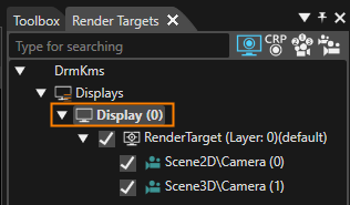
2. In the **Render Targets** panel, select **\[Display (0)\]**.
    
    
    - - The **\[Properties\]** panel will display **\[Display\]** properties.
            
            <div drawio-diagram="8399"><img src="https://doc316en.candera.eu/uploads/images/drawio/2025-05/drawing-5-1746775102.png" alt=""/></div>
3. In the **\[Display\]** section of the **\[Properties\]** panel configure the resolution as in the table below. <table><tbody><tr><td style="width: 100px; background-color: rgb(35, 111, 161);"><span style="color: rgb(255, 255, 255);">X Resolution  
    </span></td><th style="width: 50px;">640</th></tr><tr><td style="width: 100px; background-color: rgb(35, 111, 161);"><span style="color: rgb(255, 255, 255);">Y Resolution</span></td><td style="width: 50px;">960</td></tr></tbody></table>
4. Click **\[Save solution...\]** in the toolbar.
    
    
    - The Windows **\[Save As\]** dialog will appear.
        
        <div drawio-diagram="8400"><img src="https://doc316en.candera.eu/uploads/images/drawio/2025-05/drawing-5-1746775292.png" alt=""/></div>
5. In the **\[Save As\]** dialog choose a location and name for your solution and click **\[Save\]**. 
    - The solution is saved.


### Using Smart Importer

In our example we will use the Smart Importer to import a Photoshop .psd file. Smart Importer will analyze the PSD file and try to identify which controls are included in the picture. After some configuration effort you can directly create CGI Studio Controls wherever it is applicable.

#### Configuration of Header

1. Select **\[Import &gt; Smart Importer &gt; From Local File...\]** from the menu bar. 
    - A Windows Open dialog titled **Smart Importer** will be opened.
2. Select the following Photoshop file and press **\[Open\]**. 
    - The **\[Smart Importer\]** window is opened (please be patient, this may take a while).
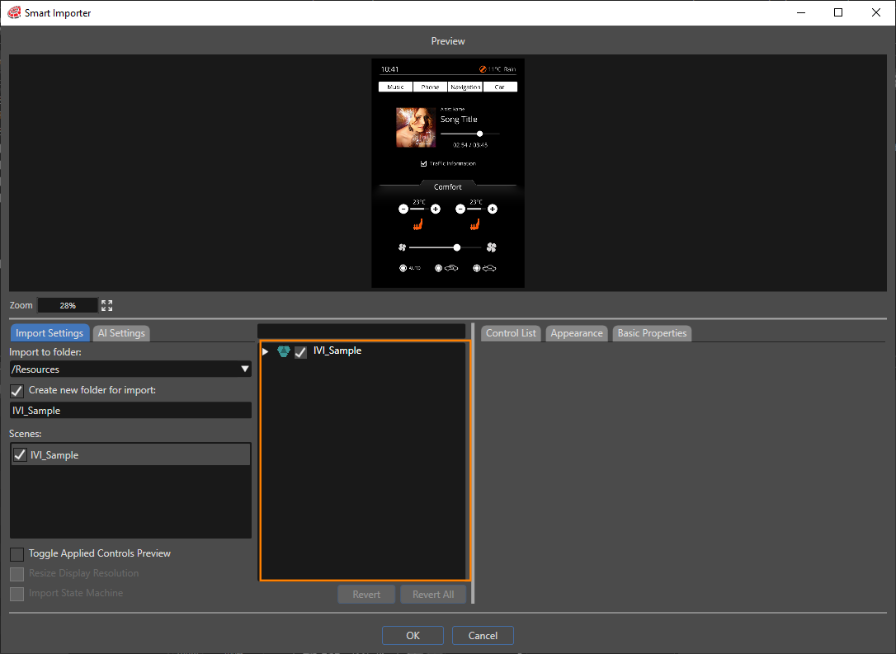
    - The Photoshop file's layers will be displayed in the **Layer Tree** area marked in orange in the image below.
    - The **Layer Tree** is displayed in tree style. Initially it is collapsed, but it can be expanded via double-clicking or using the triangle to the \[IVI\_Sample\]'s left.  
        <table border="1" class="align-left" style="border-collapse: collapse; border-width: 1px; width: 522px;"><tbody><tr><td style="background-color: rgb(35, 111, 161); width: 121.667px;"><span style="color: rgb(236, 240, 241);">File path  
        </span></td><td style="width: 414.667px;">&lt;cgi-studio-root&gt;\\cgi\_studio\_content\\2D\\PSD\\IVI\_Sample.psd</td></tr></tbody></table>
        
        <div drawio-diagram="8401"><img src="https://doc316en.candera.eu/uploads/images/drawio/2025-05/drawing-5-1746777849.png" alt=""/></div>
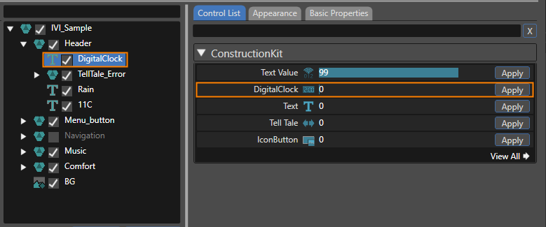
3. Expanding the **Layer Tree** navigate to **\[IVI\_Sample &gt; Header &gt; DigitalClock\]** and select **\[DigitalClock\]**. 
    - In the **Smart Importer's Preview** the DigitalClock on the top left is marked with a yellow border.
    - The **Control List** to the right displays applicable Controls.
4. In the **\[Control List\]** click on the **\[Apply\]** button on the right side of the **\[DigitalClock\]** control (see image below). 
    - Based on the Photoshop file's DigitalClock the Scene Composer control **DigitalClock** will be created when the import is done.
    - **DigitalClock** will be displayed in a different color and with a different icon in the **Layer Tree** to indicate successful assignment of a Scene Composer control. <div drawio-diagram="8404"><img src="https://doc316en.candera.eu/uploads/images/drawio/2025-05/drawing-5-1746782115.png" alt=""/></div>
5. Switch to the **\[Basic Properties\]** tab and tick the checkboxes noted in the table below. 
    - After import the created SceneComposer Control **DigitalClock** will be configured with these property values.  
        <table border="1" class="align-left" style="border-collapse: collapse; border-width: 1px; width: 230px;"><tbody><tr><td style="background-color: rgb(35, 111, 161); width: 150px;"><span style="color: rgb(236, 240, 241);">ShowFull24Hours</span></td><td style="width: 100;">TRUE</td></tr><tr><td style="background-color: rgb(35, 111, 161); width: 150px;"><span style="color: rgb(236, 240, 241);">ShowSeconds</span></td><td style="width: 100;">TRUE</td></tr></tbody></table>
6. In the **Layer Tree** select **\[TellTale\_Error\].**
    - In the **Smart Importer's Preview** the TellTale\_Error on the top right is marked with a yellow border.
    - The **Control List** panel to the right displays applicable Controls.
7. In the **Control List** panel click the **\[Apply\]** button next to **\[Tell Tale\]**.  
    
    - The Scene Composer Control **TellTale** is applied to the Photoshop file's **TellTale\_Error** layers.
    - In the **Appearance Tab** you can see that the **Telltale**'s properties **OnStateImage** and **OffStateImage** are automatically configured with the Photoshop file's layers OnStateImage and OffStateImage.
    - **TellTale\_Error** as well as its OnStateImage and OffStateImage will be displayed in a different color and with different icon in the **Layer Tree** to indicate successful assignment of a Scene Composer control.


#### Configuration of Menu Buttons

1. In the **Layer Tree** expand **\[Menu\_button\]**. 
    - The **Layer Tree** displays 4 **TextButtons**, each of which has 3 images (NormalImage, PressedImage and FocussedImage).
2. In the **Layer Tree** select **TextButton\_Car**.   
    
    - The **Control List** offers a list of Controls to apply.
3. In the **Control List** apply the Scene Composer control **TextButton**. 
    - In the **Appearance** tab you can see that NormalImage, PressedImage and FocussedImage have been configured automatically.
    - In the **Layer Tree** the **TextButton** has changed its color and its icon.
4. In the **\[Basic Properties\]** tab empty the textfield of the Text property (delete "Text..."). 
    - The textfield of property Text is empty.
5. Repeat the 3 steps above with the other **TextButtons** to achieve a configuration as in the table below. 
    - The menu buttons are configured for importing.  
        <table border="1" style="border-collapse: collapse; width: 69.3827%;"><colgroup><col style="width: 33.3333%;"></col><col style="width: 33.3333%;"></col><col style="width: 11.2847%;"></col><col style="width: 22.0486%;"></col></colgroup><tbody><tr><td class="align-center" style="background-color: rgb(35, 111, 161);"><span style="color: rgb(255, 255, 255);">**Target Layer**</span></td><td class="align-center" style="background-color: rgb(35, 111, 161);"><span style="color: rgb(255, 255, 255);">**Control List**</span></td><td class="align-center" colspan="2" style="background-color: rgb(35, 111, 161);"><span style="color: rgb(255, 255, 255);">**Basic Properties**</span></td></tr><tr><td>TextButton\_Car</td><td>TextButton</td><td>Text</td><td>(blank space)</td></tr><tr><td>TextButton\_Navigation</td><td>TextButton</td><td>Text</td><td>(blank space)</td></tr><tr><td>TextButton\_Phone</td><td>TextButton</td><td>Text</td><td>(blank space)</td></tr><tr><td>TextButton\_Music</td><td>TextButton</td><td>Text</td><td>(blank space)</td></tr></tbody></table>

#### Configuration of Music Tree  


<div class="contents" id="bkmrk-in-the%C2%A0layer-tree-ex-1"><div class="contents"><div class="textblock">1. In the **Layer Tree** expand **\[Music\]**. 
    - The **Layer Tree** displays among other things a Slider, DigitalClock\_Time, DigitalClock\_Total\_Time and a CheckBox.
2. In the **Layer Tree** select the target layer. Apply the controls in the **\[Control List\]** tab and configure the property values in the **\[Basic Properties\]** tab according to the table below. 
    - The controls of the Music part are configured for importing.  
        <table border="1" style="border-collapse: collapse; width: 600px;"><colgroup><col style="width: 130px;"></col><col style="width: 80px;"></col><col style="width: 110px;"></col><col style="width: 70px;"></col><col style="width: 80px;"></col></colgroup><tbody><tr><td class="align-center" style="background-color: rgb(35, 111, 161);"><span style="color: rgb(255, 255, 255);">**Target Layer**</span></td><td class="align-center" style="background-color: rgb(35, 111, 161);"><span style="color: rgb(255, 255, 255);">**Control List**</span></td><td class="align-center" colspan="3" style="background-color: rgb(35, 111, 161);"><span style="color: rgb(255, 255, 255);">**Basic Properties**</span></td></tr><tr><td rowspan="3">Slider</td><td rowspan="3">Slider</td><td>Value</td><td>Float</td><td>9000</td></tr><tr><td>Minimum</td><td>Float</td><td>0</td></tr><tr><td>Maximum</td><td>Float</td><td>18000</td></tr><tr><td rowspan="2">DigitalClock\_Time</td><td rowspan="2">DigitalClock</td><td>ShowFull24Hours</td><td>Boolean</td><td>TRUE</td></tr><tr><td>ShowSeconds  
        </td><td>Boolean</td><td>FALSE  
        </td></tr><tr><td rowspan="3">DigitalClock\_Total\_Time  
        </td><td rowspan="3">DigitalClock  
        </td><td>Time</td><td>UInt32</td><td>18000</td></tr><tr><td>ShowFull24Hours</td><td>Boolean</td><td>TRUE</td></tr><tr><td>ShowSeconds</td><td>Boolean</td><td>FALSE</td></tr><tr><td>CheckBox  
        </td><td>CheckBox  
        </td><td>Text</td><td>String</td><td>(blank space)</td></tr></tbody></table>

</div></div></div>#### Configuration of Comfort Tree  


<div class="contents" id="bkmrk-target-layer-control-0"><div class="contents">  
</div></div><div class="contents" id="bkmrk--17"><div class="contents"><div class="textblock">1. In the **Layer Tree** expand **\[Comfort &gt; Seat\_Left\]**. 
    - The **Layer Tree** displays among other things Seat\_Left with TextValue\_Temperature, Icon\_Button\_+, Icon\_Button\_-, ProgressBar and SeatHeating\_Left.
2. In the **Layer Tree** select the **Seat\_Left**'s target layer. Apply the controls in the **\[Control List\]** tab and configure the property values in the **\[Basic Properties\]** tab according to the table below. 
    - The controls of Comfort's Seat\_Left are configured for importing. <table border="1" style="border-collapse: collapse; width: 600px;"><colgroup><col style="width: 130px;"></col><col style="width: 80px;"></col><col style="width: 110px;"></col><col style="width: 70px;"></col><col style="width: 80px;"></col></colgroup><tbody><tr><td class="align-center" colspan="5" style="background-color: rgb(0,0,0);">**<span style="color: rgb(255,255,255);">Seat\_Left</span>**</td></tr><tr><td class="align-center" style="background-color: rgb(35, 111, 161);"><span style="color: rgb(255, 255, 255);">**Target Layer**</span></td><td class="align-center" style="background-color: rgb(35, 111, 161);"><span style="color: rgb(255, 255, 255);">**Control List**</span></td><td class="align-center" colspan="3" style="background-color: rgb(35, 111, 161);"><span style="color: rgb(255, 255, 255);">**Basic Properties**</span></td></tr><tr><td rowspan="2">TextValue\_Temperature</td><td rowspan="2">Text Value</td><td>Value</td><td>Float</td><td>23</td></tr><tr><td>FormatText</td><td>String</td><td>%02d</td></tr><tr><td>Icon\_Button\_+</td><td>IconButton</td><td> </td><td> </td><td> </td></tr><tr><td>Icon\_Button\_-</td><td>IconButton</td><td> </td><td> </td><td> </td></tr><tr><td rowspan="3">ProgressBar</td><td rowspan="3">ProgressBar</td><td>Value</td><td>Float</td><td>23</td></tr><tr><td>Minimum</td><td>Float</td><td>16</td></tr><tr><td>Maximum</td><td>Float</td><td>28</td></tr><tr><td>SeatHeating\_Left</td><td>CheckBox</td><td>Text</td><td>String</td><td>(blank space)</td></tr></tbody></table>
3. In the **Layer Tree** expand **\[Comfort &gt; Seat\_Right\]**. 
    - The **Layer Tree** displays among other things Seat\_Right with TextValue\_Temperature, Icon\_Button\_+, Icon\_Button\_-, ProgressBar and SeatHeating\_Left.
4. In the **Layer Tree** select the **Seat\_Right**'s target layer. Apply the controls in the **\[Control List\]** tab and configure the property values in the **\[Basic Properties\]** tab according to the table below. 
    - The controls of Comfort's Seat\_Right are configured for importing. <table border="1" style="border-collapse: collapse; width: 600px;"><colgroup><col style="width: 166px;"></col><col style="width: 102px;"></col><col style="width: 140px;"></col><col style="width: 89px;"></col><col style="width: 102px;"></col></colgroup><tbody><tr><td class="align-center" colspan="5" style="background-color: rgb(0,0,0);">**<span style="color: rgb(255,255,255);">Seat\_Right</span>**</td></tr><tr><td class="align-center" style="background-color: rgb(35, 111, 161);"><span style="color: rgb(255, 255, 255);">**Target Layer**</span></td><td class="align-center" style="background-color: rgb(35, 111, 161);"><span style="color: rgb(255, 255, 255);">**Control List**</span></td><td class="align-center" colspan="3" style="background-color: rgb(35, 111, 161);"><span style="color: rgb(255, 255, 255);">**Basic Properties**</span></td></tr><tr><td rowspan="2">TextValue\_Temperature</td><td rowspan="2">Text Value</td><td>Value</td><td>Float</td><td>23</td></tr><tr><td>FormatText</td><td>String</td><td>%02d</td></tr><tr><td>Icon\_Button\_+</td><td>IconButton</td><td> </td><td> </td><td> </td></tr><tr><td>Icon\_Button\_-</td><td>IconButton</td><td> </td><td> </td><td> </td></tr><tr><td rowspan="3">ProgressBar</td><td rowspan="3">ProgressBar</td><td>Value</td><td>Float</td><td>23</td></tr><tr><td>Minimum</td><td>Float</td><td>16</td></tr><tr><td>Maximum</td><td>Float</td><td>28</td></tr><tr><td>SeatHeating\_Right</td><td>CheckBox</td><td>Text</td><td>String</td><td>(blank space)</td></tr></tbody></table>
5. In the Layer Tree expand **\[Comfort &gt; Fan\]**. 
    - The **Layer Tree** displays among other things a Slider.
6. In the **Layer Tree** select **Fan**. Apply the control in the **\[Control List\]** tab and configure the property values in the **\[Basic Properties\]** tab according to the table below. 
    - The controls of the Comfort's Fan are configured for importing. <table border="1" style="border-collapse: collapse; width: 600px;"><colgroup><col style="width: 166px;"></col><col style="width: 102px;"></col><col style="width: 140px;"></col><col style="width: 89px;"></col><col style="width: 102px;"></col></colgroup><tbody><tr><td class="align-center" colspan="5" style="background-color: rgb(0,0,0);">**<span style="color: rgb(255,255,255);">Fan</span>**</td></tr><tr><td class="align-center" style="background-color: rgb(35, 111, 161);"><span style="color: rgb(255, 255, 255);">**Target Layer**</span></td><td class="align-center" style="background-color: rgb(35, 111, 161);"><span style="color: rgb(255, 255, 255);">**Control List**</span></td><td class="align-center" colspan="3" style="background-color: rgb(35, 111, 161);"><span style="color: rgb(255, 255, 255);">**Basic Properties**</span></td></tr><tr><td>Slider</td><td>Slider</td><td> </td><td> </td><td> </td></tr></tbody></table>
7. In the Layer Tree expand **\[Comfort &gt; Air\]**. 
    - The **Layer Tree** displays among other things a RadioButton\_Outside air, RadioButton\_Inside air and RadioButton\_AUTO.
8. In the **Layer Tree** select **Air**. Apply the control in the **\[Control List\]** tab and configure the property values in the **\[Basic Properties\]** tab according to the table below. 
    - The RadioButtons are configured for importing. <table border="1" style="border-collapse: collapse; width: 600px;"><colgroup><col style="width: 171px;"></col><col style="width: 97px;"></col><col style="width: 78px;"></col><col style="width: 106px;"></col><col style="width: 147px;"></col></colgroup><tbody><tr><td class="align-center" colspan="5" style="background-color: rgb(0,0,0);">**<span style="color: rgb(255,255,255);">Air</span>**</td></tr><tr><td class="align-center" style="background-color: rgb(35, 111, 161);"><span style="color: rgb(255, 255, 255);">**Target Layer**</span></td><td class="align-center" style="background-color: rgb(35, 111, 161);"><span style="color: rgb(255, 255, 255);">**Control List**</span></td><td class="align-center" colspan="3" style="background-color: rgb(35, 111, 161);"><span style="color: rgb(255, 255, 255);">**Basic Properties**</span></td></tr><tr><td>RadioButton\_Outside air</td><td>RadioButton</td><td>Text</td><td>String</td><td>(blank space)</td></tr><tr><td>RadioButton\_Inside air  
        </td><td>RadioButton  
        </td><td>Text  
        </td><td>String  
        </td><td>(blank space)</td></tr><tr><td>RadioButton\_AUTO  
        </td><td>RadioButton  
        </td><td>Text  
        </td><td>String  
        </td><td>(blank space)</td></tr></tbody></table>
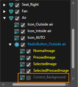
9. When expanding these **RadioButtons** in the Layer Tree, you can see that each of them contains a **Control\_Background**. **Uncheck the checkbox** of these Control\_Background images in the Layer Tree as seen in the image below. 
    - All images for the RadioButtons are configured for importing  
        <table border="1" style="border-collapse: collapse; width: 635px;"><colgroup><col style="width: 301px;"></col><col style="width: 334px;"></col></colgroup><tbody><tr><td class="align-center" colspan="2" style="background-color: rgb(0,0,0);">**<span style="color: rgb(255,255,255);">\[Air\] In the Layer Tree Panel  
        </span>**</td></tr><tr><td class="align-center" style="background-color: rgb(35, 111, 161);"><span style="color: rgb(255, 255, 255);">**Target Layer**</span></td><td class="align-center" style="background-color: rgb(35, 111, 161);"><span style="color: rgb(255, 255, 255);">**Configuration Details** </span></td></tr><tr><td>RadioButton\_Outside air/Control\_Background</td><td>disable (uncheck checkbox in Layer Tree)  
        </td></tr><tr><td>RadioButton\_Inside air/Control\_Background  
        </td><td>disable (uncheck checkbox in Layer Tree)</td></tr><tr><td>RadioButton\_AUTO/Control\_Background  
        </td><td>disable (uncheck checkbox in Layer Tree)</td></tr></tbody></table>
        
        <div drawio-diagram="8405"><img src="https://doc316en.candera.eu/uploads/images/drawio/2025-05/drawing-5-1746798417.png" alt=""/></div>

</div></div></div><div class="contents" id="bkmrk-target-layer-control-3"></div>#### Configuration of Navigation Tree

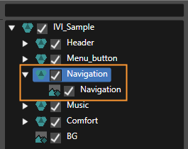
<div class="contents" id="bkmrk--42"><div class="contents">1. In the Layer Tree enable the Navigation tree by checking the checkbox to the left of **Navigation**. 
    - Navigation will be enabled as seen in the image below.  
        <div drawio-diagram="7102"><img src="https://doc316en.candera.eu/uploads/images/drawio/2024-10/drawing-5-1729262508.png" alt=""/></div>

</div></div>#### Completing the Import

1. Since configuration is done now, click the **\[OK\]** button on the bottom of the **Smart Importer** window. 
    - The Photoshop file will be imported with all configured controls and settings.
    - The imported content can be viewed in the Scene Composer's Solution Explorer.
    - The imported scene IVI\_Sample will be displayed in the Scene Editor.
    - In the Scene Tree panel you can confirm that all configured controls and settings made in Smart Importer have been applied during the import.
2. In the Scene Tree panel right-click on the Navigation GroupNode and uncheck "Node Rendering Enabled" in the context menu. Alternatively press &lt;Ctrl + E&gt; on your keyboard. 
    - The Navigation GroupNode will not be rendered (i.e. displayed) by default.
3. In the Render Targets panel enable displaying the imported "IVI\_Sample\\DocumentView" camera in display design. 
    - Rendering of camera "IVI\_Sample\\DocumentView" is enabled.

<div class="contents" id="bkmrk--50"><div class="contents">  
</div></div>

# Part 2: Set-up Scene

This section uses the scene imported in Part 1. The steps describe how to group RadioButtons with a GroupBox so that only one of the RadioButtons can be selected at a time.

#### Activating the Imported Scene

1. In the Solution Explorer navigate to the imported **IVI\_Sample scene** and **move** it to the solution's scene folder via drag and drop. Please see the origin and destination paths in the table below. 
    - The IVI\_Sample scene has been moved to the Solution's Scenes folder, where you can also find Scene2D and Scene3D.
        
        <table style="width: 600px;"><tbody><tr><td style="width: 150px; background-color: rgb(35, 111, 161);"><span style="color: rgb(255, 255, 255);">Origin Path  
        </span></td><td>Solution &gt; Resources &gt; IVI\_Sample &gt; Scenes &gt; **IVI\_Sample**  
        </td></tr><tr><td style="background-color: rgb(35, 111, 161);"><span style="color: rgb(255, 255, 255);">Destination Path  
        </span></td><td>Solution &gt; Scenes &gt; **IVI\_Sample**  
        </td></tr></tbody></table>
2. Delete the Scene2D and Scene3D that are in folder Solutions &gt; Scenes. 
    - Scene2D and Scene3D are deleted, IVI\_Sample scene is the only scene in this folder.
3. Double-click the **IVI\_Sample scene** to **open** it. 
    - IVI\_Sample scene is displayed in the Scene Editor.
    - IVI\_Sample scene is displayed in the Scene Tree panel.
4. In the **Scene Tree** panel expand to **\[IVI\_Sample &gt; IVI\_Sample &gt; Comfort &gt; Air\]**. 
    - In the Scene Tree panel the air flow RadioButtons are visible.
5. From the Toolbox panel's **\[Nodes 2D\]** section drag a **\[Group\]** node into the **Scene Tree** panel directly onto the **\[Air\]** Group node. 
    - In the Scene Tree panel a new **\[Group\]** node has been created inside the **\[Air\]** Group node.
6. In the Scene Tree panel select the following **RadioButtons** and move them into the newly created **\[Group\]** node via drag and drop. 
    - The respective RadioButton nodes are grouped together in the **\[Group\]** node.
        
        <table style="width: 400px;"><tbody><tr><td style="width: 150px; background-color: rgb(35, 111, 161);"><span style="color: rgb(255, 255, 255);">RadioButtons  
        </span></td><td>RadioButton\_Outside air</td></tr><tr><td style="background-color: rgb(35, 111, 161);"><span style="color: rgb(255, 255, 255);">  
        </span></td><td>RadioButton\_Inside air</td></tr><tr><td style="background-color: rgb(35, 111, 161);"><span style="color: rgb(255, 255, 255);">  
        </span></td><td>RadioButton\_AUTO  
        </td></tr></tbody></table>
7. From the Toolbox panel's **\[Controls\]** section under **\[Container\]** drag a **GroupBox** into the Scene Tree panel directly onto the **\[Air\]** Group node. 
    - A **GroupBox** node is created and is visible in the Scene Tree panel as last entry of the **\[Air\]** Group node.
8. In the Scene Tree panel click on the **little triangle** on the left of the newly created **GroupBox** node. 
    - The **GroupBox** node is **expanded** in the Scene Tree panel and a **Content** anchor gets visible.
9. In the Scene Tree panel drag the **\[Group\]** node with the RadioButtons onto the **\[GroupBox\]**'s Content anchor. 
    - The RadioButtons are now grouped together.
    - You can select **only one** of the grouped radio buttons at a time.
10. In the Scene Tree panel select the **GroupBox** node. In the Properties panel's **\[Control\]** section configure the properties according to the table below.  
    
    - **Enable Background** is set to FALSE.
    - The GroupBox node's background is disabled.  
        <p class="callout info">To easily configure the Default Selected Object lock the Properties panel to the **GroupBox** by clicking on the padlock in the Properties panel's top right corner. From the Scene Tree panel drag **RadioButton\_AUTO** onto the **Default Selected Object** property and release as soon as the cursor changes. Unlock the Properties panel by clicking on the padlock again.</p>
        
        <table style="width: 600px;"><tbody><tr><td style="width: 450px; background-color: rgb(35, 111, 161);"><span style="color: rgb(255, 255, 255);">Default Selected Object  
        </span></td><td style="width: 150px; background-color: rgb(35, 111, 161);"><span style="color: rgb(255, 255, 255);">Enable Background</span>  
        </td></tr><tr><td>IVI\_Sample &gt; Comfort &gt; Air &gt; GroupBox &gt; Content &gt; Group &gt; RadioButton\_AUTO</td><td>FALSE  
        </td></tr></tbody></table>

<div class="contents" id="bkmrk--0"><div class="contents">  
</div></div>

# Part 3: Configure Behaviors

This page explains how to configure interaction between various components of the scene with Behaviors using Fusion.

<div class="contents" id="bkmrk-changing-the-playbac"><div class="contents"><div class="textblock">- Changing the playback time value by moving the slider knob for playback music
- Changing the state of the temperature progress bar by pressing the seat heater buttons

</div></div></div>### Configuring the Music's Playback Time Slider  


1. In the Scene Tree panel navigate to and select the **Slider** control, which can be found following the path below. 
    - The Slider Control is selected.  
        <table border="1" class="align-left" style="border-collapse: collapse; border-width: 1px; width: 570px;"><tbody><tr><td style="background-color: rgb(35, 111, 161); width: 150px;"><span style="color: rgb(236, 240, 241);">Scene Tree Path  
        </span></td><td style="width: 419px;">IVI\_Sample &gt; IVI\_Sample &gt; Music &gt; **Slider**  
        </td></tr></tbody></table>
2. In the Menu select **\[View &gt; Fusion &gt; Fusion\]**.  
    
    - The Fusion editor will be opened, hiding the Scene Editor.
    - The **Slider Fusion Node** is displayed as Top node with a set of properties.
3. In the **\[Slider\]** Fusion Node drag the Behaviors connector circle to the right and release the mouse. 
    - A **Select Behavior** dialog will be opened.
    - This dialog has an input field on top and a list of behaviors organized as a tree on the bottom.
    - This list of behaviors is similar to the one in the Toolbox panel's **\[Behaviors\]** section.
4. In the Select Behavior dialogue's input field start typing "**Forward Value**".  
    
    - While you are typing the list of behaviors gets smaller as the content of the input field serves as a filter.
5. In the Select Behaviors dialog **double-click** the **Forward Value** behavior. 
    - In Fusion a new **\[Forward Value\]** node is created, which is connected to the Slider's Behaviors connector.
6. In the **\[Forward Value\]** node click the search icon next to the property "Target Node". 
    - The **Choose Item** dialog will be opened.
7. Select the IVI\_Sample scene's **DigitalClock\_Time** control, which can be found following the path below and click **\[OK\]**. 
    - **DigitalClock\_Time** is set as Forward Value's TargetNode.
    - When the Slider's value is changed, the value will be forwarded to DigitalClock\_Time.  
        <table border="1" class="align-left" style="border-collapse: collapse; border-width: 1px; width: 570px;"><tbody><tr><td style="background-color: rgb(35, 111, 161); width: 100px;"><span style="color: rgb(236, 240, 241);">Path</span></td><td>IVI\_Sample &gt; IVI\_Sample &gt; Music &gt; **DigitalClock\_Time**</td></tr></tbody></table>

<div class="contents" id="bkmrk--1"><div class="contents">  
</div></div>### Configuring Seat Heater Setting

#### Creating Fusion Nodes

1. In the Scene Tree panel select the Seat\_Right's "**Icon\_Button\_-**", which can be found following the path below. 
    - Fusion displays the Fusion Node for "**Icon\_Button\_-**".  
        <table border="1" class="align-left" style="border-collapse: collapse; border-width: 1px; width: 570px;"><tbody><tr><td style="background-color: rgb(35, 111, 161); width: 100px;"><span style="color: rgb(236, 240, 241);">Path</span></td><td>IVI\_Sample &gt; IVI\_Sample &gt; Comfort&gt; Seat\_Right &gt; **Icon\_Button\_-**</td></tr></tbody></table>
2. In Fusion drag the Fusion Node's Behaviors connector to the right and release the mouse button.  
    
    - The Select Behavior dialog will open.
3. Find the "**Event Handler**" behavior and double-click it. 
    - A Fusion node for the **Event Handler** behavior is created.
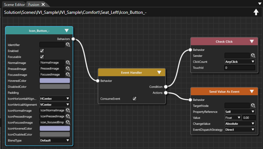
4. Using the Event Handler's Condition connector connect a **Check Click** condition. 
    - A Fusion node for the Check Click condition is created.
5. Using the Event Handler's Actions connector, connect a **Send Value As Event** behavior.  
    
    - A Fusion node for the **Send Value As Event** behavior is created.
    - The Fusion diagram will look like in the image below. <div drawio-diagram="8468"><img src="https://doc316en.candera.eu/uploads/images/drawio/2025-06/drawing-5-1751007068.png" alt=""/></div>
6. Select the 3 Fusion Nodes you have just created **(Event Handler, Check Click, Send Value As Event)** and copy them either using the context menu "Copy" or via the keyboard shortcut &lt;Ctrl + C&gt;. 
    - Fusion Nodes are copied and ready to be pasted into another Fusion diagram.
7. Select the IconButtons in the table below one by one and paste these Fusion Nodes into their Fusion diagrams either using the context menu "Paste" or via the keyboard shortcut &lt;Ctrl + P&gt;. 
    - EventHandler, Check Click condition and Send Value As Event behavior have been created for all 4 seat heating Icon\_Buttons.  
        <table border="1" class="align-left" style="border-collapse: collapse; border-width: 1px; width: 570px;"><tbody><tr><td style="background-color: rgb(35, 111, 161); width: 100px;"><span style="color: rgb(236, 240, 241);">Path</span></td><td>IVI\_Sample &gt; IVI\_Sample &gt; Comfort&gt; Seat\_Right &gt; **Icon\_Button\_+**</td></tr><tr><td style="background-color: rgb(35, 111, 161); width: 100px;"><span style="color: rgb(236, 240, 241);">Path  
        </span></td><td>IVI\_Sample &gt; IVI\_Sample &gt; Comfort&gt; Seat\_Left &gt; **Icon\_Button\_-**</td></tr><tr><td style="background-color: rgb(35, 111, 161); width: 100px;"><span style="color: rgb(236, 240, 241);">Path  
        </span></td><td>IVI\_Sample &gt; IVI\_Sample &gt; Comfort&gt; Seat\_Left &gt; **Icon\_Button\_+**</td></tr></tbody></table>

#### Configuring Value Behaviors  


When pressing Icon\_Button\_-, the value should be decreased (-1,00) and when pressing Icon\_Button\_+, the value should be increased (+1,00). These value changes need to be reflected in the corresponding ProgressBar, which will be set as TargetNode.

1. In Scene Tree panel select the Icon\_Buttons of Seat\_Right and Seat\_Left one by one. In Fusion configure their **Send Value As Event** Nodes that you created in "Creating fusion nodes" as in the table below. 
    - The Send Value As Event Nodes are fully configured and functional.  
        <table border="1" class="align-left" style="border-collapse: collapse; border-width: 1px; width: 570px;"><tbody><tr><td style="background-color: rgb(35, 111, 161); width: 110px;"><span style="color: rgb(255, 255, 255);">**Seat\_Right**  
        </span></td><td style="background-color: rgb(35, 111, 161); width: 200px;"><span style="color: rgb(255, 255, 255);">Icon\_Button\_-</span>  
        </td><td style="background-color: rgb(35, 111, 161); width: 200px;"><span style="color: rgb(255, 255, 255);">Icon\_Button\_+</span></td></tr><tr><td style="background-color: rgb(35, 111, 161); width: 110px;"><span style="color: rgb(236, 240, 241);">TargetNode  
        </span></td><td>Seat\_Right &gt; ProgressBar  
        </td><td>Seat\_Right &gt; ProgressBar  
        </td></tr><tr><td style="background-color: rgb(35, 111, 161); width: 110px;"><span style="color: rgb(236, 240, 241);">Value  
        </span></td><td>-1,00  
        </td><td>1,00  
        </td></tr><tr><td style="background-color: rgb(35, 111, 161); width: 110px;"><span style="color: rgb(236, 240, 241);">Change Value  
        </span></td><td>Relative  
        </td><td>Relative  
        </td></tr></tbody></table>


        <table border="1" class="align-left" style="border-collapse: collapse; border-width: 1px; width: 570px;"><tbody><tr><td style="background-color: rgb(35, 111, 161); width: 110px;"><span style="color: rgb(255, 255, 255);">**Seat\_Left**  
        </span></td><td style="background-color: rgb(35, 111, 161); width: 200px;"><span style="color: rgb(255, 255, 255);">Icon\_Button\_-</span>  
        </td><td style="background-color: rgb(35, 111, 161); width: 200px;"><span style="color: rgb(255, 255, 255);">Icon\_Button\_+</span></td></tr><tr><td style="background-color: rgb(35, 111, 161); width: 110px;"><span style="color: rgb(236, 240, 241);">TargetNode  
        </span></td><td>Seat\_Left &gt; ProgressBar  
        </td><td>Seat\_Left &gt; ProgressBar  
        </td></tr><tr><td style="background-color: rgb(35, 111, 161); width: 110px;"><span style="color: rgb(236, 240, 241);">Value  
        </span></td><td>-1,00  
        </td><td>1,00  
        </td></tr><tr><td style="background-color: rgb(35, 111, 161); width: 110px;"><span style="color: rgb(236, 240, 241);">Change Value  
        </span></td><td>Relative  
        </td><td>Relative  
        </td></tr></tbody></table>
2. In the Scene Tree panel select the **Seat\_Right &gt; ProgressBar**. In Fusion drag the ProgressBar's Behaviors connector to the right and release the mouse button.   
    
    - The Select Behavior dialog box will open.
3. Find the "**ForwardValue**" behavior and double-click it. 
    - A Fusion node for **ForwardValue** behavior is created.
4. Configure the ForwardValue behavior's **TargetNode** to the Seat\_Right's TextValue\_Temperature node. 
    - The ProgressBar is configured to forward its value to the respective TextValue\_Temperature node.  
        <table border="1" class="align-left" style="border-collapse: collapse; border-width: 1px; width: 570px;"><tbody><tr><td style="background-color: rgb(35, 111, 161); width: 90px;"><span style="color: rgb(236, 240, 241);">  
        </span></td><td style="background-color: rgb(35, 111, 161); width: 480.333px;"><span style="color: rgb(255, 255, 255);">**Seat\_Right &gt; ProgressBar --&gt; Fusion ForwardValue Node**</span>  
        </td></tr><tr><td style="background-color: rgb(35, 111, 161); width: 90px;"><span style="color: rgb(236, 240, 241);">TargetNode</span></td><td style="width: 480.333px;">IVI\_Sample &gt; IVI\_Sample &gt; Comfort&gt; Seat\_Right &gt; TextValue\_Temperature  
        </td></tr></tbody></table>
5. Repeat steps 2 - 4 with **Seat\_Left &gt; ProgressBar** configure the TargetNode as in the table below.  
    
    - The ProgressBar is configured to forward its value to the respective TextValue\_Temperate node.  
        <table border="1" class="align-left" style="border-collapse: collapse; border-width: 1px; width: 570px;"><tbody><tr><td style="background-color: rgb(35, 111, 161); width: 90px;"><span style="color: rgb(236, 240, 241);">  
        </span></td><td style="background-color: rgb(35, 111, 161); width: 480.333px;"><span style="color: rgb(255, 255, 255);">**Seat\_Left &gt; ProgressBar --&gt; Fusion ForwardValue Node**</span></td></tr><tr><td style="background-color: rgb(35, 111, 161); width: 90px;"><span style="color: rgb(236, 240, 241);">TargetNode</span></td><td style="width: 480.333px;">IVI\_Sample &gt; IVI\_Sample &gt; Comfort&gt; Seat\_Left &gt; TextValue\_Temperature  
        </td></tr></tbody></table>

<div class="contents" id="bkmrk--6"></div>### Checking the Configuration in Player  


Use the Player to check the functionality of the behaviors configured in Fusion.

#### Checking the Behavior's Functionality

In the Player you can test the interactivity between the music Slider and the numeric display of the playback time.

1. Save your solution and click the \[Play selected scenario...\] icon on the toolbar to start the Player.  
    
    - Three windows will open, and you can see that the simulation display shows the IVI\_Sample scene,
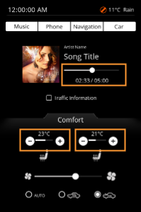
2. In the simulation display drag the slider's knob below the "Song Title".  
    
    - While dragging you can watch the digital playback time, which is displayed below the slider, increase and decrease accordingly.
3. In the scene's lower "Comfort" part click on the \[+\] and \[-\] buttons for seat heating.
    
    
    - The progress bar will change its value
    - The numeric temperature displayed above the progress bar will be updated according to your operation.  
        <div drawio-diagram="8408"><img src="https://doc316en.candera.eu/uploads/images/drawio/2025-05/drawing-5-1748000000.png" alt=""/></div>

<div class="contents" id="bkmrk-drag-a-progress-bar-"><div class="contents"><div class="textblock">  
</div></div></div>

# Part 4: Animation settings

This section describes how to create an animation that animates the position and size of an object. Here, the thumbnail image of the music is animated.

### Configuring the Animation

1. In the Scene Tree panel navigate to the RenderNode2D **Cover** and right-click it. Select \[Add Animated Property...\] from the context menu. The **Cover** node can be found in the path below. 
    - The **Property Animation Configuration** dialog will be opened.  
        <table border="1" class="align-left" style="border-collapse: collapse; border-width: 1px; width: 570px;"><tbody><tr><td style="background-color: rgb(35, 111, 161); width: 150px;"><span style="color: rgb(236, 240, 241);">Scene Tree Path  
        </span></td><td>IVI\_Sample &gt; IVI\_Sample &gt; Music &gt; **Cover**</td></tr></tbody></table>
2. In the **Property Animation Configuration** apply the settings as in the table below and press **\[OK\]**. 
    - A new animation **MyAnimation** has been created.
    - The new animation is visible in the Solution Explorer.
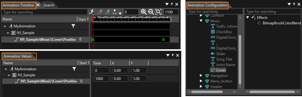
    - Scene Composer switches to **Animation Design**. Three new panels are visible: 
        - **Animation Configuration** panel
        - **Animation Timeline** panel
        - **Animation Values** panel
        
        <p class="callout info">To switch back to Scene Design press the **\[Scene Design\]** button in Scene Composer's main toolbar.</p>
        
        <table border="1" class="align-left" style="border-collapse: collapse; border-width: 1px; width: 570px;"><tbody><tr><td style="background-color: rgb(35, 111, 161); width: 213px;"><span style="color: rgb(236, 240, 241);">Create new Animation  
        </span></td><td style="width: 356.333px;">MyAnimation</td></tr><tr><td style="background-color: rgb(35, 111, 161); width: 213px;"><span style="color: rgb(236, 240, 241);">Location  
        </span></td><td style="width: 356.333px;">/Animations  
        </td></tr><tr><td style="background-color: rgb(35, 111, 161); width: 213px;"><span style="color: rgb(236, 240, 241);">Property  
        </span></td><td style="width: 356.333px;">Position  
        </td></tr><tr><td style="background-color: rgb(35, 111, 161); width: 213px;"><span style="color: rgb(236, 240, 241);">Interpolation  
        </span></td><td style="width: 356.333px;">Spline</td></tr><tr><td style="background-color: rgb(35, 111, 161); width: 213px;"><span style="color: rgb(236, 240, 241);">Create new keyframe sequence  
        </span></td><td style="width: 356.333px;">X and Y  
        </td></tr></tbody></table>
        
        <div drawio-diagram="8411"><img src="https://doc316en.candera.eu/uploads/images/drawio/2025-05/drawing-5-1748007940.png" alt=""/></div>
        
        <div class="contents" id="bkmrk--2"></div>
3. In the **Animation Configuration** panel's scene tree select the same **Cover** node as before. In the Properties panel click on the **\[+\]** button. 
    - The Property Animation Configuration will be opened.
4. In the **Property Animation Configuration** apply the settings as in the table below and press **\[OK\]**. 
    - A new keyframe sequence for the property "scale" has been added to the existing animation **MyAnimation.**
    - This can be seen in the **Animation Timeline**, in the **Animation Values** panel and in the **Properties** panel.  
        <table border="1" class="align-left" style="border-collapse: collapse; border-width: 1px; width: 570px;"><tbody><tr><td style="background-color: rgb(35, 111, 161); width: 213px;"><span style="color: rgb(236, 240, 241);">Selected Animation  
        </span></td><td style="width: 356.333px;">MyAnimation</td></tr><tr><td style="background-color: rgb(35, 111, 161); width: 213px;"><span style="color: rgb(236, 240, 241);">Property  
        </span></td><td style="width: 356.333px;">Scale  
        </td></tr><tr><td style="background-color: rgb(35, 111, 161); width: 213px;"><span style="color: rgb(236, 240, 241);">Interpolation  
        </span></td><td style="width: 356.333px;">Spline</td></tr><tr><td style="background-color: rgb(35, 111, 161); width: 213px;"><span style="color: rgb(236, 240, 241);">Create new keyframe sequence  
        </span></td><td style="width: 356.333px;">X and Y  
        </td></tr></tbody></table>
5. In the **Animation Values** panel select the animated properties and enter the configurations from the table below. 
    - The keyframes for the animated properties are fully configured.  
        <table border="1" class="align-left" style="border-collapse: collapse; border-width: 1px; width: 250px;"><tbody><tr><td colspan="3" style="background-color: rgb(35, 111, 161);"><span style="color: rgb(255, 255, 255);">IVI\_Sample\\Music\\Cover\\**Position**\\XY</span></td></tr><tr><td style="background-color: rgb(53, 152, 219);"><span style="color: rgb(255, 255, 255);">**Time**</span></td><td style="background-color: rgb(53, 152, 219);"><span style="color: rgb(255, 255, 255);">**X**</span></td><td style="background-color: rgb(53, 152, 219);"><span style="color: rgb(255, 255, 255);">**Y**</span></td></tr><tr><td>0</td><td>138.00</td><td>140.00</td></tr><tr><td>1000</td><td>104.00  
        </td><td>207.00</td></tr></tbody></table>
        
        <table border="1" class="align-left" style="border-collapse: collapse; border-width: 1px; width: 250px;"><tbody><tr><td colspan="3" style="background-color: rgb(35, 111, 161);"><span style="color: rgb(255, 255, 255);">IVI\_Sample\\Music\\Cover\\**Scale**\\XY</span></td></tr><tr><td style="background-color: rgb(53, 152, 219);"><span style="color: rgb(255, 255, 255);">**Time**</span></td><td style="background-color: rgb(53, 152, 219);"><span style="color: rgb(255, 255, 255);">**X**</span></td><td style="background-color: rgb(53, 152, 219);"><span style="color: rgb(255, 255, 255);">**Y**</span></td></tr><tr><td>0</td><td>0.50</td><td>0.50</td></tr><tr><td>1000</td><td>1.00</td><td>1.00</td></tr></tbody></table>

### Check Animation in Player

Use the Player to check the configured animation.

1. Save your solution and click the \[Play selected scenario...\] icon on the toolbar to start the Player.  
    
    - Three windows will open, and you can see that the simulation display shows the IVI\_Sample scene.
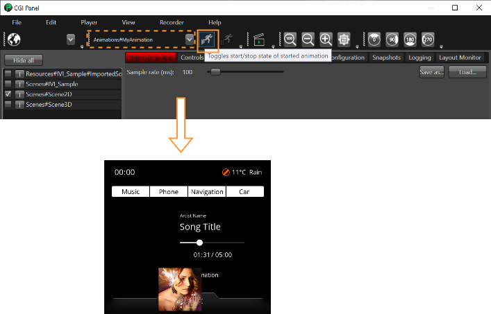
2. In CGI Panel below the menu select your animation from the drop-down list and press the "run animation" button right next to the drop-down list.  
    
    - The configured animation of the Cover image will be started and played once in the simulation display.
    
    <div drawio-diagram="4428"><img src="https://doc316en.candera.eu/uploads/images/drawio/2023-09/drawing-5-1696002805.png" alt=""/></div>

# Part 5: Configure State Machine

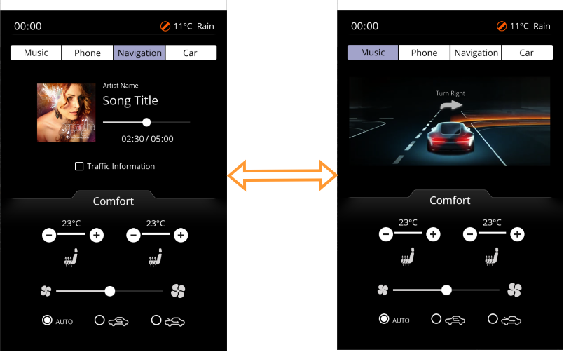
State Machine feature is used to configure a Music State and a Navigation State. Transitions are created from one state to the other. Behaviors are set up using the powerful Fusion Editor. These behaviors trigger the configured transitions and set GroupNodes visible and invisible.

### Configuring the State Machine

Using the State Machine Editor configure the already existing GlobalStateMachine to incorporate 2 states: Music and Navigation. Connect these states with transitions in both directions. Define these transitions to be triggered by TextButton\_Music and TextButton\_Navigation.

1. In Solution Explorer navigate to the **GlobalStateMachine** which can be found following the path below. **Double-click** the **GlobalStateMachine**. 
    - The **State Machine Editor** will be opened and GlobalStateMachine will be displayed.
    - GlobalStateMachine consists of an Initial State (circle) and a State (rectangle) called "State" and a transition from the Initial State to the State.  
        <table border="1" class="align-left" style="border-collapse: collapse; border-width: 1px; width: 570px;"><tbody><tr><td style="background-color: rgb(35, 111, 161); width: 160px;"><span style="color: rgb(236, 240, 241);">Solution Explorer Path  
        </span></td><td style="width: 409.333px;">Solution &gt; State Machines &gt; **GlobalStateMachine**  
        </td></tr></tbody></table>
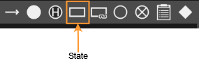
2. In **State Machine Editor** add another state by dragging a State from the upper right toolbar and dropping it into the State Machine diagram below the already existing state. 
    - A new state "State\_1" will be created in the State Machine Editor.  
        <div drawio-diagram="7175"><img src="https://doc316en.candera.eu/uploads/images/drawio/2024-10/drawing-5-1729864735.png" alt=""/></div>
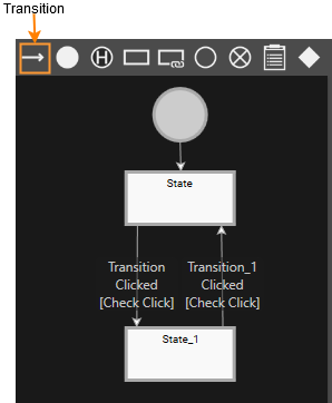
3. In State Machine Editor add a transition from "State" to "State\_1" and another transition from "State\_1" to "State". To do this drag a Transition from the toolbar onto the outgoing state (e.g. State) then click onto the second state (e.g. State\_1). 
    - 2 Transitions will be added from State to State\_1 and back  
        <div drawio-diagram="8416"><img src="https://doc316en.candera.eu/uploads/images/drawio/2025-05/drawing-5-1748252301.png" alt=""/></div>
4. In **State Machine Editor** select the **State** and **State\_1** one by one. In the **Properties panel**'s **\[General\]** section change their Name properties according to the table below. 
    - In State Machine Editor you can see that the states have been renamed.  
        <table border="1" class="align-left" style="border-collapse: collapse; border-width: 1px; width: 570px;"><tbody><tr><td style="background-color: rgb(35, 111, 161);"> </td><td style="background-color: rgb(35, 111, 161);">**<span style="color: rgb(236, 240, 241);">Target State "State"</span>**</td><td style="background-color: rgb(35, 111, 161);">**<span style="color: rgb(236, 240, 241);">Target State "State\_1"</span>**</td></tr><tr><td style="background-color: rgb(35, 111, 161); width: 160px;"><span style="color: rgb(236, 240, 241);">General &gt; Name  
        </span></td><td style="width: 115.333px;">Music  
        </td><td style="width: 703.333px;">Navigation  
        </td></tr></tbody></table>
5. In State Machine Editor select the transitions one by one. In the Properties panel's \[Transition\] section configure the Sender property according to the table below. 
    - Both transitions are configured to be executed whenever the corresponding TextButton is pressed. <p class="callout info">To easily configure this property lock the **Properties panel** clicking the **padlock** icon in the panel's top right corner. **Drag** the desired node **from** the **Scene Tree onto** the input field of the **property** to be configured. Release the mouse button when the mouse cursor is changed. The input field will be filled. Finally click the padlock icon again to **unlock** the Properties panel.</p>
        
        <table border="1" class="align-left" style="border-collapse: collapse; border-width: 1px; width: 600px;"><colgroup><col style="width: 143px;"></col><col style="width: 456px;"></col></colgroup><tbody><tr><td style="background-color: rgb(35, 111, 161);">**<span style="color: rgb(236, 240, 241);">Transition</span>**</td><td class="align-center" style="background-color: rgb(35, 111, 161);"><span style="color: rgb(236, 240, 241);">Sender \[Event Filter\]</span>
        
        </td></tr><tr><td style="background-color: rgb(35, 111, 161);"><span style="color: rgb(236, 240, 241);">Music -&gt; Navigation</span>
        
        </td><td>IVI\_Sample &gt; IVI\_Sample &gt; Menu\_button &gt; TextButton\_Navigation</td></tr><tr><td style="background-color: rgb(35, 111, 161);"><span style="color: rgb(236, 240, 241);">Navigation -&gt; Music</span>
        
        </td><td>IVI\_Sample &gt; IVI\_Sample &gt; Menu\_button &gt; TextButton\_Menu</td></tr></tbody></table>

### Configuring Behaviors using Fusion

Here we are using Fusion to define the actions to be performed when entering and exiting the Music and Navigation State. In the Fusion diagram of TextButton\_Music and TextButton\_Navigation we connect a HandleControlState behavior.

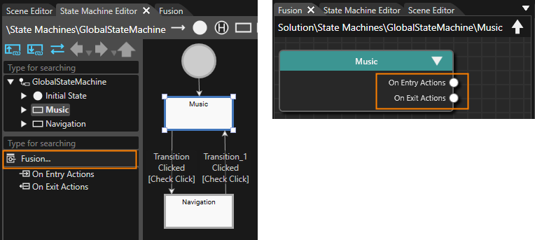
1. While the state "Music" is selected in the State Machine Editor click on the **\[Fusion...\]** button on the bottom left. 
    - Fusion will be opened, displaying the **Fusion node "Music".**
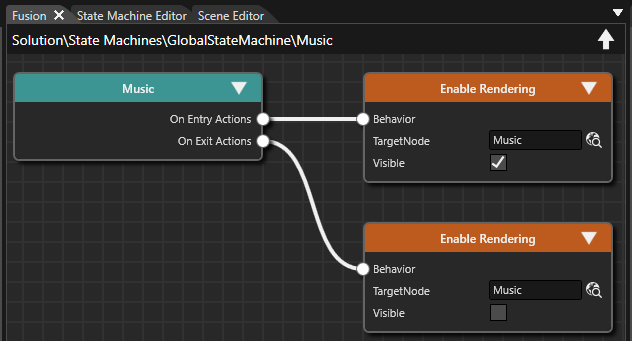
    - The displayed Fusion node offers 2 behavior connectors: one for \[On Entry Actions\] and one for \[On Exit Actions\].  
        <div drawio-diagram="8469"><img src="https://doc316en.candera.eu/uploads/images/drawio/2025-06/drawing-5-1751008175.png" alt=""/></div>
2. In the **\[Music\]** Fusion Node drag the \[On Entry Actions\] connector circle to the right and release the mouse. 
    - A **Select Behavior** dialog will be opened.
    - This dialog has an input field on top and a list of behaviors organized as a tree on the bottom.
    - This list of behaviors is similar to the one in the Toolbox panel's **\[Behaviors\]** section.
3. In the Select Behavior dialogue find the "Enable Rendering" behavior and double-click it.   
    
    - In Fusion a new **\[Enable Rendering\]** node is created, which is connected to the Music's \[On Entry Actions\] connector. <p class="callout info">Use the dialogue's input field and start typing "Enable Rendering". While you are typing, the list of behaviors decreases as the content of the input field serves as a filter.</p>
4. In Fusion configure the **\[Enable Rendering\]** node according to the table below. 
    - The \[Enable Rendering\] node is fully configured.
    - Whenever GlobalStateMachine **enters** the **state "Music"**, the GroupNode "Music" will get **visible**.  
        <table border="1" class="align-left" style="border-collapse: collapse; border-width: 1px; width: 570px;"><colgroup> <col style="width: 150px;"></col> <col style="width: 420px;"></col> </colgroup><tbody><tr><td style="background-color: rgb(35, 111, 161);"><span style="color: rgb(236, 240, 241);">**Music Node**  
        </span></td><td style="background-color: rgb(35, 111, 161);"><span style="color: rgb(236, 240, 241);">On Entry Actions &gt; EnableRendering  
        </span></td></tr><tr><td style="background-color: rgb(35, 111, 161);"><span style="color: rgb(236, 240, 241);">TargetNode  
        </span></td><td>IVI\_Sample &gt; IVI\_Sample &gt; Music  
        </td></tr><tr><td style="background-color: rgb(35, 111, 161);"><span style="color: rgb(236, 240, 241);">Visible  
        </span></td><td>TRUE  
        </td></tr></tbody></table>
5. Repeat similar steps to create an **\[EnableRendering\]** Fusion Node for the \[Music\] node's **\[On Exit Action\]** connector. Configure this new \[EnableRendering\] node according to the table below. 
    - The \[Enable Rendering\] node is fully configured.
    - Whenever GlobalStateMachine **exits** the **state "Music"**, the GroupNode "Music" will get **invisible**.  
        <table border="1" class="align-left" style="border-collapse: collapse; border-width: 1px; width: 570px;"><colgroup> <col style="width: 150px;"></col> <col style="width: 420px;"></col> </colgroup><tbody><tr><td style="background-color: rgb(35, 111, 161);"><span style="color: rgb(236, 240, 241);">**Music Node**  
        </span></td><td style="background-color: rgb(35, 111, 161);"><span style="color: rgb(236, 240, 241);">On Exit Actions &gt; EnableRendering  
        </span></td></tr><tr><td style="background-color: rgb(35, 111, 161);"><span style="color: rgb(236, 240, 241);">TargetNode  
        </span></td><td>IVI\_Sample &gt; IVI\_Sample &gt; Music  
        </td></tr><tr><td style="background-color: rgb(35, 111, 161);"><span style="color: rgb(236, 240, 241);">Visible  
        </span></td><td>FALSE  
        </td></tr></tbody></table>
        
        <div drawio-diagram="8415"><img src="https://doc316en.candera.eu/uploads/images/drawio/2025-05/drawing-5-1748248693.png" alt=""/></div>
6. In State Machine Editor select the **\[Navigation\]** state, switch to Fusion and configure a similar **\[On Entry Action\]** and **\[On Exit Action\]**. Necessary configuration details are given in the table below. 
    - The \[Navigation\] State has been configured similar to the \[Music\] State.
    - Whenever GlobalStateMachine enters the state "Navigation", the GroupNode "Navigation" will get visible.
    - Whenever GlobalStateMachine exits the state "Navigation", the GroupNode "Navigation" will get invisible.  
        <table border="1" class="align-left" style="border-collapse: collapse; border-width: 1px; width: 570px;"><colgroup> <col style="width: 150px;"></col> <col style="width: 420px;"></col> </colgroup><tbody><tr><td style="background-color: rgb(35, 111, 161);"><span style="color: rgb(236, 240, 241);">**Navigation Node**  
        </span></td><td style="background-color: rgb(35, 111, 161);"><span style="color: rgb(236, 240, 241);">On Entry Actions &gt; EnableRendering  
        </span></td></tr><tr><td style="background-color: rgb(35, 111, 161);"><span style="color: rgb(236, 240, 241);">TargetNode  
        </span></td><td>IVI\_Sample &gt; IVI\_Sample &gt; Navigation  
        </td></tr><tr><td style="background-color: rgb(35, 111, 161);"><span style="color: rgb(236, 240, 241);">Visible  
        </span></td><td>TRUE  
        </td></tr></tbody></table>


        <table border="1" class="align-left" style="border-collapse: collapse; border-width: 1px; width: 570px;"><colgroup> <col style="width: 150px;"></col> <col style="width: 420px;"></col> </colgroup><tbody><tr><td style="background-color: rgb(35, 111, 161);"><span style="color: rgb(236, 240, 241);">**NavigationNode**  
        </span></td><td style="background-color: rgb(35, 111, 161);"><span style="color: rgb(236, 240, 241);">On Exit Actions &gt; EnableRendering  
        </span></td></tr><tr><td style="background-color: rgb(35, 111, 161);"><span style="color: rgb(236, 240, 241);">TargetNode  
        </span></td><td>IVI\_Sample &gt; IVI\_Sample &gt; Navigation  
        </td></tr><tr><td style="background-color: rgb(35, 111, 161);"><span style="color: rgb(236, 240, 241);">Visible  
        </span></td><td>FALSE  
        </td></tr></tbody></table>
7. In the Scene Tree panel navigate to TextButton\_Music which can be found following the path below and select it. Click on the Fusion button on the top right of the Scene Tree panel.  
    
    - Fusion will be opened, displaying the TextButton\_Music's Fusion node with a Behaviors connector.  
        <table border="1" class="align-left" style="border-collapse: collapse; border-width: 1px; width: 570px;"><tbody><tr><td style="background-color: rgb(35, 111, 161); width: 117px;"><span style="color: rgb(236, 240, 241);">Scene Tree Path  
        </span></td><td style="width: 452.333px;">IVI\_Sample &gt; IVI\_Sample &gt; Menu\_button &gt; **TextButton\_Music**  
        </td></tr></tbody></table>
8. Drag the **Behaviors connector** to the right and release the mouse button. 
    - The Select Behaviors dialog will be opened
9. Find the "**Handle Control State**" behavior and double-click it. 
    - A new Fusion node **\[Handle Control State\]** will be created.
10. Repeat these steps for TextButton\_Navigation which can be found following the path below. 
    - A new Fusion node **\[Handle Control State\]** will be created.  
        <table border="1" class="align-left" style="border-collapse: collapse; border-width: 1px; width: 570px;"><tbody><tr><td style="background-color: rgb(35, 111, 161); width: 120px;"><span style="color: rgb(236, 240, 241);">Scene Tree Path  
        </span></td><td style="width: 449.333px;">IVI\_Sample &gt; IVI\_Sample &gt; Menu\_button &gt; **TextButton\_Navigation**  
        </td></tr></tbody></table>

<div class="contents" id="bkmrk--5"></div>### Check the Transitions in Player

Use the Player to check the configured transitions between Music and Navigation.

1. Save your solution and click the \[Play selected scenario...\] icon on the toolbar to start the Player.  
    
    - Three windows will open, and you can see that the simulation display shows the IVI\_Sample scene.
    - The Music GroupNode will be displayed.
2. In the simulation display click the Navigation menu button. 
    - The Navigation GroupNode will be displayed.
3. In the simulation display click the Music menu button. 
    - The Music GroupNode will be displayed again.  
        <div drawio-diagram="4498"><img src="https://doc316en.candera.eu/uploads/images/drawio/2023-10/drawing-5-1696587974.png" alt=""/></div>