# GettingStartedControls Solution
# Overview
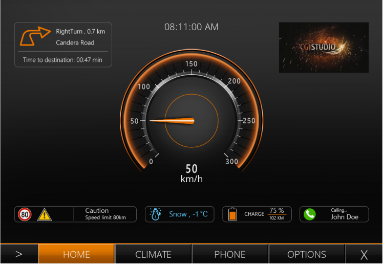
The GettingStartedControls solution is a sample solution primarily focused on gauge clusters and center clusters. It consists of various scenes for displaying advanced gauge clusters and center clusters.
GettingStartedControls Parts 1 to 4 introduce the basics of using controls. In addition to using individual controls, we also show how to connect them to each other to implement basic HMI logic.
- [GettingStartedControls Part 1](https://doc316en.candera.eu/link/284#bkmrk-page-title)
- [GettingStartedControls Part 2](https://doc316en.candera.eu/link/290#bkmrk-page-title)
- [GettingStartedControls Part 3](https://doc316en.candera.eu/link/310#bkmrk-page-title)
- [GettingStartedControls Part 4](https://doc316en.candera.eu/link/311#bkmrk-page-title)
- [GettingStartedControls Part 5](https://doc316en.candera.eu/link/312#bkmrk-page-title)
---
| **Target Item** | **Setting Value** |
| X Resolution
| 1024
|
| Y Resolution
| 768
|
#### Preparing the Scene
1. In the Solution Explorer panel on the top left select "Scene3D" (under "Solution - Scenes") and delete it either using the <delete> key or via the context menu \[ Delete \] as described in [Delete a Scene](http://cgi3151en.candera.eu/books/scene-design/page/delete-a-scene "Delete a Scene").
- A "Delete Items" dialog will popup.
2. Please resolve all dependencies with "Delete Usage Item" and click \[ OK \].
- Scene3D will be deleted.
3. Select "Scene2D" and rename it to "SceneHome" either by pressing <F2> on your keyboard or via the context menu "Rename".
- The scene's name has been changed to "SceneHome"
4. In the Solution Explorer panel double-click the "SceneHome" to open it in the Scene Editor (see also [2D Scene Editor](http://cgi3151en.candera.eu/books/scene-design/page/2d-scene-editor "2D Scene Editor")).
- "Scene Home" will be displayed in the Scene Editor on the right of the Solution Explorer panel.
- The content of this scene will be displayed in the Scene Tree panel below the Solution Explorer panel.
5. Save the solution using the <Ctrl+S> keyboard combination or via the menu bar File - Save Solution.
- The asterisk next to the filename in the SceneComposer window's titlebar will disappear, indicating that the solution has been saved.
It might be a good idea to make a backup of your solution now! If you destroy something during execution of the following steps you always have the possibility to restart with a clean solution. To make a copy just make a copy of the GettingStartedControls folder or create a copy by archiving into a zip file.
#### Import Images
The images needed for this solution will be imported. Some of them will be used as plain static images, but most will be used to configure controls.
1. In the menu bar choose \[ Import \] - \[ Import Resources... \] as described in [How to Import Resources](http://cgi3151en.candera.eu/books/import-of-resources/page/how-to-import-resources "How to Import Resources").
- \[ Import Resources \] dialog will be opened
2. Navigate to the following folder, select all files provided in this "Cluster" folder and press \[ Open \].
**<cgi-studio-root>/cgi\_studio\_content/Resources/GettingStartedControls/Cluster**
- \[ Import Images \] dialog will be opened
3. Use the settings as shown in the screenshot and press \[ OK \].
- The images have been imported into the solution and are ready to be used in SceneHome.
#### Position Images
1. In the Solution Explorer select the Bitmap "Navi60Bmp" and drag it into the Scene Editor.
- The image with the curved orange arrow will be placed in the Scene Editor.
- It also appears in the Scene Tree panel.
2. Select "NewWarning80Bmp" in the Solution Explorer and drag it into the Scene Editor too.
- The image with the speed limit will be placed in the Scene Editor.
- It also appears in the Scene Tree panel.
3. In the Scene Editor or in the Scene Tree panel select the images individually and modify their Transformation Position X and Y in the Properties panel on the bottom right.
- Navi60Bmp and NewWarning80Bmp are on their final position.
| **Render Node**
| **Transformations** |
| **Position X** | **Position Y** |
| Navi60Bmp
| 38
| 121
|
| NewWarning80Bmp | 38
| 612
|
#### Configure Tell Tale Controls
Controls are special types of nodes that already contain logic for handling of user actions (touch, click) and state changes. They can be found in the Controls section of the Toolbox, which is by default located in the top right corner.
This tutorial uses "[Tell Tale](http://cgi3151en.candera.eu/books/controls-and-behaviors/page/common#bkmrk-tell-tale)" Controls to indicate weather alerts, charging status information and incoming calls.
| **Scene Tree** | **Transformations** | **Control** |
| **Rename Node to** | **Position X** | **Position Y** | **State** |
| Tell Tale\_Snow | 387
| 612 | Off |
| Tell Tale\_Gas | 594
| 612 | Off |
| Tell Tale\_Call | 800 | 612 | Blinking |
3. Select the 3 "Tell Tale" Controls individually again to apply new OnState and OffState Images to the "TellTale" Controls in the \[ Controls \] section of Properties panel according to the table below. To change "On State Image" and "Off State Image" click on the respective magnifying glass.
- The \[ Choose Item \] dialog will be opened.
4. Navigate to your desired image, select it and click \[ OK \].
| **Scene Tree** | **Control** |
| **Node** | **On State Image** | **Off State Image** |
| Tell Tale\_Snow | NewWeather\_BBmp | NewWeather\_HBmp |
| Tell Tale\_Gas | Ev\_HBmp | Ev\_Bmp\_HBmp |
| Tell Tale\_Call | NewCall\_HBmp | NewCallBmp |
5. In the Scene Tree or in the Scene Editor select "Tell Tall\_Call". This Tell Tale Control is configured to keep blinking. Therefore, the speed of blinking has to be configured.
- The blinking interval of "Tell Tale\_Call" is configured
- When "active rendering" is activated, this Tell Tale will be blinking in Scene Editor. "Active rendering" can be toggled using pinwheel button in the Scene Editor's bottom toolbar (see image below).
| **Item Name** | **On Time Ms** | **Off Time Ms** |
| Tell Tale\_Call
| 800 | 800 |
#### Configure a Gauge Control
To display the current speed of the car a "[Gauge Control](http://cgi3151en.candera.eu/books/controls-and-behaviors/page/common#bkmrk-gauge "Gauge Control")" will be used.
1. From the Toolbox panel in the Controls section drag and drop "Gauge" Controls into the Scene Editor.
- A Gauge control with default images will be visible in the Scene Editor.
- The Gauge Control also appears in the Scene Tree.
2. In the Properties panel's \[ Transformations \] section configure the Gauge Control's position according to the table.
- Gauge Control will be on it final position.
| **Item Name** | **Position X** | **Position Y** |
| Gauge
| 319 | 217
|
3. Adapt the Background Image and Needle Image by clicking the corresponding magnifying glass icon.
- The \[ Choose Item \] dialog will be opened.
4. Navigate to your desired image, select it and click \[ OK \].
- The newly configured images will be displayed in the Scene Editor.
| **Item Name** | **Background Image** | **Needle Image** |
| Gauge
| NewClusterBmp | NewNeedleBmp |
5. The image "NewClusterBmp" needs to be repositioned in order to be in the center of the Gauge. In the Solution Explorer select NewClusterBmp. In the Properties panel's \[ Bitmap \] section tick the checkbox "Enable Pivot Hint" and configure the Pivot Hint according to the table below.
- After defining the Pivot Hints for both images, the needle will be displayed in the center of the gauge.
6. If no change is visible, try to forcing a screen invalidation by pressing the <F5> key.
| **Solution Explorer** | **Properties panel \[ Bitmap \]** |
| **Item Name** | **Pivot Hint X** | **Pivot Hint Y** |
| NewClusterBmp
| 194 | 194 |
| NewNeedleBmp
| 112
| 8
|
You may need to trigger a refresh by hitting the <F5> button on your keyboard if the images' positions are not updated automatically.
#### Configure Digital Speed Display
A "[Text Value](http://cgi3151en.candera.eu/books/controls-and-behaviors/page/common#bkmrk-text-value)" Control will be used to display the current speed as digits
1. From the Toolbox panel under \[ Controls \] - \[ Common \] drag a "Text Value" control to the Scene Editor just below the Gauge Control.
- The control will be visible in the Scene Editor and in the Scene Tree panel.
2. While the Text Value control is selected, adjust its position in the Properties panel's \[ Transformation \] section as follows:
- The control will be positioned as configured.
| **Item Name** | **Position X** | **Position Y** |
| Text Value | 486 | 492 |
3. In the Properties panel's \[ Control \] section configure properties from the table below.
- The *Format Text* property is a template for the text using the standard printf value formatter syntax (%d for int or %03d for a 3 digit integer).
- The Text Value control is now positioned and configured correctly.
| **Item Name** | **Format Text** | **Style** | **Text Alignment** |
| Text Value
| %3d | OpenSans25 | Center |
4. From the Toolbox panel under \[ Controls \] - \[ Common \] drag a "[Text](http://cgi3151en.candera.eu/books/controls-and-behaviors/page/common#bkmrk-text)" control to the Scene Editor and perform the following configurations in the Properties panel's \[ Transformation \] and \[ Control \] section.
- The Text control that displays a static text is now positioned and configured correctly.
|
| **Transformation** | **Control** |
| **Item Name** | **Position X** | **Position Y** | **Text** | **Text Style** |
| Text
| 482 | 522 | km/h
| OpenSans25 |
#### Connect TextValue Control and Gauge Control
The Text Value control will now be connected to the Gauge control, so that both controls display the same value.
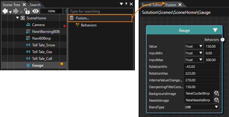
1. Select the Gauge Control in the Scene Tree panel and click on the \[Fusion...\] button in the right side of the Scene Tree panel.
- Fusion will be opened and Scene Editor will be put to the background.
- The Fusion diagram displays the Fusion node of the Gauge control.
2. In Fusion drag the Fusion node's Behaviors connector to the right and release the mouse button.
- The Select Behavior dialog will be opened displaying a list of behaviors.
- The list of behaviors is organized similar to the behaviors in the Toolbox.
- There is an input field just above the behaviors list.
3. Click into the Select Behavior's input field and start typing "Forward Value".
- While typing the list of behaviors will be filtered so you can easier find the desired behavior.
4. Double-click the "Forward-Value" behavior.
- The Select Behavior dialog will be closed.
- Fusion has added a Forward Value node to its diagram.
- This behavior is responsible for copying the speed value from the Gauge control to the TextValue control.
5. Configure a TargetNode for the Forward Value behavior, so it knows, where it should forward the value to. Click on the magnifying glass in the Forward Value Fusion Node.
- The Choose Item dialog will be opened.
6. Navigate to the Text Value control, select it and click \[ OK \].
- The Text Value control is selected as TargetNode for the Forward Value behavior.
| **Item Name** | **TargetNode** |
| Forward Value
| Scenes/SceneHome/CompositeNode2D:Text Value |
#### Add a FlipBook
The top center of our home screen is decorated with a "[DigitalClock](http://cgi3151en.candera.eu/books/controls-and-behaviors/page/common#bkmrk-digitalclock)" control. We will also add a "[FlipBook](http://cgi3151en.candera.eu/books/controls-and-behaviors/page/common#bkmrk-flipbook)" control to the upper right corner of the scene.
1. Drag and drop a DigitalClock control from the ToolBox (under \[ Controls \] - \[ Common \]) to the Scene Editor.
- A DigitalClock control will be placed into the scene.
2. Configure its Position properties in the Properties panel's \[ Transformation \] section.
- The DigitalClock control will be positioned as configured.
| **Item Name** | **Position X** | **Position Y** |
| DigitalClock
| 439 | 116 |
3. Drag and drop a FlipBook from the ToolBox (under \[ Controls \] - \[ Common \]) to the Scene Editor. Place it in the upper right corner.
- A FlipBook control will be placed into the scene.
4. Configure its properties in the Properties panel's \[ Transformation \] section.
- The FlipBook control will be positioned as configured.
| **Item Name** | **Position X** | **Position Y** | **Scale X** | **Scale Y** |
| FlipBook
| 745 | 121 | 0.50 | 0.50 |
#### Check the First Scene
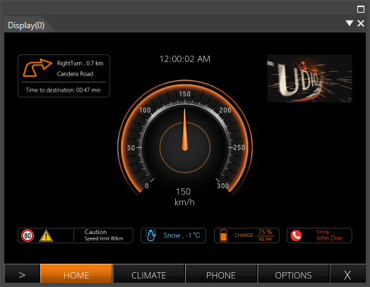
The first screen/scene is now finished.
1. To check the result of configuring the first scene, open the display view. This view represents the final rendered result and can be opened via the menu bar: View - Display - Display-0.
- The display panel will be opened in a floating way displaying the scene configured in the steps above.
2. In the Toolbar make sure that the item "Generate and Play" is selected in the drop-down menu and click the \[ > \] button to the left.
- This will generate the asset so it is available as input for the Player. After that the CGI Panel will be started.
3. In the CGI Panel select "Scenes#SceneHome" on the left and click on the \[ Controls \] tab.
- All of the scene's controls are listed.
4. Select the Gauge control.
- The Gauge control's properties are displayed in a table on the right.
5. To check the functionality of the configured ForwardValue behavior click in the table's field of the property "Value" and manipulate its "Value" to e.g. 35.
- The Gauge's needle will adjust its rotation to display 35.
- The TextValue control will also update its value to 35.
# GettingStartedControls Part 2
Part 2 of the GettingStartedControls Tutorial covers the creation of a scene for climate control using various predefined Scene Composer controls. As basis for part 2 of our GettingStartedControls creation tutorial please use your own created solution from part 1.
The final result of our ClimateControl Scene will look like this:
---
#### Preparing the Climate Scene
1. Create a new scene via the menu bar "Scene" - "New 2D Scene" or press < Ctrl+2 > on your keyboard
- The "Add New Scene 2D" dialog will be opened.
2. In the first row select "/Scenes" from the drop-down menu. Enter "SceneClimate" as name and press \[OK\]. We use the prefix "Scene" to have all scenes listed next to each other in the Solution Explorer panel.
- A new scene "SceneClimate" is created and visible in the Solution Explorer panel in folder "Scenes".
- The new scene is opened in the Scene Editor and in the Scene Tree panel.
- In the Scene Tree panel you can see that the scene already has a camera.
- In the Render Targets panel you can see that the camera is already added to the RenderTarget.
3. In the Render Targets panel check the checkbox of "SceneClimate\\Camera" in order to enable rendering.
4. In the Render Targets panel select the SceneClimate\\Camera. In the Properties panel's \[ Camera \] section change the sequence number to 1.
- The camera's sequence number is set to 1.
- In the Scene Tree panel the red Information/Warning/Error square disappears.
#### Configure the ClimateScene's Layout
For the climate scene we will use a more realistic setup of the scene than before, because very often the layout of the elements of a scene are dependent to the screen size or language. Some languages for example are written from right to left and others from left to right. This for sure will influence the layout of texts and controls. Instead of absolute positioning of all elements, we will use a [GridLayout](http://cgi3151en.candera.eu/books/layouter/page/types-of-layouters#bkmrk-grid-layouter).
1. In the Toolbox panel under \[ Nodes 2D \] drag and drop a GridLayout (see image below) into the Scene Editor or into the Scene Tree panel on the SceneClimate node.
- A GridLayout is visible in the Scene Tree panel.
- It is also available in the Scene Editor, but only its pivot point is visible when it is selected.
2. In the Scene Tree panel right-click on the GridLayout to open the context menu and choose "Configure Layouter...".
- The "Grid Layouter Editor" will popup where the GridLayout can be configured.
3. On the Grid Layout Editor's lower left corner, use the \[ + \] buttons to add rows and columns (see image below). Configure 6 rows and 4 columns.
- The GridLayout is configured with 6 rows and 4 columns.
4. Configure the columns' widths and the rows' heights according to the table below using the input fields on the top and right.
- Rows and columns are configured as in the image above. | **Column** | **Width** |
| **Row** | **Width** |
| Column 1
| 0.05 |
| Row 1 | 0.20 |
| Column 2
| 0.30 |
| Row 2
| 0.20 |
| Column 3
| 0.50 |
| Row 3
| 0.20 |
| Column 4
| 0.05
|
| Row 4
| 0.20 |
|
|
|
| Row 5
| 0.20 |
| | |
| Row 6
| 0.20 |
5. When you're done configuring, press the \[OK\] button.
- The Grid Layout Editor will be closed. Be aware that you cannot see the GridLayout. Its size is 0 as long as no size and no content for its cells has been configured.
6. In the Properties panel's \[ Transformations \] section configure the following position of the GridLayout.
- The position of the GridLayout in the Scene Editor has changed.
| **Target Item** | **Setting Value** |
| Position X | 0 |
| Position Y | 0 |
7. In the Properties panel's \[ Transformations \] section configure the following size of the GridLayout.
The size is currently calculated automatically. In order to be able to change the values for the size, you have to click on the \[ A \] button to disable the automatic calculation of the size.
- The size of the GridLayout has changed.
- The GridLayout's grid is now visible.
| **Target Item** | **Setting Value** |
| Size X
| 1024 |
| Size Y | 714 |
8. It is recommended to save the Scene Composer solution.
---
#### Creating and Configuring the Labels
Each of the Controls in the Climate Control Scene has a label, telling the user which setting he is able to change with it.
1. From the Toolbox panel drag and drop a "[Text](http://cgi3151en.candera.eu/books/controls-and-behaviors/page/common#bkmrk-text)" control into the Scene Tree panel directly onto the "GridLayout" node. The "Text" control can be found in the Toolbox panel's \[ Control \] section in the list of "Common" controls.
- The "Text" Control can be seen in the Scene Editor's top left corner.
- It is also visible in the SceneTree panel, hierarchically ordered below the GridLayout.
2. In the Properties panel's \[ Control \] section click on the magnifying glass icon next to the "Text Style" property.
- The "Text Style Palette" dialog will be opened displaying a list of text styles. The currently configured "OpenSans35" is selected.
3. In this "Text Style Palette" dialog select "OpenSans25" and click \[OK\]
- In the Scene Editor the size of the "Text" control's text has decreased.
4. In the Scene Tree right-click on the "Text" control to open the context menu and select "Clone".
- The "Clone Item" dialog is opened.
5. In the "Clone Item" dialog set the "Number of Copies" to 5 and click \[OK\].
- In the Scene Tree panel you can see that 5 new "Text" controls have been added, named "Text\_1", "Text\_2" ...
6. In the Scene Tree panel right-click on the "GridLayout" and choose "Configure Layouter..." from the context menu.
- The Grid Layout Editor will be opened.
- The 6 "Text" controls are listed in the panel on the left.
- By default the 6 "Text" controls are also positioned in the top left cell of the GridLayout.
7. In the "Grid Layout Editor" drag and drop the "Text" controls from the left into their destination cells one by one as seen in the image below and click \[OK\].
- The "Text" controls' position in the GridLayout are now configured correctly.
- In the Scene Editor you can see that the "Text" controls are now neatly positioned in the Scene.
- The layout is done by the GridLayout according to its configuration.
8. In the Scene Tree panel select all "Text" nodes. Keeping the <SHIFT> key pressed allows you to add items to your selection. In the Properties panel's \[ Layout \] section configure VerticalAlignment to "VCenter"
- "VertigalAlignment" is configured to "VCenter" for all "Text" controls.
- In the Scene Editor all "Text" controls are vertically centered in their cell.
9. In the Scene Tree panel select the "Text" controls one after the other and rename them either via the context menu entry "Rename" or by pressing <F2> on your keyboard. Apply the names provided in the table below.
- In the Scene Tree panel you can see that the "Text" controls have been renamed. | **Target Item** | **Name** |
| Text
| Text\_Temperature |
| Text\_1 | Text\_Steering wheel heating |
| Text\_2 | Text\_Air Condition
|
| Text\_3 | Text\_Fan
|
| Text\_4 | Text\_Seat heater
|
| Text\_5 | Text\_Heating
|
10. In the Scene Tree panel select the "Text" controls one after the other again and change text that is displayed by the "Text" controls according to the table below. This can be done in the Property panel's \[ Control \] section.
- In the Scene Editor you can see that the "Text" controls display different texts. | **Target Item** | **Text** |
| Text\_Temperature | Temperature |
| Text\_Steering wheel heating | Steering wheel heating |
| Text\_Air Condition
| Air Condition
|
| Text\_Fan
| Fan
|
| Text\_Seat heater
| Seat heater
|
| Text\_Heating
| Heating
|
#### Importing Images
This scene uses the built-in Scene Composer controls but they will be customized with new images. Therefore these images have to be imported into the Scene Composer solution.
1. In the menu bar select Import > Import Resources...
- The "Import Resources" dialog will be opened.
2. In the "Import Resources" dialog navigate to the path given in the table below. Select all 36 files and press \[ Open \]
- The "Import Images" dialog will be opened. | **Import Resources** | **Path** |
|
| /cgi\_studio\_content/Resources/GettingStartedControls/Climate |
3. In the "Import Images" dialog select folder "/Resources", make sure to create a new folder "Climate" for the imported images and click \[OK\].
- In the Solution Explorer you can see that there is a new folder "Climate" in folder "Resources" that contains the 36 imported images.
- The images have been imported and can be used in the Scene Composer solution.
### Configuration of Temperature Controls
The temperature settings of this scene are composed of a multitude of different controls that are arranged by a GridLayout. The currently set temperature value can be increased and decreased using the buttons on the left and right side of the Slider. The temperature value can also be controlled dragging the Slider knob.
The configured temperature value is displayed in digits above the Slider. Therefore the Slider and the Text Value Control displaying the value will be connected with a ForwardValue behavior.
To finish the configuration of the temperature controls, the look and feel of the configured temperature controls will be adjusted by exchanging the Slider's and Buttons' default images to be consistent with the scene's design.
#### Configuring the Layout for the Temperature
The temperature setting for this sample is composed by
- a Text Value control that will displays the current value
- a Slider control that shows the current value as well as the range of the possible values
- a Button control to decrease the currently set value
- a Button control to increase the currently set value
- a GridLayout that layouts the controls above.
The following steps show how to arrange all these fragments to a temperature configuration item.
1. From the Toolbox panel's \[ 2D Nodes \] drag and drop a "[GridLayout](http://cgi3151en.candera.eu/books/layouter/page/types-of-layouters#bkmrk-grid-layouter)" into the Scene Tree panel directly onto the already configured "GridLayout" node.
- In the Scene Tree the new GridLayout will be inserted as element of the already existing GridLayout.
2. From the Toolbox panel drag and drop a "[Text Value](http://cgi3151en.candera.eu/books/controls-and-behaviors/page/common#bkmrk-text-value)" control into the Scene Tree panel directly onto the new GridLayout. The "TextValue" control can be found in the Toolbox panel's \[ Controls \] section under "Common".
- In the Scene Tree panel the "Text Value" control is visible as subordinates to the new GridLayout.
3. From the Toolbox panel drag and drop 2 "[Button](http://cgi3151en.candera.eu/books/controls-and-behaviors/page/touchable#bkmrk-button)" controls and a "[Slider](http://cgi3151en.candera.eu/books/controls-and-behaviors/page/touchable#bkmrk-slider)" control into the Scene Tree panel directly onto the new GridLayout. "Button" and "Slider" control can be found in the Toolbox panel's \[ Controls \] section under "Touchable".
- In the Scene Tree panel the Buttons and the Slider are visible as subordinates to the new GridLayout.
4. In the Scene Tree panel rename the newly created controls according to the table below using the context menu or pressing <F2> on your keyboard.
- In the Scene Tree panel the controls appear with their new names. | **Target Item** | **Name** |
| GridLayout
| GridLayout\_Slider
|
| Text Value
| Text Value
|
| Button | Button\_TempDec |
| Button\_1 | Button\_TempInc |
| Slider
| Slider\_Temperature
|
5. In the Scene Tree panel right-click on GridLayout\_Slider and choose "Configure Layouter..." from the context menu.
- The "Grid Layout Editor" will be opened.
6. In the "Grid Layout Editor" configure 2 rows and 5 columns using the buttons on the bottom left.
- In the "Grid Layout Editor" a grid with rows and columns will be displayed as configured.
7. In the "Grid Layout Editor" drag and drop the controls to their destination position as seen in the image below and click \[OK\].
- The "Grid Layout Editor" is configured as in the image.
8. In the Scene Tree panel right-click on the (outer, older) GridLayout and choose "Configure Layouter..." from the context menu.
- The "Grid Layout Editor" will be opened.
9. In the "Grid Layout Editor" drag and drop GridLayout\_Slider into the cell right next to the "Text\_Temperature" Text control. Then click \[OK\].
- In Scene Editor GridLayout\_Slider and all its content is now placed at the correct position.
#### Connect Slider and Text Value Control
The Temperature controls' functionality will be configured in the following steps: The slider's default, minimum and maximum values, the Text Value control's formatting text as well as the "[Forward Value Behavior](http://cgi3151en.candera.eu/books/controls-and-behaviors/page/value-processing-behaviors#bkmrk-forward-value)" that takes care that Slider and Text Value will display the same value at all times.
1. In the Scene Tree panel select the "Text Value" control. In the Properties panel apply the changes according to the table below.
- In the Scene Editor, the "Text Value" will display "0.0°C" in the center.
| **Item Name** | **Section
** | **Property** | **Value** |
| Text Value | Control
| Format Text | %2.1f°C |
| Layout
| HorizontalAlignment
| HCenter
|
2. In the Scene Tree panel select the Slider\_Temperature. In the Properties panel in the \[ Control \] section apply the changes according to the table below.
- The slider's current value, its minimum and maximum value are configured.
- In the Scene Editor the knob of the slider is on a different position than before.
| **Item Name** | **Section
** | **Property** | **Value** |
| Slider\_Temperature | Control
| Value | 22 |
|
| Minimum | 15 |
|
| Maximum
| 28
|
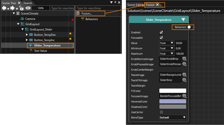
3. In the Scene Tree panel select the Slider\_Temperature and click on the **\[Fusion...\]** button on the right side of the Scene Tree.
- Fusion will be opened, hiding the Scene Editor.
- The Fusion diagram displays the Slider\_Temperature's Fusion node.
4. In Fusion drag the Slider\_Temperature node's Behaviors connector to the right and then release the mouse button.
- The Select Behaviors dialog will be opened, which displays a list of behaviors. The behaviors in this list are organized in categories similar to the list of behaviors in the Toolbox panel's \[Behaviors\] section.
- Directly above the list of behaviors is an input field.
5. Click into the input field above the behaviors list and start typing "Forward Value".
- While typing the list of behaviors will be narrowed down, so that you can easily find the Forward Value behavior.
6. As soon as you can find the "Forward Value" behavior, double-click it.
- A \[Forward Value\] node will be added to the Fusion diagram.
7. In the \[ForwardValue\] Fusion node click on the magnifying glass icon next to the property "TargetNode".
- The Choose Item dialog will be opened.
8. Select the TargetNode as in the table below and click \[OK\].
- The \[Forward Value\] Fusion node's TargetNode is configured.
| **TargetNode** | **Path** |
| | /Scenes/SceneClimate/GridLayout/GridLayout\_Slider/Text Value |
9. Switch back to the Scene Editor and press the <F5> key to trigger a refresh.
- In the Scene Editor you can see that the Text Value will display "22°C", which is the value currently configured in the Slider control.
#### Beautifying Temperature Setting Controls
The default visual appearance of the Scene Composer's Slider does not fit to this sample's design. Luckily the Slider's images are exchangeable, so are the Button's images.
1. In the Scene Tree panel select Button\_TempDec. In the Properties panel press the magnifying glass icon next to the property "Normal Image" to open the "Choose Item" dialog.
- The "Choose Item" dialog will be opened.
2. Select image "/Resources/Climate/NewTempDecreaseBmp" and press OK.
- The "Choose Item" dialog will be closed.
- Property "Normal Image" is set to "NewTempDecreasBmp".
- In the Scene Editor a new image will be displayed differently.
3. Repeat steps 1 and 2 to set a new "Pressed Image" for Button\_TempDec. Finally, Button\_TempDec should be configured according to the table below.
- Button\_TempDec is configured with new "Normal Image" and "Pressed Image" which completely changed its appearance.
| **Target Item** | **Property** | **Image** |
| Button\_TempDec | Normal Image
| /Resources/Climate/NewTempDecreaseBmp |
| Pressed Image
| /Resources/Climate/NewTempDecrease\_pressedBmp |
4. In the Scene Tree panel select Button\_TempInc and repeat steps 1 to 3 above to configure new images for "Button\_TempInc" according to the table below.
- Button\_TempInc is configured with new "Normal Image" and "Pressed Image" changing its appearance completely.
| **Target Item** | **Property** | **Image** |
| Button\_TempInc | Normal Image
| /Resources/Climate/NewTempIncreaseBmp |
| Pressed Image
| /Resources/Climate/NewTempIncreae\_pressedBmp |
5. In the Scene Tree panel select "Slider\_Temperature". In the \[ Control \] section of the Properties panel set new images according to the table below.
- In the Properties panel the Slider Control's image properties are configured with new images.
- In the Scene Editor you can see the final result of the configured Temperature Slider Control. | **Property** | **Image** |
| Knob Normal Image
| /Resources/Climate/NewSliderKnobBmp |
| Knob Pressed Image
| /Resources/Climate/NewSliderKnobPressedBmp
|
| Track Image
| /Resources/Climate/NewSliderBackgroundBmp |
| Track Fill Image
| /Resources/Climate/NewSliderBmp |
### Configuration of Steering Wheel Heating CheckBox
Steering wheel heating is easy to configure. It uses a simple [CheckBox ](http://cgi3151en.candera.eu/books/controls-and-behaviors/page/touchable#bkmrk-checkbox)Control for turning the steering wheel heating on and off.
1. From the Toolbox panel's \[ Controls \] section under "Touchable" drag and drop a "CheckBox" into the Scene Tree panel directly onto the already configured "GridLayout" node.
- The CheckBox will appear in the Scene Tree panel.
- The CheckBox will also be visible in the Scene Editor.
2. In the Scene Tree panel select the CheckBox and rename it to "CheckBox\_Steering heater" either via the context menu entry "Rename" or by pressing <F2> on your keyboard.
- In the Scene Tree panel, the "CheckBox\_Steering heater" can be seen.
3. In the Scene Tree panel right-click on the "GridLayout". In the opened context menu choose "Configure Layouter...".
- The Grid Layout Editor will be opened.
- The newly added CheckBox will be placed in the grid's top left cell.
4. In the Grid Layout Editor drag and drop the CheckBox into the cell to the right of "Text\_Steering wheel heating". When you're done, press \[OK\].
- The Grid Layout Editor will be closed.
- In Scene Editor the CheckBox will be positioned in the correct cell of the GridLayout.
5. In the Properties panel's \[ Layout \] section change the "Vertical Alignment" to VCenter.
- In the Scene Editor the CheckBox's position has changed, it is now in the same line as the text "Steering wheel heating".
6. In the Properties panel's \[ Control \] section change the Text to "On" and configure the CheckBox's images as in the table below.
- In the Scene Editor the CheckBox has a different visual appearance with the new images.
- The Steering Wheel heating Controls have been configured correctly.
| **Property** | **Image** |
| Normal Image | /Resources/Climate/NewCheckBoxDeselectedBmp |
| Pressed Image | /Resources/Climate/NewCheckBoxDeselectedPressedBmp
|
| Selected Image | /Resources/Climate/NewCheckBoxSelectedBmp |
| Selected Pressed Image | /Resources/Climate/NewCheckBoxSelectedPressedBmp |
1. From the Toolbox panel's \[ Controls \] section under "Container" drag and drop a "
[GroupBox](http://cgi3151en.candera.eu/books/controls-and-behaviors/page/container "Container")" into the Scene Tree panel directly onto the configured "GridLayout" node.
- In the Scene Tree panel the GroupBox is visible, hierarchically below the GridLayout.
2. In the Scene Tree panel click the triangle on the left of the GroupBox to open the GroupBox.
- "Content" gets visible below "GroupBox".

3. From the Toolbox panel's \[ Nodes 2D \] section drag and drop a "Stack Layout" into the Scene Tree panel directly onto the "Content" anchor of the GroupBox that has been added in the first step.
- In the Scene Tree panel the Stack Layout has been added as the GroupBox's content.
4. From the Toolbox panel's \[ Controls \] section under "Touchable" drag and drop 2 "Radio Buttons" into the Scene Tree panel directly onto the "Stack Layout" that has been added in the previous step.
- In the Scene Tree panel the RadioButtons have been added to the Stack Layout.
5. In the Scene Tree panel select the "GroupBox" and "RadioButtons" individually and rename them according to the table below either via the context menu entry "Rename" or by pressing <F2> on your keyboard.
- In the Scene Tree panel, "RadioButton\_AC On" and "RadioButton\_AC Off" can be seen as in the image below.
| **Target Item** | **Name** |
| GroupBox | GroupBox\_AC |
| RadioButton | RadioButton\_AC Off |
| RadioButton\_1 | RadioButton\_AC On |
6. In the Scene Tree panel right-click on the GridLayout and choose "Configure Layouter..." from the context menu.
- The Grid Layout Editor will be opened.
7. In the Grid Layout Editor drag and drop GroupBox\_AC onto its correct position to the right of "Text\_Air Condition". When you're done press \[OK\].
- In the Scene Editor you can see that GroupBox (and its RadioButton content) is in the correct cell in the GridLayout's grid.
8. In the Scene Tree panel select the Stack Layout. In the Properties panel's \[ Layout \] section set the Vertical Alignment property to "VCenter".
- In Scene Editor the Radio Buttons appear in correctly aligned with the text "Air Condition".
9. In the Scene Tree panel select GroupBox\_AC. In the Properties panel's \[ Control \] section uncheck the "Enable Background" property.
- In Scene Editor you can see that a border around the Radio Buttons disappears.
Remember: If you select both RadioButtons in a "multiple selection" in the Scene Tree panel, you can configure the properties that are the same for both RadioButtons at once.
1. In the Scene Tree panel select the Radio Buttons individually. In the Property panel's \[ Control \] section change the "Text" property according to the table below.
- In the Scene Editor the Radio Buttons' texts appear as configured.
| **Target Item** | **Text** |
| RadioButton\_AC On
| On |
| RadioButton\_AC Off
| Off |
2. In the Scene Tree panel select both Radio Buttons. This can be achieved by selecting one Radio Button and click on the second Radio Button while keeping the <Shift> key pressed.
- In the Scene Tree panel and in the Scene Editor you can see that both Radio Buttons are selected.
- In the Properties panel it says "Multiple items selected".
3. In the Properties panel's \[ Control \] section define new images according to the table below. To do this, click the magnifying glass icon next to the image property to open the "Choose Item" dialog, where you select the corresponding image.
- New images of the Radio Buttons have been configured.
| **Property** | **Image** |
| Normal Image | /Resources/Climate/NewRadioButtonNormalBmp |
| Pressed Image | /Resources/Climate/NewRadioButtonNormalPressedBmp
|
| Selected Image | /Resources/Climate/NewRadioButtonActivatedBmp |
| Selected Pressed Image | /Resources/Climate/NewRadioButtonActivatedPressedBmp |
4. In the Properties panel's \[ Layout \] section configure the Margin property of both Radio Buttons according to the table below.
- In Scene Editor the two Radio Buttons are further apart than before.
- The configuration of the Air Condition Radio Buttons and GroupBox is now complete.
| **Margin** | **Value** |
| Left | 0 |
| Top | 0 |
| Right | 100 |
| Bottom | 0 |
1. From the ToolBox panel's \[ Nodes 2D \] section drag and drop a GridLayout into the Scene Tree panel directly onto the already existing "GridLayout" node.
- In the Scene Tree panel you can see that a GridLayout has been created under the already existing GridLayout. The newly created GridLayout is hierarchically below the older GridLayout.
2. From the ToolBox panel's \[ Controls \] section under "Touchable" drag and drop 2 Buttons and 1
[MultiStateButton ](http://cgi3151en.candera.eu/books/controls-and-behaviors/page/touchable#bkmrk-multistatebutton)into the Scene Tree panel directly onto the node "GridLayout" that was created in the previous step.
- In the Scene Tree panel you can see that 2 Buttons and 1
MultiStateButton have been created below the GridLayout that has been created in the previous step.
3. In the Scene Tree panel create a multiple selection of all Fan Buttons (the 2 Buttons and the MultiStateButton) by clicking on the first one, holding the <Shift>-key on your keyboard and then clicking on the last one.
- In the Scene Tree panel 3 items are selected.
- In the Properties panel's top it says "Multiple items selected".
4. In the Properties panel's \[ Layout \] section change the VerticalAlignment to VCenter.
- Vertical Alignment of all 3 nodes is set to center.
5. In the Scene Tree panel select the newly created GridLayout, Buttons and MultiStateButton individually and rename them according to the table below either via the context menu entry "Rename" or by pressing <F2> on your keyboard.
- In the Scene Tree panel the newly created Controls appear as in the image below.
| **Target Item** | **Name** |
| GridLayout | GridLayout\_Fan |
| Button | Button\_Fan Off |
| Button\_1 | Button\_Fan Max |
| MultiStateButton
| MultiStateButton\_Fan
|
6. In the Scene Tree panel right-click on the "older" GridLayout and choose "Configure Layouter..." from the context menu.
- The "Grid Layout Editor" will be opened.
7. In the "Grid Layout Editor" drag and drop GridLayout\_Fan into the cell right next to the "Text\_Fan" Text control. Then click \[OK\].
- In Scene Editor GridLayout\_Fan and its content is now placed at the correct position.
- The MultiStateButton and the 2 Buttons are still overlapping. This will be solved by configuring the layout of GridLayout\_Fan in the next steps.
1. In the Scene Tree panel right-click on the GridLayout\_Fan and choose "Configure Layouter..." from the context menu.
- The "Grid Layout Editor" will be opened.
2. In the "Grid Layout Editor" configure 1 row and 6 columns using the buttons on the bottom left.
- In the "Grid Layout Editor" a grid with rows and columns will be displayed as configured.
3. In the "Grid Layout Editor" adjust the width of the columns on the top of the grid. Then drag and drop the controls to their destination position as seen in the image below and click \[OK\].
- The "Grid Layout Editor" is configured as in the image.
- After pressing \[OK\], the controls of GridLayout\_Fan are arranged as in the image below.
If the new images are not visible try refreshing the screen by pressing the <F5> key on your keyboard.
| **StateImages** | **Image Path** |
| StateImages 0 | /Resources/Climate/NewClimate-0Bmp |
| StateImages 1
| /Resources/Climate/NewClimate-1Bmp |
| StateImages 2
| /Resources/Climate/NewClimate-2Bmp |
| StateImages 3
| /Resources/Climate/NewClimate-3Bmp |
| StateImages 4
| /Resources/Climate/NewClimate-4Bmp |
| StateImages 5
| /Resources/Climate/NewClimate-5Bmp |
| StateImages 6
| /Resources/Climate/NewClimate-6Bmp |
| StateImages 7
| /Resources/Climate/NewClimate-7Bmp |
#### Configuring Fan Buttons
1. In the Scene Tree panel select "Button\_Fan Off". In the Properties panel's \[ Control \] section click the magnifying glass icon next to the "Normal Image" property.
- The "Choose Item" dialog will be opened.
2. In the Choose Item dialog select "/Resources/Climate/NewButton offBmp" and click \[OK\].
- A new image is configured for "Button\_Fan Off".
- In the Scene Editor the new image for the button is displayed.
3. Repeat steps 1 and 2 above to configure the images for "Button\_Fan Off" and "Button\_Fan Max" according to the table below
- The images for the Fan Buttons have been changed.
- In Scene Editor the new normal images can are visible.
| **Target Item** | **Property** | **Image Path** |
| Button\_Fan Off | Normal Image | /Resources/Climate/NewButton offBmp |
| Pressed Image
| /Resources/Climate/NewButton offselectedBmp |
| Button\_Fan Max | Normal Image
| /Resources/Climate/NewButton maxBmp |
| Pressed Image
| /Resources/Climate/NewButton max\_selectedBmp |

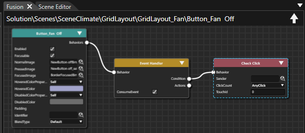
1. In Scene Tree panel select "Button\_Fan Off" and click on the \[Fusion...\] button on the right side of the Scene Tree.
- Fusion will be opened, displaying a Fusion diagram as shown in the image below.
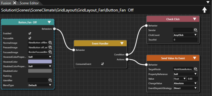
2. Drag the Event Handler Fusion Node's Actions connector of the right and release the mouse button.
- The Select Behavior dialog will be displayed.
3. Position the mouse cursor into the input field above the behaviors list and start typing "
[Send Value as Event](http://cgi3151en.candera.eu/books/controls-and-behaviors/page/action-behaviors#bkmrk-send-value-as-event)". As soon as you find the behavior in the list, which is narrowed down while typing, double-click it.
- A new Fusion Node is added to the Fusion diagram: Send Value as Event Fusion Node.
4. Configure the Send Value as Event Event Node's TargetNode by pressing the magnifying glass icon next to it. In the opened Select Item dialog navigate to the MultiStateButton\_Fan, which can be found at the path given in the table below. Select MultiStateButton\_Fan and press \[OK\].
- MultiStateButton\_Fan is configured as TargetNode, where the value will be sent to when a click action occurs on "Button\_Fan Off".
5. Configure the Send Value As Event Fusion Node's value according to the table below.
- \[Button\_Fan Off\] is configured to send a value of 0.00 to MultiStateButton\_Fan whenever it is pressed.
6. Repeat steps 1 to 5 with "Button\_Fan Max" setting the Send Value As Event Fusion Node's value to the maximum fan value of "7".
- \[Button\_Fan Max\] is configured to send a value of 7.00 to MultiStateButton\_Fan whenever it is pressed.
1. From the ToolBox panel's \[ Controls \] section under "Touchable" drag and drop 1
[MultiStateButton ](http://cgi3151en.candera.eu/books/controls-and-behaviors/page/touchable#bkmrk-multistatebutton)into the Scene Tree panel directly onto the scene's GridLayout.
- In the Scene Tree panel you can see that a
MultiStateButton has been created below the scene's GridLayout that has been created in one of our first steps on this page.
2. In the Scene Tree panel select the MultiStateButton and rename it to "MultiStateButton\_Seat" either via the context menu entry "Rename" or by pressing <F2> on your keyboard.
- In the Scene Tree panel, the "MultiStateButton\_Seat" can be seen.
3. In the Scene Tree panel select MultiStateButton\_Seat. In the Properties panel's \[ Layout \] section change the VerticalAlignment to VCenter.
- In the Scene Editor MultiStateButton\_Seat is displayed vertically centered inside its cell.
4. In the Scene Tree panel right-click on the scene's GridLayout and choose "Configure Layouter..." from the context menu.
- The "Grid Layout Editor" will be opened.
5. In the "Grid Layout Editor" drag and drop MultiStateButton\_Seat into the cell right next to the "Text\_Seat heater" Text control. Then click \[OK\].
- In Scene Editor MultiStateButton\_Seat is now placed at the correct position.

6. In the Scene Tree panel select MultiStateButton\_Seat. In the Properties panel's \[ Control \] section under "StateImages" click on the magnifying glass next to "StateImages 0".
- The "Choose Item" dialog will be opened.
7. In the Choose Item dialog navigate to "/Resources/Climate/NewButtonState1Bmp", select this image and click \[OK\].
- In the Properties panel the first StateImage has been configured.
8. Repeat steps 6 and 7 to configure the remaining StateImages as in the table below.
- In Properties panel all StateImages are configured.
- In Scene Editor you can see the newly configured images.
-
If the new images are not visible try refreshing the screen by pressing the <F5> key on your keyboard.
| **StateImages** | **Image Path** |
| StateImages 0 | /Resources/Climate/NewButtonState1Bmp |
| StateImages 1
| /Resources/Climate/NewButtonState2Bmp |
| StateImages 2
| /Resources/Climate/NewButtonState3Bmp |
| StateImages 3
| /Resources/Climate/NewButtonState4Bmp |
9. You can check the functionality by changing the Control's "Current State" property to any value from 0 to 3 in the Properties panel's \[ Control \] section.
- In the Scene Editor a different image will be displayed for the Seat heater depending on the configured value of the "Current State" property.
- Below you can see the MultiStateButton\_Seat when "Current State" is 3.
1. From the Toolbox panel's \[ Controls \] section under "Touchable" drag and drop a
[SpinBox ](http://cgi3151en.candera.eu/books/controls-and-behaviors/page/touchable#bkmrk-spinbox)into the Scene Tree directly onto the scene's GridLayout.
- In the Scene Tree panel you can see that SpinBox
has been created below the scene's GridLayout that has been created in one of our first steps on this page.
2. In the Scene Tree panel select the SpinBox and rename it to "SpinBox\_Heating" either via the context menu entry "Rename" or by pressing <F2> on your keyboard.
- In the Scene Tree panel, the "SpinBox\_Heating" can be seen.
3. In the Scene Tree panel select SpinBox\_Heating. In the Properties panel's \[ Layout \] section change the VerticalAlignment to VCenter and change the Size's X property to "150".
-
To change the Size's X property you might have to click the disabled \[ A \] button first.
- In the Scene Editor SpinBox\_Heating is displayed vertically centered inside its cell and its width is reduced to 150px.
| **Target Item** | **Value** |
| Vertical Alignment | VCenter |
| Size X | 150,00 |
4. In the Scene Tree panel right-click on the scene's GridLayout and choose "Configure Layouter..." from the context menu.
- The "Grid Layout Editor" will be opened.
5. In the "Grid Layout Editor" drag and drop SpinBox\_Heating into the cell right next to the "Text\_Heating" Text control. Then click \[OK\].
- In Scene Editor SpinBox\_Heating is now placed at the correct position.
6. In the Scene Tree panel select Spinbox\_Heating. In the Properties panel's \[ Control \] section adjust the properties given in table below.
- SpinBox\_Heating is configured according to the table.
- In Scene Editor the displayed text is changed to "22°C".
-
If the displayed value doesn't change to "22°C" try refreshing the screen by pressing the <F5> key on your keyboard
| **Target Item** | **Value** |
| Value | Float 22.00 |
| Minimum Value | Float 15,00 |
| Maximum Value | Float 28,00 |
| Text Format | %02d°C |
7. In the Properties panel's \[ Control \] section click on the magnifying glass icon next to "Arrow Up Normal Image".
- The "Choose Item" dialog will be opened.
8. In the Choose Item dialog select /Resources/Climate/New\_arrow\_incrementBmp
- In Scene Editor you can see that a new image has been configured for the SpinBox.
9. Repeat steps 7 and 8 to configure new images according to the table below.
- In Properties panel new images are configured for the SpinBox\_Heating as seen in the image below.
- In the Scene Editor new images are visible for the SpinBox.
| **Target Item** | **Value** |
| Arrow Up Normal Image | /Resources/Climate/New\_arrow\_incrementBmp |
| Arrow Up Pressed Image | /Resources/Climate/New\_arrow\_increment\_activeBmp |
| Arrow Down Normal Image | /Resources/Climate/New\_arrow\_decrementBmp |
| Arrow Down Pressed Image | /Resources/Climate/New\_arrow\_decrement\_activeBmp |
The Climate scene is now finished.
1. To check the result of configuring the first scene, open the display view. This view represents the final rendered result and can be opened via the menu bar: View - Display - Display-0.
- The display panel will be opened in a floating way displaying the scene configured in the steps above.
2. In the Scene Composer's Toolbar make sure that the item "Generate and Play" is selected in the drop-down menu and click the \[ > \] button to the left.
- This will generate the asset so it is available as input for the Player. After that the CGI Panel will be started.
3. In the CGI Panel tick the checkbox next to "Scenes#SceneClimate" and uncheck "Scenes#SceneHome".
- SceneClimate will become visible in the Player.
4. You can now play around with the configured Climate Controls in the scene and watch the results.
- Temperature slider is working and the displayed temperature is updated.
- Steering wheel heating CheckBox can be checked and unchecked
- Air Conditioning RadioButtons can be toggled
- Fan Buttons and MultiStateButton can be clicked and are functional.
- Seat heater MultiStateButton can be clicked and will change its image
- Heating SpinBox can be configured for values from 15 to 28°C
1. In the menu bar select Import > Import Resources...
- The "Import Resources" dialog will be opened.
2. In the "Import Resources" dialog navigate to the path given in the table below. Select all 16 files and press **\[Open\]**
- The "Import Images" dialog will be opened.
| **Import Resources** | **Path** |
|
| /cgi\_studio\_content/Resources/GettingStartedControls/Options |
3. In the "Import Images" dialog select folder "/Resources", make sure to create a new folder "Options" for the imported images and click **\[OK\]**.
- In the Solution Explorer you can see that there is a new folder "Options" in folder "Resources" that contains the 16 imported images.
- The images have been imported and can be used in the Scene Composer solution.
| **Target Item** | **Name** |
| Group |
| Connection |
| | BitmapNode | Background |
| Group\_1 |
| Devices |
| | BitmapNode | Background |
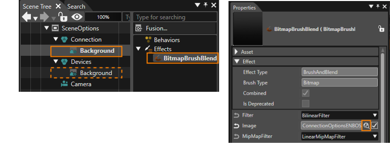
5. In the Scene Tree panel select the BitmapNodes called "Background" one after the other and perform the following instructions on both background nodes: In Scene Tree panel's right side select the "BitmapBrushBlend" effect. In the Properties panel's **\[Effect\]** section click on the magnifying glass icon next to the Image property.
- The "Choose Item" dialog will be opened.
6. In the "Choose Item" dialog select the image as in the table below and click **\[OK\]**.
- The Choose Item dialog will be closed.
- In the Scene Editor a background image is visible displaying a vertical grey-black gradient. | **Node** | **Effect** | **Property** | **Path** |
| Connection > Background | BitmapBrush Blend | Image
| /Resources/Options/ConnectionOptionsENBOSBmp |
| Connection > Background | BitmapBrush Blend | Image
| /Resources/Options/ConnectionOptionsENBOSBmp |
7. In the Scene Tree panel select the "Connection" group. In the Properties panel's **\[Transformations\]** section adjust the "Position" property according to the table below. Repeat this step with the "Devices" group.
- In Scene Editor two rectangles with a gradient background are visible. | **Target Name** | **Position X** | **Position Y** |
| Connection
| 78.00
| 58.00
|
| Devices
| 551.00
| 58.00
|
### Configuration of the "Connection" Nodes
The left side of the scene offers the possibility to choose the connection type. The Scene Composer's built-in Dial control will be customized with new images that fit to the scene's design. TextNodes will be added as labels.
#### Creation and Positioning of the Dial Control
1. From the Toolbox panel's **\[Controls\]** section under Touchable drag a [Dial](http://cgi3151en.candera.eu/books/controls-and-behaviors/page/touchable#bkmrk-dial) control into the Scene Tree panel directly onto the "Connection" group.
- In the Scene Tree panel a Dial control has been added into the "Connection" group.
- In the Scene Editor the Dial control is visible in the top left corner of the left gradient image.
2. In the Scene Tree panel select the Dial control. In the Properties panel's **\[Transformation\]** section adjust its position according to the table below.
- In the Scene Editor the Dial control is positioned in the lower center of the gradient image. | **Target Name** | **Position X** | **Position Y** |
| Dial
| 72.00
| 163.00
|
#### Configuration of the Dial Control
The following steps show how to configure the Dial control with new images.
1. In the Properties panel's **\[Control\]** section click on the magnifying glass icon next to property "Knob Image".
- The "Choose Item" dialog will be opened.
2. In the "Choose Item" dialog select the image as in the table below and click \[OK\].
- The "Choose Item" dialog will be closed.
- In the Scene Editor an orange ring will become visible. | **Property** | **Path** |
| Knob Image
| /Resources/Options/NewDial\_arrow\_middleBmp |
3. In the Properties panel's **\[Control\]** section click on the the "BackgroundImages" section.
- In the Properties panel the "BackgroundImages" section will be expanded.
4. In the Properties panel's **\[BackgroundImages\]** section click on the magnifying glass next to "BackgroundImages 0".
- The "Choose Item" dialog will be opened.
5. In the "Choose Item" dialog select the image as in the table below and click \[OK\].
- The "Choose Item" dialog will be closed.
- In the Properties panel the first one of the BackgroundImages has been configured. | **Property** | **Path** |
| BackgroundImages 0
| /Resources/Options/NewDial\_background\_leftBmp |
6. Repeat steps 4 and 5 to configure the remaining BackgroundImages. After this step the BackgroundImages are configured according to the table below.
- In Properties panel all BackgroundImages are configured.
- In Scene Editor you can see the newly configured images. If the new images are not visible try refreshing the screen by pressing the <F5> key on your keyboard.
| **StateImages** | **Image Path** |
| BackgroundImages 0 | /Resources/Options/NewDial\_background\_leftBmp |
| BackgroundImages 1
| /Resources/Options/NewDial\_background\_middleBmp |
| BackgroundImages 2
| /Resources/Options/NewDial\_background\_rightBmp |
7. In the Solution Explorer panel select the new Knob Image "/Resources/Options/NewDial\_arrow\_middleBmp". In the Properties panel's **\[Bitmap\]** section enable "Pivot Hint" by checking the respective checkbox.
- A new property "Pivot Hint" becomes visible.
8. Configure the "Pivot Hint" as in the table below.
- The Pivot Hint for the Knob Image is configured correctly. | **Target Name** | **Enable Pivot Hint** | **Pivot Hint X** | **Pivot Hint Y** |
| NewDial\_arrow\_middleBmp | true | 84,50
| 88,00
|
9. In the Solution Explorer select the three images that were configured as BackgroundImages. In the Properties panel proceed similar to steps 7 and 8, enabling and configuring the Pivot Hint of these three images according to the table below.
- The Pivot Hint is configured correctly.
- In Scene Editor the Dial's images are neatly aligned. The images have a common center. If the the images are still not aligned correctly try refreshing the screen by pressing the <F5> key on your keyboard.
| **Target Name** | **Enable Pivot Hint** | **Pivot Hint X** | **Pivot Hint Y** |
| NewDial\_background\_leftBmp | true
| 130,50
| 130,50 |
| NewDial\_background\_middleBmp | true
| 130,50 | 130,50 |
| NewDial\_Background\_rightBmp | true
| 130,50 | 130,50 |
#### Adding TextNodes as Connection Labels
TextNodes will be configured with an attractive font and positioned as labels for choosing the connection type.
1. From the Toolbox panel's **\[Nodes 2D\]** drag and drop a [TextNode ](http://cgi3151en.candera.eu/books/scene-design/page/2d-nodes#bkmrk-create-2d-nodes)into the Scene Tree panel directly onto the "Connection" group node.
- In the Scene Tree panel a TextNode will become visible.
- In the Scene Editor the text "Text" will appear. If the text does not appear in Scene Editor, the BitmapNode "Background" might be covering the TextNode. Make sure that "Background" is the first (top) item inside the "Connection" group. Nodes can be re-arranged in the Scene Tree panel via drag&drop.
2. In the Scene Tree panel select the new TextNode. In the Properties panel's **\[2D Text Node\]** section click on the magnifying glass icon next to property "Style".
- The "Text Style Palette" dialog will be opened.
3. In the "Text Style Palette" dialog select "OpenSans25" and click **\[OK\]**.
- In Scene Editor the Text Style of the TextNode will change.
4. In the Scene Tree panel right click onto the TextNode and select "Clone..." from the context menu.
- The "Clone Item" dialog will be opened.
5. In the "Clone Item" dialog change to the "Multiple Clone" tab. Configure "Number of Copies" to "3" and click **\[OK\]**.
- In the Scene Tree panel 4 TextNodes are now available inside the "Connection" group.
6. In the Scene Tree panel select the newly created TextNodes one after the other and configure their names in the Scene Tree panel and the remaining properties in the Properties panel as in the table below.
- The TextNodes are fully configured.
- The final result of the Connection part can be seen in the images below. | **TextNode Name** | **2D Text Node** | **Transformations** |
| **Text** | **Position X** | **Position Y** |
| TextNode\_Connection | Connection | 141 | 61 |
| TextNode\_Bluetooth | Bluetooth | 149 | 134 |
| TextNode\_Cable | Cable | 20 | 200 |
| TextNode\_Other | Other | 315 | 200 |
### Setting up the "Devices" nodes
The right side of the scene displays a list of devices. Scene Composer's built-in List control will be expanded to facilitate customization later on. Based on the existing List control a new reusable MyList control template will be created.
1. In the Scene Tree panel copy the TextNode\_Connection from the Connection Group2D either via the context menu "Copy" or via the keyboard shortcut <Ctrl + C>. Paste the TextNode into the Devices Group2D either via the context menu "Paste" or via the keyboard shortcut <Ctrl + V>.
- In the Scene Tree panel you can see that TextNode\_Connection has been copied to the Devices group.
- In the Scene Editor another Textnode with "Connection" is visible.
2. In the Scene Tree panel select the new TextNode\_Connection from the Devices group and rename it to TextNode\_Devices either via the context menu "rename" or via the keyboard shortcut <F2>.
- In the Scene Tree panel you can see a TextNode called TextNode\_Devices inside of the Devices Group2D.
3. In the Scene Tree panel select TextNode\_Devices. In the Properties panel's **\[2D Text Node\]** section change the TextNode's Text property and in the **\[Transformation\]** section adapt its Position according to the table below.
- Text and position of the TextNode are configured.
- In the Scene Editor you can see that the devices part has got a headline. | **TextNode Name** | **2D Text Node** | **Transformations** |
| **Text** | **Position X** | **Position Y** |
| TextNode\_Devices | Devices | 145 | 61 |
4. From the Toolbox panel's **\[Control\]** section under "Touchable" drag a [List ](http://cgi3151en.candera.eu/books/controls-and-behaviors/page/touchable#bkmrk-list)Control into the Scene Tree panel directly onto the "Devices" group node.
- In the Scene Tree panel a "List" node is visible directly under the "Background" node.
- This list node contains a "ListContentGroupAnchor", that is visible in Scene Tree panel by expanding the List node via a click on the triangle on its left.
5. In the Scene Tree panel right-click on the newly created List node and choose **\[Expand Control Node\]** from the context menu.
- In the Scene Tree panel the expanded List now shows a "ListContentGroup" and a "Scrollbar".
6. In the Scene Tree panel right-click on the "Scrollbar" and once again choose **\[Expand Control Node\]** from the context menu.
- In the Scene Tree panel the expanded Scrollbar shows 6 sub-nodes.
7. In the Scene Tree panel right-click on the List node and choose **\[Save as Control...\]** from the context menu.
- The "Add New Templates" dialog will be opened.
8. In the "Add New Templates" dialog select the "/Controls" folder to store the new control in, enter "MyList" as name and click **\[OK\]**.
- A new customizable control "MyList" has been created. It is visible in the Solution Explorer panel in the Controls folder and in the Toolbox panel's **\[Controls\]** section as last item of the list.
- The Scene Editor doesn't display SceneOptions any more, it displays the control MyList.
- The Scene Tree panel shows the structure of MyList.
- The Properties panel shows the properties of "MyList (Control)".
### Configure MyList Control
#### Expose MyList's ScrollBarVisibility
Scene Composer's List internally holds a property for the scrollbar's visibility, which is not shown in the Properties panel by default. The following steps show how to access a list of hidden properties. For this sample solution we will make the scrollbar's visibility property publicly editable in the Properties panel.
1. In the Solution Explorer right-click on the newly created control "MyList" and choose **\[Control Properties...\]** from the context menu.
- The "Configure Public Control Properties" dialog will be opened.
2. In the "Configure Public Control Properties" dialog's tree on the left side select the following item MyList > List > Scrollbar > Behaviors > ScrollbarBehavior. In the dialog's centered panel "Internal properties" find property "ScrollbarVisibility", check the "Is Public" checkbox and click **\[OK\]**.
- The "Configure Public Control Properties" dialog will be closed.
- For every instance of the MyList control, there will be a property available to configure the visibility of the scrollbar.
3. In the Scene Tree navigate back to SceneOptions by pressing the arrow in the top left corner.
- The Scene Tree panel navigates back to SceneOptions and displays SceneOptions and its nodes.
- The Scene Editor displays SceneOptions.
4. In the Scene Tree delete the List node.
- The "Delete Item" dialog will be opened.
5. In the "Delete Item" dialog press **\[OK\]**.
- The List node is deleted.
6. From the Toolbox panel's **\[Control\]** section drag and drop a MyList control into the Scene Tree panel directly onto the Devices group.
- In the Scene Tree panel, a new MyList node will be visible.
7. In the Scene Tree panel select "MyList". In the Properties panel's **\[Control\]** section set the "Scrollbar Visibility" to "Visible".
- In the Scene Editor a small blue scrollbar becomes visible.
#### Customize MyList's Scrollbar
Scene Composer's default scrollbar has a blue base color. For our orange based design the scrollbar will be customized in the steps below.
1. In the Scene Tree panel double-click on the MyList node.
- Scene Tree panel will switch from displaying SceneOptions to displaying the MyList template.
2. In the Scene Tree panel select the "Thumb" button node. In the Properties panel change the button's image properties according to the table below by clicking the magnifying glass icon and selecting the appropriate image in the "Select Item" dialog.
- New images for the scrollbar's "Thumb" have been defined. | MyList > List > Scrollbar > **Thumb** |
| **Thumb Images** | **Image Path** |
| Normal Image | /Resources/Options/ThumbNormalBmp2Bmp |
| Pressed Image | /Resources/Options/ThumbPressedBmp2Bmp |
| Focused Image | /Resources/Options/ThumbNormalBmp2Bmp |
3. In the Scene Tree panel select the "VerticalPrevItem" button node. In the Properties panel change the button's image properties according to the table below by clicking the magnifying glass icon and selecting the appropriate image in the "Select Item" dialog.
- New images for the scrollbar's "VerticalPrevItem" have been defined. | MyList > List > Scrollbar > PrevItem > **VerticalPrevItem** |
| **VerticalPrevItem Images** | **Image Path** |
| Normal Image | /Resources/Options/ArrowUpNormalBmp2Bmp |
| Pressed Image | /Resources/Options/ArrowUpPressedBmp2Bmp |
| Focused Image | /Resources/Options/ArrowUpNormalBmp2Bmp |
4. In the Scene Tree panel select the "VerticalNextItem" button node. In the Properties panel change the button's image properties according to the table below by clicking the magnifying glass icon and selecting the appropriate image in the "Select Item" dialog.
- New images for the scrollbar's "VerticalNextItem" have been defined. | MyList > List > Scrollbar > NextItem > **VerticalNextItem** |
| **VerticalNextItem Images** | **Image Path** |
| Normal Image | /Resources/Options/ArrowDownNormalBmp2Bmp |
| Pressed Image | /Resources/Options/ArrowDownPressedBmp2Bmp |
| Focused Image | /Resources/Options/ArrowDownNormalBmp2Bmp |
5. In the Scene Tree navigate back to SceneOptions by pressing the arrow in the top left corner.
- The Scene Tree displays SceneOptions.
- In the Scene Editor the scroll bar is now rendered with the new images in orange color.
#### Configure MyList's Main Item
Our MyList control will be composed of MainItems. Whenever a certain MainItem gets selected, the appropriate Sub-List will be displayed. The following steps explain how to build up a MainItem.
1. In the Scene Tree panel double-click on the MyList node.
- Scene Tree panel switches from SceneOptions to MyList.
- You are now able to edit the MyList template.
2. From the Toolbox panel's **\[2D Nodes\]** section drag an [OverlayLayout ](http://cgi3151en.candera.eu/books/scene-design/page/2d-laying-out#bkmrk-overlay-layouter)into the Scene Tree panel directly onto the List's "ListContentGroup" (MyList > List > ListContentGroup).
- In the Scene Tree panel there is an OverlayLayout inside of "ListContentGroup".
3. From the Toolbox panel's **\[2D Nodes\]** section drag a [RenderNode ](http://cgi3151en.candera.eu/books/scene-design/page/2d-nodes#bkmrk-create-2d-nodes)and a [TextNode ](http://cgi3151en.candera.eu/books/scene-design/page/2d-nodes#bkmrk-adding-text-to-the-2)into the Scene Tree panel directly onto the OverlayLayout that was created in the previous step.
- In the Scene Tree panel there are a RenderNode and a TextNode inside the OverlayLayout that was created in the previous step.
- In the Scene Editor the TextNode is visible displaying the TextNode's default text "Text".
4. In the Scene Tree panel select the nodes created in the previous steps and rename them either via the context menu entry "Rename" or by pressing <F2> on your keyboard according to the table below.
- In the Scene Tree panel the nodes are renamed according to the following table. | **Initial Name** | **New Name** |
| OverlayLayout | MainItem |
| TextNode | EntryName |
| RenderNode | FocusImage |
5. In the Scene Tree panel select the List (Group2D). In the Properties panel's **\[Transformation\]** section configure the position and size according to the following table.
- In Scene Editor the Position and size of the selected rectangle is adjusted according to the new settings. Size X and Size Y properties are initially set to "Automatic" and greyed out. Clicking onto the "A" next to the greyed-out input field allows you to edit these properties.
| **Target Item** | **Transformation** | **Layout** |
| **Position X** | **Position Y** | **Size X** | **Size Y** |
| List (Group2D)
| 58
| 134
| 300
| 300
|
#### Configure MyList's Highlight for Selected Item
In a list it is useful to highlight the selected item. This will be done using a FocusImage drawing a border around the focused MainItem.
1. From the Toolbox panel's \[Effects\] section drag a [BitmapBrushColorBlend ](http://cgi3151en.candera.eu/link/602#bkmrk-bitmapbrushcolorblen)effect into the Scene Tree panel directly onto the MainItem's FocusImage.
- In the Scene Tree panel's right side you can see BitmapBrushColorBlend effect under "Effects" when FocusImage is selected.
2. In the Scene Tree panel select FocusImage. In the Scene Tree panel's right side select the BitmapBrushColorBlend effect. In the Properties panel click on the magnifying glass icon next to the "Image" property.
- The "Choose Item" dialog will be opened.
3. In the "Choose Item" dialog select the image as in the table below and click **\[OK\]**.
- The "Choose Item" dialog will be closed. | **Target Item** | **Image** |
| MyList > List > >ListContentGroup > MainItem > FocusImage > BitmapBrushColorBlend | //ConstructionKit/ConstructionKit/Controls/Images/Common/BorderFocusedBmp |
4. In the Properties panel change the Color property by entering new values for "Red", "Green" and "Blue" according to the table below.
- In the Properties panel the configured orange color will be visible. The Color property can also be edited in the Color Palette window, which can be opened by clicking on the color preview rectangle next to the Color property.
| **Target Item** | **Color** |
|
| **Red** | **Green** | **Blue** |
| MyList > List > >ListContentGroup > MainItem > FocusImage > BitmapBrushColorBlend | 1.0
| 0.62
| 0.00
|
5. In the Scene Tree panel select the FocusImage node. In the Properties panel's **\[Layout\]** section set the StretchBehavior to "Fill" according to the table below.
- In the Scene Editor the FocusImage RenderNode will appear highlighted with an orange outline. | **Target Item** | **Layout > StretchBehavior** |
| MyList > List > >ListContentGroup > MainItem > FocusImage
| Fill
|
#### Create MyList's Sub-List
A Sub-List will be used to display 2 TextButtons to "Connect" or "Unpair" the associated device. The TextButtons will be positioned by a StackLayout. New images for normal, pressed and focused image will be defined.
1. From the Toolbox panel's **\[Controls\]** section under "Touchable" drag a [Sub-List ](http://cgi3151en.candera.eu/books/controls-and-behaviors/page/touchable#bkmrk-sub-list)into the Scene Tree panel directly onto the List's ListContentGroup
- In the Scene Tree panel the Sub-List node is positioned inside of ListContentGroup just below the MainItem.
- The Sub-List has a SubListAnchor.
2. From the Toolbox panel's **\[Node 2D\]** section drag a [StackLayout ](http://cgi3151en.candera.eu/books/scene-design/page/2d-laying-out#bkmrk-stack-layouter)into the Scene Tree panel directly onto the Sub-List's SubListAnchor.
- In the Scene Tree panel the StackLayout appears beneath the Sub-List's SubListAnchor.
3. From the Toolbox panel's **\[Controls\]** section under "Touchable" drag a [TextButton ](http://cgi3151en.candera.eu/books/controls-and-behaviors/page/touchable#bkmrk-textbutton)Into the Scene Tree panel directly onto the StackLayout you added in the step before.
- In the Scene Tree panel the TextButton appears beneath the StackLayout.
4. In the Scene Tree panel select the StackLayout. In the Properties panel's **\[Transformation\]** and **\[Layout\]** section configure the properties as in the table below.
- In the Scene Editor the dashed line of the TextButton's boundings will decrease.
| **Target Item** | **Transformations** | **Layout** |
| **Scale X** | **Scale Y** | **Margin Left** |
| TextButton
| 0,75
| 0,75
| 12
|
5. In the Properties panel's **\[Control\]** section click on the magnifying glass icon next to the TextButton's "Normal Image" property.
- The "Choose Item" dialog will be opened.
6. In the "Choose Item" dialog select the image according to the table below and click **\[OK\]**.
- A new image for "Normal Image" has been configured.
7. Repeat steps 5 and 6 for the TextButton's "Pressed Image" and "Focused Image".
- New images are configured for the TextButton.
| **Target Item** | **Image Path** |
| Normal Image
| /Resources/Options/ButtonNorma\_BkBmp
|
| Pressed Image
| /Resources/Options/ButtonNorma\_Prss\_OreBmp |
| Focused Image
| /Resources/Options/NOTBorderFocusedBmp |
8. In the Scene Tree panel select the TextButton and create a copy either via the context menu entries "Copy" and "Paste" or via the keyboard <Ctrl>+C and <Ctrl>+V.
- A copy of the TextButton has been created.
- In Scene Tree panel the name of the copy is "TextButton\_1".
9. In Scene Tree panel rename the TextButtons according to the table below. Renaming can be done either via the context menu "Rename" or pressing <F2> on your keyboard.
- In Scene Tree panel the TextButtons are renamed.
10. In Scene Tree panel select the TextButtons individually and change the text they are displaying in the Properties panel's **\[Control\]** section according to the table below.
- The texts of the TextButtons have been changed.
| **Target Item** | **New Name** | **Control - Text** |
| TextButton | TextButton\_Connect | Connect |
| TextButton\_1 | TextButton\_Unpair | Unpair |
#### Configure Behaviors for the Focus Handling of MyList's MainItem
Whenever MyList's MainItem gets focused, an orange border shall be displayed. Focus and FocusLeave behaviors are used to enable or disable the rendering of the FocusImage. The behaviors are configured using [Fusion](https://doc316en.candera.eu/books/fusion "Fusion").
A detailed explanation about Fusion, how to operate Fusion (how to add Fusion Nodes) and a configuration example can be found in the documentation about [Fusion](https://doc316en.candera.eu/books/fusion "Fusion").
1. In the Scene Tree panel select the MainItem's FocusImage. In the Properties panel's **\[Item\]** section uncheck "Enable Rendering".
- In the Scene Editor FocusImage (the orange rectangle) is not visible any more.
- In the Scene Tree panel an icon indicates the FocusImage node's disabled rendering.
2. In the Scene Tree panel select the MainItem GroupNode. Then press the **\[Fusion...\]** button on the right side of the Scene Tree.
- Fusion panel is opened displaying the Fusion diagram with the MainItem Fusion Node.
- The MainItem Fusion node has a Behaviors connector on its right side.
3. Add Fusion Nodes to the MainMenu Fusion Node using its Behaviors connector according to the table below.
- Three new Fusion node will be added to the Fusion diagram: Handle Control State, Focus, FocusLeave.
- Focus Fusion Node and FocusLeave Fusion Node can be configured with \[Action\] connectors.
| **Connect to** | **Connector** | **Add Fusion Nodes** |
| MainItem Fusion Node
| Behaviors
| Handle Control State
|
|
| Behaviors
| Focus |
|
| Behaviors
| FocusLeave |
4. Add Fusion Nodes to the Focus Fusion Node and the FocusLeave Fusion Node using their Actions connectors according to the table below.
- An EnableRendering Fusion Node will be connected to the Focus Fusion Node.
- An EnableRendering Fusion Node will be connected to the FocusLeave Fusion Node. | **Connect to** | **Connector** | **Add Fusion Nodes** |
| Focus Fusion Node
| Actions | EnableRendering |
| FocusLeave Fusion Node
| Actions | EnableRendering |
5. Configure the properties "Visible" and "Target Node" for both EnableRendering Fusion Nodes nodes according to the table below.
- MyList's behaviors for focus handling are configured.
- Whenever the MainItem gets the focus, the FocusImage will get visible.
- Whenever the MainItem looses the focus, the FocusImage will get invisible.
| **Behavior** | **Visible** | **Target Node** |
| Focus - EnableRendering
| True | MyList > List > ListContentGroup > MainItem > FocusImage |
| FocusLeave - EnableRendering
| False | MyList > List > ListContentGroup > MainItem > FocusImage |
#### Configure Behaviors for MyList's MainItem
When an item in the Devices list is clicked, a Sub-List will become visible. This Sub-List contains buttons for connecting/disconnecting.
1. In the Scene Tree panel select item MyList > List > ListContentGroup > MainItem. Then press the **\[Fusion...\]** button on the right side of the Scene Tree.
- Fusion is opened displaying the Fusion diagram with the MainItem Fusion Node.
- The MainItem Fusion Node has a Behaviors connector on its right side.
2. Add Fusion Nodes to the MainItem Fusion Node using its Behaviors connector according to the table below.
- A new Fusion node will be added to the Fusion diagram: Event Handler Fusion Node.
- The Event Handler Fusion node has 2 connectors on its right: a Condition connector and an Action connector. | **Connect to Fusion Node** | **Connector** | **Add Fusion Nodes** |
| MainItem
| Behaviors
| Event Handler |
3. Add Fusion Nodes to the Event Handler Fusion Node according to the table below.
- A new Fusion node will be added to the Fusion diagram: Check Logic Condition Fusion Node. With the Check Logic Condition you can combine 2 conditions with a configurable logic operation (And, Or, Xor).
| **Connect to Fusion Node** | **Connector** | **Add Fusion Nodes** |
| Event Handler
| Condition
| Check Logic Condition
|
4. Add two Fusion Nodes to the Check Logic Condition Fusion Node using its Conditions connector according to the table below.
- 2 new Fusion Nodes will be added to the Fusion diagram: Check Key Input Fusion Node and Check Click Fusion Node.
| **Connect to Fusion Node** | **Connector** | **Add Fusion Nodes** |
| Check Logic Condition
| Condition
| Check Key Input |
|
| Condition
| Check Click |
5. Configure the Condition Fusion Nodes according to the table below.
- Check Click and Check Key Input condition are logically combined through Check Logic condition.
- The Check Logic condition will evaluate to TRUE if either the Check Click condition or the Check Key Input condition is TRUE.
| **Condition** | **Property** | **Value** |
| Check Logic Condition
| Operation
| Or
|
| Check Key Input | KeyCode | Key\_Enter |
| Check Click | - | -
|
6. Add a Fusion Node the Event Handler Fusion Node using its Action connector according to the table below.
- A new Fusion Node will be added to the Fusion diagram: Send Value as Event Fusion Node. | **Connect to Fusion Node** | **Connector** | **Add Fusion Nodes** |
| Event Handler
| Action
| Send Value As Event
|
7. Configure the \[Send Value as Event\] Fusion node according to the table below.
- Send Value As Event is configured according to the table.
- On every click or enter key press a boolean value will be sent to the Sub-List control. To configure the TargetNode click on the magnifying glass icon to open the \[Choose Item\] dialog. Navigate to the desired object and press \[OK\].
| **Behavior** | **Property** | **Value** |
| Send Value As Event | Target Node | /Controls/MyList/List/ListContentGroup/Sub-List |
| Value | Bool - TRUE |
| Change Value
| Relative |
1.
#### Configure Behaviors for MyList's Sub-List
The visibility of the Sub-List shall be toggled by clicking the MainItem. Let's configure the necessary behaviors to the Sub-List.
1. In the Scene Tree panel select item MyList > List > ListContentGroup > Sub-List node. Then click the **\[Fusion...\]** button on the right side of the Scene Tree.
- Fusion is opened displaying the Fusion diagram with the Sub-List's Fusion Node.
- The Fusion node has a Behaviors connector on its right side.
2. Add a Fusion Node the Sub-List Fusion Node using its Behaviors connector according to the table below.
- A new Fusion Node will be added to the Fusion diagram: Value Fusion Node. | **Connect to Fusion Node** | **Connector** | **Add Fusion Nodes** |
| Sub-List
| Behaviors
| Value
|
3. Configure the Value Fusion Node according to the table below.
- The Value behavior's type has been changed to Bool.
| **Behavior** | **Property** | **Value** |
| Value
| Variant | Bool - FALSE
|
4. Add a Fusion Node the Value Fusion Node using its Receivers connector according to the table below.
- A new Fusion Node will be added to the Fusion diagram: Action On Value Fusion Node. | **Connect to Fusion Node** | **Connector** | **Add Fusion Nodes** |
| Value
| Receivers
| Action On Value
|
5. Add two Fusion Node the Action On Value Fusion Node according to the table below.
- 2 new Fusion Nodes will be added to the Fusion diagram: Check Processed Value Fusion Node and Set Control State Fusion Node.
| **Connect to Fusion Node** | **Connector** | **Add Fusion Nodes** |
| Action On Value
| Condition
| Check Processed Value
|
|
| Actions
| Set Control State
|
6. Configure the newly added Fusion Nodes according to the table below.
- The Action On Value Fusion Node is configured with an action that will be executed whenever a new value is received. In our case the Sub-List's Control State is set to enabled when the Bool value "TRUE" is received.
| **Behavior** | **Property** | **Value** |
| Check Processed Value
| ConditionOperator | Equal |
| ConditionValue | Bool, TRUE |
| Set Control State
| State | Enabled |
| ChangeTo | TRUE |
7. Repeat steps 4 and 5 to configure another set of Fusion Nodes to the Value Fusion Node using its Receivers connector according to the table below.
- 3 new Fusion Nodes will be added to the Fusion diagram: Action On Value\_1 Fusion Node, Check Processed Value\_1 Fusion Node and Set Control State\_1 Fusion Node. | **Connect to Fusion Node** | **Connector** | **Add Fusion Nodes** |
| Value
| Receivers
| Action On Value\_1
|
| Action On Value
| Condition
| Check Processed Value\_1
|
|
| Actions
| Set Control State\_1
|
8. Configure the newly added Fusion Nodes according to the table below.
- The Action On Value\_1 Fusion Node is configured with an action that will be executed whenever a new value is received. In our case the Sub-List's Control State is set to disabled (enabled = FALSE) when the Bool value "FALSE" is received.
| **Behavior** | **Property** | **Value** |
| Check Processed Value\_1
| ConditionOperator | Equal |
| ConditionValue | Bool, FALSE |
| Set Control State\_1
| State | Enabled |
| ChangeTo | FALSE |
#### Test MyList in the Player
Let's test if the configured behaviors of MyList control are functional.
1. Save your solution either via the menu bar "File - Save Solution" or via the keyboard <Ctrl + S>.
- The solution has been saved.
2. In the Scene Composer's Toolbar click on "Play selected scenario...".
- The resources will be generated and the Player will be started.
3. In the CGI Panel check Scenes#SceneOptions and uncheck SceneHome and SceneClimate
- In the Player window SceneOptions will be displayed with the Connection Dial on the left side and the empty Devices List on the right side, displaying the scrollbar.
4. In the Player window click the first item of the Devices List, the text of which is "Text".
- In the Player window's Devices List an orange border will be displayed indicating the selected MainItem.
- Additionally, the Sub-List with the TextButtons "Connect" and "Unpair" will be displayed below the selected MainItem.
5. In the Player window click the selected MainItem again.
- The TextButtons of the Sub-List will disappear.
6. In the Scene Composer's Toolbar click the "Close the Player" button.
- The Player and CGI Panel window will be closed.
#### Configure a Devices List using MyList
So far we have been working on our MyList control with only one single list entry. Now that this first list entry is fully configured, we can create more of them.
1. In the Scene Tree panel select the Main Item and the Sub-List. Copy and paste them to create 4 more instances. This can be done either via the context menu **\[Copy\]** and **\[Paste\]** or via the keyboard shortcuts <Ctrl + c> and <Ctrl + v>.
- In the Scene Tree panel you can see that MyList's ListContentGroup now contains 5 MainItems and 5 Sub-Lists.
2. In the Scene Tree panel select the MainItems individually. Use Fusion to configure the appropriate TargetNode for the \[Send Value As Event\] Fusion nodes (see table below).
- The "Send Value As Event" behaviors' TargetNodes are configured with the respective MainItems. To easily set the Target Node lock the Properties panel using the pad lock icon in the top right corner. From the Scene Tree panel drag the Sub-List node into the Properties panel directly onto the input field next to "TargetNode". Finally, don't forget to unlock the Properties panel clicking the pad lock icon once again.
| **SendValueAsEvent of** | **TargetNode** |
| MainItem | /Controls/MyList/Group2D:List/Group2D:ListContentGroup/CompositeNode2D:Sub-List |
| MainItem\_1 | /Controls/MyList/Group2D:List/Group2D:ListContentGroup/CompositeNode2D:Sub-List\_1 |
| MainItem\_2 | /Controls/MyList/Group2D:List/Group2D:ListContentGroup/CompositeNode2D:Sub-List\_2 |
| MainItem\_3
| /Controls/MyList/Group2D:List/Group2D:ListContentGroup/CompositeNode2D:Sub-List\_3 |
| MainItem\_4
| /Controls/MyList/Group2D:List/Group2D:ListContentGroup/CompositeNode2D:Sub-List\_4
|
3. In the Scene Tree panel select MainItem's EntryName. In the Properties panel's **\[2D Render Node\]** section change the property "Text" according to the table below.
- In the Scene Editor you can see the changed texts.
| **TextNode2D** | **Text** |
| MainItem > EntryName
| Phone (Private) |
| MainItem\_1 > EntryName | Phone (Work) |
| MainItem\_2 > EntryName | New Device |
| MainItem\_3 > EntryName
| New Device |
| MainItem\_4 > EntryName
| New Device |
### Check the Options Scene
The Options scene is now finished.
1. To check the result of configuring the first scene, open the display view. This view represents the final rendered result and can be opened via the menu bar: View - Display - Display-0.
- The display panel will be opened in a floating way displaying the scene configured in the steps above.
2. In the Scene Composer's Toolbar make sure that the item "Generate and Play" is selected in the drop-down menu and click the **\[>\]** button to the left.
- This will generate the asset so it is available as input for the Player. After that the CGI Panel will be started.
3. In the CGI Panel tick the checkbox next to "Scenes#SceneOptions" and uncheck "Scenes#SceneHome".
- SceneOptions will become visible in the Player.
4. You can now play around with the configured Options Controls in the scene and watch the results.
- Grab the Connection Dial Control and switch between Cable, Bluetooth and Other.
- Click into the Devices List to open the Sub-List.
- Click on the Sub-List's "Connect" and "Unpair" TextButtons and watch the configuredhover and click effects.
- Click on several devices in the Devices List to make multiple Sub-Lists visible. Now you can test the scrollbar.
# GettingStartedControls Part 4
In the first 3 parts of this sample we have created 3 individual scenes. In the Player it was necessary to enable and disable the displayed scenes manually. In this part we will add menu tabs to the bottom of the screen so the user can switch between scenes as he likes.
As basis for step 4 of our GettingStartedControls tutorial, please use your own created solution from the previous "GettingStartedControls" tutorial.
Our menu tabs scene can be seen on the bottom of the climate scene in below image.
Our goal is to create a tab bar to enable the user to switch between different scenes. As this bar shouldn't be displayed permanently, it will be put into a drawer control. This way it can be made visible by hovering an image and it can be hidden again by clicking on a close button. The buttons will be realized using customized radio buttons.
This tab bar will be placed on the bottom of every screen. To avoid having to create this bar inside every scene where it should be displayed, we will define a separate scene, which we can reuse on all screens.
### Importing Images
We will use the built-in Scene Composer controls but they will be customized with new images. Therefore these images have to be imported into the Scene Composer solution.
1. In the menu bar select **Import > Import Resources...**
- The Windows **"Import Resources"** dialog will be opened.
2. In the **"Import Resources"** dialog navigate to the path given in the table below. Select all 5 files and press **\[Open\]**
- The Windows **"Import Resources"** dialog will be closed.
- Scene Composer's **"Import Images"** dialog will be opened.
| **Import Resources** | **Path** |
|
| /cgi\_studio\_content/Resources/GettingStartedControls/MenuTabs |
3. In the **"Import Images"** dialog select folder "/Resources", make sure to create a new folder "MenuTabs" for the imported images and click **\[OK\]**.
- In the Solution Explorer you can see that there is a new folder "MenuTabs" in folder "Resources" that contains the 5 imported images.
- The **images have been imported** and can be used in the Scene Composer solution.

The important thing to know is that all changes you perform here will be applied to ALL instances of this control class immediately.
This is also valid when changing properties as long as your control class is opened. You can close it by clicking the left arrow at the top of the Scene Tree or by using the context menu of the Control in the SceneTree and choosing "Go To Previous Element".
If you are outside of the control's "Edit mode", all changes in the properties or behavior panel will influence a single instance of the control.
5. In the Scene Tree panel navigate to and **select** the **RadioButtonNode** (TabButton > StackLayout > OverlayLayout > RadioButtonNode). In the Scene Tree panel's right side select the RadioButtonNode **behavior actions** for setting images one by one as (see the table in the next step below). For each of the behaviors **click on the magnifying glass icon** next to the Image property in the Properties panel.
- The Choose Item dialog will be opened
6. In the "Choose Item" dialog **select the image** as in the table below and click \[ OK \].
- The "Choose Item" dialog will be closed.
- The respective **image** has been **changed**.
- In the Scene Editor the TabButton (former RadioButton) has changed as you can see in the image below.
| **RadioButtonNode - Behavior** | **Image** |
| SetNormalImage | /Resources/MenuTabs/ButtonNorma\_BkBmp |
| SetSelectedImage | /Resources/MenuTabs/ButtonNorma\_Prss\_OreBmp |
| SetSelectedPressedImage | /Resources/MenuTabs/ButtonNorma\_Prss\_OreBmp |
| SetNormalPressedImage
| /Resources/MenuTabs/ButtonNorma\_Prss\_OreBmp |
#### Configure the Text's Position
The positioning of text and background is not quite right. The following steps will correct that.
1. In the Scene Tree panel **select** the **TextNode** (TabButton > StackLayout > TextNode). In the **Properties panel's \[Layout\]** section change the HorizontalAlignment and the Margin according to the table below.
- In the Scene Editor panel minor changes in text positioning are visible.
| **Target Node** | **HorizontalAlignment** | **Margin** |
| **Left** | **Right** |
| RadioButtonNode | HCenter | 6 | 6 |
2. In the Scene Tree panel **select** the **TextNode** (TabButton > StackLayout > TextNode). In the Scene Tree panel's right side select the ProvideTextProperty. In the **Property panel** change the Text property to "TabButton".
- In the Scene Editor the TabButton's text is changed to "TabButton".
3. In the Scene Tree panel **select** the **TextNode** and **drag it onto** the root node **TabButton**, which is called "TabButton".
- In the Scene Tree panel you can see that the TextNode is now directly under the TabButton.
- In the Scene Editor the TextNode with the text "TabButton" is visible. It is hidden behind the Image of the RadioButtonNode.
4. In the Scene Tree panel **select** the **RadioButtonNode** and **drag it onto** the root node **TabButton** as well.
- In the Scene Tree panel you can see that the RadioButtonNode is now between the TabButton and the TextNode.
- In the Scene Editor the TextNode with the text "TabButton" is visible again as in the picture below.
5. In the Scene Tree panel **select** the **StackLayout** (with the OverlayLayout) and **delete** it either via the context menu "Delete" or by pressing the delete key on your keyboard.
- The Delete Item dialog will be opened displaying which items are going to be deleted.
6. In the Delete Item dialog **press** the **\[OK\]** button.
- In the Scene Tree panel you can see that StackLayout and OverlayLayout have been deleted.
- The Scene Tree looks as in the image below.
7. In the Scene Tree panel **select** the **RadioButtonNode**. In the **Properties panel's \[Layout\]** section change Alignment and Margin properties as well as the StretchBehavior according to the table below.
- In the Scene Editor the TextNode's text "TabButton" is neatly positioned in the center of the button (see image below).
- We have successfully created and customized our own TabButton control, which can be used like any other control.
| **Target Node** | **Vertical** | **Horizontal** | **Margin** | **StretchBehavior** |
| **Alignment** | **Left** | **Right** |
| RadioButtonNode | VStretch | HStretch | 0 | 0 | Fill |
### Creating MenuTabs Scene
A MenuTabs scene will be created and configured with a GridLayout holding various Buttons.
##### Setting up the Scene
In the following steps a scene is created and the camera as well as the viewport are configured.
1. **Create a new scene** via the menu bar "Scene" - "New 2D Scene" or press < Ctrl+2 > on your keyboard
- The "Add New Scene 2D" dialog will be opened.
2. In the first row select "/Scenes" from the drop-down menu. Enter "**SceneMenuTabs**" as name and press **\[OK\]**. We use the prefix "Scene" to have all scenes listed next to each other in the Solution Explorer panel.
- A new scene "SceneMenuTabs" is created and visible in the Solution Explorer panel in folder "Scenes".
- The new scene is opened in the Scene Editor and in the Scene Tree panel.
- In the Scene Tree panel you can see that the scene has a camera.
- In the Render Targets panel you can see that the camera is already added to the RenderTarget.
3. In the **Render Targets** panel check the checkbox of "SceneMenuTabs\\Camera" in order to **enable rendering**.
- Rendering of the scene is enabled.
4. In the Scene Tree panel select the Camera. In the Properties panel's **\[Camera\]** section configure the Viewport height to 54. The value of this property is calculated automatically. In order to be able to edit it, you have to click on the **\[A\]** button to the property's right, which will switch auto off.
- In the Scene Editor you can see that the height of the viewport is reduced to 54, which is about the height of the TabButton control.
5. In the Scene Tree panel select the Camera. In the **Properties panel's \[Camera\]** section change the **sequence number** to **3**.
- The camera's sequence number is set to 3.
- In the Scene Tree panel the red Information/Warning/Error square disappears.
#### Adding and Arranging Buttons
A GridLayout is configured to arrange 3 different kinds of buttons forming our menu of our configured car HMI.
1. From the **Toolbox panel's \[Controls\]** section under "Container" drag a **GroupBox** into the Scene Tree panel directly onto SceneMenuTabs.
- In the Scene Tree panel you can see that there is a GroupBox node.
- In the Scene Editor you can see a square with a white dashed outline.
2. In the Scene Tree panel **select the GroupBox** node. In the **Properties panel's \[Layout\]** section configure the Size according to the table below. The value of this property is calculated automatically. In order to be able to edit it, you have to click on the **\[A\]** button to the property's right, which will switch auto off.
- In the Scene Editor the white dashed outline will match the yellow line that marks the viewport.
| **Target Node** | **Size** |
| **X** | **Y** |
| GroupBox
| 1024
| 54
|
3. In the Scene Tree panel click on the little triangle to the left of the GroupBox to expand its content.
- In the Scene Tree panel the GroupBox node will open and you can see the Content anchor below.
4. From the **Toolbox panel's \[Node 2D\]** section drag a **GridLayout** into the Scene Tree panel directly onto the **GroupBox's Content anchor**.
- In the Scene Tree panel you can see the GridLayout node.
5. In the Scene Tree panel **select** the **GridLayout**. In the Proper**ties panel's \[Layouter\]** section change the Column Count to 6.
- The Column Count has been changed to 6.
6. From the **Toolbox panel's \[Controls\]** section **drag Controls into the Scene Tree panel** directly onto the GridLayout according to the table below.
- In the Scene Tree panel you can see that a Button, 4 TabButtons and a TextButton have been added to the GridLayout.
- In the Scene Editor the blue Button and 4 TabButtons (with the dark background) are rendered directly over each other, so that not all of them are visible.
| **Controls Section** | **Controls** |
|
| Touchable <ConstructionKit>
| 1 Button
|
| Touchable
| 4 TabButtons
|
| Touchable <ConstructionKit>
| 1 TextButton
|
7. In the Scene Tree panel **select** the **GridLayout**. In the **Properties panel's \[Layout\]** section configure **GridAutoArrangement** for **"horizontal"**.
- In the Scene Editor you can see that the Button, TabButtons and TextButton are neatly arranged.
8. In the Scene Tree panel right-click on the **GridLayout** and choose **\[Configure Layouter...\]** from the context menu.
- The Grid Layout Editor will be opened.
- In the Grid Layout Editor you can see that the Controls are bunched together inside of the first cell.
The Controls don't have to be configured for a certain column. The Controls will be arranged at runtime using the GridAutoArrangement property that we configured in the previous step.
9. In the Grid Layout Editor **configure** the **columns' widths** according to the table below and press **\[OK\]**.
- In the Scene Editor you can see that the columns widths have changed.
| **Column 1** | **Column 2** | **Column 3** | **Column 4** | **Column 5** | **Column 6** |
| 0.10 | 0.20 | 0.20 | 0.20
| 0.20
| 0.10
|
#### Configuring the Menu Bar's Buttons
The following steps will adapt the Buttons' visual appearance to the intended design and configure the Buttons' texts.
1. In the Scene Tree panel **expand** the **Button** by clicking on the little triangle on its left.
- In Scene Tree panel a Content anchor will get visible.
2. From the **Toolbox panel's \[Controls\]** section under "Common <ConstructionKit>" **drag** a **Text control** and drop it directly **onto** the **Button's Content anchor**.
- In the Scene Tree panel the Text control appears beneath the Content anchor.
- In the Scene Editor the Button is displayed with the text "Text" on it.
3. In the Scene Tree panel **select** the **Text control**. In the **Properties panel** change the properties according to the table below.
- In the Scene Editor the Button is displayed with the centered sign ">".
| **Properties Section** | **Property** | **Value** |
| Control | Text | > |
| Layout
| Vertical Alignment
| VCenter
|
|
| Horizontal Alignment
| HCenter |
4. In the Scene Tree panel **select** the **Button**. In the **Properties panel's \[Control\]** section change the Button's Image properties according to the table below. To change the images click on the magnifying glass icon to open the Choose Item dialog, select the appropriate image and click **\[OK\]**.
- In the Scene Editor the Button's background will be displayed in almost black color.
| **Properties Section** | **Property** | **Value** |
| General
| Name
| Next
|
| Control | Normal Image | /Resources/MenuTabs/ButtonNorma\_BkBmp |
| | Pressed Image | /Resources/MenuTabs/ButtonNorma\_Prss\_OreBmp |
|
| Focused Image
| /Resources/MenuTabs/ButtonNorma\_Prss\_OreBmp
|
5. In the Scene Tree panel **select** the **TabButtons** one by one (from top to bottom) and apply the properties in the **Properties** panel according to the table below.
- In the Scene Tree panel all TabButtons are renamed.
- In the Scene Editor you can see the TabButtons' texts (from left to right): HOME, CLIMATE, PHONE, OPTIONS.
| **General > Name** | **Control > Text** |
| TabHome | HOME |
| TabClimate | CLIMATE |
| TabPhone | PHONE |
| TabOptions | OPTIONS |
6. In the Scene Tree panel **select** the **TextButton**. In the **Properties** panel apply the properties as given in the table below.
- In the Scene Editor the TextButton's Text and Background have changed according to the configuration
- In the Scene Tree panel the TextButton is renamed.
| **Properties Section** | **Property** | **Control > Text** |
| General
| Name
| CloseButton |
| Control
| Text
| X |
|
| Normal Image
| /Resources/MenuTabs/ButtonNorma\_BkBmp |
|
| Pressed Image
| /Resources/MenuTabs/ButtonNorma\_Prss\_OreBmp |
|
| Focused Image
| /Resources/MenuTabs/ButtonNorma\_Prss\_OreBmp
|
7. In the Scene Tree panel **select** the **GroupBox**. In the **Properties panel's \[Control\]** section click on the magnifying glass icon next to property "**Default Selected Object**".
- The "Choose Item" dialog will be opened.
8. In the Choose Item dialog navigate to and **select** the **"TabHome"** TabButton which can be found via the path below, and click **\[OK\]**.
- In the Scene Editor the "TabHome" TabButton will be displayed selected as in the image below.
| **Default Selected Object** | **Path** |
|
| /Scenes/SceneMenuTabs/GroupBox/Content/GridLayout/TabHome |
### Integration of SceneMenuTabs
To integrate the SceneMenuTabs into the Display we have to reduce the height of our Home and Climate scenes.
1. In the **Render Targets panel select** the **cameras** one by one and change the properties in the **Properties panel's \[Camera\]** section according to the table below.
- In the Scene Editor for SceneHome, SceneClimate and SceneOptions you can see that the height of the yellow camera viewport rectangle is reduced to 714.
| **Camera** | **Viewport** | **Enable Swapping** |
| **Left** | **Top** | **Height** |
| SceneHome\\Camera | 0 | 0
| 714 | TRUE
|
| SceneClimate\\Camera | 0 | 0
| 714 | TRUE
|
| SceneOptions\\Camera | 0 | 0
| 714
| TRUE
|
| SceneMenuTabs\\Camera | 0
| 714
| 54
| FALSE
|
2. In the menu bar go to **View > Display > Display-0**.
- The **Display(0)** window will be opened.
3. In the **Render Targets panel** check the SceneMenuTabs\\Camera and one of the other cameras.
- In the Display(0) window you should be able to see the SceneMenuTabs on the bottom of the window and the other scene on the top just like in the image below.
#### Adding Functionality to the MenuTabs
When pressing a TabButton the respective scene should be displayed. This will be solved by configuring conditions and behaviors using [Fusion](https://doc316en.candera.eu/books/fusion "Fusion") to trigger scene activation and deactivation.
A detailed explanation about Fusion, how to operate Fusion (how to add Fusion Nodes) and a configuration example can be found in the documentation about [Fusion](https://doc316en.candera.eu/books/fusion "Fusion").
1. In the Solution Explorer **double-click** on **SceneMenuTabs**.
- In the Scene Editor and in the Scene Tree panel SceneMenuTabs will be opened.
2. In the Scene Tree panel navigate to SceneMenuTabs > GroupBox > Content > GridLayout > TabHome. Click on the **Fusion button** on the Scene Tree panel's right side.
- Fusion will be opened with the TabHome Fusion Node in the center.
- The TabHome Fusion Node has a Behaviors connector.
3. **Add Fusion Nodes** to Fusion diagram the according to the table below.
- 3 new Fusion node will be added to the Fusion diagram: Event Handler Fusion Node, Check Control State Fusion Node and Transition Request Fusion Node. | **Connect to Fusion Node** | **Connector** | **Add Fusion Nodes** |
| TabHome
| Behaviors
| Event Handler |
| Event Handler
| Condition
| Check Control State
|
|
| Action
| Transition Request
|
4. **Configure** the newly added **Fusion nodes** according to the table below.
- If TabHome's selected state changes to true, a transition to activate SceneHome is requested. | **Fusion Node** | **Property** | **Value** |
| Check Control State
| State
| Selected
|
|
| StateCondition
| ChangedToTrue
|
| Transition Request
| RequestType
| Activate
|
|
| Identifier
| SceneHome
|
5. In Fusion **select** the 3 newly added EventHandler Fusion Node, the Check Control State Fusion Node and Transition Request Fusion Node. **Now copy and paste** these nodes into the Fusion diagram (either via the context menu or via the keyboard shortcuts <Ctrl>+c and <Ctrl>+v).
- The Fusion nodes are copied, resulting in: Event Handler\_1 Fusion Node, Check Control State\_1 Fusion Node and Transition Request\_1 Fusion Node.
6. Change the **configuration of the Fusion Nodes** created via Copy&Paste according to the table below.
- If TabHome's selected state changes to false, a transition to deactivate SceneHome is requested. | **Fusion Node** | **Property** | **Value** |
| Check Control State\_1
| State
| Selected
|
|
| StateCondition
| ChangedToFalse
|
| Transition Request\_1
| RequestType
| Deactivate
|
|
| Identifier
| SceneHome
|
7. **Copy** all **Fusion Nodes** of this Fusion diagram except for the TabHome Fusion Node and paste them into the Fusion diagrams of TabClimate and TabOptions. Adapt the TransitionRequest Fusion Nodes' Identifier to SceneClimate or SceneOptions respectively according to the table below.
- If TabClimate's selected state changes to true, a transition to activate SceneClimate is requested.
- If TabClimate's selected state changes to false, a transition to deactivate SceneClimate is requested.
- The same is true for TabOptions and SceneOptions.
- With these configurations done, the SceneMenuTabs works as a navigation bar, enabling the user to switch between different scenes.
For this tutorial, ScenePhone has been skipped, since most controls have already been covered by other scenes.
| **Fusion Diagram of** | **Fusion Node** | **Identifier Value** |
| TabClimate
| Transition Request | SceneClimate |
|
| Transition Request\_1 | SceneClimate |
| TabOptions
| Transition Request | SceneOptions
|
|
| Transition Request\_1
| SceneOptions
|
8. **Save** your work and **start** the **Player** to test the functionality of your configuration.
- Pressing TabClimate will activate SceneClimate, Pressing TabOptions will activate SceneOptions and Pressing TabHome will activate SceneHome.
### Configuring the Menu Bar to Hide/Reappear
We want to make our menu bar with our TabButtons appear on hovering an indicator and disappear when clicking a button. To achieve this, the GroupBox will be moved into a Drawer Control. The indicator RenderNode2D will be enhanced with Control functionality.
#### Configuring a Drawer Control
Our menu bar will be encapsulated into a Drawer Control that can then be opened and closed like a drawer at a desk, hiding or showing its contents according to its opened/closed state.
1. Open **SceneMenuTabs**. From the **Toolbox panel's \[Controls\]** section under "Touchable <ConstructionKit>" **drag** a **Drawer** control and drop it into the Scene Tree panel directly onto the SceneMenuTabs.
- In the Scene Tree panel you can see that a Drawer control has been added to your scene.
2. In the Scene Tree panel **expand** the newly added **Drawer control**.
- A ContentAnchor will be displayed.
3. In the Scene Tree panel drag the **SceneMenuTabs > GroupBox** directly onto the **Drawer's ContentAnchor.**
- The GroupBox and all its content will be moved into the Drawer control.
4. **Configure** the **Drawer Control**'s properties in the Properties panel according to the table below.
- The Drawer is configured to only appear if needed and to appear from the Bottom.
- The Drawer is configured closed and its content won't be visible.
By unchecking the "Open" property, the Drawer Control will be closed, so it will hide its content. The content is still available, just hidden in a drawer (like in a desk drawer, where you can put away stuff).
You can check and uncheck this property during editing as you like and watch it appear and disappear, but please make sure to uncheck it in the end.
If there is no visual change when toggling the "Open" property, try forcing a refresh by pressing <F5> on your keyboard.
| **Drawer Properties Section** | **Property** | **Value** |
| Control
| Open | False |
|
| Appear Direction | Bottom |
5. In the Solution Explorer panel **navigate** to the image **arrowTabsBmp** which can be found following the path below and drag this image into the Scene Editor or into the Scene Tree panel.
- In Scene Editor the arrowTabsBmp image will be displayed.
- In Scene Tree panel a new RenderNode2D with the arrowTabBmp image will be available.
| **arrowTabsBmp** | **Solution Explorer Path** |
|
| Solution > Resources > MenuTabs > arrowsTabBmp
|
6. In the **Scene Tree panel** make sure that **arrowsTabBmp** is **positioned** above the Drawer control as seen in the image below.
- The indicator is now hidden while the drawer is open and our menu bar is displayed.
7. In the Scene Tree panel select the newly created **RenderNode2D arrowsTabBmp**. In the **Properties panel** change the properties as in the table below.
- The RenderNode2D is positioned correctly. | **arrowsTabBmp Properties Section** | **Property** | **Value** |
| Transformations | Position | X
| 469 |
| | Position | Y
| 21 |
|
| Scale
| X
| 0.5
|
|
| Scale
| Y
| 0.5
|
#### Opening and closing the Drawer Control
The Drawer Control shall be opened when hovering or clicking the indicator and it shall be closed when the Close Button is pressed. This functionality is configured using [Fusion](https://doc316en.candera.eu/books/fusion "Fusion").
A detailed explanation about Fusion, how to operate Fusion (how to add Fusion Nodes) and a configuration example can be found in the documentation about [Fusion](https://doc316en.candera.eu/books/fusion "Fusion").
1. While arrowsTabBmp is selected in the Scene Tree panel click on the **\[Fusion...\]** button on the right side of the Scene Tree.
- Fusion will be opened, displaying the **arrowsTabBmp** Fusion Node.
2. Add a **HandleControlState** Fusion Node to the arrowTabBmp Fusion Node using its Behaviors connector according to the table below.
- A new HandleControlState Fusion Node will be added to the Fusion diagram.
- RenderNode2D is now enhanced with control functionality. | **Connect to Fusion Node** | **Connector** | **Add Fusion Nodes** |
| arrowsTabBmp
| Behaviors
| HandleControlState
|
3. **Add Fusion Nodes** to the Fusion diagram according to the table below to build up the Fusion diagram shown in the image below.
- 4 new Fusion nodes have been created: OnClick Fusion Node, Hover Fusion Node, Change Drawer State Fusion Node and Change Drawer State\_1 Fusion Node. | **Connect to Fusion Node** | **Connector** | **Add Fusion Nodes** |
| arrowsTabBmp
| Behaviors
| Hover
|
|
| Behaviors
| OnClick
|
| OnClick
| Actions
| Change Drawer State
|
| Hover | Actions | Change Drawer State\_1 |
4. In Fusion **configure** the **TargetNode** of Change Drawer State Fusion Node and Change Drawer State\_1 Fusion Node according to the table below. To do this, click on the magnifying glass icon on the right side of the **TargetNode** property and follow the path to the Drawer control given in the table below.
- The Drawer will now be opened when the indicator is hovered or clicked. | **TargetNode** | **Choose Item Path** |
| Change Drawer State
| Scenes > SceneMenuTabs > Drawer
|
| Change Drawer State\_1
| Scenes > SceneMenuTabs > Drawer |
5. In the Scene Tree panel **select** the **CloseButton**, which can be found in the path below. Then click on the **\[Fusion...\]** button on the Scene Tree panel's right side.
- Fusion will be opened with the CloseButton's Fusion diagram.
- The CloseButton is already a Control and has an EventHandler and a Check Click condition.
6. **Add a Fusion Node** to the Event Handler Fusion Node using its Actions connector according to the table below.Change Drawer State action.
- In Fusion a new Fusion Node has been added to the Fusion diagram: Change Drawer State Fusion Node.
| **Connect to Fusion Node** | **Connector** | **Add Fusion Nodes** |
| Event Handler
| Actions
| Change Drawer State
|
7. In Fusion **configure** the **Change Drawer State** Fusion Node as in the table below.
- The Close Button is now configured to close the drawer.
- The Fusion diagram looks like in the image below.
| **Change Drawer State**
**Property**
| **Value** |
| TargetNode
| Scenes > SceneMenuTabs > Drawer |
| Action
| Close
|
8. **Save** your work and **start the Player** to test the functionality of your configuration.
- The Drawer will close when the \[Close\] button is pressed.
- The Drawer will open when the indicator is hovered.
# GettingStartedControls Part 5
#### Data-bound clock
In this step we will add a new Control that represents a clock. This clock works via data-binding. The Player that comes with CGI Studio provides one sample data-source that represents the current UTC time. This value will be bound to the clock Control. Scene Composer offers an analog and a digital clock control. In this example digital clock will be used. Note that the following steps work similarly for the analog clock.
##### Application specification
The data-source is defined in the Player. Therefore a connection between the Player and the Scene Composer Solution has to be defined. The following approach needs to be followed if data-binding should be used.
1. In the menu bar go to \[File\] >\[Define application specification\].
- The "Courier Editor Parameters" dialog will pop up. See image below
- This dialog requires two paths. | **File** | This is the path to the XHCDL file where the binding sources are stored |
| **Include Path** | This is root path to the source of CGI Studio [Courier](http://dev.doc.cgistudio.at/APILINK/namespace_courier.html).
|
2. Enter the paths as given in the table below and press \[OK\].
- The specification is saved.
- The Output panel will show whether the validation is valid (Validation finished!) or not (Validation failed!).
| **File** | \\cgi\_studio\_player\\src\\Player\\xhcdl\\PlayerDataBinding.xhcdl |
| **Include Path** | \\cgi\_studio\_courier\\src |
##### Add Data-Binding to the DigitalClock Control
1. In the Solutions Explorer **double-click SceneHome**, which can be found under path given in the table below.
- Scene Tree panel displays the scene tree of SceneHome. There is a DigitalClock control under the root node (SceneHome > DigitalClock).
- Scene Editor displays the editable scene. There is a DigitalClock control in the top center above the gauge.
| **Open Scene** | **Solution Explorer Path** |
| SceneHome
| Solution > Scenes > SceneHome
|
2. Either in Scene Editor or in Scene Tree panel **select** the **DigitalClock** control and view the configurable properties in the **Properties panel**.
- In the Properties panel under \[Control\] there is a **Time** property.
- The Time property has a button with a chain icon on its right side. Its tooltip says "Bind property to a data source item".
3. Click on this button.
- The **Define Data Binding** dialog will be opened.
- In the top of this dialog you can see that for the property "**Time**" the datatype "**Variant**" is preselected.
4. From the list of Data items **choose** the **Time binding source** and click **\[OK\]**.
- The Data Binding has been configured successfully. To find the binding source more easily, the dialog offers a search field.
5. You can now generate a new asset library and try it out in the Player.
#### Conclusion
This concludes the Getting Started Controls tutorial. However, by providing your own custom images and further modifying the layout of the controls, you can create even more visually stunning solutions. The GettingStartedControls sample provided in CGI Studio is just one example of what can be achieved using this tutorial as a basis.