# Advanced Cluster Solution

# Overview

This solution represents an advanced 2D cluster example. It consists of various scenes that are necessary to represent an advanced Cluster. The Main Scene consists of gauges that can be manipulated with Controls and Behaviors. This documentation includes a tutorial of how this advanced gauges can be implemented without coding. Other scenes, like the coverflow, show some other interactions in the solution and how this can be achieved with Behaviors. Culture is also used to support switching between display languages. Furthermore, a scene with a dynamic list is included in the sample. The dynamic list is the result of the tutorial that can be found under <span style="color: rgb(230, 126, 35);">[Dynamic List](https://doc316en.candera.eu/link/293#bkmrk-page-title)<span style="color: rgb(0, 0, 0);">.</span></span>

Advanced Cluster Part 1 to Part 4 are step-by-step tutorial of customizing a gauge by using the built in controls as a base. More design elements and behaviors are used to change its look and extend its logic. The gauges represent the main scene of this sample solution.

<div class="contents" id="bkmrk-advanced-cluster-par"><div class="contents"><div class="textblock">- <span style="color: rgb(230, 126, 35);">[Advanced Cluster Part 1](https://doc316en.candera.eu/link/275#bkmrk-page-title)</span>
- <span style="color: rgb(230, 126, 35);">[Advanced Cluster Part 2](https://doc316en.candera.eu/link/277#bkmrk-page-title)</span>
- <span style="color: rgb(230, 126, 35);">[Advanced Cluster Part 3](https://doc316en.candera.eu/link/278#bkmrk-page-title)</span>
- <span style="color: rgb(230, 126, 35);">[Advanced Cluster Part 4](https://doc316en.candera.eu/link/280#bkmrk-page-title)</span>

---

</div></div></div>

# Advanced Cluster Part 1

This section of the Best Practice describes how to configure the **render target** for this solution. It shows how to imported images via **\[Import Resources\]**. Some of these images will be used in controls later. In order for them to correctly fit e.g. into a Gauge control they need to have their **pivot point** adjusted. Finally, a **Custom Gauge** control will be created based on Scene Composer's built-in Gauge control.

#### Create Solution and Setup Render Target

A new empty solution will be created and the render target configuration is performed.

1. Create a **new solution** using the Empty Solution template and save it as shown in<span style="color: rgb(230, 126, 35);"> [Creating a new Solution](http://cgi3151en.candera.eu/books/getting-started/page/creating-a-new-solution "Creating a new Solution")<span style="color: rgb(0, 0, 0);">.</span></span>
    - A new solution is created and saved.
2. In the Solution Explorer panel on the top left select "Scene3D" (under "Solution - Scenes") and delete it either using the &lt;Del&gt; key or via the context menu **\[Delete\]** as described in <span style="color: rgb(230, 126, 35);">[Delete a Scene](http://cgi3151en.candera.eu/books/scene-design/page/delete-a-scene "Delete a Scene")</span>. 
    - A **\[Delete Items\]** dialog will popup.
3. Please resolve all dependencies with **\[Delete Usage Item\]** (which is the default) and click **\[OK\]**. 
    - Scene3D will be deleted.
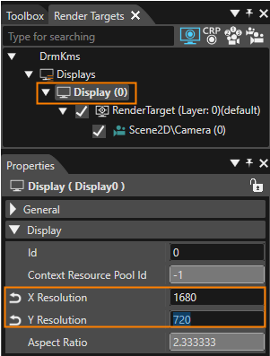
4. Activate the Render Targets panel on the top right and select **\[Display (0)\]**. In the Properties panel below change the display's X and Y Resolution. 
    - The horizontal and vertical resolution of the display is defined.
    - The aspect ratio of the display will be calculated automatically.  
        <table border="1" class="align-center" style="border-collapse: collapse; width: 600px; border-width: 1px;"><colgroup><col style="width: 50%;"></col><col style="width: 50%;"></col></colgroup><thead><tr><td style="background-color: rgb(53, 152, 219);"><span style="color: rgb(255, 255, 255);">**Target Item**</span></td><td style="background-color: rgb(53, 152, 219);"><span style="color: rgb(255, 255, 255);">**Setting Value**</span></td></tr></thead><tbody><tr><td>X Resolution  
        </td><td>1680</td></tr><tr><td>Y Resolution  
        </td><td>720
        
        </td></tr></tbody></table>
        
        <div drawio-diagram="8497"><img src="https://doc316en.candera.eu/uploads/images/drawio/2025-08/drawing-5-1754040396.png" alt=""/></div>
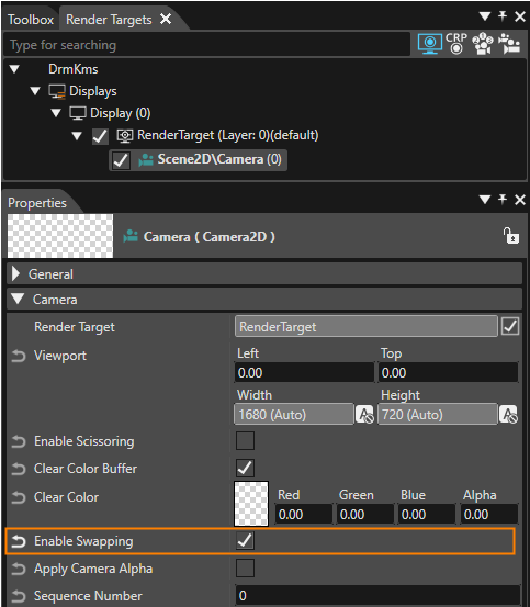
5. In the Render Targets panel select Scene2D\\Camera (0). In the Properties panel check the checkbox to **Enable Swapping**. 
    - Swapping has been enabled for Scene2D's camera.
    - The display will be refreshed after each time this scene is rendered. <table border="1" class="align-center" style="border-collapse: collapse; width: 600px; border-width: 1px;"><tbody><tr><td style="background-color: rgb(53, 152, 219);"><span style="color: rgb(255, 255, 255);">**Camera**</span></td><td style="background-color: rgb(53, 152, 219);">**<span style="color: rgb(255, 255, 255);">Enable Swapping</span>**</td></tr><tr><td>Scene2D\\Camera(0)</td><td>TRUE</td></tr></tbody></table>
        
        <div drawio-diagram="8498"><img src="https://doc316en.candera.eu/uploads/images/drawio/2025-08/drawing-5-1754040778.png" alt=""/></div>

#### Import Images and Configure Pivot Hints

The images needed for this solution will be imported. They will later be used to build up the gauge control. For correct positioning and alignment inside the control, the <span style="color: rgb(230, 126, 35);">[Pivot Hints](https://doc316en.candera.eu/books/scene-design/page/pivot-hint "Pivot Hint")</span> for these images need to be configured. Additionally, the Custom\_Gauge control will be created.

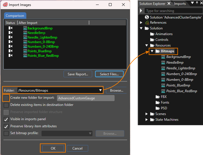
1. In the menu bar choose **\[Import\] - \[Import Resources...\]** as described in <span style="color: rgb(230, 126, 35);">[How to Import Resources](http://cgi3151en.candera.eu/books/import-of-resources/page/how-to-import-resources "How to Import Resources")</span>. 
    - **\[Import Resources\]** dialog will be opened
2. Navigate to the following folder, select all files provided in this folder and press **\[Open\]**.  
    **&lt;cgi-studio-root&gt;/cgi\_studio\_content/Resources/AdvancedCustomGauge**
    - **\[Import Images\]** dialog will be opened as seen in the image below the next step.
3. Use the settings as shown in the screenshot below and press **\[OK\]**. 
    - The images have been imported into the solution and are ready to be used. <p class="callout info">Select an item in the Solution Explorer panel to access its properties in the Properties panel.</p>
        
        <div drawio-diagram="8494"><img src="https://doc316en.candera.eu/uploads/images/drawio/2025-08/drawing-5-1754027219.png" alt=""/></div>
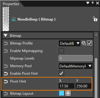
4. To configure the <span style="color: rgb(230, 126, 35);">[Pivot Hint](https://doc316en.candera.eu/books/scene-design/page/pivot-hint "Pivot Hint")</span>, select the image in the **Solution Explorer** panel. In the **Properties panel** under **\[Bitmap\]** you can adjust the image's **Pivot Hint settings**. Configure the images with the values given in the table below. 
    - The images' Pivot Hints are correctly configured to be used in Scene Composer's Gauge Control: The needle images' Pivot Hints are their **central point of rotation**. The other images' Pivot Hints are configured to align the images correctly in the Gauge Control. <table border="1" class="align-center" style="border-collapse: collapse; width: 617px; border-width: 1px;"><thead><tr><td rowspan="2" style="background-color: rgb(53, 152, 219); width: 185.083px;"><span style="color: rgb(255, 255, 255);">**Image**</span></td><td rowspan="2" style="background-color: rgb(53, 152, 219); width: 152.083px;"><span style="color: rgb(255, 255, 255);">**Enable Pivot Hint**</span></td><td colspan="2" style="background-color: rgb(53, 152, 219); width: 279.166px;"><span style="color: rgb(255, 255, 255);">**Pivot Hint**</span></td></tr><tr><td style="background-color: rgb(53, 152, 219); width: 125.083px;"><span style="color: rgb(255, 255, 255);">**X**</span></td><td style="background-color: rgb(53, 152, 219); width: 154.083px;"><span style="color: rgb(255, 255, 255);">**Y**</span></td></tr></thead><tbody><tr><td style="width: 185.083px;">NeedleBmp</td><td style="width: 152.083px;">TRUE</td><td style="width: 125.083px;">17.50</td><td style="width: 154.083px;">250.00</td></tr><tr><td style="width: 185.083px;">Needle\_Lighter</td><td style="width: 152.083px;">TRUE</td><td style="width: 125.083px;">241.00</td><td style="width: 154.083px;">245.00</td></tr><tr><td style="width: 185.083px;">Numbers\_0-24Bmp</td><td style="width: 152.083px;">TRUE</td><td style="width: 125.083px;">325.00</td><td style="width: 154.083px;">329.00</td></tr><tr><td style="width: 185.083px;">Numbers\_0-8Bmp</td><td style="width: 152.083px;">TRUE</td><td style="width: 125.083px;">325.00
        
        </td><td style="width: 154.083px;">329.00</td></tr><tr><td style="width: 185.083px;">Points\_BlueBmp</td><td style="width: 152.083px;">TRUE</td><td style="width: 125.083px;">282.00</td><td style="width: 154.083px;">282.00</td></tr><tr><td style="width: 185.083px;">Points\_Blue\_RedBmp</td><td style="width: 152.083px;">TRUE</td><td style="width: 125.083px;">282.00</td><td style="width: 154.083px;">282.00</td></tr></tbody></table>
        
        <div drawio-diagram="8501"><img src="https://doc316en.candera.eu/uploads/images/drawio/2025-08/drawing-5-1754049472.png" alt=""/></div>
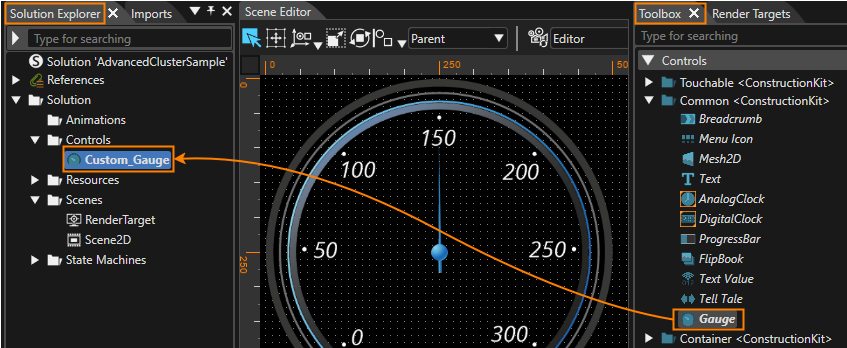
5. In the Toolbox panel's **\[Controls\]** section under "Common" **copy** the **Gauge Control** either via the context menu entry "Copy" or via the keyboard &lt;Ctrl&gt;+C. **Paste** the Gauge Control into the Solution Explorer's folder "Solution &gt; Controls" either via the context menu entry "Paste" or via the keyboard &lt;Ctrl&gt;+V. 
    - A copy of the Gauge Control has been created in the Scene Composer solution's Controls folder.
6. In the Solution Explorer panel **rename** the newly copied Gauge to **"Custom\_Gauge"** either via the context menu entry "Rename" or via the keyboard &lt;F2&gt;. 
    - The copy of the Gauge Control in the Solution Explorer's Controls folder is called "Custom\_Gauge". <p class="callout info">The image below shows where to copy the Gauge Control from and where to copy it to.</p>
        
        <div drawio-diagram="8500"><img src="https://doc316en.candera.eu/uploads/images/drawio/2025-08/drawing-5-1754044266.png" alt=""/></div>

# Advanced Cluster Part 2

In this part of the Advanced Cluster Best Practice the Custom\_Gauge control will be extended with a ForegroundImage and a NeedleEffectImage and new images will be configured to change the control's appearance completely.

#### Restructuring Custom\_Gauge Control

1. In the Solution Explorer double-click the "**Custom\_Gauge**". 
    - The control "**Custom\_Gauge**" will be opened in the Scene Editor, ready to be edited.
    - Scene Tree will display the tree of nodes the control is composed of.
2. In the Scene Tree panel rename the "Group" node to "**Group\_Bitmaps**". 
    - In the Scene Tree panel the Group node has been renamed.  
        <table border="1" class="align-center" id="bkmrk-property-path-image-" style="border-collapse: collapse; width: 600px; border-width: 1px; height: 59.6px;"><tbody><tr style="height: 29.8px;"><td style="background-color: rgb(53, 152, 219); width: 320.583px; height: 29.8px;"><span style="color: rgb(255, 255, 255);">**Rename from**</span></td><td style="background-color: rgb(53, 152, 219); width: 278.75px; height: 29.8px;"><span style="color: rgb(255, 255, 255);">**Rename to**</span></td></tr><tr style="height: 29.8px;"><td style="width: 320.583px; height: 29.8px;">Group</td><td style="width: 278.75px; height: 29.8px;">Group\_Bitmaps</td></tr></tbody></table>
3. In the Scene Tree panel select the root node Custom\_Gauge. In the Properties panel's **\[Layouter\]** section change the Layout type from "Overlay" to "None". 
    - The Layout Type has been changed.
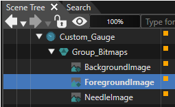
4. In the Scene Tree panel right-click on the "BackgroundImage" and choose **\[Clone...\]** from the context menu. In the opening "Clone Item" dialog enter "ForegroundImage" as name and press **\[OK\]**. 
    - A clone of "BackgroundImage" has been created. Its name is "ForegroundImage". The Scene Tree now looks as in the image below. <div drawio-diagram="8502"><img src="https://doc316en.candera.eu/uploads/images/drawio/2025-08/drawing-5-1754051266.png" alt=""/></div>

#### Exchanging Custom\_Gauge Control's Images

In steps 1 - 3 of this section the Custom\_Gauge new images for the **ForegroundImage** and **BackgroundImage** nodes will be configured. These steps need to be performed for the BackgroundImage node as well as for the Foreground Image node.

In steps 4 - 5 of this section the NeedleImage will be cloned and the images of NeedleImage and NeedleEffectImage will be exchanged.

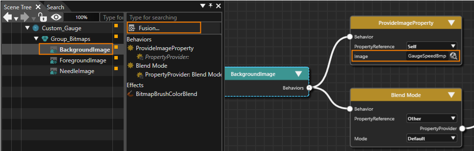
1. In the Scene Tree panel select the image. In the right side of the Scene Tree click on the **\[Fusion...\]** button. 
    - Fusion will be opened, displaying the Fusion diagram for the image.  
        <div drawio-diagram="8503"><img src="https://doc316en.candera.eu/uploads/images/drawio/2025-08/drawing-5-1754052639.png" alt=""/></div>
2. In the Fusion diagram change the ProvideImageProperty's image by clicking the magnifying glass icon to the property's right. 
    - The **\[Choose Item\]** dialog will be displayed.
3. In the **\[Choose Item\]** dialog choose the appropriate new image given in the table below and click **\[OK\]**. 
    - The images displayed by the BackgroundImage and ForegroundImage nodes have been changed.
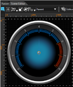
    - When activating the Scene Editor the Custom\_Gauge with new Foreground and Background image can be viewed. It should look like the image below. <p class="callout info">To switch to the Fusion diagram of the second image simply double click it in the Scene Tree panel.</p>
        
        <table border="1" class="align-center" id="bkmrk-node-provideimagepro" style="border-collapse: collapse; width: 600px; border-width: 1px; height: 59.6px;"><tbody><tr style="height: 29.8px;"><td style="background-color: rgb(53, 152, 219); width: 212.583px; height: 29.8px;"><span style="color: rgb(255, 255, 255);">**Node**</span></td><td style="background-color: rgb(53, 152, 219); width: 386.75px; height: 29.8px;"><span style="color: rgb(255, 255, 255);">**new ProvideImageProperty image**</span></td></tr><tr style="height: 29.8px;"><td style="width: 212.583px; height: 29.8px;">BackgroundImage</td><td style="width: 386.75px; height: 29.8px;">Solution &gt; Resources &gt; Bitmaps &gt; Points\_Blue\_RedBmp</td></tr><tr><td style="width: 212.583px;">ForegroundImage</td><td style="width: 386.75px;">Solution &gt; Resources &gt; Bitmaps &gt; Numbers\_0-8Bmp</td></tr></tbody></table>
        
        <div drawio-diagram="8505"><img src="https://doc316en.candera.eu/uploads/images/drawio/2025-08/drawing-5-1754054007.png" alt=""/></div>
4. In the Scene Tree panel create a clone of the "NeedleImage" and name it "NeedleEffectImage". 
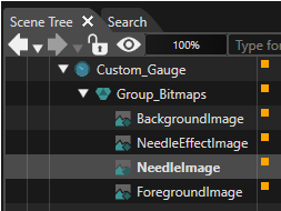
    - A clone of "NeedleImage" has been created. Its name is "NeedleEffectImage". The Scene tree looks as in the image below. <p class="callout info">Please follow the order of the nodes in the scene tree to ensure their proper visibility.</p>
        
        <div drawio-diagram="8506"><img src="https://doc316en.candera.eu/uploads/images/drawio/2025-08/drawing-5-1754054833.png" alt=""/></div>
5. Let's change the images displayed by NeedleImage and NeedleEffectImage. This can be done similarly to above. Select the image, open Fusion and click on the magnifying glass next to the ProvideImageProperty's image property. Configure the images given in the table below. 
    - The images displayed by the NeedleImage and NeedleEffectImage nodes have been changed.
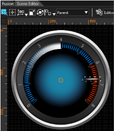
    - When activating the Scene Editor the Custom\_Gauge with new Needle and NeedleEffect image can be viewed. It should look like the image below (the needle is pointing to 3 o'clock). <table border="1" class="align-center" id="bkmrk-node-provideimagepro-1" style="border-collapse: collapse; width: 600px; border-width: 1px; height: 59.6px;"><tbody><tr style="height: 29.8px;"><td style="background-color: rgb(53, 152, 219); width: 212.583px; height: 29.8px;"><span style="color: rgb(255, 255, 255);">**Node**</span></td><td style="background-color: rgb(53, 152, 219); width: 386.75px; height: 29.8px;"><span style="color: rgb(255, 255, 255);">**ProvideImageProperty's image**</span></td></tr><tr style="height: 29.8px;"><td style="width: 212.583px; height: 29.8px;">NeedleImage</td><td style="width: 386.75px; height: 29.8px;">Solution &gt; Resources &gt; Bitmaps &gt; NeedleBmp</td></tr><tr><td style="width: 212.583px;">NeedleEffectImage</td><td style="width: 386.75px;">Solution &gt; Resources &gt; Bitmaps &gt; Needle\_LighterBmp</td></tr></tbody></table>
        
        <div drawio-diagram="8507"><img src="https://doc316en.candera.eu/uploads/images/drawio/2025-08/drawing-5-1754055485.png" alt=""/></div>

#### Configuring the Gauge Needle's Rotation Behavior

1. In the Scene Tree panel select the NeedleImage node. In the Scene Tree panel's right side rename the existing SetRotation behavior according to the table below. Repeat the same steps for the NeedleEffectImage node. 
    - The SetRotation behaviors of NeedleImage and NeedleEffectImage have been renamed. <table border="1" class="align-center" id="bkmrk-node-new-name-of-set" style="border-collapse: collapse; width: 600px; border-width: 1px; height: 59.6px;"><tbody><tr style="height: 29.8px;"><td style="background-color: rgb(53, 152, 219); width: 212.583px; height: 29.8px;"><span style="color: rgb(255, 255, 255);">**Node**</span></td><td style="background-color: rgb(53, 152, 219); width: 386.75px; height: 29.8px;"><span style="color: rgb(255, 255, 255);">**New Name of SetRotation Behavior**</span></td></tr><tr style="height: 29.8px;"><td style="width: 212.583px; height: 29.8px;">NeedleImage</td><td style="width: 386.75px; height: 29.8px;">SetRotation\_Needle</td></tr><tr><td style="width: 212.583px;">NeedleEffectImage</td><td style="width: 386.75px;">SetRotation\_Effect</td></tr></tbody></table>
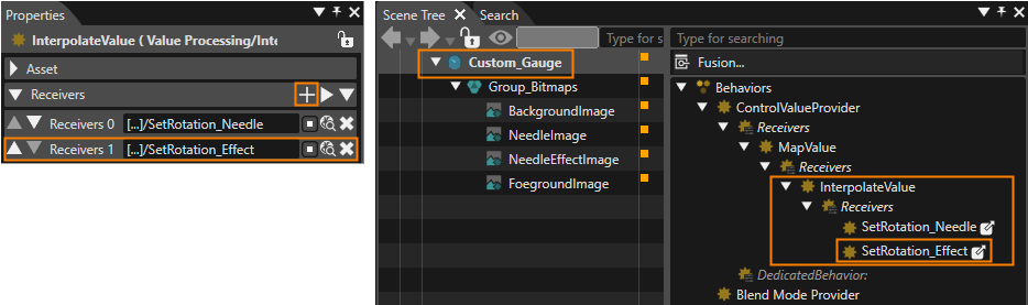
2. In the Scene Tree panel select the **Custom\_Gauge** node. In the Scene Tree panel's right side select the **InterpolateValue** behavior. In the Properties panel's **\[Receivers\]** section press the **\[+\]** button in the top right corner. This **\[+\]** button is marked in orange in the image of step 4. 
    - In the Properties panel's Receivers section you can see that a new line for a **new Receiver** is added for the InterpolateValue behavior.
3. Press the magnifying glass icon next to the new **Receivers 1** entry. 
    - The **\[Choose Item\]** dialog will be opened.
4. Select the behavior SetRotation\_Effect, which can be found under the path given below, and click **\[OK\]**. 
    - The NeedleEffectImage's **SetRotation\_Effect** is referenced as one of the Receivers of the **CustomGauge's InterpolateValue** behavior as you can see in the imaged below. <table border="1" class="align-center" id="bkmrk-import-resources-pat" style="border-collapse: collapse; width: 600px; border-width: 1px; height: 59.6px;"><tbody><tr style="height: 29.8px;"><td style="background-color: rgb(53, 152, 219); width: 153.583px; height: 29.8px;"><span style="color: rgb(255, 255, 255);">**Set Rotation\_Effect**</span></td><td style="background-color: rgb(53, 152, 219); width: 445.75px; height: 29.8px;"><span style="color: rgb(255, 255, 255);">**Path** </span></td></tr><tr style="height: 29.8px;"><td style="width: 153.583px; height: 29.8px;">  
        </td><td style="width: 445.75px; height: 29.8px;">Custom\_Gauge &gt; Group\_Bitmaps &gt; NeedleEffectImage &gt; **SetRotation\_Effect**</td></tr></tbody></table>
        
        <div drawio-diagram="8537"><img src="https://doc316en.candera.eu/uploads/images/drawio/2025-08/drawing-5-1756470270.png" alt=""/></div>

#### Configuring Effects and MapValue Behavior's Limits

<div class="image" id="bkmrk--12"></div><div class="image" id="bkmrk-in-the-scene-tree-pa-2">1. In the Scene Tree panel select the **NeedleEffectImage** node. In the Scene Tree panel's right side under **\[Behaviors\]** select "**Blend Mode**" and press Delete on your keyboard to delete this behavior. 
    - The behavior Blend Mode has been deleted.
2. While **NeedleEffectImage** is selected in the Scene Tree panel select the **BitmapBrushColorBlend** effect in the Scene Tree panel's right side and adjust its properties in the Properties panel according to the table below. 
    - The BitmapBrushColorBlend effect is configured correctly.
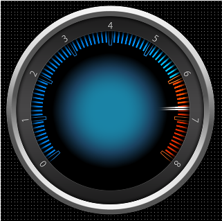
    - In the Scene Editor you can see that the **NeedleEffectImage** is not a white gradient anymore. You can rather **perceive a slight change of color** compared to the original BackgroundImage (see image below, the needle is pointing to 3 o'clock). <table border="1" class="align-center" id="bkmrk-bitmapbrushcolorblen" style="border-collapse: collapse; width: 600px; border-width: 1px; height: 59.6px;"><tbody><tr style="height: 29.8px;"><td style="background-color: rgb(53, 152, 219); width: 212.583px; height: 29.8px;"><span style="color: rgb(255, 255, 255);">**BitmapBrushColorBlend**</span>
        
        <span style="color: rgb(255, 255, 255);">**Property**</span>
        
        </td><td style="background-color: rgb(53, 152, 219); width: 386.75px; height: 29.8px;"><span style="color: rgb(255, 255, 255);">**Value**</span></td></tr><tr style="height: 29.8px;"><td style="width: 212.583px; height: 29.8px;">ColorBlendFactorSrc</td><td style="width: 386.75px; height: 29.8px;">DestColor</td></tr><tr><td style="width: 212.583px;">ColorBlendFactorDst</td><td style="width: 386.75px;">SourceAlpha</td></tr></tbody></table>
        
        <div drawio-diagram="8538"><img src="https://doc316en.candera.eu/uploads/images/drawio/2025-08/drawing-5-1756473802.png" alt=""/></div>
3. In the Scene Tree panel select the **Custom\_Gauge** node. In the Scene Tree panel's right side select the **MapValue** behavior. In the **Properties** panel configure its properties according to the table below. 
    - The MapValue behavior's minimum and maximum value have been configured. <table border="1" class="align-center" id="bkmrk-mapvalue-properties-" style="border-collapse: collapse; width: 600px; border-width: 1px; height: 59.6px;"><tbody><tr style="height: 29.8px;"><td style="background-color: rgb(53, 152, 219); width: 212.583px; height: 29.8px;"><span style="color: rgb(255, 255, 255);">**MapValue Properties**</span>
        
        </td><td style="background-color: rgb(53, 152, 219); width: 386.75px; height: 29.8px;"><span style="color: rgb(255, 255, 255);">**Value**</span></td></tr><tr style="height: 29.8px;"><td style="width: 212.583px; height: 29.8px;">OutputMin</td><td style="width: 386.75px; height: 29.8px;">-128.50</td></tr><tr><td style="width: 212.583px;">OutputMax</td><td style="width: 386.75px;">128.50</td></tr></tbody></table>

</div>

# Advanced Cluster Part 3

In part 3 of this Best Practice the Custom\_Gauge control will be further customized adding controls:

- A **TextValue control** to display the gauge's current value numerically
- A **Text control** above of the numeric value to display the gauge's scope (e.g. speed)
- Another **Text control** below the numeric value, which can be used to display the unit (e.g. km/h)

In order to make our control more versatile, various properties of our configured Custom\_Gauge (like all images and text styles) will be made public.

<p class="callout info">**Public Control Properties** are those that can be configured when using a Custom\_Gauge in a scene. </p>

#### Create and Configure Two TextNodes and a TextValue Node

1. In Scene Composer's Solution Explorer navigate to the path below and double-click on the "Custom\_Gauge" control. 
    - The Scene Tree panel shows the Custom\_Gauge control's tree.
    - Scene editor displays the Custom\_Gauge control.  
        <table border="1" class="align-center" id="bkmrk-property-image-norma-1" style="border-collapse: collapse; width: 600px; border-width: 1px;"><tbody><tr><td style="background-color: rgb(53, 152, 219); width: 283.667px;"><span style="color: white;">**Path in Solution Explorer**</span></td><td style="background-color: rgb(53, 152, 219); width: 315.667px;"><span style="color: white;">**Control**</span></td></tr><tr><td style="width: 283.667px;">Solution/Controls</td><td style="width: 315.667px;">Custom\_Gauge</td></tr></tbody></table>
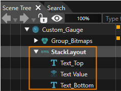
2. From the **Toolbox** panel's **Nodes 2D** section drag and drop a **StackLayout** into the Scene Tree panel directly onto the Custom\_Gauge node. 
    - In the Scene Tree panel you can see that a **StackLayout** has been created directly under the Custom\_Gauge node.
3. From the **Toolbox** panel's **Controls** section under Common drag and drop **2 Text** controls and **1 Text Value** control into the Scene Tree panel directly onto the StackLayout. 
    - In the Scene Tree panel you can see the **2 Text** controls and the **Text Value** control directly under the StackLayout.
4. In the Scene Tree panel select the **StackLayout** as well as the **2 Text** controls one after the other and rename them according to the table below either via the context menu entry "Rename" or by pressing &lt;F2&gt; on your keyboard. 
    - In the Scene Tree panel you can see that the Controls have been renamed.  
        <table border="1" class="align-center" id="bkmrk-target-item-new-name" style="border-collapse: collapse; width: 600px; border-width: 1px;"><tbody><tr><td style="background-color: rgb(53, 152, 219); width: 283.667px;"><span style="color: white;">**Target Item**</span></td><td style="background-color: rgb(53, 152, 219); width: 315.667px;"><span style="color: white;">**New Name**</span></td></tr><tr><td style="width: 283.667px;">StackLayout</td><td style="width: 315.667px;">StackLayout\_Texts</td></tr><tr><td style="width: 283.667px;">Text</td><td style="width: 315.667px;">Text\_Top</td></tr><tr><td style="width: 283.667px;">Text\_1</td><td style="width: 315.667px;">Text\_Bottom</td></tr></tbody></table>
5. In the Scene Tree panel re-arrange StackLayout\_Texts and its contents via drag and drop until it looks like in the image below. 
    - The Scene Tree looks as in the image below. <div drawio-diagram="8563"><img src="https://doc316en.candera.eu/uploads/images/drawio/2025-09/drawing-5-1757057054.png" alt=""/></div>
6. In the Scene Tree panel select StackLayout\_Texts controls. In the **Properties** panel under **Layouter** and **Layout** adjust the properties as in the table below. 
    - In the Properties panel you can see that the correct values are set.  
        <table border="1" class="align-center" id="bkmrk-property-value-layou" style="border-collapse: collapse; width: 600px; border-width: 1px;"><tbody><tr><td style="background-color: rgb(53, 152, 219); width: 300px;"><span style="color: white;">**Property**</span></td><td colspan="2" style="background-color: rgb(53, 152, 219); width: 300px;"><span style="color: white;">**Value**</span></td></tr><tr><td colspan="3" style="background-color: rgb(35, 111, 161);">**<span style="color: rgb(255, 255, 255);">Layouter</span>**</td></tr><tr><td style="width: 300px;">Arrangement</td><td colspan="2" style="width: 300px;">Vertical</td></tr><tr><td colspan="3" style="width: 600px; background-color: rgb(35, 111, 161);">**<span style="color: rgb(255, 255, 255);">Layout</span>**</td></tr><tr><td style="width: 300px;">Vertical Alignment</td><td colspan="2" style="width: 300px;">VCenter</td></tr><tr><td style="width: 300px;">MinimumSize</td><td style="width: 50px;">**X**</td><td style="width: 250px;">250.00</td></tr><tr><td style="width: 300px;"> </td><td style="width: 50px;">**Y**</td><td style="width: 250px;">0.00</td></tr></tbody></table>
7. In the Scene tree panel select **Text\_Top**, **Text Value** and **Text\_Bottom** one after the other. In the **Properties** panel under Layout and Control configure the properties as in the table below. 
    - In the Properties panel you can see that the correct values are set.
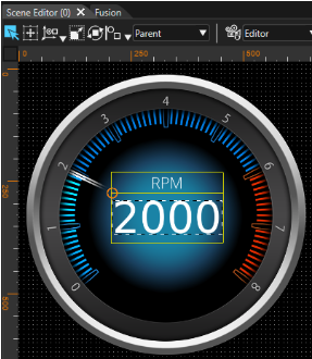
    - In the Scene Editor the texts are centered and the Text Value appears in a bigger font.
    
    <table border="1" class="align-center" id="bkmrk-property-text_top-te" style="border-collapse: collapse; width: 634px; border-width: 1px;"><tbody><tr><td style="background-color: rgb(53, 152, 219); width: 186px;"><span style="color: white;">**Property**</span></td><td style="background-color: rgb(53, 152, 219); width: 130.667px;"><span style="color: white;">**Text\_Top**</span></td><td style="background-color: rgb(53, 152, 219); width: 135.667px;"><span style="color: white;">**Text Value**</span></td><td colspan="2" style="background-color: rgb(53, 152, 219); width: 181px;"><span style="color: white;">**Text\_Bottom**</span></td></tr><tr><td colspan="5" style="background-color: rgb(35, 111, 161); width: 633.334px;">**<span style="color: rgb(255, 255, 255);">Layout</span>**</td></tr><tr><td style="width: 186px;">VerticalAlignment</td><td style="width: 130.667px;">VCenter</td><td style="width: 135.667px;">VCenter</td><td colspan="2" style="width: 181px;">VCenter</td></tr><tr><td style="width: 186px;">HorizontalAlignment</td><td style="width: 130.667px;">HCenter</td><td style="width: 135.667px;">HCenter</td><td colspan="2" style="width: 181px;">HCenter</td></tr><tr><td colspan="5" style="width: 633.334px; background-color: rgb(35, 111, 161);"><span style="color: rgb(255, 255, 255);">**Control**</span></td></tr><tr><td style="width: 186px;">Text</td><td style="width: 130.667px;">RPM</td><td style="width: 135.667px;">-</td><td colspan="2" style="width: 181px;">&lt;empty String&gt;</td></tr><tr><td style="width: 186px;">Text Style</td><td style="width: 130.667px;">OpenSans35
    
    </td><td style="width: 135.667px;">Vera96</td><td colspan="2" style="width: 181px;">OpenSans35</td></tr><tr><td style="width: 186px;">Text Alignment</td><td style="width: 130.667px;">Center</td><td style="width: 135.667px;">Center</td><td colspan="2" style="width: 181px;">Center</td></tr><tr><td style="width: 186px;">Text Format</td><td style="width: 130.667px;">-</td><td style="width: 135.667px;">%04d</td><td colspan="2" style="width: 181px;">-</td></tr></tbody></table>

#### Configure the TextNodes' and TextValue Node's Position

1. In the Scene Tree panel select **StackLayout\_Texts**. In the Scene Tree panel's right side click on the **\[Fusion...\]** button. 
    - Fusion will be opened covering the Scene Editor.
    - StackLayout\_Texts Fusion diagram will be displayed. It only has one Fusion Node.
2. In Fusion use the StackLayout\_Texts' "Behaviors" connector to add 2 new Fusion Nodes: Connect **2 Value Processing &gt; Value** behaviors to the StackLayout\_Texts Fusion Node. <p class="callout info">Please check <span style="color: rgb(230, 126, 35);">[Fusion's Basic Operations ](https://doc316en.candera.eu/books/fusion/page/basic-operations#bkmrk-adding-a-fusion-node)</span>documentation on how to add Fusion Nodes. </p>
    
    
    - In Fusion 2 new Fusion Nodes "**Value**" and "**Value\_1**" have been created.
3. In Fusion select and right-click on the behavior nodes and rename them according to the table below. 
    - In Fusion the Value behavior fusion nodes have been renamed.  
        <table border="1" class="align-center" id="bkmrk-target-item-new-name-1" style="border-collapse: collapse; width: 600px; border-width: 1px;"><tbody><tr><td style="background-color: rgb(53, 152, 219); width: 283.667px;"><span style="color: white;">**Target Item**</span></td><td style="background-color: rgb(53, 152, 219); width: 315.667px;"><span style="color: white;">**New Name**</span></td></tr><tr><td style="width: 283.667px;">Value</td><td style="width: 315.667px;">Value\_TextPos\_X</td></tr><tr><td style="width: 283.667px;">Value\_1</td><td style="width: 315.667px;">Value\_TextPos\_Y</td></tr></tbody></table>
4. In Fusion use the Value behaviors' "Receivers" connectors to add a **Value Processing &gt; Transformation &gt; SetPosition** Fusion Node to each of them.  
    
    - In Fusion 2 new Fusion Nodes "**Set Position**" have been created, one of which is connected to Value\_TextPos\_X, the other to Value\_TextPos\_Y.
5. In Fusion select and right-click on the behavior nodes and rename them according to the table below. 
    - In Fusion the **Set Position** behavior fusion nodes have been renamed.  
        <table border="1" class="align-center" id="bkmrk-target-item-new-name-2" style="border-collapse: collapse; width: 600px; border-width: 1px;"><tbody><tr><td style="background-color: rgb(53, 152, 219); width: 283.667px;"><span style="color: white;">**Target Item**</span></td><td style="background-color: rgb(53, 152, 219); width: 315.667px;"><span style="color: white;">**New Name**</span></td></tr><tr><td style="width: 283.667px;">Value\_TextPos\_X &gt; Set Position</td><td style="width: 315.667px;">Set Position\_X</td></tr><tr><td style="width: 283.667px;">Value\_TextPos\_Y &gt; Set Position</td><td style="width: 315.667px;">Set Position\_Y</td></tr></tbody></table>
6. In Fusion configure the behaviors' Fusion Nodes according to the table below. 
    - In Fusion the Fusion Nodes' Properties have been changed.
    - In Scene Editor the position of StackLayout\_Texts has been changed. The texts are now neatly placed inside the Custom\_Gauge control as you can see in the image below. <table border="1" class="align-center" id="bkmrk-fusion-node-property" style="border-collapse: collapse; width: 600px; border-width: 1px;"><tbody><tr><td style="background-color: rgb(53, 152, 219); width: 145.333px;"><span style="color: white;">  
        </span></td><td colspan="2" style="background-color: rgb(53, 152, 219); width: 454px;"><span style="color: white;">**Fusion Node**</span></td></tr><tr><td style="background-color: rgb(53, 152, 219); width: 145.333px;"><span style="color: white;">**Property**</span></td><td style="background-color: rgb(53, 152, 219); width: 218.5px;"><span style="color: white;">**Set Position\_X**</span></td><td style="background-color: rgb(53, 152, 219); width: 235.5px;"><span style="color: white;">**Set Position\_Y**</span></td></tr><tr><td style="width: 145.333px;">TargetNode</td><td style="width: 218.5px;">Custom\_Gauge &gt; StackLayout\_Texts
        
        </td><td style="width: 235.5px;">Custom\_Gauge &gt; StackLayout\_Texts</td></tr><tr><td style="width: 145.333px;">TranslationAxis2D</td><td style="width: 218.5px;">AxisX</td><td style="width: 235.5px;">AxisY</td></tr><tr><td style="background-color: rgb(53, 152, 219); width: 145.333px;"><span style="color: white;">**Property**</span></td><td style="background-color: rgb(53, 152, 219); width: 218.5px;"><span style="color: white;">**Value\_TextPosX**</span></td><td style="background-color: rgb(53, 152, 219); width: 235.5px;"><span style="color: white;">**Value\_TextPosY**</span></td></tr><tr><td style="width: 145.333px;">Variant</td><td style="width: 218.5px;">(Float) 205</td><td style="width: 235.5px;">(Float) 230</td></tr></tbody></table>
        
        <div drawio-diagram="8594"><img src="https://doc316en.candera.eu/uploads/images/drawio/2025-09/drawing-5-1758889195.png" alt=""/></div>

#### Configure Value Forwarding and Maximum Value

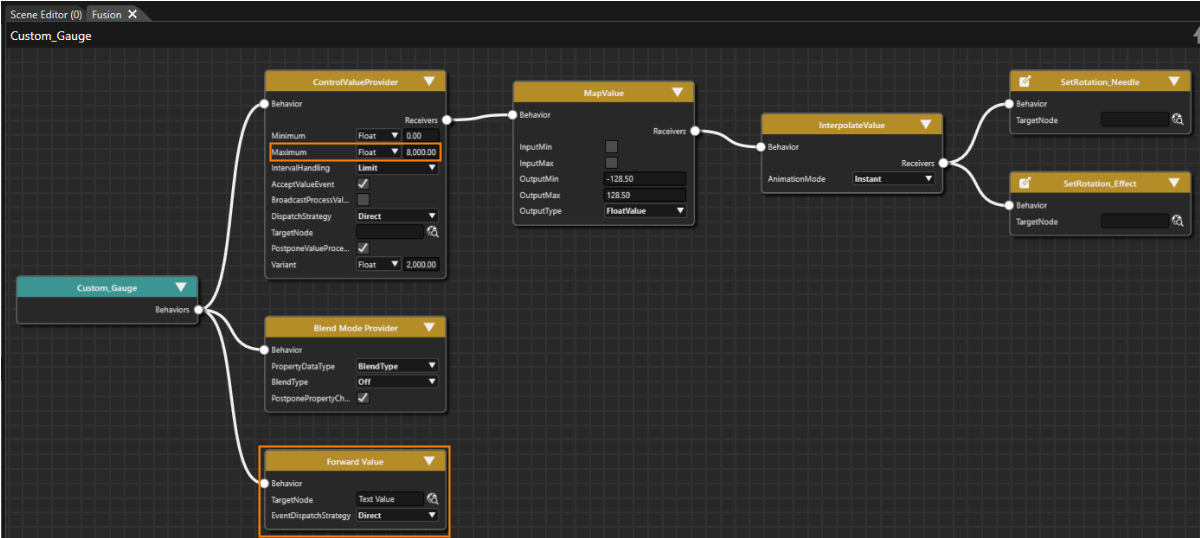
1. In Fusion add a **Value Processing &gt; Forward Value** behavior to the **Behaviors** connector of the **Custom\_Gauge** Fusion Node. Configure its **TargetNode** according to the table below. 
    - In Fusion the property will be changed accordingly.  
        <table border="1" class="align-center" id="bkmrk-forward-value-fusion" style="border-collapse: collapse; width: 600px; border-width: 1px;"><tbody><tr><td style="background-color: rgb(53, 152, 219); width: 211.667px;"><span style="color: white;">**Forward Value Fusion Node**</span></td><td style="background-color: rgb(53, 152, 219); width: 387.667px;"> </td></tr><tr><td style="background-color: rgb(53, 152, 219); width: 211.667px;"><span style="color: white;">**Property**</span></td><td style="background-color: rgb(53, 152, 219); width: 387.667px;"><span style="color: white;">**Value**</span></td></tr><tr><td style="width: 211.667px;">TargetNode</td><td style="width: 387.667px;">Custom\_Gauge &gt; StackLayout\_Texts &gt; Text Value</td></tr></tbody></table>
2. In Fusion in the **ControlValueProvider** Fusion Node configure the property **Maximum** according to the table below. 
    - In Fusion the the property is changed accordingly.
    - Custom\_Gauge's Fusion diagram will look as in the image below. <table border="1" class="align-center" id="bkmrk-controlvalueprovider" style="border-collapse: collapse; width: 600px; border-width: 1px;"><tbody><tr><td style="background-color: rgb(53, 152, 219); width: 211.667px;"><span style="color: white;">**ControlValueProvider**</span></td><td style="background-color: rgb(53, 152, 219); width: 387.667px;"><span style="color: white;">  
        </span></td></tr><tr><td style="background-color: rgb(53, 152, 219); width: 211.667px;"><span style="color: white;">**Property**</span></td><td style="background-color: rgb(53, 152, 219); width: 387.667px;"><span style="color: white;">**Value**</span></td></tr><tr><td style="width: 211.667px;">Maximum</td><td style="width: 387.667px;">(Float) 8000.00</td></tr></tbody></table>
        
        <div drawio-diagram="8593"><img src="https://doc316en.candera.eu/uploads/images/drawio/2025-09/drawing-5-1758889102.png" alt=""/></div>

#### Configure Public Control Properties

1. In the Scene Tree panel right click "Custom\_Gauge" and select "**Control Properties...**" from the context menu. 
    - The Configure Public Control Properties dialog will be opened.
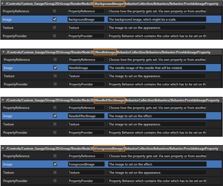
2. In the Configure Public Properties dialog the Properties which should be public to the user of the Custom\_Gauge control need to be marked with the "Is Public" checkbox. Check the "Is Public" checkbox and eventually change the image properties' names according to the table and images below. 
    - Image properties necessary for using and configuring the Custom\_Gauge will be made public.
    - The Custom\_Gauge control is now fully configured and ready to use.  
        <table border="1" class="align-center" id="bkmrk-custom_gauge-%3E-group" style="border-collapse: collapse; width: 600px; border-width: 1px;"><tbody><tr><td class="align-left" colspan="4" style="background-color: rgb(53, 152, 219); width: 599.332px;"><span style="color: white;">**Custom\_Gauge &gt; Group\_Bitmaps &gt;** </span></td></tr><tr><td style="background-color: rgb(53, 152, 219); width: 238.833px;"><span style="color: white;">**Property** </span></td><td style="background-color: rgb(53, 152, 219); width: 60.833px;"><span style="color: white;">**Is Public**</span></td><td style="background-color: rgb(53, 152, 219); width: 149.833px;"><span style="color: white;">**Source**</span></td><td style="background-color: rgb(53, 152, 219); width: 149.833px;"><span style="color: white;">**Name**</span></td></tr><tr><td style="width: 238.833px;">BackgroundImage &gt; ProvideImageProperty</td><td style="width: 60.833px;">x</td><td style="width: 149.833px;">Image</td><td style="width: 149.833px;">BackgroundImage</td></tr><tr><td style="width: 238.833px;">NeedleImage &gt; ProvideImageProperty</td><td style="width: 60.833px;">x</td><td style="width: 149.833px;">Image</td><td style="width: 149.833px;">NeedleImage</td></tr><tr><td style="width: 238.833px;">NeedleEffectImage &gt; ProvideImageProperty</td><td style="width: 60.833px;">x</td><td style="width: 149.833px;">Image</td><td style="width: 149.833px;">NeedleEffectImage</td></tr><tr><td style="width: 238.833px;">ForegroundImage &gt; ProvideImageProperty</td><td style="width: 60.833px;">x</td><td style="width: 149.833px;">Image</td><td style="width: 149.833px;">ForegroundImage</td></tr></tbody></table>
        
        <div drawio-diagram="8574"><img src="https://doc316en.candera.eu/uploads/images/drawio/2025-09/drawing-5-1757075534.png" alt=""/></div>
3. In the Configure Public Properties dialog check the "Is Public" checkbox and perform other configurations according to the table and images below. 
    - Image properties necessary for using and configuring the Custom\_Gauge will be made public.
    - The Custom\_Gauge control is now fully configured and ready to use. <p class="callout info">The properties made public in this **Configure Public Properties** dialog will be configurable in the **Properties panel's Controls section**.</p>

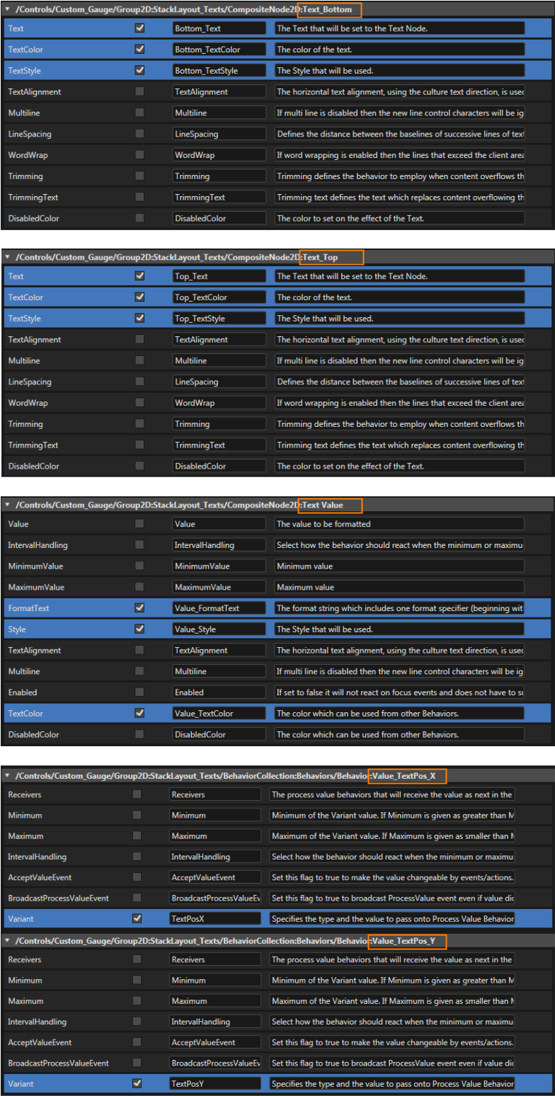
<table border="1" class="align-center" id="bkmrk-custom_gauge-%3E-stack" style="border-collapse: collapse; width: 600px; border-width: 1px;"><tbody><tr><td class="align-left" colspan="4" style="background-color: rgb(53, 152, 219); width: 599.332px;"><span style="color: white;">**Custom\_Gauge &gt; StackLayout\_Texts &gt;**</span></td></tr><tr><td style="background-color: rgb(53, 152, 219); width: 179.833px;"><span style="color: white;">**Property**</span></td><td style="background-color: rgb(53, 152, 219); width: 119.833px;"><span style="color: white;">**IsPublic**</span></td><td style="background-color: rgb(53, 152, 219); width: 149.833px;"><span style="color: white;">**Source**</span></td><td style="background-color: rgb(53, 152, 219); width: 149.833px;"><span style="color: white;">**Name**</span></td></tr><tr><td style="width: 179.833px;">TextBottom</td><td style="width: 119.833px;">x</td><td style="width: 149.833px;">Text</td><td style="width: 149.833px;">Bottom\_Text</td></tr><tr><td style="width: 179.833px;">  
</td><td style="width: 119.833px;">x</td><td style="width: 149.833px;">TextColor</td><td style="width: 149.833px;">Bottom\_TextColor</td></tr><tr><td style="width: 179.833px;">  
</td><td style="width: 119.833px;">x</td><td style="width: 149.833px;">TextStyle</td><td style="width: 149.833px;">Bottom\_TextStyle</td></tr><tr><td style="width: 179.833px;">Text\_Top</td><td style="width: 119.833px;">x</td><td style="width: 149.833px;">Text</td><td style="width: 149.833px;">Top\_Text</td></tr><tr><td style="width: 179.833px;">  
</td><td style="width: 119.833px;">x</td><td style="width: 149.833px;">TextColor</td><td style="width: 149.833px;">Top\_TextColor</td></tr><tr><td style="width: 179.833px;">  
</td><td style="width: 119.833px;">x</td><td style="width: 149.833px;">TextStyle</td><td style="width: 149.833px;">Top\_TextStyle</td></tr><tr><td style="width: 179.833px;">Text Value</td><td style="width: 119.833px;">x</td><td style="width: 149.833px;">FormatText</td><td style="width: 149.833px;">Value\_FormatText</td></tr><tr><td style="width: 179.833px;">  
</td><td style="width: 119.833px;">x</td><td style="width: 149.833px;">Style</td><td style="width: 149.833px;">Value\_Style</td></tr><tr><td style="width: 179.833px;">  
</td><td style="width: 119.833px;">x</td><td style="width: 149.833px;">TextColor</td><td style="width: 149.833px;">Value\_TextColor</td></tr><tr><td style="width: 179.833px;">Behaviors &gt; Value\_TextPos\_X</td><td style="width: 119.833px;">x</td><td style="width: 149.833px;">Variant</td><td style="width: 149.833px;">TextPosX</td></tr><tr><td style="width: 179.833px;">Behaviors &gt; Value\_TextPos\_Y</td><td style="width: 119.833px;">x</td><td style="width: 149.833px;">Variant</td><td style="width: 149.833px;">TextPosY</td></tr></tbody></table>

<div drawio-diagram="8573"><img src="https://doc316en.candera.eu/uploads/images/drawio/2025-09/drawing-5-1757075516.png" alt=""/></div>

# Advanced Cluster Part 4

The following steps describe how to use the Custom\_Gauge control in a scene. Speed gauge and RPM gauge are realized with the same control. Using the public properties for customization these Gauge controls appear similar yet different.

Once the advanced cluster scene is fully configured, it's time to test its functionality using the Scene Composer's <span style="color: rgb(230, 126, 35);">[Player](https://doc316en.candera.eu/books/player "Player")</span>.

#### Create a Cluster Scene with 2 Custom\_Gauge Controls

1. In the Solution Explorer navigate to the Scene2D and double click it. 
    - Scene2D will be opened and visible in Scene Editor and Scene Tree panel.
    - In Scene Tree panel you can see that the scene contains a camera.
2. In the **Scene Editor's bottom toolbar** make sure that "**active rendering**" and "**widgets updating**" is enabled. 
    - In the Scene Editor's bottom toolbar "**active rendering**" and "**widgets updating**" are highlighted as seen in the image below.  
        <div drawio-diagram="8581"><img src="https://doc316en.candera.eu/uploads/images/drawio/2025-09/drawing-5-1757669749.png" alt=""/></div>
3. From the Toolbox panel under **\[Nodes 2D\]** drag a **Group node** into the Scene Tree panel or the Scene Editor. 
    - In the Scene Tree panel you can see the newly created Group node.
    - In the Scene Editor you can see an indicator of the Group node's current position.
4. **Rename** the **Group node** according to the table below either via the context menu "Rename" or the keyboard shortcut &lt;F2&gt;. 
    - The Group node has been renamed accordingly. <table border="1" class="align-center" id="bkmrk-target-item-image-my-1" style="border-collapse: collapse; width: 601px; border-width: 1px; height: 58.9334px;"><tbody><tr><td style="background-color: rgb(53, 152, 219);"><span style="color: white;">**Old Name**</span></td><td style="background-color: rgb(53, 152, 219);"><span style="color: white;">**New Name**</span></td></tr><tr><td>Group</td><td>Group\_Content</td></tr></tbody></table>
5. In the Scene Tree panel select the Group node. In the Properties panel's **\[Transformations\]** section reset the Position property according to the table below. 
    - In the Scene Editor you can see the Group node's current position. <p class="callout info">A property can easily be **reset** in the Properties panel by clicking on the **curled arrow icon** on the property's left.</p>
        
        <table border="1" class="align-center" id="bkmrk-target-item-position" style="border-collapse: collapse; width: 601px; border-width: 1px; height: 58.9334px;"><tbody><tr><td rowspan="2" style="background-color: rgb(53, 152, 219); width: 200.1px;"><span style="color: white;">**Target Item**</span></td><td colspan="2" style="background-color: rgb(53, 152, 219); width: 200.1px;"><span style="color: white;">**Position**</span></td></tr><tr><td style="background-color: rgb(53, 152, 219); width: 200.1px;"><span style="color: white;">**X**</span></td><td style="background-color: rgb(53, 152, 219); width: 200.1px;"><span style="color: white;">**Y**</span></td></tr><tr><td style="width: 200.1px;">Group\_Content</td><td style="width: 200.1px;">0.00</td><td style="width: 200.1px;">0.00</td></tr></tbody></table>
6. From the Solution Explorer **drag** the **image** according to the table below into the Scene Tree panel **directly onto the Group\_Content** node. 
    - In Scene Tree panel you can see that a new RenderNode2D with a BitmapBrushBlend effect has been created inside Group\_Content.
    - In Scene Editor you can see the rendered background image. <table border="1" class="align-center" id="bkmrk-path-in-solution-exp" style="border-collapse: collapse; width: 601px; border-width: 1px; height: 58.9334px;"><tbody><tr><td style="background-color: rgb(53, 152, 219); width: 244.167px;"><span style="color: white;">**Path in Solution Explorer**</span></td><td style="background-color: rgb(53, 152, 219); width: 356.167px;"><span style="color: white;">**Image**</span></td></tr><tr><td style="width: 244.167px;">Solution &gt; Resources &gt; Bitmaps</td><td style="width: 356.167px;">BackgroundBmp</td></tr></tbody></table>
7. From the Solution Explorer drag **two** **Custom\_Gauge** into the Scene Tree panel directly onto the **Group\_Content**. The path to the Custom\_Gauge control is given in the table below. 
    - In the Scene Editor only one Custom\_Gauge will be displayed since both controls are located at the same position and therefore are completely overlapping. One Custom\_Gauge is hiding the other.
    - In the Scene Tree panel the Group\_Content node contains a RenderNode2D and the newly created Custom\_Gauges. <table border="1" class="align-center" id="bkmrk-path-in-solution-exp-1" style="border-collapse: collapse; width: 601px; border-width: 1px; height: 58.9334px;"><tbody><tr><td style="background-color: rgb(53, 152, 219); width: 244.167px;"><span style="color: white;">**Path in Solution Explorer**</span></td><td style="background-color: rgb(53, 152, 219); width: 356.167px;"><span style="color: white;">**Control**</span></td></tr><tr><td style="width: 244.167px;">Solution &gt; Controls</td><td style="width: 356.167px;">Custom\_Gauge</td></tr></tbody></table>
8. **Rename** the **Custom\_Gauge** nodes according to the table below either via the context menu "Rename" or the keyboard shortcut &lt;F2&gt;. 
    - The Custom\_Gauge node has been renamed accordingly. <table border="1" class="align-center" id="bkmrk-old-name-new-name-cu" style="border-collapse: collapse; width: 601px; border-width: 1px; height: 58.9334px;"><tbody><tr><td style="background-color: rgb(53, 152, 219);"><span style="color: white;">**Old Name**</span></td><td style="background-color: rgb(53, 152, 219);"><span style="color: white;">**New Name**</span></td></tr><tr><td>Custom\_Gauge</td><td>Custom\_Gauge\_Speed</td></tr><tr><td>Custom\_Gauge\_1</td><td>Custom\_Gauge\_RPM</td></tr></tbody></table>
9. Select the **Custom\_Gauge controls** one after the other. In the Properties panel **configure the properties** as given in the tables below. 
    - In the Scene Editor the gauge controls for RPM and Speed are both visible.
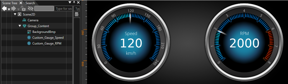
    - The Scene2D starts to look like a cluster, see image below. <table border="1" class="align-center" id="bkmrk-custom_gauge_rpm-pro" style="border-collapse: collapse; width: 601px; border-width: 1px; height: 58.9334px;"><tbody><tr><td style="background-color: rgb(53, 152, 219);"><span style="color: white;">**Custom\_Gauge\_RPM Property**</span></td><td style="background-color: rgb(53, 152, 219);"><span style="color: white;">**Value**</span></td></tr><tr><td colspan="2" style="background-color: rgb(35, 111, 161); width: 300.167px;"><span style="color: white;">**Transformation**</span></td></tr><tr><td>Position X</td><td>965.00</td></tr><tr><td>Position Y</td><td>30.00</td></tr></tbody></table>
        
        <table border="1" class="align-center" id="bkmrk-custom_gauge_speed-p" style="border-collapse: collapse; width: 601px; border-width: 1px; height: 58.9334px;"><tbody><tr><td style="background-color: rgb(53, 152, 219); width: 273.167px;"><span style="color: white;">**Custom\_Gauge\_Speed Property**</span></td><td style="background-color: rgb(53, 152, 219); width: 327.167px;"><span style="color: white;">**Value**</span></td></tr><tr><td colspan="2" style="background-color: rgb(35, 111, 161); width: 600.334px;"><span style="color: white;">**Transformation**</span></td></tr><tr><td style="width: 273.167px;">Position X</td><td style="width: 327.167px;">60.00</td></tr><tr><td style="width: 273.167px;">Position Y</td><td style="width: 327.167px;">30.00</td></tr><tr><td colspan="2" style="background-color: rgb(35, 111, 161); width: 600.334px;"><span style="color: white;">**Control**</span></td></tr><tr><td style="width: 273.167px;">Value</td><td style="width: 327.167px;">120</td></tr><tr><td style="width: 273.167px;">Input Max</td><td style="width: 327.167px;">240</td></tr><tr><td style="width: 273.167px;">Top\_Text</td><td style="width: 327.167px;">Speed</td></tr><tr><td style="width: 273.167px;">Value\_Format Text</td><td style="width: 327.167px;">%d</td></tr><tr><td style="width: 273.167px;">Bottom\_Text</td><td style="width: 327.167px;">km/h</td></tr><tr><td style="width: 273.167px;">BackgroundImage</td><td style="width: 327.167px;">Solution/Resources/Bitmaps/Points\_BlueBmp</td></tr><tr><td style="width: 273.167px;">ForegroundImage</td><td style="width: 327.167px;">Solution/Resources/Bitmaps/Numbers\_0-240Bmp</td></tr></tbody></table>
        
        <div drawio-diagram="8595"><img src="https://doc316en.candera.eu/uploads/images/drawio/2025-09/drawing-5-1758890507.png" alt=""/></div>

#### Check the Scene in the Player

1. **Save** your work and **start** the **Player** to test the functionality of your configuration. To do this, please perform similar steps to the ones described in the <span style="color: rgb(230, 126, 35);">[GettingStartedControls Best Practice](https://doc316en.candera.eu/books/best-practice/page/gettingstartedcontrols-part-1#bkmrk-check-the-first-scen)<span style="color: rgb(0, 0, 0);">. </span></span>
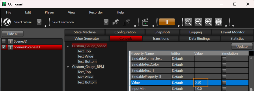
    - <span style="color: rgb(230, 126, 35);"><span style="color: rgb(0, 0, 0);">The Speed Gauge can be tested by manipulating Custom\_Gauge\_Speed's Value Property (The property is changed to 50 in the image below).</span></span>
    - <span style="color: rgb(230, 126, 35);"><span style="color: rgb(0, 0, 0);">The RPM Gauge can be tested by manipulating Custom\_Gauge\_RPM's Value Property.</span></span><div drawio-diagram="8584"><img src="https://doc316en.candera.eu/uploads/images/drawio/2025-09/drawing-5-1757685817.png" alt=""/></div>

<div class="contents" id="bkmrk--0"><div class="contents">  
</div></div><div class="contents" id="bkmrk--12"><div class="textblock"><div class="image">  
</div></div></div>