A widget adds dynamics to a static scene structure. It is linked to some parts of the scene graph and will be exported to the asset as a part of the scene.
SceneComposer is delivered with a default set of widgets, which can be extended with custom widgets by modifying SCHost.dll.
---
#### Widgets Panel
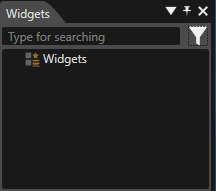
Widgets linked to a scene are organized in a widgets collection in the Widgets panel. Sorting is controlled by widget categories in the widget meta information.
Drag a widget from the Toolbox panel and drop it
- on a specific position in the Widgets panel or
- on a specific node part of the scene graph in the Scene Tree panel
- on a specific position in the Scene Editor panel.
In any case, the widget will then be listed in the Widgets panel, displaying all widgets linked to the given scene:
Sometimes it is necessary to group some widgets in the Widgets panel. To get this desired result a widget group has to be dragged from the Toolbox panel. After this first step, any widget can be dragged into the new group. The group can be renamed, deleted, cloned etc. If not visible, make the Widgets panel visible by choosing the "View" > "Scene" > "Widgets" menu option.
##### Widget Properties
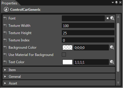
Select a widget and its properties will appear in the "Properties" panel of the main view.
- All widget properties are defined by the C++ implementation of the widget.
- SceneComposer provides type specific editors to configure those user-defined widget properties.
##### Update Widgets in all Scenes
SceneComposer provides an option which enables updating widgets for all scenes (2D, 3D, composites, composite node internal widgets). The button for updating widgets for all scenes is placed on the Toolbar near the "Active Rendering" button.
# Widgets Using Controls
#### Widgets Using Controls
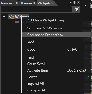
When a node from a control is set as value of a widget property, the option "Control Properties" becomes available in the context menu of the Widgets node.
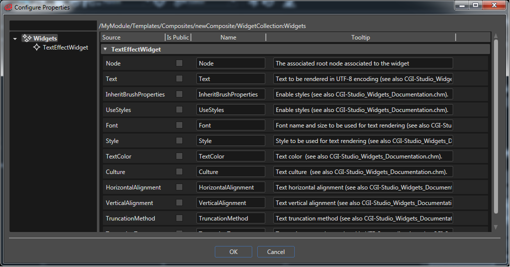
A new dialog "Configure Properties" opens where you can choose which properties of the widget should be available in the control. If necessary the user can use the fields available under the "Name" and "Tooltip" sections to introduce any useful piece of information. The values filled by the user in the "Configure Properties" dialog will be visible in the "Properties" panel.
When the control is used in a new scene, the widget's properties selected in the "Configure Properties" dialog will be available as Control's Properties and they will be editable in the Properties panel.
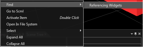
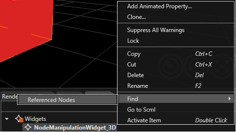
It is possible to search nodes referred by a widget having property types "Node" and to search widgets which use a node or its descendents as widget properties. For convenience purpose this functionality is also offered as a context menu on widgets and nodes.
Any referencing widget can be found by using the context menu via Scene Tree.
If a node is referenced by a widget, the node can be found by using the context menu via Widgets panel.